
David Petersen's Blog, page 14
March 14, 2023
Ancient Storm Stag Dragon
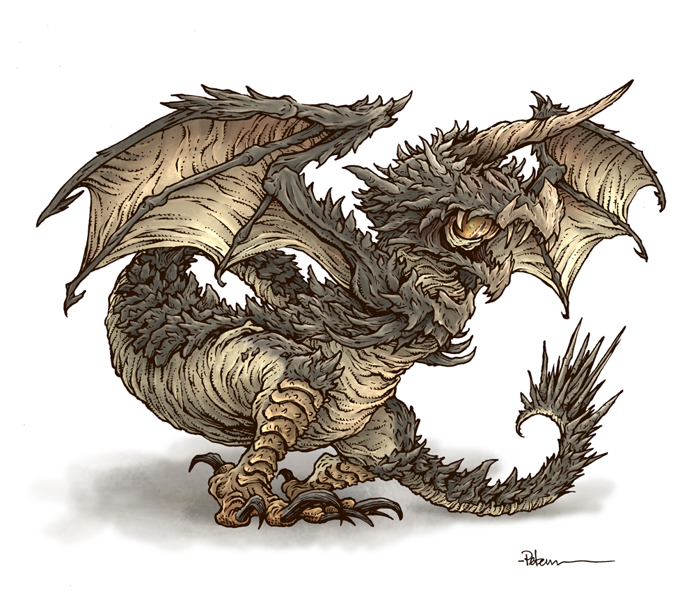
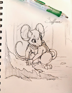
 Last Friday on my Twitch Stream, we did the #DiscoveringDragons Community-Draw-Along! Normally it happens on the first friday of the month, but because I was at Emerald City Comic Con on the first friday, we postponed it until the second friday for this month. It's a fun event where I welcome all skill levels to push their pencils (or whatever tools they use to make art). I worked on my piece live on my Twitch stream while viewers worked at home and then on Monday we shared our finished pieces.Here is my finished colored Dragon. And below are my steps to create it as well as the community submissions.
 For #DiscoveringDragons, I post two or three prompt words for everyone to make into a dragon. It's a nice framework for artists of any skill level to focus some time on an 'assignment' to shake the rust off or get the pencil moving again––all while also being loose enough that there's plenty of room for individual expression and interpretation.
This month the prompt words were Ancient, Storm, and Stag. I opened a few tabs of google image searches of those words & one for 'dragons'.
I knew going into this dragon that I wanted to push a sense of scale more than my previous pieces.
 I started with a pencil drawing on copy paper of an elk head and then a separate drawing of the body shape & pose. I used a kneaded eraser to lighten the elk feature enough that I could draw more dragon-ish features that happen to be in the shape of an elk's head. I assembled those drawings in Photoshop and added a photo of a stag's antlers. In this step I was able to make adjustments, resize, reposition, and refine the rough shapes.
I then printed it out so I could do the tighter pencil drawing you see to the left on top of it on a light pad.

After I was happy with my above design, I printed that piece out on copy paper and taped it to the back of a sheet of Strathmore 300 series bristol. Using a lightpad, I was able to see through the surface of the bristol as I inked the dragon. I used Copic Multiliner 0.7 & 0.3 SP pens to ink the art. I started with the head, but them moved down to the body. I hesitated on the antler-like spines down the neck and tail, so I postponed on those, moved on to the antlers before needing to end the Twitch stream for time concerns. After I had some dinner, I came back and redrew the antler spines and inked them in off stream.

At the end of my stream I'd wished the viewers all luck with their pieces and told them we'd take a look at everyone's work on Monday. After I finished the inks, I also wanted to draw some weather effects to get 'storm' in the piece more. So I inked a separate cloud on a piece of scrap, and the lightning on the back of the dragon art.
I scanned them all, assembled them and started the coloring process. That first step is to flat in the colors––basically professional coloring-in-the-lines.
For the final colors and all the highlights, shading, and texture I used the dodge and burn tools with a stock photoshop texture brush. I also did a little bit of painting with a brush on the cloud effect. Below you can again see the final rendered dragon.


March 7, 2023
Mike Davis' Wordless-Fill-In-Comics
Back in the early/mid 00's, my friend Mike Davis (Rand) and I had an idea for him to draw very quick simple comic strips that I would post (mainly on the CBR Hellboy Forums) for other folks to fill in their jokes. I colored most of these (and added a subtle color halftone to push the idea of them being newspaper comic strips.
We did a few as contests (I think I mailed a sketch to the person who's entry got the most fan votes), but I felt like this would have been a great publishable book (with more polish and production) where the pages are a glossy board book stock that colorform or post it style balloon shaped stickers could be placed on and easily removed. Anyhow, here is the full run of the wordless comics Mike drew and I posted over 20 years ago.


If you want to download any of these and try your hand at digitally adding in some balloons, text, and jokes, I'd be happy to do a follow-up post of everyone's efforts.
February 28, 2023
TMNT/USAGI 5 Covers Process 3/3: Colors
 For the past two weeks I've been sharing the process for creating my 5 adjoining covers for the TMNT/Usagi WhereWhen crossover miniseries. I've covered the pencils/layouts and the inks. Today I'm sharing the coloring process. Above you can see the finished colored and assembled covers. Below I'll walk through a bit of the process.
With the inked covers all digitally reassembled, I started the first part of digital coloring called 'flatting' where you are adding flat colors to establish all the color areas in the piece.

This is a professional version of coloring-inside-the-lines to establish the colors for the piece, but also to make it easy to isolate and grab those color areas again and again as I do the rendering. At this step I also added in the color holds (areas where I wanted the line-art to be a color other than black) to Usagi's scar, Tomoe & WhereWhen's pupils, and all the sword blade lines, as well as some of the debris I decided was further back.
 To start the final colors in Photoshop CS5, I needed to add shading, highlights, and texture. To do this, I rendered all the covers like one big piece using the Dodge and Burn tools while using a stock Photoshop Brush. Dodge and Burn are tools carried over from Photoshop being a photo retouching tool and are terms for purposefully over or under exposing areas of photographs in a dark room.
 More simply Burn darkens whatever values/colors are there, and Dodge will lighten them. The textured brush adds in some random and natural variation as I render giving the piece a bit of texture so it doesn't look quite so 'digital'.
 When I was working on the layout of the 5 adjoining covers, I had no idea what to do with the background. I even wondered if I should leave it white and make the piece a bit more graphic (I was thinking of a Joe Mad X-Men cover from the 90's). But as I was flatting the piece, I eyedroppered up the orange color I had as a placeholder for the robot debris and flooded the sky with it––and didn't hate it.
Adding in some gradients and color shifts so that it was brightest at Dr. WhereWhen and darkest at the edges made a difference and both felt like the fatigue of battle as well as reminded me of a Usagi group piece of Stan's.
 Most of my color choices were made when I was doing the layouts for this piece and all based on how the characters are colored in the comic already. But, I already have some shifts in color I generally prefer, like warmer versions of cool colors, more muted yellow greens for the turtles, and a warmer creamier color for Usagi's fur. That being said, I had to make further alterations to the base colors once I had the orange background in. Color perception is influenced by the colors surrounding them, so I had to make subtle adjustments to make the piece cohesive.
I also had to lasso areas (with a many-pixeled feathered edge) on each character after rendering them to adjust the highlight colors to be warmer and more yellow/red/magenta to imply the lighting of the background was affecting the characters as well––and that effect needed to be more intense closer to the middle of the composition.
 For all the clockwork robot debris, I started with them being a base color that was somewhere between grey/brown and orange. I then went through on two different layers just making some pieces base tones lighter (with a screen layer) or darker (with a multiply layer). I then rendered everything the same way as the figures, while trying to make sense of those heaps of parts, I also knew they needed to be background and not pull focus away from the characters.
 So, the rendering detail isn't as deep––and I did very little to shift the colors of various parts to make them look different from one another, I only employed the same lasso color shift to correspond with the intensity of the background.
 There were a few areas I did special effects-like tricks like a subtle yellow starburst in the background radiating out from the blast near WhereWhen's wrist. The eyes of Wherewhen and Tomoe got a little effect tweak because of the color hold and I could render in a more rounded shadow and highlight into the pupil. The biggest effect was the keypad on WhereWhen's forearm on cover 5. In the comic it glows a bit, so I added some color hold effects as well as a screen glowy layer and a subtle starburst radiating out from it.
I knew the schedule would be tight getting this piece done on time when I started the layout. The trouble with adjoining covers is that you kinda have to get them all done by the time just the first one is due (because the colors on the background and the overlapping characters need to flow together without seams).
The work was going along smoothly as we neared Christmas, and I even made sure I'd have some down-time over the Holiday before this was due. Unfortunately, I got COVID (exposed on the 24th, symptomatic on the 26th, tested positive on the 27th). I was down for over a week, which really cut into this schedule. Once I was able to sit up without coughing or aching too badly, I just focused on coloring for as long as I could before needing to lay down again. The art was due on the 10th of January (only for cover #1––but as I said, I had to have the whole thing done because of choosing to do adjoining covers). I was up until 4AM on the 9th (technically the 10th by that point) when I finished uploading the completed files. All done, on time, while recovering from COVID.

The TMNT/Usagi Yojimbo WhereWhen five issue mini series starts April 12th. My covers are called 'Retailer Incentive' covers and will arrive in a 1/50 ratio for retailers.
I'll be selling all my inked covers together in my online store the same day the first issue goes on-sale in stores: mouseguard.bigcartel.com
February 21, 2023
TMNT/USAGI 5 Covers Process 2/3: Inks

Last week I showed my Pencils/Layout stage for my TMNT/Usagi 5 issue adjoining covers. This week I'm going through the inking process for this massive piece. Above you can see a photo of the inked covers all lined up on a table in my studio before I scanned them.
 I printed out the enormous layout for all five covers which was 4 feet long when everything was taped together. On a Huion A3 Lightpad, I taped a piece of bristol over the printed layout and started inking each cover seprately.
 The trick was that covers 2, 3, & 4 were all narrower since the 'bleed' (the extra area of safety art for when the printed comic is cut to size) was just a bit of the covers adjacent to them––and figuring all that out as well as doing the math and making sure it all went together was a little stressful.

As I finished a cover, I'd tape the next piece of bristol onto the previous cover and continue inking any forms that carried over (Usagi's leg, Leo's sword, clockwork parts, WhereWhen's arm, etc.), then I'd carefully tape the newly started cover to the prinout, and carefully untape the previous cover from everything and carry on.
To ink this piece I use Copic Multiliner SP pens. These are technical nylon nibbed pens similar to Microns, but I prefer Copic's version. The SP's are an aluminum bodied pen with the option to swap out worn nibs and empty ink cartridges (though I almost never need to replace nibs––one of the reasons I prefer these over Microns)
 There was a lot of detail and texture across these 5 covers, and with a composition having this many characters and details I like using line weight and density/design of texture to help visually break up the space and describe different objects.
Most of this is done with the 0.7 nib, and I just feather my pressure or go back over areas as I ink to get the desired line weight and sensitivity. The 0.3 nib is usually only brought in for fine facial details like eyes, noses and mouths where a slight error in thickness or contour can spoil the entire piece.
Some of the textures I already had a mental catalog of from my past TMNT covers such as their back shells, belts, and elbow/knee pads. But I then had to play with other densities of line and pattern to help differentiate the parts of the Usagi crew's Samurai armor.
 Dr. WhereWhen had unique textures all his own, much different from the more organic forms I usually focus on in my work. Still, I managed to make sure he was battle worn, dented, damaged, and textured so he didn't artistically look out of place with the rest of the piece.
For the clockwork robot debris, I really had to play with scale of form as well as density of line & shadow to help make sure that while it looked like the chaos of battle, it didn't look like static on a TV with no discernible forms or places for the eye to rest––a lesson I learned when doing a similar junk pile for the Plotmasters Revisit episode of R-Wars
 When all the covers were inked and scanned, I used little crop and calibration marks (not seen in these single cover inks, but can be spotted in the photo of all the covers at the top of this blogpost) to reassemble them all.
This was a step I dreaded, because I knew that even with my taking time to do the math for the layout, and carefully aligning each sheet of bristol with the layout crop and/or bleed lines, there was always a chance I wouldn't be able to get all the pieces back together again without some hassle and/or gaps.
There were a few minor gaps and adjustments to make. I made a new layer in photoshop to digitally ink over any gaps in the seams, so that the line of one form smoothly flowed over to the next cover. All-in-all, this process that I dreaded as a potential nightmare took less than 15 minutes.
Below are detail images of the inks for each character:
 Donatello
 Usagi
Usagi Tomoe
Tomoe
Leonardo
 Raphael
 Gen
Gen Dr. WhereWhen
Dr. WhereWhen & clockwork robot debris
 Michelangelo
 Jotaro
Below is the full spread of all 5 covers scanned and assembled with gap corrections (as well as the layout grid for cops and bleed for each cover.

The TMNT/Usagi Yojimbo WhereWhen five issue mini series starts April 12th. My covers are called 'Retailer Incentive' covers and will arrive in a 1/50 ratio for retailers.
I'll be selling all my inked covers together in my online store the same day the first issue goes on-sale in stores: mouseguard.bigcartel.com
Next week I'll cover the colors for the 5 adjoining covers!
February 14, 2023
TMNT/USAGI 5 Covers Process 1/3: Layout/Pencils
 I was invited by Scott Dunbier of IDW and Stan Sakai to contribute five variant covers for the upcoming TMNT/Usagi Yojimbo crossover titled 'Dr. WhereWhen' written and Drawn by Stan. It was my pleasure to do a cover for his last teamup/crossover story a few years ago, which then lead to my doing a run of Usagi covers. Scott told me that I could make the covers non-issue specific, and while that was an idea I rejected at first, I somehow then got into the idea of making all 5 covers adjoin to form one complete battle image when lined up.
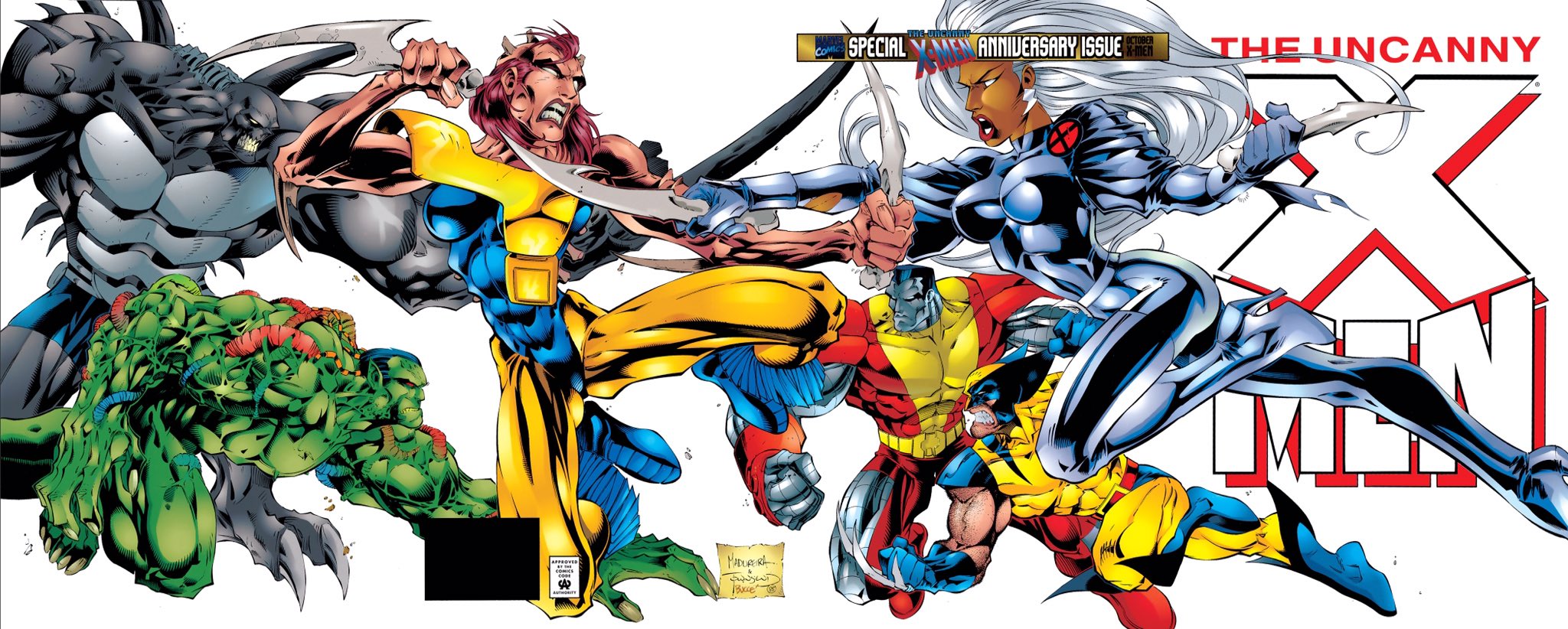
  Of course, it's impossible not to think of Jim Lee's fantastic 4 adjoining covers for X-Men #1. Those made a big impact on me when I was a teen. For my TMNT/Usagi cover, I had 5 issues of real-estate to fill, 4 turtles, two rabbits, a cat, a rhino, and one cyborg villain. I was nervous to try something so big, but in some ways, it felt like a bucket list type comic gig to pay homage to this cover of Jim's while also getting to Draw TMNT and Usagi.
 Wanting to avoid matching Jim Lee's composition exactly, I decided to move the villain in. Originally I wanted him on cover #3, dead center, but when I noodled with a thumbnail or two, I realized it would be better to shift him on to #4 and have an asymmetrical balance with six of the heroes coming in from one side and only two on the other.
Here you can see my list of pairings, wanting to get one Turtle and one Usagi character on covers 1, 2, 3, & 5. I also made notes of which character was larger in the foreground, and which was further behind in the back––staggering the IP's so that each franchise got the same number of close-ups.

But before I drew any of the hero characters, I had to draw Dr. WhereWhen––our cyborg villain––so I could figure out how I was going to make that character work. Scott & Stan had provided me with a digital Issue 1 of the series already finished (and inks of issue 2, and pencils of issue 3), and Stan's drawings of the character were a design that worked well in his style, but would look mismatched if I drew him similarly to Stan's design against the way I draw the Turtles and Usagi characters. Having drawn a number of covers for Stan, I've had to walk that edge of interpreting characters in my style, while also making them clearly the same characters that fans know and love.
 I also knew that inherent in these kinds of adjoining covers will mean there is some dead-space in the whole composition because of needing to avoid putting anything important into the edge of each issue's cover where it's trimmed. So, I planned to make sure I had some characters or their weapons overlap those seams and crossover onto the next cover.
While Usagi's flying kick does end up crossing over the cover gap, it was because I ran out of space before hitting the edge of the paper before getting his foot drawn. A little displaced foot on the same sheet of paper would allow me to adjust once I had my pencil drawings scanned.
 I draw my pencils of each character on regular copy paper with a mechanical pencil in HB lead. And while I did have a thumbnail somewhere before I started this, it wasn't much more than a scribble, so I was focused on drawing each character in a cool pose, with the idea that most of the background figures had to be leaping and the foreground characters needed to be leaning or hunched.
Stan had drawn some specific details for the turtles' belts and weapon storage. So, instead of just drawing the turtles the way I always do, I looked to Stan's interiors to give the subtle changes to their 'costumes' so that they fit with the interiors. I also tried to make the ties of their bandannas echo Usagi's ears.
 To avoid tangents and worry about compositional messes, I sometimes find it easier to draw some character's body parts separately. Unlike Usagi's foot, here I drew Tomoe's hand and sword hilt apart from her arm on purpose. That way once the piece was scanned I can turn and alter the position not just for her hand's placement, but also where the long blade of her sword ends up. It gave me more flexibility to not have her sword in an awkward spot with Leonardo––and when I draw compositions like this, I don't necessarily know how the parts are going to assemble, what will get covered up, what will be a tangent to fix, etc.
 For Raph's pose, I looked at the cover to Teenage Mutant Ninja Turtles #4 (which also became the box art for the NES game, as well as a poster I had in my room in middle school). I loved that pose and Did my best version of copying it, while also mirroring it so that he was facing the correct way to menacingly stare down Dr. WhereWhen.
I also left his sais out of the drawing originally, opting to loosely sketch them on the back side of the paper over a light pad until I got the geometry correct, then while still on the light pad I could trace them over on the front with confidence.
 It wasn't just the turtle's wardrobes that had changed for this mini series, but also all the Usagi characters. They had elaborate samurai armor with lots of details to figure out and interpret. There was a constant window open on my desktop of Issue 1's interiors and well as a google search window for samurai armor where I could look closely at details specific to Stan's drawings as well as historic record.
For Gen the Rhino here, I planned that I could have him crushing one of the baddie's clockwork robot's heads in his left hand, and place the displaced sword in his right. What I didn't plan for was how I drew his head too small, but that was something I could easily fix in Photoshop after it was scanned.

For the last cover the plan was to have Dr. WhereWhen's arm crossing over into it and Jotaro (who is secretly Usagi's son) very close to getting a fatal blow in on our villain.
This piece wasn't working for me though. I was looking through some reference photos of stances with a single samurai sword and found something like these sketches, but it wasn't dynamic enough, and it didn't work well with the already established pose of Dr. WhereWhen. Sometimes when I do compositions like this (without a solid thumbnail) I run the risk of generating sketches that get abandoned rather than adjusted because there's no good way to get them to work without starting over.
 Instead I went with this more furious batting stance, which left room in the lower left for the villainous cyborg's arm in the foreground. I was very happy with the energy I was able to get with this pose.
The other struggle with Jotaro was getting him drawn so that he both looked enough like Usagi that he could be his son and could be mistaken for him by one of the TMNT who have only met our hero a handful of times––but also looks like an individual. Stan is able to make the distinction with some simple and subtle shape changes to his head, but mostly through the nose being bigger and darker. It took me a little while before I found what I thought was a good balance of Jotaro being his own man, but also the son of his father.
 Michelangelo was the last character to draw. But this point, I'd both started assembling all of the drawings into a template (which showed me what space I had left) and I'd also done a quick doodle of a leaping and leaning Mike with nunchucks flailing that had a fairly tight head.
The pose had to match the energy of Jotaro, but also fit in an already tighter cover due to WhereWhen's arm eating up so much of the composition. It means that I knew a bunch of Mike's body wouldn't be seen––so while I had to sketch those parts out to make sure everything lined up, I didn't need to do finished pencils on them.
 A cover has more than leaping and posing characters though. The background (as well as some of the foreground) was going to be full of clockwork robot debris––foes already struck down by our heroes. In the digital rough, I'd painted in orange blobs to give me an idea of how much junk needed to fill the space without overwhelming it. I printed out what I had so-far, and then on a light pad drew five pages of clockwork robot debris while looking at Stan's drawings of them in the materials I was sent.
Below is the entire 5 issue layout assembled, all my sketches and drawings, photoshop corrections, resizing, and edits, as well as some quick blocked in flat colors to help me see where each character started what was junk and where the other character ended (and with all the armor detail, getting base colors really helped me figure out what I was looking at when one character overlapped another).

You can see the guidelines here that show how the 'bleed' for the covers are actually part of the adjacent cover's live area (other than the left side of cover #1 and the right side of cover #2)...if 'bleed' and 'live area' are too inside baseball for you, no worries––
What you need to know is that The TMNT/Usagi Yojimbo WhereWhen five issue mini series starts April 12th. My covers are called 'Retailer Incentive' covers and will arrive in a 1/50 ratio for retailers.
I'll be selling all my inked covers together in my online store the same day the first issue goes on-sale in stores: mouseguard.bigcartel.com
Next week I'll cover the inks for the 5 adjoining covers!
February 7, 2023
Horned Cyclops Terror Dragon
 Last Friday on my Twitch Stream, we did the our first-Friday-of-the-month #DiscoveringDragons Community-Draw-Along! It's a fun event where I welcome all skill levels to push their pencils (or whatever tools they use to make art). I worked on my piece live on my Twitch stream while viewers worked at home and then on Monday we shared our finished pieces.Here is my finished colored Ember Ferret Dragon. And below are my steps to create it as well as the community submissions.
 For #DiscoveringDragons, I post two or three prompt words for everyone to make into a dragon. It's a nice framework for artists of any skill level to focus some time on an 'assignment' to shake the rust off or get the pencil moving again––all while also being loose enough that there's plenty of room for individual expression and interpretation.
This month the prompt words were Terror, Cyclops, and Horned. I opened a few tabs of google image searches of those words & one for 'dragons' as well as a piece of art of a Roper from D&D by Tony DiTerlizzi.
 I started with a pencil drawing on copy paper. I started with the body shape of a Mouser from TMNT (or really a chicken) and started drawing ideas for where the eye was going to go. My original thought was to have it magically hovering over the head or horn of the dragon, but then saw an opportunity to put it inside of the mouth, which also covered 'terror' (not to mention the slit under the horn implying that the single eye can shift up to that location too). I went with a very spikey body, but I consider the single unicorn/narwhal like horn on the head to cover 'horned'.
 I scanned this drawing into Photoshop, made a few slight tweaks and added some quick color blocking to help me see which areas were hard and which were soft and belly-like.

After I was happy with my above design, I printed that piece out on copy paper and taped it to the back of a sheet of Strathmore 300 series bristol. Using a lightpad, I was able to see through the surface of the bristol as I inked the dragon. I used Copic Multiliner 0.7 & 0.3 SP pens to ink the art. I worked on the head first, and then pushed through all the texture of the rigid parts on the wing and neck before using a different texture for the fleshy parts. I wasn't quite able to finish the inks before needing to end the Twitch stream.

I wished the viewers all luck with their pieces and told them we'd take a look at everyone's work on Monday. After some dinner, I finished the inks, scanned them and started the coloring process. That first step is to flat in the colors––basically professional coloring-in-the-lines.
I also added a color hold to the pupil of the eye so I could give it a little more dimension in the next step.
For the final colors and all the highlights, shading, and texture I used the dodge and burn tools with a stock photoshop texture brush. I also selected areas and used the color balance tool to tint them warmer or cooler. As you can see, I swapped out the ruddy pink flesh with something a bit more pale yellow-green. Below you can again see the final rendered dragon.
But, as this is a community event, I wanted to share all the other entries posted in the Discord.
 Capt.Nemo
 Doombot2015
 Drakenhart
 Eleven10-O
 justpottering22
 Matt Goodall
 Nate Pride
 NPL illustration
 Nuvalo
 redSkwrl
 Shake Zula
 Shakuras Ender
 Sleepless Ninja
 TowryGames
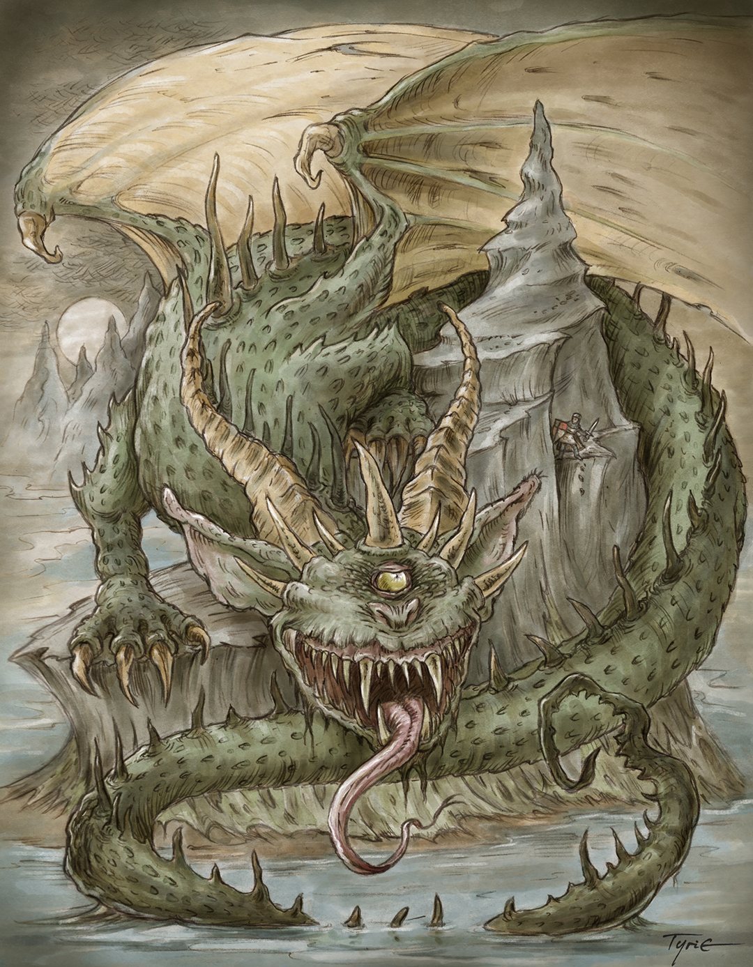 Tyrie
Tyrie Wicked Goblin King
 Yannik ohne E
 Dennerbob
January 31, 2023
Fan Art!
A great joy as a creator is to see fans drawing, sculpting, panting, modeling, cosplaying, inking, and expressing themselves by making artwork of Mouse Guard characters from the books and moments from their RPG campaigns. And so to celebrate that, here is a whole post of amazing Fan Art
(See past Fan Art Blogposts here)
 Eugene Park
Damian at Hello Sailor Blackpool UK

Alexandr Kulikov

Alex Johnson

Cassandra Kottman

Catherine Graham

Catherine Graham
 Chickens Tabletop Crafting
 Cody Gram
Da Mangaka

Darryl Leech
 Dennis agl
Derek Squirreltail
 Dêverton Plácido Xavier
 Eponine Jacquet
Frightnight

Hakyoun Lee

Hakyoun Lee

Hakyoun Lee

HarpyTea
 James Chung
 Jessi Nelson
 Jitske Habekotté
 Jiye Kim
Jordi Contreras
 Joshua Søren
Kenny Dalman
 Kevin Walls
 A young fan of Mouse Guard
Lamp Soul

Lamp Soul

Lamp Soul
 Lines and Dreams
Matheus Lima

Mike Cherniske

Mike Cherniske

Mirhayasu
 Moon Raven
 Nicolai Kochnev
 Orion Keren
 Panambi Art
 Peter Baldwin
Peter Baldwin

Rebecca Wright
 Rei Lark
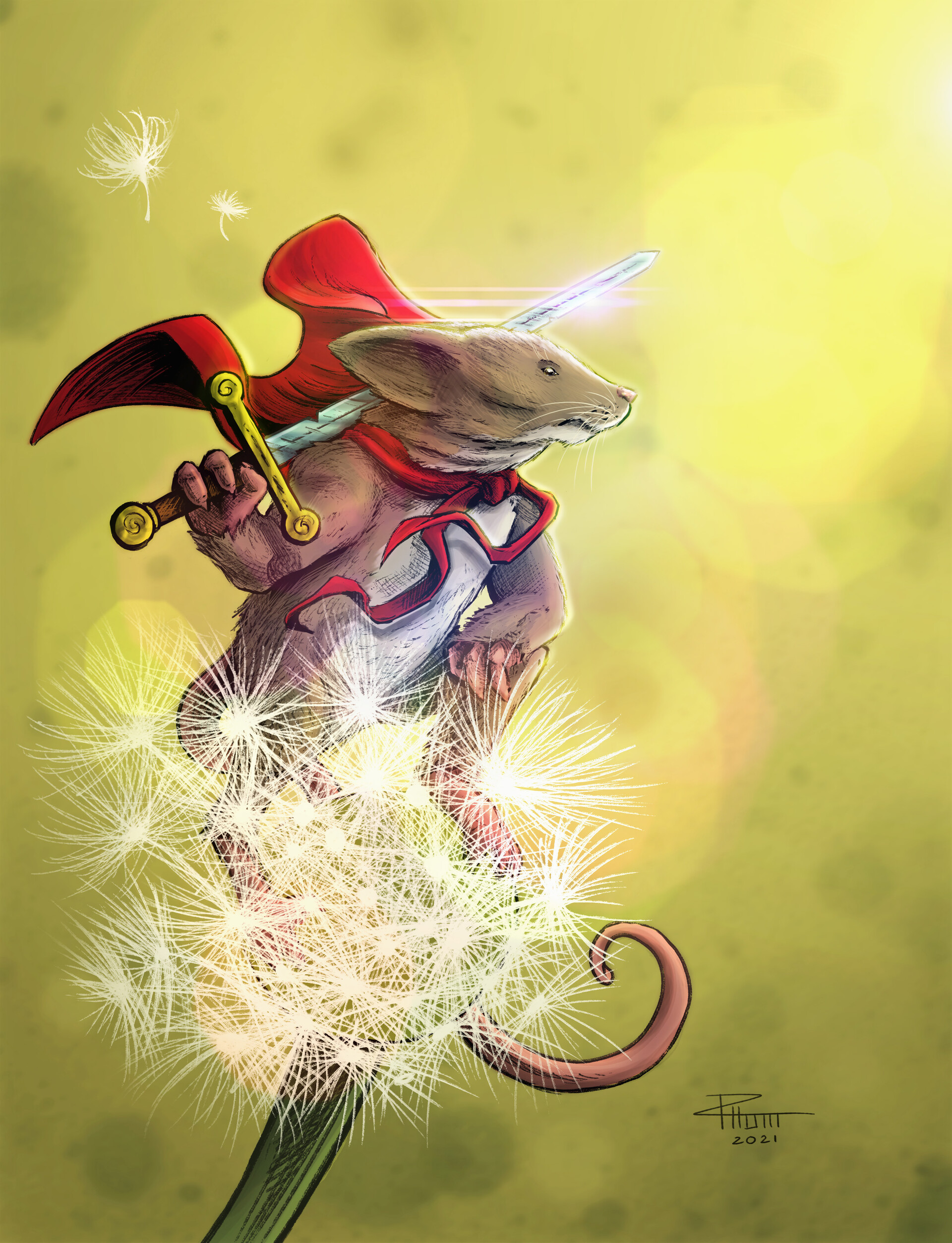 Romain Houbert
 Santiago Gonzalez Bertolotti
 Sradoscorvos
 Terith
 Vasili Kravtsov
 Vincent Tremblay
Angus Baldwin
 Vlad Legostaev
Rogelio Rendon Fierro
 Peachy Queen
January 24, 2023
Wooden Utensils
 Just before Christmas I went out into my unheated woodshop and made wooden utensils to give as gifts to my family. It started with a request from Julia to help replace our brother-in-law's favorite curved wooden spatula. The maker of that one had retired, and everything Julia found online to replace it felt too clunky or had poor craftsmanship. At Thanksgiving we did a tracing of his worn utensil and I reproduced it––I then exhausted my supply of exotic hardwoods (and a few less exotic) until I'd reproduced two of the favorite shapes he and Julia both use when they cook.
They start life being traced from a pattern and cut roughly out of a plank on a bandsaw. Next comes the shaping on a belt sander with rough paper. Then lots and lots of hand sanding going from 80 grit up to 220. Lastly a polishing with 0000 steel wool and finish of mineral oil. They were fun to make, but labor intensive and tough on the shoulder of my sanding arm. I happily made these for my loved ones, but I won't be going into business making them anytime soon.
Below are closeups of each wood species I used (unpictured are two Cherry ones that were ones we ordered from someone and were disappointed with, so I reshaped and refinished them--but since I didn't make them from scratch, I'm not showing them).
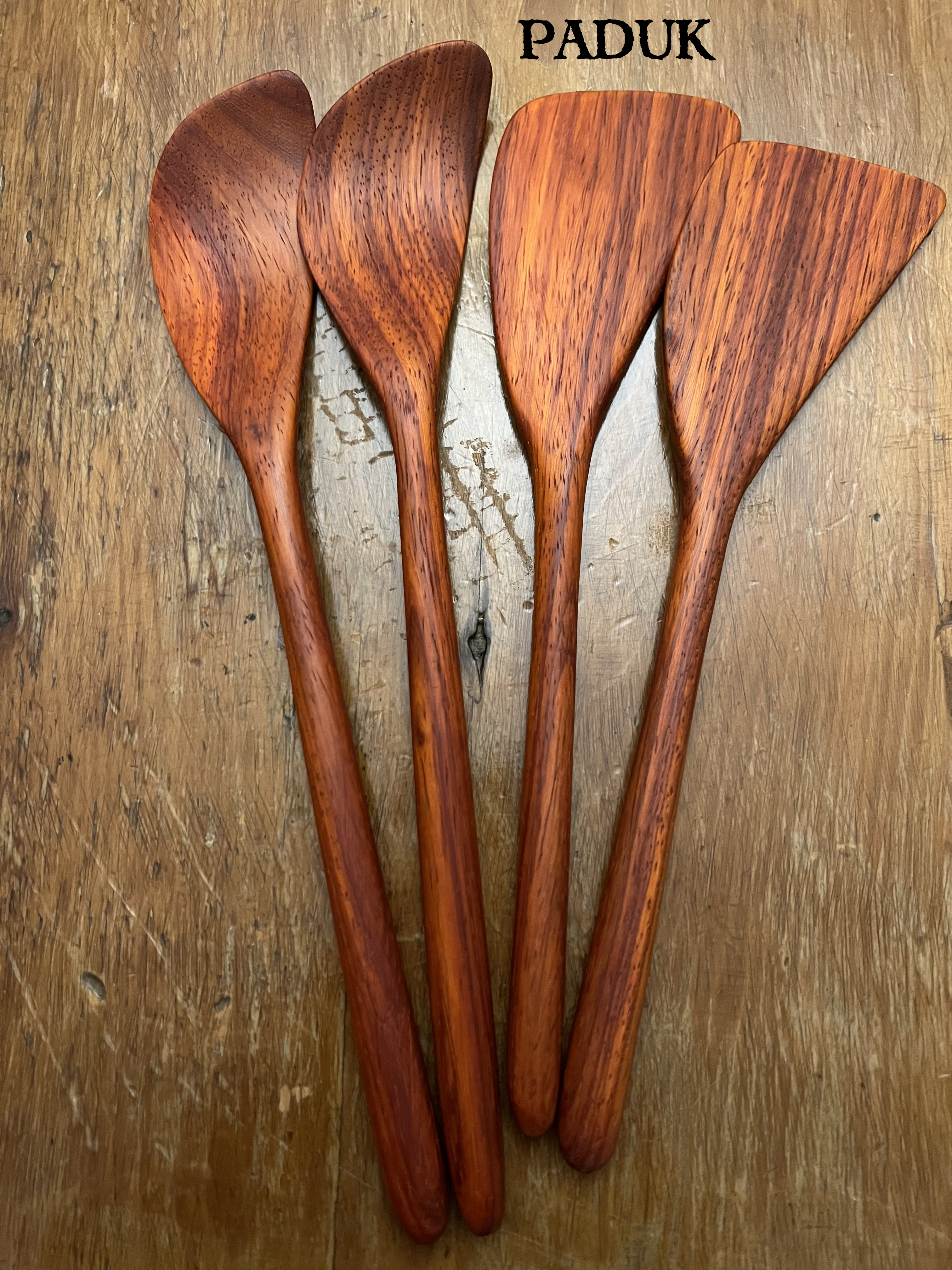
Paduk
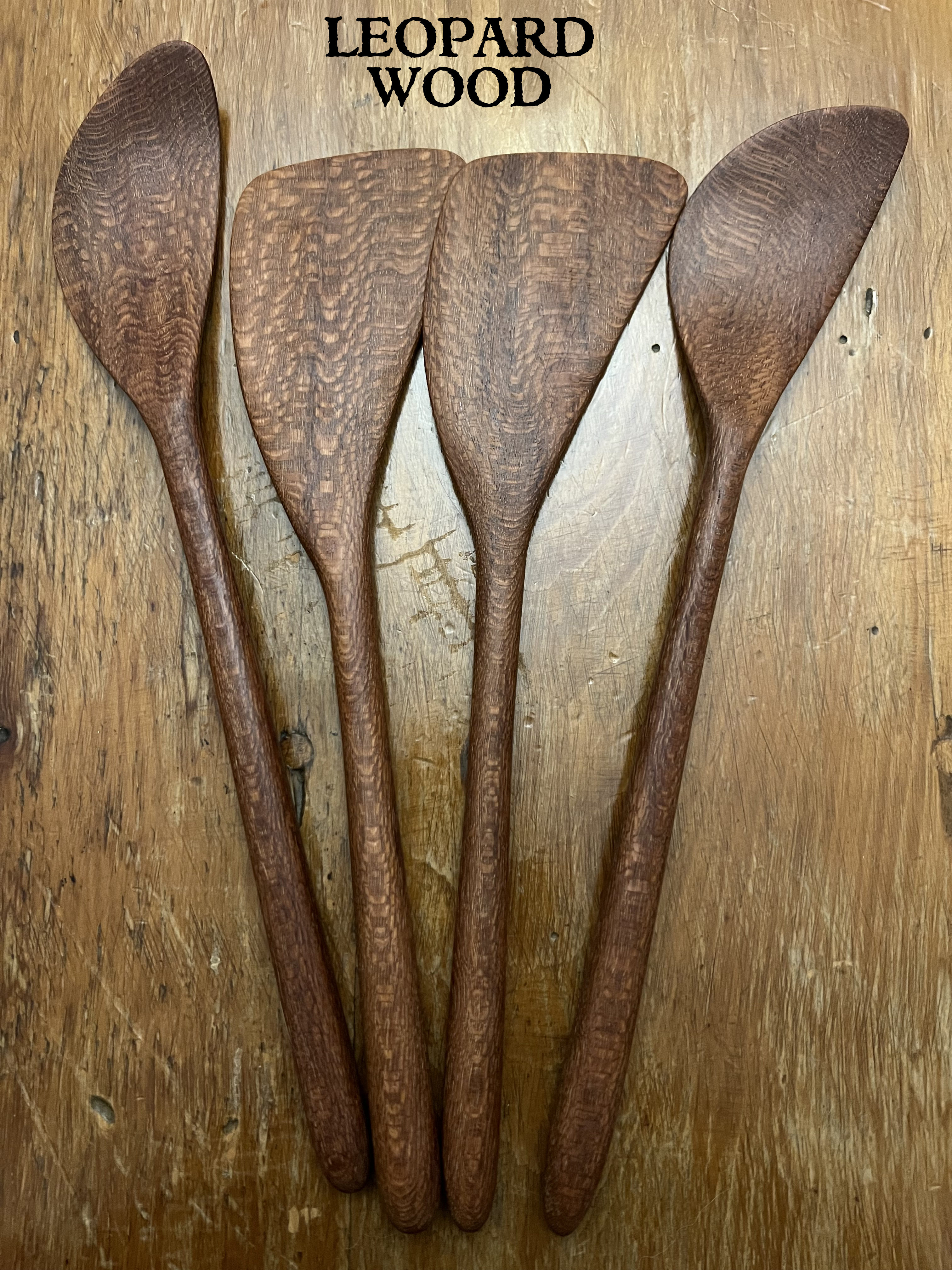
Leopard Wood
 Bubinga
 Zebra Wood
 Wenge
Wenge (one of them had a split and so I reshaped it into a large butter knife shape instead)
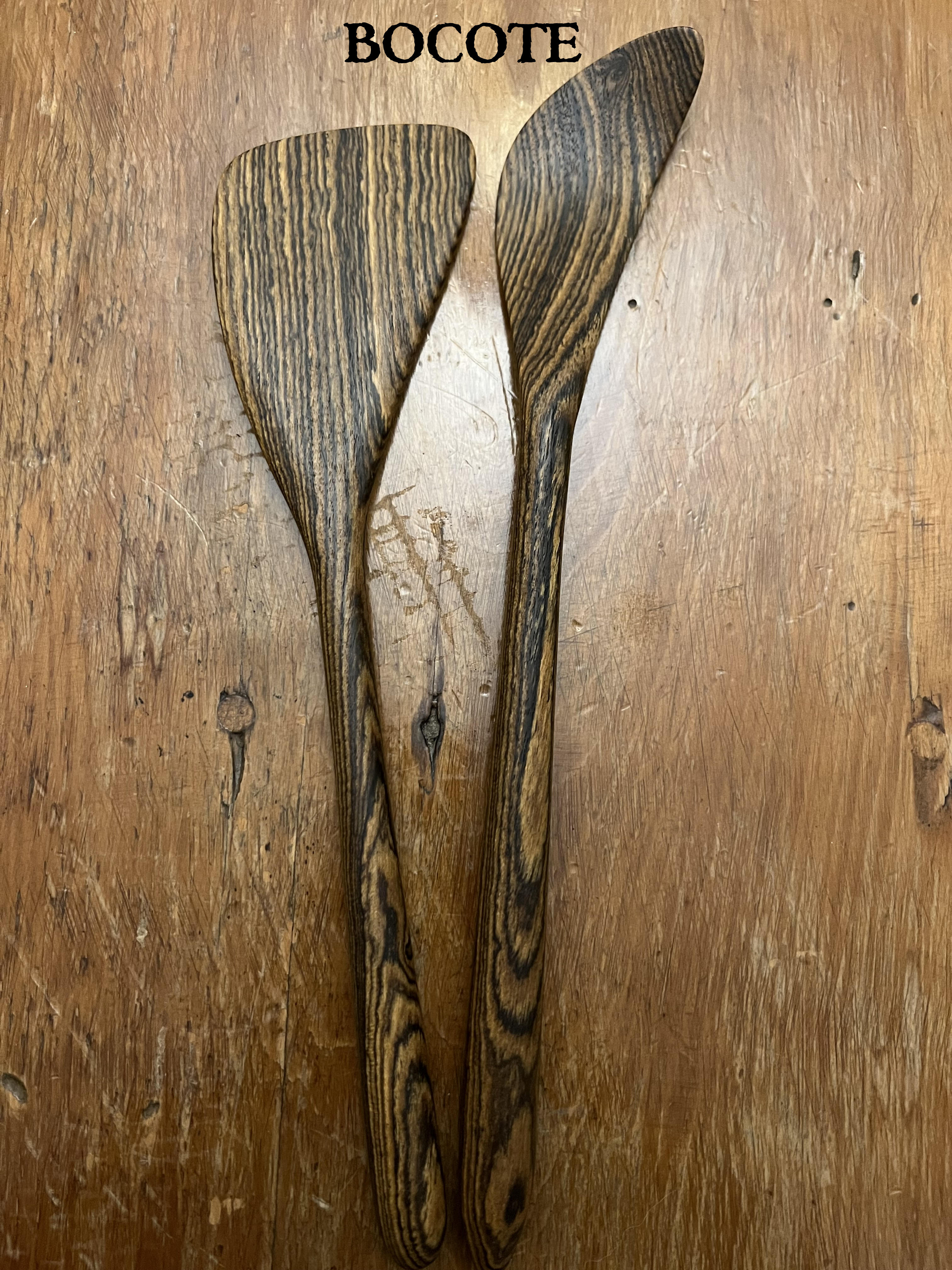 Bocote
 Oak
Oak(I made these as matching mirrored pairs to be used as salad tongs)
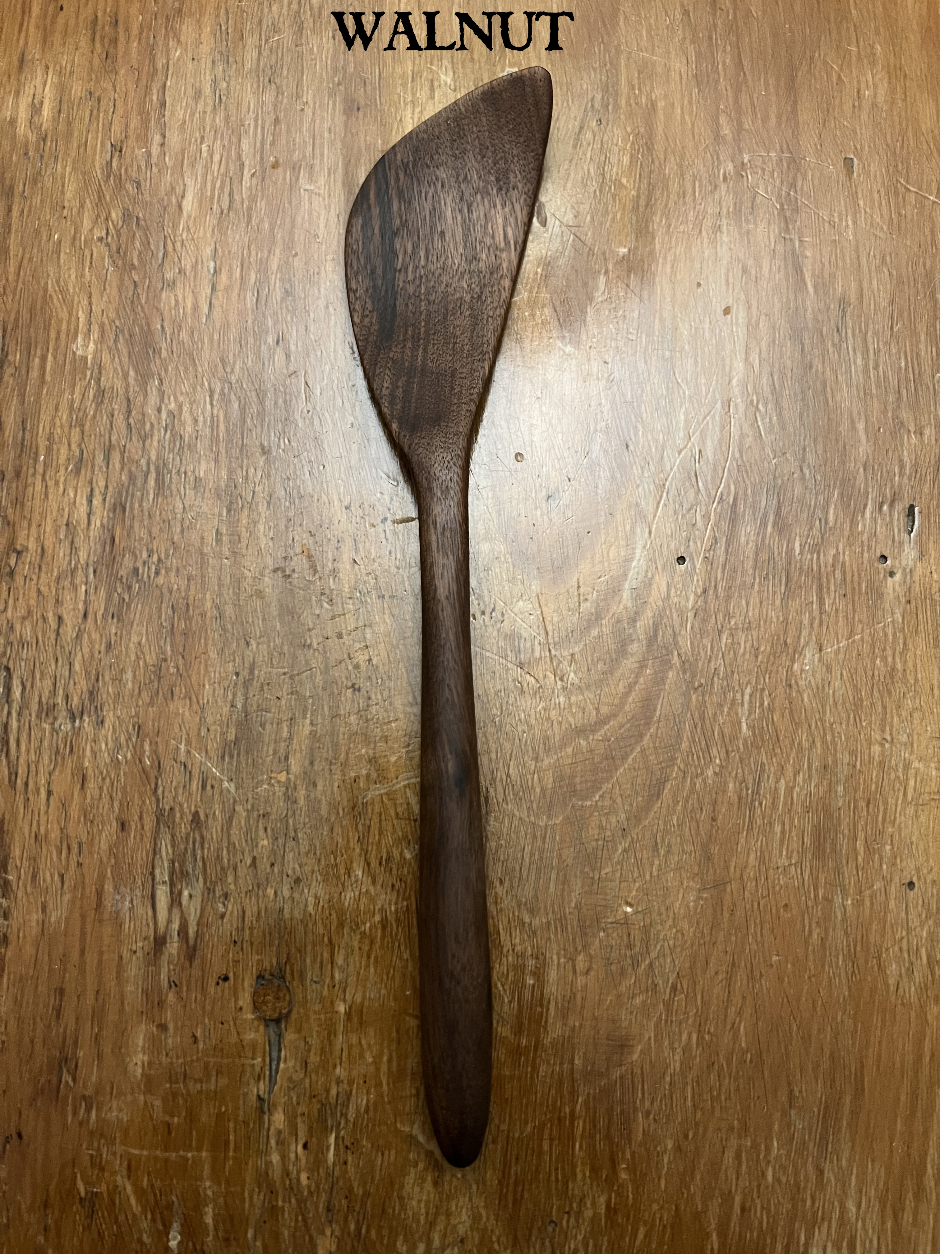 Walnut(I only had one small piece of walnut--enough to make one short spatula)
January 16, 2023
Mouse Guard Mugs by Hollowed Earth
 I reached out to Hollowed Earth Pottery to see if he'd be interested in manufacturing a Mouse Guard mug/tankard for me to sell to fans. Mutual friend Cory Godbey had introduced us to the husband and wife team of potters as well as their amazing work (which Julia and I use almost every day for our morning coffee).
 The initial run of what Hollowed Earth could get to us in time for Christmas sold out in a day, so I talked to them and ordered a 2nd batch as a pre-order (slated to be shipped later this month)––and there are only a handful of those still available to order in the online store.
Below are images and videos Mark of Hollowed Earth sent me as he worked on the first batch.


January 10, 2023
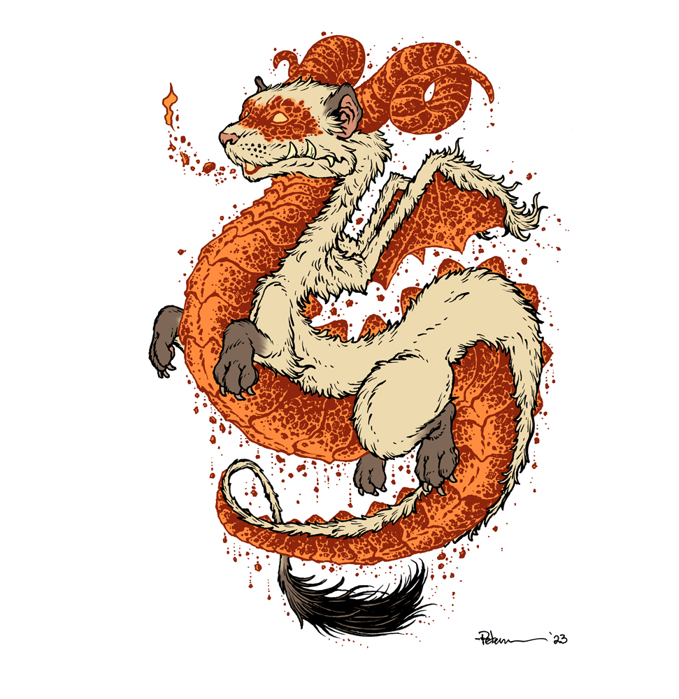
Ember Ferret Dragon

Here is my finished colored Ember Ferret Dragon. And below are my steps to create it as well as the community submissions.
 For #DiscoveringDragons, I post two or three prompt words for everyone to make into a dragon. It's a nice framework for artists of any skill level to focus some time on an 'assignment' to shake the rust off or get the pencil moving again––all while also being loose enough that there's plenty of room for individual expression and interpretation.
This month the prompt words were Ferret & Ember. I opened a few tabs of google image searches of those words as well as one for 'dragons' as well as another artist I was inspired by 'Nora Patwora'
 I started with a pencil drawing on copy paper of the ferret shape and I slowly started adding dragon features like the belly scale plates and the horns. To incorporate 'ember' into the piece, I decided that all the dragon-ish parts would have a texture like glowing embers on a log in a fire. I also applied that idea to the ferret mask markings.
The wings I actually drew on a separate sheet of copy paper because I'd taken a few stabs at loose shapes on the original paper and wasn't happy. In photoshop I was able to combine the two drawings into this piece to the left.

After I was happy with my above design, I printed that piece out on copy paper and taped it to the back of a sheet of Strathmore 300 series bristol. Using a lightpad, I was able to see through the surface of the bristol as I inked the dragon. I used Copic Multiliner 0.7 & 0.3 SP pens to ink the art. I worked on the fur contours first, then dove in to the texture of the glowing ember bits. As I inked I started adding more of the falling ash and embers falling from his floating form.
 I was able to scan the piece and establish some color holds (areas where I want the ink to be a color other than black) before needing to sign off the stream for the night. I wished everyone luck with their pieces and told them we'd take a look at everyone's work on Monday.
After I had a break and some dinner, I got back into the coloring. That first step is to flat in the colors, basically professional coloring-in-the-lines.
For the final colors and all the highlights, shading, and texture I used the dodge and burn tools with a stock photoshop texture brush. I also selected areas and used the color balance tool to tint them warmer or cooler. Below you can again see the final rendered dragon.

But, as this is a community event, I wanted to share all the other entries posted in the Discord.
 Amy With A Side of Art
 Atimllam
 Capt.Nemo
 DePuggo
 Doombot2015
 Emily C.
 Evil Cartoonist
 Kelsey
 Matt Goodall
 Nate Pride
 Nuvalo
 Pendrake
 SciFi Taoist
 Sleepless Ninja
 Sydney
 Theresa Seanchai
 Towry Games
 Wicked Goblin King
David Petersen's Blog

- David Petersen's profile
- 339 followers

