
David Petersen's Blog, page 10
January 23, 2024
2024 Bookplate
 Every year since 2012 I do a new Mouse Guard bookplate for sale at conventions and in my online store. The idea is that this mini-print can be pasted/taped into your book(s), you can write your name in to identify it as yours to borrowers, and since the bookplates are signed, it means you now have a signed book. I try and make each year's bookplate art some medium the mice would/could use. I've done stained glass, relief printing, embroidery, mosaic, etc in past years––this year I was inspired by some medieval encaustic tiles.
The bookplate will be made available at Emerald City Comic Con and then in my online store shortly after.
 In digging around for inspiration and looking up 'Medieval Tiles' I came across the Chertsey tiles, which were made around 1250 AD. These are Encaustic tiles, where the different colors you see aren't due to glazes painted on, but rather different colored clays. The base tile is formed in a wooden mold that leaves depressions wherever the lighter tone of clay is meant to be, and then a different clay in the consistency of slip (wet clay) is carefully poured/dribbled in those vacancies. It means that no matter how much the tile wears down from use and abuse, the pattern will never fade or be worn away.
The tiles were unearthed at Chertsey Abbey––though there is some suggestion they weren't commissioned for that location, and though incomplete, have been reassembled by the British Museum.
 So, I took one of the digital tile reconstructions, and changed out the center round illustration with one of my own as well as spacing out the word 'PREVAIL' around the ring while losing the 'R' to a lost fragment of tile.
The mouse on a bird seems to be some of the imagery people respond to well of my work, and since so many of the Chertsey tiles were of men on horses, I needed some kind of mouse-mount to help make my tile feel authentic.
The drawing was done in pencil on copy paper and then digitally added in and colored to roughly match the terra cotta tones of the existing tiles.
 With the above digital layout ready, I printed it out and taped it to the back of a sheet of Strathmore 300 series bristol. On my Huion A3 Lightpad I was able to see through the bristol and down to the printout to use as a guide as I inked the piece.
I used Copic Multiliner SP pens (the 0.7 nib mostly) to ink the artwork. It was a little odd to be working so starkly on something and basically in inverse values, since everything black was eventually be a lighter yellow/tan color much lighter than the surrounding red clay. I purposely weathered and distressed the edges of the tiles and even the design in some areas to imply chipping and damage.
 When the inks were done, I scanned the art and flatted in the digital coloring. On a piece like this that starts with establishing color holds (areas where I want the ink lines to be a color other than black) and so I carefully isolated all the linework that should be the lighter clay color and left everything else black ink.
Then I flatted in the other colors, the red terra cotta, the grey-brown dirt, and a paler grey that was part of the glazing on some of the tiles in the Chertsey reference images.
The last step was to do a final rendering job adding some highlights and shadows in the appropriate places while also getting some texture and color variance in there to make it look more authentic and realistic.

Here are all the past years Bookplates––many of which are available in my online store as a bundle (https://mouseguard.bigcartel.com/product/set-of-9-mouse-guard-bookplates). Below are the blogposts about the process of making each:

Blogposts:2012 – Lino Print2013 – Stained Glass2014 – Embroidery2015 – Mosaic2016 – Pencil Rendering2017 – Engraving2018 – Wood Painting2019 – Gouache Painting2020 – Wood Carving2021 – Lino Registration Print
2022 – Stained Glass
2023 –– Gouache Painting on Canvas


January 16, 2024
Yulefrost Process
 During the Christmas season I drew, colored and inked the piece to the left as a Happy Holidays piece to share with fans. Of course, in Mouse Guard, the winter holiday is Yulefrost, and it's a bit more of a solemn affair.
 This artwork will serve double duty though and also be included in my next sketchbook (which I don't have a release date for)
In this blogpost, I'll go through the process of creating it.
 I started with discovering the term 'Lychgate' (a covered gateway found at the entrance to a traditional English or English-style churchyard) and then went on a Google search bonanza of looking at all different styles of them. I landed on a 3D model of one up on sketchfab, which meant I could rotate it to any angle I wanted for reference. I also nabbed this photo of a pinecone to drape in candle, which is how I've drawn mice celebrating Yulefrost in the past.
 Using the reference I drew the Lychgate and pinecone as a setting on a sheet of copy paper. Using my Huion lightpad, on a new sheet of copy paper place on top of it I drew the mouse and the candles.
 I scanned these drawings into Photoshop and then assembled them (tinting the linework for the elements different colors to help me see which lines belonged to which objects.
I also added in a digital crescent moon shape and an overall border.
 With the layout/pencils to my liking, I printed them out and taped them to the back of a sheet of Strathmore 300 series bristol. On the lightpad I was able to see through the bristol and use the printout as a guide to ink from. For pens I used Copic Multiliners (the 0.3 & 0.7 nibs mainly).
Most of the inking was straight forward and I tried to balance my density of linework throughout so that the piece would still be readable and not too muddy.
I inked the stars and moon in black, even though I knew they'd be a color in the final product.
 Then I scanned the inks and started the coloring process with flat colors (nicknamed 'flatting' for that very reason). I didn't have any colors to go on from my layout/pencils like I sometimes do, so I just started dropping in things that made sense (the blue of the night sky, a more grey-brown for the wood, etc.)
 Color holds (areas where I want the ink lines to be a color other than black) were applied to the moon, stars, snow, flames, and a glow around all the light sources.

The last step was to render the piece using the dodge and burn tools (lighten and darken) while also doing a bit of painting and color shifting to light the inside of the Lytchgate that would be affected by the lantern. The final detail was to digitally draw/paint in some puffy falling snow.
As I said, this piece will eventually be collected in my next sketchbook. And in case you didn't see it a few months agao––belated Happy Holidays to you all.
January 9, 2024
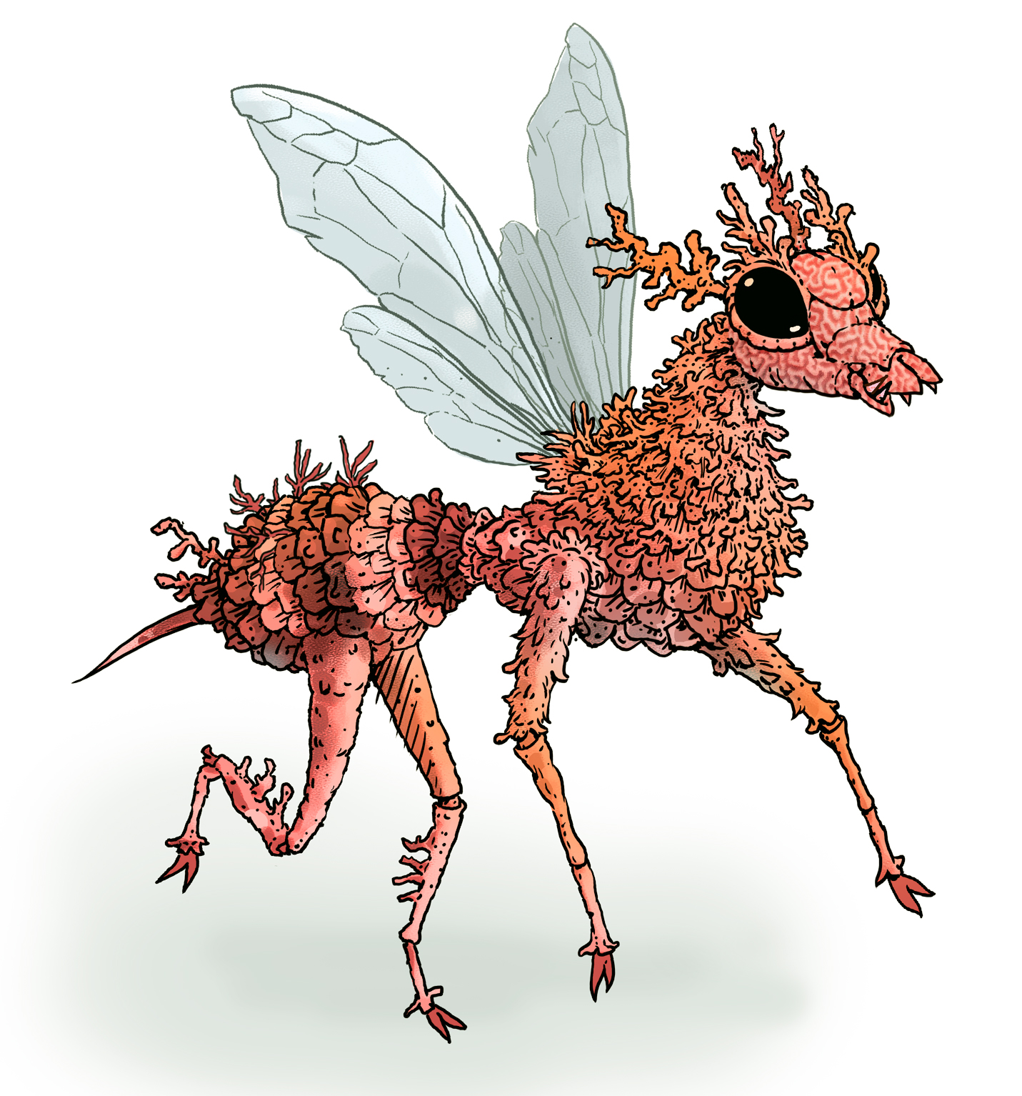
Elegant Coral Wasp Dragon
 Last Friday on my Twitch Stream, we did the #DiscoveringDragons Community-Draw-Along! It's a fun event where I welcome all skill levels to push their pencils (or whatever tools they use to make art).
I worked on my piece live on my Twitch stream while viewers worked at home and then on Monday we shared our finished pieces.
Here is my finished colored Dragon. And below are my steps to create it as well as the community submissions.

For #DiscoveringDragons, I post two or three prompt words for everyone to make into a dragon. It's a nice framework for artists of any skill level to focus some time on an 'assignment' to shake the rust off or get the pencil moving again––all while also being loose enough that there's plenty of room for individual expression and interpretation.
This month the prompt was three words: Elegant, Coral, & Wasp
I opened several tabs of google image searches of wasps, wasp wings, coral, and 'elegant dragon' (where I found inspiration for the overall pose.
 I wanted my dragon to be more of a dragon-form with wasp traits than a wasp with some dragony expressions. So I sketched out the overall form of the pose before starting to make the head and body sections wasp-like and the underbelly with the texture of brain coral (something I'd push more in the inks). I scanned the pencil rough (on copy paper) into Photoshop to paint in the forms to see the overall mass better.
The worry about incorporating 'Elegant' was something I thought the crossed front paws would solve, but it didn't––and perhaps only the long neck, non-aggressive expression, and the lightness of the wings (where I photoshopped wasp wings in the pattern of feathers) saved me and made it more elegant than I'd planned.
 I printed out the above design and taped that onto the back of a sheet of Strathmore 300 series bristol. Using a lightpad, I was able to see through the surface of the bristol as I inked the dragon. I used Copic Multiliner 0.7 and 0.5 SP pen to ink the art.
The inking on this piece was about varying the line weight on the scaley bits and the wings (more dense in the corners and then thinner in the middle) and to tackle the brain coral texture without overwhelming the inks with too much black––luckily the black wasp markings helped weigh down other areas so the coral bits never seemed too dark. I was unable to finish the inks on-stream, but returned to them after signing off and having some dinner.
 When the inks were finished, I scanned them and established color holds (areas where I want the inks to be a color other than black––like the coral texture, the wing outlines, and the interior wing pattern).
Then it was time to start the color flatting process––basically professional coloring-in-the-lines. Some of this is just to make it easy to re-isolate various parts when doing later painting & rendering. So, I established the main yellow color, a coral color for the coral underbelly, a darker color for any of the uninked areas near the black markings as well as the paws and ends of the antennae, and a lighter tone for the wings.
For the final colors I did most of the highlights, shading, and texture with the dodge and burn tools and a stock photoshop texture brush. I also painted in a bit of a silhouette of the dragon's body where the wings overlaped it to give them a sense of some transparency. Below you can again see the final Dragon...

But, as this is a community event, I wanted to share all the other entries posted in the Discord.
 88 Uncle Ernie
 Jodudeit
 Jonathan Towry
 Nate Pride
 redSkwrl
 Tyberius
VernNYC
January 2, 2024
Happy 2024!
 Happy New Year everyone! I wish you all a safe and prosperous and rewarding 2024. I know we all want for that (along with self-promises to curtail certain vices, engage in better behaviors, & accomplish more) every year––though we rarely live up to those hopes. So, are we delusional to focus on our own pie-in-the-sky once every 365 days? No!––we are engaging in optimism of the highest order. To wish for a world or self better than what might be possible. Much like the mice of Mouse Guard reaching above their station as prey to not merely survive, but thrive.
 I've been struggling with getting the next Mouse Guard book (Weasel War) drawn for years. And again on New Years' Eve, I said my heart's wish aloud––that I may slay that snake in 2024. (Below are the steps to create the artwork seen here)
 It all started with seeing a photo a friend took of a mushroom took on a hike. I decided it would be good to have a mouse sitting atop it for a Happy 2024 image (and possibly a new Tee for con season). I drew a rough shape for a banner/ribbon to display the Happy New Year/2024 bit and realized it kinda looked like a snake––so, on another sheet of paper I drew a snake to fill the space. It's a grass snake and while I did use photo reference to get the head right, I drew the rest and the scales without any guides.
Then I digitally put the drawings together and darkened in certain scales (like pixels) to display 2024.
 I printed out the above layout of scanned pencil drawings and taped that to the back of a sheet of Strathmore 300 series bristol. On my Huion A3 lightpad I was able to see through the surface of the bristol down to the prinout to use it as a guide to ink from. I used Copic Multiliner SP pens (the 0.7 & 0.3 nibs).
 The last day of 2023 I spent a few hours inking the piece. Knowing I wanted to to be also used as a tee shirt design, I didn't go overboard on texture and tried to make sure the outer contours were strong. I also opted not to darken in the 2024 scales so that this piece could be reused more easily for other things (tee, sketchbook, etc).
 After the inks were complete, I scanned the original art to begin the digital coloring process. This starts with laying in flat colors to establish each areas: the mouse's fur is brown, his cloak is red, the snake is a dark grey-green, the snake's belly is a lighter grey-green, etc. Even if these aren't the final color choices, having everything easily isolated to grab for adjustments or rendering is the key.
 This step is also where I'd normally establish color holds (areas where I want the inks to be a color other than black), but this piece didn't have any. I did use color to put in the 2024––but in lighter scales rather than darker ones because the snake we so dark already.

The last step was to do the final coloring and rendering. I used Photoshop's Dodge (lighten) and Burn (darken) tools with a stock texture brush to finish the piece.
So, if you didn't accomplish everything you wanted to in 2023 and it disappoints you and makes 2024 seem like an uphill battle where you're starting from behind––Know that I'm there with you...and hopefully we'll slay the snake this year.
December 26, 2023
Usagi Yojimbo: Ice & Snow #4 Cover
 For the Ice & Snow Usagi Yojimbo series now being published at Dark Horse I was asked by Stan Sakai to contribute two covers. To the left you can see my final cover art for issue #4.
This cover was new territory for me. In the past my Usagi covers have either been for classic reprints where the entire arc was finished and ready to read, or the Usagi/TMNT crossovers where I completed once piece to sum up the entire series based on some amound of completed material. But, for Ice & Snow, we were working far enough in advance that I didn't have any of Stan's pages for the issue, just an outline & description.
Below I'll go through the steps of creating the piece.
 I was given a PDF of inked pages from issues 1 & 2 showing Usagi and Yukichi in the snowy mountaintops of Northern Japan. And Stan let me know that the climax to issue 4 is a fight between Usagi and his old enemy Jei on a frozen lake.
I'd never drawn Jei professionally (only a commission for a fan), and I wanted to push in close on a duel between the two. I started drawing the characters separately on copy paper. To make sure they were both going to fit while fighting, I had to make use of the vertical nature of a cover and have Jei leaping/thrusting down with his weapon as Usagi takes a near miss over his shoulder.
I scanned in the drawings of the two figures, digitally blocked in their forms with some color, and painted a simple background idea so I could send it off for approval.
 When the pencils were approved, I printed out the layout/pencils and taped them to the back of a sheet of Strathmore 300 series bristol with some painter's tape. On my Huion lightpad I can see through the surface of the bristol to the layout and use it as a guide to ink from. I used Copic Multiliner SP pens (the 0.3 & 0.7 nibs) as I inked the piece.
I had to build up several different dark areas (Usagi's pants, Jei's clothes, and Jei's hair) and tried to give them all a slightly different density and in the case of Jei's hair a different line quality. I also left a gap between the characters and any of the ink lines for the background. This is partly to make the coloring easier, but also just to separate them and push an idea of distance before color is even added.
 Stan & Co. approved the inks and I was able to scan them and begin the coloring process. That first step in coloring is known as 'flatting' which is a professional version of coloring-in-the-lines with flat color (no texture, no shading).
Some of the color choices were roughed in for the layout, but still needed to be adjusted for value, hue, and saturation to go with the more stark inks.
At this stage I also established the color holds (areas where I want the lineart to be a color other than black) for the ice cracks, trees, and Usagi's scar.
The last step to coloring (seen below) is the rendering. I used the dodge and burn tools along with a stock textured brush to add shadows and highlights. I then also painted in the falling snow on a new layer.

Usagi Yojimbo Ice & Snow #4
will be in stores January 10th, 2024!
December 19, 2023
Animal Pound Variant Cover
 Tomorrow a new comic from BOOM! comes out called 'Animal Pound' by Tom King & Peter Gross. It's a re-imagining of Orwell's Animal Farm, but with a uniquely American frame of reference.
 I was asked to contribute a retailer exclusive variant cover for Cards, Comics, & Collectibles in Baltimore, which is the only location that will be selling it (though also through their online store I believe).
To the left you can see my finished cover artwork, but below I'll go through the steps to creating the artwork.
 I started with lots of reference materials from BOOM! with series summaries, character descriptions and reference, & images of all the covers created so-far. The deadline for this was a quick one, and I had some travel that cut down the working time even shorter.
My focus for the art was a dog and a cat looking in opposite directions (A local vet has a sign that looks like this and it came to mind) with the shadows of the pound's bars like flag stripes across their bodies and a tally of voting behind them on the wall.
I used some reference of a cat I found online and a photo of my sister's dog (RIP Angus) that had the perfect side eye...
 Unfortunately I didn't check to make sure using a dog not featured in the reference packet from BOOM! so visually closely tied to the voting didn't work for the editors and I was asked to change the dog to the Doberman/Pit mix character from the series.
I had to find some reference of that breed and do my best to get the expression back in there. In some ways, I think the untrustworthy glance is better in this drawing than my original.
The voting and the scale of the dog icons to the cat icons does play into the story too. All of the drawings were done on copy paper, scanned into Photoshop, and then assembled together with some color blocking added to help explain light/dark forms.
 When the second rough was approved, I was able to move on to inks. I printed the layout out onto copy paper (fir across two sheets and then taped together) and taped it with painters tape to the back of a sheet of Strathmore 300 series bristol. On my Huion lightpad I'm able to see the prinout and then ink on the clean bristol surface (needing no pencils erasing).
Getting the character's linework clean and with some nice lineweights was my main goal, and then to make sure as I hand inked each 'vote' they all had individual flaws. On the back of the bristol (not pictured) I drew and inked the lines for the bar shadows.
 When the inks were done I scanned them into Photoshop and started the coloring process. My first step after cleaning up and level adjusting the scan was to establish all the color holds (areas where I want the inks to be a color other than black) on the votes, the grid, and the bricks as well as bring the bar shadow inks from the back around to the front and color hold them as well (along with an effect to make them semi transparent).
When all of that was done I could start flatting in the base colors for the wall, dog, and cat. Most of those color decisions were already made in my rough layout, but I did need to alter them a bit.
 The last step was to do the final colors. I use the Dodge and Burn tools in Photoshop to add highlights and shadows to all the base colors, and I use a stock textured brush so it has some life to it.
Animal Pound #1 is out tomorrow in comic shops everywhere and my cover is available exclusively at Cards, Comics, & Collectibles in Baltimore.
December 12, 2023
Goose At Dawn Tavern
 As part of the new illustrations for a 2024 Mouse Guard Calendar, I did this piece of a little mouse tavern called The 'Goose at Dawn' with a old rotting stone staircase.
Like last year's calendar, this new one will feature half of the months featuring new-for-this-project artwork, while the other months feature existing favorite illustrations.
Below in this blogpost I'll walk through the process of creating the artwork
 I started with some reference photos of a little cottage and a stairway to nowhere crumbling in the woods. I redrew them and combined them in mouse-form, swapping the neat little tiles on the roof for pine needle thatch and pinecone shingles, making each sill and window more rustic, and wrapping that stairwell around the back (does it connect with the tavern? or does it end abruptly?)
The tavern and stairs were drawn on different sheet and assembled in Photoshop. I also made a little sign using clip art and a font. With the setting in place, I printed out copy of this and on my light pad I penciled in the mouse inhabitants of the illustration. When they were done, I inserted them in Photoshop and tinted them all different colors to make seeing them a little easier.
 I printed the above digitally assembled layout onto two sheets of legal sized paper (taping them together so the image was 11" x 11") and then taped them with painter's tape onto the back of a sheet of Strathmore 300 series Bristol.
On my Huion Lightpapd I was able to see through the surface of the bristol down to the printout and use it as my 'pencils' as I worked. I used Copic Multiliner SP pens (the 0.3 & 0.7 nibs).
I inked this piece focused mainly on making very compact scene readable even without color by changing density and variety of textures.
 With the inks finished, I scanned them into Photoshop and started the coloring process. That first step is known as 'Flatting' and essentially is professional coloring-inside-the-lines. None of the color palette was established, and I started with a pink sky––perhaps implying that it is dawn and the tavern is closing with these mice being the last patrons and workers to leave. Every other color choice was born from that one.
Here I also established color holds (areas where I want the ink lines to be a color other than black) the stairway as it bends around into the distance, the trees even further back, and the sign details.
The final step was to render the piece. I used the Dodge and Burn tools in Photoshop while using a stock textured brush.
This piece took a lot of playing back and forth with different values and intensities of light to get the final art to work. I'm still not convinced I got there in the end, but I'm happy enough with it to include it in the calendar for 2024.
To order the calendar for 2024:mouseguard.bigcartel.com/product/mouse-guard-2024-calendar

December 5, 2023
Copper Frog Dragon
 Last Friday on my Twitch Stream, we did the #DiscoveringDragons Community-Draw-Along! It's a fun event where I welcome all skill levels to push their pencils (or whatever tools they use to make art).
I worked on my piece live on my Twitch stream while viewers worked at home and then on Monday we shared our finished pieces.
Here is my finished colored Dragon. And below are my steps to create it as well as the community submissions.

For #DiscoveringDragons, I post two or three prompt words for everyone to make into a dragon. It's a nice framework for artists of any skill level to focus some time on an 'assignment' to shake the rust off or get the pencil moving again––all while also being loose enough that there's plenty of room for individual expression and interpretation.
This month the prompt was two words: Frog & Copper.
I opened several tabs of google image searches of frogs, copper ore, dragon wings, and eventually frogspawn.
 I started my dragon with a frog head on copy paper. I'd planned to give it more of a dragon body proportions, but as I drew it kept coming back to be more frog-like. At one point I had the back legs much bigger, but knowing I needed room for the wings, I shortened them, which is where I think I lost any dragon-body sizing.
Because I'd run out of room on the copy paper for wings, I placed my original pencil drawing on a light pad and with a fresh piece of paper overtop of it, I drew the wing shapes. These were all then scanned into Photoshop and assembled with a quick blocking in of forms to help me see the silhouette of the character as well as the different parts (like the ing folds and hard scales vs the main body)
 I printed out the above design and taped that onto the back of a sheet of Strathmore 300 series bristol. Using a lightpad, I was able to see through the surface of the bristol as I inked the dragon. I used Copic Multiliner 0.7 and 0.5 SP pen to ink the art.
Before I started inking, I used a circle template on the printout to layout where I wanted eggs with little tadpole babies. The inking on this piece was about trying to use line wight to get the subtle wrinkles and hard textures without overwhelming the piece with too much texture.
In a last minute choice I also altered the tail a bit to make it more 3D and folding over on itself
 I scanned the inks and established color holds (areas where I want the inks to be a color other than black––like the pupils, egg outlines and the tadpoles) as the stream was ending and I wished the viewers all luck with their pieces and told them we'd take a look at everyone's work on Monday.
Later that night I finished the color flatting process––basically professional coloring-in-the-lines. Some of this is just to make it easy to re-isolate various parts when doing later painting & rendering. So, I established the main skin color, something slightly darker for the spines, a dark color for the scales, a verdigris green for the belly & wing membranes, and lightest for the eyes, teeth, and eggs.
For the final colors I did most of the highlights, shading, and texture with the dodge and burn tools and a stock photoshop texture brush. But, I did use the paintbrush to help add in some color variance as well as a 'tarnish' layer on top (set to mode 'color') to spread and erode the green across the whole dragon. Below you can again see the final..
 But, as this is a community event, I wanted to share all the other entries posted in the Discord.
  88UncleErnie
Capt.Nemo
 Doombot79
 Jonathan Towry
 Nathan Pride
 redSkwrl
 SarahC
 sperble_elite
 Tyberius
VernNYC

Waddle Art
November 28, 2023
Saxon Kenzie & Rand on the mossy rocks
 As part of the new illustrations for a 2024 Mouse Guard Calendar, I did this piece of Saxon, Kenzie, and Rand exploring some mossy rocks.
Like last year's calendar, this new one will feature half of the months featuring new-for-this-project artwork, while the other months feature existing favorite illustrations.
Below in this blogpost I'll walk through the process of creating the artwork

I had 'rocks' written down on a list of calendar subject inspirations. So, I drew the original trio of Saxon, Kenzie, and Rand on some rocks. The rocks have swirl patterns carved into them to evoke a mood from some of the earliest Mouse Guard ink drawings: https://2.bp.blogspot.com/-uW64ncVFn1c/T0MSKkPsAGI/AAAAAAAAC8k/j59fnX6ee_4/s1600/Lieam.jpg
The drawings of the characters were done on copy paper, scanned into Photoshop, assembled with some quick digitally painted rocks (that I then printed out to do tighter pencil drawings over) and then assembled again.
 I printed the above digitally assembled layout onto two sheets of legal sized paper (taping them together so the image was 11" x 11") and then taped them with painter's tape onto the bak of a sheet of Strathmore 300 series Bristol.
On my Huion Lightpapd I was able to see through the surface of the bristol down to the printout and use it as my 'pencils' as I worked. I used Copic Multiliner SP pens (the 0.3 & 0.7 nibs).
I inked this piece on my Twitch Stream where I mostly focused and got lost in the textures of the rocks and moss. I then finished inked the characters off stream.
 With the inks finished, I scanned them into Photoshop and started the coloring process. That first step is known as 'Flatting' and essentially is professional coloring-inside-the-lines. A lot of the color palette was established both by the cannon of what I know the characters look like, but also a bit from my layout stage.
 Here I also established color holds (areas where I want the ink lines to be a color other than black) on all of the grass
The final step was to render the piece. I used the Dodge and Burn tools in Photoshop while using a stock textured brush. I colored a great deal of this on my Twitch Stream as well.
As I said before, the colored image appears in the calendar for 2024mouseguard.bigcartel.com/product/mouse-guard-2024-calendar
November 21, 2023
TMNT RPG Illustration
 The TMNT RPG is being Kickstarted for a reprint/remastering! To quote the campaign: "Teenage Mutant Ninja Turtles and Other StrangenessThe best-selling role-playing game is back, in beautiful full color with new art by TMNT creators Kevin Eastman, Peter Laird, and more!" I am thrilled that I got to be one of those 'and more's to create a new full page color piece for the book.
The Kickstarter is fully funded (and hitting stretch goals), but it ends Nov 28th, so there's still time to back it and get in on this reprinting of the TMNT RPG: https://www.kickstarter.com/projects/palladiumbooks/teenage-mutant-ninja-turtles-and-other-strangeness
 I played the hell out this RPG in middle school and high school. D&D was banned in my house, so this was the first RPG I ever played. I loved the mutation character creation process, and my friends and I used this RPG to flesh out characters and ideas for Cats Trio.
 The folks over at Palladium wanted an illustration that was more than just TMNT fan-art, something that spoke to the RPG itself, random mutant animals or characters and settings from the canned adventures in the books. I had always loved these three separate illustrations by Eastman & Laird from the original book, so I opted to make them into a party patrolling some derelict space.
 I redrew each character in my own way, adding gear and clothes from the RPG as well as from the original illustrations. These were done in pencil on copy paper and then assembled digitally. I found 3D reference for the opossum's gun, the porcupine's goggles (still visible in this layout), the weasel's compound bow, and the setting of a rusted out train.
 Over printouts of those models I penciled my own versions, adding my own details and scratches and dings. To help me see everything's individual forms, I did a quick color blocking before sending it off to Palladium & Paramount for approvals.
 The Layout was approved to move forward on. I printed out the above layout onto copy paper and taped it to the back of a sheet of 14" x 17" Strathmore bristol so I could ink the piece on a light pad. I use a Huion A3 lightpad, which is fairly big, but this whole piece wouldn't fit on it all at once.
I used Copic Multiliner SP pens (the 0.5 & 0.7 nibs mainly) to ink the piece. I think I spent most of the time on the train, because I knew the concentration of lines to depict the rust and wear would set a darker value for the 'background' and I could then ink the characters afterwards making sure I didn't add too much texture to their forms so they could still be seeing against the train.
 When the inks were finished I scanned them and started the coloring process by placing in flat base colors for every form. Some of these colors were already loosely established in the layout stage, but here I needed to start dialing in on the value ranges for everything.
I struggled with the color for the rusty train, and instead of sitting on this step for a night, I went straight in after this flats image was saved to figure out a painted color blend of grays, purples, and oranges that would make the train look less like a cardboard cutout.
For the train, I relied on several layers that I used the paintbrush tool (rather than the dodge and burn I rely on for most all of my rendering) and I painted a shadow layer (set to multiply) to help block in all those geometric shadow transitions. The characters were rendered using my normal method of a stock textured brush and the dodge and burn tools.
Below you can see the final art again, and I want to remind you to visit and consider backing the Kickstarter: https://www.kickstarter.com/projects/palladiumbooks/teenage-mutant-ninja-turtles-and-other-strangeness

David Petersen's Blog

- David Petersen's profile
- 339 followers

