
David Petersen's Blog, page 6
October 29, 2024
Halloween Trio Decorations
These characters were from a Baltimore Yearbook and later a silkscreened poster I made to celebrate the spooky holiday. I've isolated them for these printouts as well as included the poem I wrote for the occasion


PUMPKIN SKELETON FIDDLER
(right-click and open in a new window to download full-size)


BELL CAT WITCH
(right-click and open in a new window to download full-size)

PIPE AND TAILS DEVIL
(right-click and open in a new window to download full-size)


October 22, 2024
Recent Commissions

Lieam in the snow
 A mouse with a flower
 Mabel Heir to Cragflame
 A Mouse rogue
 Pet portrait of a cat with a hood
 Beta Ray Bill
Another Mabel Heir to Cragflame
 SkekSil The Chamberlain Skeksis
 A Guardmouse with a rapier
 A Guardmouse with Heraldic designs from Milan
October 15, 2024
Skelton's Keys To The Classics: Jungle Book
 Skelton Crew has a line of 'Keys to the Classics' of keys designed by artists to summarize a book in classic literature. As you may remember, Israel Skelton and I did a line of Mouse Guard replica weapons years ago, so it was a pleasure to reunite when he asked if I'd design a Jungle Book themed key: 'The Key to the Ruined City'
I was given technical specifications for the thickness, width, height, etc as well as a caveat that I needed to pull visuals and details only from the original text instead of any popular adaptations.
My goal was to make the key look like a stone or bone carving of a portion of the ruined city itself that also featured Shere Kahn, Bagheera, Baloo, Kaa, and some monkeys (Not King Louie--as he was a Disney invention)
 The job started with pencil sketches digitally toned of the key rotation where each side is a bit different (especially the monkeys) This stage took the longest as I had to keep making adjustments so that the silhouette of each side matched the other and that the side edge details wrapped around convincingly enough.
  Because I knew Skelton Crew would like cleaner linework to use as etched/carved lines in the key itself, I then did an inked version using the above pencil version as a guide to ink from on my Huion lightpad. While in some ways I think the stark lines take away from the softer and more subtle pencil version above, it did give me a chance to clean up bits I wanted to refine.
 The last step before sending it off was to do a digital render on the inked drawing to help show the relief and form.
 The key itself is available for purchase at Skelton Crew's Online Store:
skeltoncrewstudio.bigcartel.com
And I have a few available with signed boxes in my online store:
mouseguard.bigcartel.com
October 8, 2024
Royal Taloned Octopus Dragon
 Last week on my Twitch Stream, we did the #DiscoveringDragons Community-Draw-Along! It's a fun event where I welcome all skill levels to push their pencils (or whatever tools they use to make art). It takes place on the first Friday of the month.I worked on my piece live on my Twitch stream while viewers worked at home and then on the following Monday we shared our finished pieces.
Here is my finished colored Dragon (twenty first in the series). And below are my steps to create it as well as the community submissions.
 For #DiscoveringDragons, I post two or three prompt words for everyone to make into a dragon. It's a nice framework for artists of any skill level to focus some time on an 'assignment' to shake the rust off or get the pencil moving again––all while also being loose enough that there's plenty of room for individual expression and interpretation.
This month the prompt was three words: Octopus, Talon, & Royal
I opened several tabs of google image searches of octopus species, bird talons, and crowns.
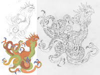 I started on copy paper with the body form of a Blue Ringed Octopus and then added on a taller dragon head and a bit of a hood like a King Cobra (adding to the Royal prompt). That loose sketch was taken into Photoshop where I added blocky colors to help refine and define the overall shape and silhouette. I also put in a pale green to be the underbelly so I could keep track of where a tentacle would have suckers or not. With that rougher version bolstered with color shape design, I printed it out and did a tighter pencil drawing over it on a clean sheet of paper on my Huion lightpad.
  With the tighter pencil drawing done, I wend back into Photoshop and blocked in some flat colors to again help me see which parts were which (negative space, underbelly, top skin, shin pattern, etc. but also to just get me closer to envisioning what my goal was for the final image.
In some ways, this step was unnecessary and superfluous––I did a good enough job with the pencils that I could tell where the underbelly and suckers were to get the ink texture right in the next step...but I really do like trusting in this process of mine. It did make me think harder about how I was going to ink the skin pattern knowing what the final color issues would be.

With the above design printed out at full scale and taped that onto the back of a sheet of Strathmore 300 series bristol, it was time to start inking. Using a lightpad, I was able to see through the surface of the bristol as I inked the dragon. I used Copic Multiliner 0.7 pen to ink the art.
The inking on this piece was about balancing the lighter hand I needed to not overwork the underbelly and to get the details on the suckers looking fleshy, and then being more textured and heavy-handed when it came to the skin pattern.
 I wasn't able to finish my inks on stream before having to sign off an wish every one success over the weekend with their Dragons. Later that same night after some dinner I finished inking the last few tentacles and then scanned the inks and started the flatting process. In addition to the basics of color flatting–basically professional coloring-in-the-lines, I also established color holds (an area where I want the ink to be a color other than black)––the overall lines became a dark brown, the skin pattern got two different color holds and the pupil got one as well.
Most of of the color selections were already established in the rough, but I played with the final value/hue choices for a while before getting to this point.
For the final colors I used a bit of the paintbrush to add some color variance to each area before using the dodge and burn tools to do the final rendering.
Below you can again see the final Dragon...

But, as this is a community event, I wanted to share all the other entries posted in the Discord.
 Capt.Nemo
 Nathan Pride
 Nuvalo
Nuvalo
 RedSkwrl
 Jonathan Towry
 88UncleErnie
October 1, 2024
Usagi Yojimbo 40th Anniversary
 The Usagi Yojimbo Dojo will be publishing a 40th Anniversary Usagi Yojimbo Tribute book this November. It will be by fans and for fans of Stan Sakai's Usagi Yojimbo. Limited to 500 copies, available upon request for free (just pay postage) while supplies last. Since this will be a non-profit labor of love, any and all contributions to help cover the costs of printing are appreciated GoFundMe: https://www.gofundme.com/f/the-40th-anniversary-usagi-yojimbo-tribute-project
To request a copy email Steve Hubbell: usagiyojimbodojo@yahoo.com
with subject line "Usagi Yojimbo 40th Anniversary book"
To the left you can see my finished pinup for the book, and below I go through the process of creating it.
 This piece started long before I knew about the 40th anniversary tribute book with a commission request by a fan who wanted a Mouse Guard Usagi crossover piece. I drew Usagi on copy paper, scanned him and placed him into a Photoshop template for the size of the commission, and then printed that out to use as reference to draw the branches and Guardmouse.
These drawings were scanned back into Photoshop and given a quick color blocking to help me see the difference between the leaves and the ground and the branches, etc.
 I printed that above layout and taped it to a back of a sheet of Strathmore 300 series bristol. On my Huion Lightpad I could se ethrough the bristol surface down to the printout to use as a guide while I inked. The pen I used were Copic Multiliner SP 0.7 & 0.3 nibs.
There was a lot going on in terms of depth on this piece and I wanted it not to get too busy, but still have bursts of texture and value so the viewer's eye could clearly see all the forms.
The original was then sent off to the fan who commissioned it.
 Then Steve Hubbell reached out about the tribute book asking if I could contribute something. I was so slammed with freelance work, commissions, and Convention prep, I didn't have time to create something new, so I made a plan to take the square commission and get it tall enough to fit a standard comic size. To do this I drew two birds and photoshopped in a cobbled together background pattern based on some Japanese patterns to become top and bottom border designs. Once the pencils and patterns were digitally assembled, I inked the two bird pieces in the same process as the main commission piece described above.
The original inks for these birds are available for sale in my online store:
mouseguard.bigcartel.com

With all the inked drawings scanned, I started the process of color flatting the piece.
This is the first step of coloring that is essentially a professional version of coloring-in-the-lines. It's all about establishing color areas, that the fur is a different color than the clothes, or the leaves, or the branches, etc.
In this step I also established color holds (areas where I want the linework to be a color other than black) on the leaf veins, Usagi's scar, the ground texture, and two on the decorative pattern behind the birds.

The final step was to render the image which I did mostly with the dodge and burn tools, but also a paintbrush and some special layers to created the dappled shadows on the scene.
Again, to request a FREE copy of the tribute book email Steve Hubbell: usagiyojimbodojo@yahoo.com
with subject line "Usagi Yojimbo 40th Anniversary book" and cover shipping. You can also charitably donate to the GoFundMe to help him with the costs: https://www.gofundme.com/f/the-40th-anniversary-usagi-yojimbo-tribute-project
September 24, 2024
Magic the Gathering: Azure Beastbinder
 Last year I was asked by Wizards of the Coast to do some Magic the Gathering card art for their upcoming animal set Bloomburrow (https://magic.wizards.com/en/products/bloomburrow). I played a lot of MtG back in the mid/late 90's, so it was an honor and thrill to become a part of the fraternity of MtG illustrators.
The final card of mine from Bloomburrow that was revealed is Azure Beastbinder.
The set was released in early August, and I'm happy to share the artwork and process for creating it.
 The process started with the brief from my art director asking for a Ratfolk rogue sliding underneath a Calamity Beast slicing its underbelly with a dagger that turns the wound into blue smoke or vapor. WotC provided me with an enormous PDF with reference for the rats and their clothing (In this case they asked specifically for japanese Aizome triangular patches) and weaponry for Bloomburrow, as well as reference for the Calamity Beast.
 I started with a rough version of the rat in a power slide pose and did a few versions before I put it on a lightpad to draw it out more tightly and add in all the clothing details as well as the dagger. Before I drew the Calamity beast in pencil, I think I scanned in the rat, then painted a blocky mass where I wanted the creature, then printed that out to do the drawing seen here.
 The pencil roughs were all assembled and combined digitally in Photoshop. For the magic vapor wound I painted with a cyan color in Photoshop and had a stroke applied to that layer to give me an outline.
 At this stage, I also like to do a preliminary digital color blocking, to make sure I have the color and value tangents worked out, and also to show my art director at WotC so they are on the same page as I am (no one likes surprises in the later stages of a commissioned art piece). This is the stage where I can also easily make adjustments moving a character or resizing something.
 With the pencils/layouts approved by my art director, Aliana Rood, I moved on to inks. I printed the digital composite out and taped it to the back of a sheet of Strathmore 300 series bristol. On my Huion Lightpad, I was able to see through the surface of the bristol to use the printout as a guide as I inked with Copic Multiliner SP pens. I did more texture on this card than any of my others, but I think it works in the end with color.
 The inks were then scanned back into Photoshop where I could start the coloring process. This stage. called flatting' is the professional version of coloring-in-the-lines. Just flat color is placed in to establish everything's base colors. the art director also liked when my linework was softer in my Mouse Guard work, and wanted everything to have a dark brown color hold (ink lines colored to be something other than black). I also established other color holds on the vapor wound and the rocky background.

Here are the final rendered colors for the art (sans card borders). I did the light and shadow and texture by using the dodge and burn tools in Photoshop with a stock textured brush.
I have prints of this piece available for sale: https://mouseguard.bigcartel.com/category/magic
September 17, 2024
The Tick for Baltimore Yearbook 2024
 Every year the Baltimore Comic Con has published a convention art book called 'The Baltimore Yearbook' that features a character or property, where that creator is a guest of the convention. Selected guest artists are asked to contribute a piece of fan art for the book to celebrate the creator and property. It allows us to play in someone's world, and offers a chance for attendees to meet new creators as they go around the show floor collecting autographs in their yearbook.
This year's subject is Ben Edlund's The Tick! To the left you can see my finished art, and below in the blogpost I'll walk through my process.
 I started with a drawing of The Tick––and then started realizing how difficult it might be for me to include the sense of humor and parody to the piece. I looked up all the other characters that appeared in the comics and animated series, even thought of including characters from The Plotmasters...but none of those spoke to me.
 We are always encouraged to include our own characters into our Yearbook piece--to create a cross-over image that might not have otherwise happened. I'm always hesitant to add mice from Mouse Guard into these pieces, but it dawned on me that I could parody my own characters with a close-but-not-quite version called Vole Patrol. That's when the line 'No more Mr. nice mice' came into my head. I drew vole versions of my characters on copy paper along with the banner and digitally added them in to the pencils I had of the Tick and blocked in some colors.
 I then printed out the digital assembly above at 14 x 17 and taped it to the back of a sheet of Strathmore 300 series bristol board. On my Huion lightpad, I can see through the surface of the bristol down to the printout to use it as a guide to ink by. I used Copic Multiliner pens (mostly the 0.7 nib) to do all the inkwork.
I debated inking in the balloon and text, but to make the original art more salable (available at the auction in Baltimore), I opted to ink it in. I kept Tick open linework mostly, only adding a little bit of weight/texture to the contour lines. The voles I inked like I'd ink my mice and the groundcovering became my dark anchor visual.
 With the inks finished it was time to start coloring the piece. I scanned the inks and began laying in flat colors. This part of the process is called 'flatting' where the color areas are all established with flat colors (no shading, no rendering, no textures, no effects). While the Tick's colors are closer to correct here, I flatted in false colors for everything else––sometimes having bold wrong colors helps you see that you're staying in the lines.
In this step I also established all the color holds (areas where I want the ink lines to be a color other than black) like the text, banner stripes, lantern glow and fading the ground covering.

After I quickly switched all the bold vole colors to the correct ones, the last step was to do the final rendering and lighting effects for the piece. I did this mostly using the dodge and burn tools and a stock Photoshop brush.
This piece will be published in the Baltimore Yearbook later this month. That book will be available for purchase at the convention and through the con's website afterwards. The original inked piece will also be for sale in the art auction at the con on Saturday.
 2023: First Comics (American Flagg):https://davidpetersen.blogspot.com/2023/07/american-flagg-baltimore-yearbook-2023.html
 2022: Scary Godmother:
https://davidpetersen.blogspot.com/2022/10/scary-godmother-tribute-for-baltimore.html
 2021: Halloween:https://davidpetersen.blogspot.com/2021/10/happy-halloween-baltimore-yearbook.html
 2019: Blacksad:
https://davidpetersen.blogspot.com/2019/10/blacksad-for-baltimore-yearbook.html
 2018: Strangers in Paradise:https://davidpetersen.blogspot.com/2018/09/baltimore-yearbook-strangers-in-paradise.html
 2017: Tellos:https://davidpetersen.blogspot.com/2017/09/tellos-baltimore-comic-con-yearbook.html
 2016: Archie:http://davidpetersen.blogspot.com/2016/08/baltimore-yearbook-2016-archie-process.html
 2015: Mouse Guard:http://davidpetersen.blogspot.com/2015/09/baltimore-comic-con-yearbook-cover.html
 2014: Grendel:http://davidpetersen.blogspot.com/2014/08/baltimore-yearbook-grendel.html
 2012: Liberty Meadows:http://davidpetersen.blogspot.com/2012/09/baltimore-comic-con-yearbook-2012-this.html
September 10, 2024
Milan Gwendolyn
 The piece you see to the left is a 12" x 12" inked piece that is up for bid at the Hero Initiative Auction at Baltimore Comic Con (along with pieces by Sanford Greene, Chris Bachalo, Steve Purcell, Stan Sakaim Kevin Nowlan, Paul Smith, Walt Simonson, Kevin Eastman, and many many more). You do not need to be at the auction to bid, you can bid by proxy (as long as you email your high-bid in by Sept. 16th.
 More info about the auction on the Hero Initiative Website:
https://www.heroinitiative.org/portfolio-item/2024-baltimore-comic-con-auction/
For this blogpost though, I wanted to walk you through the creation of the piece and its upcoming use...
 In the sprint, Julia and I attended Lake Como Comic Art Festival, and on our way there we spent a few days in Milan. There we had a guided tour of the Duomo and saw the statue of the Madonna perched on the tallest spire of the rooftop (we were on the roof when I took this photo). I loved the pose and thought it would be great to do a homage with a Matriarch of the Guard.
 And as always I also take photos of various tile floors, grates, and inlays when in other cities...so I opened my Milan photos for inspiration for a background.
 In pencil on copy paper I drew a version of Gwendolyn in the Madonna pose (or as closely as I could make that mouse anatomy fit).
I scanned that in and dropped it into a Photoshop file with the correct dimensions for the finished art and resized and positioned my pencil drawing.
The star circle was created using some Photoshop tools and the brass floor grate photo was dropped in for a pattern in the background.
 The above layout was printed out and taped to the back of a sheet of Strathmore 300 series bristol. On my Huion lightpad I can see through the bristol surface to see the printout as a guide while I ink. To ink this I used Copic Multiliner SP pens (I think I only used the 0.7 nib)
Making good clean lines on this piece was imperative for me since I knew the original was getting donated for the Hero Initiative auction.
But I also intend to use it elsewhere...
 And the first place this art will be used is for the newest Mouse Guard tee which will make its debut at Baltimore Comic Con and go in my online store shortly afterwards.
Again, to bid on the original inked drawing you can either come to auction at the Baltimore Comic Con or proxy bid by email by Sept. 16th.More info about the auction on the Hero Initiative Website:
https://www.heroinitiative.org/portfolio-item/2024-baltimore-comic-con-auction/
September 3, 2024
Santa Barbara Courhouse Commission
 Last September, my friend Stephen Christy and his partner Dominique were married. You may recognize Stephen's name––He was an integral part of bringing Archaia back from it's early collapse, in shepherding the deal between Archaia and Henson, and for being the film liaison for a Mouse Guard movie since the earliest offers came in right up to being a producer on the FOX movie we started.
 I was contacted by a friend of Stephen's who wanted to commission me to draw the Santa Barbara Courthouse where they had their ceremony for him to give as a wedding gift.
 I accepted the commission and started with going through lots of publicly available photos of the building as well as a few 3D models on shared model libraries. Once I had a photo, I printed it out and then on a light pad, drew a refined pencil version––tracing the form, but also interpreting how I'd manage the details and complexity in just line and texture.
With the pencil drawing done, I scanned it into photoshop and sized it to match the final art (10" x 10"). I also tinted the linework to make it easier to see for the next step, and painted in some areas where I knew I wanted to add shadows with texture. The last step was to add a horizontal line guide to help me when it came tim to ink something in the sky area.
 A printout of that version was taped to the back of a sheet of Strathmore bristol, and on my lightpad I was able to do the final inked drawing with Copic Multiliner SP pens.
 There was a lot of structural detail to get right in the tower, the arch and the windows, so I used a slightly smaller nib size than I normally would, and then built up the stippling for the shadows slowly to make sure I was never losing the forms of the architecture.
I was honored to get to draw a piece to be gifted to Stephen and Dom for their wedding. Happy Anniversary!
August 27, 2024
TMNT 40th Anniversary Pinup
 On July 10th a TMNT 40th Anniversary on-shot was released. I was asked by editors to contribute a pinup to mark the occasion (I'd similarly done one a decade ago for the 30th: http://davidpetersen.blogspot.com/2014/05/tmnt-30th-anniversary-tribute.html)
It was reading the early Eastman & Laird TMNT comics and playing the RPG that really cemented my desire of wanting to write and draw my own comics. The only other comics I'd read at that point were some older X-Men reprints (that had Arthur Adams covers, Dave Cockrum interiors, and John Bolton backup stories) and Archie comics that had a different artist every story––Kevin and Peter were doing something different, and seeing their names above the logo on the cover made me realize these guys were just making stuff up and drawing it––not a factory of creators contributing to a long-standing legacy brand.
Unfortunately due to timing, I didn't have time to draw a new pinup before the tight deadline for the 40th one-shot. But I did have some sketchcovers I inked (and scanned before painting) of each of the brothers. Since they'd never been published, I asked the editors if they minded if I assembled them into a group composition and colored them to include in the issue and luckily they agreed.
Below you can see each individual turtle's inks before coloring and assembly:


David Petersen's Blog

- David Petersen's profile
- 339 followers

