
David Petersen's Blog, page 5
January 7, 2025
Blog Index Updated
 Since I started this Blog in 2007, there have been hundreds of posts about art process, ideas, advice, cover work, illustration projects, and lots of Mouse Guard.
I've updated the Blog's index (something 18 months past-due)
Perhaps there are posts you've missed, or forgotten about, or you're new to my work and would like to go back and look at posts.
https://davidpetersen.blogspot.com/2019/12/blog-index.html
Included in the update are Magic the Gathering pieces, TMNT illustrations, Usagi Yojimbo covers & a pinup, Discovering Dragons, Mouse Guard prints, and much more.Enjoy the new year everyone!


December 31, 2024
Happy 2025
 It's New Year's Eve––and just in a matter of hours, it will be 2025. While, as I always do, I have concerns going into this circuit around the sun, I'm also pleased that this year will mark the 20th anniversary of when I self-published the first issue of Mouse Guard.
To the left you can see a little illustration I did between Christmas and New Years of a very David Petersen-eque mouse riding a frog. May we be the mice atop a frog mount leaping into 2025 and hopefully hopping over as many of our obstacles as possible.
Below in this blogpost I go through the art steps to create the piece.
 Rough:
I decided it would be nice to have a mouse on a mount, and I've done a fair number of mice on birds in recent years, and somehow I arrived at the alternative for a frog. I looked at reference for a leopard frog (native here in Michigan) and drew it on a sheet of copy paper. On a lightpad I then placed a new sheet of copy paper overtop to draw a mouse with some sort of basket-saddle.
The two drawings were scanned and assembled in Photoshop (tinted different colors). I then did a little digital drawing and warped both the Mouse Guard emblem and '2025' to fit the banner.
 Inks:
Inks:I printed out the above layout and taped it to the back of a sheet of Strathmore 300 series Bristol. On my lightpad I could see through the bristol surface to the layout beneath to use as a guide as I inked. I used a Copic Multiliner 0.7 SP pen.
The reason I inked the Mouse Guard emblem on the banner was so I could use this art piece again at some point (as well as sell the original without the date connotations) The 2025 was inked separately on another small piece of bristol. The little lines above the numbers were there to help me register them back up to the crossbar of the banner.
 Flats:
With the inks scanned I started the process to color this piece called 'flatting' Flatting is basically a professional version of coloring-in-the-lines to establish with flat colors where all the color areas are (the fur is different than the hat is different than the frog is different from the banner, is different from the other banner, etc). I flatted this with the 2025 numbers properly registered back in place.
Also at this stage I established color holds, areas where I want the ink lines to be a color other than black like the numbers and the frog's eye and spots.
 Final colors:
The last step was to render the finished colors. I do so using the dodge and burn tools in Photoshop while also using a stock textured brush. The colors here are very different from the flats, and I did get them all adjusted closer to what you see here before I started adding shadows and highlights.
So, Happy 2025––Happy 20th Anniversary year from Mouse Guard, which is as much a celebration of all you fans who have enjoyed and supported it!
December 24, 2024
Dawn of the Black Axe Announced!
 Last week we announced a new Mouse Guard series called 'Dawn of the Black Axe' where the origins of the legendary Black Axe are revealed in this prequel story set in the earliest point in the Mouse Guard history with the ancient weapon’s first mouse wielder and champion, Bardrick.
I am writing and coloring this book and I handpicked the amazing Gabriel Rodriguez to drawn it. He's been an amazing collaborator and have been very kind as I attempted to write a script for someone other than myself. The series will be three issues and start in March of 2025.
This series will have 3 main covers per issue, Gabe's cover, My cover, and a Guest Variant.
Like the interiors, I also colored Gabe's covers. And here are the covers and order codes for mine and Gabe's (I'll do future blogposts as we get closer to release with process breakdowns for these)
 Gabriel Rodriguez cover
Diamond Order Code: JAN250016

David Petersen cover
Diamond Order Code: JAN250017
The variant for this issue will be by Goni Montes and has not yet been revealed (though the order code for Diamond is JAN250018
Gabe and I were asked for some quotes, and I'll pepper those between the inked preview pages below that were shared around on various other comic sites--I can't show more of the finished work now, but I can tell you that I've sweated every moment as I colored these.

David: Getting to write this Mouse Guard lore of the forging of the Black Axe and it being handed to Bardrick (first of eleven wielders) while getting to do so with the brilliant Gabriel Rodríguez drawing Dawn of the Black Axe has been a thrill,

David: “He’s going above and beyond with his inked pages and storytelling...while I’m just trying to keep up coloring them and still do them justice.

David: Gabe was top of my list when we started pitching names for this spin off project, and I postponed it for a long time until his schedule opened up––I didn’t want to do this first one with anyone else.

David: I’ll continue to work on the next volume in the main Mouse Guard series: The Weasel War of 1149, but I also hope this is first of many more Mouse Guard books like this one, where I get to explore the other past wielders of the Black Axe with exciting and extremely talented collaborators like Gabe.”
 Gabe: I’ve been a fan of David Petersen’s work since the first time I saw a volume of his astonishing Mouse Guard books. We became friends as soon as we met,
Gabe: Almost a decade ago we started daydreaming about working together on the story of the first wielder of the mythical Black Axe. That dream finally came true, and I’m humbled, grateful and excited to share it with the faithful legion of Mouse Guard readers.
-------------------MOUSE GUARD: DAWN OF THE BLACK AXE #1 will be available in comic shops March 19, 2025. It is available for pre-order at your local comic shop. Digital copies can be purchased from content providers, including Kindle, iBooks, and Google Play.
December 17, 2024
Gilkey Warlocks Page breakdowns
 Last month Nick Kowalcyk, Mike Davis, & I got together in Flint, MI to celebrate Jesse Glenn's 50th birthday with him. The four of us were very close friends back in high school, and variations of us have appeared in many Plotmasters Project creations, Mouse Guard, and most unabashedly––in Gotham Academy.
This recent reunion made me think it would be a good time to revisit the story on my blog. Below are my 'Gilkey Warlocks' pages broken down into roughs, pencils, greyscale, & final color.

Page 1 Roughs:
For the hallway I made a little paper model (though the checkered floor was digitally added in). With this story being for DC and having a proper editorial process (unlike my creator-owned Mouse Guard pages) I had to send roughs in for approval.
 Page 1 Pencils:
Because I was worried about smudging up a rendered pencil panel when working on an adjacent one, I decided to draw them all separately, drawing a little bit of overlap to make sure there wasn't going to be a gap between panels.
 Page 1 Greyscale:The pencils were all assembled in Photoshop and then masked off to conform to their appropriate panel shape. I added in borders digitally.
Page 1 Final Colors:
Using different layer modes I was able to color over the top of my greyscale page to essentially tint the image like a colorized black and white photo.

Page 2 Roughs:The Serpents and Spells RPG name had already been established in the pages of Gotham Academy––but not what the cover of a 1984 era players handbook would look like, so I got to do a fun cover treatment and then paste it in. I also photographed a huge D20 rather than drawing an icosahedron from scratch.
 Page 2 Pencils:
Getting pencils this dark was difficult––I suspect that the file I opened to show you this already had some heavy level adjustments done to darken those darkest darks. On some of the panels I added in little crop marks to know where the panel borders were as I was drawing it, but also to know where to crop it when making the greyscale composite.
 Page 2 Greyscale:All assembled with some added in digital black space in the areas around the last 5 panels.
The digital borders on this included another dashed line between a panel and the zoom-in, something I enjoyed on the first page and continued here.
 Page 2 Final Colors:
Keen eyed viewers will notice that on page 1 Jonathan Crane's name was on the secret door, and here we find an abandoned room with chemistry equipment and an erlenmeyer flask with 'FEAR TOXIN' on the label––and there goes Davey (Mike Davis) blowing off all that dust on the table into the air...
 Page 3 Roughs:
These pencils got a healthy amount of digital help when it came time for me to visualize the animated shadows growing off the kids, and then forming into Serpents and Spells monsters.

Page 3 Pencils:
After the success of drawing the last 5 panels on page 2 together, I opted for the middle section of 4 panels here to all be drawn together.
 Page 3 Greyscale:
I'm not sure why, but I think I put reasoning into why each boy's shadow became which monster––and for the life of me I can only remember Glen (Jesse Glenn)'s being an owlbear-like thing because of an inside Joke about real-life Jesse once drawing the friendliest owlbear for my homemade board game Tower
 Page 3 Final Color:
This story was written, drawn, and turned in a few months before the first season of Stranger Things aired––you know, that 1980's period piece about four pals playing an RPG when one of them mysteriously disappears after a session.
So there you have it! I'm still proud of this story, because it got me to stretch narratively (humans, likenesses, panel count (9 panels on page 2!), and in a different medium (rendered pencil).
I did a blogpost about the process of drawing this story back when the issue came out in 2016. The story can still be found in Gotham Academy Vol. 3: Yearbook TPB or Comixology.
Someday soon I hop to have a moment and revisit these characters––to show what each of their Serpents and Spells characters looked like.
December 10, 2024
Mouse Guard Holiday Ornament
My Patrons over on Patreon get a larger version
If you want more crafting fun to make ornaments for your holidays, I also have Mouse Guard papercraft figures that can be printed at full size, or a smaller % to make them hang on a tree easier.
Free Papercraft .PDFs
https://www.mouseguard.net/papercraft

December 3, 2024
Mouse Guard mice, pre-publication (2005)
It's easy to look at an artist's published works and forget that before those images were seen by the public, there were hundreds of thousands of steps to artistically get there. I've been lucky enough to be noted as having a 'style' that stands out with a confidence of textured ink line (I've done a few videos addressing 'style' and my inkwork 'Drawing like yourself' and 'Inking grey'), but I wanted to use this Blogpost to remind everyone that the look of Mouse Guard Issue 1 didn't just happen––nor did it happen quickly.
Below I've put together many images of my drawings of Mouse Guard characters when it stopped being the lots-of-species 1149 story, but before I'd drawn a single page of the comic. The earliest image is from 1996 when I was in my first year of college, and the last are from 2003-4 when I was newly married, bought a house with Julia and just before I started drawing issue 1 of the comic. I've tried to keep them in chronological order, and written some commentary for each.
 This is the first image of Saxon Kenzie, and Rand––when I decided to add mouse characters to 1149.
These were drawn while sitting on the floor of my childhood bedroom looking at the mice in Tom Pohrt's Coyote Goes Walking (a Michigan based Illustrator).
The images were drawn in pencil on copy paper, inked with a crow-quill dip pen, then painted with watercolor pencils.
 Very soon after that first image I used a scrap of mat board to draw my patrol of Saxon, Kenzie, and Rand. I was still figuring out scale here––the 1149 characters were human-sized, but with animal features, and when I brought the mice in is when I wanted to utilize real-world proportions--this is still an in-between stage. The mouse bodies are wrapped in cloaks (later to be a distinguishing feature of Guardmice) because I didn't have good reference (real of from another illustrator) of a mouse standing on it's hind feet.
This is again crow-quill dip pen and watercolor pencils.
 To try and make the characters more 'comic book style' I tried stylizing their proportions (I feel like I was influenced by real-life Kenzie, Jesse Glenn's drawings for a 1996 Cats Trio revamp.
Crow-quill dip pen and Prismacolor Markers
 Another ink & watercolor pencil on a scrap of mat board piece––this time trying to get a handle (poorly) of that fictional upright mouse anatomy. This may have been in preparation of a bronze statue you'll see in a few more images. What I remember about this piece was how many people commented on my 'rat' character...I made a concious decision I had to figure out how to stylize them so they looked 'cuter' to evoke the feel of mice.
 In my second year of college I took a printmaking class around the same time I was actually writing down a story for my Guardmice characters. This was my second ever etching (a technique assignment all using softground). This may be the first time I'd drawn all three with their signature weapons.
  One of my last prints made in that first-semester Printmaking class. The assignment was more about the scale and printing an edition of your plate, but to note here is that I was doing this as a potential book cover when 1149 was going to be a prose book with illustrations. Much of what that story was got stored away and used as raw ingredients for what will be The Weasel War of 1149. But, at this stage, the other species of rams, a tiger, duck, fox, opossum, etc. were still characters.
 Around the time I was taking that printmaking class, I was also taking a sculpture class where we did a bronze casting. The piece had to be sculpted in wax first, then a mold (able to resist the heat of molten bronze) was formed around it, heated to melt out the wax, and then filled with molten bonze (I added the felt cloak later).
This isn't the only sculptural Mouse Guard piece from this pre-comic era. And I'd say at this stage that was partly because I didn't know what 1149/Mouse Guard was supposed to be. Was it a prose book? a comic? a stop-motion film? a puppet show? Exploring mediums as well as 2D & 3D here was all about trying to find what I wanted this thing to be and where I felt most comfortable.
 Please excuse the poor quality of this image--it's actually a low-res photo of a slide projected on a screen of a watercolor painting, and while the original wasn't great, a lot of quality was lost here. This was from my one and only Watercolor class in college. It's also an era of internet where doing image reference searches wasn't really a thing...so for weasel reference I had one or two photos in a book on mammals to look at. But art-journey-wise, I think here I was exploring taking what I learned in casting the bronze statue and applying it back into a 2D format where I felt more at home.
 To give a sense of dates, I think this was from 1998(?) I got into a groove with 1149 drawings at this point (I have a Ferret and a Fisher drawn around the same time) all done in rendered pencil. Still trying to find a balance in stylization and realism.
 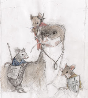 1999-2000-ish(?) These mice were all drawn from some field guide that had several photos of mice I could reference. And while they are so based on real-mice, I think this is where the clearest turn to my stylized proportions and sensibilities of the comic arrive.
This was pencil in a sketchbook with some light watercolor wash.
 Please excuse the low quality of this image. I'd nearly forgotten about it and then saw it online when I was gathering links and a few photos of the sculptures from Facebook. I'm fairly certain this was before I drew issue 1––but I'm not sure when. I placed it here because I felt the proportions more closely matched the piece above and the sculpts below. Note Ran'd shield being silver/grey metal rather than copper––something we see next...
 Sculpy Sculpts from 2003-4.
I did these for fun, still not knowing I was going to start drawing the comic when I started them. The bases are broken tiles we used as coasters at our wedding reception, the weapons are mostly made from found objects (sticks, nails, metal fittings––AND a scrap of copper for Rand's shield from the hammered leaf centerpieces I made for our wedding). Their cloaks are all scraps of fabric I either had or bought as swatches from a fabric store.
 And lastly, the 2003 inked drawings I featured in the earliest Mouse Guard sketchbook (that still pre-dated the comic by a few months...and is available in my Digital Sketchbook Collection). As I've told many times, these were after a 'breakthrough' drawing I did without any access to reference (of photos, other artists, or even my own work) while at a Family BBQ. I leaned into my memory of drawing, my training in art school, and my printmaking background to draw/ink as comfortably as I could (later the main tenant in my lecture Drawing Like Yourself)
Hope you enjoyed that look back. I know I've changed a lot as an artist since that first issue in 2005, and the mice look different now as a result. That's what should be happening though...an artist whose work looks exactly the same year in year out would be stagnating, not growing, not pursuing, and not exploring.
We never arrived fully formed, and we shouldn't think any form we take is meant to stay.
November 26, 2024
Happy Thanksgiving & a recipe for your feast
 Happy Thanksgiving Guardmice!
I'm swamped with coloring on an upcoming Mouse Guard project, so please excuse the re-run of some material here (Harvest Print & Gabcroon Recipe).
I also wanted to say that in addition to the obvious of being thankful for my family, friends, my health, dogs, etc––I need to say that I'm thankful to have the fans who support and appreciate the work I do. Thank you all!

GABCROON
by Rhomni St. John
A hearty nut, seed, & fruit packed
scone. the Guardmouse staple perfect for travel,
while reading a book, or to share with your patrol. INGREDIENTS: 3/4 cup butter softened 1 cup honey2 eggs1/2 tsp salt2 tsps vanilla 1 tsp baking powder3 cups whole wheat flour1 cup rolled oats1 cup sunflower seeds 1.5-1.75 cups chopped walnuts 1 cup dried blueberries1 cup dried cranberries
INSTRUCTIONS:
Preheat oven to 375 degrees F
Cream together honey and butter, and then stir in the rest of the wet ingredients.
Slowly add flour, oats and baking powder until well mixed.
Stir in sunflower seeds and dried fruit.
Separate dough if you wish to make nut-free versions.
Add chopped walnuts to taste.
Scoop out tablespoons of dough and place on 1-2 inches apart
on an ungreased non-stick cooking pan.
Bake for 10 minutes or until cookies are slightly golden brown.
Eat with honey.
November 19, 2024
Sandmason Mouse
 Earlier this year I did an inked commission of a Mouse from Sandmason on a desert mount.
The plan is that this piece will be included in the next Mouse Guard sketchbook (hopefully out mid-next year).
I've colored it for that eventual sketchbook and in today's blog, I'm going through the process for drawing, inking, and coloring the final image you see here.
The fan's request was a mouse from Sandmason (a location on the map of the Mouse Territories I've never taken readers to in the course of the books––but a style of dress I did show in the extras of the Winter book when delegates from various cities come to Lockhaven for a summit) on some kind of a mount in the desert sand ala Luke on a Tauntaun on Hoth in The Empire Strikes Back.

The only lizard in Michigan (and I know you're thinking Michigan isn't a desert––but we do have sand dunes, which to a mouse...) is a Five Lined Skink.
I penciled the lizard and the rock on a sheet of copy paper, the mouse on another, and then on a light pad with a fresh sheet of copy paper over the lizard drawing, I drew the saddle/seat and assembled them all together in Photoshop.
 I printed out the above pencils/layout and taped it to the back of a sheet of Strathmore Bristol 300 series. On my Huion Lightpad I was able to see through the surface of the bristol down to the layout to use as a guide while I inked the piece. The inks were dong using Copic Multiliner SP pens (the 0.7 nib mainly).
This piece had some tricky textures that had to be subtly managed: the scales, the belly, the sand, the rock...over doing any of those would not just make the piece too cluttered and unreadable, but also would lose the contours of those forms.
 With the inks finished I started the coloring process. The first part of which is called 'flatting'. It's essentially a professional version of coloring-in-the-lines to establish what each area's flat base color will be (though, you can use colors that aren't in the final palette and adjust them later) no textures or shading.
It's also at this stage I added in color holds (areas where I want the lineart to be a color other than black) and I established those on the sand, the flag emblem, and the goggle glare).
 The last step was to render the final colors. I do this mainly with the dodge and burn tools in Photoshop, but on this piece I did use the paintbrush a bit too. I also will use the freehand lasso tool with a feather (blurred edge) to select certain areas to adjust the color balance on to make subtle transitions––like the skink's nose area.
Hopefully I'll get past my current deadline crunch and get to a point where I know I'll have enough finished images to combine into a sketchbook collection for 2025.
November 12, 2024
Plotmasters Project Re-Run

This week is Jesse Glenn's 50th Birthday. My best friend, the Kenzie to my Saxon and a collaborator for decades. Te celebrate, I wanted to go back and promote our video podcast: THE PLOTMASTERS PROJECT where we looked back and revisited our earliest stories and characters together. Below are all 10 episodes for you to enjoy as we share a fraction of our old artwork and ideas going back to the early 90's and then draw updated pieces to see what those ideas would look like today.
CATS TRIO
QUIETUS
BLACKCAT
DRAGONS pt1
DRAGONS pt2
PSYCHO-MANTIS
HERO SQUAD
R-WARS
FEATHER
CLAW
Gallery of updated pieces:
 CATS TRIO: David
CATS TRIO: Jesse

QUIETUS: Jesse

QUIETUS: David
 BLACKCAT: David

BLACKCAT: Jesse

DRAGONS: Jesse
DRAGONS: David
 DRAGONS: David
 DRAGONS: Jesse
 HERO SQUAD: Jesse
 HERO SQUAD: David
 PSYCHO-MANTIS: Jesse
PSYCHO-MANTIS: David

FEATHER: David

FEATHER: Jesse

R-WARS: Jesse

R-WARS: David

CATS TRIO - CLAW: David
 CATS TRIO - CLAW: Jesse
November 5, 2024

David Petersen's Blog

- David Petersen's profile
- 339 followers

