
David Petersen's Blog, page 9
April 2, 2024
Grandparent Mice
 Before Mouse Guard was a comic, when I was still in college, I made some mouse-versions of my Paternal Grandparents as Christmas gifts. I remember sculpting them in my workspace in my Dad's basement when home from school on Christmas break. These were made with Sculpey, an oven baked polimer clay. The eyes are bicycle ball bearings.
Unfortunately, these did not stand the test of time and I'd repaired them so many times with super glue and epoxy that they were a mess and still crumbling apart. I took a few photos of them before they fell to ruin.
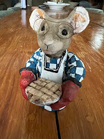 My Grandmother was the prototypical grandmother, she was kind, loving, and a consummate cook & baker.
 As fans of Mouse Guard know, I based the very idea of having the Guard run by a Matriarch on my Grandmother's role in our family. More recently, I've made her part of the Mouse Guard with a Matriarch named Dorys who is depicted in the stained glass of the Matriarch Chamber as well as a piece in the 2024 Callendar: https://davidpetersen.blogspot.com/2023/09/dorys-matriarch-cook.html
I sculpted the head for this mouse separately, and then later sculpted a body/dress––which is pretty out of proportion or capable of containing legs, and then attached them with a dowel. She's wearing oven mitts and presenting one of her famous pies.
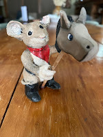 My Grandfather fashioned himself a bit of a cowboy––and for good reason, he did have a natural way with horses. Though most of his life was lived in the city of Flint, he grew up on farms. In their senior years my grandparents wintered in Arizona, where my grandfather would drive a team of horses in the Tucson Rodeo Parade.
He wore a lot of Western style shirts and belts, so his mouse has cowboy boots and a neckerchief bandanna while riding a hobby horse.
His mouse was the more crumbly of the two sculptures and lost most of an ear to dust before the end.
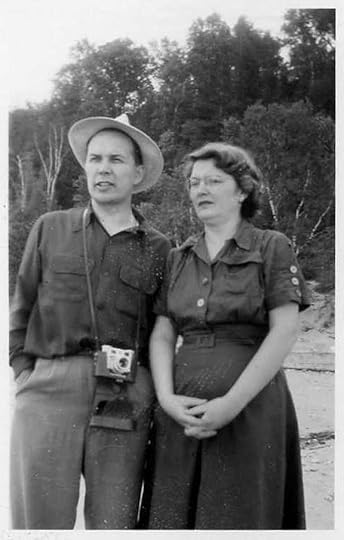 Gilbert & Doris Petersen on Lake Michigan

March 26, 2024
Skullduggers Concept Art Revamp
 Beware the Skullduggers, a group of diminutive animated bones who use the scrap gear and weapons of fallen fighters as they tunnel and mine to excavate more of an equipment horde as well as bones of the dead to stock their own ranks with.
 They can range from a lone goblin-sized miner to a swarm of calamity miscreants all the way up to a legion of undead ready to murder the heroes and townspeople and collect all their possessions to repurpose for their own use.
Well––at least that's the idea of what they are. In fact, they are a re-design of an old drawing I 'unearthed' when scanning pencil drawings for my Patreon.
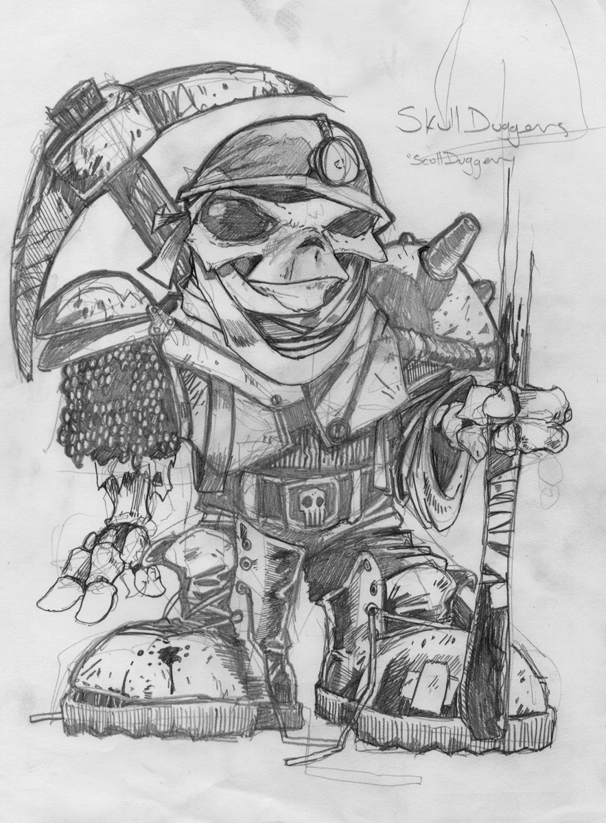
Back in the earliest of the 2000's, I was toying with the idea of creating a table-top game (like Warhammer) with simpler rules for movement, army creation, etc.
While struggling to design those elegant game mechanics (which never materialized) I only ever drew a few of the types of creatures one could populate their fighting forces with.
To the right is that old drawing of a single Skulldugger (I envisioned these were the minion pawns that could respawn.
 As a just-for-fun exercise, I thought it would be fun to redraw and redesign and older concept piece of mine like this (Plotmasters style). I hope to do this with a few of the other drawings I've found when scanning things for Patreon.
I penciled the mining Skulldugger first, but then decided that the concept art should reflect the idea that these are a throng of minions rather than one unique character.
So, on other sheets of copy paper I drew one with a lantern (inspired from a character in Hellboy: Wake the Devil) and a glimpse of one in armor. These were scanned and assembled and then given a quick color splash to help me see the forms easier.
 I printed out the above layout and taped it to the back of a sheet of Strathmore 300 series bristol. Using my Huion lightpad I was able to see through the surface of the bristol to the printout below and use it as a guide to ink from. I used Copic Multiliner SP pens.
It was important to to overwhelm the inks with too much texture, so I tried to limit it to their gear where I needed a material or rust to be obvious and also to help break up the space between the larger open areas in their designs.
There is a tanget I regret in the armored one's eye socket and the rust spot on the front one's pick axe---it looks like a continuation of the opening...but I knew I could improve upon it with color.
 The first step after scanning in the inks for digital coloring is called color flatting/ It's basically a professional version of coloring inside the lines.
I'd roughly established a color scheme for the front Skulldugger when doing the pencils/layouts, and opted to keep that look and expand on it only a bit to fill in the other two characters.
These little minions should be dusty, dirty, and corroded––so I liked going with a cohesive muted palette. At this stage I also established color holds (areas where I wanted the lineart to be a color other than black) on the lantern openings and the miner's candle flame.
 Here again are the final colors. They were rendered using the dodge and burn tools in Photoshop and a stock textured brush.
 I have no immediate plans for what to do with these guys, but between my Draw The Extinct creatures, Discovering Dragons, and a few more like this––I seem to have a nice bestiary for fantasy gaming...
March 19, 2024
Rusty Iron Swamp Dragon
 Earlier this month on my Twitch Stream, we did the #DiscoveringDragons Community-Draw-Along! It's a fun event where I welcome all skill levels to push their pencils (or whatever tools they use to make art). Usually it takes place on the first friday of the month, but due to ECCC, it got pushed back (as did this blogpost--sorry)I worked on my piece live on my Twitch stream while viewers worked at home and then on the following Monday we shared our finished pieces.
Here is my finished colored Dragon. And below are my steps to create it as well as the community submissions.

For #DiscoveringDragons, I post two or three prompt words for everyone to make into a dragon. It's a nice framework for artists of any skill level to focus some time on an 'assignment' to shake the rust off or get the pencil moving again––all while also being loose enough that there's plenty of room for individual expression and interpretation.
This month the prompt was three words: Rust, Iron, & Swamp
I opened several tabs of google image searches of Rusted Iron, and Alligators (because without a swampy background I thought getting the anatomy cues of an Alligator would telegraph the environment)
 I started on copy paper figuring out the overall body shape and how to make it both an alligator, while also looking like a mythicar creature and not just a big alligator. In pencil I focused detail only on the head and arm before scanning it into Photoshop to block in the shapes and forms for the rest.
With a big digital brush I painted in how I wanted to rpeat that scale pattern as well as color notes for where I wanted the back ridges/spines and draped swamp-muck. Last minute a blocked in some wings and a burping gassy alligator skull and crossbones.

I printed out the above design and taped that onto the back of a sheet of Strathmore 300 series bristol. Using a lightpad, I was able to see through the surface of the bristol as I inked the dragon. I used Copic Multiliner 0.7 pen to ink the art.
The inking on this piece was mostly about that scale pattern and getting it to bend around the form and to taper off and fade out where I needed. I was unable to finish the inks on-stream, but returned to them the next day off-stream.
 Right after the inks were finished, I scanned them so I could start the coloring process to try and save the form of the piece. After prepping the digital inks, I established color holds (areas where I want the inks to be a color other than black––on the overall lines (to a dark brown) and a pale green on the gas breath effect
Then it was time to start the color flatting process––basically professional coloring-in-the-lines. Some of this is just to make it easy to re-isolate various parts when doing later painting & rendering. I went with a bluer-grey to get away from alligator and still imply 'iron'. I did start splotching in some of the rust effects here, so this image is a half step past the flatting stage.
For the final colors I did most of the highlights, shading, and texture with the dodge and burn tools and a stock photoshop texture brush. I like the glowing gassy mouth, and the idea of the rust, but I kept going back and forth between how much is too much and how much is not enough. Below you can again see the final Dragon...

But, as this is a community event, I wanted to share all the other entries posted in the Discord.
 88UncleErnie
 CaptNemo
 Dakota
 fidelea
 Jonathan Towry
 Knickolaus
 Nate Pride
 RedSkwrl
 Tyberius
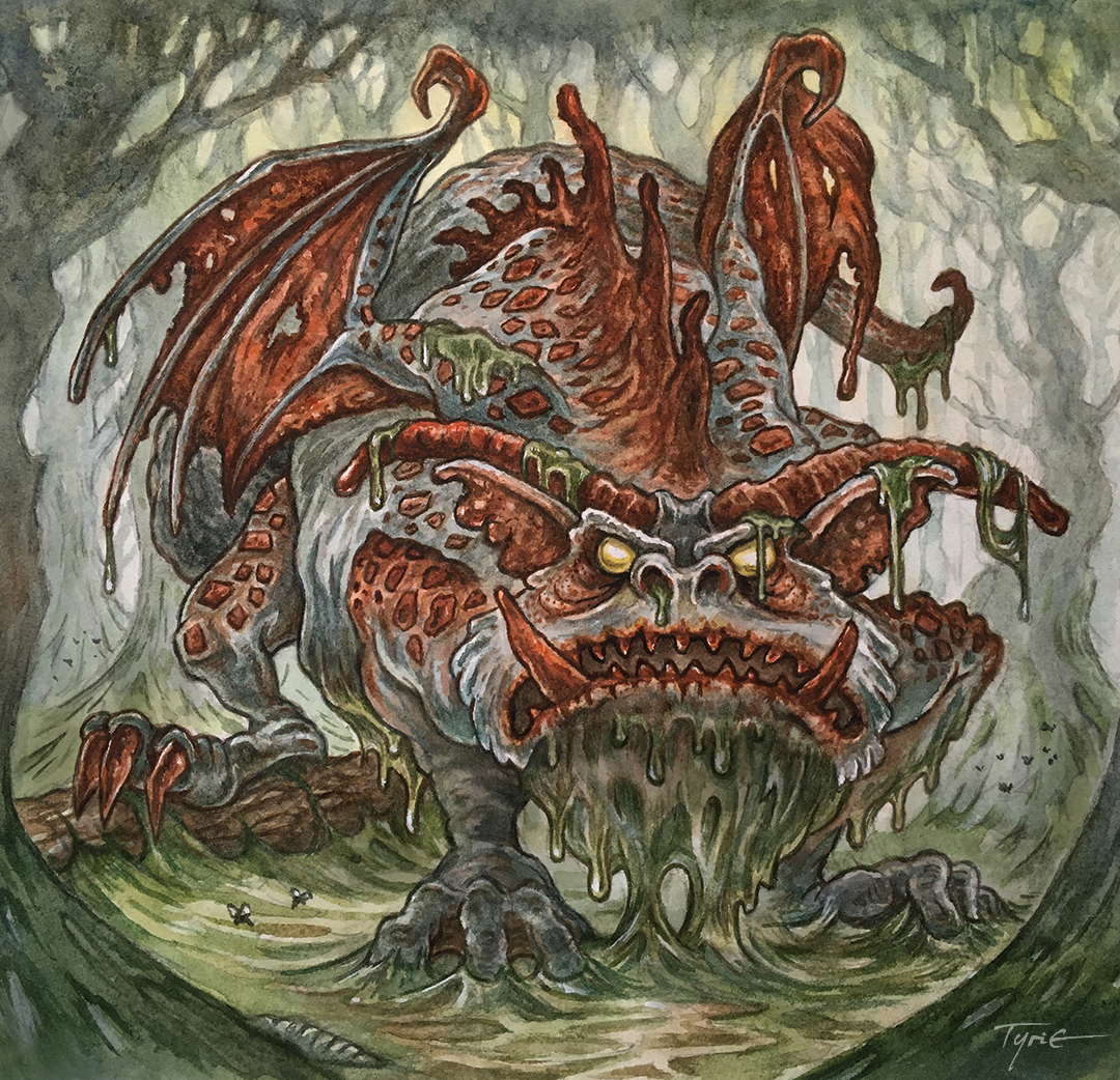 Tyrie
Tyrie VernNYC
March 12, 2024
Magic the Gathering: Mabel Card Process (Bloomburrow)
 Last year I was asked by Wizards of the Coast to do some Magic the Gathering card art for their upcoming animal set Bloomburrow (https://magic.wizards.com/en/products/bloomburrow). I played a lot of MtG back in the mid/late 90's, so it was an honor and thrill to become a part of the fraternity of MtG illustrators.
The first card of mine that has been revealed is Mabel, Heir to Cragflame. She is this set's protagonist in the story. She is a mother of three mouselings and heir to a storied sword, the Cragflame. The set will be released in early August, and since Wizards of the Coast has already revealed my version of this card, I can share the artwork and process for creating it.
 The process started with the brief from my art director asking for Mabel in her bedroom gearing up to protect her children. WotC provided me with an enormous PDF with reference for the mice and their clothing and architecture for Bloomburrow, as well as reference for Mabel's specific character design.
I started with a rough version of Mabel on copy paper, and then refined the drawing on a different sheet of copy paper using a lightpad to work off of the original. When I had a version of Mabel I liked, I did the same thing with the mouse-bedroom background, starting with a rougher version and then working to a tighter one on a light pad. I didn't need to draw anything where I already knew Mabel was going to be, which is why there is a void on both background pencils.
 The pencil roughs were assembled and combined digitally in Photoshop. At this stage, I also like to do a preliminary digital color blocking, to make sure I have the color and value tangents worked out, and also to show my art director at WotC so they are on the same page as I am (no one likes surprises in the later stages of a commissioned art piece). This is the stage where I can also easily make adjustments moving a character or resizing something (this is the post-edit correction of enlarging the blade of the Cragflame sword).
 With the pencils/layouts approved by my art director, I moved on to inks. I printed the digital composite out and taped it to the back of a sheet of Strathmore 300 series bristol. On my Huion Lightpad, I was able to see through the surface of the bristol to use the printout as a guide as I inked with Copic Multiliner SP pens. The art director for this card requested not to have any large or dense areas of black, so I kept the linework fairly open and was restrained with the amount of texture.
 The inks were then scanned back into Photoshop where I could start the coloring process. This stage. called flatting' is the professional version of coloring-in-the-lines. Just flat color is placed in to establish everything's base colors. the art director also liked when my linework was softer in my Mouse Guard work, and wanted everything to have a dark brown color hold (ink lines colored to be something other than black). I also established other color holds on Mabel's eyes and on the blade of the Cragflame sword.Here are the final rendered colors for the art (sans card borders). I did the light and shadow and texture by using the dodge and burn tools in Photoshop with a stock textured brush.
When Bloomburrow is released in August, I'll have prints and possibly playmats of Mabel available for sale.

The original inked artwork is up for sale by auction the the Facebook group: MtG Art Market: https://www.facebook.com/groups/mtgartmarket
March 5, 2024
Recent Toned Commissions
Here are some Toned Commissions from the end of last year.

A Gryphon

Jei from Usagi Yojimbo
 Celanawe
Frog from Chrono Trigger

Usagi Yojimbo in Samurai Armor

A Mouse playing a lute
February 27, 2024
Fan Art
(See past Fan Art Blogposts here)

Aidan Cooley
 Art of RMZ
 awilson7757
 Bamboo Bandit
 Brian Hurtt & Matt Kindt
 Byron Leboe
 Cody Gramstad
 David lo pu
 Datlef Henke
 drachenmagier
 Cosplay Kids at Laker Con in Michigan
 Florian Buchgraber
 HorYeHong
 HorYeHong
 Inchiostro e Radici
 Iván García
 Jessica Peters
 Joe Pingleton
 Jordi contreraS
 Kimberli Johnson
 kuro Bono
Kuhl
official.jpeg) laurathebard (dot) official
laurathebard (dot) official Mx. Isabell Struble
 Paul GribblesMiniatures
 Salvatore Pellone
 Spookshow71
 SteveSketches
 Stian Willums
 tofeenut
 Tom Gambino
 Vinícius Ibrahim
Voron

Melvin Higgins
 Sir Foxalot
 CarnieArt
 Gredin
 Credin
 Greg Jones Jr.
 Semper
February 20, 2024
Mouse Guard Lanyard!
 I've designed & produced a Mouse Guard Lanyard which will be for sale at Emerald City Comic Con and available in my online store soon after we return home.
 It's a 1.5" wide sublimated ribbon lanyard with printing on the front and back side as well as a lobster claw style clasp for your badge/id.
This is an item Julia has wanted us to produce for some time, but I was always hesitant about, but after ECCC last year, I surrendered and started looking into the manufacturing options (Thanks here to Jim Demonakos & James Kim for their help).
Below are some of the process for creating the very thin and very long art.
 I toyed around with a few different design ideas (a few of which I may revisit if sales on this are successful enough) and landed on something that featured many of the main characters as well as some Ivy and the Mouse Guard logo.
In playing with a layout, I dropped in some art from character paintings I did for SDCC last year and liked how they looked so I redrew them as crisp ink drawings. I also did new art to add in Celanawe and Gwendolyn (and I would have added in Rand too if he'd have fit). I inked the characters in two groups (even though Lieam overlaps Sadie) so that I could fit them easier on a sheet of bristol board and perhaps make the original art more sellable.
 For the ivy, I needed a very long stretch of it. I inked everything twice as large as it would end up printing (that way I could ink it comfortably, but it wasn't so large that I'd loose detail in the reduction).
 That meant I needed 51" of ivy 3" wide. So, I broke up the ivy into 3 segments that overlapped slightly that I could piece back together in Photoshop after scanning (you can see some registration & calibration marks in the margins). The inks for these were done on a sheet of 14" x 17" Strathmore bristol with Copic Multiliner SP pens.
 After everything was scanned and assembled I had a very tall file to get ready for printing. I've separated it into two parts here for the sake of the blog to make it easier to see.
 The characters colors were pretty well established from having draw and colored the same characters for years (though I always make micro adjustments to compensate for the colors surrounding those established colors). I also established color holds (areas where I want the ink lines to be a color other than black) on the ivy veins and Gwendolyn's dress.
I played with the ivy colors for a while too--there are lots of shades of green and I needed these to be a bit warmer and more subtle than most ivy you'd see in the wild.
 The last step before sending them off to manufacturing was to render all the the color and finish the logo/emblem treatment.
I used the Dodge and Burn tools in Photoshop with a stock textured brush to add all the shadows and highlights.
There was also a period of experimentation for how best to make sure the logo & emblem didn't get lost in the business of the ivy, but I'm happy with the final results.
As I said above, the lanyard will be available at Emerald City Comic Con at the end of this month and in my online store shortly after we return home.
February 13, 2024
Foxglove Print Process
 Each Year I create a new limited edition signed and numbered 11" x 11" print. The tradition started many years ago when Julia urged me to create a new print for a convention or event that was 'just pretty'. She thought that we had plenty of images of mice wielding swords and threatening snakes and owls––that the audience, especially women, appreciated when I just drew tender moments, or nature, or flowers. I followed her advice, and for years now fans have proven her right by anticipating and purchasing the new square print I offer.
This year the piece is titled 'Foxglove'. Below I'll show the step-by-step of creating the art.

When scanning some old sketches for my Patreon rewards, I found a list on a previous 11x11 rough of flora to consider. On that list was Foxglove (and a few others I considered for this year). Then I did a pencil drawing of a mouse who would be among the foxglove blooms. She is based on the stained glass representation of the Matriarch Caylyn from the Matriarch Chamber from The Black Axe (Blogpost about the architectural model).
I then used some photo reference of some foxglove blooms and drew a setting she'd fit in. These pencil drawings were scanned into Photoshop, tinted (to see them each more clearly), and then given a quick blocking of color for visual mass help.
 When the layout was ready, I printed it out and taped it to the back of a sheet of Strathmore 300 series bristol. On my Huion A3 Lightpad I can see through the surface of the bristol down to the printout to use as a guide for inking. I used Copic Multiliner SP pens (The 0.7 nib mainly).
Lots of the inking was just about varying line weights on all the foxglove blooms and the draped fabrics. Then I wanted to limit texture to her clothing and not use it everywhere, so the difference in fabrics was evident.
I inked almost all of this piece on my Twitch stream.
 Once the inks were finished and scanned, I could start the coloring process. The first step to that is called 'flatting' which is where you paint in all the areas with flat colors only. It's about establishing easy to grab and re-isolate areas for the later step of rendering. Think of it as a professional version of digitally coloring in the lines.
Some of the color palette was dictated by the character's look in the stained glass window (though I got to elaborate on them here a bit). The colors of the foxglove were in a constant state of flux as I worked on this piece ranging from yellows to pinks to corals. You'll also notice I established some color holds at this step (areas where I want the linework to be a color other than black), like the spots in the foxglove, the embroidered details in her clothing and design on her tiara.The last step was to render the colors using the dodge and burn tools in Photoshop with a stock texture brush. In the end, I also used a screen layer to lighten up certain areas in the background to push some depth of field and make the piece look less flat.
 The print will be signed and numbered, available at ECCC this month and then in my online store afterwards.
 As this is the 13th year I've been doing these, here are the past year's 11x11 limited prints (many of which are available in a bundle in my online store) and links to blogposts for these pieces below
 2012 Peacock2013 Raspberry2014 Moonflower2015 Lavender2016 Juniper2017 Rose2018 Elderberry2019 Teasel2020 Sharon2021 Yarrow2022 Pinecone2023 Clematis
February 6, 2024
Cactus Heron Dragon
 Last Friday on my Twitch Stream, we did the #DiscoveringDragons Community-Draw-Along! It's a fun event where I welcome all skill levels to push their pencils (or whatever tools they use to make art).I worked on my piece live on my Twitch stream while viewers worked at home and then on Monday we shared our finished pieces.
Here is my finished colored Dragon. And below are my steps to create it as well as the community submissions.
 For #DiscoveringDragons, I post two or three prompt words for everyone to make into a dragon. It's a nice framework for artists of any skill level to focus some time on an 'assignment' to shake the rust off or get the pencil moving again––all while also being loose enough that there's plenty of room for individual expression and interpretation.
This month the prompt was two words: Cactus & Heron
I opened several tabs of google image searches of Herons, Cactus varieties and Wyverns (because I wanted this to be a bipedal creature)
 On a continuing plan to make my dragons more dragon-like with the prompts as traits (rather than the prompts glued together with dragon adhesive), I started with the head and neck trying not to just draw a heron, so I made lots of angles and exaggerations while keeping the overall shapes and proportions (as well as the little feather swoop off the back of the head.)
Cactus became more of a texture to apply to the form and details to use as the back spines. I drew the pencils on two sheets of copy paper (The wings were separate) and then put them together in Photoshop with some quick color blocking.

I printed out the above design and taped that onto the back of a sheet of Strathmore 300 series bristol. Using a lightpad, I was able to see through the surface of the bristol as I inked the dragon. I used Copic Multiliner 0.7 pen to ink the art.
The inking on this piece was about trying to make the forms and textures all make sense without it becoming visual noise. I'm not sure if I got there in the end, and hoped I could make more sense of the form in color. I was unable to finish the inks on-stream, but returned to them the next day off-stream.
 Right after the inks were finished, I scanned them so I could start the coloring process to try and save the form of the piece. After prepping the digital inks, I established color holds (areas where I want the inks to be a color other than black––on the overall lines (to a dark brown) and on the flame.
Then it was time to start the color flatting process––basically professional coloring-in-the-lines. Some of this is just to make it easy to re-isolate various parts when doing later painting & rendering. So, I established the main green everywhere, a darker green for the beak and back cacti, a brown for the wings & spines, pink of the flowers, and the flame and eye.
For the final colors I did most of the highlights, shading, and texture with the dodge and burn tools and a stock photoshop texture brush. I'm not sure if I'm as happy with this dragon because I think the silhouette is a bit confusing and while I tried to push colors and value, I worry I ended up making a yellow-green knot of spaghetti. Below you can again see the final Dragon...
 But, as this is a community event, I wanted to share all the other entries posted in the Discord.
  88UncleErnie
 Capt. Nemo
 Druffzilla
 jodudeit
 Nate Pride
 Pendrake
 redSkwrl
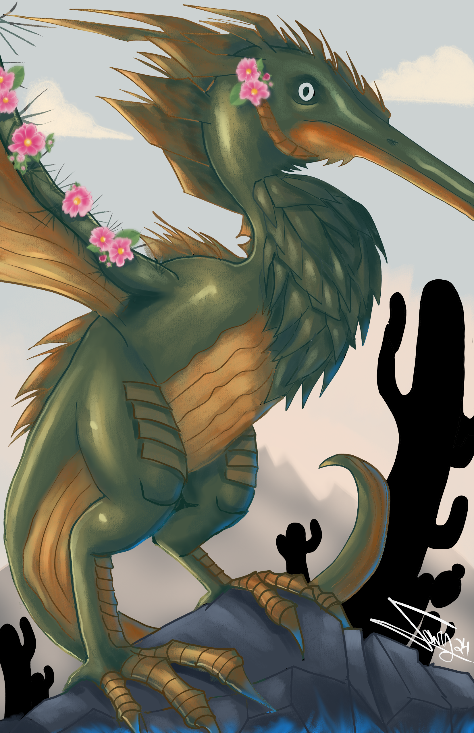 Towry
Towry Tyberius
 VernNYC
January 30, 2024
Usagi Yojimbo: Ice & Snow #5 Cover
 For the Ice & Snow Usagi Yojimbo series now being published at Dark Horse I was asked by Stan Sakai to contribute two covers. To the left you can see my final cover art for issue #5.
This cover was new territory for me. In the past my Usagi covers have either been for classic reprints where the entire arc was finished and ready to read, or the Usagi/TMNT crossovers where I completed once piece to sum up the entire series based on some amount of completed material. But, for Ice & Snow, we were working far enough in advance that I didn't have any of Stan's pages for the issue, just an outline & description.
Below I'll go through the steps of creating the piece.
 For Issue 5, all I was told for a long while was that it was a stand alone issue. Then Stan gave me an outline of the plot that involved a mountain town over-run by scary cats.
So, I started drawing characters on copy paper. I certainly pulled from my experience drawing the Cats Trio characters. Usagi and Yukichi were easier to draw (as they were meant to be more straight, no action, just calm reaction. The setting was based on a 3D model I found online and rotated to the right angle for the figures.
I scanned in the drawings of everything, assembled them and did quick color blocking to get approval.
 When the above was approved, I printed out the layout/pencils and taped them to the back of a sheet of Strathmore 300 series bristol with some painter's tape. On my Huion lightpad I can see through the surface of the bristol to the layout and use it as a guide to ink from. I used Copic Multiliner SP pens (the 0.3 & 0.7 nibs) as I inked the piece.
The complicated amount of overlapping figures made my main goal when inking to vary the density of texture so that the forms could be read clearly from one another.
 Stan & Co. approved the inks and I was able to scan them and begin the coloring process. That first step in coloring is known as 'flatting' which is a professional version of coloring-in-the-lines with flat color (no texture, no shading).
Some of the color choices were roughed in for the layout, but still needed to be adjusted for value, hue, and saturation to go with the more stark inks.
At this stage I also established the color holds (areas where I want the lineart to be a color other than black) for the snow, cat's eyes, clothing pattern, and Usagi's scar.
The last step to coloring (seen below) is the rendering. I used the dodge and burn tools along with a stock textured brush to add shadows and highlights.

Usagi Yojimbo Ice & Snow #5 will be in stores Feb. 14th
David Petersen's Blog

- David Petersen's profile
- 339 followers

