
David Petersen's Blog, page 12
September 5, 2023
Lava Lion Dragon
 Last Friday on my Twitch Stream, we did the #DiscoveringDragons Community-Draw-Along! It's a fun event where I welcome all skill levels to push their pencils (or whatever tools they use to make art).
I worked on my piece live on my Twitch stream while viewers worked at home and then on Monday we shared our finished pieces.
Here is my finished colored Dragon. And below are my steps to create it as well as the community submissions.
 For #DiscoveringDragons, I post two or three prompt words for everyone to make into a dragon. It's a nice framework for artists of any skill level to focus some time on an 'assignment' to shake the rust off or get the pencil moving again––all while also being loose enough that there's plenty of room for individual expression and interpretation.
This month the prompt was two words: Lava & Lion.
I opened several tabs of google image searches of dragons, Lava flows, Lions, Stone sculptures of lions, etc.

In my 'Dragon' search tab, I found an illustration for a Magic Card with a dragon flying with the rear legs tucking under it while breathing fire. I used that pose as the start for my piece.
Even before that I knew I wanted my lion headed dragon to be vomiting lava, so the head pose needed to work with that. I sketched the head and body on a sheet of copy paper, and then scanned it into photoshop as I blocked in some wings using clip art as a guide.
When the wing clip art was where I wanted after some resizing, warping, etc. I printed it out and drew lava versions over the top in pencil on a light pad. The entire drawing was merged in Photoshop and tinted to make seeing it a little easier.
 The printout was taped it to the back of a sheet of Strathmore 300 series bristol. Using a lightpad, I was able to see through the surface of the bristol as I inked the dragon. I used Copic Multiliner 0.3 and 0.5 SP pen to ink the art.
 The inking on this piece was all about texture and trying to retain some of the subtlety around the lion's face from the pencils (most of which I think I lost). I found that the later pencils on the tail and wings were the easiest to ink, and that might be that they were more open areas, unlike the forms of the lion's face.
 I was unable to get the inks finished before my stream ended but I wished the viewers all luck with their pieces and told them we'd take a look at everyone's work on Monday.
After some dinner, I came back up to the studio and finished inking the piece and then scanned the bristol to start the color flatting process––basically professional coloring-in-the-lines. First step was creating color holds (areas where I want the ink lines to be a color other than black) for the entire dragon as well as the lighter ones around the eyes, in the wings, horns, and the lava flow. Then I flatted in two colors: the overall creature, and the lighter bits.
For the final colors I did do a bit of painting with the paintbrush tool, but did most of the highlights, shading, and texture with the dodge and burn tools and a stock photoshop texture brush. Below you can again see the final rendered dragon.

But, as this is a community event, I wanted to share all the other entries posted in the Discord.

88UncleErnie
 anelanlani WIP
 Art Vogt
 Capt.Nemo
 Doombot79
 joedudeit
 Jonathan Towry WIP
 Nate Pride WIP
 Nuvalo WIP
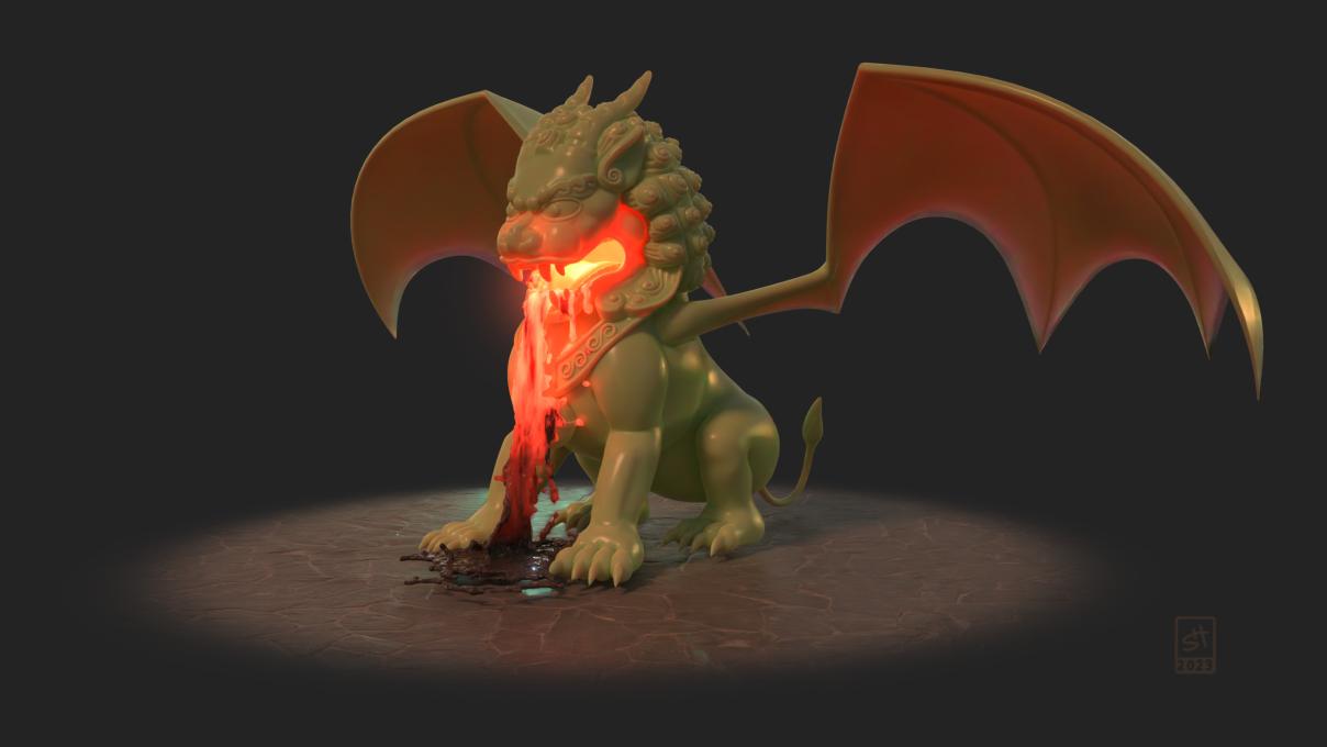 redSkwrl
  sleeplessninja WIP
 SummerDragoness
 VernNYC


August 29, 2023
Loukas & Saxon Calendar Piece
 I was asked by Scott Dunbier if I'd like to contribute an original piece to the charity auction he runs for the Hero Initiative at Baltimore Comic Con next month
The original inks (see below) were turned over to Scott at San Diego Comic Con and will be included in the auction.
But I decided even before I started on the piece, that it could pull double duty and be used for a 2024 Mouse Guard Calendar. So, my process was more involved since I knew the final piece would also be colored and used for print.
 For a subject matter I started with the idea of drawing Loukas, Saxon's Mentor who made an appearance in Winter. I thought it would be cool to have a strong veteran of the Mouse Guard as the focus of the piece. But somewhere in drawing him on a sheet of copy paper, I also wondered what it would look like if I added a young Saxon. And as I drew Sax, I decided not to draw a cloak, but to draw him in a pre-Guard induction vest.
These drawings were done on copy paper, scanned into Photoshop, assembled with a quick digital flat painting and background
 I printed the above digitally assembled layout onto two sheets of legal sized paper (taping them together so the image was 11" x 11") and then taped them with painter's tape onto the bak of a sheet of Strathmore 300 series Bristol.
On my Huion Lightpapd I was able to see through the surface of the bristol down to the printout and use it as my 'pencils' as I worked. I used Copic Multiliner SP pens (the 0.3 & 0.7 nibs).
Because the inks were set to be auctioned, I wanted to do something with lots of line weight and texture while sting being clear to read and very clean.

With the inks finished, I scanned them into Photoshop and started the coloring process. That first step is known as 'Flatting' and essentially is professional coloring-inside-the-lines. A lot of the color palette was established both by the cannon of what I know the characters look like, but also from my layout stage.
Here I also established color holds (areas where I want the ink lines to be a color other than black) on the oak leaves, Loukas' plaid tunic, and Saxon's scratches.

The final step was to render the piece. I used the Dodge and Burn tools in Photoshop while using a stock textured brush.
The colored image will appear in a calendar for 2024––AND the original inks will be in the Hero Initiative auction at Baltimore Comic Con.
Art will be available for viewing both at the Baltimore Comic-Con, and at Hero Initiative’s website: https://www.heroinitiative.org/portfolio-item/2023-baltimore-comic-con-auction/
In addition to bidding at the auction, advance proxy bidding will also be available via Hero’s website with a strict deadline of August 31, 2023. Hero will begin accepting bids on August 21.
August 22, 2023
The Bygones Fan Art
 For several years I've been a fan of the music of Joshua Lee Turner. I've enjoyed his solo work, his collaborations with Carson McKee, and more recently his pairing with Allison Young as 'The Bygones'.
Josh & Allison currently have a Kickstarter running for a first full album and tour for The Bygones (funded in less than 48 hours!): https://www.kickstarter.com/projects/thebygonesband/the-bygones-first-full-album-and-tour-3
I decided, just for fun, to do some fan art of the duo as birds in a mock poster/tee design––sort of as a thank you for the enjoyment they've given me through their music. Below is a bit of process & inspiration for the piece, as well as some links to videos of Josh, Carson, & Allison's music.
 The piece started with inspiration of a drawing Allison did as part of the Kickstarter graphics with little bird versions of them singing and playing the guitar. I based my birds on house finches, but added in some glasses on Josh and looked at specific references of his guitar and classic microphones that Allison uses when she preforms with Post Modern Jukebox.
I drew the duo traditionally in pencil on copy paper and then added some digital tweaks for my layout with a stock banner shape, clip art notes, a font for the text, and straight lines for the guitar strings.
 I printed the above layout onto copy paper and taped it to the back of a sheet of Strathmore 300 series bristol. On my Huion lightpad I was able to see through the surface of the bristol to the image below and used it as a guide to ink from.
For pens I used Copic Multiliner SP's with the 0.7 & 0.3 nibs. The pencils were pretty tight with a lot of lineweight work already done, so the inks were mostly about reinforcing that without screwing it up and overworking it in the process.
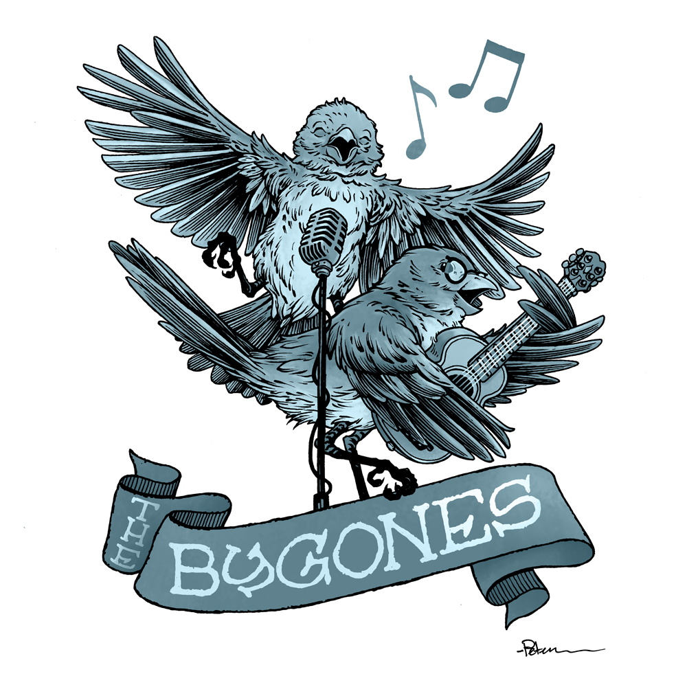 In addition to the full color version you saw at the top of this post (where I ignored real-life finch color patterns and went for nodes to Allison & Josh's hair as base colors), I tried making something a little more vintage looking with a monochrome grey-blue tinted version.
Again, this art was done just for fun, to share with Josh & Allison (who wrote me back very kind notes on Instagram), and to help get more eyes and ears to music and musicians I appreciate.
Here is The Bygones Kickstarter link: https://www.kickstarter.com/projects/thebygonesband/the-bygones-first-full-album-and-tour-3 (still time to help fund and get a copy of the album early)
And here are some videos of the music that inspired me to back their album and follow their music.

Public Life –– Solo Album by Joshua Lee Turner
After seeing some of Josh's YouTube videos of him playing covers or explaining Nick Drake's guitar specifics, this was the work of his that got me hooked. It was my go-to Pandemic soundtrack starter. There's a Paul Simon & Nick Drake quality to this album that I really love.
Below is the entire album as a playlist on YouTube:
UNAMERICANA –– The Other Favorites
(Carson McKee & Joshua Lee Turner)
Carson is Josh's long time friend and collaborator and together they are a Folk duo called The Other Favorites. This album was released during the pandemic––I think one track per week. There's a Kingston Trio meets Simon and Garfunkel meets Tennessee Ernie Ford feel to the set-list, and while it leans more classic country than I normally go, I'm happy to be there for this album.
Below is the entire album as a single video on YouTube:
 In The Hollow Wood ––– The Bygones
As the Kickstarter is currently going for their first album, (https://www.kickstarter.com/projects/thebygonesband/the-bygones-first-full-album-and-tour-3)there isn't a lot of original music available from The Bygones yet...but Josh and Allison have performed many times together on Josh's YouTube channel.
But one song that has been released is 'In The Hollow Wood' A dreamy lullaby folk ballad that evokes the tale of Shel Silverstein's The Giving Tree.
Below is a video of that song on YouTube:
August 15, 2023
Wild's End cover
 Wilds End is back for a 4th series. From Dan Abnett & I.N.J. Culbard, publisged by BOOM! Studios is this anthropomorphic mix of Wind in the Willows & War of the Worlds.
I've been asked to provide a variant cover for Issue #3 of the series and in this blogpost I'll go through the steps to making the final art you see here.
If you'd like to go back and see a variant cover I did for Volume 1, I have a blogpost for that one too: http://davidpetersen.blogspot.com/2014/06/wilds-end-cover-process.html
 Layout: I was given an outline of some early issues, some character concept art, and some editor suggestions for cover ideas. One of which I mis-read as 'All the characters shocked to be pulling in one of the aliens in their fishing net'––when in-fact it was more like 'one character, looking away not noticing the alien is trapped in the net'. Whoops.
 Well I drew these characters each separately on copy paper, and assembled them in Photoshop. I also had a 3D fishing boat model as reference, and I pasted in a drawing from the concept art of the alien 'lantern body'. I added some flat colors to help me see all the forms and plan for avoiding tangents and bad compositional overlaps, and I sent it off, apologizing to the editor for misreading the brief and hoping it would still be ok.
 Inks: Turns out it was ok. The team liked the composition and felt that since this is a variant cover, I had more narrative leeway. I printed out the above layout and taped it to the back of a sheet of Strathmore 300 series 11" x 17" bristol.
On my Huion lightpad I was able to see through the surface of the bristol to use the printout as a guide to ink from. I used Copic Multiliner SP pens (the 0.7 & 0.3 nibs).
Most of the inking was straight forward, but I did consider inking the badger character's dark spots flat black, before opting to leave them open so I could show more fur texture and details around the muscles & eye.
 Color Flats: When the inks were approved by the editorial team, I scanned them in and started the coloring process by painting in mostly flat colors. This process, known as 'flatting' is a professional version of coloring in the lines, but also helps set up the digital file to be able to later re-isolate areas to render them separately.
 Many of my color choices were already established in my layout, but they still needed subtle shifts in value, hue, and saturation until it all looked right against the inked lines rather than a pencil drawing collage.
I added in color hold (areas where I want the ink work to be a color other than black) on the Badger's tattoos, the ship's lettering, the alien's tentacles, the cat's eyes, and the polkadot bandanna.
 Final Colors: The last step was to render the color. I do this with Photoshop's Dodge (lighten) and Burn (Darken) tools and a stock textured brush (Dry Brush).
Around character's noses I also lassoed areas and tinted them a bit pinker/warmer as well as using a textured paint brush to add some rust coloration to the ship's hull.
Wild's End Vol. 4 Issue #3 is available for your comic shop tomorrow August 16th
August 8, 2023
Many-Eyed Bone Moon Dragon
 Last Friday on my Twitch Stream, we did the #DiscoveringDragons Community-Draw-Along! It's a fun event where I welcome all skill levels to push their pencils (or whatever tools they use to make art).
I worked on my piece live on my Twitch stream while viewers worked at home and then on Monday we shared our finished pieces.
Here is my finished colored Dragon. And below are my steps to create it as well as the community submissions.
 For #DiscoveringDragons, I post two or three prompt words for everyone to make into a dragon. It's a nice framework for artists of any skill level to focus some time on an 'assignment' to shake the rust off or get the pencil moving again––all while also being loose enough that there's plenty of room for individual expression and interpretation.
This month the prompt was three words: Many-Eyed, Bone, & Moon.
I opened several tabs of google image searches of dragons, pterosaur skeletons, bird skulls, and of the moon phases.
 I knew from the start I wanted a dragon that had the stance of a walking pterosaur. So, I started with that body drawing. I didn't leave quite enough room on the sheet of copy paper for the head, so I drew it separately on another sheet (referencing bird skulls, but adding more possible eye sockets).
Somewhere in there my concept of a halo of moons in their phases (with the skull lighting them like a sun) it dawned on me that those moons could also serve as the many eyes.
I scanned the drawings I had, merged them in photoshop, used some shape tools to lay out the moon-eyes and did a quick color blocking to see the forms better. I then printed it out so I could ink it.
 The printout was taped it to the back of a sheet of Strathmore 300 series bristol. Using a lightpad, I was able to see through the surface of the bristol as I inked the dragon. I used Copic Multiliner 0.7 SP pen to ink the art.
 Most of the inking was straight forward other than the on-the-spot line weights and contours that imply more form and planes to the bones. I also wanted to play with the idea of this dragon glowing a bit, but also letting off some darkness (like the Balrog being a creature of smoke and shadow--but also flame). So, on the back of the bristol I stippled in a darkness aura around the creature while leaving a little air gap around it.

I was unable to get the inks finished before my stream ended but I wished the viewers all luck with their pieces and told them we'd take a look at everyone's work on Monday.
After some dinner, I came back up to the studio and finished inking the piece and then scanned both sides of the bristol and assembled them to start the color flatting process––basically professional coloring-in-the-lines. I kept the idea from the layout phase of using a yellow-purple contrast for my color scheme (though toned down more). I also added color holds to the darkness aura (making it a pale mauve), the moon-eyes, & pupils.
For the final colors and all the highlights, shading, and texture I used the dodge and burn tools with a stock photoshop texture brush. Below you can again see the final rendered dragon.

But, as this is a community event, I wanted to share all the other entries posted in the Discord.
 Capt.Nemo
 Doombot79
 jodudeit
 JustPottering22
 realtidydesign_prime
 RedSkwrl
 Sleepless Ninja
 TowryGames
 VernNYC
August 1, 2023
Recent Toned Commissions
My Toned Commissions from SDCC
 A Guardmouse that resembles the fan who commissioned it.
 Hawk Wizard
 A Frodo-esque Mouse
 A Samwise-esque Mouse
 Usagi Yojimbo
 Kenzie
 Mrs. Brisby from Secret of NIMH
 Gwendolyn
 Fan's RPG character with a concertina
  A dog named River
July 25, 2023
American Flagg! Baltimore Yearbook 2023
 For over a decade the Baltimore Comic Con has published a convention art book called 'The Baltimore Yearbook' that usually features a creator-owned character or property, where that creator is a guest of the convention. Selected guest artists are asked to contribute a piece of fan art for the book to celebrate the creator and property. It allows us to play in someone's world, and offers a chance for attendees to meet new creators as they go around the show floor collecting autographs in their yearbook.
This year 1First Publishing is celebrating its 40th anniversary so the subjects are Nexus, Grimjack, American Flagg, E-Man, MARS!, Jon Sable, & Starslayer. To the left you can see my final piece. Below I'll go through the steps.
 Layout: I wasn't terribly familiar with the characters from these creator-owned series, but I had seen some Nexus & American Flagg comics. Knowing Steve Rude's Nexus would be getting a lot of love, I decided to go for American Flagg. I did my research about the Sci-fi political satire nature of the comic and how important TVs and messaging (subliminal hypnosis) was in it. So I drew Reuben Flagg with a TV remote pushing a 1First Comics button. The rest of the layout was just an assembly of stock photos of TVs, a flag, a cat, static, and covers from the various other 1First comics being celebrated in the Yearbook.
Wanting to get a James Bond feel to the piece, I thought it would be fun to place a sniper's scope crosshairs over Flagg––but instead make it an old TV test pattern. The only thing I really drew was Flagg himself, and I certainly used photo reference for the hand and remote.
 Inks: When I was satisfied with the above layout, I printed it out (without the test pattern) and taped it to the back of a sheet of Strathmore 300 series 14" x 17" bristol. On my Huion lightpad I was able to see the printout through the bristol and ink without transferring pencils to the board.
Inking the TV cases over and over got a bit tedious, and Reuben was so big, he was easy. The hardest part was inking in all the homages to the other 1First covers at that tiny scale. I tried to just be loose since it was all an interpretation being displayed on a screen anyhow.
The cat on screen is another character in American Flagg, Raul, a talking tabby with mechanical gloves that lets him use his 'hands'
 Overlay: To get the Test Pattern cross-hairs to look like my layout, I needed to ink it separately on another sheet of bristol. First I took a real test pattern and then cleaned it up and replaced the Indian head on top with Flagg's logo. Then I printed it out on copy paper. Not wanting to use as large of a sheet of bristol just for this effect, I shrunk the design down before printing it and taping it to the back of a sheet of 12" x 12" Strathmore 300 bristol.
 On the lightpad I inked everything as carefully as I could, but without rulers so it still looked hand drawn. I then scanned the overlay sheet at a higher resolution to make up for it being smaller than the other inks without losing line quality.
 Color Flats: Once the inks were done I scanned them and started the color flatting process. This is a professional version of coloring-in-the-lines.
Many of the color choices were already decided in my layout, but as always, there's need to shift the values, hues, and saturation until it looks right with the darker ink lines.
I also established color holds (areas where I want the ink lines to be a color other than black) on any linework inside the TV screens, the stripes and stars on Flagg's lapels, and the buttons and light on the remote.

Final Art: For this cover, I approached some of the rendering a little differently and painted in the shading with a paintbrush rather than my normal dodge and burn tools. I still used them, but much less than normal. I though doing such a different subject matter afforded me the room to have the final result look a little different from my Mouse Guard work.
The Overlay sheet was added and painted away in a few areas for visual clarity.
This piece will be published in the Baltimore Yearbook. That book will be available for purchase at the convention and through the con's website afterwards. The original inked piece will also be for sale in the art auction at the con on Saturday.
 2022: Scary Godmother:
https://davidpetersen.blogspot.com/2022/10/scary-godmother-tribute-for-baltimore.html
 2021: Halloween:https://davidpetersen.blogspot.com/2021/10/happy-halloween-baltimore-yearbook.html
 2019: Blacksad:
https://davidpetersen.blogspot.com/2019/10/blacksad-for-baltimore-yearbook.html
 2018: Strangers in Paradise:https://davidpetersen.blogspot.com/2018/09/baltimore-yearbook-strangers-in-paradise.html
 2017: Tellos:https://davidpetersen.blogspot.com/2017/09/tellos-baltimore-comic-con-yearbook.html
 2016: Archie:http://davidpetersen.blogspot.com/2016/08/baltimore-yearbook-2016-archie-process.html
 2015: Mouse Guard:http://davidpetersen.blogspot.com/2015/09/baltimore-comic-con-yearbook-cover.html
 2014: Grendel:http://davidpetersen.blogspot.com/2014/08/baltimore-yearbook-grendel.html
 2012: Liberty Meadows:http://davidpetersen.blogspot.com/2012/09/baltimore-comic-con-yearbook-2012-this.html
July 18, 2023
Mouse Guard Portraits for SDCC
 In anticipation for SDCC 2023, I painted four Mouse Guard watercolor portraits of Saxon, Kenzie, Sadie, & Lieam.
 I had some cut-offs from trimming down the boards from my large HeroesCon watercolors of the Gummi Bears & Ducktales (http://davidpetersen.blogspot.com/2023/06/heroes-con-2023-paintings.html).
These Mouse portraits are each 7.5" x 10" and will be for sale at my table at SDCC. In this blogpost, I'll go through several stages of the watercolor painting
 I started with a pencil drawing of each of the mice. The Saxon drawing was based on a real mouse Photograph I'd planned to use for this year's Bookplate inspiration, which is why I went a little more realistic real-world mouse on the designs for these. I did a quick digital color pass over my pencil drawings to get a sense of value and color choices.
 I transferred the drawings to the thicker illustration board (suitable for watercolors) with graphite paper (pressing down while tracing a copy of the drawing on top of the illustration board transfers the image) and started with a light subtle pale wash--and then apparently started laying in fur color on Lieam.
 because I knew the backgrounds were going to be more sloppy, blended, and wet, I started on those early.
 Lightest tones on the mice went next, ie the bare skin of the hands, noses, ears, tails, and eyes.
 more tone and depth to those lighter areas as well as some weapon details.
 base fur tones for Saxon and Kenzie while Lieam is getting more definition and Sadie has her front cloak panel lightly blocked in.
 Then cloaks for Saxon and Kenzie, fur for Sadie, and a background for Lieam (which I saved because of how dark I knew it was planned to be).
Unfortunately, in the second session of painting, I forgot to take any photos until I was finished––Luckily I did stream that painting session, and so I have a timelapse video that takes us to the end stage.
 Here again are the paintings finished––but before I added a dark brown color pencil 'ink' line as seen below
 SAXON
SAXON KENZIE
 SADIE
SADIE LIEAM
LIEAM
July 11, 2023
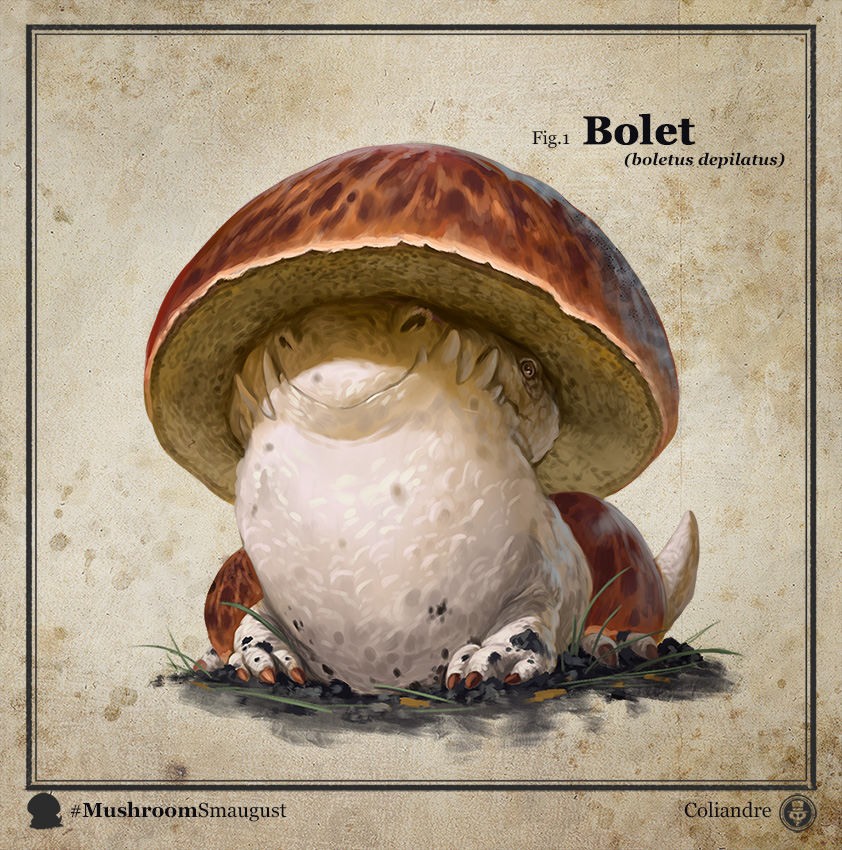
Drunkard Mushroom Dragon
 Last Friday on my Twitch Stream, we did the #DiscoveringDragons Community-Draw-Along! It's a fun event where I welcome all skill levels to push their pencils (or whatever tools they use to make art).
I worked on my piece live on my Twitch stream while viewers worked at home and then on Monday we shared our finished pieces.
Here is my finished colored Dragon. And below are my steps to create it as well as the community submissions.
 For #DiscoveringDragons, I post two or three prompt words for everyone to make into a dragon. It's a nice framework for artists of any skill level to focus some time on an 'assignment' to shake the rust off or get the pencil moving again––all while also being loose enough that there's plenty of room for individual expression and interpretation.
This month the prompt was three words: Drunkard & Mushroom.
I opened a few tabs of google image searches of various mushroom species, images of people drunk, & dragons. I also found an artist named 'Coliandre' who did a whole #Smaugust series of mushroom dragons (which inspired me, but also was hard to avoid when coming up with my own ideas)
 I had several mis-starts (not pictured) of mushroom shapes with toothy mouths like The Bolete of Coliandre's. I then saw a photo of a Komodo Dragon in my 'dragon' search bar and it lead to the pencils you see on the left. It's pencil on copy paper, incorporating fly agaric caps, morel pores, enokis, and mushroom gills.
 On a separate sheet of copy paper I drew the 'wings' and then assembled the two drawings together in Photoshop and added in flat colors just to help me see the forms and know where certain textures would begin and end.
I then printed it out so I could ink it.
 The printout was taped it to the back of a sheet of Strathmore 300 series bristol. Using a lightpad, I was able to see through the surface of the bristol as I inked the dragon. I used Copic Multiliner 0.7 SP pen to ink the art.
 The texture of the morel pores was where I dove in and had the most fun. I was certainly inspired by the textures of my friend Nate Pride's ink work. The rest of the linework was my normal thick/thin line weights and varying densities of detail.
I was unable to get the inks finished before my stream ended but I wished the viewers all luck with their pieces and told them we'd take a look at everyone's work on Monday.

After some dinner, I came back up to the studio and finished inking the piece. The next day I started the coloring process as I listed to a live streamed concert by Joshua Lee Turner. The first step in coloring (after scanning and cleaning up the scan) is to flat in the colors––basically professional coloring-in-the-lines.
It was a fairly basic color palette I'd already established in the pencils/layout. This piece had very few color holds (areas where I want the line art to be a color other than black) only on the pupils and the roots coming off the pads of the feet.
For the final colors and all the highlights, shading, and texture I used the dodge and burn tools with a stock photoshop texture brush. and I added the Psionic designs in on a new layer and added an outer glow effect. Below you can again see the final rendered dragon.

But, as this is a community event, I wanted to share all the other entries posted in the Discord.
 Capt.Nemo
 JustPottering22
 88UncleErnie
 JoDudeIt
 Jonathan Towry
 lukas
lukas Nate Pride
 Nuvalo
 RedSkwrl
July 4, 2023
Recent Toned Commissions
My Commissions from Cherry Capital Con & Heroes Con
 A Harvester Mouse
 Slash from TMNT
 Krypto
 A Worm With A Moustache #PUMPRULES
 Saxon
Saxon The Silver Surfer
 A Mouse Harvester
 A Dog named Freddie
 A Kobold Artificer (D&D Character)
 King Dok (from Bone)
 Darkwing Duck
 A Guardmouse with a bee
 A Kraken
 Darkwing Duck
 The Last Unicorn
 A Fan's pet rat as a Guardmouse
David Petersen's Blog

- David Petersen's profile
- 339 followers

