
Todd Klein's Blog, page 98
January 11, 2021
Ira Schnapp in DC ANNUALS
 Images © DC Comics
The idea of annuals as larger than usual collections of material, often reprints, has a long tradition in England and America going back to the late 1800s. Comics annuals, or annual-sized collections of reprints, began turning up from DC as early as 1935 with THE BIG BOOK OF FUN COMICS from National Allied Publications, the company that became DC Comics, and some publishers like Archie were issuing them regularly by 1950. DC did not begin annuals featuring their superheroes until 1960 with the publication of SUPERMAN ANNUAL #1, cover above, which set the style, a large central image surrounded by smaller ones. At the time, reprints of DC comics were almost unknown, and back issues were hard or impossible to find, so readers often knew little about the history and previous appearances of the characters. This comic, delving into the past, was the first time many like myself had any idea what had come before 1960, and it must have sold very well, as DC was soon putting out several annuals a year. In 1964, they decided to make a series from the annual format called 80-PAGE GIANT, and for over a year issued monthly annual reprint collections under that name. After issue #15, the Giants abandoned their own numbering and later ones were numbered as issues of the series they were collecting, so for instance, 80-Page Giant #G-16 featured The Justice League of America and is also issue #39 of that series. I’ve already shown a few of those in other articles, and won’t be covering them here, where I’ll focus on annuals that had their own numbering and were not part of any other series.
One thing that made reprints harder at DC was that they did not have copies of the art or printing materials for many of their older stories. Some time after Irwin Donenfeld, son of company co-owner Harry Donenfeld, joined the editorial staff around 1948, he established a new policy that the company would get back the film negatives created by the color separator to make the printing plates for all their titles rather than the previous system of chemically melting them to recapture the silver used to make the negatives. DC’s film archives begin at that time, and having them meant that reprinting those stories was much easier. Stories before then could only be reprinted by more expensive and time consuming methods like bleaching the color out of actual comics pages to make new art images and then retouching them, sometimes heavily, to get anything printable. It was done occasionally for important early issues, but not on a regular basis in the period covered here, which is to the end of the 1960s. That’s why DC’s reprints are mainly drawn from 1950s-1960s stories in this era.
Ira Schnapp did cover lettering on nearly all the annuals from the 1960s, sometimes including the back covers, and he occasionally lettered special one or two-page fillers inside the books. On the cover of the first annual, above, dated Summer 1960, he designed GIANT and ANNUAL to go with his SUPERMAN logo from 1940, as well as the rest of the lettering.

For the back cover he did the large lettering across the center. Three of the old covers shown have logos and cover lettering by Ira, but they’re indexed in those titles, and not here. Many of the reprinted stories in the annuals are lettered by Ira too, but again, covered elsewhere under the original printings. The Map of Krypton mentioned on the cover was not lettered by Schnapp. Rather than go strictly by date, I’m going to cover each annual series separately, so all the Superman ones first.

For the cover of issue #2 dated Winter 1960, Ira added an exclamation point to the logo, and of course did all the other lettering. This one was a favorite from my childhood, I knew almost nothing about the villains featured.

Ira did two large blurbs for the back cover. The top one was reused many times on other annuals. The idea of any comic being a collector’s item was still new to many readers, but obviously it caught on in a big way!

I couldn’t find a good image of the map described on the cover, but I did find the original art on the Heritage Auctions site (ha.com), and it has lots of Schnapp lettering. I don’t know who wrote and drew this, but it’s a clever summary of the Superman origin at the time, and Ira’s lettering makes it all look official. I particularly like his bottom title. This was a single page here, but reprinted as two pages in other later comics.

Ira’s cover lettering for issue #3 follows the same plan as the others, so everyone must have liked it. The thing that catches my eye is the long stroke on the F in the subtitle at the top that extends down over the picture.

The back cover has a pinup or signed “photo” of Superman. The art for this had been around since the early 1940s, and was used on promotional postcards. That version had different lettering in the inscription, so I think Ira redid it for this version.


Ira lettered the two-page filler “Secrets of the Fortress of Solitude” mentioned on the cover, and I’m showing it here in two parts. The full explanation mentioned was set in type. I bet these fillers were a nice change of pace for Ira, and less work than lettering regular pages.

Issue #4 has a new design with a large round Schnapp caption at the center. Ira rarely used round captions, but it works well here. Though they were called Annuals, DC was issuing these twice a year, so for instance #3 is dated Summer 1961 and #4 Winter 1961. Starting here the issue number is lettered.

On the back cover of #4, the top blurb is a reprint, the bottom one is new.


Ira lettered this two-page filler about the Legion of Super-Heroes in issue #4. Again, the details were elsewhere and typeset. Interesting that Chameleon Boy had to have explanatory balloon lettering.

Issue #5 has another new cover layout but otherwise familiar Schnapp lettering. The back cover has no new lettering. Starting here the price and 80 PAGES are lettered, so now there’s almost no type on the cover.

Issue #6 dated Winter 1962-63 returns to the original layout, which I think works best. Some of Ira’s lettering is cropped or almost cropped off the edges here, At the time, high-speed printing and trimming was less precise, and I bet other copies of this cover avoided that.

The back cover of #6 has this great Superman Family pinup by artists Curt Swan and George Klein (no relation). Ira lettered only the label at the bottom, but I thought it was still worth counting. This also appeared in other places later.

Issue #7 has a metallic color treatment on the logo (not by Schnapp of course) and some fine lettering on the trophy as well as the usual captions by Ira.

Issue #8 dated Winter 1963-64 is the last in this series.

On the back cover, Ira lettered two large blurbs. Future Giant Annuals would actually be 80-Page Giants.

While not called an annual, this comic is one in every other way. It’s dated Summer 1961, the same as SUPERMAN ANNUAL #3. I had this as a child, and it answered many questions about the characters, and made me want to know more. The Challengers intro is just a section of the first story by Jack Kirby, and it took decades for me to find out what happened next. Everything is lettered by Ira Schnapp except the character names in the black banner. I like his SECRET ORIGINS logo, which would be used more times in the future, though this book was a one-shot. The back cover was essentially a house ad.

With the success of the Superman annuals, DC soon did the same thing with Batman. This first issue is dated Summer 1961, again the same as the third Superman Annual. The logo by Schnapp combines the classic Batman logo by Jerry Robinson from 1941 with new words GIANT and ANNUAL in a matching Art Deco style. Ira also lettered the subtitle in the box to the right of the logo, but the rest of the cover uses type. The layout is different from the standard Superman one, but follows the same idea.

With issue #2, everything is lettered by Schnapp except the price and issue number.

The back cover has this Batman Family pinup with a script signature I think is by Ira Schnapp. Despite the Bob Kane signature, the art is by Sheldon Moldoff.

Ira also lettered the large, handsome title on the calendar mentioned on the cover. It’s two pages, but the second page is all type. I love the way the A in CALENDAR is tucked into the C, and the swash on the right leg of the R.

Issue #3 has an innovative design probably by Sheldon Moldoff again, though it’s not credited. Everything is hand-lettered by Ira.

The back cover has a large blurb across the center by Schnapp.

Issue #4 dated Winter 1962-63 has new lettering by Ira in the subtitle caption and down the center. Notice how the word AND in the middle pulls it all together. I’m not sure what “Personal” adventures means, and the back cover has no new Schnapp lettering.

Issue #5 has lettering by someone other than Schnapp, I’m not sure who. Issue #6, above, has Ira’s lettering and follows the same design as #4. Issue #7 again has non-Schnapp lettering, and that’s the end of this series.

Surprisingly, Lois Lane had two of her own annuals dated Summer 1962, above, and Summer 1963. Ira only did lettering for the front cover of the first one, the second had Gaspar Saladino lettering. These covers followed the Superman Annual layout.

The Flash had a single annual dated 1963, and type was used on most of the cover. Ira’s only addition were the words GIANT and ANNUAL around his FLASH logo, though ANNUAL might have been picked up from elsewhere, along with 80 PAGES and the price.

The back cover has a pinup signature probably by Schnapp, though it’s hard to be sure with these short non-typical examples. The way the word FLASH is handled does suggest it’s by Ira.

Superboy had one annual dated 1964 with lots of front cover lettering by Ira, including additions to his SUPERBOY logo. That’s all of the stand-alone annual series from DC in the 1960s.

In 1964 DC decided to combine all their annual-sized books into a monthly series titled 80-PAGE GIANT that ran for 15 issues before being folded into the regular comics runs. This might have been a last minute decision, as this first issue was intended to be SUPERMAN ANNUAL #9. If you look at the burst around Ira’s 80 PG. GIANT lettering at the top, the bottom edge of the burst shows the outlines of the previous word GIANT from the GIANT SUPERMAN ANNUAL logo. Otherwise, the lettering is all fine, including another rare round caption by Schnapp.

The back cover blurb by Ira is full of old news, as the upcoming Lois Lane book would be 80-PAGE GIANT #3, not LOIS LANE ANNUAL #3. Same idea, of course.

Issue #2 focuses on Jimmy Olsen, and the cover design follows the most used Superman Annual one. If any series could provide weird stories, it’s Jimmy’s.

The back cover has a large Schnapp blurb across the center with some fine script.

Issue #3 is surprisingly light on images and lettering, with the simple background giving it a fresh look.

Issue #4, on the other hand, has lots of small pictures and plenty of Schnapp lettering. The art and layout by Carmine Infantino and Murphy Anderson is quite appealing to me.

Issue #5 is back to Batman, uses the same layout as previous Batman annuals, and is full of Ira’s lettering. Each of these issues would have been prepared by the editor of each series or feature, and followed their ideas.

Issue #6 is back to Superman and uses the standard layout for his annuals, which I still like the best. Note Ira’s attempt to be scary on the word THINGS.

Issue #7 features Sgt. Rock, and his logo is by Gaspar Saladino, but the apostrophe S and the rest of the cover lettering is by Ira Schnapp.


This two-page spread in #7 is lettered by Schnapp, and it’s almost a house ad, but there’s nothing really trying to sell these titles to readers. Instead it just explains who the stars of each title are. I’m calling it a filler not a house ad. Ira’s banner at the top is great.

Issue #8 dated Winter 1963-64 is the second use of Schnapp’s SECRET ORIGINS logo, this time with MORE added. I would have wanted this badly as a kid if I’d seen it.

Issue #9 is another I would have loved to read when it came out. Ira’s lettering in the central black box is particularly appealing.

Issue #10 follows the Superman Annual layout again. Who could resist those enticing stories?

Back to Superman for issue #11 in this all-Luthor issue.

Here’s an interesting one-page filler from #11 showing an unused cover for SUPERMAN #175. Some of the text in the lettering is the same, but the revised cover was all relettered by Schnapp. This version would have remained unknown if not seen here. I’m not sure if Ira did the title at the top of the page.

Issue #12 is Batman again, following the Batman Annual layout, and with lots of large, appealing Schnapp lettering in the open spaces. Ira spent more time on covers than inside pages, and it shows.

Issue #13 has an interesting twist: all the stories are described in newspaper headlines rather than regular captions. Putting them in curved perspective was no problem for Schnapp.

Issue #14 has a more open layout and fewer boxes, and the art and lettering look good. Calling Supergirl a girlfriend of Superman is a bit of a stretch.

This one-page filler showing Lois’s hairstyles in different stories is new for #14 and lettered by Ira.

The final issue in this series features stories from WORLD’S FINEST COMICS without using that book’s logo. Instead, the dual character logos from many of the story splash pages are used, and they work fine with all the other Ira Schnapp lettering. The circular panels are an interesting choice.
Here are the covers lettered by Ira Schnapp. Where he did both front and back covers I’ve noted it as two pages.
Superman Annual: #1 2pp, #2 2pp, #3 1pp, #4 2pp, #5 1pp, #6 2pp, #7 1pp, #8 2pp
Batman Annual: #1 1pp, #2 1pp, #3 2pp, #4 1pp, #6 1pp
Secret Origins #1 (1961) 1pp
Lois Lane Annual #1 1pp
Flash Annual #1 2pp
Superboy Annual #1 1pp
80-Page Giant #1 2pp, #2 2pp, #3 1pp, #4 1pp, #5 1pp, #6 1pp, #7 1pp, #8 1pp, #9 1pp, #10 1pp, #11 1pp, #12 1pp, #13 1pp, #14 1pp, #15 1pp
That’s a total of 41 covers.
These few new inside pages were also lettered by Ira:
Superman Annual #2: How the Super-Family Came to Earth 1pp
Superman Annual #3: Secrets of the Fortress of Solitude 2pp
Superman Annual #4: Origin and Powers of the Legion of Super-Heroes 2pp
Batman Annual #2: 1962 Calendar 1pp
80-Page Giant #7: DC’s Blazing Gallery of Battle Stars 2pp
80-Page Giant #11: Unused Cover for Superman #175 1pp
80-Page Giant #14: Lois Lane’s Hairstyles 1pp
That’s 10 pages in all.
More articles like this are on the Comics Creation page of my blog.
The post Ira Schnapp in DC ANNUALS appeared first on Todd's Blog.


January 10, 2021
And Then I Read: THE DANGEROUS JOURNEY by Tove Jansson

This is the final book in the Moomin saga, and it’s a short picture book for younger readers, but so full of action and suspense, it seems longer. It was published in 1977.

The story begins with Susanna who thinks her life is too peaceful, and she longs for danger. A pair of magic glasses appear, and when she puts them on, everything changes, and won’t change back. Susanna flees from one danger to another until she meets some old friends from other Moomin books: the Hemulen, Sniff, Thingummy and Bob, and Tooticky. Together they continue to flee new dangers that keep threatening them, until at last they are able to climb aboard a large passenger balloon in hopes it will bring them to safety in Moomin Valley.
The finale of this book is the best part, a last visit with the Moomins, and a satisfying if brief conclusion to the Moomin epic from Tove Jansson. Recommended.
Reviews of all the Moomin books and plenty more are on the Book Reviews page of my blog.
<br />
The post And Then I Read: THE DANGEROUS JOURNEY by Tove Jansson appeared first on Todd's Blog.
January 8, 2021
Ira Schnapp in GREEN LANTERN
 Images © DC Comics
The second of editor Julius Schwartz’s revamps of Golden Age DC superheroes was Green Lantern. The new version visually designed by artist Gil Kane first appeared in SHOWCASE #22-24 beginning in 1959, where it had a new Ira Schnapp logo. Ira’s block letters were given added interest by putting them in a flaming rectangle. The flames actually looked back to the Golden Age version of the character, whose powers were expressed in green flame. The new version used green energy beams. Despite that, I think the logo works well.

The same Schnapp logo was used when the character gained his own title beginning in 1960. The flaming box always ran off the cover on the left side. Ira also did the caption and thought balloon, and he lettered most of the covers until issue #59 in 1968. Schnapp lettered no pages inside the books, most of the stories were lettered by Gaspar Saladino.

Though Ira Schnapp’s logo and cover lettering looked back to previous decades with elements of Art Deco design, somehow it works quite well with Gil Kane’s art on these covers, perhaps because both were sleek and simple.

Issue #8 from 1961 has an unusual painted look because of added gray wash tones from colorist Jack Adler, who removed the caption border too.

Issue #12 has some classic stone-carved lettering by Schnapp on the statue pedestal in the Trajan style he knew well.

Green Lantern was also appearing in THE JUSTICE LEAGUE OF AMERICA, and faced some of the same villains in his own title. With issue #33 from 1964, a revised logo by Ira Schnapp removes the flaming box and puts the flames at the tops of the letters instead. Still not relevant to this version of the character, but I thought it looked great as a reader.

Issue #35 divides the cover into three panels, giving Schnapp more lettering to fit in, which he does expertly.

Issue #40 from 1965 not only teamed the Golden and Silver Age versions of the character, but filled in the background of the Green Lantern Corps and its Guardians of the Universe, all explained in Ira’s caption and word balloons.

The Flash was also an occasional guest in the series, as Green Lantern was in his. The two revamped characters worked well together. There’s too much Schnapp lettering on this cover (and perhaps his only use of brackets), but Ira fits it in…barely.

Issue #46 from 1966 is an unusual combination on the cover lettering. The circle caption at lower left is definitely by Schnapp. The burst caption at upper right looks more like the work of Gaspar Saladino, though the shape of the burst itself might be by Schnapp. Perhaps editor Schwartz asked Gaspar to redo it. At this time, Ira’s style was falling out of favor as being old-fashioned, while Gaspar’s work began to replace it.

Ira wasn’t quite done though, and his lettering for DAZZLER on issue #49 shows his creativity was still present.

Schnapp’s final cover lettering appeared on issue #59 from 1968, and it’s full of effective open lettering in Ira’s style that had been gracing DC’s covers since the late 1940s. This was a fine way for him to go out on the title.
Here are the covers lettered by Ira Schnapp: 1-20, 22-29, 31-37, 39-53, 55-59. That’s 55 in all.
More articles like this are on the Comics Creation page of my blog.
Green Lantern on Wikipedia.
Gil Kane on Wikipedia.
The post Ira Schnapp in GREEN LANTERN appeared first on Todd's Blog.
January 7, 2021
And Then I Read: NIGHT WATCH by Terry Pratchett
 Cover art by Paul Kidby after Rembrandt’s painting of the same name.
I came late to Terry Pratchett’s Discworld series, and so far have read less than half of them. This book is the sixth one featuring Sir Samuel Vimes, head of the City Watch of Discworld’s largest city, Ankh-Morpork. I haven’t read any of the others, though I do know Vimes from supporting roles in books I have read. I chose it because it’s on a list of Neil Gaiman’s favorite fantasy novels.
Sam Vimes’ job keeps him very busy, but not too busy to remember the anniversary of the death of his mentor as a young policeman, John Keel, fallen hero of the Glorious Revolution of thirty years earlier. After visiting Keel’s grave with others who were there, Vimes learns a vicious criminal, Carcer, has been found, and Vimes wants to make the collar himself. While trying to do so, Vimes and Carcer are caught in a magical storm that sends them thirty years into the past, where Vimes soon finds himself in jail, taken there by a green young recruit, his former self. Vimes discovers that he must take on the role of John Keel to not only teach young Vimes the things he needs to know, but to prevent the Glorious Revolution from becoming a much more deadly event than he remembers it, and also to recapture Carcer, who has killed the real John Keel.
The plot of this book runs like an expensive watch, but the real joy in reading it is the characters and Pratchett’s knowledge of human nature. Old Vimes, posing as John Keel, has his work cut out for him, but he remembers how that work is done, and finds himself enjoying the challenges of his situation. The other members of the Night Watch, and the many other people of power and influence he must deal with, are written of with gentle humor or scathing sarcasm, as they each play their part. The outcome, while expected, never feels certain, and tragedy is always waiting for one false move.
Recommended. I look forward to reading more about Sam Vimes.
The post And Then I Read: NIGHT WATCH by Terry Pratchett appeared first on Todd's Blog.
January 6, 2021
Ira Schnapp in DOBIE GILLIS and PAT BOONE
 Images © DC Comics
In 1960, DC Comics began another of their many TV comedy series, this one based on a teen romance humor show starring Dwayne Hickman as the title character and Bob Denver as his beatnik sidekick Maynard G. Krebs. The show ran from 1959 to 1963. DC editor Larry Nadle chose his favorite and best humor and personality artist, Bob Oksner, to pencil the stories, I think from the beginning, though the Grand Comics Database doesn’t credit him until issue #5. The logo, topline and balloons are all by Ira Schnapp, and he would letter most of the covers and most of the stories inside. Schnapp’s logo is handsome and cleverly uses hearts and script to enhance the block letters of the main title. I had a look at the TV show logo to see if there are any similarities, and there aren’t. Schnapp’s is much better!

All or most of the covers follow the same theme, with Dobie entranced by a woman and Maynard making a snide comment about that. The logo is pretty tall, but Oksner makes it work, and Ira squeezes in his word balloons where needed.

Issue #10’s cover has some fine sign work by Ira.

Issue #14 has the only use of an actor photo on the covers, in this case a supporting player, with Schnapp sign lettering.

Issue #22 has extra work for Ira on the tree inscriptions, which help tell the story perfectly.

By the final issue, #26 in 1964, the storylines had gotten very silly, but Ira’s lettering was consistently helping to sell the ideas.
I see Ira Schnapp lettering on these covers: 1-4, 6-16, 18, 20-22, 24-26, a total of 22.

A page of Ira’s lettering from the first issue which includes some musical dialogue by Maynard with Ira’s slightly off-model musical notes. As with other DC humor titles, this one usually had one long story broken into three chapters as well as a few one-page fillers, in this case mostly by Mort Drucker and often with Schnapp lettering.

The first page of the main story in issue #6 has some fine sign lettering by Ira.

Ira’s final story lettering was for issue #24, though he was unable to finish and eight of the pages are by Gaspar Saladino. The gimmick of using real girls in the stories, as seen here, was a good one, but too late to help sales.
Here are the stories lettered by Ira Schnapp, all feature Dobie Gillis unless titled otherwise:
#1 May/June 1960: 20pp, Maynard 4pp, Tina Teen 1pp
#2 July/Aug 1960: 26pp, Teen Age 1pp, Sister’s New Boyfriend 1pp
#3 Sept/Oct 1960: 26pp, Dee Jaye 1pp
#4 Nov/Dec 1960: 26pp
#5 Jan/Feb 1961: 1-21 of 26pp (21pp), Teen Views 1pp
#6 March/April 1961: 26pp, Teen Age 1pp, The Beat Set 1pp, On The Job 1pp
#7 May/June 1961: 26pp, Teen Debs 1pp
#8 July/Aug 1961 26pp
#9 Sept/Oct 1961: 26pp, Lola 1pp
#10 Nov/Dec 1961: 26pp, Teen Talk 1pp, Beat Nick 1pp
#11 Jan/Feb 1962: 26pp, Teen Age 1pp
#12 March/April 1962: 26pp
#13 May/June 1962: 26pp, Lola 1pp, Like Young 1pp
#14 July/Aug 1962: 26pp
#15 Sept/Oct 1962: 26pp, Young World 1pp
#16 Nov/Dec 1962: 26pp, It’s A Teen’s World 1pp
#17 Jan/Feb 1963: 26pp, Teen Age 1pp
#18 March/April 1963: 26pp, The Kids On My Block 1pp
#19 May/June 1963: Small Talk 1pp
#20 July/Aug 1963: 26pp
#21 Sept/Oct 1963: 26pp
#22 Nov/Dec 1963: 26pp
#23 Jan/Feb 1964: 26pp
#24 March/April 1964: Pages 1, 10-26 of 26 (18pp)
That’s a total of 603 pages on this title.

PAT BOONE ran a mere five issues in 1959-1960, and Ira Schnapp’s involvement began and ended with the logo, done in typical block letters. Everything else on the cover is type, and so was almost everything inside the comic. The editor was Larry Nadle. As with other licensed properties, I think either the star or his management had specific ideas about what they wanted, and in this case they wanted the series to be as far from a comic book as possible. Perhaps someone didn’t approve of comics or think it was the right venue for Boone. The result is closer to a fan club/movie star magazine.

The stories told in continuity looked like this, with handsome art by Bob Oksner, open panels and typeset lettering. Not a terrible look, but I don’t like it any more than I liked the typeset lettering in MAD. Stories like this made up about a third of each issue. The rest was text stories with spot illustrations, profiles of other musicians, biographical info on Pat and his family, gag cartoons (a few with hand-lettering, most using type), and lots of fan club material. I can see why it didn’t find an audience among comics readers.
More articles like this are on the Comics Creation page of my blog.
The Many Loves of Dobie Gillis TV SHOW on Wikipedia.
Pat Boone on Wikipedia.
Bob Oksner on Wikipedia.
The post Ira Schnapp in DOBIE GILLIS and PAT BOONE appeared first on Todd's Blog.
January 4, 2021
Ira Schnapp in THE FLASH
 Images © DC Comics
In 1955, DC Comics editor Julius Schwartz began a revival and revamp of some of the company’s 1940s heroes. His efforts were successful, launching what became known as the Silver Age DC superheroes, with the earlier versions known as the Golden Age ones. The dividing line between the two is somewhat blurred and often debated, but many comics historians place the beginning the the Silver Age at this comic from 1956, where Schwartz and his creative team—writer Robert Kanigher and artists Carmine Infantino and Joe Kuber_created a new, modern version of The Flash. The logo by Ira Schnapp used square, slanted letters similar to those from the 1940s series FLASH COMICS, but Ira’s letters used better proportions, and he added speed lines to suggest appropriate movement. This logo appeared on three later SHOWCASE tryout issues before DC okayed a series for the character, which must have sold well enough to warrant one.

The Flash’s own series began in 1959, picking up the numbering of the previous FLASH COMICS, which had ended in 1949 with issue #104. In those days, number one issues were not yet sought out by fans as collector’s items, and often met resistance from stores that sold comics, as their racks were already full. The fascinating cover (at least to me at the time) included a new larger logo by Ira Schnapp that improved on the SHOWCASE version in several ways. First, the outlines of the letters were much thicker for more impact. Second, the F is larger than the rest, giving the word better balance. Third, THE is now small and in script, leaving the emphasis on FLASH, where it should be. Fourth, Ira’s speed lines are cleverly reversed in the letter outlines, making them read and work better. Ira also did the cover lettering, as he would on most of the series until issue #177 in 1968.

Along with a new, sleek look for the hero, regular writer John Broome and penciller Carmine Infantino created a Rogue’s Gallery of new super-villains to oppose The Flash that were as interesting as he was, all enhanced by Ira Schnapp’s cover lettering.

Inside the book, as on this page from issue #106, many of the stories were lettered by Gaspar Saladino, but Ira Schnapp created another version of his character logo for the top of each splash page. This one was wider and had fatter letters that were all the same size.

You would think a character with super-speed would be hard to deal with, but the Rogue’s Gallery found plenty of ways with their own devices and abilities.

By issue #111 in 1960, The Flash had a young sidekick, Kid Flash, who also had a story logo designed by Ira Schnapp. These were the only things Ira did inside the book. The rest of this page is lettered by Saladino.

More new characters were introduced like The Elongated Man in issue #112, soon another regular backup feature alternating with Kid Flash. Ira’s thought balloon here is the same as his speech balloons except for the two-bubble tail. Compare the more typical thought balloon of Saladino in the page above.

Issue #118 from 1961 has something odd going on in the top line lettering. A white box has replaced what was there, and plain type KID FLASH in magenta ink is inside. I think Ira’s original lettering said “A New Elongated Man Story!” but the issue had a Kid Flash one instead, perhaps a last-minute switch. The error wasn’t caught until the book was due at the printer, and there was no time for DC to provide new lettering, so this poor substitute was cobbled together either at the separator or at the printer.

Editor Julius Schwartz began another trend that changed DC Comics with issue #123, introducing the idea that the Golden Age heroes were still alive and living on an alternate version of Earth, allowing the two versions of Flash to meet and work together. The concept was expanded in THE JUSTICE LEAGUE OF AMERICA and other places, and many Golden Age heroes and villains returned. Ira Schnapp’s caption (probably written by Schwartz) was prophetic, this issue did become a classic.

By issue #131 in 1962, Flash and another revamped Schwartz hero, Green Lantern, were appearing together in THE JUSTICE LEAGUE OF AMERICA, and also crossed over into each other’s books. Added interest is given to Ira’s caption by holding the character names in appropriate colors.

THE FLASH continued to gain popularity and sales, and by issue #153 in 1965 had added time-travel to the mix, and Flash’s opposite in every way, Professor Zoom, the Reverse-Flash. I love the captions and arrows on this one.

Issue #155 has lots of lettering by Ira, and a new top-line, “The Fasted Man Alive!” that I think is by someone else, perhaps Joe Letterese. This is the beginning of the period with too much lettering on many DC covers.

Another example on issue #156, but I do like the sign work by Ira Schnapp here. That’s Kid Flash with a new uniform.

Issue #159 from 1966 has another large sign with handsome lettering, but I don’t think it’s by Ira Schnapp, who did do the caption. I don’t know who lettered the sign, possibly Gaspar Saladino.

Several issues of THE FLASH were 80-Page Giants like issue #160. This was a series of reprints that appeared across many titles, similar to early DC Annuals. Only the cover was new, and it had lots of Schnapp lettering. He even did the price, issue number and date.

The cover of issue #163 is often used as an example of cover lettering that increased sales. That may be so, but it’s not the work of Ira Schnapp, nor that of Gaspar Saladino. Someone else did it, perhaps cover artists Carmine Infantino and Joe Giella, perhaps someone else in DC’s production department like Joe Letterese. Elements are similar to Ira’s work, but not as good in my opinion, and in general the lettering is a poor melange of styles and forms. This gimmick must have worked, as it was used again elsewhere.

Issue #173 from 1967, on the other hand, is full of large Ira Schnapp lettering that works well. The countdown idea is carried across perfectly by the giant numbers, and the rest is fine support. Another example of a cover that’s more lettering than art.

On issue #174, the logo takes center stage, and this time it’s definitely by the cover artists, Infantino and Anderson, though based on Schnapp’s original except for the shape of the A. Ira did the caption, and the tiny logo at the top is, I think, the one he did for stories. Carmine was playing with logos at this time in interesting ways.

Ira’s final cover lettering was for issue #177 from 1968, and likely done in 1967. His larger than usual balloon is well made, and a fitting farewell to his work in this series.
Here are the covers lettered by Ira Schnapp: 105-136, 139-141, 143-145, 147-162, 164-166, 168-175, 177. That’s 63 in all. Ira did no story lettering in this title.
The Flash on Wikipedia.
Julius Schwartz on Wikipedia.
The post Ira Schnapp in THE FLASH appeared first on Todd's Blog.
January 2, 2021
Ira Schnapp in GIRLS’ ROMANCES
 Images © DC Comics
 Following the successful launch of their first two romance titles, GIRL’S LOVE STORIES and SECRET HEARTS in the summer/fall of 1949, DC began this third title with the first issue, above, having a Feb/March 1950 indicia date. Once again DC tried to distance it from their other comics by using photo covers for the first few issues, and in place of their DC bullet symbol, the name of the comic in a small circle at upper left. This and the book’s logo were designed by Ira Schnapp, who also did the caption and “In this issue:” at the bottom, though the story titles are type. The editor was probably Robert Kanigher initially, though he likely had help from Zena Brody and later Phyllis Reed, who took over the editing a few years later. Other editors were Larry Nadle, Jack Miller and Barbara Friedlander in the years covered here. Unlike most DC comics, their romance titles had very few references to any other DC properties and almost none of the same paid ads. At first the only ads were house ads for the other two romance books. Later, paid ads for things like dresses, fashion items and weight-loss gimmicks became more common. Only in the 1960s did the romance books become a more obvious part of the DC line. The purpose was to attract new readers, especially girls, and it must have worked, as the romance books all sold well until they were made irrelevant by social changes in the late 1960s and early 1970s. A large part of Ira Schnapp’s work at DC was on the romance line, and he did elegant logos, house ads and cover lettering and a great many story pages for all of them.

By issue #7 the photo covers had given way to line art, and that continued for the rest of the run. Schnapp’s story title is in a style similar to the logo here, which has lost the slant.

Issue #20 is the first one with word balloons. With the audience firmly hooked, full comic book treatment was now okay. On this yellow backround you can better see Ira’s logo with a slight drop shadow.

By issue #32 in 1955, a new typeset top line was added. The captions were becoming more melodramatic.

Issue #44 has a rare oval caption border, but in general the look of this title was very consistent for many years. One change is a new corner symbol for the “National Romance Group” designed by Ira. National (DC) was finally acknowledging ownership of their romance line, but still keeping it mostly separate in other ways.

By issue #56 from 1958, Ira had created a new version of his logo with wider and more open letters and no drop shadow.

Issue #73 from 1961 is still following the same look with a slightly larger story title from Schnapp. His caption and balloon borders were very thin on romance covers, a conscious style choice I think.

Issue #103 from 1964 shows some new ideas creeping in: a three-panel cover, more stylized art and coloring, and a large caption by Ira with clever subtle indications of marquee lights around the inside border.

Issue #123 from 1967 saw the debut of a new Schnapp logo in an oval. It put the emphasis on GIRLS’ and allowed space for the fraught caption to its right. There’s also a rare round burst caption from Ira.

Ira’s final cover lettering appeared on issue #130 from 1968, but of course done the year before. It shows Ira’s skill for these had not diminished. I like the unusual color fill in the balloon. Ira would leave the company in 1968, and covers after this were mostly lettered by Gaspar Saladino.
Here are the covers with Ira Schnapp lettering: 1-2, 7-10, 12-29, 31-38, 40-42, 44-56, 58-97, 99-101, 103-113, 115-119, 121-125, 127-130. That’s 116 in all. Note that on issue #104 Ira did the caption but the balloons are by Gaspar Saladino, perhaps added later.

Most of the stories on the early issues of this series were lettered by Gaspar Saladino. Ira’s first story lettering appears in issue #7, sample above.

A more typical Schnapp story title appears on this one from issue #10 along with some sound effects that Ira rarely needed in this series.

I love the title on this tale from issue #19 in 1953. Ira might have added the leaves behind it, too.

While Saladino continued to letter stories for a few years, Schnapp’s story lettering gradually increased until by issue #32 from 1955, above, he was doing the majority of them. This story title reminds me of the original logo for THE FANTASTIC FOUR from Marvel, which would come a few years later. It shows that the style was out there in the world for the designers of both to draw on.

I love Ira’s elaborate title for this story on issue #57 from 1959. He seemed to have just the right styles for romance comics.

This story from issue #101 of 1964 has Schnapp employing his own handwriting for the diary caption and a larger, more careful version for the story title.

Ira’s final story lettering appeared in issue #130 dated Jan. 1968. The title shows he’d lost none of his skill in that area either.
Here are the stories lettered by Ira. There are no continuing characters and just a few continuing short features like “Charm in Romance,” which I’ve shortened to just “Charm.” Otherwise, most story titles are complete.
#7 Feb/March 1951: Password to Love 8pp
#8 April/May 1951: A Heart Betrayed 8pp, Lost Romance 8pp, Escape from Yesterday 10pp
#9 June/July 1951: A Kiss From a Stranger 9pp, No Love of My Own 10pp
#10 Aug/Sept 1951: Second Sweetheart 8pp, Immune to Love 8pp, Exile from Happiness 9pp, Leave Me, My Love 9pp
#11 Oct/Nov 1951: Forgotten Kisses 8pp, My Uncertain Heart 8pp
#12 Dec 1951/Jan 1952: Make-Believe Romance 8pp, My Lost Love 10pp
#13 Feb/March 1952: Love Without Faith 8pp, One Reckless Moment 10pp
#14 April/May 1952: Battling Hearts 12pp, My Handsome Johnny 1pp
#15 June/July 1952: Flight From Heartbreak 10pp, Unforgettable Kiss pages 2-8 of 8 only, 7pp
#16 Aug/Sept 1952: Secret Marriage 10pp, Kiss and Forget 8pp, Mistaken Heart 8pp
#17 Oct/Nov 1952: Love Me 9pp, When Strangers Meet 7pp
#18 Dec 1952/Jan 1953: Love For a Day 6pp, Substitute for Heartbreak 8pp, Death of a Heart 8pp
#19 Feb/March 1953: Dangerous Corner 8pp, Early Autumn 6pp, Something Blue 6pp, Runaway Sweethearts 8pp
#20 April/May 1953: Romance Quotes 1pp, Appointment by Candlelight 8pp, Always Goodbye 7pp, Never Too Late 6pp, Dangerous Decision 8pp
#21 June/July 1953: Desperate Heart 9pp, Let Love Alone 6pp
#22 Aug/Sept 1953: No Perfect Love 8pp, Two-Faced Woman 6pp, Heart of Shame 7pp
#23 Oct/Nov 1953: Bitter Souvenirs 8pp, Unlucky Wishing Well 6pp
#24 Dec 1953/Jan 1954: This Time It’s Love 8pp, Never Let Him Go 7pp
#25 Feb/March 1954: Three Loves 8pp, No Man Like Mine 6pp, Hopeless Love 8pp
#26 April/May 1954: One Chance to Choose 8pp, Runaway Love 6pp, My Angry Heart 7pp
#27 June/July 1954: Fallen Idol 7pp, Dreams For the Lonely 7pp, End of the Rainbow 7pp
#28 Aug/Sept 1954: Three Girls and a Man 8pp, Belated Love 6pp, End of Summer 7pp, Bitter Kiss 8pp
#29 Oct/Nov 1954: Another Woman’s Man 8pp, Time for Tears 6pp, Lost Moment 7pp, Heartbreak Journey 8pp
#30 Dec 1954/Jan 1955: Unmarried Sister 7pp, I Inherited a Sweetheart 7pp, Hidden Heart pages 8-9 of 9 only, 2pp
#31 Feb/March 1955: Never Dream Again 6pp, In the Heart of a Fool 7pp, Return of Heartbreak 8pp
#32 April/May 1955: End of a Dream 8pp, Romantic Notion 6pp, Do I Love You? 7pp
#33 June/July 1955: Our Last Goodbye 7pp
#34 Aug/Sept 1955: Just For Today 7pp, Some Call It Love 7pp, My Love is Not Mine 8pp
#35 Oct/Nov 1955: Parting At Midnight 7pp, Can Love Last? 7pp, Was It a Dream? 7pp, Exit Love 8pp
#36 Dec 1955/Jan 1956: Don’t Call Me Darling 7pp, Gazing At the Stars 1pp
#37 Feb/March 1956: Heartbreak Was the Prize 7pp, A Rose for Susan 7pp, Goodbye, My Past 7pp, Borrowed Heart 8pp
#38 April/May 1956: Sweetheart’s Moon 7pp, Escape From Love 7pp, Forsaking All Others 7pp, Fortune’s Fool 8pp
#40 Aug/Sept 1956: Untouchable Heart 7pp, Three Secret Loves 7pp, Empty Romance 6pp, Too Much In Love 8pp
#41 Oct/Nov 1956: Dream House 7pp, My Silent Love 6pp, Lost–One Heart 6pp, Love Is Not a Dream 8pp
#42 Dec 1956/Jan 1957: Remember My Kiss 7pp, Love Left Me Crying 6pp, Temporary Sweetheart 7pp, Three Minutes to Heartbreak 8pp
#43 Feb/March 1957: Two Lonely Hearts 7pp, Love Is a Distant Dream 7pp, Heartbreak Hour 8pp
#44 April/May 1957: Darling, Darling 7pp, So Close to Heartbreak 7pp, Never is a Long, Long Time 7pp, The Ring of Broken Dreams 8pp
#45 June/July 1957: Run From Heartbreak 7pp, Heartbreak Island 7pp, Be Still My Heart 7pp, So Near and Yet So Far 8pp
#46 Sept 1957: Echo of Love 7pp, Bridge to Heartbreak 7pp, Love is Only a Dream 6pp, Follow Your Heart 8pp
#47 Oct 1957: Fool’s Prize 7pp, Leave Me to Tears 7pp, Portrait of Heartbreak 7pp, Love Doesn’t Answer 8pp
#48 Nov 1957: Meet Me in Paris 7pp, Too Many Tomorrows 7pp
#49 Jan 1958: Almost Paradise 8pp, Where Love Leads 7pp
#50 Feb 1958: No Time for Happiness 7pp, The Morning of Love 7pp
#52 May 1958: A Walk in the Rain 7pp, Flight From Love 8pp
#53 July 1958: This Foolish Dream 7pp, Awaken to Love 7pp, Mirror of Heartbreak 8pp
#54 Sept 1958: Rebound to Love 7pp, The Face of Love 8pp
#55 Oct 1958: Second Chance 7pp, Lonely Autumn 7pp, Wild Heart 9pp
#56 Nov 1958: A Kiss from a Stranger 7pp, Sing to Me 8pp
#57 Jan 1959: Token of Love 7pp, Our Sweetheart 7pp, Lonely Heart 7pp
#58 March 1959: Somebody Else’s Sweetheart 7pp, Stranger to my Heart 7pp
#59 April 1959: A Dream for Diana 7pp, No Heart for Love 7pp, You’ll Never Know 7pp, Stranger to Love 8pp
#60 May 1959: A Puzzle Called Love 7pp, We Were in Love 8pp
#61 July 1959: Ten Days of Heartbreak 9pp, Dream’s Return 6pp, Love Is No More 8pp, Charm 1pp
#62 Sept 1959: My Secret Heart 7pp, Love Can Wait 7pp, Weep For My Heart 8pp, Charm 1pp
#63 Oct 1959: The Day I Met You 8pp, Let Me Love You 7pp, Love In Disguise 8pp
#64 Nov 1959: Don’t Cry, My Heart 7pp, A Kiss to Remember You By 7pp, Another Heart, Another Love 8pp
#65 Jan 1960: To J.S. With Love 8pp, Charm 1pp, Bon Voyage 8pp, A Message From Mike 5pp, Don’t Look Back 8pp
#66 March 1960: Heart’s Encounter 6pp, The Quiet Heart 8pp, Charm 1pp, Ring of Heartbreak 8pp
#67 April 1960: Love Walks a Lonely Road 16pp, A Lesson in Love 7pp, Nicolette 7pp
#68 May 1960: Three Steps to Heartbreak 7pp, An Answer to Loneliness 8pp, To Tell the Truth 7pp, This Is Love 8pp
#69 July 1960: One Moment of Bliss 8pp, Temporary Sweetheart 7pp, The Heart’s Deceit 7pp, Love Only Once 8pp, Charm 1pp
#70 Sept 1960: The Arms of Love 7pp, Charm 1pp, Love Without End 7pp, Waiting For a Dream 7pp, Dearly Beloved 8pp
#71 Oct 1960: Pawn of Love 7pp, What Is Love 8pp, Suddenly It’s Spring 7pp, If Love Is Blind 8pp
#72 Nov 1960: I’ll Always Be With You 7pp, Charm 1pp, Journey to Love 7pp, A Message of Love 7pp, Rival for Heartbreak 8pp
#73 Jan 1961: Girl On the Beach 7pp, Charm 1pp, Fly Away Heart 5pp, Have a Heart 9pp, Don’t Mention My Name 8pp
#74 March 1961: Say No To Your Heart 8pp, Someone In My Arms 7pp, Forever In Love 7pp, Hurry to Heartbreak 8pp
#75 April 1961: The Moon In My Arms 8pp, Silent Tears, Secret Tears 7pp, My Turn for Tears 7pp, Promise Me Nothing 8pp
#76 May 1961: I’ll Say Goodbye 7pp, It Was You 7pp, Charm 1pp, We’ll Both Dream 7pp, Lonely In Love 8pp
#77 July 1961: Gone From My Heart 8pp, Come To My Arms 5pp, The Boy Downstairs 7pp, You For Me 9pp
#78 Sept 1961: Beyond Tomorrow 8pp, One-Way Heart 6pp, Tomorrow and Tomorrow 8pp, The Wayward Heart 8pp
#79 Oct 1961: Love Without Hope 9pp, One Fateful Ring 6pp, Forgive a Fool 7pp, Eternally Yours 8pp
#80 Nov 1961: Carnival of Heartache 8pp, Panic In My Heart 7pp, A Seeing Heart 7pp, The Look in His Eyes 8pp
#81 Jan 1962: These Three 8pp, A Kiss From a Stranger 7pp, Give Me An Hour 7pp, Sincerely Yours 8pp
#82 March 1962: A Night for Remembering 7pp, So Out of Reach 7pp, An Answer to Tears 7pp
#83 April 1962: Out of Sight, Out of Love 7pp, Another Autumn Love 7pp, Proposal of Heartbreak 8pp
#84 June 1962: A Wounded Heart 7pp, A Moment Is Eternity 8pp, Goodbye For a While 7pp, Love Is Forever 8pp
#85 July 1962: True True Love 8pp, A Message From Yesterday 7pp, Not For These Arms 7pp, Rebel Heart 8pp
#86 Sept 1962: A Change of Heart 8pp, Out of His Past 7pp, A Loser at Love 8pp
#87 Oct 1962: Stay Away 8pp, A Dream of Roses 7pp, A Heart Alone 7pp, Heart In Flight 8pp
#88 Dec 1962: Love, Handle With Care 8pp, Not For These Arms 7pp, Catch a Falling Heart 7pp, Run From Your Heart 8pp
#89 Jan 1963: Not For Keeps 8pp, Escape From Love 7pp, Love or Run 7pp, My Ghostly Rival 8pp
#90 Feb 1963: I’ll Never Be Yours 8pp, Reunion 7pp, Your Love Is False 7pp, Dream Wedding 8pp
#91 March 1963: You Can’t Take Your Love With You 8pp, Walk Into My Heart 7pp, Another Dream 7pp, Look Out for Love 8pp
#92 May 1962: Come Love, Come Heartbreak 8pp
#93 June 1963: Swing Me To the Stars 8pp
#94 Aug 1963: All My Tomorrows 7pp, My Rival’s Secret 8pp
#95 Sept 1963: Every Girl Was the Other Girl 8pp, Hello–and Goodbye 7pp, Why Must I Love You? 6pp, No Home for My Heart 8pp
#96 Nov 1963: A Heart to Give or Take 8pp, Lover’s Quarrel 7pp, Love Is Not a Lullaby 8pp
#97 Dec 1963: Love Isn’t What You Make It 8pp, Too Much to Ask 7pp, Love Is An Act 8pp
#98 Jan 1964: I Would Never Find Love 8pp, Wait For Me 8pp, Holiday of Heartbreak 8pp
#99 March 1964: Less Than Perfect 8pp, In The Name of Love 12pp
#100 April 1964: Forget No More 8pp, How Deep Was My Love 8pp, Heart to Heart 12pp
#101 June 1964: Dreamers Love Their Dreams 8pp, Dear Peter 7pp, Come Back, My Heart 8pp
#103 Sept 1964: Too Late for Tears 13pp
#105 Dec 1964: My Floundering Heart 9pp, Don’t Kiss Me Again 12pp
#106 Jan 1965: I’ll Be Around 7pp
#107 March 1965: Come Back to Yesterday 7pp, The Love I Lost Twice 8pp
#108 April 1965: Come Home to Heartbreak 7pp
#109 June 1965: Why Would Anyone Love Me? 8pp, When My Dreams Come True 13pp
#110 July 1965: Love Is a Boy Named Joey 13pp
#112 Oct 1965: Give Me Back My Love 13pp
#114 Jan 1966: Heartbreak Follows Me 8pp, Kiss and Tell 10pp
#116 April 1966: My Divided Heart 6pp
#117 June 1966: The Wrong Side of Love 13pp
#118 July 1966: Say Goodbye to Love 14pp
#121 Dec 1966: I’ll Follow My Heart 7pp, My One True Love 7pp
#122 Jan 1967: Give My Love Away 7pp
#123 March 1967: Which One of Us Will He Marry? 6pp
#124 April 1967: Heartbreak House 6pp, That Crazy Thing Called Love 6pp
#125 June 1967: Her Reputation Ruined Her Love 9pp, When Will You Grow Up? 14pp
#129 Dec 1967: Big City Cinderella 10pp, What Makes a Man Fall in Love? 6pp
#130 Jan 1968: I Didn’t Want His Love 9pp, Mad Mad Mods 2pp
That’s a total of 2,410 pages, a large amount of work! And combined with equally large amounts on the other romance titles, and quite a lot on humor titles too, you can see what was keeping Ira Schnapp busy much of his time at DC.
More articles like this are on the Comics Creation page of my blog.
Girls’ Romances on Wikipedia.
The post Ira Schnapp in GIRLS’ ROMANCES appeared first on Todd's Blog.
January 1, 2021
Rereading MOOMINVALLEY IN NOVEMBER by Tove Jansson
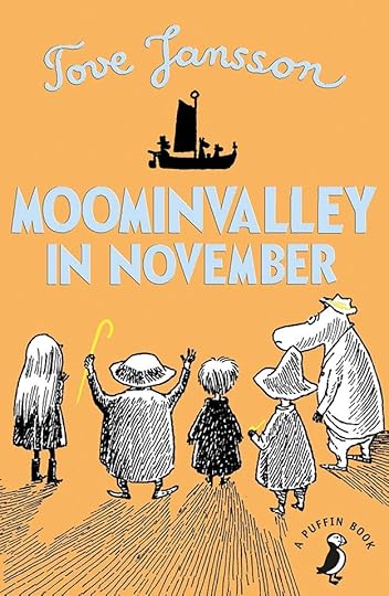
The final novel in the Moomin series was first published in English in 1971. Unlike all the others, none of the Moomin family appear in it. The book takes place at the same time as the previous novel, “Moominpapa At Sea” when they are away living on a small island with a lighthouse. During that time in Moominvalley, a varied assortment of other creatures decide to come visit the Moomins, and finding them gone, stay in and around the Moomin home waiting for them to return. Most of these folks don’t know each other well, and each is looking for something or dealing with a problem. Snufkin, the wandering musician, is there to work on a new song. Mymble came to visit her daughter Little My, who the Moomins have adopted, but she is away with them. Toft is a young orphan living in an empty boat who has never met the Moomins but often hoped to. Fillyjonk is a woman obsessed with cleaning and neatness, but an accident that endangers her life makes her decide to visit the Moomins, where in previous visits all had been calm and pleasant. The Hemulen has realized his life of collecting things has lost interest, and thinks the Moomins might help him find another plan. An old man called Grandpa Grumble can’t recall much about his past life, but remembers Moomin Valley as a place he enjoyed visiting. When all these strong personalities are gathered at the Moomin house, clashes and arguments soon develop as each one tries to follow their own ideas. Gradually some of the group learn to work together and even help and entertain each other as they wait for the family to return home.
This is perhaps the best of the series, though it works much better if you’ve read the others first. It’s kind of melancholy in some ways, but heartwarming and funny in others, and is a fine final novel with great insights into the characters. One later picture book for younger readers came from Jansson, and I will also review that here.
Recommended.
The post Rereading MOOMINVALLEY IN NOVEMBER by Tove Jansson appeared first on Todd's Blog.
December 30, 2020
Ira Schnapp in CHALLENGERS OF THE UNKNOWN
 Images © DC Comics
This team of non-powered trouble-shooters and their series was largely created by Jack Kirby, possibly with help from Joe Simon and/or writer Dave Wood. After four tryout issues in SHOWCASE and eight issues of their own series, Kirby moved on and was soon creating a somewhat similar team for Marvel Comics with Stan Lee, THE FANTASTIC FOUR. The SHOWCASE issues used a logo pulled from a story splash page by a letterer I can’t identify. The new logo seen above was designed by Ira Schnapp for the first issue of their own series from 1958. It uses his standard heavy block letters with hints of Art Deco design, the main point of interest being the curve of CHALLENGERS, which also made room for OF THE. The logo outlines are thin, but it works fine. Ira also did the balloon and caption on this and most of the covers. The series was edited by Jack Schiff and his associates Murray Boltinoff and George Kashdan, later just Boltinoff. It ran to 87 issues with a few hiatuses, and the team had several later revamps.

Issue #4 shows the effectiveness of the logo with bright colors, and has more typical Schnapp cover lettering. I missed the Kirby issues of this series, but I think I would have bought this one if I saw it!

Issue #10 from 1959 has an example of a Schnapp inscription in stone. The letter shapes are familiar for him, and he’s added shadows to make them look carved into the stone. This interests me due to Ira’s involvement with giant carved inscriptions on the Farley Post Office building in New York City in his youth, though these letters are not in the same style.

Issue #18 from 1961 introduces a “space pet,” usually a gimmick to try to interest new readers. Reversing some of Ira’s caption words, making them white on a pale blue background, might have been hard to read, but it works pretty well since they’re so bold.

By issue #30, the team was facing some very powerful villains, in this case one that’s being helpful. Somehow I feel that an image that needs as much explanation as it’s given in Ira’s speech balloon is not very successful.

Issue #40 shows that, no matter the situation, Ira was up to the challenge of providing clear, readable lettering. The border of the word balloon has been held in blue with the background art, but it’s hardly noticeable.

As we enter the worst era for DC cover design in 1966, there is, as usual, too much cover lettering, but Ira does his best with it.

Schnapp’s final cover lettering was on issue #61 from 1968, and his choice of three different styles for the story title is perhaps a poor one, but the craft is still there. The issue also has a new Schnapp logo that began the issue before, one of Ira’s last. It shifts the emphasis to CHALLENGERS and away from UNKNOWN and adds black telescoping for depth.
Ira did no story lettering for this series. Here are the covers with Schnapp lettering: 1-4, 6-31, 34-35, 37-38, 40-41, 43-44, 46-52, 55-56, 58-61. That’s 51 in all.
Challengers of the Unknown on Wikipedia.
More articles like this are on the Comics Creation page of my blog.
The post Ira Schnapp in CHALLENGERS OF THE UNKNOWN appeared first on Todd's Blog.
December 28, 2020
Ira Schnapp in LOIS LANE
 Images © DC Comics
Lois Lane has been an integral part of Superman comics from the beginning, appearing in ACTION COMICS #1 as a newspaper reporter working alongside Superman’s Clark Kent identity. The love triangle of Kent, Superman and Lois was a mainstay of the feature. When Mort Weisinger took over the editing of Superman stories, Lois’ role became more focused on trying to trick Clark into revealing he was also Superman and failing, though she had a series of solo reporter stories starting in 1944. After the success of Jimmy Olsen’s own series, one for Lois was a natural next step, and it began in 1958, first cover above, after a tryout run in SHOWCASE, for which Ira Schnapp had already created this logo. Editor Mort Weisinger (later assisted by E. Nelson Bridwell) focused on stories of Lois dreaming of marrying Superman and what their family life would be like, fighting for his attention with rival Lana Lang, swooning over other super men, and generally acting catty and jealous with little attention paid to reporting. Was the title more attractive to female readers? I don’t know, but as a boy it didn’t appeal to me much. Ira also lettered this and many of the covers until issue #80 in 1968, but only lettered a few stories inside the book.

There was no end to the silly stories Weisinger and his writers came up with, including turning Superman into a baby, as on issue #3. I like the cursive note by Schnapp.

Issue #9 had a rare guest-star appearance by actor/musician Pat Boone, who also had a short-lived DC comic at the time. Ira’s note-filled song is clever, but somehow he always got the shapes of the notes wrong when he did this kind of thing.

There were plenty of crossovers with other DC super characters like Batman and Batwoman, as on this cover of issue #14 in 1960.

On issue #15, Ira Schnapp’s appealing lettering is as much the star as the art, taking up almost half the space if you include his logo. Weisinger was fond of these book-length three-part stories.

More guest-star hero appearances on issue #29. Even as a fan of the characters, I don’t think this would have convinced me to buy the comic.

Issue #53 has a typically ill-tempered Lois scene with some nice Schnapp lettering on the sign.

Occasionally Lois and Lana teamed up to torment Superman, as on the cover of issue #60 in 1965. I do love the goodbye note by Ira.

DC’s 80-Page Giants were all reprints with only the covers having new art and lettering. Schnapp made it work well.

Ira’s final cover lettering was on issue #80 from 1968. Ironically, Lois is tearing off part of his logo! Here are the covers with Ira Schnapp lettering: 1-25, 27-30, 32-40, 42-49, 51-57, 59-65, 67-74, 76-80. That’s 73 in all.

Ira only lettered a few stories inside the book. The first was this one from issue #8. Editor Weisinger probably had his own go-to letterers and only turned to Ira occasionally. The stories were usually text-heavy.

This story is from issue #17, and looks like it might actually be one I would enjoy reading, as it focuses on her early days as a reporter.

Ira’s last story lettering was for issue #25, above. Usually the first page of a story is a little lighter on words, but not this one. I do like the Kurt Schaffenberger art, though.
Here are the stories lettered by Ira Schnapp:
#8 April 1959: The Ugly Superman 9pp, Queen For a Day 9pp
#9 May 1959: Lois Lane’s Stone-Age Suitor 8pp
#11 Aug 1959: The Leopard Girl of the Jungle 8pp, Lois Lane’s Super-Perfume 8pp
#17 May 1960: How Lois Got Her Job 8pp
#19 Aug 1960: The Superman of the Past 9pp
#25 May 1961: Lois Lane and Superman, Newlyweds 9pp
That’s a total of 68 pages.
More articles like this are on the Comics Creation page of my blog.
Lois Lane on Wikipedia.
The post Ira Schnapp in LOIS LANE appeared first on Todd's Blog.
Todd Klein's Blog

- Todd Klein's profile
- 28 followers

