
Todd Klein's Blog, page 96
February 12, 2021
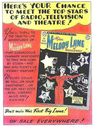
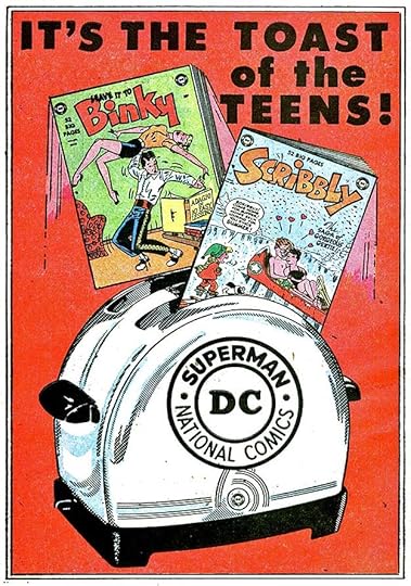
Ira Schnapp’s DC Ads: 1951
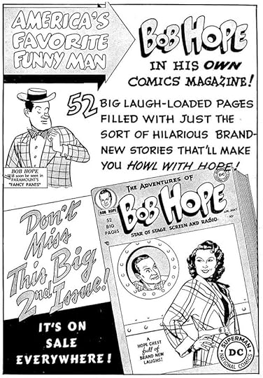
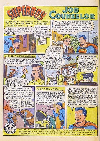
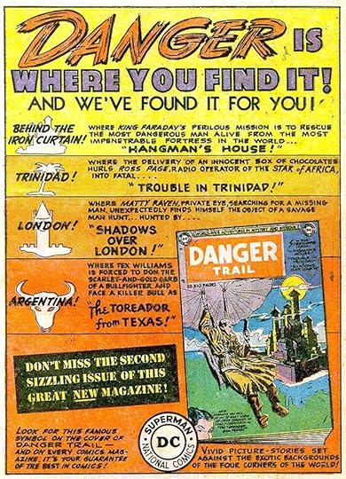
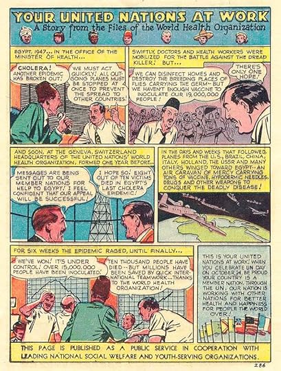
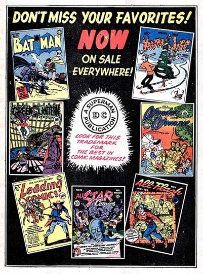
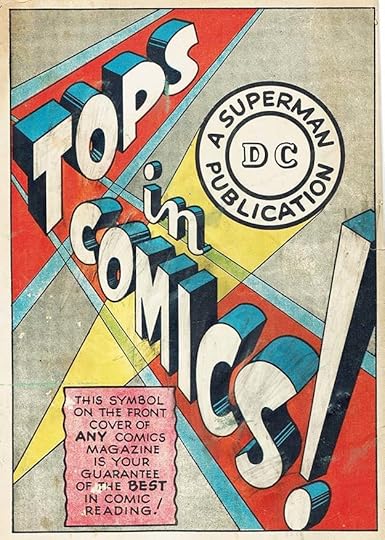
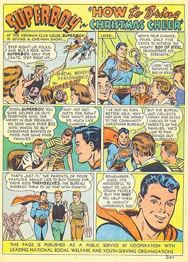 All images © DC Comics. From ACTION COMICS #152, Jan. 1951
From 1951 on I will generally be showing only the DC house ads lettered by Ira Schnapp. That number dropped from 1950, but house ads in general seem to be fewer in the issues published with 1951 cover dates (actually work done from fall 1950 to fall 1951). I haven’t counted all the ads, but I’m sure there are less than the year before, and a few 1950 ads were still running in 1951, sometimes with newer covers. The public service ads created and often written by DC editor Jack Schiff continued to appear in almost every DC issue, and added eleven new ones. All are lettered by Ira Schnapp. The first is above.
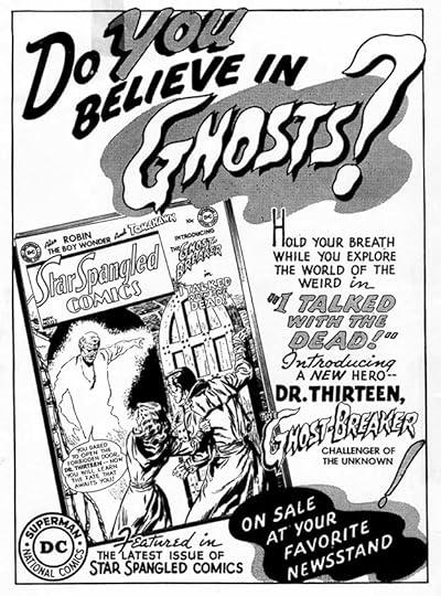
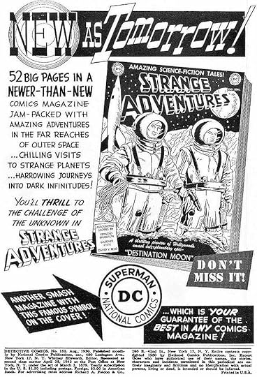
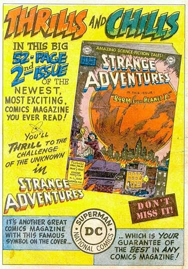
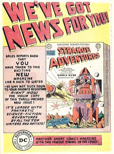 From STAR-SPANGLED COMICS #112, Jan. 1951
This ad uses a large three-dimensional headline in the same style as Ira Schnapp’s STRANGE ADVENTURES logo. The rest of the lettering is in a style he rarely used, and then for robotic speech, which I guess is appropriate for a science fiction title. Not sure about it, but I believe it’s Ira’s work.
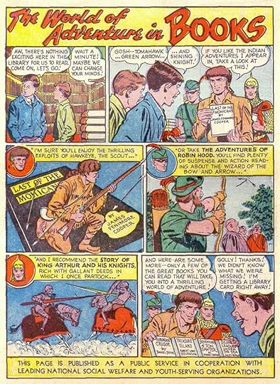
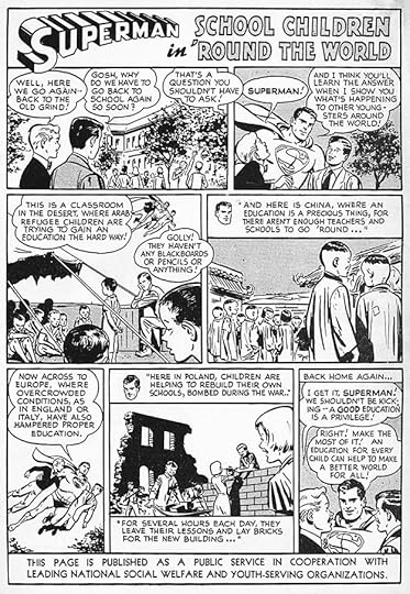
The next PSA is my all-time favorite, being a fan of reading myself! It stars three relatively lesser-known DC heroes, though of course Green Arrow would become a DC stalwart. I love the Schnapp title.
 From ADVENTURE COMICS #162, March 1951
This ad is full of styles not typical for Ira, and they are more like the work of the unknown letterer I’ve nicknamed Proto-Schnapp, but this is very late for him. Possibly it was done before he left staff in 1949 and hadn’t been used earlier. It has the same text as an ad I showed in the 1940s section of this series that was by Ira. The background art is something Ira could have done, and the DC bullet symbol is the one Schnapp revised in 1949. I can’t decide, so will not count it for Ira.
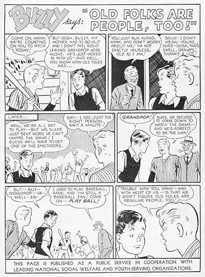
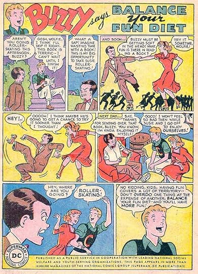
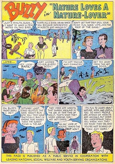
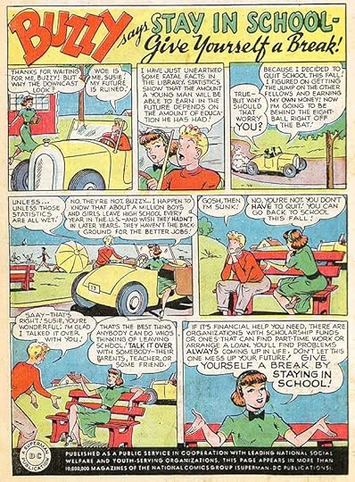
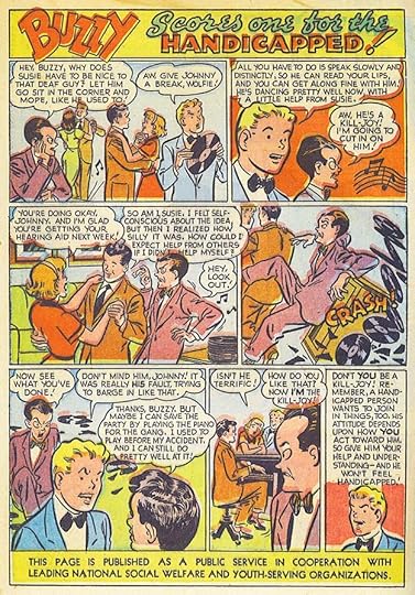 From ACTION COMICS #154, March 1951
The next PSA features Buzzy and his frequent annoyance, Wolfie. Any similarities to Archie Andrews and his annoyance Reggie are coincidental, right?
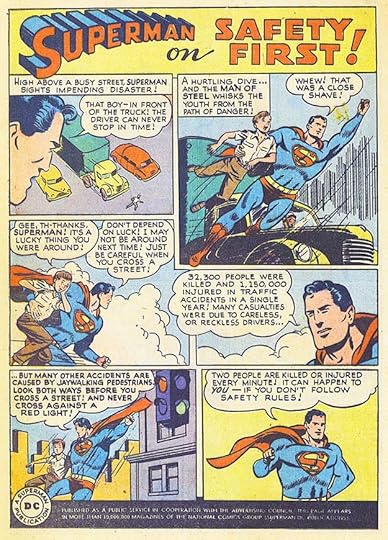
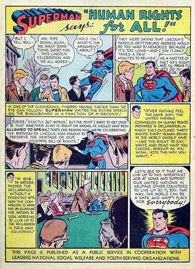 From ACTION COMICS #155, April 1951
As usual, Superman has the right idea in this PSA, which seems more relevant today than ever.
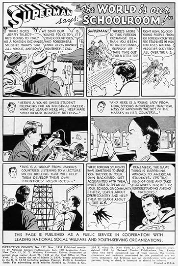
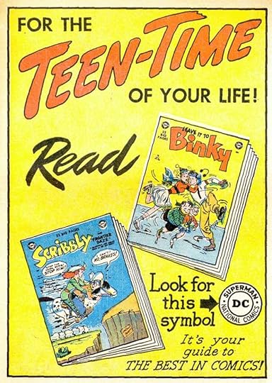
 From DETECTIVE COMICS #171, May 1951
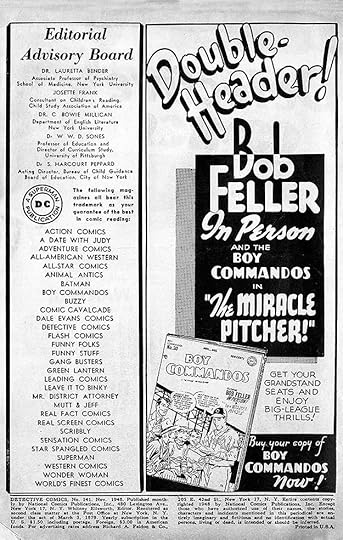
This line ad appeared in many issues, and though it shows twelve covers, as the ad says, there were many more as the DC line continued to grow. Titles not shown are ACTION, ADVENTURE, ADVENTURES OF ALAN LADD, ALL-AMERICAN WESTERN, ALL-STAR COMICS, BIG TOWN, BUZZY, COMIC CAVALCADE, DANGER TRAIL, DETECTIVE, FUNNY STUFF, GIRLS’S LOVE STORIES, GIRLS’ ROMANCES, HOLLYWOOD FUNNY FOLKS, JIMMY WAKELY, LEADING COMICS, LEAVE IT TO BINKY, PETER PORKCHOPS, SENSATION, STAR-SPANGLED, STRANGE ADVENTURES, WESTERN COMICS and WORLD’S FINEST. The bottom line is headline type, but I think the central lettering is by Schnapp.
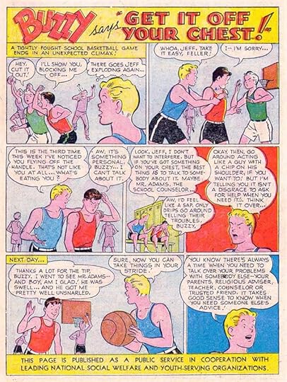 From ACTION COMICS #156, May 1951
These public service ads were, of course, more like story pages than most house ads, and the lettering by Schnapp reflects that, but they did place his work in almost every DC title.
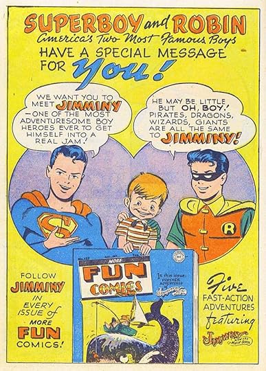
 From ACTION COMICS #157, June 1951
When the PSA was run on an inside cover, it could only use black ink and gray halftone dots that did not appear in the color version, so two variations of each PSA must have been made. Another fine title by Ira and another topic that’s still relevant.
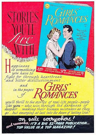
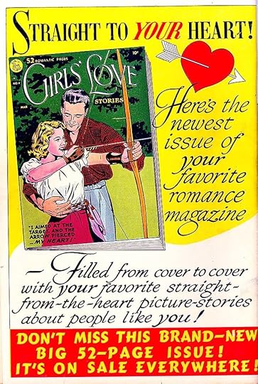
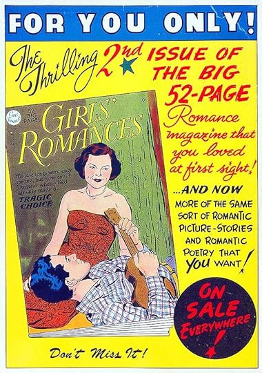
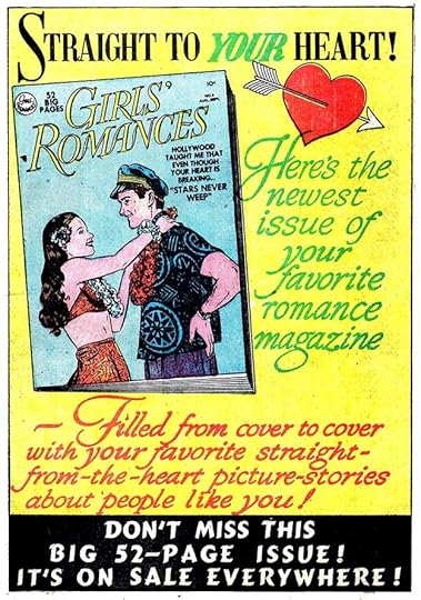
 From GIRLS’ ROMANCES #9, June/July 1951
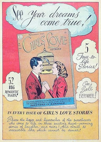
In 1950, DC romance titles had quite a few fine Ira Schnapp ads. Some of those were reused with newer covers in 1951, and a few new ads were by other hands. This new one looks like it has Schnapp script lettering to me. though parts of it are typeset.
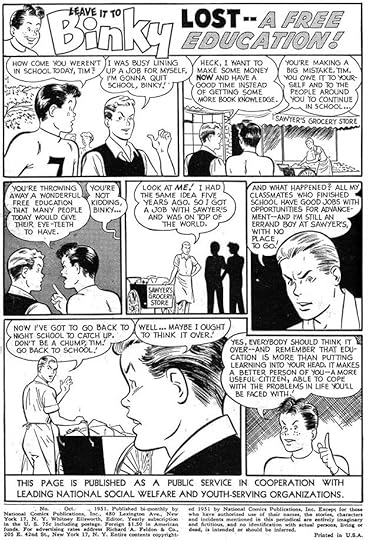
 From DETECTIVE COMICS #173, July 1951
DC’s teen humor characters show up often in the PSAs, perhaps because they could discuss topics more relevant to teens.
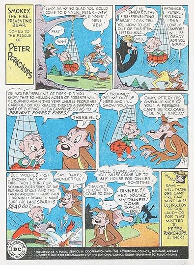
 From COMIC CAVALCADE #46, Aug. 1951
DC’s funny animals also have their moments in the PSAs, and here’s another character named Wolfie. I love the Schnapp title on this one.
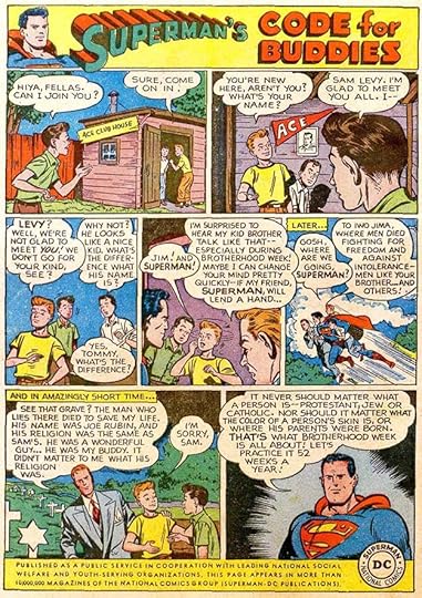
 From ACTION COMICS #160, Sept. 1951
DC employees can be said to not be subject to ageism at this time in the company’s history, having pages like this lettered by Schnapp in his late 50s as an example, and production staffer Raymond Perry was 75 at the time. Most of the staff were well past their twenties, something that became a problem a decade later when they were trying to compete with Stan Lee at Marvel Comics.
 From ACTION COMICS #161, Oct. 1951
I wonder how many readers actually read and thought about the topics in these public service ads? I don’t remember if I did or not, but later ones are certainly familiar.
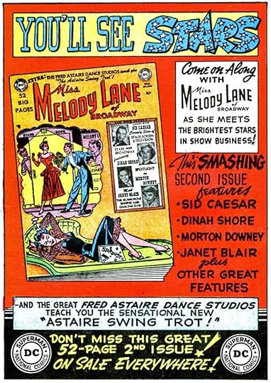
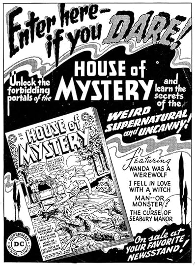 From STAR-SPANGLED COMICS #122, Nov. 1951
Now, here’s an excellent house ad from Ira Schnapp! I’ve long felt that Ira’s weakest genre was “scary” lettering, but he does it well here, and the overall design and layout are atmospheric and impressive, even though his HOUSE OF MYSTERY logo is mundane. This shows an excellent use of black that Ira would have learned from showcard lettering, and the background art is very Art Deco. I was not yet a comics reader, having been just born in 1951, but if I was, I would have tried to find this comic!
 From DETECTIVE COMICS #177, Nov. 1951
Another PSA that’s relevant today. Perhaps some current and recent American leaders weren’t comics readers…
 From SENSATION COMICS #106, Nov. 1951
Another dynamic “scary” ad from Ira that I don’t think is quite as successful, but still much better than contemporary DC ads by others, and there were still plenty of those in 1951. This shows how DC was trying to save some long-running superhero books by converting them to other genres, something that didn’t usually work for long.
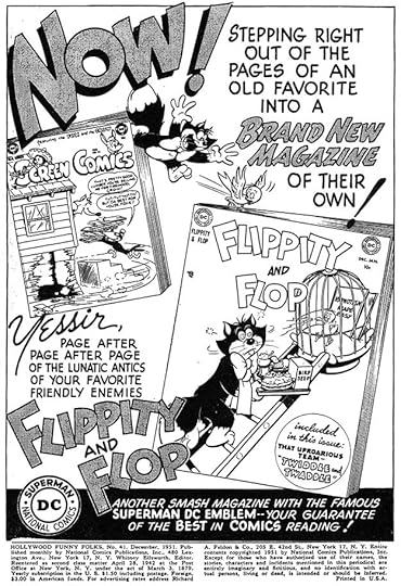 From HOLLYWOOD FUNNY FOLKS #41, Dec. 1951
The final Ira Schnapp ad I’ve found in 1951 is this one, which is again quite dynamic and appealing. Ira was becoming one of DC’s best-kept promotional secrets, and editors must have looked at ads like these and said, “I’d like Ira to do work like this for me.” Soon he’d be doing more of it!
For 1951 I count six house ads and eleven public service ads for a total of 17 ads lettered by Ira.
More articles like this are on the COMICS CREATION page of my blog.
The post Ira Schnapp’s DC Ads: 1951 appeared first on Todd's Blog.


February 10, 2021
Ira Schnapp’s DC Ads: 1950
 Images © DC Comics
Continuing with this new series looking at Ira Schnapp’s DC Comics work on everything other than cover logos, cover lettering and story lettering, each post from here on will cover one year in cover dates. Some of the actual work was done the year before, as cover dates at DC always ran a month or two ahead, and production time before that added an additional month or two. So, a comic cover-dated January probably went on sale the previous November and the work in it was likely done no later than early October.
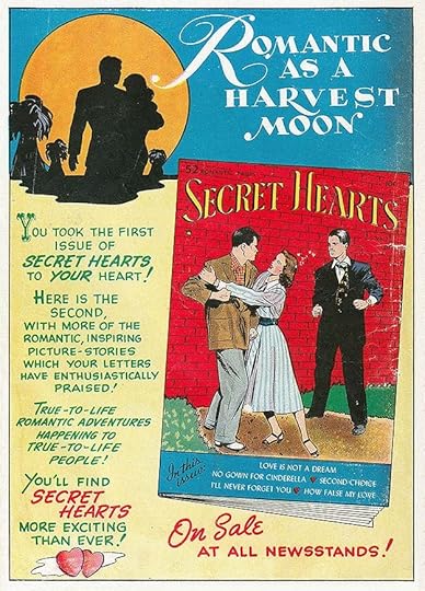
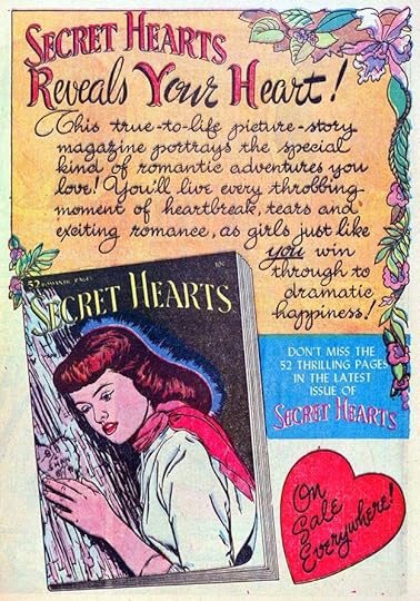
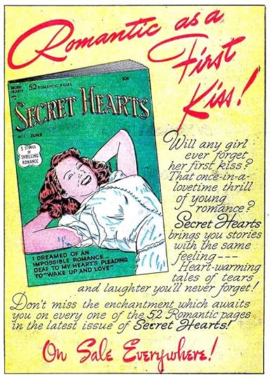
I have access to scans of nearly all the DC Comics from the 1950s and 1960s, but not all, and of the scans I do have, ad pages are not always included, so I may miss an ad here or there, but since house ads (our main topic) usually ran in more than one title, I believe I have access to nearly all of them. For 1950 I found an incredible 48 house ads and 12 public service ads, more than I expected. Many are not lettered by Ira Schnapp, but I will include all the ones I found in this first yearly survey to give an idea of what the entire range is. Prepare for a long post! Note that ads run on inside covers were black and white, but the same ads often had color versions that appeared in other comics on inside pages. Above is one of the earliest house ads I think has lettering by Ira Schnapp, from SECRET HEARTS #3, Jan/Feb 1950. DC’s romance or love comics were just getting started in late 1949, and unlike other DC titles, they rarely had paid ads or house ads for company titles other than romance ones. DC seemed to want to separate the genre from their other books. Many of the early romance issues had handsome full-page ads like this on the back cover. The middle section of the ad uses type, but I think the top and bottom sections are lettered by Ira, who was great with script styles. He also designed the book’s logo, and did the cover lettering, but the cover shown is a drawn recreation of the actual photo cover.
 From ACTION COMICS #140, Jan 1950
A lettered ad not by Schnapp, letterer unknown. This ad also had a full-page version, the two-thirds version here was adapted to fit above the code message appearing in every issue of ACTION COMICS. Ads not lettered by Ira or by Proto-Schnapp (more on him below) were probably lettered by other production staffers or possibly by freelancers. This ad is for a specific title and issue, so could not be reused later, but probably ran in several issues.
 From ADVENTURE COMICS #148, Jan 1950
In 1946, National Comics and All-American Comics merged to form the company we now know as DC Comics. Only a few of the All-American titles lasted to 1950 without a change of genre, this was one that would soon become ALL-STAR WESTERN. I don’t know who lettered it.
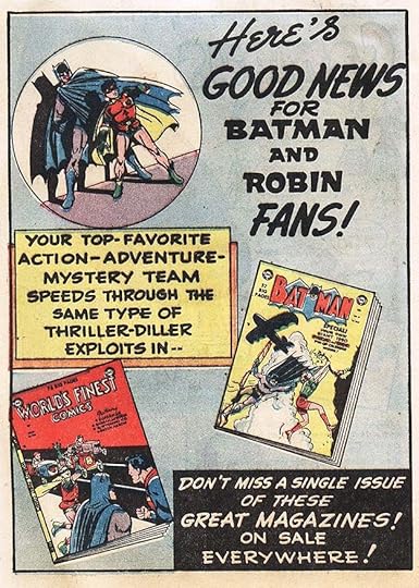 From DETECTIVE COMICS #155, Jan 1950
This is an example of a character ad, promoting other appearances of Batman and Robin. I don’t know who lettered it.
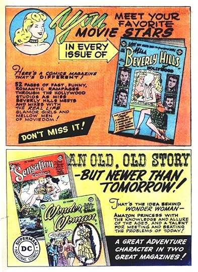 From A DATE WITH JUDY #14, Dec. 1949/Jan 1950
Two ads on a full page split roughly in the center to promote three comics. I don’t know who lettered it. WONDER WOMAN and SENSATION were two other survivors from All-American, but Sensation wouldn’t last much longer, and MISS BEVERLY HILLS also had a short run. These ads may have also been used separately.
 From DETECTIVE COMICS #155, Jan 1950
This ad has information about how often these comics were published that many fans might not have known. It has some styles similar to Schnapp, but I don’t think he lettered it. The ad was also resized to a two-thirds page layout.
 From FUNNY FOLKS #23, Dec 1949/Jan 1950
I think whoever lettered the previous ad also did this one. Again, some similarities to Schnapp, but the spacing between lines is too wide, and the letter shapes are not quite right.
 From ACTION COMICS #140, Jan 1950
The first public service ad for 1950 is lettered by Ira Schnapp in his typical page lettering style. Ira also designed the Superboy logo, and many of the other cover logos seen in this post.
 From GIRL’S LOVE STORIES #3, Dec 1949/Jan 1950
This romance ad does not look like Ira Schnapp’s work to me, though it’s quite well done. It might be by his role model, an unknown letterer I’ve nicknamed Proto-Schnapp, who I believe also had training in showcard lettering. I have no hard info, but my theory is that Proto-Schnapp was an older man with a similar background to Ira’s.
 From BUZZY #29, Jan/Feb 1950
The mix of hand-lettering and type on this ad suggests it was done by someone in the DC production department, but I don’t know who, not Ira. Ads for humor titles were most often run in other humor titles, as here.
 From PETER PORKCHOPS #2, Jan/Feb 1950
On the other hand, ads for DC’s western titles might turn up anywhere. Not lettered by Schnapp. The wood frame is well done but the layout and lettering are not great.
 From ACTION COMICS #141, Feb 1950
The second public service ad for 1950 is also lettered by Schnapp, who adds a fine title.
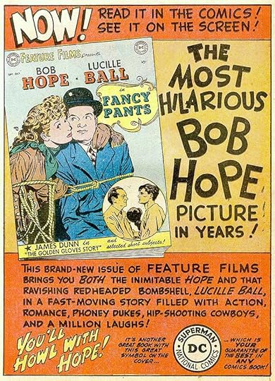
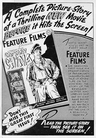 From THE ADVENTURES OF ALAN LADD #3, Feb/March 1950
This ad for the short-lived series FEATURE FILMS is very much in the showcard style, and has the bouncy lettering I think is the work of Proto-Schnapp. Great design and use of black, especially effective in the black and white version used on an inside cover.
 From A DATE WITH JUDY #15, Feb/March 1950
Another ad in the showcard style, and it might also be by Proto-Schnapp. It’s not by Ira.
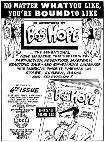
 From A DATE WITH JUDY #15, Feb/March 1950
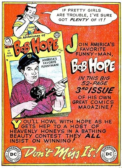
This ad uses some of the same styles as the previous two and I think is by Proto-Schnapp, who shared some styles with Ira. Bob Hope’s new title received a lot of house ads that ran in many titles, obviously a big promotional push. It may have worked, as the title sold well for many years.
 From GIRLS’ LOVE STORIES #4, Feb/March 1950
Another handsome romance ad by Ira Schnapp using one of his distinctive upper and lower case styles in the yellow section. The comic cover is another line version of a photo cover. DC’s romance titles used photo covers on early issues, then moved to line art.
 From ACTION COMICS #142, March 1950
This PSA is also lettered by Ira Schnapp, and has a rare Wonder Woman appearance.
 From ACTION COMICS #142, March 1950
Another character ad promoting Superman’s other titles and leaving room for the code message. I don’t know who lettered it.
 From BUZZY #30, March/April 1950
Ads using just type were still being made for 1950 issues. The DC bullet symbol is the one revised by Ira Schnapp in 1949.
 From SECRET HEARTS #4, March/April 1950
Yet another handsome romance ad by Ira Schnapp with large, appealing script lettering, though the bottom section is type probably made on a headline photo-type machine in the DC production department.
 From ACTION COMICS #143, April 1950
These public service ads were the pet project of DC editor Jack Schiff, who probably wrote most of them. If so, his topics ran a wide range, but some, like this one, are still relevant today. Lettered by Schnapp.
 From A DATE WITH JUDY #16, April/May 1950
Letterer unknown, definitely not Schnapp, who would not have done the top line so poorly.
 From A DATE WITH JUDY #16, April/May 1950
This ad has the earmarks of someone in DC’s production department trying to capture the showcard look of Ira Schnapp but not succeeding very well.
 From ALL-AMERICAN WESTERN #113, April/May 1950
This ad has lots of lettering that may be by several hands. The top line open lettering is, I think, poorly done. Some of the other lettering is better.
 From FUNNY FOLKS #25, April/May 1950
I think this ad is lettered by Ira Schnapp, but I doubt he did the cartoon figures, which may be by someone else in the DC production department. The elements work well together.
Another ad that uses just type, though the logo and story titles make it seem otherwise.
 From GIRLS’ LOVE STORIES #5, April/May 1950
I think this romance ad is by Proto-Schnapp, notice how much more bounce there is to some of the lettering, but it’s equally well done. The top line is type.
 From THE ADVENTURES OF OZZIE AND HARRIET #4, April/May 1950
I think this ad was designed and lettered by Ira Schnapp. The top line was used earlier on the 2 SMASH HITS ad. Excellent work.
 From GIRLS’ LOVE STORIES #5, April/May 1950
Another romance ad probably by Ira Schnapp, though the script styles here are not ones he usually used, so I’m not sure, but I’m calling it for Ira.
 From ADVENTURE COMICS #152, May 1950
This one is lettered by Ira using many of the same layout and style techniques he employed through the 1950s: expansive background art adding depth, for instance. Notice how even and regular much of the work is. The large open lettering at the top and bottom has some bounce and variety, it’s still more angular and classically shaped than much of what Proto-Schnapp did. Great use of black.
 From ACTION COMICS #144, May 1950
Another PSA lettered by Schnapp. They seem to have been his regular assignment when he was available. While the ideas in the ads were well-meant, they also gave publicity to some of the company’s characters that readers might not be following, so were useful in that way too.
 From BUZZY #31, May/June 1950
DC was really pushing Bob Hope’s title, with ads for every issue early on. I think this is lettered by Ira Schnapp, though the wide space between the lines in the balloon at the top suggests that part might be by someone else. Or not, hard to be sure.
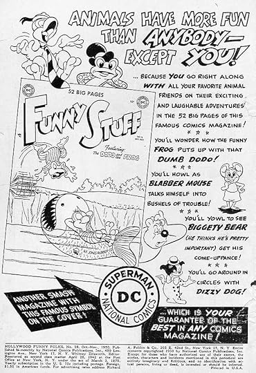
 From FUNNY STUFF #54, May/June 1950
This ad looks like the work of Proto-Schnapp. I don’t know when each of these ads was created, of course, nor do I know when Proto left DC, I can only guess it was around summer/fall of 1949 because Ira was on staff by fall of 1949, and I think he essentially replaced Proto. If that’s the case, perhaps this was created well ahead of time.
 From SECRET HEARTS #5, May/June 1950
Another fine romance ad by Ira.
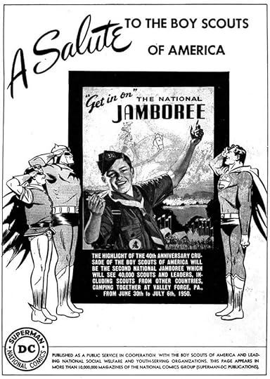 From STAR-SPANGLED COMICS #105, June 1950
This PSA is different from the rest, being a single image and using mostly type. Ira might have designed A SALUTE, and because of that I’ll call it for him.
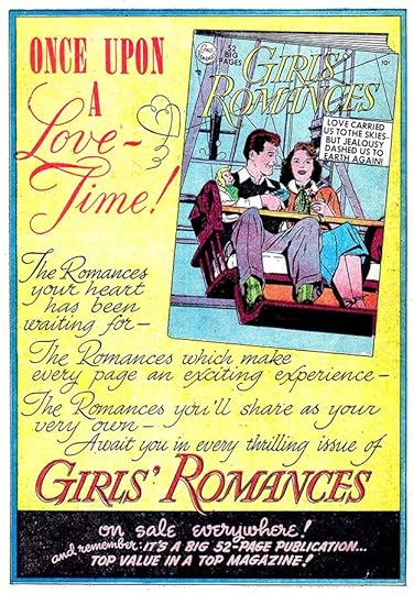 From GIRLS’ LOVE STORIES #6, June/July 1950
I think Ira Schnapp enjoyed working on all aspects of DC’s romance comics. He designed the logos, lettered the covers and many of the stories, and did most of the house ads, as here.
 From GIRLS’ LOVE STORIES #6, June/July 1950
Certainly it gave Ira a chance to use script styles that were rarely appropriate on other genres, perhaps ones he’d developed and practiced often before working at DC.
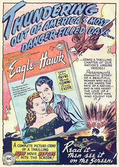 From ADVENTURE COMICS #154, July 1954
The showcard look of the ads for FEATURE FILMS must also have been appealing to Schnapp, as they were probably similar to showcard work he’d been doing for movie theaters before joining the DC staff. I wonder if he did the background art here? It might be pulled from the story.
 From DETECTIVE COMICS #161, July 1950
Another PSA lettered by Ira with a nice title. Some of these topics were a bit of a stretch as “public service.”
 From BUZZY #32, July/Aug 1950
I don’t know who lettered this ad, not Ira.
 From SECRET HEARTS #6, July/Aug 1950
Most of this romance ad is type. I don’t think Ira did the lettering in the center section that isn’t.
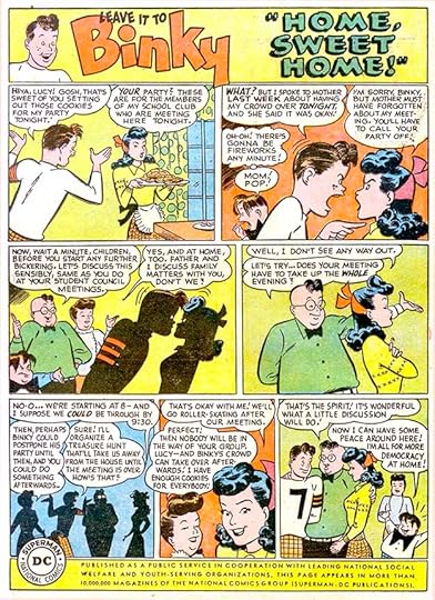
 From LEAVE IT TO BINKY #15, July/Aug 1950
I would call the small amount of hand lettering on this ad poorly done, at least the top part, and not by Schnapp. The bottom section is headline type.
 From ACTION COMICS #147, Aug 1950
This PSA is lettered by Ira.
 From DETECTIVE COMICS #162, Aug 1950
This ad is puzzling to me. The top display lettering is quite good, but unlike anything I’ve seen from Schnapp. The rest is also unlike Schnapp, but I don’t know who did it.
 From HOLLYWOOD FUNNY FOLKS #27, Aug/Sept 1950
I think this charming ad is lettered by Ira., though some of the lettering is a bit off-model for him. The ad must have been a favorite of the editors, as it continued to run with newer covers for a few years.
 From A DATE WITH JUDY #18, Aug/Sept 1950
Another ad not by Ira but imitating his style here and there.
 From A DATE WITH JUDY #18, Aug/Sept 1950
Perhaps by that same person. Possibly Ira was unavailable when these were done. The substitute, probably a production staffer, did pretty well.
 From ALL-AMERICAN WESTERN #115, Aug/Sept 1950
Yet another ad by someone other than Ira. It’s frustrating to not have more information about who was working in DC’s production department at the time.
 From DETECTIVE COMICS #163, Sept 1950
Another PSA by Schnapp. The information at the bottom of this one has changed, apparently the Ad Council was no longer involved. This was the bottom blurb from here on.
 From GIRLS’ LOVE STORIES #13, Sept/Oct 1950
Back to Ira for this romance ad, though again the bottom section is headline type.
 From BUZZY #33, Sept/Oct 1950
Another ad by an unknown letterer that’s often too small and not very good. Blocks of type suggest it was done in the production department.
 From DETECTIVE COMICS #164, Oct 1950
An ad by someone trying to mimic Ira Schnapp, but I think not by him. The open lettering is definitely not in a style Ira ever used, but this is generally effective.
 From ACTION COMICS #149, Oct 1950
Another PSA lettered by Ira.
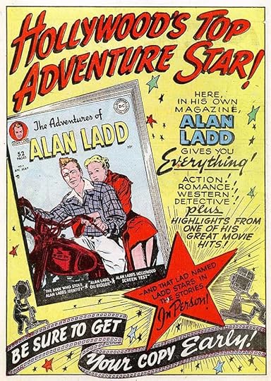
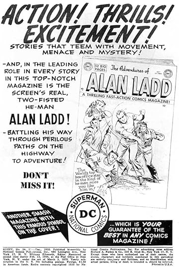
 From THE ADVENTURES OF ALAN LADD #7, Oct/Nov 1950
Whoever was lettering these house ads not by Schnapp certainly gave it their best effort, and at times it works nearly as well.
 From A DATE WITH JUDY #19, Oct/Nov 1950
Another ad by an unknown letterer. The large display lettering at center right on this one is quite effective, the rest is not as good.
 From HOLLYWOOD FUNNY FOLKS #28, Oct/Nov 1950
On this ad the lettering is poorly done and sometimes too small. The bottom two reused captions are probably by Schnapp.
 From DETECTIVE COMICS #165, Nov 1950
A PSA by Schnapp with an informed message on wildlife.
 From Buzzy #34, Nov/Dec 1950
An ad not done by Ira probably from someone in the production department. I’m detecting several different hands in these.
 From ACTION COMICS #151, Dec 1950
The final PSA of 1950 is by Schnapp, making it a clean sweep for him, though there’s just a small bit of lettering on the July entry.
 From DETECTIVE COMICS #166, Dec 1950
One more ad by someone other than Schnapp. The best part of this one is the top line, but in general this is pretty good.
Whew! That’s a lot of ads for one year! In future posts, I will focus on the ones by Schnapp. So, for 1950 cover dates I count 12 PSA ads and 14 house ads lettered by Ira, for a total of 26. That still left about half for other hands, but the situation would soon change as DC came to further value Ira’s contribution to their brand and in a few years had him lettering nearly all their house ads.
More articles like this are on the Comics Creation page of my blog.
The post Ira Schnapp’s DC Ads: 1950 appeared first on Todd's Blog.
February 9, 2021
Incoming: WONDER WOMAN EARTH ONE VOLUME THREE Hardcover
 Written by Grant Morrison, art by Yanick Paquette, colors by Nathan Fairbairn,
letters by Todd Klein, image © DC Comics
The third and final volume of this series arrived yesterday. Literally years in the making (I believe I started working on Volume One in 2015), I’ve enjoyed lettering it, and am happy I was able to complete the series. Fine writing by Grant, wonderful art by Yanick, great coloring by Nathan. Should be available in shops soon, but here’s an Amazon link.
The post Incoming: WONDER WOMAN EARTH ONE VOLUME THREE Hardcover appeared first on Todd's Blog.
February 8, 2021
Ira Schnapp’s DC Ads: 1940s
 Images © DC Comics
In this new series of articles I plan to catalog the lettering work of Ira Schnapp for DC Comics other than on logos, covers and stories. to begin, let’s consider the contents of a typical DC comic from the 1940s, DETECTIVE COMICS #127 dated Sept. 1947, cover above. It has 48 interior pages, and with the outside and inside covers, is 52 pages in all. The front covers always have comics art. The back covers almost always have a paid advertisement, as this one does. The inside covers can have various contents from paid ads to house ads to single page stories to lists of the issue’s contents. In this issue the inside front cover is a house ad with additional information like the indicia, and the inside back cover is a paid ad. Inside the book, in this case, there are four comics stories: Batman and Robin 12pp, Slam Bradley 7pp, Air Wave 6pp and Boy Commandos 12pp, a total of 37 story pages. Paid ads total 6.5 pages. House Ads add 1 page. Fillers, in this case gag cartoons by creators like Henry Boltinoff, make up 1.5 pages. There is a two-page text story, fulfilling the requirement for the comic to be mailed at the 2nd-class postage rate for periodicals, a cheaper method first introduced for newspapers in the 1800s. (Some comics get away with a single page text story somehow.) That was only important for subscription copies I think. As you can see, the proportion of house ads is very small, but that proportion continued to grow over time.
Paid ads were always present in comics, but varied in number depending on how many the company could sell. Many paid ads ran across the entire line of the publisher’s comics, and were most common on back covers. House ads, or ads for the company’s own publications, were also present from early on, but the number varied a lot, probably depending on how many paid ads and story pages there were in any given issue. In this series I’ll mainly be talking about house ads, which were important to the company because they were often the only kind of publicity available for comic books, particularly individual issues and new titles, in the days before fan and comics news publications and of course the internet.
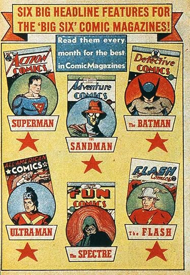 From DETECTIVE COMICS #36, Feb. 1940
One of the earliest kinds of house ads is what I call a line ad because it usually features multiple titles from the publisher’s line of comics. This one from 1940 is interesting because it includes comics and characters from National Comics (Superman, The Sandman, The Batman and The Spectre) and All-American Comics (Ultra-Man and The Flash). These were sister companies that generally worked separately but shared common owners, and as here, advertising. (And whatever happened to Ultra-Man, I wonder?) They would merge in 1946 to become the company now known as DC Comics. Line Ads were often somewhat generic so that they could be reused with newer covers. Early ones like this, and a few through the 1940s, use all or mainly set type rather than hand lettering. That was an extra expense and took more time. Set type from the 1940s to 1970s had to be ordered from a type house with very specific instructions as to size and style. When a proof or print was made and delivered to the company’s production department, the type was cut and pasted onto the page layout. Hand-lettering was a better and faster solution, even if the letterer was a freelancer and had to be paid a fee for his work. It was still often cheaper than getting set type, and I think many house ads were lettered by salaried production staffers at no extra cost to the company. Later, perhaps as early as the late 1940s, a headline machine—which could photographically set a single line of large type on a roll of photo paper using a small selection of fonts—brought some of the simpler and shorter type work in-house. Ads that have a few lines of large type were probably done that way.
 From ACTION COMICS #57, Feb. 1942
This line ad from 1942 uses hand-lettering, and again features titles from both National and All-American. As with most early house ads from the 1940s, I don’t know who lettered it. The style doesn’t seem similar to any of the story lettering. The result isn’t great, but not too bad, and pretty typical for the time. It might have been done by a freelancer, but more likely a production staffer. It’s another good example of a generic ad that could be reused later with newer covers.
 From ACTION COMICS #60, May 1943
On the other hand, this house ad from 1943 has poorly done lettering and features cartoon characters probably by the same person. This definitely looks like the work of a production staffer who was an aspiring cartoonist. It’s actually two half-page ads that each feature a particular title and issue, so not likely to be reused, though the lower one could have been.
 From ACTION COMICS #64, Sept 1943
Surprisingly, DC occasionally prepared and ran paid ads for comics from other publishers in the 1940s like this one, probably by the same letterer and artist. I suspect they were all comics with some connection to DC management, or were at least distributed by DC’s division for that, Independent News, like these titles from Crestwood.
House ads with this kind of amateurish work continued to be found in DC comics through the 1940s, but they were gradually replaced by ones with more polished and professional design and lettering.
 From DETECTIVE COMICS #93, Nov 1944
By 1944, better display lettering was sometimes appearing in ads like this one. The lettering in the bottom caption also uses more professional styles that appeared frequently through the rest of the 1940s. Can we assume this is a new letterer with more training and skills? It seems likely, but I have more questions than answers about DC lettering in the 1940s.
 From DETECTIVE COMICS #101, July 1945
Lettering using some of those same styles appears in this 1945 full-page line ad that has much better design than the DC house ads that came before it, in my opinion. The page is unified by the central cloud or explosion and the radiating lines from it, while the arrangement of the covers, the use of the black band and reversed type at the bottom, and the general symmetry of the page show that whoever did this probably had showcard lettering experience at least. Showcard lettering was then being used for all kinds of advertising, from coming attractions signs in movie theaters, to signs in stores, to magazine and newspaper ads. The design elements are much like what Ira Schnapp would soon be doing on DC ads. Is this one of his early efforts? The lettering styles make me less sure, but I think it is. Note that the books in this ad are now all from National Comics.
 From DETECTIVE COMICS #104, Oct 1945
A long series of alphabetical inside page ads beginning with this one combine animal cartoons with promotion of the company bullet symbol and titles. They often use similar lettering styles to the ones above, but not always. Was the cartoonist and the letterer the same person? I doubt it, but I’m not sure. I can only say that DC house ads in the 1940s are a confusing mixture of elements, and were likely from many hands. I’d say the lettering here is not by Ira.
 From ACTION COMICS #105, Feb. 1947
Ira Schnapp’s first work for DC Comics, as he told a young Michael Uslan, was revamping Joe Shuster’s Superman logo in 1940, which first appeared on the cover of SUPERMAN #6 that year. Ira did variations on that logo such as the SUPERBOY one in the ad above from 1947, and other logos for the company. I’ve written a three-part article on who I think might have designed the company’s 1940s logos that begins HERE. I believe Ira was doing other kinds of freelance work then, including logos and cover lettering for DC owners Harry Donenfeld and Jack Liebowitz’s pulp magazines, and showcard lettering for movie theaters in Manhattan. He gradually also began lettering comics covers and stories, but pinpointing his early work is difficult. I have a theory that someone else with similar skills to Ira began working at DC by the mid 1940s, and I’ve nicknamed him Proto-Schnapp. Initially I thought Proto-Schnapp’s work WAS early work by Ira, and that’s still a possibility, but I came to doubt it because the story and cover work in (to me) two styles was appearing at the same time in the late 1940s, and often in the same issues. While it’s sometimes hard to tell them apart, I felt there was more than one letterer’s work involved. There was no reason then for a letterer to have two different styles, even close ones, as the only task was to get the work done. I think Ira picked up some of Proto’s styles and added them to his own repertoire of Art Deco and classic alphabets. In general, though, Proto’s style was bouncier and more cartoony, something on display in this ad. Some comparisons of what I think are Proto and Ira’s story lettering are in THIS post, but I want to emphasize the idea that I am making guesses here that might or might not be right.
 From ACTION COMICS $107, April 1947
Another 1947 house ad with a logo I think was designed by Ira Schnapp surrounded by what I call typical Proto-Schnapp lettering. It has a generally lively and cartoony bounce that is often missing from Ira’s work.
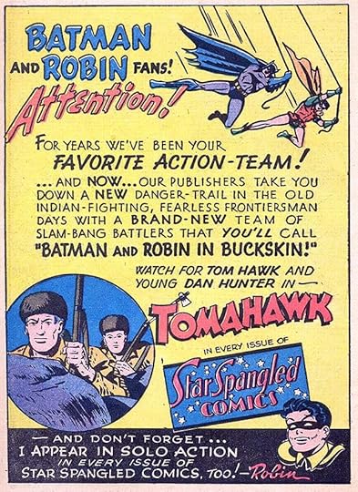 From ACTION COMICS #108, May 1947
Here’s another 1947 house ad that at first glance says “Ira Schnapp,” but is it? The open lettering style at the top is certainly one Ira used often. In the text below that, FAVORITE ACTION TEAM has letters where the strokes cross through each other, something Ira rarely did later, but perhaps he was doing it then. The layout of the ad and the regularity of the lettering suggests Ira to me, so I am calling this his work, but you can see why I have trouble! I think Proto-Schnapp lettered many DC house ads from 1945 to 1949, but some are by Ira, and there were always some by other letterers or staffers as well as a few using type, and in rare cases series artists like Sheldon Mayer did their own ad lettering.
 From ACTION COMICS #110, July 1947
Is this ad by Ira Schnapp or Proto-Schnapp? I’m not sure, but I’m leaning toward Ira.
 From ACTION COMICS #113, Oct 1947
This one definitely looks like Proto-Schnapp, very bouncy and full of letters with small gaps, something I don’t think Ira did often if at all.
 From ACTION COMICS #137, Oct 1947
Proto or Ira? The background art and wood sign seem like Ira’s work. I’m less sure about the lettering but I’m leaning toward Schnapp on this one.
 From ACTION COMICS #114, Nov 1947
I also think this one is by Ira, as the lettering is even and regular in most places. These last few ads all share similar styles, though, making it difficult to decide.
 From DETECTIVE COMICS #131, Jan. 1948
Another typical ad used on inside front covers in the 1940s, with company information and title list on the left, the book’s indicia below, and the ad in the remaining space. I don’t know who did the cartoon characters and title, but the lettering looks like the work of Ira Schnapp, matching his work on story pages of the time. It could also be Proto-Schnapp, they were similar, but the tiny and distinctive question marks say Ira to me, as do the very square and even letters.
 From DETECTIVE COMICS #131, Jan 1948
On the other hand, while the design and layout might suggest Ira Schnapp on this ad from the same release month, the bounce in the lettering says Proto-Schnapp to me. I can’t be sure on this one.
 From DETECTIVE COMICS #132, Feb 1948
Here’s another puzzler with design and layout that suggest Ira Schnapp but lettering that doesn’t seem right for him. Or maybe we’re seeing Ira’s DC ad work developing gradually here, I don’t know.
 From DETECTIVE COMICS #138, Aug 1948
Is this attractive ad the work of Ira Schnapp or Proto-Schnapp? The design and background elements are similar to many ads Ira did in the 1950s, and the lettering is generally regular and even, so I think it’s by Ira.
 From DETECTIVE COMICS #141, Nov 1948
This ad seems like classic Ira Schnapp work to me in every way.
 From ACTION COMICS #129, Feb. 1949
This new SUPERBOY logo is another one designed by Ira Schnapp. Could he have been assigned to do a house ad for the new series? I think so, the layout and design as well as the regularity and evenness of the lettering say Ira to me.
This variation for the second issue has the same lettering except for a few words at the bottom, and is a good example of ad variants that I am not counting as separate ads in this survey, and sometimes will not even show or mention.
 From SECRET HEARTS #2, Feb/March 1950, Simcoe Publishing of Canada
Finally, there’s this startling ad that was not published in any American comics, but instead in Canadian versions of DC issues from 1948 to 1950 by publishers National Comics of Canada and Simcoe Publishing. These were almost replica editions of U.S. versions with the addition of “Published in Canada” on the front cover and a different indicia on the inside front cover. This ad often ran on the back cover. The relationship between National of Canada/Simcoe and America’s National Comics (DC) is not known, but the ad certainly seems to be the work of Ira Schnapp. The huge three-dimensional tagline is in the style of his Superman logo but with more Art Deco letterforms, and the caption is typical of his work. The abstract background is unusual, but well crafted in a showcard style I think Schnapp might have used. The story here may never be known, but I’m going to count this ad for Ira. Note that the DC bullet symbol is the earlier version before Ira revamped it in 1949, so confirming the date of the ad’s creation as before that. There may be other Schnapp house ads from this period that I’ve missed, but of the ones I’ve seen, all I can attribute to Ira are here.
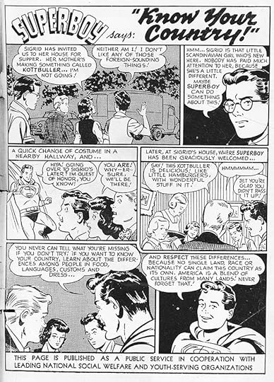
 From ACTION COMICS #135, Aug. 1949
Beginning in August, 1949, a new type of house ad began appearing regularly in DC Comics that wasn’t selling any kind of product. DC had run similar public service ads in the early 1940s to support U.S. World War Two home front efforts like collecting scrap paper and buying War Bonds, but with this series, the brain child of editor Jack Schiff who probably wrote many of them, DC began promoting a wide range of topics to readers that were meant to be helpful and beneficial. No one paid them to do this as far as I know. The text at the bottom reads, “Published as a public service in cooperation with the Advertising Council. This page appears in more than 10,000,000 magazines of the National Comics Group (Superman Publications).” Artists and characters from across the DC line were used, and many, like this first one, were lettered by Ira Schnapp in the same style as his story pages. Ira found a place with these ads in nearly every DC comic from this point until he left the company in 1968. From the style of the title to the balloon shapes and lettering, this is Ira’s work, and it meant that his style was becoming familiar to every DC comics reader, even in comics where he lettered nothing else.
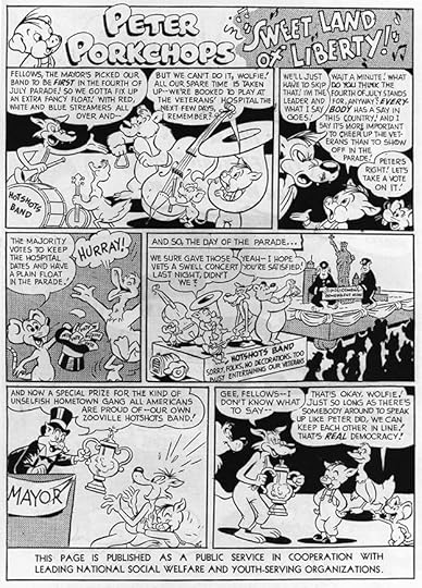
 From DETECTIVE COMICS #151, Sept. 1949
The second PSA, also lettered by Schnapp, features Smokey Bear, created in 1945 by the Ad Council, the U.S. Forest Service and others to help prevent forest fires, along with DC’s funny animal character Peter Porkchops.
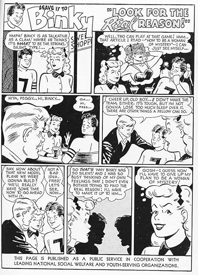
 From ALL-AMERICAN WESTERN #110, Oct. 1949
The PSA campaign must have been well planned in advance, as once it was rolling, nearly every month featured a new one for many years. Schnapp lettered this one featuring Buzzy, a DC teen humor character, and it has a fine title.
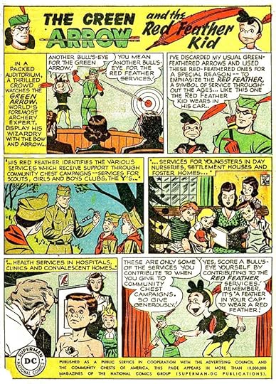 From ACTION COMICS #139, Dec. 1949
The fourth and final PSA to appear in comics with a 1949 cover date features The Green Arrow, and is again lettered by Ira Schnapp. While Proto-Schnapp and others were lettering many of the DC house ads in the 1940s, Ira had begun doing his part. In the rest of this series of articles I will be looking at DC ads by Ira from each year he was at the company, and also a few by others. For the 1940s, I can only claim 14 ads I believe are lettered by Schnapp, but as we move forward into the 1950s, that number will grow fast.
Here’s a list of DC PSAs on Mikes Amazing World of Comics website, which is helpful for reference, though I think I’ve found a few he missed.
More articles like this are on the COMICS CREATION page of my blog.
The post Ira Schnapp’s DC Ads: 1940s appeared first on Todd's Blog.
February 5, 2021
Ira Schnapp in INFERIOR FIVE, BOMBA and THE SPECTRE
 Images © DC Comics
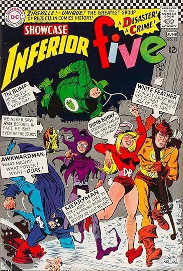
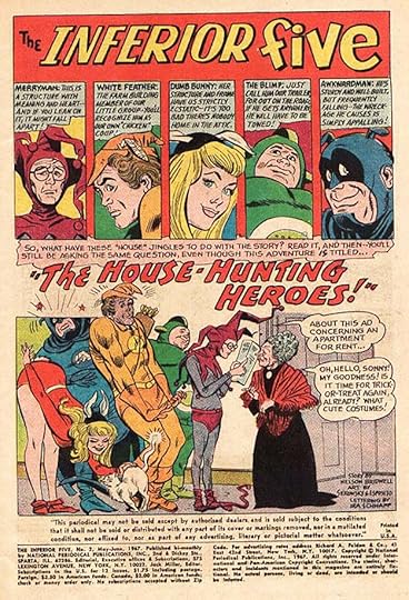
E. Nelson Bridwell was hired by DC Comics in 1965 as an assistant to editor Mort Weisinger on the Superman titles. Bridwell has been described as one of the first comics fans to be hired by the company. I think it would be more accurate to say one of the first writers who was fan of comic books. Bridwell had an encyclopedic knowledge of comics that was put to good use, and he had already become a published writer at MAD and other places. Rumor has it that Weisinger treated Bridwell very badly, but Nelson persevered and outlasted his mean boss to become an editor and writer for the company. The Inferior Five was his creation along with artist Joe Orlando. It had a three-issue tryout in Showcase 62, 63 and 65, sample above, for which Ira Schnapp created a logo and lots of cover lettering introducing the characters. The series was a MAD-like parody of superhero teams that had some funny moments if not quite up to MAD standards in general.
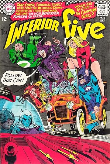
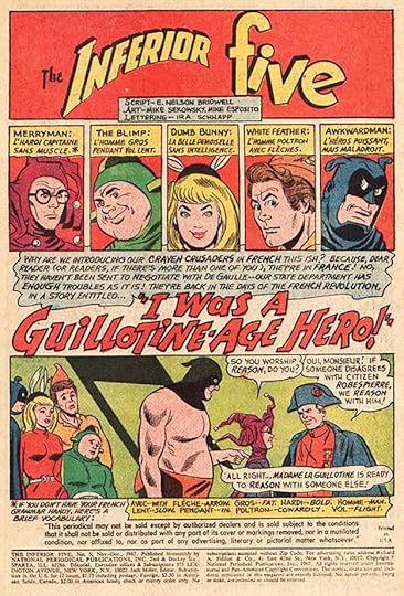
The series began in 1967, edited by Jack Miller, but my guess is he basically let Nelson do as he liked. The first issue, above, has more Schnapp lettering, and Ira would do several more as well as lettering stories in the first few issues. The book would run to 12 issues in all.
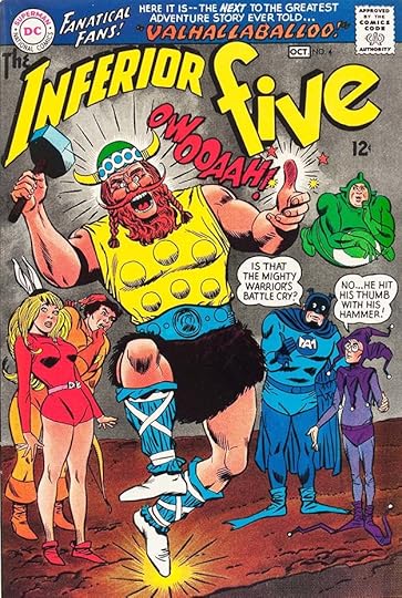
Issue #4 is a good example of Ira’s cover lettering and pretty funny too. Ira lettered the covers of issues 1-2 and 4-5, four in all.
Nelson was someone who knew and appreciated DC’s history more than most of the staff at the time, and I think he must have enjoyed meeting Ira Schnapp and learning about Ira’s own history at the company. Nelson often used Ira on the early books he wrote for DC, including this one, and on the splash page of issue #2 I think he encouraged Ira to add a lettering credit for himself, the first one Ira had received in his twenty-plus prolific years at the company. It’s a bit hard to see in this image, but it’s at the lower right. That must have been a strange thing to Ira, who was by all accounts a very modest man who did not seek the limelight.
Ira also received a lettering credit on issue #5, just under the logo. These were the only two lettering credits Schnapp ever received at DC.
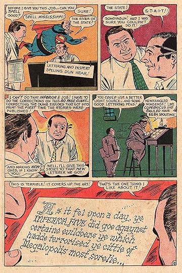
Also interesting is issue #6, which takes place largely in the DC Comics offices. On page 18, we see editor Jack Miller talking to production man and letterer Joe Letterese in the first three panels, ending with Miller saying, “Well, I’ll give this story to that NEW letterer we got!” In the next panel we see a medieval monk lettering by candle light. He’s unnamed, but he’s meant to be Ira Schnapp, making the “new letterer” all the more funny to those in the know, which was hardly any of the readers at the time. The last panel has some fine Old English style lettering by Ira, a fitting tribute to his own work and his history with DC written by Nelson. This was probably among the last stories Ira lettered, and it’s a nice if very late acknowledgement of his many years at DC, though it’s a shame he wasn’t named.
These are the stories lettered by Schnapp, all featuring The Inferior Five:
#2 May/June 1967: 23pp
#4 Sept/Oct 1967: 24pp
#5 Nov/Dec 1967: 23pp
#6 Jan/Feb 1968: 23pp
That’s 93 pages in all.
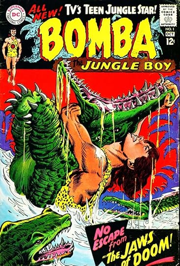
Another new series from 1967 edited by George Kashdan featured BOMBA THE JUNGLE BOY, who had been featured in a series of books for young readers in the 1920s and 1930s, then in a series of twelve movies from 1949 to 1955. These were repackaged for TV in the 1960s, hence the TV reference on the cover of the first issue, above. Like Tarzan, Bomba was a white boy hero among the native people of Africa, and is considered a racist stereotype today. The comics were edited by George Kashdan, and the series had just seven issues. The logo is by Ira Schnapp, though decorated with art by someone else, and Schnapp also did the cover lettering on this and the next three issues. He did no story lettering for the title.
Issue #4, Ira’s last one, has his logo without the background art, and the logo becomes a series of drumbeat sound effects that work well in Ira’s style. To repeat, Ira lettered the covers of issues 1-4.
The Spectre was a Golden Age DC character who first appeared in MORE FUN COMICS #52 in 1940. Editor Julius Schwartz decided to bring him back in a somewhat revamped version, and he had tryouts in SHOWCASE #60-61 and 64 before getting his own series. Ira Schnapp designed the logo for the SHOWCASE issues, and I think it’s his best logo for a scary character. The letters are wavy but not extremely so, and retain pointed serifs to give the logo a dangerous feel. The spooky head added by cover artist Murphy Anderson also works well.
When the character’s own series began at the end of 1967, Ira Schnapp lettered the cover of the first issue, as well as the next two.
The art and sometimes the writing on the series was famously an early success for artist Neal Adams, who like Nelson Bridwell, became a friend of Ira Schnapp in Ira’s last few years at DC, and often asked for Ira on his covers until Schnapp left the company in 1968. Issue #3 was the last of these he worked on. To repeat, Ira lettered covers 1-3.
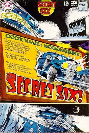
There was one more DC title Ira did a logo for, but no other work, SECRET SIX. The first issue, above, from 1968 had a small round logo at the top by Schnapp. On later issues it was somewhat larger. The series was again written by E. Nelson Bridwell, who probably asked for Ira to do a logo, but on the first cover it’s dominated by a larger one designed by Gaspar Saladino, who would soon take over most of Ira’s logo, cover, and house ad lettering at DC.
We’ve come to the end of this series of articles about Ira Schnapp’s work in individual DC titles, but I’m not finished yet. Next I’ll be indexing Ira’s lettering on everything other than stories, including house ads, public service pages, and more. Articles about that will begin in a new multipart series soon.
The rest of the articles in this series are listed as “Ira Schnapp in…” on the Comics Creation page of my blog.
E. Nelson Bridwell on Wikipedia.
Inferior Five on Wikipedia.
Bomba the Jungle Boy on Wikipedia.
The Spectre on Wikipedia.
Ira Schnapp on Wikipedia.
The post Ira Schnapp in INFERIOR FIVE, BOMBA and THE SPECTRE appeared first on Todd's Blog.
February 4, 2021
And Then I Read: PUDD’NHEAD WILSON by Mark Twain
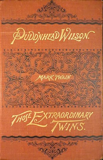 First edition with related short story, 1894.
This is a problematic story to read and write about today because it’s a story largely about pre-civil war slave life in the Missouri of Twain’s boyhood, yet the story is engaging, the characters are well-developed, and this is probably the most thoughtful book of Twain’s since “Huckleberry Finn.”
David Wilson is an intelligent young lawyer who moves to the town of Dawson’s Landing on the Mississippi River hoping to establish a law practice. Instead, a remark he makes is misunderstood by townsfolk, and he is labeled a “pudd’nhead,” or harmless idiot, dashing his career plan. His hobby of collecting and studying fingerprints does not help his case. He lives next door to the wealthy Driscoll family who own a black (though by birth mostly white) woman named Roxy to take care of infant Tom Driscoll after the death of his mother. Roxy has her own child the same age, and fearing he will be sold “down the river” by her master, she changes the places of the two infants, allowing her birth son to become the heir of the family, while the real heir is raised as her slave child. This plan backfires when her son grows up spoiled and mean, careless with money, and spiteful to Roxy despite her early care for him. When Mr. Driscoll dies, Roxy is given her freedom, and she gladly leaves town for a career working on steam boats. Tom is taken in by his uncle, another rich man, and continues to get into money trouble through gambling and drinking. Tom becomes a thief to keep up with his debts, even stealing from his uncle. When Roxy returns having lost all her savings, how will Tom react to her news about his true origins? Two Italian twins arrive in town, causing a sensation, what role will they play in Tom’s plans? A murder is committed, and only Pudd’nhead Wilson has the evidence that can unveil the true murderer and set things to rights, but he doesn’t even know he has it.
As Twain explains in an afterword, this was originally planned as a farce about the twins, but other characters took over the story, and their tragic tale did not work with the humor, so Twain took the farce out and made the book more about Roxy and her son. Elements of the farce became his short story “Those Extraordinary Twins,” also in the first edition, but not read by me. There are difficult elements to the book, even though Twain was making valid satirical points, but I enjoyed it and recommend it.
<br />
The post And Then I Read: PUDD’NHEAD WILSON by Mark Twain appeared first on Todd's Blog.
February 3, 2021
Ira Schnapp in SWING WITH SCOOTER and PLASTIC MAN
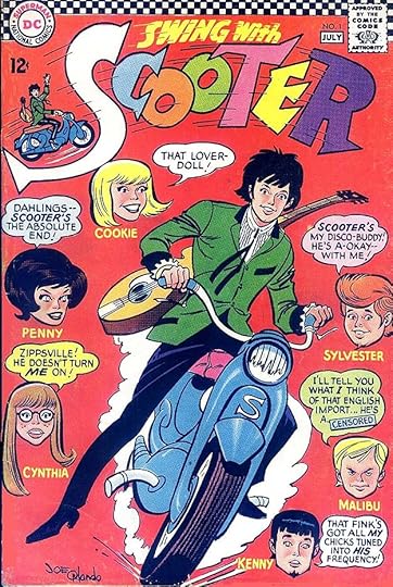
In 1966 DC launched a new teen humor title about a motorcycle-riding musician they hoped might interest fans of The Beatles and other current teen idols. It was originally supposed to have a tryout in SHOWCASE, but instead moved right into a bimonthly series edited and co-written by Jack Miller and Barbara Friedlander. Ira Schnapp created the logo, which had more movement and bounce than many of his logos, and a small image of the character by artist Joe Orlando was added. The multi-colored letters suggest DC was going for a Pop Art look, as do the colored balloons, but the language in them lettered by Ira was typically lame and off the mark in my opinion, having been a teenager then myself. Ira would letter many of the covers and stories inside.
Issue #4 shows the book going far from reality in typical DC style, with Ira’s balloons trying to keep things together.
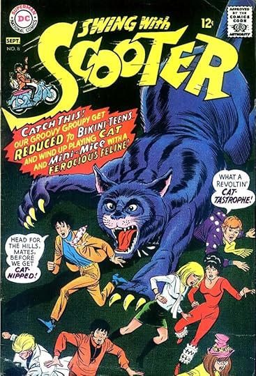
If the lame language wasn’t bad enough, the cover of issue #8 adds bad puns to the mix in the style of the Batman TV show, I suppose. What real teenager would find this funny and appealing?
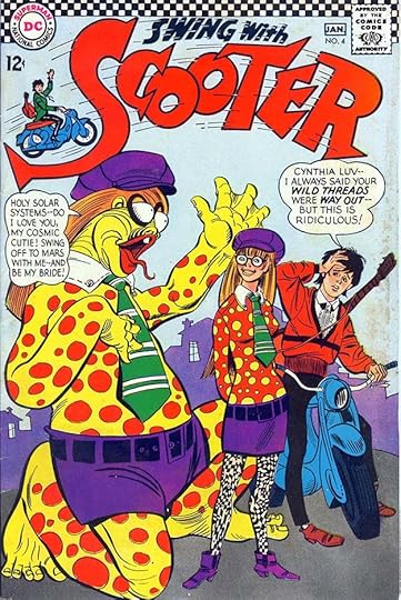
For issue #12, Schnapp designed a new logo meant to mimic and appeal to readers of Archie comics, which is the direction the series was heading. This was also the last issue that had Ira’s cover lettering. The covers he worked on are 1, 3-6, 8-12. That’s ten in all.
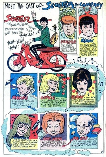
Ira lettered many of the stories in the first eight issues, beginning with this synopsis of the characters from issue #1. The British musician is clearly in the style of Paul McCartney, as the captions emphasize.
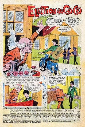
A more typical Schnapp splash page from issue #4. Can you mix a teen idol with high school hijinks? Someone must have been buying this book, as it ran to 36 issues.
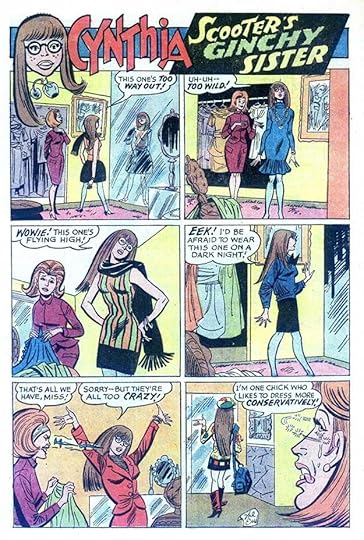
Ira also lettered a one-page story in issue #5 featuring Scooter’s sister Cynthia, who gets a lamely-worded logo.
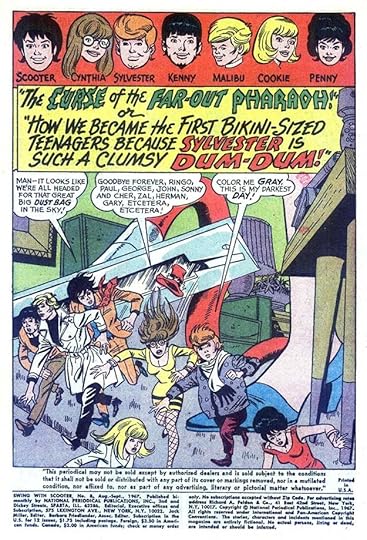
Ira’s final inside lettering was the book-length story in issue #8 from 1967, which features one of the longest story titles I’ve ever seen, but nicely lettered by Schnapp.
Here are the stories lettered by Ira, all feature Scooter unless otherwise titled.
#1 June/July 1966: 24pp
#2 Aug/Sept 1966: 11pp, 13pp
#3 Oct/Nov 1966: 13pp (first story)
#4 Dec 1966/Jan 1967: 14pp, 10pp
#5 Feb/March 1967: 17pp, 7pp, Cynthia 1pp
#6 April/May 1967: Kicky Kenny 1pp
#8 Aug/Sept 1967: 24pp
That’s a total of 135 pages on this series.
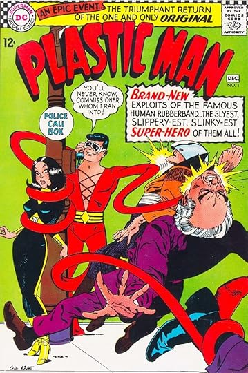
When DC bought the rights to characters published by Quality Comics in the 1950s, Jack Cole’s creation Plastic Man was included, but DC did nothing with him until launching a new series in late 1966. Apparently there was a Plastic Man movie in the works, prompting DC to start the series, but the movie never happened. Murray Boltinoff was the editor, and fans of the character, who had last appeared just ten years earlier from Quality, must have been pleased. Ira Schnapp designed the new logo, which I think better represents Plas than any of his previous ones, and also lettered the cover. He would letter several more, but no stories inside the book. The series would run to 20 issues, and the character would make many later returns at DC.
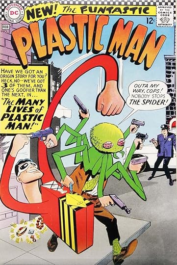
The second issue has a new top line by Ira that I like, and the caption is pretty good too. Ira’s rounded style here is a good match for the character.
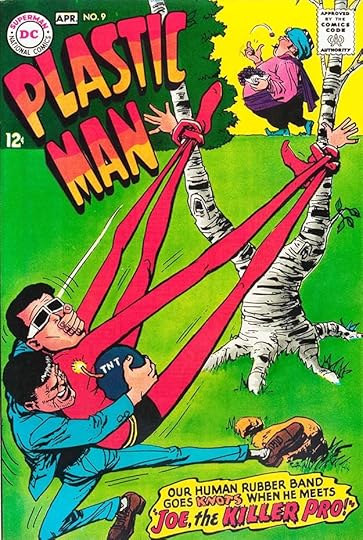
Ira’s final lettering for the series was on the cover of issue #9 from 1968. His logo is on two lines to fit around the art better, and still works well. If Schnapp hadn’t left the company around this time, I think his cover lettering would have continued to be a good match for the book. Ira’s lettering is on issues 1-4, 6 and 9, six covers in all.
More articles like this are on the Comics Creation page of my blog.
Swing With Scooter on Wikipedia.
Plastic Man on Wikipedia.
The post Ira Schnapp in SWING WITH SCOOTER and PLASTIC MAN appeared first on Todd's Blog.
February 1, 2021
Ira Schnapp in METAMORPHO and TEEN TITANS
 Images © DC Comics
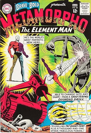
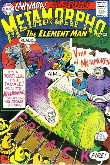
Early in 1964, DC introduced one of their weirdest heroes in a two-issue tryout in THE BRAVE AND THE BOLD #57-58. Rex Maxon becomes transformed by radiation from an Egyptian artifact and has the ability to become any element in the human body, but can no longer take on his original human form, making him a misfit in his own eyes. The tryout had a logo designed by Ira Schnapp that was divided between normal block letters and a kind of lava-like mush that’s a bit hard to read and not very appealing visually, at least to me. The subtitle, THE ELEMENT MAN is clear enough, at least. His tryout and short-lived series was edited by George Kashdan, and the character would have a long history at DC.
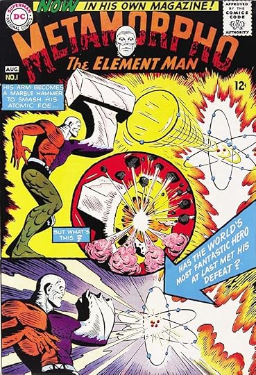
When his series began with a July/Aug 1965 cover date, the same logo was used with an added head shot. I’m not sure who did the cover lettering on this issue. Parts of it could be by Schnapp, other parts I’m not sure about. I guess I will credit it to Ira, since I have no other ideas, but possibly someone else had a hand in it.
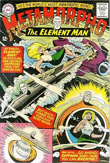
Issue #2 is definitely lettered by Ira, who would go on to do the same on many of the covers.
By issue #4 from 1966 we are into the period of too much cover lettering across the DC line, but Ira makes it work pretty well here, and even adds a fine sound effect.
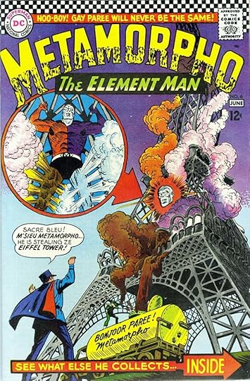
Issue #6 includes a Schnapp sign on the truck among other cover lettering.
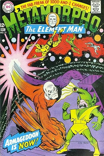
Issue #15 from 1967 has the final Schnapp cover lettering for this unusual series. These are the covers lettered by Ira: 1-5, 8, 11-12, 14-15. That’s ten in all.
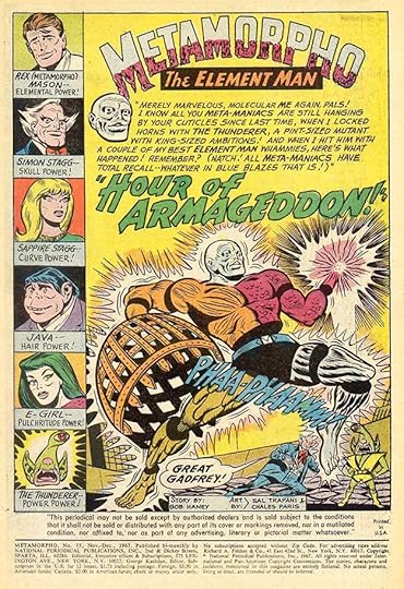
Ira lettered just one 23-page story for issue #15, first page above, with a title in one of his familiar styles. Many of the others were lettered by Stan Starkman.

I believe Ira also lettered this two-page pinup used in issue #16 as a center-spread, with Ira’s script on the second page.
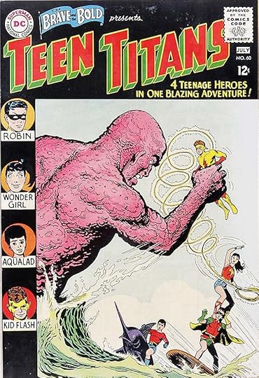
Another series developed by editor George Kashdan was the Teen Titans, made up of four teen sidekicks. The idea developed gradually with tryouts in issues #54 and 60 of THE BRAVE AND THE BOLD and issue #59 of SHOWCASE. Ira’s logo was created for the second of those, above, using his standard block letters with a telescoped drop shadow. The feature was successful in its own book, which ran to 53 issues, but later versions were even more popular.
The first issue of the new series began in 1966 with a large burst at the top, and more of the somewhat clueless language often used on DC covers in an attempt to appeal to young readers. Where Stan Lee succeeded with this at Marvel, DC usually failed. Ira would letter many of the covers to issue #13, but no stories inside, which where often lettered by Stan Starkman.
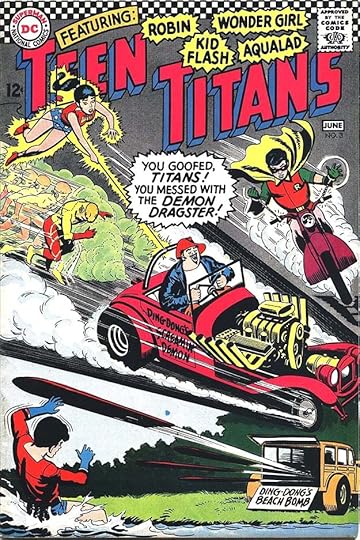
Issue #3 has more large Schnapp bursts and a few signs.
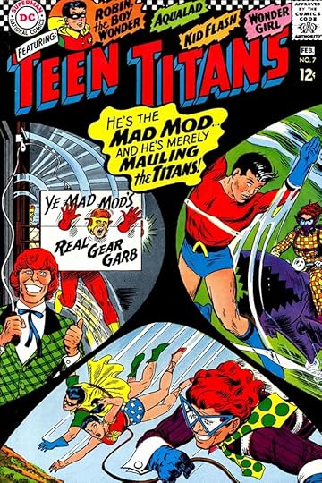
Issue #7 presents another large caption by Ira and a well-crafted sign, but both are full of that cringe-worthy trying-to-be-hip language.
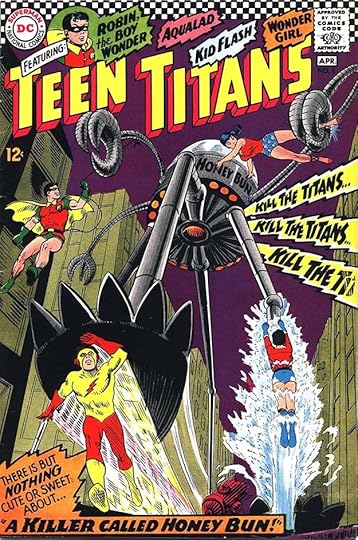
Issue #8 does better with a more serious approach and some nice loudspeaker bursts by Ira.
The best of Ira’s cover lettering on this title, in my opinion, was saved for his final effort on issue #13 from 1968, where he was able to use one of his most artful Old English styles in the Christmas wreath. These covers have Schnapp lettering: 1-3, 5, 7-9, 11-13. That’s ten in all.
More articles like this are on the Comics Creation page of my blog.
Metamorpho on Wikipedia.
Teen Titans on Wikipedia.
The post Ira Schnapp in METAMORPHO and TEEN TITANS appeared first on Todd's Blog.
January 30, 2021
And Then I Read: THE WRIGHT 3 by Blue Balliett
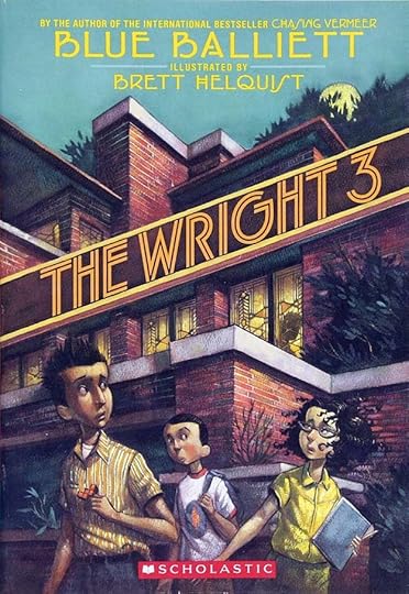 Cover illustration by Brett Helquist
This is the second in a series of mysteries for young readers that revolve around famous artists and their work, it’s a sequel to her Chasing Vermeer. In that book, residents of Hyde Park, Chicago and classmates Calder Pillay and Petra Andalee solve the mystery of a missing painting by Vermeer and become friends in the process.
In this book, Calder and Petra are joined by Tommy Segovia, another friend of Calder who has been away from Hyde Park for a while, and is now back. The three are told by their teacher, Mrs. Hussey about plans to demolish a famous architectural landmark in their neighborhood, the Robie House, one of designer Frank Lloyd Wright’s favorite projects, now in financial trouble. A plan has been made to divide up the house into sections and ship them to museums around the world that can exhibit them, but Mrs. Hussey, and soon her students, find this a horrible idea. The class is soon on a visit to the house, and while there, strange things began happening to the three protagonists. It almost seems as if the house itself is asking them for help.
Part of the fun of this book is the exploration of Frank Lloyd Wright’s work on the house and in general, part is the strange and sometime dangerous adventures the three children have trying to save the Robie House from destruction and from art thieves, and part is the dynamics of their friendship. Tommy and Petra do not like each other, though they both like Calder, who is caught in the middle trying to please both. Each of the children has flaws, but each also has special talents and insights useful for their investigation. Mrs. Hussey plays a role, as does their elderly friend Mrs. Sharpe, their parents, and even Tommy’s pet goldfish whose bowl is used to hide an important artifact. Before the end, the children are trapped inside the Robie House with men who want to kill them, leading to a suspenseful pursuit.
Recommended. More of these to come.
The post And Then I Read: THE WRIGHT 3 by Blue Balliett appeared first on Todd's Blog.
January 28, 2021
Ira Schnapp in DOOM PATROL and HAWKMAN
 Images © DC Comics
The Doom Patrol, created by writers Arnold Drake and Bob Haney and artist Bruno Premiani, began appearing in MY GREATEST ADVENTURE #80 in 1963. They were a team of misfit heroes led by a man in a wheelchair, Dr. Niles Caulder. The original team was Robotman, Elasti-Girl and Negative Man with other members Beast Boy and Mento joining later. Their tag line was “The World’s Strangest Heroes.” Many comparisons were later made with Marvel Comics’ The X-Men, which came soon after, though the parallels could have been a coincidence. With issue #86 in 1964, above, the book was retitled after the team for the rest of its initial run to issue #121 in 1968. It was edited by Murray Boltinoff. Ira Schnapp designed the new logo using his standard block letters, and did the rest of the cover lettering on this and many of the covers to issue #117. Ira did no story lettering for the series, most were lettered by Stan Starkman.
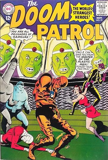
For issue #91, Schnapp created a revised logo on two lines that was larger, added interest by slanting the word DOOM, and incorporated the tagline in a burst in the logo area. THE is now in typical Schnapp upper and lower case.

Issue #97 from 1965 shows the growing tendency at DC for too much cover lettering around this time, perhaps as a reaction to what Marvel was doing, but Ira manages to fit it in pretty well here.
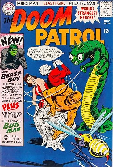
Beast Boy was introduced in issue #99 with an elaborate and wordy Schnapp caption. This is the same character that would later become part of the New Teen Titans.

For issue #100, Ira was asked to revise the logo again, making DOOM taller and with the outlines broken by notches. The effect is not entirely successful to my eye, and the rest of the cover again has too much lettering, though at least it’s clear of the art.
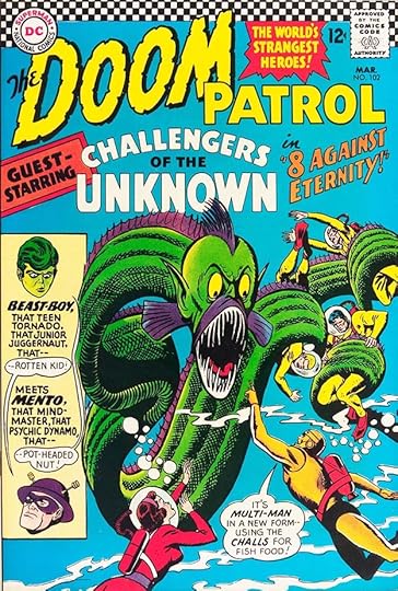
Issue #102 has even more lettering, and includes Mento for the first time, as the Doom Patrol teams with the Challengers of the Unknown. Editor Boltinoff would have written the cover copy, so the surplus of lettering is his decision.
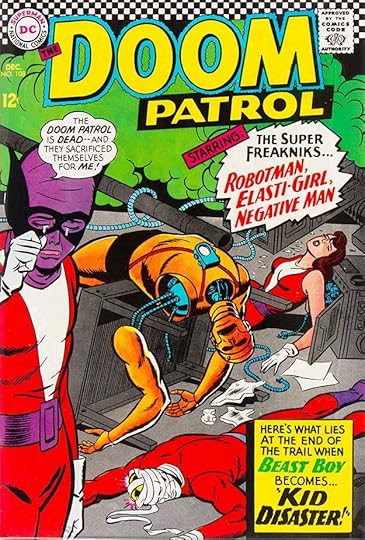
For issue #108, Ira designed another new logo that I like a little better than the previous one, but this suggests that sales were falling, and the company thought, “It must be the logo,” instead of any more realistic reasons. DC was also trying for hip language to appeal to readers and failing miserably with words like “freakniks.” The new look for Beast Boy also seems like a bad idea to me. I do like Schnapp’s burst balloon though.
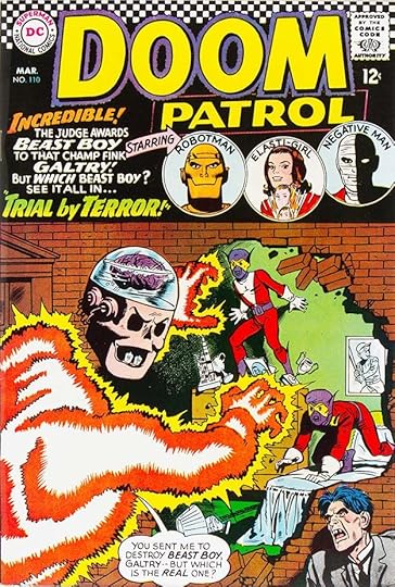
Issue #110 adds head shots in circles at the top with the caption next to it, a better plan than many of these covers.
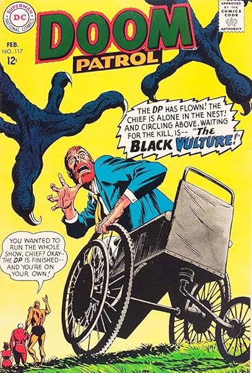
Ira’s final cover lettering was for issue #117 in 1968, and I like his rendering of the word VULTURE. Here are the covers lettered by Schnapp: 86-92, 94-111, 113-117. That’s 30 in all.
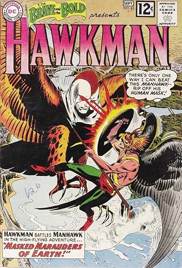
Hawkman was another Golden Age DC character revamped by Julius Schwartz following his successes with The Flash and Green Lantern, and the character had a tryout run in THE BRAVE AND THE BOLD #34-36 in 1961. Sales on those issues must not have been as good as with the previous revamps, and there was another tryout in B&B #42-44 in 1962 before the character got his own series in 1964. For the tryouts, Ira Schnapp designed what I think is one of his best logos, which continued on the new series.
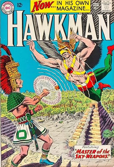
When the series did begin, it had a huge caption at the top by Schnapp perhaps expressing editor Schwartz’s frustration that it took so long! The series ran to issue #27 in 1968. Ira lettered most of the covers up to #24. He did no story lettering on this book, most stories were lettered by Gaspar Saladino.
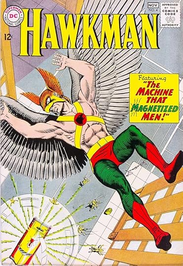
Issue #4 has a pretty typical Schnapp caption except for those lines around the M in MAGNETIZED suggesting the same kind of attraction as in the art, a nice subtle addition.
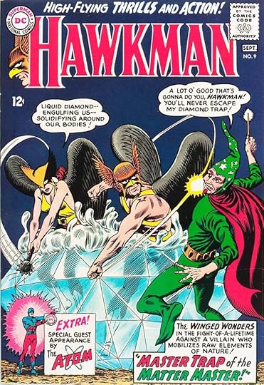
The Atom guest starred in issue #9, and these two heroes would later appear together for a brief series after their books ended. Ira has done a miniature version of his Atom logo.
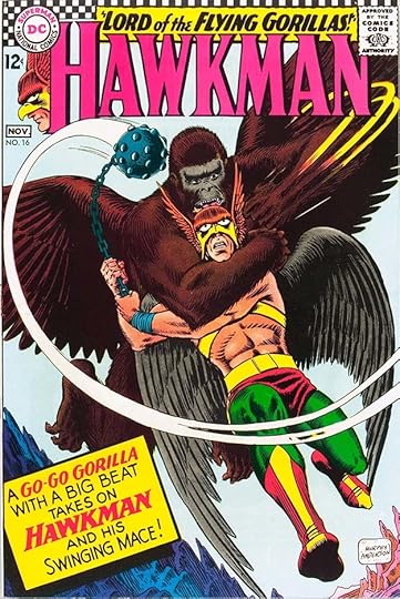
Issue #16 from 1966 is now in the era of poor cover design and big captions. Also the era of lame language like “Go-Go Gorilla.” At least the art by Murphy Anderson is the main focus here.
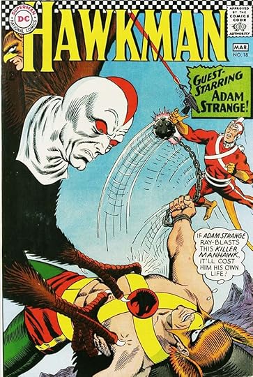
Issue #18 has another guest-star, Adam Strange, and these two heroes would have later crossovers and connections between Hawkman’s home planet Thanagar and Adam’s adopted homeworld Rann. I like the burst in one corner of the caption.
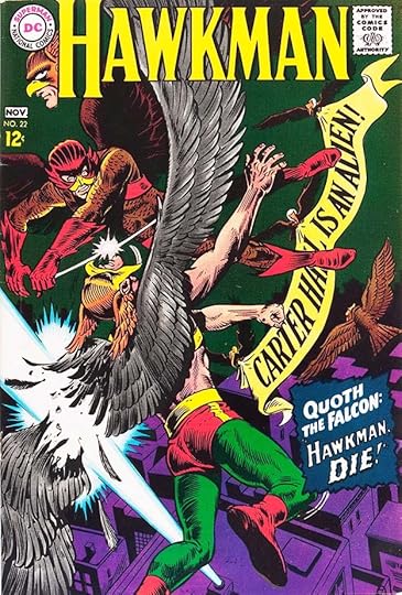
Issue #22 has a handsomely-lettered banner by Ira, and the caption manages to pick up a Stan Lee vibe, which is what editor Schwartz was probably going for.
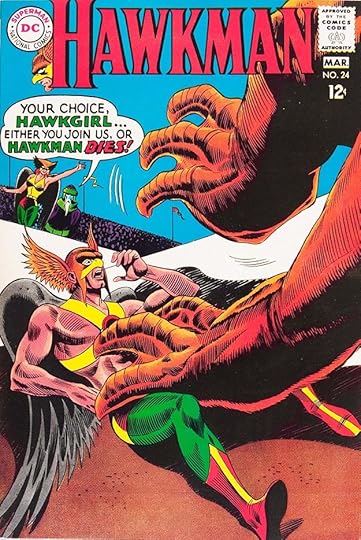
Ira’s final cover lettering was for issue #24, above. The balloon is larger than usual and I think works well. Here are the covers lettered by Schnapp: 1-5, 7-24. That’s 23 in all.
Doom Patrol on Wikipedia.
Hawkman on Wikipedia.
More articles like this are on the Comics Creation page of my blog.
The post Ira Schnapp in DOOM PATROL and HAWKMAN appeared first on Todd's Blog.
Todd Klein's Blog

- Todd Klein's profile
- 28 followers

