
Todd Klein's Blog, page 93
April 2, 2021
Ira Schnapp’s DC Ads: 1965 Part 2
 All images © DC Comics. From ACTION COMICS #327, Aug 1965
Opening part 2 of the 1965 DC ads lettered and designed by Ira Schnapp with this one, the 80-Page Giant line continued to get lots of promotion and support, and Jimmy Olsen’s popularity was solid.
 From THE ADVENTURES OF JERRY LEWIS #89, Aug 1965
The same Bob Hope ad with all new lettering by Ira.
 From ADVENTURE COMICS #335, Aug 1965
This public service ad is well meant, but perhaps describes activities beyond the means of many readers.
 From ADVENTURE COMICS #336, Sept 1965
 From JIMMY OLSEN #87, Sept 1965
 From WORLD’S FINEST COMICS #152, Sept 1965
Seven new blurbs by Ira for this ad in September cover-dated issues. It seems likely there were some in August, but I found none.
 From ADVENTURE COMICS #336, Sept 1965
A popular war feature about a German World War One fighter pilot received a SHOWCASE tryout, and went on to its own series. Lots of lettering by Ira, and I like his style on ACHTUNG!
 From DOOM PATROL #98, Sept 1965
Again, the same art but all new lettering on this Jerry Lewis ad.
 From ADVENTURE COMICS #336, Sept 1965
While Jimmy Olsen’s Giant featured his greatest “scoops,” Lois Lane’s was about her scraps, spats and scuffles, highlighting the inferior way she was handled in my opinion.
 From ADVENTURE COMICS #336, Sept 1965
Awakening interest in preserving the environment is the subject of this PSA.
 From BLACKHAWK #212, Sept 1965
DC trying to be hip with slang that was already considered corny and outdated in this ad for a BRAVE AND BOLD team-up. You have to remember that the editors were all middle-aged or older, so trying to appeal to young readers was a battle they often lost. Ira Schnapp did his best with what he was given.
 From TOMAHAWK #100, Sept/Oct 1965
DC did much better when they simply let the characters, covers and ideas sell the product, as here.
 From BLACKHAWK #213, Oct 1965
A crossover before they were a regular thing at DC. The full page ad gives Ira room for some fine display lettering, and his always fine use of black.
 From ACTION COMICS #329, Oct 1965
 From ADVENTURE COMICS #337, Oct 1965
Six new blurbs by Ira for October issues.
 From FALLING IN LOVE #78, Oct 1965
This is not exactly an ad, rather a request for reader mail, though it was a promotion of the romance titles, so I’m including it here. DC was hoping reader participation would lead to more sales. Lots of fine upper and lower case work by Ira.
 From HOUSE OF MYSTERY #154, Oct 1965
A rare full-page war ad from Ira promoting a new feature starring the brother of Sgt. Rock. I like the black burst with radiating lines around it.
 From ACTION COMICS #329, Oct 1965
An ad for an 80-Page Giant that’s a WORLD’S FINEST COMICS collection in everything but the title. Not sure why it was done this way.
 From CHALLENGERS OF THE UNKNOWN #46, Oct/Nov 1965
Even Bob Hope’s comic suffered from DC’s laughable attempts to be hip.
 From STAR-SPANGLED WAR STORIES #123, Oct/Nov 1965
A fine ad for a war title that was struggling.
 From ACTION COMICS #330, Nov 1965
The lame DC mascot “Johnny DC” seems to have fallen by the wayside, but Bob Hope trying to be hip is almost as bad. Many titles had subscription ads lettered by someone other than Ira Schnapp, this one for most of the line (other than romance titles) is by him.
 From ADVENTURE COMICS #338, Nov 1965
 From LOIS LANE #61, Nov 1965
Five new blurbs by Ira in November titles.
 From ACTION COMICS #330, Nov 1965
With the words GO-GO-GO in this ad you can almost feel the dreaded go-go checks on the horizon.
 From JUSTICE LEAGUE OF AMERICA #39, Nov 1965
The issue of JLA in the ad above was an 80-Page Giant, thus all reprints except for this half-page filler lettered by Ira. Not an ad, but I have no better place for it than here.
 From MYSTERY IN SPACE #103, Nov 1965
Sgt. Rock confronts racism in World War Two as promoted in this ad.
 From ACTION COMICS #330, Nov 1965
Even the public service ads were trying to be hip. That word had come into use in the early 1900s, peaked in popularity in the 1940s, and was already tired by the time of this ad, though as “hipster,” still a derogatory term today.
 From METAL MEN #16, Nov 1965
STRANGE ADVENTURES under editor Jack Schiff was struggling to attract readers. This wasn’t a bad attempt.
 From ACTION COMICS #330, Nov 1965
DC’s promotion of three issues representing something new. Two of them were, the newness of a kooky witch in Jerry Lewis is questionable. Lots of small lettering here.
 From DOOM PATROL #99, Nov 1965
TOMAHAWK continued to be the sole representative of “western” themes at DC, though at this point it was being marketed as a war comic. I love the giant question mark by Ira.
 From TOMAHAWK #101, Nov/Dec 1965
Only the bottom half of the lettering is new on this ad, but it’s enough to consider it a new one in my opinion.
 From ADVENTURE COMICS #339, Dec 1965
Schnapp did not always do well with scary lettering, but I think FANTASTIC and SINISTER work well in this ad. I also like the double-outlined burst.
 From DOOM PATROL #100, Dec 1965
More lame language from Robotman in this odd ad that’s almost strange enough to work, or at least provoke curiosity. I wonder where I’ve seen the phrase “‘Nuff Said” before?
 From ADVENTURE COMICS #339, Dec 1965
Another subscription ad nicely lettered by Ira.
 From ADVENTURE COMICS #339, Dec 1965
The final new PSA of the year ties into the United Nations again.
 From MYSTERY IN SPACE #104, Dec 1965
Still trying desperately to attract readers to this book.
 From BLACKHAWK #215, Dec 1965
While in the other “science fiction” title, a new series was being tried for the same reason. Ira’s lettering on this one is at least clever and interesting.
To sum up, I count 52 new house ads and seven new public service ads lettered by Ira Schnapp for a total of 59, his highest yearly number yet, plus that one half-page filler. And there were also a few ads by Gaspar Saladino and others. DC was promoting hard, perhaps feeling the pressure of competition from Marvel. We’ll see what happens in 1966.
Other articles like this are on the Comics Creation page of my blog.
The post Ira Schnapp’s DC Ads: 1965 Part 2 appeared first on Todd's Blog.


March 31, 2021
Ira Schnapp’s DC Ads: 1965 Part 1
 All images © DC Comics. From CHALLENGERS OF THE UNKNOWN #41, Dec 1964/Jan 1965
In 1965 letterer/designer Ira Schnapp continued to produce a large number of ads with the main focus being on the company’s superheroes. War and romance titles continued to do well, but romance received little publicity and few house ads, only one new one from Ira. The war titles got more attention and ads. Humor titles were dwindling, and though they had new ads, they ran mostly in other humor titles and occasionally in the adventure/mystery ones, as above. This Bob Hope ad was reused with different covers and lettering through the year, Jerry Lewis had a similar one. Mystery, adventure and science fiction titles were handled much the same way, running new ads mostly in similar books. There were just seven new public service ads, all lettered by Ira. In this first part I’ll cover ads that ran in January to July titles.
 From THE ADVENTURES OF BOB HOPE #90, Dec 1964/Jan 1965
This VERY BEST ad has mostly reused lettering with just the word FUNNY added, though COMICS READING is redone. I hesitate to count it as a new ad, but it was used often through the year with different titles, so I guess I will.
 From ACTION COMICS #320, Jan 1965
The first new public service ad of the year was a fine tribute to the late President Kennedy.
 From ADVENTURE COMICS #329, Feb 1965
 From LOIS LANE #55, Feb 1965
COMING SUPER-ATTRACTIONS continued in 1965, but I could not find any in some months, so it was more sporadic. There are six new blurbs by Ira here, which I will count as one new ad.
 From DOOM PATROL #93, Feb 1965
Another of the Bob Hope ads with the same art but new lettering.
 From DOOM PATROL #93, Feb 1965
This Challengers ad followed the same idea, the lettering at the top is reused, but the lower part with story titles and descriptions is new, and that’s enough to consider it a new ad in my opinion.
 From ACTION COMICS #321, Feb 1965
This full page ad by Ira promotes the 80-Page Giant line, which the DC Annuals had morphed into. Not a pretty ad, lots of clip art, but also lots of lettering.
 From BLACKHAWK #205, Feb 1965
This somewhat generic ad could be reused, but only for a few titles that involved the sea. Ira’s title is stylish, especially the G in Sagas.
 From ACTION COMICS #322, March 1965
Here’s the only version of this ad I found in March titles.
 From MYSTERY IN SPACE #98, March 1965
SHOWCASE had moved from a tryout title to a team-up one with each team lasting just an issue. Schnapp’s mini-logos in the caption mimic his actual ones, and he also did the larger logos below.
 From ACTION COMICS #322, March 1965
Some of Ira’s ads in this year have considerably less copy or text than most in the past, allowing the art to sell the product.
 From ACTION COMICS #322, March 1965
Editor Jack Schiff had been running public service ads supporting the United Nations for years, and this one reminds me that I took part in this program and had a French pen-pal for a year.
 From BLACKHAWK #207, April 1965
A handsome new generic ad for any issue of AQUAMAN. Love the title.
 From STRANGE ADVENTURES #175, April 1965
By contrast, this ad has lots of lettering, but it still works well.
 From ACTION COMICS #323, April 1965
 From JIMMY OLSEN #84, April 1965
Four new blurbs by Schnapp in April titles.
 From THE ADVENTURES OF JERRY LEWIS #87, April 1965
This ad could be used with any DOOM PATROL cover. Only THE WORLD’S STRANGEST HEROES and the logo are picked up from the covers. I like the checklist.
 From ACTION COMICS #323, April 1965
It’s likely that editor Julius Schwartz gave Ira a typed version of the text for this ad. Perhaps the words IF were emphasized, but it was Ira who made them monumental and thereby made the ad interesting and memorable.
 From ACTION COMICS #323, April 1965
There’s some drama in this PSA, the kind most of us hope to avoid, but kudos to DC for presenting the right reaction to it.
 From THE ADVENTURES OF BOB HOPE #92, April/May 1965
This Jerry Lewis ad has reused art but new lettering and cover.
 From GIRLS’ LOVE STORIES #111, May 1965
This new third-page ad for DC’s romance line was the only new one by Schnapp in 1965. It’s well done, but a far cry from his full-pagers of the past.
 From ACTION COMICS #324, May 1965
Another example of a Schnapp ad with less copy, allowing him room to make large, interesting display lettering and letting the cover sell the product.
 From THE ADVENTURES OF JERRY LEWIS #88, June 1965
I don’t know if readers were sold by the copy in these ads, but Ira does his best with it.
 From JIMMY OLSEN #85, June 1965
It seems like there must have been other uses of this ad in June titles, but I couldn’t find them.
 From ACTION COMICS #325, June 1965
This handsome ad has great display lettering and layout by Schnapp, and shows how the focus at DC had narrowed to promote superheroes the most. These 80-Page Giants were all reprints except for the covers. New work in other titles got little attention.
 From THE ADVENTURES OF BOB HOPE #93, June/July 1965
Unlike the Bob Hope ads, some of the ones for Jerry Lewis actually sound a bit like him to me.
 From ACTION COMICS #326, July 1965
My favorite thing here is the OF, so Art Deco and unusual.
 From ACTION COMICS #326, July 1965
Finally an ad for something new! The Teen Titans would go on to a long and popular career at DC. Notice how the character names are on one continuous banner.
The rest from 1965 in Part 2, and I’ll have totals for the year there. More articles like this are on the Comics Creation page of my blog.
The post Ira Schnapp’s DC Ads: 1965 Part 1 appeared first on Todd's Blog.
March 29, 2021
Ira Schnapp’s DC Ads: 1964 Part 2
 All images © DC Comics. From HOUSE OF MYSTERY #143, June 1964
To begin the second half of my look at DC ad work in 1964, this full-pager by Ira is full of drama enhanced by the black area at the top and the logo at the bottom, the only one I know of that used a double dash. This was actually reprints from many years earlier, perhaps prompted by the success of James Bond in theaters.
 From MYSTERY IN SPACE #92, June 1964
I never saw any of this run of appearances by J’onn J’onzz, and I must say they don’t seem very appealing now, but Ira tries his best to sell this one.
 From ADVENTURE COMICS #321, June 1964
With the Legion of Super-Heroes appearing regularly in ADVENTURE, a new letter-column header was created with a Schnapp title. Not an ad, of course, but I wanted to include things like this somewhere.
 From ACTION COMICS #313, June 1964
When a public service ad like this one ran on an inside cover, only black ink was available, but gray tones were added. There was probably also a color version.
 From STRANGE ADVENTURES #165, June 1964
After the departure of original editor Julius Schwartz, his science fiction titles were never the same. At least this one still had Adam Strange in it for a while. That’s a strange arrow from Ira.
 From ACTION COMICS #313, June 1964
Lots of fine work from Schnapp on this annual ad for the first and only one featuring Superboy. Plus Lana Lang, of course!
 From TALES OF THE UNEXPECTED #83, June/July 1964
A new generic ad for STRANGE ADVENTURES promotes two issues, even while this title begins to run off the rails in my opinion.
 From ACTION COMICS #314, July 1964
 From SUPERMAN #170, July 1964
Four new blurbs found in July titles for this ad. Possibly I missed one.
 From JIMMY OLSEN #78, July 1964
This PSA is not lettered by Schnapp, except for the title. I don’t know who did the balloon lettering or why, perhaps Ira didn’t have time to finish it. I won’t count it as a Schnapp ad.
 From ACTION COMICS #314, July 1964
Half page ads for annuals continued to be created by Schnapp, and were often used together, but also separately. The ad text, usually written by the editors, are often effective but made more so by Ira’s lettering. Counts as two ads.
 From THE BRAVE AND THE BOLD #54, July/Aug 1964
Batman’s new look touted here was idea of new editor Julius Schwartz. Batman and Robin were drawn more realistically and their adventures were also less fantasy-based. It was a change long overdue, and popular with fans.
 From DOOM PATROL #89, Aug 1964
Another Challengers ad with mostly new lettering.
 From ACTION COMICS #315, Aug 1964
While touted here as an annual, this was actually the second issue of a new series of 80-Page Giants that took over the role of annuals but came out monthly. On the actual book, the word Annual was removed from the title.
 From ADVENTURE COMICS #323, Aug 1964
Somehow I found these PSAs more interesting when they took place in the great outdoors. Perhaps they reminded me of my time in the Boy Scouts.
 From MYSTERY IN SPACE #92, Aug 1964
Another new text page header by Ira Schnapp for MYSTERY IN SPACE.
 From WORLD’S FINEST COMICS #144, Oct 1964
And a new WORLD’S FINEST letter column header with lettering by Ira, though I don’t think he did the art.
 From BLACKHAWK #201, Oct 1964
Again we see an ad for an 80-Page Giant that promotes it as an annual. They were, essentially, the same thing, just released more frequently.
 From ADVENTURE COMICS #325, Oct 1964
This PSA was ahead of the curve on smoking, anti-smoking ads did not become common in the U.S. until 1967. Good for them. DC has also snuck in an ad for Palisades Amusement Park in panel 2, I wonder if it was a paid spot?
 From LOIS LANE #52, Oct 1964
This has to be the strangest paid ad that Schnapp ever worked on! Images of the wax figures depicted can be found online. The museum was short-lived despite success at the New York World’s Fair of 1964-65. A planned relocation to California never happened.
 From BLACKHAWK #202, Nov 1964
Memorable ad copy probably from editor Julius Schwartz is memorably handled by Ira Schnapp in this ad, one of his best of the year. This is another of the 80-Page Giant series. I particularly like the radiating lines around LISTEN.
 From ADVENTURE COMICS #326, Nov 1964
Another earnest and well-meaning PSA that I probably skipped over.
 From THE ADVENTURES OF JERRY LEWIS #85, Nov/Dec 1964
DOOM PATROL was like the secret success that DC didn’t know what to do with. At least these small ads gave it some promotion.
 From ACTION COMICS #319, Dec 1964
The quality of this scan is poor, but I like Ira’s lettering here, though only the top title is new.
 From JIMMY OLSEN #81, Dec 1964
On this half-page version, Ira did all new lettering, so between the two versions I will count this as one new ad.
 From DOOM PATROL #92, Dec 1964
Another of these ads with mostly new lettering. If you were a Challengers reader, you were probably also a Doom Patrol reader and vice versa.
 From ACTION COMICS #319, Dec 1964
 From JIMMY OLSEN #81, Dec 1964
 From SUPERBOY #117, Dec 1964
 From WORLD’S FINEST COMICS #146, Dec 1964
I found no versions of this ad in August through November titles. Did I miss them, or was the ad finally running out of steam? There are seven new blurbs by Ira here, possibly some appeared in November titles where I didn’t have the right pages to check or overlooked them.
 From BLACKHAWK #203, Dec 1964
This new war tryout series ran only two issues and went no further, despite the hard sell and great logo by Schnapp seen in this ad. As far as I know it was not connected to the Hasbro toys, which also debuted in 1964, but I could be wrong. The title had been used in comics since 1942 by several publishers.
 From MYSTERY IN SPACE #96, Dec 1964
A new hero that went on to a long career at DC began in THE BRAVE AND THE BOLD, artfully promoted by Ira. A third-page version had some different lettering, but not enough for me to call it a separate ad.
So, to sum up, I count 41 house ads created by Ira, also three paid ads and seven public service ads for a total of 50 ads, plus six text page or letter column headers. Plenty of work, and he wasn’t finished yet. On to 1965!
More on Walter’s Wax Museum and Superman.
Other articles like this are on the Comics Creation page of my blog.
The post Ira Schnapp’s DC Ads: 1964 Part 2 appeared first on Todd's Blog.
March 28, 2021
And Then I Read: PIECES AND PLAYERS by Blue Balliett
 Cover and illustrations by Brett Helquist
This is the fourth book in the “Chasing Vermeer” series by Balliett, each of which includes a mystery involving fine art. In the first three, a particular artist was the focus: Vermeer, Frank Lloyd Wright and Alexander Calder. This time the mystery is about thirteen pieces of art stolen from a small private museum in the Chicago suburb where three returning children live; Calder and Petra, featured in the three previous books, and Tommy, included in the second and third. Joining them are two more children who were featured in other books by Balliett that I haven’t read yet; Early and Zoomy. Tommy, Calder and Petra’s friend Mrs. Sharpe is a trustee of the small museum, and she and the other trustees are characters and sometimes suspects in the story as the children investigate what might have happened to the missing art. Mrs. Sharpe’s son Eagle is also introduced and plays a mysterious part, sometimes helping the children, sometimes considered a suspect. Episodes inside the museum are key to the story, as the children seem to be receiving messages about the theft from the other art there, and from the ghost of the museum’s founder. When they decide to sneak into the museum secretly at night, things get dangerous. And who are the “black jackets,” older kids who seem to be following them everywhere?
I enjoyed this, but not as much as the previous books. There’s such a large cast that the book seems less focused, and the mystery is harder to understand both for the children and the reader. The new children are interesting, but it’s harder to give them all moments to shine in this busy plot. Still, recommended.
&amp;amp;amp;amp;amp;amp;lt;br /&amp;amp;amp;amp;amp;amp;gt;&amp;amp;amp;amp;amp;lt;br /&amp;amp;amp;amp;amp;gt;&amp;amp;amp;amp;lt;br /&amp;amp;amp;amp;gt;&amp;amp;amp;lt;br /&amp;amp;amp;gt;&amp;amp;lt;br /&amp;amp;gt;&amp;lt;br /&amp;gt;&lt;br /&gt;<br /><br />
The post And Then I Read: PIECES AND PLAYERS by Blue Balliett appeared first on Todd's Blog.
March 26, 2021
Ira Schnapp’s DC Ads: 1964 Part 1
 All images © DC Comics. From THE ADVENTURES OF BOB HOPE #84, Dec 1963/Jan 1964
The high volume of DC ads continued in this year with a few shifts in placement. There was only one new ad in the romance titles, a subscription one not by Ira Schnapp, and almost no other house ads. The other genres DC was publishing all had some, but the ones for the adventure/mystery/science fiction and humor titles were generally small, like the one above and ran mostly in those titles. The emphasis was on superheroes, as DC continued to play to that successful area. There were just eight new public service ads, nearly all lettered by Schnapp, and he produced most of the house ads and lettered a few new paid ads too. I’ll cover the first half here and the second half in Part 2, with totals for the year there.
 From ACTION COMICS #308, Jan 1964
 From ADVENTURE COMICS #316, Jan 1964
 From LOIS LANE #46, Jan 1964
This venerable ad continued in the frame from the previous year with five new blurbs for January cover-dates. As before, I consider each month a new ad because of the work involved for Ira Schnapp.
 From AQUAMAN #13, Jan/Feb 1964
Here’s a lesson in how to create an effective ad for a third of a page, space often left at the end of a story or a chapter. The three open display words at upper left increasing in size as the descend tell a dramatic story themselves, and the amorphic black shape for the other text also pulls the reader inward, as does the shape of Ira’s logo.
 From THE ADVENTURES OF JERRY LEWIS #80, Jan/Feb 1964
Sales of this Hollywood humor title must have been slowing, and the editor was hoping a contest would spark interest.
 From ACTION COMICS #309, Feb 1964
Though this was a war issue, a solo series tryout in THE BRAVE AND THE BOLD was still being promoted well with a handsome full-page ad by Schnapp. Ira may also have done the background art.
 From ACTION COMICS #310, March 1964
 From METAL MEN #6, Feb/March 1964
Another rare push for a war title, this was the only war annual DC produced. Many full-page ads by Ira ran in more than one size, but usually the same lettering was used. Here the lettering is different on the smaller one.
 From ACTION COMICS #310, March 1964
The first new public service ad of 1964 has a fine title and lettering by Schnapp.
 From AQUAMAN #14, March/April 1964
This should have been a full page ad in my opinion, but the feature wasn’t considered important enough, I guess. I like the black burst.
 From GREEN LANTERN #28, April 1964
I don’t know about the characters, but their Ira Schnapp logos work well together.
 From WONDER WOMAN #145, April 1964
The text in this Bob Hope ad is as long as some of his monologues!
 From BLACKHAWK #195, April 1964
I always thought this feature deserved its own series, but it didn’t get one.
 From ACTION COMICS #311, April 1964
 From ADVENTURE COMICS #319, April 1964
 From JIMMY OLSEN #76, April 1964
 From SUPERMAN #168, April 1964
I did not find this ad in February or March issues, but it returned with six new Schnapp blurbs in April ones.
 From ACTION COMICS #311, April 1964
Now, this is how to announce a new series! It’s one of Ira’s best ads in my opinion, even if the character’s battle cry is silly. Also one of Ira’s best logos.
 From ACTION COMICS #311, April 1964
I think this is the only PSA that utilized a Hollywood actor. Though he was appearing in a DC series, he’s drawn more realistically here, and he must have given permission for this admirable ad.
 From HOUSE OF MYSTERY #142, April 1964
This generic ad could be used with almost any two covers, joining other previous generic third-page ads in the rotation.
 From ACTION COMICS #312, May 1964
This is the first of several paid ads lettered by Schnapp in 1964. The client certainly got his money’s worth, half the ad is Ira’s work.
 From DOOM PATROL #87, May 1964
BLACKHAWK had been cruising along for years with little attention other than a generic third-page ad that was often repeated. This new one is for a specific issue and I think quite effective thanks to Ira’s lettering.
 From ACTION COMICS #312, May 1964
After little attention for a long time, DC’s war books were more in the spotlight in 1964. This new title did not last long, but Ira did a fine job of promoting it. There were smaller versions with the same lettering.
 From ACTION COMICS #312, May 1964
 From ADVENTURE COMICS #320, May 1964
Five new blurbs from Ira for this ad in May titles.
 From ADVENTURE COMICS #320, May 1964
Another nice title by Ira on this PSA.
 From STRANGE ADVENTURES #164, May 1964
 From HOUSE OF MYSTERY #143, June 1964
 From HOUSE OF SECRETS #66, May/June 1964
These three text page titles were designed by Schnapp in some of his familiar styles. The first one replaced a letters page when STRANGE ADVENTURES changed editors from Julius Schwartz to Jack Schiff, who apparently didn’t want to run one. He was also the editor of HOUSE OF MYSTERY and HOUSE OF SECRETS where these features replaced generic unconnected text pages. Both could have been used for reader letters, but in issues I looked at they were instead collections of random unusual facts and mysteries.
 From BLACKHAWK #196, May 1964
The one remaining title at DC with at least some elements of a western, mainly Indians, gets some attention in this ad.
 From ADVENTURE COMICS #321, June 1964
Another full-page paid ad lettered by Ira. I’m guessing that the client for these was the same unnamed company, as the mailing addresses are similar. I don’t recall seeing the toys from this one anywhere, I wonder if they were as cool as they look in the ad? Probably not is my guess.
 From DOOM PATROL #88, June 1964
As always, when sales were slipping, DC tried shaking things up with gimmicks like new costumes, new logos and new internal strife, all in play here.
 From BLACKHAWK #197, June 1964
The title display lettering at the top of this ad appeared previously, the rest is new. There are several others like this in coming months. Since most of the lettering is new, I will count them as separate ads.
 From ACTION COMICS #313, June 1964
 From ADVENTURE COMICS #321, June 1964
Four new Schnapp blurbs for June books.
 From BLACKHAWK #197, June 1964
While the Doom Patrol did not get much love in DC in superhero titles, at least they were being promoted with ads like this elsewhere.
I’ll continue with the rest of the ads from 1964 in Part 2, coming up next. Other articles like this can be found on the Comics Creation page of my blog.
The post Ira Schnapp’s DC Ads: 1964 Part 1 appeared first on Todd's Blog.
March 24, 2021
Ira Schnapp’s DC Ads: 1963 Part 2
 From ADVENTURE COMICS #310, July 1963
I’ll begin the second half of 1963 with one of Ira’s best ads from this year. He really went to town on the display lettering to promote this anniversary issue. I love the big S on Silver and the big P on Plus.
 From ACTION COMICS #302, July 1963
 From ADVENTURE COMICS #310, July 1963
Four new blurbs for this ad by Ira with one by someone else from the previous month. Can you spot it? It’s the one that’s not as good.
 From DETECTIVE COMICS #317, July 1963
This is the second new public service ad from 1963 that Ira Schnapp did not work on. I don’t know who did, but probably the same person as the other one.
 From ACTION COMICS #303, Aug 1963
 From ADVENTURE COMICS #311, Aug 1963
Four new Schnapp blurbs for August titles. I’m counting each month of these as a separate new ad because of the work involved.
 From BATMAN #157, Aug 1963
Lois Lane certainly had her fans, and many of them probably bought her second annual. This appeared in an August title, but the annual went on sale in early June, pointing out the typical two-month advance on cover dates, done in hopes that retailers would keep them on their racks longer.
 From BATMAN #157, Aug 1963
Certainly lots of Batman fans were buying his annuals, including me, though I missed this one. Reprints of early covers were rare enough to merit a blurb from Ira here.
 From ACTION COMICS #304, Sept 1963
 From ADVENTURE COMICS #312, Sept 1963
Four new blurbs in September titles, and a new frame from Ira that includes a major error. Did you notice? He’d done so many of these, but this time his attention lapsed. This frame was not used again.
 From ACTION COMICS #305, Oct 1963
This PSA adds interest by putting the character in a plane over the northern forests. The black and white versions were used on inside covers, and gray tones were added. Usually there was also a color version.
 From ACTION COMICS #305, Oct 1963
 From ADVENTURE COMICS #313, Oct 1963
 From LOIS LANE #44, Oct 1963
Five new Schnapp blurbs in October titles.
 From THE BRAVE AND THE BOLD #50, Oct/Nov 1963
 From ADVENTURE COMICS #314, Nov 1963
The top image isn’t exactly an ad, but I didn’t count it as a story page, so I’m counting it here. It’s a plea for mail, essentially, as this title is revamped for the second time from a tryout venue to a team-up book with teams supposedly chosen by reader mail. Below is the ad made from some of the same lettering, parts are relettered, but I will only count this as one ad.
 From THE BRAVE AND THE BOLD #50, Oct/Nov 1963
The same issue of BRAVE AND BOLD has this new letter-column header with the word MAILBAG lettered by Schnapp.
 From OUR FIGHTING FORCES #80, Nov 1963
 From ACTION COMICS #305, Oct 1963
Ira’s ad for the Flash Annual came in at least two sizes, with some relettering on the smaller one, though I’ll just count them as one ad. Flash artist Carmine Infantino’s star was on the rise, and his mention by name in this ad was almost unheard of at DC up to this time.
 From ACTION COMICS #306, Nov 1963
 From ADVENTURE COMICS #314, Nov 1963
 From LOIS LANE #45, Nov 1963
 From SUPERMAN #165, Nov 1963
Six new blurbs for November titles by Ira.
 From DETECTIVE COMICS #321, Nov 1963
This PSA returns to work done by the United Nations, an annual theme.
 From BLACKHAWK #191, Dec 1963
This ad is mostly a repeat from one a few years earlier except that where it says TWO here it said THREE before, and of course the story titles and cover are new. I’m hesitant to call it a new ad, but I guess I will since there are other versions with other covers and story titles.
 From BATMAN #160, Dec 1963
An ad for the second team-up issue of BRAVE AND BOLD again asking for mail as well.
 From ACTION COMICS #307, Dec 1963
 From ADVENTURE COMICS #315, Dec 1963
Four new blurbs for December issues that are NOT lettered by Schnapp. These might be by Joe Letterese trying to imitate Ira and doing fairly well, he also worked in the DC production department. It seems that Ira was having trouble keeping up with ad work in this year, but let’s remember he was 69 years old at the time and doing plenty of other DC lettering.
 From BLACKHAWK #191, Dec 1963
The beginnings of a new team that would soon gain their own title by converting this one. I love the black shape by Ira here.
 From MY GREATEST ADVENTURE #84, Dec 1963
Two of DC’s less-promoted titles get a small push in this busy but well-designed third-page ad.
 From ADVENTURE COMICS #315, Dec 1963
A PSA promoting libraries, of which I heartily approve.
 From BLACKHAWK #191, Dec 1963
We’re not seeing many Schnapp ads where he added background art now, but I think he might have here. Very effective.
 From ADVENTURE COMICS #315, Dec 1963
Another pair of half-page annual ads. There are many styles of display lettering on them, but they all work well together. These could be used separately and count as two ads.
 From ADVENTURE COMICS #315, Dec 1963
This ad’s word balloon is in the form of a rebus, though it’s much simpler than the one Ira did some years earlier for the story of Superman. Still an eye-catching idea.
 From BATMAN #160, Dec 1963
To finish up the year, we have a full page paid ad lettered by Ira, the first in a while. The war theme seems appropriate for an inside cover ad in black and white and gray tones, and Ira’s work is inspired. Look at how the small 126 banner floats in front of WORLD but doesn’t prevent it from reading correctly. I also like the OF at upper left, and the burst balloon in the picture that just fills the space available. The client must have asked for comics lettering in their ad, and who better than Schnapp?
To sum up, I count 39 new house ads by Ira, six public service ads and one paid ad for a total of 46, plus a letter column header. Down some from the previous year, but still lots of ad work. We’ll see how it goes for him in 1964.
More articles like this are on the Comics Creation page of my blog.
The post Ira Schnapp’s DC Ads: 1963 Part 2 appeared first on Todd's Blog.
March 22, 2021
Ira Schnapp’s DC Ads: 1963 Part 1
 All images © DC Comics. From ADVENTURE COMICS #304, Jan 1963
The volume of DC ads did not decrease in 1963, and Ira Schnapp was still lettering and designing most of them, though in this year there were again more with lettering by others including Gaspar Saladino. As always, I will focus on the ones Schnapp did. There were no new romance group ads, but a few new ones for other DC books appeared there, showing that the separation was beginning to loosen, though only in one direction. There were four repeated public service ads and eight new ones, but Ira lettered only six of them. DC’s new lame mascot Johnny DC, above, appeared in many ads, Ira did some fine Old English style lettering in this one. Did Ira also draw the mascot and background art here? I don’t know, but it’s possible. Or it may have been done by someone else on staff.
 From ACTION COMICS #296, Jan 1963
 From ADVENTURE COMICS #304, Jan 1963
 From LOIS LANE #38, Jan 1963
I found five new blurbs by Ira in books with January cover dates for this now venerable third-page ad. It also has a new frame and title by Ira and includes Johnny DC, which suggests that Ira was drawing the mascot too, though it could have been reused from somewhere else.
 From ACTION COMICS #296, Jan 1963
The first public service ad of the year has an intriguing title by Schnapp.
 From ACTION COMICS #296, Jan 1963
This ad for the annual Rudolph Annual is rather small and hard to read in places. There was a full page version that simply turned the ad sideways to fit. Many house ads were now being prepared in more than one size.
 From ACTION COMICS #297, Feb 1963
ComicPacs got a full page ad that ran on inside covers in 1963 with a photo of the store display and a larger Johnny DC. As I compare the mascot images, I’m more convinced Ira was doing them. ComicPacs still seem like a bad option for comics fans, but a good one for parents.
 From ACTION COMICS #297, Feb 1963
 From LOIS LANE #39, Feb 1963
Four new blurbs by Ira in February books, and the first set are longer and larger, using a different previous layout for that, probably to fit the space available.
 From BATMAN #153, Feb 1963
This third-page ad is unusual in that it promotes two different issues of the same title. I don’t think that had been done before. As a child, I remember flipping through the comics racks in stores looking for older issues, and sometimes I found one, but it wasn’t common. I like the symmetry and diamond shape by Ira in this ad.
 From BATMAN #153, Feb 1963
Generally DC’s war titles were not promoted in their superhero books, so this is a rare exception, and it ran in many titles. I have no idea who decided what ads were used in each book, there seems to be no set plan except in a few cases like those COMING SUPER-ATTRACTIONS ones, but generally ads ran in similar titles, or titles from the same editor more often than not. Maybe editors made the call when they could, but were sometimes overruled?
 From BATMAN #153, Feb 1963
Tommy Tomorrow was a feature that ran for many years in several titles, and had a SHOWCASE tryout, but never achieved a series. Ira does his best to sell it here.
 From ACTION COMICS #297, Feb 1963
I can see editor Julius Schwartz pushing hard to get this tryout of his new book promoted, and it was. The ad appeared in several sizes and over several months with different covers in many titles. The effort did not immediately succeed in landing a new series, though.
 From HOUSE OF MYSTERY #131, Feb 1963
This title was only promoted in other DC mystery/adventure/science fiction ones, for instance. This use of the UNEXPECTED logo by Ira shows how long that telescoping was!
 From ACTION COMICS #298, March 1963
 From ADVENTURE COMICS #306, March 1963
Four new blurbs for March books.
 From OUR ARMY AT WAR #128, March 1963
As was typical, this war ad ran only in war titles.
 From ACTION COMICS #298, March 1963
Home safety is featured in this PSA likely written by Jack Schiff. It’s an ad I probably skipped by as a child.
 From MY GREATEST ADVENTURE #77, March 1963
Not exactly a western title, but TOMAHAWK was the closest thing to it at DC in 1963, and it had to be promoted elsewhere, as there was no longer a western line. In fact, they were trying to sell it as a war title here.
 From ACTION COMICS #299, April 1963
 From ADVENTURE COMICS #307, April 1963
 From LOIS LANE #40, April 1963
Six new blurbs by Ira in April books. Color was missed on the Superboy logo in the last one.
 From BLACKHAWK #183, April 1963
This adaptation of the first James Bond film was picked up from Gilberton when they didn’t want it for their CLASSICS ILLUSTRATED line in America, though they used it in England. It was an odd fit at DC, who generally didn’t do movie adaptations then, but this third-page ad by Ira tried to sell it in a number of titles.
 From BLACKHAWK #183, April 1963
Now, this PSA is one I find much more interesting: full of information that might intrigue kids, and good public service. Rita Moreno, at least, is still with us.
 From FALLING IN LOVE #58, April 1963
One of two new ads created by Schnapp for the DC romance books trying to get those readers interested in other female DC characters. This one was kind of a stretch, but nicely designed.
 From THE ATOM #6, April/May 1963
Another small ad promoting the GL-Flash team as they crossed over into each other’s titles. The deep shadows on DOUBLE add depth.
 From HEART THROBS #83, April/May 1963
Here’s the other new ad by Ira for the romance line. This one seems like it would have a better chance of success to me, as Lois’s title was played more in the romance direction than Wonder Woman. An interesting combination of superhero and romance styles from Ira, and great use of black.
 From ACTION COMICS #300, May 1963
 From ADVENTURE COMICS #308, May 1963
 From SUPERMAN #161, May 1963
Five new Schnapp blurbs for May titles. Where I can only find three or four, did I miss one, or perhaps one wasn’t used? Hard to say.
 From ACTION COMICS #300, May 1963
The May PSA is not lettered by Ira Schnapp, I don’t know who did letter it. Probably someone else working on staff at DC.
 From ACTION COMICS #300, May 1963
This is one of several similar subscription ads from around this time that are mostly not lettered by Schnapp, but this one has a section by him in a box. I’m not sure how that happened or why. Perhaps Ira started it and couldn’t finish it? Perhaps it was a separate house ad originally? The rest of the lettering is definitely not as good. I am going to count this for Ira based on what he did.
 From ACTION COMICS #301, June 1963
Here’s a first, COMING SUPER blurbs by someone other than Schnapp. I can only find these three. Perhaps he was away when they were needed.
 From ACTION COMICS #301, June 1963
This new generic line ad could be used with any four titles, though the baseball theme was probably only good for a few months. Still not liking the mascot.
I will continue with ads running in July to December 1963 books in Part 2 of this article next time, and do totals for the year then. Other posts you might enjoy are on the Comics Creation page of my blog.
The post Ira Schnapp’s DC Ads: 1963 Part 1 appeared first on Todd's Blog.
March 20, 2021
Rereading: BETWEEN PLANETS by Robert A. Heinlein
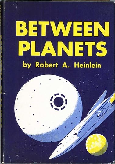 Cover art by Cllifford Geary
The fifth book in Robert Heinlein’s science fiction series for young readers is different from the ones before it in that it’s written as a suspenseful thriller rather than a typical boys’ adventure. Don Harvey attends a private school in New Mexico where riding is a feature activity while his parents are on Mars doing scientific research. He’s surprised when they suddenly send word and a rocket ship ticket to join them on Mars, but talk of war between Venus and Earth as been growing, and his school is happy to see him leave. Don was born in space and claims dual citizenship from Earth and Venus. Don’s parents have told him to contact their old friend Dr. Jefferson in Chicago the night before his ship leaves, and Don and the doctor attend a nightclub show where the power goes off suddenly. Dr. Jefferson is worried, and they return to his home, but security officers are waiting for them there and Don is interrogated before being released at his hotel. Before this happened, Dr. Jefferson had sent Don a package and impressed on him the contents must urgently travel with Don to his parents on Mars. When the package arrives, it holds only a cheap plastic ring, which Don decides to wear. Another police interrogation examines the ring but deems it harmless. Before boarding his ship to the orbiting space station where he will transfer to a Mars rocket, Don meets a Venusian, a dragon-like creature with the English name Sir Isaac Newton. They become friends, and when trouble erupts on the space station, that friendship helps him. Venusian freedom fighters have taken over the station, and plan to destroy it. The only options for Don are to return to Earth or join the rebels and travel to Venus, which he agrees to do. Throughout the book, Don is constantly thrown from one kind of trouble to another, and his eventful time on Venus is no different as war erupts.
This is an exciting story and I enjoyed reading it again. Recommended.
&amp;amp;amp;lt;br /&amp;amp;amp;gt;&amp;amp;lt;br /&amp;amp;gt;&amp;lt;br /&amp;gt;&lt;br /&gt;<br /><br />
The post Rereading: BETWEEN PLANETS by Robert A. Heinlein appeared first on Todd's Blog.
March 19, 2021
Ira Schnapp’s DC Ads: 1962 Part 2
 All images © DC Comics. From ACTION COMICS #289, June 1962
How many of you guessed this pass to new worlds was a library card? As we begin the second half of Ira Schnapp’s ad work in 1962, I’ve cheated a bit by including this one from June cover dated issues. The public service ads were the project of editor and writer Jack Schiff, who must have loved books as much as I do.
 From ACTION COMICS #289, June 1962
I also wanted to show this ad from June because, even though I don’t think it was lettered by Ira, I like it. Someone was going for a 1950s advertising look on the display lettering, and it works for me.
 From THE BRAVE AND THE BOLD #42, June/July 1962
I like this ad with the low-key approach, as if the characters were in a cop show. I also like the shape of the black area.
 From THE BRAVE AND THE BOLD #42, June/July 1962
In the same issue is a letter column heading with a title by Schnapp based on his Hawkman logo. Letter columns had been around for a few years at DC, and were growing in popularity with fans. Here editor Julius Schwartz was getting a head start, as Hawkman didn’t even have his own title yet, but soon would. Not an ad, but close.
 From THE ATOM #1, June/July 1962
One more letter column heading by Ira for a new Schwartz title. Julie was obviously a fan of fan letters. He’d started out as a science fiction fan himself.
 From THE FOX AND THE CROW #74, June/July 1962
Another book edited by Schwartz, I love the amorphous shape of space in the background art by Schnapp, and I loved the title and character.
 From G.I. COMBAT #94, June/July 1962
There are a few new small war ads that ran only in other war books for the most part. Others from the previous year were also used.
 From ACTION COMICS #290, July 1962
Two half-page annual ads that could be and were used separately, but here designed to work well together. I always thought Lois Lane was an odd choice for an annual, especially since her own title, and therefore reprints from it, were only a few years old, but there was more than one, so they must have sold. Counts as two ads.
 From BLACKHAWK #174, July 1962
Two ads together, one for a specific issue, and one more generic. DC and Ira are trying to make 2 BIG STORIES seem like a plus, though not long before there were three stories per issue.
 From ACTION COMICS #290, July 1962
 From ADVENTURE COMICS #298, July 1962
 From LOIS LANE #34, July 1962
 From SUPERMAN #154, July 1962
Six new blurbs in July books. Editor Mort Weisinger is making someone fat again. Was this a personal obsession? He was overweight himself from photos I’ve seen.
 From WONDER WOMAN #131, July 1962
I liked Hawkman, but remember thinking his “battle cry” in this ad by Ira was kind of silly. Nicely lettered, though.
 From ACTION COMICS #290, July 1962
Superman is back in this PSA. I know I was more likely to read them when a DC superhero was present.
 From OUR ARMY AT WAR #120, July 1962
Editor Robert Kanigher’s SEA DEVILS gained an ad in his war comics, and for once it was mostly great art with a small amount of lettering work for Ira.
 From ACTION COMICS #290, July 1962
I’ve only found this annual ad as a half-page, but there’s plenty of appealing lettering on it.
 From BLACKHAWK #175, Aug 1962
This generic annuals ad ran in most August titles.
 From BLACKHAWK #175, Aug 1962
This ad did also, promoting a new marketing idea: four bagged DC comics for 47 cents, a savings of one cent. And, if I recall correctly, it was hard to see which titles were in the there behind the first one. Ira did the logo used here and on the packaging. Ira’s ad lettering doesn’t really explain what it is, you have to read the small lettering on the package illustration, but it does emphasize they’re sold in supermarkets, which didn’t usually sell comics. They were probably more willing to take this sealed bag as it would cut down on shopper damage. Apparently they sold well for many years, probably more often to parents than kids.
 From ACTION COMICS #291, Aug 1962
 From ADVENTURE COMICS #299, Aug 1962
Four new blurbs for the August issues on this ad.
 From ACTION COMICS #291, Aug 1962
A PSA encouraging kids to stay in school. I would think those who didn’t probably weren’t reading comics anyway, but maybe I’m wrong.
 From BLACKHAWK #175, Aug 1962
This generic third-page ad was used often over the next months with a variety of covers.
 From ADVENTURE COMICS #300, Sept 1962
Lois Lane had become such a pain in her own title that fans were more interested in Lana, I guess, and this ad told you where to find her.
 From ACTION COMICS #293, Oct 1962
A fine full-pager for The Atom with appealing display lettering, fine use of black, and intriguing ideas.
 From ACTION COMICS#293, Oct 1962
I found no new blurbs for September issues, and just these three for October. Perhaps I missed some, or the ad may have been pushed out in favor of others.
 From JIMMY OLSEN #64, Oct 1962
An ad full of melodramatic copy from editor Mort Weisinger, and the first use in an ad of “Not a Hoax…” and so on, one that was often repeated on covers, and became kind of a mantra of the late Weisinger Superman titles. Here, it worked for me, I wanted to read that story!
 From BLACKHAWK #177, Oct 1962
Another full-pager for a Weisinger title heralding the dominance of the Legion of Super-Heroes in ADVENTURE. It’s funny to recall now that the team had so few members at the start. So, here we are in the 21st century, where are they, I’d like to know?
 From ACTION COMICS #294, Nov 1962
Two more titles getting a full page ad by Ira. He was certainly busy with these in 1962! Beautifully designed.
 From ACTION COMICS #294, Nov 1962
 From LOIS LANE #37, Nov 1962
Four new blurbs by Ira in November titles.
 From CHALLENGERS OF THE UNKNOWN #28, Nov 1962
Individual issues among DC’s non superhero titles weren’t getting much attention in 1962, but this ad bucks that trend.
 From DETECTIVE COMICS #309, Nov 1962
Seems like useful information.
 From ACTION COMICS #295, Dec 1962
I found only these three new blurbs by Ira for December issues.
 From ACTION COMICS #295, Dec 1962
Even as a child of eleven in 1962 I knew that Johnny DC was a lame idea. Ira’s giant word balloon can’t improve it.
 From HOUSE OF MYSTERY #129, Dec 1962
The final new PSA of the year returns to the United Nations and Unicef. This is not the same as the one from a few years earlier.
 From STRANGE ADVENTURES #147, Dec 1962
Editor Julius Schwartz tried hard to make this idea work, but it did not gain a series until a few years later, and then didn’t last long. Perhaps there weren’t enough sports fans reading DC comics, which had no other sports-related titles. Ira did his best to sell it.
 From ACTION COMICS #295, Dec 1962
What was working for DC were their annuals featuring reprints of stories many readers had missed the first time around. These were used separately and count as two ads.
 From BLACKHAWK #179, Dec 1962
As far as I’m concerned, the amount of space devoted to Johnny DC in this ad is wasted, it could have shown art from the issue or just a larger cover. The gray background is equally boring. Whose idea was this mascot, I wonder?
So, to sum up, I count 56 house ads lettered by Ira Schnapp in 1962 plus eight public service ads for an astounding total of 64 ads plus two letter-column headers. Can Ira and DC keep up this increase in ad volume? We’ll see!
More articles like this are on the Comics Creation page of my blog.
More about Comicpacs.
More about Johnny DC.
The post Ira Schnapp’s DC Ads: 1962 Part 2 appeared first on Todd's Blog.
March 17, 2021
Ira Schnapp’s DC Ads: 1962 Part 1
 All images © DC Comics. From ACTION COMICS #284, Jan 1962
By 1962, house ads seem to have become a vital part of every DC title, and Ira Schnapp was lettering lots of them, even more than in 1961. The emphasis was on superheroes, but other genres got their share too, even if they didn’t appear in very many places. There were just eight new public service ads, all lettered by Ira, and four repeats from past years. In the romance group, many ads from 1961 were reused, and Ira did just one new one. Most of the full-pagers that ran in many titles, like the one above, promoted their long-time characters like Batman and Superman as well as newer heroes. These ads must have taken Ira a lot of time to do, and it shows in the work. Management must have felt they paid off in sales. Annuals received a lot of attention, so they must have sold well.
 From THE ADVENTURES OF BOB HOPE #72, Dec 1961/Jan 1962
Here’s an example of a half-page ad that appeared only in humor titles, and one that’s generic enough so they could repeat it several times with different covers. Many of the small Schnapp ads worked that way.
 From BLACKHAWK #168, Jan 1962
This third-page ad worked in a similar way, except that Ira had to letter new story titles for later uses. I’m not going to call those new ads, just count the first one.
 From ACTION COMICS #284, Jan 1962
 From ADVENTURE COMICS #292, Jan 1962
 From LOIS LANE #30, Jan 1962
The ever-present “Coming Super-Attractions” ad continued in this year. I found six new blurbs by Schnapp in January cover-dated issues, including the one for SUPERMAN, which had appeared in December 1961, but is here relettered. Perhaps even Ira couldn’t keep track of which ones he had done!
 From WONDER WOMAN #127, Jan 1962
This is one of many small ads by Ira Schnapp that I found used in only one or two places, and there could be more that I missed. Some of the scans I have for this year’s books don’t include ad pages. Ira’s logo works well here.
 From ACTION COMICS #284, Jan 1962
Annual ads continued to get wide coverage, and have lots of lettering.
 From LOIS LANE #30, Jan 1962
This generic third-page ad continued through year with many different titles and three new words from Ira at the bottom. I don’t count it as a new ad. Others from the past year or two also were reused.
 From ACTION COMICS #285, Feb 1962
 From ADVENTURE COMICS #293, Feb 1962
Four new blurbs by Ira in February cover-dated books. As before, I’m counting each month as a new ad because of the large amount of new lettering.
 From ACTION COMICS #285, Feb 1962
The first new public service ad of 1962 features upper and lower case lettering by Ira, something he did well, but it was rarely wanted.
 From THE FOX AND THE CROW #72, Feb/March 1962
Another annuals ad that seems like new work from Schnapp at first glance, but I think it’s cobbled together from previous ones with a few new bits of lettering by someone else, probably a production person. The top two and last two lines look like someone imitating Ira but not well.
 From ACTION COMICS #286, March 1962
 From ADVENTURE COMICS #294, March 1962
Four new blurbs for March cover dates, lots of tiny lettering.
 From WORLD’S FINEST #124, March 1962
The text for these ads was generally written by the editor of the books featured, Julius Schwartz in this case, but Ira was great at making it exciting with display lettering and design skills.
 From ACTION COMICS #286, March 1962
While these ads appeared together, they were also used separately, and the Aquaman one is a repeat except for the story title, on sale date and cover. The JLA ad counts as a new one for Ira.
 From ADVENTURE COMICS #294, March 1962
Many of the ideas expressed in these PSAs are still relevant today, though the specific facts may not be.
 From BLACKHAWK #170, March 1962
In the 1950s, full page ads for specific titles other than first issues were rare. In 1962, they’re common. Ira’s title at the top is very stylish.
 From ACTION COMICS #287, April 1962
 From ADVENTURE COMICS #295, April 1962
Three new Schnapp blurbs for April, as Lois Lane’s is a repeat.
 From WONDER WOMAN #129, April 1962
This seems like an ad that should have been used often, but I found it only in this one issue. Perhaps it was in titles where I don’t have ad pages.
 From BLACKHAWK #171, April 1962
Ads like this were reused with other covers and just the release month changed. Ira was doing most of DC’s logos and covers too, so that made for a more cohesive ad look.
 From ACTION COMICS #287, April 1962
This handsome ad is generic enough to reuse. After little attention for a decade, SUPERBOY was receiving an ad push perhaps because in ADVENTURE COMICS the boy of steel was often in the future with the Legion of Super-Heroes or replaced on covers by the Bizarros.
 From WONDER WOMAN #129, April 1962
This ad appeared only once, and is essentially an elaborate “next issue” blurb with extra work for Schnapp.
 From BLACKHAWK #172, May 1962
This ad, on the other hand, appeared in several titles, as house ads were intended to do. It’s also a good example of how silly Batman had become, but then Superman wasn’t far behind.
 From ACTION COMICS #288, May 1962
 From ADVENTURE COMICS #296, May 1962
Four new Schnapp blurbs for May titles, though the Superman one is minimal since the cover is shown. Note that Superman’s legs are not colored blue on the first one. These ads seem to have been recolored with every use, as the color schemes often differ.
 From BLACKHAWK #172, May 1962
The Flash part of this ad is mostly reused from one in 1959, but the Green Lantern part is all new.
 From WORLD’S FINEST COMICS #125, May 1962
A new generic ad for Detective. The generics generally had room for larger display lettering by Ira, and he made good use of it.
 From ACTION COMICS #288, May 1962
One of Ira Schnapp’s most memorable line-wide ads, this appeared mainly on inside covers of many titles over a long span of time. Everything but the characters is his, and the large display lettering is elegant and appealing.
 From FALLING IN LOVE #50, May 1962
This is the one new romance ad by Ira for the year, and it’s again a generic for the entire romance line, though that line is now branded with the same DC bullet as their other titles rather than a separate Romance Group one. Sorry to run it sideways, but that’s as it appeared, and if I turn it and reduce it, the resulting image is not very clear.
 From WONDER WOMAN #130, May 1962
The top blurb and the story title are different but complementary open display styles by Ira in this ad. The bottom line is by someone else.
 From ACTION COMICS #288, May 1962
No fighting, now, kids.
 From LOIS LANE #33, May 1962
As I said, Superman-related titles were getting pretty silly too. Even Ira’s lettering couldn’t induce me to buy this issue.
 From BLACKHAWK #172, May 1962
This generic ad could be and was used for many titles, and as long as the stories were book-length, only the on-sale dates had to be updated. Is that burst in the center meant to be an exclamation point, I wonder?
 From ACTION COMICS #289, June 1962
Half the lettering in this ad is repeated from the full-page Atom in SHOWCASE one from 1961, the rest is new, so I’m going to count it as a new ad.
 From ACTION COMICS #289, June 1962
 From ADVENTURE COMICS #297, June 1962
Four new blurbs here in June issues. And with that, I’ll end this first half of 1962, presenting the rest and totals for the year in Part 2.
More articles like this are on the Comics Creation page of my blog.
The post Ira Schnapp’s DC Ads: 1962 Part 1 appeared first on Todd's Blog.
Todd Klein's Blog

- Todd Klein's profile
- 28 followers

