
Todd Klein's Blog, page 95
February 27, 2021
And Then I Read: THE CALDER GAME by Blue Balliett
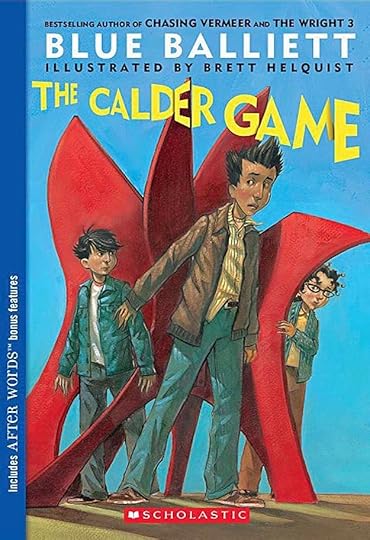 Cover and illustrations by Brett Helquist
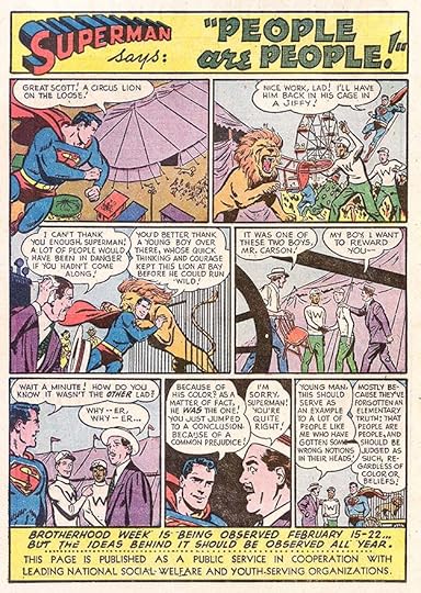
The third in a series of art-related mystery novels for young readers, following “Chasing Vermeer” and “The Wright 3,” this one focuses on the mobile art of Alexander Calder. In Chicago, the three friends, Tommy, Calder (named after the artist) and Petra, are having a hard time dealing with their new teacher, Ms. Button, who is absurdly strict. When they attend an exhibition of the art and mobiles of Alexander Calder at the Museum of Contemporary Art, she hardly lets them enjoy it at all. Despite that, all three are fascinated by Calder’s ever-changing mobile art and an interactive section called the Calder Game that allows visitors to design their own mobiles on paper.
Calder (the boy) is leaving for a trip to England with his father, who is attending a conference in Oxford. They stay in a bed and breakfast in the town of Woodstock just outside the national treasure Blenheim Palace, which Calder hopes to explore while his father is in Oxford. Both Pillays are surprised to see a large red Alexander Calder sculpture in Woodstock near where they’re staying, recently donated and installed by a wealthy person who wishes to remain anonymous. Most of the book follows Calder as he investigates this mystery, encountering much suspicion and anger from Woodstock residents who don’t like the sculpture, and it’s possible connection to the exhibit in Chicago. Calder also explores the features of Blenheim’s grounds, like a hedge maze, and as he’s beginning to find clues to the mystery, he suddenly disappears. Calder’s father invites Tommy and Petra to join him in Woodstock to try to find his missing son, as the police seem baffled. Will they be able to succeed when the police can’t?
A fine read, and again an interesting way to learn more about an artist. Recommended.
The post And Then I Read: THE CALDER GAME by Blue Balliett appeared first on Todd's Blog.


February 26, 2021
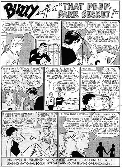
Ira Schnapp’s DC Ads: 1957
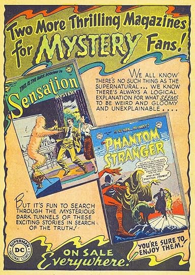
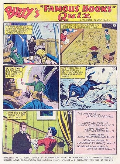 All images © DC Comics. From STRANGE ADVENTURES #76, Jan 1957
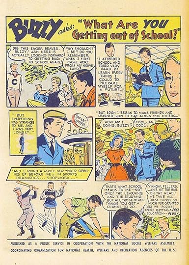
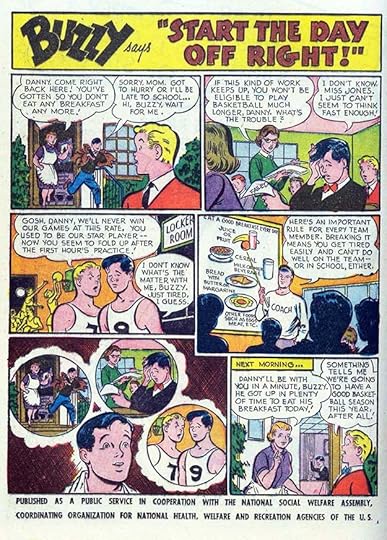
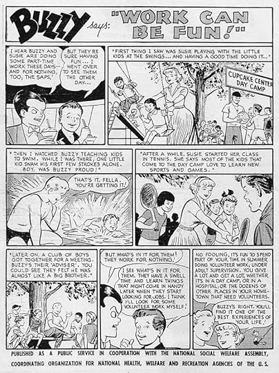
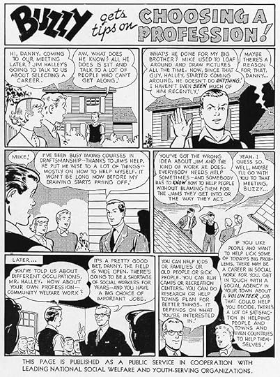
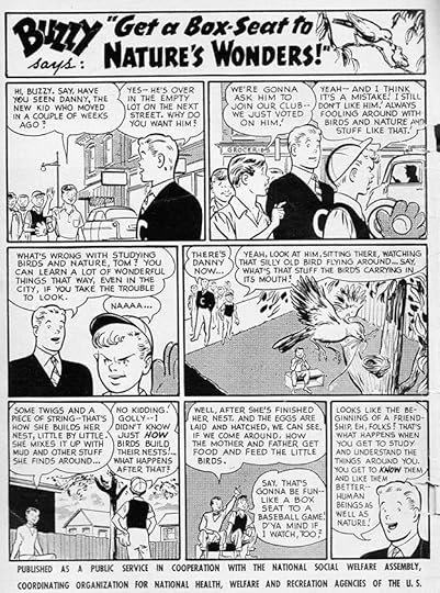
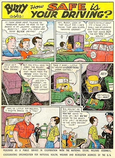
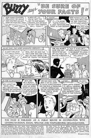
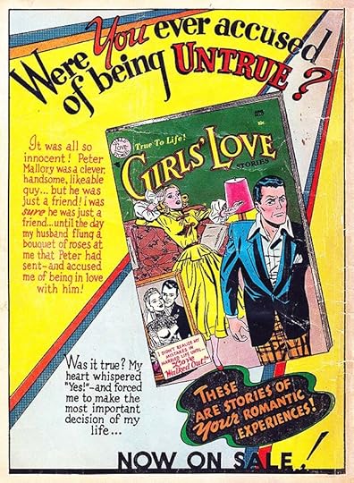
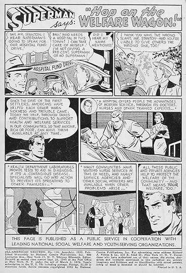
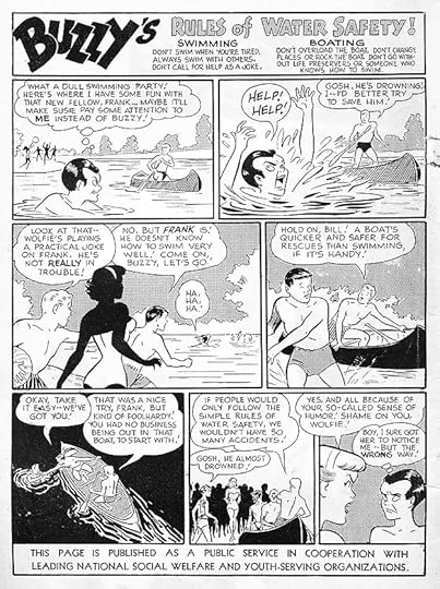
The number of paid ads in 1957 was up and the number of house ads was down. Several ads from past years were reused, so Ira Schnapp was only asked to letter a few new ones. Most were for the romance line, which saw a new title introduced, and had almost no paid ads, leaving room for Ira’s new work, though several from the past were also reused. On public service ads, like the one above, Ira lettered eleven new ones, one was a repeat. I like the fact that this book quiz includes two fairly recent titles that have since become classics. Buzzy is name-checked but not seen.
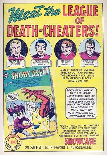 From STRANGE ADVENTURES #76, Jan 1957
This ad is not lettered by Schnapp, I don’t know who did it, but I like it and thought it worth showing. The fact that it’s all hand-lettered and uses no type suggests it might have been done by a freelancer, perhaps someone working for the Simon & Kirby studio, who provided the Challengers stories for SHOWCASE. Or it could have been lettered by a DC freelancer or staffer.
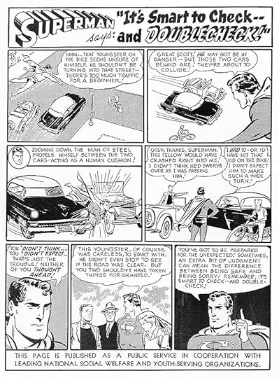
 From ACTION COMICS #225, Feb 1957
Editor and writer Jack Schiff began moving away from using DC characters in the PSAs in this year. Some, like this one, were merely informational and supportive of cooperation between countries.
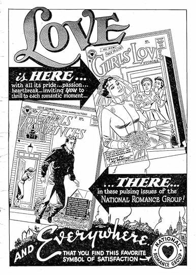
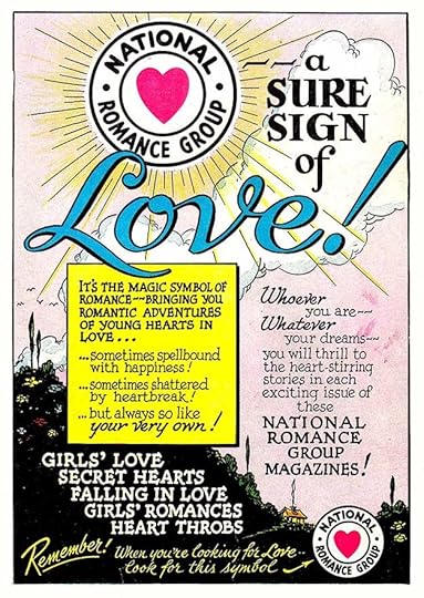
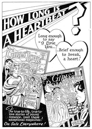
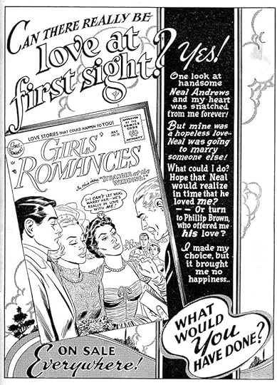
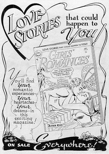
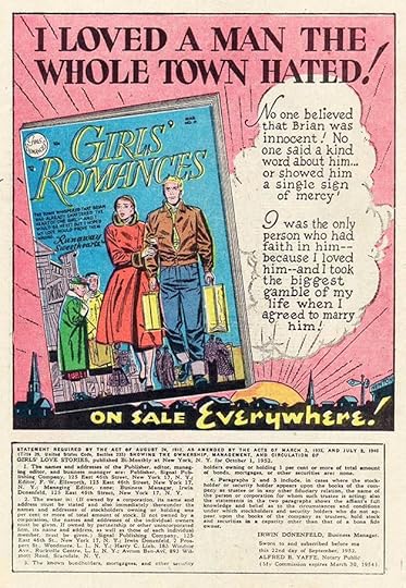
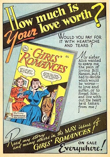
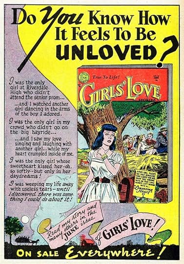
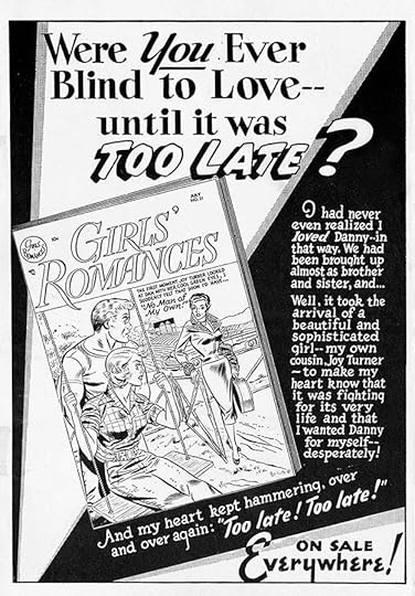
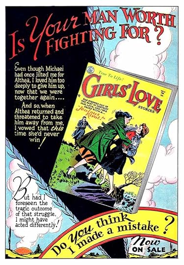
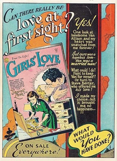
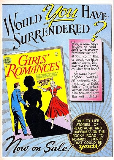
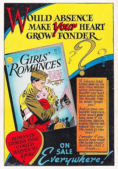
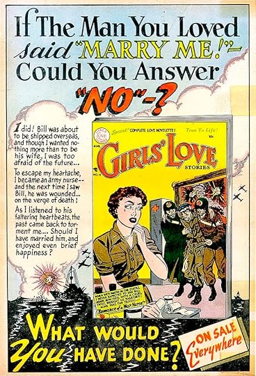
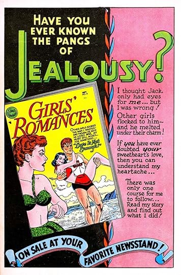
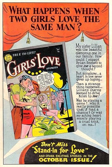
 From GIRLS’ LOVE STORIES #46, March/April 1957
Full page romance ads from this era have some of Ira Schnapp’s best background work in addition to fine lettering and design. Most of the romance ads were now generic enough to be reused with new covers if needed.
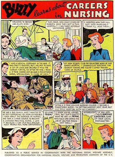 From ACTION COMICS #227, April 1957
Encouraging careers in medicine seems like something comics could be doing today, as this PSA did then.
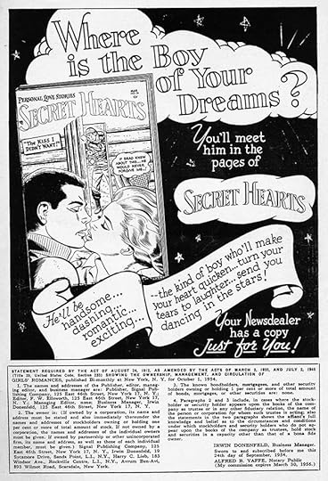
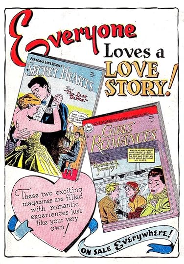
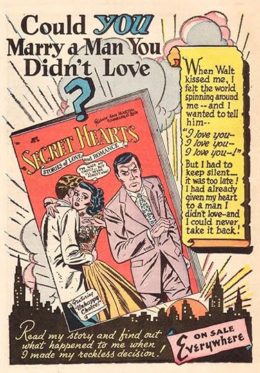
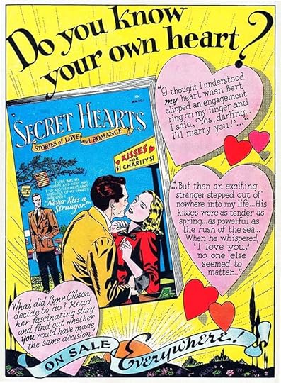
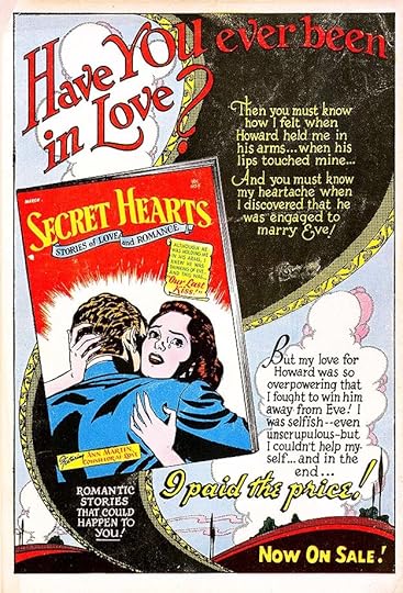
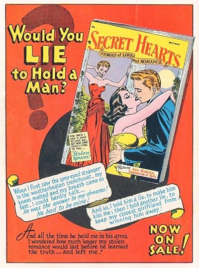
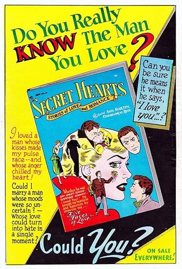
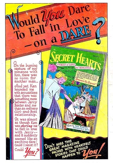
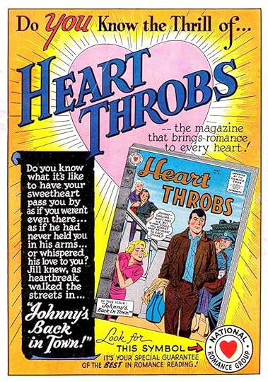 From SECRET HEARTS #39, April/May 1957
Ira’s ad work was presented excellently on the back covers of some romance titles, with better quality printing and paper than interior pages and great color. This one promotes the new title, brought over from Quality Comics. DC kept the Quality logo for a while (designed for Quality by staffer Al Grenet) probably in an attempt to keep existing readers, but Ira’s logo in this ad is so much better! I wonder if it was designed for use on the book? When Ira did do a new logo for the title in 1959, it was not as good as this one.
 From ACTION COMICS #228, May 1957
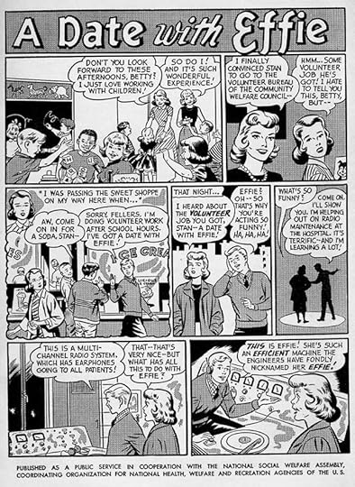
This PSA again uses no DC characters, and the gag suggests the kind of nerd appeal radio equipment had at the time, similar to computer gear a few decades later. The message about volunteering is subtle for comics.
 From ACTION COMICS #229, June 1957
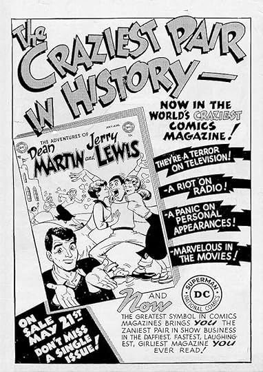
This ad for a new Hollywood humor title ran in most DC titles other than the romance ones, and features some fine Schnapp lettering.
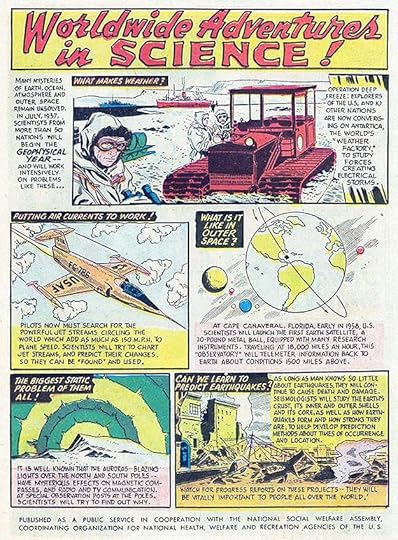 From ACTION COMICS #229, June 1957
Another PSA that shares information about current research in science, including the beginnings of the U.S. space program. It has a nice open title by Ira.
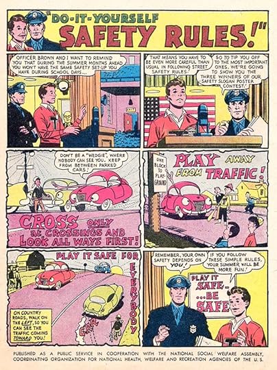
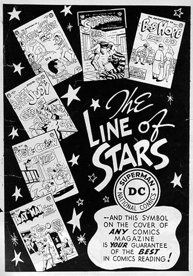
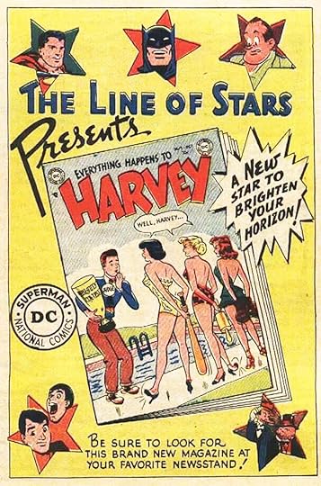
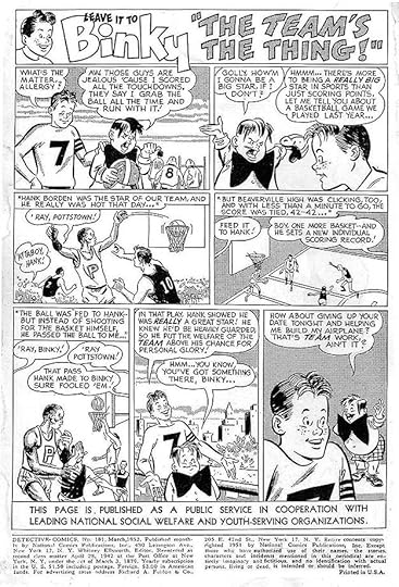
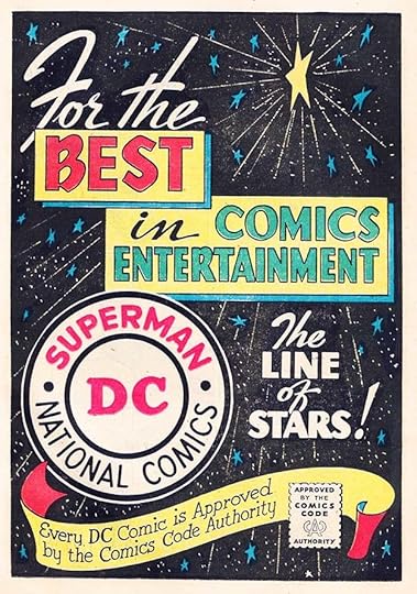 From DETECTIVE COMICS #245, July 1957
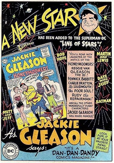
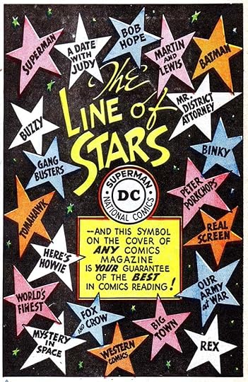
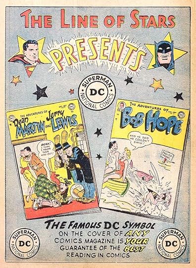
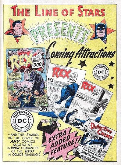
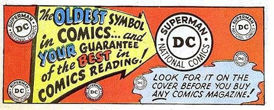
This company promotional ad by Schnapp is dynamic and full of fine work. It includes a huge example of his revised DC bullet symbol and the second mention of the Comics Code Authority as well as the code seal Ira designed. Remember that slogan contest DC did in 1956? The winners were announced in 1957, but no mention is made of a winning slogan. Could this be it? The tagline “The Line of Stars” is not new, it had been in use for a few years.
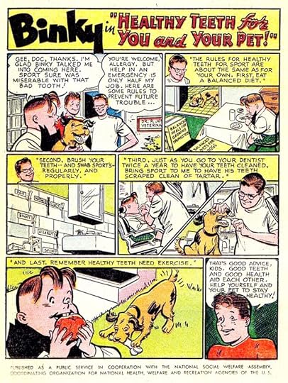
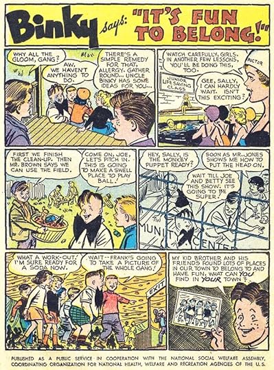
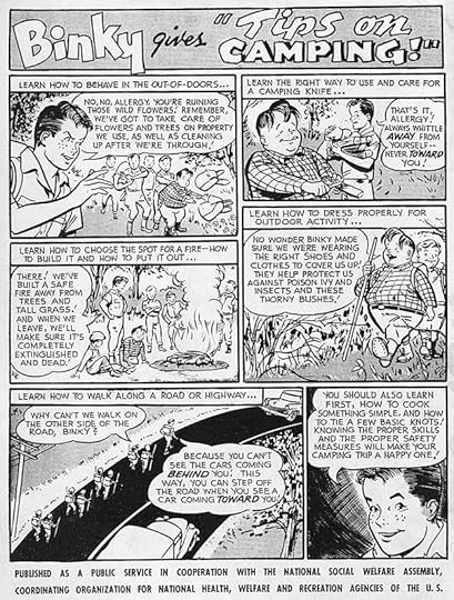
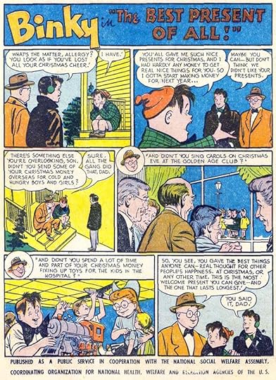
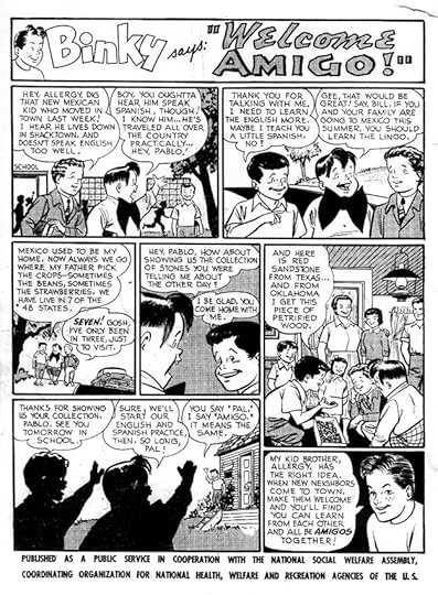
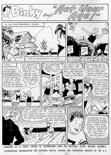
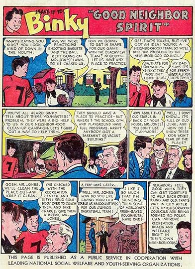
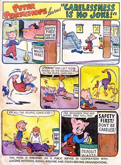
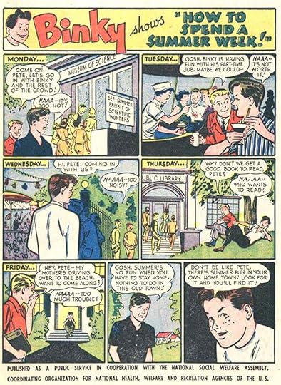
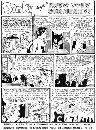
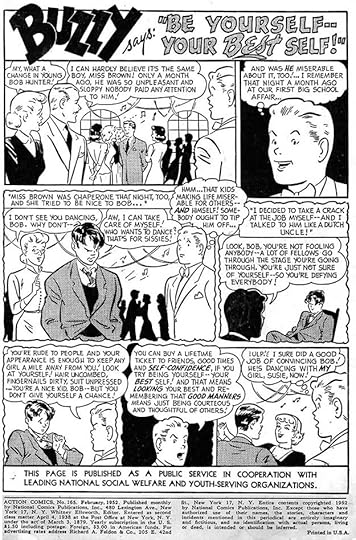
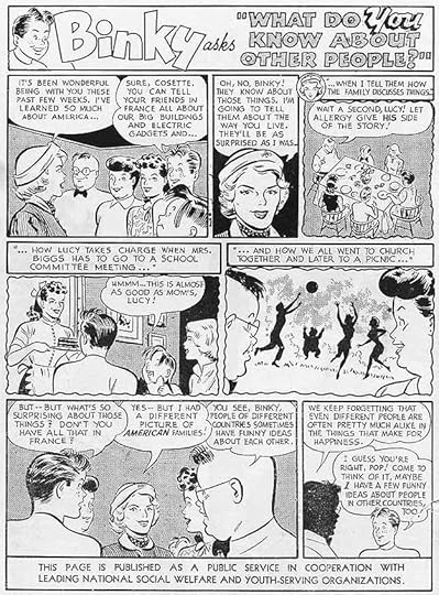
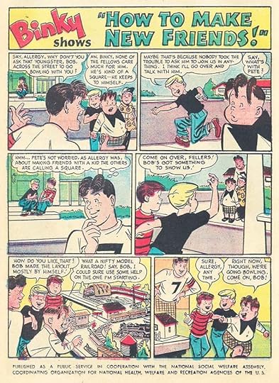 From DETECTIVE COMICS #245, July 1957
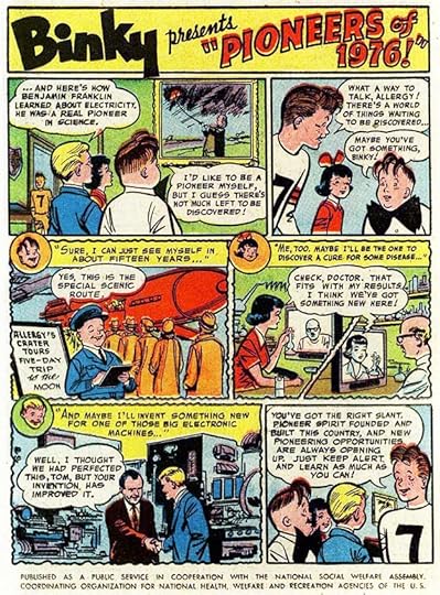
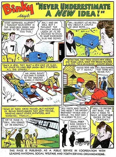
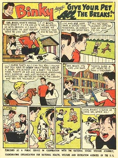
This public service ad turns back to Binky and his little brother Allergy to tell kids about making friends.
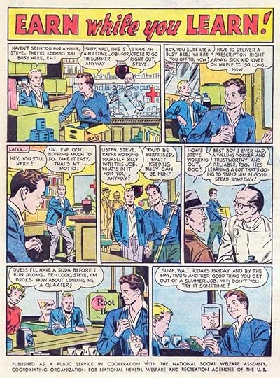 From ACTION COMICS #231, Aug 1957
Another PSA with no DC characters about the upsides of having a summer job. “Keeping busy can be fun!” I’m not sure Walt is convinced.
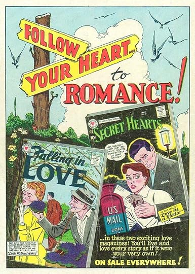
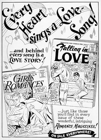
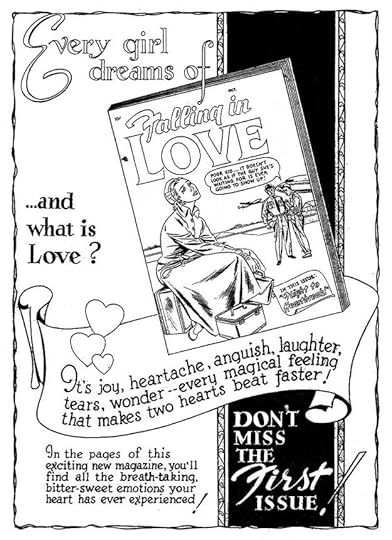
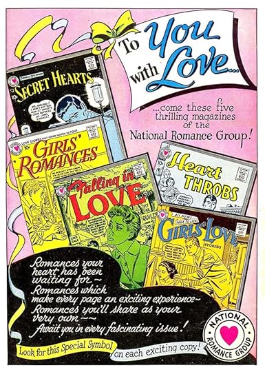 From FALLING IN LOVE #12, Aug 1957
A new Schnapp ad for the romance line now including five titles. Notice how the ribbon carries graceful curves through the entire page echoed by the edge of the bottom black area.
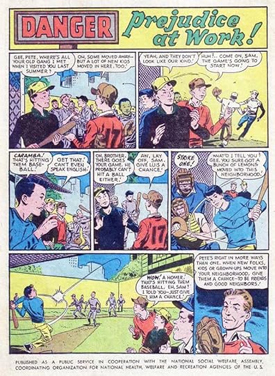 From ACTION COMICS #232, Sept 1957
Again no DC characters in this PSA about prejudice. Ira’s title might have enticed some to read it.
 From FALLING IN LOVE #13, Sept 1957
Another fine example of Ira’s work on this generic romance ad with great design and background work, not to mention excellent lettering.
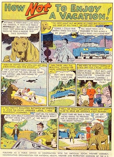 From ACTION COMICS #233, Oct 1957
This public service ad is probably the only one narrated by a dog!
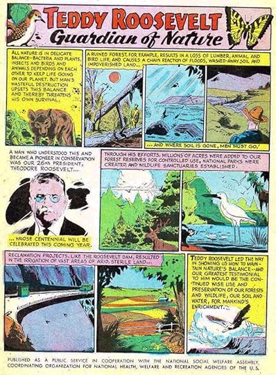 From DETECTIVE COMICS #249, Nov 1957
Another informational PSA on the conservation work of President Roosevelt.
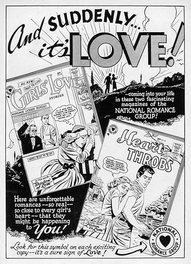
 From FALLING IN LOVE #15, Dec 1957
These romance ads by Schnapp are full of elegant charm, and probably never seen by most DC readers, as they only ran in romance titles. DC was still keeping the National Romance Group separate from their other comics.
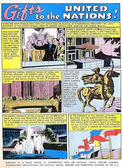
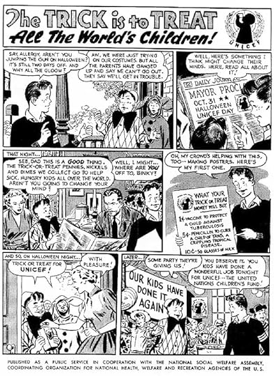 From ACTION COMICS #235, Dec 1957
Jack Schiff was clearly a supporter of the United Nations and their many programs. This one promotes UNICEF. I well remember collecting change at Halloween for it, as described here. Lots of sign work by Ira.
 From FALLING IN LOVE #15, Dec 1957
Another generic ad for the entire romance line with more fine lettering and background work by Ira. His National Romance Group bullet symbol is here twice.
To sum up, I found eight new house ads by Schnapp, six of them for the romance books only. It’s interesting to note that SHOWCASE #4 with the premiere of the revamped Flash did not receive one, even though that issue changed the company’s future course. There were also eleven public service ads for a total of 19 new Ira Schnapp ads in 1957.
More articles like this are on the Comics Creation page of my blog.
The post Ira Schnapp’s DC Ads: 1957 appeared first on Todd's Blog.
February 24, 2021
Ira Schnapp’s DC Ads: 1956
 From STRANGE ADVENTURES #64, Jan 1956. All images © DC Comics
House ads and public service ads were again lower in 1956, but Ira Schnapp lettering appeared for the first time in two paid ads, this being the first one, covering two pages. The ad was probably prepared by DC for their toy clients, who each might have contributed a small fee, but that’s just a guess. In addition to the title, word balloon and lower right caption, Ira probably also did lettering on the package art. Meanwhile, DC reused several house ads and PSAs from previous years, and there was also a 5000 prize slogan contest that took up four or more pages of every DC title, cutting back room for house ads. The contest pages were all set in type. Ira did have ads to letter, but the only book that got a major promotional push was the new title SHOWCASE, with ads for each of the first three issues.
 From STRANGE ADVENTURES #65, Feb 1956
The first new public service ad of the year features some Ira Schnapp handwriting captions, which are probably close to his own regular script. Buzzy and Binky again dominated the new PSAs.
 From STRANGE ADVENTURES #66, March 1956
Binky’s ad promotes tooth care for kids and their pets, an unusual topic.
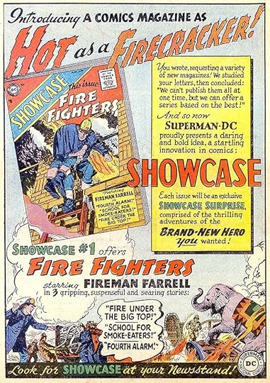 From MY GREATEST ADVENTURE #8, March/April 1956
DC clearly had high hopes for their new tryout series SHOWCASE. It would become very successful, but not in the way they expected, when issue #4 featured a revamped version of The Flash. Prior to that, the subjects were more mundane, but Ira Schnapp was selling them with all his skill.
 From STRANGE ADVENTURES #67, April 1956
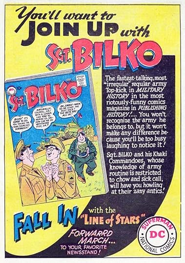
Binky and friends on joining up to have fun.
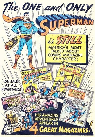 From STRANGE ADVENTURES #67, April 1956
It had been a while since DC’s titles featuring Superman had any promotion in house ads, and Ira did that nicely here. Notice how the black semicircle at the bottom and lines radiating from it holds things together.
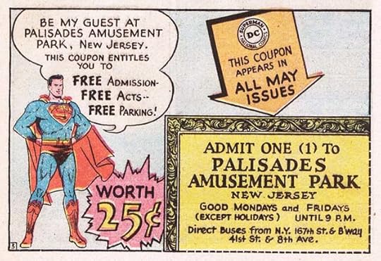 From STRANGE ADVENTURES #68, May 1956
May titles saw the first appearance of another paid ad designed by Ira Schnapp, one that would run for years in many variations, often with Schnapp lettering additions, sometimes with work by others. This was a half-page size, some were third-pages. Other versions in 1956 used the same lettering. The fancy coupon border is new, though similar to the one he did for the Guarantee ad in 1955. Though I grew up in New Jersey, I never got to this amusement park. I guess my parents weren’t enticed by the 25 cent coupon. The park had opened in 1898 and remained open and popular until 1971. It was close to New York City, but actually not close to where I lived.
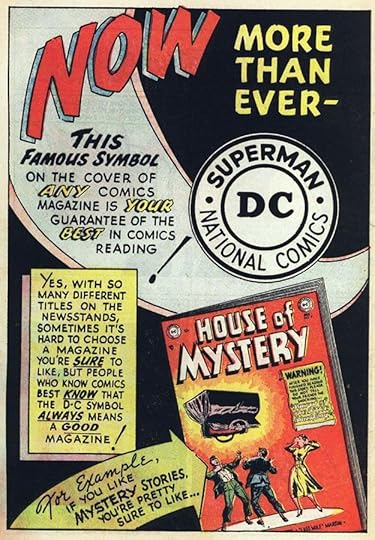
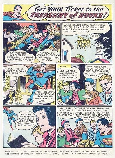 From HOUSE OF MYSTERY #50, May 1956
It didn’t take Superman to get me into libraries, they were some of my favorite places, or would be in a year or two. I was just five when this ad ran.
 From STRANGE ADVENTURES #68, May 1956
I think editor Robert Kanigher wrote this clever ad for the second issue of SHOWCASE, one he edited. The title had rotating features and editors. The idea of a trail of animal tracks was perfect for Schnapp’s drawing skills, and as always his design and selling points were excellent.
 From MY GREATEST ADVENTURE #9, May/June 1956
Showing his versatility, look at the different styles Ira used for this new humor title, and they all work well together.
 From STRANGE ADVENTURES #69, June 1956
Ira Schnapp did not letter this PSA, I don’t know who did.
 From STRANGE ADVENTURES #69, June 1956
Ira’s ad for this new Hollywood humor title is full of great lettering and design. His logo fits right in, too.
 From STRANGE ADVENTURES #70, July 1956
I think Binky narrates this PSA, though he’s not named. Ira’s lettering on the posters is meant to look a bit amateurish, done by children, but I’m not convinced.
 From STRANGE ADVENTURES #70, July 1956
The third SHOWCASE AD, perhaps again written by Kanigher, adds interest with an Ira Schnapp explosion.
 From GIRLS’ LOVE STORIES #42, July/Aug 1956
The first of only two new Schnapp romance ads for 1956. It’s generic enough to be reused later with different covers, but the musical theme is memorable and well-drawn.
 From STRANGE ADVENTURES #71, Aug 1956
There’s no dialogue in this PSA, but Ira ads a nice title and some signs. Unlike the one from 1949 that used Smokey the Bear with permission, this one simply has a similar but more cartoony bear.
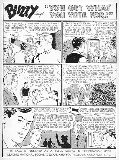
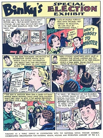 From STRANGE ADVENTURES #74, Nov 1956
Here’s a PSA about getting out the vote that couldn’t be more relevant today.
 From FALLING IN LOVE #8, Nov/Dec 1956
The other new romance ad is also generic. Perhaps DC had told the editors to make them easier to repeat if necessary, and not just about one particular issue. The title on this one uses deep perspective to add depth.
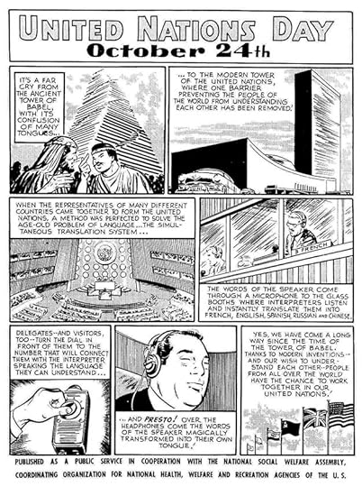
 From STRANGE ADVENTURES #75, Dec 1956
The last new PSA for this year again promotes the United Nations. I visited the U.N. as a child, and would have enjoyed reading this ad lettered by Ira.
For 1956 I count two paid ads, eight house ads and eight public service ads for a total of 18 lettered by Ira Schnapp. We’ll see if that number increases in the future.
More articles like this are on the Comics Creation page of my blog.
Palisades Amusement Park on Wikipedia.
Ira Schnapp’s other work on SHOWCASE.
The post Ira Schnapp’s DC Ads: 1956 appeared first on Todd's Blog.
February 23, 2021
Incoming: SANDMAN, THE DELUXE EDITION BOOK TWO
 Cover art by Michael Wm. Kaluta, image © DC Comics
I wish I could say how many times the Sandman series has been reissued by DC. All I can say is, a lot of times. This version is hardcovers in the slightly oversized deluxe format. I haven’t opened the shrink-wrap, but the deluxe format usually has great printing and paper, though a glued binding rather than sewn. This one contains issues 17-31 of the original series plus SANDMAN SPECIAL #1 and stories from VERTIGO: WINTER’S EDGE 1-3. The retail price is $49.99. It looks to me like there will be five volumes in all, but that’s a guess. The cover by Kaluta may be the only new art. I don’t know when this will be out in shops, but the Amazon release date is March 16, 2021. Here’s a link.
The post Incoming: SANDMAN, THE DELUXE EDITION BOOK TWO appeared first on Todd's Blog.
February 22, 2021
Ira Schnapp’s DC Ads: 1955
 All images © DC Comics. From HOUSE OF MYSTERY #34, Jan 1955
The number of new house ads and public service ads went down in 1955. There seem to be about as many paid ads as the year before, maybe a few more, so why was that? First, DC reused some previous ads updated with new covers. Second, there were more new ads that could be reused the same way, and were. Third, the number of filler pages went up. Fillers could be many things from gag cartoons by people like Henry Boltinoff (he did most of them by this time), to puzzle and game pages to one-page informative articles in comics form on almost any topic that could be vaguely related to the genre of the title it was in. Those were often written by the editors and drawn by production staffers as freelance work. The ad above is a version of a 1954 ad reworked as a third-page generic ad, but with new Schnapp lettering. An even more generic one with just the lettering at lower right appeared with a list of DC titles in some issues.
 From HOUSE OF MYSTERY #35, Feb 1955
The “NOW” theme was continued in a fine house ad by Schnapp promoting a new adventure anthology with a logo by Ira. As always, Ira’s layout and use of black is excellent, but my favorite thing is the rough brushwork outer border.
 From HOUSE OF MYSTERY #35, Feb 1955
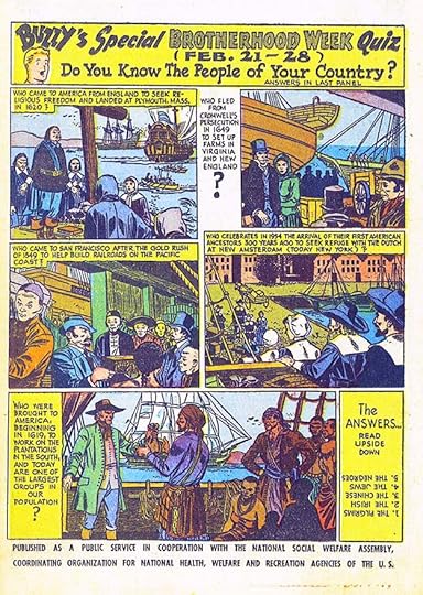
Some January issues reused an old public service ad. This was the first new one with an excellent title by Ira. Go ahead, take the quiz!
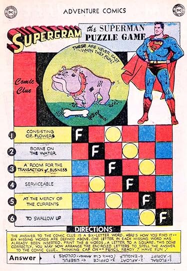 From ADVENTURE COMICS #209, Feb 1955
This is a typical puzzle page and not lettered by Ira, but he did do the SUPERGRAM logo, one of the many variations on his SUPERMAN logo design. Not counting it, just wanted to note it.
 From GIRLS’ ROMANCES #31, Feb/March 1955
There were only four new romance ads in 1955. Several older ones were reused. The large lettering at the top of this one is an unusual style for Ira, but the romance ads seemed to bring out his creativity. This ad was also done in a full page size.
 From HOUSE OF MYSTERY #36, March 1955
The United Nations was a favorite topic for PSAs, clearly something editor/writer Jack Schiff was a fan of. This one gets into the weeds…literally.
 From HOUSE OF MYSTERY #37, April 1955
The top third of this ad will be familiar to you if you’ve read any DC comics from 1955 to the early 1960s. It’s one of Ira Schnapp’s most elaborate and memorable designs with masterful pen work in the certificate border and impressive title work on GUARANTEE. It served as a third-page ad for many years, but this is the original use, as part of a generic ad promoting two titles. DC liked it so much they reused it a number of times in later months of 1955 with other covers. It’s also the first mention of the Comics Code Authority, whose symbol, designed by Ira, began appearing on DC covers early in this year.
 From HOUSE OF MYSTERY #37, April 1955
Sometimes funny animals were the right vehicle to tell kids how to do the right thing. This ad is wordy, but well written, and Ira makes it work.
 From HOUSE OF MYSTERY #38, May 1955
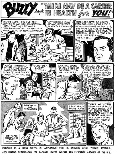 From HOUSE OF MYSTERY #39, June 1955
 From HOUSE OF MYSTERY #40, July 1955
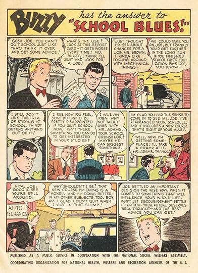
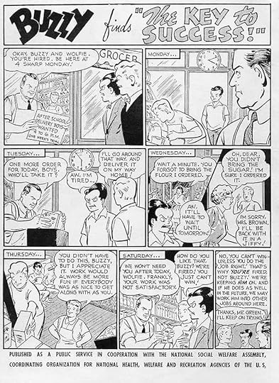
Teen humor characters Binky and Buzzy were the ones most often used in PSAs, as stand-ins for readers in social situations, I guess. These three are along those lines. I don’t think the third one is lettered by Schnapp, but I don’t know who did letter it.
 From GIRLS’ LOVE STORIES #36, July/Aug 1955
Another classy Schnapp romance ad with impressive lettering, effective layout and use of black. His background art is equally fine.
 From HOUSE OF MYSTERY #41, Aug 1955
This PSA encourages kids to not fear being different and to think outside the box, good sentiments.
 From GIRLS’ LOVE STORIES #37, Sept/Oct 1955
This Schnapp ad heralds the launch of a new romance title, making it four at DC. I love the scroll.
 From HOUSE OF MYSTERY #43, Oct 1955
Two more new title launches are promoted in this ad with lots of fine lettering by Ira. It’s a busy page, but the angles help make it work.
 From HOUSE OF MYSTERY #43, Oct 1955
Buzzy lectures us again about the value of school in this PSA.
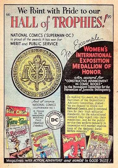 From HOUSE OF MYSTERY #44, Nov 1955
This unusual page promotes DC comics and an award they won, which is reproduced beautifully. The award was for DC’s public service ads. Is it the first award DC ever won for anything? I’m not sure, but I can’t think of an earlier one. This must have given Jack Schiff support and satisfaction for his pet project, and DC was obviously happy for the chance to promote their comics, too. Ira added lots of lettering, but the layout does not look crowded.
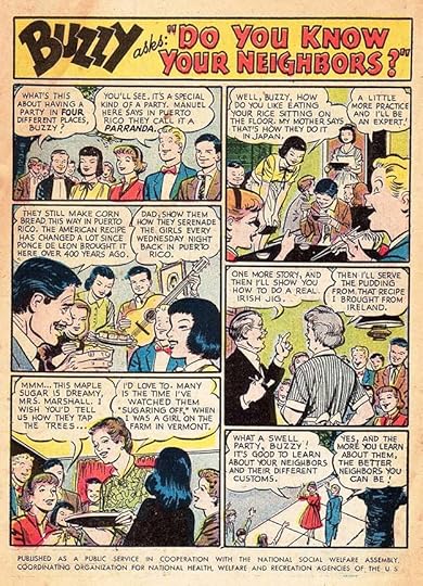 From HOUSE OF MYSTERY #44, Nov 1955
More PSA work about getting along with and understanding your neighbors. The Japanese girl here is a far cry from the stereotypes of the previous decade.
 From GIRLS’ ROMANCES #36, Dec 1955
The final romance ad of the year features two titles, and is generic enough to be reused in the future with different covers.
 From HOUSE OF MYSTERY #45, Dec 1955
And the final new PSA of the year returns to the United Nations, and has no DC character in it. Ira’s lettering helps make the story more interesting to my eye.
For 1955 I count nine new house ads and nine new public service ads by Ira Schnapp for a total of 18, well down from 1954. We’ll see how that changes in future years.
More articles like this are on the Comics Creation page of my blog.
All I could find on the Women’s International Exposition of 1954.
The post Ira Schnapp’s DC Ads: 1955 appeared first on Todd's Blog.
February 21, 2021
Rereading: FARMER IN THE SKY by Robert A. Heinlein
 Cover and illustrations by Clifford Geary
Heinlein’s fourth in his series of science fiction novels for younger readers was published in 1950, it follows Rocket Ship Galileo, Space Cadet and Red Planet. Though the books published by Scribners are not a series, and do not take place in chronological order, there are connections. This one mentions the Space Patrol from the second book, for instance. It also mentions the song “Green Hills of Earth” from the story of that name in Heinlein’s connected stories for adult readers known as his Future History.
The Earth of this story is struggling with overpopulation causing many to go hungry. Bill enjoys rare visits to wilderness areas with the Boy Scouts. He lives with his widowed father George and finds creative ways to get enough calories for them, but their life is stifled and claustrophobic. George has an escape plan: a colonist ship is soon leaving for Jupiter’s moon Ganymede where colonists will be given land and an opportunity to farm it. Ganymede is in the process of being terraformed to allow that. George plans to leave Bill behind to attend college, but Bill will have none of it, and is determined to go too. To make himself more eligible, George meets and marries another potential colonist, Molly, who has a daughter Peggy, younger than Bill. The boy is hurt by this move, seeing it as a betrayal of their deceased mother and wife, but in the end, all four are allowed to join the colonists. On board and underway, Bill connects with other Boy Scouts and makes new friends while learning a lot about the ship and the project. He’s almost killed when a small meteorite pierces his bunk room, but Bill manages to save himself and his bunk mates with quick thinking.
When the colonists arrive on Ganymede, they find a very different situation than they expect. The colony is struggling to get started, and the last thing they want is more colonists. They were hoping for a ship full of farming machinery and other needed resources, but do their best to make room for everyone. As Bill and the others learn the realities of their situation, Peggy turns out to be unable to adjust to the low pressure, and George and Molly talk about returning to Earth. Bill is determined to claim his homestead and begin farming it, and with much hard work he’s finally able to get started, but many challenges stand in his way.
Like all of this series, a great read, full of interesting characters, situations and science (even if some of it is now inaccurate). This was originally serialized in Boy’s Life magazine, so Scouting is a theme throughout. Recommended.
The post Rereading: FARMER IN THE SKY by Robert A. Heinlein appeared first on Todd's Blog.
February 19, 2021
Ira Schnapp’s DC Ads: 1954
 All images © DC Comics. From ACTION COMICS #188, Jan 1954
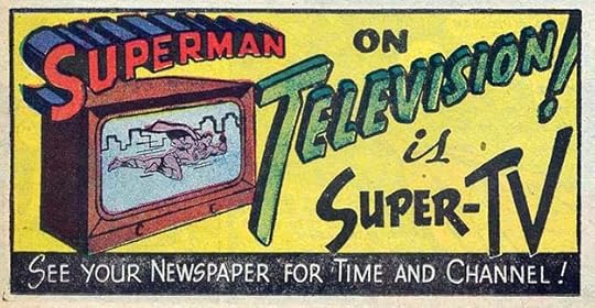
In 1954 Ira Schnapp continued to dominate the lettering of house ads and public service ads at DC Comics, though there were a few by others, and a few from previous years were reused, sometimes with changes. An example of that is above. Most of this third-page ad appeared in Dec 1952 issues, but “is Super-TV” by Ira replaces his previous lettering. I’m counting it as a new ad because otherwise it would go uncounted, and that doesn’t seem right to me. Your opinion on this may be different.
 From ACTION COMICS #188, Jan 1954
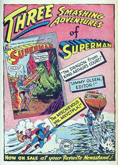
Another example, this ad reuses THREE SMASHING ADVENTURES and the bottom banner from an ad run in December 1953 titles, replacing Batman in that one with Superman in this one. Again, I will count it as a new ad for Schnapp.
 From GIRLS’ LOVE STORIES #27, Jan/Feb 1954
DC did fewer new romance house ads in this year. They reused some from past years, and in general had more paid ads. This is one of just three new ones by Ira for 1954, and the only one focused on a particular issue.
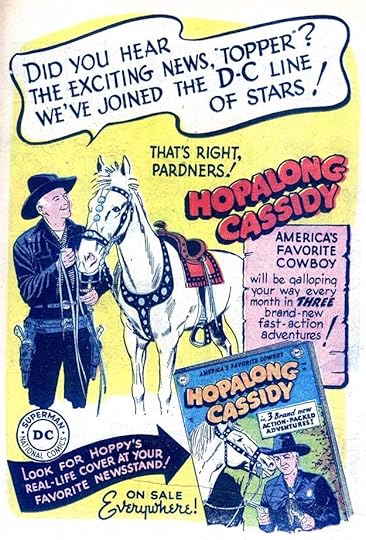 From ACTION COMICS #189, Feb 1954
Fawcett got out of the comics publishing business in late 1953, and DC brought this western title over from them, continuing the numbering. Cassidy starred in a long series of movies and also a TV show. Ira’s style in the large top caption is unusual for him, as is the name of the publisher being hyphenated as “D-C,” but everything else about the ad is pure Schnapp.
 From ADVENTURE COMICS #107, Feb 1954
January issues repeated an old public service ad, this one in February issues is new, and lettered by Schnapp. He would letter nine more. With two exceptions, the 1954 new PSAs used teen humor characters Binky and Buzzy.
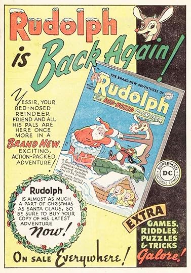
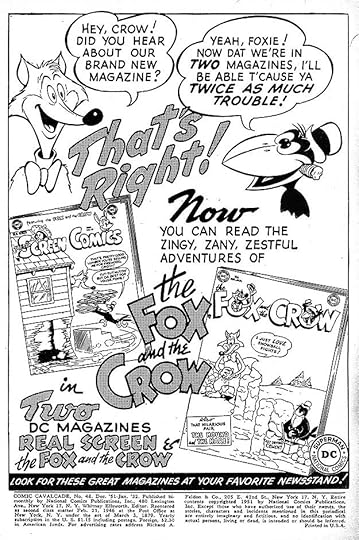
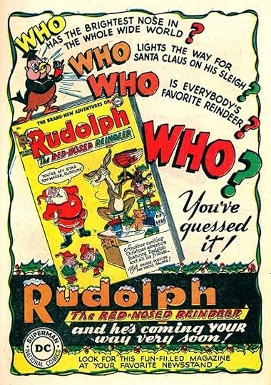 From THE FOX AND THE CROW #14, Feb 1954
This charming ad by Ira for the annual issue of RUDOLPH is full of great lettering.
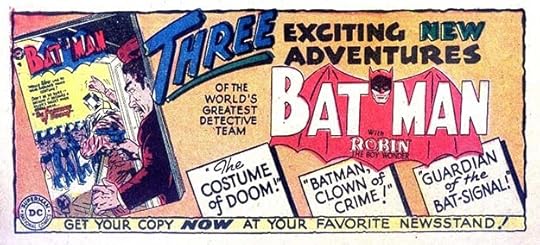
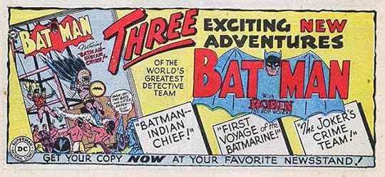
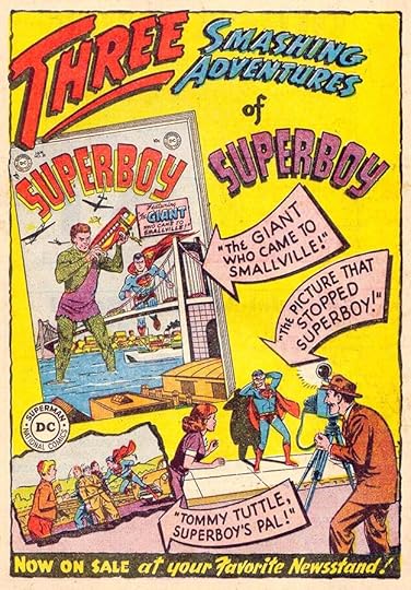 From BATMAN #81, Feb 1954
Here’s another version of that THREE SMASHING ADVENTURES ad focused on Superboy. only the curved arrows and the word OF are new, but I will still count it.
 From ACTION COMICS #190, March 1954
I think if Buzzy lectured his friends as much in his comic as he does in these PSAs, readers would flee.
 From HOUSE OF MYSTERY #25, April 1954
This ad by Schnapp recycles one from 1947 shown in my 1940s post. Only the lettering in the lower half of the wooden sign is new, but I’m going to count this as a new ad for Ira. It does confirm that the first version was by him, I think.
 From ACTION COMICS #191, April 1954
Some of you that are my age might know the Tom Lehrer song about this yearly event that began in the 1930s and petered out by the 1990s. This PSA is set up as a quiz, a way to get more kids to read it.
 From COMICS CAVALCADE #62, April/May 1954
DC continued to promote their new fantasy/funny animal title in 1954, but only in other humor titles. The top two lines and the bottom caption are repeated from the 1953 ad, the rest is new.
 From ACTION COMICS #192, May 1954
Continuing the brotherhood theme in this PSA, lots of lettering but Ira fits it all in.
 From ADVENTURE COMICS #200, May 1954
Here’s the start of a kind of third-page ad the Ira did a lot of, similar to the THREE SMASHING ADVENTURES ones above, but taking up less space. More ads were being sold by DC to fill the lower third of the last story page that many stories were now leaving blank, but when there weren’t enough of those, ads like this went there. The cover reproduction is quite small, so the selling point was really Ira’s lettering and the intriguing story titles.
 From ACTION COMICS #193, June 1954
Another one reusing the top and bottom lines with new Schnapp lettering between.
 From ACTION COMICS #193, June 1954
Of the few ads not by Schnapp, this is the only one worth showing. It’s quite impressive, with masterful brush lettering, a good design, and appealing character art. I think the same person did the art and the lettering, but I don’t know who that was.
 From ACTION COMICS #193, June 1954
Binky is just as frequent a lecturer as Buzzy in these PSAs, but the ideas are generally good ones.
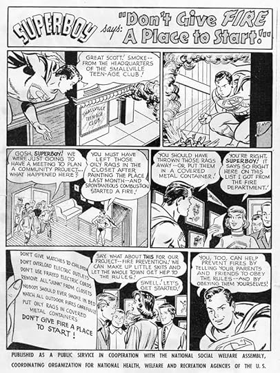 From SUPERBOY #34, July 1954
Superboy was the only DC hero to appear in a PSA in this year, promoting fire safety. The curved list of suggestions at lower left was no problem for Ira.
 From ACTION COMICS #195, Aug 1954
Another reuse of the Batman third-page, only the story titles are new.
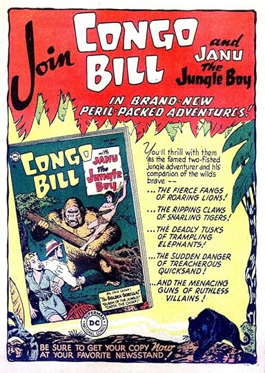 From ACTION COMICS #195, Aug 1954
Ira and readers were probably more entertained by his full-page house ads like this one promoting a short-lived series tryout for a long-running feature from ACTION COMICS. I love the huge J in JOIN.
 From ACTION COMICS #195, Aug 1954
A funny animal character having a moment to shine in this PSA. The story title at the top has an unusual graduated fill from Ira.
 From HOUSE OF MYSTERY #29, Aug 1954
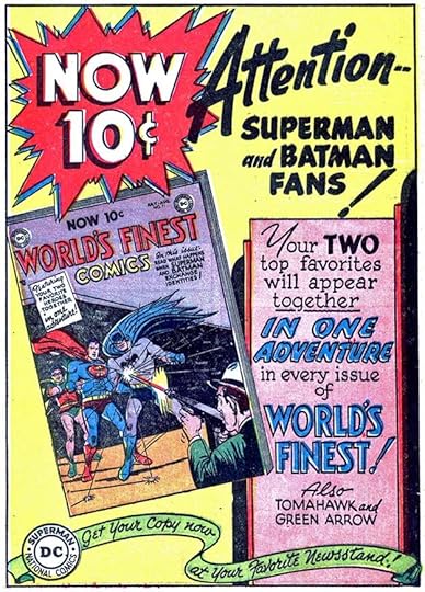
WORLD’S FINEST had long been a larger than usual anthology selling for 15 cents and featuring Superman and Batman stories as well as other characters. With issue #71, shown here, the price dropped, the page count was reduced to 36 pages like most DC titles then, and for the first time Superman and Batman appeared in the lead story together. This fine Schnapp ad highlights all those elements with a gigantic burst for the price change. Could saving a nickel ever get more exciting?
 From ACTION COMICS #196, Sept 1954
Yet another use of the same Batman third-page ad with only the story titles having new lettering. I still feel it’s worth counting.
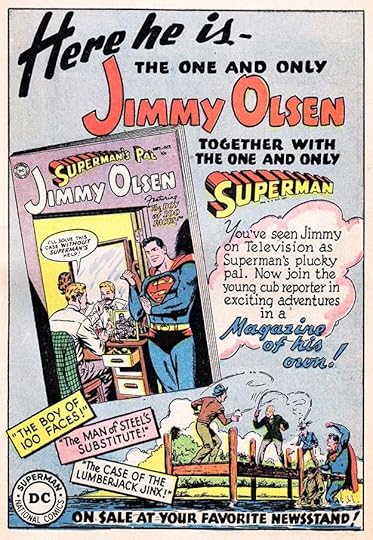 From HOUSE OF MYSTERY #30, Sept 1954
But a full page Schnapp ad like this one for Jimmy Olsen’s new title is much more satisfying, and of course much more work for Ira. These very different workloads even out in my mind. Art like that at the bottom is picked up from a story page with Ira adding the cloud I think.
 From THE FOX AND THE CROW#19, Sept 1954
Over in the humor titles, Ira was promoting this ongoing series with more handsome lettering.
 From ACTION COMICS #196, Sept 1954
While I certainly support the message of this PSA now, I’m not sure I’d have believed it as a child.
 From GIRLS’ LOVE STORIES #31, Sept/Oct 1954
Ever versatile, Ira switches gears for this generic romance ad with elegant lettering and an appealing background. This ad could be and was reused for other romance issues.
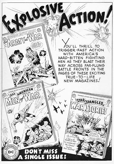
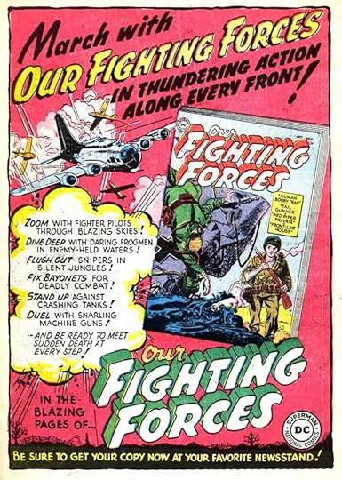 From STRANGE ADVENTURES #49, Oct 1954
Surprisingly, this was the only war comics ad I could find for 1954 promoting the newest DC war title. The planes are probably from a story, the rest of the background is by Ira making good use of his talents.
 From ACTION COMICS #197, Oct 1954
Buzzy gets to lecture a fellow student again in this PSA.
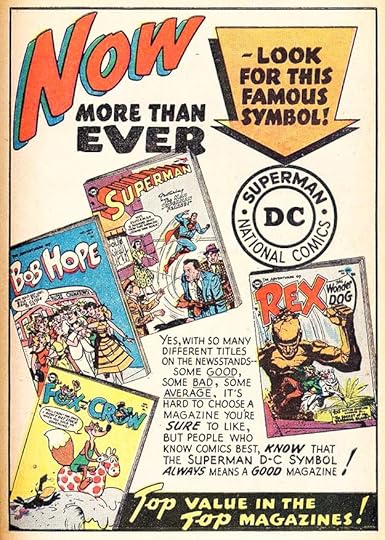 From DETECTIVE COMICS #213, Nov 1954
Ira returns to the NOW MORE THAN EVER ad style from 1952, but this has all new lettering. It’s a generic line ad which could show any four titles, though the lettering is far from generic. Another example of “D-C.”
 From GIRLS’ LOVE STORIES #32, Nov/Dec 1954
Ira’s final romance ad of the year is also generic, and could apply to any two issues. His display lettering at the top is masterful.
 From JIMMY OLSEN #2, Nov/Dec 1954
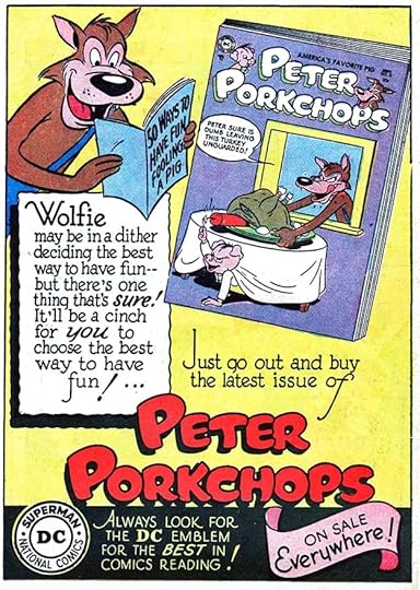
The final PSA of the year, lettered once more by Ira, with Buzzy and Wolfie playing the good and bad kid roles.
For 1954, I count 20 new house ads by Schnapp and 10 new public service ads for a total of 30. Ira is now firmly in place as the visual style setter for DC.
More articles like this are on the Comics Creation page of my blog.
More about National Brotherhood Week on PRI.
The post Ira Schnapp’s DC Ads: 1954 appeared first on Todd's Blog.
February 17, 2021
Ira Schnapp’s DC Ads: 1953
 All images © DC Comics. From THE FOX AND THE CROW #7, Dec 1952/Jan 1953.
As DC Comics continued to expand its lineup in 1953, the house ads and public service ads they used to promote them had a new aspect: nearly all were designed and lettered by Ira Schnapp. Ads by others had mostly vanished, signaling that the company was now fully invested in Ira Schnapp’s work as the company style, as he was also designing most of their logos, lettering most of their covers, and many story pages. Ira worked on staff every day doing these things, and probably also did some at home. We don’t know how he was paid, was it by the piece or was he on salary? When Gaspar Saladino began working at DC in late 1949, he worked on staff but billed his work by the page as a freelancer would. When I started there in 1977, I was a salaried production staffer, but also did freelance lettering at home to supplement my income. Covers and house ads paid about twice the rate for story pages. Either payment method could have been true for Ira, we don’t know. It’s clear that he spent more time and craft on his house ads and covers than he did on story pages, and hopefully was paid accordingly. The ad above is full of charm and good design with thoughtful use of shapes and black and appealing styles in a variety of sizes. One could feel his enthusiasm for the work coming off the page, and readers loved it and wanted to buy the comics he was promoting even if they didn’t know Ira’s name.
 From MYSTERY IN SPACE #11, Dec 1952/Jan 1953
DC was so happy with his work they were looking for more places to use it, as on this small house ad that filled only about one-sixth of a page, part of a half-page ad listing company titles and information. Even though it’s small, it counts!
 From WONDER WOMAN #57, Jan/Feb 1953
The first public service ad of the year is quite relevant to today, sadly, and expresses opinions about fairness that must have come from editor Jack Schiff, as this series was his project. As before, Ira Schnapp lettered most of them.
 From BUZZY #47, Jan/Feb 1953
A second PSA in appearance ran in many of the same issues as the one above, and there’s something not right about it. The ad promotes the use of air rifles, like the ones advertised in DC comics from Daisy, and also promotes air rifle competitions and clubs sponsored by the National Rifle Association (NRA). This ad looks like a sneaky paid ad to me, and notice that the public service bottom text is missing. I wonder what Jack Schiff thought about his idealistic series being imitated this way? We’ll never know. Ira lettered it just like the others.
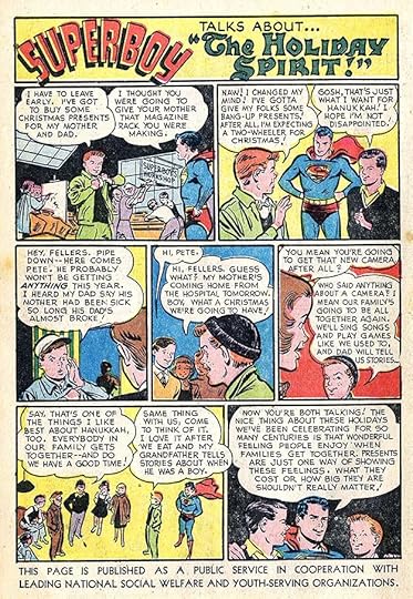 From DETECTIVE COMICS #192, Feb 1953
The PSA series gets back on the right track with this entry about holiday spirit, and a fine title by Ira.
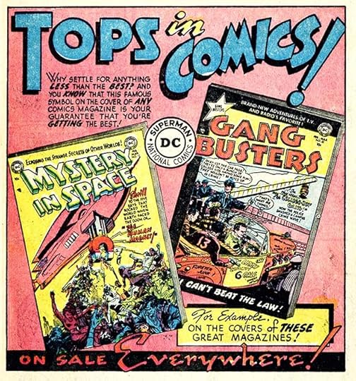 From DETECTIVE COMICS #192, Feb 1953
This ad designed and lettered by Ira fills a two-thirds page area, and was also used a bit smaller as a half-page. It’s generic enough that any two covers could be used on it and it was reused over time. DC was getting smarter about that sort of thing. The TOPS IN COMICS motto had been employed several times before, but I like this lettering of it by Ira.
 From ADVENTURE COMICS #186, March 1953
DC’s teen humor characters often appeared in these PSAs. This is a wordy one but Ira makes it work.
 From WORLD’S FINEST COMICS #63, March/April 1953
This small ad filled a space on the inside covers of some titles with comic characters I don’t recognize in the style of their teen humor ones. Another very generic ad.
 From GIRLS’ LOVE STORIES #22, March/April 1953
DC continued to keep their romance titles separate from the rest of the line, but in this year were able to sell more paid ads in them to clients like dress and clothing makers, fashion accessory vendors, and weight-loss gimmicks. They still got in some house ads, but not as many, and not as often on the back covers. Most, like this one, referred to a specific issue, so were not able to be reused easily. This one fits a two-thirds size to leave room for necessary legal information. Notice how Ira’s small scene at the bottom adds interest and depth, and the sunrise pulls things together.
Another fine sentiment in the PSA series. Only the two top lines of the bottom caption are not lettered by Ira, and probably added by a production staffer later.
 From SECRET HEARTS #15, April/May 1953
DC’s romance editors continued to emphasize the word YOU in their ads to pull readers into the fantasy. I think the entire background here is by Schnapp, again adding depth and interest.
 From ACTION COMICS #180, May 1953
This new full-page Schnapp ad was generic enough to be used for some time, and was also adapted for other versions, as we’ll see below. The layout is no mean feat, getting the stars and titles to work together in a random way that seems evenly spread across the page, and getting the titles to fit in the stars. Still missing are the romance titles.
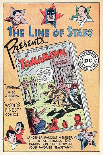
 From DETECTIVE COMICS #197, July 1953
With the addition of some comics covers, the same Line of Stars ad copy works fine in this version, so I’m not counting this as a separate ad, though Ira might have worked on it. This layout could be reused with different covers.
 From DETECTIVE COMICS #198, Aug 1953
Another variation with the same lettering, also not counted as a separate ad. It could have been assembled by someone other than Ira in the DC production department.
 From DETECTIVE COMICS #195, May 1953
Another wordy PSA. Note how Ira solved the problem of way too many words in the last panel.
 From GIRLS’ LOVE STORIES #23, May/June 1953
These romance ads are generally just for a single issue, but since they were only running in one or two other titles, I guess it made sense. The diagonals and black areas add interest.
 From DETECTIVE COMICS #196, June 1953
Another PSA with some large signs by Ira. Of the 12 regular ones in 1953, Ira lettered 11 of them, and also that bogus one about air rifles.
 From SECRET HEARTS #16, June/July 1953
How about that long tail on the Y of YOU? Nicely designed and with more background art by Ira.
 From GIRLS’ ROMANCES #21, June/July 1953
I have the impression that Ira did best with background art that didn’t include human figures. I have the same issue myself, so I sympathize!
 From DETECTIVE COMICS #197, July 1953
A PSA about bird-watching, a topic I approve of! The bottom sponsor line has changed with this one.
 From GIRLS’ LOVE STORIES #24, July/Aug 1953
More effective use of upper and lower case, diagonals and black areas.
 From DETECTIVE COMICS #198, Aug 1953
Don’t be like Pete.
 From ACTION COMICS #184, Sept 1953
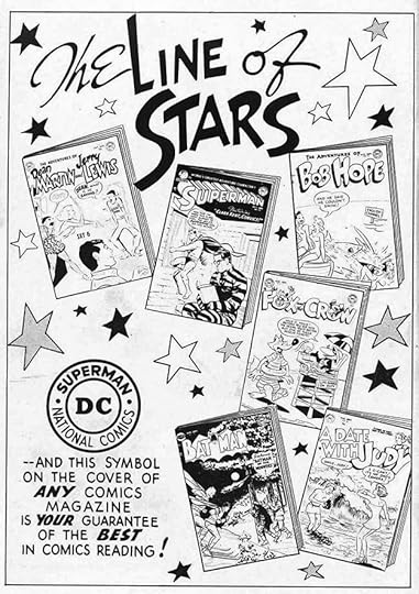
Here’s the LINE OF STARS tagline used in a new way for a new title launch. Still generic enough to be reused for other new titles.
 From HOUSE OF MYSTERY #18, Sept 1953
And so it was on this ad, though some new Schnapp lettering was needed, so I count this as another one for Ira.
 From ADVENTURE COMICS #192, Sept 1953
This is the only 1953 PSA not lettered by Ira Schnapp. I don’t know who lettered it, but it’s someone who was reasonably successful imitating his style, though with even smaller letters.
 From GIRLS’ LOVE STORIES #25, Sept/Oct 1953
Was the script lettering on this ad done by hand, or is it headline type? Hard to be sure, but I think I see a few variations in the letters suggesting it was done by hand, but possibly not by Ira Schnapp. Perhaps by someone else in the DC production department who could also add headline type. I won’t count it for Ira.
 From BATMAN#79, Sept/Oct 1953
Another variation of the LINE OF STARS idea. This one appeared with several different pairs of covers.
 From ACTION COMICS #185, Oct 1953
A PSA about pet care, which I also heartily endorse. Ira’s title is hard to read because of the dark green color, though it may have appeared lighter in the actual comics. and the color wasn’t his choice anyway.
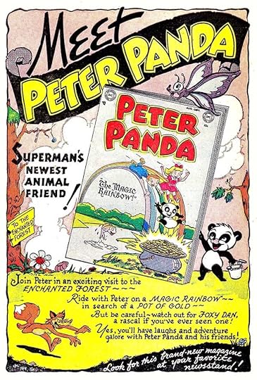 From THE FOX AND THE CROW #12, Oct/Nov 1953
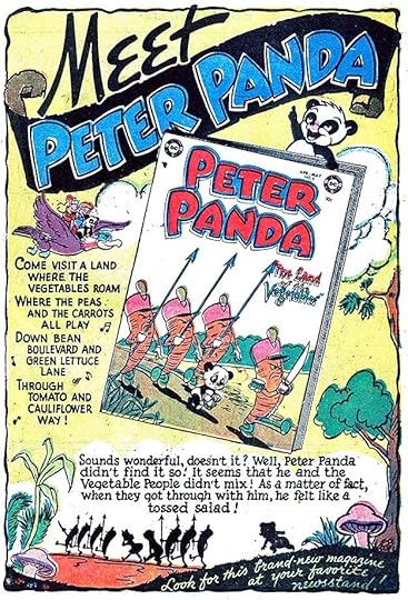
This ad by Ira for a new funny animal title pulls out all the stops in design, lettering styles and layout. PETER PANDA was really more of a fantasy series than a funny animal one, and Ira’s lettering reinforces that.
 From SUPERBOY #28, Oct/Nov 1953
Another version of the LINE OF STARS idea with new lettering by Ira. An unusual use of splash pages from the three stories in the issue, which have Ira’s logos on them.
 From WONDER WOMAN #62, Oct/Nov 1953
These PSAs usually had two versions, a full color one for inside use and a black and white one for inside covers, as here. Gray tones were added to the black and white versions.
 From DETECTIVE COMICS #202, Dec 1953
Another wordy PSA, but some issues needed more words.
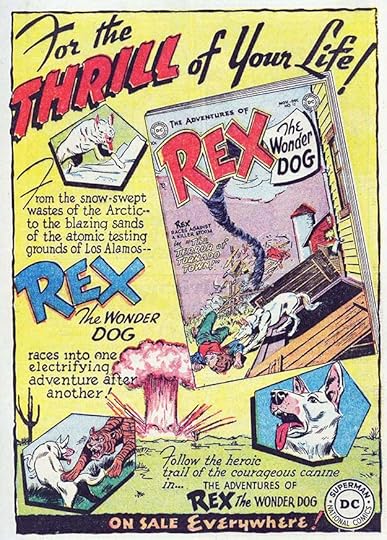 From HOUSE OF MYSTERY #21, Dec 1953
This full page ad for REX works much better than the earlier one I think, and would have encouraged me to look for this comic with a dog somewhat like Rin-Tin-Tin.
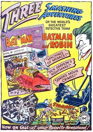 From DETECTIVE COMICS #202, Dec 1953
The final new ad for 1953 is specific to BATMAN, encouraging readers of DETECTIVE COMICS to try it. The art picked up from inside is rather confusing, but Ira’s lettering works fine.
To sum up, there are 18 house ads and 12 public service ads by Ira Schnapp in this cover-dated year of 1953, for a total of 30.
More articles like this are on the Comics Creation page of my blog.
Ira Schnapp on Wikipedia.
The post Ira Schnapp’s DC Ads: 1953 appeared first on Todd's Blog.
February 15, 2021
Ira Schnapp’s DC Ads: 1952
 From COMIC CAVALCADE #48, Dec 1951/Jan 1952. All images © DC Comics
In 1952, DC’s creation of house ads increased somewhat from the previous year, and Ira Schnapp’s work on them increased a lot. His work was obviously popular with editors and readers, and in this year it made up about three-quarters of DC’s own ads. The ad above shows Ira now firmly in command of the tools that brought him favor, with layout and design learned from showcard lettering in his past and appealing lettering styles and techniques. The ads were probably written by the editors, but Ira’s job was to sell the product, and he did it well. Possibly he also had some input on the words used. Certainly he chose the ones to emphasize, I would say.
 From ACTION COMICS #164, Jan. 1952
DC’s public service ads continued to run every month, and in 1952 eleven of them were lettered by Ira Schnapp.
 From GIRLS’ LOVE STORIES #15, Jan/Feb 1952
One major factor in the increase in ad work by Ira was a surge in handsome back cover ads by him on DC’s romance titles like this one. Editor Robert Kanigher’s style is evident in the text, and Ira’s appealing and elegant script styles are often on display. After only one new romance ad in 1951, there were 14 in 1952.
 From ACTION COMICS #165, Feb. 1952
DC’s teen characters were again frequently used in the PSAs, which not only allowed for more teen topics but perhaps exposed them to new readers. Overly wordy ads like this one might not have helped their case, though. Lettered by Schnapp.
 From SECRET HEARTS #8, Feb/March 1952
Look at the excellent design work and use of black on this ad from Ira, and he probably did the background art as well. Ads like this must have taken a lot longer to do than a typical story page or cover, but they also gave Schnapp a chance to better use the skills he’d developed in a lifetime of previous work. Ira turned 58 in 1952, and his skill and experience were the ideal solution for DC’s ad work.
 From DETECTIVE COMICS #181, March 1952
Buzzy and Binky were the two teen humor characters that showed up most often in PSAs, with their casts of supporting characters. Lettered by Schnapp.
 From GIRLS’ LOVE STORIES #16, March/April 1952
DC’s romance titles were largely kept separate from all the others, so house ads in them mostly advertise each other. This allowed editor Kanigher to produce elaborate back cover ads like this for one specific issue that was used only on the other two romance books, or sometimes only one. This must have added to the line’s cost, but Kanigher must have felt it was worth it. Certainly his romance titles sold well for many years after he was no longer editor. Lettered by Ira.
 From ACTION COMICS #167, April 1952
The only PSA not lettered by Schnapp in 1952 was this one lettered by Gaspar Saladino, who also sometimes filled in for Ira on covers when he wasn’t available. The difference in lettering style is obvious to me, but probably wasn’t noticed by many readers. The title is either a good imitation of Ira by Gaspar, or Ira did it, but I won’t call this ad for Ira.
 From SECRET HEARTS #9, April/May 1952
Just look through these romance ads by Schnapp and notice the variety of layouts but similarity of style and approach. It’s a master class in ad design for the time.
 From GIRLS’ ROMANCES #14, April/May 1952
And Kanigher’s ad copy cleverly draws in readers by asking them to think about the decisions made by the characters and think about how they would have acted. This is great selling.
 From GIRLS’ LOVE STORIES #17, May/June 1952
The background by Ira on this one is almost psychedelic, a precursor to the 1960s. His script styles on the large lettering is beautiful, too.
 From SENSATION COMICS #109, May/June 1952
Back to Schnapp lettering for the rest of the PSAs in this year. I like the sentiment in this one.
 From SECRET HEARTS #10, June/July 1952
The three-dimensional effect in the background of this ad is reminiscent of the early one Ira did for Canadian editions in the late 1940s. Notice how NOW ON SALE at the bottom is connected to the black lower border.
 From ALL-AMERICAN WESTERN #126, June/July 1952
There were still DC house ads by others in this year, but Ira’s were by far the best. Here’s one that could be reused with any two DC covers, and was. The large black lettering in the arrow is helped by the white outlines around it, something probably added for the black and white inside cover treatment.
 From HOUSE OF MYSTERY #6, Sept 1952
Lettering from the ad was repurposed for a third-page ad a few months later. In 1952 DC began selling more third-page ads, so many stories ended with only two-thirds of the page used on the last page to make room for them. When there weren’t enough paid ads to fill those spaces, house ads like this did. This version was probably made by someone other than Ira, and doesn’t count as a separate ad.
 From ALL-AMERICAN WESTERN #126, June/July 1952
This PSA promotes ideas that might be considered socialism today by some, and showing that socialized health care had a long history in America.
 From GIRLS’ ROMANCES #15, June/July 1952
Another back cover romance ad by Schnapp that many DC readers probably never saw.
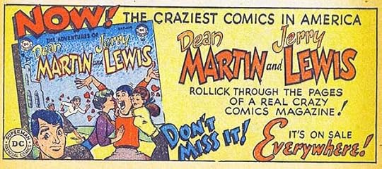
 From ACTION COMICS #170, July 1952
Joining DC’s Bob Hope comic was this one featuring a very popular comedy team. It sold well even after Martin and Lewis split up, leaving Jerry with a solo title. The top open lettering is pretty bouncy for Ira, and quite effective. Notice the date lag between this title with a July cover date that must have been on sale in May like the comic in the ad. DC did this hoping issues would stay on newsstands longer.
 From HOUSE OF MYSTERY #5, Aug 1952
A third-page version of this ad has new lettering by Ira, so I count it as a separate ad.
 From ADVENTURE COMICS #178, July 1952
Here’s topic that you weren’t likely to find in many comics stories, mental illness and PTSD. I think it’s handled pretty well.
 From GIRLS’ LOVE STORIES #18, July/Aug 1952
If one large question mark isn’t enough, why not three? In the 1950s, readers of these comics probably had a lot more questions than answers about romance.
 From DETECTIVE COMICS #186, Aug 1952
If only Superman were around to save us from our errors of judgment!
 From SUPERBOY #21, Aug/Sept 1952
In 1952, DC’s war comics were just getting started, also edited by Robert Kanigher. He knew ads by Ira Schnapp would help sell his products.
 From SECRET HEARTS #11, Aug/Sept 1952
And why not combine the genres of romance and war, thought Kanigher? Ira was ready to provide the ad and background art!
 From GIRLS’ ROMANCES #16, Aug/Sept 1952
How many readers of this comic had a man they loved? Those who didn’t could still imagine one.
 From DETECTIVE COMICS #187, Sept 1952
Water safety, a good topic, and I like the use of black on this art by Win Mortimer.
 From ACTION COMICS #172, Sept 1952
Another scary ad from Ira that works pretty well, though I don’t find his treatment of the word MYSTERY very effective.
 From GIRLS’ LOVE STORIES #19, Sept/Oct 1952
This ad panders a bit to teen insecurities, but Ira’s large JEALOUSY is wel done. I also like the bottom banner.
 From ACTION COMICS #173, Oct 1952
Here’s an example of how a half-page ad with lettering by Ira at the bottom could be paired with another half-page ad using all type and created in DC’s production department. It’s likely Ira did two half page ads on the same piece of art paper, and they were mixed and matched in various ways.
 From SUPERBOY #22, Oct/Nov 1952
And here’s the another Schnapp half-pager for Bob Hope probably created with the one above. I’ll consider each a separate Schnapp ad.
 From ACTION COMICS #173, Oct 1952
Another nicely done PSA probably written by Jack Schiff, who may have been the conscience of DC in some ways.
 From SECRET HEARTS #12, Oct/Nov 1952
In addition to all the other styles on this romance ad, Ira used some of his Old English style in the bottom section. It works well. The theatrical background art seems a good choice for one of these melodramatic ads.
 From GIRLS’ ROMANCES #17, Oct/Nov 1952
The emphasis on many of these ads is on the word YOU.
 From ACTION COMICS #174, Nov 1952
On these two half-page ads, only the smaller lettering on the lower one is by Ira, the open lettering above that is headline type, and the lettering on the upper ad is by someone else. I still count this as one Schnapp ad.
 From ACTION COMICS #174, Nov 1952
A PSA about taking voting seriously, but handled in a way kids would understand. Well done.
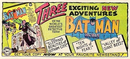
 From BATMAN #73, Nov/Dec 1952
Another action-filled war comics ad from Ira. Explosions make everything more exciting, but also notice the effective silhouettes at the bottom.
 From DETECTIVE COMICS #190, Dec 1952
At the end of 1952, Schnapp created this ad that could be and was used to promote many different comics with only small changes need on the lettering.
 From MYSTERY IN SPACE #11, Dec 1952/Jan 1953
For instance, this one is the same except for the cover and the word MYSTERY in the bottom arrow, replacing HUMOROUS. I count these variations as all one ad.
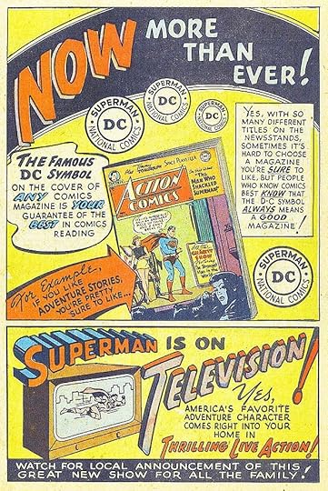 From ACTION COMICS #175, Dec 1952
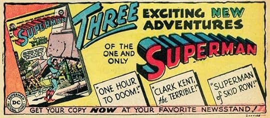
The top two-thirds of this version would count as a variation of the previous ad with only the word ADVENTURE added, but the bottom third is a new Schnapp ad that filled many third-page slots in many comics over the next few years, possibly one of Ira’s most-used house ads. It got my attention, though I think I discovered the Superman TV show before I ever saw this ad in a comic.
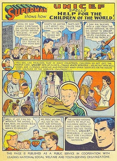 From ACTION COMICS #175, Dec 1952
The final Schnapp ad for 1952 is this PSA promoting the United Nations UNICEF program, certainly a worthwhile ad and effort.
For 1952 I count 11 public service ads he lettered and 26 house ads for a total of 37. Ira was really rolling now, and his ad work would continue to increase in the years ahead.
More articles like this are on the COMICS CREATION page of my blog.
Superman on TV from Wikipedia.
The post Ira Schnapp’s DC Ads: 1952 appeared first on Todd's Blog.
February 14, 2021
And Then I Read: SHADOW & CLAW by Gene Wolfe
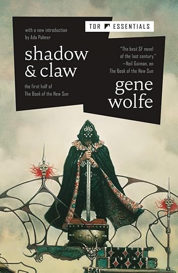
“The Book of the New Sun” was originally published in four parts from 1980-1983, this is the first two, “Shadow of the Torturer” and “Claw of the Conciliator.” It has been called a tetralogy, but seems to really be one long story. It won many awards, and was on a list of Neil Gaiman’s favorite sf/fantasy books.
Severian, the narrator is an orphan taken in by the Guild of Torturers in the massive ancient city of Nissus, and trained in the skills and duties of that guild. The world of Nissus is known as Urth, and gradually through the book we come to understand it’s our own Earth far in the future when the sun has cooled and many civilizations and empires have come and gone. The one Severian finds himself in has many medieval overtones, but there are always bits of ancient technology and lost knowledge coming to light in the margins. For instance, the tower that’s home to the Guild is made of metal, and is recognizable as a former space ship. Inhabitants of Urth include some familiar plants, but also unfamiliar ones, the same with animals, and among the people are those who seem to be from other planets, though they are uncommon. Nissus is a place of ancient traditions and rituals in a crumbling infrastructure that no one seems to be completely in charge of, though the nominal ruler is an unseen Autarch. Many guilds are present, each with duties and territory, and they are sometimes rivals and sometimes partners in the events of the day. Above them is a ruling class who are mostly absent from Nissus, many live in another huge dwelling to the north, and below them are the common folk who get by as best they can with what little resources they have.
Severian is smart and brave, learning well the skills of his guild and loyal to it until a chance encounter with a revolutionary aristocrat named Vodalus sets his mind on a different course. Later, a beautiful young woman, Thecla, also an aristocrat, is brought to the dungeons and torture chambers of the guild for punishment. She and Severian are attracted to each other, and the Guild assigns him to be her companion. All goes well as Severian rises in the guild until the time for Thecla’s torture arrives, and Severian must take part. His soul secretly rebels, and he finds a way to give Thecla a release.
Severian expects this to lead to his own torture and death by the guild, but instead they send him away to work as an executioner in the far north. Severian’s journey there is difficult and complex. He finds new companions who wish him well and ill, and goes through a fascinating series of adventures that not only inform his own life but fill in many details about the world of the New Sun. At the end of the first book he is just about to exit the massive city of Nissus through a gate in its mile-high wall. In the second book, he takes on his first work as an executioner, but still far from the city of his goal, and in his possession is the Claw of the Conciliator, which seems to have amazing healing powers at times. Severian has come by it accidentally, and one of his aims is to return it to the religious sect which worships it. Severian and some of his companions eventually reach the House Absolute, home of the Autarch and the ruling classes, where more adventures happen, and by the end of the second book they have traveled further north, as Severian is still heading toward his assignment in Thrax.
There’s too much here to really summarize it well, but I enjoyed reading this, and am now working through the second half of the epic. To say Severian is a complex character would be to oversimplify, and having him as narrator is sometimes difficult, as he tends to leave things out and only gradually reveal what really happened at critical moments. Many other characters are equally complex and interesting, and the plot is constantly inventive and surprising. This is a book I find myself thinking about when I’m not reading it.
Highly recommended.
<br />
The post And Then I Read: SHADOW & CLAW by Gene Wolfe appeared first on Todd's Blog.
Todd Klein's Blog

- Todd Klein's profile
- 28 followers

