
Todd Klein's Blog, page 92
April 19, 2021
Ira Schnapp’s DC Ads: 1967 Part 2
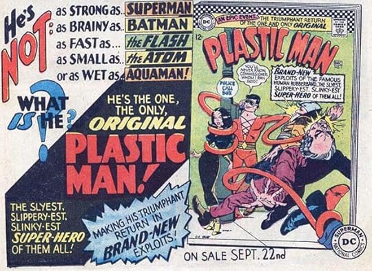
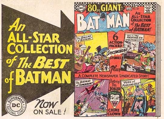
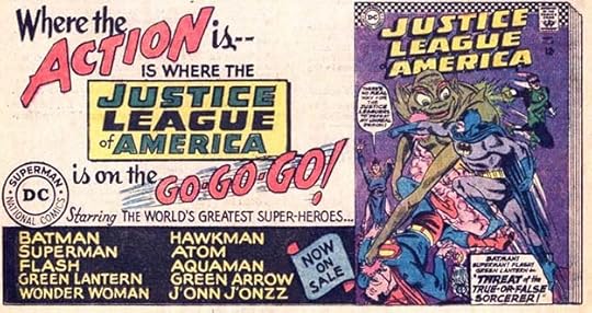
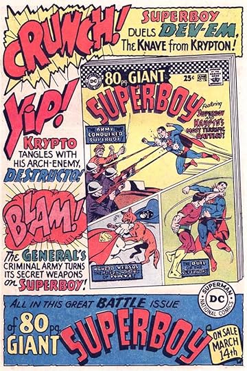 All images © DC Comics. From ADVENTURE COMICS #356, May 1967
As noted in Part 1, I was surprised to find so many new Ira Schnapp house ads in DC Comics cover-dated 1967. We begin here with a full-page Superboy Giant ad that shows the impact of the Batman TV show in the use of large sound effects, and I think also shows that Schnapp’s skills had not diminished despite his age at the time of 72. Hand lettering involves fine motor skills, which tend to decrease with age, and Ira’s page lettering by this time was clearly not as good as it was ten years earlier, but his larger display lettering and ad lettering in general still looks great to me. It’s reported that Ira spent more time on things like this and did them more carefully, working out elements on tissue paper before finalizing them, so that would have helped.
 From AQUAMAN #33, May/June 1967
Here’s an auction any fan would have enjoyed attending!
 From THE ADVENTURES OF JERRY LEWIS #100, May/June 1967
Super tools seem to be a momentary theme here. Lots of text on this ad, but as usual, Ira’s layout and use of black makes it work.
 From SHOWCASE #68, May/June 1967
Following previous examples, Ira was asked to create a letters page header for The Maniaks with the assumption it would be needed for their own title, but they never got one. The Maniaks is actually not a bad sixties group name.
 From ACTION COMICS #351, June 1967
The final new public service ad in Jack Schiff’s long running series (almost monthly since late 1949) was not lettered by Ira. I don’t know who lettered it, but it’s about libraries, so I certainly approve.
 From SUPERBOY #138, June 1967
This was truly a great Superman story, but not a new one. It first ran in 1954, further illustrating the tendency of editor Mort Weisinger to look backward rather than forward.
 From THE ADVENTURES OF BOB HOPE #105, June/July 1967
Dial H for Hero was an interesting idea, but hard to build an ad around, as the heroes were different in each issue. Ira does his best.
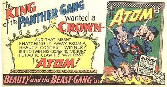
 From ACTION COMICS #352, July 1967
The Atom’s powers were highly visual, giving Ira and editor Julius Schwartz more to work with for ads like this.
 From ACTION COMICS #352, July 1967
Artist Carmine Infantino had fun with the Batman logo on this cover, and Ira worked with its energy in his ad layout.
 From THE ADVENTURES OF JERRY LEWIS #101, July/Aug 1967
Too much text on this ad, but Ira makes it work anyway with alternating areas of white and black in the background.
 From ADVENTURE COMICS #359, Aug 1967
Notice how the black diagonal area mimics the diagonals of the cover in this ad, which once again uses The Atom’s powers in a visual way.
 From ADVENTURE COMICS #359, Aug 1967
A hero along the lines of Tarzan, Bomba was as close to that as DC would get until the early 1970s.
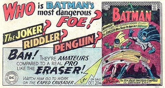
 From BATMAN #194, Aug 1967
Super-Gorilla Grodd was one of The Flash’s best villains. Ira’s visualization of squeezed letters here is clever.
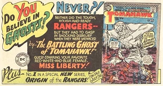
 From TOMAHAWK #112, Aug 1967
DC’s two remaining Hollywood humor books, this one and Bob Hope, did not get much ad attention, and their ads ran only in a few titles.
 From ACTION COMICS #353, Aug 1967
Giants, on the other hand, got plenty of ad attention. This is a half-page ad, but ran in many titles sideways as a full page one. Old stories, but new to many readers.
 From LOIS LANE #76, Aug 1967
A new elegant letters page header by Ira with art by Kurt Schaffenberger.
 From THE FOX AND THE CROW #105, Aug/Sept 1967
Generic ads like this one continued through the year, about the only mention of the Go-Go theme, and with several different top lines by Ira. The last appearance of the checks on a cover in these ads.
 From ADVENTURE COMICS #360, Sept 1967
DC’s teen humor character Binky had not been seen for about ten years when DC tried him out in SHOWCASE, and then a continuation of his old series, but all reprints except for the covers. Looking backward again.
 From ACTION COMICS #354, Sept 1967
This ad is probably a companion to the Jerry Lewis one above, and has great upper and lower case work by Ira.
 From ACTION COMICS #354, Sept 1967
Great display and balloon lettering by Ira here, and I love the witch cameos, wonder if they’re from the issue or done for the ad? And by who, Schaffenberger?
 From THE ADVENTURES OF JERRY LEWIS #102, Sept/Oct 1967
Action! Fisticuffs! Well, TOMAHAWK was trying anything that might grab readers. That big question mark from Ira might, too.
 From AQUAMAN #35, Sept/Oct 1967
Speedy, Green Arrow’s sidekick, seems a natural addition to the Teen Titans.
 From THE ADVENTURES OF JERRY LEWIS #102, Sept/Oct 1967
This was a fun idea in every way, both the cover, the storyline and the ad.
 From ACTION COMICS #355, Oct 1967
The ad for the Giant version of WORLD’S FINEST, on the other hand, seems rather lame to me.
 From THE ADVENTURES OF BOB HOPE #107, Oct/Nov 1967
Great display lettering full of energy by Ira. I can’t quite understand the emphasis on tearing down The Blackhawks in their issues and ads, though.
 From THE ADVENTURES OF BOB HOPE #107, Oct/Nov 1967
I can understand the focus of Lois Lane comics on her trying to marry Superman, but I never liked it. Interesting lettering treatments here by Ira.
 From ACTION COMICS #356, Nov 1967
A full page ad for this new title based on a series of movies being syndicated on TV, movies which were based on books, but I never saw them. This ad is almost a throwback to Ira’s glory days in the early 1950s with lots of room for his lettering and even a bit of background art.
 From ADVENTURE COMICS #362, Nov 1967
When in doubt, ad a few more question marks, thought Ira.
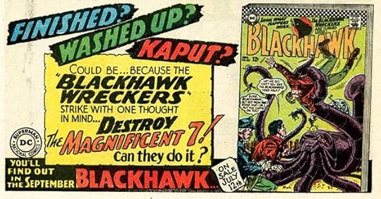
 From BLACKHAWK #237, Nov 1967
An anti-hero, Deadman, began appearing in STRANGE ADVENTURES with a logo by Ira, and he would become one of DC’s most successful new characters of this era with a long presence ahead. I wonder who drew that skeletal hand?
 From ADVENTURE COMICS #362, Nov 1967
Maybe it’s because so many of the ads this year were smaller that these full pagers look so good to me. Even as we near the end of the year with work probably done around August 1967 or so, I see no faltering in Ira’s ad skills.
 From ADVENTURE COMICS #362, Nov 1967
Another great one as Deadman moves right into his own title. Okay, the pun at the top is lame, but the cover and ad are good.
 From ACTION COMICS #356, Nov 1967
This is very unusual lettering for Ira, but I believe it is by him, trying to emulate the psychedelic look of the sixties for a teen magazine. It reminds me that I left this two-issue series (the second was retitled TEEN BEAM) out of my Schnapp series inventory. He lettered the logos and covers of both. I will have to fix that.
 From AQUAMAN #36, Nov/Dec 1967
A new generic ad for an unlikely pairing of themes.
 From THE ADVENTURES OF JERRY LEWIS #103, Nov/Dec 1967
Writer Nelson Bridwell probably wrote the copy for this ad, which utilizes an older meaning for the word gay.
 From THE ADVENTURES OF JERRY LEWIS #103, Nov/Dec 1967
Nelson’s other new series tryout lands a surprising guest star, who must have given permission. Lovely lettering by Ira.
 From AQUAMAN #36, Nov/Dec 1967
The script lettering in this ad is not up to Schnapp’s usual standards, and this might be a first sign that his ad skills were starting to decline, but in general the lettering is effective.
 From JUSTICE LEAGUE OF AMERICA #58, Dec 1967
Artist Carmine Infantino again having fun with the logo of this issue, but the only action in the ad is in the lettering.
 From ACTION COMICS #357, Dec 1967
An amusing attempt to promote Inferior Five while also featuring some of DC’s other teams.
 From ADVENTURE COMICS #363, Dec 1967
A late version of this generic ad which still has the GO-GO-GO lettering, but is missing the checks. In the bottom right corner is “1/2 H.A. #500,” which should have been removed before printing but was missed, one of the few times this happened. I noted one in 1958 for House Ad #44. If this is from the same ad registry, a lot of ads have been logged since then!
To sum up, I found 71 new house ads for Ira Schnapp in 1967 plus two new public service ads for a total of 73, as well as four letters page headers. Definitely less than the previous year, but still quite a lot. It will be interesting to see what I find in 1968 cover-dated issues, coming up in the final part of this series.
More articles like this are on the Comics Creation page of my blog.
Bomba the Jungle Boy on Wikipedia.
The post Ira Schnapp’s DC Ads: 1967 Part 2 appeared first on Todd's Blog.


April 18, 2021
Rereading: TUNNEL IN THE SKY By Robert A. Heinlein
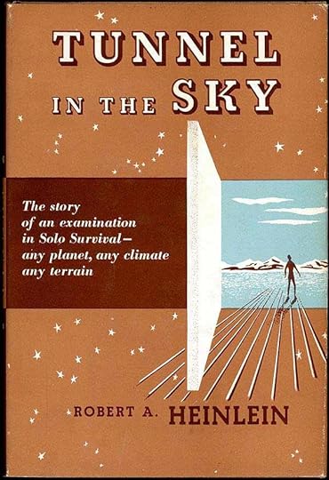 First Edition cover
I loved this book as a kid, and enjoyed rereading it recently. Rod Walker is a teenager on a future Earth burdened with massive overpopulation, but a new technology that creates gateways to other worlds around our galaxy has provided an outlet: colonists leave for promising undeveloped new worlds on a regular basis. Rod enjoys watching their wagon trains head out for distant planets at the transport center on his way home from school. Rod is taking a survival course, and graduation from it means a field test. He and other students will be dropped off on a planet with only what they can carry. The goal is to survive until they are recalled, up to ten days later.
Rod wants to take the test, though his instructor is not sure he has what it takes to get through. Not everyone does. Once dropped, it’s survival of the fittest against any and every threat, including the most dangerous one of all, other humans from his and a few other classes dropped at the same time. Rod’s sister, a soldier, backs his plan, but his parents are against it. Rod sticks to his decision, and shows up for the drop with his pack of supplies but no weapons other than two knives, on the advice of his sister.
Rod spends a frightening first night in a tree haunted by horrible sounds from some unknown animal, and after escaping a ground predator. As he begins to get used to the new environment, Rod is knocked out from behind. He wakes with a headache and stripped of all his gear except one knife he had hidden. How will he survive until recall? Soon he meets and joins another test person from a different school and they decide to team up, but the recall never comes. Something has gone wrong, and they’re stuck in this hostile jungle with no idea if they’ll ever be rescued.
A great action-filled story until the last third when it becomes more about politics than survival at times, and a little heavy on lecturing, but still a fine read. Recommended.
The post Rereading: TUNNEL IN THE SKY By Robert A. Heinlein appeared first on Todd's Blog.
April 15, 2021
Ira Schnapp’s DC Ads: 1967 Part 1
 All images © DC Comics. From THE FOX AND THE CROW #101, Dec 1966/Jan 1967
1967 was the final full year of employment at DC Comics for Ira Schnapp. At some point in 1968 his staff job was terminated. I don’t know when that happened, exactly how it happened, or whose decision it was, but Carmine Infantino is likely to be the person who gave Ira the news. Here’s what I wrote in my series of biographical articles about Ira from information I received from those who were there at the time like Neal Adams and Gaspar Saladino:
One of the most popular artists at the company then was Carmine Infantino, known for his excellent work on THE FLASH, among other titles. In 1966, Irwin Donenfeld made him art director, in charge of designing all the company’s covers, and Infantino was later promoted to Editorial Director. One of the changes Carmine enacted was to start putting long-time DC letterer Gaspar Saladino on logos, cover lettering and house ads, shifting that work away from Ira. Apparently Carmine felt the company’s design presence needed a fresh approach, and Gaspar’s work was excellent, as he rose to the challenge with dynamic, energetic and artful lettering and logos. Carmine kept Ira on for a while doing less important tasks, but in 1968 he was let go. As artist Neal Adams, who had befriended Ira when he started working at DC around 1967 put it, it meant Ira was being sent home to die. Gaspar Saladino has described Ira as “Mister DC,” and said it was sad that when he left, it was as though he’d never been there at all.
From these reports, I expected to see less ad work from Ira in 1966 and much less in 1967, keeping in mind that there is always a time shift between cover dates and when the work was done of three to four months. What I found in my research for these articles was that Ira’s ad output about doubled in 1966. Gaspar’s also increased, but to only about a dozen ads. In 1967, Ira’s ad output did decrease by a third, declining from about 120 ads to about 75. Gaspar’s ad output increased from about a dozen to about two dozen, and there were some ads by others in both years. This is significant, but not the dismissal of Ira’s ad skills I was expecting. There are enough Schnapp ads in 1967 to still require two parts, and we’ll look at the numbers at the end of Part 2.
Some changes in 1967: there were no new romance group ads. A few were reused, and otherwise ads for other DC books appeared. The public service ads that were the pet project of editor Jack Schiff tapered off this year with mostly repeats. Only four were new. Ira lettered two of those, including his finest one ever. Jack Schiff retired from DC in 1967 and his admirable project ended, though DC did some similar ads in 1976-77. The Go-Go-Checks push from 1966 was not continued much in house ads, only a few referenced them, and they quietly died out by the end of 1967. Ad emphasis remained on superheroes, though all genres other than romance received some new ones, like the Jerry Lewis ad above. There only the lettering by Ira is new, the art and layout are from past ads.
 From ADVENTURE COMICS #352, Jan 1967
Third page ads were by far the most common now, filling in spaces left on most new comics stories on the final page. Some paid ads were used there, but often it was ads like this promoting a particular character, title or issue, as well as some more generic ads that could be reused.
 From ACTION COMICS #345, Jan 1967
One of the largest impacts the popular Batman TV show had on the comics was the introduction in them of Barbara Gordon, the new Batgirl. There had been a different Batgirl in the early 1960s, but she was abandoned when Julius Schwartz took over editing the Batman titles in 1964. The new Batgirl was requested by the TV show producers, and introduced in the comics and on the TV show in 1967. Ira gives her a logo in this ad, I don’t know if it was used anywhere else.
 From ADVENTURE COMICS #352, Jan 1967
Elsewhere, DC was still floundering, trying desperately to come up with new ideas that would appeal to readers. This was one of the worst, not only a tired concept of a white hero in Africa with all the racist overtones that suggests, but with one of Ira Schnapp’s lamest logos ever. Thankfully the character did not last long.
 From ACTION COMICS #345, Jan 1967
This first new public service ad of the year was lettered by Gaspar Saladino. I’m including it for completeness.
 From ACTION COMICS #345, Jan 1967
DC continued to promote their 80-Page Giant line, all reprints, as if that was their strong suit. Perhaps it was. The silly text of this ad was probably written by editor Mort Weisinger, though it might be by his assistant Nelson Bridwell.
 From AQUAMAN #31, Jan/Feb 1967
Marvel Comics was full of character crossovers, so DC was doing some too. I hope the appearance of the Justice League raised sales of BLACKHAWK, even though the message about that group here is very negative.
 From ADVENTURE COMICS #353, Feb 1967
Ira’s display lettering makes this ad work, though the cover is pretty exciting too.
 From THE FLASH #167, Feb 1967
Another ad with great display lettering, especially SCARECROW, done in dry-brush style, a rarity from Schnapp.
 From ACTION COMICS #346, Feb 1967
War titles did not receive much attention unless it was a Giant reprint issue.
 From OUR FIGHTING FORCES #105, Feb 1967
An odd ad, even for Superman, this is way more space and attention the storyline would seem to merit in my opinion.
 From ACTION COMICS #346, Feb 1967
This looks like a paid ad, but it’s for DC posters produced and sold by them, with payment going to the DC offices. It’s the first time that happened, as far as I know. Most of these images appeared before in the comics as pinups, some have character “autographs” by Ira. I hope they were printed on better paper than the comics. From the description it sounds like they were, but I’ve never seen one. Influenced by the TV show, as far as content.
 From BLACKHAWK #229, Feb 1967
This is kind of a replacement for “Coming Super-Attractions,” but it was only used this once.
 From ACTION COMICS #346, Feb 1967
Ira’s second-to-last public service ad was his best, in my opinion, and if Jack Schiff wrote this, one of his as well. I know from experience that it took a lot of time to research and letter all those languages correctly, and the ad is not only beautifully done but timeless.
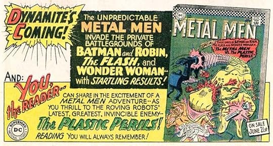
 From METAL MEN #24, Feb/March 1967
A common crossover or team-up story plot begins with a fight between the characters, as here, something Marvel did frequently too.
 From THE ADVENTURES OF BOB HOPE #103, Feb/March 1967
Ira always found a way to make his layouts interesting with black shapes and display lettering.
 From THE ADVENTURES OF BOB HOPE #103, Feb/March 1967
A more typical DC approach to conflict was to have characters standing around talking on the cover while Ira tries to make that conflict interesting.
 From ADVENTURE COMICS #354, March 1967
Two half-page ads (counts as two for Ira). DIAL H seemed an interesting concept, though I never read it. Nelson Bridwell was pushing his creation The Inferior Five with another series of house ads for each character, more below.
 From BLACKHAWK #230, March 1967
 From JUSTICE LEAGUE OF AMERICA #52, March 1967
 From THE ADVENTURES OF JERRY LEWIS #99, March/April 1967
 From AQUAMAN #32, March/April 1967
Clearly Nelson and Ira, not to mention artists Mike Sekowsky and Mike Esposito, were giving this promotion their all, and these ads are amusing.
 From BLACKHAWK #230, March 1967
Another odd ad, this doesn’t even have any information about what’s coming up in the next issue. Is it an ad, or just a filler?
 From ACTION COMICS #348, March 1967
These Giants must have sold well, and were a sure source of profits, as they were all reprints other than the covers.
 From AQUAMAN #32, March/April 1967
A new letters page header lettered by Ira. I doubt he did the art, but it’s possible.
 From BLACKHAWK #231, April 1967
And this is a header for a page where you could advertise back issues to trade, something I never saw before in a comic, and a great idea for readers when back issues were hard to find.
 From ACTION COMICS #349, April 1967
Another Giant, and one that again reprints Carmine Infantino’s pages about how he drew The Flash.
 From BLACKHAWK #231, April 1967
Two of the funnier comics from DC are featured in this ad with appealing lettering by Ira.
 From BLACKHAWK #231, April 1967
Teen humor with Hamlet? Well, it made for an good title at least.
 From STRANGE ADVENTURES #199, April 1967
TOMAHAWK continued to roll along as the sole survivor of its western genre.
 From THE FLASH #169, April/May 1967
Another ad urging readers of a Giant to also look for new Flash stories appearing at the same time. Giants were numbered as part of the series they featured, but did not replace the series issue for that month, which was also on the stands.
 From THE ADVENTURES OF BOB HOPE #104, April/May 1967
Batman made repeated appearances in team-ups in THE BRAVE AND THE BOLD until eventually co-starring in every issue. I like Ira’s arrows.
 From THE ADVENTURES OF BOB HOPE #104, April/May 1967
This ad copy misses the mark, I’d say. The only connection to Valentine’s Day is the on-sale date.
 From THE FOX AND THE CROW #103, April/May 1967
Editor Mort Weisinger continued to circle back to the same tired ideas in his Superman-related titles. One of my least favorites was baby versions of the characters.
 From THE BRAVE AND THE BOLD #71, April/May 1967
Ira has fun with stretched words in this ad.
 From DETECTIVE COMICS #363, May 1967
Potential death is a common theme in comics, as here. I like that the ad copy refers to the group as The Challs, as their full name is too long.
 From ACTION COMICS #350, May 1967
Another series tryout created by Bridwell and Sekowsky, this one reaching for laughs about a music group did not gain its own title. Ira did his best to sell it.
 From BLACKHAWK #232, May 1967
In this ad and story, Metamorpho seems to be facing opponents more typical of the Metal Men. Still, intriguing. I would have given this a try if I’d seen it.
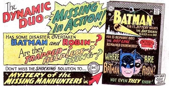
 From ADVENTURE COMICS #356, May 1967.
Ira Schnapp’s final public service ad lettering appeared on this unusual entry. I don’t think it would have appealed to many kids, so perhaps the series had run its course. Ira certainly did a lot of them.
I’ll continue with the rest of Schnapp’s 1967 ads in Part 2. More articles you might enjoy are on the Comics Creation page of my blog.
Wikipedia on Batgirl.
Wikipedia on editor Jack Schiff.
The post Ira Schnapp’s DC Ads: 1967 Part 1 appeared first on Todd's Blog.
April 13, 2021
Ira Schnapp’s DC Ads: 1966 Part 3
 All images © DC Comics. From HOUSE OF MYSTERY #160, July/Aug 1966
In this third and concluding article on Schnapp’s DC ads from 1966, we begin with this nice full page ad that shows how the Batman TV show that began a few months earlier and was a sensational hit with viewers was influencing the comics. When Julius Schwartz took over the Batman titles in 1964 he ushered in more realistic art and stories, but that effort was somewhat derailed by the campy humor of the TV show. DC management may have pushed him to reflect the show in his comics, or it may have simply been his decision. In either case, the art and text of this ad are a good example of trying to find a middle ground between the Schwartz Batman and Robin and the TV ones. The art is still realistic, but the large sound effect and language are like the show.
 From HOUSE OF MYSTERY #160, July/Aug 1966
These Riddler ads were even more like the TV show, and rather lame.
 From AQUAMAN #28, July/Aug 1966
In fact, rather than promoting the comics in them, these ads were closer to laughing at the characters, as the TV show did. Not a great idea in my book.
 From HOUSE OF SECRETS #79, July/Aug 1966
The Superman-related titles did not reflect the Batman TV show much, but they were already full of pretty silly ideas as seen in this ad. How DC expected this sort of thing to compete with Marvel’s comics of the same era is beyond me.
 From ACTION COMICS #340, Aug 1966
In this ad similar to the Go-Go-Checks ones, DC is, in my opinion, even talking down to their readers, never a good idea. I’m sure they didn’t see it that way, but that’s how it seemed to me at the time. I was much more drawn to Stan Lee’s approach, which was inviting, actually funny, and made me feel part of the gang creating the comics, a true believer.
 From BATMAN #183, Aug 1966
A third-page version of an ad shown in Part 2 of this article, but with all new lettering by Schnapp.
 From ACTION COMICS #340, Aug 1966
80-Page Giants full of reprints seemed to be where DC was putting much of their focus, as if their current offerings were not as good as the old stuff. Perhaps that was right, at least at this time. Nice upper and lower case work by Ira here.
 From BLACKHAWK #223, Aug 1966
Another of these generic third-page ads. Only the top center lettering is new, but it was used often, so I will call it another ad by Ira.
 From ADVENTURE COMICS #347, Aug 1966
This public service ad lettered by Schnapp has a good message, but probably one many kids were not going to believe much longer in 1966.
 From BLACKHAWK #223, Aug 1966
Editor Mort Weisinger’s ideas, or those of his writers, seemed to keep circling back to the same material over and over rather than breaking any new ground. Ira did his best to make it exciting.
 From ADVENTURE COMICS #347, Aug 1966
TOMAHAWK, DC’s last western-themed comic was grabbing for any ideas that might draw readers, including ones from war, mystery and even superhero titles with Miss Liberty.
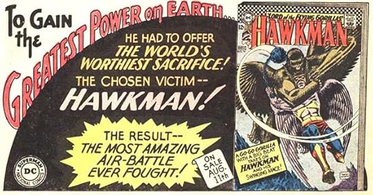
 From HAWKMAN #15, Aug/Sept 1966
Writer Robert Kanigher had a good idea for this issue of METAL MEN, pitting them against living plastic opponents.
 From THE ATOM #26, Aug/Sept 1966
When Batman’s adventures were taken more seriously, they work better for me, as here.
 From HOUSE OF MYSTERY #161, Sept 1966
Filling ads with defeatist language does not seem like the way to draw in readers to me, but I could be wrong.
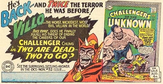 From ACTION COMICS #341, Sept 1966
More defeatism, and naming a villain Villo seems to signal a lack of ideas to me. Sorry to be so negative here, but DC seems to be floundering.
 From BLACKHAWK #224, Sept 1966
I like the ideas in this ad better, but they don’t suggest Batman and Robin as very capable heroes, and the telephone hot-line seems right out of the TV show.
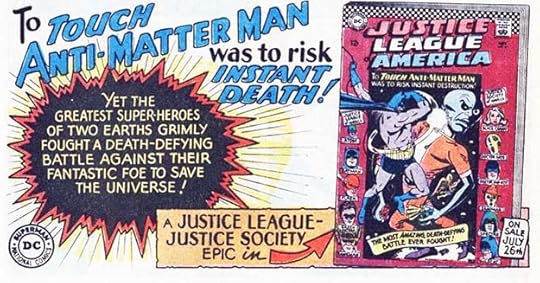 From GREEN LANTERN #47, Sept 1966
Finally a threat epic enough to be worthy of the Justice League, and there’s Batman up front taking it on heroically. I like Ira’s black burst here suggesting an anti-matter explosion.
 From HOUSE OF MYSTERY #161, Sept 1966
Jimmy Olsen as a powerful prize fighter? Okay, that’s more interesting than many of his past roles.
 From ACTION COMICS #341, Sept 1966
More stories from the past suggesting Lois Lane’s main interest is romance and matrimony. Fine lettering and design, though.
 From ADVENTURE COMICS #348, Sept 1966
Yes, old people might have some interesting ideas, kids. Are you hip?
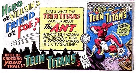 From BLACKHAWK #224, Sept 1966
The Teen Titans seem to be taking on a character inspired by Marvel’s Spider-Man and Ant-Man perhaps. This is at least intriguing.
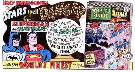 From BLACKHAWK #224, Sept 1966
Now we’re back in the influence of the Batman TV show with this ad’s “Holy Horoscope!” I love Ira’s treatment of the word DANGER in stars.
 From BLACKHAWK #225, Oct 1966
Schnapp’s elaborate crown design here is as good as his display lettering.
 From ADVENTURE COMICS #349, Oct 1966
This ad signals some interesting developments due to the TV show, a new comic strip and a film compiling several episodes of the TV show. Sadly, this interest was a fad that would soon pass once the show was off the air. By the way, the large, colorful sound effects used in the TV show and imitated here by Ira were reportedly drawn by DC production staffer and letterer Joe Letterese.
 From ACTION COMICS #342, Oct 1966
Two half page ads probably created together by Ira but also used separately, and counting as two ads for him. Less words meant more room for appealing design and display lettering.
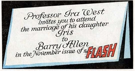 From DETECTIVE COMICS #356, Oct 1966
DC turns to the wedding option for Flash in this subtle and beautifully lettered third-page ad by Ira. I find it more effective for its quiet approach. I bet Ira had done a few real-life wedding invitations in his time, too.
 From BLACKHAWK #225, Oct 1966
An effective ad and an intriguing storyline.
 From ACTION COMICS #342, Oct 1966
Perhaps one of DC’s best moves of 1966 was bringing back the Quality Comics character Plastic Man. His return was prompted by a potential movie that never happened, but he was a welcome addition to the DC roster, even though they already had at least two stretchy characters in Elongated Man and Jimmy Olsen’s Elastic Lad. Plas was the original, and still entertaining. Great ad by Ira.
 From FALLING IN LOVE #86, Oct 1966
DC was still pushing Scooter in their romance titles. I wonder if any of those music groups ever saw this appealing ad? Still some lame language, but better than most of his ads.
 From STAR-SPANGLED WAR STORIES #129, Oct/Nov 1966
Over in ADVENTURE COMICS, the Legion of Super-Heroes was quietly building a devoted fan base that would keep them going for decades, even though they received little promotion.
 From THE ATOM #27, Sept/Oct 1966
The effectiveness of this ad is marred by the color choice for the burst, making it a bit hard to read.
 From CHALLENGERS OF THE UNKNOWN #52, Oct/Nov 1966
Here’s an intriguing story idea from writer Robert Kanigher! I haven’t read it, but I would have wanted to after reading this ad. Love the faux newspaper work by Ira.
 From BLACKHAWK #227, Dec 1966
The use of acronyms for villainous groups may have been popularized by James Bond, and was quickly adapted by TV shows like “The Man From U.N.C.L.E.” Marvel followed the trend, as did DC.
 From ACTION COMICS #344, Dec 1966
Still pushing those old stories in the Giants, this ad has one of Ira’s largest arrows.
 From BLACKHAWK #227, Dec 1966
Here’s a clever idea that could only work in comics. What ever happened to The Eraser, I wonder?
 From SECRET HEARTS #116, Dec 1966
Scooter really goes off the edge with this storyline. I can’t see many romance comic readers wanting to buy it, despite all the great lettering by Ira.
 From GIRLS’ ROMANCES #121, Dec 1966
A smaller version with all new lettering by Schnapp.
 From GREEN LANTERN #49, Dec 1966
DC sure kept Ira busy in 1966 with so many ads for individual issues, and there were more I’m not showing by Gaspar Saladino and others.
 From JUSTICE LEAGUE OF AMERICA #48, Dec 1966
This ad is from an 80-Page Giant issue of JLA prompting readers to look for another issue on sale at the same time with new material.
 From ACTION COMICS #344, Dec 1966
The final ad by Ira in 1966 has me asking, did he draw that large hand and arm? I don’t know the answer.
To sum up this incredibly busy year, I found 113 house ads, three public service ads and one paid ad by Schnapp for a total of 117, plus eight headers for letters pages and text pages. Truly an amazing amount of work, about double his ad output in the previous year. It will be interesting to see what happens in 1967, Ira’s last full year on staff at DC, and one in which Ira’s star was falling and Gaspar Saladino’s was on the rise.
More articles like this are on the Comics Creation page of my blog.
The post Ira Schnapp’s DC Ads: 1966 Part 3 appeared first on Todd's Blog.
April 11, 2021
Incoming: FABLES COMPENDIUM TWO
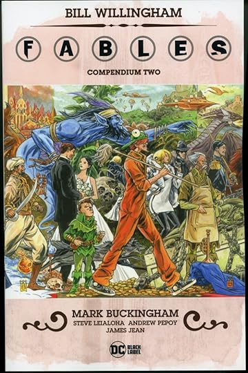 Image © Bill Willingham and DC Comics, cover art by Mark Buckingham.
The second of four massive trade paperbacks collecting all of the FABLES series has arrived. This one contains issues #42-82. The printing and paper quality look fine to me. The book is over two inches thick, so I hope the glued binding will hold up for readers. The cover art connects to that on the first Compendium, so I’m guessing all four will connect into one very wide image, a nice idea. If you haven’t read the series, this is a handy and relatively inexpensive way to do so. Retail price is $59.99, which seems a lot, but if you divide that by 41 issues, it’s about $1.46 per issue, less than you’re likely to pay for all those monthlies or previous collections. Not sure when it’s out in shops, but Amazon has delivery by May 11, link below.
&amp;amp;amp;lt;br /&amp;amp;amp;gt;&amp;amp;lt;br /&amp;amp;gt;&amp;lt;br /&amp;gt;&lt;br /&gt;<br /><br />
The post Incoming: FABLES COMPENDIUM TWO appeared first on Todd's Blog.
April 8, 2021
Ira Schnapp’s DC Ads: 1966 Part 2
 All images © DC Comics. From ACTION COMICS #336, April 1966
Continuing to look at Ira Schnapp’s house ads for April titles, this one promotes another 80-Page Giant full of reprints. Golden Age reprints were rare, since DC did not have good copies of the art in most cases and had to hire artists to retouch and sometimes redraw parts of them.
 From THE FLASH #160, April 1966
Among the Silver Age revamps of Golden Age DC characters, Green Lantern and The Flash were the best. Both added new ideas to the original concepts. GL’s power ring is a fine example, as powerful as the will of the user.
 From GIRL’S ROMANCES #116, April 1966
 From YOUNG ROMANCE #141, April/May 1966
 From GIRL’S LOVE STORIES #119, May 1966
Ira’s revised letter column headers were much better than the previous ones using set type. He did not do the art.
 From ACTION COMICS #336, April 1966
TOMAHAWK was looking a bit desperate as it tried to rope in both horror and war themes. I like Ira’s display lettering here.
 From GIRL’S LOVE STORIES #118, April 1966
After a few years of almost no house ads, the romance titles were full of them in this year promoting the new continuing soap opera direction.
 From FALLING IN LOVE #83, May 1966
Another one debuts in this title with a fine Ira Schnapp logo.
 From ACTION COMICS #337, May 1966
A full page ad probably intended to show the diversity at DC, but kind of a mess design-wise. The dark background color doesn’t help. Note that this has Scooter appearing in SHOWCASE, but it went right to its own title instead.
 From HAWKMAN #13, May 1966
Sure, making fun of South American characters is a great way to attract readers.
 From BLACKHAWK #220, May 1966
I’ve run out of things to say about these.
 From OUR ARMY AT WAR #167, May 1966
 From BLACKHAWK #220, May 1966
 From WONDER WOMAN #162, May 1966
 From DETECTIVE COMICS #351, May 1966
 From LOIS LANE #65, May 1966
The Inferior Five, a creation of E. Nelson Bridwell, tried for a mix of MAD magazine humor with superheroes, and it had its moments. It was well-promoted by Ira Schnapp as you can see, with separate third-page ads for each character.
 From OUR ARMY AT WAR #167, May 1966.
METAL MEN had started off well but by this time was reaching for crazy story ideas.
 From FALLING IN LOVE #83, May 1966
At least the romance group was consistently pursuing a theme that would keep them going for a while.
 From ACTION COMICS #337, May 1966
The 80-Page Giants were also consistently looking to past glories.
 From SUGAR AND SPIKE #64, May 1966
DC’s last remaining funny animal title was also trying new things. This was a great feature, but came too late to turn the tide. Sorry for the poor scan, best I could find.
 From THE ADVENTURES OF BOB HOPE #98, May 1966
In editor Mort Weisinger’s Superman titles, the storylines usually remained as simplistic as they had been for some time.
 From ACTION COMICS #337, May 1966
This Schnapp ad from many years earlier was revived with a long list of TV stations carrying reruns in syndication. I think it’s all lettered by Ira. His hand was not as steady as it had been, and things had to be crammed in, but it reads fine.
 From FALLING IN LOVE #83, May 1966
Another new text page header from Schnapp, and he also did the other lettering.
 From BLACKHAWK #221, June 1966
This ad promotes pinups of Batman and Robin that ran as double-page centerspreads. A nice idea (and they had Schnapp-lettered signatures). I’m not sure newsprint images are really suitable for framing, though.
 From DETECTIVE COMICS #352, June 1966
Ira’s lettering is the star of this ad in my eyes.
 From BLACKHAWK #221, June 1966
I’m guessing these Inferior Five ads were written by series creator Nelson Bridwell, also an assistant editor at DC.
 From DETECTIVE COMICS #352, June 1966
The Justice League would seem to be a likely subject for house ads, but perhaps it sold fine without them, so attention was shifted elsewhere. A few third-page size ads was all they got in 1966.
 From BLACKHAWK #221, June 1966
Could the lameness of checks ads become worse? They could when combined with even lamer poetry. I wonder if this was also written by Nelson?
 From ADVENTURE COMICS #345, June 1966
Among his other areas of knowledge, Nelson Bridwell was a Shakespeare scholar, so perhaps this mildly amusing poem is also by him.
 From ADVENTURE COMICS #345, June 1966
More glories from Superman’s past.
 From STAR-SPANGLED WAR STORIES #127, June/July 1966
Another ethnicity handled poorly, though the character Egg Fu was created many years earlier in WONDER WOMAN.
 From FALLING IN LOVE #84, July 1966
After some of the above ads, this one seems like a breath of reality. Melodramatic reality perhaps, but still…I can see how it might have appealed to a now elderly Ira Schnapp more than the other genres DC was selling. Great display lettering.
 From ACTION COMICS #339, July 1966
The cover of this comic was lettered by Gaspar Saladino, so Ira’s work is just the top section and the on sale date.
 From THE ADVENTURES OF BOB HOPE #99, July 1966
Character weddings were another idea that might have come from what Marvel was doing with stories like the wedding of Reed and Sue in THE FANTASTIC FOUR. DC characters usually stayed single with a few exceptions.
 From GIRLS’ ROMANCES #118, July 1966
Compare this ad to the ones for DC’s romance titles. It seems unlikely readers of those would be interested in Scooter, but I could be wrong. This is a fine variety-pack of Schnapp styles.
 From FALLING IN LOVE #84, July 1966
See what I mean? Another fine layout from Ira making all this copy interesting by placing it in different shapes.
 From ACTION COMICS #339, July 1966
Part of a series of ads featuring The Riddler that must have been inspired by the Batman TV show.
 From THE ADVENTURES OF BOB HOPE #99, July 1966
DC humor titles continued to get little attention except for this variation on an ad I showed in Part 1 with some new lettering at the top center.
 From ADVENTURE COMICS #346, July 1966
A new PSA, but this one is lettered by Gaspar Saladino, not Ira. Wise words that are still true.
 From DETECTIVE COMICS #353, July 1966
Another of these. Note that Ira could have reused the top line from the previous ad, but it was probably simpler to redo it.
 From OUR ARMY AT WAR #169, July 1966
Another. While I did watch the Batman TV show, I realized about ten minutes into the first one that they were making fun of the characters rather than playing them straight, and it was a disappointment. The villains were fun.
 From OUR FIGHTING FORCES #101, July 1966
This is a tricky one. The lettering on the cover is by Gaspar Saladino, but everything outside it is by Schnapp.
 From FALLING IN LOVE #84, July 1966
Another letters page header lettered by Ira. He was a master of fine script.
I’ll wrap up coverage of ads from 1966 in Part 3, next. Other posts you might enjoy are on the Comics Creation page of my blog.
The Batman TV show on Wikipedia.
The post Ira Schnapp’s DC Ads: 1966 Part 2 appeared first on Todd's Blog.
April 6, 2021
IRA SCHNAPP IN LEADING COMICS

LEADING COMICS began with a Winter 1942-43 issue as a home for a new super-team along the lines of the Justice Society, but using second-tier heroes that were not in that team. It followed the model of JUSTICE SOCIETY OF AMERICA in that it was broken into chapters each featuring one or two heroes. The lettering seems to have been done by one person for each issue, at least as far as the main story goes. With issue #15 dated Summer 1945, the book made a sharp turn into funny animals instead of superheroes, and continued as such until 1955, changing its name to LEADING SCREEN COMICS along the way. I think Ira Schnapp was involved with the first format for a short time, and then was the main letterer on covers and stories for the humor format from 1946 to 1950. He continued to do some work on the book after that until it folded. The only editor of record on the first format is Whitney Ellsworth. When it turned to humor, the editors were Bernie Breslauer and then Larry Nadle. I’ll look at Ira’s work on covers first.

Issue #12 from 1944 is where I think Schnapp begins his lettering work. The caption is not much like his later cover lettering, but it does look like other cover work from this early period, and the style of the numbers in the signs is also something he would do.

Issue #13 has more familiar Schnapp lettering styles from the 1940s in the caption.

Issue #14 from 1945 has styles in the caption that Ira was using at the time, again not so much like his later cover lettering, but you can see similarities especially in FROM THE.

With issue #15, Summer 1945, the book switched to funny animals, and this one is full of Ira’s lettering. He even lettered the issue number, price and date. Some of this work is again not much like his later, more familiar cover styles, but it does match other cover work from the time.

Issue #16’s caption is looking more familiar, especially the word Featuring, which would appear on many issues.

You could say that the large square-cornered words in this first balloon are not like Schnapp, but he did do this on other covers of the time, and the regular letters show his style points such as the slightly up-curved right leg of each R and his small distinctive question mark.

Lots of interesting lettering by Ira on the cover of issue #19.

With issue #23 dated Feb-March 1947, the character lineup changed and Peter Porkchops became the new lead feature, as lettered by Schnapp.

Some of the covers had no lettering or only reused Ira’s “Featuring” blurb, but this one does have his work on the cookie jar. Note the word SCREEN has been added to the logo, but the official name of the comic didn’t change in the indicia until issue #45.

By issue #38 from 1949 Ira’s word balloon style was getting closer to the familiar one he would use for many years after this.

Another example from 1950, but after this most of the covers had no lettering for a while.

With issue #62 from 1953 on, most of the covers once again had Schnapp word balloons like this one on issue #70.

The final issue instead has a Schnapp thought balloon, not common on this series.
Here are the issues I see Ira’s cover lettering on: 12-29, 34, 38-40, 42, 48, 54, 62-67, 69-71, 73-77, that’s 39 in all.
 From LEADING COMICS #11, Summer 1944
Identifying Ira Schnapp’s first work on stories is more difficult. This chapter heading from issue #11 has a character logo and story title that are very much in styles Ira used, but the rest of the lettering is unlike anything I’ve identified as his. The letters are made with a wedge-tipped pen, creating thick and thin variations, and the letter shapes also don’t look right. Could Ira have just done the character logos and titles, or is this early lettering by him in a different style? I can’t be sure, so I’m not going to call it for him. The rest of the issue is much the same.
 From LEADING COMICS #13, Winter 1945 (probably should have been 1944)
Issue 13, on the other hand, is lettered in a style much more like what I’d expect from Schnapp at this early time in his career at DC. The pen used has a dead line, no thick and thin variations, and the letters are similar to what he was doing elsewhere.

The Shining Knight chapter from the same issue has a character logo and story title very much in styles Ira used, and now the rest of the lettering is convincingly his to me, though different from what he would be doing a year or two later. I think Ira lettered all the superhero chapters in issue #13, but #14 was lettered by someone else.


With issue #15, dated Summer 1945, Ira became the main letterer for a few years, sometimes lettering every story. Schnapp seemed to like working on humor comics, he did lots of them, and why not? They generally had less words than other genres, and were entertaining to read. The four images above are just some of the new features that began in issue #15 lettered by Ira.

This one began in issue #17 dated Winter 1945 (the second issue with that date, but meaning 1945-46 in this case). Ira’s lettering was becoming more consistent and wider, and note the letter R with a slightly up-curved right leg and his tiny angular question marks. This is very close to what he was doing on the Superman newspaper strip at the time.


With issue #23 dated Feb-March 1947, some of the features were dropped and new ones introduced like these two, which would remain on the roster for some years in this and other funny animal titles like ANIMAL ANTICS. From this point forward, other letterers worked on one or more stories in each issue.

The new lead character was Peter Porkchops, and Ira first lettered him on this story in issue #24. Peter P was popular, and soon appeared in two stories in each issue. Later he would get his own title.

One of the best things Ira worked on in this book was Doodles Duck stories with great art by Howard Post, initially in the style of Walt Kelly, though he moved away from that later. This one is from issue #29.

This Lippy Leprechaun story in issue #39, Oct-Nov 1949, has Schnapp lettering that is now looking like what he would do for the rest of his career. The letters are less wide, most would fit into a square. From 1950 to 1954 Ira did less than half the stories in most issues, but he returned in force for the last few issues in 1955.

Here’s the lead Peter Porkchops story from issue #56, dated Aug-Sept 1952, lettered by Ira.

Some stories in this series were written and drawn by Sheldon Mayer, who often did his own sound effects, balloon shapes and larger display lettering. This was probably a time-saver for Mayer, and even though it’s a collaboration of sorts, I include those stories in Ira’s lettering totals.
Here are the stories lettered by Ira Schnapp in LEADING. Peter Porkchops (hereafter Pork) often had two stories, so they’re numbered where Ira did only one. Feature names are abbreviated after their first appearance.
#13 Winter 1945 (should be 1944): Seven chapters, entire main story, 40pp
#15 Summer 1945: King Oscar’s Court 8pp, Spylot Bones 7pp, Frankie and Fanny Flipper 6pp, Jumpin Juniper 2pp, Hugo Hornspred 5pp, Pelican Pete 4pp, Nero Fox 10pp, Patch 1pp
#16 Fall 1945: NF 10pp, SB 7pp, JJ 2pp, FFF 6pp, PPete 4pp, HH 5pp KOC 8pp
#17 Winter 1945: NF 8pp, PPete 4pp, Salty the Sailor 6pp, Tee for Two 1pp, HH 6pp, Fish Story 1pp, SB 7pp, KOC 8pp
#18 April-May 1946: NF 8pp, STS 6pp, JJ 3pp, HH 5pp, PPete 4pp, Patch 1pp, SB 7pp, KOC 8pp
#19 June-July 1946: NF 8pp, STS 6pp, HH 5pp, JJ 2pp, SB 7pp, The Showoff 1pp, Hungry Wolf 1pp, PPete 4pp, KOC 8pp
#20 Aug-Sept 1946: NF 8pp, HH 5pp, STS 6pp, JJ 2pp, SB 7pp, Inflated Trouble 1pp, PPete 4pp, KOC 8pp
#21 Oct-Nov 1946: NF 8pp, SB 7pp, STS 6pp, HH 5pp, PPete 4pp, KOC 8pp
#22 Dec 1946-Jan 1947: NF 8pp, SB 7pp, STS 6pp, JJ 2pp, HH 5pp, Practice Makes Perfect 1pp, PPete 4pp, KOC 8pp, Truthful Tim 1pp
#23 Feb-March 1947: Puss & Pooch 8pp, Roly & Poly 6pp, JJ 2pp, STS 6pp, PPete 4pp, Crazy Like A Fox 5pp, Bippy 1pp
#24 April-May 1947: Peter Porkchops 6pp, P&P 8pp, Doodles Duck 5pp, R&P 6pp, JJ 2pp, STS 6pp, PPete 4pp, CFox 5pp
#25 June-July 1947: Pork 6pp, Tortoise & Hare 6pp, DooD 5pp, R&P 6pp, Benny Bear 1pp, P&P 7pp, Pork 6pp
#26 Aug-Sept 1947: Pork 6pp, DooD 5pp, T&H 6pp, PPete 4pp, R&P 6pp, Pork 6pp
#27 Oct-Nov 1947: Pork 6pp, DooD 5pp, R&P 6pp, T&H 6pp, PPete 4pp, Pork 6pp
#28 Dec 1947-Jan 1948: Pork 6pp, R&P 6pp, T&H 1pp, DooD 5pp, Kanga Rudy 2pp, T&H 6pp, Dusty & Rusty 1pp, Pork 6pp
#29 Feb-March 1948: Pork 6pp, R&P 6pp, D&R 1pp, PPete 4pp, DooD 5pp, T&H 6pp, Zeke 1pp, Pork 6pp
#30 April-May 1948: Pork 6pp, R&P 6pp, DooD 5pp, Walrus Whopper 5pp, T&H 6pp, Pork 6pp, Papa Knows Best 1pp
#31 June-July 1948: Pork 7pp, R&P 6pp, KR 2pp, DooD 5pp, Pork 7pp
#32 Aug-Sept 1948: Pork 6pp, DooD 5pp, T&H 6pp, Brownie 1pp, R&P 6pp
#33 Oct-Nov 1948: Pork 6pp, DooD 5pp, R&P 6pp, T&H 6pp
#34 Dec 1948-Jan 1949: Pork 6pp, P&P 6pp, R&P 6pp, DooD 5pp, T&H 5pp
#35 Feb-March 1949: Pork 6pp, P&P 7pp, R&P 7pp, DooD 6pp, Rusty Rhino 1pp, T&H 6pp
#36 April-May 1949: Pork 8pp, P&P 8pp, T&H 6pp, DooD 6pp, R&P 6pp
#37 June-July 1949: Pork 6pp, R&P 6pp, DooD 6pp, T&H 7pp, P&P 6pp
#38 Aug-Sept 1949: Pork 6pp, R&P 6pp, T&H 6pp, Ozzie Owl 5pp, P&P 7pp
#39 Oct-Nov 1949: Pork 6pp, T&H 7pp, P&P 7pp, Plato Platypus 6pp, R&P 5pp, Lippy Leprechaun 6 pp
#40 Dec 1949-Jan 1950: Pork 6pp, J. Rufus Lion 7pp, R&P 7pp, Little Ozzie 1pp, P&P 7pp
#41 Feb-March 1950: Pork 6pp, R&P 6pp, Rufus 7pp, T&H 7pp, Dodo and the Frog 2pp, P&P 8pp
#42 April-May 1950: Rufus 7pp, P&P 5pp
#43 June-July 1950: Pork 6pp, R&P 6pp, P&P 6pp
#44 Aug-Sept 1950: T&H 6pp, Buff & Bobo 6pp, Pork 7pp (2)
#45 Oct-Nov 1950: P&P 6pp, R&P 7pp
#46 Dec 1950-Jan 1951: P&P 6pp, Dizzy Dog 6pp
#47 Feb-March 1951: P&P 6pp, Dizzy 6pp
#48 April-May 1951: P&P 7pp, DooD 6pp, T&H 6pp
#49 June-July 1951: Rufus 5pp
#50 Aug-Sept 1951: R&P 5pp
#52 Dec 1951-Jan 1952: Pork 5pp, P&P 6pp, Pork 4pp
#53 Feb-March 1952: Pork (1) 6pp
#54 April-May 1952: T&H 5pp
#55 June-July 1952: Pork (1) 6pp, P&P 4pp, Bo Bunny 6pp
#56 Aug-Sept 1952: Pork (1) 6pp R&P 5pp, Dizzy 6pp, Nip & Chip 4pp
#57 Oct-Nov 1952: Pork (1) 6pp, R&P 4pp
#58 Dec 1952-Jan 1953: Pork (1) 6pp
#59 Feb-March 1953: Custer Cat and Cheesy Mouse 5pp
#60 April-May 1953: P&P 3pp, BoB 6pp
#61 June-July 1953: T&H 4pp
#62 Aug-Sept 1953: Pork (1) 6pp, OO 3pp, N&C 4pp, DooD 6pp
#63 Oct-Nov 1953: DooD 6pp, Blackie Bear 3pp, Pork (2) 4pp
#64 Dec 1953-Jan 1954: Pork 6pp, R&P 4pp, DooD 6pp, Pork 4pp
#65 Feb 1954: Pork (1) 6pp, Dizzy 4pp
#66 March 1954: Dizzy 6pp, Pork (2) 5pp
#67 April 1954: Pork (1) 6pp, N&C 4pp, Pinky & Winky 4pp
#68 June 1954: Pork 6pp, BoB 6pp, Pork 4pp
#69 Aug 1954: Pork 6pp, Dizzy 5pp, BoB 4pp, Pork 4pp
#70 Sept 1954: Pork (1) 6pp, Fraidy Cat 4pp, BoB 6pp
#71 Oct 1954: Pork (1) 6pp, Blackie 4pp, DooD 5pp
#72 Dec 1954: Pork 4pp, DooD 4pp, BoB 4pp, P&W 4pp, Pork 4pp
#73 Feb 1955: BoB 6pp, DooD 5pp, Pork (2) 4pp
#74 March 1955: Pork 6pp, BoB 6pp, Blackie 4pp, Dizzy 5pp, Pork (2) 4pp
#75 April 1955: Pork (1) 6pp, DooD 5pp, Dizzy 5pp, BoB 6pp, Goofy Goose 6pp
#76 June-July 1955: Pork 6pp, DooD 6pp, Blackie 4pp, Pork 6pp
#77 Aug-Sept 1955: Pork (1) 6pp, BoB 6pp
That’s a total of 1,467 pages, lots of work in small batches!
Other articles in this series and others you might enjoy can be found on the COMICS CREATION page of my blog.
Leading Comics in Wikipedia.
The post IRA SCHNAPP IN LEADING COMICS appeared first on Todd's Blog.
Ira Schnapp’s DC Ads: 1966 Part 1
 All images © DC Comics. From ACTION COMICS #332
Suddenly in 1966 the volume of DC house ads more than doubled. I don’t know why, but can guess they were feeling the pressure of competition from Marvel Comics, the smaller company making a big impact on fans with titles like THE FANTASTIC FOUR, THE AMAZING SPIDER-MAN and others. Perhaps the number of paid ads was dropping, leaving more room for house ads. Possibly management saw the value of Ira Schnapp’s ad work and thought it should be increased. He did lots, and there were also more than a dozen ads by Gaspar Saladino and others. The Go-Go Checks promotional gimmick took up a lot of ad space and cover space. I don’t know whose idea that was. It could have been Ira’s, as he was setting the style for the company through his ads, cover lettering and logos, but would DC have turned to a 72-year-old man for ideas about what might appeal to kids? The long-running “Coming Super-Attractions” ad in Superman-related titles was gone, replaced by many third-page ads for individual issues. Some new titles like THE INFERIOR FIVE received big ad pushes perhaps hoping to capture a new audience. There were only four new public service ads, three lettered by Ira, but romance group ads made a big comeback. There are so many ads to cover in this year that I’m going to do it in three parts, with totals for the year in part three. The image above shows two ads making a full page between them, but each was also used separately, so I count these as two ads for Ira.
 From BLACKHAWK #216, Jan 1966
DC was trying new ideas and new features in many titles, like this one in HOUSE OF MYSTERY. Whether they were interesting enough to readers to raise sales is another matter.
 From FALLING IN LOVE #80, Jan 1966
This ad promotes a new idea for DC romance books, a continuing series along the lines of a soap opera. Lots of fine lettering by Schnapp here along with a subscription coupon, which DC was also pushing.
 From BLACKHAWK #216, Jan 1966
SHOWCASE tryouts also received plenty of promotion. If scary was your thing, this might have made a sale.
 From ACTION COMICS #332, Jan 1966
80-Page Giants were still rolling out, full of reprints but clearly popular with readers who hadn’t been around when the original stories were published. Here the ad copy even notes the growing back-issue market for comics with the line “They’re worth gold!”
 From ACTION COMICS #332, Jan 1966
Reader-enticing gimmicks like the supposed death of a lead character became more common as editors seemed desperate to increase sales. Perhaps management was putting pressure on them.
 From OUR ARMY AT WAR #162, Jan 1966
Secret origins had proved popular at DC, so that gimmick was also used, often changing continuity, though that was not yet a concern, as the common belief at DC was that comics readership lasted about five years, and few readers would keep reading long enough to remember older storylines.
 From ACTION COMICS #333, Feb 1966
War titles did not receive as much attention as superhero ones, but they did have more promotion when there was an 80-Page Giant involved.
 From ACTION COMICS #333, Feb 1966
DC was even trying out some anti-heroes like Eclipso, perhaps responding to characters doing well at Marvel that did not fit the typical hero role, like Spider-Man.
 From BLACKHAWK #217, Feb 1966
Using crossovers is another idea that DC might have seen Marvel having success with. Generally DC characters rarely met each other in the past except in a few titles like JUSTICE LEAGUE OF AMERICA and WORLD’S FINEST, but began to do so more often now.
 From ACTION COMICS #333, Feb 1966
Even while so busy with house ads, Ira Schnapp found time to do lettering on this paid ad from the same vendor as others he worked on. Some of the large lettering here is not his, and is probably by the artist who created the ad art, but all the small lettering is by Ira.
 From ACTION COMICS #333, Feb 1966
Black and white check patterns began running across the top of every DC cover with February 1966 issues. They were annoying and distracting to me as a reader at the time, and the name Go-Go Checks seemed quite lame and silly. In all I think it was a misfire, but DC pushed the idea through the year with ads by Ira like this one.
 From OUR ARMY AT WAR #164, Feb 1966
This fine full page ad by Ira has too many words, but his design skills and use of black makes it work. Included are early examples of covers with checks at the top certainly drawn by Schnapp.

Metamorpho was another anti-hero character who had the temerity to refuse membership in the Justice League alongside DC’s best-known heroes. Rebellion was in the air in the 1960s.
 From ACTION COMICS #333, Feb 1966
Subscription ads were being pushed hard, and ones for the entire line had many new designs, some by Schnapp like this one, some by others. Who had the patience to decipher all that backwards lettering that Ira had to do?
 From ACTION COMICS #333, Feb 1966
This public service ad is an early acknowledgement of mental issues not yet generally known or understood by most people, things like autism that are now well accepted.
 From FALLING IN LOVE #81, Feb 1966
A rare double-page spread house ad that I’ve turned sideways for better viewing of the lettering (it was too blurry turned the other way). DC was pushing their new soap opera hard, as well as subscriptions. The huge title by Ira might have reminded him of sign work he’d done for theaters, and all this lettering is excellent.
 From ACTION COMICS #333, Feb 1966
Even WORLD’S FINEST was getting a few darker stories, though not much darker perhaps.
 From ADVENTURE COMICS #341, Feb 1966
WONDER WOMAN was trying a new look that was actually an old look, bringing back the visual style and characters from her golden age, but not much of those storylines.
 From G.I. COMBAT #116, Feb/March 1966
One of many ads playing off the Go-Go Checks idea, though only one of the covers shown has them.
 From CHALLENGERS OF THE UNKNOWN #48, Feb/March 1966
DOOM PATROL was perhaps the most in line with what Marvel Comics was doing, but it did not get much attention or appreciation from DC.
 From SECRET HEARTS #110, March 1966
In the romance titles, Ira Schnapp designed classy new headers for letters and text pages, this being the earliest one I found.
 From ACTION COMICS #334, March 1966
The ad copy here is probably from editor Julius Schwartz, and pretty lame. How many kids would be amused by this comparison? Ira had fun with the display lettering.
 From ADVENTURE COMICS #342, March 1966
The Challengers were being repackaged as as the Challenger Corps perhaps to make them more like the Fantastic Four?
 From ADVENTURE COMICS #342, March 1966
Nice lettering for a lame idea. Artist Carmine Infantino is reported to have said the Go-Go Checks were useful to fans in identifying DC titles so they could skip past them to the Marvel ones.
 From ACTION COMICS #335, March 1966
The one place I do like the checks is on this new feature DIRECT CURRENTS with a nice logo by Schnapp. It listed all the upcoming titles from the company other than romance ones, and in an era before comics shops, was a good way for fans to know what was out there.
 From GREEN LANTERN #43, March 1966
Another gimmick perhaps borrowed from Marvel was a superhero giving up on his career. I like the cityscape background here by Ira.
 From BLACKHAWK #218, March 1966
Even Jimmy Olsen was getting an anti-hero story of sorts.
 From ACTION COMICS #334, March 1966
The Spectre had been around for decades, but his SHOWCASE appearances brought him new attention. Another kind of anti-hero.
 From ACTION COMICS #335, March 1966
For those committed to traditional DC heroes and heroines, the 80-Page Giant series delivered collections of reprints like this. The display lettering by Schnapp is great, and the ad copy at upper left ties it to the Superman TV show, still in reruns.
 From ACTION COMICS #335, March 1966
The Teen Titans were a draw for younger readers, or so DC hoped. Too bad the DC idea of current slang was still stuck in the Beatnik era.
 From DETECTIVE COMICS #349, March 1966
Bizarros were about as anti-hero as you could get at DC, though of course always played as buffoons for laughs.
 From THE FLASH #160, April 1966
These somewhat generic third-page ads for superheroes worked best when not choked with too much ad copy, as here. It gave Ira room to do interesting display lettering.
 From GREEN LANTERN #44, April 1966
Similar ads for a specific issue could only be used once, and needed more explanation. Ira still worked in an exciting CONFESSES!
 From BLACKHAWK #219, April 1966
The war titles were also trying new characters and features to retain readers, who were perhaps less likely at this time in history to be war fans. DC took on the war in Vietnam with this feature.
 From GIRL’S LOVE STORIES #118, April 1966
Scooter, a Beatles look-alike, was thought to have appeal for DC romance comics readers. Again with the lame slang, though.
 From ADVENTURE COMICS #343, April 1966
This ad gives us a break from the checks, and is one of the better designed ones of the year with an interesting central shape.
 From HOUSE OF MYSTERY #158, April 1966
I don’t think Ira Schnapp designed the DIAL H FOR HERO logo, but did design this similar letters page header.
 From BLACKHAWK #219, April 1966
This checks ad has a feeling of desperation about it to me. DC was still leading in sales, perhaps because they had many more titles, but gradually losing the battle against Marvel.
 From THE FLASH #160, April 1966
This is an interesting ad for The Flash in an issue of THE FLASH that was an 80-page Giant, therefore all reprints. Again having a feeling of desperation, DC exhorts readers to ALSO buy issues with new stories.
 From DETECTIVE COMICS #350, April 1966
Here you can see the way DC thought of the Doom Patrol, as freaks. Teaming them with Flash would make them more acceptable I guess.
Whew, that’s lots of items, and we’re not finished with April cover-dates yet! To be continued in Part 2. Other articles like this are on the Comics Creation page of my blog.
This section of the DC History article on Wikipedia has more on the competition with Marvel and Go-Go Checks.
The post Ira Schnapp’s DC Ads: 1966 Part 1 appeared first on Todd's Blog.
April 4, 2021
And Then I Read: PERSONAL RECOLLECTIONS OF JOAN OF ARC by Mark Twain
 First edition cover
This is the last full-length novel by Twain, and he considered it his best work. It’s his longest novel, and certainly the most serious and well-researched. I had not read anything about this historic person before, but I knew something of her story through other references. I certainly knew of her tragic end, and that she led an army in France, but little more.
Twain presents his book as if told by Joan’s childhood friend, war companion, and secretary at her trial, Sieur Louis de Conte in three sections: her childhood, her wartime role, and her lengthy trial for witchcraft. Much of the research comes from transcripts of her trials that came to light in the late nineteenth century, affording Twain the chance to use them. Joan claimed that angels appeared to her in visions, telling what her remarkable role would be in helping free France from many years of war with England (the Hundred Years War). These saintly angels brought her the word of God, and though she was fearful and doubting at first, she came to accept what they told her. She was a simple country girl, religious, caring of animals, and not afraid to speak up for her friends, but the idea that she could lead an army, a young woman with no training who could not even read or write, seemed impossible. With the guidance of her spiritual mentors, she made it happen. Each step along the way was fraught with difficulties and she was treated with derision and scorn, but her simple sincerity and uncanny knowledge of events that would happen came to convince those around her and eventually even the uncrowned king of France that she could prevail.
It’s a remarkable book. There’s some humor, especially among Joan’s friends and comrades, but most of the story is told seriously and well. The middle section on Joan’s battles is thrilling and exciting. The final section about her trial by French clerics on the side of England is equally remarkable, as Joan was a match for them through many days and many tough questions. Her tragedy is heart-wrenching: betrayed by the king, and subject to emotional and physical torture, she never gives up even though she can’t win.
This is a difficult read at times, but certainly one that’s worthwhile. Recommended.
&amp;lt;br /&amp;gt;&lt;br /&gt;<br /><br />
The post And Then I Read: PERSONAL RECOLLECTIONS OF JOAN OF ARC by Mark Twain appeared first on Todd's Blog.
Ira Schnapp in FUNNY FOLKS
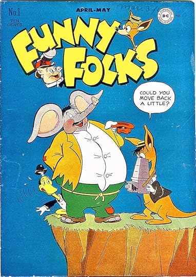
Around the same time in early 1946 that ANIMAL ANTICS was begun at DC, their sister company All-American Comics launched this similar anthology of funny animal stories. It was edited by Sheldon Mayer, a fine funny animal artist himself, and I think he designed the logo, as it’s similar in style to Mayer’s own creation SCRIBBLY. As far as I’ve discovered, Ira Schnapp did no work for All-American titles until after the companies were combined in 1946. Mayer continued to edit this one for a while, using his own stable of creators. Then it was passed on to Larry Nadle. This title was also renamed in 1950 as HOLLYWOOD FUNNY FOLKS for another 34 issues. As with ANIMAL ANTICS, the content and logo remained about the same, so I will include those here too.

Very few of the covers had any lettering, issue #18 from 1949 has only a small blurb at lower right lettered by Ira.

By issue #27, the logo is decorated with Nutsy Squirrel and his rabbit friend, now in the lead feature, and the word HOLLYWOOD is added above the logo, but it’s otherwise the same one that I think Sheldon Mayer designed. Neither that nor the word balloon look like the work of Ira Schnapp. Despite the name change I don’t think any of the characters were ever in cartoons.

By issue #39 in 1951, Ira was lettering balloons on some of the covers in his familiar style.

The final issue has a new trade dress with NUTSY SQUIRREL featured over the book’s name. This entire logo is by Ira Schnapp, and it shows where the book was headed next. The title became NUTSY SQUIRREL for twelve more issues which I’ll look at later.
These are the covers I see with Ira Schnapp lettering: 18, 19, 28, 34-36, 39-42, 44-46, 48-49, 51, 53-55, 58-60. That’s 22 in all.

Some of the lettering, like this page from issue #15, was excellent, but I don’t know who did it. It reminds me of the lettering of Ben Oda at the time, but isn’t quite the same as that, so the letterer remains unknown. The letterers used by All-American continued on this title for a while. When the editing was turned over to Larry Nadle, who handled most of DC’s humor titles, lettering by Ira Schnapp begins to show up more often.
 From FUNNY FOLKS #16, Oct-Nov 1948
This is the first story in the series lettered by Schnapp. His work appeared on one or more stories in most issues from this point on.
 From FUNNY FOLKS #19, April-May 1949
Features used in DC’s ANIMAL ANTICS began to appear in FUNNY FOLKS, like this one, with Ira’s lettering, so perhaps editor Nadle was just pulling from his inventory for both books.
 From FUNNY FOLKS #19, April-May 1949
It’s hard to know where each series originated from this point on. Some probably had input from or were created by Sheldon Mayer.
 From FUNNY FOLKS #21, Aug-Sept 1949
Another series that appeared in both books with lettering by Schnapp.
 From FUNNY FOLKS #22, Oct-Nov 1949
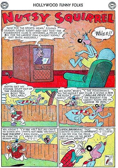
Nutsy Squirrel began appearing in the first issue of this series, and by issue 22 was sometimes lettered by Ira.
This story from issue #22 lettered by Schnapp has the same name as a later TV cartoon series, but is unrelated.
From issue #27 on there were more stories lettered by Ira Schnapp like this one in issue #41. Ira was rarely the only story letterer, but he did quite a few.

Here’s a page of Ira’s lettering from the final issue of this title, #60. Below are all the stories I see Ira Schnapp lettering on from this series. In later issues, Nutsy Squirrel often had a second story so I’ve numbered those. Feature names are abbreviated after the first appearance.
#16 Oct-Nov 1948: Chick N’ Gumbo 7pp
#18 Feb-March 1949: CnG 8pp
#19 April-May 1949: Nip & Chip 6pp, Doodles Duck 6pp
#20 June-July 1949: N&C 5pp, Ozzie Owl 6pp
#21 Aug-Sept 1949: OO 6pp, Plato Platypus 7pp, Roly & Poly 6pp
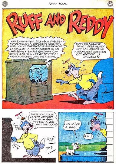
#22 Oct-Nov 1949: Nutsy Squirrel 6pp, Ruff & Reddy 7pp, PlatoP 6pp
#23 Dec 1949-Jan 1950: PlatoP 5pp, N&C 6pp, OO 6pp
#24 Feb-March 1950: N&C 6pp
#26 June-July 1950: R&P 6pp, N&C 7pp, Ham Hocks 7pp, NutsyS (2) 7pp
#27 Aug-Sept 1950: NutsyS (2) 2pp, Fraidy Cat 6pp
#28 Oct-Nov 1950: FraidyC 5pp
#29 Dec 1950: NutsyS (1) 6pp, Rufus Lion 6pp
#31 Feb 1951: NutsyS (2) 7pp
#32 March 1951: NutsyS (1) 10pp, Bo Bunny 7pp
#33 April 1951: NutsyS (2) 6pp
#34 May 1951: NutsyS (1) 8pp, Lil Chicadee 6pp
#35 June 1951: NutsyS (1) 6pp
#36 July 1951: Rufus Lion 6pp, NutsyS (2) 7pp
#38 Sept 1951: NutsyS (1) 6pp, (2) 6pp
#39 Oct 1951: NutsyS (1) 10pp
#40 Nov 1951: NutsyS (1) 6pp, BoB 6pp
#41 Dec 1951: NutsyS (1) 6pp, RufusL 5pp, NutsyS (2) 4pp
#42 Jan 1952: N&C 5pp
#43 Feb 1952: NutsyS (1) 5pp, DoodlesD 6pp
#44 March 1952: Dizzy Dog 6pp
#45 April 1952: NutsyS (1) 6pp, BoB 6pp, Blackie Bear 4pp, Bernard 6pp
#46 May 1952: NutsyS (1) 6pp, N&C 6pp, DoodlesD 6pp, NutsyS (2) 5pp
#47 June 1952: NutsyS (1) 6pp, Pinky & Winky 6pp, NutsyS (2) 6pp
#48 July-Aug 1952: FraidyC 5pp
#49 Sept-Oct 1952: NutsyS 6pp, 5pp (1-2)
#50 Nov-Dec 1952: NutsyS 6pp, 3pp (1-2)
#51 Jan-Feb 1953: Biggety Bear 3pp, DoodlesD 6pp
#52 March-April 1953: FraidyC 4pp, NutsyS (2) 4pp
#53 May-June 1953: NutsyS (1) 6pp, Biggety Bear 4pp, Blabber Mouse 4pp
#54 July-Aug 1953: FraidyC 4pp, Bernard 4pp, NutsyS (2) 4pp
#55 Sept-Oct 1953: FraidyC 4pp, NutsyS (2) 6pp
#56 Nov-Dec 1953: NutsyS (1) 6pp, DoodlesD 4pp
#57 Jan-Feb 1954: NutsyS (2) 4pp
#58 March-April 1954: NutsyS (1) 6pp, N&C 4pp
#60 July-Aug 1954: NutsyS (1) 6pp, DoodlesD 4pp, NutsyS (2) 4pp
That’s 464 pages in all.
More articles in this series can be found on the Comics Creation page of my blog.
The post Ira Schnapp in FUNNY FOLKS appeared first on Todd's Blog.
Todd Klein's Blog

- Todd Klein's profile
- 28 followers

