
Todd Klein's Blog, page 88
July 8, 2021
Incoming: SANDMAN DELUXE HC Book Three
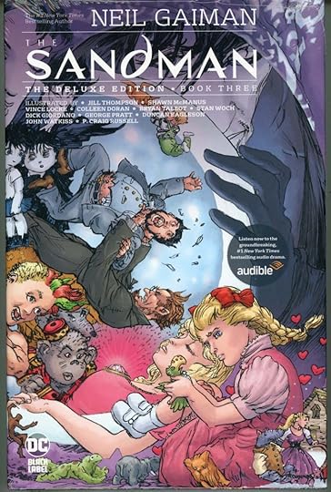 Image © DC Comics
Just arrived, this new Sandman collection includes issues 32-50, with that final issue being my favorite of the series. The slightly oversized page size and high quality paper and printing make this a good buy for new readers, and the new wraparound cover by Michael Wm. Kaluta is a nice bonus. Retail price is $49.99, should be available soon from comics retailers, or here’s an Amazon link:
The post Incoming: SANDMAN DELUXE HC Book Three appeared first on Todd's Blog.


July 3, 2021
Fourteen Years
This blog is that many years old today, begun in 2007 soon after I designed my own website and put it online. If you’ve been a long-time reader, you might recall a few years ago I claimed to have written over 3 million words here, but I never trusted that number, which came from a word-count plug-in. A few days ago I installed a new word-count plug-in which gave me a total of 1,646,280 words as of yesterday. That sounds more possible, and is probably right.
I’ve been writing a lot here in the past year, mostly research on letterer Ira Schnapp, and the new plug-in counts 207,382 words from last July 4 to yesterday. A few novels worth. My final Ira Schnapp post for the foreseeable future will be going up next Tuesday, July 6th. It’s a summary of all my Schnapp career research, and is my longest post ever at over 15,000 words.
Some years I’ve added little new content here other than book reviews, but a combination of being mostly retired now, and the pandemic, allowed me the time and gave me the interest in researching and writing about comics and lettering history, and I expect that will continue, but not right away. I’ll need a while to do research and write more. Meanwhile, thanks for reading, and I hope we will long continue to meet here.
The post Fourteen Years appeared first on Todd's Blog.
July 2, 2021
IRA SCHNAPP’S COMICS LOGOS: 1967-1968
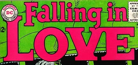
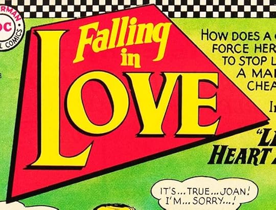 All images © DC Comics. From FALLING IN LOVE #88, Jan 1967
1967 was the last full year Ira Schnapp was at DC, though work for books with those cover dates was probably done from early Fall 1966 through early fall 1967. It was perhaps Ira’s busiest year at the company. I believe Schnapp was sent home in the late spring or early summer of 1968, but his workload for books with 1968 cover dates is much less as the majority of logos and cover lettering shifted to Gaspar Saladino. I will include all that I found here. The romance logo above is probably Ira’s most unusual design shape in a trapezoid with no alignment to the sides of the image. LOVE is in large serif letters with the L very large, and a drop shadow. The rest in upper and lower case. I like this, but think it might have been hard to fit into the cover art.
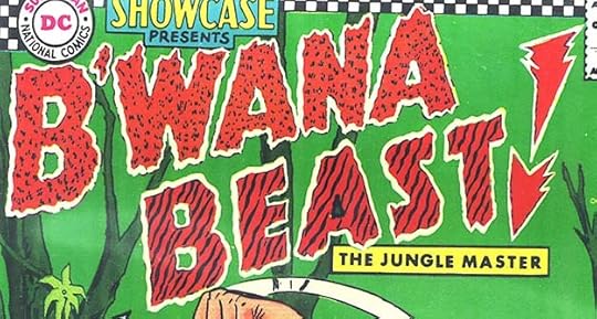 From SHOWCASE #66, Jan-Feb 1967
I dislike this logo by Ira nearly as much as his Animal Man one for some of the same reasons. The animal-marking patterns look awful, and what’s with that strange exclamation point? The white outlines seem to have been added by the separator, as you can see remains of the original black outlines, and the center triangle of the A in BEAST was missed. The subtitle is typeset. In all, this logo is a mess, and I’m glad the character didn’t gain his own series. It was an awful, racist story too.
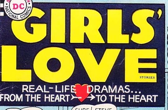
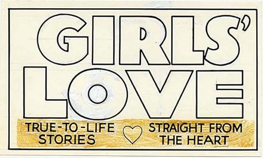
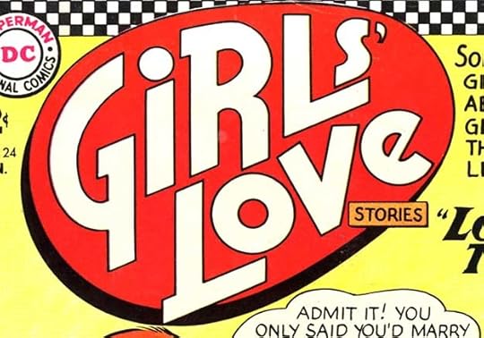 From GIRLS’ LOVE STORIES #124, Jan 1967
Continuing with oddly shaped romance logos, this one is in a kind of slightly flattened egg. I don’t like it as much as the one above, but it’s more interesting than the previous logo on this title.
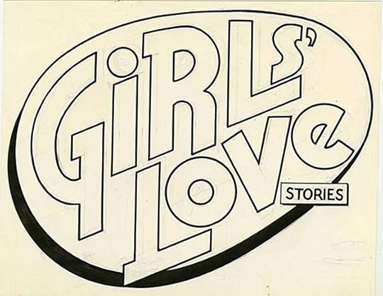
The original logo from the DC files is just the same with few white paint corrections I can see, and some of Ira’s pencil lines, so he must have been happy with it. Perhaps the geometric shapes were suggested by the editor. The previous logo had been used on just six issues, and rapid logo changes like that suggest poor sales and editors grasping at straws.
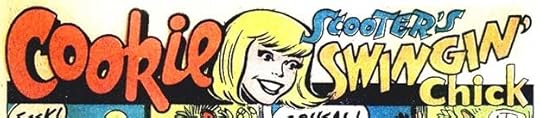
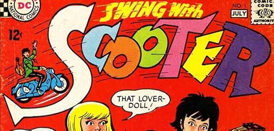
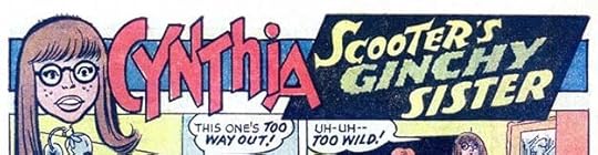 From SWING WITH SCOOTER #5, Feb-March 1967
Another feature logo for one of Scooter’s cast. I like this except for GINCHY, which seems wrong if it’s meant to be a compliment.
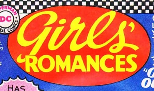 From GIRLS’ ROMANCES #123, March 1967
Another new romance logo in a geometric shape, this one is in a level oval, and for a change uses upper and lower case script for the first word. The previous logo had been unchanged for a long time, but I don’t know that this is really an improvement except that it kind of matches the other new romance ones.
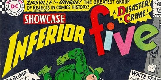
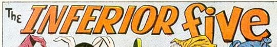 From INFERIOR FIVE #1, March-April 1967
Inside Inferior Five’s new series, the stories had this revised logo. It’s similar to the story logo from the SHOWCASE issues, but is all new lettering.
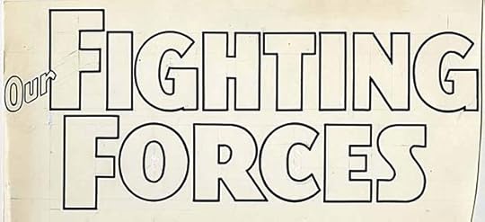
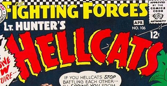 From OUR FIGHTING FORCES #106, March-April 1967
This new feature and logo in OUR FIGHTING FORCES is one I like a lot, and I think it shows the influence of Gaspar Saladino, who lettered the bulk of DC’s war stories and who often used roughened organic letters like these. If true, it shows Ira was not too old to learn, but perhaps it was too late for him to change very much at this point.
 From SWING WITH SCOOTER #6, April-May 1967
Another cast feature logo from SWING WITH SCOOTER, I like this one, but again the texture in TIGER makes it hard to read.
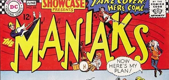 From SHOWCASE #68, May-June 1967
Another humor tryout written by E. Nelson Bridwell, this time about a pop music group. Ira’s logo cleverly uses music note shapes (though not such good ones) and a music staff in the background, and the character art by Mike Sekowsky and Mike Esposito add a lot to the appeal. This three-issue tryout did not lead to a series, even with a surprising co-star in the last one, Woody Allen.
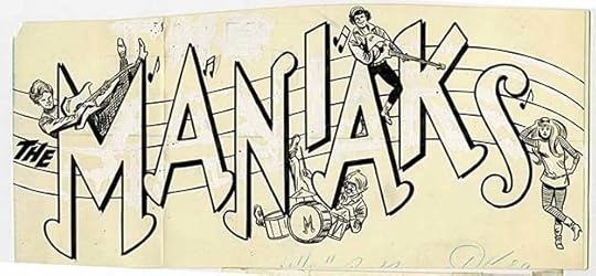
The original logo from the DC files is very large, and folded through the first A to fit in the file drawer. It has lots of white paint corrections, but it’s interesting to see that the figures and lettering are all on the same paper.
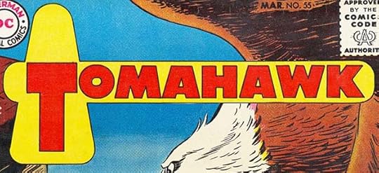
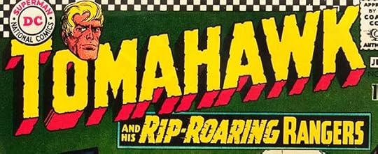 From TOMAHAWK #110, May-June 1967
This long-running series about a frontier fighter may have been slipping in sales, and they tried to remake it as a sort of war comic with this new logo by Schnapp. The notched letters and telescoping work fine, as does the subtitle, but the character head doesn’t seem to add much this time. He looks worried.
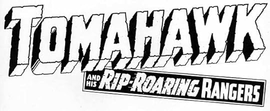
A photostat of the original logo from the DC files shows the head was added later. This is the same exact logo, but it looks different with the bottom box not level.
 From SWING WITH SCOOTER #7, June-July 1967
Another cast feature logo from SWING WITH SCOOTER, very appealing.
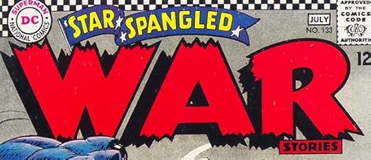 From STAR-SPANGLED WAR STORIES #123, June-July 1967
A new logo for this venerable war series goes all in on the WAR part. Great energy in those three giant letters.
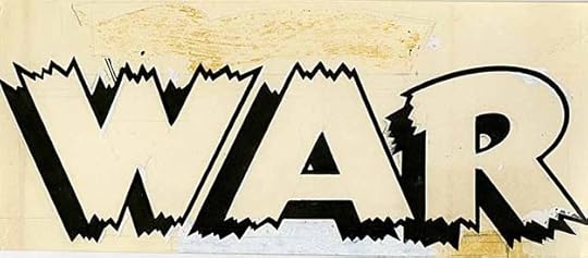
The original from the DC files shows that only WAR was new, the rest was pasted on and has fallen off as the glue weakened over the years. I’m not sure what was below the A that’s covered with correction paint.
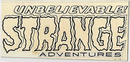
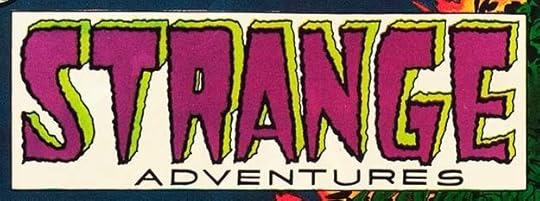 From STRANGE ADVENTURES #202, July 1967
STRANGE ADVENTURES gained this new Schnapp logo with issue #202, replacing his original version that had lasted just over 200 issues. I can see changing things up, but I’m not sure this is really an improvement. Not terrible, and definitely strange, though.
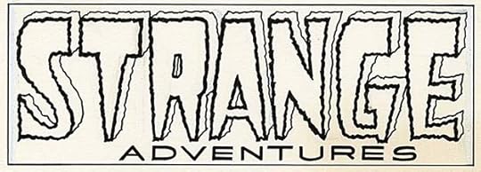
The original from the DC files is the same, and I see very few white paint corrections.
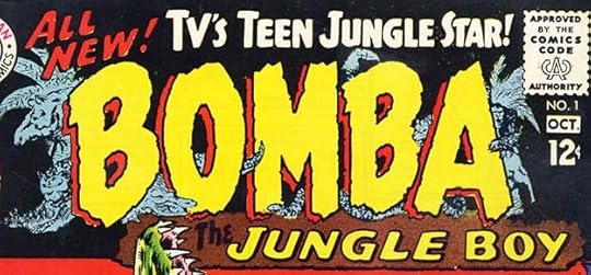 From BOMBA THE JUNGLE BOY #1, Sept-Oct 1967
This series skipped the tryout and went right to its own title, a rare thing at the time. It was based on a group of old films that were then running on TV in syndication. I like this, and I think Ira is again showing the influence of Saladino in the large letters. The background art is probably by series artist Leo Summers. The brown color in the bottom section is so dark you can barely see THE.
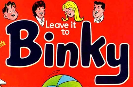 From SHOWCASE #70, Sept-Oct 1967
This was a tryout to bring back Binky in reprints, and it did lead to a new series. I’m not positive Schnapp did this logo, but it doesn’t look like Saladino, so he’s the likely choice.
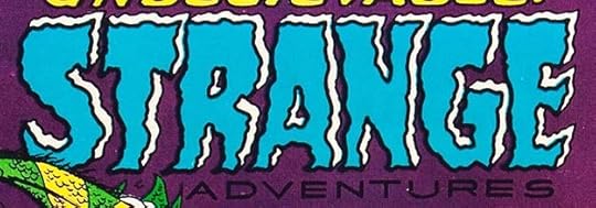 From STRANGE ADVENTURES #204, Sept 1967
Someone was not satisfied with the previous new logo, and this one replaced it two issues later. Perhaps both were done at the same time. I think this one is definitely worse than the other version, these letters look misshapen rather than scary. ADVENTURES is the same, and should have been reversed white on this dark color.
The original logo from the DC files show ADVENTURES is indeed a pasted-on copy from the other one, and it includes the top line cover lettering which is not part of the logo. Still don’t like it.
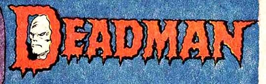 From STRANGE ADVENTURES #205, Oct 1967
Ira did much better with this scary logo for the new character Deadman in STRANGE ADVENTURES. The pointed drips at the bottom don’t quite seem to match the character, but they look good, and the character face by Carmine Infantino is creepy. This logo also appeared small on the cover near the bottom, like cover lettering.
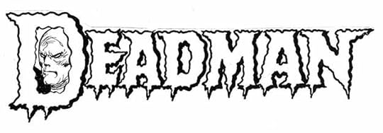
A photostat of the original from the DC files. Just the same and a bit more creepy without the red color.
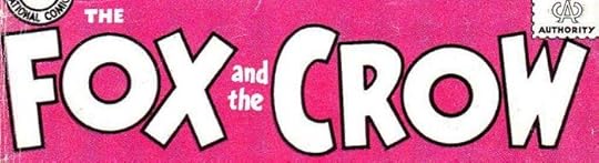
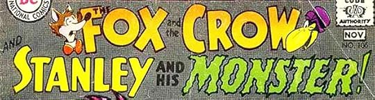 From THE FOX AND THE CROW #106, Oct-Nov 1967
On it’s last legs, THE FOX AND THE CROW tried this new funny/scary feature, and those who bought it liked it. Ira’s logo is predictable but effective.
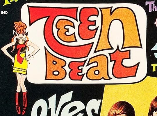 From TEEN BEAT #1, Nov-Dec 1967
This was DC’s attempt to enter the teen magazine market. Ira’s logo is going for psychedelic and I think works pretty well.
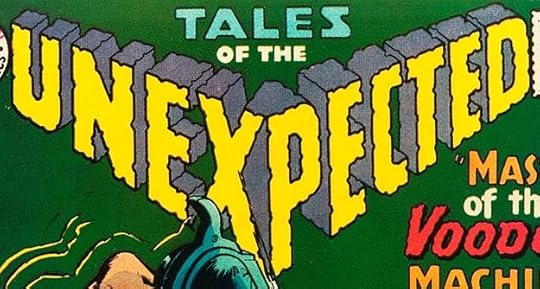 From TALES OF THE UNEXPECTED #104, Dec 1967-Jan 1968
this new logo for a long-running mystery title is quite unexpected! The triangular broken-angled main word is different, with the notched letters and open telescoping adding lots of depth. There are even notches on the telescoping. One of Schnapp’s best in his final year.
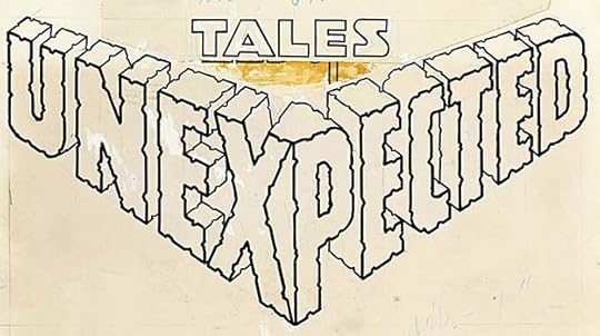
The original logo from the DC files shows the TALES used was a second version pasted over the first, and OF THE has fallen off showing part of the previous version. Not much other second guessing, Ira’s odd merge of the X and P was okay as drawn.
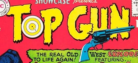 From SHOWCASE #72, Jan-Feb 1968
Ira’s final SHOWCASE logo is another one I like. The roughened letters seem appropriate for the subject, and the target in the O is well done. I doubt Schnapp did the gun art.
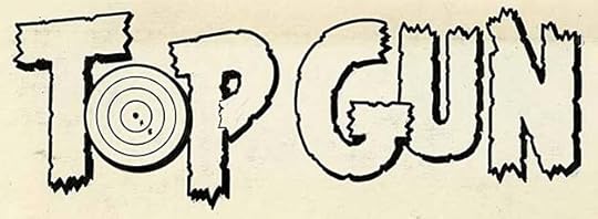
The original from the DC files shows little or no corrections, and I like it better without the gun in front of the U and N.
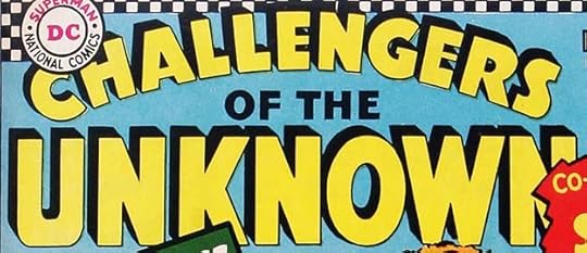
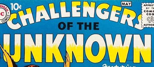
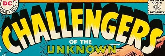 From CHALLENGERS OF THE UNKNOWN #60, Feb-March 1968
A new version of this logo puts the emphasis on CHALLENGERS rather than UNKNOWN, which I think is a good idea. The telescoping is deeper this time, but the letter shapes are about the same.
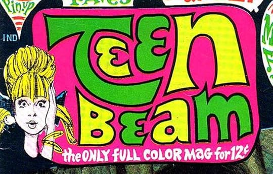 From TEEN BEAM #1, Jan-Feb 1968
DC had failed to find out there was another magazine called Teen Beat coming out at the same time as theirs, and it must have had the trademark, so DC changed the T to an M for the second and final issue. I won’t count this as a new logo, including it for completeness.
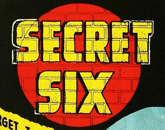 From SECRET SIX #1, April-May 1968
The final new series logo from Schnapp was this one, though the cover of the first issue was also the first page of the story, and this small logo is overpowered by Gaspar Saladino’s feature logo below it. This one appeared larger on the remaining issues, some without the brick pattern. I like that idea, as if the logo is painted on a brick wall with the circle representing a spotlight, though it isn’t really colored that way.
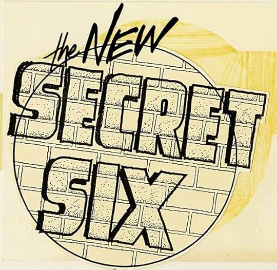
I think this is Ira’s original logo from the DC files, but someone else has added THE NEW. The first series lasted only seven issues, so perhaps a new series was planned with this title, but it didn’t happen. I really like what Ira did with the brick wall going through everything and the added texture inside the letters. Subtle and cool. Much of it didn’t show up in the printed version.
 From SWING WITH SCOOTER #11, Feb-March 1968
 From SWING WITH SCOOTER #12, April-May 1968
Two more character logos and headers from the Scooter cast, perhaps done earlier.
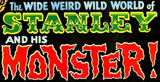 From STANLEY AND HIS MONSTER #109, April-May 1968
The feature Stanley and his Monster was successful enough in THE FOX AND THE CROW to take over that book for four issues before being cancelled. The first of those, #109, has this logo, the last cover logo by Ira Schnapp to see print. The top line is very ornate circus-style lettering, while the bottom is typical late-Schnapp scary lettering. It’s an odd combination, but the mismatch kind of works for a feature that combines humor and monsters. I thought for a long time that STANLEY was done with type. Then I found this:
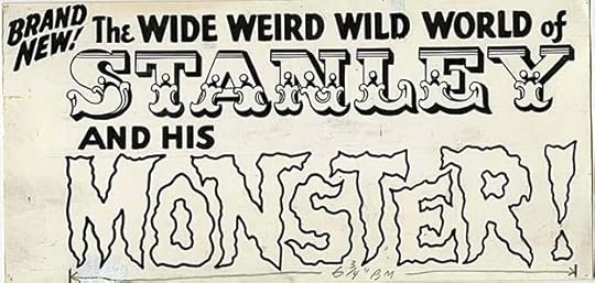
The original logo from the DC files has nothing pasted onto it, it all seems to be drawn by Ira. It’s possible that the STANLEY letters were dry-transfer Letraset ones that could be put onto art paper by pressing them from a plastic sheet with a burnisher. I don’t recall seeing this font from Letraset, but that does seem more likely than that Ira drew and inked it from scratch. I could be wrong, and as it’s been years since I saw the actual logo, I can’t say which is true. If it is all Ira’s work, it’s a fine final effort.
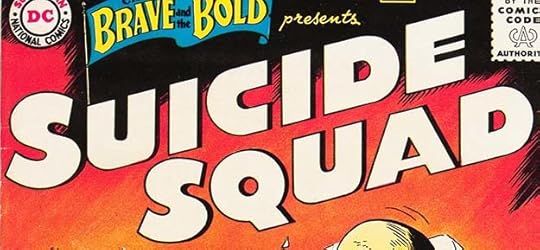
To sum up, I found 26 new logos by Ira Schnapp in these two final years of his time at DC, bringing this series to a close. I’m sure I missed some, and perhaps I misidentified some too, and if new information turns up I’ll include it, but for now that’s what I know about Ira’s logo designs. In all, from 1940 to 1968, I’ve identified 330 logos, an impressive total, especially on top of all of Ira’s other fine lettering work.
More articles in this series and others you might enjoy are on the LOGO LINKS page of my blog.
The post IRA SCHNAPP’S COMICS LOGOS: 1967-1968 appeared first on Todd's Blog.
June 30, 2021
IRA SCHNAPP’S COMICS LOGOS: 1966
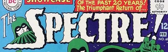 All images © DC Comics. From SHOWCASE #60, Jan-Feb 1966
Another of Julius Schwartz’s golden age revamps, The Spectre is perhaps the scariest of all DC “heroes.” Ira Schnapp captured that well in his logo, one of the few times he succeeded in doing scary lettering in my opinion. This one works because he retained the pointed ends of the serifs and made the edges with smaller random edge variations so it doesn’t look wavy, it looks rough. The character art by Murphy Anderson makes it even better.
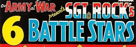 From OUR ARMY AT WAR #164, Feb 1966
Part of the 80-Page Giant series, this is similar to the 3 Battle Stars from BRAVE AND BOLD #52, but the bottom line is all new lettering. It’s interesting to compare Ira’s S shapes in STARS with Gaspar Saladino’s in SGT.
 From ACTION COMICS #335, March 1966
In this year DC began listing and describing all their current and upcoming issues in a column originally by editor E. Nelson Bridwell with this logo by Schnapp. It incorporates the infamous “Go-Go-Checks” that Ira added to the top edge of every title for a while, but that actually works okay here.
This photostat of the original logo has the checks removed, so a later version, but you can appreciate Ira’s linework better than on the cheap newsprint edition above. the DC letters are much larger versions of the ones he did for the DC bullet symbol.
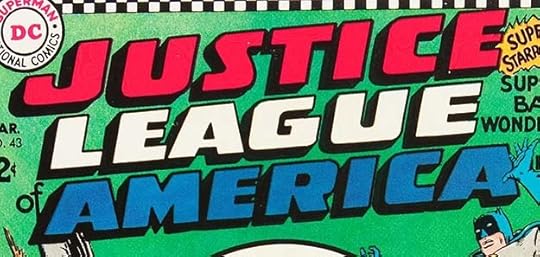 From JUSTICE LEAGUE OF AMERICA #43, March 1966
Ira was asked to create a new logo for the JLA that first appeared on issue #43. The letter shapes were the same, but the shield was gone and the open letters now had black telescoping. This allowed the logo to be a little larger and less tall, but I don’t like it nearly as well as the first version.
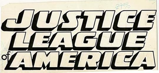
The original version from the DC files has the usual white paint corrections and faint pencil lines. Some of the letters are very close, leaving tiny gaps between them, but those all show up on the cover.
 From GIRLS’ LOVE STORIES #118, April 1966
The third Schnapp logo for this title again goes with wide block lettering similar to the others he’d recently done for romance titles. The subtitle is corny, and the most surprising thing to me is how small STORIES is, and it’s in type.
The original logo from the DC files shows a different subtitle, you can see where the revised one on the cover was pasted over it and fell off. I actually like this one better. STORIES is not here at all, so either Ira forgot to letter it, or the plan all along was to do it in type. Ira had trouble with the O in LOVE, lots of correction paint there.
 From SHOWCASE #62, May-June 1966
Writer/editor E. Nelson Bridwell and Ira Schnapp must have liked each other. Nelson appreciated the history of DC that Ira had been a part of, having been a comics fan first himself, and Nelson is the only person to have given Ira a lettering credit on two stories for this feature when it gained its own title. I don’t find this logo by Schnapp very effective even for a humorous one, the shape is odd, but Nelson must have liked it.
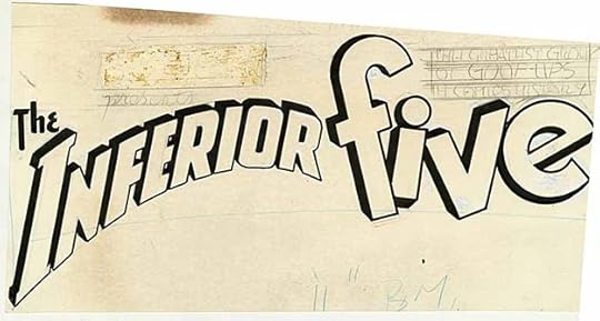
The original logo from the DC files shows where the SHOWCASE logo had been pasted in, and in pencil Ira has added a tag line likely written by Bridwell that wasn’t used or inked: THE GREATEST GROUP OF GOOF-UPS IN COMICS HISTORY. It’s the only example of Ira’s pencilled-in lettering I know of, and it looks like he was planning to do it in a bouncy, funny way.
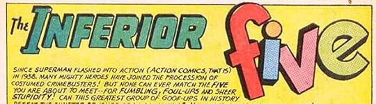 From SHOWCASE #62, May-June 1966
Inside the book Ira did a straight version of INFERIOR that was the feature logo on several tryout stories, and therefore I’m counting it as another logo for him.
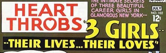 From HEART THROBS #102, June-July 1966
For issue #102, the HEART THROBS logo was shrunk to make room for a new addition, a continuing feature much like a soap opera. Ira’s logo works okay in the space he had, but the 3 is not very well shaped, and each S is also uneven. Ira was nearing the end of his long career, he was 71 when he did this, and perhaps his skills were not as sharp as they had been.
 From SWING WITH SCOOTER #1, June-July 1966
This book was an attempt to attract fans of British pop bands like The Beatles. The protagonist was a British musician landed in a small American town. Ira’s logo has lots of movement and is enhanced by the character art by Joe Orlando, but the letters in SCOOTER are more goofy than gear, and I think miss the mark.
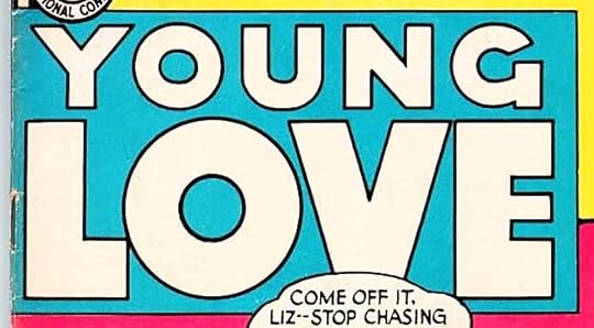 From YOUNG LOVE #56, July-Aug 1966
Young Love receives the same block letter logo approach from Schnapp that the other romance titles have recently had. Nothing very interesting about this one, but the size of LOVE sells it.
 From CHALLENGERS OF THE UNKNOWN #51, Aug-Sept 1966
With issue #51, Schnapp added black telescoping to his Challengers logo. I’m not sure if he just added to the existing one or redid it all, but I’m counting it as a new logo. The three-dimensional effect makes it stand out more.
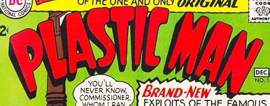 From PLASTIC MAN #1, Nov-Dec 1966
DC had acquired the rights to Plastic Man with the other Quality Comics properties in the 1950s, but hadn’t used him until now. A potential movie deal was the incentive, but that never happened. Even though DC already had a few super-stretchy characters, Plas was a good addition. The logo by Ira expresses the stretch and the cartoony feel, the black telescoping adds depth, and the arc adds interest.
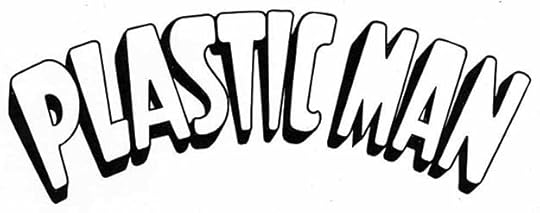
This photostat of the original from the DC files makes the rounded corners more obvious.
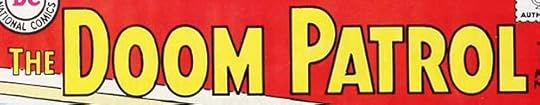
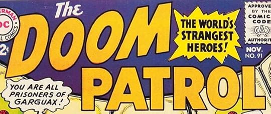
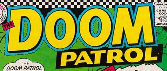 From THE DOOM PATROL #108, Dec 1966
Ira created yet another logo for this series after only seven issues for the previous one. Clearly sales were not good and the editor was desperate, but changing the logo was not the answer. I do like this logo better than the earlier ones. It feels a bit more modern with the rough outline around DOOM, and the layout is improved, but THE looks like an afterthought.
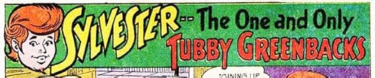 From SWING WITH SCOOTER #4, Dec 1966-Jan 1967
Scooter’s supporting cast each received a character logo and short feature, this is the first. I like Sylvester’s logo better than Scooter’s actually.
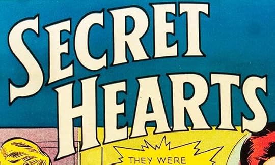
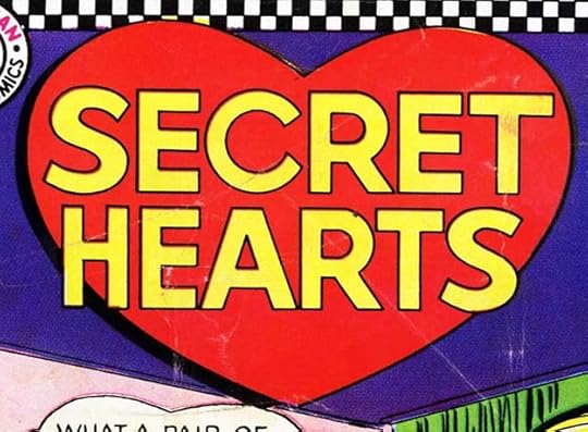 From SECRET HEARTS #116, Dec 1966
Someone must have felt this romance title needed a more romantic logo, so Ira created one that kept the block letters but put them in a giant heart. This seems an awkward fit for most cover art.
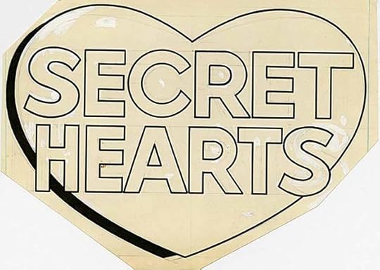
The original from the DC files, and you can see the white paint corrections on it, as well as some pencil lines. The last S was changed quite a bit.
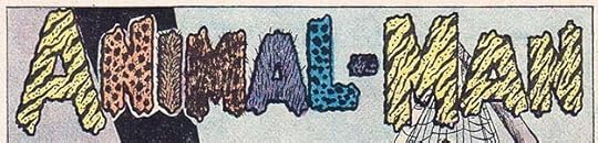 From STRANGE ADVENTURES #195, Dec 1966
This feature logo for a character appearing in STRANGE ADVENTURES is probably my least favorite of all Schnapp logos. The letter shapes are okay, but the animal skin patterns are distracting and a bit disgusting.
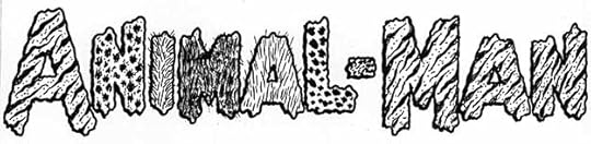
This photostat from the DC files shows those patterns better. I mean, perhaps a horrible villain with animal attributes could have hairy letters, but it’s quite off-putting for a hero, and the textures make it hard to read too. Also, if you’re going to use a variety of patterns, why do the A in ANIMAL and MAN all the same?
To sum up, I found 16 logos designed by Ira Schnapp in issues with 1966 cover-dates. I will wrap this survey up in the next post. Others from this series and more you might enjoy can be found on the LOGO LINKS page of my blog.
The post IRA SCHNAPP’S COMICS LOGOS: 1966 appeared first on Todd's Blog.
June 28, 2021
IRA SCHNAPP’S COMICS LOGOS: 1965
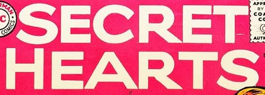 All images © DC Comics. From SECRET HEARTS #101, Jan 1965
This new logo by Ira Schnapp for SECRET HEARTS (after only two issues for the previous one) follows the trend on other DC romance titles of more modern wide block lettering, moving away from the elegant script of Ira’s earlier logos for the line. This one is bland but gets the word out. By stretching the second word, the A seems too wide to me.
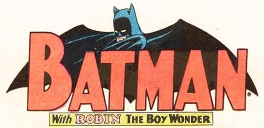 From DETECTIVE COMICS #337, March 1965
 From BATMAN #171,
 As part of editor Julius Schwartz’s new more realistic approach to the Batman titles, artists Carmine Infantino and Murphy Anderson created this new bat shape and Ira revamped the existing Batman and Robin logo lettering that had been done by Jerry Robinson in the 1940s. Ira’s Batman letters are more correctly proportioned in an Art Deco style than Jerry’s, and they also rejoin the two syllables into one word, where Robinson’s version had separated BAT from MAN with the head between them. The new bat shape had been used on BATMAN #170 with the old letters, and it was not a good mix, so I’m glad Ira redid them. The Robin subtitled version appeared mostly as a feature logo inside DETECTIVE, but sometimes also on covers.
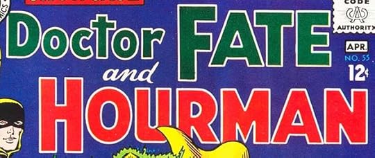 From SHOWCASE #55, March-April 1965
Two more golden age heroes in a team-up and tryout in SHOWCASE. Hourman did not go far, but Doctor Fate was later revamped and had a long career at DC. I count this as two new logos for Ira.
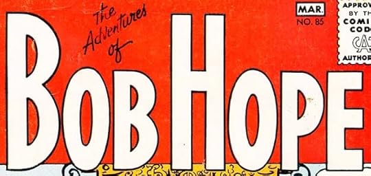
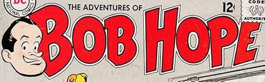 From THE ADVENTURES OF BOB HOPE #93, June-July 1965
Bob Hope got another new Schnapp logo after only eight issues for the previous one. It works better for me both in style and size, filling the top area and having some cartoony bounce. The character art is surely by Bob Oksner.
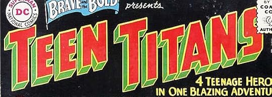 From THE BRAVE AND THE BOLD #60, June-July 1965
The three kid sidekicks teamed in BRAVE AND BOLD #54 added Wonder Girl and were now officially The Teen Titans with a new logo by Schnapp. His block letters are angled, have larger initial T’s and telescoping. For this first appearance the logo has been reversed.
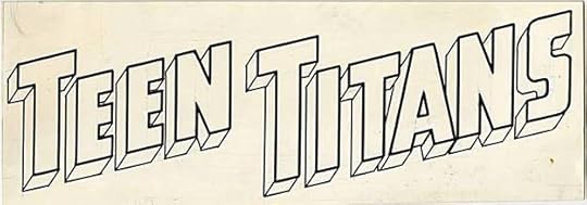
The original from the DC files shows the way it was drawn, black lines on art paper. This logo would be on their own series when it began in 1966.
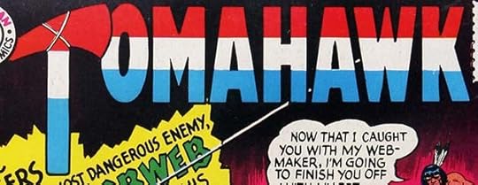 From TOMAHAWK #99, July-Aug 1965
For some reason, this Schnapp logo was only used on one issue of TOMAHAWK before it went back to the previous one for a few more issues. It makes the hatchet a T, which seems a good idea, but the impact of that is lessened by the patriotic colors.
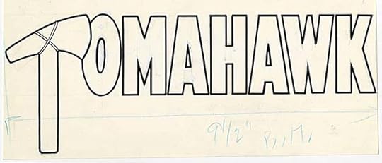
The original from the DC files. I don’t know how large it is, but written in blue pencil is the width wanted for the cover, 9.5 inches, telling the darkroom technician to make a photostat of that size. When I was on staff starting in 1977, we had to give a percentage worked out with a proportional scale tool.
 From THE BRAVE AND THE BOLD #61, Aug-Sept 1965
Here Julie Schwartz was trying to bring back more golden age heroes, but this time closer to their original versions. The Justice Society of America was making guest appearances in JUSTICE LEAGUE, and the concept of multiple earths in multiple dimensions, one retaining those golden age characters, had become part of the DC mythos.
 From THE FOX AND THE CROW #94, Oct-Nov 1965
DC’s last surviving funny animal title THE FOX AND THE CROW was struggling, and trying new features. This is one that Schnapp designed a logo for.
A photostat of the original from the DC files shows the double outline better, and this one is full of bounce and has a variety of letter sizes.
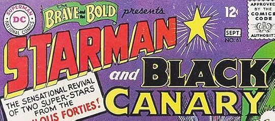
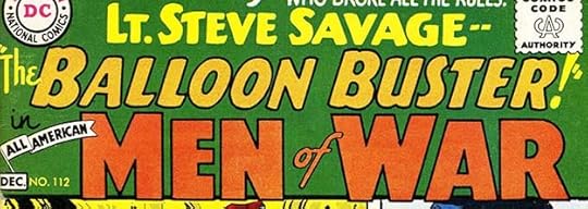 From ALL-AMERICAN MEN OF WAR #112, Nov-Dec 1965
The war titles were also struggling as kids began to reject World War Two themes and perhaps war comics in general, and new features were tried from other eras like this one from World War One. Ira’s logo is more like a feature logo than a cover one, but it appeared on four covers.
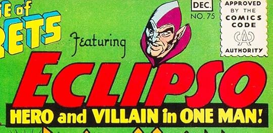
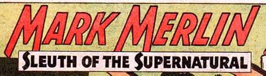
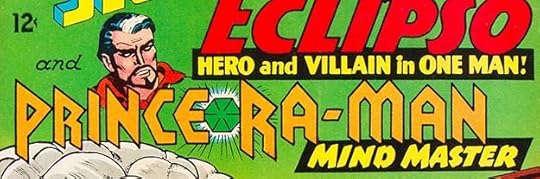 From HOUSE OF SECRETS #75, Nov-Dec 1965
With issue #75, HOUSE OF SECRETS began cover-featuring two continuing series with new logos by Schnapp. They follow a similar layout, horizontal open letters over a reversed subtitle. Both have character art not by Ira, but he did do the gem in the Prince Ra-Man logo. Eclipso, a hero and villain in one man, had been appearing since issue #61 with a feature logo not by Schnapp. Prince Ra-Man was a new version of Mark Merlin, who had been a regular feature in this title from the beginning. I like the angular style of Prince Ra-Man’s logo, but Eclipso’s might be more memorable.
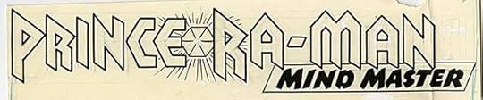
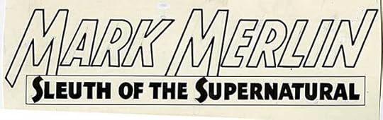
This one remains in the DC files, another large logo that had to be folded through the final N to fit in the file drawer.
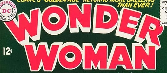 From WONDER WOMAN #158, Nov 1965
Schnapp designed a new logo for issue #158 of WONDER WOMAN. I don’t like it as much as either of the previous ones. The most interesting thing about it is the telescoping using one-point perspective, but each word has a different vanishing point, something Ira hadn’t done before. It seems to work until you follow the perspective lines.
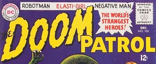 From THE DOOM PATROL #100, Dec 1965
Yet another Doom Patrol logo by Schnapp on issue #100. This time only the word DOOM is revised with notches and a drop shadow, but I think it counts as a new logo. The character names at the top are also part of it…
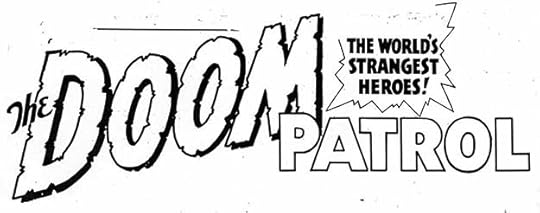
…though this photostat of the original from the DC files does not have them perhaps because the lineup changed later. There’s nothing inherently wrong with this logo, but the layout is kind of a mess.
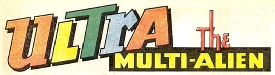 From MYSTERY IN SPACE #104, Dec 1965
This new feature in MYSTERY IN SPACE had a logo by Schnapp along the same lines as the ones above from HOUSE OF SECRETS #75. I really like the shape of the R, and the multiple colors makes ULTRA more interesting.
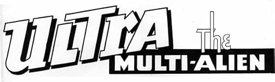
This photostat of the original from the DC files is the same. The angles and diagonals add interest, and the tall H in THE is nice too.
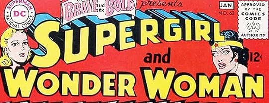 From THE BRAVE AND THE BOLD #63, Dec 1965-Jan 1966
For this issue of BRAVE AND BOLD, Ira revised his old Supergirl logo from the 1940s with a smaller S to fit the space better, and did a new version of his latest Wonder Woman logo on a single line. Both have telescoping, but it’s much thinner on Wonder Woman. I think the character art is by Jim Mooney on Supergirl and Andru and Esposito on Wonder Woman, though Mooney did the rest of the cover art. These team-up issues often presented difficult layout problems due to logos which did not go together well. I will only count this Wonder Woman as a new logo.
To sum up, I found 17 new logos by Ira Schnapp on issues with 1965 cover dates. More articles in this series and others you might like are on the LOGO LINKS page of my blog.
The post IRA SCHNAPP’S COMICS LOGOS: 1965 appeared first on Todd's Blog.
June 25, 2021
IRA SCHNAPP’S COMICS LOGOS: 1964
 All images © DC Comics. From THE ADVENTURES OF BOB HOPE #85, Feb-March 1964
By 1964, DC’s Hollywood humor titles were starting to struggle for readers, and one way editors tried to gain new ones was to put a new logo on the book. I don’t think this ever worked, but they kept doing it through the 1960s when pressure from the growing popularity of Marvel Comics was being felt. This new Bob Hope logo by Ira Schnapp moves away from the bouncy humor of the first one to very tall and conservative open block letters with the top line in very small script. It certainly announces the contents well, but I don’t think is as good a logo as the previous one, and it creates large open areas above the smaller letters that aren’t used well here.
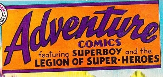 From ADVENTURE COMICS #317, Feb 1964
In ADVENTURE, the popularity of the Legion of Superheroes had grown so great that Ira was asked to add them to his logo. It remained until Supergirl took over the title in 1969.
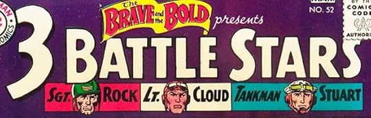 From THE BRAVE AND THE BOLD #52, Feb-March 1964
In BRAVE AND BOLD, editor Robert Kanigher tried teaming three of his most popular war heroes in this one-shot with a new logo by Ira. The large 3 is an attention-getter.
 From THE DOOM PATROL #86, March-April 1964
The Doom Patrol was DC’s team of misfit, angry heroes, a direction Marvel was having success with, and there’s some debate over whether they inspired X-Men or vice versa, or neither. They first appeared in MY GREATEST ADVENTURE #80, and with issue #86 took over that book. Schnapp’s first logo for them was sedate, but there would be several more in quick succession.
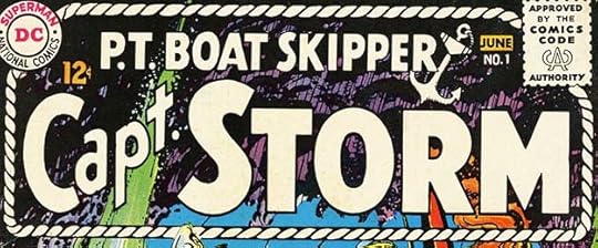 From CAPT. STORM #1, May-June 1964
While most of Robert Kanigher’s war books were successful, this one did not last very long. The logo by Schnapp features a rope enclosure and an anchor, but is otherwise his standard open letters.
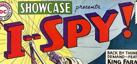 From SHOWCASE #50, May-June 1964
With the popularity of spy films like “Dr. No,” DC may have felt they’d have success bringing back King Faraday from the short-lived title DANGER TRAIL. These reprints in SHOWCASE were not successful enough to move into a new series, but I like Ira’s logo, perhaps the first one to use a double dash. An unrelated TV show with the same name began the following year.
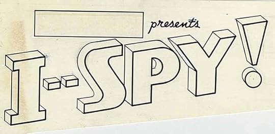
Ira’s original logo from the DC files shows that he drew the box around SHOWCASE and PRESENTS as part of this logo. In this way he was often the cover designer as much as the logo designer.
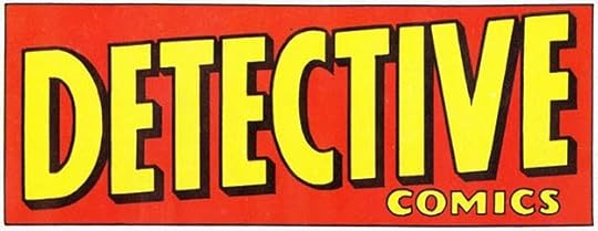 From DETECTIVE COMICS #327, May 1964
In 1964, editor Julius Schwartz took over the Batman books from the soon-to-retire Jack Schiff, and he went with a more realistic approach in the art and stories. He commissioned this new logo from Ira that seems more serious and adult to me. The angled shape inside the box and the drop shadow add interest, and the entire treatment might have been used on a detective pulp magazine.
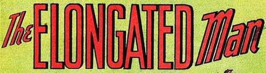 From DETECTIVE COMICS #327, May 1964
Inside the book, Elongated Man moved over from THE FLASH to backup stories in DETECTIVE with this new Schnapp feature logo that visualizes the name well.
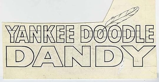
Here’s an unpublished Ira Schnapp logo from 1964 for a character that was intended to have a SHOWCASE tryout but never received one. All that remains is the logo with a patriotic theme and a well-drawn feather by Ira. The cut-out area was probably where the Showcase logo had been pasted, and that might have been reused elsewhere.
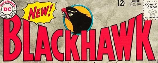 From BLACKHAWK #197, June 1964
BLACKHAWK was another property DC bought from Quality Comics, a mix of war themes and aviation superheroes, and it had been their best-seller, so DC simply kept it going with the same creative personnel and fine logo by Al Grenet for many years. Perhaps sales were falling in 1964, so surely a new logo would fix that, right? I like this one by Schnapp with a hawk emblem by Dick Dillon and Charles Cuidera.
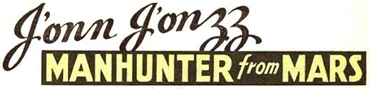 From HOUSE OF MYSTERY #143, June-July 1964
J’onn J’onzz moved to HOUSE OF MYSTERY in this year and his feature had this new logo from Ira that includes elegant script and reversed block letters.
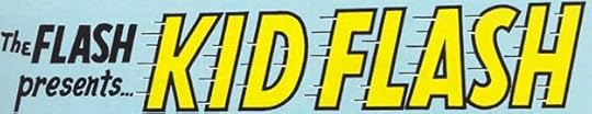
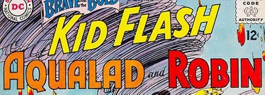 From THE BRAVE AND THE BOLD #54, June-July 1964
The beginnings of the Teen Titans first emerged in this issue of BRAVE AND BOLD with three kid sidekicks teaming up. Schnapp did new logos for each of them, and I consider this three logos for him even though Kid Flash’s logo is similar to the one on his feature stories. This version is different enough to qualify in my opinion.
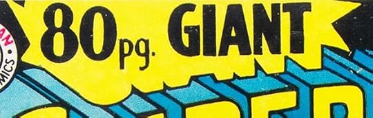
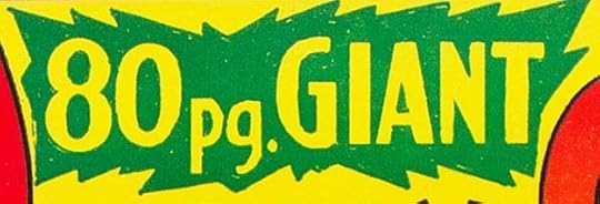 From 80-PAGE GIANT #1 and #2, Aug-Sept 1964
The title of this new series that grew out of DC’s annuals is pretty small, but I think still qualifies as a logo rather than simply cover lettering as it was the book’s title and reused many times. The one on the first issue has a shape around it showing the remains of the word GIANT, as it was a last-minute switch from a GIANT SUPERMAN ANNUAL. The second issue one is in a more typical burst shape, which varied to fit the main character logo. The second one is relettered, but I will count them as one logo.
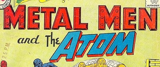 From THE BRAVE AND THE BOLD #55, Aug-Sept 1964
For this team-up, Schnapp had to create a new version of his Metal Men logo with much shorter letters. This time he made each M a little larger than the rest. His logo for The Atom was okay as is.
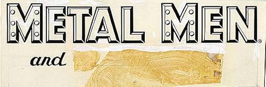
The original logo from the DC files shows where The Atom had been pasted on but AND is new. Metal Men has quite a bit of white correction paint.
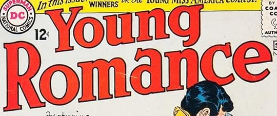 From YOUNG ROMANCE #131, Aug-Sept 1964
Schnapp did a new logo for this issue of YOUNG ROMANCE that has less tall letters and an uphill slant. Otherwise it’s similar to the previous one.
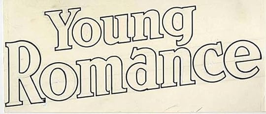
On the original from the DC files you can see some of Ira’s pencil work behind the inks.
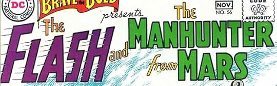 From THE BRAVE AND THE BOLD #56, Oct-Nov 1964
For this BRAVE AND BOLD team-up, Ira created a condensed (less wide) version of his Flash logo and a new one for the Manhunter From Mars that I like. This book was making lots of extra logo work for Schnapp.
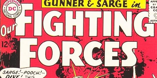 From OUR FIGHTING FORCES #87, Oct 1964
Ira’s new logo for this war title is one I like better than his looser previous one. It has a more serious feel that I think is appropriate for the subject.
The original from the DC files shows very little white paint correction.
 From SECRET HEARTS #99, Oct 1964
This new logo by Schnapp for SECRET HEARTS lasted only two issues. Perhaps the shape was not a good fit for cover art.
 From THE DOOM PATROL #91, Nov 1964
Ira’s second logo for this book emphasizes DOOM by slanting and angling it, and ads a new tag line in a burst that has an almost Marvel Comics sound, probably written by series scripter Arnold Drake.
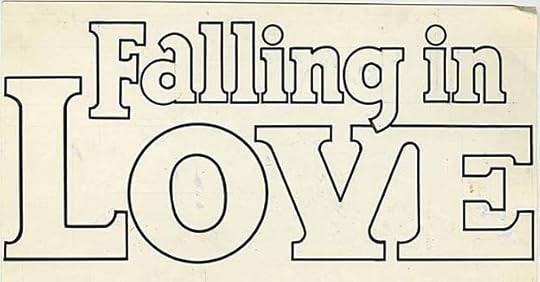
 From FALLING IN LOVE #71, Nov 1964
This title had had the same Schnapp logo since 1955, and was due for a new one, the editor thought. Here Ira replaced his old-fashiones script for the top line with more modern upper and lower case open letters, and LOVE follows the same layout as the previous logo but now has larger serifs that join the V and E.
The original logo from the DC files shows how tight the spacing is in the top line, but those tiny openings between the letters do show on the cover.
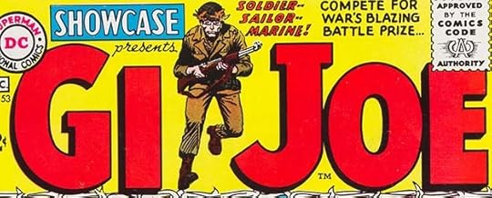 From SHOWCASE #53, Nov-Dec 1964
It’s not clear if this SHOWCASE tryout for G.I. Joe has any connection to the new line of Hasbro toys out at the same time. There doesn’t seem to be any official connection, but the toys were advertised in the comics. The concept had already had several comic book and comic strip versions by then. This logo by Ira shows a TM, meaning a tradmark was applied for, but DC did nothing else with it after this two-issue appearance. The letters are massive, commanding attention, but Joe Kubert’s figure art makes it work, and the letters seem even larger because of it.
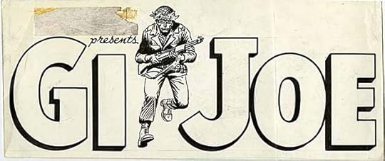
The original logo from the DC files shows that Ira and Kubert did their parts on the same art paper, so they must have worked on the design together. I think this original is very large, as it seems to have been folded through the O to fit in the file drawer. Proofreaders would likely have wanted periods after the G and I, which originally stood for Galvanized Iron, but was commonly thought to mean Government Issue or Ground Infantry. The logo is better without them.
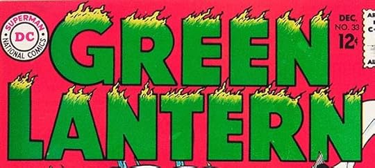 From GREEN LANTERN #33, Dec 1964
Ira created a new Green Lantern logo for issue #33. It still features green flames, which are actually appropriate for the golden age character not this version, but I like it anyway, and the flames add texture and interest. I think this is better than the previous version in a flaming box.
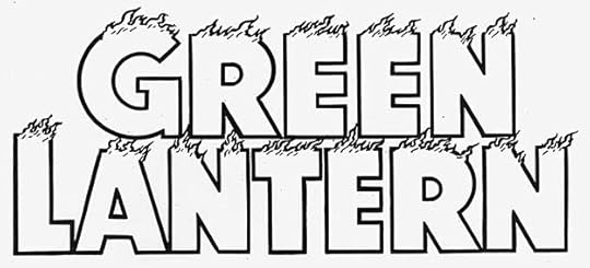
I think this is a photostat of the logo from the DC files, as I see no correction paint or pencil lines. The flames show up better here, and they are done with skill using a wedge-tipped pen. I love the way they break up the letter borders.
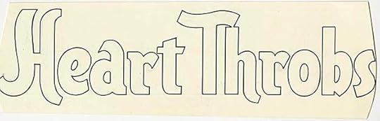
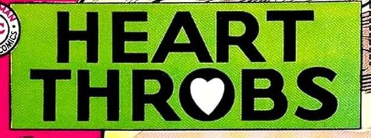 From HEART THROBS #93, Dec 1964-Jan 1965
Ira’s new logo for HEART THROBS also gives it a more modern look with only the heart inside the O breaking the block letters. I think it’s quite effective.
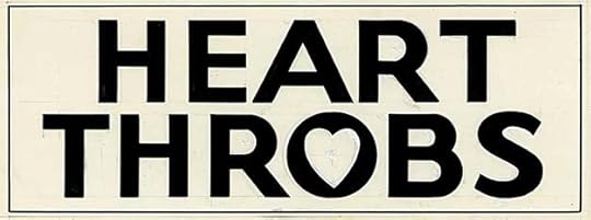
The original from the DC files shows some pencil lines and a little white correction paint.
 From THE BRAVE AND THE BOLD #57, Dec 1964-Jan 1965
This BRAVE AND BOLD tryout has a logo by Ira I don’t care for much. The texture in the main word makes it look kind of dirty rather than conveying the metamorphic quality of molten lava Schnapp might have been going for.
That texture shows up better on this photostat from the DC files, and by comparing it to the printed cover you can see that the texture Ira did was not used anyway but replaced by even cruder coloring work. Was this logo meant to be scary? If so, not a success in my eyes. The character was sort of an anti-hero.
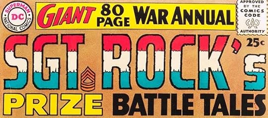 From SGT. ROCK’S PRIZE BATTLE TALES #1, Winter 1964
This was DC’s first and only war annual other than some in the 80-Page Giant series. From the top lettering, this seems like it might have been intended for that, but was issued separately. The Sgt. Rock logo is by Gaspar Saladino, one of his first, the rest is by Schnapp, including the apostrophe and S. Gaspar would become DC’s main logo designer in a few years.
To sum up, I found 28 new logos by Ira Schnapp in books with 1964 cover dates, a big increase from the previous few years. Other articles in this series and more you might like are on the LOGO LINKS page of my blog.
The post IRA SCHNAPP’S COMICS LOGOS: 1964 appeared first on Todd's Blog.
June 23, 2021
IRA SCHNAPP’S COMICS LOGOS: 1962-1963
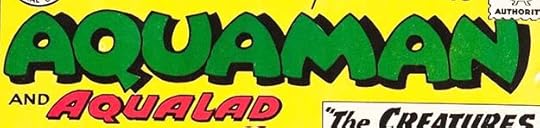
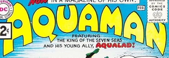 All images © DC Comics. From AQUAMAN #1, Jan-Feb 1962
This will be a shorter post than usual, as Ira did not design many new logos in these two years, perhaps because many then-current titles were in successful runs and featured his logos already. Aquaman’s new series logo by Schnapp builds on the previous one last used in his SHOWCASE appearances. the letter shapes are about the same, but the first A is larger, and the logo has an arc which to me suggests the bouyancy of being underwater. Also it leaves more room for the DC Bullet and Comics Code seal. The tagline about Aqualad is more like cover lettering than a logo, but it was repeated on a half-dozen following issues.
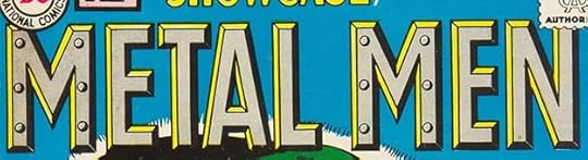 From SHOWCASE #37, March-April 1962
The next successful tryout in SHOWCASE was Metal Men, who went on to a popular series of their own. Schnapp’s logo is deceptively simple, but the bevels around each letter are well thought out, and the rivets on each M are just enough of a visual tie to the characters’ nature to make this logo memorable. While Ira did not always make the sharper corners on letters like this pointed enough for my taste, he did here.
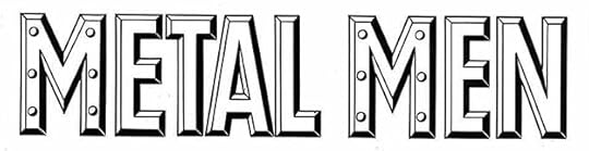
This photostat of the original logo from the DC files makes one detail more obvious: the white connectors in the black bevels. They are subtle and hidden by color on the covers, but help make the bevels work better. I’m not sure why he didn’t use them on the inner corners of the A and each E.
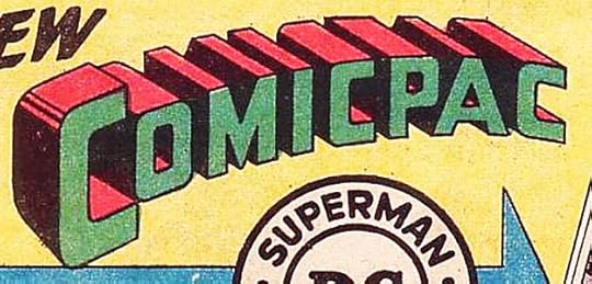 From BLACKHAWK #175, Aug 1962
Not exactly a comics logo, but close, Comicpacs were bundles of three DC comics in a sealed plastic bag with this logo on the top cardboard hangar. The savings in price was a massive one penny, but the win for DC was probably impulse buys from adults for their kids, adults who might not have bought comics otherwise. They were sold in supermarkets for a few years perhaps to use up unsold copies, I’m not sure. Schnapp was asked to imitate his Superman logo for the style, which may not have been a wise move legally, as it could weaken the trademark, but since the product did not last long it probably didn’t matter, and it might have caught the eye of Superman fans.
 From HOUSE OF SECRETS #56, Sept-Oct 1962
In HOUSE OF SECRETS, this long-running feature finally gained a full-size feature logo from Schnapp to replace the small one in a circle he had done earlier. I like the extended strokes of M’s and N. The title is a mouthful, but good design makes it work.
The original logo from the DC files is the same, but a few white paint corrections are barely visible.
 From SHOWCASE #41, Nov-Dec 1962
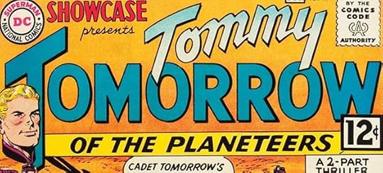
Tommy Tomorrow had been around a long time and finally had a series tryout in SHOWCASE. I remember liking it and was disappointed that he never got his own series. Once again the name is too long, but Ira makes it work by emphasizing TOMORROW and using three styles that work well together. I like the way TOMMY crosses in front of TOMORROW, and the subtle drop shadows help it read well.
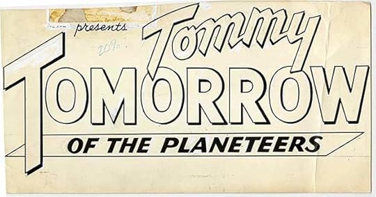
The original logo from the DC files confirms that the Lee Elias character head was added after Ira’s logo was completed, but note that the small SHOWCASE logo had been pasted in place and Schnapp lettered PRESENTS under it. This is another very large original that had to be folded to fit into the file drawer, you can see the fold through the W of TOMORROW.
 From THE BRAVE AND THE BOLD #45, Dec 1962-Jan 1963
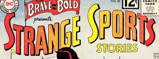
Several series at DC were favorites of the editor but not the readers, and I think it was true for this one from Julius Schwartz. It had a hefty series tryout in BRAVE AND BOLD, but did not receive a series until 1973, ten years later, and then lasted only six issues. Nothing wrong with Ira’s logo, which uses a flag-wave arc and shows Art Deco influences. Perhaps not enough DC readers were sports fans, or would rather read about superheroes. As I recall, some at DC used to tease Julie about it by calling it Strange Schwartz Stories.
 From SHOWCASE #43, March-April 1963
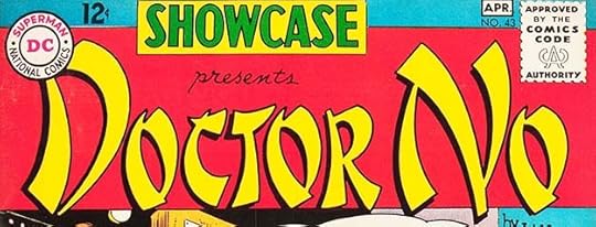
This oddity, a comics version of the first James Bond film, had been prepared for Gilberton’s CLASSICS ILLUSTRATED series, and was published by them in England, but they thought there would be no market for it in the U.S., so sold it to DC. No one then had any idea how successful Bond would become. As on the Charlie Chan comic, Ira went with a typical faux-Chinese style popular at the time, but now frowned on. As a logo I think it’s intriguing and works well.
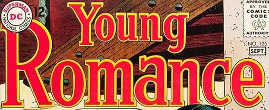 From YOUNG ROMANCE #125, Aug-Sept 1963
In 1963, Crestwood/Prize got out of the comics business and sold their two successful romance titles to DC, who continued them with the same numbering. This one got a new logo by Ira Schnapp which is similar to the previous Prize one but makes the letters more regular. YOUNG LOVE, the other title, kept the Prize logo probably by Joe Simon or Simon with Ben Oda, for some time. These titles originally by Simon and Kirby had started the romance comics genre, and with their existing three titles gave DC five in all. By now the Romance Group corner symbol had been replaced with the usual DC one, but the company still kept their romance line separate in most ways, never advertising them in the rest of their comics for instance.
 From THE BRAVE AND THE BOLD #50, Oct-Nov 1963
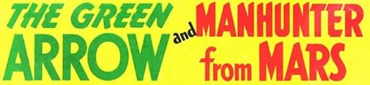
With issue #50, THE BRAVE AND THE BOLD changed game plans again, becoming mostly a team-up title where any two DC characters could be paired in the same story. The first two have logos by Schnapp, above, and he did many new logos, or variations on existing logos, for the series. I like both of these. Green Arrow in particular had never had a logo I liked, and this one is pretty good. I count this as two logos.
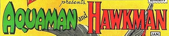 From THE BRAVE AND THE BOLD #51, Dec 1963-Jan 1964
The next issue paired these characters, and Ira had to create a new condensed version of his recent Aquaman logo that would fit next to Hawkman, which could be used unchanged. I would have been annoyed by this, but perhaps he was not.
To sum up, I found just 11 new logos by Ira Schnapp in comics with 1962-1963 cover dates, but the following year would have a lot more. Other articles in this series are on the LOGO LINKS page of my blog.
The post IRA SCHNAPP’S COMICS LOGOS: 1962-1963 appeared first on Todd's Blog.
June 21, 2021
IRA SCHNAPP’S COMICS LOGOS 1960-1961
 All images © DC Comics. From THE BRAVE AND THE BOLD #28, Feb-March 1960
1960 begins with one of Ira Schnapp’s finest logos, in my opinion. Editor Julius Schwartz was revamping DC’s golden age heroes, and decided to also update the former Justice Society of America with this new feature, replacing Society with League. DC’s top long-standing heroes Superman, Batman, Aquaman and the Martian Manhunter appeared together with Schwartz’s revamped versions of The Flash and Green Lantern for the first time, an idea that I embraced with enthusiasm and excitement at age nine. Ira’s logo has it all: a shield representing Justice containing stars, and wide letters with the top and bottom lines having inner shapes to hold a color, in this case the perfect choice of red and blue to suggest a patriotic connection to the American flag (even though two of the heroes, Superman and J’onn J’onzz, were not even from Earth, and Wonder Woman and Aquaman were not exactly American). The idea was a hit and soon had its own long-running series with the same logo.
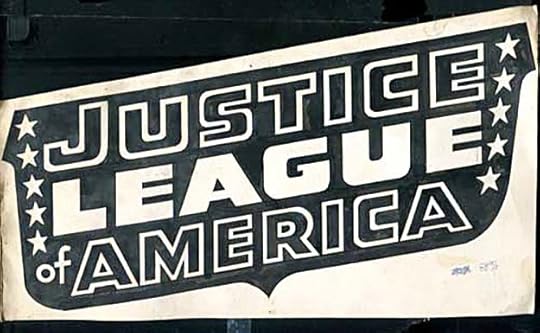
Ira’s logo is no longer in the DC files and has been sold online, but I found this image of it there. Not the clearest image, but you can still appreciate his skill and see that the words and stars were actually left white and surrounded by ink, not an easy thing to do well. It was no problem for Schnapp.
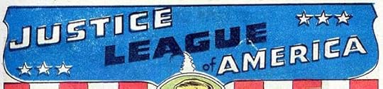 From THE BRAVE AND THE BOLD #28, Feb-March 1960
Inside the book this alternate logo was used, spreading out the elements in a wide open shield to fit the space better and leave more room for art. It could have been done by someone else, but I think it’s also by Schnapp.
 From THE FLASH #111, Feb-March 1960
In THE FLASH, the main character gained a similar boy sidekick, and in issue #111 his solo stories began with this new Schnapp logo following the style of his Flash cover logo but with some rounded letters.
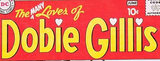 From THE MANY LOVES OF DOBIE GILLIS #1, May-June 1960
DC was trying to hit multiple genres and audiences with this new title: Hollywood TV comedies, teen humor and maybe even romance (though the romance books were short on humor). The Schnapp logo starts with large open letters like other recent ones, then adds charming script for the top line with the clever “late addition” of MANY (as on the TV show title), and hearts over each I in GILLIS. It’s actually a much better logo than the TV show had.
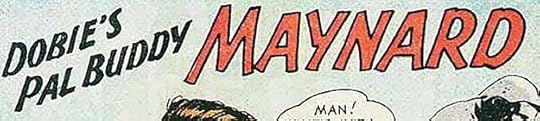 From THE MANY LOVES OF DOBIE GILLIS #1, May-June 1960
Inside the book, Dobie’s beatnik sidekick Maynard G. Krebs had his own short feature with this logo by Ira.
 From STRANGE ADVENTURES #117, June-July 1960
The best continuing feature in the entire run of STRANGE ADVENTURES in my opinion began in issue #117 with this new Schnapp feature logo where Ira used some of his favorite Old English styles. A post-atomic war America with survivors clad in medieval armor and riding giant Dalmations…what’s not to like? The stories and art by John Broome and Murphy Anderson were great.
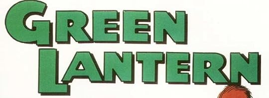 From GREEN LANTERN #1, July-Aug 1960
When Green Lantern began his own series, stories were topped with this new feature logo by Schnapp using similar letter shapes to his cover logo but stretched horizontally.
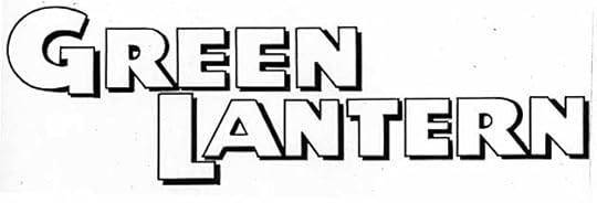
A photostat of the original logo from the DC files. This version has the second word farther to the right and closer to the first one, probably to make it less high and leave more space for cover art, perhaps a later adjustment.
 From SHOWCASE #27, July-Aug 1960
Another tryout in SHOWCASE, this was an original series. It did well enough to gain its own title. The logo by Ira is once again very standard open letters using the same S shape as his WORLD’S FINEST logo.
The original logo in the DC files is just the same, and I see no white paint corrections on this one.
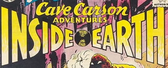 From THE BRAVE AND THE BOLD #31, Aug-Sept 1960
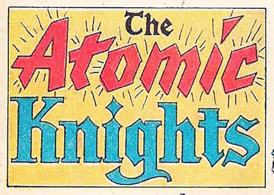
This new feature received several tryout issues in THE BRAVE AND THE BOLD, but never got it’s own series. Too bad, I liked the idea of exploring inside the Earth. Ira’s logo has an almost three-dimensional illusion of depth using one-point perspective that I find effective.
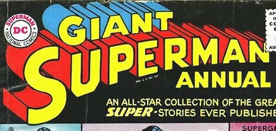 From SUPERMAN ANNUAL #1, Summer 1960
With this thick book, DC began a popular new program that reprinted old hard-to-find stories for fans who had missed them. Schnapp added the top and bottom words to his existing Superman logo, this version with the telescoping open for color. The issue sold out, and DC was soon doing them twice a year for both Superman and Batman, and later made the idea a monthly book under the name of “80-Page Giant.” I’ll count this as a new logo for Ira. There were more for other characters, and other annuals sometimes reused parts of this one.
 From SHOWCASE #30, Jan-Feb 1961
Aquaman had been around since 1941 but never in his own series. In 1961 he got several tryout issues in SHOWCASE and then finally his own book. This Aquaman logo is one I think Schnapp designed in 1944, only Aqualad is new, and it was replaced by a new logo on the series, so I won’t count this as another logo for Ira.
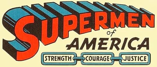 From Supermen of America club membership certificate, 1961
The Supermen of America fan club had been around since about 1939, and had a logo similar to this one but using one of Joe Shuster’s Superman logos. Ira revised it in 1961 using his own Superman revamp, just replacing the A with an E, and he also lettered his own version of the rest. Not exactly a comics logo, but I think close enough.

On the original logo from the DC files you can see how it was made: a photostat of Ira’s logo was pasted onto a new piece of art paper with the A removed, and Ira drew and inked in that new letter. Below inside the chain links are Ira’s original versions of the three words that were revised to make them bolder. The revised lettering was pasted on these (you can see the glue marks) but they fell off at some point and are probably lost.
 From ALL-STAR WESTERN #117, Feb-March 1961
This new feature in ALL-STAR WESTERN featured a Native American with super powers. Ira went with a Native American approach on the logo.
 From THE BRAVE AND THE BOLD #34, Feb-March 1961
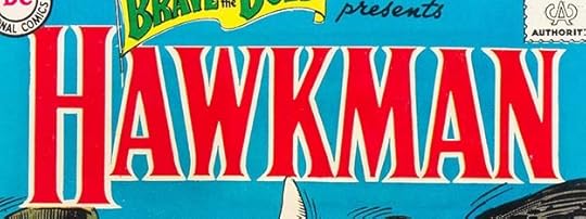
Another Julius Schwartz revamp of a golden age character, this version of Hawkman was also popular and flew into his own series after the BRAVE AND BOLD tryout. Schnapp’s logo uses letters based on the style of the inscription on Trajan’s Column in ancient Rome. The Trajan style was often used on carved letters from that time forward, and Ira had long experience with it as described in THIS article. I think it works really well for Hawkman, adding a feeling of historic age. Though the character and his wife Hawkgirl were from another planet, they were historians and liked to use ancient Earth weapons to fight crime. Their own series used the same logo.
 From SHOWCASE #34, Sept-Oct 1961
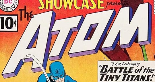
Schwartz and his creators were on a roll, and the next revamp given a tryout in SHOWCASE was The Atom. Because it’s such a short word, Ira’s logo can be very large, and he made the most of that. The square-cornered O is a bit odd, but it matches the rest of the word, and also echoes the square S on The Flash. The short telescoping made room for other colors and added a three-dimensional lift off the surface of the cover to get attention. This is one book you could pick out on a newsstand from across the street!
 From BATMAN ANNUAL #1, Summer 1961
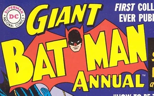
The Batman Annuals followed a similar plan to the Superman ones, but the new words Schnapp designed above and below the existing Batman logo were somewhat different. I think they’re enough to call this a new logo.
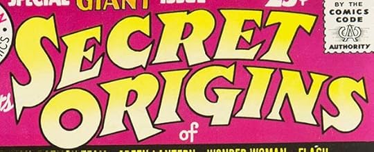 From SECRET ORIGINS #1, Summer 1961
Having had success with reprints in the annuals, DC put out this annual-sized book featuring origin stories for nine of their characters, though the one for Superman and Batman was about the origin of their team-ups as seen in WORLD’S FINEST. All the same, many of the stories here were only rumors to most readers at a time when older comics were very hard to find and there was no back issue market, and for fans like myself, this was a revelation. I love Ira’s logo, which uses open letters with large triangular serifs in an appealing arc. I’m not sure why, it may be my childhood self that loves it, but it’s an effective and attention-grabbing logo in any estimation.
To sum up, I found 16 new logos by Ira Schnapp for books with 1960-1961 cover dates. Other articles in this series and more you might like are on the LOGO LINKS page of my blog.
The post IRA SCHNAPP’S COMICS LOGOS 1960-1961 appeared first on Todd's Blog.
June 19, 2021
Rereading: TITAN by John Varley
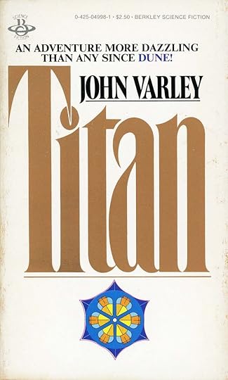 Cover design by Tony Russo
In the 1970s I was reading several science fiction digest-size magazines regularly, and finding new favorite authors there to add to ones I liked from a previous generation like Heinlein, Asimov and Clarke. One was John Varley, whose inventive stories seemed cutting edge, full of original ideas, and well written. I bought each of his Gaea trilogy novels when they came out and loved them, but hadn’t read them since. Titan came out in 1979 in hardcover, I got the 1980 paperback.
In 2025, a small crew aboard the NASA ship Ringmaster heads toward Saturn on an exploratory expedition. The crew consists of Commander Cirocco Jones, astronomer Gaby Plauget, the clone twin physicists April and August Polo, pilot Eugene Springfield, physician Calvin Greene and engineer Bill (no last name given). As they approach Saturn they discover a previously unknown satellite that can’t be natural, it’s in the shape of a hollow wheel or torus thousands of kilometers wide with six spokes and a central hub. As they approach it, control of their ship is lost, and they are drawn into the torus by tentacle-like appendages. The crew is rendered unconscious, and each of them spends uncountable time inside the structure’s “soil” or lower levels before emerging to the inner surface and awakening. Cirocco is the viewpoint character, and while marveling at the amazing world around her, she’s also trying to find her crew as well as answers about exactly what’s happened. Some of the crew is reassembled, but each of them has been changed by Gaea, as they name this world they’ve entered, and somehow they know it’s one gigantic living thing. Calvin, for example, has been given the language of Blimps, giant gas-filled creatures who roam the skies of Gaea, while Cirocco has the ability to understand and sing in the language of the Titanides, centaur-like creatures who become the allies of she and Gaby as they explore the vast inner world of Gaea and try to find a way to contact the mind of the world itself. To do that they must make a perilous climb up a huge cable to the hub, where Gaea holds court and perhaps will help them, or perhaps will kill them.
This book is stuffed with wonderful ideas and characters, it has a thrilling plot, and the sense of wonder never quits as Gaea’s nature is gradually revealed, with the inner torus divided into many different lands, some in sunlight, some in darkness, and all dangerous. I won’t say any more except to recommend it highly.
The post Rereading: TITAN by John Varley appeared first on Todd's Blog.
June 18, 2021
IRA SCHNAPP’S COMICS LOGOS 1958-1959
 All images © DC Comics. From TOMAHAWK #55, March 1958
The first new logo design by Ira Schnapp in issues with cover dates in these years is this one for the long-running frontier fighter. The stylized hatchet shape is a good idea, tying the name to a large symbol, but the shape of this logo creates a lot of empty space above it. Often that would be filled with cover lettering, but not on this first appearance. The logo seems more serious and streamlined than the previous one.
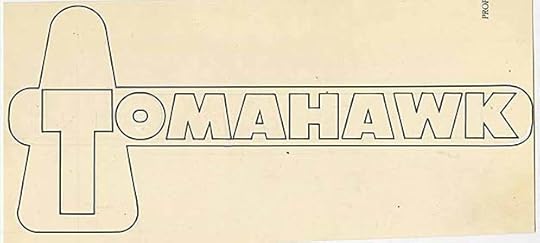
Here’s the original from the DC files. It has less impact without color, and the outlines are surprisingly thin.
 From CHALLENGERS OF THE UNKNOWN #1, April-May 1958
The Challengers had a tryout run in SHOWCASE, but the logo used there was pulled from the splash page of a story and not by Ira. This one is all his and is massive and monumental, with a nice arc on the first word. Again, I find it odd DC covered so much of the S with the code seal when they could have made the logo a little smaller, or even just the first word, and shown it all on this first issue. Ira’s designs also did not always take the code seal into account, which didn’t help.
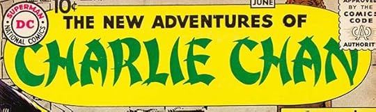 From THE NEW ADVENTURES OF CHARLIE CHAN #1, May-June 1958
This short-lived title was based on a TV series, though no mention of that is made. CHARLIE CHAN is in the faux Chinese style one saw a lot at the time, but now considered condescending and in poor taste.
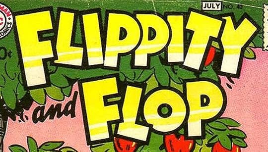 From FLIPPITY AND FLOP #40, June-July 1958
While Schnapp was doing some new logo designs with thin outlines, this revamp went in the other direction. FLIPPITY AND FLOP began in the pages of REAL SCREEN COMICS #1 in 1945, and their own title started in 1952 with a logo drawn for the stories and I think not by Ira. This revision came late in the run, and certainly got the message across.
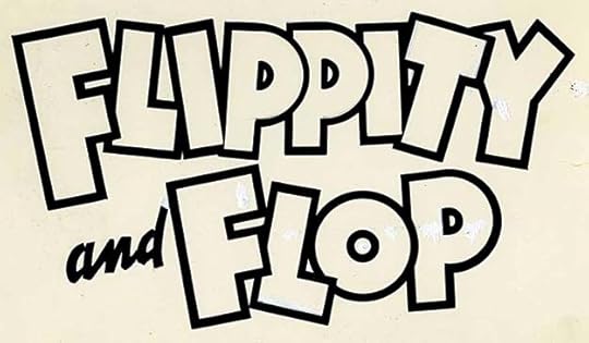
The original logo from the DC files. The slightly thinner outlines on the loops of the P’s in the first word suggest all the outlines were originally that size and Ira added more thickness later, but that’s a guess. Like most of Ira’s originals, this one has quite a few white paint corrections, but they’re hard to see.
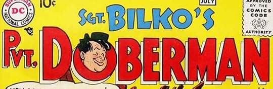 From SGT. BILKO’S PVT. DOBERMAN #1, June-July 1958
Sgt. Bilko’s comic did well enough to spawn this spin-off title, a first for DC’s Hollywood humor books. The logo for Doberman is more regular and conservative than Bilko’s, but the character head by Bob Oksner keeps it funny. Both Bilko books ended at the same time in early 1960.
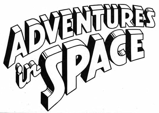
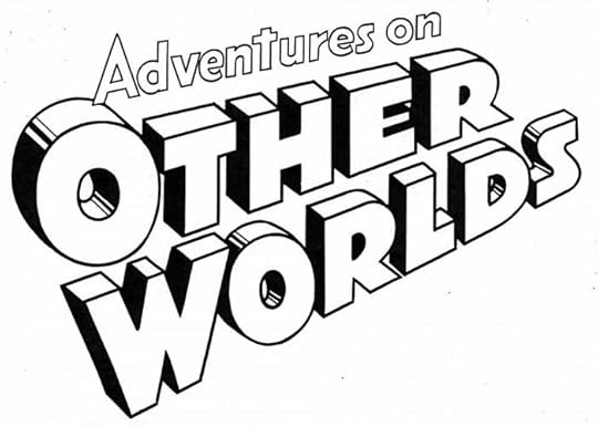
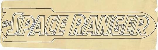
Expanding DC’s science fiction anthologies was on DC’s mind in 1958, and someone commissioned these two new logos from Ira that were never used except possibly to secure trademarks on the names. The space race was on between the U.S. and Russia beginning in 1955, and the minds of many more young readers turned toward space and science fiction themes than ever before.
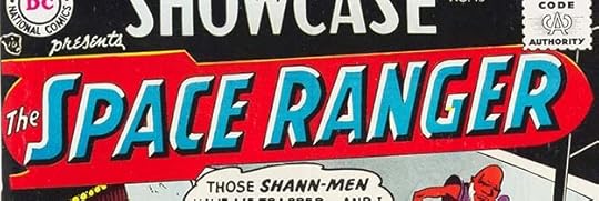 From SHOWCASE #15, July-Aug 1958
DC management challenged editors Jack Schiff and Julius Schwartz to come up with new science fiction series to run in SHOWCASE. Schiff’s ran first with a new logo by Schnapp that I find sadly outdated already, with the name inside a rocket ship from the Buck Rogers era of twenty years earlier. The beveled look of the letters is quite nice, though.
You can see how that was done more clearly in this original from the DC files, which was so large it had to be folded, and is worse for the wear. Even though he left all the beveled areas open, Ira knew how it would work in color and put dividing lines in the right places. Some of the outlines were removed for the cover above to make the bevels look even better, though one tiny section of the G was colored wrong.
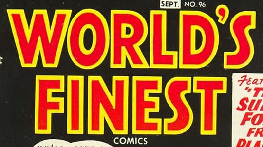 From WORLD’S FINEST COMICS #96, Aug-Sept 1958
After having a poorly-designed logo on every issue of this book since it began in 1941, Ira Schnapp was finally able to create this better version. He followed the general look of the previous logo, but did away with the pointed letters and remade it in his block style with very thick outlines that could be held in a color, as was done here. This is actually closer in feel to the logo I think Ira designed for WORLD’S BEST COMICS before the title changed with the second issue.
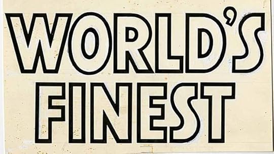
The original from the DC files again shows lots of white paint revisions on the edges of the letters, some of which is flaking off a little from age. Ira’s logos always look so perfect in print, but clearly they were often the result of much fine-tuning.
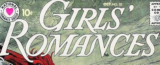 From GIRLS’ ROMANCES #55, Oct 1958
GIRLS’ ROMANCES had continued with Ira’s original logo and its very thin letters from the beginning, and at times the thinnest parts were hard to read, though a few covers used a version with the open areas filled in, and that read better. For issue #55, Ira made a new outline version of that filled-in logo, which finally gave it enough weight in all areas to read well. This version lasted until 1966. Though the shape is the same, I feel this counts as a new logo.
 From SHOWCASE #17, Nov-Dec 1958
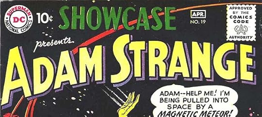
The other new science fiction hero following Space Ranger in SHOWCASE was Adam Strange, but he appeared first under this new Schnapp logo using the same title as one of the unused ones above. That logo would not have worked on this cover, which is probably why a new one was created. It’s pretty standard but the arc along the bottom adds interest.
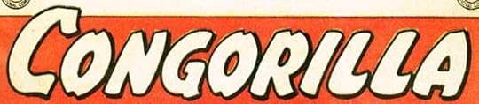 From ACTION COMICS #248, Jan 1959
While Congo Bill had been around since the early 1940s, he’d been unable to attract readers in his own title. In this issue, someone changed his white hunter in Africa premise to one with a fantasy element: Bill was able to change bodies with a golden gorilla, leading to more heroic adventures due to Bill’s intelligence combined with a very powerful body. It kept the feature going for a while longer. Ira’s logo uses one of his more organic styles, and the result works for me.
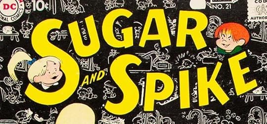 From SUGAR AND SPIKE #21, Feb-March 1959
With issue #21, SUGAR AND SPIKE gained a new Schnapp logo with sans-serif letters in two curves and the same character art by Sheldon Mayer. It’s a little more compact than the first one and stands out well from the busy background.
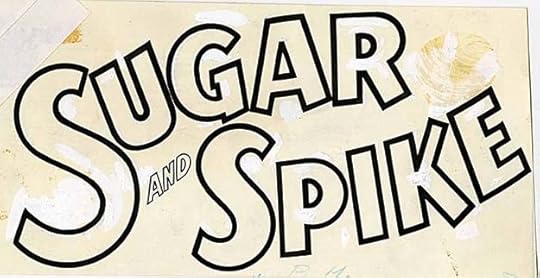
The original logo from the DC files reveals the very thick outline on the main words to help it read well against cover art, and again lots of white paint revisions. At upper right you can see where Spike’s head was pasted onto the logo.
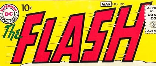 From THE FLASH #105, Feb-March 1959
Though he appeared earlier in SHOWCASE, many equate this new title as a major turning point for DC Comics as editor Julius Schwartz oversaw the revamp and revitalization of their best characters and ideas from the 1940s, with lots of help from artists like Carmine Infantino, Joe Kubert and Murphy Anderson and writers like Robert Kanigher, John Broome and Gardner Fox. Ira Schnapp’s bold, exciting logo helped attract readers. It takes the ideas from the 1940s version that he began working with on the SHOWCASE versions and brings them to new heights. The outlines are thick, the sense of movement is strong, and I love how the speed lines begin in the black outlines as white openings, then continue as black lines. The larger F adds balance missing in the SHOWCASE versions. This logo and book made a huge impression on me when I first saw it at age eight.
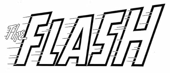
This photostat of the original logo from the DC files only improves my opinion of it.
 From SHOWCASE #19, March-April 1959
For his third SHOWCASE appearance, Adam Strange gained this fine Schnapp logo that has long been associated with him. It uses Ira’s standard open block letters with an open drop shadow and a gentle arc that adds interest.
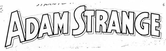
This photostat of the original from DC’s files allows the linework to show up better. The shape of the R is unusual for Schnapp, but it puts the R and A closer together and avoids a gap there.
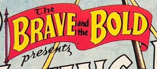 From THE BRAVE AND THE BOLD #23, April-May 1959
With issue #23, Ira’s BRAVE AND BOLD logo was redrawn much smaller to leave room for a larger character logo. This was needed as the book became a second tryout title for potential new series. The large words are almost the same but have a slight drop shadow to read better. The banner is improved with a curled end and a flagpole. The small words may be from the original version.
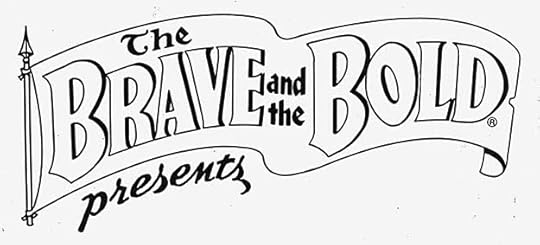
This photostat of the original logo from the DC files shows that PRESENTS was part of this logo. The flagpole seems smoother than the printed version, and may be a revision.
 From THE BRAVE AND THE BOLD #23, April-May 1959
The first headliner was The Viking Prince, who had been one of the three regular features to this point, and now took center stage with an Old English style logo by Ira. Unlike the earlier feature logo, this one is in all caps with larger first letters. This tryout did not gain a series.
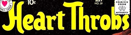 From HEART THROBS #59, April-May 1959
HEART THROBS was another former Quality Comics title bought by DC, and they continued publishing it with the existing numbering and logo after a pause of a few months in 1957. In 1959, Schnapp designed this new logo, which has oddly uneven letters. The A seems too big and the R’s and first T seem too small. It almost suggests the ebb and flow of a heartbeat, but that’s probably just me projecting something never intended.
The original logo from the DC files is just the same, but with a thin outline that doesn’t show on the cover. Someone trimmed off a bit of the H probably so it would fit in the file drawer.
 From THE FLASH #106, April-May 1959
For the second issue of the revamped Flash, Schnapp designed this feature logo in the same style as his cover one, but with less tall and more horizontally even letters. This ran as a top banner over the first page of each story for some time, and fit better than the cover logo would have.
 From SHOWCASE #20, May-June 1959
In SHOWCASE this new feature had a tryout that led to a new series. Both used this new logo by Schnapp. The outer shape is puzzling, as it suggests a bullet, though Rip’s time machine was a sphere, but it does provide space for a second color.
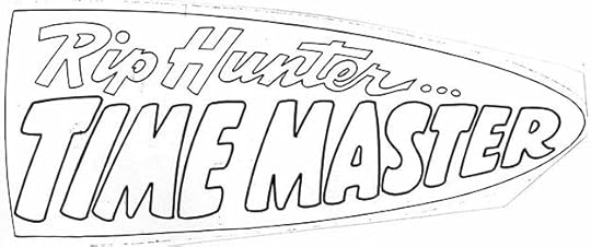
A photostat of the original logo from the DC files. Ira’s loose, rounded shapes in TIME MASTER don’t seem particularly appropriate for the concept, but it looks fine in color.
 From THE FOX AND THE CROW #56, June-July 1959
These characters began in REAL SCREEN COMICS in 1945 and their own series started in early 1952 with a logo I think was not by Schnapp. For issue #56 he provided this new one with strong, bouncy open letters for the large words. Both the old logo (with character art in each O) and this new one were used for a while until this one became the regular logo.
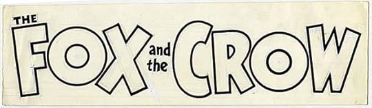
The original logo from the DC files showing some of Ira’s pencil lines and his white paint corrections. THE had been over the F, but was moved right to fit better.
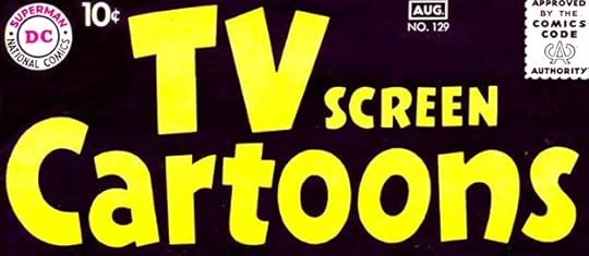 From TV SCREEN CARTOONS #129, July-Aug 1959
Speaking of REAL SCREEN COMICS, that title was renamed and got a new Schnapp logo with this issue in an attempt to attract viewers of TV cartoons. There were a few actual cartoons made for some of the features in this book, but years earlier, and most kids in 1959 would not be likely to see them. Ira’s logo does the job of promoting the tenuous TV connections.
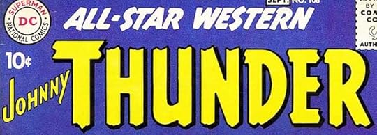 From ALL-STAR WESTERN #108, Aug-Sept 1959
Westerns were still popular on TV, and DC decided to make Johnny Thunder the headliner on this one with a new cover logo and a smaller version of the actual book title, both by Schnapp. I will count them as one logo, as they always appeared together. The rough ends of the letters in THUNDER look similar to what Artie Simek was doing on some western Marvel Comics logos of the time, so I wonder if Ira was influenced by that.
 From THE BRAVE AND THE BOLD #25, Aug-Sept 1959
The next tryout feature in BRAVE AND BOLD was this one with a fine logo by Schnapp. The letters are precise with some minor Art Deco touches, and a drop shadow that adds depth. Though their tryout did not result in a series, it set the stage for later ones in the future.
 From SHOWCASE #22, Sept-Oct 1959
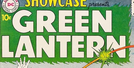
The second of editor Julius Schwartz’s golden age superhero revamps was equally as successful as The Flash. Ira’s logo oddly looked back to the golden age character for the surrounding box of green flame, the new character used beams of green energy instead, but the green flames do add interest and texture all the same. Otherwise the logo is standard Schnapp open block letters. The flaming box ran off the cover at the left side and the flames were trimmed at the top for use on SHOWCASE tryout issues, but returned when the character got his own title.
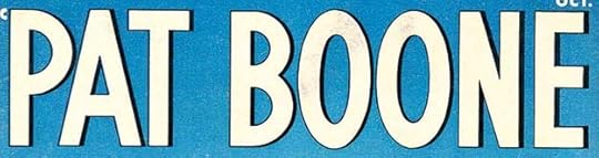 From PAT BOONE #1, Sept-Oct 1959
This short-lived title tried hard to distance itself from comics in every way, with Ira Schnapp’s staid type-like logo being the only hand-lettering on the covers.
 From SERGEANT BILKO #16, Nov-Dec 1959
For the last three issues of its run, this title had a new Schnapp logo with more type-like letters made funny only by the character art.
To sum up, I found 27 new Ira Schnapp logos for issues cover-dated 1958-1959, an increase over the previous few years, and including some memorable ones. Other articles in this series and more you might enjoy are on the LOGO LINKS page of my blog.
The post IRA SCHNAPP’S COMICS LOGOS 1958-1959 appeared first on Todd's Blog.
Todd Klein's Blog

- Todd Klein's profile
- 28 followers

