
Todd Klein's Blog, page 84
October 13, 2021
Incoming: BATMAN NOËL Hardcover
Just arrived, a new printing of this Batman Christmas story by Lee Bermejo (story and art) that I lettered in 2011, and originally printed in time for Christmas of that year. It was popular and went back to press several times. The only difference I see on the cover is an updated DC bullet symbol and the price is $19.99. This is due in shops soon, or you can order it at a discount through the link below. As I recall, it’s a fine story with fine art.
The post Incoming: BATMAN NOËL Hardcover appeared first on Todd's Blog.


September 28, 2021
Paintings by IRA SCHNAPP

A few weeks ago I was contacted through my blog by someone who wanted to know if I might be interested in a painting by Ira Schnapp. He had been researching the name and found one of my many blog posts about Ira. I emailed him and said I’d like to know more. He replied with this photo and wrote:
I am a part-time antique dealer and found this lovely painting of his in an upstate New York estate sale. Please let me know if you are interested. Thanks.
 Marty Schnapp by Todd Klein, 2015
I knew that Ira had done some painting after talking to his son Marty in 2015. He was located with the help of my research partner, Alex Jay. Marty and his wife lived in a small apartment in Manhattan. He was still working part time as a consultant for Burlington Coat Factory after a long career in the clothing business, and he and his wife Pam were delighted to hear from me about Marty’s father Ira. I interviewed Marty on the phone a few times, and was able to visit him briefly in his apartment where he showed me the first photo I had ever seen of Ira, the one that’s in my blog posts about Ira’s life and work, and is now available to use freely on Wikipedia HERE and HERE. Marty helped me achieve that.
In my conversations with Marty, he told me:
Ira was very quiet at home. Very soft-spoken. I don’t think he had any real hobbies. He did painting and things like that. I don’t recall him ever selling any.
Marty was not interested in art growing up, so he didn’t know or remember much about Ira’s work, unfortunately. Marty said Ira was a loving father, but Marty was into sports and Ira was not, so they didn’t spend a lot of activity time together. It’s interesting that Marty didn’t consider Ira’s painting a hobby, but I think it certainly was one, especially if he wasn’t selling them. Marty also talked to me about his sister Theresa (Teddy), who died in 2009 after living alone for many years, and Marty and Pam had to dispose of most of her belongings. I asked if there were any works by Ira, and Marty said there was one large painting, but there was no room for it in Marty and Pam’s small apartment, so they gave it away.
 Photo by Todd Klein
I contacted the antiques dealer, and he was asking a reasonable price for the painting, and would mail it framed by priority mail for his price. I agreed, and we worked out a payment method. The painting arrived safely, and I took it out of the original frame to get a better look at it and photograph it. Above is the full painting, done in pastels on thick textured art paper or illustration board about 1/16 inch thick, and stiff like cardboard. The paper may have begun with a gray color, which seems like a good choice for pastels, but I think the spotting in slightly darker gray is from age. There’s also damage on the edges from the original matte where it stuck to the art paper. Despite all that, the pastels still look great, fresh and colorful as if they were put down yesterday.
 Photo by Todd Klein
Here’s a closer look at the ballet dancer’s upper body, and you can see more of the pastel technique, which I think is quite good.
 Photo by Todd Klein
The signature seems to have been done with one of Ira’s lettering pens, and the picture is helpfully dated 1954. Ira was working in the DC offices then much of the time, but probably also doing lettering at home.
 Art-Degas.com, Two Dancers, 1898 by Edgar Degas
The painting seems to be in the style of pastel work by French artist Edgar Degas (1834 – 1917), who was famous for his ballet dancer portraits in pastel, oils and even a sculpture. I’ve searched online, but I can’t find any Degas image that comes very close to Ira’s painting as far as the pose and subject, though many are somewhat similar, like the one above. The costume in Ira’s work seems more modern somehow, and I wondered if Ira might have used a photo of his daughter Teddy as his model. I was excited to have the painting, and I wanted to try to get in touch with Marty to show it to him.
Sadly, his email account was no longer valid, and some research found that Marty had passed on April 8, 2020, at the age of ninety. I hadn’t been in touch with him for a few years, but at his age the news was not very surprising. I am consoled by the fact that Marty seemed happy when we spoke, and said he had had a good life. I further found that Marty’s wife Pam had passed in 2018. I never met her in person, but she was there for our phone interviews, and I enjoyed speaking with her.
 Teddy and Marty Schnapp, 1935, courtesy of Marty Schnapp
 Teddy Schnapp, date unknown, courtesy of Marty Schnapp
I knew that Pam and Marty had a son, Jonathan, and searching on the internet, I was able to find a phone number for him. These things are often wrong or outdated, but I tried the number, and Jonathan answered! It was the same kind of good luck I had with Marty. Jonathan was happy to hear from me, he knew who I was from hearing his father talk about me, Alex Jay, and Arlen Schumer. We had all attended the show about Ira and his work that Arlen had put together at the Type Director’s club in Manhattan, more on that HERE with lots of photos. Jonathan and I talked some about the sad news of his parents’ passing, and I told him about the painting I’d found. I emailed him images of it, and asked if he knew if Teddy had ever taken ballet lessons, and if he thought she might have been the subject, though from the few photos I have of Teddy, above, I didn’t think the face looked like her. Jonathan wrote:
Teddy might have taken dance or ballet classes as a teen but I don’t recall her ever mentioning anything to me. I will look through some old photo books and keep you posted and send you a few photos of Teddy. All of your research brings much joy and happiness to me knowing more about my grandfather. I also have stored some of his paintings and have never seen a ballerina photo. The more I think about it, it makes sense. I’ll certainly see if I can find any hints on my aunts hobbies.
That’s inconclusive, but it does leave the door open to the pose and costume possibly being Teddy Schnapp. As I said, online searches haven’t turned up any very similar ones by Degas, but there could be one I haven’t found. Or Ira could have been using a photo of a ballerina from a magazine instead. Jonathan hasn’t had a chance yet to send me more pictures of Teddy, but if he does, I will add some here.

 Images courtesy of Lot-Art Auctions
After learning of the Schnapp pastel, I did a search for Ira Schnapp paintings online, and came up with images of another one that had sold at auction a few years ago. This was a much larger oil painting, and it’s a copy by Ira of a 1755 oil by François Boucher titled “Winter,” part of a series on the four seasons, and owned by the Fricke Collection in Manhattan. The Fricke is at 5th Avenue and 70th Street, not far from Ira’s apartment on West 110th Street in 1947 (and for many years), so perhaps he was able to get permission to set up an easel there and copy the original painting. Or, it might also have been copied from a printed reproduction. The Schnapp signature is block letters done with a brush, and not unlike some of Ira’s lettering.
 Winter by François Boucher, 1755, in the Fricke Collection
Here’s an image of the original painting. As you can see, it was done to fit an unusual shape, perhaps a frame of that shape, and in Ira’s version he’s filled out the corners, adding his signature in the lower right corner. I don’t think Ira’s version is as skillful as the original, but it’s not bad. I also showed those images from the auction to Jonathan, and he told me that painting hung in his living room when he was growing up, and he was glad to see it again. I think that was when Marty and Pam were living in a larger home in New Jersey, perhaps they sold it when they moved to their small Manhattan apartment.
 Clipping from Ira Schnapp’s “Art of the Ages,” The Toledo, Ohio Blade, 1940
We know that Ira was interested in fine art because in the late 1930s, he prepared a series of newspaper features about artists and their work titled “Art of the Ages.” I’ve written much more about that HERE. I think Ira’s reproductions of famous paintings and sculptures, and also portraits of the artists like the one above for his articles show that interest, even if the crude reproduction needed for newsprint is not always very effective. I can certainly see him wanting to do paintings himself, and also copying work by the masters. Ira’s signature in that clipping is one of the few examples we have from him.
 Image courtesy of Pat McGreal, used with permission
There’s a better Ira signature on this postcard that he did for young writer Pat McGreal when he was taking a tour of the DC offices in 1964. This one is similar to the signature on the ballerina painting above. There’s no doubt in my mind that the two paintings are by our Ira Schnapp, and I think it’s quite possible that others might turn up on the market. I’m also hoping that Ira’s grandson Jonathan will be able to send me images of the paintings he has in storage someday. If any new Schnapp paintings come to my attention, I will write about them.
The post Paintings by IRA SCHNAPP appeared first on Todd's Blog.
September 26, 2021
And Then I Read: A MYSTERY FOR THOREAU by Kin Platt
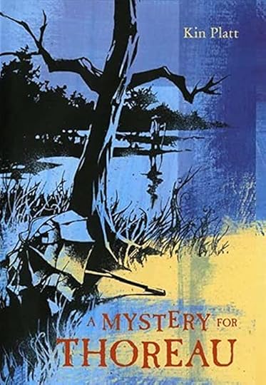
In 1846, Concord, Massachusetts is a surprisingly intellectually active town, being the home of writer and philosopher Ralph Waldo Emerson as well as the family of writer Henry Thoreau. Thoreau himself lives a short way from town in a cabin he’s built on Walden Pond, but his strong opinions about everything are well known in the village. Most of the villagers are average working folks of all kinds, and they get their news from the small local paper, The Concord Freeman run by Rufus Puckle, published twice a week. The main news reporter, and the narrator of this story, is his nephew Oliver Puckle, who is still a teenager but already knows everyone in town because of his job, from the strange madwoman Hetta who lives in the woods to his friend and fellow teenager Louisa May Alcott and many more. When Oliver’s uncle leaves him in charge of the newspaper while he visits Boston and New York for supplies, Oliver feels he is quite capable of handling the job. The female stranger that appears in the newspaper office one morning with a want ad to place surprises him. Her name is Margaret Roberts, and Oliver finds himself struck by her beauty and charm. She has arrived alone from Boston, reason unknown, and desires to place an ad in the paper advertising for any sort of work. Oliver is happy to comply, and gives her advice on finding a place to stay. He suggests the Thoreau home, which takes boarders. Henry Thoreau, meanwhile, has been placed in the town jail because he has refused to pay his taxes on matters of principle, and Oliver hastens there to get his side of the story.
Later, Oliver asks at the Thoreau home about Miss Roberts and finds she never appeared there. He searches for her around town, and no one has seen the young woman. Oliver fears some tragedy has befallen her, but can’t convince the town Sheriff to act, though he does tell local hunters to look for the girl when they go out hunting. Late that night the town bell rings repeatedly, a sign of trouble and alarm. When Oliver turns out to hear the news, it’s of a murdered woman found by hunters. He fears the worst, and is determined to find out what happened. Surprisingly, Henry Thoreau, though in jail all night, turns out to have the best ideas about that.
This is a great read by an author with a long and interesting career in many arenas, including comics. I’ve reviewed two more favorite books by him already, “Sinbad and Me,” and “The Blue Man.” This book, published posthumously, is a worthy addition, and recommended.
The post And Then I Read: A MYSTERY FOR THOREAU by Kin Platt appeared first on Todd's Blog.
September 24, 2021
Incoming: THE DOLLHOUSE FAMILY Trade Paperback
 Image © Mike Carey & Peter Gross, cover by Jessica Dalva.
This miniseries that came out in 2019 from DC and Joe Hill’s Hill House imprint was one of the scarier books I’ve worked on. No surprise from writer Mike Carey (now credited as M.R. Carey) and penciller Peter Gross, the same team that brought chills in THE UNWRITTEN and other projects, here greatly enhanced by the work of inker Vince Locke. A hardcover collection came out last year, and now the trade paperback has arrived. Not sure when it’s in shops, but I recommend it.
The post Incoming: THE DOLLHOUSE FAMILY Trade Paperback appeared first on Todd's Blog.
September 23, 2021
GASPAR SALADINO’S COMICS LOGOS 1986-2015
 All images © DC Comics except as noted. From LEGIONNAIRES 3 #1, Feb 1986
Gaspar Saladino continued to create logos for DC Comics regularly, but not nearly as often as in the past, from 1986 to 1988. Then his logo output nearly stopped, as far as I can tell, with just one for DC in 1991 and none after that. In a sense he had been replaced by younger designers, just as he had replaced Ira Schnapp beginning in 1967. I don’t know what he thought about this, but Gaspar continued to do story lettering and cover lettering for the company for some time. Digital desktop publishing was gradually making its way into comics, and newer companies like Image and Malibu were pioneers in establishing an all-digital workflow around 1994, including digital lettering by Comicraft and others. DC was much slower to adopt digital, but by the late 1990s, covers were being assembled that way, and I was doing a lot of DC’s cover lettering digitally on my first Apple computer. Gaspar had no interest in learning computer lettering, so he was gradually shut out of his first and best market, DC. He continued to hand-letter comics stories for the company until DC made the switch to an all-digital workflow in 2002. At that point, Gaspar was essentially retired as a DC letterer. He turned 75 that year, and I think he was content to enjoy his family and they spent a lot of time in Florida as well as Long Island. Gaspar was occasionally called on by DC for his unique hand lettering on covers, including for the BATMAN ’66 series beginning with issue #3 in 2013, something I think he enjoyed. That work extended Gaspar’s DC career to seven decades, an amazing feat in itself.
As I mentioned in the first article in this series, Saladino’s Wikipedia page credits him with logo designs for Neal Adams’ Continuity Associates and also Eclipse Comics in the 1980s, but I’ve looked at every cover by both publishers and I don’t see any work by Gaspar. The Wikipedia page also says he did product logos for Eclipse editor cat yronwode’s separate business Lucky Mojo Curio Company in the 1990s, and I do see some of those in online images, but as they’re not comics logos, I won’t attempt to cover them here. One final comics logo came from Gaspar late in his career, and I will include it at the end of this article.
DC editor Karen Berger was one of the few younger editors at the company who seemed to appreciate Gaspar’s logo work, and he did a fine one, above, for a Legion of Super-Heroes mini-series. The lightning bolt slash of the giant L lines up with the top of the large 3 to make it memorable.
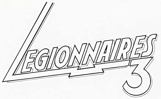
A photostat of the original logo from the DC files is the same. I like the way the S is curved at the top and straighter at the bottom, and also the old-style 3.
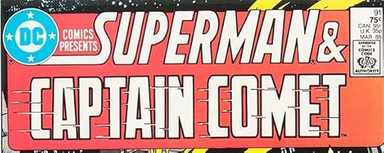 From DC COMICS PRESENTS #91, March 1986
With issue #90, this title replaced my original series logo with a new one that emphasized SUPERMAN & and had space for the other team-up character. I’m not sure who did the repeating design, I don’t think it was Gaspar, but he did do this character logo for Captain Comet. I’m a bit surprised it doesn’t lean to the right, but at least the speed lines add motion and interest.
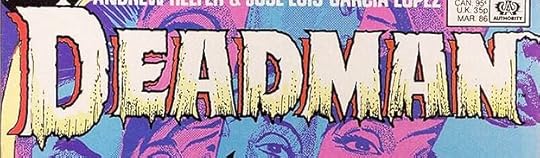 From DEADMAN #1, March 1986
I think this is one of Gaspar’s best logos of the 1980s. His talent for horror logos was still strong, and a perfect choice for Deadman. I like it much better than Ira Schnapp’s original. You can almost see rotting flesh sagging down from the ragged, textured letters, a fitting idea for the character.
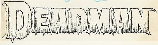
The original logo from the DC files is the same, I don’t see any changes or corrections. Perfect as executed.
 From DC COMICS PRESENTS #93, May 1986
Another character logo for this title by Saladino, and again his letter S is different and appealing.
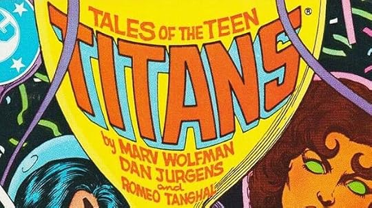 From TALES OF THE TEEN TITANS #65, May 1986
This series usually had a logo by me, but for one issue, Gaspar created this distorted version for the surface of a balloon that I think is better. Not an easy job, but in Gaspar’s hands it was no problem.
 From BLUE BEETLE #1, June 1986
Blue Beetle was a character with a long history in comics from several publishers. Gaspar’s logo for the DC series is his interpretation of the last logo used by Charlton Comics for the character in 1967-68. It’s quite similar except for the thin-line inner shapes and the open telescoping.
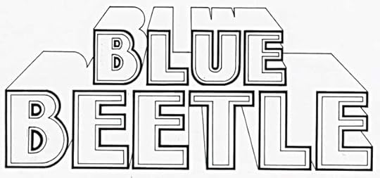
A photostat of the original logo from the DC files is the same, but the thick borders on the letter outlines can be seen better.
 From DC COMICS PRESENTS #94, June 1986
These three characters were new and essential parts of the first major company crossover event at DC, “Crisis on Infinite Earths,” which had its own series but affected the entire line in many ways. These character logos were all used other places as well as on this cover, so I will count them as three new logos for Saladino.
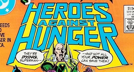 From HEROES AGAINST HUNGER #1, Aug 1986
This was a charity fundraiser, the second one I can think of, the other being a similar one from Marvel that came out first in 1985, HEROES FOR HOPE. Gaspar’s logo is classy and epic. I like the way the two H’s meet.
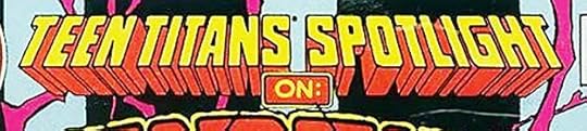 From TEEN TITANS SPOTLIGHT #1, Aug 1986
A new series featuring individual Teen Titans members and allies, Gaspar’s classic block letters and telescoping work fine and leave lots of room for the character logo on each issue.
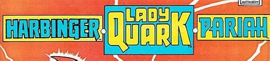
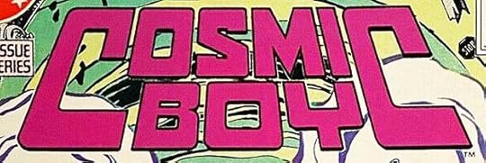 From COSMIC BOY #1, Dec 1986
Another Legion of Super-Heroes mini-series with a cool Saladino logo. I love the symmetry and style of the giant C’s.
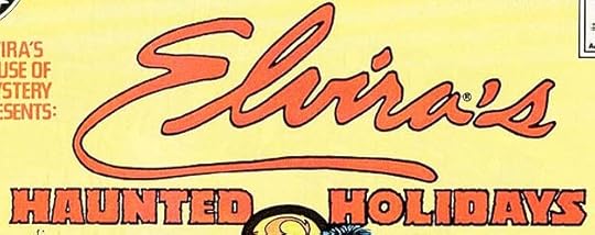 From ELVIRA’S HOUSE OF MYSTERY SPECIAL #1, March 1987
I felt TV horror host Elvira was never a good match for DC Comics. I did the logo for her version of HOUSE OF MYSTERY, but never liked it or the book. This special has a logo by Gaspar that starts with the character’s trademarked signature in outline form that probably had to be shown in full by contract, and the rest of the title is crammed small below it in Saladino’s horror style. I can’t see how he could have done much better with what he was given.
 From SECRET ORIGINS #12, March 1987
SECRET ORIGINS was an anthology where original and retold origins could become new stories. Most issues had two, and on this one Gaspar has created a new logo for a character that probably never had one. Note his use of an implied unconnected drop shadow, a new idea for comics logos that was just coming into use. It works best on lighter backgrounds, not so well over the brown area.
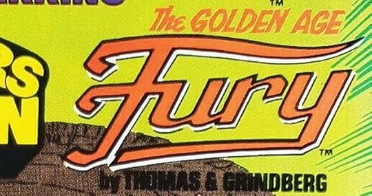
 From SLASH MARAUD #1, Nov 1987
This great brush-style logo was designed by Gaspar from a layout by series artist Paul Gulacy, according to Paul. It would be interesting to see that layout, but I haven’t found it. Gaspar’s brush technique is excellent, as always, and the outer border makes room for a second color.
 From CAPTAIN ATOM #15, May 1988
While this was probably handled as cover lettering by Gaspar, it’s a new character logo that takes center stage at the top of the cover, so I count it as a logo. Multiple open drop shadows was another new idea in logo design that Gaspar picked up on.
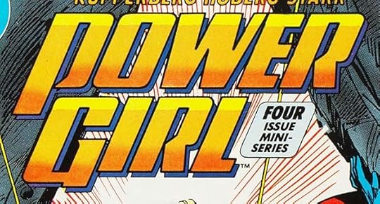 From POWER GIRL #1, June 1988
Saladino had designed a logo for this character in SHOWCASE appearances in 1978. His new logo is a very different approach with some interesting letter shapes like the P and R with unconnected loops.
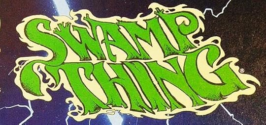 From SWAMP THING #110, Aug 1991
SWAMP THING had been a great success for DC, even beyond the groundbreaking issues written by Alan Moore, and as time went on, a type-based logo replace Gaspar Saladino’s original masterpiece. In 1991, editor Karen Berger decided to return to something more organic, and commissioned this new design from Gaspar. It was his last logo for DC as far as I can tell, and it’s a gem. It goes it a different direction from his first one, but it’s still an amazing example of finely-crafted letters made with dry brush outlines, and the liquid outer shape is perfect for a swamp creature, too.
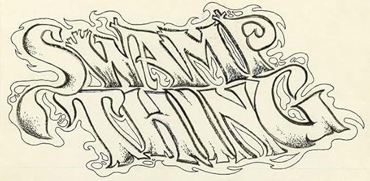
The original logo from the DC files is even more impressive, as you can see the details of the brushwork and inner texture better. Despite the brilliance of this design, it was only used for 18 issues, and then Gaspar’s logo design talent was put aside for other new ideas by younger creators, and he did no more logos for DC that I know of.
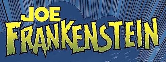 From JOE FRANKENSTEIN #1, Feb 2015, image © Chuck Dixon and Graham Nolan
In 2012 I was contacted by artist Graham Nolan to see if I could design a logo for a project he was working on with writer Chuck Dixon that they would publish themselves. The logo was needed quickly, and I didn’t have time, but I had been talking to Gaspar recently, and thought he might be interested. I hooked Graham up with Gaspar, and he did this fine logo for the project, which didn’t see print until 2015. I’ve written more about this HERE, an article which includes Gaspar’s logo sketches, the only ones I’ve seen, well worth a look. At the time, Clem Robins, another letterer friend of Gaspar’s, was finding other small jobs for him, and Clem, Gaspar and I all thought this might be a chance for Gaspar to get back into lettering at least in a small way. That happened a few times, but Gaspar’s health was gradually failing, and this was the only late career logo design he did as far as I know before he passed in 2016.
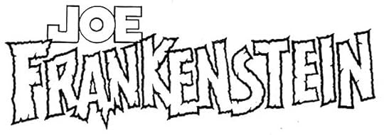 Image © Chuck Dixon and Graham Nolan
Here’s the original inked logo, scan courtesy of Graham. While perhaps not as impressive as Gaspar’s horror logos from the 1970s, it’s quite good for a designer at the age of 85, and I think it works well. Too bad he didn’t get the chance to use his talent more in his later years.
To sum up, I found 19 logos by Saladino in this period. A total of all the logos in this series comes to 409, a legacy of design work that was enjoyed by countless readers when it was being published, and will continue to be remembered and appreciated by fans for years to come. I hope these articles will help by putting a name to that work, and any corrections or additions that come to light will be added as I get them. The entire series is on my LOGO LINKS page.
The post GASPAR SALADINO’S COMICS LOGOS 1986-2015 appeared first on Todd's Blog.
September 22, 2021
Incoming: ECHOLANDS 2, ECHOLANDS RAW CUT 1

 Echolands #2 A and B covers, A by J.H. Williams III, B by Alison Sampson, all images © J.H. Williams III and W. Haden Blackman
Complimentary copies of the second issue of this creator-owned series I’m lettering have arrived, and look great. The epic fantasy is getting more epic, and I think the ultra-wide-screen format (running across both pages of each landscape format spread) is working well, but that’s for readers to ultimately decide. The printing and paper are top notch, with a cover as thick as card stock, and the back of the book contains lots of extras. Reader reviews of the first issue I’ve seen look positive. I don’t know when this issue is out in shops, but look for it soon.


Also arrived are two cover variants of the Raw Cut edition. This is for fans who want to see the art as it left J.H. Williams III’s drawing board (or computer more accurately these days, after scanning), and before colors by Dave Stewart were added. My lettering is there, but translucent so more of the art shows through. This is similar to what was done for SANDMAN: OVERTURE. I’m not sure, but I think these editions will follow one month after the regular ones.
Great stuff for fans of J.H., now you can see some of what I’ve been working on with him over the last five years!
The post Incoming: ECHOLANDS 2, ECHOLANDS RAW CUT 1 appeared first on Todd's Blog.
September 20, 2021
GASPAR SALADINO’S COMICS LOGOS 1983-1985
 All images © DC Comics. From THE BEST OF DC #37, June 1983.
 From DC COMICS PRESENTS ANNUAL #2, July 1983.
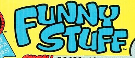
Gaspar Saladino continued to be a valued part of the DC freelance work force, lettering many stories (with an emphasis on war stories), many covers (something few other letterers for DC were asked to do) and some logos and house ads, but as the structure of the company changed around this time to include an art director and/or cover editor, house ads were more often done in-house, and logo designs were assigned more widely to a larger group of staffers and freelancers. In Ira Schnapp’s time, he had essentially functioned as an art director, setting the visual style for the company through his logos, house ads and cover lettering from the late 1940s through the mid 1960s. When Flash artist Carmine Infantino was appointed the art director around 1967, he began shifting that high-profile work to Gaspar Saladino, and from 1968 to 1978, Gaspar’s work set the style for the company. Now art directors and cover editors, beginning with Neal Pozner and continuing with Richard Bruning, Keith Wilson, and Curtis King, were hired to place THEIR stamp on the company’s visual style, and each did so. Many of Pozner’s designs were strictly type-based, and that was a growing trend at DC and other companies. Also, art directors who were trained outside comics, even if they were comics fans, knew more about type design than hand-made lettering, so that was part of the trend. All this resulted in less house ad and logo design work for Gaspar, though I feel he still had plenty to offer. The two logos above show the variety of styles and ideas he was capable of, with FUNNY STUFF embodying all the joy of cartoony comics and SUPERWOMAN representing superheroes in a modern way.
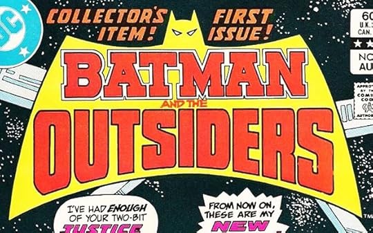 From BATMAN AND THE OUTSIDERS #1, Aug 1983
Here’s another fine example. Saladino has further modernized and streamlined the Batman shape to its essential and unmistakable elements, and using just a head outline and eye shapes is, if anything, more effective than the previous idea of having an entire Batman face included. Gaspar’s take on BATMAN using slab serifs is punchy and powerful, while OUTSIDERS is equally bold. The entire logo is a dominant element that commands attention and says, “New!”
 From THE BEST OF DC #42, Nov 1983
This simple feature logo for a DC digest comic has great Saladino touches, like the connection of the A to the outer shape, the angular S, and the loose THE for contrast. Unfortunately the digest size presented his work small, and it had less chance to be noticed.
 From POWER LORDS #1, Dec 1983
 As he had in the past, Gaspar created his own version of a logo provided by a toy company, using outlines that would work on a comic book cover. His top line matches the style well, too.
 From NEW TALENT SHOWCASE #1, Jan 1984
Here’s a fine combination of art director Neal Pozner’s cover design with an energetic Saladino logo. NEW TALENT is done in brush lettering style, while SHOWCASE looks back to the Art Deco roots of the company and the original SHOWCASE logo by Ira Schnapp, but handled in Saladino’s unique way. I love this logo.

The original logo from the DC files is much the same, but shows the left end of the S is unfinished, as if Gaspar thought it should run off the edge. It works fine either way.

In 1984, DC Comics awarded Kenner the rights to launch a line of action figure toys based on DC characters. The line was extensive, and in addition to DC superheroes, Kenner did figures for some of Jack Kirby’s Fourth World characters. Kenner and DC commissioned new logos for the ones that didn’t have any, and Gaspar did two. His logo for Darkseid’s henchman DeSaad is remarkably clever and original. I never would have thought of lining up the DeS like that, but it works well. One advantage of these Kenner logos was that they didn’t have to fit on a comic, just toy packaging.

Gaspar’s other entry was for KALIBAK, where he used rough block letters with telescoping to convey a character with energy. The shape of the K’s is again creative and unusual, giving a subtle “out of kilter” feel to the entire logo.
 From STAR TREK #1, Feb 1984
“Star Trek, the Motion Picture” came out in 1979, and featured a slick new logo design for the franchise. Marvel had the comic book license for the property from 1980-1982, and someone did a logo for them based on the movie logo. When DC gained the rights to produce Star Trek comics, Gaspar did his own version of the movie logo, which used thicker letters that would show up well against cover art. I think it’s the best take on this design.
 From DC COMICS PRESENTS #67, March 1984
Breaking from the usual Old English style for Santa Claus, this Saladino version has very curvy and organic letter shapes with mostly ball-end serifs, though the S begins with a more traditional serif. This suggests Gaspar was just winging it, and perhaps in a hurry, as if he came to the DC offices one day and DCCP editor Julius Schwartz said, “We need a Santa Claus logo right away!”
 From MANHUNTER #1, May 1974
This was a one-shot reprinting the fan-favorite backup series from DETECTIVE COMICS in 1974 written by Goodwin with art by Simonson. I thought Walt might have designed the logo since it matches his art so well, but he told me he didn’t, and wasn’t aware of who did. That led me to believe it’s by Gaspar, and while it’s not quite like anything else he did, there are many style points that Saladino did use in other places. The angled ends add interest and give it energy, as does the variation between thick and thin strokes.

Here’s the original logo from the DC files done on typical DC paper, which seems right for Gaspar. The joining of the first three letters is more obvious here.

In 1984, DC decided to launch a new title for this popular franchise in a new format they were using with higher quality paper and printing. Gaspar was commissioned to do this logo, which strikes me as too tall, even for such a long title, and the stencil style of LEGION makes it a bit hard to read. This logo was used only in a house ad, which I haven’t been able to track down in print. I don’t remember seeing it at the time, but so I’ve been told. Possibly it was never published. I was also commissioned to do a logo for the book:

I think the two requests I was given were to keep it compact vertically, and to use something more type-based than I was used to doing. DC and the art director were happy with it, and it lasted for some years. As I say, I don’t recall ever seeing Gaspar’s version, I may not have. This kind of typifies where DC was going with logos and design in general at the time.
 From DC COMICS PRESENTS #77, Jan 1985
This charming feature logo by Gaspar uses an organic, rough block letter style that no one else did as well. It makes me a bit sad, because I think Saladino himself was gradually becoming a forgotten DC hero. The editor of this book was Julius Schwartz, who had hired Gaspar as a letterer on his titles in 1949. They were getting older together, and Julie clearly appreciated what Saladino had to offer, perhaps more than some of the younger editors. Gaspar turned 58 in 1985, and perhaps was beginning to feel a bit like his predecessor Ira Schnapp, who had come to be seen as old-fashioned, but Gaspar’s talent meant he would continue to work for DC for many more years, just not in the same pivotal style-setting role he had enjoyed for a while.
 From THE IMMORTAL DOCTOR FATE #1, Jan 1985.
This Saladino logo uses some unusual letter shapes, particularly the T’s, which suggest scimitars to me. THE IMMORTAL is Gaspar’s rough lettering, even rougher than usual, adding some energy.
 From DC COMICS PRESENTS #78, Feb 1985
A matching logo for the opposite type of characters, only VILLAINS is new, and perhaps both were done at the same time, but I will call this a new logo anyway.
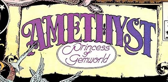 From AMETHYST #11, Nov 1985
Amethyst was a character and series that I designed a logo for in early 1983. This was her second series, and for issue #11, editor Karen Berger wanted a fairytale storybook approach, so she commissioned Gaspar to create this wonderful logo just for one issue. When I saw it, I thought it should have been used for the entire series.
 From THE OUTSIDERS #1, Nov 1985
BATMAN AND THE OUTSIDERS was successful enough for DC to launch this new title in their higher-quality paper and printing arena. Batman was not featured, so Gaspar created a new version of this Outsiders logo with deep telescoping. One advantage of this shorter title is it left more room for cover art.
To sum up, I found 17 Saladino logos for this period. One final article to come will cover his remaining comics logos, as far as I’ve identified them. Other articles in this series and more you might like are on the LOGO LINKS page of my blog.
The post GASPAR SALADINO’S COMICS LOGOS 1983-1985 appeared first on Todd's Blog.
September 19, 2021
Rereading: THE TRIUMPH OF TIME by James Blish
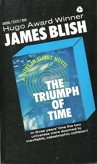
The fourth and final book of the “Cities in Flight” series by Blish is my least favorite, though some of its story elements are unusual. The flying city of New York and its Mayor Amalfi have settled permanently on a world in the Lesser Magellanic Cloud beyond the edges of our galaxy, their long lives now devoted to farming and settling. Amalfi is unhappy, he longs for the excitement of his former nomadic life, and a new discovery provides a reason to return to it. Scientist on his world and the traveling world of He have discovered a major cosmic event is close to happening, a collision between our own universe and another one made of anti-matter that will wipe out everything we know and restart it all again. Amalfi and his scientists discover that an empire called the Web of Hercules in our galaxy is planning to influence this rebirth for their own ends, and Amalfi’s scientists want to stop them and influence the rebirth themselves. Thus, a new interstellar battle is underway with New York once again in flight to the center of the Universe. The crew are all doomed to die with the rest of that universe, but some elements of their personalities and ideologies might be allowed to survive if their plan succeeds.
While the ideas in this one are interesting, the plot is not as engaging. There’s too much talk, and some hard to believe melodrama between the characters doesn’t help much. The ending is, indeed, cosmic, but inconclusive. Still, having read the previous three books, it was fun to revisit these characters and ideas one more time.
Mildly recommended.
The post Rereading: THE TRIUMPH OF TIME by James Blish appeared first on Todd's Blog.
September 16, 2021
GASPAR SALADINO’S COMICS LOGOS 1979-1982
 All images © DC Comics. From DC SPECIAL SERIES #18, Fall 1979.
As I outlined last time, the “DC Implosion” wreaked havoc on staff and freelancers alike as about 40% of the line was cancelled, and everyone was scrambling to keep at least some of their freelance income if they had any. I’ve just gone through all the DC covers from 1979 and I see only eight new cover logos. The one above, for a digest-size comic DC was trying out, has the sole new Saladino logo. Though the top line is quite similar to the new Sgt. Rock logo Gaspar designed for 1977, this is all new. The R shape in ROCK is different, for example. The other seven new cover logos (two for the Famous First Edition of Superman #1 for the front and back covers, World of Krypton, Red Tornado for DC Comics Presents, All-Out War, another digest: Jonah Hex and other Western Tales, and Time Warp) were designed by me. I have to admit that back then I didn’t notice I was getting work that had often been going to Gaspar, I was just happy for the assignments and thrilled to be doing them. Was this a cost-saving move by DC? It’s possible.
I have no idea what kind of pay rate Gaspar was getting for any of his work, but as a long-time freelancer since 1949, his rates were probably considerably higher than mine. When I started at DC in 1977, my page rate for lettering was $5, but my logo rate was $30. Not comparable to what a logo designer might get in the general publishing world, but it seemed like a lot to me, and six times my page rate was a great windfall, even considering the extra work involved in logos: preparing several concept sketches to show the editor, getting approval for one (or perhaps having to do more if they weren’t what was wanted), then developing the approved sketch in finished pencils and carefully and precisely inking it. All that took time. My rates were reviewed about once every year, and by late 1979 I was making a whopping $8 per page for story lettering. My logo rate remained at $30, so not as much of a windfall, but still worthwhile, and by then I had figured out more of what I was doing and what would appeal to the editors. My logo rate jumped to $50 in 1982, and then doubled to $100 in 1983 when DC hired a real art director, Neal Pozner, who demanded better rates for things like logos, and standardized those rates for everyone. So, it’s possible that DC shifted some of Gaspar’s higher-paid work to me as a cost savings. I’ll never know for sure. Gaspar was still getting lots of other lettering work from DC even in those difficult times, and well he should.
 From THE BRAVE AND THE BOLD #159, Feb 1980
While SHOWCASE had been cancelled, THE BRAVE AND THE BOLD continued as a Batman team-up book. Gaspar created this logo for one such team-up. The character has a middle-eastern background, but in some stories a Chinese heritage, so the style for the main logo is not far wrong. The top line is perhaps meant to suggest an Arabian style.
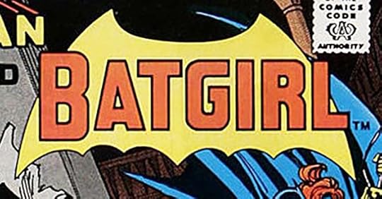 From DC COMICS PRESENTS #19, March 1980
There was an existing feature logo for Batgirl designed by John Workman, but perhaps the editor didn’t like it, so Saladino created this new one using block letters and a simplified bat shape. I actually like this better than the traditional bat shape with a character’s head in it. Surprisingly, Gaspar did not use his usual R, the indent on the right side is centered. He changed it up from time to time. The rest of the letter shapes look like his work to me.
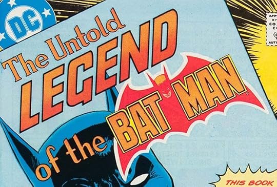

 From THE UNTOLD LEGEND OF THE BATMAN #1-3, July-Sept 1980
Here we have all the logos I can find by Gaspar for 1980. This book was edited by Paul Levitz and written by Len Wein, who if consulted, I’m sure would have wanted Gaspar to do the logos. The cover art is by José Luis García-López, who might have done a pencil layout for the computer logo in issue #2, but that’s a guess. Mostly, this looks to me like Gaspar all the way, and perhaps trying to impress with a different logo treatment on each issue.
 From ADVENTURE COMICS #479, March 1981
As we enter 1981, Saladino is once more getting regular logo work from DC, but not nearly as much as he did from 1968 to 1978. Other designers were also doing some, but Gaspar’s talent for logos had not diminished, and his contributions were still valued. I think he did this new version of ADVENTURE COMICS in script, it’s not as consistent and well-crafted as Ira Schnapp’s version, or even as good as Gaspar’s previous one for the Black Orchid issues, but it does the job. His DIAL “H” FOR HERO logo is a great improvement on the one that had appeared years earlier in HOUSE OF MYSTERY, having a graceful arch and strong outlines with telescoping on HERO. I count this as two logos for Saladino.
 From THE BRAVE AND THE BOLD #173, April 1981
The long-running overseers of the Green Lantern Corps received this fine Saladino logo on a Batman team-up in THE BRAVE AND THE BOLD. Gaspar is using a different style of R here that I like, and I also like the extensions on the G and V.
 From TALES OF THE GREEN LANTERN CORPS #1, May 1981
Saladino added to his existing Green Lantern logo for this mini-series. The result is an odd shape, but pleasingly symmetrical. The flames on each side going behind the trade dress might have been added by someone else. OF THE looks like type.
 From DC SPECIAL SERIES #26, Summer 1981
This logo appeared on a tabloid-size comic. AND HIS INCREDIBLE is headline type, but the rest is by Saladino. He has come up with a creative variation on the letter S, and I love the way OF fits into the space between the L and the I.
 From THE BEST OF DC #14, July 1981
DC had success with their digest-sized titles, most often used for reprints, and this one features a fine Saladino logo. His take on BATMAN is different and appealing, and VILLAINS is in a slightly more block version of his horror style with thick rough borders and inner texture. The deep telescoping gives it more of a superhero flavor.
 From MADAME XANADU #1, July 1981
This character first appeared in the horror anthology DOORWAY TO NIGHTMARE. When that was cancelled it left some stories unpublished, and they were put out in this one-shot with an unusual Saladino logo. Rather than going in a horror direction, this seems more heroic, as if in a nod to Marvel’s X-Men franchise. It does work perfectly with the cover art.
 From ALL-STAR SQUADRON #1, Sept 1981
My favorite Saladino logo from this period is this one, both a modern superhero logo and also a tribute to its origin, ALL-STAR COMICS, which Gaspar might have enjoyed reading when he was growing up. Notice the graceful curves of the big S and A in STAR, and ALL has bounce to attract attention. The star in the lower A is a nice touch, and the telescoping, gentle arch and backward slant all help make this a memorable logo.
 From ARAK, SON OF THUNDER #1, Sept 1981
As you can see, by the summer of 1981, DC was again doing well enough to try new things, like this series about pre-European America with a native-American hero. The short word ARAK was perfect for the epic move-title treatment with thick, rough outlines and inner textures, so big it runs off the cover at the top. The second line is great Saladino rough lettering, and the telescoping pulls it together.
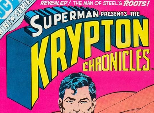 From KRYPTON CHRONICLES #1, Sept 1981
This mini-series also has a very large, epic logo emphasizing KRYPTON in a style somewhat like the Superman logo by Ira Schnapp above it, with CHRONICLES filling in the space below. It’s a long title and a very tall logo, but the cover artist Ross Andru and Dick Giordano, made room for it. Note that the R in KRYPTON does not quite follow the usual Saladino style of lowered notch on the right side, but the one in CHRONICLES does.

A photocopy of the original logo from the DC files is the same, and you can see some evidence of where the Superman logo was cut out of a photostat and pasted on, probably where Gaspar had indicated it should go.
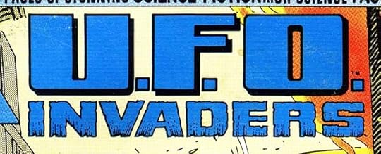 From DC SPECIAL BLUE RIBBON DIGEST #14, Oct 1981
Another DC digest-size comic features this Saladino logo using wide block letters with narrower horizontal shapes, which adds variety. INVADERS has a Gaspar scary style.

In the fall of 1981, DC was planning a new title combining the genres of funny animals and superheroes. This logo was commissioned from Gaspar, and I think it’s creative and clever, but apparently the creators or the editor didn’t like it. Having the character name made out of carrots is, perhaps, not the best idea. It makes it seem too organic and kind of scruffy. Gaspar’s logo was used on a house ad for the book that ran in February 1982 titles, the image above is the best one I can find of it. For the actual book, they had me design another logo, along more typical superhero lines:
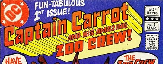 From CAPTAIN CARROT AND HIS AMAZING ZOO CREW #1, March 1982
The weird thing to me is that I have no memory of ever seeing Gaspar’s version, but the general layout of my logo is similar to his, so I must have. In retrospect, I should have dropped all the perspective lines, as I did with ZOO CREW, it looks cleaner and less complicated that way. Gaspar’s nearly unused version still counts.
 From THE BRAVE AND THE BOLD #185, April 1982
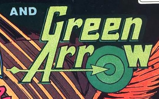
I really like this clever Saladino logo for Green Arrow, who had never had a good solo logo to this point despite being a regular character since 1941. The bullseye for the O and the arrow pointing to the center of it are, if you pardon the joke, right on target. The same logo was used for a Green Arrow mini-series the following year. One odd thing is that the W is not slanted like the rest.

A photocopy of the original logo from the DC files is the same, but you can see some details better like the very narrow open drop shadow and the rough edges of the target.
 From THE SAGA OF THE SWAMP THING #1, May 1982
Swamp Thing, especially the original run by writer Len Wein and artist Bernie Wrightson, had continued to be a fan favorite, and DC decided to launch a new series for him, this time with Wein as the editor. To avoid confusion, a cool new top line was added by Gaspar to his wonderful original series logo, though on the first issue, that’s somewhat different because the inner textures have been removed to show cover art. The textures were there on most issues. Only the top line is new, but it appeared on most issues until #30, so I’m counting it as a new logo.
 From DC COMICS PRESENTS #46, June 1982
This feature logo uses a globe as an appropriate background. The Saladino block letters are enhanced by several curly serifs to give it a unique look.
 From THE FURY OF FIRESTORM #1, June 1982
Firestorm had first appeared in a five-issue series in 1978 that was cut short by the “DC Implosion.” That series had a logo by John Workman. The character remained popular, and starred in this new series with a logo by Saladino that takes the idea of burning letters in a new direction. The angle of the bottom line gives it a three-dimensional feel, and the entire logo has a flag-wave shape that adds interest and energy, as do the flames around it.
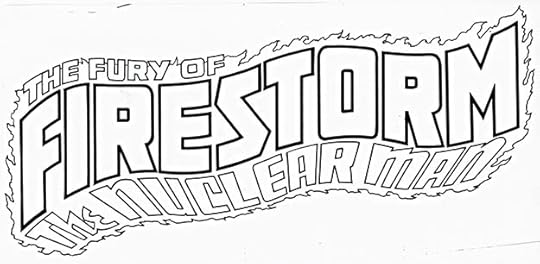
This photocopy of the original logo from the DC files suggests it was intended to be used at this angle, with the FIRESTORM letters aligned vertically. I think it works fine either way.
 From THE BEST OF DC #27, Aug 1982
It’s odd that few DC villains had received logos over the years, so for this title, Saladino had to design one. LUTHOR uses block letters with small serifs and raised bevels. There’s nothing tied to the character, but it works fine.
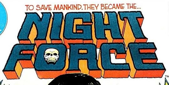 From NIGHT FORCE #1, Aug 1982
I remember how delighted editor and writer Marv Wolfman was with this Saladino logo for his new horror series, and who better to design it? Most DC horror titles had been anthologies, this one featured a group of regular characters and a continuing storyline. Gaspar has combined his horror style with some super-heroic elements like backward-leaning letters and telescoping. The skull in the O, probably by artists Gene Colan and Dick Giordano, adds the perfect spooky element.
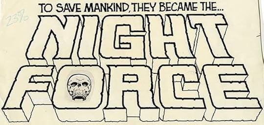
The original logo from the DC files shows that the top line was part of the logo, and you can see that the skull was done separately and pasted in place. The Saladino R shape is present.

Finally, we have this logo by Gaspar using his superhero style block letters and wonky wide-screen perspective. I don’t know when it was done, but this use in a comics ad is dated 1979, so I’ll put it here. DC and Marvel teamed up to jointly trademark the words (and logo) SUPER HEROES in order to keep other companies from using it. I don’t know how successful this was, but I remember seeing this logo on all kinds of merchandise in the 1980s.
to sum up, I found 25 logos by Gaspar for these years. His logo work had been much reduced, but the quality of it was as fine as ever. Other articles in this series and more you might enjoy are on the LOGO LINKS page of my blog.
The post GASPAR SALADINO’S COMICS LOGOS 1979-1982 appeared first on Todd's Blog.
September 15, 2021
Incoming: BATWOMAN OMNIBUS
 Image © DC Comics
Just arrived, a massive hardcover collecting the Batwoman stories from DETECTIVE COMICS #854-863 and BATWOMAN #0-24 as well as BATWOMAN ANNUAL #1 with wonderful art by J.H. Williams III and scripts by Greg Rucka, Williams III and W. Haden Blackman as well as art by Trevor McCarthy and Amy Reeder. It was a privilege to letter most of this. There are 888 pages, and the retail price is $99.99. It should be available now from comics retailers, and there’s also a link below.
The post Incoming: BATWOMAN OMNIBUS appeared first on Todd's Blog.
Todd Klein's Blog

- Todd Klein's profile
- 28 followers

