
Todd Klein's Blog, page 81
December 5, 2021
And Then I Read: ERIC by Terry Pratchett
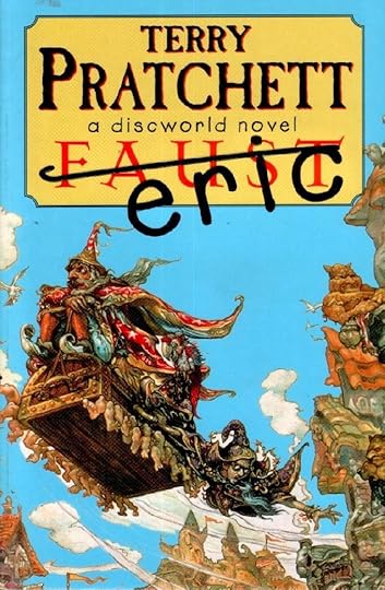
This entry in the long-running Discworld series by Pratchett is a farcical parody of the Faust story with a young demonologist, Eric Thursley, trying to summon a demon from Hell to grant his wishes. He ends up instead with Rincewind, an ineffective wizard, protagonist of several previous Pratchett books, who had been stuck in Hell in an early story. Rincewind tries to explain to Eric that he can’t grant the impetuous boy wishes by simply snapping his fingers, but when he does that, they both realize that somehow he can. Eric’s wishes take them to an Aztec-like empire where Eric is made the ruler…briefly, a besieged city similar to Troy, where Eric is able to meet the most beautiful woman in the world, but is soon caught up in the fighting, and to Hell itself, where Eric and Rincewind manage to barely outwit the current management. Rincewind’s protector and companion, the magical and indestructible Luggage, struggles to keep up with his master, and ends up saving the day when he does.
Rincewind is my least favorite of the Pratchett protagonists I’ve encountered so far, I find his cowardice and bungling tiresome, but he does pretty well in this book, and I enjoyed reading it. The comedy is broad and pervasive, but pretty entertaining. Recommended.
The post And Then I Read: ERIC by Terry Pratchett appeared first on Todd's Blog.


December 3, 2021
GASPAR SALADINO in ALL-AMERICAN MEN OF WAR
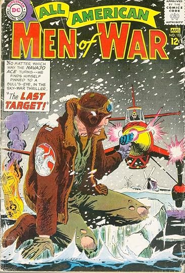 All images © DC Comics. From ALL-AMERICAN MEN OF WAR #104, July 1964
When National (DC) Comics merged with its sister company All-American Comics in the mid 1940s, All-American’s titles continued as before, but as interest in superheroes waned after World War Two, some titles changed genre. ALL-AMERICAN COMICS became ALL-AMERICAN WESTERN, and when that genre did not perform as well as hoped for the company, it changed again to ALL-AMERICAN MEN OF WAR, joining a throng of newly popular war comics that were selling well for all companies. The war itself had faded just enough to make soldiers, sailors and airmen fighting in it role models for young male readers, and editor/writer Robert Kanigher at DC proved to be a master at editing and writing stories that appealed to them.
Gaspar Saladino had been hired by DC editor Julius Schwartz in the fall of 1949 to letter his stories. At first, Gaspar told me, he sat in the production room between veteran letterer Ira Schnapp and production artist Mort Drucker, but soon he was given a drawing board right in the office Schwartz shared with editor Kanigher, where he was always handy to letter stories for either. Gaspar seemed to have a liking for Kanigher’s new war books, and he lettered most of the stories in them. His angular style and large titles and sound effects worked well with the art and stories. Ira Schnapp lettered nearly all the DC covers in these years, and I’ve written about his lettering on this title HERE. Ira lettered only a few stories, though, and a few were lettered by others, especially in the last year, but most are by Saladino. This was the kind of steady work that allowed Gaspar to marry his wife Celeste in 1957, buy a house on Long Island in 1959, and raise a family. He and Kanigher made a good team, and they were joined by some fine artists including Joe Kubert, Russ Heath, Irv Novick, Jerry Grandenetti, Ross Andru and many more. While superhero fans might not have paid much attention, a great deal of fine work appeared for years in this and other DC war titles.
The cover above is the only one lettered by Gaspar, filling in for regular cover letterer Ira Schnapp. While I like Ira’s cover lettering, I think it’s kind of a shame that Gaspar wasn’t given more of it for the war titles, as his style suits the art so well.
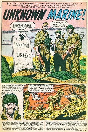 From ALL-AMERICAN MEN OF WAR #127, Aug 1952
The numbering on this series began oddly. The first two issues continued the numbering from ALL-AMERICAN WESTERN, so issue #127 is the first, and #128 is the second. Then the company began again, but with issue #2 instead of #1. At the time, first issues were not yet sought out and valued by collectors, and they were often put aside by retailers who already had racks full of existing titles, and that might have been the reason. By early 1952, when he was probably working on this story, Gaspar had more than a year of lettering experience under his belt, and his work is already top notch on this first page of the first story. His story titles and sound effects would get larger with time, but this is already fine.
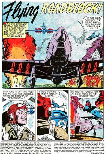 From ALL-AMERICAN MEN OF WAR #15, Nov 1954
For many years this was an anthology title with no recurring characters. Gradually, over time, some did emerge, including Gunner and Sarge, and pilot Johnny Cloud, Navajo Ace, but generally the heroes of each story were regular enlisted men in many roles and theaters of war, mostly World War Two, but other wars as well. The word FLYING in Gaspar’s story title here is particularly well done in brush style.
 From ALL-AMERICAN MEN OF WAR #30, Feb 1956
Gaspar’s lettering was always creative and full of variety. The title of this story is quite different from the previous ones, large open letters with heavy rough outlines. I also like the sound effects in the water adding to the drama.
 From ALL-AMERICAN MEN OF WAR #47, July 1957
A random story page with lots of sound effects shows Gaspar handling everything well, enhancing the storytelling. Note the emotion added to the balloon at lower left by the wavy outline and last line of letters.
[image error]From ALL-AMERICAN MEN OF WAR #60, Aug 1958Perhaps the most dramatic sound effects were in the air fighter stories, where open skies gave Saladino plenty of room, as on the lower left panel here. Gaspar’s gradually increasing emphasis in the first three balloons on the top row of panels adds to the tension.
[image error]From ALL-AMERICAN MEN OF WAR #74, Oct 1959This page begins with a symbolic calendar page, and more work for Saladino, which he handles well. Around this time, Gaspar began doing all the lettering in italic, I’m not sure why, but perhaps it was an editorial choice, or possibly it was faster.
 From ALL-AMERICAN MEN OF WAR #96, March-April 1963
As DC entered the 1960s, Gaspar was busier than ever lettering editor Julie Schwartz’s new superhero titles like THE FLASH, GREEN LANTERN, THE ATOM and JUSTICE LEAGUE OF AMERICA. Other letterers were sometimes needed to do stories on the war titles, but Gaspar usually still did the first and longest story, like this one featuring Lt. Cloud.
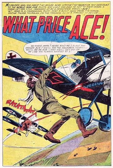 From ALL-AMERICAN MEN OF WAR #113, Jan-Feb 1966
Gaspar’s final story lettering for this title was on the second story in issue #113 featuring a World War One pilot. As always, the story title and sound effect add to the drama. The last few issues were lettered by others, or used reprints lettered previously by Saladino. I’m not sure why this title ended when it did, other DC war books continued for some years, but perhaps their feature characters were more appealing to readers, and they sold better. Certainly Sgt. Rock had taken the top spot, and he was not in this book.
As above, the only cover lettered by Saladino was for issue #104. Below are all the stories he lettered, but to save having to type all the story titles, I’m listing each story as a number, usually 1 to 4 or 1 to 3 in each issue. This doesn’t count the one-page fillers, either humorous ones by Irwin Hasen and Henry Boltinoff, or informational ones by Morris Waldinger for instance. Saladino might have lettered a few early examples of those, but I’m not sure, so I’m not counting any of them. Almost all were lettered by the artists. As far as I can tell, none of these lettering credits are listed yet on the Grand Comics Database.
#127 Aug-Sept 1952: 1) 8pp, 2) 6pp, 3) 6pp, 4) 6pp 26pp total
#128 Oct-Nov 1952: 1) 6pp, 2) 6pp, 3) 6pp, 4) 8pp 26pp total
#2 Dec 1952-Jan 1953: 1) 6pp, 2) 6pp, 4) 6pp 18pp total
#3 Feb-March 1953: 2) 6pp, 4) 6pp 12pp total
#4 April-May 1953: 1) 8pp, 2) 6pp, 3) 4pp, 4) 6pp 24pp total
#5 June-July 1953: 1) 6pp, 2) 6pp, 3) 6pp, 4) 6pp 24pp total
#6 Aug-Sept 1953: 1) 8pp, 2) 6pp, 3) 4pp, 4) 6pp 24pp total
#7 Oct-Nov 1953: 1) 8pp, 2) 6pp, 3) 4pp, 4) 6pp 24pp total
#8 Dec 1953-Jan 1954: 1) 6pp, 2) 6pp, 3) 6pp, 4) 6pp 24pp total
#9 Feb-March 1954: 1) 6pp, 2) 6pp, 3) 6pp, 4) 6pp 24pp total
#10 April-May 1954: 1) 6pp, 2) 6pp, 3) 6pp, 4) 6pp 24pp total
#11 June-July 1954: 1) 6pp, 2) 6pp, 3) 6pp, 4) 6pp 24pp total
#12 Aug 1954: 1) 6pp, 2) 6pp, 3) 6pp, 4) 6pp 24pp total
#13 Sept 1954: 1) 6pp, 2) 6pp, 3) 6pp, 4) 6pp 24pp total
#14 Oct 1954: 1) 6pp, 2) 6pp, 3) 6pp 18pp total
#15 Nov 1954: 1) 6pp, 2) 6pp, 3) 6pp, 4) 6pp 24pp total
#16 Dec 1954: 1) 6pp, 2) 6pp, 3) 6pp, 4) 6pp 24pp total
#17 Jan 1955: 1) 6pp, 2) 6pp, 3) 6pp, 4) 6pp 24pp total
#18 Feb 1955: 1) 8pp, 2) 6pp, 3) 6pp, 4) 6pp 26pp total
#19 March 1955: 1) 8pp, 2) 6pp, 3) 6pp, 4) 6pp 26pp total
#20 April 1955: 1) 8pp, 2) 6pp, 3) 6pp, 4) 6pp 26pp total
#21 May 1955: 1) 8pp, 2) 6pp, 3) 6pp, 4) 6pp 26pp total
#22 June 1955: 1) 8pp, 2) 6pp, 3) 6pp, 4) 6pp 26pp total
#23 July 1955: 1) 8pp, 3) 6pp, 4) 6pp 20pp total
#24 Aug 1955: 1) 8pp, 2) 6pp, 3) 6pp, 4) 6pp 26pp total
#25 Sept 1955: 1) 8pp, 2) 6pp, 3) 6pp, 4) 6pp 26pp total
#26 Oct 1955: 1) 6pp, 2) 6pp, 3) 6pp, 4) 6pp 24pp total
#27 Nov 1955: 1) 8pp, 3) 6pp, 4) 6pp 20pp total
#28 Dec 1955: 1) 8pp, 2) 6pp, 3) 4pp, 4) 6pp 24pp total
#29 Jan 1956: 1) 8pp, 2) 6pp, 3) 6pp, 4) 6pp 26pp total
#30 Feb 1956: 1) 8pp, 2) 6pp, 3) 6pp, 4) 6pp 26pp total
#31 March 1956: 1) 8pp, 2) 6pp, 3) 6pp, 4) 6pp 26pp total
#32 April 1956: 1) 8pp, 2) 6pp, 3) 6pp, 4) 6pp 26pp total
#33 May 1956: 1) 8pp, 2) 6pp, 3) 6pp, 4) 6pp 26pp total
#34 June 1956: 1) 8pp, 2) 6pp, 3) 6pp, 4) 6pp 26pp total
#35 July 1956: 1) 8pp, 2) 6pp, 3) 6pp, 4) 6pp 26pp total
#36 Aug 1956: 1) 8pp, 2) 6pp, 3) 6pp, 4) 6pp 26pp total
#37 Sept 1956: 1) 6pp, 2) 6pp, 3) 4pp, 4) 6pp 22pp total
#38 Oct 1956: 1) 6pp, 2) 6pp, 3) 4pp, 4) 6pp 22pp total
#39 Nov 1956: 1) 6pp, 2) 6pp, 3) 4pp, 4) 6pp 22pp total
#40 Dec 1956: 1) 6pp, 2) 6pp, 3) 6pp, 4) 6pp 24pp total
#41 Jan 1957: 1) 6pp, 2) 6pp, 3) 6pp, 4) 6pp 24pp total
#42 Feb 1957: 1) 8pp, 2) 6pp, 3) 4pp, 4) 6pp 24pp total
#43 March 1957: 1) 8pp, 2) 4pp, 3) 6pp, 4) 6pp 24pp total
#44 April 1957: 1) 6pp, 2) 6pp, 3) 6pp, 4) 6pp 24pp total
#45 May 1957: 1) 8pp, 2) 6pp, 3) 6pp, 4) 6pp 26pp total
#46 June 1957: 1) 8pp, 2) 6pp, 3) 6pp, 4) 6pp 26pp total
#47 July 1957: 1) 8pp, 2) 6pp, 3) 6pp, 4) 6pp 26pp total
#48 Aug 1957: 1) 6pp, 2) 6pp, 3) 6pp, 4) 6pp 24pp total
#49 Sept 1957: 1) 6pp, 2) 6pp, 3) 6pp, 4) 6pp 24pp total
#50 Oct 1957: 1) 6pp, 3) 6pp, 4) 6pp 18pp total
#51 Nov 1957: 1) 6pp, 4) 6pp 12pp total
#52 Dec 1957: 1) 6pp, 2) 6pp, 3) 6pp, 4) 8pp 26pp total
#53 Jan 1958: 1) 9pp, 2) 4pp, 3) 6pp, 4) 6pp 25pp total
#54 Feb 1958: 1) 7pp, 2) 6pp, 3) 6pp, 4) 6pp 25pp total
#55 March 1958: 3) 6pp
#56 April 1958: 1) 6pp, 2) 6pp, 3) 6pp, 4) 1-4 only 22pp total
#57 May 1958: 1) 8pp, 2) 6pp, 3) 6pp, 4) 6pp 26pp total
#58 June 1958: 1) 8pp, 2) 6pp, 3) 6pp, 4) 6pp 26pp total
#59 July 1958: 1) 13pp, 2) 6pp, 3) 6pp 25pp total
#60 Aug 1958: 1) 13pp, 2) 6pp, 3) 6pp 25pp total
#61 Sept 1958: 1) 12pp, 2) 4pp, 3) 8pp 24pp total
#62 Oct 1958: 1) 13pp, 2) 6pp, 3) 6pp 25pp total
#63 Nov 1958: 1) 6pp, 2) 6pp, 3) 13pp 25pp total
#64 Dec 1958: 1) 13pp, 2) 6pp 19pp total
#65 Jan 1959: 1) 13pp, 3) 6pp 19pp total
#66 Feb 1959: 1) 13pp, 2) 6pp, 3) 6pp 25pp total
#67 March 1959: 1) 6pp, 2) 6pp, 3) 13pp 25pp total
#68 April 1959: 1) 13pp, 2) 6pp, 3) 6pp 25pp total
#69 May 1959: 1) 13pp, 2) 6pp, 3) 6pp 25pp total
#70 June 1959: 1) 13pp, 2) 6pp, 3) 6pp 25pp total
#71 July 1959: 1) 13pp, 2) 6pp, 3) 6pp 25pp total
#72 Aug 1959: 1) 12pp, 2) 6pp, 3) 6pp 24pp total
#73 Sept 1959: 1) 13pp, 2) 6pp, 3) 6pp 25pp total
#74 Oct 1959: 1) 13pp, 2) 6pp, 3) 6pp 25pp total
#75 Nov 1959: 1) 13pp, 2) 6pp, 3) 6pp 25pp total
#76 Dec 1959: 1) 13pp, 2) 6pp, 3) 6pp 25pp total
#77 Jan-Feb 1960: 1) 13pp, 2) 6pp, 3) 6pp 25pp total
#78 March-April 1960: 1) 13pp, 2) 4pp, 3) 8pp 25pp total
#79 May-June 1960: 1) 13pp, 2) 6pp, 3) 6pp 25pp total
#80 July-Aug 1960: 1) 12pp, 2) 6pp, 3) 8pp 26pp total
#81 Sept 1960: 1) 18pp, 2) 6pp 24pp total
#82 Oct-Nov 1960: 1) 17pp, 2) 8pp 25pp total
#83 Jan-Feb 1961: 1) 13pp, 2) 6pp, 3) 6pp 25pp total
#84 March-April 1961: 1) 13pp, 2) 6pp, 3) 6pp 25pp total
#85 May-June 1961: 1) 13pp, 2) 6pp, 3) 6pp 25pp total
#86 July-Aug 1961: 1) 13pp, 2) 6pp, 3) 6pp 25pp total
#87 Sept-Oct 1961: 1) 13pp, 2) 6pp, 3) 6pp 25pp total
#88 Nov-Dec 1961: 1) 13pp, 2) 6pp, 3) 6pp 25pp total
#89 Jan-Feb 1962: 1) 6pp, 2) 13pp, 3) 6pp 25pp total
#90 March-April 1962: 1) 13pp, 2) 6pp, 3) 6pp 25pp total
#91 May-June 1962: 1) 6pp, 2) 13pp, 3) 6pp 25pp total
#92 July-Aug 1962: 1) 13pp, 2) 6pp 19pp total
#93 Sept-Oct 1962: 1) 13pp, 2) 6pp, 3) 6pp 25pp total
#94 Nov-Dec 1962: 1) 15pp, 2) 10pp
#95 Jan-Feb 1963: 1) 13pp, 2) 6pp 19pp total
#96 March-April 1963: 1) 13pp 3) 6pp 19pp total
#97 May-June 1963: 1) 15pp, 2) 10pp 25pp total
#98 July-Aug 1963: 1) 15pp
#99 Sept-Oct 1963: 1) 15pp
#100 Nov-Dec 1963: 1) 15pp, 2) 10pp 25pp total
#101 Jan-Feb 1964: 1) 15pp, 2) 10pp 25pp total
#102 March-April 1964: 1) 25pp
#103 May-June 1964: 1) 15pp, 2) 10pp 25pp total
#106 Nov-Dec 1964: 1) 15pp
#107 Jan-Feb 1965: 1) 24pp
#108 March-April 1965: 1) 25pp
#109 May-June 1965: 1) 16pp, 2) 9pp 25pp total
#110 July-Aug 1965: 1) 15pp, 2) 10pp 25pp total
#111 Sept-Oct 1965: 1) pages 1-4 only
#112 Nov-Dec 1965: 1) 15pp
#113 Jan-Feb 1966: 2) 9pp
That’s a whopping total of 2,588 pages on this series lettered by Gaspar, not counting that one cover. As we’ll see, there were other books he was doing at the time with just as much work, he was a busy man.
Other articles in this series are on the COMICS CREATION page of my blog with more you might enjoy.
The post GASPAR SALADINO in ALL-AMERICAN MEN OF WAR appeared first on Todd's Blog.
December 1, 2021
GASPAR SALADINO in ADVENTURE COMICS
 All images © DC Comics. From ADVENTURE COMICS #255, Dec 1958
As I looked through all the issues of this title that might have cover or story lettering by Gaspar Saladino, I was heartened to see that the Grand Comics Database has a much more complete listing of his credits for this title than they did for ACTION COMICS, the first one I indexed. I decided to go ahead and index this title anyway, for completeness, in my new ongoing series of cover and story lettering work by my favorite letterer. The main cover letterer for DC from the late 1940s to about 1967 was Ira Schnapp, but when he wasn’t available others were assigned the work, and above is the first one by Saladino. Compare it to any contemporary Schnapp cover and you’ll see that the style is quite different, with wider and more angular balloon lettering, thinner balloon and caption borders, and a different approach to open lettering. Cover lettering was generally done on separate art paper after the cover art was finished, and then photostatted to the desired size and pasted in place by someone in the DC production department. Here it looks like Gaspar made the tops of his balloons flat to fit under the logo, but the slight tilt to that logo made it unclear where it would fall, so some of the balloons look a bit squashed. Other letterers in this position tried to copy Ira Schnapp’s style as closely as they could, but Gaspar stuck to his own distinctive style, which I think makes the work better.
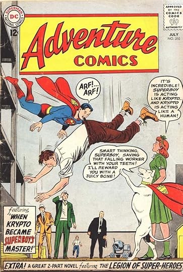 From ADVENTURE COMICS #310, July 1963
As is my usual practice, I’m looking at Gaspar’s cover work first, then his story lettering. In this fill-in cover by him, there’s too much lettering and a very silly concept, both typical of editor Mort Weisinger on all the Superman-related titles he edited in the 1960s. Saladino does the best he can to fit things in and make the text interesting.
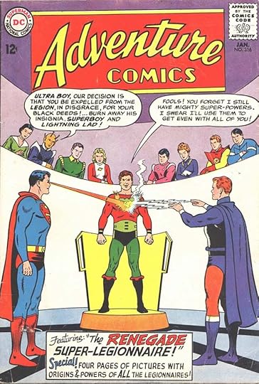 From ADVENTURE COMICS #316, Jan 1964
Another fill-in cover lettering job from Gaspar, and I think this one shows him getting a little more comfortable with the kind of display lettering needed in the caption, though the line spacing is still not the best, with too much blank space in the center. The balloons are again wide and squashed to fit under the logo, but in this case the left one was run over it.
 From ADVENTURE COMICS #352, Jan 1967
Another fill-in job with a more confident approach to the display lettering in the balloon that I think works well. Gaspar was about to be tapped by Carmine Infantino to essentially replace Ira Schnapp as the main cover letterer for DC, and his talent for it is clear here.
 From ADVENTURE COMICS #364, Jan 1968
This issue marks Gaspar’s debut as the new style-setter for DC, now tasked with giving the company’s design presence a more exciting and modern look. He still had to deal with the silly ideas of Mort Weisinger on this title, though, but he does his best with the caption, and at least there is some action.
 From ADVENTURE COMICS #377, Feb 1969
A year later, the balloons on this cover show Gaspar feeling freer to be creative with distinctive shapes, and the lettering itself is appealing and beautifully done, as is the caption in deep perspective.
 From ADVENTURE COMICS #390, March 1970
ADVENTURE went through many format and feature changes in its long history, this cover shows the switch to Supergirl as the lead feature around this time with a reprint issue of her stories. Saladino’s Supergirl logo was done just for this cover, and the rest of his lettering is appealing. This is the kind of cover Ira Schnapp was good at, but Gaspar shows he could make it his own with unique caption borders and a beautiful banner, not to mention the fine display lettering.
 From ADVENTURE COMICS #403, March 1971
Perhaps the most popular feature in this title was the Legion of Super-Heroes, and here Gaspar goes all-out with another one-use logo and lots of fine display lettering for them.
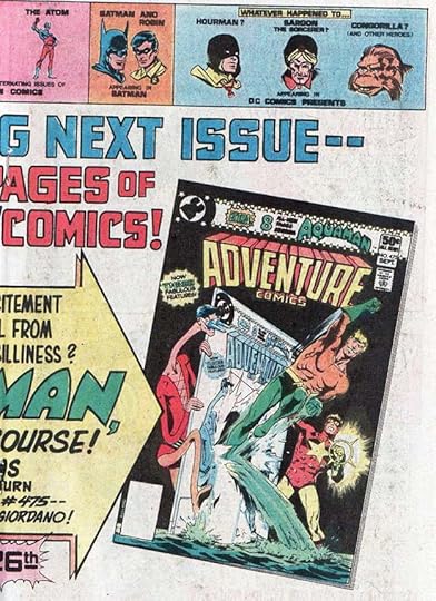
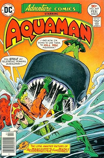 From ADVENTURE COMICS #449, Jan 1977
By 1977, the title starred Aquaman, with other features as backups. Gaspar’s caption here is the best part of the cover’s trade dress and lettering.
 From ADVENTURE COMICS #472, June 1980
A later era split the book evenly between these two features, and the cover too, which made for some unusual cover designs and challenging cover lettering tasks for Saladino.
 From ADVENTURE COMICS #503, Sept 1983
The final issue in this run of ADVENTURE was after a change to digest format, mostly reprints at a smaller page size. Gaspar’s lettering touts the finality, but in fact the title was brought back for another short run from 2009 to 2011.
 From ADVENTURE COMICS #185, Feb 1953
As with ACTION COMICS, Gaspar was never a regular letterer for ADVENTURE, but he did letter a few stories in the 1950s, this being the first. While his balloon lettering is instantly recognizable to me, his story titles were not yet very good, something that would gradually improve with time.
 From ADVENTURE COMICS #195, Dec 1953
Again on this Superboy story, the title is not as good as ones he would be doing a few years later, though it’s certainly readable and similar to ones being done by other letterers at the time.
 From ADVENTURE COMICS #366, March 1968
Letterers were considered more interchangeable in the past, and when one could not finish a story, another would take it on. That happened with this Legion of Super-Heroes story. The first and sixth pages were the only ones completed by the first letterer, credited as Morris Waldinger by the Grand Comics Database, and the rest were lettered by Saladino. His first balloon on this page has some fine display lettering.
 From ADVENTURE COMICS #368, May 1968
Something else was going on in this story, Gaspar lettered just the first page, the rest is credited to Charlotte Jetter. The same thing happened in the following issue. It suggests the editor didn’t like what Charlotte was doing with titles, and had Gaspar do these first pages to improve the overall impression on readers. This is interesting because Saladino was hired by Marvel Comics to do just that on many of their stories a few years later, but this is the first instance of it at DC that I’ve come across.
 From ADVENTURE COMICS #376, Jan 1969
Gaspar lettered the whole Legion story in this issue. It’s interesting to see that DC was occasionally allowing credits for writer and artist at this time, but they were years away from doing that regularly, as Marvel Comics did starting in the early 1960s (and occasionally earlier), and colorists and letterers had to wait even longer for printed credit.
 From ADVENTURE COMICS #459, Sept-Oct 1978
I couldn’t resist showing this unlikely combination of Saladino lettering next to (and outshining) my own early efforts. This issue was the first of the Dollar Comics issues, 68 pages with no ads. I designed this inside front cover and lettered the large caption. Gaspar did the FEATURING banner on the right, which is far more interesting. On later issues, that was set in type.
 From ADVENTURE COMICS #459, Sept-Oct 1978
Gaspar also lettered the lead Flash story in the issue. Look how far his story title work as come from the previous ones above! Also note that he often credited himself simply with his first name. That was probably because his name was so long, but also I think acknowledged his confidence in the work.
 From ADVENTURE COMICS #467, Jan 1980
After the Dollar Comics run, ADVENTURE became a smaller anthology with two features. Saladino did his only regular monthly work on the title lettering this feature for eleven of its twelve episodes. As a reader, I loved his work here, and found it the suited the art and writing perfectly.
To sum up, here are the ADVENTURE COMICS covers with Saladino lettering:
255, 310, 316, 352, 364, 367-410, 412-415, 417-421, 423-424, 426, 431, 442-443, 445, 449-453, 457, 462, 464-465, 467-473, 476-477, 479-490, 491-503
That’s 107 covers in all. And for the digest issues, he was lettering both the front and back covers, though I will count them as one each.
Here’s a list of his story lettering on ADVENTURE:
#185 Feb 1953 Green Arrow 8pp
#195 Dec 1953 Superboy 12pp, Johnny Quick 6pp
#196 Jan 1954 Johnny Quick 6pp
#366 March 1968 Legion of Super-Heroes pages 2-5, 7-24, 22pp
#368 May 1968 Legion of Super-Heroes page 1 only
#369 June 1968 Legion of Super-Heroes page 1 only
#376 Jan 1969 Legion of Super-Heroes 24pp
#396 Aug 1970 Supergirl pages 2-13, 12pp (first story)
#459 Sept 1978 Inside Front Cover (partial), The Flash 12pp
#468 Feb 1980 Starman 8pp
#469 March 1980 Starman 9pp
#470 April 1980 Starman 9pp
#471 May 1980 Starman 8pp
#472 June 1980 Starman 9pp
#473 July 1980 Starman 8pp
#474 Aug 1980 Starman 9pp
#475 Sept 1980 Starman 8pp
#477 Nov 1980 Starman 8pp
#478 Dec 1980 Starman 8pp
Thats a total of 188 pages on this series, not much for Gaspar, but he was very busy elsewhere.
More articles in this series and others you might enjoy are on the COMICS CREATION page of my blog.
The post GASPAR SALADINO in ADVENTURE COMICS appeared first on Todd's Blog.
November 29, 2021
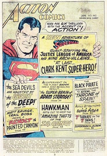
GASPAR SALADINO in ACTION COMICS
 All images © DC Comics. From ACTION COMICS #308, Jan 1964
After writing a series of blog articles about the logos and another about the house ads of my favorite letterer, Gaspar Saladino, I thought I had written enough about his unknown work, since many of the covers and stories he lettered were already credited in the Grand Comics Database, the best source for creator credits in comics. And, nearly all the stories lettered by Saladino from mid-1977 on were credited on the title pages, so that meant much more of his work was already known to readers who were paying attention than was the case with his predecessor, Ira Schnapp, who received only two printed story credits in his long career. That’s what I thought, but as a test, I decided to do a list of Gaspar’s work in this seminal and important DC Comics title to see what was actually in the GCD. I was dismayed to find that few of his covers were credited (at least the ones I spot-checked), and of course none of the stories he lettered before 1977 were either. Superman stories were never a regular assignment for Saladino, so there weren’t a lot, but I still wanted to get his credits reported so that eventually they can be added to the GCD. Over time I plan to work on indexes of Gaspar’s lettering work in all DC titles. I’ll discuss covers first, then stories in each of these articles.
Above is the first ACTION cover lettered by Saladino at a time when Ira Schnapp was doing almost all of them, but occasionally he was not available, and Gaspar was assigned the work. By comparing this cover lettering to others of the period, you can see that the balloon letters are wider and more angular than Schnapp’s, and his title and display lettering, as in the bottom banner, is also more angular. The outline around the word SUPERMAN is thinner than what Schnapp usually did, as are the balloon borders. Gaspar had been lettering stories for DC since late 1949, and he had plenty of experience doing balloons and story titles. He was a talented letterer whose work stands above many others, but it did take him a while to get comfortable with high-profile assignments like covers. I think this one is quite good.
 From ACTION COMICS #345, Jan 1967
Gaspar’s second appearance as cover letterer on this title came a few years later, and I think is less successful than the first one. The layout of the large caption box seems awkward, with white areas and uneven line spacing, and the balloon layouts and borders are also tentative and not as good as they could be. Saladino was still learning how to do this, and perhaps rushed here.
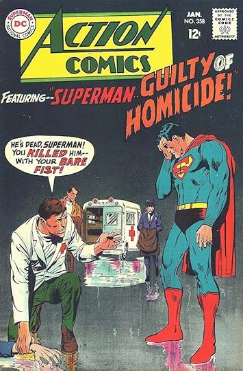 From ACTION COMICS #358, Jan 1968
By the fall of 1967, when this cover was lettered, Gaspar had been given the job of revitalizing DC’s style and design look by former freelance artist, now Editorial Director Carmine Infantino, who felt that Ira Schnapp’s work was old-fashioned and that the company needed a design face-lift. Gaspar rose to the challenge, and here you can see him approaching cover lettering with more confidence and style. His ragged letters on HOMICIDE add energy, and even the balloon lettering is more varied and emphatic than what Ira had usually been doing. The Neal Adams cover art doesn’t hurt!
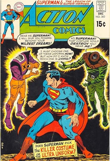 From ACTION COMICS #383, Dec 1969
By 1969, Schnapp had left DC and Gaspar was lettering nearly all the covers. This one again shows a more confident approach, with well-designed balloons and caption that fill the available spaces without seeming cramped. Unlike story lettering, cover lettering was done separately from the art, usually on thinner art paper. In most cases it was resized by making photostats and cut out, positioned, and pasted on the art by someone in the DC production department, so those decisions were not in Gaspar’s hands, though he would have indicated where things should go if there was any question.
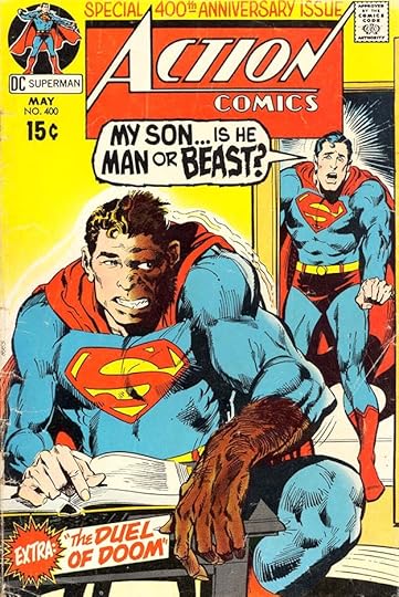 From ACTION COMICS #400, May 1971
By 1971, Gaspar’s energy and creativity were frequently on display on DC covers, and this is a good example. Everything about the lettering here adds interest to the art and the subject.
 From ACTION COMICS #427, Sept 1973
Gaspar’s balloon borders on covers have been getting thicker, which not only helps them read well but makes cutting and pasting them easier. The burst does a nice job of drawing attention without covering the figure.
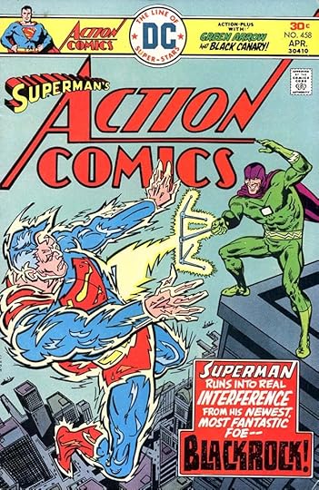 From ACTION COMICS #458, April 1976
By 1976, the overall cover design and trade dress at DC was kind of a mess, but Saladino’s caption for this cover is excellent, particularly the treatment of BLACKROCK with tucked letters and texture.
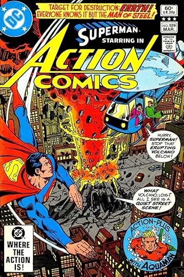 From ACTION COMICS #529, March 1982
The trade dress and DC bullet symbol are much improved by 1982, and Saladino’s cover lettering works well to enhance the action and excitement of the art and situation. The round inset for backup feature Aquaman works well too, I think.
[image error]From ACTION COMICS WEEKLY #608, July 1988For a while in the late 1980s, ACTION became a longer weekly anthology, and Gaspar continued to contribute some fine cover lettering, though type was being used more often.
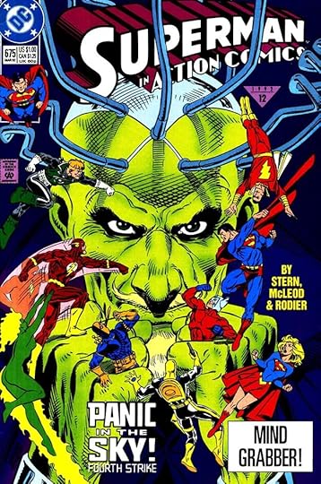 From ACTION COMICS #675, March 1992
In the early 1990s, the regular story letterer for ACTION was Bill Oakley, and I believe he also did much of the cover lettering that didn’t use type. This is the last cover lettering I think is by Saladino.
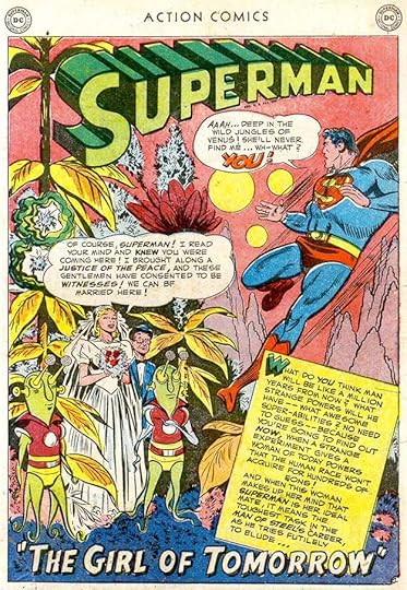 From ACTION COMICS #163, Dec 1951
In the 1950s, Mort Weisinger, editor of the Superman titles, had his regular letterers, and Gaspar was not one of them, but he did a few stories like this one. Saladino had been hired by editor Julius Schwartz in late 1949 to letter his stories, and soon was also lettering many edited by Robert Kanigher, who shared the office with Julie. For his first few years at DC, Gaspar worked in the offices every day, and was more likely to be asked to letter stories by other editors there who needed a quick fill-in. Gaspar’s balloon lettering was always unique and strong, but this page shows him still not quite sure how to handle the story title, and the balloon shapes could also be better.
 From ACTION COMICS #165, Feb 1952
Gaspar was more often assigned backup features in ACTION like this one. He was already doing western stories for Schwartz, and seems more comfortable with Vigilante than with Superman. Note the open first letter with drop shadow in the top caption, something Gaspar was doing at the time.
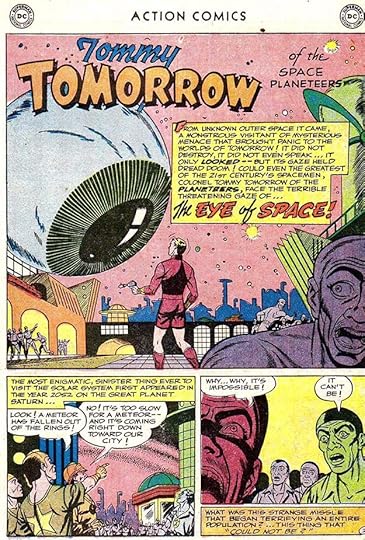 From ACTION COMICS #172, Sept 1952
Science fiction was another story type Gaspar was doing for Julie Schwartz, so again Tommy Tomorrow was perhaps a more comfortable fit for him. These backups were also shorter, six or eight pages rather than twelve, so it would have been easier to fit them into his schedule. The story title is still what I’d call early Saladino work.
 From ACTION COMICS #363, May 1968
After eight stories in the 1950s, we next find Saladino’s work on this Supergirl story from 1968, but he only lettered the first page, someone else did the rest. I’m not sure why that might have happened, perhaps the editor didn’t like what the other letterer had done, or perhaps there was a last-minute rewrite, and Gaspar was available. In any case, you can see his story title is much more accomplished now.
 From ACTION COMICS #365, July 1968
In this issue, Saladino lettered both the Superman lead story and the Supergirl backup, perhaps filling in for whoever usually did them. In this story title, Gaspar goes his own way with the name SUPERMAN, and I like it.
 From ACTION COMICS #413, June 1972
Gaspar continued to make occasional appearances in the 1970s as letterer on Superman and other stories in ACTION. I find the title on this one particularly amazing.
 From ACTION COMICS #419, Dec 1972
Editor Julius Schwartz took over ACTION with this issue, and he tapped Gaspar to letter the first installment of a new backup feature by writer Len Wein and artists Carmine Infantino and Dick Giordano. Gaspar’s feature logo was reused on later stories, but he only lettered this first one. Note his creative sound effects.
 From ACTION COMICS #443, Jan 1975
This was a 100-page issue, mostly reprints except for the lead story, and Schwartz had Gaspar do this handsome title page lettering. I hope he got a little extra money for all that labor. Lots of variety, but it all works together well.
 From ACTION COMICS #449, July 1975
This was an odd idea for a filler page, perhaps Julie’s idea. Gaspar did a nice header and lettered the new “funny” balloons. These appeared in a few other places.
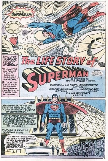 From ACTION COMICS #500, Oct 1979
By 1979, Gaspar had earned a reputation as the go-to letterer for high-profile projects, and this 64-page recap of Superman’s life to that point was one. I think it’s the longest Superman story ever to appear in a monthly comic, and the lettering is gorgeous.
 From ACTION COMICS WEEKLY #601, May 24, 1988
With this issue, ACTION became a large weekly anthology for a while with a half dozen continuing series. Gaspar lettered all nine parts of Wild Dog’s first serial in the book, and it’s again excellent work, though I have to point out I did the feature logo. Sadly, the cheap newsprint paper did not help any of the lettering.
 From ACTION COMICS #757, Sept 1999
Gaspar lettered only two Superman stories for ACTION in the 1990s, and this is the second and last one. His balloon lettering had changed some by this time, becoming even more angular, but I think it still looks great. Note the little feathers on the A in HAWK in the title. In a few years, DC would move to an all digital workflow and no longer employ any letterers like Gaspar who worked only with pen and ink, which is a great shame, but considering that he was a busy letterer from late 1949 to around 2003, he had a good run.
Here’s a list of the ACTION covers lettered by Gaspar Saladino:
308, 345, 358, 362-418, 420-423, 426-436, 438-449, 451-452, 455, 458-463, 467, 475, 480, 486-487, 491, 493, 495-498, 502, 504-505, 508-509, 512-514, 516-521, 523, 525-538, 542-554, 556, 558-559, 561-567, 569-587, 590-596, 602, 604-608, 612-615, 618-620, 624, 626, 637-638, 645, 668-669, 671-675.
That’s a total of 210 covers, a substantial amount of fine, creative work.
Below is a list of the story pages Saladino lettered for this title:
#163 Dec 1951 Superman 10pp
#165 Feb 1952 Vigilante 8pp
#169 June 1952 Vigilante 8pp
#171 Aug 1952 Vigilante 8pp
#172 Sept 1952 Tommy Tomorrow 6pp
#180 May 1953 Tommy Tomorrow 6pp
#187 Dec 1953 Superman 12pp
#189 Feb 1954 Tommy Tomorrow 6pp
#363 May 1968 Supergirl page 1 only
#365 July 1968 Superman 12pp, Supergirl 12pp
#367 Sep 1968 Superman 14pp
#370 Dec 1968 Supergirl 11pp
#391 Aug 1970 Superman page 1 only
#413 June 1972 Superman 14pp
#419 Dec 1972 Human Target 10pp
#443 Jan 1975 Contents 1pp, Sea Devils recap 2pp
#449 July 1975 Comedy Covers 1pp
#462 Aug 1976 Krypto 6pp
#500 Oct 1979 Superman 64pp
#569 July 1985 Superman (story #2) 8pp
#582 Aug 1986 Superman 24pp
#601 May 1988 Wild Dog 8pp
#602 May 1988 Wild Dog 8pp
#603 June 1988 Wild Dog 8pp
#604 June 1988 Wild Dog 8pp
#605 June 1988 Wild Dog 8pp
#606 June 1988 Wild Dog 8pp
#607 July 1988 Wild Dog 8pp
#608 July 1988 Wild Dog 8pp
#609 July 1988 Wild Dog 8pp
#749 Dec 1998 Superman 22pp
#757 Sept 1999 Superman 22pp
That adds up to 360 pages on this title, not a lot for Gaspar, but he was doing plenty of other things, with a focus on war stories and all the titles edited by Julius Schwartz.
 From ACTION COMICS #51, Aug 1942, “Silly Willy” by Henry Boltinoff
One more thing I want to address. On the Wikipedia article about Gaspar it says, “He did much of the lettering for the humor strips of Henry Boltinoff in Action Comics.” I don’t know where that information came from, but I find no evidence of it. Above are panels from a Boltinoff strip from 1942. Henry was the brother of DC editor Murray Boltinoff. I don’t know if that’s why he was able to place so many short humor strips there, but he was already well established by this time. To me, it makes no sense for Henry to be getting someone else to letter his strips. He was clearly a cartoonist, writing and drawing everything, so why wouldn’t he also letter? This lettering seems in the same general style as his art. Second, the logistics of having someone else letter these short pieces is problematic. Too much back and forth for it to be profitable or time wise.
 From ACTION COMICS #160, Sept 1951, “Little Pete” by Henry Boltinoff
Another sample from 1951 has lettering which is much the same. It’s somewhat larger, and more condensed, but the letter shapes are very much like those of 1942.
 From ACTION COMICS #163, Dec 1951
This is a panel from a Superman story lettered by Gaspar Saladino early in his career. Compare it to the examples above, and you’ll see there’s very little similarity. These letters are wider, spaced more evenly, and look how angular the S is, with a straight central bar in the middle in most cases. I see nothing in the Boltinoff lettering that’s like this in more than a very general way.
 From ACTION COMICS #201, “Shorty” by Henry Boltinoff
If Saladino was lettering for Boltinoff, that would surely have happened by 1954, the time of this example, but the lettering here looks just the same as the earlier Boltinoff examples to me. If the idea of Gaspar lettering for Boltinoff was a guess, I call it a wrong one. If anyone has evidence otherwise, I’d like to see it. Further, the Wikipedia article mentions only Boltinoff’s strips in ACTION, but he was doing them for every DC title. If Henry had a letterer who was not himself, it couldn’t have been Saladino, he was much too busy with his own DC work.
Look for more articles in this series in the future under “Gaspar Saladino In” on the COMICS CREATION page of my blog.
The post GASPAR SALADINO in ACTION COMICS appeared first on Todd's Blog.
November 28, 2021
Rereading: SEVEN-DAY MAGIC by Edward Eager
 Cover and illustrations by N. M. Bodecker
The final seventh book of what is now known as the “Tales of Magic” by Edward Eager returns to the plan of the first four, and is just as charming as delightful.
The children in this one are new, from two families. John and Susan are twins, and are the tall blond type that are successful in school, confident in what they can do, and calm in the face of trouble. Their main trouble is their Grannie, who is technically raising them, but in fact is more often treated as the child by John and Susan, as she is likely to get into all kinds of trouble if they don’t keep an eye on her. Grannie was raised to be independent and resourceful too, but sometimes forgets she can’t do everything she once could.
Next door are Barnaby, Abbie and Fredericka. Their father works in New York as a singer and performer, but in the background. With others he sings commercial jingles and backs up stars on variety shows. He also acts when he can, and keeps hoping for a big break to stardom, but meanwhile supports his family well.
As in other Eager books, these children love to read, and the book opens in their local library where they’re discussing favorite books about children having magical adventures and wishing they could have some. As they’re checking out their choices, Fredericka is drawn to a small red book with no visible title, and adds it to her stack. The librarian tells her it’s a seven-day book that must be returned by then. On their way home, Fredericka begins to read the book and finds it’s about them, and everything they’ve said and done in the library and since. Clearly it’s a magic book! The children argue about what they should wish for, but as often happens, Fredericka gets impatient and just makes her wish that they would have a magical adventure starting right away. In a few minutes it does when a dragon appears, grabs Fredericka, and flies off.
One of the best things about this book is that most of the adventures have a literary flavor, tying into other books including The Wizard of Oz, The Little House on the Prairie, and even Half Magic, the first book in Eager’s series, where we find out what happened next to the magic coin from that story. There’s a good dose of humor, and there are also more personal adventures for each family that go deeper than just having fun.
Eager died too young at age 53 two years after this book was published in 1962. His widow reported in one article I found that he had begun an eighth book that would have brought together all eight children from the first four books, and while I would have loved to read that, this one seems to make a good capper for the series, especially as it returns for a time to the events in the first book. It’s a fine story, and stands on its own, but would be improved by reading it after the rest. Highly recommended.
The post Rereading: SEVEN-DAY MAGIC by Edward Eager appeared first on Todd's Blog.
November 24, 2021
GASPAR SALADINO’S COMICS ADS 1981-1988
 All images © DC Comics. From ACTION COMICS #515, Jan 1981
In these years, Gaspar’s ad lettering was greatly diminished and eventually ended as far as I can tell, and I have some theories about why, but up front I have to say that scans of comics that include ads are very hard to find for these and later years, and I probably missed some. That said, here are some possible explanations.
First, there are almost no house ads in DC comics with 1981 cover dates, I found only two lettered by Saladino, including the one above. There were two other subscription ads for the entire line lettered by me, and that’s about all. Paid ads had increased to fill the ad locations in each issue, and there was a regular amount of those. DC had worked out a system where all or nearly all the ads were on one”flat,” or sixteen page sheet of paper (eight pages on each side) that could be the same in all the regular-size titles and save money on color separations. I think there were usually only six interior ad pages per issue, so only part of the flat was ads, but having that section the same on every comic saved time and cost. There are some variations in different months, but often the center-spread of a 32-page comic, pages 16-17 was a paid ad, and other common ad pages were 5, 6, 11, 22, 27 and 32, but only six per month, usually. The increase in paid ads left less room for house ads.
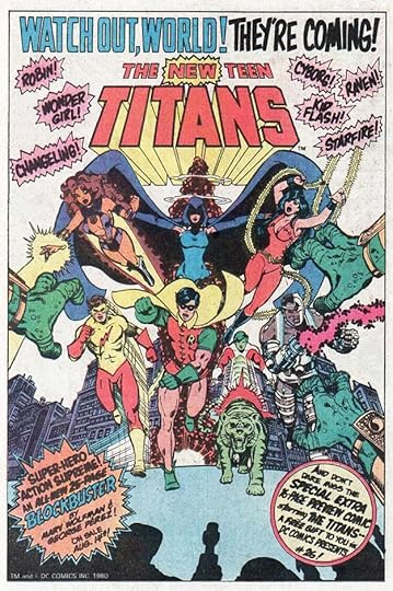
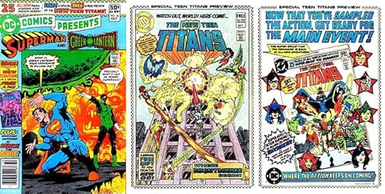 From DC COMICS PRESENTS #26, Oct 1980
Second, starting in 1980, DC began a different kind of promotion for new or revamped titles: sixteen page inserts in selected issues. The first of these was for THE NEW TEEN TITANS, and the insert ran in DC COMICS PRESENTS #26, Oct 1980. These previews gave readers a sample of the new product for free, a great marketing idea, and sometimes there was also a solo house ad in other comics promoting the project, but there weren’t any of those I could find for 1981 launches Dial H for Hero (in ADVENTURE), ALL-STAR SQUADRON and ARAK, SON OF THUNDER, nor for the first preview of 1982, a revamped WONDER WOMAN. Perhaps all the ad money was being spent on the previews, and DC did not want to do additional house ads, and again, perhaps there wasn’t room because of an increase in paid ads. DC may, instead, have been putting that money and effort into posters and other promotional material for direct market comics shops, and I’ve found one example, which I’ll include below. The last page of each preview (right image above) was essentially a house ad for the upcoming book, and I lettered those. They may also have run in other books.
Third, DC Comics had not had a real art director in its history, one who functioned like a typical art director for other publishers by creating advertising and setting the style for the line and its promotional material. From about 1950 to 1967, Ira Schnapp acted as the de facto art director, though he was never named or paid for that role. Carmine Infantino was briefly given the title Art Director when he was designing all of DC’s covers from about 1966 to 1967, but was then promoted on to Editorial Director and later Publisher. Gaspar Saladino filled the same role of de facto art director as Ira Schnapp from about 1968 to 1978, but only in some aspects. The general look of the line fell into disarray in the early 1970s, and was not really set on a better course until Jenette Kahn brought in design elements by the Milton Glaser Studio, and tried to modernize the company’s look with help from Neal Adams and others starting around 1977. Artist Vince Colletta had the title of Art Director for a few years, but he did little art directing, mostly he sat in his office and inked late pages. Finally, Jenette hired a real art director, Neal Pozner, in the summer of 1982, I believe. I remember working with him in the late summer and fall of 1982 before the DC offices moved from 75 Rockefeller Plaza to 666 Fifth Avenue in November 1982. By 1983, Neal was asserting more influence and control over the look of the line and its advertising, and even though Neal was a comics fan, his training was type based like most art directors in publishing at the time, and he moved DC’s ads toward type and away from hand lettering. That’s another reason why Gaspar’s ad lettering declined in these years and stopped in 1988, as far as I can tell. Neal was replaced by other art directors and cover editors at DC such as Richard Bruning, Keith “Kez” Wilson and Curtis King, all comics fans, but all often in favor of type over hand-lettering for ads as a visual indication that DC Comics was becoming more adult and sophisticated, and ready to match the rest of the publishing world in that area. Thus, Gaspar’s unique talents were largely put aside in favor of other ideas.
Finally, I have to acknowledge that, of the hand-lettered house ads from 1982 to the early 1990s, and there were some in each year, I was assigned to letter many of them. So, I too contributed to the decline of Gaspar’s fine hand-lettered ad work, but not intentionally or even consciously. They also had pretty much vanished by 1994 in favor of all-type ads being produced by DC’s art directors using desktop design software. Gaspar continued to letter some of DC’s covers during that time, but much of that work was also gradually assigned to me, and even more once I began doing it on my first desktop Mac computer in 1995. At least Gaspar was still able to letter story pages for DC in his later years until 2003 when the entire lettering process went digital at DC. Considering that Gaspar turned 76 in 2003, and always seemed to be busy until then, I think he had a pretty good run, and when I got to know Gaspar better a few years later, he always seemed to be in a good place as far as his career and work goes, and was enjoying his retirement.
 From BATMAN #338, Aug 1981
Here’s the other house ad for 1981 lettered by Gaspar, and it’s a fine one for the entire line that ran on back covers, where printing and color looked best. It does give some extra promotion to new projects like THE NEW TEEN TITANS and Dial “H” for Hero, as well as ALL-STAR SQUADRON and a sword and sorcery book not yet named (ARAK). The design of the ad, and Saladino’s lettering are appealing and interesting, at least to me, especially the Art Deco style in the smaller letters of the blue caption. The tagline that Gaspar had designed in the previous year is still running at the bottom of this one.
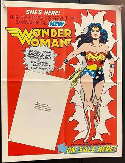
Recently Benjamin Le Clear, the DC Comics librarian, put this image of a 1981 DC promotional poster on Facebook. I’d never seen it before, and it was definitely lettered by Gaspar, though I did the logo. It promotes the revamp of Wonder Woman beginning with the January 1982 issue, and this large poster was meant for comics shops. The blank space has spots at each corner that can be cut so that a WONDER WOMAN issue could be inserted, and switched out when each new issue arrived. It’s a clever idea, and there could well be more marketing items lettered by Saladino that I’ve never seen. As I said above, this could be where some of DC’s ad budget was going instead of house ads for new projects.
 From THE FLASH #305, Jan 1982
This standalone ad promotes both the new title and the preview for it in NEW TEEN TITANS. What a great variety of styles here from Saladino, and they all work well together. On the cover is a Captain Carrot logo he designed, but it was not liked by the creators, and I was asked to do a different version that was used instead on the book. The top blurbs are headline type, not by Gaspar.
 From THE BRAVE AND THE BOLD #185, April 1982
These ads may always have run together, but they are potentially each a third-page ad that could have been used separately, and I will consider them three for Gaspar. The image is not very clear, partly due to the cheap newsprint paper I think, but all of Gaspar’s lettering is readable and appealing.
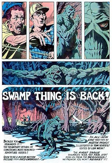 From DC COMICS PRESENTS #44, April 1982
DC had decided to bring back Swamp Thing, who continued to sell well in reprints, but with Len Wein as the editor instead of the writer. This ad is a departure for DC, more atmospheric and subtle, telling a wordless story until the final large panel. The display lettering is by artist Tom Yeates as part of his art, but Gaspar’s lettering at the bottom is all clear and familiar to Swamp Thing fans, as he had lettered the initial issues of the character’s fan favorite run.
 From THE BRAVE AND THE BOLD #186, May 1982
Two half-page ads for new series. The title of the first one was expanded to SAGA OF THE SWAMP THING to set it apart from the original run, and Gaspar pushes the word SAGA to promote that. He did that addition to his original logo, and also the new FIRESTORM logo seen here. All this ad copy is well-written and interesting, much better than what they were doing a few years earlier. Perhaps DC had learned from Marvel’s successful ad copy. Possibly they were written by Len Wein, former Marvel editor.
 From THE BRAVE AND THE BOLD #187, June 1982
Another cleverly written ad with fine Saladino lettering. This could have been reused with later covers.
 From THE BRAVE AND THE BOLD #187, June 1982
As you can see, Saladino ads made a comeback in 1982, though not nearly to the degree seen in 1980. The top line here is reused from a 1980 ad.
 From THE BRAVE AND THE BOLD #187, June 1982
Here Gaspar’s tagline is expanded at the top while five issues are promoted with arrow blurbs and bursts against a DC Bullet background pattern. A busy ad, but everything is clear.
 From BATMAN #349, July 1982
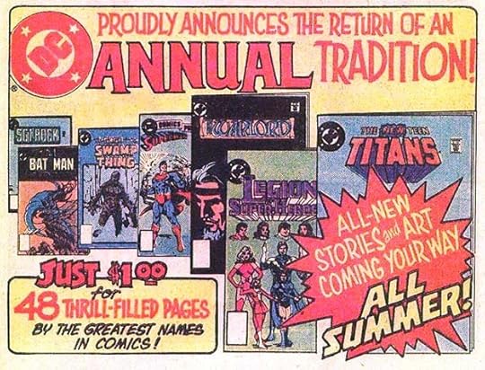
While the Dollar Comics line was on the way out, DC revived the Annual concept with 48 pages for a dollar. The actual Annual covers were probably not ready yet when this ad was done, but Gaspar’s exciting lettering is enough to sell it in my opinion.
 From BATMAN #349, July 1982
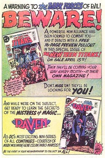
That huge, scary BEWARE is Saladino at his best. The rest of this ad is equally exciting. I find it odd that the title being previewed isn’t named, it’s NIGHT FORCE, but maybe that was done to get readers to pick up the issue and find out themselves. Below, my Raven logo never looked better than when surrounded by great Gaspar lettering.
 From BATMAN #349, July 1982
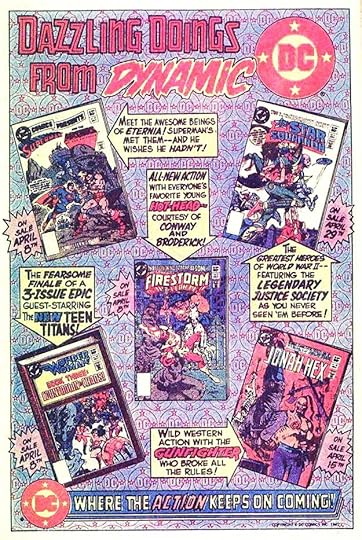
This ad follows the same plan as the five title one above, but with mostly different lettering. In the top display lettering, the style of DAZZLING DOINGS FROM has a single thin line inside block letters. This is harder to do than you might think. DYNAMIC is Gaspar’s great dry-brush work, though when held in red it’s hard to see.
 From DETECTIVE COMICS #522, Jan 1983
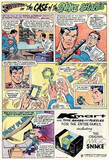
Moving on into years with only a few Saladino ads, here’s a paid one obviously produced by DC for K-Mart, and a toy I had and enjoyed. Gaspar’s title is perfectly appropriate.
 From THE BRAVE AND THE BOLD #197, April 1983
Another thing DC began at this time was books produced exclusively for collectors and sold only through the direct market and by subscription. The improved printing and paper were a big step up from other DC comics of the time. The price was also higher. The Comics Code was bypassed, and this series had plenty of gore and violence, at least in the early issues. It was the beginning of a growing trend that would include CAMELOT 3000 and other similar titles, and also the beginning of DC producing much better quality comics. It would take a few years, but cheap newsprint was on the way out.
 From DETECTIVE COMICS #543, Oct 1984
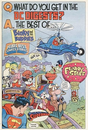
To my mind, trying to sell cartoony characters like these with typeset ads wouldn’t have worked nearly as well as having Gaspar do his stellar work on them. I’m not sure the DC Digests really benefitted from the promotion, they seemed to fill their own niche, but it’s a fun ad.
 From DETECTIVE COMICS #563, June 1986
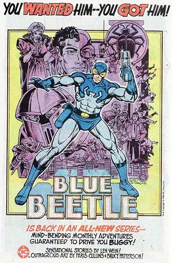
As part of the deal DC made to buy characters from Charlton Comics, Blue Beetle, a hero with a long history during and before his time at Charlton, began a new series at DC, and proved to be a long-lasting character at the company. Gaspar may well have enjoyed Blue Beetle’s adventures as a boy himself, and he does a fine job lettering this ad. He also did the logo, based on what Charlton had been using.
 From DETECTIVE COMICS #565, Aug 1986
Another success for DC was a relaunch of SECRET ORIGINS with two origins per issue, usually one from the past and one for a new character. I find this ad layout and lettering appealing and charming.
 From SGT. ROCK #386, Oct 1986
Now we’re into the era of crossovers running through many titles, a gimmick that encouraged readers to buy issues of titles they normally didn’t read to get the full story. I always thought it was poor way to up sales, though it did work. Fans often disliked being manipulated that way, though. This ad is heavy on design and light on lettering, but that lettering by Gaspar works well.
 From SGT. ROCK #386, June 1987
Here’s a late paid ad from Gaspar on what might be Neal Adams art, so perhaps Neal requested Gaspar as the letterer. Great work, and you might notice that Saladino’s balloon lettering had become a bit more angular by this time, also true in his story lettering. In a way it’s a throwback to his story lettering of the early 1950s. I don’t know how that came about, but a letterer’s style can change over time. The upper and lower case lettering reminds me of Gaspar’s signature and handwriting, which used a similar style, but italic.
 From YOUNG ALL-STARS #8, Jan 1988
This is the last ad I’ve found lettered by Gaspar for DC, but as I’ve said, there could be more that I haven’t found. Again very design oriented with startling colors that would not have worked on newsprint, but the lettering looks as good as ever. Gaspars main ad lettering work spans 20 years, and as far as I’m concerned, it was all terrific.
To sum up, I found 23 ads lettered by Gaspar in these years, plus that one retailer poster that could be one of many. Adding up all the ads in this series, I come to a total of 406, lots of time-consuming and beautiful work that helped sell comics to generations of readers.
This wraps up my detailed look at the ad lettering of Gaspar Saladino. I hope this and the Saladino logo studies have helped you appreciate the work of my favorite letterer as much as I do. I will have more posts about his lettering soon. Other articles in this series are on the COMICS CREATION page of my blog, and the series on Gaspar’s logos is on the LOGO LINKS page.
The post GASPAR SALADINO’S COMICS ADS 1981-1988 appeared first on Todd's Blog.
November 22, 2021
GASPAR SALADINO’S COMICS ADS June-Dec 1980
 All images © DC Comics. From ACTION COMICS #508, June 1980
Continuing with the rest of the ads lettered by Gaspar for books with these cover dates, we begin with the kind of half-page ad that had been appearing in DC issues for decades, promoting two titles that have some connection (both here are team-up books) and made more exciting and interesting by Saladino’s fine display lettering. This year was kind of Gaspar’s last hurrah as a major designer for DC house ads, and I feel he was still at the top of his game. Look at the energy and impact of THRILLS!
 From ACTION COMICS #508, June 1980
DC’s digest comics were good sellers I think, and as mostly reprints, more profitable than all-new titles. Personally I never liked the small size of the art, but many did. Often the lettering had to be resized larger to be readable on the cheap newsprint paper, making a mess of the original page layouts, and therefore also making these versions unlike the original comics, but if all you wanted to do was read the stories, they were a bargain. Gaspar’s ad lettering has fun with the size issue. I don’t know who did the figure art, but it’s inked by Dick Giordano.
 From ACTION COMICS #508, June 1980
This retelling of Batman’s origin, sort of, has intriguing ad text probably by writer and former Marvel editor Len Wein. DC was getting better at that.
 From ACTION COMICS #508, June 1980
DC was putting lots of effort into their subscription ads at this time, there were many fine ones. This example is full of terrific display lettering by Gaspar. Ad lettering paid better than page lettering, and also better than cover lettering, and here’s a good reason why, this must have taken a long time to do.
 From ACTION COMICS #508, June 1980
Another fine subscription ad lettered by Saladino, and that’s five house ads by him in one issue of ACTION COMICS. This was almost like his early days of doing all the house ads, and lots of them, in 1968.
 From THE BRAVE AND THE BOLD #163, June 1980
Another subscription ad. I don’t like the design of this one as much, the art looks cobbled together from many sources, but there’s nothing wrong with the lettering.
 From ACTION COMICS #509, July 1980
Jenette Kahn’s plan to add more pages and more backup features to the entire DC line had been thwarted by management in 1978, but now she was able to try it again without interference. The price of regular issues went up from 40 cents to 50 cents, but there was more story and a wider variety of features, some that had hardly been seen in a while. Yes, buyers took a hit financially to keep up with their favorites, but they got more for their money, and retailers were happy to make a little more profit on each sale. Gaspar’s lettering on this ad makes the dull layout more exciting.
 From ACTION COMICS #509, July 1980
This upcoming tabloid teaming Marvel and DC’s best-known heroes for the second time was perhaps the biggest news of 1980 in the comics world. The first such tabloid from 1976 was a big hit, I’m guessing the second one was too. Gaspar’s ad lettering sells it well.
[image error]From ACTION COMICS #509, July 1980It’s a sign of changing times that DC is promoting the creators in these ads, a welcome change in my opinion, after many years when creators were not even named. DC was now catering to collectors and comics specialty shops more than newsstands, and those buyers were looking for favorite writers and artists more than blindly following titles.
 From ACTION COMICS #509, July 1980
Though promoted here as a new beginning for Wonder Woman, it was pretty much more of what had come before. It would take another year for the character to get a real revamp. Saladino’s lettering sure makes this one sound worth trying. Sadly, the printing and paper quality at the time was at it’s worst, and some of this ad is hard to read.
 From ADVENTURE COMICS #474, Aug 1980
In August cover-dated issues, the expanded line with new 8-page backups was promoted in this double-page spread ad at the center of many issues, and with different Saladino lettering at the center of each. Below are a few of the other versions of this ad.
 From THE BRAVE AND THE BOLD #165, Aug 1980
 From GHOSTS #91, Aug 1980
 From HOUSE OF MYSTERY #283, Aug 1980
 From JONAH HEX #39, Aug 1980
 From THE UNEXPECTED #201, Aug 1980
I suspect that many more DC titles published in August 1980 had one of these ads, and each had different lettering by Gaspar in the central arrow, though some only used the single page stamps ad shown earlier instead. Unfortunately, I don’t have access to digital scans that include ad pages for other likely candidates. Gaspar’s lettering for these ads is full of variety, and includes many new versions of the character logos and book titles designed just for these ads. It’s hard to know how to count them, but I’m going to call the six different versions I’ve found six new ads for Saladino, and if others come to light I will add them.
 From ADVENTURE COMICS #471, Aug 1980
This is two half-page ads that might have been used separately, and I will count them as two for Gaspar.
 From ADVENTURE COMICS #474, Aug 1980
I don’t recall anything about this Superman club, and I have no idea how long it lasted or how successful it was. As always, Gaspar’s lettering made it appealing. There was also a half-page version of this ad.
 From ADVENTURE COMICS #474, Aug 1980
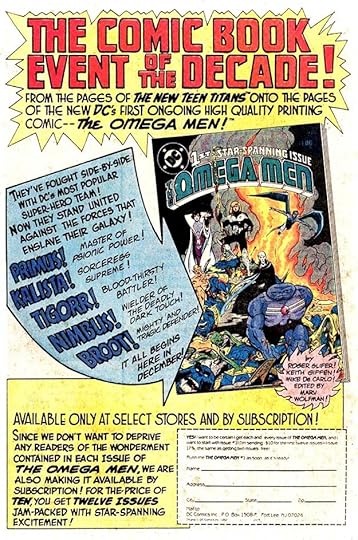
In addition to all the new backup features, DC also brought out a new version of The Teen Titans that would prove to be one of the company’s most popular launches of the decade. Before long they were giving Marvel’s X-Men serious competition due to the fine stories by writer Marv Wolfman and artist George Pérez. Gaspar’s lettering sells it well.
 From ACTION COMICS #511, Sept 1980
There’s not much lettering by Saladino on this teaser ad for the upcoming tabloid, but it still counts. And after this, there were almost no new house ads for the rest of 1980-dated issues. I think DC had blown out their ad budget with all those spreads and other ads seen above.
To sum up, I found 22 new ads lettered by Gaspar in this period. Adding the 20 I found in the first five months of the year, that makes 42 ads for 1980 books, much more than the previous few years. As I said, this was kind of the last hurrah for Saladino on house ads at DC. There are more that I will cover next time in the final article in this series, but not very many per year. Other articles in this series are on the COMICS CREATION page of my blog as well as others you might enjoy.
The post GASPAR SALADINO’S COMICS ADS June-Dec 1980 appeared first on Todd's Blog.
November 21, 2021
Rereading: MAGIC OR NOT? and THE WELL-WISHERS by Edward Eager
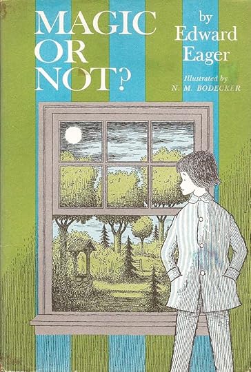
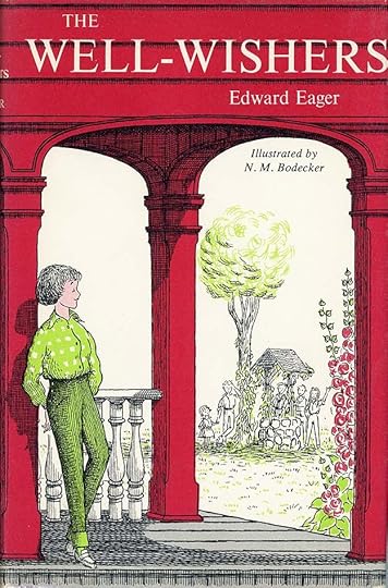 Cover and interior illustrations by N.M. Bodecker
I’m covering these two books in Edward Eager’s “Tales of Magic” series together because they’re related, and because they have a different tone than the others. The first four books of the series, and the final one, are unabashed magic stories with delightfully improbable beings and settings. These two are more realistic in approach, and the magical adventures that happen could all be explained by coincidence, planning by adults, and other real world things. As a child, I found this a cheat, and I never liked these two as much as the rest, but rereading them today I find much of value in them.
Laura and James and their parents are moving from New York City to a small village in rural Connecticut, and while the parents deal with the moving vans, the children are put on a train to their new home town. They’re excited about the move, and what the new house will be like, they haven’t seen it yet. They wonder if anything magic will happen to them, as in book adventures they enjoy. On the train they meet a strange girl, who tells them there is magic at their new home in a wishing well in the yard. The girl, Lydia, who they soon learn is their new neighbor, and another neighbor boy, Kip, join Laura and James and investigate the wishing well. When Laura’s first wish written on a scrap of paper and lowered into the well, “I wish I had a kitten” comes true the next day when the well bucket is found to have two kittens in it, the four children begin to believe in Lydia’s claim, and through this and the second book they have adventures in their neighborhood and make wishes that often seem to somehow come true, but it’s never a clear exhibition of magic powers. The children decide that using their wishes for good deeds is the best way to make them work, and they do help out others and help to solve real problems in the town, making new friends and a few enemies, and getting involved in many projects. Sometimes, too, the magic seems to play tricks on them, just as it often does in stories, as when a girl that James is attracted to seems to need rescuing, but when he does, it turns out she was only escaping from her father to go to the movies with her boyfriend. One of their new friends is Gordy, a rich boy who only wants to be their friend, though he makes it hard because of obnoxious behavior. Often adventures that seem to have fairytale elements, like a lost heir, a wicked ogre, and a hidden treasure involve the children in exciting events, but afterward leave them wondering if there was any real magic or not.
The second book goes even further into real world problems, and is charmingly narrated by each of the children in the story in turns. When they encounter a runaway girl, Gordy turns out to be the one who can help her. They meet a sad older man whose apple orchard is going to be replaced by a parking lot. Another new acquaintance turns out to have the solution for his problem. When their Well-Wishers clubhouse in the woods is attacked by tough older kids, a secret friend turns out to help. Later, the group works to turn public opinion from against to accepting the arrival of a new and different family to the neighborhood. This book is perhaps the deepest of the series, and the characters all change and grow through their experiences. Eager often continued the ideas of children’s book author E. Nesbit in his own work, and in these two books, I think he was using her Bastable stories as the model rather than her magic adventures.
Both books are recommended, as is the whole series. A link to the collection, in paperback and sadly lacking the original Bodecker covers, but otherwise a fine way to read them, is below.
The post Rereading: MAGIC OR NOT? and THE WELL-WISHERS by Edward Eager appeared first on Todd's Blog.
November 19, 2021
Incoming: FABLES COMPENDIUM FOUR
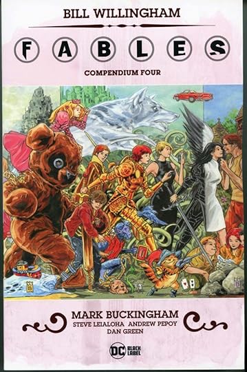 Image © DC Comics
The fourth and final one of these massive trade paperbacks has arrived. The charming Mark Buckingham cover connects to the other three, perhaps they will be issued as a poster at some point. This one includes issues 114 to 150 of the original series, with the final issue being a huge one, and it does include the wraparound cover of that as a foldout. These are the best and currently cheapest way to acquire the FABLES series. Even at the cover price of $59.99, that’s still only $1.62 per issue. I loved lettering the series, and just between us, there may be more in the future. Look for this at your comics retailer, or there’s a link below.
The post Incoming: FABLES COMPENDIUM FOUR appeared first on Todd's Blog.
November 18, 2021
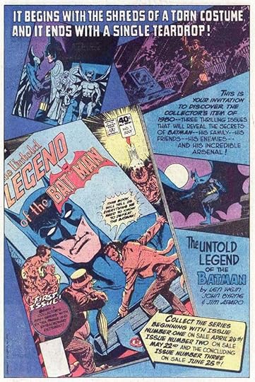
GASPAR SALADINO’S COMICS ADS Jan-May 1980
 All images © DC Comics. From ACTION COMICS #503, Jan 1980
DC began making a comeback with issues having 1980 cover dates (work prepared from Fall 1979 to Fall 1980). Newsstand sales continued to decline, but they were offset by increased sales in the direct market: retailers who focused on comics and other collectibles. Newsstands still worked on the old distribution system of returnable product, so sell-through was never certain, while the direct market bought comics on a non-returnable basis, hoping to sell items eventually as back issues even if they didn’t sell right away, and betting on what they thought collectors would want long-term. Comics collectors were also now more informed about their hobby through publications like the Overstreet Price Guides and the COMICS BUYER’S GUIDE, a weekly newspaper for collectors and fans full of information on upcoming products, sales trends, and comics history. Gaspar Saladino was again being called on more often to letter house ads, still the main method of promotion for DC, and there were enough of them in books for this year for me to break them into two articles. Above is another fine war comics ad by Gaspar, one of his favorite genres.
 From ACTION COMICS #503, Jan 1980
DC was also trying to revamp long-running titles like ADVENTURE, now the home to two features, as seen here. Saladino’s lettering is full of energy and creative touches like the stick of dynamite in that word.
[image error]From ACTION COMICS #503, Jan 1980DC was also experimenting with crossover titles like WEIRD WAR TALES, with a foot in two genres, and as here, putting horror characters into SUPER FRIENDS. Saladino’s display lettering at the top is his fine dry-brush work.
 From ACTION COMICS #503, Jan 1980
DC was expanding their line by doing spinoffs, as here, putting Superboy in a new title of his own, knowing that LEGION OF SUPER-HEROES would do fine without him due to its strong fan base. The company had come a long way from their previous clueless attitudes about their readers, partly due to the leadership of publisher Jenette Kahn, and partly to new, younger creators and younger editors like Jack C. Harris, Len Wein and Paul Levitz, who were more in touch with what readers wanted, being fans first themselves.
 From ACTION COMICS #504, Feb 1980
Rather than focusing so much on the past, DC was now willing to look into the future, as seen in this issue and ad, with Gaspar’s fine display lettering making it all more appealing.
 From ACTION COMICS #805, March 1980
New young marketing specialists had been hired by DC to better connect what readers wanted with what the company was creating. A decade of DC tag lines began with the one seen at the bottom of the ad. There would be many others. Ad copy was improving, and approaching the level of Marvel’s skill in that area. The text in this ad is much more interesting and engaging that what DC was doing a few years earlier. Gaspar’s ad lettering was a major plus.
 From ACTION COMICS #805, March 1980
DC was no longer shy about promoting creators they thought would help sell comics, and the direct market and collectors were often more interested in creators than in characters. It’s hard to imagine DC or any company promoting “12 Tremendous Talents” a few years earlier. And isn’t this a fun ad layout by Gaspar?
 From ACTION COMICS #805, March 1980
DC continued to promote subscriptions, here for the Superman titles. Even with a savings discount, DC made more money this way than on distribution sales. The top display lettering here is rather sedate, I suspect it was penciled in by artist Kurt Schaffenberger, and Gaspar just inked it.
 From ACTION COMICS #505, March 1980
Even the larger Dollar Comics anthologies were looking for subscribers in this ad.
 From ADVENTURE COMICS #469, March 1980
In this amusing ad, editor Len Wein takes on the Stan Lee huckster role for his title ADVENTURE COMICS, with great display lettering by Saladino to add excitement.
 From ADVENTURE COMICS #469, March 1980
DC was promoting more genres again after focusing on superheroes, war and “mystery” for a while. THE WARLORD, a sword and sorcery title by Mike Grell, had already developed a strong following.
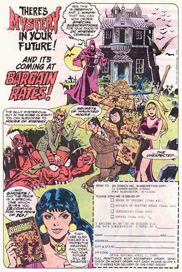 From HOUSE OF MYSTERY #278, March 1980
Gaspar could always be depended on to deliver great spooky lettering for the “mystery” titles and their ads. Here we see that Unexpected has been shrunk from Dollar Comics size back to regular size, but these titles continued to sell well enough for DC to stay with them.
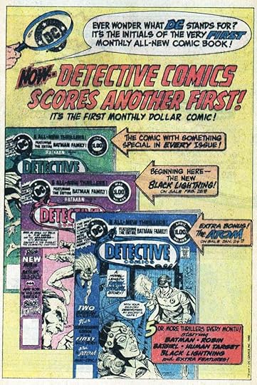 From ACTION COMICS #506, April 1980
On the other hand, DETECTIVE went from bi-monthly to monthly as a Dollar Comic, showing that Batman and his related characters were popular. Some features that had been cancelled elsewhere like Black Lightning were added. This ad claims that DETECTIVE was the very first monthly comic with all-new material. This is clearly untrue even just counting the earliest titles from the company that became DC Comics, Major Malcolm Wheeler-Nicholson’s National Allied Publications, which began with NEW FUN as an all-new monthly in 1935, but few fans would have known that or anything about the origins of DC, who never mentioned those days.
 From ACTION COMICS #506, April 1980
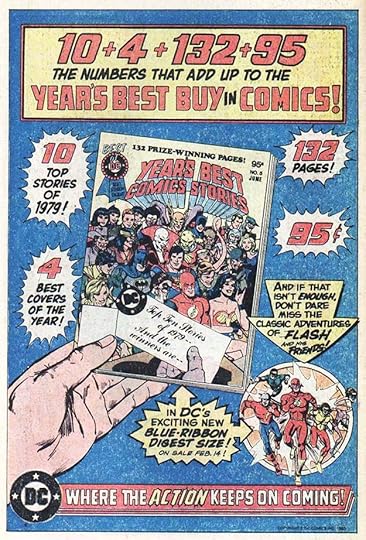
An odd sort of math in this ad, but an interesting way to grab reader attention for this digest comic. Gaspar’s lettering is the best part, and that tagline is being drummed in.
 From ACTION COMICS #806, April 1980
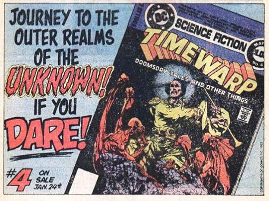
TIME WARP was an interesting experiment from editor Joe Orlando, the first new science fiction anthology from the company in many years. I sure enjoyed working with him on the logo design, but Gaspar’s lettering on this ad is way better than anything I could have done. Sadly, it did not last long.
 From ADVENTURE COMICS #470, April 1980
The top ad copy here cleverly ties the three promoted series titles into a sentence. Gaspar’s display lettering and unique layout make it more interesting, and I love the bold burst at the top.
 From BATMAN #322, April 1980
With DETECTIVE a Dollar Comic, there were only two regular-sized Batman titles to promote in this subscription ad with intriguing ad copy and appealing art I think by Jim Aparo. I wonder if Aparo pencilled in the open lettering at the top left, it looks a bit off-model for Gaspar, so he may have just inked what was there, or Aparo did it when he inked the art.
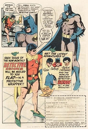 From BATMAN #322, April 1980
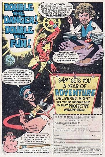
And in the same issue is a subscription ad for DETECTIVE with more great Saladino lettering. Notice that DC is still trying to make amends for the way they USED to mail subscription copies by emphasizing that they now mail them FLAT.
 From ADVENTURE COMICS #471, May 1980
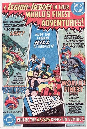
The Legion was getting lots of ad attention at this time. I think DC saw them as their best competition for Marvel’s X-Men, at least that’s my guess. Certainly they had a solid fan base. Great display lettering from Saladino.
 From THE BRAVE AND THE BOLD #162, May 1980
DC lured Marvel’s popular artist John Byrne over just long enough to pencil the first issue of this miniseries, but I’m sure they were delighted to put Byrne’s name on this ad. Saladino’s fanciful lettering makes it all the more interesting.
To sum up, I found 20 ads lettered by Gaspar in these issues. I will cover the rest of the year next time and do year totals then. Other articles in this series and more you might enjoy are on the COMICS CREATION page of my blog.
The post GASPAR SALADINO’S COMICS ADS Jan-May 1980 appeared first on Todd's Blog.
Todd Klein's Blog

- Todd Klein's profile
- 28 followers

