
Todd Klein's Blog, page 83
October 31, 2021
Rereading: KNIGHT’S CASTLE by Edward Eager
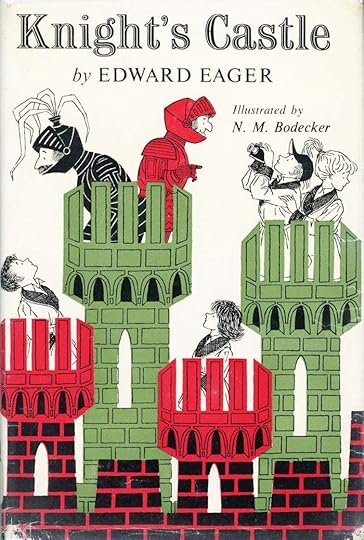 Cover by N.M. Bodecker
The second of Edward Eager’s seven novels for children now called his “Magic Tales” takes place in the present day of 1956, when it was written. There are again four children, but different ones, who are themselves the children of the two of the quartet from the first book, Half Magic. Roger and Ann are looking forward to vacation adventures in the country, but when their father becomes ill and must have an operation in Baltimore, MD, those plans change. Instead they go to stay in Baltimore with their Aunt Katherine and her family while their mother, Martha, spends time in the hospital with their father. Their cousins Eliza and Jack welcome them…well, Eliza does, Jack seems more interested in photography. Roger has brougnt with him some of his collection of lead soldiers to play with, and he and Ann are delighted to discover that a soldier-size medieval castle is one of the toys in their new playroom, along with a dollhouse for Ann, though Eliza treats the idea of playing with dolls with scorn.
Roger’s oldest lead soldier is very old indeed, handed down from father to son in the family for generations. On their way to Baltimore by train, Roger is startled when the figure comes to life and begins to talk to him. The Old One, as Roger calls him, is a magical soldier, and the promise of magical adventures in the near future makes Roger’s sadness about his father easier to bear.
Sure enough, after falling asleep in the room with the toy castle, Roger wakes to find it life size (or himself shrunk) and an exciting adventure begins. But as often happens with magic, things keep going wrong, and once the other children join in on later evenings, everything gets confused and modern instead of medieval. Jack is not a believer at first, but finally gets to join in, as the children become part of the story of Ivanhoe and Robin Hood and other characters, sometimes saving the day, sometimes getting into trouble of various kinds.
This is just as much fun as the first book, though the magic is a bit less defined and predictable. Perhaps that’s for the best, as the story itself becomes less predictable. The book is also in the spirit of E. Nesbit, particularly her book The Magic City. As before, the adventures are exciting, but also sometimes funny, an appealing combination. Recommended.
The post Rereading: KNIGHT’S CASTLE by Edward Eager appeared first on Todd's Blog.


October 28, 2021
GASPAR SALADINO’S COMICS ADS 1971-1972
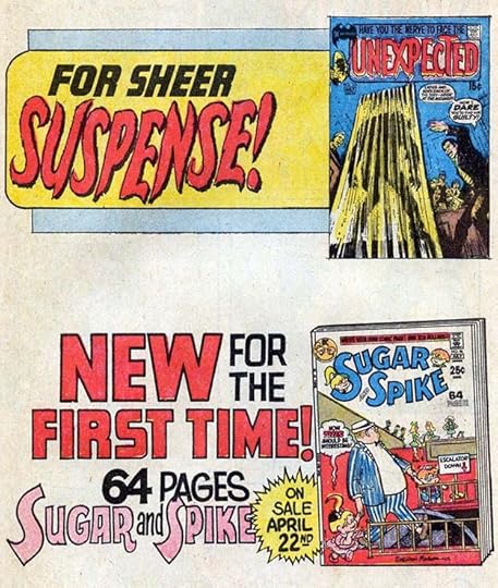
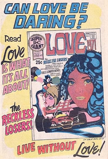 All images © DC Comics. From FALLING IN LOVE #120, Jan-Feb 1971.
As we begin ads with cover dates in these years, we find DC giving a rare promotion for a romance collection that ran not only in romance titles but in ones from the regular DC line. Gaspar’s lettering and logo are modern and appealing, as is the cover art, but most of the book was reprints. Despite his fine work on ads, ones lettered by him began to decline in these years in favor of more that used type or were by others. I don’t know if this was a cost-cutting measure, but the trend became more pronounced through this decade. The Ira Schnapp DC Bullet symbol that had represented the company for decades was now gone, and in place of it were various corner treatments and logos like the one seen here.
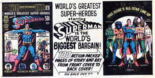
[image error]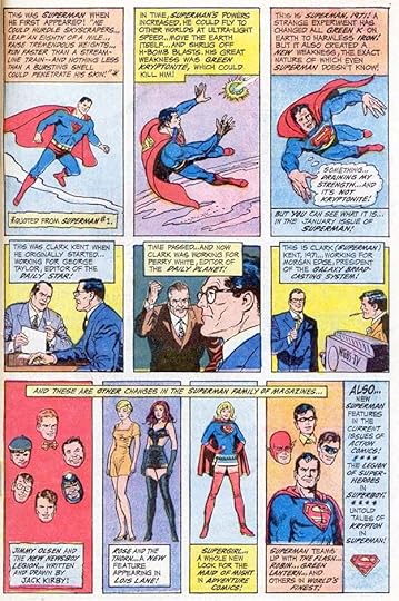 From ACTION COMICS #396, Jan 1971
For instance, this two-page Superman promotional ad that ran in many titles is not lettered by Saladino, as one might expect, and as I thought initially. The first page uses large display lettering that I thought might be by Gaspar, but it didn’t seem quite right. The second page is definitely not lettered by him, I think it’s by John Costanza, whose presence at DC (and soon at Marvel) was growing. I think both pages are by him. John was never much interested in the higher profile lettering assignments like logo design, house ads, and cover lettering, though he did a few of each. Mostly he preferred to letter story pages, and he was prolific on those.
 From FALLING IN LOVE #120, Jan-Feb 1971
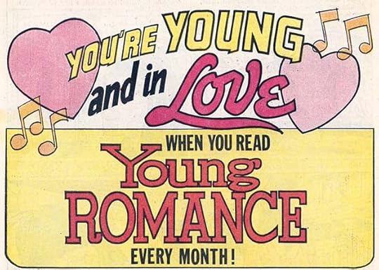
A companion ad to the first one in this article, it promotes the entire romance line, which at this time was seven titles. All the logos shown here are by Gaspar Saladino, replacing ones by Ira Schnapp. Ads like this never appeared anywhere except in romance titles, DC almost always kept them separate from the rest of their line. I think by this time sales were fallling, as reader interests and the times themselves changed, and some of these titles would not last much longer.
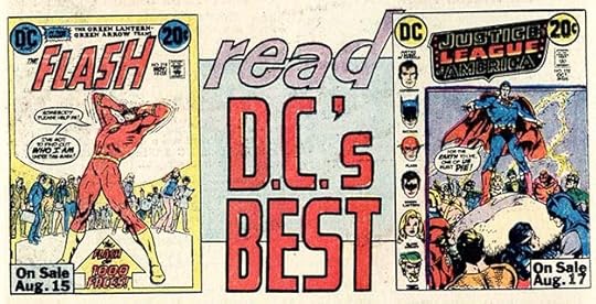
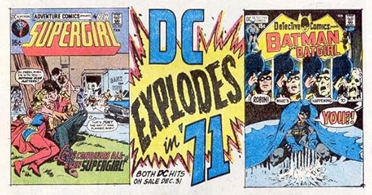 From ACTION COMICS #397, Feb 1971
If you wanted lettering that grabbed reader attention, it was hard to beat what Saladino had to offer. You can’t get much more energy and excitement into a small space than this. The ad copy is kind of a look ahead to 1978 when the company’s big theme was the DC Explosion. That didn’t go well. It’s hard to see in this ad, but corner treatments were now often figures of the lead characters with DC in type and the book title.
 From ACTION COMICS #398, March 1971
The Woodstock music festival was an unprecedented phenomenon, and afterward vendors tried to capitalize on it with products like these. The vendor must have contacted DC for a letterer, and Gaspar’s work on it is easy to identify. The only things he didn’t do are the Woodstock logo and areas of small type in the coupon and elsewhere. The ad ran for several months, and also in a half-page version. Note that the copyright is by Warner Bros., Inc. In 1967, National Periodical Publications was bought by Kinney National Company. In 1969, that company bought the movie and music company Warner Bros., and so in 1971, Warner Bros. and DC Comics were parts of the same company that soon became Warner Communications. Perhaps someone at Warner Bros. was behind this ad and tapped Gaspar to letter it.
[image error]From ACTION COMICS #400, May 1971These ads are probably third-page size, explaining the large gap between them. They likely also appeared separately, and count as two ads. I’m not positive the lower one is by Saladino, but I’ll credit it to him.
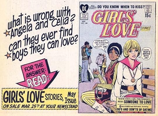 From FALLING IN LOVE #123, May 1971
On the romance titles, where the Schnapp DC Bullet had been in use for a while, there was now a heart shape around DC in type. I like this upper and lower case lettering by Saladino. The end of each stroke had to be squared with a small pen point or made square with white paint, taking extra time, but I think the effort was worth it, as it looks better that way.
 From ACTION COMICS #401, June 1971
Two more third-page ads that probably also ran separately. Requests for smaller ads might have come from DC’s advertising buyer who had smaller ads lined up that needed this size to fill out a page. The one at the top is generic, and could have been used with many covers. The one below is specific only to that particular issue.
[image error]From SECRET HEARTS #152, June 1971This ad is in a half-page size, and specific, so probably needed to fill a particular gap. Many older stories were being reprinted now in the romance titles, and some of those were set up to end on a half page to leave room for an ad. I like Gaspar’s display lettering here, using a style similar to the one above without the stroke ends squared off, but the cover could have been larger.
 From ACTION COMICS #402, July 1971
In addition to his comics series, Jack Kirby also wanted to try some magazine-size publications with color covers and black and white interiors. These were common at Marvel, but DC did not have a line in that size and style. That meant retailers weren’t expecting them, and probably weren’t sure where to put them when they arrived, and may not have put them out at all. None lasted more than an issue or two, and I never saw any of them where I lived. Nothing wrong with Gaspar’s lettering on this busy ad, it’s full of energy, though some areas use type.
[image error]From ACTION COMICS #402, July 1971Another experiment for DC, this was a new idea for the romance line, trying to interest readers of gothic romance novels. A worthy idea, but probably those readers did not check the comics racks at retailers. Gaspar’s lettering sells it well, but the cover logo and cover lettering are all in type. By the time the book hit retailers, it was retitled with an even more gothic first line: DARK MANSION OF FORBIDDEN LOVE.
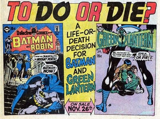
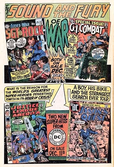
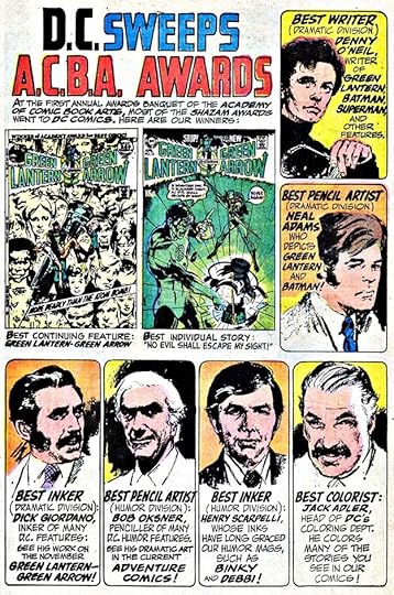 From ACTION COMICS #406, July 1971
The A.C.B.A. Awards was the successor to the Alley awards of the 1960s. The Alleys recognized and celebrated all the creative categories of comics EXCEPT lettering, including editing, inking, and coloring. I’m not sure why that was, but clearly lettering was not then considered worthy of an award by those involved. The A.C.B.A. awards, beginning in 1971 for work done in 1970, remedied that by including letterers, and in this first year of awards, Sam Rosen won. Gaspar Saladino did an excellent lettering job on this self-promotional house ad celebrating DC’s wins with great pencil portraits by Neal Adams, though the claim that DC “swept” the awards is misleading, there were winners from other companies too. Gaspar won his own A.C.B.A. awards for work done in 1971 and 1973. The last year these awards were given was for work done in 1974.
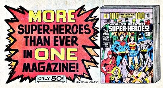 From ACTION COMICS #404, Sept 1971
Comics had been shrinking in page count from the late 1940s on, as publishers tried to hold the line on prices. This gained them some sales in the short term, but harmed them long term because as the prices of all other magazines rose due to inflation, the profit margin for retailers on low-priced comics shrunk, giving less reason to carry them. DC tried to buck the trend with larger issues such as annuals beginning in the early 1960s, and 80-Page Giants soon after that. By 1971 they were trying 100-Page comics for 50 cents at a time when regular issues were selling for 15 cents. Of course they were almost all reprints, but it was a lot of reading for the money, and offered more profit for retailers. Gaspar’s bold burst helps sell this one.
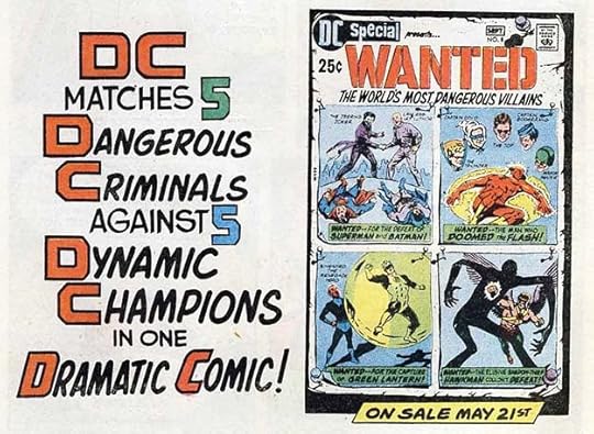
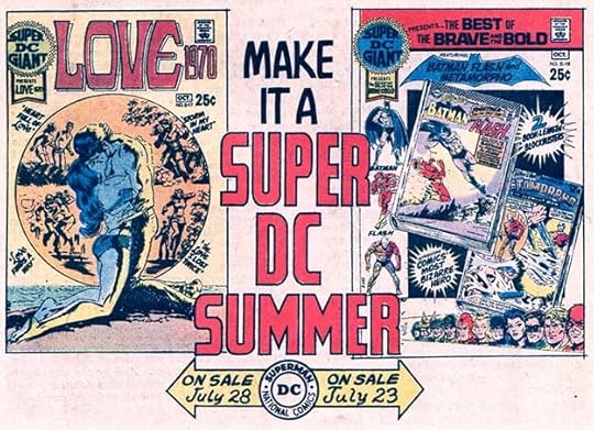
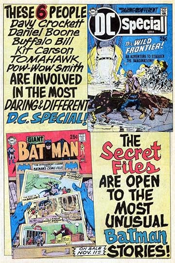
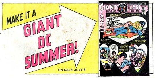 From DC SPECIAL #14, Sept-Oct 1971
Giant issues were also still coming out on a regular basis, this one sold for 35 cents. Gaspar’s lettering is simple and generic, leaving a lot of blank space.
 From HOUSE OF MYSTERY #196, Nov 1971
Another ad with mostly simple block letters, some type, and a good deal of white space. The ad copy sounds like the work of editor Julius Schwartz.
 From THE BRAVE AND THE BOLD #99, Dec 1971
The lack of color on this house ad suggests it was a last-minute addition to a book going out the door to the separator, and there was no time to do a color guide.
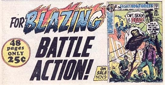 From BATMAN #238, Jan 1972
In this case, the blue tint missing from the G in BLAZING is simply a separation error by the color separator working on this page. Gaspar’s flaming letters were always good at attracting attention.
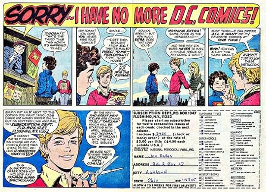
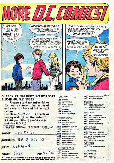 From ACTION COMICS #409, Feb 1972
This is an impressive subscription ad that ran across two pages at the center of many titles at this time, with art by Carmine Infantino and lettering by Saladino. Subscription ads were always present at DC from the mid 1940s on, and the reason is they made more money from them than from newsstand sales, even considering the costs of postage. The young man who filled out this coupon had big plans for his money, but perhaps $24 proved to be too steep a price to pay. I had a hard time finding comics where I lived, and I tried subscribing to JUSTICE LEAGUE OF AMERICA when it began, only to discover to my horror that each issue came folded in half in a plain brown paper sleeve. Condition was not a big deal to me at the time, but the fold creases in every page were still annoying, and I never subscribed again. At some point, DC began including the info in these ads that “copies are mailed flat.” Too late for me, though.
 From ACTION COMICS #411, April 1972
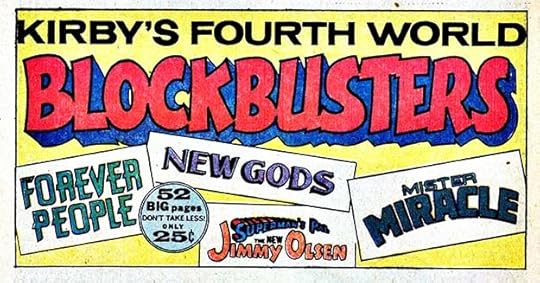
Once Jack Kirby’s Fourth World titles were launched, they didn’t receive much promotion. This third-page ad was put together by someone in the DC production department reusing a Saladino BLOCKBUSTER from a 1969 ad. It doesn’t count as a new ad for him. Considering how important Kirby’s titles had seemed to the company when they were new, DC must have been disappointed by sales, but more promotion of them might have helped.
 From FALLING IN LOVE #132, May 1972
This ad seems to be talking down to readers, and I don’t think it works well either from an ad copy or layout perspective. Perhaps it was meant to be generic so other titles could be plugged in.
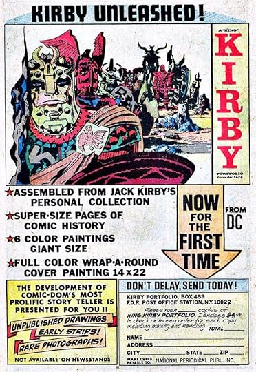 From ACTION COMICS #413, June 1972
An interesting ad for an interesting product. I wonder if Kirby was given free ad space for this personal project? Perhaps Mark Evanier will know. Most of the ad uses type, but there are Saladino banners in the box at lower left, and part of the coupon is also lettered by him. This just barely qualifies as a Saladino house ad.
 From BATMAN #245, Oct 1972
This generic ad was used with many covers.
[image error]From FALLING IN LOVE #137, Oct 1972Contests in comics are usually a sign of falling sales and desperate attempts to send them up again. The script lettering in this ad by Saladino is charming, showing he could hold his own in that area even though he did it rarely.
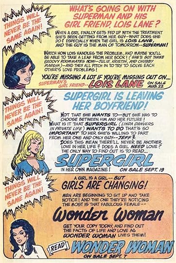 From FALLING IN LOVE #137, Oct 1972
In the same issue, DC was still trying to get romance readers to try their female superheroes. This ad has the most text we’ve seen in a long time spelling out why these books might be appealing, with emphasis on romance of course, and Gaspar makes it all interesting.
 From FALLING IN LOVE #138, Nov 1972
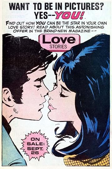
While promoted as a new title, LOVE STORIES was actually just a renamed one and contained the same sort of romance stories as the others in the line. This contest offer ups the game for readers, but did it help sales?
To sum up, I found 25 ads lettered by Gaspar in these two years, a considerable drop from his ad output in the previous few years. It’s hard to be sure why, but saving money on his fees could be a factor, and there may also have been less room for house ads because of a greater number of paid ones. More articles in this series and others you might enjoy are on the COMICS CREATION page of my blog.
The post GASPAR SALADINO’S COMICS ADS 1971-1972 appeared first on Todd's Blog.
October 26, 2021
Incoming: ECHOLANDS 3, RAW CUT 2

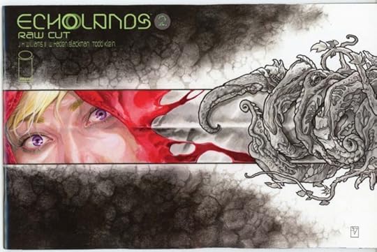
 Images © JH Williams III and W Haden Blackman
Just arrived is the third issue of this series, the Williams III cover and a variant by Michael Oeming, plus the Raw Cut version of issue two, the Williams III cover and a variant by Alison Sampson. The Raw Cut is the art as it left Jim’s hands before Dave added his colors, and with my lettering but translucent so you can see all the art. I’m a bit staggered by how quickly these seem to be coming out, which is great for readers, but a bit worrying for me on the production end. We only managed to get one issue completed per year for the first five issues, and I still haven’t seen finished color for issue 5 from Dave Stewart yet, which I will need to make the printer files. Issue 6 is finished on my end, but also waiting for Dave’s colors. I haven’t received art from Jim for issue 7 yet. Publication is rapidly catching up to our backlog! In any case, these are wonderful books that I think show all the many hours of hard work put into them by Haden and Jim, as well as Dave and myself, though my part goes much quicker than the rest. Look for them in a shop near you, or your favorite online comics retailer. Amazon links below if you prefer.
<br />
The post Incoming: ECHOLANDS 3, RAW CUT 2 appeared first on Todd's Blog.
October 25, 2021
GASPAR SALADINO’S COMICS ADS June-Dec 1970
 All images © DC Comics. From ADVENTURE COMICS #394, June 1970
This will be a shorter than usual post to finish out 1970 ads, just the way the year broke down best for me, and there were too many for a single post. At this time, Saladino was doing a lot of generic ads that could be reused with other DC covers. Some were, I can’t be sure if they all were, but this is a money-saving tactic that DC also used during Ira Schnapp’s tenure on house ads. I don’t know what Gaspar was being paid for ad lettering, but certainly it would have been more than his story page rate, and probably also more than his cover lettering rate, which was higher than the page rate too. At least that’s how it worked when I started at DC in 1977. This is a half-page ad, and it’s likely there were two on a page of comics art paper done at the same time, this being one. Gaspar was using concentric circles a lot as backgrounds, and tall DC letters, sometimes with periods, sometimes without. The tradition was that D.C. stood for Detective Comics, one of the first titles from the company that became their symbol, but Irwin Donenfeld, son of co-owner Harry Donenfeld from about 1938 on, said his father thought of it as representing Donenfeld Comics.
 From BATMAN #222, June 1970
Officially the actual company name at this time was National Periodical Publications, as represented in this ad as N.P.P., but everyone still called it DC Comics. Gaspar’s display lettering for this ad is well done, but he was sometimes now leaving out any background and just going with white. I think that looks fine.
 From BATMAN #222, June 1970
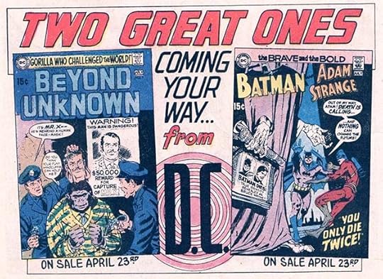
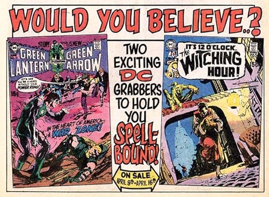
Here again the ad copy imitates the catch phrase of Don Adams in the TV show “Get Smart” on the top line. I recall it being a very popular comment. The rest of the ad copy calls these comics “grabbers,” something I don’t recall seeing anywhere else, but self-explanatory. I would agree. DC’s covers were becoming more dynamic and appealing due to the talent of artist Neal Adams and others who followed his lead.
 From OUR ARMY AT WAR #220, June 1970
Another generic ad that would work for any two “mystery” covers, and perhaps others as well. Gaspar’s lettering has great bounce and dry-brush texture inside some of the letters.
 From ACTION COMICS #390, July 1970
Here’s an ad that’s not generic, it only works for this particular feature, though that feature proved popular and appeared more than once. Of course it was all reprints. The repetition of DC in the ad copy and lettering reinforces replacement on this cover of the long-running DC Bullet corner symbol with the DC of tall block letters in Gaspar’s DC SPECIAL logo. The move away from the Ira Schnapp bullet was gradual, and this was the beginning of it.
 From ACTION COMICS #390, July 1970
There was also a trade dress change on the long-running Giant series, with Schnapp’s logo being replaced by a smaller Saladino one, as on this cover. That Giant by Gaspar is really more like cover lettering than a logo, and I’m considering it that. Gaspar’s ad lettering is appealing. The angles on the character names and the treatment of TM in BATMAN add interest. I like how the book seems to be gigantically thick, artistic license I guess.
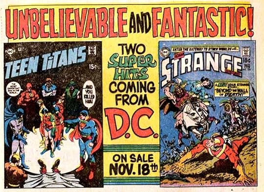
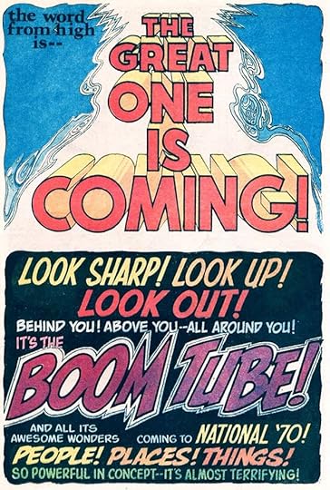 From ADVENTURE COMICS #395, July 1970
These are perhaps the two most famous half-page teaser ads in DC Comics history, hinting at the imminent arrival of Jack Kirby’s Fourth World titles. To the world at large, The Great One was either the supreme deity or Jackie Gleason, but in comics, it was definitely Kirby. I particularly love Gaspar’s treatment of BOOM TUBE. Note that in the lower ad, DC is calling itself NATIONAL. At this time I was reading mostly Marvel comics, but on hearing of Kirby’s move to DC, it did indeed bring me back.
 From BATMAN #223, July 1970
In this ad, the Schnapp DC bullet is still prominently displayed, and of course the name NATIONAL COMICS was part of it, though no one I knew ever called it that. Large block letters from Gaspar and a very simple round-cornered frame on this full-page generic ad.
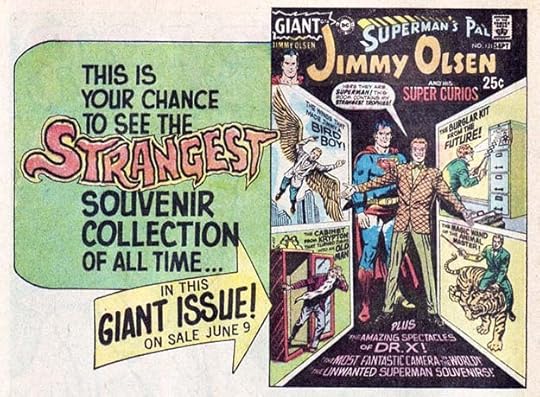 From OUR ARMY AT WAR #222, Aug 1970
On this Giant we’re back to the original Schnapp Giant logo. Several others of various sizes and shapes were tried through this year. Perhaps editor Mort Weisinger, who would retire in a few months, made that call on his books. Gaspar’s treatment of STRANGEST is the best thing here.
 From ADVENTURE COMICS #397, Sept 1970
Another somewhat generic ad that could be used with other similar titles, but only for another month or two. In addition to the Giant series, DC was also issuing another line of Super DC Giants, as seen here, continuing to pad their output with reprints.
 From ADVENTURE COMICS #398, Oct 1970
The treatment of FUNNIEST is indeed fun and funny here. Not sure why there’s an opening in the dot over the I, that may be a printing or separations error.
 From ACTION COMICS #394, Nov 1970
This generic ad was used many times with many different covers over the next few months.
 From ACTION COMICS #394, Nov 1970
The ad copy, which nicely contrasts Science and Sorcery, was undoubtedly written by editor Julius Schwartz, and it harkens back to the busier ads of Ira Schnapp, as do these reprint titles.
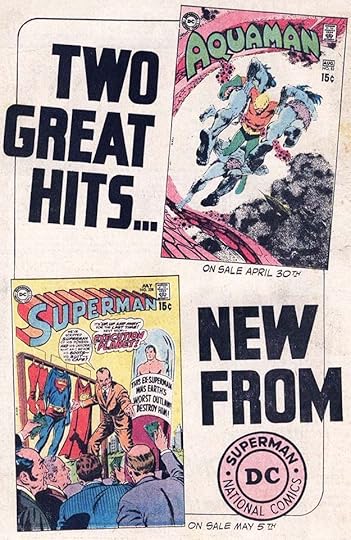
[image error]From AQUAMAN #54, Nov 1970Along with his three new Fourth World titles, NEW GODS, THE FOREVER PEOPLE, and MISTER MIRACLE, Jack Kirby also took on JIMMY OLSEN, causing me to buy that series for the first time in many years. I actually loved his work on the title, and even his handling of Superman. I didn’t know then that Superman’s face was often redrawn by DC’s regular artists after the stories were mailed to New York from Kirby’s home in California. If there was ever an appropriate use of the word BLOCKBUSTER, Kirby at DC was it! I would have preferred the cover larger and without the rough outlines around it, but in all this is a thrilling ad.
[image error]From ACTION COMICS #395, Dec 1970I don’t think DC had promoted two consecutive issues of any title this well for decades. Did Kirby have any hand in the ad copy for these? Perhaps Mark Evanier will know. Gaspar’s display lettering makes it even more exciting.
 From ACTION COMICS #395, Dec 1970
DC couldn’t wait to show off Kirby’s new titles, the images shown here are, I think, his uninked pencils, something DC almost never used in ads. This really was new for the company, and the hyperbole in the display lettering by Saladino was, for once, completely appropriate. Did many Marvel fans follow Kirby from Marvel to DC as I did? I think so, but I have no evidence. Sales on the Kirby titles were probably high at first, but of these, FOREVER PEOPLE and NEW GODS lasted only two years initially, and MISTER MIRACLE three. They and the Kirby characters became an important part of the DC Universe going forward, but it took a while for that to really kick in, and it was after Jack had left his unfinished epic behind.
To sum up, I’ve found 17 ads lettered by Saladino in this period, and adding in the 26 from earlier books with 1970 cover dates, there were 43 in all. Actually, there may well have been more. As we enter the 1970s, scans of comics online that I use for my research begin to include ads less often, making it harder to be sure I have them all. If more turn up, I will add them. Other articles in this series are on the COMICS CREATION page of my blog.
The post GASPAR SALADINO’S COMICS ADS June-Dec 1970 appeared first on Todd's Blog.
October 24, 2021
And Then I Read: AROUND THE WORLD IN 80 DAYS by Jules Verne
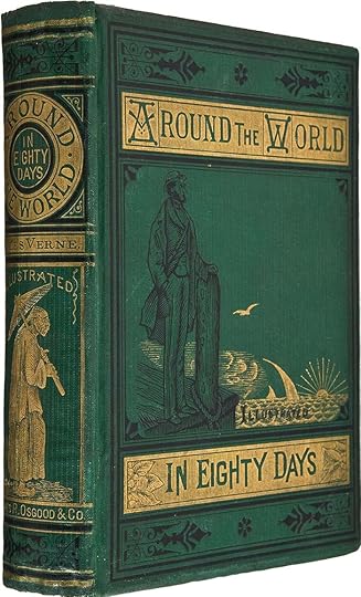
One of Verne’s most popular works, serialized in 1872 and published in 1873, I’m not sure why I haven’t read it before now. Growing up we went to see the 1956 movie version with David Niven in the lead role, and we had a short book adaptation of that, so I guess I thought I knew the story. I was right in some ways, quite wrong in others.
Phileas Fogg is a wealthy Englishman living alone in London, and one who thrives on exact routines that never vary. His home life is perfectly regulated with the help of a valet, and he goes every day to The Reform Club, one of those upper-class clubs the British were famous for, where he spends much of his time playing the card game Whist for money, and adding a bit to his fortune. One day there’s an argument about a newspaper article which cites the opening of a new railway line in India which would make it possible to circumnavigate the globe in 80 days. Many scoff at the idea, but Fogg defends it, and bets half his fortune that it not only can be done, but that he himself can do it. The bet is taken by his club mates, and Fogg hurries home to begin preparing. One difficulty is that he’s recently fired his valet and just hired a new French one, Passepartout. In fact the day of the bet is that fellow’s first day on the job. Passepartout is mystified and frightened by the news of the difficult adventure he and Fogg are about to undertake, but anxious to please his employer, and they set off almost immediately.
At first the journey goes smoothly, but in Suez, Egypt, they fall under the suspicion of a British policeman, Detective Fix, who has been sent there to watch for a bank robber. Fogg fits the description, and Fix wants to arrest him, but an arrest warrant can’t be sent from England in time, so Fix decides to follow the adventurous pair, hoping to arrest them somewhere on English soil, and with plans to slow them down wherever he can. Fix befriends Passepartout, who doesn’t know Fix’s real motive, and the three travelers form an interesting triangle. Fogg is totally focused on his mission, but seems unruffled by any of the problems and difficulties that arise on the way, and he’s happy to join a game of Whist rather than even looking at the scenery. Only when the three have the chance to rescue an Indian princess, Aouda, from being burned at the stake does Fogg show true bravery and resourcefulness, and they succeed, bringing the princess with them, though the most dangerous role is taken by Passepartout. Aouda hopes to find family in Hong Kong, but eventually joins the travelers on their entire journey. Fix tries several times to stop them, but when he fails in his arrest plans, decides to continue also on the entire journey, hoping to make his collar when they are back in England. Many exciting adventures ensue, and Verne tells his story well.
Some of the things I thought would be in the book were only in the film, like a balloon section of the trip, and many more adventures happen than were in the film. The endings of each are similar, and based on a mathematical miscalculation by Fogg that would be very unlikely in real life, but it works in the story, as does the resolution of the Aouda situation. I enjoyed reading this, and recommend it. Unlike many of the Verne stories I’ve read, it has no science fictional elements, but perhaps at the time the entire journey seemed like science fiction to readers.
The post And Then I Read: AROUND THE WORLD IN 80 DAYS by Jules Verne appeared first on Todd's Blog.
October 22, 2021
Incoming: SANDMAN DELUXE EDITION HC Book Four
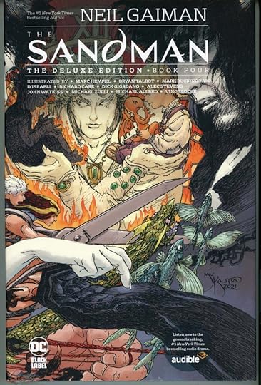 Image © DC Comics, cover art by Michael Wm. Kaluta
Just arrived is this new slightly oversized hardcover reprinting issues 51-69 of the original SANDMAN series, including the entire final long story arc, “The Kindly Ones.” As with previous volumes, there’s an interesting new cover by Michael Kaluta, and a cover tag for the Audible audio version of Sandman. The best version of this series is the Absolute Editions of some years ago, but this is cheaper and equally well made, if not as large. Cover price is $49.99. It should be at comics retailers in a few weeks, or here’s an Amazon link if you prefer.
The post Incoming: SANDMAN DELUXE EDITION HC Book Four appeared first on Todd's Blog.
October 21, 2021
GASPAR SALADINO’S COMICS ADS Jan-May 1970
 All images © DC Comics. From ACTION COMICS #384, Jan 1970
As we begin ads in comics with cover dates from January to May, 1970 (work probably produced from September to December 1969), Gaspar has grown comfortable with his role as the style setter for DC. The majority of DC’s titles—and all the newest ones—feature his logos, nearly all the cover lettering is by him, and nearly all the house ads too. Gaspar was still also lettering plenty of story pages, with his main focus being war stories, but he did others in all genres. DC’s output was increasing, though a fair amount of it was reprints from the 1950s-1960s. Still, new editors and freelance artists were making their presence known, and the biggest shakeup of all was on the horizon: the move of Marvel mainstay Jack Kirby to DC with a roster of all-new creations. The ad above has fine display lettering by Saladino, but the books are full of reprints.
 From ACTION COMICS #384, Jan 1970
With artist Carmine Infantino now running the creative end at DC, more artists were being hired as editors. In addition to Joe Orlando and Dick Giordano, others had a chance to try their ideas. This three-issue run in SHOWCASE was written, drawn and edited by Mike Sekowsky, the long-time artist on JUSTICE LEAGUE OF AMERICA and other titles. He probably designed the ad with his art surrounded by Saladino lettering running in all four directions. The ad is memorable, and it gave Gaspar a chance to use his upper and lower case style more than usual, but the feature went no further.
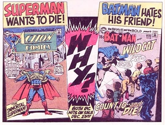
 From ACTION COMICS #384, Jan 1970
It’s been said the most important topics in fiction are love and death. For younger male readers, love is not something they want to read much about, so death was most often used in comics, as here. DC was trying to get into more serious stories at this time, and away from the lighter fluff they had been selling for years. Gaspar’s lettering was dramatic and serious when needed, or silly and light, or could follow any direction requested. Versatile.
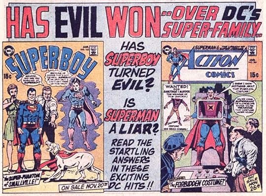 From ADVENTURE COMICS #388, Jan 1969
In the Superman-related titles, long-time editor Mort Weisinger had recycled his favorite ideas to death and was at least turning to new, younger writers like Cary Bates and Jim Shooter for stories, but I don’t know that making his heroes evil was the way to go. Gaspar sells the direction well.
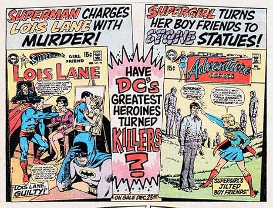 From ACTION COMICS #385, Feb 1970
More turning heroes into villains with effective Saladino lettering. Gaspar’s treatment of STONE is clever, but a bit hard to read.
[image error]From ACTION COMICS #385, Feb 1970Gaspar had been the visual glue holding together DC’s war titles for years, and his house ads and cover lettering for them were always effective.
 From ADVENTURE COMICS #389, Feb 1970
The ad copy here shows the influence of the “Get Smart” TV show, using the main character’s most well-known gag line. It seems like a fun idea, even if it’s a desperate ploy to boost sales for the last of DC’s Hollywood humor books, and the ever creative new logo versions by Saladino work well together.
 From ADVENTURE COMICS #389, Feb 1970
Death, anger, and despair. Why? Desperation to turn the tide against the rise of Marvel Comics perhaps.
 From BATMAN #219, Feb 1970
Two half-page ads with fine Saladino work. At this time, Marvel was hardly doing any house ads, preferring to promote their books mostly on their Bullpen Bulletins page of chatty, engaging, humorous hype in the Stan Lee style. Perhaps they also thought they couldn’t compete with what Gaspar was doing in this area, and DC’s editors certainly couldn’t compete with Stan’s ability to charm readers.
 From DC SPECIAL #6, Jan-March 1970
DC’s ideas about interacting with fans were brief responses in letter columns and impersonal ads like this one. They did have a page of coming attractions listing upcoming issues, Direct Currents, but it wasn’t nearly as appealing as what Marvel was doing.
 From ACTION COMICS #386, March 1970
I find the ad layouts and lettering on these two half-page ads appealing and effective, but as usual DC was promoting reprints at least as often as new material. And, of course, Supergirl was all about romance.
 From ADVENTURE COMICS #390, March 1970
This title and ad copy does nothing but reinforce how out of touch DC editors were with the audience they were seeking. THE NEXT HAPPENING is an interesting experiment, but hard to read, and the thin lettering in the center is a bit weak, and not one of Gaspar’s better efforts.
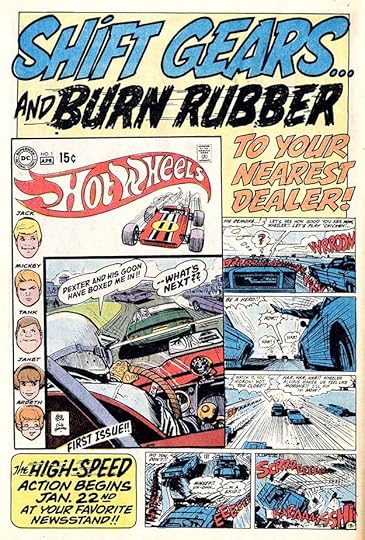 From BATMAN #220, March 1970
Here’s a much better ad for comics related to a new toy line and cartoon show. Well-crafted and creative display lettering by Gaspar makes it exciting. The story art by Alex Toth with lettering by newcomer John Costanza is appealing too.
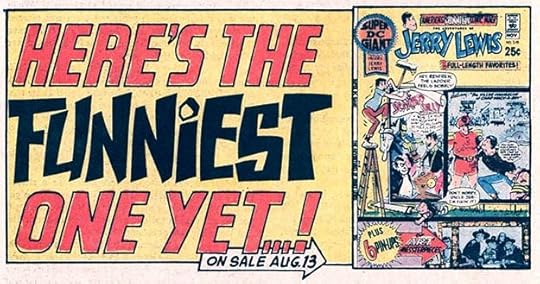
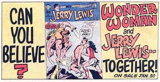
 From THE ADVENTURES OF JERRY LEWIS #117, March 1970
DC was at least trying to be different with PHANTOM STRANGER, but STRANGE ADVENTURES was reprints, so not very different. This generic ad lettering could have been used with almost any two DC covers.
 From OUR ARMY AT WAR #217, March 1970
Gaspar makes good use of arrows to grab attention in another generic ad, the first one for AQUAMAN in a long time. I should repeat that I didn’t look for ads as thoroughly in these years as I did for my Ira Schnapp ad articles, and sometimes couldn’t find many from my usual online sources, so I could well have missed some.
 From ACTION COMICS #387, April 1970
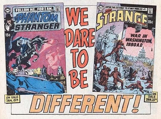
Different and Daring were definitely buzz words for DC ads at this time. This title was certainly different, but did not find much of an audience. Again, the ad copy could be applied to many other titles.
[image error]From ACTION COMICS #387, April 1970An even more generic ad with minimal lettering that would work with any four covers. Only on-sale dates would need to be added. I actually think this is a bit too minimal, and why use the ACTION COMICS cover for the very issue this appears in?
 From ADVENTURE COMICS #392, April 1970
This ad copy at least avoids lame attempts at hip slang, but it’s still kind of off-putting. Gaspar’s mix of solid and outlined letters adds some interest.
 From ACTION COMICS #388, May 1970
Another minimalist generic ad that would work for almost any two humor titles.
[image error]From ACTION COMICS #388, May 1970After all that generic minimalism, this copy-heavy ad is kind of a nice change, though it’s again all about reprints. Origins were of interest to fans who had missed out on the original stories, so that was a good selling point. Gaspar presents it well with varied and creative display lettering.
[image error]From ACTION COMICS #388, May 1970Another minimalist generic ad that was used with other titles. The conundrum of whether DC should have periods vacillated back and forth over the years.
 From ADVENTURE COMICS #393, May 1970
The ad copy MILE A MINUTE makes this ad a bit less generic, as it would apply best to stories involving vehicles. Lots of white space, but nothing wrong with that. I am puzzled by the different sizes of the two covers.
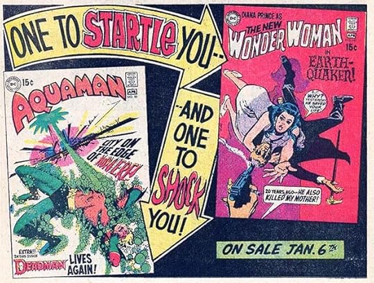
[image error]From AQUAMAN #51, May 1970A helpless Wonder Woman and a manipulative Lois Lane. Not the best role models for female readers, I would say. Nice lettering, though.
 From DETECTIVE COMICS #399, May 1970
Another ad that would work with many titles and having just a little lettering. These must at least have saved Gaspar some time.
I could continue with the rest of the 1970 ads I found, but it would make this article a little too long, so I’ll do that next time. To sum up, I count 26 ads by Saladino for these months. I’ll do a total for the year in the next article. Others in this series and more you might enjoy are on the COMICS CREATION page of my blog.
The post GASPAR SALADINO’S COMICS ADS Jan-May 1970 appeared first on Todd's Blog.
October 18, 2021
GASPAR SALADINO’S COMICS ADS Aug-Dec 1969
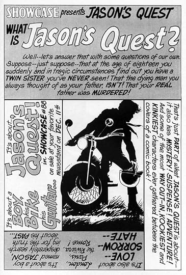
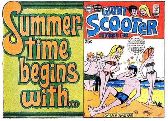
Finishing up Gaspar’s very busy ad year of 1969, we begin with this ad for yet another Giant reprint issue. You’d think they’d all have been used by now, but not so. Saladino’s script lettering was never as well done as that of Ira Schnapp, but it does have a nice bounce here, and works fine. Giant arrows are always effective, and the angled boxes for the women’s names adds interest. Can the ad copy get any more sexist?
[image error]From ACTION COMICS #379, Aug 1969While the Superman family of titles often featured static and motionless characters on the covers, the Batman titles were more interesting and active. The villain here has a long name, but Gaspar makes it work in the lettering.
 From THE BRAVE AND THE BOLD #85, Aug-Sept 1969
DC continued to push their teen humor characters in reprint titles like this. I don’t know who was buying them. The lettering is appealing.
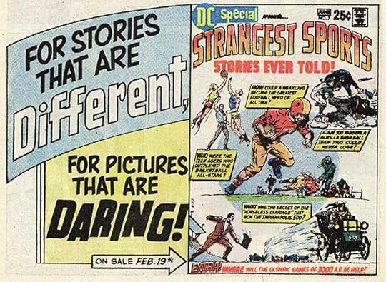
 From DC SPECIAL #4, July-Sept 1969
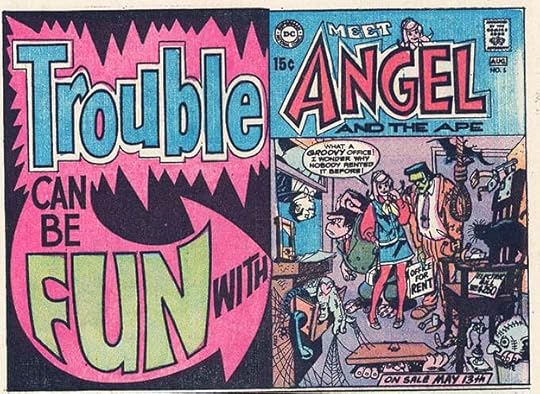
I’m counting this as an August cover date, averaging the three month span. This ad shows the final evolution of ANGEL to the lead character in her series, which was being played as teen humor, and did not last much longer. Saladino’s lettering is certainly fun in my opinion.
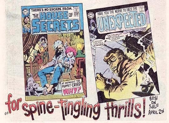
 From OUR ARMY AT WAR #209, Aug 1969
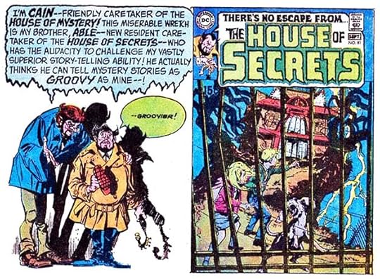
With the success of Joe Orlando’s relaunch of HOUSE OF MYSTERY, he did the same for HOUSE OF SECRETS. One of the best things about them was the hosts of each, brothers Cain and Abel. You might have heard of them before. The lettering here is all story lettering with some nice balloon borders.
 From ACTION COMICS #380, Sept 1969
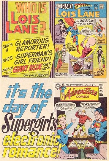
These two half-page ads represent DC’s ideas about their female lead characters, and not in a way that looks very good today. DC thought they were mainly interested in romance and glamor, or in the case of Lois here, glamor gone wrong. At least Gaspar does a fine job on the lettering. I like the shaky outlines of ELECTRONIC.
 From ADVENTURE COMICS #384, Sept 1969
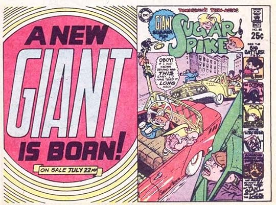
Those Giants, they kept coming. It’s actually good to see this one for Sugar and Spike, characters who were often overlooked by DC fans. Gaspar’s giant GIANT is effective.
 From ADVENTURE COMICS #384, Sept 1969
Two more half-page ads with large, attention-getting display lettering. The burst and the oval are done with a dry brush on the second one. For those not familiar, it’s an inking technique using a brush that has been dipped in ink and then partially wiped off to create those rough textures when used. I was never any good at it.
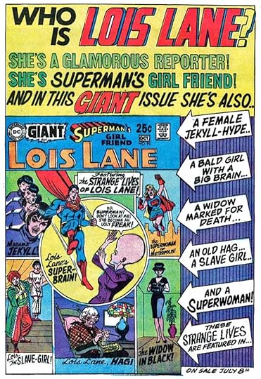 From OUR ARMY AT WAR #210, Sept 1969
A full page version of the Lois Lane Giant seen earlier with all new Saladino display lettering, though a few words are type. This didn’t happen often, half-page ads converted from full pages or vice-versa were usually cobbled together in the DC production department using the same lettering.
 From OUR ARMY AT WAR #210, Sept 1969
Perhaps whoever wrote the ad copy for this one couldn’t think of anything better to say about this cryptic but intriguing cover. I like the lettering of KRYPTON.
[image error]From ACTION COMICS #381, Oct 1969For decades, DC did not promote or even name the artists on many of their books for fear that it would lead to them asking for more money or otherwise asserting themselves. The company line was that artists were interchangeable, and if one left or was unavailable, another would do just as well. Once artist Carmine Infantino joined management, that began to change, and this Joe Kubert issue of DC SPECIAL is an example. Note that the ad still did not name Kubert in the ad copy, he’s simply “an artist,” but he is named on the cover. Great display lettering by Saladino.
[image error]From ACTION COMICS #381, Oct 1969Again we see a Batman cover with action, and even a three-panel story tease, very different from many of the Superman-related ones. Gaspar’s large display lettering is possible due to the small amount of ad copy, mainly two short sentences that work well to intrigue buyers.
 From ACTION COMICS #381, Oct 1969
Here’s a good example of a mostly static group of scenes except for the top one on this cover. As usual, DC was turning to the past to generate sales. Gaspar’s lettering helps make it sound interesting.
[image error]From ADVENTURE COMICS #385, Oct 1969Another static scene and a defeated, devastated hero. Marvel’s covers usually had more to appeal for readers, in my opinion.
[image error]From FALLING IN LOVE #110, Oct 1969Another example of DC’s romance line promoting their superheroic female leads. Nothing very romantic about that Wonder Woman cover, but perhaps there’s some inside. Saladino’s lettering and background attempt to add some energy.
 From OUR ARMY AT WAR #211, Oct 1969
The display lettering on this ad is great, and the idea is more interesting than usual for Superman. Note that Gaspar lettered two different versions of each hero’s name.
[image error]Frin ACTION COMICS #382, Nov 1969Two more half-page ads. The top one promotes another Giant with attention-getting lettering and arrow, the bottom one tries some hip language in “What’s your thing?” I wonder if the person writing ad copy and using this kind of slang was looking at the TV show “Rowan and Martin’s Laugh-in” for ideas? They used similar hippie and youth culture slang, but usually in a somewhat mocking way. The show began airing in 1968. DC’s ideas about youth culture seemed pretty clueless to this teenager at the time.
[image error]From ADVENTURE COMICS #386, Nov 1969Now here’s a house ad I completely approve of, and it falls into the “public service” category which DC had not been producing since 1967. There’s little to be gained by DC here other than the good will of readers and families who steered younger siblings to Sesame Street, or even enjoyed it themselves, though having DC characters on the show in some way was a promotional tool. Well done, DC!
 From AQUAMAN #48, Nov 1969
Different and Daring were two words DC liked to promote with at this time. I think Firehair qualifies, I’m not sure about the other one. Gaspar’s display lettering certainly added excitement. That arrow in the center is really packed.
[image error]From GIRLS’ LOVE STORIES #147, Nov 1969Here’s a generic romance ad by Gaspar that was used in different titles with different pairs of logos. It worked well for all of them. I don’t think Gaspar did the figure art, but he might have done the flowers, or at least the ones on the bottom half.
[image error]From THE ADVENTURES OF JERRY LEWIS #115, Nov-Dec 1969This looks like it was designed as a full page ad to run sideways, but I found it as a half-pager. There’s that hep language again, but the display lettering is lovely.
[image error]From OUR ARMY AT WAR #212, Nov 1969Two covers showing heroes acting heroic, what a great idea! And Saladino’s display lettering in the center makes them more intriguing.
 From DETECTIVE COMICS #393, Nov 1969
These covers, on the other hand, have no heroism in sight, only heroes being mocked. Blockbuster was another word DC was liking at this time, but I’m not sure it applies to these comics.
 From ACTION COMICS #383, Dec 1969
That BRAVE AND BOLD cover is more like it, but ADVENTURE features an “evil super-tot.” Not for me, that one.
 From ACTION COMICS #383, Dec 1969
This Superman Giant seems to have a very soap opera-ish theme, one I don’t think I would have bought. Gaspar’s display lettering is great, and sells the idea well. I was also resistant to characters telling me to “STOP! You MUST read these stories…” though that had worked for DC elsewhere.
 From ADVENTURE COMICS #387, Dec 1969
Promoting clever babies Sugar and Spike as “tomorrow’s teenagers” is an interesting approach. This book had to be finding an audience to survive so long, fifteen years and almost 100 issues. The genius of creator Sheldon Mayer is the reason, but Gaspar’s display lettering helped too in this ad.
[image error]From ADVENTURE COMICS #387, Dec 1969DC’s “mystery” titles weren’t getting much attention, but pairing one with the popular Justice League in this ad is not a bad idea. It might have caught the interest of a few new readers.
To sum up, I found 30 new ads lettered by Saladino in this final part of 1969. Adding the ones from the rest of the year, that’s an amazing 86 new ads for books with 1969 cover dates. I don’t know how he did it along with all his other work, and so much of it is excellent! Other articles in this series and more you might enjoy are on the COMICS CREATION page of my blog. On to the 1970s next.
The post GASPAR SALADINO’S COMICS ADS Aug-Dec 1969 appeared first on Todd's Blog.
October 17, 2021
Rereading: HALF MAGIC by Edward Eager
 Cover illustration by N.M. Bodecker
Edward Eager was a successful playwright and lyricist for musical theater in New York from the 1940s to the 1960s, but he’s best known today for the series of seven novels for children now called “Tales of Magic,” this being the first one, written from 1954 to 1962. I loved them as a child, and continue to do so. Eager’s role model was E. Nesbit, writer of similar magic books in England from 1899 to 1911, and Eager similarly structured his books and followed the rules of magic laid down by Nesbit, but with a more modern approach, an economy of plot and structure, and delightful touches of sly humor, not enough to spoil the magic, but making it all the more fun.
Half Magic happens to four children, Jane, Mark, Katharine and Martha who live in a small town with their widowed mother during the 1920s. Their mother works hard at a job she hates to keep them housed, clothed and fed, but there’s little money for anything extra, and the four children begin their summer vacation from school wishing they could go to the country like their school friends, but faced with the prospect of visits to the library as their only entertainment. They wish something interesting would happen, and without them realizing it at first, something does. Katherine spots a coin on the sidewalk, nabs it, and puts it into her pocket. As the day goes on, the children begin to notice some very odd things happening that can’t be explained in any ordinary way. For instance, Katharine wishes there would be a fire to make life more exciting, and suddenly there is one, but only a small fire in a playhouse down the street. No one connects this with the coin in Katharine’s pocket until later.
Magic in these books, as with Nesbit’s, has strict rules, and the magic coin Katharine found grants wishes, but only half of them. It takes the children a while to figure this out, and there are plenty of amusing events while they do. For instance, their cat Carrie (as seen on the cover above) is given the power to talk, but can only half talk, leading to dialogue from it like, “Idjwitz! Oo fitzwanna talkwitz inna fitzplace annahoo?” Once the nature of the magic coin is deciphered, the children agree to take turns using it for a day, but as with all magic things in these stories, the coin is as tricky and literal as a hostile lawyer, and many wishes go wrong, especially ones made by mistake or in anger.
I can’t recommend these books enough, and I’ll be rereading the whole series in the days ahead. This one is the place to start, and the whole series has been reprinted often and is easy to find. The original illustrations by N.M. Bodecker are equally delightful.
<br />
The post Rereading: HALF MAGIC by Edward Eager appeared first on Todd's Blog.
October 14, 2021
GASPAR SALADINO’S COMICS ADS May-July 1969
 From ACTION COMICS #376, May 1969
Continuing with Gaspar Saladino’s very busy year on ads in comics with 1969 cover dates, DC’s long history was always a source of pride, even though its earliest years under the ownership of Major Malcolm Wheeler-Nicholson were never talked about, nor was the takeover from him by Harry Donenfeld and Jack Liebowitz. The Major’s last new title was Detective Comics, launched in 1937, but DC preferred to celebrate the anniversary of Batman’s first appearance in issue #27. Fair enough, it was what current readers were most interested in. Gaspar’s giant 30 is eye-catching. The blurb at upper left was meant to be hip, but was probably considered lame by teen readers. Saladino’s starry background works well, almost merging with the black area of the cover to create an appealing curved diagonal shape.
 From ACTION COMICS #376, May 1969
On the top one of these two half-page ads, Gaspar’s display lettering is large and appealing. His ADVENTURE presages the logo he would do for the title a few years later. Below is a paid ad for the long-time advertiser Palisades Amusement Park. Ira Schnapp did many similar ads for them, this is Gaspar’s version, and I think his lettering stands out and attracts attention to a subject many readers had seen so often they were ignoring it. I believe this was the last new ad for the amusement park, which closed in 1971. Though I lived in New Jersey, I was never there.
 From ACTION COMICS #376, May 1969
Gaspar could always be counted on for effective horror lettering, like his dry-brush treatment of GHOST here. More dry brush work fills in the background.
 From ACTION COMICS #376, May 1969
DC was trying to shake things up in their long-running SHOWCASE series with a new logo and trade dress, and this series with art by newcomer Bernie Wrightson, one of a handful of young artists getting the chance to do work for DC alongside the company’s regular stable of long-time talent. Gaspar sells the idea brilliantly with two swords in SWORD and a horrific SORCERY. Though it ran in three SHOWCASE issues, it went no further.
[image error]From ACTION COMICS #376, May 1969Short, sweet, and succinct ad lettering with a creative final word. That’s five house ads just in this one comic, so DC was upping their promotional game.
[image error]From ADVENTURE COMICS #380, May 1969Giant arrows in perspective are always a good way to draw the eye to a subject. Having the text inside it lead directly into the cover lettering is a nice touch.
[image error]From ADVENTURE COMICS #380, May 1969Lettering in perspective is another way to bring the eye into the picture, and it works well here. The open telescoping on FUTURE is not very accurate, but good enough.
 From BATMAN #211, May 1969
You can’t get much briefer than this ad copy! Effective, and the concentric circles also pull one into the picture.
 From OUR ARMY AT WAR #206, May 1969
It made sense to promote war titles in other war titles, as here, but DC was not doing much of that at this time. Great burst by Gaspar.
[image error]From OUR ARMY AT WAR #206, May 1969Another version of SHOCKER and another giant arrow with perspective lettering. Both work well to garner attention, and the concentric circle backgrounds were an easy choice to fill the space.
 From ACTION COMICS #377, June 1969
THE BRAVE AND THE BOLD had become a Batman team-up title, and by this time he’d teamed up with all the likely superheroes, and the book was getting more creative, though the focus on dying characters was perhaps not the best way to go. Gaspar’s creativity shows up in small ways like the TH in THIS at the top and that wild version of BATMAN.
[image error]From ACTION COMICS #377, June 1969In my opinion, no one did scary lettering better than Saladino. His organic shapes often seem covered in shaggy fur, as on 13 here, and the result is unsettling. Some of the smaller lettering is type, possibly Letraset adhesive letters one could press into place from a plastic sheet of them, or it might be headline type from DC’s headliner machine, which printed large photo-type one letter at a time on a narrow roll of photostat paper. Both were time-consuming, but the results looked good, and were common resources in the DC production department. Gaspar may have asked for that help to make a deadline, or simply because he liked the contrast.
 From ACTION COMICS #377, June 1969
DC continued to push their Giant line of reprints with handsome Saladino ads like this one, mining their past for sales that many new titles couldn’t achieve. That 1 on the right side is possibly the largest number Gaspar ever produced in an ad. I particularly like the smaller lettering at the bottom of it, which is full of lively bounce.
[image error]From ADVENTURE COMICS #381, June 1969This ad might be a first for DC in that it’s a collage of partially-seen covers running behind the lettering rather than an ad displaying entire covers, as had often been done before. This is called a line ad, advertising an entire line, and of course there were many more titles that didn’t make it into the collage, but I think it’s an effective promotion, as if to say, “We have so much for you!” Gaspar’s lettering is large and impressive. There was also a color version, but I like this one better.
 From BATMAN #212, June 1969
Captain Action was based on a toy line, a short-lived but well-made series. Gaspar’s angled block lettering and large question mark work well in the first of these two half-page ads. In the Flash one, impossible seems to be the new buzz word. The Flash logo used with the lettering is an old one created by Ira Schnapp for story splash pages. This counts as two ads.
[image error]From BATMAN #212, June 1969Gaspar’s ad lettering here is appealing, I like the brass of making the D in DC smaller to fit FROM above it. Perhaps the word HAPPENING in a mix of upper and lower case is indeed fun.
 From CAPTAIN ACTION #5, June-July 1969
Another well-lettered ad for three war titles. My apologies for not rotating these sideways ads, as it makes the lettering too hard to see if I reduce them enough to run them normally.
 From OUR ARMY AT WAR #207, June 1969
SUGAR AND SPIKE by DC veteran Sheldon Mayer had been running for many years with little attention from superhero fans, so I’m surprised at the boast here that it was a super seller. If true, perhaps parents were buying it for their kids. It was a fine book, and Gaspar did well on the ad lettering.
 From ACTION COMICS #378, July 1969
Another title celebrating Batman’s anniversary was this Giant reprint issue. The most modern thing in the ad is Gaspar’s lettering, which is full of energy. Look at the lower case A in BATMAN that makes room for the number 4. So clever.
 From ACTION COMICS #378, July 1969
Saladino put lots of skill into these two half-page ads, the lettering seems to jump off the page. The tragedy and comedy masks are a nice idea, and the display lettering is all excellent.
 From ADVENTURE COMICS #382, July 1969
One way that Gaspar differed from Ira Schnapp is that he usually preferred to letter a new version of a book’s logo in the ad lettering rather than use the cover logo, even when it was one he’d done. It made sense here, as the cover logo would not have fit as well. Again, this lettering jumps off the page and demands to be read.
 From ADVENTURE COMICS #382, July 1969
This ad effectively breaks the lettering space into two side bars that help balance the divided cover.
[image error]From AQUAMAN #46, July-Aug 1969The three main female stars at DC in 1969 (with Supergirl being the third), were often paired in ads and in stories. Once again, Gaspar does new versions of the logos that work better with the rest of his lettering.
To sum up, I found 26 ads lettered by Saladino in this part of 1969. I will do totals for the year in the next article. Other parts of this series, and more you might enjoy are on the COMICS CREATION page of my blog.
The post GASPAR SALADINO’S COMICS ADS May-July 1969 appeared first on Todd's Blog.
Todd Klein's Blog

- Todd Klein's profile
- 28 followers

