
Todd Klein's Blog, page 87
August 2, 2021
GASPAR SALADINO’S COMICS LOGOS Jan-April 1969
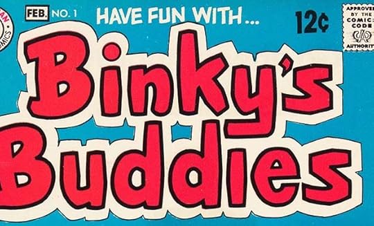 All images © DC Comics. From BINKY’S BUDDIES #1, Jan-Feb 1969
As you can see from the title of this post, the fall of 1968 (when these logos were probably created) was a very busy time for Gaspar Saladino. Ira Schnapp had been sent home some time in 1968, my guess is the summer, and Gaspar’s mandate to update and revitalize the entire DC line with his own new cover lettering, house ads and logos was in full swing. New editor Joe Orlando had taken on non-superhero genres as his domain, and he decided to add to DC’s teen humor genre with this new series that featured one new story in front of reprints. Gaspar’s take on the logo is somewhere between what he had done recently for Binky’s own title and Scooter and the more angular logos he was beginning to favor elsewhere. The result is easy to read, especially with the wide outer second outline, and has a little more punch than those previous two.
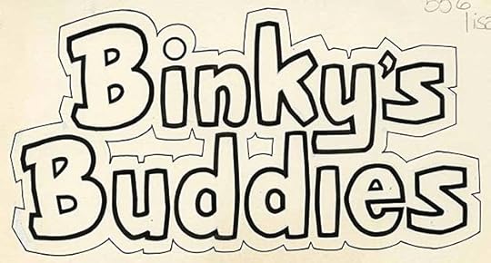
The original logo from the DC files is the same, I see only a few minor white paint corrections.
 From DATE WITH DEBBI #1, Jan-Feb 1969
Another new DC editor, Dick Giordano, also added to the teen humor line with this new title. Gaspar’s logo here is much closer to the style used by Archie Comics, and it works well as that. I like the heart over the i, but I’m not sure why the second outline around it is smaller than the rest. Possibly a late change to make room for the issue number?
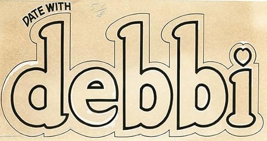
As the original logo from the DC files shows, that wasn’t it. The browning art paper on this logo makes the few white paint corrections more obvious. While this is similar to Archie’s logo style, it has its own divergent logic with points at some places and rounded shapes at others.
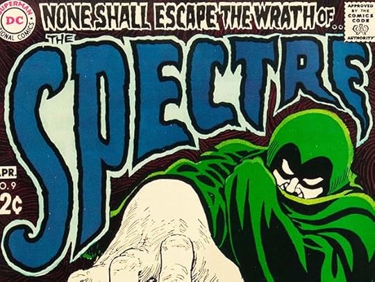
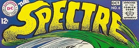
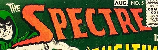
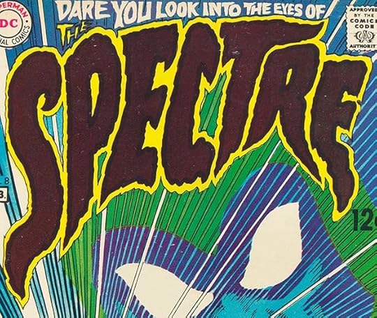 From THE SPECTRE #8, Jan-Feb 1969
THE SPECTRE had been trying a series of one-shot logos, but this one with art by Nick Cardy blows them all out of the water. I only regret that such a dark brown was used inside the letters, obscuring Gaspar’s thick, rough outlines, but for scary, this is hard to beat. Even the top line lettered to fit the space works well. Only THE above the P is a bit hard to read.
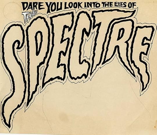
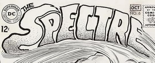
On the original logo from the DC files you can see what I mean about the outlines, they deserved to be seen. You can also see that THE has been modified, probably to make it outlined. The rest is right from Gaspar’s pen. No one did this kind of thing better.
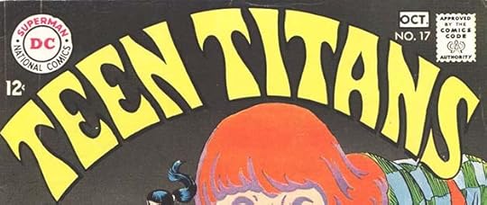
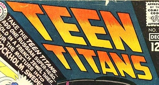
 From TEEN TITANS #19, Jan-Feb 1969
With issue #19, TEEN TITANS arrived at a Saladino logo style that would stay for a while. These are standard slanted block letters made interesting by the lower case i between the two T’s of TITAN. On later issues it was often in a banner.
 From THE BRAVE AND THE BOLD #82,
 With THE BRAVE AND THE BOLD issue #82, Gaspar replace the long-standing flag banner logo by Ira Schnapp with this very long one running at the top of the cover in a box. It had the advantage of being larger but still leaving more room for character logos, as this title continued to present two or more character team-ups, usually with Batman as one of them. I like the variation of lower and upper case words.
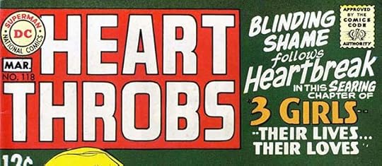 From HEART THROBS #118, Feb-March 1969
This second revamped logo for a DC romance title is much more conservative than what Gaspar did for YOUNG ROMANCE, simple block letters in a box with his characteristic R shapes. Ira Schnapp’s logo for 3 GIRLS remains on the right.
 From SHOWCASE #80, Feb 1969
Phantom Stranger had had a brief series in the early 1950s. Joe Orlando brought him back first in this SHOWCASE tryout, then in his own series using this new logo by Saladino. The top line is in Gaspar’s horror style, the bottom word is block letters with a rough outline around it. This seems a good mix for the character who walked the line between horror and heroics. Saladino R’s in use.
 From DETECTIVE COMICS #384, Feb 1969
This issue of DETECTIVE had Gaspar replace ROBIN with BATGIRL, and both versions were used alternately on different issues. While most of the logo is the same, repeated use of BATGIRL qualifies it as a new logo in my opinion.
 WITCHING HOUR #1, Feb-March 1969
Editor Dick Giordano joined the horror bandwagon with this title boasting an excellent logo by Saladino. The word WITCHING uses dry brush lettering very effectively, in fact the entire logo may have been done with a brush rather than a pen, though if so HOUR has pen outlines as well for the long straight edges. Perhaps my favorite thing is that the entire logo is in a giant word balloon with the tail to a tiny figure below. This makes it seem even larger in context. The balloon and tail continued for the first few issues, then just the balloon, and eventually just the words THE WITCHING HOUR.
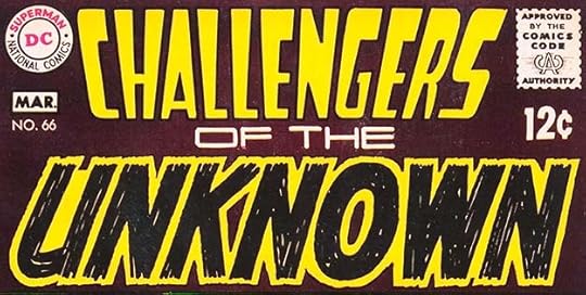 From CHALLENGERS OF THE UNKNOWN #66, Feb-March 1969
Considering how many logos Saladino was designing in this period, it’s unsurprising that a few are not so good. I would say that of this new logo for CHALLENGERS. I like the UNKNOWN part, made of many large pen strokes that leave some white voids between them, but the top three words don’t work well for me, and don’t go well with the bottom word.
 From OUR FIGHTING FORCES #118, March-April 1969
This Saladino logo follows the general plan of his CAPT. HUNTER logo from OUR FIGHTING FORCES #102, but with a double outline around the main word rather than telescoping. It replaced one of Ira Schnapp’s final logos for the same feature. The cat art is by Joe Kubert. Both Ira and Gaspar thought block letters were a good idea on war logos, and one by each of them is seen here.

The original logo from the DC files has only the word HELLCATS, so the rest was probably done as part of the cover lettering. Note how Gaspar has added small indents in the outer line in some places to suggest where he would have made larger ones if there was room. This does not follow the logic of the outer line, but it works fine anyway to break up the long curves, showing that the logical choice is not always the best.
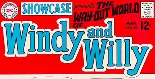 From SHOWCASE #81, March 1969
In the early 1960s, DC had a good run with THE MANY LOVES OF DOBIE GILLIS based on the TV teen humor/romance series. Here editor Dick Giordano tried to repurpose a few of those stories with a new Saladino logo, art changes to hairstyles and clothing, and revised dialogue. It didn’t go beyond this one issue. The logo has elements of Archie about it. Note that Ira Schnapp’s SHOWCASE logo has returned for this issue.
 From THE SPECTRE #9, March-April 1969
Issue #9 of THE SPECTRE has another great scary logo by Gaspar designed to fit around the art by Nick Cardy. Not quite as good as the previous issue, but still very impressive.
 From STRANGE ADVENTURES #217, March-April 1969
This title had been through lots of changes, and with this issue returned to its Julius Schwartz science fiction roots featuring Adam Strange (originally seen in the sister title MYSTERY IN SPACE). Gaspar’s logo is not his best work, but I do like the use of it here with stars showing through the letters.

Here’s how it looked on a later issue with the lines in black as lettered, and a revised ADVENTURES inset over the word STRANGE. Still not a favorite, but the thick outlines command attention.
 From YOUNG LOVE #73, March-April 1969
This romance comic logo by Saladino again suggests the psychedelic styles of the time that were appealing to young people outside comics, though there’s more of that in the second word than the first. I think it works well.

The original logo from the DC files shows no corrections or alterations, just confident logo design.
 From DEBBI’S DATES #1, April-May 1969
Another teen humor title from editor Giordano, and another Archie-like logo. DC may have hoped to compete with Archie in this arena, but though teen humor had sold well in earlier years, DC readers did not flock to these new titles and they didn’t last long.
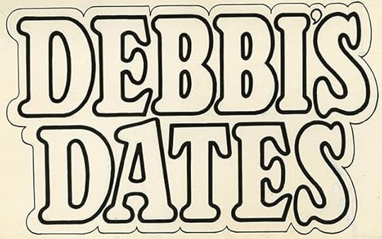
The original from the DC files shows hardly any corrections.
 From FALLING IN LOVE #106, April 1969
Gaspar’s revamp of this logo seems full of life to me with the overlapping G, the heart for the O and an elegant top line in lower case. Romance comics were losing readers but more because of the times than the stories, I surmise. Young girls were more likely to be out finding romance than home dreaming about it.
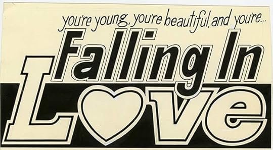
Again the original logo shows little or no corrections, a sign of Gaspar’s growing confidence with logos.
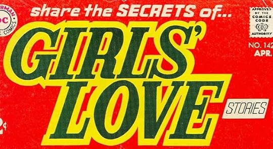 From GIRLS’ LOVE STORIES #142, April 1969
This romance logo is more staid and traditional, closer to what Ira Schnapp might have done, but it works fine.

This unused version from the DC files shows what Gaspar originally intended. The editor may have decided the oval took up too much cover space, and had the logo extracted from it, while Gaspar redid the top line. Gaspar did not follow his usual R style in GIRLS, the indent is centered.
 From SECRET HEARTS #135, April 1969
Another similar romance logo from Gaspar, and this time editor Dick Giordano kept the heart shape, the bottom of which could be tucked under figure art. The spacing between and within letters is tight here, but it still reads okay even with such a dark color obscuring the linework. The top line is going for that rock poster look again.
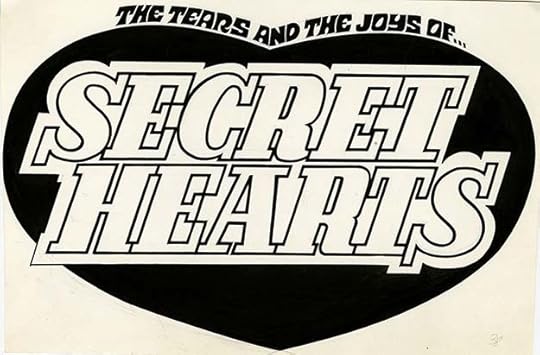
The original logo is the same, and now the linework is clearer. Oddly, Gaspar’s R’s have an indent that’s higher than centered on these examples, the opposite of his usual plan, proving that every rule has exceptions.
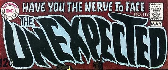 From THE UNEXPECTED #112, April-May 1969
Two issues after the previous new logo, Gaspar did this variation probably at the editor or proofreader’s request to resolve the odd reading order. THE is moved left over a shortened N while the T is enlarged to fill the space where it had been. Other letters have minor changes too. I won’t count this as a new logo, it’s more of a correction.
For this approximately four month period I count 19 new logos by Gaspar, more than Ira Schnapp often did in a year. I’ll cover the rest of Saladino’s 1969 logos next time. Other parts of this series and more articles you might enjoy are on the LOGO LINKS page of my blog.
The post GASPAR SALADINO’S COMICS LOGOS Jan-April 1969 appeared first on Todd's Blog.


July 31, 2021
And Then I Read: QUEENS WALK IN THE DUSK by Thomas Burnett Swann

This was the final Swann novel published in 1977 after the author’s death, in a limited signed edition, one reason I never found it. It tells part of the story of the Greek warrior Aeneas and Queen Dido of Carthage, in present-day Tunisia. The Greek poet Homer wrote of Aeneas in The Iliad, his story of the Trojan War. The Roman poet Virgil took Aeneas’s story up after that in his The Aeneid, including the meeting with Dido, though Virgil’s story went on much further. Swann has borrowed from both poets in this book but also from the myths and stories of Greece to create a different and less ambitious tale that’s still interesting and worth reading.
Aeneas, his son Ascanius, and the remnants of his army are shipwrecked on the shore of Africa where they are first threatened by elephants, who hate all men because they are ivory hunters in their eyes. The king of the elephants and Ascanius are able to converse mentally somehow and become friends, staving off the attack. Aeneas learns of Queen Dido and her people living nearby, and he and his son go to meet her. Aeneas finds in her a strong woman and a kindred spirit, and their attraction for each other grows, which angers the elephant king, Iarbus, who still fears Aeneas and his men, and does not want them to stay. Gods and demi-gods have some roles to play here, and the anger of elephants, even though Ascanius visits the elephants’ home after he is rescued from a giant deadly pitcher plant by Iarbus. Ascanius wishes for his father’s happiness, but the path ahead for Dido and Aeneas is troubled and full of difficulties.
I enjoyed this return to the myth-filled world of Thomas Burnett Swann, and recommend it.
The post And Then I Read: QUEENS WALK IN THE DUSK by Thomas Burnett Swann appeared first on Todd's Blog.
July 29, 2021
GASPAR SALADINO’S COMICS LOGOS Aug-Dec 1968
 This and all images © DC Comics. From BLACKHAWK #242, Aug-Sept 1968
Some time in 1967, DC Comics art director Carmine Infantino began reassigning many of the high-profile lettering tasks like logo design, house ads and cover lettering from long-time letterer Ira Schnapp to the younger Gaspar Saladino, also a long-time letterer for the company, but mainly on story pages. Both men were talented, but Ira’s style had come to be looked at as old-fashioned, and indeed he was in his seventies at the time. Gaspar was just entering his forties in 1967, and he responded to the challenge with admirable work full of unique styles, energy, and a more youthful approach that was just what Infantino wanted. We continue here with the rest of Gaspar’s new and revamped logos for books with cover dates from the second half of 1968. This one for Blackhawk uses pretty standard block letters, but notice that the curves are short ones, giving the letters more blockiness than what Schnapp usually did. Also notice that Gaspar’s unique style of R in block letters did not carry over to the letter K. Here the indent is centered rather than lowered. This logo is not very different from the previous Schnapp version, but the shorter curves and square K’s make it seem so.
ADDED: Mark Evanier has suggested this logo may be by cover and interior artist Pat Boyette because of similarities to the one he lettered on the splash page. He could be right, but I’m not completely convinced DC would have allowed a relatively new artist at the company to design a cover logo, so I will just offer it as a possibility and say that Mark makes a good case for Boyette. I will put it some of that in the comments.
 From SHOWCASE #76, Aug 1968
Gaspar used a very different style for this logo about a western character created by editor Joe Orlando, Sheldon Mayer, Carmine Infantino and Sergio Aragonés, but one with humorous aspects, as rather than a typical gunfighter he was a pacifist, a ladies man, and a gambler along the lines of the TV series “Maverick.” The style is based on a Victorian font that became associated with the old west perhaps because it was used on wanted posters. Gaspar has added notches to further embellish the already complex letter shapes, and a thin second outline for a second color. The central openings in the B don’t follow the width of the rest, but they work fine. Making the top of the S wider to fill the space next to the A was a good idea. The logo in general is just quirky enough to suggest it’s a parody of traditional western logos, but maybe that wasn’t intentional.

This photocopy of the original logo in the DC files shows it was probably drawn on cover paper preprinted with the DC bullet symbol and the Comics Code seal. That was fine if the logo never needed to be repositioned, but if it did, the missing parts would have to be filled in. Ira Schnapp rarely did his logos on those pre-printed boards for that reason, and they were not around for much longer. The tag line at the bottom was added when the character received his own short-lived series and is also by Gaspar. I like the contrast of RUIN to the rest.
 From TEEN TITANS #16, July-Aug 1968
With issue #16, TEEN TITANS left behind the existing Ira Schnapp logo, and for a few issues there were several different ones by Saladino before a final choice for a new logo was made. This logo simply uses standard block letters in perspective to work as a book title. The story title below it, also by Gaspar, is more interesting. In cases where a logo was not at the top, DC felt it necessary to also have the title in type so it would show on a typical newsstand comics rack, which often only showed the top third of a comic or less.
 From ANTHRO #2, Sept-Oct 1968
ANTHRO was another new title from editor Joe Orlando, created, written and drawn by Howie Post. His first two appearances, in SHOWCASE #74 and the first issue of his own series, had logos by Post drawn into the cover art. For the second issue, Gaspar did this large logo with similar letter shapes, but handled in a more traditional logo way with thick outlines and open telescoping. The odd letter shapes are kind of an amalgam of Post’s original ideas with Gaspar’s take on them. The subject was a prehistoric character, and that idea doesn’t come through in this logo, though it’s certainly memorable and eye-catching. The series didn’t last long.
 From BROTHER POWER THE GEEK #1, Sept-Oct 1968
DC’s sales had been losing ground to Marvel Comics through much of the 1960s, and after some foot dragging they were now trying all kinds of new things to see what might sell. This was one of the oddest efforts, and it only lasted two issues. Gaspar’s logo plays with three dimensional letters that go in two directions in GEEK, while BROTHER POWER looks toward the psychedelic styles of 1960s rock posters. An interesting logo, but the color choices don’t help it, and it’s not really a success in my view.
 From SHOWCASE #77, Sept 1968
This Joe Orlando-edited tryout has a logo by Saladino I like much better, though perhaps Gaspar missed a chance by not tying the two character names to something that visually expresses their characters. The open letters with a double outline have appealing shapes and bounce, with contrast provided by a more angular AND THE. Once again the openings in each A are narrower than the rest. Incidentally, I doubt that SHOWCASE PRESENTS is by Gaspar, but it might be. It appeared on several issues, replacing the much better Schnapp logo.

The original logo from the DC files shows that AND THE was revised, with an earlier version covered by white paint. The letters NGE and PE are also revised and pasted over the original versions…or are they?
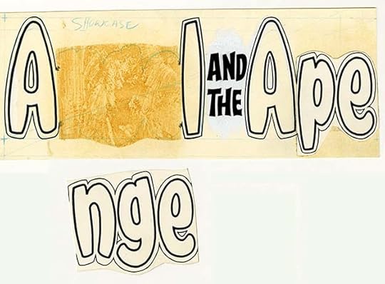
This is the way the logo looked when I had it scanned at the DC offices some years ago. The NGE had come loose and reveals that there’s nothing below it but a light blue outline. It looks like the pasted-on sections were saved from an earlier version and the A, L and A were redrawn to fit around them. Clearly this logo went through a difficult genesis!
 From THE SPECTRE #6, Sept-Oct 1968
With issue #6, Gaspar and the cover artists (Jerry Grandenetti here) began to experiment with more diverse logos on THE SPECTRE. The letter shapes look like Saladino, but the extended ink lines on the S and E are probably from Grandenetti and inker Murphy Anderson, while any of them could have added the ink dot texture in the letters. This is better than the logo on issue #5, but the best ones are still to come.
The original art for the cover, courtesy of Heritage Auctions ha.com, doesn’t add much to the discussion, but I thought it was still interesting enough to show. The outlines and drop shadow on the letters are at least easier to see here.
 From TEEN TITANS #17, Sept-Oct 1968
TEEN TITANS also continued to experiment, this time with a logo that suggests 1960s rock concert posters, though it’s easier to read than many of those. There’s nothing here that definitely says it’s by Gaspar, but the rest of the cover lettering is by him, and he was obviously game for any new idea and was looking at current design trends that appealed to kids, perhaps even his own.
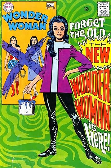 WONDER WOMAN #178, Sept-Oct 1968
Another experiment along the lines of rock posters with a Saladino logo designed to fit a particular space, and only used this once. It still counts in my book. Penciller Mike Sekowsky might have pencilled this in for Gaspar to follow. I like all these unusual logo ideas, DC was at least trying new things after years of sedate repetition.
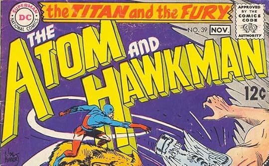 From THE ATOM AND HAWKMAN #39, Oct-Nov 1968
When Hawkman’s title was folded into THE ATOM, it received this new title and Saladino logo. The shape is a bad fit for most cover art, and struggles to work here behind The Atom’s figure, but it does have appealing shapes and energy enhanced by the odd back-leaning angle. It’s not something you would notice if I didn’t point it out, but this is an example of something Gaspar often did: fake perspective. I haven’t tried it to be sure, but I can tell by looking at the angles of the short perspective lines in the telescoping (from the front of the letters to the back of the telescoping) that they do not all line up to a single vanishing point. Some that are close together, like the two near the top of the T in Atom go in obviously different directions. Gaspar did this to save time, and he was good enough at it to get away with it as far as most viewers were concerned, but to a logo designer it stands out. There are a few other things here that aren’t right, like the telescoping at the right side of the K. It should indent to follow the letters, but that would have left a big hole there, so Gaspar ignored it. This brings to mind something DC President Sol Harrison used to say when I started there in 1977: “Close enough for comics.” Few readers were examining logos with a critical eye. When it looked good it was good enough.
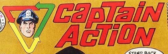 From CAPTAIN ACTION #1, Oct-Nov 1968
This is the first of many properties and short series from DC based on toys and licensed from toy companies, in this case Ideal Toy. Someone working for them designed the logo, but it was not right for comics and Gaspar did his own version of it with outlined letters and small differences to make it more readable. I think that still counts as a logo design for him.
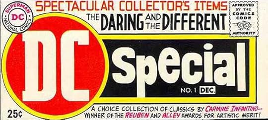 From DC SPECIAL #1, Nov-Dec 1968
Another example of Gaspar hitting his stride with large, appealing logos. There’s nothing visual about the title, it’s not a character name, and “special” is a pretty bland and overused idea, so Saladino’s ability to make it exciting is impressive. The other lettering by Gaspar around it, full of its own energy and style, helps sell the idea. Comics as “Collector’s Items” was still a new idea, as comics fans were just beginning to gather in conventions and share their finds and knowledge, and the concept of comics industry awards to creators was also pretty new. This cover picks up on all of that. The large DC in a red circle commands attention like a stop light, and Gaspar’s take on those letters is crisp and muscular compared to the one Ira Schnapp did in his DC bullet. You can almost feel new ideas sweeping in.
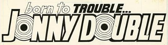
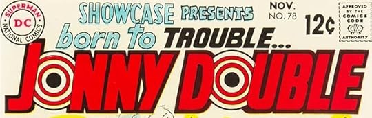 From SHOWCASE #78, Nov 1968
Saladino’s logo for this one-issue tryout is eye-catching. The two bullseye targets are almost hypnotic, and the rest has a very heavy outline that won’t be overlooked. The top line works well as both a preamble and a rhyme for the character name. The private investigator character went no further, but elements resurfaced as The Human Target. It’s interesting to note that Ira Schnapp’s SHOWCASE logo is back for this issue, but PRESENTS is still that awful version.
The original logo from the DC files is just the same, but shows how much the red color helps both the block letters and the targets stand out.
 From THE SPECTRE #7, Nov-Dec 1968
Another experimental logo probably penciled in by cover artist Jerry Grandenetti. I don’t like this one much.
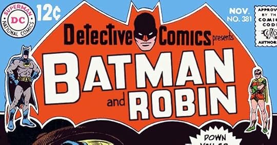 From DETECTIVE COMICS #381, Nov 1968
With this issue, DETECTIVE gained a new Saladino logo using a large bat shape and Batman head, similar to past logos on the character’s own title, with DETECTIVE COMICS in upper and lower case at the top and BATMAN and ROBIN in large open letters below. Character figures on each side complete the branding, just in case anyone needs more visual confirmation. This works fine, but the bat shape takes up a lot of space. Note the Saladino R in ROBIN with the notch just slightly lower than center.
 From TEEN TITANS #18, Nov-Dec 1968
Another one-time-use logo for this title, block letters in steep perspective. The A, N and each T are actually too narrow at the bottom for correct perspective, so it’s Gaspar faking it again, but it looks fine.
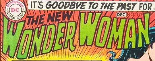 From WONDER WOMAN #179, Nov-Dec 1968
Having established a sharp break from the past last issue, Saladino created this new flowing, organic logo for Wonder Woman. I like the way it fills the logo area, I don’t like the large central spaces in each W, I would have extended the dividers further into it. Here the Gaspar R has almost pinched off the right leg. It works fine, though, and is a nice change from the blocky Schnapp version that came before it.
 From SHOWCASE #79, Dec 1968
This logo shows that Gaspar did not always go for eye-grabbing emphasis. The lower case letters here are calm, elegant and graceful with just some up and down bounce to indicate her underwater nature. That awful SHOWCASE version is back, though. This character went no further.
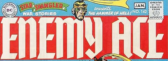 From STAR SPANGLED WAR STORIES #142, Dec 1968-Jan 1969
When Enemy Ace began as the cover feature in this war title, a new Saladino logo heralded his appearance. The style is drawn from German blackletter fonts made simpler to read well, but still infused with that foreign flavor perfect for the character. It’s hard to imagine how it could have been any more prominent!
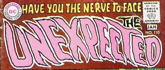 From THE UNEXPECTED #110, Dec 1968-Jan 1969
Gaspar returned to his unique horror style for this new UNEXPECTED logo that I love. Two unexpected things about it: THE is at the right side even though it’s read first. Since the reader is led there by the top line, it works; and the letters lean to the left as if being blown by an uncanny wind, enhancing the feeling of motion. These two elements were soon revised, but I like this version the best.
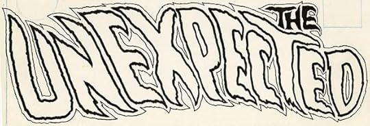
The original logo from the DC files is just the same, no corrections or touch-ups. It was probably laid out with blue pencil and then inked. Masterful.
That’s twenty new logos for the second half of 1968, and a total of 35 for 1968 cover-dates, quite a lot for the time frame. Gaspar was well on his way to revamping the entire DC line except for a few long-time stalwarts like SUPERMAN, and there would be many more in 1969. Other parts of this series and more logo articles you might enjoy are on the LOGO LINKS page of my blog.
The post GASPAR SALADINO’S COMICS LOGOS Aug-Dec 1968 appeared first on Todd's Blog.
July 26, 2021
GASPAR SALADINO’S COMICS LOGOS 1963-July 1968
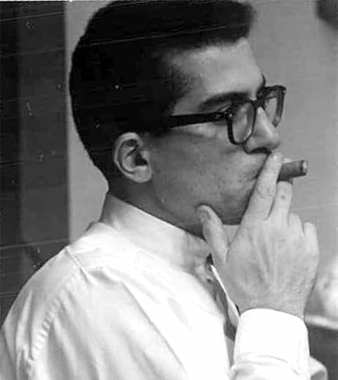 Gaspar Saladino, 1950s, photo courtesy of Lisa Weinreb.
Gaspar Saladino was born in Brooklyn, NY on September 1st, 1927. As a child, he was a fan of comic strips like “Secret Agent X-9” by Dashiell Hammett and Alex Raymond. Gaspar was also a comics reader and budding artist, confirmed by a drawing of an airplane published in FUNNY PAGES Volume 3 #8 dated October 1939 when Gaspar was eleven. For that image and more details about his life and career, see THIS article on my blog.
For high school, Gaspar enrolled in Manhattan’s High School of Industrial Arts (later renamed the High School of Art and Design), commuting to school by subway from Brooklyn. Many of its students became comics professionals, including Neal Adams, Jack Adler, Frank Giacoia, Joe Giella, Dick Giordano, Sol Harrison, Carmine Infantino, GIl Kane, Bernard Krigstein, Joe Kubert, Joe Orlando, John Romita Sr., and Alex Toth. Of these, Gaspar reported in an interview with Kirk Kimball, “Joe Kubert I knew of. And I knew Carmine and Gil Kane. I knew Joe Orlando. Joe was in my grade. Alex Toth was in the grade below me.” Joe Giella was also a classmate of Gaspar. While he was in high school, some of the New York comics studios employed students, and Gaspar did a little inking for Lloyd Jacquet Studios, but described them as “occasional one or two-pagers.” Gaspar graduated in the class of 1945, and was then drafted. He spent two years in the Air Force serving as a public relations staffer under General Douglas MacArthur as part of the U.S. occupation force in Japan.
In 1947, Gaspar returned to Brooklyn and was soon out pounding the pavement looking for work. His original direction was toward fashion design, but he found little work in that field. Finally, in 1949 he put together some sample comics pages that he drew, lettered and inked, and took them to National Comics (now DC Comics) where the Production Manager Sol Harrison, a graduate of the High School of Industrial Arts himself, was known to be friendly to other graduates. Several of Gaspar’s former schoolmates were already working for the company. Harrison showed the samples around to the editors, and Julius Schwartz expressed interest. Julie said that, while he didn’t like Gaspar’s art enough to hire him for that, he did like his lettering, and offered him regular lettering work, which Gaspar was happy to get. Gaspar worked as a freelancer, but in the DC offices in his early years. A series of articles beginning HERE detail his first work for DC. He lettered countless stories for many titles, primarily ones edited by Julie Schwartz and Robert Kanigher, mainly western, war and science fiction titles at first. When Schwartz began reviving DC’s golden age super-heroes like The Flash, Green Lantern and The Atom in the late 1950s, Gaspar also lettered many of their stories.
Gaspar worked concurrently with Ira Schnapp from late 1949 until Ira left the company in 1968. Schnapp was the company’s go-to person for logos, cover lettering and house ads, but Gaspar filled in for Ira here and there during those years in the latter two areas. When Carmine Infantino became Art Director and later Editor-In-Chief at DC around 1967, he began shifting that high profile work from Schnapp to Saladino, hoping to give the company’s image a fresh look. Gaspar responded to the challenge with fine, creative, energetic lettering and design, and when Schnapp left the company, Gaspar continued in that role as the go-to person for logos, cover lettering and house ads.
Like Ira Schnapp, Gaspar did most of his prolific lettering and design work for DC Comics, but unlike Schnapp, Saladino also became a regular letterer and logo designer for Marvel Comics beginning in 1971, and he designed all the logos for the short-lived Atlas/Seaboard line in 1974-75. That work, as best I can identify it, is included here. It’s likely I’ve missed some Saladino logos, and it’s also likely that Gaspar did logos for other companies. Wikipedia’s article about Saladino claims he did logos for Eclipse Comics and Continuity Comics, but I’ve looked through all the covers from both companies and I don’t see any logos that I think were by Saladino. Gaspar worked regularly for MAD, but probably not as a logo designer. Beyond that, anything is possible, but I know of only one other comics logo by Gaspar, and have included it here. Anyone with knowledge of logos by Saladino for other companies, please contact me.
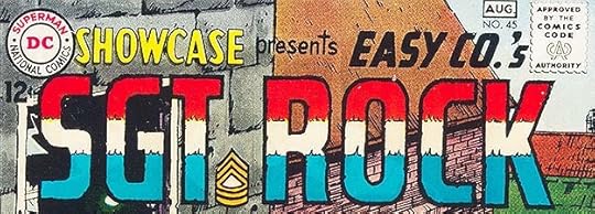 This and all following images © DC Comics. From SHOWCASE #45, July-Aug 1963
Editor and writer Robert Kanigher was one of Gaspar’s biggest fans at DC, and Gaspar lettered the majority of Kanigher’s war comics stories from the beginning of the line forward. Kanigher was the first to assign Gaspar a cover logo as far as I can tell, this Sgt. Rock logo from 1963. Notice how the indent on the right side of the R falls below the center, as if it was a P with the right leg added. This is a style point characteristic of Saladino’s block lettering throughout his career, and one of the surest ways to identify his logos. Otherwise these block letters might have been done by Ira Schnapp, though the thin lines meant to separate the color stripes have a delicate energy that also suggests Saladino. The Sergeant’s stripes in place of a period after SGT is a clever and creative touch. I think this was the first appearance of this logo, but it’s possible it appeared earlier. I haven’t found any logos before this one that look like the work of Saladino.
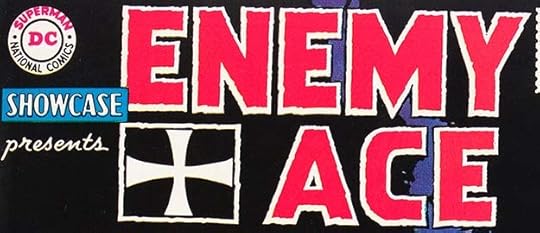 From SHOWCASE #57, July-Aug 1965
A second logo assignment from Kanigher in 1965 shows Gaspar beginning to express his own style in the block letters, which have rough outlines that add energy. The iron cross symbol, used by Prussia and then Germany in World War One, has the straightest lines, though they’re curved. That element again adds interest. I think this was the first use of this logo. Both Rock and Enemy Ace appeared earlier in Kanigher war titles, but without a logo as far as I’ve seen.
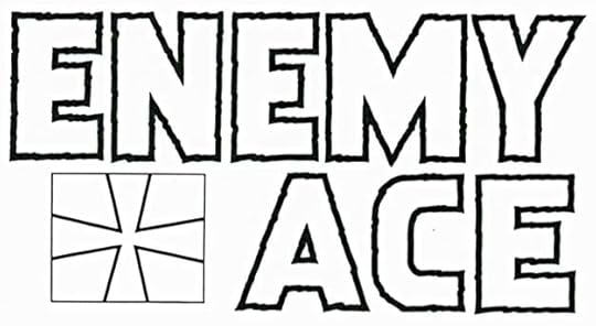
This photocopy of the original logo from the DC files shows the block outlines better as they were lettered, black on white, while the iron cross is a different version. I don’t know which came first, but this is probably a later one. I don’t see it on any covers from the early Enemy Ace appearances.
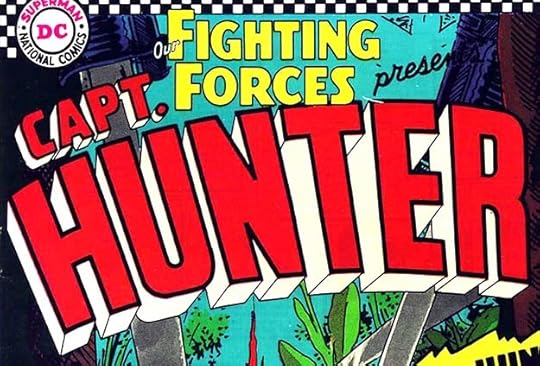 From OUR FIGHTING FORCES #102, Aug 1966
A third Saladino logo from 1966 was also commissioned by Robert Kanigher to promote his Capt. Hunter character in OUR FIGHTING FORCES. Ira Schnapp’s logo for the series is present above and much smaller. Note the Saladino R shape again in HUNTER. This logo has thick letters and telescoping with much thinner outlines, something that Gaspar did more than Schnapp. The curve and angle add appeal, but it’s still pretty conservative. There’s something about the construction that immediately says Gaspar to me all the same.
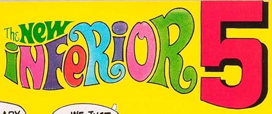 From INFERIOR 5 #7, March 1968
Carmine Infantino’s shift of logo work from Schnapp to Saladino happened some time in 1967, but because of the lag time between when work was done and when it appeared, PLUS the intentional post-dating of comics to try to keep them on display longer, the first Gaspar revamps of existing DC logos began hitting newsstands with March 1968 cover dates, like the one above. Ira Schnapp’s logo for the first six issues of this series was an odd one that didn’t fit the space very well. Gaspar’s revised version fills the logo area better. The first three words are very 1960s psychedelic, similar to rock posters of the time, with a variety of colors enhancing that idea, while the large 5 (replacing Ira’s spelled-out FIVE) seems to hold things together and command attention. The series might already have been selling poorly, as it was canceled with issue #10.
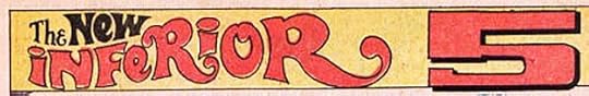 From INFERIOR 5 #7, March 1968
Gaspar was not often asked to create new logos for the first pages of interior stories, something Ira Schnapp did a lot of. For one thing, the era of lengthy anthologies with four or more regular features was mostly past (there would be a few in the future, but not many), and for another, most DC features either dropped the use of a logo on the first story page, or used the one from the cover. Here’s an exception, a variation Gaspar did for the first page of the issue with his new logo.
 SHOWCASE #73, March-April 1968
Steve Ditko was best known for his work at Marvel Comics on Spider-Man and Dr. Strange. He came to DC with this new creation, and Gaspar did the logo. There are actually two versions of it on this cover along with other fine lettering by Saladino.
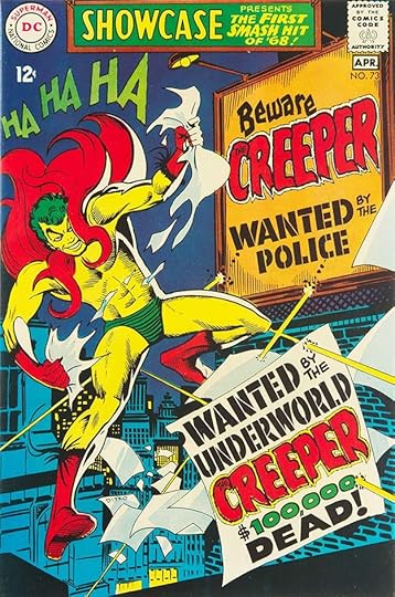
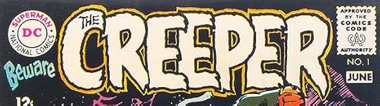 From BEWARE THE CREEPER #1, May-June 1968
A third version of the logo was used on the character’s new series which began two months later. All three are similar enough to pass as the same logo, but if you look closely you’ll see that there are minor differences in each. Here Gaspar was revealing his talent for rough, scary letter shapes that would become one of his trademark styles. No one before him had hit on this approach which combines rough edges with organic letter shapes to create the unsettling appearance of something alive and sinister. Perhaps furry rather than drippy or explosive like many previous “scary” logo styles. Though separated, BEWARE THE is part of the logo and uses another effective rough style. This is Gaspar finding his talent for logo design. Though there are three variations, I will count them as just one logo.
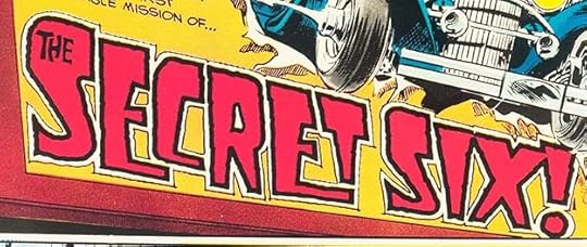 From SECRET SIX #1, April 1968
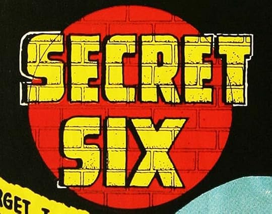
In an odd sort of team-up, Ira Schnapp and Gaspar Saladino each did logos for this new series that appeared together on the cover. Ira’s was at the top but relatively small. The cover was also the first page of the story, and this logo by Gaspar was in the first panel. It might be considered simply a story title, but it was also used as a story logo on at least one other issue, and it was clearly created with care and intended for reuse if wanted. Again, Gaspar is exploring new styles using rough outlines, but this time on more angular letters that are heavier at the top, sort of like art deco, but in fact unique to Gaspar, with letters of different sizes that are stacked at the bottom in two places. The exclamation mark adds excitement, but the logo as a whole is already full of energy. What reader wouldn’t want to know more about these six and their secret? By comparison, Ira’s logo is sedate, though actually innovative for him because of the clever use of brick patterns:
 From SECRET SIX #1, April 1968
This is a pretty clear example of the torch being passed. Gaspar did not fumble the exchange.
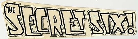
Gaspar’s original is still in the DC files, and shows no white correction paint, so it was conceived, penciled and inked confidently. It’s unlike any earlier DC cover logo.
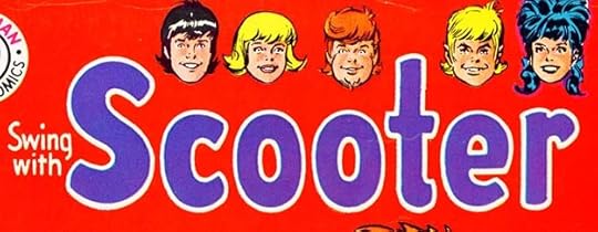 From SWING WITH SCOOTER #12, April-May 1968
Not all of Gaspar’s revamps were scary or even very original. For SWING WITH SCOOTER, he was asked to create something along the lines of Archie Comics’ teen humor logos. The result is not very interesting, and he would do a better one about a year later.
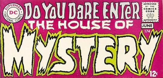 From HOUSE OF MYSTERY #174, May-June 1968
Editor Joe Orlando was charged with returning some of DC’s “mystery” titles to their scary origins, and Gaspar Saladino’s logos were a big help. This one follows the same general style as THE CREEPER, but with thicker and somewhat more square letter shapes, at least in places. The double outline leaves room for a second color to help MYSTERY read well, while THE HOUSE OF seems to be in a dry-brush style with a few small gaps in it, something Gaspar would develop more later. I don’t like the top line so much, but it was not a permanent part of the logo.
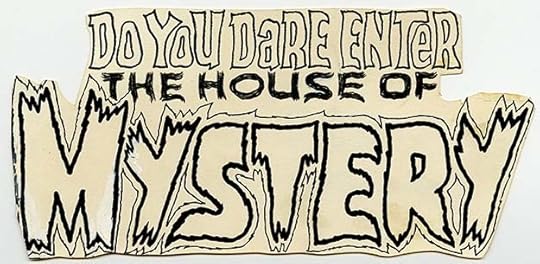
Gaspar’s original logo is in the DC files, though heavily trimmed and the worse for wear. Clearly someone cut it out and pasted it onto a cover instead of making a photostat and using that, as was the correct method. Parts of the first M are missing. White paint corrections are visible, but it’s unclear if they’re from Gaspar or some later user. This is why many original logos have a warning in large letters on them, “DO NOT USE! MAKE COPIES!”
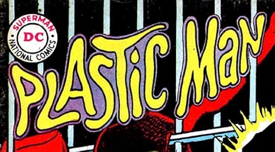 From PLASTIC MAN #10, May-June 1968
Ira Schnapp’s appealing Plastic Man logo was used on all twenty issues of the character’s first DC series except for issue #10, where the art didn’t leave room for it and Gaspar created this version probably when he did the cover lettering. It’s the cover logo, so it still counts in my book. It’s certainly more pliable than Ira’s.
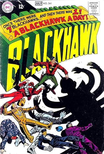 BLACKHAWK #241, June-July 1968
When a logo becomes a major element on a cover, it’s hard to tell if it was drawn by the cover artists (Dick Dillin and Chuck Cuidera in this case) or by a letterer. Either is possible here, but the way the logo stands apart from the art, except for shadows from the characters, suggests to me that Gaspar had a hand in it. He also did the banner across the top. The logo is based on the original version by Al Grenet, not the revamp by Ira Schnapp from the previous issue. I’m not sure if I should count this for Gaspar, but have decided I will.
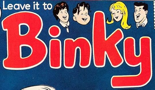 From LEAVE IT TO BINKY #61, June-July 1968
A long-running teen humor title received a new logo from Gaspar in the same style as his Scooter one. This one I find more interesting because the main word is larger and has a little more bounce, but again Gaspar would revisit these teen humor titles and do better logos for them in 1969.
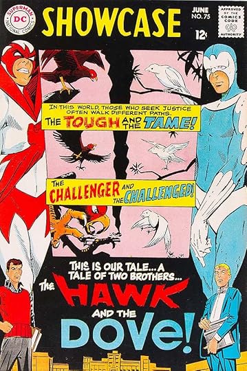 SHOWCASE #75, June 1968
Another Steve Ditko creation was tried out in SHOWCASE with an unusual multiple panel layout, lots of lettering by Gaspar, and a new logo by him at the bottom. He contrasts the warring personalities and ideologies with a rough treatment for HAWK and a calm, smooth one for DOVE but adds an exclamation point. The same logo was used on their brief series minus the exclamation point.
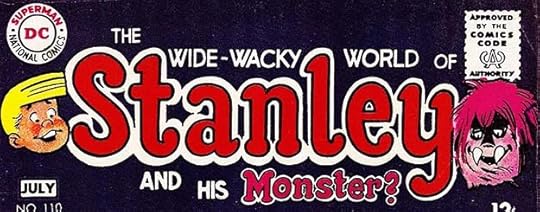 From STANLEY AND HIS MONSTER #110, June-July 1968
Continuing the teen humor theme, a struggling title was given the same treatment as Binky and Scooter, though this one looks even more like an Archie logo to me. The stories were not really teen humor, but I guess DC thought linking it to that genre might help sales.
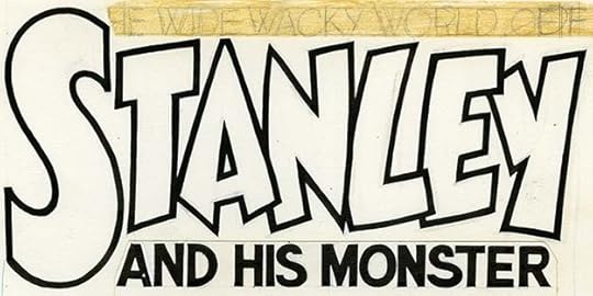
I like this unused version from the DC files much better, and I think it might have brought in at least a few more sales. Possibly it would have been on a later issue if the book lasted long enough, it’s similar in approach to logos Saladino would do for the other teen humor books in the near future.
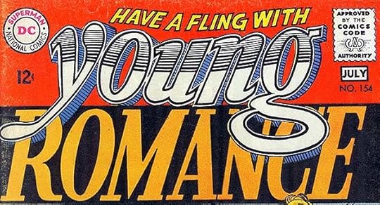 From YOUNG ROMANCE #154, June-July 1968
This is the first of a series of new logos done for DC’s romance titles around this time. For years I thought they were by some unknown designer brought in by editor Joe Orlando to give the books a fresh look, but I’ve now decided they’re by Saladino, perhaps encouraged by Orlando to try new things, using non-comics references. This one reminds me of the original logo for “Rolling Stone,” the music newspaper, by underground comix artist Rick Griffin, at least the treatment of YOUNG does. It makes more sense to me now that Orlando and other editors would have liked the logo revamps Gaspar was doing and given him romance logo assignments too. The oddest thing about this logo is the way the textured drop shadow for the Y and G in YOUNG goes behind the letters of ROMANCE. I guess it was a compromise to keep the lower word readable. Somehow it works.
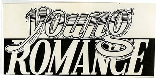
The original logo from the DC files show it was lettered just as it appears on the cover, and on typical comics art paper, another reason to think it’s by Gaspar and not some outside designer. I don’t think he ever got this experimental with line textures again.
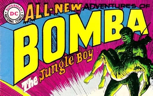 From BOMBA
Not all of Gaspar’s logo revamps were a success, I don’t think this one works very well, and I prefer the previous one by Schnapp. BOMBA is okay, but not as interesting as what came before and the top and bottom lines don’t work for me at all. ADVENTURES OF should have been held white like THE, but that wouldn’t have helped a lot. Someone, perhaps a production artist, has added lines inside the inner telescoping of the B and O to match the background, which makes no sense, and the colorist rightly ignored them.
 From THE SPECTRE #5, July-Aug 1968
Issue #5 has a half-hearted revision of Ira Schnapp’s SPECTRE logo, giving it a backward slant and somewhat different letter shapes. The only part I really like is THE, using a more typical Saladino style. Gaspar would do much better and more original logos for this title beginning with the next issue.
1968 was a very busy logo year for Saladino at DC, and I will continue with the rest of them in the next part of this series. So far I count 18 logos by Gaspar, and he was just getting started! Other logo articles you might enjoy are on the LOGO LINKS page of my blog.
The post GASPAR SALADINO’S COMICS LOGOS 1963-July 1968 appeared first on Todd's Blog.
July 24, 2021
IRA SCHNAPP and PEP CEREAL
 This and all images © DC Comics.
 Recently on a Facebook post by Robert Beerbohm, I was made aware of another commercial lettering job by Ira Schnapp when Bob posted one of these images. Kellogg’s Pep cereal was a sponsor of “The Adventures of Superman” radio show in the 1940s, and in 1945 Superman premiums were featured on the cereal boxes, and inside in the form of a Superman pin-back button.
Here’s an image of the button. It was part of a large series of pin-back buttons used as premiums in Pep. There were five sets of 18 buttons featuring comics characters, but because of the radio show sponsorship, each set included the Superman button, so there were 86 different buttons in the series. There were other button series on other topics, all sought after today by pin-back button collectors.
What interests me more is a series of two-color one-page Superman comics stories that ran on the back of Pep boxes, as in the first example above. It’s clearly lettered by Ira Schnapp in the style he was using at the time on both Superman comics stories and the Superman newspaper strip. Robert Beerbohm says there were at least 12 different strips. They’re numbered in the top banner left of the Superman logo, the one above is number 2. I’ve found images of six, including #11, so twelve in all sounds right. My guess is they were issued one per month, about the frequency that a family might buy a new box of Pep cereal, and that would mean they ran for a year. You can see the copyright year of 1945 on at least one of these images, so I’m guessing they all were issued in and around that year.

This appears to be #1, with the number in black on the red banner. I don’t think there are any continuing elements in these one-page stories, they’re all meant to stand on their own. The art size and amount of lettering is about the same as a typical comics page. A caption in small type under the art reads, “For further Adventures of Superman, read the backs of other PEP packages and follow the Superman radio program on the Mutual Network.” That ties the mutually advantageous licensing arrangement together nicely, even though Superman comics are not mentioned.

Here story #3, in a photo which shows more of the entire cereal box. While all such boxes today are probably printed in four colors, Kellogg was saving money by only using black and red. The stories made good use of the red in Superman’s costume and other places, including the word SUPERMAN in the lettering. I’m sure the art was produced by National (DC) Comics for Kellogg, but a production person there may have done the color separations. I would have loved these as a kid.

This image of story #4 shows the other side of the box where other premiums are described: a beanie cap you can order, 6 color pictures of war planes likewise, and a comic character pin-back button right in this box. Since there were five times as many Superman buttons as any of the others, you had a pretty good chance of getting one, and some have survived and can be found for sale online.

This image of Story #9 was found for me by Jim Davidson, thanks Jim! Despite the limited space, these stories cram in a lot of action, as well as a lot of Schnapp lettering.

The final one I’ve found is story #11, and it’s the worst image, but you can just about read the lettering and understand what’s going on.
If anyone reading this has images of the other six stories, I’d love to add them, please contact me. Meanwhile, I will consider this work the equivalent of 12 comics pages and add them to my summary of Ira Schnapp’s comics work HERE.
The post IRA SCHNAPP and PEP CEREAL appeared first on Todd's Blog.
July 22, 2021
And Then I Read: THE FOREST OF FOREVER by Thomas Burnett Swann
 Cover illustration by George Barr
Thomas Burnett Swann is an author I discovered in the science fiction magazines of the 1960s. I liked his work, usually fantasy based on Greek myths, and followed it to his novels. I bought and enjoyed many of them, but there were a few I never found, either because I just missed them or because they were only issued in rare limited editions. Recently I found the ones I haven’t read are easily available now as ebooks, and I bought a few including this one. It’s the middle book of a trilogy about a minotaur and his friends, and I don’t recall the other two, but it works fine on its own. (They were written in reverse order anyway.)
In a remote forest on the island of Crete in pre-Christian times live a dwindling population of mythical creatures like the dryad Zoe and the last of the minotaurs, Eunostos as well as centaurs, bee-creatures and others. Though they have become isolated and surrounded by mundane humans, they continue their ancient ways as best they can. Eunostos is in love with a younger dryad named Kora, but he is shy and inept at courting her, and asks his friend Zoe, a much older dryad, for help. When Kora is captured by Saffron, a Bee-Queen, Eunostos and his friends rescue her, and in gratitude she accepts his advances. Then things change when a human prince of Crete, Aeacus, comes into the forest fleeing enemy warriors. He is reluctantly accepted by the inhabitants, and Kora falls in love with him. Eunostos is heartbroken but determined to remain her friend, even though Aeacus tries to keep the minotaur and Kora apart. What will happen when Aeacus and Kora have children? The court of King Minos of Crete has no heir, Aeacus’s son could be that heir, but Kora cannot leave her tree for long without dying.
I enjoyed this story and the writing. Swann has a gentle touch, but his characters are interesting and his plots engaging, if somewhat predictable. He was ahead of his time in promoting equal rights for all, and frank in his inclusion of sexual themes, though they were not explicit. His world has its tragedies, but generally it’s a pleasant place to visit, and informed by his scholarship. Recommended.
The post And Then I Read: THE FOREST OF FOREVER by Thomas Burnett Swann appeared first on Todd's Blog.
July 19, 2021
Incoming: FABLES COMPENDIUM THREE
 Image © DC Comics
The third thick volume of this series has arrived, again with a new cover by Mark Buckingham that connects with the others to form one wide image. This book collects issues 83-113 of the monthly comic as well as the graphic novel “Werewolves of the Heartland,” “The Great Fables Crossover” sections from JACK OF FABLES, and “THE LITERALS.” Paper and printing are of fine quality, and total page count is 1,096. It’s a heavy handful, but these collections (one more to come) are an economical way to collect the entire FABLES series even compared to the original cover prices of all the issues inside. Retail price is $59.99. Look for it at your comics retailer, or here’s a link:
<br />
The post Incoming: FABLES COMPENDIUM THREE appeared first on Todd's Blog.
July 17, 2021
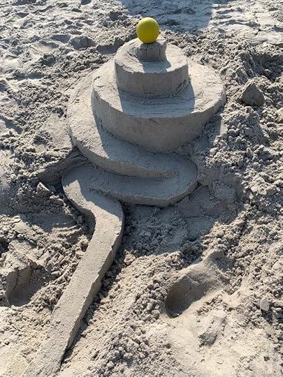
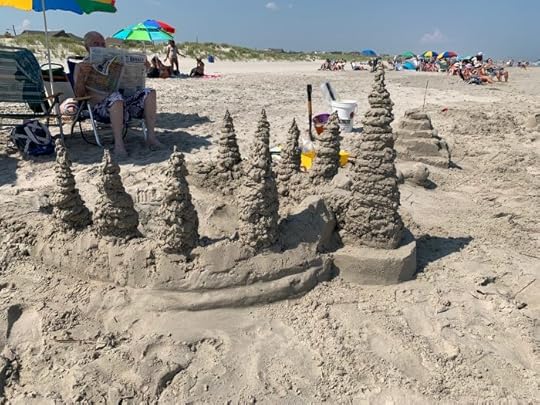
Sand Sculptures 2021
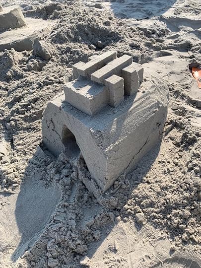
After missing last year, my friend Tim and I spent two days at the beach near my home in southern New Jersey, and continued our long tradition of sand sculptures. They were smaller and somewhat less inspired than in the past. As Tim said, “Our best ones are behind us.” I thought I would document them here all the same. This is Tim’s creation imitating some of the ideas of master sand sculptor Calvin Seibert, a favorite of ours.

Tim at work on his sculpture. Some of his hand-made tools are on the left. Tim does not like his picture shown, but I feel this one is sufficiently anonymous to pass muster.
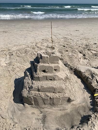
My sculpture from the first day. My original plan was a trough that the ball could roll down, but the ball was too heavy and kept crashing through the sides, so I gave that up and just made it a ramp.
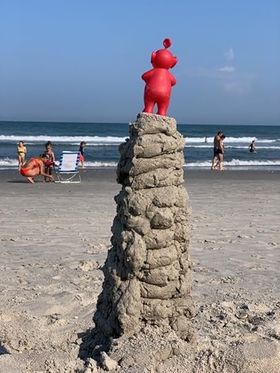
The second day I made this horseshoe-shaped wall to hold off the incoming tide with pancake and drip towers on the edges. Again, not inspired, but fun to do.
My wife Ellen and her sister Ann, also visiting, made this tower/pyramid.
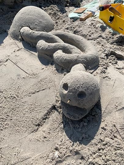
The most interesting sculpture was Tim’s on the second day, an odd worm making a pretzel shape as it emerges from an egg. The pretzel part was the most challenging and time-consuming. That’s it for this year, at least so far. You can see many more sculptures from past years HERE.
The post Sand Sculptures 2021 appeared first on Todd's Blog.
July 13, 2021
Rereading: WIZARD and DEMON by John Varley

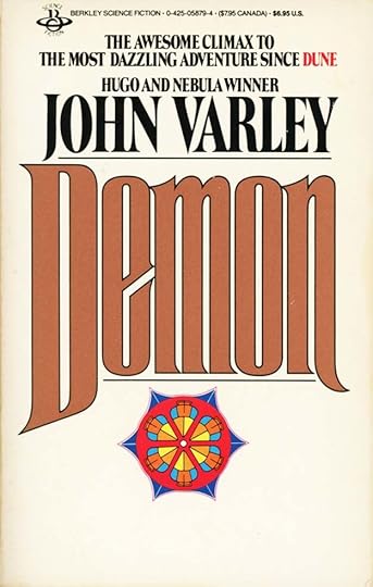
A few weeks ago I posted about my rereading of TITAN by John Varley. Of the new science fiction authors that I sampled in the 1970s, Varley was one of the best. I first read some of his short stories in the science fiction digests of the time, and when this trilogy came out in paperback in the 1980s, I devoured it. Varley seemed to me (and others) a talent as original and compelling as Robert A. Heinlein, and this trilogy was as full of terrific ideas, impressive world building, and wonderful characters as Heinlein’s “Future History” stories. I continue to follow Varley’s work and enjoy each new book by him as it comes out, though he no longer seems as important an author to me as he did in the 1980s, but that may just be my jaded view through the passage of time. Certainly these books were just as great on the reread as when I first read them. I’d like to review the second and third books in the trilogy in more detail, but I can’t see how I might do that without spoiling some of the surprises in the plot, so I’ll just say that I encourage anyone interested in top-quality science fiction to give this trilogy a try. You won’t be disappointed. It’s been so much fun to reread that I only wish there were more in the series. Highly recommended. Here are links to all three books.
&amp;lt;br /&amp;gt;&lt;br /&gt;<br /><br />
<br />
The post Rereading: WIZARD and DEMON by John Varley appeared first on Todd's Blog.
July 10, 2021
And Then I Read: PEACE by Gene Wolfe

I am slowly working my way through a list of Neil Gaiman’s favorite fantasy novels that he posted on Facebook a few months ago. There are two entries for Gene Wolfe, and I greatly enjoyed the other one, “The Book of the New Sun,” which is actually one long novel divided into four separate books. The other Wolfe entry on Neil’s list is this one, a standalone novel written by Wolfe at the beginning of his writing career and published in 1975. It is indeed a puzzle. Here’s what Wikipedia says:
Peace is a psychologicalfantasy/ghost story novel by American writer Gene Wolfe, published in 1975. It is the story of a man from a small Midwestern town in the early to mid-20th century, Alden Dennis Weer, who narrates various memories from different parts of his life, including his childhood, early adulthood, and middle to old age.
Further from Wikipedia:
Unlike a lot of Wolfe’s work Peace is a standalone novel set in a somewhat contemporary time and place (as opposed to the future or an imaginary world). Despite this, the story of the novel is one of Wolfe’s strangest and most difficult; the narrator’s consciousness at times seems to transcend time and space, as if he’s narrating from beyond our plane of reality. One interpretation is that the narrator, Weer, is dead, and the scattered memories are those of a ghost; in 2014, Wolfe confirmed that this was his intention.
There’s no clear narrative thread in the book, it wanders like the wandering of an elderly mind from era to era of the character’s life, much as the elderly man wanders from room to room of his house, lost. The stories within stories comprise much of the book, but they aren’t always complete in one place, and important events are left out or purposely told in an evasive way. Reading “Peace” was a bit like the time I was trying to read a novel while feverish from the Flu. There were many interesting stories and moments, but I couldn’t keep things clear or make sense of the book as a whole. I can see why Neil might love it, as a writer himself he would appreciate all the ways Wolfe plays with the form and goes against the expected, but I can’t say I really enjoyed the book. I liked “Book of the New Sun” much more. This is not Joyce’s “Ulysses,” but it’s similarly tangled at times.
In case you’d like to try it yourself, a link is below.
<br />
The post And Then I Read: PEACE by Gene Wolfe appeared first on Todd's Blog.
Todd Klein's Blog

- Todd Klein's profile
- 28 followers

