
Todd Klein's Blog, page 85
September 13, 2021
GASPAR SALADINO’S COMICS LOGOS 1977-1978
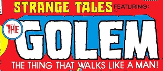
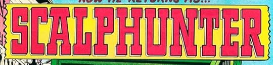 All images © DC Comics except as noted. From WEIRD WESTERN #39, March-April 1977.
The first new Saladino DC logo design for comics with 1977 cover dates is this one, using fine western-style letters with a small open drop shadow on a broken-ended banner. The character replaced Jonah Hex in WEIRD WESTERN when Hex got his own title.
Gaspar Saladino’s logo design work began to decline in these years, as far as I can identify it. At DC Comics, some logo assignments were being given to staffers. As Ira Schnapp knew, being in the DC offices every day was the best way to have the pick of assignments. Gaspar had started out that way, but by the time he was designing logos, he had moved further from the offices to Plainview, Long Island, and usually visited DC once a week to drop off and pick up work. This made it more likely a production staffer might get a logo design assignment, as the editor could simply stop by their desk to discuss it with them, after getting the okay from the Production Manager Jack Adler. Jack knew how busy Gaspar was, and was usually fine with that. (Later production manager Bob Rozakis was of the same mind.)
John Workman was hired as a DC production artist in the summer of 1975, and worked on staff until late 1977, developing his lettering and logo design skills. I’ve written about his DC logos beginning HERE. He designed 16 cover logos in that time. I joined the production staff in the summer of 1977 and stayed for ten years. I, too, worked on my lettering and design skills and was given an increasing number of logo assignments. In 1978 I did one cover logo. In 1979 I did seven, and by 1986, the year before I left staff, I was doing about twenty DC cover logos a year. As DC moved from having the editors make most of the logo decisions to having an art director or cover editor involved in the 1980s, more new designers from staff, as well as outside freelancers, were given logo work at the company, including Alex Jay starting in 1986, Ken Bruzenak, Keith Wilson, Steven Bové and others.
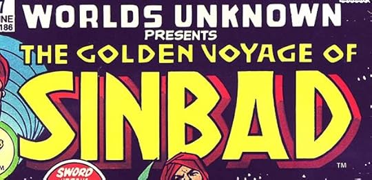
At Marvel, the story is more opaque to me, and more complex. Opaque because I never worked there, so I have to go by hearsay and the evidence of the actual logos. Complex because in 1975, Marvel hired the talented letterer Jim Novak. Many letterers of my generation revered the work of Gaspar Saladino and tried to emulate it, including myself, but Jim was the best at that. When he started designing logos around 1977, he absorbed Saladino’s logo work to the point of even imitating Gaspar’s quirky style points, like his unusual R shape. From then on, it becomes much harder to know if a Marvel logo was designed by Saladino or Novak, and as I can’t tell in most cases, I’m not going to guess. For instance, here’s a logo that Jim Novak mentioned designing in an article in COMICS INTERVIEW #1 (1983):
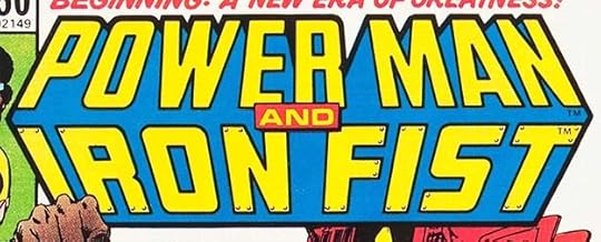 From POWER MAN #50, April 1978, image © Marvel.
Everything about this logo, except perhaps the very thick outline around the entire thing, seems a perfect match for Saladino. Except for a few cases like this where Novak is known to have lettered a logo, I have only the evidence of my eyes to go by, and I feel it’s not enough. By the way, Novak’s most famous logos were for Marvel’s comics adaptation of STAR WARS and the movie CREEPSHOW, but beyond that I’m sure of only a few. I tried asking him about logos once, but he didn’t seem that sure himself which one’s he’d done, and sadly, Jim passed in 2018, so it remains an open question in many cases. I may be missing some Saladino Marvel logos due to this, but I feel that’s better than taking credit away from Jim Novak. I should add that once Sam Rosen and Artie Simek were gone from Marvel by 1976, other designers were also getting logo work there, including Danny Crespi, Morrie Kuramoto, Tom Orzechowski, Alex Jay, Ken Bruzenak, and myself (after 1987), so perhaps it was less likely that they would be calling Gaspar from that point on.
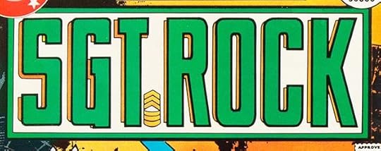 From SGT. ROCK #302, March 1977
With this issue, SGT. ROCK replaced the decades-long run of OUR ARMY AT WAR. Rock had been the main attraction for some time, and later issues featured a different logo for him. This new one by Saladino follows the plan of his first Sgt. Rock logo from 1963, but I think it’s fair to say it shows how his logo design talents had matured. The letter shapes are taller and more effective, the narrow open drop shadow adds depth and room for a second color, and the double-bordered frame adds room for two more color options, plus the center could be opened up to the cover art without detracting from the logo’s readability. Well done.
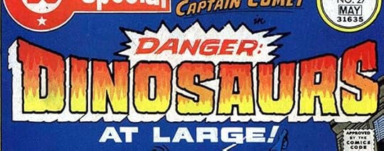 From DC SPECIAL #27, April-May 1977
This issue of DC SPECIAL featured a new book-length Captain Comet tale. The story title, lettered with energy and impact by Gaspar, became the feature logo, with Captain Comet’s Ira Schnapp logo small at the top.
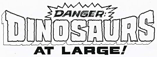
A photocopy of the original logo from the DC files is the same, but you can see the dry-brush work on DANGER better.
 From BLACK LIGHTNING #1, April 1977
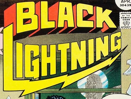
This new superhero created by Tony Isabella and Trevor Von Eeden gained a series with a logo by Gaspar having two words curved in different directions. BLACK has telescoping, while the L of LIGHTNING illustrates the idea with a long lightning bolt below the rest. It seems like this shouldn’t work, but I think it does, though it takes up a lot of space.
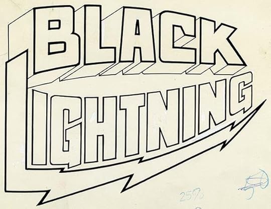
The original logo from the DC files is just the same, I see no changes or corrections, though you can see the bottom facets of the telescoping were filled in black on the cover, and two were added inside the B for consistency, though to be really consistent you would need to add two more under the horizontal bar of the A and the top bar of the B as well as filling in that tiny opening in the A. These are minor points that few people would notice.
 From DC SPECIAL #28, June-July 1977
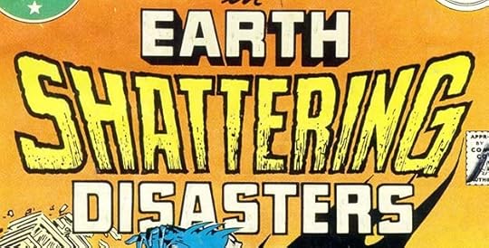
Another issue of this book with three new stories on a common theme. Instead of predictable broken letters for SHATTERING, Gaspar went with his horror style, including thick, rough outlines and inner textures.
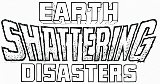
A photocopy of the original logo is almost the same, but shows the telescoping on EARTH was originally open.
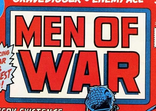 From MEN OF WAR #1, Aug 1977
A new war title from editor Paul Levitz has a conservative block letter logo design from Saladino in a round-cornered frame. An open drop shadow on WAR gives it a lift off the page.
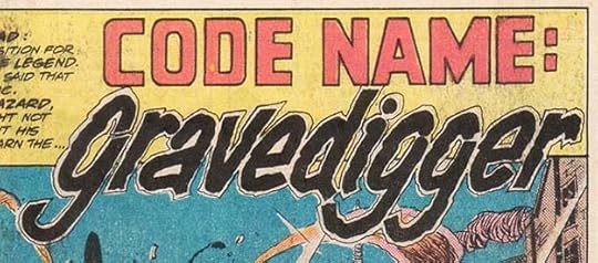 From MEN OF WAR #1, Aug 1977
Inside, this new feature has a handsome and energetic logo by Saladino. The second line reminds me a bit of his signature writ large.
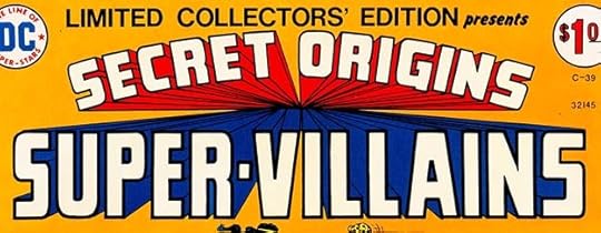
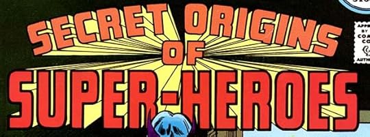 From DC SUPER STARS #17, Nov-Dec 1977
Gaspar’s similar logo for SUPER-VILLAINS from 1975 had been reused on issue #14 of this series, and here he revised the bottom line, changing it to HEROES. The word OF has been added in the center on both, perhaps it was left off by mistake in the original version. The infinite telescoping now vanishes behind the OF, and that works better and looks good to me. I count this as a new logo.
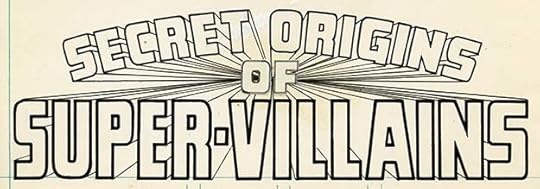
This scan of the SUPER-VILLAINS version from the DC files shows that the OF is a pasted-on photostat done separately. I see no other changes.
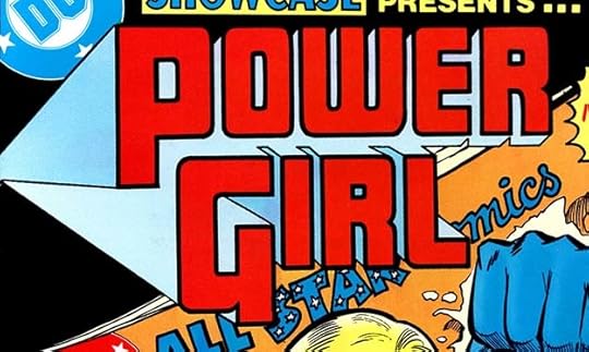 From SHOWCASE #97, Feb 1978
One of Gaspar’s most memorable logos from this time is for Power Girl. The letters are block style, large, thick bordered, and using a different form of W for Saladino. His R shapes are present. The open telescoping makes no sense at all, and is therefore kind of abstract and interesting in its own right. The colorist made choices that work well.
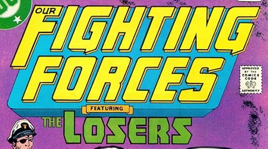 From OUR FIGHTING FORCES #178, March-April 1978
This venerable DC war title was now being edited by the venerable Murray Boltinoff. The venerable Ira Schnapp logo is replaced by a new much larger Saladino one, with THE LOSERS now a smaller feature logo, but in the same style Gaspar had used previously. Classic block letter forms were Gaspar’s usual choice for war titles. I don’t think the background shape adds much here except to hold the logo and feature together, and its telescoping contradicts the direction of the open drop shadow.
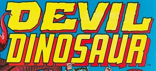 From DEVIL DINOSAUR #1, April 1978, image © Marvel.
Here’s an example of a puzzling Marvel logo that the Grand Comics Database attributes to Saladino without any citation or reference. That certainly could be correct, but it could also be by Jim Novak. On one hand, would Marvel have given a new Jack Kirby title to the relatively untried Novak? Perhaps not, but on the other hand, he was probably handy, and as Kirby was mailing his work in from the west coast and not involved in logo decisions, it would be an easy call. The logo would have been created in late 1977, around the same time as Novak’s POWER MAN AND IRON FIST one shown earlier. This is why I can’t give Gaspar credit on logos like this. I also think the shapes used in DEVIL seem unlike Gaspar’s work, but that’s just a gut feeling that could be wrong. The GCD also attributes the cover lettering to Saladino, but I’m not sure that’s right either, I think it’s by Danny Crespi.
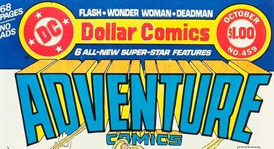 From ADVENTURE COMICS #459, Sept-Oct 1978
With this issue, ADVENTURE gained a fine new Saladino logo using block letters tilted toward the reader. The bottom edge is gently arched to make room for COMICS, and both words have telescoping, deeper on ADVENTURE, shallower on COMICS. The epic feel heralds a return to large anthology size as in the title’s early days, but with all new material. Well worth the price in my opinion. Incidentally, this features the new DC Bullet corner symbol designed by the Milton Glaser studios that had begun appearing on February 1977 covers.
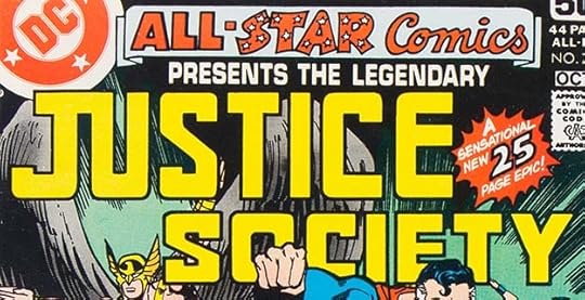 From ALL-STAR COMICS #74, Sept-Oct 1978
The final issue of this ALL-STAR COMICS revival has a new feature logo for JUSTICE SOCIETY by Saladino using some of the newer block letter forms he liked at the time such as S’s with serifs of a sort that extend toward the center and round corners on the E in JUSTICE. I like the joined JU. This version of the book logo is not by Saladino, I’m not sure who did it.
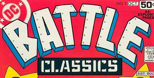 From BATTLE CLASSICS #1, Sept-Oct 1978
Now a tale of woe must be told. New DC publisher Jenette Kahn and her editors had engineered a substantial increase in comics production nicknamed the DC Explosion, with both new titles and expanded older ones that was just starting to reach retailers with issues like this. Gaspar’s logo for the war reprint title is appealing and well-done, and even if the telescoping on BATTLE doesn’t make much sense, it looks fine. Ads promoting the expansion had been running for several months, but at Warner, the parent company of DC, executives looked at sales figures from the previous year and those available from the current year so far, and decided to reverse this plan. They cancelled 40% of the line, including many of the new titles and some long-running ones, and also laid off staff in both production and editorial. This became known in comics fan circles as the “DC Implosion.” I survived the purge, but it was a sad and disheartening time at the company that was only reversed with the success of the first Superman movie. So, the first issue of BATTLE CLASSICS was the only one to make it out the door.
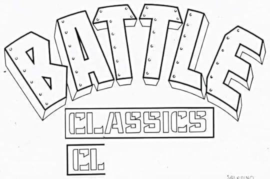
This photocopy of the original logo shows that the L in CLASSICS was deemed too wide, and Gaspar was asked to do another one, which he did right below. It’s the one used on the cover. You can also see that the telescoping goes to at least three separate vanishing points if not more.
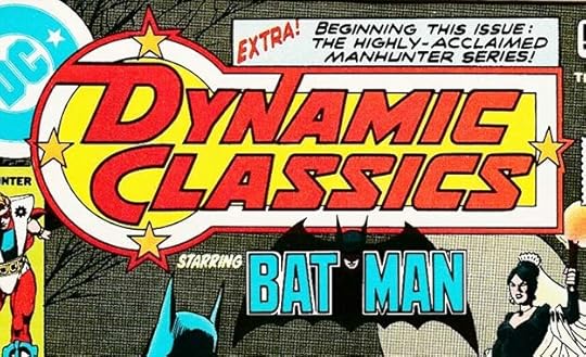 From DYNAMIC CLASSICS #1, Sept-Oct 1978
Another victim of the DC Implosion, this was the only issue of a planned Batman-featured reprint series. I love this Saladino logo, which builds on the Milton Glaser corner symbol but makes it much more exciting and dynamic, appropriately. The way the D and N connect to the outer shape is brilliant. What a shame it didn’t have a longer run.
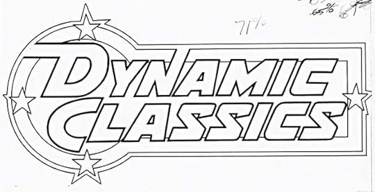
This photocopy of the original from the DC files is the same and still works fine without the color.
 From SHOWCASE #104, Sept 1978
The final issue of this long-running series has a new feature logo and large title (or maybe it’s all one big feature logo) by Saladino using several styles of block letters and decorated with a handsome dagger. Many other new issues and features were in the works, but because of the Implosion they were not published until later, or never published.
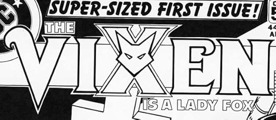
This is one of the new planned titles that didn’t make it out the door. The completed cover was one of many unpublished covers and stories issued in two massive Xeroxed collections titled CANCELLED COMICS CAVALCADE to secure copyrights on the material. There were only 35 copies made, and beyond the ones sent to Washington DC, the rest were given to contributors. I like this Saladino logo, decorated with the character’s costume symbol and cleverly emphasizing X as a subliminal nod to Marvel’s X-Men perhaps.
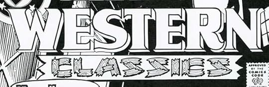
Another finished cover that never saw print, and another fine Saladino logo. The wood pieces of CLASSICS is creative and well done, and the handling of WESTERN is right on target.
The original logo from the DC files is the same, except that you can see the black drop shadow on the bottom banner better. I think the DC Implosion is another reason that Gaspar’s logo output dropped around this time, as the company issued fewer new titles over the next years.
To sum up, I count 17 new Saladino logos for books with 1977 and 1978 cover dates, considerably less than he’d been doing in recent years, but there are some fine ones. Other articles in this series and more you might like are on the LOGO LINKS page of my blog.
The post GASPAR SALADINO’S COMICS LOGOS 1977-1978 appeared first on Todd's Blog.


September 12, 2021
Rereading: EARTHMAN, COME HOME by James Blish

The third in the “Cities in Flight” series by Blish is what’s called a fix-up novel, one made by combining several short stories with changes to make it read as a more continuous narrative. The original stories appeared in the early 1950s, the first things written in the series, and it’s the longest book but episodic, and it doesn’t hold together as single plot very well. It’s the first one I read, and I loved the ideas in it.
The focus is the adventures of the wandering Okie city of New York headed by Mayor Amalfi, who we met in the second book, “A Life For The Stars.” New York is one of the largest cities in flight, and one of the most revered due to its history on Earth, but among the spaceways, it’s just another hobo trying to find work, make money, and feed its citizens. The cities are supposedly overseen by Earth Police, who act as sort of cops on the intergalactic beat in smaller spindizzy ships of their own, well armed. New York and other cities get by under police rules, but sometimes walk the line between legal and illegal activities. Other cities have gone criminal, and are called bindlestiffs, taking what they want where they can get away with it. Cities like New York take on contracts to do work for planets they encounter who need their help, but in this book a galaxy-wide depression has devalued what the cities use for money, work is scarce, and they are gradually being starved. Some gather in a space colony called a Jungle (after hobo jungles on Earth in the 1930s), trying to negotiate as a group, but in danger of being destroyed by Earth Police. Amalfi’s New York is forced to join this rebel group, and when they decide to travel together back to Earth to demand rights and justice, Amalfi finds a way to make that work for him and save Earth at the same time by taking over an entire planet and making it travel like the cities do with spindizzy engines. Then New York must flee, and they travel to the distant Lesser Magellanic Cloud beyond our galaxy in search of a new home.
There’s plenty of adventure in this book, and I enjoyed rereading it, even if the science is not always very believable. The characters are appealing, and the plot’s many twists and turns keep things interesting. One thing I would have liked to see more of is making the buildings, streets, and environment of New York more part of the story, most of the interior scenes take place mainly in City Hall, and few New York landmarks are mentioned. On the whole, recommended.
The post Rereading: EARTHMAN, COME HOME by James Blish appeared first on Todd's Blog.
September 9, 2021
GASPAR SALADINO’S COMICS LOGOS 1976
 All images © DC Comics except as noted. From 1ST ISSUE SPECIAL #10, Jan 1976.
After the truckload of extra logo work in 1975, Gaspar settled back into his usual busy design role for DC Comics and Marvel Comics for books cover-dated 1976. This was a Joe Simon concept that did not go further. The S shapes are ones Gaspar began to use more often at this time, with the top and bottom loops extending toward the center. The bottom loop on the first S has been made wider to fill in the extra space next to the T, which only bothered me when I finally noticed it just now.
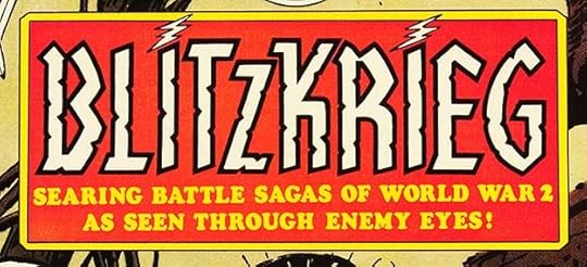 From BLITZKRIEG #1, Jan-Feb 1976.
Leave it to editor Joe Kubert and writer Robert Kanigher to use a German word for a DC war book title, one that had to be explained in the tag line. Gaspar used a style suggesting German blackletter fonts, but simplified to be more readable, and with lightning bolts over each I to add interest.
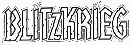
A photocopy of the original logo from the DC files shows it was designed with a typical Saladino outer shape for a second color, and I think it works better this way. This version was only used on the fifth and final issue.
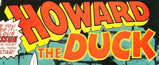 From HOWARD THE DUCK #1, Jan 1976, image © Marvel.
This one surprised me, but having gone through all the Marvel logos by Saladino to this point, there’s no doubt in my mind he also did this one. HOWARD is classic Saladino block letters with open telescoping, and DUCK is reminiscent of his teen humor work. THE might be type. Great contrast to play up the humor of the idea.
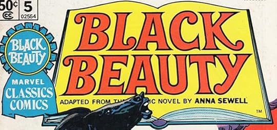
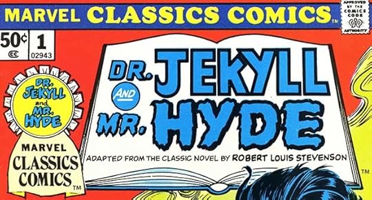 From MARVEL CLASSICS COMICS #1, (Jan) 1976, image © Marvel.
In 1975, Marvel bought the rights to some classic literature comics adaptations prepared by Vincent Fago, the first few had been published a few years earlier by Pendulum Press. With this material Marvel launched their own version of the Gilberton CLASSICS ILLUSTRATED line, continuing on with new material after the Fago issues were finished. I believe the feature logos were a regular assignment for Gaspar for the first twelve issues. The feature logo above looks like his work and has appropriate contrast between the two sides of the character. I don’t think he lettered the bottom line. He might have drawn the ribbon and book, I’m not sure, but I think he did letter the story titles in the ribbon.
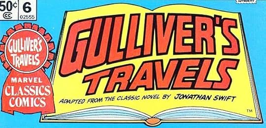
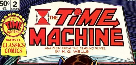 From MARVEL CLASSICS COMICS #2, (Jan) 1976, image © Marvel.
This one is less typical of Saladino’s work, but creative touches like the sand dial, the clock over the I, and the arrow in the E suggest he lettered it.
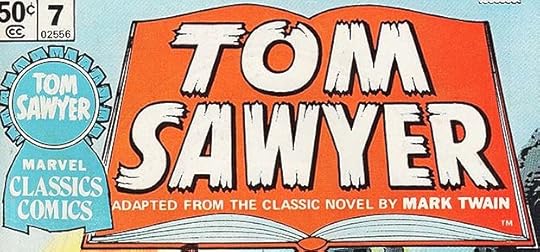
 From MARVEL CLASSICS COMICS #3, (Jan) 1976, image © Marvel.
I feel more certain this one is by Saladino due to the R shape and also a style of K he was using at this time. Perhaps this was all handled like cover lettering rather than a logo design for billing purposes. They still count as cover logos in my book.
 From MARVEL CLASSICS COMICS #3, (Jan) 1976, image © Marvel.
Another that seems definitely in Saladino’s wheelhouse, so I think it’s likely he did all four of these feature logos for the line’s first releases, and perhaps at the same time.
 From MARVEL PREVIEW #4, Jan 1976, image © Marvel.
This feature logo has the Saladino R shapes, and the perspective on the telescoping is faked in the way he often did it to save time. There are some odd elements like the dash, which should have the same depth of telescoping as the rest, but appears to end sooner, and the horizontal back edge, but in general it works fine, and few would have noticed those things.
 From 1ST ISSUE SPECIAL #11, Feb 1976
The assignment here was simple: a logo suggesting something stenciled on a military top secret file. It works well.
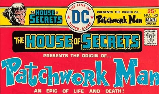 From THE HOUSE OF SECRETS #140, Feb-March 1976
This odd logo is probably by Saladino, the clever stitched lines inside the letters suggest that, and while the letter shapes aren’t like anything he usually did, they indicate his creativity.
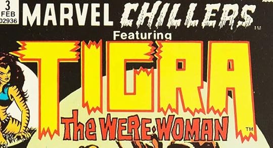 From MARVEL CHILLERS #3, Feb 1976, image © Marvel.
Gaspar went with very square-cornered block letters for TIGRA, and Simek-influenced broken ends. THE WERE-WOMAN is more typical of his horror lettering, and provides contrast. Note that, with printing presses of the time, color registration was not as predictable or consistent as it is now, so the magenta ink used for the TIGRA outlines was out of alignment on this copy, creating those yellow edges.
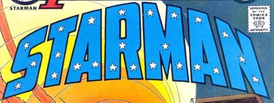 From 1ST ISSUE SPECIAL #12, March 1976
Perhaps the least known of DC’s many versions of Starman, he had just one feature appearance in this tryout title with a fine Saladino logo, three-dimensionally curved block letters decorated with stars.
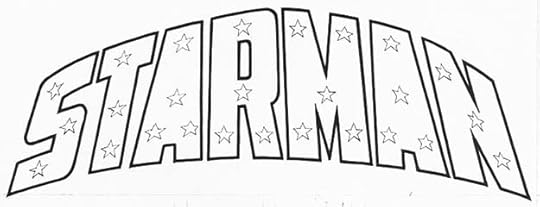
A photocopy of the original logo from the DC files, but overexposed so the star shapes look thinner than they actually were. Here the openings in each A were replaced with a single star, but that was revised for the printed version.
 From DC SUPER-STARS #1, March 1976
This new anthology was mostly for reprints, and Gaspar’s wide but small logo left lots of room for each issue’s feature logo.
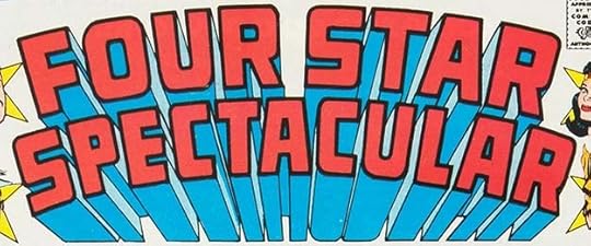 From FOUR STAR SPECTACULAR #1, March-April 1976
Another new anthology for superhero stories, Gaspar’s logo impresses with attention-grabbing block letters and effective telescoping that pops it off the page. There’s one odd error below the last A. Perhaps Gaspar forgot to draw the vertical side, and someone finished it incorrectly. Without checking, if this is fake perspective, it’s more carefully done than usual, and looks right.
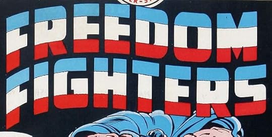 From FREEDOM FIGHTERS #1, March-April 1976
These wide block letters don’t immediately suggest Saladino, but the appropriate flag wave shape does, and also the thin organic lines used to create separations for the colors in each letter, the same thing he did for his very first DC logo for Sgt. Rock in 1963.
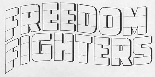
A photocopy of the original logo from the DC files shows those dividing lines better. Gaspar often came up with original ideas. Another is the drop shadow which doesn’t show on the printed cover, where each section is smaller top and bottom than the shape it is cast from, as if the logo is in a bright spotlight and raised just a little off the background. It’s more visible on other issues.
 From MARVEL CLASSICS COMICS #5, (April) 1976, image © Marvel Comics.
Four of these were released in each quarter of the year. This one has charming ball-end serifs.
 From MARVEL CLASSICS COMICS #6, (April) 1976, image © Marvel Comics.
 From MARVEL CLASSICS COMICS #7, (April) 1976, image © Marvel Comics.
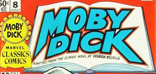 From MARVEL CLASSICS COMICS #8, (April) 1976, image © Marvel Comics.
Not a lot to say about these individually, but the variety is admirable, and Gaspar’s talent keeps them from seeming like stuffy old literature, and instead makes them exciting, which is just what Marvel wanted.
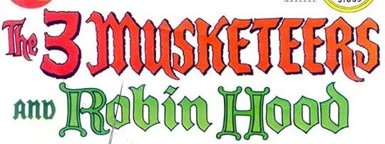 From DC SPECIAL #22, June-July 1976
This issue paired a new story about the Three Musketeers with reprints of Robin Hood from the 1950s. The top logo is a new one by Saladino. He makes it a little shorter by using a number 3, and in general it’s his roughened and energetic version of Old English. the Robin Hood logo is by Ira Schnapp from the 1950s, and his more traditional approach with Celtic capitals and Old English for the rest makes a good comparison of their different approaches.
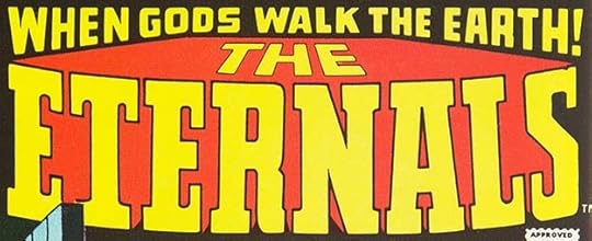 From THE ETERNALS #1, July 1976, image © Marvel Comics
Another Marvel logo that surprised me, but it has the Saladino R, slab serifs (which no one else but Gaspar seemed to use at the time) and open telescoping with THE in perspective. The top line is also by Saladino and probably done at the same time. I like this logo better now that I did when it first appeared.
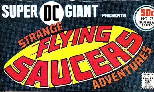 From SUPER DC GIANT #27, Summer (July) 1976
What kind of logo would be appropriate for a collection of stories from STRANGE ADVENTURES about flying saucers? Gaspar knew, but his execution doesn’t really work very well as a saucer. I do like the letter shapes and it reads fine.
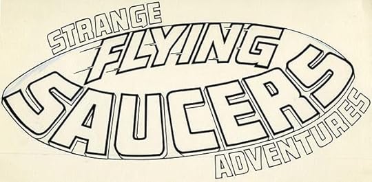
The original logo from the DC files shows he had trouble with that saucer shape, it has white correction paint at the upper sides. The speed lines on FLYING show up better here, and that word is full of motion.
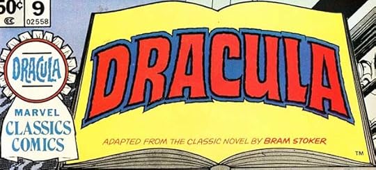 From MARVEL CLASSICS COMICS #9, (July) 1976, image © Marvel.
This version of Dracula is very close to the one Saladino did for DRACULA LIVES in 1973, but curved and with a second rough outline.
 From MARVEL CLASSICS COMICS #10, (July) 1976, image © Marvel.
 From MARVEL CLASSICS COMICS #11, (July) 1976, image © Marvel.
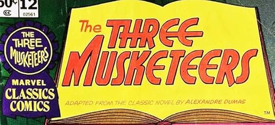 From MARVEL CLASSICS COMICS #12, (July) 1976, image © Marvel.
The last set of these by Saladino are just as varied and creative as the earlier ones. I particularly like his Art Deco approach to issue #12. After this, the series continued with new material produced by Marvel, and the logos look like they were done by staffers such as Danny Crespi.
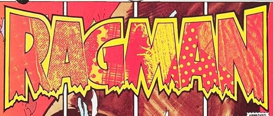 From RAGMAN #1, Aug-Sept 1976
This logo was one of the most technically complex of its time, and it was a collaboration. Joe Kubert had the concept of letters filled with a variety of diverse cloth pieces, and he and DC production head Jack Adler put that together on the DC photostat camera in the darkroom. Adler photographed it to get the best contrast in a black and white image (held in red here). Gaspar created the letter shapes and outlines, which were photostatted on acetate, then the areas between the two outlines were painted with white paint on the back of the acetate, like an animation cell, so that the fabric pieces only showed through inside the letters when it was photographed on top of the previous image made by Adler. I’ve written at length about the creation of this logo HERE. I feel Gaspar should receive at least partial credit for it with Kubert, and I will count it as a logo for him.
 From MARVEL TREASURY EDITION #9, Sept 1976, image © Marvel.
Okay, everyone who sees many familiar Saladino ideas in this logo raise your hand. Yes, it’s too long and a bit wonky, with perspective going in two conflicting directions, but it works for me.
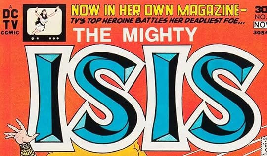 From ISIS #1, Oct-Nov 1976
This logo is similar to a shiny, metallic beveled one associated with the TV show, though I can’t pinpoint if it was actually used on TV at the time. In any case, Gaspar did his usual black line version of it, and he had trouble figuring out how to make the bevels work on the S’s. It doesn’t really work as far as I can tell, they seem to switch from raised to incised in odd ways that are neither, but it looks fine on the covers as long as you don’t look at it too long or too closely as we are here.
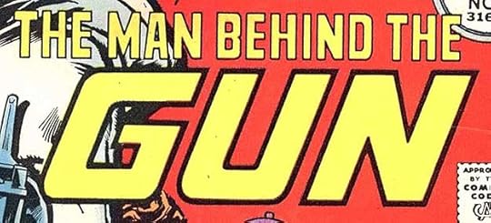 From DC SUPER STARS #9, Nov 1976
If you show a gun on the cover, you must use it inside, to misquote an old theater adage. I guess that also applies to the giant word GUN, and Saladino used it well to grab attention.
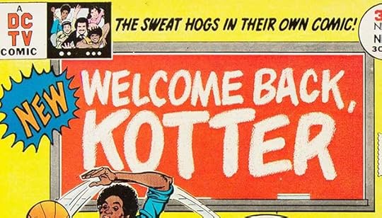 From WELCOME BACK, KOTTER #1, Nov 1976
DC was trying to get back into TV tie-ins, and in this case, Gaspar’s version of the TV logo is far better than the one on the show. It looks like he used dry brush on textured paper to get that chalk look for the letters, which were then held in white to complete the idea. It looked better on dark blue or dark green chalkboards on later covers.
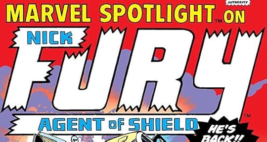 From MARVEL SPOTLIGHT #31, Dec 1976, image © Marvel.
Saladino is definitely using Artie Simek broken ends here, but the R is in his style, as is the K of NICK. The extended Y for the bottom line is a nice touch.
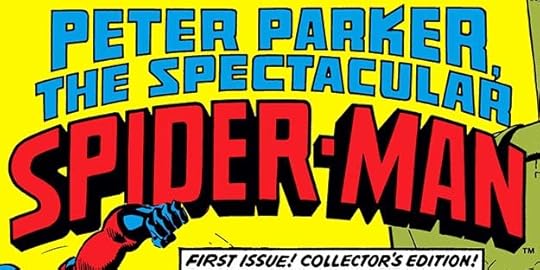 From THE SPECTACULAR SPIDER-MAN #1, Dec 1976, image © Marvel.
Another logo that surprised me, but it again has Saladino R’s and K in the top two lines. The telescoping was filled black here, but it was lettered open in Gaspar’s usual way, and shows up thus on later issues. The S in SPIDER-MAN is a graceful double loop that I like, but MAN is leaning to the right for no good reason.
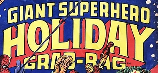 From MARVEL TREASURY EDITION #13, Dec 1976, image © Marvel.
Finally, we have that large appealing Saladino logo that uses arced serif letters for HOLIDAY with an open drop shadow and Saladino R’s in the other lines.
To sum up, I found 34 Gaspar Saladino logos in DC and Marvel books with 1976 cover dates, about half of what he did in the previous year, but still quite a lot on top of his other lettering work. There’s more to come, but the busiest years for Gaspar’s logo designs were winding down now as other designers began to gain assignments at both companies.
Other articles in this series and more you might like are on the LOGO LINKS page of my blog.
The post GASPAR SALADINO’S COMICS LOGOS 1976 appeared first on Todd's Blog.
September 6, 2021
GASPAR SALADINO’S COMICS LOGOS June-Dec 1975
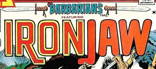 From THE BARBARIANS #1, June 1975, image © Nemesis Group, Inc.
Continuing with Gaspar Saladino’s busiest logo year, as he was designing them for DC Comics, Marvel Comics, and Atlas/Seaboard Comics, who produced a flood of 67 issues dated 1975, and then were no more. This Seaboard title has two logos. BARBARIANS nicely flanked by swords, appeared only this once. Gaspar was certainly capable of doing the swords, but these are so detailed they might have been added by someone else. IRONJAW we’ve already seen on his own title, though the right leg of the N has been shortened to make room for FEATURING in type. Why this was not simply an issue of IRONJAW I don’t know, but Seaboard continued to swamp the market with titles, perhaps at owner Martin Goodman’s request.
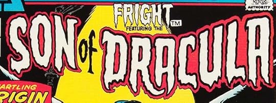 From FRIGHT #1, June 1975, image © Nemesis Group, Inc.
Another one-issue title with fine Saladino logos for the book name and the feature. How many times is this for Gaspar to create a logo for Dracula? I’ve lost count! Since both of these only appeared once, I’m going to count this as one logo.
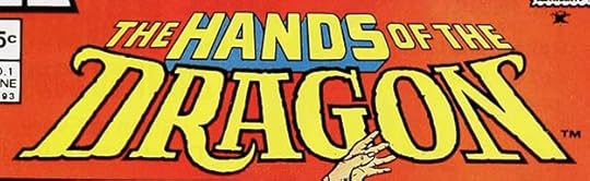 From THE HANDS OF THE DRAGON #1, June 1975, image © Nemesis Group, Inc.
An entry in the martial arts genre, I like this one much better than RICHARD DRAGON, the one he did for DC in this year as seen in the previous post. Not overtly Asian, but I think that’s a good thing. DRAGON is stylish, with slab serifs and dragon’s claws, and I like the RA combination.
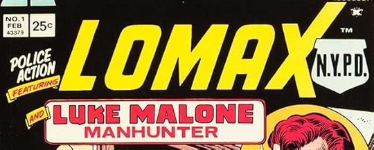
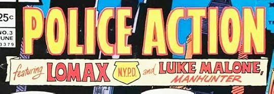 From POLICE ACTION #3, June 1975, image © Nemesis Group, Inc.
The third and final issue of this series has yet another logo, this time promoting the actual book title. It seems less interesting to me, but perhaps the real problem was selling any kind of police/crime comic in 1975.
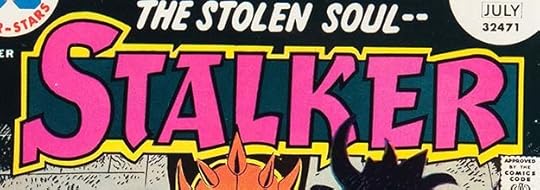 From STALKER #1, June-July 1975, image © DC Comics.
Not a familiar look for Saladino, but I can’t think who else might have designed it. The art is by Steve Ditko and Wally Wood, could Ditko have supplied a logo idea that Gaspar used as his starting point? The letters are inconsistent, though it reads fine.
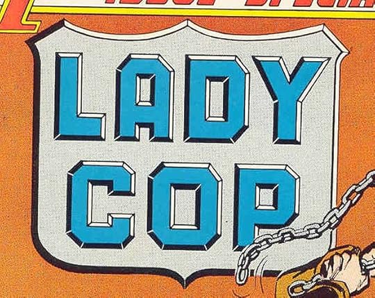 From 1ST ISSUE SPECIAL #4, July 1975, image © DC Comics
Carl Gafford told the Grand Comics Database that this story had been on the shelf for some time, and was originally to be titled POLICE WOMAN, but had this name change because of the TV show of the same name. Saladino did a fine job with beveled letters on a shield, but it probably takes up too much space. No matter, the feature went no further.
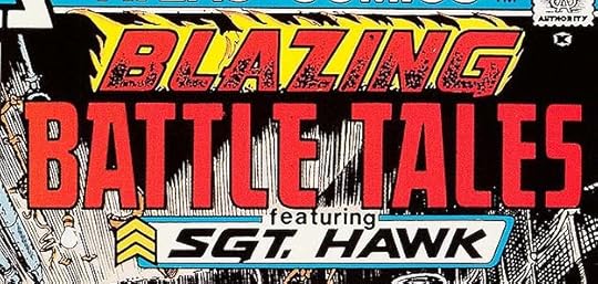 From BLAZING BATTLE TALES #1, July 1975, image © Nemesis Group, Inc.
Another one-shot from Seaboard, and Gaspar gets a chance to use his flaming letters, this time with the flames blowing to the left. The bottom character logo is a nice variation on his Sgt. Rock logo.
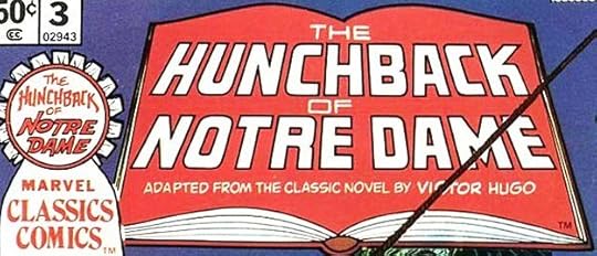
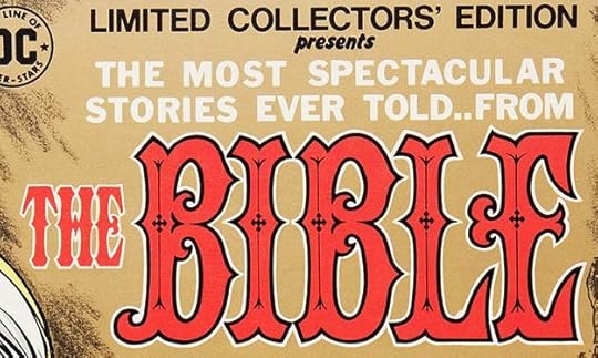 From LIMITED COLLECTORS’ EDITION #C-36, June-July 1975, image © DC Comics.
A tricky assignment for Saladino, create a logo for one of the world’s oldest and most famous books without making it seem too religious, something that might turn fans away. I think he succeeded admirably. I love the decorative details in the letters, and the ornate shapes themselves.
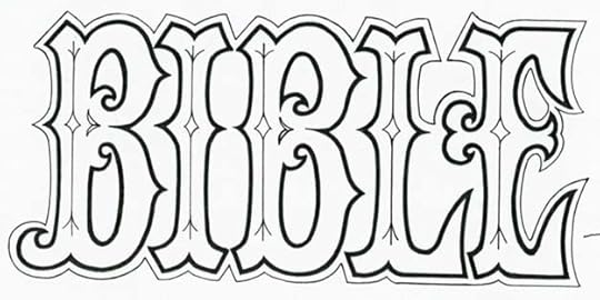
A photocopy of the original logo from the DC files shows that some of the details were changed, with the original diamond-shaped points being replaced with tiny crosses. I like the final version better.
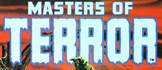 From MASTERS OF TERROR #1, July 1975, image © Marvel.
No mistaking this Saladino horror treatment on TERROR. I might have been tempted to repeat one of those three R’s, but these are all different, and I don’t think Gaspar thought that way.
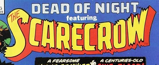 From DEAD OF NIGHT #11, Aug 1975, image © Marvel.
While I’m not absolutely sure this one is by Saladino, it looks that way to me, from the shapes of the top line to the open drop shadow. Gaspar did seem to use elements of Artie Simek’s logo style at times, like these broken-ended letters, especially at Marvel, but this is definitely not by Simek.
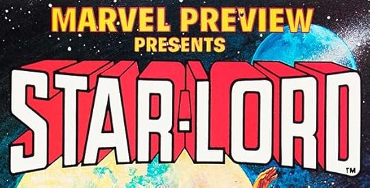
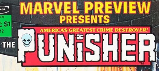 From MARVEL PREVIEW #2, June 1975, image © Marvel.
Another logo I’m not completely sure about, but Saladino seems the most likely designer, and it had his R shape. The target over the I is also something he might have done, I’m not sure about the skull in the P.
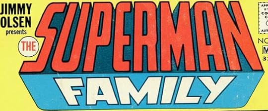
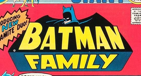 From BATMAN FAMILY #1, Sept-Oct 1975, image © DC Comics.
After thinking about it, I don’t believe Gaspar worked on this logo. The bottom part is from his SUPERMAN FAMILY logo, the top uses the Infantino/Anderson bat shape from ten years earlier and the Ira Schnapp letters from that logo, but tilted back in perspective. However, the T is wrong, not in perspective, not close enough to the A, and I think just copied directly from the Schnapp BATMAN logo. This was probably done by someone in the DC production department.
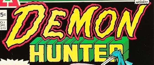 From DEMON HUNTER #1, Sept 1975, image © Nemesis Group, Inc.
Seaboard was running out of steam when this Saladino logo hit the newsstands, and his fine logos were not enough to save it. Powerful, energetic and scary work here on DEMON, fine telescoped letters on HUNTER. It was the final new title from the company, and there were no Seaboard cover dates later than September. One good thing about designing logos in my experience is that you rarely have to worry about getting paid. You are contributing at the early stages of a project, when hope and enthusiasm are at their highest, and the price of a logo design seems worthwhile to bring a sure-fire profitable idea to life. I hope that was true for Gaspar at Seaboard right to the end.
 From THE LEGION OF MONSTERS #1, Sept 1975, image © Marvel.
At Marvel, it was business as usual, as they brought out yet another black and white magazine size horror title with a nice Saladino logo. One place he and I did not see eye-to-eye was the treatment of inside corners like the ones here on the M and N. He sometimes cut them short, I like them better brought to a sharp point.
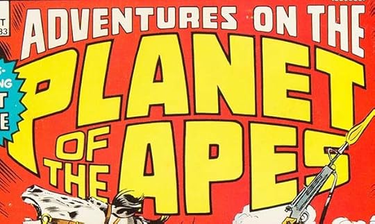 From ADVENTURES ON THE PLANET OF THE APES #1, Oct 1975, image © Marvel.
The film was a hit, Marvel’s black and white magazine version was too, so they reprinted it in color in this series. Gaspar’s logo plays with apparent distance, the top line recedes at the center just where the main title bulges out toward the reader, making that bulge seem even more three-dimensional. The title is too long and the logo too big, but it’s a cool one.
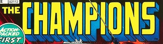 From THE CHAMPIONS #1, Oct 1975, image © Marvel.
Another logo I’m not sure about, but I think it’s by Saladino. Note the chopped off points in the A and M, but the ones in N are pointed. Perhaps someone else did that. The general look and telescoping say Gaspar to me.
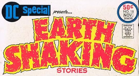 From DC SPECIAL #18, Oct-Nov 1975, image © DC Comics.
By this time, the DC SPECIAL logo had become much smaller, leaving room for a large feature logo. Saladino created several like this one for specific reprinted story themes, an interesting idea. His block letters are made of many rough pen strokes, and leaving lots of voids and openings to emphasize the earthquake theme.
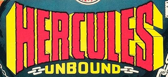 From HERCULES UNBOUND #1, Oct-Nov 1975, image © DC Comics.
Both the title and logo treatment of this series suggest the Hercules movies, with the logo having that wide-screen, impossible perspective and massive footprint that epic movies sometimes use. The perspective is purposely distorted, and works well. I also like the chain links, suggesting chains the movie Hercules and this one often tried to break free of.
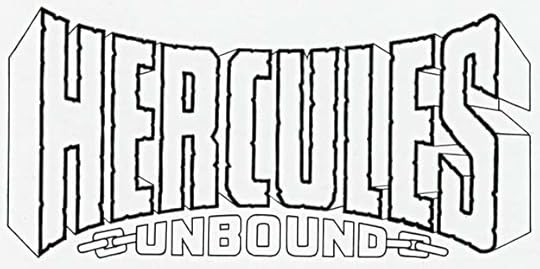
A photocopy of the original logo from the DC files is just the same, and still impressive.
 From THE INHUMANS #1, Oct 1975, image © Marvel.
I can’t be sure, but I believe this logo is by Saladino from the general look, the open drop shadow, and the creative THE. Here the N’s and M have pointed inner angles, while the A is squared at the top.
 From LIMITED COLLECTORS’ EDITION #C-39, Oct 1975, image © DC Comics.
Sometimes telescoping can be carried to extremes, like this example, using one-point perspective with the vanishing point between the two lines. With so much implied depth, the illusion is harder to make convincing, and to my eye, this just flattens out at the center, not helped by the flat colors, but you can still appreciate the extra work of all those lines. The logo reads fine.
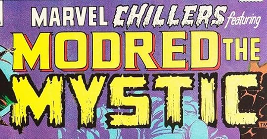 From MARVEL CHILLERS #1, Oct 1975, image © Marvel.
Both this book title logo and feature logo are the work of Gaspar Saladino. Five different styles, but they all work well together in my opinion. MYSTIC gets the full horror treatment with dry brush outlines and inner textures. I will count this as two logos for Gaspar.
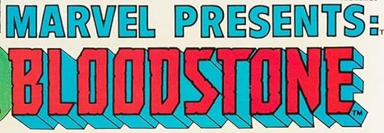 From MARVEL PRESENTS #1, Oct 1975, image © Marvel.
Marvel was also turning out lots of new titles, some filled with reprints, some with new material like this one. MARVEL PRESENTS is done with headline type, but BLOODSTONE is by Saladino. He put in most of the telescoping dividing lines on the bottom and right sides, but left others out for interior shapes. The colorist has wisely made it all the same color.
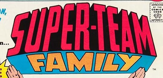 From SUPER-TEAM FAMILY #1, Oct-Nov 1975, image © DC Comics.
Following the style of SUPERMAN FAMILY and BATMAN FAMILY, the bottom section is a repeat from the first of those by Gaspar. I’m not positive he did the top part here, but he probably did even though the R doesn’t follow his usual style. The FAMILY concept is getting stretched beyond sensible limits for this reprint title.
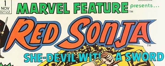 From MARVEL FEATURE #1, Nov 1975, image © Marvel Comics.
Even though the top and bottom lines of this logo are not by Gaspar, I believe RED SONJA is. I can’t think of anyone else working at Marvel at the time who did this kind of creative and unusual letter shapes, and it follows a typical Saladino style with thick inner shapes and a thin second outline. The rounded inner curves on the E remind me of other Gaspar logos, too. Exotic, but not in a specific genre way, this logo is fresh and appealing, and was also used on her solo series of 1977.
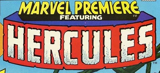 From MARVEL PREMIERE #26, Nov 1975, image © Marvel.
I’m not positive Saladino designed this logo, but I think it’s likely. The letter shapes and inner textures seem right. The thin black telescoping creates an odd illusion here that the letters are carved into the background, but a closer look shows they are raised above it.
 From 1ST ISSUE SPECIAL #9, Dec 1975, image © DC Comics.
These roughened block letters are certainly by Saladino. If you look closely at the inner shapes, they are created with a pattern of tiny concentric circles, a cool effect more visible on the actual comic. That might have been created by Jack Adler in the DC production darkroom, it’s not something Gaspar would have done, though he might have drawn the shapes.
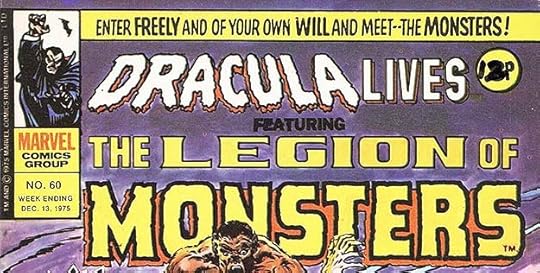 From DRACULA LIVES #60, Dec 1975, image © Marvel.
Marvel UK was publishing lots of Marvel reprints for the British market, usually in thin weekly comics like this one. The feature logo looks like the work of Saladino, so I’m guessing these covers were put together in Marvel’s New York offices and sent over.
 From MAN-BAT #1, Dec 1975-Jan 1976, image © DC Comics.
After decades of Batman, someone finally thought of switching the syllables to create this new character. Saladino’s logo suggests the connection with a shape similar to the bat shapes often used for Batman, but scalloped on both the top and bottom. I think it works okay, but I don’t find it completely successful, it tends to seem like DC and Gaspar ripping off their own better ideas.
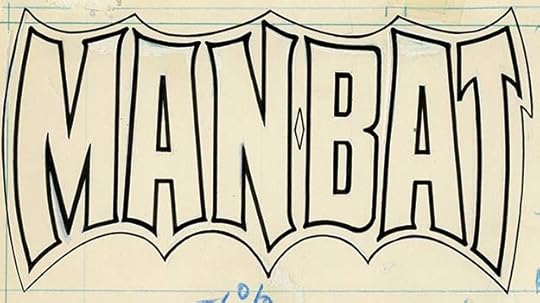
The original logo from the DC files shows a fair amount of white correction paint suggesting Gaspar had some trouble with it. The printed blue lines indicate it’s done on DC pre-printed interior page paper. The closeness of some letters to the top border bothers me here.
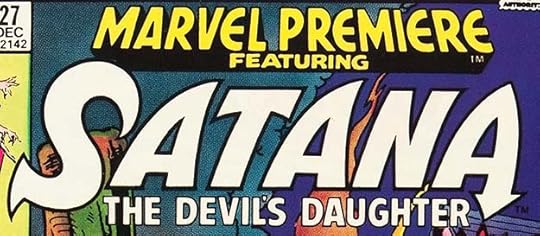 From MARVEL PREMIERE #27, Dec 1975, image © Marvel.
Another logo I’m not sure about, but likely to be by Saladino, at least the main word, SATANA. The arrow (demon tail?) in the A seems like something he might do.
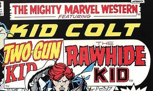 From THE MIGHTY MARVEL WESTERN #43, Dec 1975, image © Marvel.
While the book logo is not by Gaspar, the three new feature logos are for this Marvel reprint title, which reminds me of what he was doing for Seaboard westerns. Each logo is appealing, but I don’t know that it hangs together well even with the giant bullet shape around two of them, and of course it’s too long and takes up too much space. The feature logos were used for the remaining issues of the series, and I will count them as three logos for Saladino.
To sum up, I found 32 Saladino logos in the books with June-Dec 1975 cover dates. Adding in the 38 I counted for the first part of this year, that’s an amazing total of 70 logos, well more than one per week! To break it down, there were 28 for Atlas/Seaboard, 20 for DC, and 22 for Marvel. How did he have time to even show up at each company to pick up and drop off these assignments on top of his other lettering work for house ads, covers and stories? And not only was Gaspar prolific, the quality of his work was usually excellent, too. Truly, he was a master.
Other articles in this series and more you might enjoy are on the LOGO LINKS page of my blog.
The post GASPAR SALADINO’S COMICS LOGOS June-Dec 1975 appeared first on Todd's Blog.
September 5, 2021
And Then I Read: A LIFE FOR THE STARS by James Blish
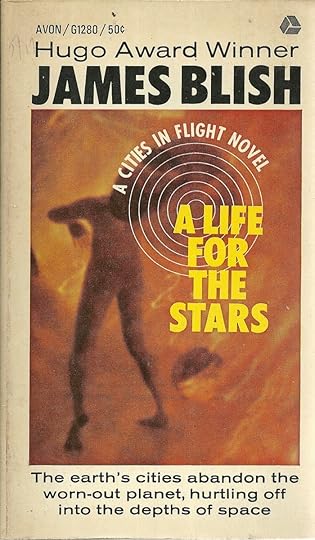
The second book in the “Cities In Flight” series puts us into the initial phase of cities leaving Earth with the use of massive “spindizzy” engines that create anti-gravity force fields. Earth’s resources and economy have become stressed and stripped by overpopulation and war, and the planet is ruled by a dictatorial central government, but spindizzy technology provides an escape. Factories at first, then entire cities leave Earth to roam the spaceways looking for work and income for their inhabitants. These escapees are called Okies, a nod to the migrant farmers who left the middle and southwestern United States during the droughts of the 1930s in search of better lives in California.
Teenager Chris deFord lives in the Appalachian hills outside Scranton, Pennsylvania, and has heard that Scranton is getting ready to lift off. He wants to witness this event in secret, but a roving band of “recruiters” finds his hiding place and brings him into the city, where he becomes an unwilling part of the migration when Scranton heads for the stars. Space travel’s long time-frame is only made possible by anti-aging drugs, but they are scarce, and Chris is one of many conscripts who are not eligible for them. He’s only wanted for his skills as a laborer, but after some adventures aboard Scranton, he has the chance to move to a larger Okie city, New York, when he’s traded to that city for some other workers Scranton wants. In New York City, Chris is treated better, and educated, but he will still not be a full citizen and eligible for the anti-aging drugs until he proves his worth to the city. Chris has more adventures with New York as they land on various worlds and take job contracts until a contract is offered on a world that is trying to get rid of an Okie city causing them trouble. That city is Scranton, and Chris’s unique knowledge of his former city gives him a lead role in trying to fulfill that contract.
This was an enjoyable read, and I’d call it my favorite of the four books in the series. Blish’s model for the story might have been the Heinlein juveniles, coming of age stories by Robert A. Heinlein, and though this is a shorter book than most of those, and not as well written, it’s still a worthy attempt along the same lines.
Recommended.
The post And Then I Read: A LIFE FOR THE STARS by James Blish appeared first on Todd's Blog.
September 2, 2021
GASPAR SALADINO’S COMICS LOGOS Jan-May 1975
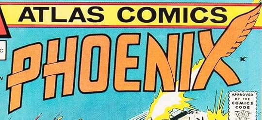 From PHOENIX #1, Jan 1975, image © Nemesis Group inc.
We’ve come to Gaspar Saladino’s busiest year for logo designs. Not only was he continuing to create them for both DC and Marvel Comics, he was crafting logos for a new line published under the Atlas name, but known as Atlas/Seaboard or simply Seaboard today to avoid confusion with Marvel, who also used the Atlas name in the 1950s. Atlas/Seaboard was begun by Marvel Comics founder Martin Goodman, who had sold his interest in Marvel in 1968 and left the company in 1972. Some saw Atlas/Seaboard as an attempt at revenge against Marvel for failing to keep his son Chip Goodman in charge, others as simply a new business to make money for the Goodman family doing what they knew best. Goodman hired Warren editor Jeff Rovin and Stan Lee’s brother Larry Lieber as editors, and Steve Mitchell (from the DC Comics production department) as Production Manager. Over the course of a year, from fall 1974 to fall 1975, the new company put out a large line of color comics and a smaller one of black and white magazine-size comics. Creators were wary, thinking the plan was too ambitious to succeed (which proved true), so Goodman had to offer top rates and creator-ownership of properties to attract big-name artists and writers. As a comics reader of the time, it was an interesting year trying to keep up with three busy comics publishers of somewhat similar material. Atlas/Seaboard modeled their product on Marvel’s for the most part, and to get a similar look, they hired Gaspar Saladino to design all the logos. I’m sure Gaspar was delighted with this windfall of new logo business, and as usual he rose to the challenge to create many fine logos. The one above is an example, with handsome design elements including a winged X. This character predates the transformation of Marvel’s X-Men character Jean Grey to the character Phoenix by a few years.
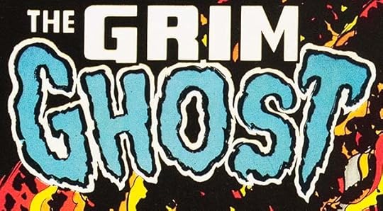 From THE GRIM GHOST #1, Jan 1975, image © Nemesis Group Inc.
Another early example from Atlas/Seaboard, Gaspar uses his artful dry-brush technique on GHOST and block letters (with his distinctive R shape) on the rest. I think many Marvel Comics readers would have tried these comics based on the logos and cover art alone, though they weren’t always easy to find. Distribution to newsstands and other retailers was a tricky problem to solve for magazine publishers then before the direct market was created.
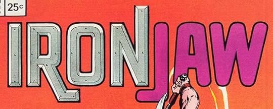 From IRONJAW #1, Jan 1975, image © Nemesis Group Inc.
For this logo, Saladino went to beveled metal with rivets for IRON and rounded letters for JAW. Surprisingly, they go together well here, perhaps partly because the right leg of the R is similar to the J. The right leg of the N seems unfinished at the top, missing its thick outline, probably trimmed off by mistake.
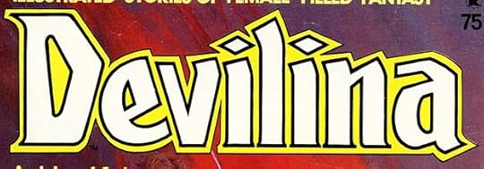 From DEVILINA #1, Jan 1975, image © Nemesis Group, Inc.
The first black and white magazine-size comic from Atlas/Seaboard had this logo from Saladino which uses upper and lower case and subtle serifs as well as angular shapes to add interest. I like the diamonds on the i’s.
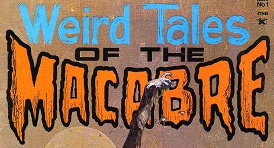 From WEIRD TALES OF THE MACABRE #1, Jan 1975, image © Nemesis Group, Inc.
Also out with a January cover date was this black-and-white magazine. It looks like Gaspar’s brushwork again on the top line and perhaps also on the outlines of MACABRE, with texture inside to add interest. He did the center openings with thinner outlines perhaps to make sure they didn’t fill in black. Weird Tales had been a long-running pulp magazine, but perhaps was not active at the time. This logo does not work very well for me, but the colors don’t help.
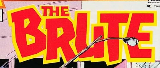 From THE BRUTE #1, Feb 1975, image © Nemesis Group, Inc.
After four titles with January cover dates, there were 13 with February dates, as Atlas/Seaboard continued to ramp up their launch, I think far too many for most comics readers. A better approach would have been to launch six or eight titles first, then gradually add more after a few months, but it was not a stream, it was a flood. I like this logo by Saladino suggesting a character similar to Marvel’s Hulk. The letter shapes are creative, and the tilted B adds to the appeal for me. Again, the color doesn’t help it, though.
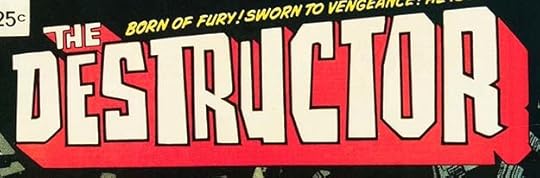 From THE DESTRUCTOR #1, Feb 1975, image © Nemesis Group, Inc.
Many of the new Seaboard titles were intriguing, and Gaspar’s logos helped with that. I love the unusual letter shapes in this one, adding a feeling of something gone out of control.
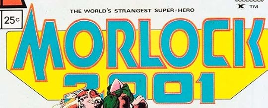 From MORLOCK 2001 #1, Feb 1975, image © Nemesis Group, Inc.
An obvious reference to H.G. Wells’ “The Time Machine,” this title takes block letters in a futuristic direction. The M is unusual and creative, as is the K.
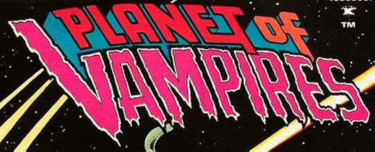 From PLANET OF THE VAMPIRES #1, Feb 1975, image © Nemesis Group, Inc.
A nice combination of Gaspar’s block letters and his horror style. The ET is clever. I wonder how many of these he did at one time? They certainly all seem different from each other, a tribute to Saladino’s creativity.
 From POLICE ACTION #1, Feb 1975, image © Nemesis Group, Inc.
Not content with horror and super-heroes, Seaboard tried all different genres, even ones like this crime/police anthology, a type of comic that had hardly been seen since the 1950s. Perhaps this was Martin Goodman trying to recreate those glory days when he flooded the market with titles.
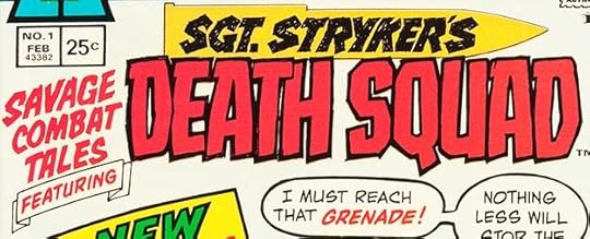 From SAVAGE COMBAT TALES #1, Feb 1975, image © Nemesis Group, Inc.
War comics were not excluded, and Saladino had plenty of experience there, though this logo is somewhat looser than what he’d done for DC war books. Lots of energy in all of this, and the bullet shape is a nice addition.
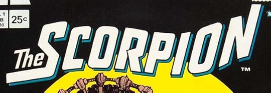 From THE SCORPION #1, Feb 1975, image © Nemesis Group, Inc.
A 1930s pulp-style soldier-of-fortune from Howard Chaykin, Gaspar’s logo uses a graceful flag-wave to work around the art, an open drop shadow for a second color, and an unusual R shape.
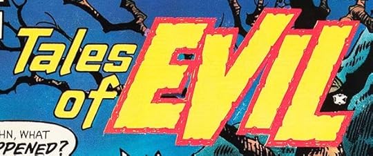 From TALES OF EVIL #1, Feb 1975, image © Nemesis Group, Inc.
It’d be hard to get more attention-grabbing than this large EVIL with rough, notched outlines, and TALES OF makes a great counterpoint with smaller upper and lower case letters.
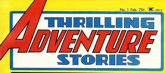 From THRILLING ADVENTURE STORIES, Feb 1975, image © Nemesis Group, Inc.
Another black and white magazine-size comic intending to evoke pulp magazines of the past and/or men’s adventure magazines of the 1960s. It’s interesting to see Saladino’s take here on the word ADVENTURE, with elements of Art Deco and the giant A of Avengers and Action Comics, also a similar R to his SCORPION logo.
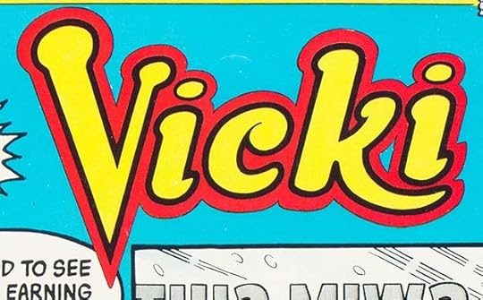 From VICKI #1, Feb 1975, image © Nemesis Group, Inc.
Another genre tagged by Seaboard as they try to capture the Archie Comics audience with reprints from Tower Comics. Gaspar’s logo has Archie elements, but to me has more vitality and impact.
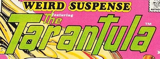 From WEIRD SUSPENSE #1, Feb 1975, image © Nemesis Group, Inc.
WEIRD SUSPENSE is Cooper Black type, THE TARANTULA is a fine Saladino effort in slanted upper and lower case. I like the extended second T.
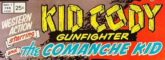 From WESTERN ACTION #1, Feb 1975, image © Nemesis Group, Inc.
Trust Martin Goodman to leave no genre out of his massive lineup. I like the nailed boards logo for KID CODY, and the rest of the lettering is well-crafted, but this one doesn’t hold together well for me.
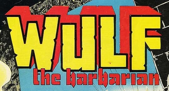 From WULF THE BARBARIAN #1, Feb 1975, image © Nemesis Group, Inc.
If CONAN was a success at Marvel, why not WULF at Seaboard? So thought creator Larry Hama. I love this logo’s mix of contrasting styles that somehow work together perfectly, and the B’s suggest axes.
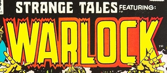 From STRANGE TALES #178, Feb 1975, image © Marvel Comics.
Oh, were there comics from other publishers out this month? This new feature logo has the distinctive Saladino R shape, and broken-ended letters in the Simek style, but I think it’s by Saladino.
 From SUPERMAN FAMILY #169, Feb-March 1975, image © DC Comics.
Another feature logo by Gaspar for a story in SUPERMAN FAMILY, the last new one. Saladino shows his versatility with this fine upper and lower case effort for a character with nothing to tie to visually.
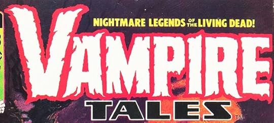
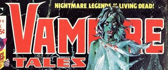 From VAMPIRE TALES #9, Feb 1975, image © Marvel Comics.
For the ninth issue of this black and white magazine-size comic from Marvel, they had Gaspar try another, smoother variation of VAMPIRE that was used on just two covers.
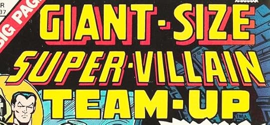 From GIANT-SIZE SUPER-VILLAIN TEAM-UP #1, March 1975, image © Marvel Comics.
While most of these ridiculously long and mis-matched titles on the Giant-Size line are by Marvel staffers in my opinion, I think Gaspar did the bottom two lines of this one.
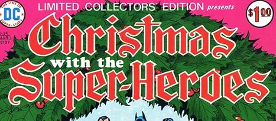 From LIMITED COLLECTORS’ EDITION #C-34, Feb-March 1975, image © DC Comics.
Here’s a delightful change of pace for Gaspar and us, lettering in an Old English style with creative flourishes on each S. WITH THE is Cooper Black type.
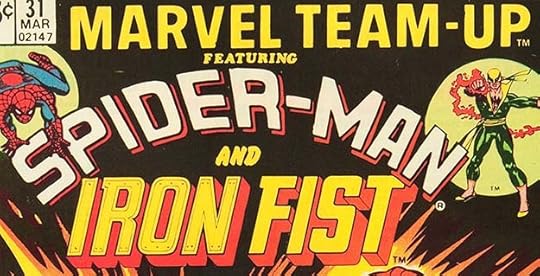 From MARVEL TEAM-UP #31, March 1975, image © Marvel Comics.
This IRON FIST character logo looks like Gaspar’s work to me. The inner shapes and rivets did not reproduce well, you can barely see them, but the R is a Saladino one.
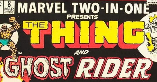 From MARVEL TWO-IN-ONE #8, March 1975, image © Marvel Comics.
Likewise this variation of his GHOST RIDER logo using a different approach for RIDER. Did Marvel know about Gaspar’s work for Seaboard? It seems likely, the comics business was an insular one at the time, and many people hired by Seaboard were also working for Marvel. If so, it doesn’t seem to have kept Gaspar from getting Marvel work.
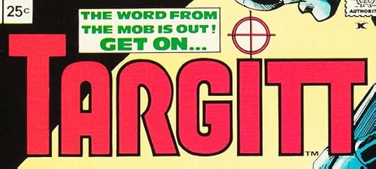 From TARGITT #1, March 1975, image © Nemesis Group, Inc.
A crime/detective comic from Seaboard with another creative Saladino logo. The target over the I is a perfect visual tag, and I like the joined TT.
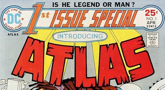 From 1ST ISSUE SPECIAL #1, April 1975, image © DC Comics.
As seen here, DC was trying a new top bar with two circles, the one on the left having a new DC corner symbol designed by Michael Uslan using type. This new tryout series title fills a wide banner between the circles in a shape that reminds me of a baton. The large number 1 probably reflects the growing comics fan base now eagerly buying first issues…this series would be full of them. ST is Cooper Black type, I think the rest is lettered by Gaspar, as is the feature logo ATLAS decorated with deep cracks. As a whole it’s not a great combination, but I like the parts. Having INTRODUCING in type in an oval doesn’t help. I count this as two logos.
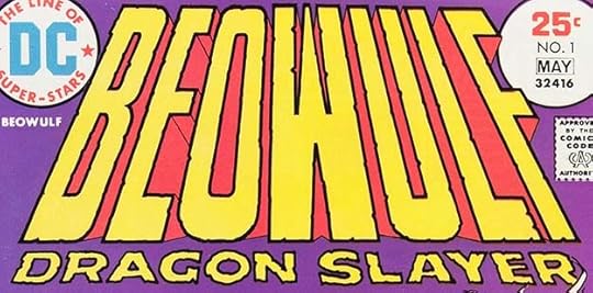 From BEOWULF #1, April-May 1975, image © DC Comics.
If Conan worked at Marvel, why not the far more ancient legend Beowulf, thought writer Michael Uslan? This Saladino logo is not one of his better efforts, though. It’s too tall and the W is oddly shaped to make it work in perspective and fill the space between the O and U. It does have an epic quality, but I don’t find it appealing.
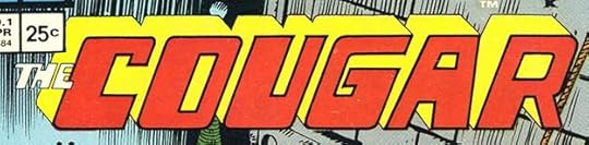 From THE COUGAR #1, April 1975, image © Nemesis Group, Inc.
This logo, on the other hand, uses odd letter shapes very effectively to intrigue and entice the buyer. It worked on me.
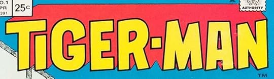 From TIGER-MAN #1, April 1975, image © Nemesis Group, Inc.
This logo follows a more traditional super-hero plan, but the letters have bounce and the TI works well, as does the open drop shadow.
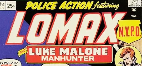 From POLICE ACTION #2, April 1975, image © Nemesis Group, Inc.
Gaspar was asked to do another version of this logo for the second issue making LOMAX even larger. I find this treatment works a little better, though the title is still far too long.
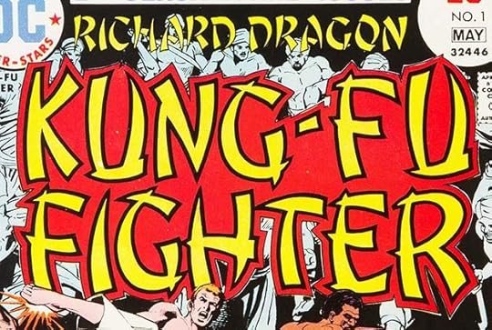 From RICHARD DRAGON, KUNG-FU FIGHTER #1, April-May 1975
The popularity of the 1972 “Kung Fu” TV series and Asian action movies led DC to try this series. Saladino went for the expected oriental style so often used in previous years to suggest Chinese writing, but now disliked by Asian-Americans. It has lots of energy, but the connected space in the center gives it kind of an odd look, and the top line gets hard to read against cover art.
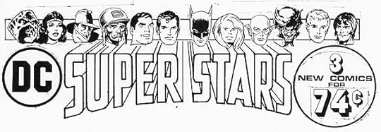 Image © DC Comics
I don’t know when this was done or when it was used, I found it in the DC files and I’m adding it here at random. The intent is clear, a logo for pre-packaged bags of three DC Comics. SUPER STARS is by Gaspar, the rest was probably cut and paste in the DC Production department. Perhaps someone out there has more info. The characters used suggest this is about the right time period.
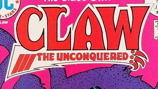 From CLAW THE UNCONQUERED #1, May-June 1975, image © DC Comics.
Another attempt by DC to cash in on the sword and sorcery success of titles like Conan at Marvel, and I find this logo much more interesting and appealing than Beowulf. Not only is the character’s claw-like right hand represented in a stylized version at the bottom, there are two more claws on the C and L. The letter shapes are creative and unusual, too. According to J. David Spurlock, artist Jim Steranko supplied the design layout for this logo in exchange for changing the original name from Talon to Claw, as Steranko was developing a project of his own with the Talon name. That never happened except for some concept art. I will credit this to Saladino even though it’s a collaboration.
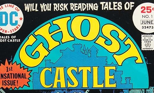 From TALES OF GHOST CASTLE #1, May-June 1975, image © DC Comics.
For this new “mystery” title edited by artist Tex Blaisdell and Paul Levitz, Gaspar’s logo moves away from his usual horror styles except for the top line, but cleverly incorporates a silhouette of the castle into the logo, which I like, though it does take up a lot of cover space. The book only lasted three issues.
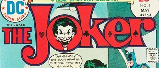 From THE JOKER #1, May 1975, image © DC Comics.
It was almost unheard of for a villain to get his own title at DC up to this time, but it lasted for nine issues, so it did okay. Saladino’s logo is clever and different from anything else at the company. I love the card suit symbols. I don’t know who did the Joker face.
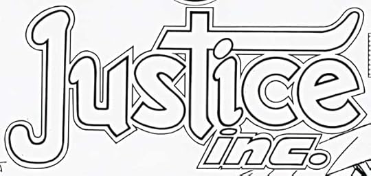
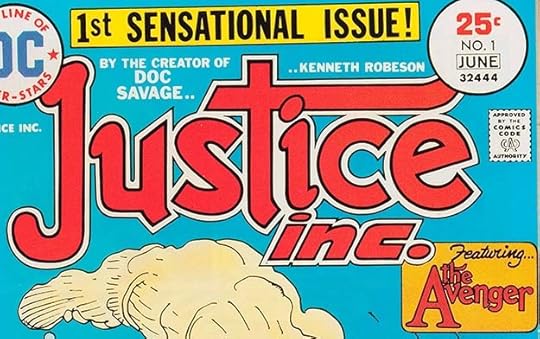 From JUSTICE INC. #1, May-June 1975, image © DC Comics.
Having had success with THE SHADOW, DC tried another pulp character, The Avenger, though they couldn’t use that name as the title because of Marvel’s THE AVENGERS, or at least that’s my guess. This logo is one of my favorites by Gaspar from 1975, it’s so full of life and creativity that jumps out and grabs my eyeballs. Not very pulpy, full of odd quirks, but I love it all the same.
This photostat of the original logo from the DC files is just the same except you can see all of it, the upper corners aren’t covered.
To sum up, I found 38 Saladino logos for this five-month period, an amazing output. I will cover the rest of 1975 in the next post. Other articles in this series and more you might enjoy are on the LOGO LINKS page of my blog.
The post GASPAR SALADINO’S COMICS LOGOS Jan-May 1975 appeared first on Todd's Blog.
August 30, 2021
GASPAR SALADINO’S COMICS LOGOS 1974
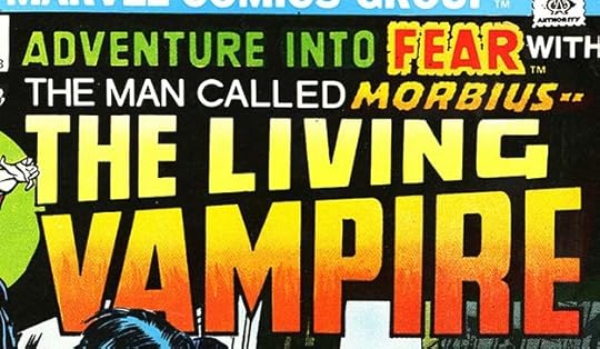 Images © DC Comics and Marvel respectively. From Marvel’s FEAR #20, Feb 1974.
From the fall of 1973 to the fall of 1974, when books with 1974 cover-dates were being produced, Gaspar Saladino continued to be very busy with all kinds of lettering work for both DC Comics and Marvel Comics, including logo designs. This one is for a new Vampire character, Morbius, for which he used standard block letters except for the word MORBIUS itself, which has rough-edged ones. The R in VAMPIRE has the signature Saladino style with the indent on the right side lowered so it looks like a P with the right leg added. I don’t know where Gaspar got that idea, but it stayed with him. THE MAN CALLED looks like type.
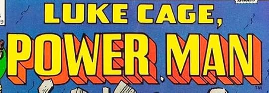 From POWER MAN #17, Feb 1974, Marvel Comics.
I’m not sure this logo is by Gaspar, but it does have the Saladino R shape, so I’m including it here. The top line is more typical of Gaspar than the bottom one, but both are in his style range, I’m just not sure about the letter shapes in POWER MAN, which are not ones he used often, and don’t convey the idea of power very strongly. I will call it for him unless I learn it’s by someone else. The logo was only used for a few issues.
 From VAMPIRE TALES #9, Feb 1974, Marvel Comics.
There’s no mistaking Saladino’s horror style on this logo, a revision of the one he’d done for the first issue. The ragged letter shapes are full of energy.
 From THE SUPERMAN FAMILY #164, April-May 1974 from DC Comics
In this year DC started experimenting with 100-page anthologies for 60 cents, a return to the glory days of comics as far as length, though unlike the anthologies of the past, these were a mix of new and reprinted stories. This one took the place of SUPERMAN’S PAL JIMMY OLSEN, and he and other Superman friends and relations filled out the book. Gaspar’s take on SUPERMAN is similar to what he’d done on SUPERBOY, but with telescoping on backward-leaning letters and a three-dimensional base filled with the word FAMILY. The lower word could have filled the space better, but it looks okay otherwise, though it’s lacking in flair and a bit dull. It worked for editor Julius Schwartz, now handling all Superman material.
The original logo from the DC files is about the same except for THE. It looks like there’s a small hand-lettered one inside the S at the top covered in white tape, and an open version in headline type has been added, but wasn’t used on the cover because of the Jimmy Olsen intro. It’s interesting to see that SUPERMAN is not connected to the base at all, though the coloring connects it on the cover. I don’t see how that could have worked otherwise. The telescoping lines are not in true perspective, and I think there should have been one for the middle horizontal of the S, but something is covered there, and that could be it. Not one of Gaspar’s better efforts.
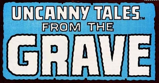 From UNCANNY TALES #3, April 1974, Marvel Comics.
With this issue, Gaspar’s logo from the first issue was replace by a new one adding FROM THE GRAVE to the cover, but not the indicia. This is the only logo I know of where Gaspar used wavy lines to suggest something ghostly, even though that was a popular technique for comics. He kept the corners crisp and pointed, so it works fine for me. FROM THE seems to have a border that’s too thick, perhaps that was an afterthought or editorial request.
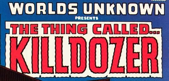 From WORLDS UNKNOWN #6, April 1974, Marvel Comics.
Gaspar’s previous logo for this book was replaced by a much smaller one as the top line to make room for a feature logo. Based on a story by science fiction writer Theodore Sturgeon, the word KILLDOZER seems unintentionally funny the way Sharknado is to me, but Marvel and Saladino were obviously taking it seriously.
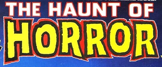 From THE HAUNT OF HORROR #1, May 1974, Marvel Comics.
Another Saladino horror logo for a Marvel black and white magazine-sized comic. The second line is definitely Gaspar’s work, and features a very thick rough outline perhaps done with a brush. The top line could be type, not sure.
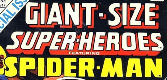 From GIANT-SIZE SUPER-HEROES #1, June 1974, Marvel Comics.
The Giant-Size comics line Marvel was cranking out in this year often had logos that were too long and of wildly uneven styles. The word GIANT-SIZE is not by Gaspar, it was used on many titles and is probably by either Danny Crespi or Morrie Kuramoto, Marvel staffers who did some logo work. SUPER-HEROES could be by Saladino, it has the right R shapes and is otherwise consistent with his work, but SPIDER-MAN again looks like Marvel staff lettering, as Gaspar would never have done the S in the word that way in my opinion. There are a few more logo puzzles like this in the Giant-Size line, and I’m not going to call them for Saladino, as I’m not sure who did what. It’s possible Danny or Morrie was imitating Gaspar’s style at times, as I can’t see why Marvel would have paid him to letter one third of a logo otherwise done by staffers.
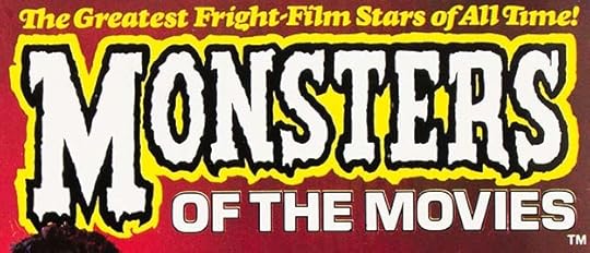 From MONSTERS OF THE MOVIES #1, June 1974, Marvel Comics.
A black and white magazine sized book from Marvel with minimal comics content, but I think the word MONSTERS is by Saladino in his familiar horror style, though the use of slab serifs is different.
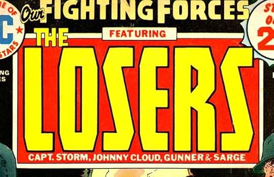 From OUR FIGHTING FORCES #149, June-July 1974, DC Comics.
Editor and cover artist Joe Kubert had been putting the feature logo THE LOSERS into his cover art in many different shapes and styles for about two years, then began using a regular logo I think Joe himself might have done for about a year, not very good in my opinion. Finally, with this issue, he had Gaspar design a new logo that I think works well, even if it’s rather tall. Ira Schnapp’s title logo remained at the top, but this feature logo was used until the Jan-Feb 1978 issue, including the ones with Jack Kirby art. The character names and FEATURING are type. It’s interesting to see that even where nearly all the corners are straight angles, the R still has half of that curve Gaspar used often for the indent on the right side. Once you see it, you can’t help wondering why it doesn’t match the rest.
 From STRANGE TALES #174, June 1974, Marvel Comics.
We’re back on steady ground with this fine Saladino logo that offers many familiar features and some unusual letter shapes. In this case, I think Gaspar did the bottom line too, but I could be wrong. It’s not type, in my opinion. I would not have covered so much of the G with the circles, but otherwise I like this.
 From SUPERMAN FAMILY #165, June-July 1974, DC Comics.
Starting with the second issue, editor Julius Schwartz had Saladino design new feature logos for the stories in this new anthology, something that DC did rarely now. I really like this one for Krypto. I’d always thought him a bit silly, but this logo actually gives him superhero status.
A photocopy of the original from the DC files is just the same, and even more appealing in black and white. I wish Gaspar had done a Superboy logo in this style.
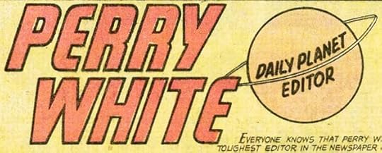 From SUPERMAN FAMILY #165, June-July 1974, DC Comics.
The feature logo for Perry White is not as successful because the Daily Planet symbol is poorly done and way off-model compared to the way it looked on the top of the Daily Planet building in the comics.
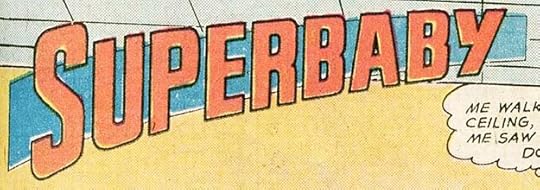 From SUPERMAN FAMILY #165, June-July 1974, DC Comics.
I like Superbaby better. The gentle arc and slant imply movement, and the shape behind holds it together.
 From WORLDS UNKNOWN #7, June 1974, Marvel Comics.
I’m not sure Gaspar lettered this feature logo, but it doesn’t look like the work of Danny Crespi, who did the cover lettering, or anyone else at Marvel at the time, and Gaspar did logos for the rest of the series. The letter shapes are creative and just slightly suggest something Arabian.
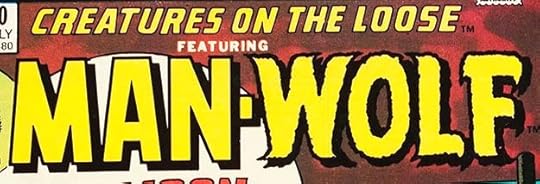 From CREATURES ON THE LOOSE #30, July 1974, Marvel Comics
This logo has MAN in block letters and WOLF in Saladino horror shapes, nicely illustrating the idea.
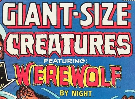 From GIANT-SIZE CREATURES #1, July 1974, Marvel Comics.
Another logo mess on this Giant-Size title. I’m more inclined to think CREATURES is by Saladino, and WEREWOLF is in the style of his WEREWOLF BY NIGHT logo, but the spacing between letters and the outline are both wonky. This could again be by Danny Crespi, so I’m not calling it for Saladino.
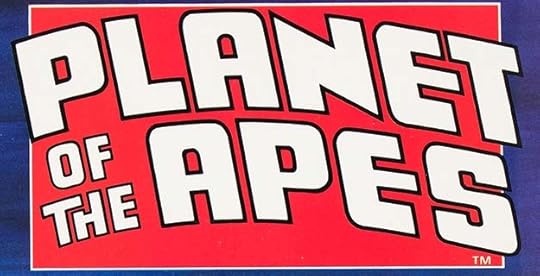 From PLANET OF THE APES #1, Aug 1974, Marvel Comics.
A solid entry from Gaspar with creative touches like the extended middle arm of the E’s and the spacing of TH. Futuristic but on a grand scale, appropriate for a film tie-in.
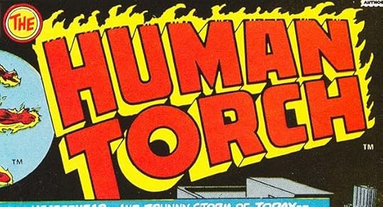 From THE HUMAN TORCH #1, Sept 1974, Marvel Comics.
A handsome logo using the Saladino approach to burning letters with wind-swept flames at the top and crumbling letter edges there also. The telescoping gives it depth and impact, and I like the way the flames merge with it.
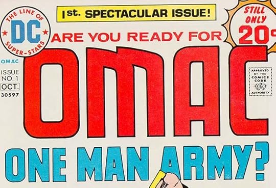 From OMAC #1, Sept-Oct 1974, DC Comics.
Another futuristic logo for this Jack Kirby creation. The shape of the M is particularly original. With issue #4, the question mark was replace with CORPS, spelling out the full abbreviated name.
 From SUPERMAN FAMILY #167, Oct-Nov 1974, DC Comics.
Another batch of feature logos was commissioned from Saladino for this issue of SUPERMAN FAMILY. They follow a similar plan. The smaller black lettering is Cooper Black type done with Letraset adhesive letters or DC’s headline phototypesetting machine.
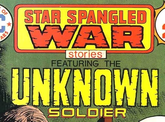 From STAR SPANGLED WAR STORIES #183, Nov-Dec 1974, DC Comics.
The word WAR in this style in a double-outlined round-cornered box had been on this Joe Kubert-edited war title for about a year with a different STAR SPANGLED, possibly type. I don’t think Gaspar was involved, it might have been by Kubert himself. With this issue, Gaspar has lettered STAR SPANGLED, though WAR remains the same, and also UNKNOWN SOLDIER in a similar style. I’m not positive Gaspar did the feature logo, but it makes sense that if he was revising the book title, he would do both.
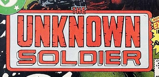
With issue #205 dated April-May 1977, Unknown Soldier took over the title, continuing the numbering, and with this revised logo. Both words are the same, but UNKNOWN has slightly thinner outlines and SOLDIER is larger to fill the space horizontally. This version may have been put together by a DC production person, but I will credit the logo on both these books as one new entry for Saladino.
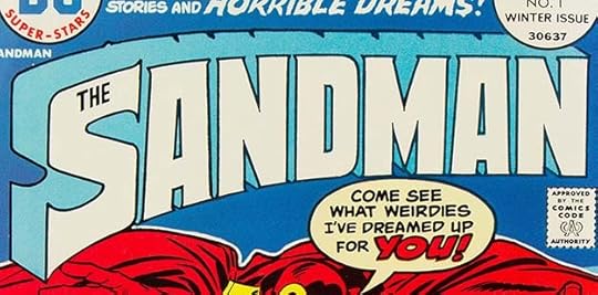 From THE SANDMAN #1, Winter (Dec) 1977, DC Comics.
My favorite Sandman comic that I didn’t letter! I love this Saladino logo for the Jack Kirby version of DC’s Sandman. Joe Simon was also involved in the creation, and an unused cover with Kirby art I found online is signed by him, “Joe Simon, Simon & Kirby.”
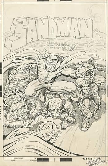
It’s possible the logo and word balloon were added by Joe Simon, and the logo does look more complex than what Kirby was likely to do, but it could be his. Perhaps Mark Evanier will weigh in on this one. In any case, Gaspar must have seen this pencilled logo sketch and based his design on it. There aren’t a lot of similarities other than the general shape and telescoping, but you can see it was the genesis.
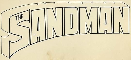
Gaspar’s original logo from the DC files is the same and I see no changes or corrections. The small serifs add interest, and I like the way the open telescoping is handled.
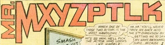
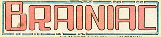 From SUPERMAN FAMILY #168, Dec 1974-Jan 1975, DC Comics.
Two more feature logos for this title, and as is often the case with villains, they have more interesting logos than the heroes and sidekicks. Gaspar is quite creative with these, and each was used later in other places. I particularly like the way MR. is tilted on its side and MXY are joined. The K is also unusual. Brainiac’s computer style is now kind of old-hat, but innovative for the time.
To sum up, I count 25 Saladino logos for books cover-dated 1974. Less than the previous year, but Gaspar’s busiest logo-design year is coming up next. Other articles in this series and more you might like are on the LOGO LINKS page of my blog.
The post GASPAR SALADINO’S COMICS LOGOS 1974 appeared first on Todd's Blog.
August 29, 2021
Rereading THEY SHALL HAVE STARS by James Blish
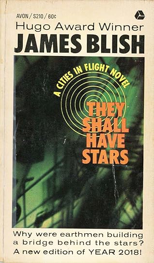
I’ve decided to revisit James Blish’s “Cities In Flight” series of four books, which I haven’t read since I bought these paperback editions in the late 1960s. Blish was an interesting writer, and these books are based on the clever idea that in our future, with Earth’s environment ruined and the planet strangled by overpopulation, entire cities would leave Earth to travel through space looking for work and resources, an idea based on the migration of farmers from the Dust Bowl droughts of the 1930s in the American midwest and southwest to seek greener pastures in California. This first book was written second in 1956, and details the origins of the two major discoveries that paved the way for flying cities: antigravity machines nicknamed “spindizzies” and anti-aging drugs allowing for the long life needed for interstellar travel, and as a near-future cautionary tale, has many elements that resonate with today.
Alaskan Senator Bliss Wagoner is a man of vision trying to find solutions to Earth’s problems, and also new avenues of research, as present ones are bogged down in restrictive regulations and bureaocracy. Scientist Dr. Corsi has some good advice for him: look into crackpot theories that no one has pursued. Perhaps there’s something there that’s been overlooked. Wagoner does that and eventually a huge project on the surface of Jupiter is funded and underway, though only a few people know the true reason for it: anti-gravity research.
In Washington, a military spaceman, Colonel Paige Russell has brought some soil samples from the Jovian moons to a research facility for analysis, and his curiosity soon has him deeply involved in the top secret project there to develop anti-aging drugs as well as anti-gravity engines. The fact that he’s attracted to the receptionist at the company, who turns out to be a surprisingly important figure at the project, helps get him there, and eventually Senator Wagoner, Colonel Russell and Anne Abbott are on the way to Jupiter. There, one of the scientists, Robert Helmuth, has uncovered the secret research on Jupiter’s surface, and is also drawn into the top secret project, even while back in Washington, Wagoner’s enemies are about to destroy his plans.
This book is well written, with a suspenseful plot and snappy dialogue that reminded me of Hollywood films like “The Front Page.” It’s a short book, and enjoyable enough to seem even shorter. The scientific ideas, though fictional, are well-supported by convincing writing, even though operational details are scarce. Essentially, the “spindizzy” antigravity engine is there to do whatever the books require, and for that, it works well.
The post Rereading THEY SHALL HAVE STARS by James Blish appeared first on Todd's Blog.
August 26, 2021
Tigger Passes (2009-2021)
We lost our cat Tigger yesterday. He’s had some chronic health problems the last few years including asthma, allergies, and ear infections, but he was generally happy most of the time until about a month ago when he started having frequent diarrhea. We took him to our vet and all the usual tests were done, including x-rays, but they couldn’t find a cause, though they suspected some kind of cancer that’s hard to detect like lymphoma. Tigger had always been a finicky and slow eater, but finally he didn’t want to eat at all. He spent some time in the animal hospital where they gave him fluids and IV medications, then he came home with new medicines for about two weeks until he was in about the same place again, and had lost about a quarter of his body weight. A week ago yesterday we took him to the vet thinking he would need to be put to sleep, as he wasn’t happy at all, and getting weaker, but they suggested another hospitalization where they would try stronger medications. He was there two nights, then came home with even more medications, some of which he hated, but we gave them as ordered, and he had another week with us, and got lots of love and attention. Yesterday morning he threw up twice, refused to eat at all, and refused all his medications by struggling violently, so we just let him go. By the afternoon he was back in the same place, getting weak, not happy, so we took him in and had him put to sleep. He went peacefully hearing that he was a good boy.
Tigger and his brother Leo came to us as kittens in 2009 when a friend of Ellen had a stray cat give birth in her barn. We took two of the litter of four, even though our older cat Katie was not happy about it. They were fun and entertaining, especially as kittens, and long-time readers of this blog may remember some of their escapades. I’ll include links to a few below. As they grew, their personalities emerged. Tigger was the runt of the litter, and smaller than Leo, but he was more outgoing and brave. We called him our greeter because anyone who came to the house had Tigger’s demand for attention and pets, while Leo was more cautious and usually hid out for a while. Tigger was determined to get what he wanted, but good natured and loving. Lap time with me in the evening was usually a must, and if Leo got there first, Tigger would just lie on top of Leo until he moved. They both loved our screened porch and spent lots of time there, but Tigger always wanted to get outside, and he succeeded briefly a few times, once by going through the screen after a stray cat in the yard that Tigger wanted to fight. Luckily we got him back in before that happened.
We will miss Tigger so much, but at least we still have Leo, who is quite healthy, and he will get even more love and attention now, which is fine with him. Goodbye, Tig. You were a good kitty.
Tigger and Leo move in
Tigger Busts Out
Kittens Being Bad, Tigger’s Version
Cats on the Porch
The post Tigger Passes (2009-2021) appeared first on Todd's Blog.
GASPAR SALADINO’S COMICS LOGOS July-Dec 1973
 All images © DC Comics except as noted. From ADVENTURE COMICS #428, July-Aug 1973
Moving on through the rest of Saladino’s logos for both DC and Marvel Comics for 1973, we continue with this one, or actually this two. ADVENTURE is Gaspar’s redrawn version of the previous logo by Ira Schnapp. Ira’s was curved, and this straight version makes a better fit with the feature logo below it. BLACK ORCHID is all new and the two words follow the same flag-wave shape, but are in contrasting styles. BLACK is thicker and more square, and filled black with either dry brush or many large pen strokes, while ORCHID is more elegant. I like this logo, I would have suggested the right side of the O be the same width as the left side if anyone asked, but I think both logos work well and I will count them as two for Gaspar.
 From JUNGLE ACTION #5, July 1973, image © Marvel.
I think Gaspar did this entire logo, the top line and the feature. The rough outlines and drop shadows seem right for him, and the squareness of JUNGLE ACTION does too. The drop shadow has some issues, it looks uneven because it fills gaps between letters in some places and not others, but generally I think this works fine.
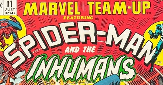 From MARVEL TEAM-UP #11, July 1975, image © Marvel.
As seen previously, the top two lines are by Saladino, and he added a new character logo for INHUMANS here. Very much in his horror style, so perhaps not a great choice for the characters, but it does provide good contrast to the rest.
 From MONSTERS UNLEASHED #1, 1973, image © Marvel.
Another black and white magazine comic with a Saladino logo in his horror and block letter styles. The color does not help it here, but it works pretty well anyway.
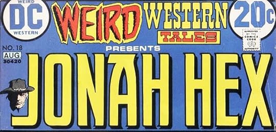 From WEIRD WESTERN TALES #18, July-Aug 1973.
With this issue, Jonah Hex got a new character/feature logo by Saladino that would continue on his own long-running series. Gaspar has created an unusual A that works well to fill the space at the top with an extension toward the N, giving the entire logo a more even look. The subtle pointed serifs add interest, as does the drop shadow. This logo was used on Hex’s series until 1983.
 From MARVEL SPECTACULAR #1, Aug 1973, image © Marvel.
Gaspar sticks with block letters for this reprint series, but ones of slightly different styles. The Saladino R shape of the final letter is diagnostic. It appeared on all 19 issues.
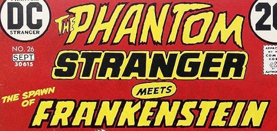 From THE PHANTOM STRANGER #26, Aug-Sept 1973
For one issue, The Spawn of Frankenstein got equal billing with the title character, but only the word FRANKENSTEIN gets a real logo treatment. I think it still counts.
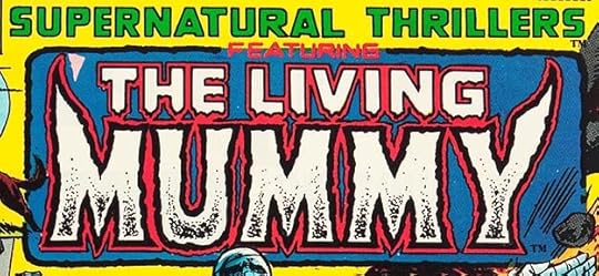 From SUPERNATURAL THRILLERS #5, Aug 1973, image © Marvel.
With this issue, SUPERNATURAL THRILLERS found a feature with staying power. It appeared in all the remaining issues except for #6. Gaspar’s horror style is enhanced by almost matching extensions of the M and Y for a somewhat symmetrical look.
 From VAMPIRE TALES #1, Aug 1973, image © Marvel
Another magazine-size horror book with a fine logo by Saldino. The large V and matching swoop of the M work well together.
 From GHOST RIDER #1, Sept 1973, image © Marvel.
This one goes in some different directions, with nice contrast between the two words for the biker version of the character. GHOST has a heavy outline and interesting line textures that make it more three-dimensional, while RIDER has the slant and speed lines of a character like THE FLASH at DC. Gaspar also did the double-outline shape around both adding to the spookiness. I find it very effective.
 From STRANGE SPORTS STORIES #1, Sept-Oct 1973
With this issue, DC editor Julius Schwartz finally got his chance to try a favorite idea in a series. It lasted only six issues. Gaspar, perhaps at Julie’s request, played it safe, not using anything unusual for STRANGE, just upper and lower case letters with a little bounce. SPORTS is thick block letters, and both are slanted to add a feeling of movement.

The original logo from the DC files is the same, with a little white correction paint on the first word, and it shows Gaspar drew in the banner lines. STORIES is Letraset adhesive type.
 From STRANGE TALES #169, Sept 1973, image © Marvel.
This series has an odd history. In 1968, Marvel’s long-running STRANGE TALES became DOCTOR STRANGE with the same numbering. Later, in this year, they revived the title and continued the original numbering. I think the entire logo is by Saladino. STRANGE TALES is small but interesting and stylish. BROTHER is typical block letters, and VOODOO is in Gaspar’s horror style with multiple outlines and effects. The large V is memorable.
 From SUB-MARINER #65, Sept 1973, image © Marvel.
Saladino gave this series a new logo with this issue. The title is too long, and the logo takes too much space, but Gaspar did what he could with it. SUB-MARINER goes back to the original stacked style of the first logo for the series probably by Sol Brodsky and Artie Simek, but with more square letters.
 From FRANKENSTEIN #6, Sept 1973, image © Marvel.
Gaspar replaced his own logo from the first issue of the series with this one which fills the space better, and has words with are closer in style to each other. Rough outlines and texture add to the horror approach.
 From MARVEL SPOTLIGHT #12, Oct 1973, image © Marvel.
One thing you have to credit Marvel for in this period, they were not afraid of religious connotations. This is not a typical Saladino style on SATAN, but the flames are very much his approach, and the rest is block letter styles he liked. Again, it fills the space well. Interesting R in MARVEL to fit well against the V.
 From THE SHADOW #1, Oct-Nov 1973
The Shadow was a long-running successful property in pulp magazines and on radio. The pulps used a variety of logos, some very similar to this, but I think it’s again Gaspar’s interpretation rather than an actual pulp logo being used here. I could be mistaken, but unless I hear otherwise, I’m counting this for Saladino.
 From SUPERBOY #198, Oct 1973
Gaspar’s SUPERBOY logo done previously worked okay on its own, but when he was asked to add the Legion in the same style, it made a logo that was too tall, way too long, and not very interesting. It persisted to the end of this series in 1977. The outline around SUPERBOY gives space for a second color, but would have looked better if it followed the letters inside more closely.
 From SUPERNATURAL THRILLERS #6, Nov 1973, image © Marvel.
A final one-shot logo for this series by Saladino before it continued with The Living Mummy for the rest of its run. Again, way too long and takes up too much space, but the variety of styles makes it more interesting.
 From WESTERN TEAM-UP #1, Nov 1973, image © Marvel.
A western reprint book that lasted only one issue. Another too long logo, but Gaspar had some fun with three different styles for the book title and the two character logos. This could be considered three logos, but since they all appeared only once, I will count it as one.
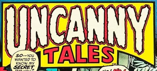 From UNCANNY TALES #1, Dec 1973, image © Marvel.
Marvel was filling the stands with reprint titles, and rather than go back to old logos by Artie Simek, they had Gaspar do new ones. This example works fine, though I don’t like the heavily bordered box around it.
 From WEIRD WONDER TALES #1, Dec 1973, image © Marvel.
Another horror reprint title with a different approach from Gaspar that I like, first because it’s different from other recent horror logos by him, second because of the arc of WEIRD and the rough, textured block letters. Saladino R’s on both lines, and the S has a style he would use more later.
To sum up, I found 22 logos by Saladino in books cover-dated July-Dec 1973, and there were 24 in the first half of the year for a staggering total of 46 logos for all of 1973! That’s almost one a week on average, and we haven’t yet reached Gaspar’s busiest logo design year. Stay tuned. Other articles in this series and more you might like are on the LOGO LINKS page of my blog.
The post GASPAR SALADINO’S COMICS LOGOS July-Dec 1973 appeared first on Todd's Blog.
Todd Klein's Blog

- Todd Klein's profile
- 28 followers

