
Todd Klein's Blog, page 89
June 16, 2021
IRA SCHNAPP’S COMICS LOGOS: 1956-1957
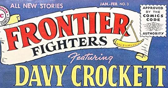 From FRONTIER FIGHTERS #3, Jan-Feb 1956
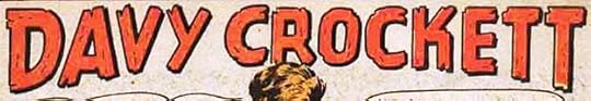
Davy Crockett was wildly popular in 1956 due to a hit TV show about him from Disney, and fortunately for DC Comics, he was a historical person who anyone could depict as long as they didn’t copy the TV show. That explains why with the third issue, FRONTIER FIGHTERS gained a second logo for Davy by Schnapp. It uses the same Trajan-influenced serif style as the main logo.
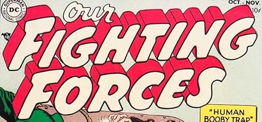
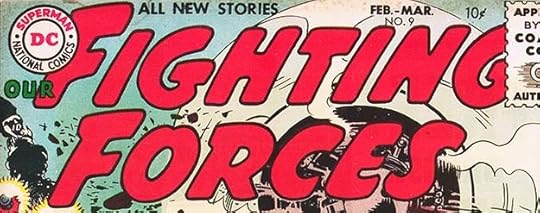 From OUR FIGHTING FORCES #9, Feb-March 1956
With issue #9, Ira’s logo for OUR FIGHTING FORCES dropped the telescoping and had a different small word OUR. Not enough of a change to call this a new logo, but I wanted to show it, as the book retained this logo for many years. Incidentally, it always bugged me that DC didn’t seem to care how much of the logo was covered by the Comics Code seal, as here.
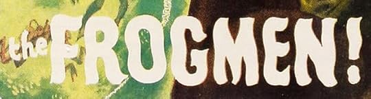
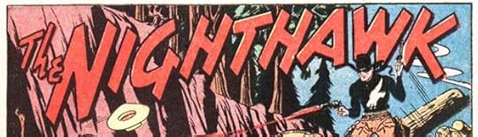
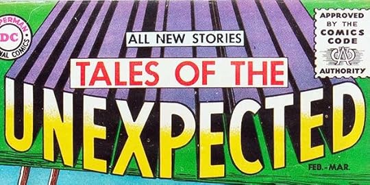 From TALES OF THE UNEXPECTED #1, Feb-March 1956
A new anthology began in DC’s “mystery” line, though the contents could have often fit just as easily in their science fiction anthologies. Ira’s logo uses standard open block letters, but they bow out toward the reader for a 3-D effect reinforced by the very deep telescoping. Perhaps Schnapp was going for the impact of a 3-D science fiction movie, I don’t know. TALES OF THE was much smaller in later issues.
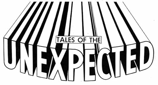
This photostat (photographic copy) from the DC files shows even more of the telescoping, and there’s a house ad with more still! To this point, I don’t think Ira had previously designed a logo meant to run off the edge of a cover, and he wasn’t taking any chances there wouldn’t be enough telescoping.
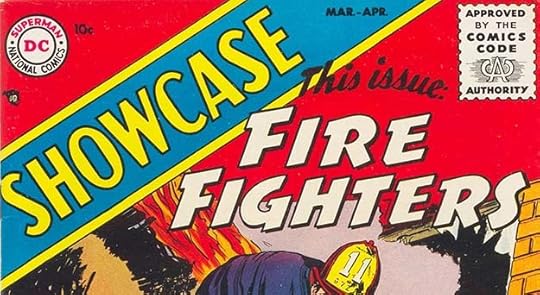 From SHOWCASE #1, March-April 1956
This was a new type of anthology for National (DC) Comics, one where the contents would change every issue or every few issues, with the material intended to vie for readers as potential new series. At first the stated concept was for readers to send in ideas for the book, and DC would use the best submissions, but I don’t believe that was ever followed, and no mention of it is made after the first issue. Instead, the book rotated through all the editors, each putting in new series ideas of his own or from his freelancers. Ira’s SHOWCASE is standard block lettering, but the banner and angle added interest. The first issue featured Fire Fighters, and those words are prepared like a logo, as if it might be needed again. It wasn’t, but the original remains in the DC files:
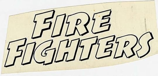
Some details that are hard to see on the cover are clearer here, like the very thin drop shadow, and in a few places you can just make out Schnapp’s pencil lines and white paint corrections. Ira wisely made the style quite different from SHOWCASE to give contrast.
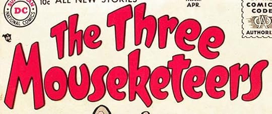 From THE THREE MOUSEKETEERS #1, March-April 1956
This new funny animal title was the idea of former DC editor Sheldon Mayer who initially wrote and drew all the stories. The mice were loosely based on the Alexander Dumas characters, but very loosely. Mostly they were just funny. Schnapp’s charming logo makes good use of the space with upper and lower case rounded letters. It was a coincidence that Disney’s “Mickey Mouse Club” used the same name around the same time.
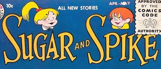 From SUGAR AND SPIKE #1, April-May 1956
An even better idea from Sheldon Mayer was this new series about very young children who can understand each other perfectly, but not adults and vice versa. Angelic-looking Sugar is the mastermind behind much of the trouble they get into, and Spike usually receives the blame. Ira’s logo uses bouncy, appealing serif letters with giant S’s, and the character art is by Mayer.
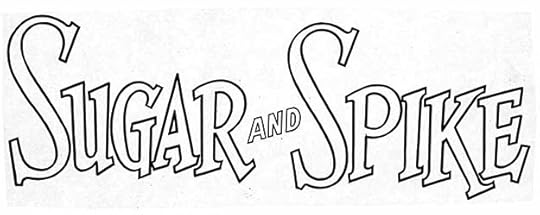
A photostat of the original logo from the DC files only reveals the outlines more clearly, and shows how well Ira had learned to make thinner letters work with the poor quality printing of comics at the time.
 From SHOWCASE #2, May-June 1956
Normally I would call this title for the second issue of SHOWCASE cover lettering, but I think the intent is to have something that could be reused if readers liked it enough, so I am continuing to call these logos even though they were used only once and are in the secondary position to the book’s actual title. I would have bought this collection of animal stories if I’d seen it and could do so (I was five).
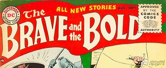
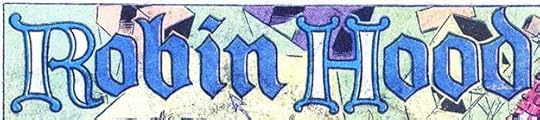 From THE BRAVE AND THE BOLD #6, June-July 1956
Robin Hood was a new feature in THE BRAVE AND THE BOLD #6 and gained a Schnapp Old English style logo, very appropriate. The R and H have a Celtic influence.
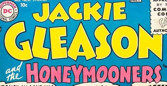 From JACKIE GLEASON AND THE HONEYMOONERS #1, June-July 1956
With Bob Hope and Martin and Lewis doing well, could Jackie Gleason make it three Hollywood comedy stars with successful DC titles? Apparently not, though the book was well done and featured a variety of Gleason characters from his TV shows. It didn’t last long. The lengthy title is unwieldy, but there had already been a comic just called JACKIE GLEASON from St. John. Ira’s logo takes up a lot of space, but I like it.
 From SHOWCASE #3, July-Aug 1956
I’m on the fence about this one. The lettering is at the bottom of the cover instead of by the SHOWCASE logo, and it definitely feels more like cover lettering, but I guess the same rules should apply as on the first two issues, so I will call it a logo. It’s one place where Ira’s wavy letters work well.
 From JACKIE GLEASON AND THE HONEYMOONERS #2, Aug-Sept 1956
Each issue of Gleason’s title had a longer Honeymooners story with the cover logo on it, and many short features starring other Gleason and Art Carney characters, but on most the feature name is relatively small and more like a title than a logo. This is one of two that feel like logos to me.
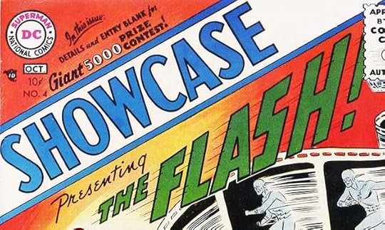 From SHOWCASE #4, Sept-Oct 1956
SHOWCASE first made waves with this fourth issue. Editor Julius Schwartz’s revamp of the golden age Flash was a big hit, but DC didn’t know it for a few months when sales figures came in. This Flash logo by Schnapp is similar to the one he designed when the character got his own title, but it’s not quite the same, so I’m calling it a separate logo. When Flash returned in issue #8, the logo was again slightly different, but close enough to this one to consider it a minor variation. Ira already had the key elements here, a strong slant to the right and speed lines to increase the sense of movement. The exclamation point added emphasis, but did not make it to the solo title. The square corners on the S seem right to me to keep it all the same. Ira was familiar with the two Golden Age Flash logos designed by someone else, and he took the letter shapes, the slant, and the speed lines from those but made them simpler, stronger and better.
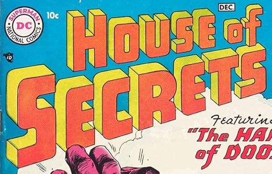 From HOUSE OF SECRETS #1, Nov-Dec 1956
Joining HOUSE OF MYSTERY and TALES OF THE UNEXPECTED was this new entry in the “mystery” genre. Again the logo by Schnapp is not scary, and the letter shapes and telescoping are closest to what he did for MY GREATEST ADVENTURE. The outlines are quite thin, but it works fine, and the logo remained on the book for most of its initial run of about ten years.
This original logo from the DC files is definitely by Schnapp, but it’s not the one used on all the covers of the series I looked at…or is it? The outlines are thicker and the drop shadow is filled in. This version did not appear on any issues where the logo was full size, but I found it on issue #78 from 1966:
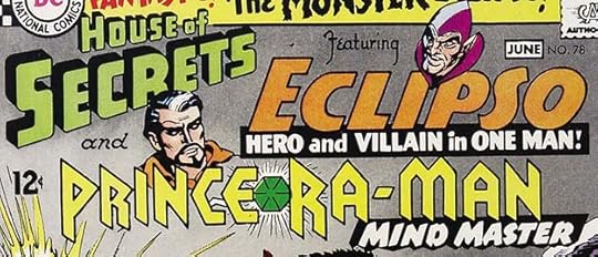
There the HOUSE OF SECRETS logo is much smaller to make room for other ones. A few previous issues used the original logo in this configuration, but it was too small to hold up well, so the thicker version was made, and I thought perhaps it was made from the original logo. Either Schnapp or someone else in the DC production department simply went over the outlines with a thicker pen and filled in the telescoping. One problem with that is the top line is smaller than on the original logo, and there’s no sign a smaller version was pasted over a larger one, so as Kurt Busiek suggested, this may simply be a retraced and newly inked version. In any case, I won’t count it as a new logo.
 From SHOWCASE #5, Nov-Dec 1956
At least this SHOWCASE logo is up near the book’s main one. Again, you could call it cover lettering, but I think it was meant for possible reuse, so I will claim it as a Schnapp logo even though it appeared only once.
 From ROBIN HOOD TALES #7, Jan-Feb 1957
In 1956, National (DC) Comics bought some properties from Quality Comics, who was getting out of comics publishing, and they continued two Quality books with the same numbering with January 1957 cover dates. The best known is G.I. COMBAT, which retained Quality’s logo by Al Grenet, and was a long-running success for DC’s war line. This is the other title, less known because it did not last long. Schnapp followed the style and layout of the previous Al Grenet logo but made it his own by adding serifs and decorative points to ROBIN HOOD and serifs to TALES. Not much to say about this, but it works fine, and I’m not sure why it didn’t sell.
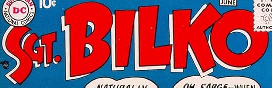 From SERGEANT BILKO #1, May-June 1957
Even while the Jackie Gleason comic was struggling, DC launched this similar comedy TV show title, and it had more success, lasting a few years. The logo is very Ira, with letter shapes he liked for humor and an open drop shadow for a second color.
 From JACKIE GLEASON AND THE HONEYMOONERS #7, June-July 1957
This is the other feature logo from the Jackie Gleason title that I think is actually a logo. It was used elsewhere without the banner, but I think that makes it work even better for this character satirizing the upper class.
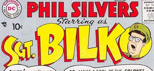 From SERGEANT BILKO #2, July-Aug 1957
There was one big problem with the first issue of SGT. BILKO, at least for star Phil Silvers or perhaps his agent, and that was fixed with the second issue, which not only added his name as part of the logo but included his image by artist Bob Oksner. I think it works even better than the first one.
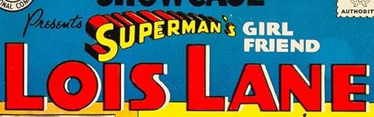 From SHOWCASE #9, July-Aug 1957
While sidekick Jimmy Olsen had gone right to his own title, Lois Lane began with a tryout run in SHOWCASE. I don’t know if there was much doubt she would go on to her own title, and Schnapp’s fine logo reflects that, he gave it about the same treatment as Jimmy’s. SUPERMAN’S is from his logo, the rest is new. Ira stuck with Art Deco styles for GIRL FRIEND and Lois’s own name, which does follow the example from Jimmy of large initial letters. This logo is sedate, but classy, and I like it.
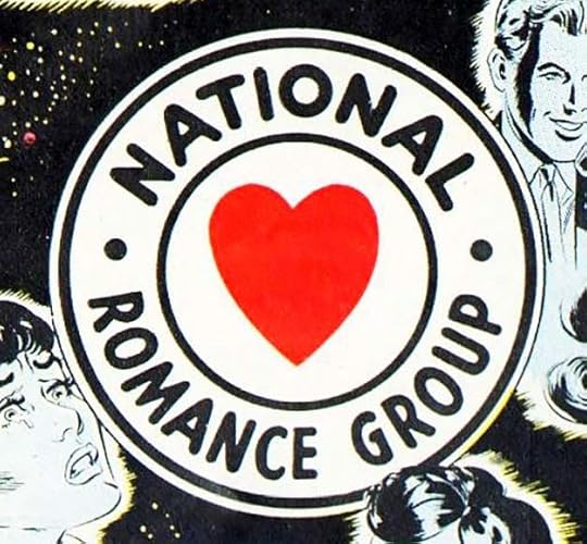
Schnapp did this variation on his DC Bullet symbol for DC’s romance titles, which were long kept separate from the rest of the company’s comics. Those titles rarely acknowledged they were from the same publisher as Superman and Batman, and this new symbol at least said they were all from National Comics, as the company was known then. Simple and effective, it lasted for a few years, then the regular DC Bullet replaced it.
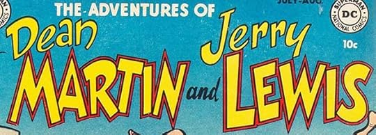
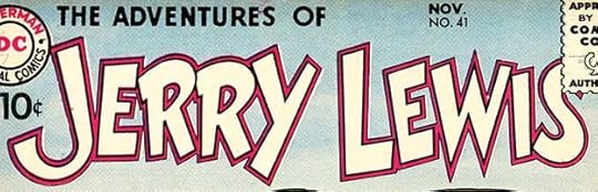 From THE ADVENTURES OF JERRY LEWIS #41, Nov 1957
DC’s Martin and Lewis title became a solo one for Jerry Lewis with this issue, reflecting the team’s split. Dean Martin’s career turned mostly to singing, and Lewis continued as a comedian and movie star, with both eventually appearing in their own TV shows. If anything, the comic was even more popular without Martin I think, and continued for many more years. Ira’s logo simply added JERRY in the same style as LEWIS, which creates a more balance whole and a much shorter title. I count it as a new logo.
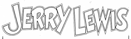
This photostat of the original from the DC files doesn’t add much to our knowledge, but highlights the appealing bounce Ira gave the name and the careful double outline is more obvious.
To sum up, I found 21 new logos by Ira Schnapp in 1956-1957 titles, down a bit from the previous year, but some that lasted a long time. Other articles in this series and more you might enjoy are on the LOGO LINKS page of my blog.
The post IRA SCHNAPP’S COMICS LOGOS: 1956-1957 appeared first on Todd's Blog.


June 14, 2021
IRA SCHNAPP’S COMICS LOGOS: 1954-1955
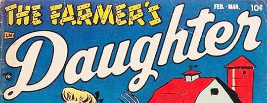 All images © DC Comics except as noted. From THE FARMER’S DAUGHTER #1, Feb-March 1954
No, you’re not mistaken, this is not a DC title, it’s another one from Stanhall Comics. As I explained in the previous post, Stanhall had offices in the same building as National (DC) whose owners Harry Donenfeld and Jack Liebowitz likely had a financial stake in it. This is their fourth title, and I think also likely to have been sold at Army PX stores like G.I. JANE, as the teasing sexual humor is more adult than what DC was doing. The word DAUGHTER is very much in Ira Schnapp’s style, and I believe this is one of the logos he produced for the short-lived comics line.
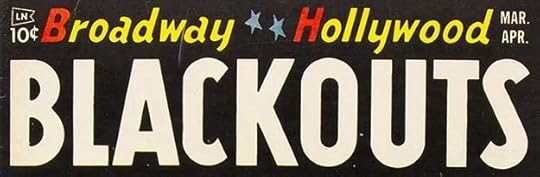 From BROADWAY HOLLYWOOD BLACKOUTS #1, March-April 1954
Here’s the final Stanhall title, and again I think the logo is by Schnapp. The lower case letters in the top line are particularly familiar from other logos by him. This title only lasted two issues. The line was distributed by Leader News, one of the financial backers, and when Leader went bankrupt in 1955, this and many other small publishers went under with it. Harry Donenfeld had a financial stake in Leader, too, as well as Independent News, so in a way he was competing with himself as far as comics distribution goes, but when Leader went under it put Independent News in a solid position as the main distributor of comics, and most other comics publishers had to accept whatever deal they could get there.
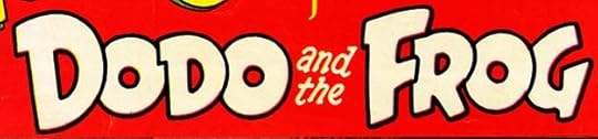 From FUNNY STUFF #77, March-April 1954
In 1954 DC converted some of their funny animal anthologies to new titles featuring the lead characters. The transition was gradual, with the new logo appearing first on the last few issues of the series they came from, FUNNY STUFF in this case. The new title DODO AND THE FROG was still a funny animal anthology, all that changed was the name. This idea was probably an attempt to revitalize flagging sales, and it did not work for long, lasting only another 13 issues. Ira’s logo is appealing.
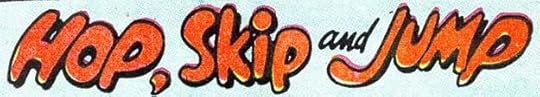 From PETER PANDA #5, April-May 1954
Over in PETER PANDA, Schnapp designed this feature logo for three frogs. I like the way SKIP is not slanted but the rest is.
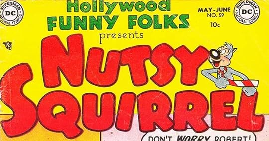 From HOLLYWOOD FUNNY FOLKS #59, May-June 1954
Another of the title conversions of DC’s funny animal books with another fine Schnapp logo. The character art is by Rube Grossman. Again, this ploy only worked for about two more years. Note that Ira also did a new logo here for HOLLYWOOD FUNNY FOLKS that I will count for him even though it lasted only two issues.
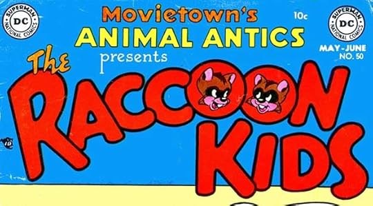 From MOVIETOWN’S ANIMAL ANTICS #50, May-June 1954
The same thing happened with this title, and again I will count this as two new logos. The RACCOON KIDS one is close to what Ira had designed as a feature logo in 1946, but redrawn more carefully. The character art is probably by Otto Feuer, the feature artist. This series also lasted about two more years.
 From WORLD’S FINEST COMICS #71, July-Aug 1954
WORLD’S FINEST had been a larger annual-sized quarterly book since its creation. In 1954 it shrank to the size of other DC titles and became bimonthly. Where before Superman and Batman appeared together only on the cover and had separate stories inside, now because of the shorter book length they appeared together, and Ira created this new feature logo for the first page of those stories. It uses Ira’s 1940 Superman logo and Jerry Robinson’s Batman and Robin logo from 1941, so only the remaining text above, between and below are new, but as it remained on these stories for many years, and even appeared on an 80-Page Giant cover, I’m calling it a new Schnapp logo.
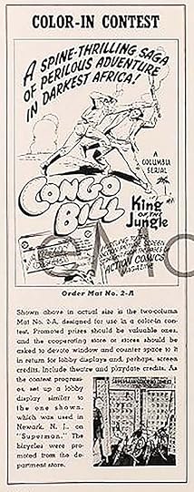
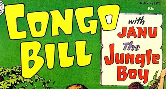 From CONGO BILL #1, Aug-Sept 1954
Congo Bill had been a regular “white hunter in Africa” feature in MORE FUN COMICS and ACTION COMICS since 1940, and finally got a shot at his own title. It did not last long. The backup feature continued and in 1959 gained new fans with a fantasy approach as Congorilla.
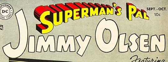 From SUPERMAN’S PAL JIMMY OLSEN #1, Sept-Oct 1954
DC’s Superman line of titles included ACTION COMICS and WORLD’S FINEST COMICS, and in 1954 they added this spin-off featuring sidekick Jimmy Olsen. Schnapp again expanded his Superman logo at the top (but not changing that name itself) and did JIMMY OLSEN in large open letters that walk the line between heroic and humorous quite well. I love the giant J and almost as large O. There are some unavoidable blank spaces between the two lines, but it worked fine. Jimmy’s stories were indeed often funny, and he generally needed Superman to get him out of trouble.
 From OUR FIGHTING FORCES #1, Oct-Nov 1954
DC added this fourth war title in 1954, and the logo by Ira breaks the pattern of the first three by going in a different direction. The letters are slanted and rounded, almost cartoony, but given importance by telescoping that makes the logo seem to loom down from above over whatever was in the art.
 From A DATE WITH JUDY #44, Dec 1954-Jan 1955
While the main characters headlined most of the teen humor stories, short backups starring others were tried out occasionally. This is one with a feature logo by Schnapp.
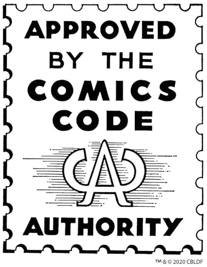
One of the longest-lasting logo designs by Ira Schnapp was this one, for the Comics Code Authority, a group formed by several major publishers to combat public sentiment equating comic books with juvenile delinquency, a movement that led to mass public comics bonfires. It was meant to signal to parents that comics with this seal were not depicting violence, sex and gore like some from other publishers like EC and Lev Gleason. I have no proof that Ira designed this, but it sure looks like his style to me, and since DC management was a leader of this new self-censorship group, it makes sense their main designer would have been given the assignment. The “code seal” appeared on many comics from many publishers until it was deemed no longer relevant around 2010.
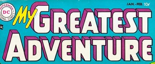 From MY GREATEST ADVENTURE #1, Jan-Feb 1955
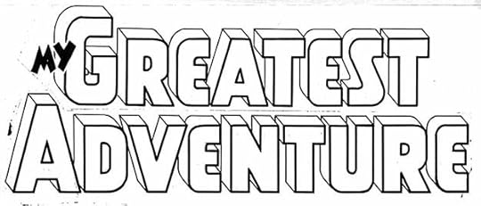 Original logo from the DC files.
1955 began with a new anthology title for adventure stories and a new Schnapp logo. The most interesting things in the logo to me are the curved corners on the E’s, which match the curves on other letters. The open telescoping adds depth and importance, providing a movie title feel. MY had several other versions over time, not enough of a change to show, but one is on the original logo photostat here.. The book started out with somewhat realistic adventures around the globe but was soon featuring aliens and monsters like other DC anthologies.
 From THE BRAVE AND THE BOLD #1, Aug-Sept 1955
A new anthology with a great logo by Ira presented heroic fighters from previous eras. The logo letters use some of Ira’s Old English styles and are in a huge pennant-style banner.
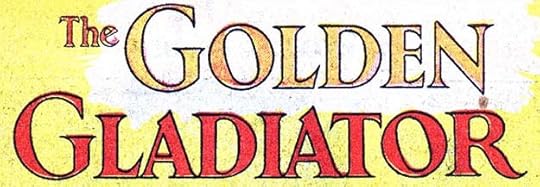
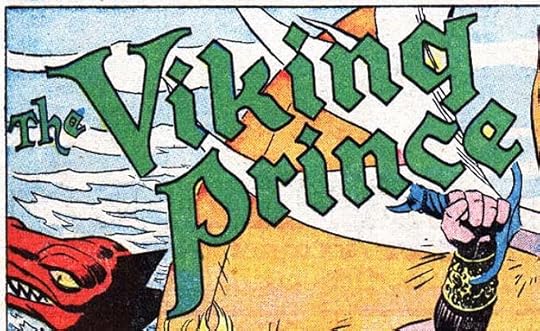
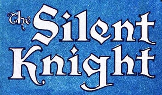 Three feature logos from THE BRAVE AND THE BOLD #1, Aug-Sept 1955
Each of the three features in the book had fine Ira Schnapp logos, with Golden Gladiator in the style of the inscription on Trajan’s Column in Rome from ancient times, and the other two using Old English styles, which is perfect for Silent Knight and works fine for Viking Prince.
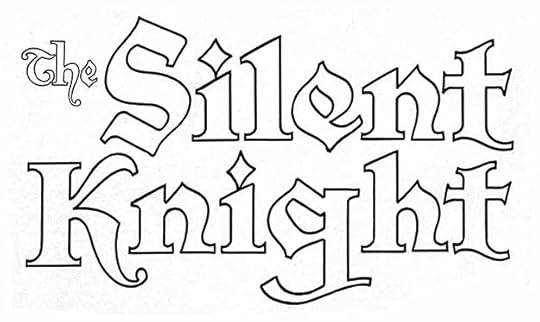
A photostat of the original Schnapp logo for Silent Knight survives in the DC files, and can be appreciated even more in this clearer image without color.
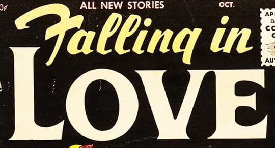 From FALLING IN LOVE #1, Sept-Oct 1955
With romance titles selling well, DC enlarged their line with this new title. Ira’s logo gives emphasis to LOVE with handsome serif letters, while FALLING IN is script with a style of F no longer used much, and probably not used often then. Today it seems backwards, but still reads okay in context.
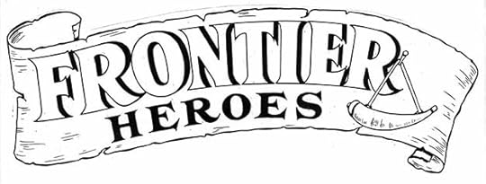
DC decided to put out another heroic anthology featuring characters from the early pioneer days of America, and Ira prepared this charming logo. The letters again turn to serif forms based on the Trajan style on a weathered scroll and with a powder horn decoration.
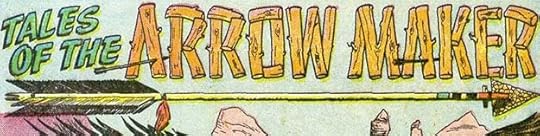
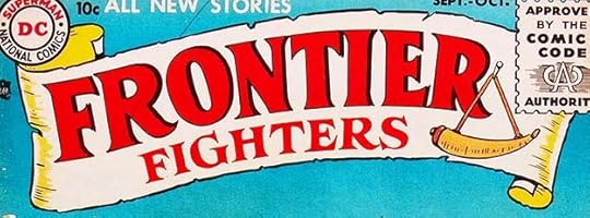 From FRONTIER FIGHTERS #1, Sept-Oct 1955
When the book came out, it had a title change: HEROES to FIGHTERS, which the editor must have thought would attract more readers.
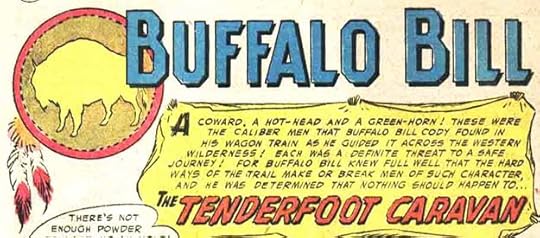
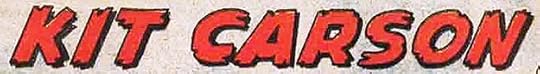 Three feature logos from FRONTIER FIGHTERS #1, Sept-Oct 1955
Inside the book were three features with new logos by Schnapp. None are particularly memorable except for the Indian buffalo art, but I’m not sure if Ira did that, probably not. This book featured Davy Crockett, then starring in a very popular Disney TV show, but it didn’t last long.
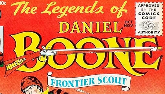 From THE LEGENDS OF DANIEL BOONE #1, Oct-Nov 1955
Another frontier fighter received his own title and an equally fine Schnapp logo, but also did not last long. I don’t know if Ira did the rifle art here, but he might have.
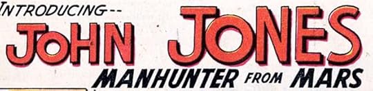 From DETECTIVE COMICS #225, Nov 1955
This new feature in DETECTIVE COMICS would have a long-lasting impression on the DC universe. Though begun as a sort of noir detective series with a science fictional twist, the character grew in popularity and powers to become almost the equal of Superman, and found a permanent home in the DC pantheon as J’onn J’onzz, the Martian Manhunter. Ira’s logo is sedate and offers no clues to this.
To sum up, I found 26 logos by Ira Schnapp first published in 1954-1955 dated comics. More to follow. Other articles in this series are on the LOGO LINKS page of my blog.
The post IRA SCHNAPP’S COMICS LOGOS: 1954-1955 appeared first on Todd's Blog.
June 13, 2021
And Then I Read: THE MYSTERIOUS STRANGER and other short novels by Mark Twain
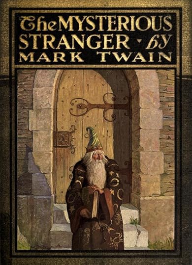
I’ve been reading and reviewing Twain novels from an eBook titled “Mark Twain: The Complete Novels,” though the last few in it are shorter than novel length. The most interesting and difficult read is “The Mysterious Stranger,” one I read and found equally difficult as a teenager. Twain worked on several versions from 1897 to 1908, and did not finish any of them. The published book was cobbled together after his death from two versions.
The story takes place in the remote village of Eseldorf, Austria in 1590. There the narrator, a teenager, Theodor, and his two friends, meet the stranger when out in the countryside. He tells them he is an angel named Satan after his more famous uncle, and the entertains the boys will stories and magic. When he later comes to their village, the boy uses another name, and soon becomes the talk of the town, everyone wants to spend time with him and listen to his clever stories. Soon Satan is involved in all kinds of village matters, and when the boys ask him to help those less fortunate, he does so, but his help always makes things worse, and soon the boys are afraid of the so-called angel, and try to keep him away from their friends and family. What makes this book difficult to read is the accuracy of Twain’s perception about human nature and all its flaws, which he points out through the character of Satan. I’ve never read such a damning condemnation of humanity as in this work, as Satan points out how cruel people are to each other and their animals, how superstition, greed and envy overcome their better natures, and how often they make the wrong choices. Twain’s writing cuts too well into all of us.
The other short works include “A Horse’s Tale,” in which the narrator is a horse, Soldier Boy, owned by Buffalo Bill at a time when he was working as a scout at Fort Paxton in the American southwest when Cavalry troops there were fighting Indians of several tribes. Much of the story is initially about a girl, Cathy, who has been sent from Spain to live with her uncle, the fort commander. Cathy is apparently based on one of Twain’s daughters, and she is full of charm and soon has the entire fort at her command, including Soldier Boy and all the other local horses, dogs and animals. At one point, Cathy is captured by Indians, and that makes for thrilling, though politically incorrect reading, but the true purpose of the story is only revealed toward the end when Cathy returns to Spain with Soldier Boy, who is stolen and becomes a horse used in bullfighting. The cruel treatment of bulls and horses both are the message, but that section seems tacked on at the end of a different story.
The third short novel is “A Double Barreled Detective Story,” contains two complex tales of attempted revenge. It begins in Virginia with a young wife abused and shamed by a husband who despises her. Her son by the man, Archy, has an uncanny ability to track and identify smells, like a bloodhound, and his mother sets him on the track of his father to find and ruin him. The second half of the story takes place in a gold-mining town in California where Archy has followed but lost the trail of his father. There we meet Fetlock Jones, a nephew of Sherlock Holmes, who is abused and hated by his employer, silver-miner Flint Buckner. Jones contrives a devious plan to blow up Buckner in his cabin, one he feels can’t ever point to him, but his plan is complicated when Sherlock himself visits the town. After the murder, Holmes declares he can solve the case, but instead gets everything wrong. Twain intended this story to be a satire of the Holmes mysteries, and it works pretty well if you can accept a Holmes who is far less perceptive than in Sir Arthur Conan Doyle’s stories about him, and the two revenge tales tie up neatly together at the end.
Of the three, “The Mysterious Stranger” is the most interesting and worth reading.
The post And Then I Read: THE MYSTERIOUS STRANGER and other short novels by Mark Twain appeared first on Todd's Blog.
June 11, 2021
IRA SCHNAPP’S COMICS LOGOS 1952-1953
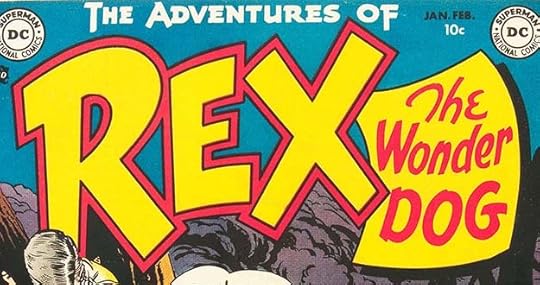 All images © DC Comics. From THE ADVENTURES OF REX THE WONDER DOG #1, Jan-Feb 1952
When National (DC) Comics and All-American Comics merged around 1946, that brought in a raft of All-American titles with logos Ira Schnapp did not do, but over the next few years some of those were cancelled and others were renamed because of a genre change. A few of DC’s long-running titles had logos created before Ira began working at the company like ACTION COMICS and DETECTIVE COMICS, but all the new titles of the late 1940s and 1950s were designed by Schnapp. Above is the first new one for books with 1952 cover-dates. I think it’s one of Ira’s best. The short word REX gets the most space and attention, but the tagline THE WONDER DOG is equally appealing. THE ADVENTURES OF is again pulled from a previous title, THE ADVENTURES OF OZZIE AND HARRIET. If Rin-Tin-Tin and Lassie could attract movie viewers, why not a comic about a dog? It did pretty well.
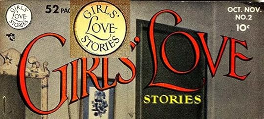
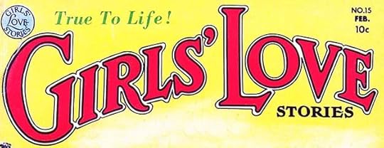 From GIRLS’ LOVE STORIES #15, Jan-Feb 1952
Issue #15 of this romance title featured a new Ira Schnapp logo with much thicker letters than the earlier one. This is a better logo for a comic, where the printing was not always top quality. The letters are just as appealing as before, and the double border allows for a second color.
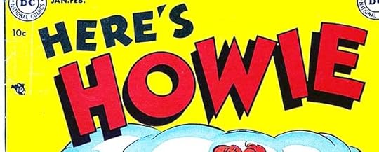 From HERE’S HOWIE #1, Jan-Feb 1952
This new teen humor title joined BUZZY, LEAVE IT TO BINKY and A DATE WITH JUDY in 1952 with a bouncy logo by Schnapp. After a few issues, the main character and his buddy were drafted and it became a military humor book.
 From HERE’S HOWIE #1, Jan-Feb 1952
That friend was featured in his own stories beginning in the first issue with a feature logo by Ira. I actually like the curves of this one more than the straight edges of the cover logo.
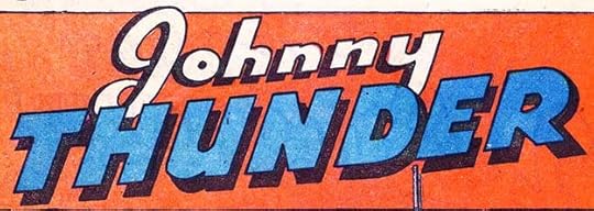
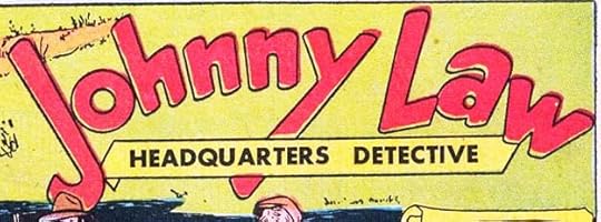
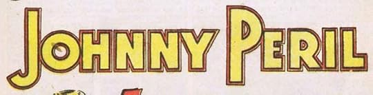 From SENSATION COMICS #107, Jan-Feb 1952
SENSATION, originally the home of Wonder Woman, was struggling, and Johnny Peril was tried as a new feature in issue #107. The new logo by Schnapp is well-designed, but Johnny didn’t last long here either. Perhaps there should have been an All-Johnny League with Johnny Everyman, Johnny Thunder, and Johnny Law.
 From THE ADVENTURES OF DEAN MARTIN AND JERRY LEWIS #1, July-Aug 1952
Bob Hope had been a hit in a DC comic, and Martin and Lewis were equally popular, suggesting that movie comedians were a better choice than stars like Alan Ladd. This title is WAY too long, but Ira makes it work by cleverly emphasizing and matching the words MARTIN and LEWIS on the bottom line, with double borders for a second color. THE ADVENTURES OF looks like type, but I think it’s lettered by Ira in his block letter style.
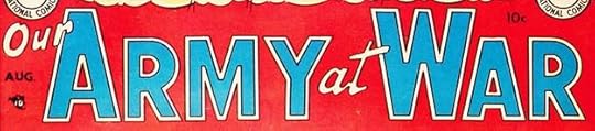 From OUR ARMY AT WAR #1, Aug 1952
With the horrors of World War Two beginning to fade from the public memory, war comics glorifying heroic soldiers and sailors grew in popularity, and DC joined in with three new titles. Again, Schnapp picks the important words to emphasize, and uses his open block letters with a double outline for a second color.
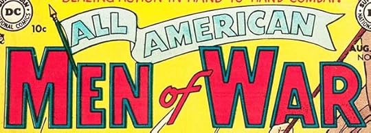 From ALL AMERICAN MEN OF WAR #127, Aug-Sept 1952
ALL-AMERICAN WESTERN had not done as well as expected, so that title was converted into a war book with a fine logo from Schnapp. WAR matches the one above, but might be redrawn. ALL AMERICAN is in a handsome banner that adds interest, depth, and movement.
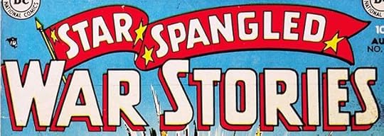 From STAR SPANGLED WAR STORIES #131, Aug-Sept 1952
This title uses a similar banner to the one above with added appropriate stars, but the letter shapes inside and the ones in the rest of the logo are different. Editor Robert Kanigher must have been pleased with Ira’s work on these logos. All three books were popular and lasted many years.
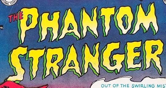 From THE PHANTOM STRANGER #1, Aug-Sept 1952
DC tried another “mystery” title with a story host like EC Comics, but it did not sell well or last long. The character later became a mainstay of the company’s spookier types. Ira Schnapp rarely seemed to do well with scary logos, and this is no exception. The wavy outlines tend to look poorly-drawn rather than ghostly or frightening to me.
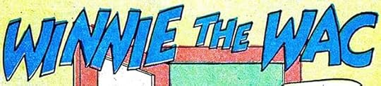 From HERE’S HOWIE #5, Sept-Oct 1952
Once in the army, Howie and friends had to find another way to meet women, and the Women’s Army Corps (WAC) was it, as noted in this new feature title by Ira.
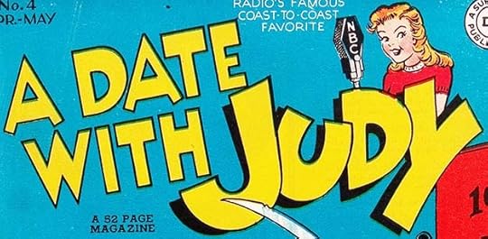
 From A DATE WITH JUDY #31, Oct-Nov 1952
And in A DATE WITH JUDY, this feature began with a Schnapp logo. I like the upper and lower case approach.
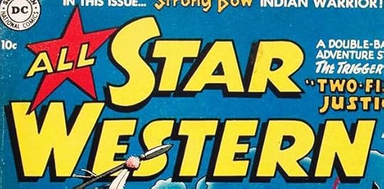
 From ALL-STAR WESTERN #67, Oct-Nov 1952
ALL-STAR WESTERN continued in that genre until 1961, and in issue #67 this new feature began with a logo by Ira. He would do a better one later, as the character was popular and had a long life.
 From OH, BROTHER! #1, Jan 1953, publshed by Stanhall Comics
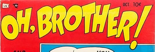 From OH, BROTHER! #5, Oct 1953, publshed by Stanhall Comics
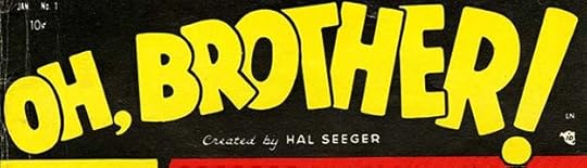
 Now we come to the only comics publisher Ira Schnapp designed logos for other than DC, as far as I know. Harry Donenfeld and Jack Liebowitz had gotten their start in publishing with sleazy pulp magazines in the early 1930s, as described in articles beginning HERE. In 1933, Harry partnered with artist Adolphe Barreaux who acted as art director for the pulps and who soon opened a studio which produced all the story illustrations as well as short comics stories for the Donenfeld pulp magazines under the umbrella name of Trojan, but everything was hidden behind a maze of shell companies and ever-changing publisher names. This continued until the late 1940s, with Barreaux eventually editing the magazines too. Then readers lost interest in the pulps, and starting around 1950 Barreaux tried to convert his line to comic books under the names Trojan, Ribage and Merit, among others. His first efforts were in the western and crime genres, and the ones I’ve looked at had no Ira Schnapp work.
In 1953, Barreaux (probably backed by Donenfeld) teamed with Stanley Estrow, co-owner of Leader News, a magazine distributor, and Hal Seeger, a former Fleisher Studios animator, to create Stanhall Comics. All were written by Seeger, who probably did some of the art, perhaps layouts, with finishes by artist Bill Williams. The editorial offices of Stanhall and other Barreaux comics were the same as National/DC Comics at the time, 480 Lexington Avenue, so it’s not hard to see how closely they were connected, though there was no public acknowledgment of it. The only names promoted in Stanhall were Seeger and Williams, though Barreaux’s name is in the indicias. These comics were very different from the other Barreaux comics, more cartoony and humorous. Their first title, above, was teen humor. I’m not sure if Ira Schnapp designed the logo on the first issue so I won’t count it, but the other one that began on issue #2 looks very much like his work. Schnapp would have known Barreaux from his time doing logos and cover lettering for the Donenfeld-Liebowitz pulp magazines, and they were now working out of the same building. It’s not a stretch to believe that Ira was asked by Barreaux, or even Liebowitz, to create some logos in a more “DC” style for Stanhall comics, and I believe he did. This title lasted for five issues.
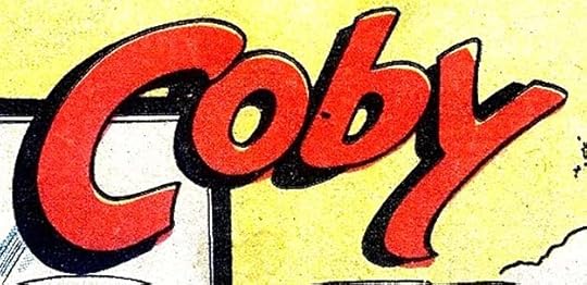
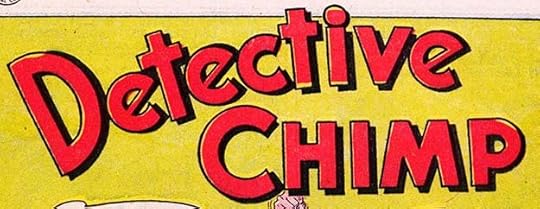 From REX THE WONDER DOG #7, Jan-Feb 1953
A backup featuring another smart animal began in REX with issue #4, and gained this fine Schnapp logo with issue #7. DETECTIVE is somewhat like the original logo for DETECTIVE COMICS, but with more interesting E’s.
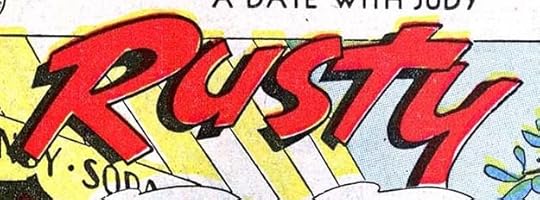 From A DATE WITH JUDY #33, Feb-March 1953
This new feature in A DATE WITH JUDY is in almost the same style as Coby, above.
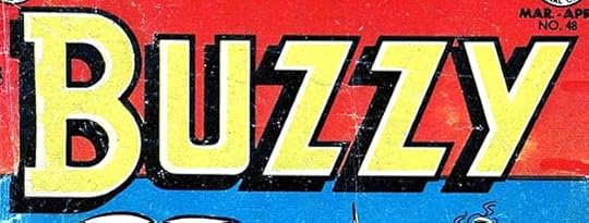 From BUZZY #48, March-April 1953
Ira provided a new logo for BUZZY #48. It’s more sedate and regular than the previous one, and seems an odd choice for a teen humor title.
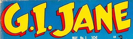 From G.I. JANE #1, May 1953, published by Stanhall Comics
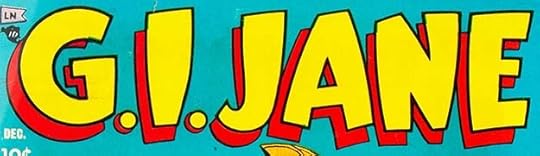 From G.I. JANE #10, Dec 1954, published by Stanhall Comics
The second Stanhall title was probably geared toward sales at Army PX stores. It’s equally humorous and cartoony looking, but with a more adult teasing sexuality from the lead than anything DC Comics was publishing, though perhaps THE ADVENTURES OF BOB HOPE got close at times. I think Schnapp designed both these logos. The first appeared only on the first issue, the second on the rest. He might have lettered a few of the covers, but I’m not sure, so I’m not going to count those in my Schnapp inventory. Stanhall published ten issues, and an eleventh came out under another publisher name, making it the longest-lasting of the group.
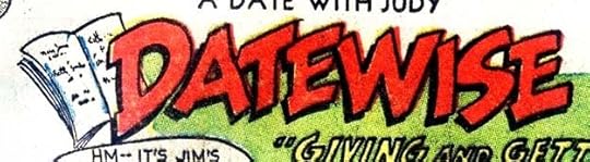
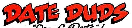
 From A DATE WITH JUDY #35, June-July 1953
This was a two-page dating advice feature in comics form that appeared in the teen humor books. It did not have a consistent logo until this one by Schnapp, which was then reused.
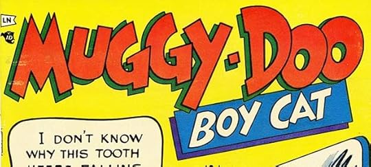 From MUGGY-DOO #1, July 1953, published by Stanhall Comics
The third Stanhall title was this funny animal one much like some DC was also publishing. The logo is very much in Ira Schnapp’s style, though you can see the word balloon isn’t. It lasted four issues.
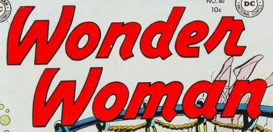 From WONDER WOMAN #60, July-Aug 1953
Wonder Woman’s original writer and co-creator William Moulton Marston had died in 1947. His artist collaborator H.G. Peter continued as the character’s artist for another ten years, but Robert Kanigher, the book’s editor, gradually took over writing the stories and moving the character away from Moulton’s ideas into ones he felt were more in line with DC’s other superheroes. One step in that process was this new logo design by Ira Schnapp, replacing the original elegant script one I think was by Peter. There’s still a script influence, but Schnapp’s very bold letters are separated rather than joined, and more like block lettering than script. This logo would last for years. While I like it, it always bothered me a little that the E and R of WONDER are not joined together, though they seem to be reaching for each other.
 From A DATE WITH JUDY #36, Aug-Sept 1953
Another two-page dating feature in comics form with a logo by Schnapp. I like the open diary behind the D.
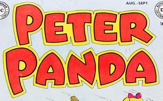 From PETER PANDA #1, Aug-Sept 1953
This new series was sort of a funny animal one, but really more of a fantasy, having human kids interacting with talking animals. Schnapp did a great job on the logo, making it fun, curvy, and a little bouncy, but with enough square corners to give it a bit more gravity, and a double outline for a second color.
 From PETER PANDA #1, Aug-Sept 1953
In addition to stories featuring the main character, this backup also appeared in PETER PANDA with a feature logo by Schnapp. Inspired by “The Wizard of Oz” perhaps?
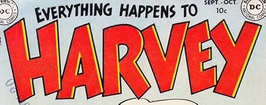 From EVERYTHING HAPPENS TO HARVEY #1, Sept-Oct 1953
DC added this teen humor title to their line with a nice Schnapp logo, but it didn’t last long. Perhaps the market was saturated by this time.
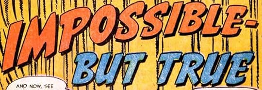
 From DETECTIVE COMICS #202, Dec 1953
At the end of 1953, DC finally changed the feature name of “Impossible But True” to one which included the main character’s name and occupation. The logo by Ira is sedate, with only a slight curve and a drop shadow to add interest, but it and the feature continued for years.
To sum up, I found 27 logos by Ira Schnapp in comics with 1952-53 cover dates, many of which would last a long time. Lots more would follow. Other articles in this series and more you might enjoy are on the LOGO LINKS page of my blog.
The post IRA SCHNAPP’S COMICS LOGOS 1952-1953 appeared first on Todd's Blog.
June 9, 2021
IRA SCHNAPP’S COMICS LOGOS 1950-1951
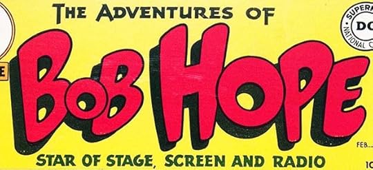 All images © DC Comics. From THE ADVENTURES OF BOB HOPE #1, Feb-March 1950
After several failed attempts, DC finally found a Hollywood star that could succeed in a comic book, and this new title lasted for 18 years. It had several Schnapp logos during that time. This first one reuses THE ADVENTURES OF from Ozzie and Harriet’s logo, but the rest is new. BOB HOPE is full of energy and quirky humor that I think is a perfect match for the subject. That very small first O is unusual for Ira, and I love it. The bottom tagline is close to the top line for balance.
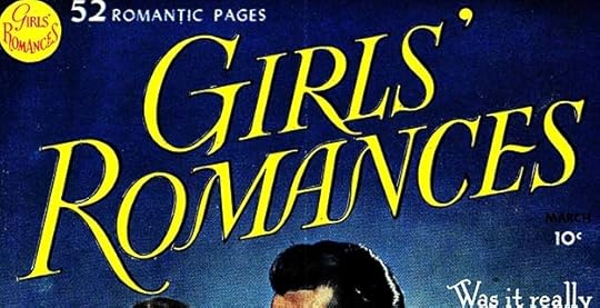 From GIRLS’ ROMANCES #1, Feb-March 1950
A third romance title joined SECRET HEARTS and GIRLS’ LOVE STORIES following the style of the latter, with another elegant but very thin logo by Ira Schnapp. Again, this was liable to fill in at the thinnest points, and I think was meant to mimic movie and romance magazines for girls that were not comics. This one also had a special logo done for the upper left corner, and here’s the original from the DC files:
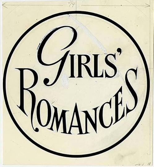
As you can see, despite the tiny size on the cover, this was as much work for Ira as any of his logos. There’s quite a bit of white paint covering areas he changed, and some of it is flaking off on the G. You can also just make out remnants of his original pencil drawing. This was not a title meant to fit into a circle, but Ira made it work pretty well anyway, and his letters here are just as elegant as on the main logo. I don’t recall how big the original art is, but my guess it at least five inches wide.
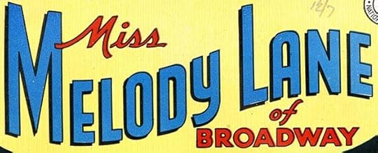 From MISS MELODY LANE OF BROADWAY #1, Feb-March 1950
DC’s obsession with media stars led in this surprising direction, a companion title to MISS BEVERLY HILLS. The logo follows the exact same design and uses the same MISS. Neither book lasted very long despite these fine logos.
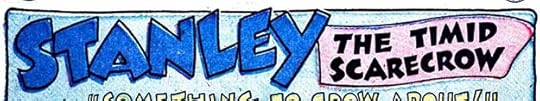
 From DETECTIVE COMICS #156, Feb 1950
This series of weird detective stories starred Roy Raymond, and later gained a new title with his name in it. Some earlier versions were more like story titles than logos, this is the first one that seems intended for reuse, and it’s by Schnapp. It’s an interesting combination of serif and sans-serif forms, just slightly cartoony, and with a drop shadow to help it read over art.
 From DETECTIVE COMICS #156, Feb 1950
In the same issue, this feature received a highly stylized new logo. I like the ideas in it, but can’t understand why the character’s name is so small, and why there’s so much empty space in the eagle. I’m also not sure why the star is droopy. Not a good effort by Schnapp in my opinion.
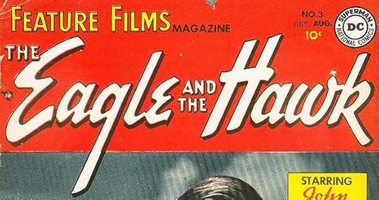
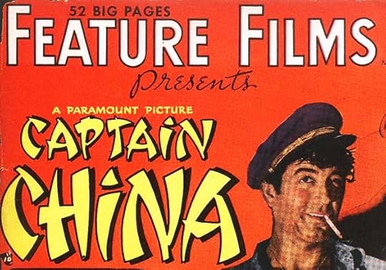 From FEATURE FILMS #1, March-April 1950
This new title intended to present comics versions of popular new films, something Dell was having success with, is right up Ira’s alley, probably reminding him of his showcard work for movie theaters. The book’s own logo is standard open block letters with a handsome script PRESENTS. Ira’s logo for the film uses typical Chinese-like letters popular at the time, but now considered in poor taste. Promotional art for the film did not follow the same idea. I’m counting this as two logos for Ira, even though the movie title was used only this once.
 From A DATE WITH JUDY #16, April-May 1950
Ira designed this feature logo for a regular two-page one in the teen humor books. There were a few earlier versions, this is the first one that seems like a logo, and it was reused.
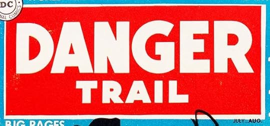 From DANGER TRAIL #1, July-Aug 1950
This new title featured international thriller stories and featured King Faraday. It was not a success, but the character had a long though intermittent history. The logo uses very plain block letters. Perhaps editor Julius Schwartz was trying to appeal to older readers buying men’s adventure magazines. The red and white colors grab attention.
 From FEATURE FILMS #3, July-Aug 1950
The second issue of this series had some poor lettering not by Schnapp, but this third one has an excellent movie title by him. It uses the open script style he had developed with the alternate style E, but larger letters starting the two main words and a very long tail on the G add style, and it looks great on the red background. The final issue, #4, used mainly type on the cover. Clearly the book had not found a following.
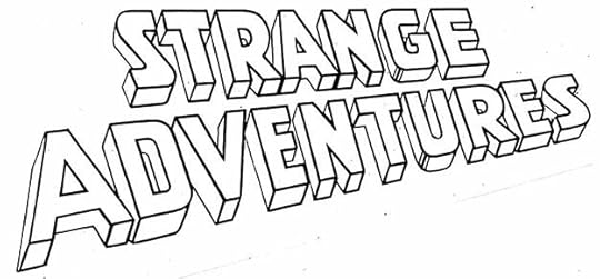
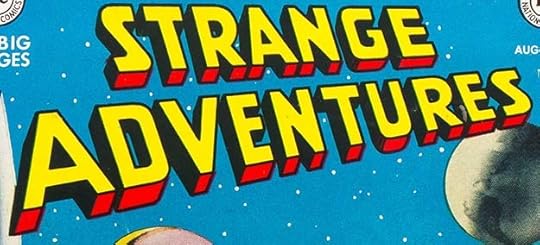 From STRANGE ADVENTURES #1, Aug-Sept 1950
Editor Julius Schwartz had been an early science fiction fan and agent before taking a job at All-American Comics, and then when that company merged with National (DC) became one of their long-term editors until his retirement. I imagine this was something he campaigned for, and in 1950 he was finally able to launch a science fiction anthology.
 Original logo from the DC files
Ira’s logo, seen here in a later version where the black areas were opened up for color, suggests he was looking at science fiction pulp magazines, perhaps provided by Julie as examples. It could also be showing the inflluence of science fiction movies, and the first issue featured a short adaptation of one, “Destination Moon.” The block letters themselves are ordinary, it’s the angle and the telescoping that make it memorable. Science fiction fans were often comics fans, and this book was a success that led to more.
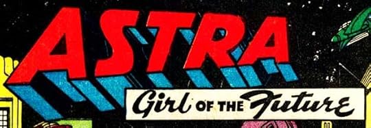 From SENSATION COMICS #99, Sept-Oct 1950
Over in SENSATION, long the home of Wonder Woman, this science fiction feature was begun. ASTRA takes a similar approach to STRANGE ADVENTURES, but angled the other way. The tag line adds interest, but the feature did not last long.
 From TOMAHAWK #1, Sept-Oct 1950
Tomahawk moved from STAR-SPANGLED to his own long-running title, and the cover used the Schnapp logo he had created for the feature, but inside the book this backup feature had a new logo by him. Another attempt to use logs as letters. I like this one better because of the arrows forming the horizontal bars of each A.
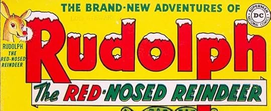 From RUDOLPH THE RED-NOSED REINDEER #1, Dec 1950
At the end of 1950, DC began a series of large yearly issues featuring a character from a popular Johnny Marks song. Ira’s logo captures the wintery feel perfectly with snow-draped letters, an early example of this idea in comics. I also like the coloring of the tag line.
 From STRANGE ADVENTURES #3, Dec 1950
This feature headlines STRANGE ADVENTURES from the first issue, but only received a Schnapp feature logo with issue #3. The square format allowed more art in the first panel.
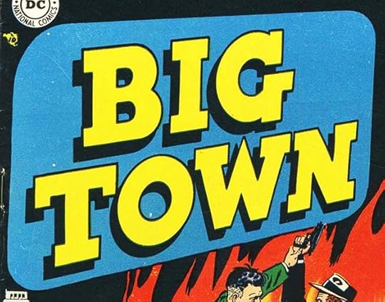
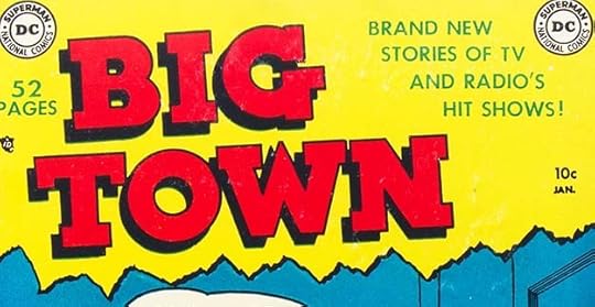 From BIG TOWN #1, Jan 1951
DC added this new crime title featuring newspaper reporters to their two previous ones, GANG BUSTERS and MR. DISTRICT ATTORNEY. It was again based on a popular radio and then TV show, and lasted for 50 issues. Ira’s slab serif block letter logo is pretty tame but easy to read, and I think the torn paper border below was meant to suggest stories “torn from the headlines.”
 From BIG TOWN #4, April 1951
For issue #4 the same letters were put into an angled rectangle with rounded corners perhaps meant to suggest a TV screen. I’m sure Schnapp would have had to redraw the letters to do this, though he might have had an angled photostat by Jack Adler to use as a guide, so I will count this as another logo.
 From BIG TOWN #2, Feb 1951
The second issue saw the debut of this backup with a feature logo by Ira, though the tag line is set in type. Possibly Ira lettered one that was not liked and replaced with this, or maybe Ira knew they wanted type there and left it blank.
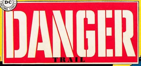 From DANGER TRAIL #5, March-April 1950
The final issue of DANGER TRAIL had this new logo by Ira, which I like better, though I think TRAIL is too small. Even if a new logo could have turned sales around, which is unlikely, sales figures on this issue wouldn’t have come in until long after the book was cancelled. This is the first DC logo that uses stencilling, something that would be more popular later.
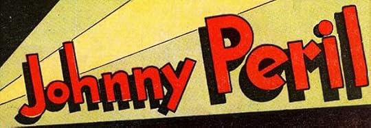 From DANGER TRAIL #5, March-April 1950
Inside the book King Faraday was replaced by Johnny Peril, a adventurous newspaper reporter who had been around as a backup character for a few years. This is one of those cases where the feature logo by Schnapp was intended to be reused, but the book’s cancellation meant it wasn’t.
 From ALL-STAR WESTERN #58, April-May 1951
ALL-STAR COMICS had been the lead title of that company and home of The Justice Society of America for years, but with interest in superheroes waning, DC decided to convert it to a western book. Schnapp did this new logo with ALL in a star very similar to the previous version, and the letter shapes of the rest in typical block letters with a drop shadow. Superhero fans mourned, western ones bought it.
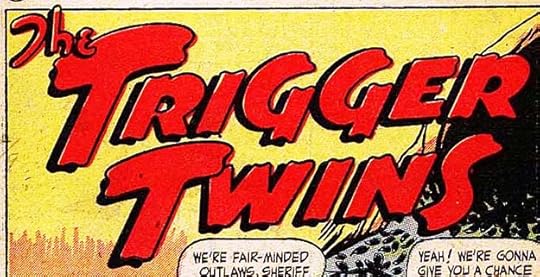
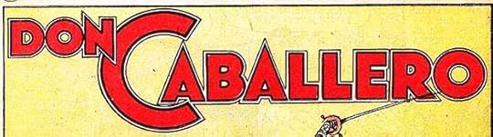
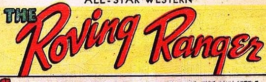
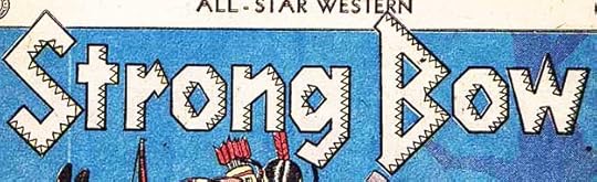 Four feature logos from ALL-STAR WESTERN #58, April-May 1951
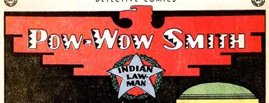
All four features inside were new and had fine Schnapp logos. Trigger Twins and Roving Ranger have examples of his open script styles, Strong Bow returns to the Native American look of Pow Wow Smith’s second logo, and Don Caballero is Art Deco made memorable by the giant C.
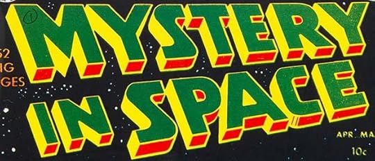 From MYSTERY IN SPACE #1, April-May 1951
The success of STRANGE ADVENTURES led to this second science fiction anthology from editor Julie Schwartz. The logo is in the same style. I don’t like the color choices on this first issue, but generally it looked good, and the black areas (reversed and filled with yellow here) were also opened up for color later.
This photostat of the original logo from the DC files show how it looked when Schnapp lettered it. The black areas give the feel of lighting from below and to the right, the opposite of the telescoping on many other Schnapp logos.
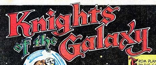 From MYSTERY IN SPACE #1, April-May 1951
This feature began in the first issue with a logo by Ira that makes use of one of his Old English styles that he thought appropriate because of the word KNIGHTS. It works for me, even though it’s not science fictional.
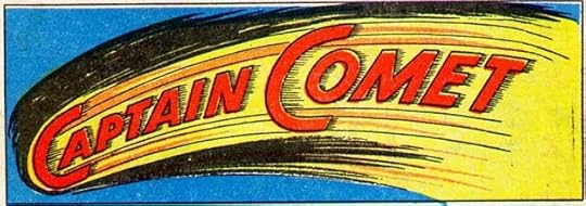 From STRANGE ADVENTURES #9, June 1951
Issue #9 of STRANGE ADVENTURES introduced a new regular feature and a character that would have a long life at DC. I’m not sure if Ira added the comet art around this logo…
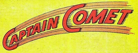 From STRANGE ADVENTURES #10, July 1951
…but it was dropped by the next issue and remained like this for the rest of the run.
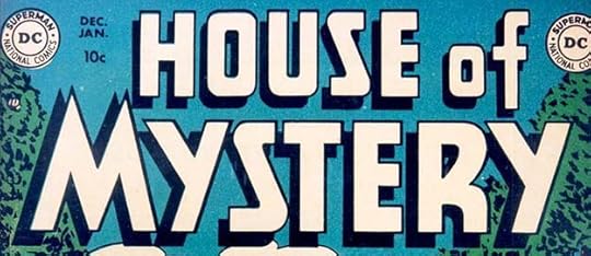 From HOUSE OF MYSTERY #1, Dec 1951-Jan 1952
Always looking to expand their line, it was inevitable that DC would try horror comics, though theirs were mild compared to others on the market, and they preferred to call them “mystery” comics after this first title. Ira’s logo is not at all scary (perhaps a good thing, as scary was not a strong point for him), but the open letters with a drop shadow are effective all the same.
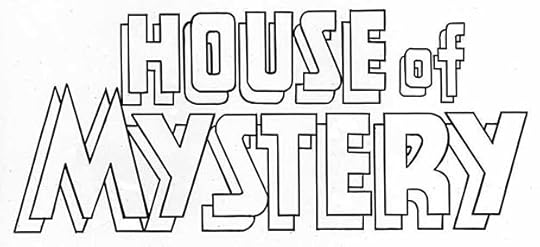
Here’s a photostat of a later version from the DC files with the drop shadow opened up for color. Not as effective in black and white, but it worked fine on the covers.
To sum up, I found 30 logos by Ira Schnapp in 1950-51 issues. His logo output was down some from the previous two years, but the work itself includes many title logos that would last for a long time. More articles in this series and others you might enjoy are on the LOGO LINKS page of my blog.
The post IRA SCHNAPP’S COMICS LOGOS 1950-1951 appeared first on Todd's Blog.
June 8, 2021
Ira Schnapp and the DC-Columbia Movie Serials
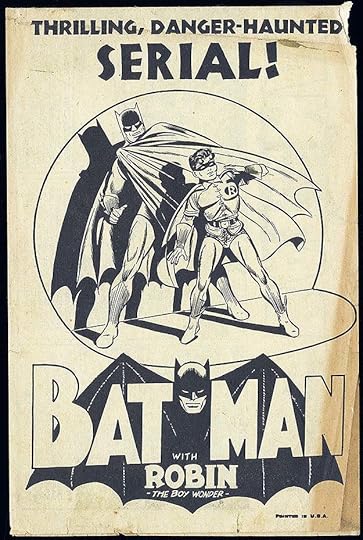 Images related to DC Comics characters are © DC Comics. Promotional poster from the 1943 Batman serial.
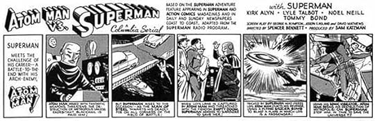
From 1937 to 1956, Columbia Pictures produced 57 movie serials. Each serial was divided into chapters, and was meant to be shown one chapter per week as an added attraction to the main feature film shown that week. Nearly all of them ran 15 chapters, and each chapter had a running time of about 15 minutes. Subjects were drawn from all kinds of popular culture, fictional and historical properties, with sources including pulp magazines, comic strips and comic books. Despite a long running time, they were low-budget and well below feature films in quality, with actors who were not big stars. They were meant to appeal to kids and readers of the source material, hoping to keep them coming back into theaters even when they’d seen the feature already, or at least that’s my guess. Ten were based on characters now owned by DC Comics, but at the time of their release only six were actually licensed from National (DC) Comics. Here’s the list of those ten:
Adventures of Captain Marvel (1941) (licensed from Fawcett)Spy Smasher (1942) (licensed from Fawcett)Batman (1943)Hop Harrigan (1946) (licensed from All-American Comics, sister company of DC)The Vigilante (1947)Superman (1948)Congo Bill (1948)Batman and Robin (1949)Atom Man vs. Superman (1950)The Miraculous Blackhawk: Freedom’s Champion (1952) (licensed from Quality Comics)For each serial, Columbia prepared a press book for theater owners. This offered them all kinds of material to promote the serial to theater owners, and also to theater patrons. In addition to reviews, actor photos and biographies, there were film posters of various sizes, banners, counter displays, lobby cards with photo stills from each chapter, and more, all of which could be ordered for a fee in lots from one to many. On the ones licensed from DC Comics, there were additional items prepared by them, usually a comics-style poster like the one above and a “Comic Strip Herald,” which was a single sheet 6 inches high by 18 inches wide, folded in half to create a four-page flyer. Often the front cover was the same as the poster, but sometimes they were different. Inside across both pages was a large comic strip something like a daily strip with five or six panels describing the serial and including actor and other film credits. I don’t know what was on the back cover. These items had comics art drawn by DC artists and most were lettered by Ira Schnapp.
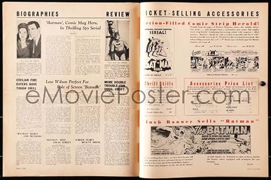
Here’s a spread from the press book for the 1943 Batman serial, the first chronologically with National (DC) licensed characters. Unfortunately this is the only image I can find, and the quality is poor, but on the left side are actor biographies and reviews. On the right side top are images from the Comic Strip Herald. The front cover, which is the first image in this article, uses type at the top, and the logo by Jerry Robinson with art from the Bob Kane studio of Batman and Robin in a spotlight. Right of that is the large comic strip that made up the center spread of the four-page flyer.
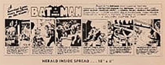
This is the best image I can get of the strip from that low resolution scan, but you can make out a few things. There are six panels across the bottom, an odd version of the Batman logo, display lettering at top left, and at top right are film credits. There’s no way to be sure the lettering is by Schnapp, but as it follows the same format as other later ones, it’s likely to be, though perhaps the logo is by the artist. Based on this guesswork, I can’t claim Ira lettered it, and I hope to find a better image someday. Incidentally, the item in the first image above might be a separate poster and not the front cover of the Herald, it was probably sold both ways.
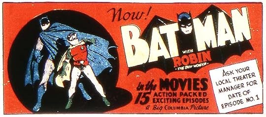
This ad for the serial appeared in the comics, here from DETECTIVE COMICS #81, Nov 1943. Again, not a great image, but the art and logo are the same and the lettering looks like Schnapp work to me. Several Batman logos were produced for movie posters and for the actual serial that use some elements of this one, but are mostly different, and probably created in California for Columbia.
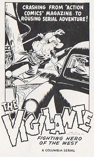
I haven’t found a press book for the Hop Harrigan serial, but it’s unlikely it has any Schnapp work in it. The next one that does is for the 1947 Vigilante serial, and I have better images this time courtesy of Jerry Beck. I believe this image was the front cover of the Comic Strip Herald and probably a separate poster as well. The lettering looks like what Ira Schnapp was doing in 1947 (or perhaps 1946), when the material was prepared. Hard to read, the copyright line says “Copr. 1947 Natl. Comics Pub. Inc.” The logo is similar to the one appearing in the comics at the time, like this one from ACTION COMICS #104, Jan 1947:
The one in the poster follows the same layout but is taller, has thicker outlines and more pronounced notches and rough edges. It’s possible Schnapp designed the one in the comics, I’m not sure, but he definitely did the one in the poster.
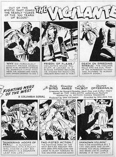
Here’s the Vigilante strip that formed the center-spread of the Herald, divided in half and stacked for better viewing. The display lettering at upper left is typical Schnapp work from the time with small gaps in some of the letters, and the rest all looks like his work right down to his question mark style. The logo is yet another version by Ira. If you compare the layout of this spread to the Batman one above, you can see they’re similar. The original art might have been the same size as a daily comic strip of the time, about 19 inches wide, but if so the reduction for printing on this 18-inch-wide spread would have been almost none, so perhaps it was done larger.
An Ira Schnapp house ad for the serial appeared in the comics, here at two-thirds page size from ACTION COMICS #110, July 1947, where Vigilante had his regular feature. There was another full-page ad using mostly the same lettering and art. The Vigilante logo is closer to the one in the press book strip than the one on the character’s feature. Logos for the film posters were nothing like this, closer to type, and no doubt produced in California for Columbia.
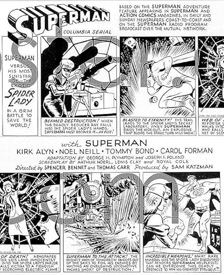
I haven’t found much from the press book from the first Superman serial of 1948, but I do have this good image of the Herald strip courtesy of Delmo Walters Jr., and I’ve again split it and stacked it for easier reading. This strip has only five panels across the bottom. Everything here is by Schnapp and it again follows the same layout as the previous Herald strips. The most unusual thing is the very rough letters of Spider Lady in the first panel. The logo is, of course, the one Ira created in 1940 based on original versions by Joe Shuster. I don’t know what was on the cover of the Herald for this serial.
Posters for the serial also used Ira’s logo, but with the S revised by the poster artist to fit the space better. One odd thing in the credits in both the poster and the strip is that they begin “with SUPERMAN,” as if he’s an actor separate from Kirk Alyn. I think that’s because the Superman flying sequences are animated as a cost savings. I saw this once, and they’re quite brief and nowhere near as good as the Fleisher studio Superman cartoons.
This ad for the serial appeared in comics, here from ACTION COMICS #124, Sept 1948. Perhaps the Herald flyer used something similar on the cover.
Congo Bill was another feature running for many years in ACTION COMICS. He was a white jungle explorer and adventurer, and his serial also ran in 1948. Above is the section of the press book advertising the Herald with the cover and strip lettered by Schnapp.
Another version of the cover with some different lettering is offered as the subject of a coloring contest theaters could use as a promotional idea.
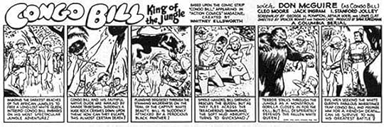
Here’s a slightly better image of the Herald strip that confirms it’s lettered by Schnapp, even though you can’t read much of it. Ira probably did this logo, it’s different from the one used on his comics feature, and also different from several created for posters by Columbia. It’s interesting to see that Whitney Ellsworth is credited as the creator of Congo Bill, something that never happened in the comics, and no creator credits are given in the other serial ads that are readable. Ellsworth was Editor-in-Chief, so perhaps had the pull to get his credit listed by Ira.
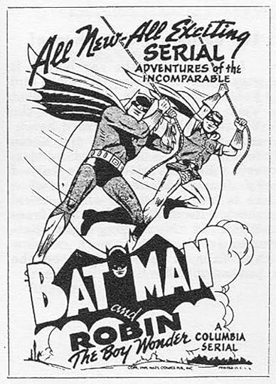
The best documentation available for these serials is for 1949’s Batman and Robin. A scan of the complete 16-page press book is on THIS site, and worth a look to see the wide variety of material in it, of which the Comic Strip Herald produced by DC is only a small part. Above is the cover of that Herald with Schnapp lettering. I think he also did this version of Robin’s logo and the background art and clouds behind it.

Here’s the best image I’ve found of a Herald strip lettered by Ira, again divided in two and stacked for better viewing. Only the Batman logo by Jerry Robinson is not by Schnapp. While perhaps not as impressive as full color movie posters, these promotional items must have appealed to comics fans. I wonder if any of the Heralds survive? I haven’t found evidence of it.
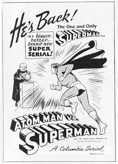
In 1950 a second Superman serial press book included this cover for its Comic Strip Herald. The lettering and logos are by Schnapp.
This is the best image I have of the Herald inside spread strip, and it’s almost readable and clearly by Ira, with two more versions of the Atom Man logo.
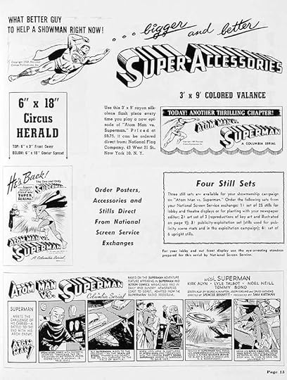
Here’s the full page 15 from the press book promoting the Herald, and I think Ira also designed Super-Accessories at the top. Since none of these Heralds mention or show anything on the back cover, perhaps that was left blank so a theater owner could stamp or print his own local ad or information on it.
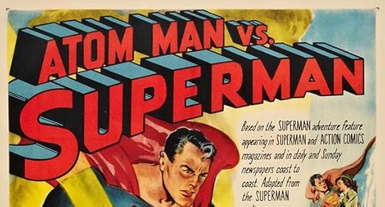
Posters for the film created for Columbia use Ira’s logos as a starting point, but are redrawn. Again the S in Superman is made smaller and has a somewhat different shape, and the top line is also taller than what Ira did. I bet he still enjoyed seeing this on the posters all the same.
The Blackhawk serial of 1952 doesn’t advertise a Comic Strip Herald in its press book, so that must have been a DC thing, and of course DC did not own the character then. In 1951 there was a sort of tryout for the Superman TV show, a black and white theatrical film, “Superman and the Mole Men,” where George Reeves first played the character. It was not a serial, and the press book doesn’t have any comics art. It later became a two-part episode of the TV show after some trimming.
That’s all I know about these press books, and I’ve just learned of them in the last two weeks. If more information or better images turn up, I will add them. Other articles you might enjoy are on the Comics Creation page of my blog.
The post Ira Schnapp and the DC-Columbia Movie Serials appeared first on Todd's Blog.
June 7, 2021
IRA SCHNAPP’S COMICS LOGOS: 1949
 All images © DC Comics. From SUPERBOY #1, March-April 1949
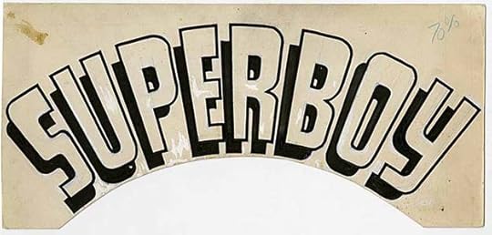 Original logo from the DC files.
With this logo, I feel that Ira Schnapp had truly arrived at his role as the primary logo designer for National (DC) comics. Perhaps for legal reasons, it did not follow the style of Ira’s Superman logo but headed off in a new direction. The influence is Art Deco, the curve adds interest, and the drop shadow provides a three-dimensional aspect as the logo seems to float above the cover. It’s friendly and appealing, perfect for the character. From this time forward Schnapp would design logos for nearly all new titles at DC until he left the company in 1968, even as he set the style for the publisher through lettering nearly all the covers and house ads as well.
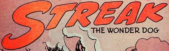 From GREEN LANTERN #36, Jan-Feb 1949
I skipped past this feature logo chronologically to put the more important logo for this year at the top. Streak was a precursor of Rex the Wonder Dog who nearly took over GREEN LANTERN, but was not enough to keep that book alive. Ira’s logo has lots of forward motion, which is appropriate.
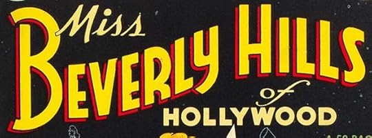 From MISS BEVERLY HILL OF HOLLYWOOD #1, March-April 1949
This short-lived series features a fine Schnapp logo. The graceful flag wave curve of the main section leaves room for the rest in the gaps. MISS and OF are typical open script from Ira with a bit of extra elegance, and HOLLYWOOD is his typical block letters. BEVERLY HILLS has an Art Deco feel with an open drop for a second color. Well done all the way.
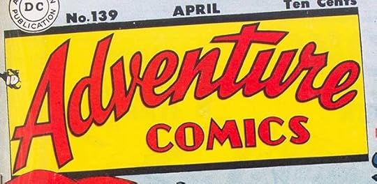 From ADVENTURE COMICS #139, April 1949
Schnapp continued his roll of fine logos with this vast improvement over the previous ADVENTURE logo. COMICS keeps the old design, but I think redrawn by Ira, and ADVENTURE is a much better open script treatment than the one on the book for many previous years. Again the arc adds interest, and this logo is in a slightly tilted box, as was the style for other titles at the time like ACTION and DETECTIVE, giving these superhero anthologies a similar look that fans could spot quickly.
 From ANIMAL ANTICS #21, July-Aug 1949
A new funny animal feature in ANIMAL ANTICS with a new Schnapp logo full of bounce.
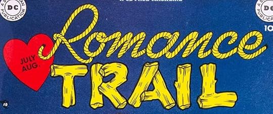 From ROMANCE TRAIL #1, July-Aug 1949
DC was about to enter the romance genre with new titles, and editor Julius Schwartz, the western editor, thought, why not combine the two? A clever idea, but it didn’t find enough readers to last long. The Schnapp logo uses rope for the top word and logs for the bottom one, adding a heart at the left. I don’t think the logo succeeds, the styles don’t go together well.
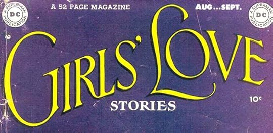 From GIRLS’ LOVE STORIES #1, Aug-Sept 1949
Romance comics had been launched by Joe Simon and Jack Kirby at Prize in 1947 with YOUNG ROMANCE. It was a big hit, and imitators soon followed. DC joined the party with this title, and I think editor Robert Kanigher’s idea was to try to appeal to young girls by making the covers look more like movie magazines than comics. At first they had photo covers, and the logos, beginning with this one, pushed the boundaries of what comics printing could handle. Ira did a fine job on this elegant logo, but the thin areas tended to fill in from ink gain. Schnapp’s skill with this style is undeniable, it’s a classy and impressive job. I’ve written in detail about all the DC romance title logos beginning HERE.
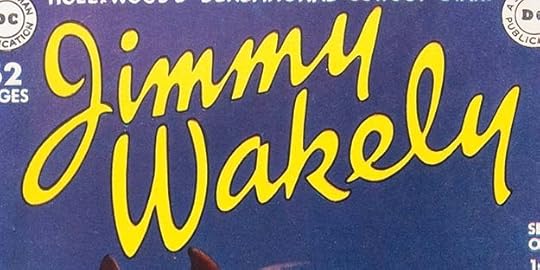 From JIMMY WAKELY #1, Sept-Oct 1949
DC was still trying to land a popular cowboy for a comic series, and they tried this one. Wakely is considered the last of the singing cowboys, and never reached the prominence of Gene Autry or Roy Rogers. His comic did not last long. I think Ira’s logo was meant to represent the star’s signature, which looks something like this in examples I’ve seen. It doesn’t seem a very effective approach for a western to me.
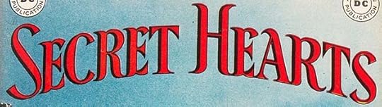 From SECRET HEARTS #1, Sept-Oct 1949
DC’s second romance title has a Schnapp logo equally as elegant as the first one, but with somewhat thicker letters. The black shading (it’s not really a drop shadow) helps pop it off the background. There are still some very thin areas that could fill in, as on the bottom of the first S.
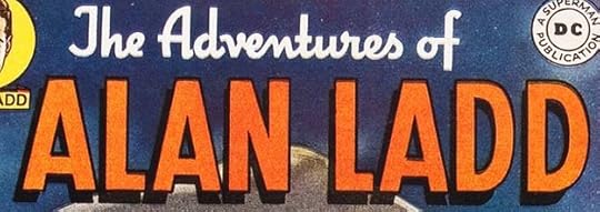 From THE ADVENTURES OF ALAN LADD #1, Oct-Nov 1949
DC continued to try to find success making comics about Hollywood actors. This one also did not last long. The name here is solid, masculine block letters with a drop shadow, while the top line is heavy script. Nothing wrong with Ira’s work, I think the lack of success was more due to kids not being that interested in the actor.
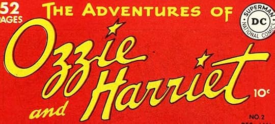 From THE ADVENTURES OF OZZIE AND HARRIET #1, Oct-Nov 1949
Perhaps comedy stars on radio and TV had a chance to succeed, thought someone at DC, probably editor-in-chief Whitney Ellsworth. This logo again seems to suggest signatures with the addition of stars over the I’s. It also did not last long.
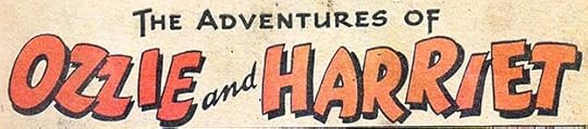 From THE ADVENTURES OF OZZIE AND HARRIET #1, Oct-Nov 1949
Inside the book a different logo was used on the first page of each story. Perhaps this was the original cover logo and replaced by the final one, I don’t know. The names are more typical of Ira’s humor work.
 From GIRLS’ LOVE STORIES #2, Oct-Nov 1949
With the second issue of this romance title, the DC Bullet symbol in the upper corner was replaced by this small circular logo, which I’ve included larger to show it better. It was used on many following issues, and despite the small size, I think it qualifies as another logo for Schnapp. In 1950 I will show an original for one of these on another title. SECRET HEARTS avoided the problem by having no corner symbol at all for a while.
 From LEADING COMICS #39, Oct-Nov 1949
Over in LEADING COMICS, this new feature logo appeared. It’s pretty generic, but I think it’s by Schnapp.
 From Superman Sunday strip of Oct 23, 1949
I thought I would include this variation by Ira of his Superman logo used as a top line on the Sunday strips beginning at this time. Despite it being very squashed vertically, and with an off-model S, it still works okay. Later it was made even smaller and simpler with open block letters, but I don’t think that version qualifies as a logo, more of a title.
 From DETECTIVE COMICS #152, Oct 1949
Here’s an impressive new feature logo from DETECTIVE where Ira seems to have found a better way to incorporate wood into a western logo. I’m not sure if wood is the best way to represent the character, but I like the logo.
 From ANIMAL ANTICS #23, Nov-Dec 1949
A new funny animal feature logo from ANIMAL ANTICS by Schnapp.
Some time in mid 1949, Ira revised the DC Bullet symbol. His new version makes SUPERMAN bolder, and replaces PUBLICATION with NATIONAL COMICS. He also adds two divider dots at the sides, and makes the circles bolder. The DC is larger and shaped better, too, in a style similar to the font Cooper Black. Not a startling change, but definitely an improvement. It first appeared on November cover-dated issues.
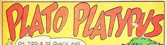
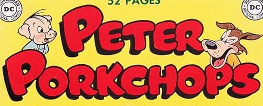 From PETER PORKCHOPS #1, Nov-Dec 1949
Peter Porkchops gained his own humor title at the end of 1949. The logo by Schnapp is very similar to the one he did for Peter’s first story in LEADING COMICS in 1947, but it’s redrawn, and has a thicker outline and a drop shadow. The character art is by Rube Grossman.
 From LEADING COMICS #40, Dec 1949-Jan 1950
Over in LEADING, this new funny animal feature began with a Schnapp logo.
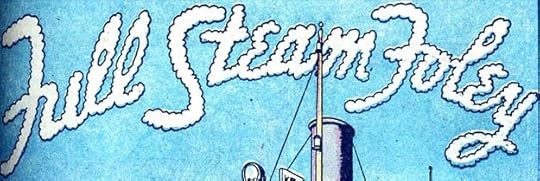 From WORLD’S FINEST COMICS #43, Dec 1949-Jan 1950
Finally, this new feature began in WORLD’S FINEST with a series logo by Ira that I guess is meant to be made of steam, though it looks more like sky writing.
In all, I found 21 logos by Ira Schnapp, the same as in 1948, but I think with some more important and long-lasting examples. Other articles in this series and more you might enjoy are on the LOGO LINKS page of my blog.
The post IRA SCHNAPP’S COMICS LOGOS: 1949 appeared first on Todd's Blog.
June 4, 2021
IRA SCHNAPP’S COMICS LOGOS: 1948
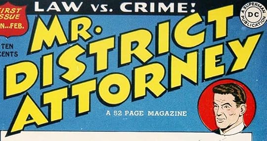 From MR. DISTRICT ATTORNEY #1, Jan-Feb 1948
Following quickly on GANG BUSTERS, DC launched a second crime comic in early 1948 again based on a popular radio show. This one had a recurring character, but he was never given any name other than the one used in this logo by Ira Schnapp. Like GANG BUSTERS, the logo is very Art Deco, and has similar letter shapes, though it leans to the right and has a drop shadow rather than a double border. The two logos are close enough to seem related, as they are, mainly by genre.
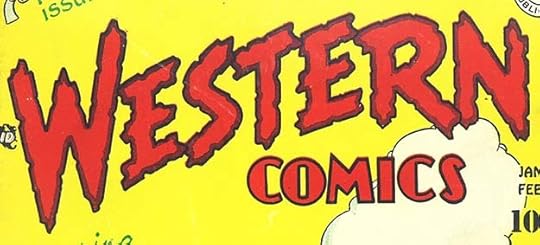 From WESTERN COMICS #1, Jan-Feb 1948
In the same month, DC jumped fully into westerns that were having success for other publishers, often with series featuring movie-star cowboys. COMICS is again picked up from previous DC logos not by Ira (but giving some of their titles a cohesive look), while WESTERN is rough and notched, I think an appropriately weathered approach.
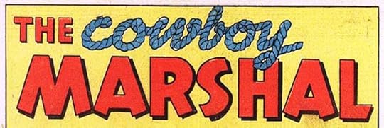
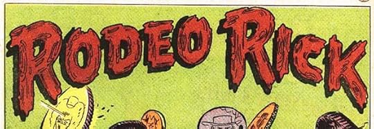
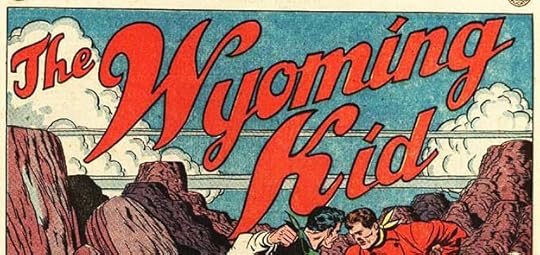 Three feature logos from WESTERN COMICS #1, Jan-Feb 1948
While one feature, Vigilante, had a long history at DC, the others were new, and were given feature logos by Ira. Notice how different they are from each other. COWBOY uses rope to make letters, always tricky. RODEO RICK is in the style of wood, perhaps meant to suggest fence rails. WYOMING KID is not very western, but has an appealing open script style.
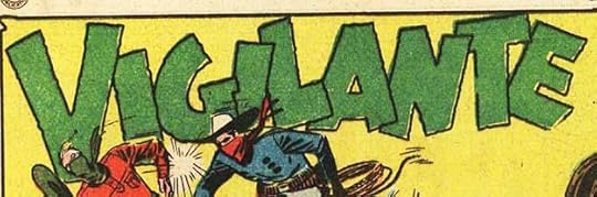 From WESTERN COMICS #1, Jan-Feb 1948
Vigilante’s logo had been in use since 1945 in ACTION COMICS, where the character had a number of different logos before that going back to 1941 and probably drawn by the artists. It could be by Schnapp, but I can’t be sure, so I’m not counting it for him.
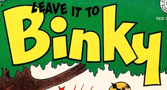 From LEAVE IT TO BINKY #1, Feb-March 1948
Having had success with A DATE WITH JUDY, the company started this second teen humor title soon after. Unlike JUDY, it was not based on a radio show, but had similar story ideas drawn from family life and dating. Ira chose an upper and lower case treatment for BINKY, which relates to JUDY but gives it a different feel, while the top line is in bouncy capitals. I like the Y which is similar to the N turned upside down, and I also like the large circle atop the I. Ira seems to have learned that if he didn’t have a double outline or drop shadow to help the open letters stand out, their outlines should be thick. It’s kind of surprising the top line is solid black, and it’s a bit hard to read on the green background, but most covers on the series had simple art that allowed it to work well enough, and really BINKY was the important part.
 From A DATE WITH JUDY #4, April-May 1948
With issue #4, A DATE WITH JUDY got a revised logo that made A DATE WITH much larger, but JUDY was also redrawn. I don’t like this version as well as the first one, but perhaps there was a legal reason to make this change, or it was requested by someone from the radio show.
 From STAR SPANGLED COMICS #83, Aug 1948
This new feature began in STAR SPANGLED #83 with a fine Art Deco logo from Ira, who also lettered most of his stories. It’s not particularly nautical, but I like it.
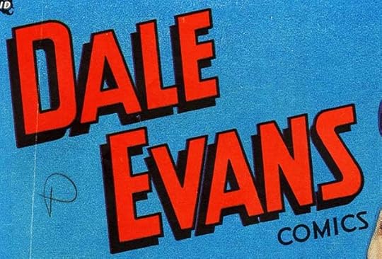 From DALE EVANS COMICS #1, Sept-Oct 1948
DC launched a second western title soon after their first one, and this time they had a movie star in the lead, though one that was perhaps not as popular as her husband Roy Rogers, who had a comics line from another publisher. Dale’s title lasted a few years and had this simple but effective block letter logo from Ira on all of them, though often not stacked so vertically as on the first issue.
 From DALE EVANS COMICS #1, Sept-Oct 1948
In addition to several stories in each issue featuring Dale, this backup series appeared in some issues with a feature logo by Schnapp. It’s not particularly appropriate to the genre, but does the job.
 From WESTERN COMICS #5, Sept-Oct 1948
Over in WESTERN COMICS, this new feature began with a nice logo by Ira, one using his familiar upper and lower case THE. It has movement and style, and I like it.
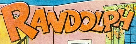 From A DATE WITH JUDY #7, Oct-Nov 1948
Judy’s brother Randolph began getting solo stories in issue #7 with this logo by Schnapp.
 From FUNNY FOLKS #16, Oct-Nov 1948
FUNNY FOLKS was another funny animal title that had begun at National’s sister company All-American Comics in 1946 right before the two merged, and the cover and features in it had little early work by Ira, but I think he did design the logo for this new feature that began in issue #16. It combines a humorous bounce with serif letters that sell the pun well.
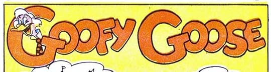 From ANIMAL ANTICS #17, Nov-Dec 1948
Goofy Goose got a new logo by Schnapp in ANIMAL ANTICS #17 that includes character art by Rube Grossman, one of DC’s funny animal stalwarts.
 From ALL-AMERICAN WESTERN #103, Nov 1948
Toward the end of 1948, DC added another western title by converting ALL-AMERICAN COMICS to ALL-AMERICAN WESTERN with issue #103 dated November 1948 featuring a new logo by Schnapp. The word WESTERN is the important one, and Ira makes it stand out with a double outline. The top banner is not well matched or evenly filled, making me at first wonder if this logo was actually by Ira, but I think it is. The star at the left end of the banner helps some, but that vanished after this issue. Not one of Ira’s best, but certainly readable from a distance.
 Four feature logos from ALL-AMERICAN WESTERN #103, Nov 1948
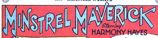
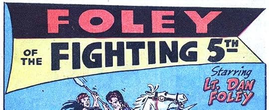
Four new features filled the pages of the issue, all with logos by Schnapp. By this time Ira was hitting his stride as a feature logo designer, and these are full of great details. I like the musical note theme of Minstrel Maverick, though the notes are oddly shaped, and the black and yellow banner for Foley.
 From ACTION COMICS #127, Dec 1948
A new science fiction series began in ACTION COMICS #127 with a feature logo by Schnapp. The character had been around for a few years, but not had a logo before. The strokes that extend beyond the corners is an interesting idea, though the overall look is more retro than futuristic. Ira would do a better one later.
 From STAR SPANGLED COMICS #87, Dec 1948
Finally we have this feature logo from a character that few remember. Merry Pemberton was the sister of the original Star-Spangled Kid. She began appearing in his stories as this heroine, and eventually took his feature for herself for a while before the run ended. MERRY is very Art Deco, and I love the long tail on the Y. The banner is nicely done, too.
That’s 21 logos by Ira Schnapp in this year, almost as many as the two previous years. Plenty more to come. Other articles in this series and more you might enjoy are on the LOGO LINKS page of my blog.
The post IRA SCHNAPP’S COMICS LOGOS: 1948 appeared first on Todd's Blog.
June 2, 2021
IRA SCHNAPP’S COMICS LOGOS: 1946-1947
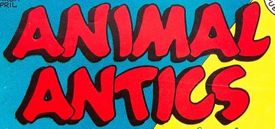 All images © DC Comics. From ANIMAL ANTICS #1, March 1946
In 1945, National (DC) Comics began a new funny animal title after having had success with converting LEADING COMICS to one a few months earlier. It saw print with a March, 1946 cover date, though the work on the first issue had been done in 1945, but throughout this series we will take the cover dates as a dividing point between posts. As with LEADING, Ira Schnapp once again did the lettering and logos for most of the stories in the first few issues, and many after that. He also designed the cover logo, above, using rounded, bouncy letters that he was employing for humor logos at the time. The drop shadow helps pop it off the cover, and it reads well. By this time Ira was doing plenty of work for the company, lettering both the Superman and Batman newspaper strips, lettering covers and stories in many titles, and creating house ads, but humor stories were relatively light on text, and perhaps easier and more fun than superhero ones, and I think he probably enjoyed them.
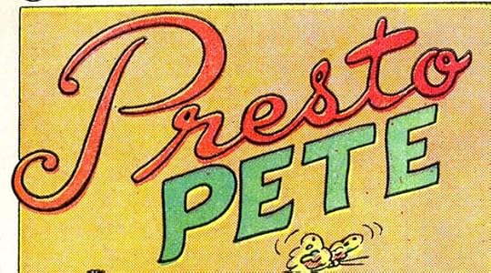 From ANIMAL ANTICS #1, March 1946
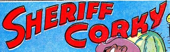
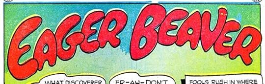
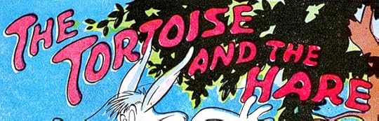
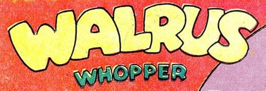
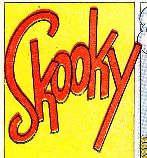
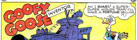
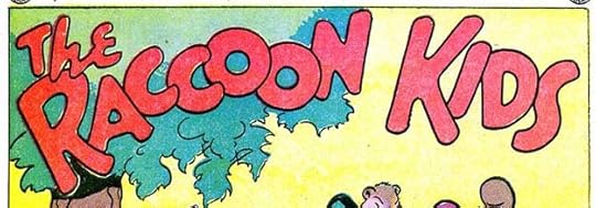 Eight feature logos from ANIMAL ANTICS #1, March 1946
Though all these logos have a loose, humorous approach, look at the variety in them. From the fancy script of Presto to the bulk of Walrus there’s a lot to appreciate. Skooky is so tall because it filled the first square panel. Presto Pete was the cover feature in ANIMAL ANTICS at first, but was soon pushed out by The Raccoon Kids, and their logo was the longest-lasting of these, with a revised version eventually appearing on their own series.
 From REAL FACT COMICS #1, March 1946
Another new title began in the same month with a very different approach. It was DC’s first and only attempt at a non-fiction comic, the idea being to do biographies and stories of real events in comics form. Readers did not flock to it, and while it lasted a while, I don’t think it was ever very popular. Ira Schnapp designed two-thirds of the logo, with COMICS pulled from one of several older logos by others. I don’t think it’s one of Ira’s better efforts. The horizontal strokes are not consistent, with the one on the A very thin, the ones on the F and T thicker, and the C having no variation at all. REAL also looks like an afterthought. The emphasis is on FACT, though some of the stories inside had few of them.
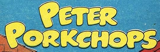
 Five feature logos from LEADING COMICS #23, Feb 1947
With the February, 1947 issue, LEADING COMICS jettisoned some of their features and replaced them with five new ones, again all with logos by Ira Schnapp. This batch seems more assured to me, and familiar style elements are creeping in such as the thin middle stroke of the E’s in PETER and DOODLES, and the open script of LIKE A. The handsome script tagline under DOODLES DUCK is charming, and that feature was the best-looking of the new group with great art by Howard Post. Peter Porkchops took over the cover, making it the lead feature, and he proved popular and long-lasting. His logo with some revisions later appeared on his own long-running series. Doodles Duck was also popular, and later had many stories created by Sheldon Mayer.
 From STAR SPANGLED COMICS #65, Feb 1947
Robin received a solo feature for the first time in STAR SPANGLED COMICS #65, and a new feature logo by Schnapp. ROBIN is based on the one in this older logo by Jerry Robinson that began appearing in the summer of 1941:
 From BATMAN #7, Oct-Nov 1941
Ira’s version copies some of the letter shapes, but his right leg of the R looks better to me, and the serifs are wider and more effective, even with one missing from the upper left corner of the N. Ira’s tagline THE BOY WONDER is in a style he was using at the time with squared-off strokes that leave small notches in some places. The bat shape is not as good as Robinson’s but gets the idea across. Ira’s feature logo for Robin was used for many years.
 From MORE FUN COMICS #121, April 1947
I think this logo is one of Ira’s best from the 1940s. It’s from a new fantasy feature launched in MORE FUN COMICS #121 with wonderful Walt Kelly-inspired art by Howard Post, who might have had some input on the design. The detail and decorative elements are great, and the letter shapes are full of interest and whimsy. The tagline is in a nice scroll and lettered in a storybook style that works well. Too bad this feature was not popular enough to last long.
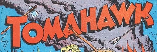 From STAR SPANGLED COMICS #69, June 1947
With this feature, DC first dipped its toe in the Western genre, though the character was really a frontier fighter from an earlier era. I believe Ira Schnapp designed the logo, including the tomahawk behind the T based on the style, which is similar to other logos he was doing at the time, though he did not letter the first three stories. By this time I think Schnapp had become the person at DC usually asked to create new logos. This one is not particularly appropriate for the genre or time period, but the tomahawk helps make it memorable.
 From ANIMAL ANTICS #8, May-June 1947
A new feature was added to ANIMAL ANTICS #8, a mostly silent strip with a Schnapp logo filling the first panel.
 From ANIMAL ANTICS #9, July-Aug 1947
Presto Pete got a new feature logo in ANIMAL ANTICS #9 that I think is very appealing, and more appropriate for a magic bunny. The treatment is somewhat similar to what Ira did on Jimminy, though the very rounded letter shapes are not. The top-heavy appearance of most letters (except the S and O) also give it an Art Deco feel. Designing this Pete in almost the same style as Pete the Pup seems like a bad idea to me, though, and could have confused readers.
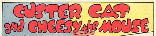 From ANIMAL ANTICS #10, Sept-Oct 1947
Another new feature began in the next issue with a very long title that Ira makes work well. This one is somewhat similar to the last two, but different enough to stand apart from them.
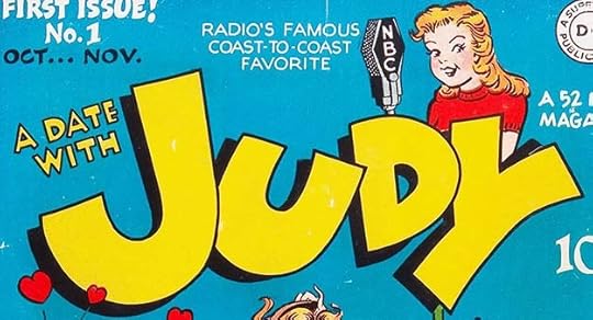 From A DATE WITH JUDY #1, Oct-Nov 1947
With this new title, DC entered the teen humor market that was proving so successful for Archie Comics. DC based theirs on a popular radio show, and it had a long run, but probably did not sell as well as Archie titles (my guess). Since radio shows didn’t usually have or need logos, Ira was on his own, but I think he came up with an appealing logo that’s made more memorable by the character art of Graham Place, though Perhaps Ira added the NBC microphone.
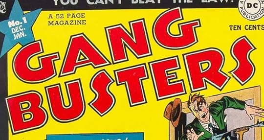 From GANG BUSTERS #1, Dec 1947-Jan 1948
With the appeal of super-heroes falling, DC was looking to branch out into as many new genres as possible, and this was their first entry into crime comics that didn’t involve a superhero. Again, it was based on a popular radio show, and the series did well. The logo by Schnapp shares some style points with his REAL FACT one, but I think this is a better effort. The feel is again Art Deco, which seems appropriate for a genre that first became popular during Prohibition years in pulps and movies when Art Deco was the latest thing.
That’s 23 logos by Ira Schnapp in books with 1947-48 cover dates. His logo work was on the rise. More articles in this series and others you might enjoy are on the LOGO LINKS page of my blog.
The post IRA SCHNAPP’S COMICS LOGOS: 1946-1947 appeared first on Todd's Blog.
May 31, 2021
IRA SCHNAPP’S COMICS LOGOS: 1940-1945
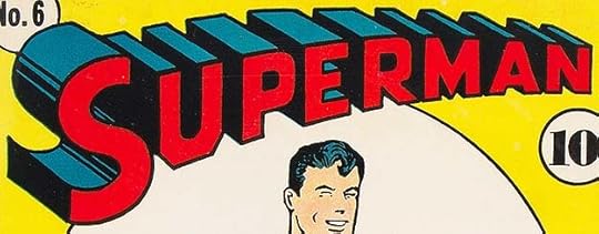 All images © DC Comics. From SUPERMAN #6, Sept-Oct 1940
Here begins a new series of posts focused on Ira Schnapp’s logo work mostly for DC Comics. I will cover what I’ve found chronologically, with links to other relevant articles on my blog. I can’t be sure I haven’t missed some, of course, nor can I be sure all the ones I’ve called his actually are, but I’m giving it my best shot, and if new information turns up, I will add it. Dates are cover dates where that applies, but keep in mind that those were at least two months later than the actual release date, and the work was probably done at least a month before that, so the Superman logo above was probably created around June of 1940.
Ira did all kinds of lettering work for DC, so what exactly qualifies as a logo? Well, if it’s the title of a comic on the front cover, that’s an easy call. Interior series or character logos can be trickier. My feeling is it must be large and memorable, more than just “larger than usual” standard lettering, and it must be intended for use on multiple stories, even if it ends up being on only one. So, intent is part of the equation, and that’s sometimes a judgement call that you might or might not agree with. Logos are usually created at the beginning of something, when hopes are high that it will be popular and often repeated. Logos are meant to be appealing and recognizable, a trigger that will bring readers back to a property they like, and make it easy to identify. DC has not always followed this plan. The character and feature Space Cabbie first appeared in MYSTERY IN SPACE #21, Aug 1954, and was in many later issues, but he never had a feature logo, for instance.
I’m starting at the beginning of Ira Schnapp’s logo work at DC with his revamp of Joe Shuster’s Superman logo, above. Ira told a young Michael Uslan it was his first logo for DC, and I have no reason to doubt that. More about this logo is HERE. At the time, Ira was a busy freelancer probably designing logos for the pulp magazines owned by Harry Donenfeld and Jack Liebowitz as I describe in a series of articles beginning HERE. He was also doing other kinds of freelance work such as showcard lettering on signs for movie theaters in Manhattan, as he told artist Murphy Anderson. Gradually he picked up more and more comics work from National (DC) Comics through the early 1940s, until by 1945 he was probably working almost exclusively for them. It’s hard to imagine he had time for much else! I have little hard evidence about who designed any of the early DC logos, but my ideas are in THIS article and more beginning HERE. Mostly I’m going by style, but a lot of guesswork is involved. Certainly his Superman revamp was excellent work that DC was very happy with, so it seems likely they would have offered him more. Below are my guesses about that for these years.
 Stationery header from an image found online, circa late 1940
It seems likely any variations of Ira’s Superman logo would have been done by him, and this is the earliest one I’ve seen, created for the company DC set up to handle Superman licensed products. The address is the same as the DC offices at the time, and this logo must have been created a month or three after Ira’s Superman revamp. Not a comics logo, but I think it counts in this case.
 From WORLD’S BEST COMICS #1, Spring 1941
Of the other early 1940s cover logos, this one looks the most like Ira Schnapp’s work to me. The open block letters are well-crafted, and in styles he used elsewhere. The S in BEST is particularly familiar from Ira’s later logo for WORLD’S FINEST and other logos. Whoever else was doing logos for DC at the time tended to reuse an existing version of COMICS, but this one is new and in the same style as the rest. Unfortunately, it appeared only on this one issue.
 From WORLD’S FINEST COMICS #2, Summer 1941
The next issue changed BEST to FINEST, but the entire logo is different. Perhaps someone thought the earlier one’s letters were too thin, for one thing. I don’t think Ira would have done it this way, some of letters are very off-model and poorly designed, especially the S in COMICS, but the R and D in WORLD’S are not much better. I think someone just thickened the outlines on the existing letters by adding ink to the inside, which meant some lousy inner shapes were created. Look at how the point between the legs of the R comes up too high, for instance. Unfortunately, this logo was used for years until Ira redid it for issue #96 in 1958. At least it was easy to read.
 From SUPERWOMAN ashcan, Jan 1942
This is the first of several more variations Ira created from his Superman logo for trademark registration. There was never a Superwoman comic, this is the only place it was used as far as I know. With that date, it would have been created in 1941, and that’s what the copyright also says. Michael Uslan commented on another of these:
The following is the legal reason why they may have designed that Superbaby logo but, upon receiving better legal advice, never did anything further with it:
“Since trademarks are issued to preserve distinctiveness, anything diluting the meaning of a mark can be grounds for cancellation.”
So it is therefore possible that a lawyer suggested to them that if they keep making logo variations of Superman with such things as Superboy, Superwoman, or Superbaby, that will ultimately cost them their exclusive trademark on Superman.
This makes sense, and it might be why this logo was never used, though I think it might have prevented other companies from producing a Superwoman comic.
 From SUPERMAN-TIM comic/brochure found online, circa 1942
Ira created this logo for a series of comic-like booklets that were a combination of comic story, clothing catalog and activity book for products sold by the Superman-Tim Store in these booklets, licensed by Tim Promotions, Inc. That company predates this combined effort. The booklets seem to be monthly, and Superman first appears in the one for Aug 1942, but the logo is not used until the following issue. Again, not typical comics, but pretty close, and I think the booklets were produced and printed through DC. Since the Superman part of the logo is unchanged, there would be less of a legal issue here.
 Created for trademark application, dated 1944
 Created for trademark application, undated but probaby circa 1944
Two more Superman variations by Schnapp, and in the Superbaby one, which is a scan of the original logo, you can see how they were made. A photostat (photographic copy) of the Superman logo was made, Ira trimmed off the part to be changed and pasted it onto a piece of art paper, then drew and inked the new section. Supergirl was used on her solo stories when they began appearing in SUPERMAN in 1958, then in ACTION COMICS in 1959, but never on the cover, perhaps because of the legal issue covered above. Superbaby was never used even though there were solo stories for the character around the same time. Note that on Supergirl the G has the angled corners of the U while the second R matches the first one. And on Superbaby, each B is rounded rather than matching the P and R. I find these mismatches hardly noticeable since the overall logo design is so strong.
 From WORLD’S FINEST COMICS #15, Fall 1944
This logo was created for a short-lived feature in WORLD’S FINEST that Ira lettered many of, and it looks like his work to me. It’s actually more like some of his funny animal feature logos, with rounded letters, and not particularly appropriate for the character, but Ira was still new at this, so I can give him a pass there. I find it appealing.
 From MORE FUN COMICS #100, Nov-Dec 1944
The next logo I suspect might be by Schnapp is this one. Aquaman was created in 1941 by writer Mort Weisinger and artist Paul Norris, and first appeared in MORE FUN COMICS #73. He had many logo variations on his stories, probably by artists Paul Norris and later Louis Cazanueve, and/or the letterer for any particular story. At the time, feature logos were not always prepared and reused, some artists redid the logo as if it were a story title on every issue, or at least did many different versions, and that happened with Aquaman. See THIS post for more on that.
 From MORE FUN COMICS #97, May-June 1944
This was the version that appeared in issue #97. As you can see, it’s pretty close to the one above, but uneven and kind of bottom-heavy. I think Ira was asked to created a revised and more professional version that could become the regular series logo, and if so, he did a fine job. He retained the most interesting parts of the previous one: the bubble-like openings in the A’s and Q and the fish-tail look of the Q’s extension, made it more even, and gave it a better drop shadow. This logo was used on all Aquaman stories going forward, and even on the covers of Aquaman’s appearances in SHOWCASE in the 1960s. Ira created a new Aquaman logo when his own title was launched, but it seems to me more likely that he did this one if it was deemed okay to use for SHOWCASE.
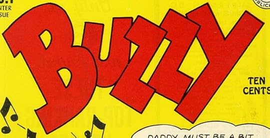 From BUZZY #1, Winter 1944
I’m not sure if Schnapp designed this logo, it could be by the cover and interior artist George Storm, but it’s not really much like Storm’s other lettering on the cover and stories, so I’m calling it for Ira. Certainly the letters are well designed and something I could see Ira doing, perhaps with input from Storm.
 From MORE FUN COMICS #101, Jan-Feb 1945
The next issue of MORE FUN after Aquaman’s revised logo saw the beginning of a new feature starring Superboy, and it had another logo by Schnapp based on his Superman one. This logo appeared only on a few covers as part of the caption, small, and when he gained his own series in 1949, it had a completely new logo by Schnapp. Here the B and O have angled corners like the U, though the P and R keep the original rounded ones. This logo might have been produced earlier in the 1940s like the other variations above.
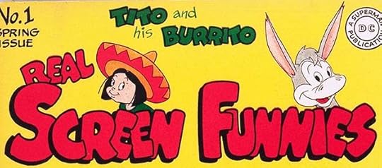 From REAL SCREEN FUNNIES, Spring 1945
 From REAL SCREEN COMICS #2, Summer 1945
Another example of a change of plans after the first issue was out the door, DC decided to change FUNNIES into COMICS for this funny animal/funny people series. The logos are cartoony, but that seems appropriate, and I see Ira’s style coming through in the small center arms of each E among other places. Ira used looser, bouncier styles for humor titles, especially in the 1940s.
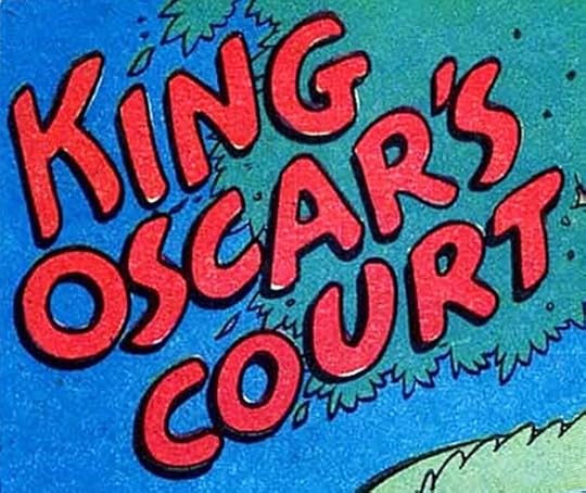
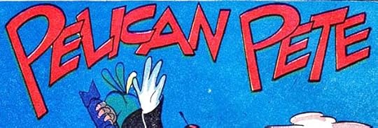
 From LEADING COMICS #15, Summer 1945
With issue #15, DC changed their superhero title LEADING COMICS to a funny animal one, and Ira Schnapp lettered and designed logos for nearly all the stories in the next group of issues. This is a fine example of Ira’s versatility. All these logos say “humor” except perhaps Nero Fox, but each is different from the others. I particularly like the open looseness of Pelican Pete and the tagline on the kangaroo character Juniper, “Down-Under Wonder.” The book continued to use the existing logo on the cover, which was not by Schnapp.
 From LEADING COMICS #17, Winter 1945
One more logo makes it into 1945, another feature logo from LEADING. I don’t like this one as much as some of the others, but it does the job. In all I count 21 logos by Ira Schnapp in these years. Many more to come.
Other articles you might enjoy are on the LOGO LINKS and COMICS CREATION pages of my blog.
The post IRA SCHNAPP’S COMICS LOGOS: 1940-1945 appeared first on Todd's Blog.
Todd Klein's Blog

- Todd Klein's profile
- 28 followers

