Todd Klein's Blog, page 90
May 30, 2021
Rereading: HAVE SPACE SUIT—WILL TRAVEL by Robert A. Heinlein
 Cover illustration by Ed Emshwiller
This is the last of Heinlein’s “juveniles” or novels for young readers, and my favorite.
High school student Kip Russell is not quite sure what he wants to do with his life, but getting into space must be a part of it. Civilian space travel is available to the very rich, but way beyond the reach of Kip and his family. His father suggests he enter a contest offered by a soap company with a trip into space as the first prize for the best slogan for their soap, and Kip goes after it with enthusiasm, finding ways to sell soap to everyone in town and get the wrappers to send in with slogans, hundreds of them. He does not win the trip, but gets a lesser prize, a decomissioned but real space suit. Before he goes off to college, Kip makes it his summer project to get the suit into working order, using his machine shop skills to restore the suit and stocking it with missing items like air bottles and a radio from his summer job earnings. With the suit complete, he takes it for a practice run outside his home, calling on the radio to an imaginary ship. To his surprise and shock, he’s answered by the voice of a girl, and presently two unidentified flying objects, alien space ships, land in the field near him. A girl jumps out with some kind of small companion, but before Kip can get to them, all three are captured and knocked senseless by some kind of paralysis beam.
Kip wakes up in a cell with the girl, Peewee, who is much younger than he expected, and learns they’re prisoners of alien invaders in their hidden base on the moon. Kip and Peewee plan a daring escape, and with them will go a different friendly alien Peewee calls The Mother Thing. She is a kind of space cop, but also a prisoner. There are many problems to overcome in their escape, the worst being having enough breathable air to get them to a government base many miles away, but the three prisoners get free and begin their deadly march across the airless, mountainous moon terrain, not knowing if they will die in the attempt.
Heinlein got everything right in this one. He knew a lot about actual pressure suits, having worked on them for the government, and Kip’s restoration of the suit is completely believable and draws you right into the story. The characters are appealing without being preachy, and the plot is full of surprises that moves the narrative from the Moon, to Pluto, to a distant planet far from Earth. Our planet is eventually threatened with complete destruction and put on trial with only Kip and Peewee to defend it. Great story, never a dull moment, memorable characters, and full of fine ideas. Highly recommended.
The post Rereading: HAVE SPACE SUIT—WILL TRAVEL by Robert A. Heinlein appeared first on Todd's Blog.
May 28, 2021
Ira Schnapp’s DC Ads: 1949
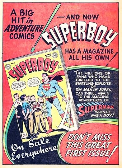 All images © DC Comics. From ACTION COMICS #130, March 1949
The big news in early 1949 issues was the debut of Superboy’s own title. It had a great new logo by Ira Schnapp, and this ad by him is full of fine lettering and enthusiasm. Ira had been associated with Superman since 1940 when he revamped Joe Shuster’s Superman logo. He’d begun lettering the Superman newspaper strip in 1943, and became a regular on Superman stories in the comics soon after. When Superboy began appearing in 1945 in MORE FUN COMICS, Ira was there as letterer for many of them, and he also lettered many stories in this new title. Ira’s ad lettering was often meeting new high points of style and lettering skill, as seen here. I particularly like the giant exclamation points.
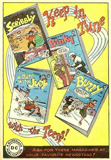 From SENSATION COMICS #87, March 1949
DC finally agreed that Scribbly was part of their teen humor line in this ad by Ira. The music they liked was probably from big bands at this point.
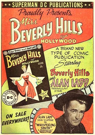 From ALL-STAR COMICS #46, April 1949
DC hoped to attract Hollywood fans with this new series, and the first issue also features Alan Ladd, who they already had a deal with to star in his own DC comic. The ad by Schnapp is full of handsome lettering and fine design, and Ira’s logo for the book is also classy.
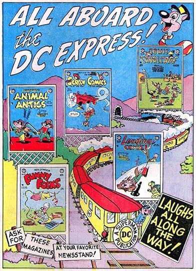 From FUNNY STUFF #45, May 1949
With Comic Cavalcade there were now six DC funny animal titles, these five and the one the ad ran in. The art looks too elaborate for Ira, so is probably by one of the funny animal artists.
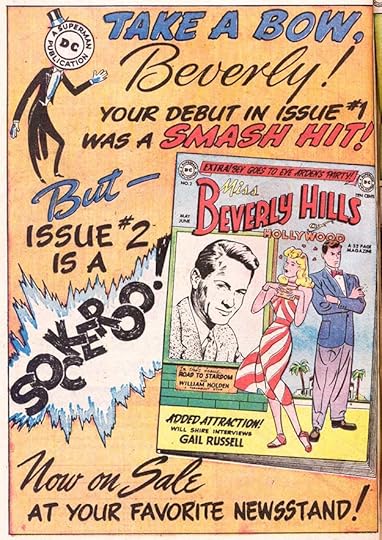 From WORLD’S FINEST COMICS #40, May 1949
I’m not sure about this ad, but I think it’s by Ira. Some of the styles, especially SOCKEROO, seem wrong for him, but no one else at DC was doing such elegant script, so I will call it his. The series did not last long, but DC would soon have other Hollywood titles.
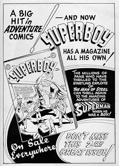 From ADVENTURE COMICS #141, June 1949
This ad for the second issue of SUPERBOY is nearly the same as the first one seen above with just a small revision in the final blurb and a different cover image. I won’t count it as a new ad.
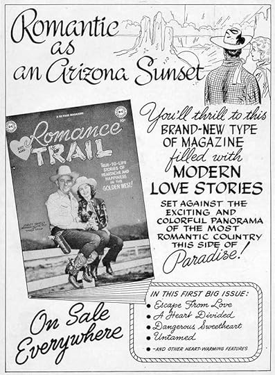 From WONDER WOMAN #36, July 1949
Editor Julius Schwartz decided to combine the western and romance genres (DC was just starting to get into the latter) for this title. The ad has lots of great Schnapp lettering, and he also did the logo. The book was not a success, though, and only lasted five issues.
 From ACTION COMICS #135, Aug 1949
Editor Jack Schiff had long been a champion of public service comics and ads, and finally in 1949 he was able to launch a regular series of them beginning with this one. Ira Schnapp did not letter all of them, but he did most including this one. Almost all are like a single page comics story in format, and lettered that way, generally with an attractive title at the top and a bottom blurb stating: “Published as a public service in cooperation with the Advertising Council. This page appears in more than 10,000,000 magazines of the National Comics Group [Superman-DC Publications]”. The Ad Council’s involvement did not last too long, but Schiff kept the series going almost monthly until his retirement in 1967. It’s a fine achievement, and one of DC’s most admirable accomplishments. That claim about DC’s total circulation for all their comics seems startling and impossible today, but at the time it could well have been true.
 From LEAVE IT TO BINKY #10, Aug 1949
This ad for the third issue of the series has an unusual style in the top two lines that I don’t think Ira ever used anywhere else in comics. I’m not sure what it’s meant to be, perhaps tickertape?
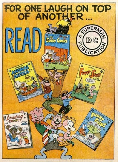 From COMICS CAVALCADE #34, Aug 1949
Humor ads, like humor stories, were able to rely on amusing characters and art to appeal to readers without a lot of explanatory text. Much easier for Schnapp.
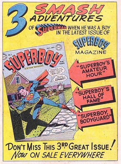 From DETECTIVE COMICS #150, Aug 1949
Superboy continued to get a good ad promotion with this third issue one by Ira. I think this was the last for the book for quite a few years.
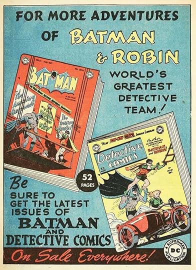 From STAR SPANGLED COMICS #96, Sept 1949
Like Superman, DC’s Batman and Robin did not get much ad promotion in the late 1940s. The lettering on this ad is mostly by Ira, but there’s some headline type at the top and in the center circle.
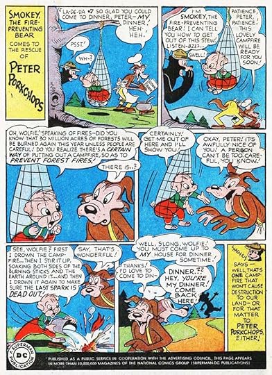 From DETECTIVE COMICS #151, Sept 1949
The second public service ad features some of DC’s funny animals. Ad coverage varied a lot, with some ads appearing only in a few titles, but the PSAs usually appeared in nearly every DC comic. Lettering by Schnapp, though already in most of them, was now appearing in every issue through these ads.
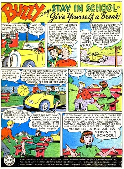 From ACTION COMICS #137, Oct 1949
The third PSA features some of DC’s teen humor characters, and they would appear often, perhaps because they could address problems kids had that superheroes and funny animals couldn’t. Great title by Ira on this one.
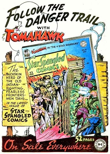 From ACTION COMICS #137, Oct 1949
I think all the art on this handsome ad is by Schnapp as well as the lettering. Like myself, he seemed most comfortable drawing backgrounds and inanimate objects rather than figures, and he did that well.
 From ACTION COMICS #138, Nov 1949
Here’s Alan Ladd’s own title in a spectacular ad from Ira that is crammed full of great lettering and brimming with energy. In fact, the picture of Ladd is the quietest part! If Ira could be said to have arrived at his full potential in house ad design, this is the moment.
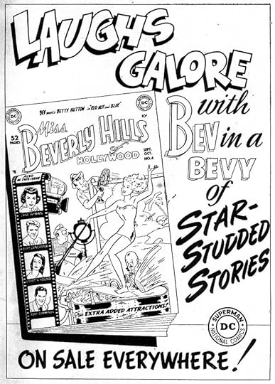 From A DATE WITH JUDY #13, Nov 1949
Ira’s looser and more bouncy work is still appropriate for some titles and subjects, and it’s fine here. It’s hard to tell if STAR-STUDDED STORIES is lettered with a brush or just imitating that with pen work, but I think it’s brush lettering, something Ira would have learned for his time as a showcard letterer.
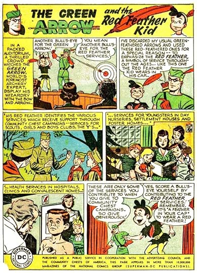 From ACTION COMICS #139, Dec 1949
The fourth public service ad, and the last in this year, features Green Arrow, and co-stars The Red Feather Kid, representing a charity idea I’ve never heard about anywhere other than here, though I did find one reference to it in a 1954 newspaper article.
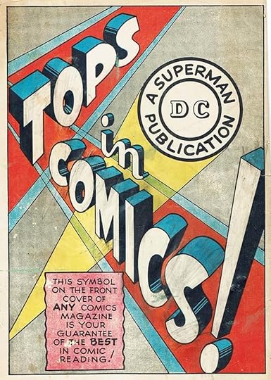 From SECRET HEARTS #2, Feb/March 1950, Simcoe Publishing of Canada
Finally, there’s this startling ad that was not published in any American comics, but instead in Canadian versions of DC issues from 1948 to 1950 by publishers National Comics of Canada and Simcoe Publishing. These were almost replica editions of U.S. versions with the addition of “Published in Canada” on the front cover and a different indicia on the inside front cover. This ad often ran on the back cover. The relationship between National of Canada/Simcoe and America’s National Comics (DC) is not known, but the ad certainly seems to be the work of Ira Schnapp. The huge three-dimensional tagline is in the style of his Superman logo but with more Art Deco letterforms, and the caption is typical of his work. The abstract background is unusual, but well crafted in a showcard style I think Schnapp might have used. The story here may never be known, but I’m going to count this ad for Ira. Note that the DC bullet symbol is the earlier version before Ira revamped it some time in 1949, so confirming the date of the ad’s creation as before that. There may be other Schnapp house ads from this period that I’ve missed, but of the ones I’ve seen, all I can attribute to Ira are here.
To sum up, I count 15 house ads lettered by Schnapp and four public service ads for a total of 19. Less than the previous year, but the amount of ads did fluctuate some over time, perhaps dependent on how many paid ads could be sold. I’ll continue with Ira’s ad work in 1950.
Other posts in this series and more you might like are on the COMICS CREATION page of my blog.
The post Ira Schnapp’s DC Ads: 1949 appeared first on Todd's Blog.
May 26, 2021
Ira Schnapp’s DC Ads: 1948
 All images © DC Comics. From ACTION COMICS #116, Jan 1948
A second crime comic from DC followed closely after the first one, GANG BUSTERS. This was also based on a radio show, and unlike the other title, it had a continuing lead character who was known only as Mr. District Attorney. I wonder what DC co-owner Harry Donenfeld thought about these comics, as he reportedly had friends in the criminal world and had faced prosecution in the past for the sexual content and images in his pulp magazines. This ad shows Ira Schnapp beginning to reach his full potential as a house ad designer. The black areas add depth and contrast and the lightning bolt borders add energy. The blocks of lettering still show his early style with unfinished letters and more bounce than seems appropriate for the subject, but the top and bottom bands are excellent. I love the word EVERYWHERE with the Y extending below the border.
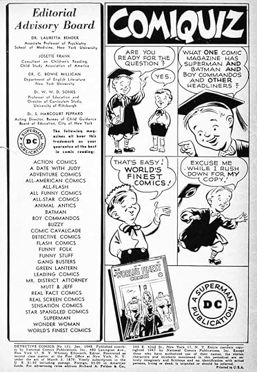 From DETECTIVE COMICS #131, Jan 1948
Replacing the alphabet ad series in this spot in January cover-dates was a four-panel gag story, unusual for a house ad. I don’t know who did the cartoon characters, I doubt it was Schnapp. The title is appealing and the word balloons include the characteristic small question marks Ira usually used in story lettering that are like a small 2 over a period.
 From ACTION COMICS #117, Feb 1948
With this title DC jumped onto the western trend that other publishers were having success with. The style of THRILL is a bit odd for a western, but I love the brush lettering at the top. The cloud (or explosion) adds energy, and the black area at the bottom adds contrast. As was usually the case by now, Ira Schnapp designed the logo, did the cover lettering, and lettered many of the stories. Ira had become the most prolific letterer at the company by this time.
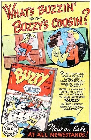 From A DATE WITH JUDY #3, Feb 1948
While he worked on nearly all DC titles, Ira seems to have enjoyed the humor books the most. At least that’s what I surmise from the fact that as he moved into the 1950s when there were too many titles and stories for him to do them all, he gravitated toward humor (and romance comics) and gave up some of the other work. In this ad Ira’s looser, bouncier style is completely appropriate and works well.
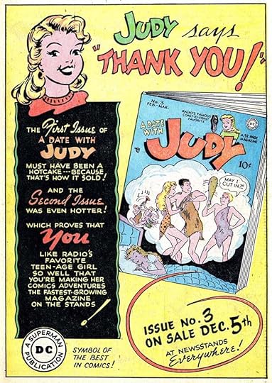 From STAR SPANGLED COMICS #77, Feb 1948
This is the first ad where DC tells readers how well a new title sold, and how happy they are about it. It’s a good promotional idea, as it might make readers more eager to see what the fuss is about. You can also see how far ahead cover dates were. The ad tells readers to look for JUDY #3 on December 5th, suggesting this issue could have been on sale in late November, but the cover date of the comic it’s in is February. Comics (and probably many other periodicals) were routinely dated ahead in an effort to get retailers to keep them on their stands longer. That’s why some retailers stamped an arrival date on the cover of each magazine so THEY knew how long it had been there.
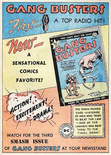 From WORLD’S FINEST COMICS #33, March 1948
Most of the lettering on this ad is repeated from the one that ran in late 1947 issues. The word FIRST is new, but that could have been picked up from another ad. The use of type in parts of this one suggest it was put together by someone in the DC production department. A less effective layout is another clue. Ira might have done a small amount of new work on it, but I’m not counting it as a new ad.
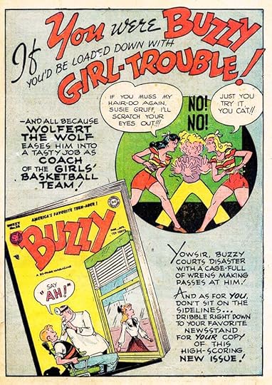 From A DATE WITH JUDY #4, April 1948
As DC comics became more divided into genres, we see more house ads used just within that genre. A DATE WITH JUDY and BUZZY always ran ads for each other. Sometimes those ads also appeared in other books, but not as widely as in the past. This ad is full of great Schnapp lettering that I find more appealing than the art.
 From STAR SPANGLED COMICS #79, April 1948
Of the two teen humor titles, JUDY got the most promotion. This is another well-designed ad for her fourth issue, a longer push than most new DC titles received. Perhaps it worked, as the book continued to be popular for years.
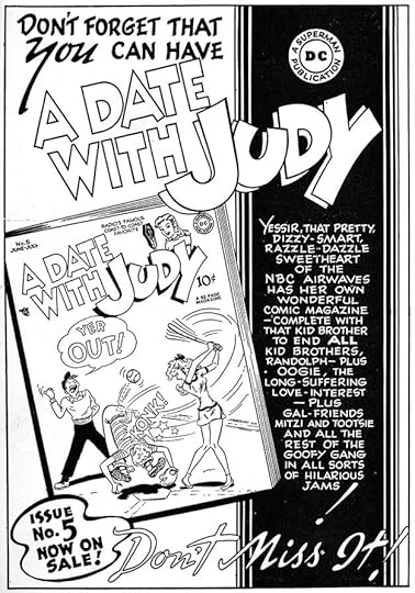 From WONDER WOMAN #29, May 1948
Four issues promoted was not enough? Okay, here’s a fifth! I don’t think any other DC title ever reached this point in house ads, at least not while Schnapp was doing them. Note that Ira’s logo has been modified to make A DATE WITH larger by now. The angled cover adds interest, as does the black area and the graceful shape at lower left. And Ira’s open script is now at its mature style, more graceful than the ad above.
 From ACTION COMICS #122, July 1948
DC proudly touts their crime comics with an emphasis on the lawmen rather than the criminals. They might not have been everything I would want in a magazine, but many bought them. While this genre was begun in titles by other publishers like CRIME DOESN’T PAY with the word CRIME much larger than the rest, DC’s motto was YOU CAN’T BEAT THE LAW, and their titles featured the lawmen.
 From ACTION COMICS #122, July 1948
DC had success with JUDY and BUZZY, and added a third teen humor title, LEAVE IT TO BINKY, as seen here. I doubt they ever sold as well as the Archie titles, but they certainly had their fans.
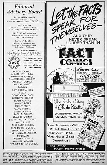 From DETECTIVE COMICS #137, July 1948
The non-fiction genre did not do as well for DC, and this attempt was their only one. I think it was a favorite of editor Jack Schiff, but readers were not convinced that reading about real people was as interesting as reading about superheroes, cowboys, gangsters, funny animals and funny people. Ira’s brush lettering at the top of this ad is well done, and his variety of styles on the rest is impressive. But perhaps the variety was part of the problem. No continuing characters to follow.
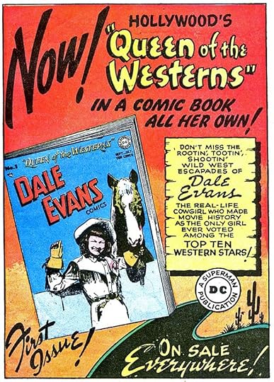 From ACTION COMICS #123, Aug 1948
With this new title, DC seemed to be trying to cover several genres at once. It featured Dale Evans, a Hollywood star (her husband Roy Rogers had comics from another publisher), it was supposedly the adventures of a real person as well, and it was clearly a western. Ira’s ad lettering is full of variety and artful design. At lower right is an early example of his background art that added depth and made the rest seem larger. If you were a fan of westerns, Hollywood stars and Dale herself, this would have been a must buy.
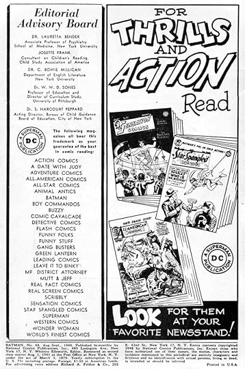 From BATMAN #48, Aug 1948
Some of Ira’s ads at this time were not as good as others. I find the lettering on this one, especially the open letters at the top, poorly done compared to many other ads from this year. Perhaps it was needed in a hurry. Two of the titles promoted are survivors from All-American Comics after the merge with National (DC). Few of them lasted longer than this decade without major genre revamps, and ALL-AMERICAN has already been converted to a western.
 From ACTION COMICS #124, Sept 1948
Oh yeah, DC also published Superman comics! You’d hardly know it from their house ads in the late 1940s. This one is a cross promotion with a new Superman movie serial starring Kirk Alyn as Superman and Noel Neill as Lois Lane, a role she would return to on the TV version. Interesting that THEATRE is spelled the British way. I’m not sure the bottom caption is by Ira, he might have done something else more specific, and this generic replacement was added by someone in the DC production department.
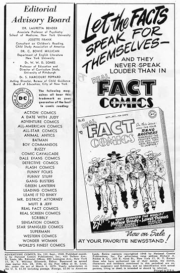 From ADVENTURE COMICS #132, Sept 1948
Most of this lettering is repeated from the one above, so I won’t count it as a new ad for Ira. Clearly DC was getting desperate with this title, here trying to interest western fans. Note that among the titles listed in the left column is Sheldon Mayer’s SCRIBBLY. Mayer did his own house ads for that, so I’m not covering them here, but they were funny and effective.
 From WONDER WOMAN #31, Sept 1948
Another Schnapp ad for the teen humor trio with just enough lettering to make the point. SCRIBBLY was kind of a teen humor comic too, but I guess DC didn’t see it that way.
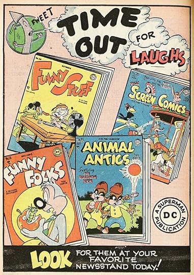 From LEADING COMICS #33, Oct 1948
Four of DC’s funny animal titles, another growing genre for the company. The fifth one was LEADING, where this ad appeared. Increasingly, they were advertised mostly in each other’s pages.
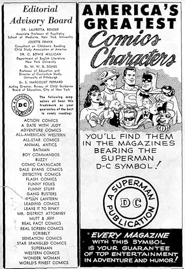 From ACTION COMICS #126, Nov 1948
Even though DC was still publishing comics featuring Wonder Woman, The Flash, Superman, Batman and Robin, and Green Lantern, interest in superheroes was waning, and DC did little to try to reverse that in their house ads. This weak effort is the only one for many of these characters in 1948. The script lettering at the top is also weak.
 From WORLD’S FINEST COMICS #37, Nov 1948
 From DETECTIVE COMICS #141, Nov 1948
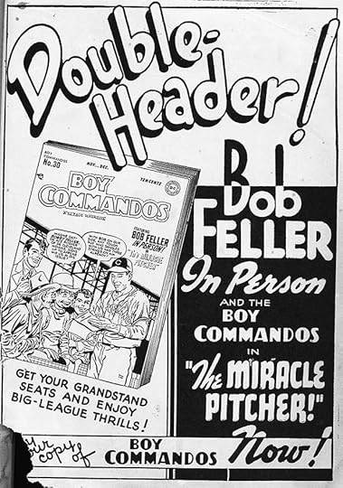
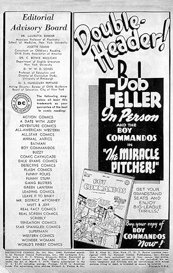
BOY COMMANDOS was another long running title that received little ad attention. Originally produced by Joe Simon and Jack Kirby and their studio, but by this time often by others hired by DC I think, the end of World War Two made the characters less relevant. An appearance by a popular baseball player gave DC a rare reason to promote the title. Most of Ira’s handsome lettering is the same in each version, so I will count this as one ad. I love the way some words cross out of the black areas in an almost op art way. Ira was not a sports fan, but his son Martin was, so that might have prompted him to make an extra effort.
 From ADVENTURE COMICS #135, Dec 1948
Continuing the trend of real people appearing in DC titles, Ralph Edwards was all over radio at the time, and is best remembered today for his game show “Truth or Consequences” and his biographical show “This is Your Life.” DC liked this kind of cross promotion, and were willing to pay for it. The ad lettering and layout here is not one of Schnapp’s better efforts.
 From FUNNY FOLKS #17, Dec 1948
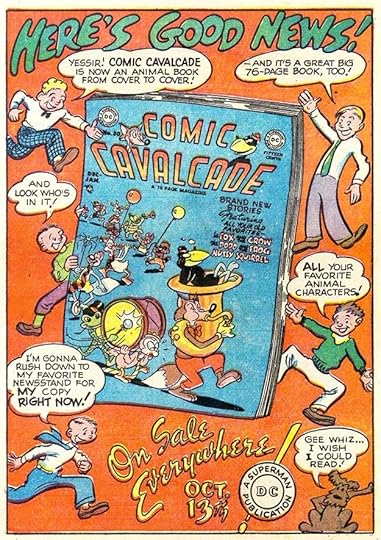
The final ad I have to show for 1948 is this frenetic one full of energy and those cartoon figures by an artist I can’t identify. It promotes the conversion of another former superhero title to one featuring funny animals, a genre that would continue to be popular through the 1950s.
To sum up, I count 20 house ads lettered by Schnapp, and there were others using only type or lettered by others. Still, Ira’s impact on the company’s look continued to grow as he lettered more and more covers and stories as well as quite a few ads.
The 1948 Superman serial on Wikipedia.
Bob Feller on Wikipedia.
Ralph Edwards on Wikipedia.
Other articles in this series and more you might like are on the COMICS CREATION page of my blog.
The post Ira Schnapp’s DC Ads: 1948 appeared first on Todd's Blog.
May 24, 2021
Ira Schnapp’s DC Ads: 1947
 All images © DC Comics. From ACTION COMICS #104, Jan 1947
The alphabet ad series will finish up this year, and there are quite a few other ads lettered by Ira Schnapp to look at. Opossum is back to the cartoony style of all these ads except Newfoundland. Ira liked to occasionally go very long with a few letter strokes and the PP in Opossum do that here.
 From ACTION COMICS #105, Feb 1947
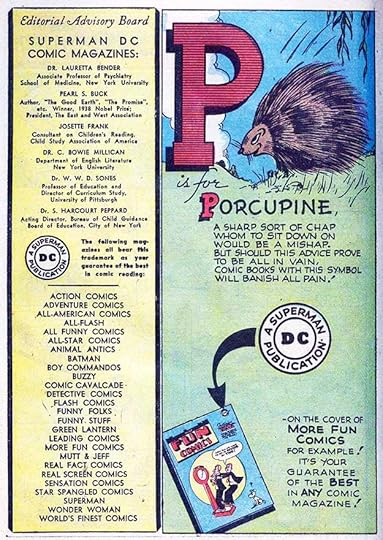
The cloud shapes behind the big letters in these last two alphabet ads are probably by Ira, he did similar ones in many of his later ads.
 From ADVENTURE COMICS #113, Feb 1947
 From ACTION COMICS #105, Feb 1947
Here are two versions of the same ad with some of the same lettering in each. DC was promoting series featuring Robin in STAR SPANGLED COMICS and Superboy in ADVENTURE COMICS, but there was no point promoting Superboy in ADVENTURE, so the top ad is just for Robin. The open script at the top shows Schnapp still working out his style for that, it’s not as well or as carefully done as he would do it later. In fact it’s a bit hard to read. Some of Ira’s other open lettering here is also looser than he would do it later, and most of these styles would become more regular in the future. Note that Schnapp designed both of the character logos, though they’re based on earlier work. Superboy just changes the end of Ira’s Superman logo, and Robin is based on the long-standing version seen in DETECTIVE COMICS and BATMAN as a small addition to Batman’s logo. There is some repetition here, but enough new lettering in each to call it two ads.
 From ACTION COMICS #106, March 1947
Most of this ad uses headline type, only the bottom blurb is lettered by Schnapp, but I wanted to include it because this blurb was used on many ads produced by others in the DC production department. I’m going to count all of them as one ad for Ira because of that small bit of lettering. Note that the company sometimes described itself as SUPERMAN D-C with a dash between the last two letters. That always looks wrong to me. The DC was said to stand for DETECTIVE COMICS, though Irwin Donenfeld once told someone his father Harry Donenfeld, co-owner of the company, said it really meant Donenfeld Comics. The headline type in this ad might have been created in the DC production department on a Headliner phototype machine that created lines of large type on a roll of photographic film. The operator would look through a shielded viewport into the red-lit innards of the machine and turn the wheel with the alphabet on it to each letter wanted, lining it up next to the previous one already in place, then hit a switch to make the photographic exposure. A slow process, and only useful for short amounts of text, but quicker and cheaper than sending out to a type house for it. The Headliner had a number of fonts available, but I think DC only bought a few, and this was one of them. This font probably had large and small versions on the same wheel.
 From ANIMAL ANTICS #7, March 1947
The rhymesters were really stretching things for this animal with a name beginning in Q. It’s an extinct subspecies of the Zebra.
 From ACTION COMICS #107, April 1947
DC seems to have had high hopes for this fantasy feature in MORE FUN, a delightful one by artist Howard Post lettered by Ira, and with this fine logo by him. The art is similar to what Walt Kelly did in ANIMAL COMICS from Dell which of course lead to Kelly’s Pogo, but DC readers did not support Jimminy, and it didn’t last long.
 From ADVENTURE COMICS #115, April 1947
This rabbit reading a comic book is even more funny animal than usual for these ads.
 From STAR SPANGLED COMICS #67, April 1947
There was no need to advertise Robin in STAR SPANGLED, so this half-page ad just promoted Superboy. All the lettering is repeated from the combined Robin-Superboy ad above, so it doesn’t count as a new ad for Ira, but I wanted to include it anyway.
 From ACTION COMICS #108, May 1947
Always on the lookout for a new genre, in 1947 DC introduced Tomahawk, a frontier fighter mainly against Indians in the early years of America. It was as close as they had come to a Western strip to this point. The character proved popular and gained his own long-running title in 1950 that lasted for 140 issues. This ad lettering by Schnapp is classy and exciting, even though the attempt to tie in Batman and Robin is a bit of a stretch.
 From ANIMAL ANTICS #8, May 1947
Extra points to the rhyme writer for using the word imprimature, though DC thought it needed an instant definition.
 From ACTION COMICS #109, June 1947
Another alphabet ad with art that reminds me of Dr. Seuss.
 From ACTION COMICS #110, July 1947
 From STAR SPANGLED COMICS #71, Aug 1947
Movie serials were a low-budget form of entertainment, but the chapter-a-week format kept viewers coming back for more just like comics. I don’t know how successful this one was, but DC was happy to promote it. The full page version has some different lettering than the two-thirds page one, but they are similar enough that I will just count this as one ad.
 From BUZZY #14, July 1947
The alphabet ad had to reach out to fantasy for this entry. Another option would have been Umbrellabird.
 From ACTION COMICS #112, Sept 1947
A nice full page ad for REAL FACT with appealing lettering from Schnapp and more cartoon figures. If I was a comics reader at the time, this would have stayed near the bottom of my potential purchase list.
 From ACTION COMICS #112, Sept 1947
The rhyme loses its way in this ad, but recovers with the clever match of chortle and portal. In the art, the animal is reading a cartoon version of the comic shown at the bottom.
 From ACTION COMICS #113, Oct 1947
Sometimes less is more when it comes to ad text. Ad writers at DC seldom remembered this, but the one above confirms it, and is quite effective.
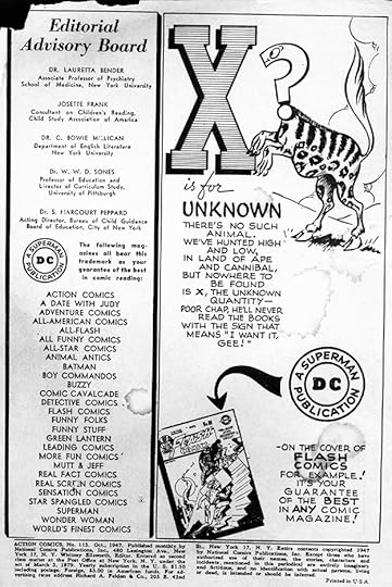
The rhymester threw in the towel on this one. There are a few birds and fish beginning with X, but obscure ones.
 From LEADING COMICS #27, Oct 1947
Similar to the Tops ad above, and equally simple and effective. Ira’s thin lettering is in danger of disappearing when reversed on black here due to ink gain in printing, something he learned to compensate for with heavier lettering where it would be reversed.
 From STAR SPANGLED COMICS #73, Oct 1947
Here’s that other title from the attempted new line of comics I wrote about in the 1946 post. Quite nice Schnapp lettering on it, and my first thought was, “Did DC publish The Gumps?” They didn’t, though it was a long-running and successful newspaper strip. My guess is the comic didn’t find the right audience, which was probably adults. You could say that this isn’t technically a DC ad, but really it is.
 From DETECTIVE COMICS #128, Oct 1947
BUZZY was the company’s first entry into the teen humor arena that was so successful for Archie Comics (originally MLJ). The original version and art were more along the lines of college humor magazines with very stylized cartooning and Art Deco influences. Later it became like Archie. Schnapp had fun with the W in WILL, the F in OF and the H in THE.
 From ACTION COMICS #114, Nov 1947
Another attempt to gain readers for Jimminy in MORE FUN. I don’t know why it didn’t succeed, the art is great and the stories seem appealing. Perhaps it was not a good fit for DC superhero fans, and not what humor readers were interested in, as it’s more fantasy than humor. The layout of this ad by Schnapp is excellent.
 From ACTION COMICS #114, Nov 1947
The penultimate alphabet ad has more realistic art like the Newfoundland one, so perhaps those two were by a different artist. I still see a lot of wasted space in the layout.
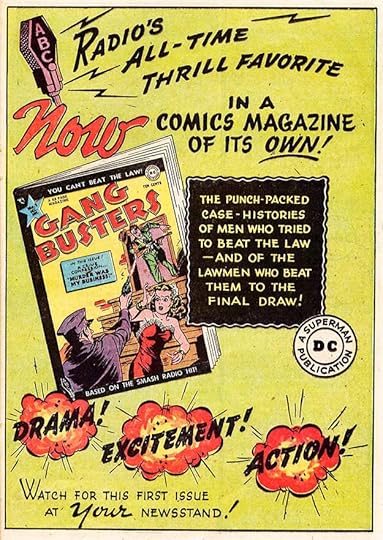 From ACTION COMICS #115, Dec 1947
This was DC’s first foray into crime comics, and quite mild for the genre, which specialized in gore, sex and murder stories. DC’s two crime books were based on popular radio shows, which helped them succeed for years. This ad has two firsts for Ira in his house ads: the first lightning bolts (coming from the microphone), and the first explosions, which are handled quite well. And of course he designed the logo.
 From ACTION COMICS #115, Dec 1947
DC launched another new title based on a radio show at the same time, this one in the teen humor genre. Ira’s fine lettering is full of bounce, energy and enthusiasm. Again, he designed the logo and lettered many of the stories. My favorite thing is the way the cent sign merges with the 0 of 10¢.
 From A DATE WITH JUDY #2, Dec 1947
And what better place to advertise BUZZY than in JUDY? This is the first ad by Schnapp to use all reversed lettering, and you can see that here he made it heavier so it would hold up well to ink gain when printed.
 From LEADING COMICS #28, Dec 1947
Humor comics got quite an ad push in December cover-dated DC titles. They now had five with funny animals, so that area was growing. I think all the lettering was drawn open with outlines and then the background was filled in with black rather than reversing it, which is more work. Perhaps they thought it would have a color in the background but it didn’t work, so someone blacked it in.
 From DETECTIVE COMICS #130, Dec 1947
The final ad of the year is also the end of the alphabetical series, now back to cartoony art. DC never again ran so many ads in a connected series. If you compare the lettering in the earliest ones to this one, you can see how Ira’s style evolved over that time, especially in the poem lettering.

This is an ad from a trade publication for distributors and newsdealers from 1947 lettered by Ira, courtesy of Robert Beerbohm. I don’t have any other information on it as of now, and there could well be more from other issues or other years. I hope to learn more about these in the future.
To sum up, I found 27 house ads by Ira Schnapp in 1947, as well as that one distributor ad for a total of 28, quite a jump from the previous year. And there were others which used only type or were lettered by someone else. We’ll see how Ira does in the following year. Other articles in this series and more you might enjoy are on the COMICS CREATION page of my blog.
The post Ira Schnapp’s DC Ads: 1947 appeared first on Todd's Blog.
May 23, 2021
And Then I Read: THE LAND OF LAUGHS by Jonathan Carroll
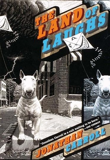
Thomas Abbey is a teacher of literature in a private school, but is not happy there, and feels the urge to write a great book. He’s the son of a famous actor, and that makes it hard to find friends who are not simply interested in his father. He has a private collecting and reading passion: the books of deceased chidrens’ book author Marshall France. In a bookstore one day he encounters another avid fan of Marshall, Saxony Gardner, and they spar over a rare Marshall book they both want to own and read, but after a while their common interest draws them together in a relationship. With Saxony’s encouragement, Thomas decides to research and write a biography of Marshall, whose life is largely a mystery itself. He visits Marshall’s editor and with some information gained there, decides he and Saxony will visit the small town of Galen, Missouri where Marshall lived and wrote his books, and where his daughter still lives.
Thomas and Saxony expect to find Galen and Marshall’s daughter Anna France difficult to know, but when they arrive they’re surprised to be welcomed with open arms by Anna and the entire town. Somehow, perhaps through Marshall’s editor, everyone knows Thomas is there to write the first France biography, and they seem enthusiastic about it. Thomas and Saxony are set up in an apartment and gradually learn more about the man they revere, his work, and the inspirations for it, people who live in and around Galen. Little by little the tone turns darker as strange things begin to happen to people in the town, and somehow they blame Thomas. He also begins a relationship with Anna that frays the one with Saxony. Things really start to come unravelled when one of the town’s dogs starts to talk to Thomas.
I loved this book until…it finally turned into a horror novel in the last quarter. Up until then I was able to completely empathize with Thomas and his obsession for childrens’ fantasy, something I share, and I ignored the dark clouds forming as long as possible. The final part of the story is well told, but I liked the rest better. The ending is clever and startling, and this book kept surprising and entertaining me throughout.
Recommended
The post And Then I Read: THE LAND OF LAUGHS by Jonathan Carroll appeared first on Todd's Blog.
May 21, 2021
Ira Schnapp’s DC Ads: 1946
 All images © DC Comics. From ACTION COMICS #92, Jan 1946
As you might expect, the series of alphabetical ads appeared throughout this year, each lettered by Ira Schnapp and each drawn by one of DC’s funny animal artists, perhaps Rube Grossman. The one area I would fault is the tiny size of the cover image, which could have been larger with a different layout.
 From ACTION COMICS #93, Feb 1946
The monthly titles listed in the left column of the page would have included all the alphabet ads, the bi-monthly ones half of them, and the quarterly comics just a few. It’s kind of surprising how many quarterly titles DC had at the time, but paper was probably still in short supply after the war.
 From ADVENTURE COMICS #102, Feb 1946
This third-page ad is the first of many Schnapp would create to promote two DC titles. Two cover images, two display words above them, the DC Bullet in the center with more lettering around it. Many were generic enough to be reused with other titles, though I’m not sure if this one was. Note that these are new titles, and DC was trying out a purportedly non-fiction comic in REAL FACT, though some of it was definitely not very factual.
 From ANIMAL ANTICS #1, March 1946
The inside front cover of ANIMAL ANTICS #1 used the ad space to show the features inside as well as to ask for mail. Not exactly an ad but this page has lots of great lettering by Schnapp. I believe Ira designed the logo, he lettered many of the stories, and designed some of the feature logos for them too. While Ira did plenty of superhero lettering, he seemed to enjoy humor comics even more, and his enthusiasm is evident in his work here.
 From ACTION COMICS #94, March 1946
The alphabet continues, but note the list of the company’s titles no longer breaks them down by frequency. This might have been to save space. The All-American titles are included and in this year the sister companies merged into one. By the end of 1946, all were being produced at 480 Lexington Avenue.
 From STAR SPANGLED COMICS #55, April 1946
There’s a slightly Dr. Seuss feel to some of these animals. It would be interesting to know how they were produced. Did the artist pencil everything including the block letter, then give it to Ira to ink all the lettering, then get it back to ink the animal art? Both the artist and Schnapp were probably frequent visitors to the DC offices, so that might have worked.
 From ACTION COMICS #97, June 1946
I also wonder who wrote the poems in these ads. My guess would be the artist, but who knows?
 From ACTION COMICS #98, July 1946
Some of the animals were unfamiliar ones needed to fill a spot in the alphabet.
 From WORLD’S FINEST COMICS #23, July 1946
This is two ads filling a full page, but they could have been used separately, so I will count it as two for Ira. The top ad promoting three DC humor books has better art than the cartoon figures we were seeing in previous years, so it’s probably by one of the artists from those books. The bottom ad is part of an unusual new project from a company called the Lafayette Street Corporation. The Grand Comics Database says: As told to Michael Feldman by Jack Adams (IND distribution manager, 1939-1953), this was an attempted new line initiated by the printer which printed DC (National)’s comics, The Bridgeport Herald, with primary partners Max Gaines, Paul Sampliner, Jack Liebowitz, and Harry Donenfeld. There were only two titles produced. This one, containing non-fiction stories like REAL FACT COMICS, lasted for ten issues, the other for only five. We’ll see that title in the 1947 post. While Ira’s lettering touts this title as “first of its kind,” it was somewhat like REAL FACT from DC and perhaps other titles from other publishers. My guess is most readers preferred fictional characters, though in a short time the true crime genre would become popular with stories supposedly drawn from real events and people.
 From ACTION COMICS #99, Aug 1946
Alphabet books for young children have always been popular, and DC is playing off that idea in these ads. I doubt any readers bought comics because of these ads, but it’s possible.
 From ACTION COMICS #100, Sept 1946
When the inside front cover was needed for a paid ad, this page was bumped to somewhere inside the issue, and then could be in color. I think I prefer them in black and white.
 From ACTION COMICS #100, Sept 1946
This two-thirds of a page ad features the return of the goofy cartoon characters from previous years, perhaps drawn by a DC production staffer who was an aspiring cartoonist, but I don’t know who that might be. REAL FACT had a pretty good run, but I doubt it ever sold as well as DC’s superhero comics.
 From STAR SPANGLED COMICS #61, Oct 1946
After World War Two, superhero comics went into a gradual decline, and DC began converting some of theirs to funny animals. LEADING COMICS was the first. It was helpful to artists who worked in that style, and probably hurtful to those who didn’t.
 From ACTION COMICS #102, Nov 1946
MORE FUN COMICS, one of the company’s oldest titles, also became a humor title by early 1946, though the change was more gradual. With such a small cover image, it’s hard to even see what’s on it.
 From ACTION COMICS #103, Dec 1946
Ira’s final ad in issues with 1946 cover-dates has more realistic animal art than the other alphabet ads. Either it’s by a different artist, or is just a change of style. Perhaps whoever did it had one of these dogs, and it’s a portrait. Just a guess.
In all I found 16 house ads by Ira Schnapp for 1946, about the same as 1945, but that would change in the following year. More articles in this series and others you might like are on the COMICS CREATION page of my blog.
The post Ira Schnapp’s DC Ads: 1946 appeared first on Todd's Blog.
May 19, 2021
Ira Schnapp’s DC Ads: 1945
 All images © DC Comics. From ACTION COMICS #80, Jan 1945
At first glance, this ad filling a third of a comics page looks like some poorly lettered ones I showed in my post on 1943-44 ads. The cartoon figure is the same, but the lettering is better. I think Ira was still finding his way here, some of the open lettering is uneven and not so good, but the list of characters and features is well done in a style Ira was using on covers at the time: block letters with some strokes not joining up, as in the B and R, and some extending past the join like in the H of HAWKMAN. The comic promoted is from the All-American Comics company, a sister publisher of National (DC). All-American generally did their own house ads and did not use Ira, so this is unusual in that way. My guess is that National thought this book worthy of a bigger push and gave the assignment to Schnapp for their own titles.
[image error]From ACTION COMICS #80, Jan 1945In the same issue Ira lettered the Superman balloon in this Supermen of America ad, one that promotes patriotism and war bonds.
[image error]Image courtesy of Hake’s AuctionsThis is one of the documents club members would have received. It predates Ira’s time at DC, and uses one of Joe Shuster’s Superman logos. Ira would do a revised version in 1961.
 From ACTION COMICS #82, March 1945
Here’s another full-page ad supporting the March of Dimes similar to one out in 1944. Some of the text is the same as the one I showed in my 1943-44 post, but I think this is all new lettering by Ira. LOOK, KIDS! is typical of Ira’s script display style at the time. They even had him hand letter the code message to make it match the rest. DC was not making money on this offer, and instead was spending money to print and mail those pictures of Superman, but it was all good publicity for the company, and for a good cause.
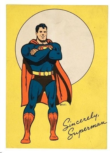
 Postcard images found on Scoop from Previews World, images courtesy of Art Cloos.
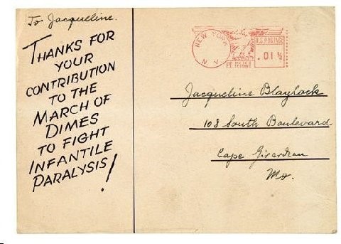
Above are the front and back of the postcard sent by DC to those who mailed in their dime. Ira did lettering for the back of it, and probably also did the signature on the front. I don’t know how much the cards cost to print, but the postage was just one cent. A fine idea, and a worthy contribution to the fight against polio by DC. At the time no one knew that President Roosevelt was himself suffering from the disease he had founded this charity to fight. Later, after polio was conquered by the Salk vaccine, the March of Dimes focused on infant mortality issues.
[image error]From MORE FUN COMICS #102, March 1945The same type of ad was done for Batman and Robin, with I think all new lettering by Ira.
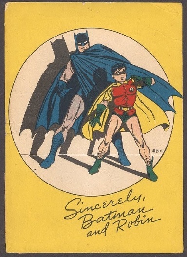
Schnapp almost certainly did the signature lettering on the Batman card, as it uses the alternate script E he liked, but the message on the back was typeset. There was a third postcard featuring Wonder Woman, but Ira did no lettering on it, and that would have come from All-American I think.
[image error]From ACTION COMICS #84, May 1945The same styles of display lettering by Schnapp that appeared in the ads above is found on this inside front cover ad promoting the DC brand. I don’t know if Ira did the art, but he might have.
 From ACTION COMICS #85, June 1945
Another ad in the same location by Ira, though I think he didn’t do the art on this one. It’s probably by one of the artists on the humor titles advertised. The large script lettering at the top looks like it was done with a brush, but it’s hard to be sure, it could be pen lettering in the style of brush lettering.
[image error]From SUPERMAN #35, July-Aug 1945Another of those large Superman balloons promoting good behavior. These are kind of the precursor of DC’s public service ad series that began in 1949, and perhaps also written by editor Jack Schiff, as those were.
 From DETECTIVE COMICS #101, July 1945
Here we have Ira Schnapp’s first full-page line ad. Compare it to the one in the 1943-44 post to see how much better the design and lettering is. The cloud or explosion caption in the center uses similar styles to previous ads by Ira, but the radiating lines from the center unify the design, and the placement of the covers on symmetrical angles adds structure and informality at the same time. The reversed bottom caption provides contrast, and the DC Bullet is mirrored to complete the symmetry. Ira is really cooking now on house ads!
[image error]From BATMAN #30, Aug 1945The Batman newspaper strip began in 1943, and Ira started lettering it in August 1944. It didn’t prove to be as popular as the Superman one, and this ad is a plea for help from Batman comics fans to ask for it in their local newspapers. I don’t know if that made a difference, but this version of the strip ended in the fall of 1946. Ira’s lettering in the body of the ad is similar to what he was doing in the strip. There are subtle differences from his Superman lettering, like the M in BATMAN with angled sides rather than his usual vertical ones. The address readers could write to was at DC Comics itself, so I assume DC would have compiled information and letters to send to newspapers.
 From ACTION COMICS #88, Sept 1945
I don’t know who did the cartoon people in these house ads, but this is one of his best efforts. Though it’s merely promotion, the ad is appealing, and Ira’s lettering helps to sell it.
[image error]From ACTION COMICS #88, Sept 1945Superman really was everywhere it seemed, including in a radio drama series that DC had a hand in. There were two versions of this ad with minor lettering differences and different art.
 From SUPERMAN #36, Sept 1945
The last of these balloon additions by Schnapp to the Supermen of America ads, and again promoting war bonds and stamps. They were a way for those at home to feel they were helping the war effort, especially kids, who had few other options to do so. We had a similar program when I was in grade school where you bought stamps toward the purchase of a government savings bond.
 From ADVENTURE COMICS #100, Oct 1945
This ad began a series that ran through the entire alphabet. One ran each month, and all were lettered by Schnapp. I think the art was probably by one of DC’s funny animal artists, perhaps Rube Grossman, and he and Ira must have worked together on the design, especially on this first one where the art crosses over the big A. Each ad promoted DC in general and one specific comic in particular. They didn’t always run in the right date sequence in all titles, but I’m sure few readers noticed.
 From REAL SCREEN COMICS#3, Fall 1945
It might be subtle, but I’m seeing Ira’s lettering getting a bit more even here, with less of those unfinished letters he was using earlier. It’s also wider, something he was doing in strips and stories at this time, and some of the R’s have that upturned right leg that I think Ira picked up from Frank Shuster on Superman work.
 From ACTION COMICS #91, Dec 1945
The final ad I have for 1945 is the third in the alphabet series, and that cat looks like it would fit well in a funny animal title. SENSATION was an All-American comic, but most of those had the DC Bullet symbol too, except for a brief period when they used their own AA symbol.
To sum up, I found 15 house ads by Ira in 1945. Several of them might be called public service ads, but there wasn’t a regular series of those yet, so we’ll lump them all together. Ira was on his way, and we’ll see how many ads he does the following year.
More articles in this series and others you might enjoy are on the COMICS CREATION page of my blog.
The post Ira Schnapp’s DC Ads: 1945 appeared first on Todd's Blog.
May 17, 2021
Ira Schnapp’s DC Ads: 1943-44
 All images © DC Comics. From ACTION COMICS #70, March 1944
This series of articles will look at the work of Ira Schnapp for DC Comics other than his logos, cover lettering, and story lettering, which will be mostly his house ads. The earliest work I know of by Schnapp at DC was his revamp of the Superman logo by Joe Shuster that first appeared on the cover of SUPERMAN #6 dated Sept-Oct 1940. We know that was his first logo because he told a young Michael Uslan so. Ira designed a few variations of the logo for trademark registration, and by 1943 he was starting to get other work at National (DC) Comics. At the time I think Ira was mostly working as a self-employed showcard sign letterer for movie theaters in Manhattan, and probably also doing logos and cover lettering for the pulp magazines published by Harry Donenfeld and Jack Liebowitz, as described on my blog beginning HERE. In the late 1930s, Schnapp had written and produced a series of illustrated articles about fine art called “The Art of the Ages” that he had hoped to sell to a newspaper syndicate for distribution to many newspapers, but had not succeeded. It ran only in one newspaper as far as I know. You can read about that HERE. Around September of 1943, Schnapp began lettering the Superman daily newspaper strip. He was also put on the Sunday strips soon after that, and added the Batman strips by early summer of 1944. That represented quite a lot of lettering work, but Ira must have been fast and reliable, and he was soon also lettering comic book covers and stories for DC too.
Ira’s background in showcard sign work made him an excellent choice to work on DC house ads, which were pages advertising the company’s comics running in those comics. Comic books had very few options for publicity, so house ads were important. Right from the start, Ira was also asked to letter pages promoting public service and charity work like the one above raising money for the March of Dimes, founded by President Franklin D. Roosevelt in 1938. It seems likely Ira was in favor of such work, and perhaps he even donated his lettering for such early charity work. There’s plenty of it in this ad in the style he was using at the time on the Superman strips in addition to fine upper and lower case lettering. Before we look at more of Ira’s work, let’s examine what was in a comic book in 1943.

ACTION COMICS #57, cover-dated Feb 1943, has Superman art on the front cover under the “trade dress,” which is the logo and all the other repeating elements around it at the top. Joe Shuster’s original Superman logo still appears above the character in the circle at upper left. The “DC Bullet” symbol is at upper right. The Action Comics logo (designer unknown) fills most of the top third of the image, and other information is set in type. This cover has a caption and story title on the side of the jack-in-the-box not by Schnapp, I don’t know who lettered it. Below are images from all the other items in the issue.

The inside front cover has lots of typeset information including an advisory board, a list of the company’s titles, a list of recommended books, a code message for members of the Superman fan club who had the decoder, and the indicia running across the bottom with legal information. On some issues the area in the right column contained a house ad.

Superman’s lead story begins on the first inside page and continues to page 13.

Next, that Superman fan club could be joined using this coupon, and the text describes a heroic soldier…

…who is also featured on this comics page that follows.

Next is a half-page gag cartoon by Henry Boltinoff and a half-page house ad for SUPERMAN #21. The lettering on this ad is not terrible, but not very well done either, and perhaps by the same person who did the cartoon figures. That might have been a DC production person.

A Vigilante story is next running 12 pages.

Then we have a page with several paid ads plus another gag cartoon by Boltinoff and small public service ad promoting war bonds and stamps. The bottom paid ad has lettering similar to what Ira Schnapp would do later, but is likely not by him, though it shows the kind of display lettering he used was not unique to him. It was out there being produced by many letterers for all kinds of advertisers, stores, magazines and businesses.
[image error]This wartime comics feature next ran six pages.

Followed by another Boltinoff half-pager and two quarter-page house ads. The one on the left promotes WORLD’S FINEST COMICS, the one on the right touts HEADLINE COMICS from another publisher, Prize. Odd as it may seem now, DC did run ads from other comics publishers through most of the 1940s. The lettering on these ads is again okay but not great, and hard to read in places.

Next is another patriotic comics adventure starring Americommando that runs eight pages.

Stamp collecting was a popular hobby at the time, and this page has a column about that as well as many small paid ads on the subject.

To get second class mailing permits, most comics had to include a text story that was usually two pages, as this one is. That permit allowed subscription copies to be mailed at a lower rate.

Then there’s a Congo Bill story running 6 pages.

Followed by another half page of gags by Boltinoff and a half-page house ad for Comic Cavalcade, published by DC’s sister company All-American Comics. More lettering on that which I think is readable but poorly done.

The last comics story in the book features Zatara and runs nine pages.

Then we have a full page house ad of the type I call a “line ad” because it promotes many titles from the company’s line of comics. In this case it includes issues from both National/DC (BATMAN, LEADING COMICS) and All-American (the rest). The lettering does the job, but is not well crafted.

The inside back cover is a paid ad that utilizes comics storytelling, as many did.

And the back cover is another paid ad in color (and with the better printing of cover paper) featuring a candy bar.
To sum up, this 68-page comic (including covers) has lots of reading material for your dime! Stories with comics art comprise 56 pages over six features plus the front cover and war hero page. Humor fillers make up about two pages. Text fills about four and a half pages, and paid ads are on about three pages. House ads make up about two and a half pages. House ads at the time were probably put together and lettered in the DC production department by staffers who were not as skilled at lettering as the freelancers and/or artists lettering the story pages, and it shows.
 From DETECTIVE COMICS #36, Feb. 1940
House ads were present from the beginning of comics and early ones were often done with set type, like the example above. It gave them a professional look, but type and comics art are often not a good match. Also, set type could not be produced at the comics company through most of the 1940s, it had to be ordered from a type house using careful specifications and limited to the fonts available. Hand lettering was quicker and easier.
 From ACTION COMICS #60, May 1943
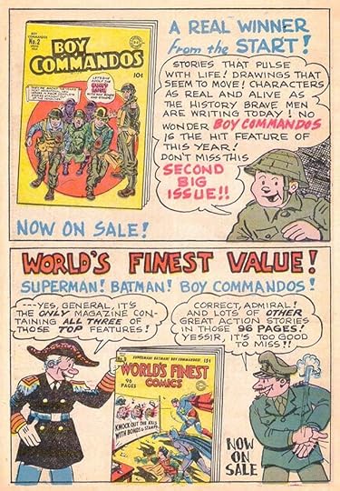
The problem was that the people doing the lettering in DC house ads in the early 1940s just weren’t good letterers, in my opinion. The obvious skills of someone like Ira Schnapp made a huge improvement that must have been clear to the editors, and gradually over the next few years Ira was given more and more house ad work.
 From DETECTIVE COMICS #81, Nov 1943
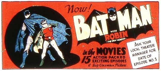
The first house ad I can find that I think is lettered by Schnapp is this one, though I have only a very poor scan of it. This Batman movie promotion, though small in size at about a third of a comics page, is right up Ira’s alley, and probably similar to movie showcards he was already doing elsewhere. The public service ad at the top of this article is the second one I found by him. I will be using cover dates to define my articles, but you should remember that comics were released about two months ahead of the cover date, and work in them was produced at least a month before that, often more, so this early ad by Ira was probably done in July or August of 1943. The ad might have run a month earlier in some comics. The Batman serial had 15 chapters that began appearing weekly in July of 1943, but probably started a month or more later in some places. Even so, this ad appearance in a comic out in September 1943 seems a bit late.
[image error]From ACTION COMICS #72, May 1944This public service ad promoting wartime paper drives is the third one I found lettered by Schnapp. I have scans of most DC comics from the 1940s, but not all of them, and some of the scans don’t include ad pages, so it’s possible I’ve missed a few, but since house ads were run in multiple titles, I feel pretty sure I caught most of them. Ads using only type continued to be common in the 1940s and were still being used in the early 1950s. Ads lettered by people other than Ira were also common through the 1940s, but gradually diminished as Ira’s work met favor.
 From BATMAN #25, Oct-Nov 1944
Here’s an unusual public service ad suggesting readers collect milkweed floss (attached to the seeds to make them float in the air) to fill life vests for sailors and soldiers. Schnapp’s style is most evident in the larger lettering on the left.
 From SUPERMAN #31, Nov-Dec 1944
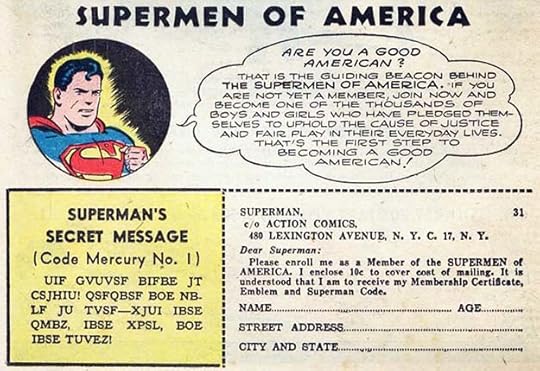
This Superman speech balloon added to the Supermen of America ad is a kind of public service message. In it, Schnapp uses the style he was also using on Superman newspaper strips and stories with very wide letters and an upcurved right leg on the letter R, something he picked up from the previous Superman letterer Frank Shuster.
 From DETECTIVE COMICS #93, Nov 1944
Finally in this last Schnapp house ad appearing in 1944 issues we see Ira beginning to use his skills to promote DC titles. This ad is simple but effective, and compare the design skills to those by others that came before. As would be the case in many more ads to come, Ira used well-balanced geometric shapes (circles, rectangles, and an arrow) as well as excellent use of black in the areas where the lettering is reversed white. That would have been done in the DC production department by making a negative photostat of Ira’s normally drawn black lettering, but surely his idea. The styles of lettering are not much like what Schnapp would do later, but they do match what he was doing on story titles and covers at the time.
To sum up, I found one house ad by Ira in 1943 and five in 1944 for a total of six for those years. More to come in individual posts for each year. Other articles in this series and more about Ira Schnapp and other letterers can be found on the COMICS CREATION page of my blog.
The post Ira Schnapp’s DC Ads: 1943-44 appeared first on Todd's Blog.
May 14, 2021
SCHNAPP VS. PROTO-SCHNAPP – A NEW DECISION
 All images © DC Comics. From ACTION COMICS #110, July 1947
I first heard the name Ira Schnapp when I started working on staff in the DC Comics production department in 1977. I knew his work well, I’d loved it growing up, but had never been able to put a name to it. While at DC I began to learn about Ira’s important role in DC Comics from the 1940s to the 1960s, and wanted to know more, but it took years for me to have the time and resources to do that. When I started my blog in 2007, I decided to write about comics history, and soon began researching and writing articles about letterers including Ira Schnapp with help from Alex Jay and early research published by Kirk Kimball on his site, “Dial B for Blog.” Around 2010 I commenced studying the early lettering and logo designs in DC Comics of my childhood, much of it by Schnapp, and in 2015 I began systematically working my way through every DC Comics issue from 1940 to 1968 looking for and cataloging Ira’s work and publishing articles about it HERE. I knew what Ira’s story and cover lettering looked like from the early 1950s on, but before that I had more trouble. Ira’s son Martin Schnapp, born in 1930, told me he remembered his father working on comics lettering at home starting in the early 1940s, but he didn’t recall exactly what that work was. Marty had no artistic talent, and he did not have much interest in his father’s work other than reading the DC comics Ira brought home, though Marty and Ira’s bond was a loving one. The first DC work by Ira I was sure about was his revamp of Joe Shuster’s Superman logo that first appeared on the cover of SUPERMAN #6 in 1940. I’d learned it was his first DC logo from Michael Uslan, as recounted HERE. At the time I think Ira was doing logos and cover lettering for some of the pulp magazines published by Harry Donenfeld and Jack Liebowitz, who were also the owners of National (now DC) Comics. Ira knew Liebowitz from at least the 1930s, as detailed in THIS post of mine about his life and career, and I think they were related, if not closely. I found work in many 1940s comics that could be early lettering by Ira, but it was different enough that I wasn’t sure. Still, it made sense that Ira’s style could have evolved some from his earliest work, so at first I was thinking it was all him.
 From DETECTIVE COMICS #120, Air Wave Story, Feb 1947
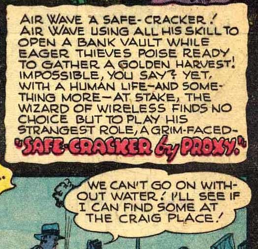
When I compared this early style, I saw many elements that were similar to what Ira did later, but some that were definitely different such as the frequent use of an R with an upwardly curved right leg and letters that were generally wider than a square. What puzzled me the most was comics where this style appeared in one story and in another there was work much more like Schnapp lettering from the mid 1950s or later. I couldn’t see any logical reason why Ira would be using more than one style at a time when style didn’t seem likely to be important, just getting the work done was the goal. That’s when I came up with my Proto-Schnapp theory. I imagined another older letterer, name unknown, working on staff at DC who might have served as a model for Ira’s own comics lettering. Ira had been doing lettering since high school, signs were his career before comics, but perhaps he needed some help and advice with this particular medium. The articles I wrote for most of the DC series that began in the 1940s included this idea, and when I was writing them I have to admit deciding which stories were by Proto-Schnapp and which were by Ira was very difficult, and I often flip-flopped several times before putting the list of Schnapp credits in the articles. There were even stories where some pages seemed like Proto and some like Ira, a possible but unlikely division of labor for the time.
I’ve recently completed cataloguing Ira’s work on the Superman (1939-1966) and Batman (1943-1946) newspaper strips, and there I was finally able to see how early lettering by him evolved into the later style I knew well. Ira’s work on the Batman strip from 1944 to 1946 is documented not only by comics historian Joe Desris, but by a first-person account he collected from the strip’s main inker Charles Paris, who remembered getting lettered strips from Ira not only at DC but at Ira’s home. By following the lettering from those years through many similar daily Superman strips into the 1950s, I was finally convinced that the early styles I had for a while attributed to my theoretical “Proto-Schnapp” was also Ira’s work. I also came to see that Ira did sometimes modify his story lettering to match the feature, picking up elements from previous letterers on Superman and Batman stories and strips, and also occasionally imitating the style of the previous lettering when he started working on a new feature. There was more variety in Ira’s early work than I expected once I had compiled further evidence, not only in stories but also on covers and in house ads. Therefore, I’ve done away with all references to Proto-Schnapp, and over the last few weeks I’ve looked again through all those early DC issues and recompiled my inventory to add all the work to it I formerly thought was by the mythical Proto-Schnapp. Thousands of covers and pages have been added to Ira’s credits, and some articles have had major rewrites, particularly the ones on ACTION COMICS, SUPERMAN and WORLD’S FINEST COMICS, but other articles have had important additions too. It’s possible I haven’t gone back far enough, that Ira’s ability to imitate the work of other letterers can include even earlier examples than the ones I’m calling for him, but where I wasn’t sure I didn’t try to include more of those.
I apologize to anyone and everyone who’s read and learned from my Ira Schnapp posts for leading you down this incorrect path, but sometimes I get things wrong, and I did here. This will mean that many entries in the Grand Comics Database drawn from my blog articles will be wrong or incomplete. I’m particularly sorry about the extra work that will create for the volunteers who labor on the credits in that important resource.
One area that needs expansion is Ira’s ad work in the 1940s. I’ve removed the single post I did about that and over the next two weeks will put up six new posts covering Schnapp’s DC ad work in the 1940s. The list has expanded from just a few to over 100 items. Still to come after that will be a new series of articles about Ira’s logos, putting all my ideas about them and identifications of them in one place chronologically. Finally, when that’s done, I will work on a summary of Ira Schnapp’s entire career by the numbers, and then my years-long project to identify and celebrate the work of DC’s first major letterer will be complete. Or as complete as I can make it!
Goodbye, Proto. You were a theory that didn’t pan out.
The post SCHNAPP VS. PROTO-SCHNAPP – A NEW DECISION appeared first on Todd's Blog.
May 13, 2021
Rereading: CITIZEN OF THE GALAXY by Robert A. Heinlein
 Cover illustration by Leonard Everett-Fisher
The penultimate book in Heinlein’s series of novels for young readers begins very far from Earth on a world in a different part of our galaxy where slavery is alive and well. Baslim the Cripple is a beggar with one leg who plies his trade near the slave market, and while he is normally only part of the audience when slaves are sold, one day he decides to bid on a young boy, Thorby, who no one else seems to want. Baslim wins the auction and takes the boy to his secret underground home, where Thorby discovers his new master can become a very different person there, one who leads the secret life of a spy. At first Thorby tries hard to escape, but eventually is won over by Baslim’s fairness and friendship, and Thorby becomes his apprentice beggar, and eventually also a messenger for Baslim’s other trade. All that changes one day when Baslim is arrested and imprisoned after the police trash their home. Thorby is being hunted, but he remembers his instructions from Baslim if something like this happened: find a way to contact the captain of any Free Trading starship for help. That sets Thorby on a journey through space first as a member of the Free Traders, later as part of a galactic military force, and ending on Earth as he gradually discovers many surprising things about Baslim and himself.
I remember enjoying this the last time I read it about 20 years ago, but this time it seemed too talky, with many Heinlein lectures and not enough action. It’s a fine book, but not one of my favorites in this series. Still recommended.
The post Rereading: CITIZEN OF THE GALAXY by Robert A. Heinlein appeared first on Todd's Blog.
Todd Klein's Blog
- Todd Klein's profile
- 28 followers


