
Todd Klein's Blog, page 94
March 16, 2021
Incoming: BATMAN CREATURE OF THE NIGHT Trade Paperback
 Image © DC Comics
This was a fun “Elseworlds” type of Batman project by Busiek and Leon that I lettered a few years ago, four long issues that were collected in a hardcover last year, and are now out in trade paperback for less. Certainly the most unusual version of Batman I can recall, and the art and writing are great. This should be available in shops by the end of March, or here’s an Amazon link:
&amp;amp;amp;lt;br /&amp;amp;amp;gt;&amp;amp;lt;br /&amp;amp;gt;&amp;lt;br /&amp;gt;&lt;br /&gt;<br /><br />
The post Incoming: BATMAN CREATURE OF THE NIGHT Trade Paperback appeared first on Todd's Blog.


March 15, 2021
Ira Schnapp’s DC Ads: 1961 Part 2
 All images © DC Comics. From G.I. COMBAT #88, June/July 1961
Opening the second half of 1961 is this half-page ad that ran only in DC war titles. Ira’s ZOOM made of horizontal speed lines adds movement and interest. Perhaps he got the idea from Carmine Infantino’s speed lines in THE FLASH. The character is a more thoughtful role for a Native American than most of what came before at DC.
 From ACTION COMICS #278, July 1961
 From ADVENTURE COMICS #286, July 1961
Four new blurbs by Ira for July cover-dated issues, constituting one new house ad in my opinion.
 From WONDER WOMAN #123, July 1961
This is the second new humor ad for the year. There aren’t many Schnapp house ads with word balloons in this period, and if you look closely you can see he does them in the same style as his cover lettering rather than the quicker style used on story pages.
 From DETECTIVE COMICS #293, July 1961
A public service ad with children learning from their elders.
 From BLACKHAWK #162, July 1961
Rip Hunter’s new title receives a third fine full-page ad by Ira with a typical background by him of clouds and stars. I was delighted to read these when I could find them.
 From ACTION COMICS #278, July 1961
Two half-page ads that often ran together, as shown. I liked the DC annuals, but the annual-sized SECRET ORIGINS one-shot was even better! AT LAST is right! Notice that, even though they are separate ads, the cover angles and black areas work together for a pleasing whole. Counts as two ads.
 From ACTION COMICS #278, July 1961
Another Annual ad with one of Ira’s strangest arrows and fine display lettering. More secrets revealed!
 From ACTION COMICS #279, Aug 1961
 From LOIS LANE #27, Aug 1961
Four new blurbs for August cover dates.
 From BATMAN #141, Aug 1961
I don’t know that this PSA would have worked for me, but then I wasn’t the target audience, I guess.
 From ACTION COMICS #280, Sept 1961
 From ADVENTURE COMICS #288, Sept 1961
Changing things up a bit, the September versions of this repeating ad were half-page size, giving more space for each of Ira’s four new blurbs. Sadly, the amount of text also increased, so it’s still quite small in places.
 From BATMAN #142, Sept 1961
From a time when “being different” could mean you collected rocks rather than going swimming with your pals.
 From ACTION COMICS #281, Oct 1961
 From ADVENTURE COMICS #289, Oct 1961
Four new blurbs, now back to third-page size.
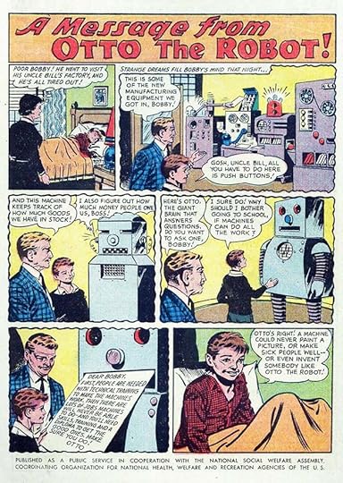 From BATMAN #143, Oct 1961
This PSA addresses fears that computers would take jobs from people, a common theme from then to now. Is Otto short for Otto Matic?
 From ACTION COMICS #282, Nov 1961
 From ADVENTURE COMICS #290, Nov 1961
Four new blurbs by Ira for November titles.
 From ACTION COMICS #282, Nov 1961
Bus safety is certainly a good topic for kids. How many learned it from this PSA is unknown, but it was a worthy idea.
 From ACTION COMICS #282, Nov 1961
While DC and editor Julius Schwartz were happy to promote this new Silver Age revamp of a Golden Age character, it was Ira Schnapp’s lettering that made the ad exciting to my eyes. The character didn’t appeal to me as much as the other revamps, but it had its moments. Traveling through telephone lines was certainly a cool idea. Note that the red color is missing from part of the A in ATOM.
 From ADVENTURE COMICS #291, Dec 1961.
I can only find these three new blurbs in December issues, perhaps I missed one, or the fourth wasn’t used.
 From ACTION COMICS #283, Dec 1961
Another United Nations PSA, and it’s amazing and sad how many of them are still relevant today.
 From BLACKHAWK #167, Dec 1961
One more grand full-pager for Rip Hunter with enough new lettering to consider it a separate ad by Ira.
 From MYSTERY IN SPACE #72, Dec 1961
In MYSTERY IN SPACE, the letter column title changed from Wonders of Space set in type to Via Rocket Mail, I believe by Ira. Both titles were used briefly before dropping the earlier one. Not sure if Ira did just the lettering, that seems likely.
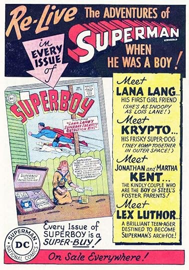 From ACTION COMICS #283, Dec 1961
And here’s a surprise to finish out the year, an appealing full page ad for Superboy, the first one he’s had since soon after his own title began more than ten years earlier. The text above and below the Superman logo is type, everything else is by Schnapp.
To sum up, I count 36 house ads lettered by Ira and twelve public service ads for a total of 48 in all, just a few less than the previous year, plus one letter column header. Clearly DC was still happy to utilize the talents of their staff letterer on ads, and in doing so, Schnapp enticed readers to buy many comics.
More articles like this are on the Comics Creation page of my blog.
The post Ira Schnapp’s DC Ads: 1961 Part 2 appeared first on Todd's Blog.
March 14, 2021
And Then I Read: SWORD & CITADEL by Gene Wolfe

This book is the second half of the four-novel work “The Book of the New Sun” published in the early 1980s. I’ve reviewed the first two HERE. It’s really one long novel, and remarkably, author Wolfe wrote it all in his spare time while editing a non-fiction magazine. It’s an impressively creative world-building story taking place in Earth’s far future when our sun is dimming with old age, and when Earth has seen many civilizations and empires rise and fall, and is now full of decaying machines and artifacts and people who have fallen into ignorance about their own heritage ruled over by an elite class, headed by an Autarch that most have never seen.
Severian, the narrator of the story, had been raised in The Citadel, an ancient massive city, as an apprentice in the Torturer’s Guild. There he was disgraced when he allowed a young female prisoner, Thecla, to escape her tortures through a quick death. At first imprisoned, Severian is released when he agrees to take a position of Lictor, or jailer and executioner, in the distant northern city of Thrax. After many adventures, this book begins with Severian at his duties in Thrax. A young woman who loves him and followed him to Thrax, Dorcas, has fallen into a deep depression, and Severian finds a way to send her back to her original home in the Citadel. He then makes another mistake out of kindness, allowing another woman to go free when he should have executed her. This makes Severian a fugitive himself, and he flees Thrax on foot over the northern mountains, and has many more close calls with death. Everyone who befriends him seems to come to some unhappy end, and eventually Severian finds himself involved in a long-running war at the northern end of the Autarch’s kingdom, where the enemy is stranger and more ruthless than even Severian himself. As the story progresses, narrator Severian drops many hints about his eventual rise in power to the position of Autarch, but the way he gets there is quite surprising, and the entire journey he makes is consistently inventive and fascinating.
This is a long story, but the kind in which you are not checking to see how much more you have to go to finish, but instead are checking to see how much more you still have to enjoy. Recommended.
&amp;amp;amp;lt;br /&amp;amp;amp;gt;&amp;amp;lt;br /&amp;amp;gt;&amp;lt;br /&amp;gt;&lt;br /&gt;<br /><br />
The post And Then I Read: SWORD & CITADEL by Gene Wolfe appeared first on Todd's Blog.
March 12, 2021
Ira Schnapp’s DC Ads: 1961 Part 1
 All images © DC Comics. From ACTION COMICS #272, Jan 1961
 From ADVENTURE COMICS #280, Jan 1961
Ira Schnapp continued to do plenty of house ads in 1961, though possibly a few less than in 1960, we’ll see. For one thing, there were no new romance group ads, the new ones from 1960 were reused through 1961. There were twelve new public service ads for the first time in a while, and Ira lettered all of them. A few new titles received support from multiple ads, but many new ads were smaller ones following past styles, like COMING SUPER-ATTRACTIONS, above, with four new Schnapp blurbs in January cover-dates, counting as one new ad in my opinion.
 From ADVENTURE COMICS #280, Jan 1961
I think this is what happened when Ira wasn’t available to letter a rush house ad and they set it in type instead. Pretty awful, isn’t it? You can see the reason DC valued his contributions. Why they didn’t have someone else letter it I don’t know.
 From BLACKHAWK #156, Jan 1961
Many of the 1961 public service ads dealt with issues between kids like this one. While the sentiments were admirable, I don’t think many readers would have been interested in them, but I could be wrong.
 From ACTION COMICS #272, Jan 1961
A different version of this ad appeared in late 1960, and I now see that this was the original version by Ira Schnapp. The revisions of the previous one (including a form for readers to give to their comics retailer) might have been added by someone else, but I’m not sure, so I’ll let both versions count for Schnapp. This one is better.
 From ACTION COMICS #273, Feb 1961
This is one of the more memorable full-pagers by Ira. The text is probably written by editor Julius Schwartz, presenting another of his Golden Age character revamps, but the presentation by Schnapp is excellent. DC and Schwartz were on a roll, this revamp also soon gained its own series.
 From ACTION COMICS #273, Feb 1961
 From ADVENTURE COMICS #281, Feb 1961
Four new blurbs by Ira for February cover-dated books, all probably written by Mort Weisinger, editor of the Superman-related titles.
 From ACTION COMICS #273, Feb 1961
Framing a PSA as a quiz seems a good way to get more readers involved, though anyone who could read upside down lettering easily could get the answers quickly. Even then, it may have imparted knowledge.
 From ACTION COMICS #273, Feb 1961
Lots of fine lettering by Ira in this ad that ran on inside covers only I believe, though there might also have been a color version somewhere. My process in looking for these ads is to go through many of the DC titles I have scans for, but not all of them, so it’s always possible I missed something. Aquaman also went on to his own title, and about time, too, he’d been around since 1941.
 From SUGAR AND SPIKE #33, Feb/March 1961
This was one of only two new humor ads I found, several generic ones from the past were reused.
 From G.I. COMBAT #86, Feb/March 1961
There were a few new third-page war ads that only ran in war titles, like this one promoting one of the weirder ideas from Robert Kanigher: soldiers vs. dinosaurs.
 From ADVENTURE COMICS #282, March 1961
Aquaman in SHOWCASE received a second ad push in this full-pager from Ira. He might have done all the background art as well as the design and lettering, I’m not sure.
 From ACTION COMICS #274, March 1961
 From ADVENTURE COMICS #282, March 1961
 From JIMMY OLSEN #51, March 1961
I found six new blurbs from Ira for this ad in March cover-dates. Some are crammed with text, and hard to read, but Ira did what he could with them.
 From ADVENTURE COMICS #283, March 1961
I think editor Julius Schwartz did a very smart thing in JUSTICE LEAGUE OF AMERICA by starting out with a small team and then inducting new members gradually. It made each addition an event that could be promoted in fine ads like this one, drawing in even more readers.
 From ACTION COMICS #274, March 1961
As a nature lover myself, I heartily approve of PSAs like this one. As always, Ira’s lettering adds value.
 From ACTION COMICS #274, March 1961
RIP HUNTER…TIME MASTER made the jump to his own title, which had lots of ad support, starting with this fine full-pager. Ira did the logo, and I never understood the bullet shape. Here, he’s added some motion lines around it as if it’s traveling, but the ship in the series was spherical.

 Both from BLACKHAWK #158, March 1961
In March, DC began promoting the fact that their comics were still 10 cents, in comparison to price increases by other companies. The third-page ad is the same as a generic one from 1960 with just the bottom three words changed. The banner ran at the top or bottom of pages in many DC titles. I’m going to count these as one new ad.
 From ACTION COMICS #275, April 1961
 From ADVENTURE COMICS #283, April 1961
 From LOIS LANE #24, April 1961
Five new blurbs for April cover-dates from Ira. Someone in the DC production department, possibly Ira, spent a lot of time adding the small art images pulled from the issues.
 From ACTION COMICS #275, April 1961
This was a welcome change of heart from DC after decades of treating American Indians as villains in their frontier and western comics, though of course they were hardly alone in that.
 From ACTION COMICS #276, May 1961
I don’t recall liking the Bizarro idea as a reader, but many others must have, as it was used a lot. This half-pager celebrates that, and even invites mail about it. The logo by Ira was used on the series splash pages.
 From ACTION COMICS #276, May 1961
 From ADVENTURE COMICS #284, May 1961
Four new blurbs found for the May books. I’m counting each month as a new house ad, as it’s certainly that much work.
 From ADVENTURE COMICS #284, May 1961
This PSA is the equivalent of “Hey, kid, you’ll put your eye out!”
 From BLACKHAWK #160, May 1961
Another fine full page ad from Ira for the second issue of this new series. If time travel wasn’t enough of a draw, why not add aliens?
 From ACTION COMICS #276, May 1961
DC went all in on holding the ten cents line with this inside front cover ad that ran in many titles. These must be the largest letters Ira Schnapp ever drew for DC! His upper and lower case text is appealing, too. I don’t think he did the figures. Despite this bluster, the ten cents cover price only lasted another six months.
 From ALL-AMERICAN MEN OF WAR #85, May/June 1961
Editor Robert Kanigher kept up reader interest in his war titles with hooks like a haunted tank. Lots of lettering in this small ad, but it doesn’t seem crowded.
 From BLACKHAWK #161, June 1961
A third handsome full-page ad for Aquaman in SHOWCASE, with attention-grabbing lettering by Schnapp and an intriguing monster. Ira’s lettering was usually heavy enough to hold up when reversed on black, but sometimes the uneven printing of the time made it hard to read anyway, as on the bottom of this ad.
 From ACTION COMICS #277, June 1961
 From ADVENTURE COMICS #285, June 1961
 From JIMMY OLSEN #53, June 1961
 From SUPERBOY #89, June 1961
Six new blurbs found for June cover-dates, but the Jimmy Olsen one from June (Giant Turtle Man) was probably done for May issues and either not used, or I didn’t find it.
 From ACTION COMICS #277, June 1961
This PSA sounds like a cry for help from the writer, or someone he knows.
 From ACTION COMICS #277, June 1961
DC was still occasionally using Ira’s Superman on Television ad from a few years back, and here they had him hand-letter a list of TV stations across the country that were carrying the show, now in reruns. If ever there was a job for set type, this was it, but Ira was handy, so they used him.
That’s it for the first half of the year, I will have the rest and year totals in Part 2. More articles like this are on the Comics Creation page of my blog.
The post Ira Schnapp’s DC Ads: 1961 Part 1 appeared first on Todd's Blog.
March 10, 2021
Ira Schnapp’s DC Ads: 1960 Part 2
 All images © DC Comics. From ACTION COMICS #266, July 1960
Continuing my look at the work of Ira Schnapp on DC Comics ads in the second half of 1960, this full page for the first issue of the revamped Green Lantern shows that DC had learned the value of these Silver Age launches from editor Julius Schwartz, and was now having Ira promote them in style. Also, rather than continue the numbering from the Golden Age version, they began this title with issue #1, though it didn’t appear on the cover. THIS IS IT is a rare example of dry brush lettering from Ira, though it’s hard to see behind the red coloring, and I think he strengthened the long edges with a black pen line. The enthusiasm of the design, lettering and text is clear.
 From ACTION COMICS #266, July 1960
 From ADVENTURE COMICS, July 1960
Four new blurbs were lettered by Schnapp for the July cover-dated titles, enough to call this one new house ad in my opinion.
 From BATMAN #133, Aug 1960
Superman returns as instructor and United Nations promoter in this new public service ad lettered by Ira. Still relevant today, sadly.
 From BATMAN #133, Aug 1960
DC was also happy to promote their new tryouts in SHOWCASE in hopes they would be popular enough to launch in a series. This one was. As always, Ira’s large display lettering and use of black draws attention. Note that the company is still named National Comics, though everyone knew it as DC Comics because of the bullet symbol.
 From ACTION COMICS #267, Aug 1960
Another good idea from DC was this beginning of their Annual line, all reprints except the cover, but as back issues were hard to find at the time, eagerly sought by fans. Ira’s action lines radiating from a central point behind the cover adds movement to the otherwise static page. The book was a rare sell-out for DC.
 From BATMAN #133, Aug 1960
With this ad design by Ira, DC had a generic third-page ad that could be used on any two titles without any further changes, and it was reused often.
 From FALLING IN LOVE #36, Aug 1960
For the first half of 1960, the romance group reused ads from 1959. In the second half, Ira supplied many new ones like this fine generic ad with an appealing title and prominent use of his Romance bullet.
 From ACTION COMICS #268, Aug 1960
DC was also happy to promote tryouts in their other book for them, THE BRAVE AND THE BOLD. This one had a number of tryout issues but never landed a series. No fault of Ira Schnapp’s fine ad lettering and logo.
 From ACTION COMICS #268, Sept 1960
 From ADVENTURE COMICS #276, Sept 1960
Four new blurbs for this ad in September cover-dated issues.
 From OUR ARMY AT WAR #98, Sept 1960
A new to DC war title, G.I. COMBAT, had been brought over from Quality Comics in 1957, and I think this is the first house ad for it. It ran only in other war titles.
 From ADVENTURE COMICS #276, Sept 1960
This PSA is one of a growing number that tried to engage readers with a quiz. Ira sells it with his title.
 From ACTION COMICS #269, Oct 1960
 From ADVENTURE COMICS #277, Oct 1960
Four new blurbs by Ira for October cover-dated books. This seems to have settled into a regular plan.
 From BATMAN #135, Oct 1960
A third-page ad promoting another issue of THE BRAVE AND THE BOLD. Who could resist that Schnapp blurb on the left? Not me!
 From ACTION COMICS #269, Oct 1960
If I had to pick one Ira Schnapp ad from the 1960s that most inflamed the imaginations and fired the desire to find and read a comic in me and my generation of readers, it’s this one. Such an exciting idea, and brilliantly presented! Perhaps the words were written by editor Julius Schwartz, but Ira’s design and lettering sold it. The cover is static, but the arrow and exclamation points add movement and excitement.
 From DETECTIVE COMICS #284, Oct 1960
There were also third-page, half-page and two-third page versions of the ad, and it ran in some form in nearly every title except the romance ones. This is all new lettering by Ira, so I will count it and the other variants as one new ad. Just imagine indeed!
 From ADVENTURE COMICS #277, Oct 1960
This is the kind of PSA I probably would have just skipped past as a reader.
 From HOUSE OF MYSTERY #103, Oct 1960
Another fine Sea Devils ad by Schnapp.
 From SUPERMAN #141, Nov 1960
 From ACTION COMICS #270, Nov 1960
 From LOIS LANE #21, Nov 1960
Six new blurbs and a new frame by Schnapp for the November version of this often-repeated ad. Editor Mort Weisinger loved making his stars fat, and Ira’s FAT BOY lettering for Jimmy is amusing.
 From FALLING IN LOVE #38, Nov 1960
Ira’s lettering for the romance group ads is always handsome and well-designed. He seemed to have an affinity for the line. For the last two months of 1960 he created full-page ads for most of the romance books that ran only in other romance books, so likely never seen by readers of other DC titles.
 From ACTION COMICS #270, Nov 1960
A bouncier title than usual by Ira on this PSA.
 From SECRET HEARTS #67, Nov 1960
 From GIRLS’ ROMANCES #72, Nov 1960
More Schnapp goodness on ads for the romance line. These black and white ones ran on the inside back covers.
 From SHOWCASE #29, Nov/Dec 1960
In this year DC’s war titles only received third-page ads by Ira, but he put a lot of work into them. The lettering in the caption is meant to look roughly scrawled by a soldier, perhaps.
 From HEART THROBS #68, Dec 1960
The figure and owl are probably not by Ira in this romance ad, but I think the rest is. I could be wrong about the owl.
 From ACTION COMICS #271, Dec 1960
 From ADVENTURE COMICS #279, Dec 1960
Four new blurbs by Schnapp for the December cover-dated version of this ad.
 From BATMAN #136, Dec 1960
Another new third-pager from Ira for Cave Carson Inside Earth. I thought this was a great series idea, but apparently it didn’t sell well enough in THE BRAVE AND THE BOLD to gain one. Ira’s scary lettering at upper left is pretty effective.
 From ACTION COMICS #271, Dec 1960
The final new PSA of the year returns to the United Nations theme, a favorite of writer/editor Jack Schiff.
 From ACTION COMICS #271, Dec 1960
The first Superman Annual sold out, so here DC was taking orders for the second one, or rather suggesting kids fill out the form and give it to their local comics retailer. I have no idea if that worked. I’m not absolutely sure Ira lettered all of this ad, but I think he did.
 From GIRLS’ LOVE STORIES #75, Dec 1960
One more handsome romance ad to round out a very busy year for Ira Schnapp on DC ads. For the year I count 41 house ads by him and nine public service ads for a total of 50 new DC ads lettered by Ira. Quite a lot of work. Will this increasingly busy schedule continue in 1961? We’ll see.
Other articles like this are on the Comics Creation page of my blog.
The post Ira Schnapp’s DC Ads: 1960 Part 2 appeared first on Todd's Blog.
March 8, 2021
Ira Schnapp’s DC Ads: 1960 Part 1
 All images © DC Comics. From SUPERMAN #134, Jan 1960
The work of letterer Ira Schnapp on DC house ads continued at the increased rate of 1959 in 1960, so I will once again break the year into two posts. The “Coming Super-Attractions” third-page ads brought lots of work for him in all twelve months, and there were plenty of full page ads as well as other smaller ones through the year. There were three repeated public service ads from past years, but Ira lettered all nine of the new ones. It seems that Schnapp’s role setting the style for the entire company in logos, covers and house ads, not to mention tons of page lettering, should have merited some kind of credit somewhere, but as always, there was none. Ira is reported to have been a very modest man, so perhaps that was fine with him, I don’t know. Editors seemed to have permission to commission ads at will for upcoming and current issues, like the one above requested by editor Mort Weisinger for a single issue of SUPERMAN, and used nowhere else that I could find. Room for smaller third of a page ads was now routinely being left on the final page of many stories.
 From LOIS LANE #14, Jan 1960
 From SUPERBOY #78, Jan 1960
Here are the COMING SUPER-ATTRACTIONS ads from January cover-dates with all the different new blurbs I could find, though it’s always possible I missed one. The frame and top line are repeated from 1959, and there are four new blurbs (Superman is a repeat from Dec 1959). I’m still counting this as one new ad, as the new blurbs seem like that much work to me. I will do the same for all similar ads this year.
 From DETECTIVE COMICS #275, Jan 1960
All genres at DC got some attention in house ads in 1960, though westerns probably got the least, with only this issue of TOMAHAWK getting solo billing.
 From HOUSE OF MYSTERY #94, Jan 1960
 From BATMAN #129, Feb 1960
 From BATMAN #130, March 1960
Here’s an example of one way a third-page ad could be used several times with only partial changes in the lettering. The changes were still work for Ira, and later, as we’ll see, ads that needed no lettering changes were used more often. I’m counting these as just one ad.
 From ACTION COMICS #261, Feb 1960
 From ADVENTURE COMICS #269
Here are the four new blurbs I could find for the February COMING SUPER-ATTRACTIONS, but note also that Ira has created a new frame and title lettering. All or nearly all the books featured were edited by Mort Weisinger in these, so he probably wrote the copy, which had to be very small in places to fit.
 From BATMAN #129, Feb 1960
Schnapp had a much better chance to use his design and lettering skills on full page ads like this one promoting the first appearance of the Justice League in THE BRAVE AND THE BOLD #28. This was again the idea of editor Julius Schwartz, and he and DC clearly thought it was a great idea. They promoted it well, and Ira did a fine job on his end with a new variation on his logo and lots of other fine lettering. What DC reader of their super-hero titles wouldn’t want to read this? I sure did!
 From BATMAN #129, Feb 1960
The first new public service ad of 1960 gets back to the roots of the series with Superboy selling the idea of helping others.
 From BATMAN #129, Feb 1960
Batman stories were getting very silly and weird, but Ira’s job was to make those ideas intriguing to readers, and he does it well here with dramatic lettering and design.
 From BATMAN #130, March 1960
Another one. I loved Bat-mite as a reader, but this promo would have sold me on him if I didn’t already.
 From ACTION COMICS #262, March 1960
 From ADVENTURE COMICS #270, March 1960
Four new blurbs found in March cover dates. I have to wonder if there were more that were never used on some of these, or perhaps I just didn’t find them.
 From OUR ARMY AT WAR #92, March 1960
Over in Robert Kanigher’s war titles, ads mainly promoted other war titles, though there were also a few super-hero ones. Here Ira uses non-typical upper and lower case lettering in Rock’s balloon, perhaps to fit in all the words.
 From ACTION COMICS #263, April 1960
 From ADVENTURE COMICS #271, April 1960
Four new blurbs found for April cover dates. Note that some of the scans I have are better than others.
 From BATMAN #131, April 1960
This third-page ad is generic enough to repeat with later covers, and that was done several times in 1960. Ira’s lettering was bold enough to read well when reversed, white letters on black, something that was done with photostats in the DC production department, Ira didn’t letter with white ink.
 From ACTION COMICS #263, April 1960
This PSA welcoming Hawaii as our fiftieth state is a nice companion to the one from the previous year welcoming Alaska. Interesting to see a young Daniel Inouye here, he was a U.S. Congressman from 1959 to his death in 2012.
 From BATMAN #131, April 1960
This ad from 1959 was reused with a different cover and new lettering from “Age of Sorcery” down. I’m counting it as a new ad based on the amount of new work.
 From ACTION COMICS #264, May 1960
 From ADVENTURE COMICS #272, May 1960
 From LOIS LANE #17, May 1960
Five new blurbs found in May cover dated issues.
 From ACTION COMICS #264, May 1960
I’m not seeing as many public service ads used on inside covers in 1960, as those were now usually paid ads, but there were a few like this one. Gray tones had to be added.
 From ACTION COMICS #265, June 1960
 From ADVENTURE COMICS #273, June 1960
Here’s a different approach in these ads, using actual cover images with just a few small additions by Ira on the first two. Is there enough new lettering on these to count it as another new ad? I say yes.
 From JIMMY OLSEN #45, June 1960
DC gave this new Hollywood humor title lots of promotion across their entire line, even in the romance titles, a rare thing up to now, but you can see how that might have worked well. There was another version with the same lettering but using the second issue cover. I assume the beatnik slang is from the Maynard G. Krebs character in the show, already probably out of date by the time the book and the ad saw print. I love Ira’s lettering of it, though.
 From ACTION COMICS #265, June 1960
Many of the PSAs now showed unknown kids trying to help other unknown kids. An effective sentiment here, but perhaps less interesting to readers.
 From ACTION COMICS #265, June 1960
Another fine full-pager from Ira with effective use of black areas and attractive lettering. DC celebrates the success of SHOWCASE by making THE BRAVE AND THE BOLD a second tryout book. The ad is generic enough to use again with newer covers.
I will continue this in Part 2 with ads from July to Dec cover dates, and give ad totals for the year at the end of that post. Other articles like this are on the Comics Creation page of my blog.
A full list of DC’s public service ads on Mike’s Amazing World of Comics.
The post Ira Schnapp’s DC Ads: 1960 Part 1 appeared first on Todd's Blog.
March 7, 2021
And Then I Read: TOM SAWYER, DETECTIVE by Mark Twain
 Original magazine featuring the story, cover by Edward Penfield, 1896.
I had never thought of Mark Twain as a series author, but this is the fourth (and final) book featuring Tom Sawyer and Huck Finn. In the 1890s, Twain was in financial difficulties and returned to his former successes with Tom Sawyer Abroad, a parody of Jules Verne, and Tom Sawyer, Detective, a parody of detective novels like those about Sherlock Holmes by A. Conan Doyle. I found this one worked better as a story, though neither are as good as the first two Tom and Huck novels.
Tom and Huck are on a riverboat heading south to visit Tom’s Uncle Silas and Aunt Sally, who they last saw near the end of The Adventures of Huckleberry Finn. They meet a thief, Jake Dunlap, who was part of a gang that stole valuable diamonds. Jake has taken off on his own with the gems, and is in mortal fear of the other two gang members, who are on his trail. Tom and Huck help him escape before leaving the steamboat themselves for their destination. Arriving at the Silas home, they find Uncle Silas being harassed by Brace Dunlap, a wealthy man who wants to marry Silas’s daughter Benny. Brace is Jake Dunlap’s brother, and his other brother Jubiter, the twin of Jake, has been forced on Silas as a farm hand, even though Jubiter does little work and is equally mean to Silas. One night Jubiter disappears under mysterious circumstances, and is presumed murdered by Uncle Silas. Tom and Huck become detectives to solve the crime. Their investigations uncover a body, and there’s a court trial as a capper to the book where Tom plays a major role.
I enjoyed this, and found it a fun read, though as with other Tom and Huck books, the dialect can be difficult to follow at times, and the handling of slaves in pre-Civil War Missouri is often tough to accept as the characters do. Still, recommended.
The post And Then I Read: TOM SAWYER, DETECTIVE by Mark Twain appeared first on Todd's Blog.
March 5, 2021
Ira Schnapp’s DC Ads: 1959 Part 2
 From ACTION COMICS #255, Aug 1959
 From ADVENTURE COMICS #263, Aug 1959
 From SUPERMAN #131, Aug 1959
Continuing my look at the many DC ads lettered by Ira Schnapp in 1959, this is the August version of the COMING SUPER-ATTRACTIONS ad. The text is probably all written by editor Mort Weisinger, and Ira does a fine job of selling the issues shown in the small space available in these third-page ads. The same lettering also appeared in one in LOIS LANE that month.
 From DETECTIVE COMICS #271, Sept 1959
Plenty of good advice in this public service ad lettered by Schnapp and probably written by editor Jack Schiff.
 From ADVENTURE COMICS #264, Sept 1959
 From DETECTIVE COMICS #271, Sept 1959
 From JIMMY OLSEN #39, Sept 1959
 From SUPERBOY #75, Sept 1959
The September version of COMING SUPER-ATTRACTIONS has new blurbs for Sept and Oct cover-dated titles, and the one in DETECTIVE includes a blurb for BATMAN. Those were not edited by Weisinger, showing that the ad was also occasionally being used by other editors. Some blurbs are again repeats from the previous month. It’s hard to decipher how many of these blurbs Ira was creating each month, and I might not have found all the uses of the ad.
 From OUR ARMY AT WAR #87, Oct 1959
In editor Robert Kanigher’s war titles, not as many new ads were present. This third-page one by Ira shows his wise use of black, and there was at least one other third-pager not by him.
 From ACTION COMICS #257, Oct 1959
 From ADVENTURE COMICS #265, Oct 1959
 From JIMMY OLSEN #40, Oct 1959
 From LOIS LANE #12, Oct 1959
 From SUPERMAN #132, Oct 1959
The October COMING SUPER-ATTRACTIONS ads, each having at least one new blurb, all counted as one new ad. Lots of work for Schnapp.
 From HOUSE OF SECRETS #25, Oct 1959
Another third-page ad about a specific issue of SHOWCASE. The proliferation of third-page ads began in 1958, though some were done earlier. DC was asking artists to leave that much space on the final page of most stories they drew. If no paid ad was available, house ads went in.
 From LOIS LANE #12, Oct 1959
Pat Boone’s short-lived series from DC tried to stay as far away from the word and look of “comics” as possible, here described as simply a magazine. The full-page ad for it used his photo and type, but this half-page version was lettered by Ira and had pretty nice art probably by Bob Oksner.
 From DETECTIVE COMICS #272, Oct 1959
Some of the PSAs strike me even now as unrealistically goody-goody. Real kids didn’t talk or act like this as I recall.
 From THE FOX AND THE CROW #58, Oct/Nov 1959
For realistic kids, you needed to look no further than Sheldon Mayer’s SUGAR AND SPIKE, as in this charming third-page ad by Schnapp. Yes, there were elements of fantasy in the way they understood each other, but their behavior and motivations were spot on.
 From SUGAR AND SPIKE #25, Oct/Nov 1959
DC was struggling to keep readers interested in their funny animal comics. This one tying them to cartoons on TV was a last gasp attempt. Ira’s lettering is the best part.
 From DETECTIVE COMICS #273, Nov 1959
BATMAN and DETECTIVE editor Jack Schiff was also commissioning his own third-page ads from Ira, like this one.
 From ACTION COMICS #258, Nov 1959
 From ADVENTURE COMICS #266, Nov 1959
 From SUPERMAN #133, Nov 1959
November versions of this ad, each with one new blurb. Other ads I found used the same ones, though I might have missed something.
 From DETECTIVE COMICS #273, Nov 1959
DC and editor Julius Schwartz weren’t going to miss the boat on promoting his next Silver Age revamp in SHOWCASE. Note how the large open WHO and matching question mark by Schnapp bracket the first caption of this handsome full page ad. I used to despair at the tagline, “On sale everywhere,” as comics were not on sale in my rural small town. I had to wait for a trip to a bigger town with my parents to find them, which didn’t happen often enough.
 From DETECTIVE COMICS #273, Nov 1959
Another ad for TOMAHAWK with Ira selling it well.
 From DETECTIVE COMICS #273, Nov 1959
This PSA celebrates the additions of Alaska and Hawaii to the United States of America. It’s hard for me to fathom that that happened in my lifetime, but it did. Ira’s title is perfect.
 From THE ADVENTURES OF JERRY LEWIS #55, Nov/Dec 1959
Another example of a third-page ad for a specific group, the Hollywood humor books.
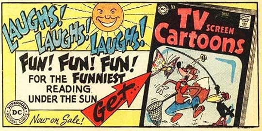
 From TV SCREEN COMICS #131, Nov/Dec 1959
Even the annual Rudolph comic got a small ad charmingly packaged by Schnapp.
 From BATMAN #128, Dec 1959
Some of the text is the same as the full-page BLACKHAWK ad earlier in 1959, but this is all new lettering by Ira.
 From ACTION COMICS #259, Dec 1959
 From ADVENTURE COMICS #267, Dec 1959
 From JIMMY OLSEN #41, Dec 1959
December versions of this ad, each with at least one new blurb by Schnapp.
 From BATMAN #128, Dec 1959
Another third-page ad for a specific issue, hoping fans of Batman will want to read it.
 From FALLING IN LOVE #31, Dec 1959
The second and final new Schnapp romance ad for the year is one of his best. The lively bounce of his large serif lettering seems modern for him, and all the lettering is great. Fine use of black and white space, too.
 From BATMAN #128, Dec 1959
This third-page ad is generic enough to be used for almost any DC titles, and is ideal for the science fiction and adventure ones.
 From BATMAN #128, Dec 1959
The final public service ad for the year is very optimistic about the use of atomic energy in science. I like Ira’s atom drawings in the title.
 From SHOWCASE #23, Dec 1959
Like SHOWCASE, THE BRAVE AND THE BOLD had become a tryout book for new series such as this one, with some fine lettering and a logo by Ira.
 From BATMAN #128, Dec 1959
Saving one of the best for last, this second ad for THE FLASH, again probably written by editor Julius Schwartz, epitomizes the appeal of DC’s new Silver Age heroes and the clever villains that opposed them. Ira’s lettering is a good as ever. I’ve never forgotten this ad and character.
Okay, so for all of 1959 I count 38 new house ads, one new paid ad, and ten public service ads for a total of 49 ads lettered by Ira Schnapp in 1959! That’s up from just 20 the previous year. Will this trend continue? Stay tuned as I look at 1960 ads next.
More articles like this are on the Comics Creation page of my blog.
The post Ira Schnapp’s DC Ads: 1959 Part 2 appeared first on Todd's Blog.
March 3, 2021
Ira Schnapp’s DC Ads: 1959 Part 1
 All images © DC Comics. From JIMMY OLSEN #34, Jan 1959
In 1959, DC house ads in general and Ira Schnapp’s work on them took a large jump upward. I don’t know the reason for this…a change in thinking by management? Fewer paid ads? Feedback from fans? Whatever the reason, there were a lot more house ads. I’ll have to see exactly how many more as we go along, because deciding how to count them is something I still have to figure out as I go. For one thing, ads for specific issues were much more common, like the half-page one above with fine lettering by Ira. There are so many to show and discuss that I’ve broken this year into two posts.
 From THE NEW ADVENTURES OF CHARLIE CHAN #5, Jan/Feb 1959
There were ten new public service ads, all lettered by Ira, joining two repeats from the past. None of the new ones included any DC characters, making it less likely comics readers would pay attention to them, in my opinion, even if the ideas were sound.
 From LOIS LANE #7, Feb 1959
After being ignored in his SHOWCASE appearances, the first issue of THE FLASH gained one of Ira Schnapp’s best full-pagers, probably written by editor Julius Schwartz, but well designed by Ira to catch readers’ attention. I know I was sold! Because I didn’t see many comics for sale where I lived, this ad in some title I had was the first I knew about the new character and series.
 From LOIS LANE #7, Feb 1959
Jack Schiff’s PSAs continued to support libraries, a worthy subject. Ira’s title might have gained this one some readers.
 From WORLD’S FINEST COMICS #100, March 1959
Another half-page ad promoting a particular issue with some handsome script work by Ira at the right, reminding me of his romance ads.
 From BATMAN #122, March 1959
As I read it, this PSA doesn’t offer any solutions for sibling rivalry, just reveals it, perhaps thinking it would make kids see it from an outsider’s perspective.
 From BATMAN #122, March 1959
Another half-page ad for a specific issue with fine display lettering by Ira. I love the title in the very old-school bat shape.
 From SUPERBOY #71, March 1959
A third-page ad for a particular issue. Many of these were directing readers who liked the book they had to another one with the same character, and in this case, a crossover story.
 From DETECTIVE COMICS #266, April 1959
This half-page ad, on the other hand, was for an unrelated title, but one by the same editorial team. It seems that each editor was being allowed to commission ads for their own books from Ira, giving him lots more ad work than in the past few years.
 From JIMMY OLSEN #36, April 1959
This PSA is a very unsubtle quiz on racism and intolerance of other kinds. My favorite part is the faces in section A, possibly by Ira.
 From JIMMY OLSEN #36, April 1959
Ira was also still producing handsome full-page ads that ran in many titles, like this one. The figure art is from the issue, but I like Ira’s shield at lower right and all the display lettering styles.
 From ACTION COMICS #2532, May 1959
 From ADVENTURE COMICS #260, May 1959
 From LOIS LANE #9, May 1959
 From SUPERMAN #129, May 1959
Now we come to a new type of third-page ad which was probably the idea of editor Mort Weisinger, as the titles in it were mostly edited by him. Ira created the frame with the title COMING SUPER ATTRACTIONS, and the three boxes, each of which promoted a different title and issue from the same or upcoming month. The titles covered are ACTION, ADVENTURE, LOIS LANE, SUPERBOY and JIMMY OLSEN. Each ad promoted three titles other than the one the ad ran in. Lois Lane is only there once, the others are used twice or three times, for a total of five different blocks of lettering Ira needed to do. All this work together seems like the rough equivalent of one full-page house ad, so I guess that’s how I’ll count it. The format and frame were repeated with different contents in each of the remaining months of 1959, so I will count each of those as another separate house ad, even though the frame is the same. Because there were so many variations and uses, I might have missed a few.
 From FALLING IN LOVE #26, May 1959
Over in the essentially separate Romance Group, there were just two new generic romance ads by Ira Schnapp that ran on back covers, and a few were repeated from past years.
 From DETECTIVE COMICS #267, May 1959
Speaking of time, this full-page ad must have taken Ira some time to do, it’s all text except for the issue cover and the background art. Ira’s work on lettering for house ads was done more carefully than what he lettered on story pages, and must have taken longer.
 From SUPERMAN #129, May 1959
Another appealing full-pager that ran in multiple titles heralding the introduction of Supergirl with lots of large display lettering.
 From WORLD’S FINEST #101, May 1959
This half-page ad for TOMAHAWK shows that DC was now willing to promote even the less-known titles of their line, and wanted Ira to do it. And, if you’re counting, that’s about four and a half pages of ads lettered by Schnapp just for May titles. The ad explosion was on!
 From SHOWCASE #20, May/June 1959
These PSAs are becoming more like mini family comedies, aren’t they? And if you add this to the May list, as I would, that makes five and a half pages Ira did on ads for May on top of all his cover and page lettering.
 From DETECTIVE COMICS #269, June 1959
This ad is a repeat from 1958 except for the story titles and cover image, just wanted to point out how some ads were repurposed. I won’t count this one as a new ad, even though Schnapp did a small amount of new lettering on it.
 From DETECTIVE COMICS #268, June 1959
Palisades Park teamed up with a circus for this new full page paid ad that ran in most titles. I think it’s all Ira’s work except the Superman and Emmett Kelly art.
 From ADVENTURE COMICS #261, June 1959
 From ACTION COMICS #253, June 1959
 From SUPERBOY #73, June 1959
 From JIMMY OLSEN #37, June 1959
The June COMING SUPER ATTRACTIONS ad in all the versions I could find with new lettering. I love the word balloon from baby Lois. Some of these are repeats from the previous set, some are new. The key is to check the month listed, May blurbs are repeats, June ones might be, July blurbs are definitely new. Confusing!
 From BATMAN #125, June 1959
It’s hard to decide if Ira lettered the title of this new letters page header, or if it’s by someone else in the DC production department. I’m leaning toward the latter, so won’t attribute it to Ira.
 From DETECTIVE COMICS #268
Another PSA for kids with problems. I hope it was helpful to some.
 From DETECTIVE COMICS #268, June 1959
This ad was generic enough to apply to any of the DC horror, adventure and science fiction titles, and was reused with other ones. The three bursts really catch my eye.
 From SUGAR AND SPIKE #23, June/July 1959
DC’s dwindling funny animal books did not get much attention at this time, but Ira created a fine generic ad for them with some of his bounciest titles.
 From HOUSE OF MYSTERY #88, July 1959
This ad was repurposed from the earlier one in this post with just new story info and cover. I’m not counting it as a separate ad, though Ira did some new work for it.
 From ACTION COMICS #254, July 1959
 From JIMMY OLSEN #38, July 1959
 From SUPERMAN #130, July 1959
 From SUPERBOY #74, July 1959
Four different versions of the July COMING SUPER ATTRACTIONS AD, which I count as one ad. Some of the lettering is quite small on these and doesn’t reproduce well in the scans I have. The Lois Lane section is repeated from June in two of these, and partly relettered in another. Some other sections are also repeats, but enough is new to call it a new ad in my estimation. The same lettering appeared in other versions in LOIS LANE and ADVENTURE COMICS.
 From WONDER WOMAN #107, July 1959
Another DC title that had been published for years with little attention gets a fine Schnapp full-pager with lots of large, appealing lettering.
There’s just too much in 1959 to cover in one post, so the rest will appear in Part 2. I’ll have 1959 ad totals there.
More articles like this are on the Comics Creation page of my blog.
The post Ira Schnapp’s DC Ads: 1959 Part 1 appeared first on Todd's Blog.
March 1, 2021
Ira Schnapp’s DC Ads: 1958
 All images © DC Comics. From ACTION COMICS #236, Jan 1958
The number of ads lettered by Ira Schnapp was up a bit in 1958. There were considerably more house ads for the main line, one new paid ad and two for the romance line. Ira’s public service ads were down a little with only eight new ones. DC reran several old ads in all these categories. The Kings of Comedy ad above is a fine start to the year. I wonder who wrote that mirth-quake line in the center? Of these four titles, only Bob Hope and Jerry Lewis would last.
 From ACTION COMICS #236, Jan 1958
The first public service ad of the year is not lettered by Ira, I don’t know who did it, but the title is definitely sub-par.
 From ACTION COMICS #237, Feb 1958
The second PSA gets back on track with a nice title by Schnapp. The subject is historical and a bit hard to understand.
 From THE FOX AND THE CROW #47, March 1958
With Jimmy Olsen’s solo title a success, Lois Lane’s was next. The ad promotes Lois as a reporter, though in the comic she was rarely seen doing that. I might have wanted to read it if she did.
 From ADVENTURE COMICS #246, March 1958
Another nice Schnapp title on this PSA, with nary a DC character in sight.
 From ACTION COMICS #239, April 1958
With their move from SHOWCASE to their own title (the first to do so), Challengers of the Unknown gained a new Schnapp logo and house ad, both better than what had come before.
 From ACTION COMICS #239, April 1958:
Finally we come to a DC character in one of this year’s public service ads. I like the message of this one. The flashback sequence of three panels has thought-balloon borders, but it’s a bit confusing all the same.
 From ACTION COMICS #240, May 1958
This short-lived series based on a TV show went nowhere for editor Julius Schwartz, and would not work today.
 From HOUSE OF MYSTERY #75, June 1958
On the other hand, Sgt. Bilko did well enough to garner a spinoff for a favorite supporting character, though neither series lasted very long. This is a rare example of Ira Schnapp lettering comics panels in a style closer to the one he used on covers and ads. A little more careful and precise.
 From HOUSE OF MYSTERY #75, June 1958
Nature is wonderful, but man is moreso, this PSA indicates.
 From ACTION COMICS #242, July 1958
This PSA is drawn by Henry Boltinoff, creator of countless gag strip fillers at DC, and he also lettered the single balloon, though the title is by Schnapp. I will still count it for him.
 From ACTION COMICS #242, July 1958
Space Ranger was one of two science fiction heroes tried out in SHOWCASE, along with Adam Strange. The logo by Ira Schnapp is a bit clunky and old-fashioned, but certainly gets the idea across. The burst caption grabs attention.
 From FALLING IN LOVE #20, Aug 1958
There were only two new romance ads by Ira in this year. Several older ones were repeated, and the new ones ran in multiple issues. This is another very appealing back cover ad. The figures may be pulled from a story, but the rest of the background is by Ira, I believe.
 From ADVENTURE COMICS #251, Aug 1958
A PSA on the value of friendship with another nice Schnapp title.
 From ACTION COMICS #244, Sept 1958
This half page paid ad uses some of the same text as the one from 1956, but adds new material and I think is all relettered. The park has upped their offer to a mighty 65 cents!
 From ACTION COMICS#244, Sept 1958
Editor/writer Jack Schiff must have loved animals, they show up a lot in these PSAs. The mom in this one is more forgiving than mine would have been!
 From FALLING IN LOVE #22, Oct 1958
Another effective though sappy Schnapp romance ad for the entire line. He might have done the silhouetted figures on this one, he certainly did the rest.
 From HOUSE OF MYSTERY #79, Oct 1958
Created in the form of a rebus, this is one of the most memorable Ira Schnapp ads. Not a true rebus, but the use of tiny images from stories is clever and amusing while also conveying the Superman story. Different covers from the list at lower left were used in other appearances. In tiny letters at bottom right it reads HA 44 for House Ad #44. I don’t know when the numbering started, but it’s interesting that they did that, indicating there was an ad register somewhere, probably for bookkeeping and payment as well as indicating where the ads were to be used. Usually those numbers were removed before color separations and printing.
 From ACTION COMICS #246, Nov 1958
Here’s the other new science fiction hero in SHOWCASE. I don’t think this ad is lettered by Schnapp, but I like it well enough to show it anyway. The bottom tagline imitates Ira’s style, but is not as good. The rest is just barely similar to Ira’s style, and I think the top two panels are from the comic.
 From ACTION COMICS #246, Nov 1958
The PSAs were mostly free of DC characters in this year. I like the information supplied in this one, and Ira’s title.
 From OUR ARMY AT WAR #76, Nov 1958
The only war comics ad of the year is this one, which ran in a few war titles. Sorry about the damage to the top display lettering, this is the best copy I could find. Ira’s lettering and background are great, as usual.
 From DETECTIVE COMICS #262, Dec 1958
Well, I guess you could also count this as a war comics ad, though BLACKHAWK always seemed more like a wartime superhero book to me.
 From ACTION COMICS #247, Dec 1958
The final PSA of the year is distinctively lettered by Gaspar Saladino, a very different but equally appealing style from Ira’s. Gaspar’s lettering is larger, too, and takes up more of the page.
 From JIMMY OLSEN #32, Oct 1958
Pages full of letters to the editor from readers were starting to replace generic text pages in 1958, and while many used type in their headers, as here with the top line, I think Ira Schnapp lettered the second line of this one, the earliest example of his letters page work I’ve found. It’s not an ad, but this is the best place I have to include it, so I am, and adding it to the list below.
To sum up, I found eleven new house ads by Schnapp, one new paid ad and eight public service ads for a total of 20 ads lettered by Ira plus one letters-page header in 1958.
Other articles like this are on the Comics Creation page of my blog.
The surprisingly long history of the rebus.
The post Ira Schnapp’s DC Ads: 1958 appeared first on Todd's Blog.
Todd Klein's Blog

- Todd Klein's profile
- 28 followers

