
Todd Klein's Blog, page 97
January 25, 2021
Ira Schnapp in YOUNG LOVE
 Images © DC Comics
Building on the success of their first romance comic for Prize, YOUNG ROMANCE, creators Joe Simon and Jack Kirby started this sister title in 1949. It ran for 73 issues to 1956. In 1960 a new series began with issue #18 and ran to issue #38 in 1963. That year the publisher decided to get out of comics and sold YOUNG ROMANCE and YOUNG LOVE to DC Comics. DC picked up the numbering of the second Prize run and published issues 39-126 from 1963 to 1977. The original logos of both Prize titles are probably by Joe Simon.

Issue #21 of the second Prize series saw this new logo debut. It’s probably also by Joe Simon, but the style certainly reminds me of Ira Schnapp’s romance logos, so perhaps Simon was looking at those for ideas.

When the first DC issue arrived, it used the same logo with the addition of solid inner shapes perhaps added by Schnapp. Ira also lettered this and most of the covers to issue #64 in 1967, and lettered many stories inside as well. While DC made YOUNG ROMANCE the home of a series about an airline stewardess, this book featured one about a registered nurse that ran for some time as the title joined the five other DC romance series. If DC had the rights to reprint the Prize material, they never did, but as romance stories reflected the styles and fashions of the time they were produced, things that changed often, that made sense. When DC reprinted their own early romance stories, the hairstyles and fashions were often updated.

Ira’s cover lettering for this and the other romance books seems to generally use thinner pen lines than most of his cover work, and his captions were elegant and used more curves, like the cut-out corners of this one on issue #42.

On the cover of issue #51 from 1965, the bottom caption is an oval, and the story title is interesting. I love the banner at the top too.

On issue #56, a new Ira Schnapp logo begins, with very thick standard block letters. I don’t like it as much as the first one, and this cover in general has too much lettering, as was often the case in this 1966 worst cover design period at DC.

Ira’s final cover lettering on issue #64 in 1967 is a much more appropriate amount and works well next to the logo. Here are the covers lettered by Schnapp: 39-49, 51-52, 54-57, 59-61, 63-64. That’s 22 in all.

Ira’s story lettering began on the first page of the first DC issue as he introduces the new registered nurse series. These would include script captions that are probably close to Schnapp’s own handwriting. As you can see, the art on this page and the cover of issue #39 are the same, probably a way to save some money.

Along with the series stories, each issue had stand-alone romance tales like this one from issue #54 with a handsome Schnapp title.

Ira’s final new page lettering for the series was in issue #64, sample above.
Here are the stories lettered by Ira Schnapp, not counting reprints. Toward the end of this run, many issues were reprinting one story from other DC romance titles, often lettered by Ira.
#39 Sept/Oct 1963: No Cure for Love 12pp, The Eve of His Wedding 8pp
#40 Nov/Dec 1963: Which Way My Heart? 12pp, Someone to Remember 8pp, The Power of Love 8pp
#41 Jan/Feb 1964: End With a Kiss 8pp, No Tomorrow For My Heart 12pp
#42 March/April 1964: Boys Are Fools 8pp, Fearful Heart 12pp
#43 May/June 1964: Remember Yesterday 6pp, Shadow of Love 12pp
#45 Sept/Oct 1964: As Long As A Lifetime 8pp, One Kiss for Always 15pp
#46 Nov/Dec 1964: Veil of Silence 15pp
#47 Jan/Feb 1965: Every Beat of His Heart 7pp
#48 March/April 1965: Two-Sided Heart 15pp
#49 May/June 1965: Your Man Is Mine 7pp, Someone Hear My Heart 15pp
#50 July/Aug 1965: Second-Hand Love 10pp
#51 Sept/Oct 1965: All Men Are Children 10pp, No Easy Lessons In Love 14pp
#52 Nov/Dec 1965: Don’t Let It Stop 9pp
#53 Jan/Feb 1966: I Wanted to Share My Love 10pp, Everybody Likes Me But Nobody Loves Me 12pp
#54 March/April 1966: False Love 8pp
#55 May/June 1966: An Empty Heart 5pp, Someone Of My Own To Love 14pp
#56 July/Aug 1966: Believe It Or Not It’s Love 4pp
#57 Sept/Oct 1966: On the Edge of Love 13pp, Love Made To Order 5pp
#58 Nov/Dec 1966: The True Face of Love 8pp
$59 Jan/Feb 1967: A Stranger to Love 7pp, Love Will Find a Way 7pp
#60 March/April 1967: I Never Gave Love a Chance 7pp
#61 May/June 1967: First Prize Heartbreak 10pp
#64 Nov/Dec 1967: The Sting of Jealousy 6pp, Waiting for the End of Love 8pp
That’s a total of 355 pages on this title.
More articles like this are on the Comics Creation page of my blog.
Young Love on Wikipedia.
The post Ira Schnapp in YOUNG LOVE appeared first on Todd's Blog.


January 23, 2021
Rereading: ROCKET SHIP GALILEO by Robert A. Heinlein
 Cover art by Thomas W. Voter, first edition, 1947
This is the first of what would become a lengthy and celebrated series of science fiction novels for young readers nicknamed the “Heinlein Juveniles.” Heinlein had not yet settled into the style and subjects that made many of the others in the series memorable and excellent, and when I first read this in my twenties, I didn’t like it very much, and haven’t read it since. That made it almost a new book for me, and I enjoyed it more this time.
Ross Jenkins, Art Mueller, and Maurice Abrams are three high-school boys who are experimenting with small rockets as a hobby. Their knowledge and mechanical skills show they know what they’re doing, but that doesn’t prevent an accident when their test rocket explodes on the test pad. Worse yet, something from the explosion seems to have hit a man entering their test field, who turns out to be Art’s Uncle Donald Cargraves, a scientist who worked on the Manhattan Project developed atomic bombs for the U.S. government. When Cargraves recovers and examines their work, he’s impressed enough to make a startling proposal. Cargraves is planning a rocket test of his own in the desert of New Mexico. He has a plan to outfit a mail rocket with an atomic engine of his own invention and take it to the moon. He invites the three boys to become his assistants and crew, if their parents will let them. Eventually they do, and the crew begins work at the desert site, but before long find they are under surveillance and even attack by some unknown operatives. They push ahead with their plans and their ship, the Galileo, takes off for the moon before anything can stop them. Unfortunately, once they arrive, they find even more dangerous interference and trouble.
There are a lot of things that seem overly simplistic about this story today, including the idea that amateurs could build and fly a moon rocket on hardly any budget, but the story is still exciting and interesting. The enemy they find on the moon is a predictable one for the time it was written, just after World War Two: Nazis. Overlooking that aspect, the book is an exciting page-turner with interesting twists and turns and a satisfyingly heroic storyline. Heinlein’s series improved markedly after this, but it’s not a bad start, and I would have loved it if I’d read it first as a child. Recommended.
The post Rereading: ROCKET SHIP GALILEO by Robert A. Heinlein appeared first on Todd's Blog.
January 22, 2021
Ira Schnapp in METAL MEN and CAPT. STORM
 Images © DC Comics
Metal Men began with a four-issue tryout in SHOWCASE #37-40, example above, and a fine logo by Ira Schnapp with the appearance of bevelled metal and rivets on each M. The series was edited and written by Robert Kanigher with art by Ross Andru and Mike Esposito, and it’s one of the more unusual hero teams I can think of. Each member of the team—Gold, Platinum, Lead, Iron, Mercury and Tin—are made of living metal, sort of fluid robots designed by Doc Magnus, their creator and the director of the team. Often team members are melted or otherwise destroyed only to be resurrected for the next issue by Magnus. Schnapp lettered all but two of the covers up to issue #31 in 1968, and also lettered one book-length story. Many of the inside pages were lettered by Gaspar Saladino.

The first issue of the series from 1963 had a cover that I found incredibly fascinating when I saw it, and I loved the book and the team. Each member had unique personalities and abilities that reflected their metal characteristics. Ira’s caption at the top of the issue is, for once, not hyperbole. It was a spectacular book!

The second issue adds Schnapp word balloons for the first time. While not very scientific, I did find the ideas intriguing. I knew actual Mercury was silver-colored, though, but understood you couldn’t have three silver characters on the team, as Platinum and Tin were already that color, and red was chosen to match Mercury’s temper, I suppose, as well as the color of some thermometers’ “mercury.”

Kanigher’s villains were equally clever, like the Gas Gang. Ira lettered their names as well as the HA HA sound effects on issue #6.

Always in tune with a good idea, Kanigher brought back the Missile Men in issue #12. Even when the team worked well together, they tended to fall apart, which I found interesting.

Lots of Schnapp lettering on the cover of issue #16, and I like the word ROBOTS in the burst. The one character I didn’t warm to was Tin’s girlfriend, who was simply Nameless for a while.
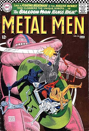
Issue #24 from 1967 has an interestingly rounded treatment for BALLOON MAN in Ira’s caption.
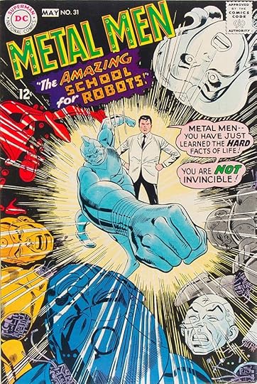
Ira’s final cover lettering was on issue #31 from 1968. The pink tint in the word balloon is an unusual choice, though not Ira’s, of course. The series went on to issue #56 in 1978, and the team has had several later revivals. Here are the covers lettered by Schnapp: 1-2, 4-28, 31. That’s 28 in all.

Ira lettered the 24-page book-length story in issue #15, his only story lettering for this title.

A new Robert Kanigher-edited and written Pacific South Seas war book began in 1964 and ran 18 issues, ending in 1967. It featured a P.T. Boat captain who loses a leg in the first issue and spends the rest of the run trying to get revenge on the Japanese in a storyline similar to Moby Dick in some ways. Kanigher’s previous record on war comics at DC was stellar, but this one was not as successful as the others. Storm was later part of the Kanigher war team “The Losers.” This series featured a new logo by Ira Schnapp that includes a rope border and an anchor, but is otherwise standard Schnapp block letters. Note that the name of the book in the indicia, like the lettering, is CAPT. STORM. Schnapp also did the cover lettering for this and all but two of the covers, but lettered none of the stories inside, many of which were lettered by Gaspar Saladino.

Issue #5 shows that the covers and stories mostly followed a similar pattern, as did the Schnapp lettering.

For issue #9, the open background of the logo has been filled with solid red, making it read better. Ira’s two burst captions sell the stories, but perhaps cover too much of the art.

On issue #14, even the dreaded “go-go checks” work with the red background, and I love Ira’s star-shaped caption and the angled one at the bottom. This is an impressive cover.

For the final issue, Storm takes his battle to land. Ira’s burst caption adds to the drama, but again covers some of the action. Here are the covers lettered by Schnapp: 1, 3-15, 17-18. That’s 16 in all.
Metal Men on Wikipedia.
More on Capt. Storm.
Other articles like this are on the Comics Creation page of my blog.
The post Ira Schnapp in METAL MEN and CAPT. STORM appeared first on Todd's Blog.
January 20, 2021
Ira Schnapp in TIME MASTER and SEA DEVILS
 Images © DC Comics
SHOWCASE #20-21 and 25-26 presented this science fiction adventure series that would soon move into its own title in 1961. The logo was by Ira Schnapp. Rip was an inventor who used his vehicle The Time Sphere to explore a variety of times and places with his friend Jeff Smith, girlfriend Bonnie Baxter, and Bonnie’s kid brother Corky. The editor was Jack Schiff with his assistants George Kashdan and Murray Boltinoff. As you can see, right from the start the adventures veered away from science fiction into fantasy, but the time travel idea was appealing and readers liked it enough to keep the title going for 29 issues.

More evidence of the unlikely stories presented from the first issue of 1961. Written largely by Jack Miller, the series was long on action and short on logic, but that was true of most DC Comics titles at the time. Ira Schnapp lettered all the covers, but none of the stories inside.

Issue two presents a rare close look at The Time Sphere and an even sillier monster. Ira’s lettering followed the style he used for all the DC covers and helped sell the ideas.

If the recent past wasn’t wild enough, how about a million years ago? DC liked to use the phrase “3-Part Novel,” but this merely meant an issue-length story in three chapters totaling about 24 pages, usually.

When they weren’t facing dinosaurs and aliens, Rip and company had some interesting encounters elsewhere in history, as here with Marco Polo and Kublai Khan in ancient China, all explained in Ira’s lettering.

Issue #20 from 1964 has a rare depiction of Hitler on a DC cover. There weren’t many, even during World War Two. Rip and his crew have gained uniforms of their own here.

Issue #23 has the time travelers meeting George Washington. There are two unusual things about Schnapp’s caption: first, it fills a picture frame in the art, and second, it ends with three question marks.

On issue #27 from 1966, Ira uses a riveted metal treatment for the word ROBOT in his caption.

The final issue goes all-in on giant monsters with a creepy spider. Rip might survive that, but he couldn’t survive poor sales, which likely ended the run. Rip and company would return in later series. Ira Schnapp lettered all 29 TIME MASTER covers.

Also beginning in SHOWCASE issues #27-29, SEA DEVILS was about undersea adventurers. The team consisted of leader Dane Dorrance, Biff Bailey, Judy Walton (Dane’s girlfriend), and Nicky Walton (Judy’s younger brother). Under exciting covers by Russ Heath and colorist Jack Adler, they also were soon facing fantastic opponents, as seen here. Once again, Ira Schnapp designed the logo, and there’s another use of three question marks in the caption.

Their series also began in 1961 a few months after RIP HUNTER, and ran to 35 issues in 1967. Ira Schnapp lettered this and most of the covers, but none of the stories inside, many of which were lettered by Gaspar Saladino. The book was edited and sometimes written by Robert Kanigher. The top caption reading “By popular demand!” is probably hyperbole from Kanigher. Sales figures on the first SHOWCASE appearance were probably not in yet when this first issue was sent to the printer. Russ Heath’s realistic art certainly sold the book to readers, and Ira’s lettering helped too.

Colorist Jack Adler used gray washes to add modeling and depth to the covers, creating the separations himself. On this one he removed the black outline from Ira’s caption box.

For issue #3, Ira used a spooky style for the word GHOST in his caption. The storytelling was so clear on these covers that many didn’t need any word balloons (and that avoided the problem of how they could speak underwater, too.)

The cover of issue #13 from 1963 has an interesting split view and lots of caption lettering by Schnapp. I think that top blurb is more hyperbole from Kanigher.

Issue #17 has two radio balloons suggesting the divers can communicate that way, even though the woman’s mouth is in the water. How did that work? And where’s her breathing tube? I guess you had to read the issue to see if this made sense!

Issue #25 from 1965 has a different style of radio balloon by Ira, and I like the use of color in his story title as well as the water-wavy banner at the top.

The final issue has a somewhat squashed caption at the top by Ira, and is not helped by those awful “go-go checks.” Here are the covers lettered by Schnapp: 1-23, 25-29, 31, 33–35. That’s 32 in all.
Rip Hunter on Wikipedia.
Sea Devils on Wikipedia.
More articles like this are on the Comics Creation page of my blog.
The post Ira Schnapp in TIME MASTER and SEA DEVILS appeared first on Todd's Blog.
January 19, 2021
Incoming: BOOKS OF MAGIC Volume 3
 Image © DC Comics
Copies of this third and final trade paperback collection of the recent series I lettered have arrived. I enjoyed working on it, and thought it was an interesting read, taking Tim Hunter to both familiar and unfamiliar places, and involving The Endless, the Dead Boy Detectives and other familiar Gaiman characters. Not sure when it’s due in comics shops, Amazon link below.
The post Incoming: BOOKS OF MAGIC Volume 3 appeared first on Todd's Blog.
January 18, 2021
Ira Schnapp in YOUNG ROMANCE
 Images © DC Comics
Like many comics pioneers, the team of Joe Simon and Jack Kirby tried all kinds of themes in comics. They essentially launched the very popular romance or love comics genre with this title in 1947 for Crestwood Publications in their Prize line. The book was so successful that many publishers were soon turning out more romance titles. The book sold millions of copies and ran to issue #124 dated June/July 1963 at Prize. Then Crestwood decided to get out of the comics business and sold YOUNG ROMANCE and its sister title YOUNG LOVE to DC Comics, where it joined the other DC romance books FALLING IN LOVE, GIRL’S LOVE STORIES, HEART THROBS, and SECRET HEARTS. The editor was Larry Nadle initially, then Jack Miller, according to the Grand Comics Database. The original logo was probably designed by Joe Simon, and the balloons on the first issue cover are by the studio’s main letterer at the time, Howard Ferguson.

By the final Prize issue, above, a new more informal logo was being used that I think was probably designed either by Joe Simon and Ben Oda, or by Ben alone. It had begun on issue #107 in 1960. Certainly the cover lettering looks like the work of Ben Oda.

For the first DC issue, #125 dated Aug/Sept 1963, Ira Schnapp created his own version of the previous logo which used the same letter shapes but in a more formal and less bouncy design. Close enough to attract Prize readers, I would say. The cover lettering on this issue is by Gaspar Saladino, who only did covers occasionally at the time, probably when Ira wasn’t available. DC did well with the title, and it ran to issue #208 in 1975. Schnapp lettered most of the covers until #151 in 1968, and also many of the stories inside, as was true for all the DC romance books then.
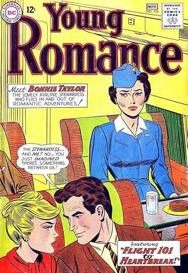
Issue #126 begins the run of familiar Schnapp cover lettering, and a series of stories about an airline stewardess. On romance books, Schnapp seemed to use a more delicate thin line for much of the cover lettering than he did on other kinds of comics.

Issue #131 from 1964 saw the debut of a new logo version by Ira. This one used the same letter shapes again, but was wider, slanted, and did not include the inner shapes. The outline was also a bit thicker to help separate the logo from the background art. As you can see in the top line lettering, DC continued the Prize feature “Young Miss America,” more on that later.

An oval caption with narration from stewardess Bonnie Taylor was used on several covers, about the only time I can think of that it was done. Schnapp’s caption shapes were often more curvy on romance books.

Issue #138 from 1965 has more unusual caption shapes and slanted lettering.

Ira’s final cover lettering was for issue #151 dated 1968. These covers have Schnapp lettering: 126-148, 151, That’s 24 in all.

Schnapp story lettering began with the first DC issue, sample above. I can only assume Ira liked working on romance stories, as he did so many of them.

This page lettered by Ira for issue #125 explains how DC was continuing the Miss Young America feature started by Prize, and the girls who sent in photos that were used had their portraits illustrated by John Romita, then one of DC’s regular romance artists before he went on to a long career at Marvel Comics.

Here’s the first of those portraits from issue #131. Ira lettered the title, which was reused in future pages like this. I wonder if any of the contest winners still have their John Romita sketch?

Some of the titles Ira had to letter were kind of ridiculous, like this one from issue #127, but he makes it look elegant.
This story from issue #144 in 1966 has script captions that are probably much like Ira’s regular handwriting. At least that’s my guess.

Ira’s final story lettering appeared in issue #151 in 1968, though it could have been done many months earlier. Anthologies like this could build up an inventory of stories well in advance.
These stories have Ira Schnapp lettering. All story titles are listed.
#125 Aug/Sept 1963: Intruder of Love 7pp, Three Week Romance 7pp, Miss Young America 1pp, His Brother’s Love 8pp
#126 Oct/Nov 1963: Flight 101 to Heartbreak 12pp, Two Can Play the Same Game 8pp, That Thing Called Love 8pp
#127 Dec 1963/Jan 1964: Another Face, Another Love 12pp, Love Is Only a Word on a Typewriter 8pp, Wait For My Love 8pp
#128 Feb/March 1964: You Deceive Yourself 8pp, In Favor of Love 8pp, Hold My Heart 12pp
#129 April/May 1964: Too Late For Love 12pp
#130 June/July 1964: Inviting Trouble 8pp, Please Make Her the Right Girl 8pp
#131 Aug/Sept 1964: Young Miss America 1pp
#132 Oct/Nov 1964: Strangers to Love 7pp, His Other Love 15pp
#133 Dec 1964/Jan 1965: Shadow On My Love 13pp, Last Kiss, First Heartbreak 15pp
#134 Feb/March 1965: A Ticket to Romance 15pp
#135 April/May 1965: Change of Heart 11pp, Never Let Go 15pp
#136 June/July 1965: Love Me Again 8pp
#138 Oct/Nov 1965: Forever Is Not Today 10pp, Don’t Steal My Love 13pp
#139 Dec 1965/Jan 1966: Stranger In My Heart 10pp, How To Lose Your Boyfriend 7pp
#142 June/July 1966: Too Shy For Romance 13pp
#143 Aug/Sept 1966: Betrayed 10pp, I Want Our Love To Be Different 12pp
#144 Oct/Nov 1966: Diary of a Broken Heart 13pp, Romance Italian Style 7pp
#145 Dec 1966/Jan 1967: Thanks For a Little Bit of Love 10pp
#148 June/July 1967: No Right To His Love 10pp, What Kind of a Girl are You? 12pp
#151 Dec 1967/Jan 1968: Take Me Back 8pp
That’s a total of 370 pages on this title.
Young Romance on Wikipedia.
More articles like this are on the Comics Creation page of my blog.
The post Ira Schnapp in YOUNG ROMANCE appeared first on Todd's Blog.
January 16, 2021
Listening to: JONI MITCHELL ARCHIVES Volume 1
 © images Rhino Entertainment and Joni Mitchell
I asked for this five CD set for Christmas, and received it from my inlaws, thanks Ann and Dave! I’ve listened to it all several times now, and I love it. This is the Joni Mitchell I fell in love with in the late sixties after buying her first few albums, but it was all recorded before that, from 1963 to 1967, in home recordings, radio stations and coffee house appearances. The booklet includes a recent interview of Joni by Cameron Crowe about the music, and she is as feisty as ever, telling him she was in no way influenced by Joan Baez, for instance, when he suggests it. The first CD is all traditional songs with a few by Woody Guthrie and the like. After that it’s nearly all original Joni songs, about half of which were never recorded or released elsewhere. You can hear her finding her way, some songs that were recorded by her have earlier lyrics or tune sections that were improved on before recording. Some songs are unfinished, some use tunes that turned up in later songs. Throughout, Joni’s voice is strong and confident, with the wide range of her early work. Intro talk about some of the songs is revealing and interesting, setting the time and place and what she was doing then, or who the song is about.

There’s a fair amount of repetition of her own songs in live performance, but I don’t mind that, they’re all a little different. The sound quality is good, though in a few spots the clink of glasses and plates is too audible. If any of you are Joni Mitchell fans, as I am, you will definitely want this. I’m not sure about later volumes of the Archives, I’ll have to see what’s on them, but this one is excellent. The first link is the CD set, the second is for mp3 downloads.
<br />
The post Listening to: JONI MITCHELL ARCHIVES Volume 1 appeared first on Todd's Blog.
January 15, 2021
Ira Schnapp in AQUAMAN and THE ATOM
 Images © DC Comics
Aquaman had been a regular DC character since 1941, but did not star in his own series until 1962. The tryouts for that ran in SHOWCASE #30-33, example above. This Aquaman logo had been created to top the splash pages of his stories in 1944, though Ira Schnapp added AQUALAD for this use.

When the new series began it featured a new logo by Schnapp which used the letter shapes from the previous logo, but made taller with a larger A and in an arc. The editor was Jack Schiff, and later George Kashdan. Aqualad had a much smaller byline, and Ira used some flaming letters in the caption. Since he was a superhero, Aquaman didn’t have to explain how he breathed and spoke underwater, and his opponents were often as mythic or fantastic as those in many other DC books of the time. Ira Schnapp lettered most of the covers up to issue #33, but none of the stories inside.

Aquaman could speak to and command the creatures of the sea, and as seen on the cover of issue #3, he wasn’t above using them to save himself.

Issue #9 from 1963 has Schnapp lettering in the bottom caption, but the word balloons are by someone else, I don’t know who. Perhaps they were added later in the DC production department.

Issue #16 has a larger and relettered subtitle, and features Aquaman’s love interest Mera in the background.

Not wasting any time, Aquaman and Mera were married in issue #18 from 1964 with the Justice League in attendance, the first cover appearance of a superhero wedding. Interesting to note which members didn’t need breathing apparatus: Superman, Wonder Woman and the Martian Manhunter. The scroll caption by Ira shows his ability to work in curved perspective.

Not only was Aquaman the rare hero to marry, he and Mera had a son in issue #23 from 1966. Ira’s banner at the top announces the event, which seems to be a mixed blessing.

Ira Schnapp’s last cover lettering for was on issue #33 from 1968. The series ran to issue #63 in 1978. The character had several later series and remains one of DC’s most well-known characters. Here are the covers lettered by Schnapp: 1-21, 23-24, 26-29, 31-33. That’s 30 in all.

The Atom was the third 1940s DC character revamped by editor Julius Schwartz after The Flash and Green Lantern. His tryout ran in SHOWCASE #34-36 with a new logo by Ira Schnapp.

The first issue of Atom’s own series began in 1962 with Schwartz editing, and ran to issue #38 in 1968. Ira Schnapp lettered most of the covers but none of the stories inside, many of which were lettered by Gaspar Saladino.

Issue #4 used a rare four-panel sequence with Ira’s thought balloon lettering helping to tell the story.

In addition to the caption and balloons, Ira lettered some book titles on the cover of issue #9, and probably the numbers and letters on the phone.

Issue #12 from 1964 has a rare round caption by Ira, and this cover is a good example of poor color choices made for the lettering (not by Ira). In the caption at the top, the first two lines should have been reversed white or yellow to read on the dark background, and the final line of the lower caption needed similar help, perhaps making it red.

Issue #19 has a completely reversed upper burst caption which reads fine, and I like the lettering in the lower caption too.

By issue #23 in 1966, cover lettering was getting larger and more bombastic. This might have been in reaction to what Marvel Comics was doing on their covers, but DC could never get theirs to work as well.

Ira uses some tall Art Deco influenced lettering in his caption for issue #32. Notice how well the blurb fits into the space.

Ira’s final cover lettering for the series was on issue #35 from 1968, and the book would last only three more issues. The labels on this cover are quite well done, and I also like the push-pin in the caption. Here are the covers lettered by Schnapp: 1–6, 8-13, 15-19, 21-27, 29-35. That’s 31 in all.
Aquaman on Wikipedia.
The Atom on Wikipedia.
More articles like this are on the Comics Creation page of my blog.
The post Ira Schnapp in AQUAMAN and THE ATOM appeared first on Todd's Blog.
January 13, 2021
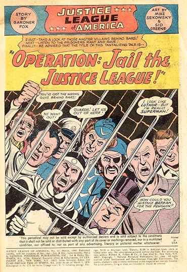
Ira Schnapp in JUSTICE LEAGUE OF AMERICA
 Images © DC Comics
Following the success of his revamp of DC Comics’ Golden Age character The Flash, editor Julius Schwartz did the same thing with Green Lantern, and then thought of teaming all the best DC heroes together in one comic, as had been done in the 1940s in ALL-STAR COMICS with The Justice Society of America. The new team first appeared in a three issue tryout in THE BRAVE AND THE BOLD #28-30. Long-time DC heroes Superman, Batman, Wonder Woman and Aquaman teamed with the 1950s creation J’onn J’onzz, the Martian Manhunter, and Julie’s new versions of Flash and Green Lantern. The book sold well and was soon in its own title.

The first issue is dated Oct/Nov 1960, and the series was one of the most popular and successful of the sixties. It ran to issue #261 in 1987, and has been revived several times since. The excellent logo created by Ira Schnapp for the SHOWCASE issues continued on the new series for several years. Ira lettered this and nearly all subsequent covers until issue #62 in 1968. Nearly all inside stories during that time were lettered by Gaspar Saladino, with just two by Schnapp at the end of his time at the company. Unlike many comics of the time, this cover is very quiet and passive, but I found it fascinating as a young reader. Note there’s no issue number. Fans then were not yet putting a high value on first issues, and places that sold comics didn’t want them, as their racks were already full, so DC sidestepped the problem by leaving it off.

Ira’s caption for the second issue has an unusual and interesting style for SINISTER SORCERERS. Though the characters worked together on the covers, inside they often worked in pairs much of the time, making it easier to tell a story.

Through it’s history, the Justice League periodically welcomed new members. The first was Green Arrow as seen on issue #4 from 1961.

Issue #7 has some unusually rounded and bouncy lettering by Schnapp on the words FUN-HOUSE MIRROR that I like.

Issue #9 told the origin of the team for the first time. Note that Superman and Batman were not featured on covers early on perhaps to give the rest of the team a chance to shine.

Issue #14 saw the addition of The Atom, another Schwartz revamp. In the Schnapp caption, Ira does a tiny version of his Atom logo.

In THE FLASH #123, Schwartz had brought together the Golden Age and Silver Age versions of the character in one story. It was a hit, so in this book he brought back the entire Justice Society of America, as the Schnapp caption says, for the first time in twelve years. From here on, Golden Age characters were liable to turn up anywhere, and there was a yearly crossover story with them in this book. The idea of both teams alive and well on Earths of different dimensions was one fans liked, and the concept of the Multiverse came into comics.

Ira had some extra sign work to do on this cover for issue #28 in 1964, and he handled it well.

Hawkman joined the team with issue #31. I like Ira’s electric style in the left caption for the word ELECTRIFYING.

Issue #38 from 1965 was another crossover with The Justice Society, and it began a new tradition in cover layouts with character heads down each side. This made more sense than trying to get them all in one drawing, and also made for interesting comparisons. Lots of Schnapp lettering here.

Issue #39 was the first of the 80-PAGE GIANT series incorporated into the title it featured, as would be the standard practice afterward. Like all the Giants, it was reprints inside with a new cover. Look at all the lettering Ira had to do here, but at least the design left room for it. I like the top blurb, “The Ultimate Utmost in Comic Magazines!”

Issue #43 saw the introduction of a new Schnapp logo. The shield frame was gone, and the title letters were a little wider and had telescoping drop shadows to add depth. Not bad, but I never liked it as much as the first logo.

By issue #46 from 1966, DC and the country were swept up in the publicity over the Batman TV show, where large comic-book sound effects were flashed on the screen during fight scenes. I think that’s the reason they’re used here. Ira might have inked them, but they were probably drawn by the penciller, Mike Sekowsky.

I’m not sure why I like the lettering on issue #51, but I do. Ira had a rare chance to use a large letter Z for one thing.

Ira’s final cover lettering for the series was on issue #62 from 1968. His handling of the word PANIC here suggests he was looking at the work of Gaspar Saladino, who would take over the job from here on.
These covers have Ira Schnapp lettering: 1-24, 26-32, 34-36, 38-47, 50-53, 55-58, 61-62. That’s 54 in all.
Gaspar Saladino was the regular story letterer for this title, only missing a few issues in the run covered here, but surprisingly, Ira Schnapp lettered two full issues probably not long before he left the company in 1968. Issue #61, above, has a handsome story title by Ira.

Issue #62 may have been one of the last things Schnapp worked on before being retired by DC. His lettering looks about the same to me as what he’d been doing since the late 1940s at least. Here are the details of the work:
JLA #61 March 1968: 23pp
JLA #62 23pp
That’s 46 pages in all for this title lettered by Schnapp.
More articles like this are on the Comics Creation page of my blog.
Justice League of America on Wikipedia.
The post Ira Schnapp in JUSTICE LEAGUE OF AMERICA appeared first on Todd's Blog.
January 12, 2021
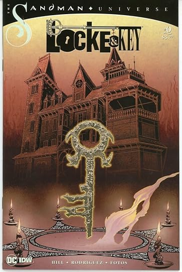
Incoming: LOCKE & KEY/THE SANDMAN #0
 Images © DC and IDW
IDW sent me a few of these recently, and I didn’t know why until I opened one up. It’s a sort of preview/prelude to an upcoming crossover between Neil Gaiman’s Sandman Universe and IDW’s Locke & Key by Joe Hill and Gabriel Rodriguez, and it includes an eight-page section from SANDMAN #1 that I lettered. I loved the original LOCKE & KEY series, and the preview includes a Locke & Key story I hadn’t read, “Open The Moon” from a comic titled LOCKE & KEY: THE GUIDE TO KNOWN KEYS. This 16-page story is a gem! Beautifully written, excellent art, lettering and coloring, very moving. It’s about a special new key created for Ian Locke, a boy who is gravely ill. It’s a key that will unlock the moon and what Ian finds there amazes and delights him. That sequence is done in the style of Little Nemo in Slumberland by Winsor McCay. There are other things in the issue, including that guide to known keys, but this story is well worth the price of the issue on its own. I haven’t been reading any comics lately, but I think I might try to read this crossover.
The post Incoming: LOCKE & KEY/THE SANDMAN #0 appeared first on Todd's Blog.
Todd Klein's Blog

- Todd Klein's profile
- 28 followers

