
Todd Klein's Blog, page 100
December 9, 2020
Ira Schnapp in SUGAR AND SPIKE
 Images © DC Comics
The longest-running series of those created by writer/artist Sheldon Mayer is this one, which began in 1956 and ran to issue #98 in 1971. Larry Nadle was probably the editor technically, but Mayer was a former editor at DC himself, and didn’t really need one I’d say, except to traffic the lettering and coloring. Mayer clearly had plenty of ideas for these two very young children and enjoyed writing and drawing them. Even after the series ended he continued to make more, and DC paid him to do so. Some appeared eventually in America, while others were only printed overseas. The two tykes are neighbors and friends, but Sugar was the leader and idea person, while Spike usually took the blame for her naughty ideas. They could speak to and understand each other, but to their parents, what they said came out as nonsense, while the kids couldn’t understand adults either. This led to many funny situations.
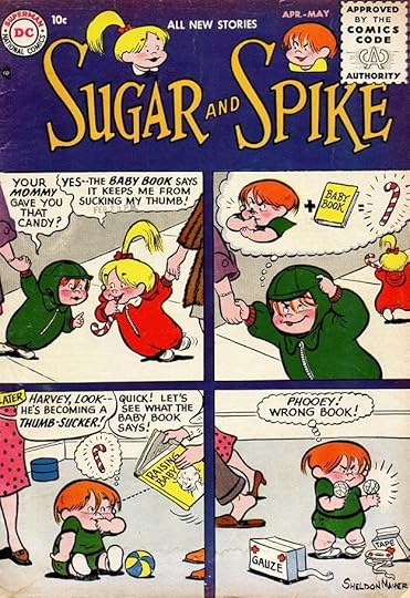
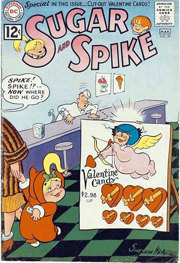
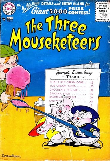
Ira Schnapp designed the logo, using thin serif letters and two large S’s to make space for character heads by Mayer. This cover of the first issue got right to the storytelling with a four-panel gag lettered by Ira. Note the more wavy edges to the balloons in the first panel where the kids talk to each other. That would become more pronounced. Mayer often did the balloon shapes, as he did here. A few other covers had four panels, but most had a single image. Schnapp lettered many of the covers and inside pages in the book until issue #76 in 1968.
The cover of issue #2 is a typical example of Sugar being bad and Spike taking the blame, a theme many kids could probably appreciate and find funny. This was the only DC series focused on very young children, but the humor might appeal to any reader who tried them.
Issue #4 is a more typical single image gag, but Mayer’s art and humor told a complete story all the same. Here Sugar’s speech balloon is completely normal, so added by Schnapp. Mayer would have made it wavy.
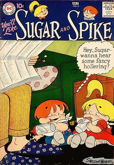
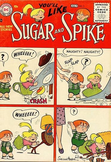
By issue #8, the child-speak balloons were completely unique, using upper and lower case lettering by Schnapp in a balloon with scalloped edges and tail. Ira has done a new version of the “You’ll Like” tag.
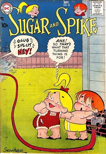
On the cover of issue #10, the adult balloon is rounded, and note the water drops around the first two words. Sugar’s balloon is in the new style, and you can see here that the tail edges criss-cross, while her words are upper case again.
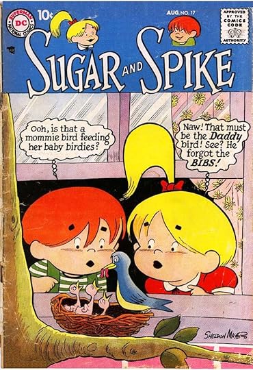
Issue #17 from 1958 is back to upper and lower case Schnapp lettering, but the balloons are by Mayer. I don’t think either of them were too concerned about being consistent, as long as the humor worked.
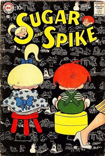
Issue #21 saw the first appearance of a new Schnapp logo using thicker sans-serif block letters in a wide oval shape with the names on two lines. I think the character heads are the same. The background of reversed images is an unusual treatment for this book.
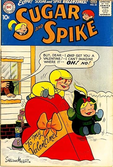
On issue #33 you can see that Ira’s outlines for the new logo were quite thick to help readability against a busy background. His script on the candy box is elegant.
Many of the six yearly issues had repeated themes, here’s another Valentine’s Day one. Other themes included summer vacation, Halloween, and Christmas.
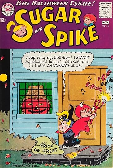
On issue #55, the lettering is back to upper and lower case in a wavy balloon for child-speak in this Halloween gag.
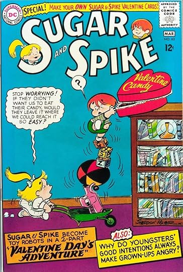
Another Valentine cover for issue #63 goes back to standard Ira Schnapp upper case lettering for the child-speak balloon, and features two large captions. There was plenty of room for them.
Schnapp’s final cover lettering was on issue #76 from 1968, though I think he did only the child-speak balloons and the bottom caption with the rest being by Mayer. It was a partnership that always worked well.
Here are the covers with Schnapp lettering: 1-11, 13-14, 16-19, 22, 24-56, 58-59, 61-76. That’s 69 in all.
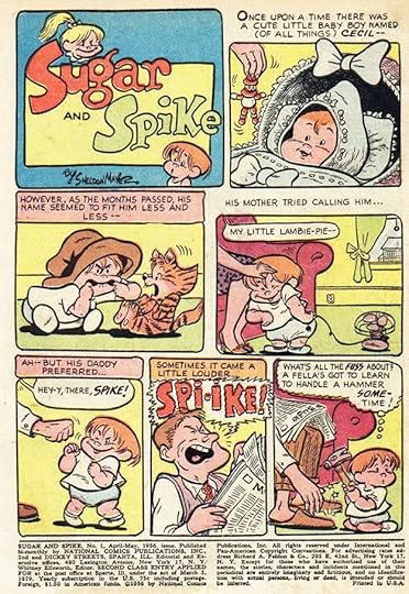
The first page of the first issue shows how Mayer and Schnapp worked together on the lettering. Ira did the caption and balloon letters, while Shelly did the balloon shapes and title and also the big open letters in the burst balloon on the bottom row. Clues to Ira’s involvement are the small, square lettering, the angular S in the emphasized words, and the clincher is the distinctive Schnapp question mark in the last panel. In many cases, Mayer may have turned in inked pages with just the lettering needed by Schnapp pencilled in for Ira to follow.
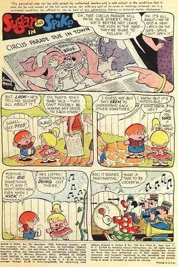
On this page from #20 are examples of the way adults heard what the kids said in panel two. Mayer explains in the adult balloons. The rest of the Sugar and Spike balloons are in the child-speak style.
For a while, starting with issue #44 above, Mayer asked Schnapp to do the upper and lower case style for child-speak in the stories too. That would have taken more time, and it was only used until issue #56.
In the last few issues he worked on, Ira made another style change perhaps requested by Mayer. His usual question marks were replaced by more standard ones. Sometimes he forgot and did the old style, as in the second balloon in panel six here in issue #74.
These are the stories lettered by Ira Schnapp. He also worked on many of the short filler pages by Mayer like the Pin-Ups, which were actually paper dolls. In some cases, like the Write Your Own Comic pages, Ira only did a small amount of lettering, so I haven’t counted those, particularly since some of them might be repeats. Often Mayer did some of the lettering himself on filler pages, so it’s less clear what Ira did. I’ve only listed the ones I think have a good amount of Schnapp lettering. Especially on early issues, stories not lettered by Schnapp are probably lettered by Mayer. Almost all longer stories feature Sugar and Spike, I’m using sometimes shortened story titles.
#1 April/May 1956: Intro 6pp, Thumbs Up 2pp, Yak-yak Box 5pp
#2 June/July 1956: Spike at Home 1pp, Sugar at Home 1pp, Big Toy Mystery 4pp
#3 Aug/Sept 1956: Shiny Roller 6pp, Spike Discovers the Ocean 6pp, Pinups 1pp, Lobsters Away 4pp, You Be the Editor 1pp, Anti-Aunty 6pp
#4 Oct/Nov 1956: Who’s Sorry Now 6pp, New Gadget 4pp, Water Babies 6pp
#5 Dec 1956/Jan 1957: Grampa’s Problem 1pp, Pinups 1pp
#6 Feb/March 1957: New Baby 6pp, The Trip 6pp, Pinups 1pp, Winter Sunday 4pp, Cats 1pp, Baby vs. Machine 5pp
#7 April/May 1957: Magic Book 6pp, First Haircut 4pp
#8 June/July 1957: Speech Lessons 6pp, Uncle Charley 6pp, Pinups 2pp, The Tick-Tock 1pp, Ride ‘Em Cowboy 3pp, Trip to the Zoo 6pp
#9 Aug 1957: Pinups 2pp, Spike Learns 6pp
#10 Sept 1957: Big Word Mystery 6pp, Magic String 4pp
#11 Oct 1957: Cuddly-Toy 6pp, Indoor Ocean 6pp, Trick or Treat 4pp, Grown-up Party 6pp
#14 March 1958: Visit 6pp, Nice Ice 6pp, Who’ll Fix 1pp
#15 April 1958: Mommies 6pp
#16 June 1958: Picnic 4pp
#17 Aug 1958: Meet Arthur 6pp, Pinups 2pp, no title 1pp, Temptation 6pp
#18 Sept 1958: First Crack 6pp, Pinups 2pp, Losing Business 4pp, Poky Problem 1pp
#19 Oct 1958: Dude Ranchers 6pp, Dictionary 1pp, Gardner’s Surprise 4pp, Pinups 2pp, Look Who’s Here 6pp, Low Gear 2pp, Mystery 6pp, How to Move 1pp
#20 Dec 1958: Circus Parade 6pp, Grown-up Game 2pp, Doing Like Daddy 4pp, Pinups 2pp, Adventures 6pp, Baby-Size Car 6pp
#21 Feb/March 1959: Pinups 2pp, The Time the Trees 6pp, The Rope 1pp
#22 April/May 1959: Visit to Daddy’s Office 6pp, Little Arthur 7pp, Pinups 2pp, Sugar’s Invention 6pp
#23 June/July 1959: Tiny Visitor 6pp, Pinups 2pp, First Movie 6pp, Sympathy 4pp, Flying Split-Peas 7pp, New Gadget 1pp
#24 Aug/Sept 1959: Sugar’s Grampa Plumm 8pp, Pinups 2pp, Uncle Charley 6pp, First Date 2pp, Babies At Sea 7pp
#25 Oct/Nov 1959: Day at the Beach 6pp, Something Special 1pp, Pinups 2pp, Sugar’s Problem 3pp, Grampa’s Music 1pp, First Echo 4pp, Big Ha-Ha 2pp, Billy Borrower 6pp
#26 Dec 1959/Jan 1960: Out-Cast 6pp, Attic 1pp, Pinups 2pp, Mystery of the Man 7pp, Big Gift 6pp, New Sugar 4pp
#27 Feb/March 1960: Baby-Talk Mystery 8pp, Snow Family 1pp, Pinups 1pp, Valentines 1pp, Little Giants 6pp, Strange Stranger 4pp, Valentine Mix-up 6pp
#28 April/May 1960: Strange Creature 6pp, no title 1pp, Spring-Time Tale 4pp, Pint-size Detective 6pp, Pinups 2pp, Spike Discovers 2pp, Daddy’s New Toy 6pp
#29 June/July 1960: Operation Ocean 6pp, Banana’s Overcoat 6pp, Grown-up Party 2pp, Trouble on Wheels 4pp, Flying Saucer 7pp
#30 Aug/Sept 1960: Funny Faces 6pp, Baby vs Cat 3pp, Monkey-Shines 7pp, Pinups 2pp, Pony Tail Strikes 7pp
#31 Oct/Nov 1960: Tackle Halloween 6pp, Pinups 2pp, Day the Plumbers Came 7pp, New Game 1pp, Gardeners 1pp, Temporary Genius 4pp, Big Indian 6pp
#32 Dec 1960/Jan 1961: Help Out Sant 8pp, Superman for a Day 6pp, Experiment 1pp, Baby-Sat 6pp, Pinups 1pp, ‘Twas the Night 4pp
#33 Feb/March 1961: Against Little Arthur 8pp, Snowball War 4pp, Flowers 1pp, Cupid Routine 6pp, Pinups 1pp, Valentines 1pp, Wanderer 6pp
#34 April/May 1961: To the Rescue 6pp, Science 4pp, Ball-Game 6pp, Pinups 2pp, Cookie Hunt 6pp
#35 June/July 1961: Grampa Plumm Returns 6pp, Scientist 4pp, Pinups 2pp, Treasure Hunt 6pp, Crossword Puzzler 4pp, Magic Don’t-Touch Thing 6pp
#36 Aug/Sept 1961: Yacht Race 6pp, Small War 6pp, Sugar’s Logic 1pp, Pinups 2pp, Tough Day 4pp, Big Giant Mystery 6pp
#37 Oct/Nov 1961: Halloween Monsters 6pp, Mystery Toy 6pp, Pinups 2pp, Day the Trees 4pp, Hidden Sugar 1pp, The Rise 6pp
#38 Dec 1961/Jan 1962: Mysterious Secrets 8pp, Nanty Minerva’s 6pp, Confusing Santa 1pp, Pinups 1pp, Foot Trouble 4pp, Christmas Eve 6pp
#39 Feb/March 1962: Ski-wheeee 8pp, Mail-Box Mystery 6pp, Pinups 1pp, New Kid 4pp, Uncle Charley’s Put-Put 6pp
#40 April/May 1962: Space Sprout 14pp, Who’s Who 1pp, Snack System 4pp, Pinups 2pp, A New Shirt 6pp
#41 June/July 1962: Who Said That 8pp, The Wet-Stuff 6pp, Pinups 2pp, New Hat 4pp, Water Sports 6pp
#42 Aug/Sept 1962: Get Separated 6pp, Daddy Fun 4pp, Little Arthur 6pp, Pinups 2pp, A Porpoise 6pp
#43 Oct/Nov 1962: Get Up in the World 8pp, Don’t-Touch Stuff 4pp, Pinups 2pp, Space Sprout 6pp, Uncle Charley 6pp
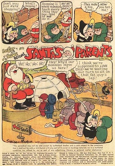
#44 Dec 1962/Jan 1963: Santa’s Parents (4 chapters) 8pp, 6pp, 6pp, 4pp, Sugar to the Rescue 1pp
#45 Feb/March 1963: First Valentine Party 8pp, White Stuff 6pp, How High 4pp, Pull-Toy 6pp
#46 April/May 1963: Muscles 8pp, Sugar Cure 4pp, The Hat 1pp, Pinups 2pp, Wooden Pussy-Cat 6pp, Sugar’s Discovery 6pp
#47 June/July 1963: Who Stole Our Ocean 8pp, Investigators 1pp, Sugar’s Always Right 4pp, The Genius 7pp, Pinups 2pp, Growing Pains 6pp
#48 Aug/Sept 1963: 4000 Year Old Baby 6pp, Indian Chief 8pp, Pinups 2pp, The Doggie 4pp, Little Arthur 6pp
#49 Oct/Nov 1963: Halloween Adventure 8pp, Uncle Charley 6pp, Pinups 2pp, War with a Window 4pp, Tale of the Tick-Tock 6pp
#50 Dec 1963/Jan 1964: Four-Legged Boss 8pp, Dozen Doll-Boys 4pp, Pinups 1pp, Became Santa Claus (2 parts) 6pp, 6pp
#51 Feb/March 1964: Valentine-Eve Adventure (2 parts) 8pp, 7pp, The Genius 4pp, Pinups 1pp, Valentine Cards 1pp, Comedienne 6pp
#52 April/May 1964: Baby Vanished 6pp, Pinups 2pp, Grown-up Talk 6pp, Lesson in Sharing 4pp
#53 June/July 1964: Ball-Fight 8pp, Pinups 2pp, Deep Sea Adventure 6pp, Back-Fire 4pp, Go Figure 6pp
#54 Aug/Sept 1964: Swimming Lesson 8pp, Boppo’s Escape 6pp, Pinups 2pp, Better Late 1pp, Spike Solves 6pp
#55 Oct/Nov 1964: Halloween Goblin 10pp, Shopping 1pp, Big Adventure 13pp
#56 Dec 1964/Jan 1965: Christmas Dollies 14pp, Pinups 1pp, Christmas Cards 1pp, Spike’s Big Problem 4pp, Air-Waves 6pp
#57 Feb/March 1965: Valentine’s Day 10pp, Pinups 1pp, Valentine Cards 1pp, Puppet Plot 8pp, Sugar’s Conscience 4pp, Education/Big Secret 1pp
#58 April/May 1965: Lion in the House 16pp, Nature Study 1pp, Pinups 2pp, Sugar Revolts 6pp
#59 June/July 1965: Baby Farmers 8pp, Conspiracy 6pp, Pinups 2pp, Legal Troubles 6pp, Spike is Right 1pp
#60 Aug/Sept 1965: Slurp Game 8pp, Pinups 2pp, One-Eyed Box 6pp, Kill-Joy 1pp, Perry 6pp
#61 Oct/Nov 1965: Halloween Cats 14pp, Uncle Charley 4pp, Pinups 2pp, Music Maker 3pp
#62 Dec 1965/Jan 1966: Santa’s Sleigh Broke Down 16pp, Pinups 1pp, Winter War 6pp
#63 Feb/March 1966: Valentine’s Day Adventure 14pp, Good Intentions 6pp, The Worrier 3pp, Pinups 1pp, Valentine Cards 1pp
#64 April/May 1966: Baby Heroes 20pp, Contest 1pp, Baby Talk 1pp, Pinups 2pp,
#65 June/July 1966: Impossible Adventure 20pp, Pinups 2pp, Law of Gravity 1pp
#66 Aug/Sept 1966: Invisible Infants 20pp, Pinups 2pp,
#67 Oct/Nov 1966: Halloween Magic 21pp, Pinups 2pp
#68 Dec 1966/Jan 1967: Cowboy Santa Claus 20pp, Pinups 2pp
#69 Feb/March 1967: A Super-Hero 21pp, Valentine Cards 1pp, Pinups 2pp,
#71 June/July 1967: Double Trouble 20pp
#72 Aug/Sept 1967: Bernie the Brain 20pp
#73 Oct/Nov 1967: Trigger Finger 20pp, Pinups 2pp
#74 Dec 1967/Jan 1968: Revolt in the Nursery 20pp, Pinups 2pp
#75 Feb/March 1968: The Mischievous Marble 20pp, Pinups 2pp, Doodles Duck 6pp
#76 April/May 1968: The Blehh 20pp, Pinups 2pp
That’s a total of 1,623 pages if my addition is right. Quite a large body of work.
Sugar and Spike on Wikipedia.
Sheldon Mayer on Wikipedia.
More posts like this are on the Comics Creation page of my blog.
The post Ira Schnapp in SUGAR AND SPIKE appeared first on Todd's Blog.


December 7, 2020
Ira Schnapp in THE THREE MOUSEKETEERS
 Images © DC Comics
Of all the funny animal artists or writer/artists at DC Comics, Sheldon Mayer had the longest history at the company. He had been the editor-in-chief of DC’s sister company All-American Comics, and when the two branches merged, he continued as an editor for a few years before deciding to go freelance full time. Shelly produced many funny and memorable stories, and in 1956 this trio of mice was given its own title edited by Larry Nadle that lasted 26 issues. At first Mayer did all the stories and art, but gradually stories with art by Rube Grossman began to appear, and by issue #10 it was all Grossman, and using other writers. Mayer’s creations were not the first mice with this name at DC. A feature with the same title appeared in FUNNY STUFF from 1940 to 1948, but was unrelated to this one. This series ran to 1960, and was reprinted in 1970-71. Disney’s Mickey Mouse Club’s children were also called Mouseketeers, probably a coincidence. Both DC series drew inspiration from the book “The Three Musketeers” by Alexander Dumas, though the earlier series drew on it more.
Ira Schnapp designed the charming logo, which is more rounded and bouncy than most of his work. The covers had no captions or word balloons, but Ira lettered signs on some of them. He also lettered about half the stories inside.
Issue #4 has Schnapp lettering on the menu.

Issue #12 has handsome title work by Schnapp on the books. He also did BOOK ENDS, part of which is scraped off on this comic.
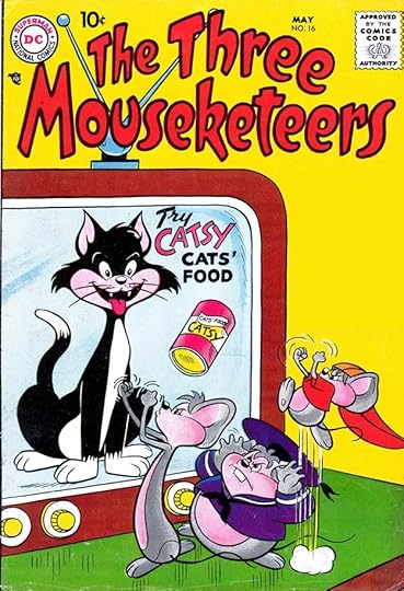
The antagonist in the book was, predictably, a cat. Ira did the titles on the TV ad here.

Ira’s last cover lettering was the song title and word HARMONICA on issue #22. He did lettering on the covers of issues 4, 12, 14, 16-17 and 22, six in all.
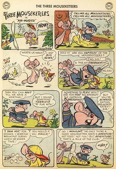
When Schnapp lettered stories by Sheldon Mayer, it was a collaborative process. Mayer did the titles, balloon shapes, sound effects, and sometimes any large display lettering. He might have done the OHO! in the final balloon on this page from issue #1. Sometimes Mayer lettered the entire story at first, but probably began to rely on Ira and other letterers to save time. When the main artist became Rube Grossman, Ira and others were lettering all the stories.

This page from issue #3 has lots of lettering by Schnapp, including a chart.

This story from issue #20 had the extra challenge of backwards lettering, which Schnapp handled easily, from the look of it. His very regular and square letters weren’t hard to do backwards.

A page of Schnapp lettering from the final issue. There was a large gap between issues 24 and 25, so the last two issues were probably using up inventory.
Here are the stories lettered by Ira Schnapp. All star the Three Mouseketeers unless otherwise noted. I’m adding the story titles to avoid confusion, but some are shortened.
#1 March/April 1956: Air Minded 6pp
#2 May/June 1956: Hi-Ho and Away 6pp, Hep Mouse 6pp, Griping 4pp, Dizzy Dog 1pp, Buzzin’ Cousin 6pp, Brain vs Brawn 1pp
#3 July/Aug 1956: Working Railroad 6pp, Dizzy Dog 1pp, Patsy 4pp, Disappearing Cave 6pp
#4 Sept/Oct 1956: Getting Up 6pp, Food for All 6pp, Patsy 4pp, Fleetin’ Meetin’ 6pp
#5 Nov/Dec 1956: Meet Cousin Rodney 6pp, Under Two Flags 4pp, Fatsy 2pp, Quiet Snooze 6pp, Crowded by Crickets 6pp
#6 Jan/Feb 1957: Letter from Petey 6pp, Lady in Distress 6pp, Stoppin’ Choppin’ 1pp, Dizzy Dog 1pp, Never Call Names 3pp, no title 2pp, Big-Feets 6pp
#7 March/April 1957: Squeaky Shoes 6pp, Dizzy Dog 1pp, Patsy 4pp, House Cleaning 2pp, The Black Ball 6pp, Hold the Phone 6pp
#8 May/June 1957: Why Minus 1pp, Happy Daze 1pp, Spring Time 6pp, Dizzy Dog 1pp
#9 July 1957: Make Mine 4pp, Captains 4pp, South Pole 6pp
#10 Aug 1957: Paging 6pp, Great Treasure Hunt 6pp, Bed-Time Story 4pp
#11 Oct 1957: Bubble Heads 4pp, Adventure Ahoy 6pp
#12 Nov 1957: Stone’s Throw 6pp, Time Out 4pp, Sky’s the Limit 4pp, Nip & Chip 4pp, X Marks the Spot 4pp
#13 Jan 1958: Yo-yo Trouble 6pp, Fire Away 4pp, Better Late 4pp, Oh, Say 4pp, Meet Max 6pp
#14 Feb 1958: Money Happy 6pp, Namedroppers 4pp, Out to Launch 4pp, Cheese It 6pp
#15 April 1958: Club-Mates 6pp, Berries 4pp, Return of Mr. Mole 4pp, Nap Happy 6pp
#16 May 1958: Food for Thought 6pp, All that Glitters 4pp, Big City Blues 6pp
#17 July 1958: Be It Ever So Humble 6pp
#19 Oct 1958: Saved by a Skin 6pp, Bugle Blues 4pp, Scout 6pp
#20 Nov 1958: Cold Comfort 6pp, Dues and Don’ts 6pp, Happy Talk 6pp
#21 Jan/Feb 1959: Blast Off 8pp, Slugger Patsy 6pp, Rip Van Patsy 6pp
#22 March/April 1959: Snooze Happy 6pp, Herman Hop-Toad 6pp
#23 May/June 1959: Smart Dumbbell 2pp, Heroes Are Made 6pp
#24 Sept/Oct 1959: Bally Ho Island 8pp, The Big Mystery 6pp
#25 Aug/Sept 1960: Oh Captain 2pp, Disappearing Cave 6pp
#26 Oct/Dec 1960: Hamilton Hawk 10pp, Patsy’s Job 1pp, Patsy the Engineer 2pp, Springtime for Rufus 6pp
That’s a total of 415 pages. More articles in this series are on the Comics Creation page of my blog.
The Three Mouseketeers on Wikipedia.
The post Ira Schnapp in THE THREE MOUSEKETEERS appeared first on Todd's Blog.
December 6, 2020
And Then I Read: PADDY by R.D. Lawrence

Published in 1977, this is a story of a baby beaver raised by a naturalist, but it’s not one of those stories about bringing a wild creature into someone’s home. Lawrence was doing a study of beavers in remote Ontario wilderness holding several ponds with beaver lodges on them. He camped there from early spring to late fall. Not long after arriving he found the remains of a female beaver eaten by a wolf, and from her condition, realized she must have been feeding young. Knowing her kits would soon die without help, he decides to intervene, braving the icy water to pull her single kit from her home lodge. Overcoming many difficulties including how to feed it and keep it safe, Lawrence raises the young beaver, who he names Paddy, and the experience changes both of them as they learn together how to make the situation work. Meanwhile, Lawrence carries on his research, discovering new things about the world of wild beavers and their behavior that had not been noted before.
I enjoyed this book. The writing is good, and Lawrence does not anthropomorphize his charge, he writes of his own anger and frustration with the young animal at times, but his care and concern are evident. Recommended to anyone who enjoys learning about wild animals.
The post And Then I Read: PADDY by R.D. Lawrence appeared first on Todd's Blog.
December 4, 2020
Incoming: BATMAN THE CAPED CRUSADER Vol 5, BATMAN THE DARK KNIGHT DETECTIVE Vol 4

 Images © DC Comics
Two new Batman trade paperbacks reprinting comics I lettered have arrived. CAPED CRUSADER includes BATMAN 466-473, which I lettered over Norm Breyfogle and Tom Lyle, now both sadly gone. DARK KNIGHT includes DETECTIVE COMICS 601-609 and 611, also with Breyfogle. It’s weird how, as you work along in comics day by day, month by month, year by year, you hardly think about the amount of work you’re doing. Only later, when I get reprints like this, and I’ve received many, do I think, “How did I get all that done?”
These are due out in January. Check with your comics supplier, or try the Amazon links below.
<br />
The post Incoming: BATMAN THE CAPED CRUSADER Vol 5, BATMAN THE DARK KNIGHT DETECTIVE Vol 4 appeared first on Todd's Blog.
Ira Schnapp in SHOWCASE
 Images © DC Comics
In 1956 DC Comics launched a new bimonthly title that was a tryout book for new series, characters and subjects. The original idea was for readers to write in with suggestions, and the editors would use the most popular ones. I don’t think that plan lasted more than a few issues if it was really followed at all. Here’s the idea as lettered by Ira Schnapp on the first page of the first issue:
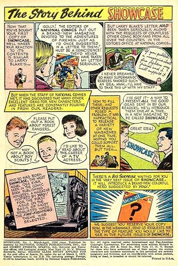
However long this idea was used, the book soon became a tryout series for every DC editor’s new ideas, and each tryout had its own editor. Mort Weisinger was the editor of the first issue that actually might be based on reader suggestions. The series ran to 104 issues, ending in 1978.
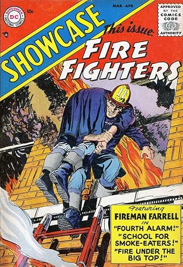
While Ira Schnapp only lettered three full issues of the series and a few short pieces, he was the main cover letterer until issue #72 in 1967, and he also designed most of the new logos needed. For the cover of issue #1 he not only designed the SHOWCASE banner, but also the FIRE FIGHTERS logo. Here it is from the DC files:
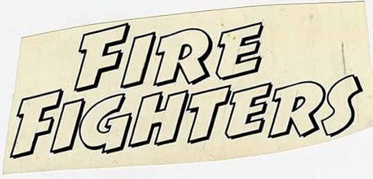
Not Ira’s best work, but it does the job. Ira also did the rest of the cover lettering. A larger image of this logo is HERE.
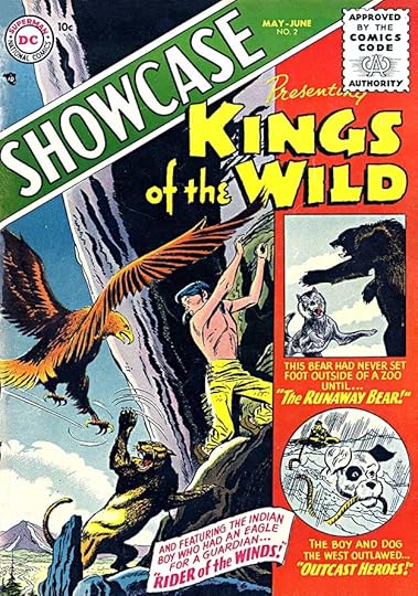
Issue #2’s theme was wild animals in an issue edited by Robert Kanigher. Schnapp again did the logo and cover lettering. One gets the feeling that his logo styles here were meant to be rougher and more organic as a contrast to the very formal SHOWCASE banner.
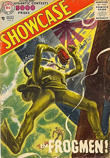
Issue #3’s THE FROGMEN is more cover lettering than logo, but also by Schnapp. Kanigher also edited this one. It might be considered a sort of tryout for SEA DEVILS.
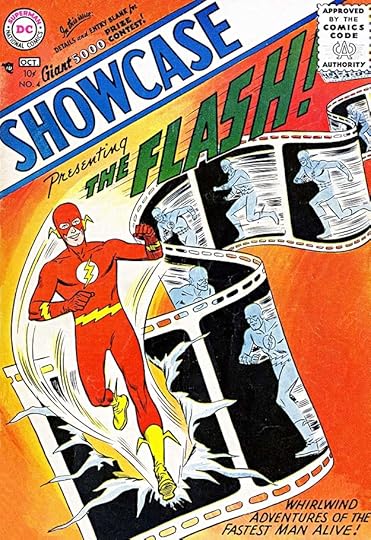
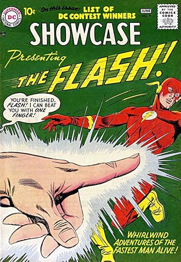
The initial big success for SHOWCASE was in issue #4, the first of editor Julius Schwartz’s revival of revamped Golden Age superheroes. Ira did the new FLASH logo and cover lettering. This was appealing to readers and must have sold well, but it took some time for sales figures to reach DC, so they didn’t know it for a while.
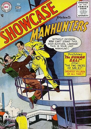
Issue #5 featured crime-fighter stories with a MANHUNTERS logo by Schnapp as well as cover lettering. Jack Schiff was the editor.
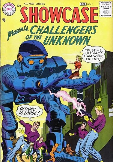
Issues 6-7 had a tryout for a new team combating weird menaces created by Jack Kirby with probable help from Joe Simon and Dave Wood. Jack Schiff was the editor. The CHALLENGERS logo is not by Ira, it’s pulled from the first page of issue #7, and I don’t know who lettered that. Ira did PRESENTING and the word balloons, though “Ultivac is Loose!” does not look quite like his work, and might have been a late addition by someone else. Note that SHOWCASE has dropped the banner and angled look.
Issue #8 had a second tryout for The Flash with a different version of the logo by Schnapp, along with cover lettering. Both are similar to but not the same as the one he would do when the character gained his own series.
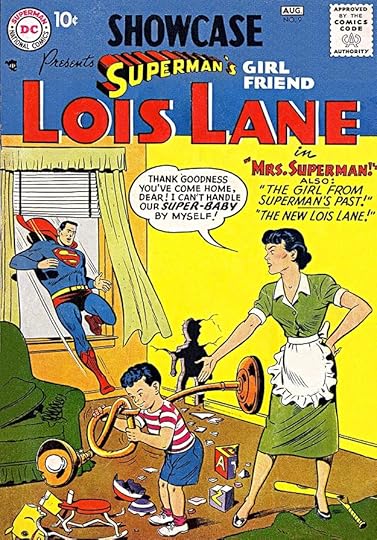
Issues 9-10 were a tryout for SUPERMAN’S GIRL FRIEND LOIS LANE. Ira’s logo followed the plan of his JIMMY OLSEN logo for the top part, but LOIS LANE is more sedate Art Deco letters. Ira also did the rest of the cover lettering. The Editor of this and all Superman-related books was Mort Weisinger.

Issues 11-12 again featured Challengers of the Unknown, and issues 13-14 again starred The Flash. Perhaps those in charge were reluctant to go ahead with new series until more sales information came in. Issues 15-16 featured new science-fictional crime-fighter, Space Ranger, with a handsome beveled logo by Schnapp in a stylized (and old-fashioned) rocket shape. The editor was Jack Schiff. He and Julius Schwartz were each asked to create new science fiction heroes, one from the present and one from the future. Schiff’s was the future hero, though his future was decidedly unscientific, relying on familiar gangster and monster themes.

Issues 17-19 featured Julie Schwartz’s editorial creation Adam Strange, who was transported to the distant planet Rann on a regular basis by “zeta-beam.” Schnapp did the new logo ADVENTURES ON OTHER WORLDS and the caption.

Issue #19 relegated the general title to a bottom caption, and Ira designed a new logo for Adam Strange. I feel that should have been done from the start, as it’s much more appealing. Adam Strange proved more popular than Space Ranger over time.

Issues 20-21 featured another science fictional series from editor Jack Schiff. Rip Hunter explored the past with his Time Sphere, along with three friends. The logo by Ira is unusual, with rounded letters in a large bullet for no particular story-related reason. It works fine, and I found it appealing as a young reader.
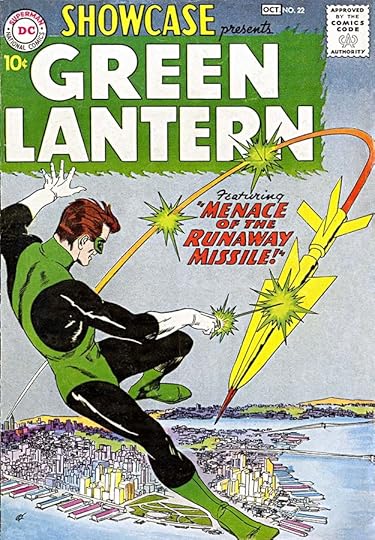
Issues 22-24 featured the second of editor Julius Schwartz’s Golden Age hero revamps. The large logo by Ira Schnapp has sedate block letters in a flaming rectangle. The flames are an odd choice, and actually relate to the original Golden Age Green Lantern, whose power was expressed in green flame. The new Silver Age version’s power came out in more modern green energy beams. Despite the disconnect, green flames were long used on this character’s logos.

Issues 25-26 again featured Rip Hunter. Issues 27-29 starred Sea Devils, scuba-diving thrill seekers from editor Robert Kanigher. The logo by Schnapp is again very large but sedate block letters. I guess that was a better choice than trying to add a “devil” look.

Issues 30-33 featured Aquaman and Aqualad. Aquaman had been created in 1941 by writer Mort Weisinger and artist Paul Norris. He’s one of the few DC superheroes to appear continuously from the Golden Age into the Silver Age, along with Superman, Batman and Robin, and Wonder Woman. This logo was created for issue #100 of his series in MORE FUN COMICS in 1944, and used on most later appearances:
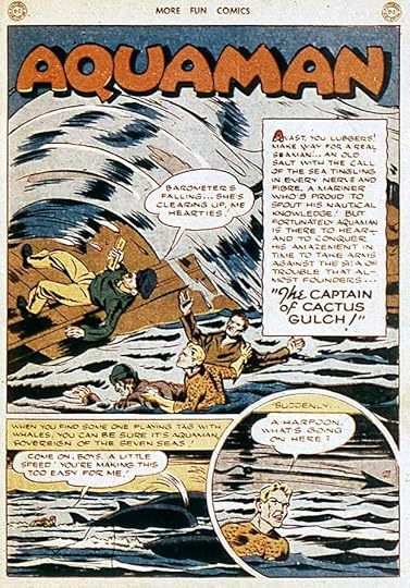
I can’t tell if it was used as-is or if Ira redrew it, they’re quite similar. In any case, Ira added AQUALAD and did the rest of the cover lettering. It’s possible Ira did the original 1944 version, or it might have been by the unknown letterer who worked on that story, or even by the artist.

Issues 34-36 featured another revamped Golden Age superhero from editor Julius Schwartz. Ira’s logo for THE ATOM is again large and very square with a narrow telescoping drop shadow. The square O seems an odd choice, but it reads fine. Ira might also have incorporated the atom on the character’s costume somewhere, but instead kept things simple.

Issues 37-40 featured a new kind of team made entirely from living metals in this series from editor/writer Robert Kanigher. Schnapp’s beveled letters with rivets in each M conveys the idea perfectly, and is strong and appealing. Note the extra-long caption probably written by Kanigher.
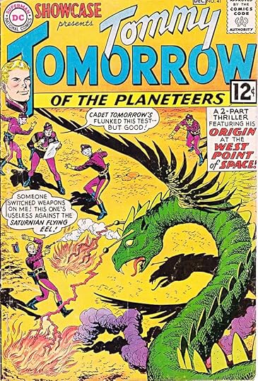
Issues 41-42 and 44 featured Tommy Tomorrow, who first appeared in REAL FACT COMICS in 1947, and was one of several features in ACTION COMICS and WORLD’S FINEST COMICS. The editors were Murray Boltinoff and George Kashdan. The idea was West Point cadets in space. Ira Schnapp’s logo was again large, with the emphasis on TOMORROW. This cover has lots of lettering, but it works well.
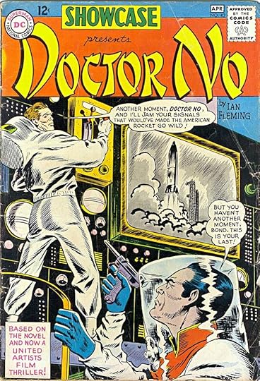
Interrupting that tryout was this one-shot adaptation of the first James Bond film, which had been prepared for Gilberton’s CLASSICS ILLUSTRATED line in England. The U.S. publisher decided it was not right for their line here, and passed it to DC. Arriving at the company many months before the film was released, Ira Schnapp’s logo went to his usual Oriental treatment for the title, a style that imitated Chinese writing as seen by Americans. A product of its time and timing, neither the logo style nor the issue were successful.
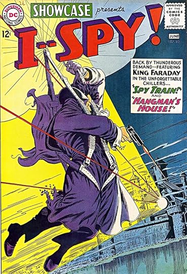
Issue #45 was a one-issue tryout for Sgt. Rock from war comics editor Robert Kanigher (with a logo by Gaspar Saladino). Issues 46-47 were two more Tommy Tomorrow entries. Issues 48-49 featured CAVE CARSON ADVENTURES INSIDE EARTH, which had previously had a tryout in THE BRAVE AND THE BOLD, and used the same Schnapp logo. Issues 50-51 used reprints of King Faraday stories from DANGER TRAIL and WORLD’S FINEST COMICS under the new name I–SPY! The logo by Schnapp is pretty typical of his work. I’m not sure why there’s a double dash instead of a single dash, but that was decided by the editor, who was either Larry Nadle or Robert Kanigher.
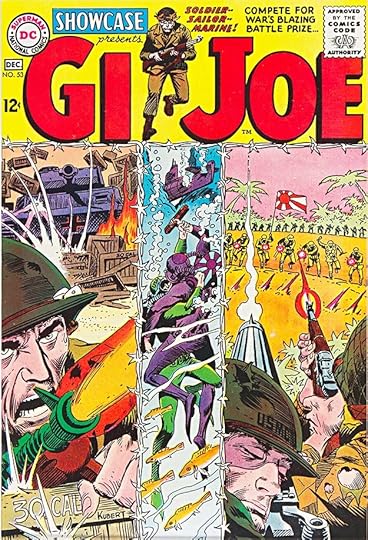
Issue #52 was another Cave Carson one, issues 53-54 were titled GI JOE, and featured reprints of stories about several branches of the armed services from editor Robert Kanigher. Ira Schnapp’s logo is very large and eye-catching.
Issues 55-56 featured more Golden Age characters, but this time not in revamps. Editor Julius Schwartz had brought back the Golden Age superhero team The Justice Society of America in the pages of his JUSTICE LEAGUE OF AMERICA, and here was attempting to interest fans in new stories about them. Ira Schnapp’s character logos are large and blocky, easy to read but having no features that relate to the characters.
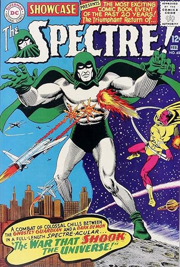
Issues 57-58 featured a tryout of the World War One German air fighter Enemy Ace, with a logo by Gaspar Saladino. Issue #59 featured The Teen Titans, using a logo Schnapp created for their tryout appearance in THE BRAVE AND THE BOLD. Issues 60-61 featured new stories about another Golden Age character from editor Julius Schwartz. The Spectre’s new logo by Schnapp, with a character head from artist Murphy Anderson, is, in my opinion, the most successful “scary” design that he ever produced. I think it’s because he kept the waviness of the outlines small and retained pointed serifs, giving the logo a spiky appeal. Ira’s bold, wavy caption border at the bottom is also unusual and effective.
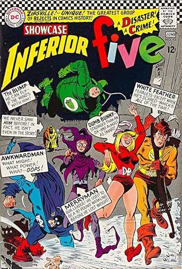
Issues 62-63 introduced a goofy parody of superheroes from creators E. Nelson Bridwell and Joe Orlando under editor Jack Miller. The logo by Schnapp was also pretty goofy for him, and he had lots of cover lettering to do as well. It all feels a bit desperate and over-the-top, trying for MAD humor and going too obvious, in my opinion.
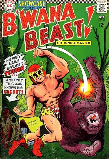
Issue #64 was The Spectre again, and issue #65 was The Inferior Five. The divided releases of some tryouts may have come from missed deadlines by the creators, but it couldn’t have helped sales. Issues 66-67 contain what I think is the low point of the series. They feature a white hero in Africa full of clueless racist themes. The logo by Schnapp is, in my opinion, one of his worst, though the name itself and the character’s costume are just as bad. The cover lettering is by Gaspar Saladino, who was beginning to gradually take over that job at this time in 1967.

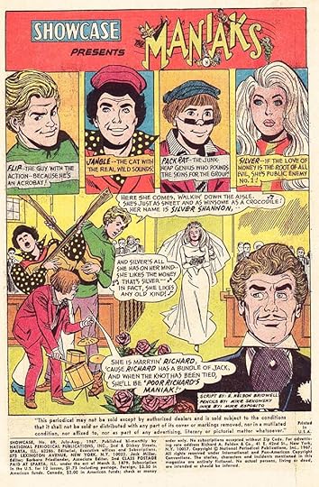
On the other hand, issues 68-69 feature The Maniaks by creators E. Nelson Bridwell and Mike Sekowsky under editor Jack Miller. They were a sort of rock band, and their stories attempted to achieve the humor of TV’s “The Monkees.” The logo by Schnapp with figures by Sekowsky is charming and fun, even though the music-note serifs on the letters don’t really work.

Issue #70 featured reprints of the teen humor series LEAVE IT TO BINKY, last published about ten years earlier, with a new logo by Schnapp. It would lead to a revival of the series with the same logo.

Issue #71 was The Maniaks again, and I’m showing it because of the appearance in a DC Comic of comedian Woody Allen. What an unlikely thing that is! The joke lettered by Ira is pretty good, too.

Ira Schnapp’s final cover lettering and logo for this series was on issue #72 from 1968 featuring western stories originally edited by Julius Schwartz. I like this logo by Ira, probably one of the last ones he did. The notched, ragged letters and target in the O suggest to me he was looking at the work of Gaspar Saladino for ideas, but it was a fine last effort.
Here are the covers lettered by Schnapp, including a few where he only did the feature logo: 1-5, 7-38, 40-44, 46-47, 49-50, 52-56, 58-62, 64, 66-72. That’s 64 in all. With the addition of so many logos, it was a substantial amount of work.

After lettering the first page of the first SHOWCASE issue, shown above, Ira’s involvement in story lettering was sparse. Here’s half of a two-page filler he lettered for issue #15 supporting Space Ranger.

Ira lettered a similar filler in issue #20 on dinosaurs supporting Rip Hunter.

For issue #54 Ira lettered two introductory pages supporting GI Joe.
It wasn’t until issue #62 in 1966 that Ira lettered an entire issue, probably at the request of writer and editorial assistant E. Nelson Bridwell.
Bridwell used Schnapp again in two of his Maniaks issues, #69 above, and #71, Ira’s last story lettering for the series. Here are the story pages lettered by Ira Schnapp:
#1 March/April 1956: Showcase intro 1pp
#15 July/Aug 1958: Space Ships of the Past 2pp
#20 May/June 1959: Dinosaur Album 2pp
#54 Jan/Feb 1965: Intro 2pp
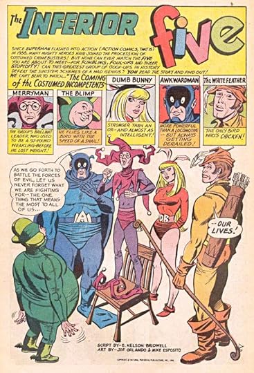
#62 May/June 1966: Inferior Five 24pp
#69 July/Aug 1967: The Maniaks 24pp
#71 Nov/Dec 1967: The Maniaks 23pp
That’s a total of 78 pages on this series. More articles like this one are on the Comics Creation page of my blog.
Showcase on Wikipedia, including more details on each feature.
The post Ira Schnapp in SHOWCASE appeared first on Todd's Blog.
December 2, 2020
Ira Schnapp in TALES OF THE UNEXPECTED
 Images © DC Comics
In 1956, DC Comics added a new anthology to their line which drew ideas from science fiction, fantasy and horror (or as DC called it “mystery”). It was perhaps most similar to MY GREATEST ADVENTURE, but also not too different from STRANGE ADVENTURES, MYSTERY IN SPACE, HOUSE OF MYSTERY and HOUSE OF SECRETS. The editing credit is only for Whitney Ellsworth for many years, as with the entire DC line. Actual editing was probably by Jack Schiff and/or his associates George Kashdan and Murray Boltinoff, each of the last two got solo editing credit for a while in the 1960s. The series ran for 104 issues under this title, then was renamed simply THE UNEXPECTED, ending with issue #222 in 1982.
Ira Schnapp designed the logo word UNEXPECTED, while the words above it are set in type. This allowed that type to vary in size as needed to make room for cover art. Schnapp’s telescoped block letters are unsurprising except possibly for the depth of the telescoping. This is the only logo of his I can think of which is intended to run off the page at the top. The logo works fine, and the curved shape adds interest. Ira also lettered the word balloons and caption, and did so for most of the covers until early 1968. He lettered only eight stories inside the book. I like this cover idea about a cartoonist, and Ira’s tiny lettering in the drawn comic strip is just as good as the larger balloon.

Issue #2’s cover includes some handsome handwriting by Ira on the blackboard and note, as well as a gorilla to help boost sales, or so DC thought at the time.

Issue #7 has quite a lot of lettering between the radio balloon, the captions, the signs, and Ira’s contest blurb at the top running on many titles. TALES OF THE has shrunk to the size it would stay at for a long time.

I guess the variety of themes was meant to attract a large variety of readers. It must have worked, as the title moved to monthly frequency with issue #5 and stayed there until issue #67 in 1961. This cover for issue #22 promotes a typical mixed batch of short story themes.

With issue #40 in 1959, the series gained a new continuing feature, Space Ranger, as noted in the bottom blurb. Space Ranger, essentially a space lawman, had two tryouts in SHOWCASE #15-16, and he appeared in every issue of this title for about 40 issues. The editors did not seem to promote him much. He didn’t appear on the cover for the first few appearances, and his story always remained one of three and usually not the first one in any issue.

Space Ranger made his first cover appearance on issue #43 in this handsome art with gray washes probably by Jack Adler. Ira’s caption about him is a little larger now. He must have been gaining readers.

There were always the silly factors of Space Ranger’s alien sidekick Cryll, looking like an alien toy, and his secretary/girlfriend Myra. I haven’t read many of the stories, but they were generally not scientific. Even the character’s half-there glass helmet seems kind of useless. At least Ira Schnapp’s lettering was always well done, as on this cover for #62 in 1961.

When all else failed, turning the hero into an alien monster seemed par for the course, as on the cover of issue #76.

Issue #84 from 1964 has a rare example of Ira Schnapp using a special lettering style for an alien. I think it works well. Appealing to the reader was another trick DC used to boost sales.

DC tried a few other continuing features like Auto-Man, a robot, though again he didn’t appear on the cover of his debut issue, #91. His top blurb by Ira has forced TALES OF THE to be even smaller. I like Ira’s story caption here with the wavy double border.

Issue #104 from 1968 was the final one for this series title, and it has a new logo by Schnapp that I think is one of his better efforts for the last years of his career. The notched letters and v-shaped perspective of UNEXPECTED works well for me. The Neal Adams cover art is also an improvement over most of the previous issues.

With issue #105 the title was shortened, but the logo design remained.

Issue #106 with a cover date of April/May 1968 was the final one that Ira lettered, though he might have done it in 1967. Gaspar Saladino replaced him as the regular cover letterer, and also designed a new logo for issue #110.
Here are the covers lettered by Ira Schnapp: 1-8, 10-29, 31, 34-86, 88-89, 91-106. That’s 100 in all, a good run.

Ira’s first story lettering did not appear until this example in issue #25 from 1958. I can’t identify most of the letterers on this title, but their styles are familiar from other DC books.

Ira also lettered this story in issue #66 in 1961 featuring a typical Schnapp story title. Here are the stories lettered by Ira Schnapp:
#25 May 1958: The Sorcerer’s Asteroid 6pp
#27 July 1958: I Filmed the Cosmic Wonders 6pp
#28 Aug 1958: The Super Space Salesman 6pp
#33 Jan 1959: The Man of 1,000 Planets 8pp
#62 June 1961: The Case of the Rampaging Robots 8pp
#66 Oct 1961: The Strange Code of Creox 8pp
#71 June/July 1962: Manhunt in Galaxy G-2 8pp
That’s 50 pages in all. More articles in this series are on the Comics Creation page of my blog.
Tales of the Unexpected on Wikipedia.
Space Ranger on Wikipedia.
The post Ira Schnapp in TALES OF THE UNEXPECTED appeared first on Todd's Blog.
November 30, 2020
Ira Schnapp in WONDER WOMAN
 Images © DC Comics except as noted
Though the DC logo is on early issues of WONDER WOMAN from 1942 on, it was published by National Comics’ sister company All-American Comics until the two merged in 1946. Publisher M.C. Gaines inked a deal with William Moulton Marston, already a successful psychologist and author, to create a new female superhero, Wonder Woman. Marston brought in his own pick for artist, H.G. Peter, and the two created the series in their own studio, delivering finished stories to the publisher which included lettering. The editor at All-American was Sheldon Mayer. It’s not known who designed the script logo, but after looking at all the early covers for this article, I’m now thinking it was created by Peter, as I will explain below. The caption on this first issue might have been added by the publisher, as the style is more like other cover lettering they were doing than anything Peter produced. Peter employed assistants on the stories, but I think all the early covers are entirely his work.

Harry G. Peter was sixty years old when he started working on Wonder Woman. He’d had a long career as an illustrator for newspapers and magazines, first in San Francisco, then in New York. At some point he became friends with Marston probably due to their mutual interest in women’s suffrage. Peter had just begun to get work in comics when Marston invited him to be the artist of Wonder Woman. The two opened a studio together in Manhattan. The cover of issue #7, above, has sign and caption lettering I believe is by Peter, and you can see that his script handling of the character’s name on the signs is very similar to the logo, I think too similar to be a mere copy of someone elses’s work. Peter had to know lettering well for newspaper illustration, which often included hand-drawn titles, and I think his deft work on these early covers, as well as story titles inside the book throughout his run, shows that, and supports the idea that he designed the logo, though I have no other proof.

By issue #30 from 1948, All-American’s titles had been folded into those of National Comics, and all were being handled from the National offices. The editor was now Robert Kanigher, who had begun at All-American and continued as an editor for National (DC) for many years, as well as writing lots of their comics. The caption on this cover is the first one that I suspect was lettered by someone at DC, and not Peter. The style is one used by an unknown letterer I’ve nicknamed Proto-Schnapp because I think Ira Schnapp used his work as a model for his own lettering. I have no evidence, but I think Proto-Schnapp was an older man who worked on staff at DC as a letterer and logo designer. His work disappears around 1950, suggesting he either died or retired, and I think Ira Schnapp took over his staff position and much of his workload. Marston, the co-creator with Peter of the feature, had died in 1947, and from then on Kanigher and DC gradually took control of the series from the Peter studio, though H.G. continued to draw all the stories (with his assistants) until his own death in 1958. I think one of the first signs of that is having cover lettering done at DC.

On issue #37 from 1949, the caption at upper right could again be by Proto-Schnapp, but the word balloon is definitely not in his style, nor in Ira Schnapp’s style. I don’t know who lettered it. All the story lettering produced by Peter’s studio used more mechanical Leroy lettering, which I’ll explain below, and looked nothing like this.

Issue #40 from 1950 shows the next step in DC taking control of the series: Peter is no longer the cover artist. This one is by Irwin Hasen and Bernard Sachs. It works fine and presents figures not too far from what Peter did, but as time went on, the Wonder Woman seen on the covers became decidedly more modern and more typical of other DC characters than the quirky, old-fashioned version by Peter inside. I think the caption is again by Proto-Schnapp, as the story title style is one he often used. Kanigher was now also writing the stories, and moving away from the ideas of Marston and his writing assistants.

Issue #41 is the first I think has Ira Schnapp cover lettering. As you can see, some of Ira’s styles were quite similar to his model, Proto-Schnapp, so it’s a tough call, but Ira’s lettering tended to be more square and regular, at least early on, and the handling of the window sign lettering is more typical of Ira.

Issue #42 definitely has cover lettering by Ira. Both the word balloon and the story title are in familiar styles for him, and Proto-Schnapp’s work had largely disappeared by this time. From here on, Ira lettered most of the covers until issue #175.

Issue #45 has more typical Schnapp lettering and shows the more modern Wonder Woman of the Silver Age. Kanigher continued to modify the Marston concept and origin over the years.

Ira’s caption on issue #48 from 1951 shows his ability to work in extreme perspective when needed.

Issue #51 has lots of Schnapp balloon lettering, still not quite in his typical style, but getting closer.

Issue #60 from 1953 replaces the original script logo with a new Ira Schnapp one using upper and lower case with some elements of script, but much wider and blockier letters that were easier to read. Ira also did the caption. The transformation of the Wonder Woman covers to the Silver Age was complete, but the stories inside remained like those of the previous decade as an elderly H.G. Peter and his assistants soldiered on.

Issue #82 from 1956 teams the character with Robin Hood, who was also appearing in THE BRAVE AND THE BOLD by Kanigher and would soon be in his own brief series. Otherwise, Wonder Woman and her stories remained separate from the rest of DC’s characters.

H.G. Peter’s final stories appeared in issue #97. With issue #98, Kanigher essentially relaunched the series in his own vision with art on covers and stories by Ross Andru and Mike Esposito. Ira Schnapp’s cover lettering helped make the transition seamless on the covers, while inside the lettering changed from that produced by Peter and his assistants to the work of Gaspar Saladino.

Fanciful stories like this one from issue #106 in 1959 became common. I like Ira’s bold sign work here.

By issue #126 from 1961, Kanigher had introduced younger versions of the character: Wonder Girl and Wonder Tot, and often had them appearing together in the same stories, an odd idea. Magic and fantasy became the general feel of many stories, which often took place in and around Paradise Island rather than America, where Wonder Woman was now appearing in JUSTICE LEAGUE OF AMERICA with DC’s other main heroes.

For issues 152-153 from 1965, Wonder Girl took a starring role and had a new logo by Schnapp at the top of the covers. She began teaming up with other teenage heroes Robin, Kid Flash and Aqualad in THE TEEN TITANS around this time. It was not explained well how that worked, with the adult character appearing in other titles simultaneously.

Issue #158 from 1965 had another new Ira Schnapp logo, this time using all capital block letters with telescoped drop shadows in a familiar Schnapp style. Certainly easy to read. Kanigher had decided to bring back some elements of the character’s first decade, reviving old villains, and even having Andru and Esposito somewhat mimic Peter’s art style on the stories.

On issue #159, Ira’s work dominates the cover in a surprising way, as Kanigher tries to interest readers with more new origin stories. The large word balloon seems awkward, and may have been enlarged and revised by someone else in DC’s production department.

Ira’s final cover lettering appeared on issue #175 from 1968, around the time he left the company. The book would soon gain a new editor and another new direction.
Here are the covers lettered by Ira Schnapp: 41-42, 44, 46-74, 76-78, 80-139, 141-146, 148-154, 156-170, 172-173, 175. That’s 126 covers in all, and that run of 60 in a row from 80-139 is, I think, now the record for Ira.

From her very first appearance in a short story in ALL-STAR COMICS #8, above, the lettering used for Wonder Woman had a very regular look that some readers might have thought was typeset. (Note also an early and cruder version of the logo I think is by the artist, H.G. Peter, and Marston using his pen name Charles Moulton.) In fact it was lettered by hand, but using a device created for lettering on architectural plans.
 Image © Todd Klein
It was called the Leroy Lettering System, made by Keuffel and Esser starting in the 1930s. Templates of different sizes were used to make letters with a scriber, as seen above. With an adjustment of the pin arm, letters could be vertical or lean to the right for italic. It was a very time-consuming process, but as with most things, the more you did, the faster it became. I suspect H.G. Peter had a Leroy set from his illustration work, and decided to use it on Wonder Woman stories, but he did not do it very well. If you look at the first page above, all the lettering is italic, suggesting he didn’t know how to adjust the pin arm, and larger bold words are lettered by hand, suggesting he didn’t have different size templates. In the second panel, the first balloon runs into the caption, showing poor placement.

All of Peter’s stories were lettered with Leroy for many years, but I think he soon passed the job to his assistants. Research by Jill LePore and others have named Peter assistant Marjorie Wilkes Huntley and others as doing some or all of the lettering. If so, they learned from Peter, as the work shows many of the same kinds of errors, like this example from issue #8, still using all italic and with some odd spacing between words and awkward hyphenation.

In 1945, Peter and Marston hired the team of Jim and Margaret Wroten to do their Leroy lettering. Jim had been a top salesman at Keuffel and Esser, and also their best Leroy demonstrator at trade shows. Once they were on board, the lettering looked much better, as on this page from issue #15, I think the first one the Wrotens lettered. They didn’t draw the balloon shapes, but the lettering is no longer all italic, and the spacing is much improved. The Wrotens would letter nearly all of the stories from the Peter studio from this point on, and would also do other work for M.C. Gaines, and later his son Bill Gaines for EC Comics.

Starting with issue #84 in 1956, hand-lettered non-Leroy lettering began to appear on some stories like this one. I think it was still done at the Peter studio, as the story title is by him. Perhaps he was getting pressure from DC to move away from Leroy lettering. This work is somewhat similar to what Ira Schnapp was doing, but not the same. By issue #96, all the Peter stories were lettered this way, and his final art appeared in issue #97.

With Kanigher’s revamp of the title to update the look and character in issue #98, above, he began using his favorite letterer, Gaspar Saladino, who lettered every Wonder Woman story from here to issue #147, and many after that.

Ira Schnapp’s only story lettering in the series came in issue #156, above, where he lettered pages 13-24 of the main story, thereby making his story lettering total just 12 pages. He may have been chosen because his lettering looked old-fashioned, and this story was an attempt to recreate the look of older stories from the 1940s, but it was a brief use of his talent. Ira’s work on logos and covers is his legacy on this title.
More articles in this series are on the Comics Creation page of my blog.
More about Jim and Margaret Wroten’s Leroy lettering.
William Moulton Marston on Wikipedia.
Wonder Woman on Wikipedia.
H.G. Peter on Wikipedia.
The post Ira Schnapp in WONDER WOMAN appeared first on Todd's Blog.
November 29, 2020
Rereading: TALES FROM MOOMIN VALLEY by Tove Jansson
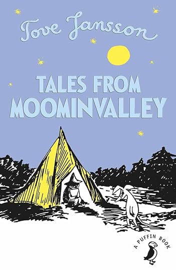
The seventh longer Moomin book is a collection of nine short stories. I found I didn’t remember it at all, though I liked it on this reading.
In “The Spring Tune,” Snufkin the wanderer is camping alone in the northern woods trying to find a new tune to play when he returns to Moomin Valley in the spring. He meets a small Creep, a creature who has been noticed so little that he doesn’t even have a name. Snufkin helps him find one.
In “A Tale of Horror,” a young Whomper finds he has a talent for telling scary stories that terrifies his baby brother. He’s so good at it that he convinces himself they are true, and gets in trouble with his father for telling lies. Then the Whomper meets Little My, who is even better at telling scary stories.
In “The Fillyjonk Who Believed in Disasters,” a creature who is prone to thinking about all the worst things that can happen has rented a house on the beach from a Gaffsie, but finds little solace there, as she continues to worry about what will go wrong next. The Gaffsie tries to be her friend, but finds it difficult. When a real disaster arrives, the Fillyjonk’s worst fears are realized, but how will it affect her?
In “The Last Dragon In The World,” Moomintroll unexpectedly catches a small dragon in the pond with a jar when he was after waterbugs. At first he tries to keep it a secret, but soon everyone knows about the tiny dragon, as it flies around and catches insects with its fiery breath. The dragon takes a strong liking to Snufkin, who doesn’t want it, which makes Moomintroll sad.
In “The Hemulen Who Loved Silence,” a creature of that sort who works in a noisy amusement park punching tickets longs for a more interesting job. When a flood ruins the amusement park, the Hemulen is out of a job and goes off by himself to find a new life. He takes residence in an abandoned garden, and with help from children, gradually builds his very own amusement park where everything is beautifully silent.
In “The Invisible Child,” a creature called Ninny has been made invisible by mean treatment, and the Moomin family takes her in to try to restore her visibility. This causes trouble for everyone.
In “The Secret of the Hattifatteners,” Moominpappa’s fascination with the small electrically-charged creatures who constantly wander the earth and sea leads him to try to join them on their wandering. For a while he forgets all about his family as he learns the ways of the Hattifatteners.
In “Cedric,” Sniff gives away his most prized toy, and that makes him sad. Snufkin tries to comfort him by telling him stories, but Sniff keeps interrupting.
In “The Fir Tree,” a Hemulen wakes the Moomin family from their winter hibernation to tell them about Christmas. Soon they are running around busily like everyone else in Moomin Valley trying to prepare for a holiday they don’t understand, and decorating a fir tree as best they can.
These are all well-told stories that expand on the lives and natures of the charming creatures in Jansson’s stories. Recommended.
The post Rereading: TALES FROM MOOMIN VALLEY by Tove Jansson appeared first on Todd's Blog.
November 27, 2020
Ira Schnapp in FALLING IN LOVE
 Images © DC Comics
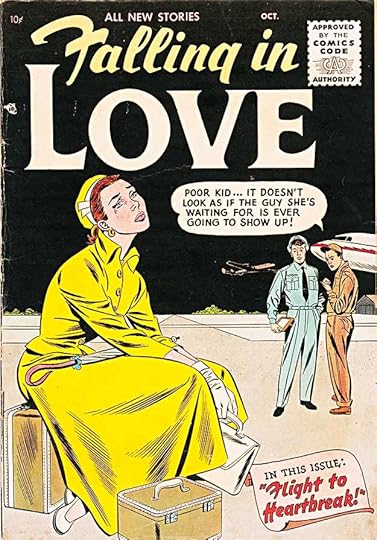
With three successful romance titles on the stands in 1955, DC added a fourth one with a Sept/Oct cover date. It’s unclear whether Robert Kanigher oversaw this one, but the actual editing was probably handled first by Zena Brody, then Phyllis Reed. In the 1960s it was handled by Larry Nadle and then Jack Miller. The series ran 143 issues, ending in 1973. By that time romance comics were no longer seen as relevant by teen readers.
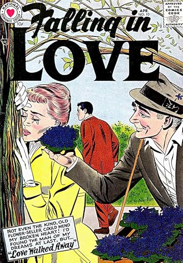
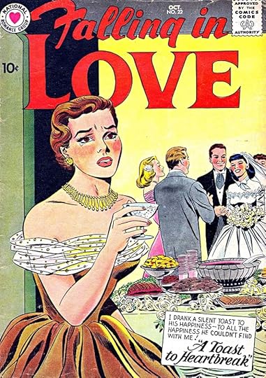
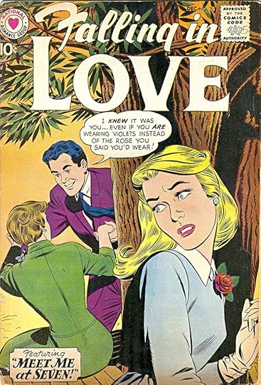
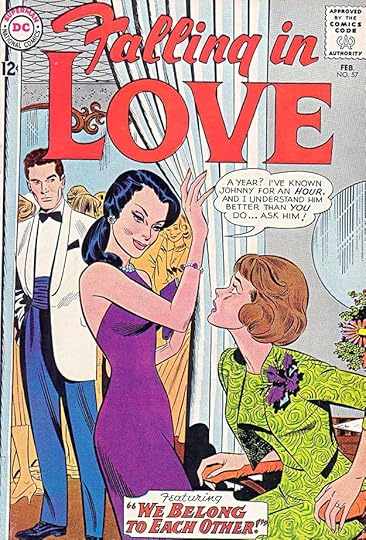
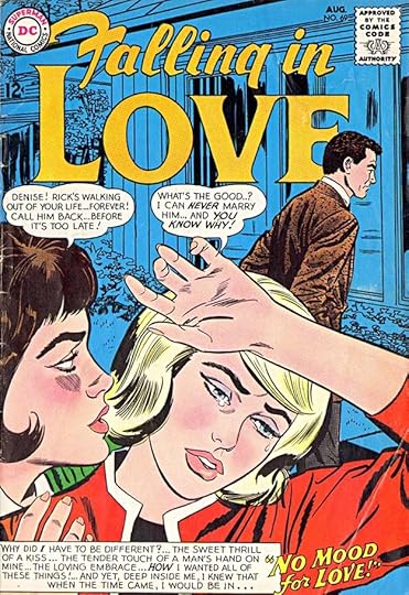
Ira Schnapp designed the logo using an older style for the capital F that he favored, with the rest of the top line in appealing lower case, leaving LOVE larger and all caps to push the theme. Ira also lettered the word balloon and the caption, where he’s used a similar style to the top logo line in F of the story title. Ira would letter most of the covers to issue #98 in 1968 and also most of the inside stories, making it one of the most prolific for him. Like the other company romance titles at the time, this one did not use the DC bullet symbol in the upper left corner.
Issue #2 has a new Schnapp top line and appealing script lettering in the note. Many issues of this series had only a caption with a story title, though some also had word balloons.
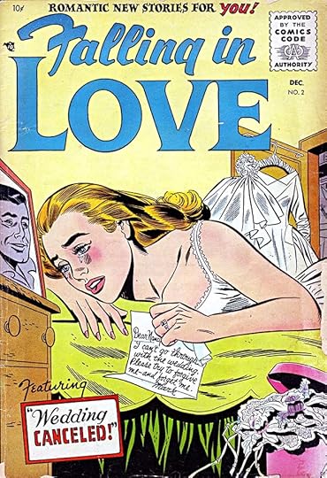
Issue #10 uses a new “National Romance Group” symbol at upper left designed by Ira, and the logo is unusually filled with black, adding a somewhat funereal feel to the cover. Some of the captions on this title were full of melodramatic text, like this one.
The series followed this model for many years with hardly a variation. Issue #22 from 1958 is another typical example. Ira’s story titles were often decorative and well-crafted.
One thing that’s a bit surprising is how thin the outline on the logo is, but it always works fine even against busy art, as here on issue #39 from 1960. All the DC romance books seemed to use thin outlines on their word balloons and captions, too, perhaps thinking it might be more appealing to female readers, though that’s just my guess.
Here’s another cover for issue #57 from 1963, and as you can see, not a thing has changed in the style and approach from the earliest issues. Only the clothing and hair styles tried to follow the latest trends.
Issue #69 from 1964 shows a growing trend for more of that melodramatic cover lettering than in the past. That trend would continue.
With issue #71, a new Ira Schnapp logo appeared that used slab-serif letters and replaced that old-fashioned F with something more common. The general layout of the logo is the same, and it certainly reads well.
Issue #88 from 1967 had another new logo from Ira, this one in an odd trapezoid shape, perhaps an attempt to be more up-to-date and stylish in the swinging sixties. The word LOVE is back to almost the first style, while FALLING IN is now smaller and italic upper and lower case. I like the logo, but it was a difficult fit for the art on some covers, so probably not a great idea in that way.
Schnapp’s last cover lettering was for issue #98 from 1968. Here are the covers he lettered: 1-43, 45-56, 58, 60, 62-72, 74-75, 77-86, 88, 90-91, 93-95, 97-98. That’s 85 in all.
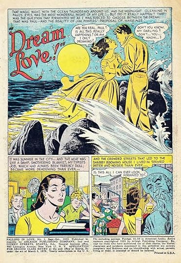
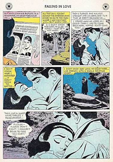
It’s unknown whether Ira enjoyed lettering romance stories, but I hope so, as he sure did a lot of them. He was the main letterer on this series until the mid 1960s when the work of other letterers became more common. Here’s Schnapp lettering for the first story in issue #1. His story titles were usually as elegant as his cover titles, and his generally small lettering worked well for wordy scripts.
It was rare, but occasionally Ira wasn’t able to finish a story and someone else had to fill in for him. This is page six of an eight-page story in issue #17 lettered by Ira.
Pages 7, shown here, and 8 were lettered by Gaspar Saladino. It’s a good chance to compare their very different styles. Gaspar’s work was larger, wider, more angular, and used a wedge-tipped pen giving a thick and thin variation to the lines depending on direction. If a reader was paying attention, this was an obvious style shift.
This story from issue #50 in 1962 has a large, handsome story title with a drop shadow, perfect for the words.
This story from issue #82 has the longest story title in the series, I think. Luckily the artist left plenty of room for it.
Ira’s final story lettering appeared in issue #97 dated Feb. 1968, though likely done in 1967. It shows no diminishing of talent for handsome story titles, and again the artist left room for a large one.
Here are the stories lettered by Ira Schnapp in this series. There were no continuing characters, so all the story titles are listed.
#1 Sept/Oct 1955: Dream Love 7pp, Unhappy Birthday 7pp, Flight to Heartbreak 8pp
#2 Nov/Dec 1955: Unfriendly Sweethearts 6pp, Hero & Leander 2pp, Unwanted Woman 6pp, Wedding Canceled 8pp
#3 Jan/Feb 1956: Orpheus & Eurydice 2pp, Sudden Enchantment 6pp, The Double Heart 8pp
$4 March/April 1956: Stolen Dreams 7pp, Suddenly…Heartbreak 6pp, Abelard & Heloise 2pp, Romance Can’t Last 6pp, A Lonely Love Is Mine 8pp
#5 May/June 1956: Strangers or Sweethearts 7pp, Farewell to Love 6pp, Say That You’re Mine 7pp, Unwelcome Heart 8pp
#6 July/Aug 1956: Other Loves 7pp, Too Wonderful to Last 6pp, Love Me Leave Me 8pp
#7 Sept/Oct 1956: Dare I Dream? 7pp, Wanted: One Love 7pp, I’ll Always Remember 6pp, A Fool At Heart 8pp
#8 Nov/Dec 1956: While My Love Waits 7pp, There Goes My Heart 6pp, The Only Man For Me 6pp, In Love With Love 8pp
#9 Jan/Feb 1957: A Heart Never Knows 6pp, A Love Like Ours 7pp, Tristan & Iseult 2pp, Plan for Heartbreak 7pp
#10 March/April 1957: This Foolish Heart 7pp, Passing Fancy 6pp, Phyllis & Acamas 2pp, Heartbreak Holiday 7pp, Love Walked Away 8pp
#11 May/June 1957: I’ll Care For You 7pp, Love Without Words 7pp, Isle of Tears 7pp, Love Me, Love Me Not 8pp
#12 July/Aug 1957: No Love At All 7pp, Dreams Are For Fools 7pp, A Summer Day’s Dream 7pp, Beyond Love 8pp
#13 Sept 1957: Magic Summer 7pp, Love Is A Red, Red Rose 7pp, Dream Date 7pp, Souvenirs of a Broken Heart 9pp
#14 Oct 1957: Magic Saturday 6pp, Give Love A Chance 7pp, Sweetheart’s Ring 7pp, Last Day of Love 9pp
#15 Dec 1957: A Shoulder to Cry On 7pp, Go Back To Tears 7pp, Stay With Me, Darling 8pp
#17 March 1958: Doomed to Love (1-6 of 8pp), Let It Last Forever 8pp
#18 April 1958: Too Proud to Cry 7pp, Written In The Stars 6pp
#19 June 1958: Letters In The Sand 7pp, Love Me Again 7pp
#20 Aug 1958: My Own True Love 7pp, Heartbreak For Tomorrow 8pp
#21 Sept 1958: Test of Love 8pp, Don’t Wait For Tomorrow 7pp
#22 Oct 1958: Wake Up To Heartbreak 7pp, I’ll Never Forgive You 8pp, A Toast To Heartbreak 8pp
#23 Dec 1958: Dream In Blue 7pp, A Souvenir From Susan 6pp
#24 Feb 1959: Bitter Victory 7pp, Happy, Happy Me 6pp, Language of Love 9pp
#25 March 1959: The Answer to Love 5pp
#26 May 1959: The Wrong Road to Love 7pp, Who Will Be My True Love? 7pp, Heartbreak for Hannah 8pp
#27 June 1959: Heart of No Return 8pp, Once Upon a Dream 7pp, Love Story 7pp, Double Date 8pp
#28 Aug 1959: More Than Ever 8pp, Bring Me Your Heart 7pp, That Special Kiss 8pp
#29 Sept 1959: Not Even a Dream 6pp, My Three Wishes 7pp, When Johnny Comes Home 9pp
#30 Nov 1959: Come To Me 7pp, In The Name of Love 7pp, A Broken Heart 9pp
#31 Dec 1959: Two Hearts Lost 7pp, First Love 7pp, A Searching Love 7pp, Love and Lose 8pp
#32 Feb 1960: Love Lives Forever 7pp, Catch My Heart 6pp, Dare I Love You? 9pp, Two for Heartbreak 8pp
#33 March 1960: Plain Jane In Love 7pp, Early Ending 6pp, Forever For Us 5pp, Dream Sweetheart 11pp
#34 May 1960: Somewhere I’ll Find You 8pp, He Loves Me Not 7pp, No Other Love 7pp, Stay Away Heartbreak 7pp
#35 June 1960: Remember Rosalie 7pp, What Must Be 7pp, Memo To A Broken Heart 7pp, Three’s A Crowd 8pp
#36 Aug 1960: Every Girl’s Dream 12pp, My Love Lies Dreaming 7pp, Tomorrow’s Heartache 11pp
#37 Sept 1960: Don’t Lose Your Love 7pp, The Touch of Love 7pp, When Dreams Come True 7pp, Rebel Heart 8pp
#38 Nov 1960: End of a Dream 9pp, Too Many Tomorrows 6pp, Love of No Return 7pp, Till Death Do Us Part 8pp
#39 Dec 1960: Model For Heartbreak 7pp, A Kiss In The Dark 7pp, Forgotten Heart 7pp, Meet Me At Seven 8pp
#40 Feb 1961: My Charley 7pp, Summer Heart 7pp, Duel of Love 8pp, Tell Me No Lies 8pp
#41 March 1961: He’ll Never Be Yours 7pp, Don’t Pity Me 7pp, Come Be My Love 7pp, Yesterday’s Sweetheart 8pp
#42 May 1961: Once And For All 8pp, A Message From Lois 7pp, My Loves Next Door 7pp, Goodbye Is Forever 8pp
#43 June 1961: My Enemy, My Heart 8pp, He’ll Never Be Yours 7pp, Meet Me At Eight 7pp, Between Love And Loneliness 8pp
#44 Aug 1961: Never Let Me Go 8pp, Kiss Me Never 7pp, Search For Yesterday 7pp, There Goes My Heart 8pp
#45 Sept 1961: You Are My Love 7pp, It Could Have Been Me 8pp, The Lie In My Heart 8pp
#46 Nov 1961: Waiting For His Arms 7pp, A Winter Song 8pp, Search For Yesterday 7pp, A Dream To Remember 8pp
#47 Dec 1961: Many A Long Day 7pp, I’ll Never Forgive You 7pp, A Restless Heart 8pp, A Threat of Heartbreak 8pp
#48 Feb 1962: Goodbye…Goodbye 8pp, Bittersweet Love 6pp, Once Chance At Love 8pp, A Promise of Heartbreak 8pp
#49 March 1962: The Girl From Yesterday 8pp, My Weeping Heart 5pp, Stolen Date 8pp
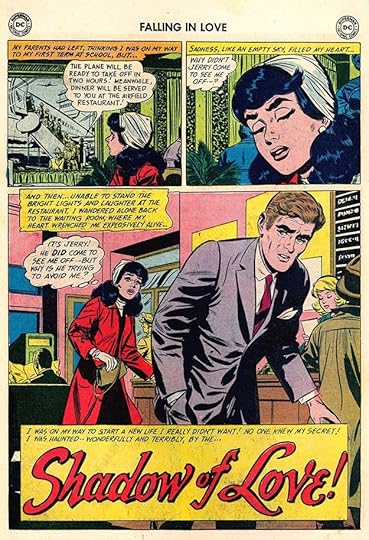
#50 May 1962: The Voice of Love 7pp, Shadow of Love 7pp, Heartbreak Tour 7pp, The Truth About a Lie 8pp
#51 June 1962: Out Of The Night 7pp, Return To My Heart 7pp, Secret Love 7pp, What Dreams Are Made Of 8pp
#52 Aug 1962: The One I Loved 7pp, His Ring Around My Finger 8pp, Impulsive Moment 7pp, A Letter From Marty 8pp
#53 Sept 1962: Two Broken Hearts 8pp, Second Love 7pp, Mr. Marvelous 7pp, Substitute For Love 8pp
#54 Nov 1962: Model For Love 7pp, Moment of Truth 7pp, Curtain For A Heart 7pp, Don’t Dream–My Heart 8pp
#55 Dec 1962: If Love Had Its Way 8pp, A Day For Tears 7pp, My Only Love 7pp, Come Back, My Heart 8pp
#56 Jan 1963: Too Dangerous 8pp, Shadow of a Lost Love 7pp, A Secret Sorrow 7pp, Hide From Love 8pp
#57 Feb 1963: The Girl I Love 8pp, Two Girls From Yesterday 7pp, Don’t Wake My Heart 7pp, We Belong To Each Other 8pp
#58 April 1963: A Make-Believe Woman 8pp, Too Long To Wait 7pp, A Time For Tears 7pp, Tell Me How To Love 8pp
#59 May 1963: My Many Loves 7pp
#60 July 1963: Lend Me Your Dream 8pp, My Faithful Heart 7pp
#61 Aug 1963: What Have I Done? 7pp, Marry In Haste 8pp
#62 Oct 1963: Picture of Love 8pp, Just One of Those Things 7pp, R.S.V.P. With Love 7pp, Second Love 8pp
#63 Nov 1963: Too Beautiful To Spoil 8pp, The Wrong Party 7pp, Three Loves 7pp, Journey To Love 8pp
#64 Jan 1964: Now And Forever 7pp, In The Beginning 7pp
#65 Feb 1964: The Handsomest Man In Town 8pp, A Thing Called Loneliness 7pp, Reunion 7pp, Leave Us Alone (1 of 8pp)
#66 April 1964: Like Never Before 7pp, The Nearness of Him 7pp
#67 May 1964: The Test of Time 8pp, A Fool Whose Love Was Soon Parted 7pp, Too Many Tomorrows 8pp
#68 July 1964: Report On Love 8pp, My Life For Yours 7pp, No Second Chance 7pp, Lost Bride 8pp
#69 Aug 1964: I Love You Again 7pp
#70 Oct 1964: One Girl’s Love 6pp, Big World, Little World 7pp, Alive With Romance 6pp, Don’t Throw Away My Love 11pp
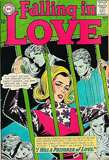
#71 Nov 1964: I Was a Prisoner of Love 13pp
#72 Jan 1965: A Plaything of Love 12pp
#73 Feb 1965: The Battle of Love 13pp
#74 April 1965: Escape From Heartbreak 7pp
#75 May 1965: Jealousy 11 pp
#76 July 1965: Not Ready For Love 8pp
#78 Oct 1965: Too Rich For Romance 13pp
#79 Nov 1965: He Said He’d Wait For Me 9pp, They Called Me Man-Hater (2 of 12pp)
#81 Feb 1966: Happy Ending 8pp, Don’t Ever Leave Me 13pp
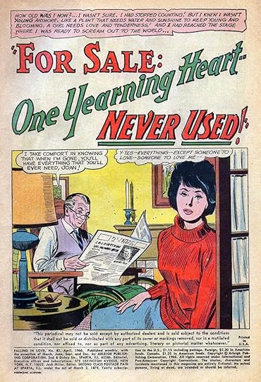
#82 April 1966: For Sale: One Yearning Heart–Never Used 10pp
#84 July 1966: Don’t Beg For Love 14pp, My Dream Man 13pp
#86 Oct 1966: Sleeping Beauty 7pp, A Fool In Love 13pp
#87 Nov 1966: Dry Your Tears 8pp, Last Chance To Be Loved 7pp
#88 Jan 1967: I Love You Again 7pp
#90 April 1967: What Is True Love? 4pp
#91 May 1967: He Couldn’t Love Me 9pp, The One Man For Me 4pp
#92 July 1967: The Secret of My Past 9pp
#95 Nov 1967: A Promise of Heartbreak 6pp
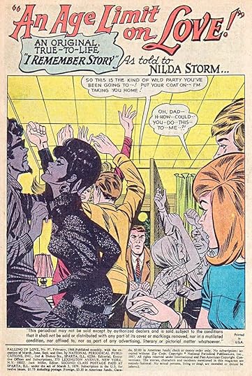
#97 Feb 1968: An Age Limit On Love 15pp
That’s a total of 1,924 pages, a large amount of lettering!
More articles in this series are on the Comics Creation page of my blog.
Ira Schnapp on Wikipedia.
The post Ira Schnapp in FALLING IN LOVE appeared first on Todd's Blog.
November 25, 2020
Ira Schnapp in FRONTIER FIGHTERS and LEGENDS OF DANIEL BOONE
 Images © DC Comics
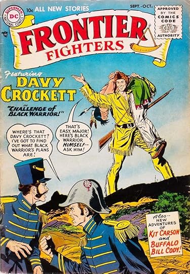
These two short-lived adventure series ran eight issues each in 1955-56. FRONTIER FIGHTERS was an anthology with three features per issue, while DANIEL BOONE was all about that character. Both were likely prompted by the success of Walt Disney’s TV version of Davy Crockett in 1954-55, a big hit. These books were probably edited by Jack Schiff and/or his assistants Murray Boltinoff and George Kashdan.
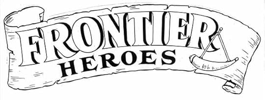
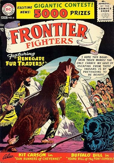
Ira Schnapp designed the logo, including the rough parchment or bark banner and powder horn. The original title was FRONTIER HEROES, as evidenced by this version of the logo I found in the DC files some years ago. The letter style is not particularly rustic or American, it’s closer to the Roman style Trajan, but that at least puts it in the long tradition of a style used ever since. Ira’s Davy Crockett character logo above is in a similar style but with rough notches, and he also did the rest of the cover lettering. Ira lettered all but three of the 16 covers in these two series, but only one interior story. Since I have room, I’ll show all the covers.
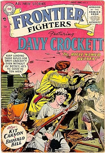
Issue #2 has a larger and more carefully designed Davy Crockett logo, indicating he’s the main star of the book, with the other features smaller in a circle. Oddly, Ira Schnapp rarely used circular captions on covers, while Artie Simek at Marvel used them often.
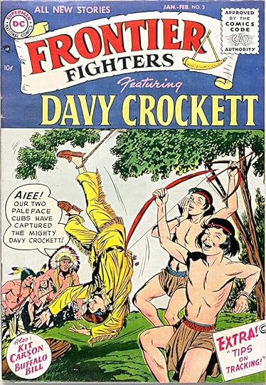
Issue #3 is one of the covers not lettered by Ira except for the repeat of his circular caption. I don’t know who did the word balloon and the other caption.
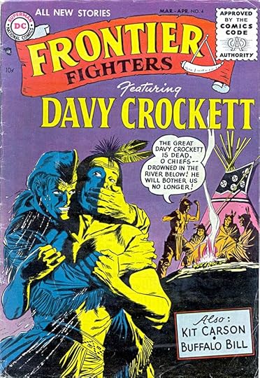
Issue #4 is back to all Ira lettering again with a new rectangular caption for the other features.
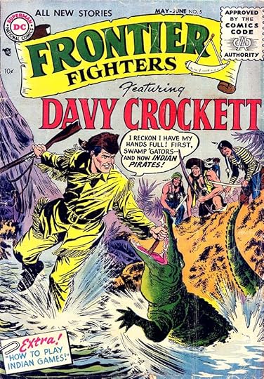
That wordy logo took up a lot of space, and on issue #5, Ira had a hard time fitting in the word balloon. I like the paper-clipped captions he was doing at this time.
Issue #6 is the other cover not lettered by Schnapp, though clearly whoever did it was trying to imitate Ira’s style. The result is reasonably close, but not the same. Story titles are added for the first time.
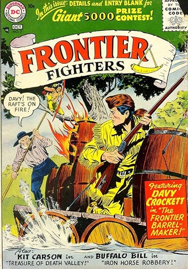
Issue #7 is back to all Ira again, including the contest lettering. It’s kind of odd that DC would set it in type on issue #6, and one issue later have Ira do his version, but it suggests they knew Ira’s work was a selling point. To make room for the art, the large Davy Crockett character logo is dropped here.
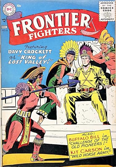
The final issue is again all Schnapp lettering. The usual reason for a title to be cancelled is poor sales, and that was probably the case with these.
Schnapp’s one story inside the book was the Kit Carson feature in issue #7. In all he lettered six covers and eight story pages for the series.
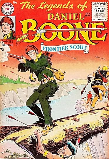
THE LEGENDS OF DANIEL BOONE also features a fine logo by Ira Schnapp. I can’t be sure he drew the rifle, but he certainly could have if given reference, or possibly it was done by cover artist Nick Cardy. The script used for THE LEGENDS OF is not one Ira used often, but it looks fine here. The side points and scallops on BOONE suggest period typography, but more a later period than the character actually inhabited, like wanted posters from the late 1800s. There’s no cover lettering other than the wordy logo.
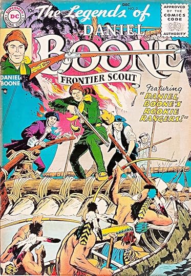
Issue #2 shows the logo struggling a bit to stand out against a busy background, and theres a story title by Ira.
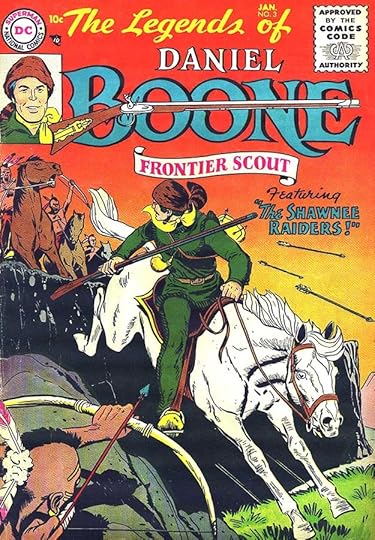
The same plan is followed on issue #3, and the solid color background works better with the logo.
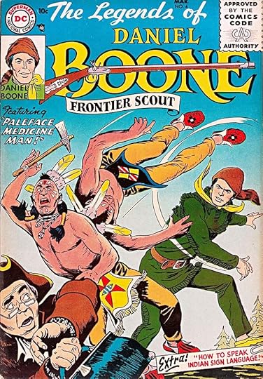
Issue #4 adds one of those paper-clipped captions by Ira.
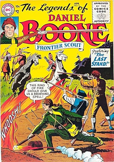
Issue #5 has the first word balloon on a cover in this series, and one of Ira’s rather wimpy sound effects.
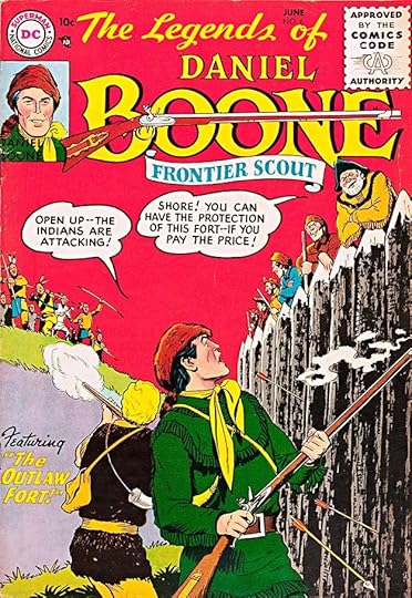
Issue #6 has an unusual color treatment for the story title at lower left, yellow letters with a red or brown outline against lavender. It works okay, and the word balloons are more important anyway.
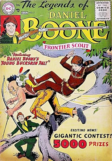
Perhaps in a last-ditch attempt to boost sales, a young sidekick was introduced. Again we have that typeset contest info, which really seems out of place on this cover.
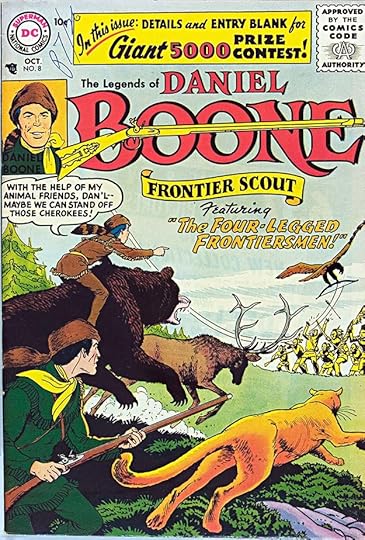
The final issue includes what looks like a fun story with wild animals on the side of the heroes. The lettering for THE LEGENDS OF has been replaced with small type to make room for the contest info. Ira Schnapp lettered seven covers in all, and no inside stories in this series.
More articles like this one are on the Comics Creation page of my blog.
Davy Crockett on Wikipedia.
Daniel Boone on Wikipedia.
The post Ira Schnapp in FRONTIER FIGHTERS and LEGENDS OF DANIEL BOONE appeared first on Todd's Blog.
Todd Klein's Blog

- Todd Klein's profile
- 28 followers

