
Todd Klein's Blog, page 104
October 7, 2020
Ira Schnapp in BIG TOWN
 All images © DC Comics
In 1950, DC Comics launched another crime comic based on a popular radio and TV show (the first was GANGBUSTERS), also the subject of several movies. It revolved around the employees of a newspaper, The Illustrated Press, with the protagonist being editor Steve Wilson assisted by his sidekick and star reporter Lorelei Kilbourne. The show ran on radio from 1937 to 1952 starring Edward G. Robinson as Steve Wilson for the first five years. Four films were made in 1947-48 and the TV version ran from 1950 to 1956. The DC comic was first edited by Jack Schiff, but he soon turned it over to Julius Schwartz who edited from issue #3 on. It ran to issue #50 in 1958. Most issues had three Big Town stories, some had a short second feature, Johnny Law.
It’s likely that Ira Schnapp designed the cover logo and lettered the balloon on this first issue. There’s nothing distinctively Ira about the logo, but he did like classic forms and aligned letters. It doesn’t seem to match the title of the TV show. Ira’s involvement in this title was mainly on covers, though he did letter a handful of stories between issues 5 and 18.

As you can see from the second issue, Wilson was no desk jockey. Most of the early covers had captions lettered by Schnapp as well as some type around the logo in a torn paper shape perhaps meant to suggest “ripped from the headlines.”

Issue #3 has a combination of Ira’s script lettering and type.

With issue #4 from 1951 the logo area was revised with BIG TOWN now in a rectangle with rounded corners. The angled letters in perspective could easily be done digitally today, but then it was probably relettered by Ira, though it’s possible Jack Adler gave him an angled photostat to follow. Jack was a master of photographic tricks like that. This logo would remain for the rest of the series. With the property also on TV, the screen-like logo shape is appropriate.

By issue #17 in 1952, Schnapp word balloons were becoming more common, and the tagline at upper right is now lettered by Ira rather than type.

Issue #30 from 1954 has lots of cover lettering and a round caption touting the TV show but not the radio one, which had ended.

By issue #48 in 1957, sales were slipping and Julie Schwartz tried the usual trick of adding bizarre story elements to attract readers. It wasn’t enough, and the book ended two issues later.
Here are the covers I see Ira Schnapp lettering on: 1-9, 11-39, 41-50. That’s 48 in all.

Schnapp’s first story lettering in this series was a story in issue #5, above. Once Julie Schwartz used up the stories acquired by Jack Schiff, and I don’t know who lettered those, he turned to Ira and Gaspar Saladino, his regular letterers at the time.

Ira lettered one episode of Johnny Law in issue #13 from 1952, the rest were lettered by Gaspar.

Ira’s last story lettering on BIG TOWN was this story in issue #18 from 1952. The regular letterer had become Gaspar Saladino by then, and nearly all the remaining stories are lettered by him.
Here are the stories lettered by Schnapp. Big Town is the subject unless otherwise noted (there were no story titles) and I’ve listed the placement in parentheses.
#5 May 1951: 10pp (1)
#6 June 1951: 10pp, 10pp, 10pp (1-3)
#7 July 1951: 10pp, 10pp, 10pp (1-3)
#8 Aug 1951: 10pp, 10pp, 10pp (1-3)
#9 Sept 1951: 10pp, 9pp (2-3)
#10 Oct 1951: 10pp (2)
#12 Dec 1951: 8pp, 8pp (2-3)
#13 Jan/Feb 1952: Johnny Law 3pp
#14 March/April 1952: 6pp (1)
#15 May/June 1952: 6pp (2)
#17 Sept/Oct 1952: 6pp (2)
#18 Nov/Dec 1952: 8pp (1)
That’s a total of 174 pages on this book. More articles in this series and others you might like are on the Comics Creation page of my blog.
Big Town on Wikipedia.
The post Ira Schnapp in BIG TOWN appeared first on Todd's Blog.


October 6, 2020
Rereading: MOOMINPAPPA’S MEMOIRS by Tove Jansson
 Cover and illustrations by Tove Jansson
The fourth book in the series of Moomin novels written by Tove Jansson, a Finnish author living in Sweden, has a confusing publishing history. It was first issued in English in 1950 under the title The Exploits of Moominpappa. I read and enjoyed that, but later learned of this version, considerably revised and with many new illustrations from 1968, and issued in America in 1994. That’s the one I’m reviewing.
Moominpappa has been working on his memoirs for some time, as mentioned in the previous books. Here he decides to read them aloud to his son Moomintroll and his son’s friends Snufkin and Sniff, whose fathers also appear in these tales of Moominpappa’s youth.
Moominpappa begins with his own childhood. He was raised in an orphanage run by a Hemulen, where food and shelter were provided along with many rules and regulations and little love. When he is old enough, he runs away into the wild forest. He decides his plan is to be a builder and creator of things, and imagines the house he will build for himself. A new friend, Hodgkins, a creature of few words, shows him how to make a water wheel. Soon they meet the Joxter and the Muddler, parents of Snufkin and Sniff, and they decide to build a ship so they can sail away and have adventures. When the ship, the Oshun Oxtra, is completed, they’re unable to launch it into the nearby stream until they trick a monster, the Groke, into doing it for them. From then, the Groke is angry and pursues them, but soon they are sailing on the ocean to new lands.
Many more adventures follow, and we also meet the Mymble, mother of Little My and her sister, as well as the Moomin maiden who will become Moominmamma. This book fills in much of the back story of the Moomins and their friends, and is a fun and exciting read. Jansson’s illustrations are as charming as her prose.
Recommended.
<br />
The post Rereading: MOOMINPAPPA’S MEMOIRS by Tove Jansson appeared first on Todd's Blog.
October 5, 2020
Ira Schnapp in RUDOLPH THE RED-NOSED REINDEER
 Images © DC Comics
In 1939 the now-iconic Rudolph and his story were created by Robert L. May for a coloring book given away to children by the Montgomery-Ward company, famous for their mail-order shopping catalogs. Over two million were given out that year. In 1948 he starred in a Fleischer animated cartoon and in 1949 was the subject of a hit song written by May’s brother-in-law Johnny Marks and sung by Gene Autrey. It sold 2.5 million copies when first released. In 1950, DC began an annual comic book about Rudolph and his adventures that lasted for 13 issues until 1962, though the final one was called an Annual. More new Rudolph stories were created by Sheldon Mayer in the 1970s, but won’t be discussed here. The cover of the first RUDOLPH comic is above with a charming logo by Ira Schnapp, who also lettered the top line, but not the small type at the left. Some covers of this series had no lettering other than the logo, and Ira did those too. He also lettered many of the long stories inside, making these few issues the source of a surprising amount of story lettering for him.

Issue #3 from Christmas 1952 has some great upper and lower case lettering from Ira at the bottom.

Issue #4 from Christmas 1953 is the first and only one with a word balloon by Schnapp as well as a repeat of his previous caption.

Issue #5 from Christmas 1954 has a new Schnapp caption and I think he also did CHRISTMAS CAROLS.

Issue #6 is the first to include the years on the cover, so this would be from Christmas 1955, and it has a fine Schnapp blurb in a holly wreath. I don’t know how Ira felt about working on Christmas projects, as he was Jewish, but then so were many others at DC. He was probably fine with it.

Issue #11 has some new lettering by Ira and a revised logo that also appeared on issue #10, making the outlines of RUDOLPH much thicker. This is not done well and I think it wasn’t done by Ira, but probably by someone else in the DC production department. The caption at the left here was also used on issue #12.

The RUDOLPH ANNUAL (sometimes considered issue #13) has the most cover lettering of any, all by Schnapp, and returns to the original logo. I never saw any of these comics. I’m sure I would have loved to read this one, which reprints two earlier stories with one new story. To sum up, these covers have Ira’s lettering, not counting repeats: 3-6, 11, 13 (Annual), seven in all.

Ira Schnapp lettered the single long Rudolph story in the first issue of 1950. There are puzzle pages interspersed that are not by Ira, but are included in the 48-page story numbering. Ira’s work, sample above, is only on the actual 42 story pages.

Ira did not letter issues 2 and 3, and is next seen in issue #4 from 1953.

Ira’s work on issue #5 of 1954 included a clever dashed line on the last page for a parent to write in the name of their child to make the Christmas gift more personal.

Here’s a fun page from issue #6 of 1955 with a nice scroll caption.

Not all the pages were so easy, here’s a wordy one from issue #7 of 1956.

Issue #8 ends with some holiday-inspired display lettering from Ira.

And the final page of issue #12 has even fancier display lettering showing the influence of Ira’s Old English style. Ira did no new lettering inside the Annual.
Here’s a list of the story lettering by Schnapp on this title, all starring Rudolph:
#1 Dec 1950/Jan 1951: 42pp
#4 Dec 1953/Jan 1954: 26pp
#5 Dec 1954/Jan 1955: 26pp
#6 Dec 1955/Jan1956: 26pp
#7 Dec 1956/Jan 1957: 28pp
#8 Dec 1957/Jan 1958: 28pp
#10 Dec 1959/Jan 1960: 28pp
#11 Dec 1960/Jan 1961: 28pp
#12 Dec 1961/Jan 1962: 28pp
That’s a total of 260 pages, a lot for so few issues. More articles in this series are on the Comics Creation page of my blog.
Wikipedia on Rudolph.
The post Ira Schnapp in RUDOLPH THE RED-NOSED REINDEER appeared first on Todd's Blog.
October 2, 2020
Incoming: BATMAN, THE MAN WHO LAUGHS Deluxe Hardcover
 Image © DC Comics
Just arrived is the hardcover collection featuring The Joker in the title story as well as BATMAN: GOTHAM NOIR and DETECTIVE COMICS #784-786 from 2001 to 2005. All are written by Ed Brubaker. Artists are Doug Mahnke, Sean Phillips, Patch Zirchewr, Aaron Sowd and Steve Bird. Colorists are David Baron, Dave Stewart and Jason Wright. Letterers are Rob Leigh, Bill Oakley and myself on the Detective issues. Seems like a nice package, with a retail price of $34.99, and scheduled for release on Oct. 27th, 2020. An Amazon preorder link is below, or check with your comics retailer.
The post Incoming: BATMAN, THE MAN WHO LAUGHS Deluxe Hardcover appeared first on Todd's Blog.
Ira Schnapp in TOMAHAWK
 All images © DC Comics
The DC frontier fighter Tomahawk began in issue #69 of STAR-SPANGLED COMICS dated June 1947. The first page of his first story is above featuring a logo that would reappear on his solo series. The letterer of the story is unidentified. It’s possible that the logo was created by that letterer for this story, but I think it was done by either Ira Schnapp or the unknown letterer whose work was the model for Ira who I’ve nicknamed Proto-Schnapp. Neither of them has a lettering style like the caption shown here. I think Proto-Schnapp was on staff at DC at the time, so he’s the likely candidate, and he tended to use a lot of curved shapes and lively bounce, while Ira tended to prefer straight lines and aligned letters. The tomahawk behind the T is part of the logo, and a nice visual tie-in that either man could have added, or perhaps the artist Edmond Good did. Tom Hawk and his young friend Dan Hunter ranged across America before and during the Revolutionary War, often fighting Native Americans, sometimes allied with them. The characters were likely inspired by Davy Crockett and Daniel Boone.

After appearances in STAR-SPANGLED and WORLD’S FINEST, a solo title launched in 1950, first issue above. It was edited by Jack Schiff with help from George Kashdan and Murray Boltinoff and it had a long run of 140 issues, ending in 1972. After 1963 the title was edited by Boltinoff alone. Usually each issue had three Tomahawk stories, sometimes with other short features. It was bimonthly at first, then published eight times a year for a while, then bimonthly again. The cover lettering on this issue above the logo looks like the work of Proto-Schnapp to me, not Ira. The caption could be either, but I’m putting it in the Proto-Schnapp column as it’s unlikely two letterers would work on one cover.

The lettering on the cover of #2 looks more like Ira Schnapp’s work to me with its very square and regular letters, though the question mark is a bit odd.

Issue #4’s cover lettering is definitely by Ira Schnapp, and he lettered almost all the covers from here until issue #114 in 1968. Ira lettered a few stories in the series, but most of his work was on covers. Note that Proto-Schnapp’s top lines continued to be used for a while.

On issue #6 in 1951, Ira created an unusual story title meant to suggest Aztec writing, which I like a lot. It may have been the only time he used this style.

Issue #9 in 1952 is the first to have a Schnapp word balloon, not quite in his regular style yet, though the story title is.

By issue #27 in 1954, Ira’s cover lettering was in his typical style seen on nearly every DC title through the 1950s and later, and he’s also redone the top line.

Issue #36 in 1955 has one of the largest Ira Schnapp captions of the 1950s touting the appearance of Davy Crockett, then in the popular TV series from Disney. The real Crockett was not born until 1786, well after the Tomahawk storyline, but few kids would know that.

With issue #55 in 1958 a new Ira Schnapp logo appears. Very simple, with a stylized tomahawk shape around the letters. It left a lot of space above, but is otherwise effective and easy to read. By this time, as you can see, elements of fancy and fantasy were becoming more common.
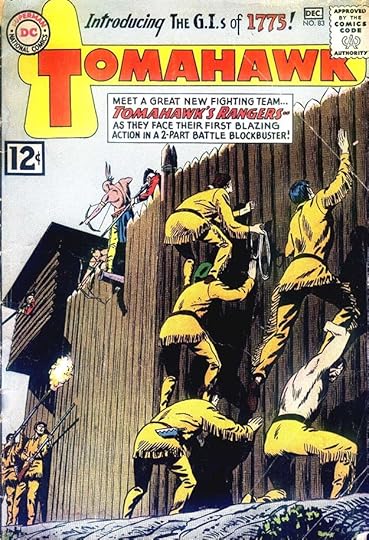
By 1962, DC’s war comics were popular, and with issue #83 this series tried to attract readers with “Tomahawk’s Rangers” billed as the soldiers of 1775.

This logo version by Schnapp appeared only on one cover, #99. A new use is made of the tomahawk, but the red white and blue stripes work against it. By now the series was drifting far from frontier America. Ira’s slanted caption is a clever way to fit things in.

On issue #101 in 1965 there’s a new top line banner and bottom line on the logo that fills the space nicely. The caption at lower right touts a Revolutionary War superheroine, Miss Liberty, thus trying to attract war-comics and superhero fans at the same time.

Issue #110 in 1967 debuted another new Ira Schnapp logo, one of his last, with notched block letters and telescoping. I find it effective except for the head of Tomahawk, which is not by Ira. The infamous “Go-Go Checks” at the top of the cover do nothing to help this one.
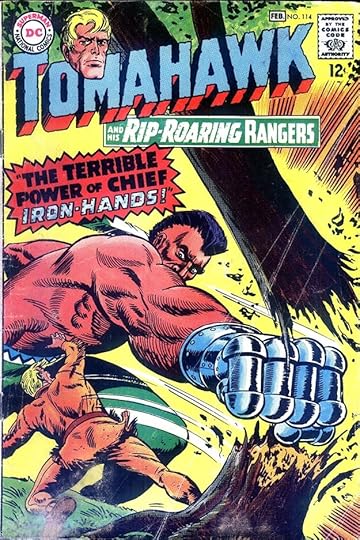
Ira’s final cover lettering on the series was on issue #114 dated Jan/Feb 1968. The treatment of IRON-HANDS shows Ira still had creative ideas. He would leave the company in this year. Here are the covers I see Ira’s lettering on: 2-7, 9-10, 12-36, 38-40, 42-53, 55-59, 61-114. That’s 107 in all, an impressive run.

Schnapp did not letter many stories on this series. The first one is in issue #10 from 1952, above.

In issue #14 he lettered the backup feature “Tales of the Arrow Maker.” I’m not sure if he created this logo, but he might have.

Ira’s final story lettering was in issue #78 in 1962, which had two stories he worked on. It’s interesting to note that the stories were still using the original logo after it was revised on the cover.
Here are the stories I find Ira Schnapp lettering on. Since most issues had three Tomahawk stories, I’ve given the number.
#10 March/April 1952: Tomahawk (3) 8pp
#12 July/Aug 1952: Tomahawk (2) 8pp
#14 Nov/Dec 1952: Arrow Maker 6pp
#15 Jan/Feb 1953: Tomahawk (1) 8pp
#17 May/June 1953: Arrow Maker 6pp
#37 Jan 1956: Tomahawk (2) 8pp
#43 Sept 1956: Tomahawk (2) 8pp
#59 Nov/Dec 1958: Tomahawk (2) 8pp
#67 March/April 1960: Tomahawk (2) 8pp
#76 Sept/Oct 1961: Tomahawk (1) 9pp
#78 Jan/Feb 1962: Tomahawk (1) 9pp, (2) 8pp
That’s a total of 94 pages, showing that Ira lettered more covers than pages on this comic. Perhaps Westerns were not something that appealed to him and he only filled in on stories when no other letterers were available.
More about TOMAHAWK on Wikipedia.
More articles in this series are on the Comics Creation page of my blog.
The post Ira Schnapp in TOMAHAWK appeared first on Todd's Blog.
October 1, 2020
Rereading: A CONNECTICUT YANKEE IN KING ARTHUR’S COURT by Mark Twain
 First edition from 1889, not the one I read. The word CONNECTICUT was added later.
I titled this “Rereading,” but I found I remembered almost nothing from the book, but only parts of the Bing Crosby film, so I may never have actually read this one before.
Hank Morgan is an engineer in then contemporary Connecticut who, after a blow to the head, finds himself in the sixth century court of King Arthur in England. At first Hank is captured by a knight, Sir Kay, and taken as a prisoner to Camelot, where everyone is astonished by his modern clothing and thinks him a magician. Merlin sees him immediately as a rival and tries to have him killed, but Hank happens to remember that a total solar eclipse is about to happen, and uses it to convince everyone he is a much more powerful wizard than Merlin. Hank joins Arthur’s court, where he soon takes on the name “The Boss.” Merlin is still working against him, so Hank creates a second display of his power by creating gunpowder and using it to blow up Merlin’s tower. From then, Hank’s power is not questioned, but he never gains the complete support of the knights and lords of the court and country because of his admittedly peasant upbringing.
Hank learns the ways of the land with help from an assistant, Clarence, and soon sets up factories and schools and other institutions in secret with hopes of creating a new generation of peasants who will rise against their feudal lords and bring democracy to the country. Hank has utter distain for the superstition and slavery rampant in England of the time, and even when sent on a quest as a knight himself, he finds plenty to laugh at. His travels bring him to a holy valley where a holy well has dried up. Hank assesses the situation, sees how to fix it, and makes the restoration of the well another magical miracle. Later, he and Arthur go on a journey through the land disguised as peasants so that Arthur can truly learn what difficult lives his subjects have. The problem is that Arthur has a very hard time pretending to be humble, and the pair end up in prison together about to be hanged.
There’s more, but you get the idea. I didn’t think this book was nearly as successful as The Prince and The Pauper, though they share some ideas. Here Hank is portrayed as the only smart person. Everyone else is not only ignorant and superstitious but stupid, from Arthur on down. This makes for a poor story with lots of lectures from Hank on the glories of his own world in Connecticut, and it’s hard to like him or really anyone else in the book. When this world turns against Hank, he does his best to kill everyone in sight, also not a good story idea. The setting is drawn largely from Sir Thomas Malory’s Le Morte d’Arthur published in 1485, itself drawing on older texts and legends, but largely myth rather than history, and the supposed 6th century setting is completely wrong even for that. As a fan of the Arthur legends, I didn’t much like Twain’s handling of them, even if he did make some good points along the way, and there are some amusing and entertaining segments.
Mildly recommended.
A Connecticut Yankee on Wikipedia.
The post Rereading: A CONNECTICUT YANKEE IN KING ARTHUR’S COURT by Mark Twain appeared first on Todd's Blog.
September 30, 2020
Ira Schnapp in STRANGE ADVENTURES
 All images © DC Comics
Before Julius Schwartz was an editor at DC Comics, he was an active science fiction fan and then a science fiction agent with his friend Mort Weisinger for many well-known authors. Julie must have long thought a science fiction comics anthology was a perfect fit for him, and his first one began appearing with an August/September cover date in 1950. Weisinger co-edited the first two issues, the rest were handled by Julie until he passed the book to editor Jack Miller with issue #164 in 1964. Julie called in some of his science fiction friends and former clients to write for the comic, like Edmond Hamilton and Gardner Fox, who scripted the eight-page adaptation of the George Pal film “Destination Moon” for the first issue. Permission for this may have come from the author of the screenplay, Robert Heinlein, another SF friend. It was the only Hollywood connection for the series, but a great one.
The book started out bimonthly but went monthly with issue #3 and remained so for many years, something of a rarity for DC at the time, so there were lots of issues to look through for the work of Ira Schnapp. I found it mostly on covers. Ira did letter some stories, including an important one in 1967, but they were few and sporadic. The main letterer for the Schwartz issues was Gaspar Saladino. He often lettered entire issues up to about #60, and usually one or two stories after that, though other letterers began appearing regularly then too. While the cover lettering is all type on issue #1, the logo is pure Ira Schnapp, utilizing the kind of telescoping also seen on other logos he designed beginning with his revamped Superman logo in 1940, and letter shapes he liked. Note that the loops of the R’s are fully rounded while the S, G and D are a mix of straight and rounded shapes. The first A in ADVENTURES is very wide, perhaps to emphasize it.

The second issue has cover lettering by Schnapp in the story title and credits box. Giving credit to writers (and one artist, Virgil Finlay, a well-known science fiction pulp illustrator) was unusual for comics at the time. Writer credits often appeared on the stories inside, too. Julie must have convinced management that to attract SF magazine readers, author credits were a selling point. That may have helped sales, as the book was a success.

Again on issue #3 we see Ira’s lettering including two writer names. The title often had continuing characters like Hamilton’s Chris KL99. They came and went over the years, appearing in a series of short stories along with other non-series tales in each issue.

Another continuing feature was Captain Comet, as featured on the cover of issue #14 in 1951, also having the first Ira Schnapp word balloon on the cover as the series took on a more typical DC Comics cover approach. While stories sometimes had genuine science fictional elements, often they were more space opera, adventure and mystery offerings with science fictional trappings.

The cover of issue #40 in 1954 has a relatively rare Ira Schnapp “electric” or “radio” balloon. Unlike other letterers, Ira did not always radiate the points of these from the center, but as here kept all the angles roughly the same.

There’s nothing remarkable about the lettering on issue #79 from 1957, but I couldn’t resist showing this unintentionally funny image.

Issue #110 from 1959 benefits from the gray wash tones of colorist Jack Adler, and Ira’s caption has an unusually amorphous border.

Of the series within STRANGE ADVENTURES, my favorite was The Atomic Knights. Who wouldn’t be intrigued by armored men riding giant dalmations in a post-apocalyptic America? I sure was! Issue #144 was their only cover appearance, oddly enough, with great lettering by Schnapp.

Ira Schnapp continued to letter covers after Jack Miller took over as editor, including this first appearance of the character who became Animal Man on issue #180 in 1965.

With issue #202 in 1967, a new Ira Schnapp logo appeared, emphasizing the book’s shift away from science fiction to mystery and horror. I have to say it’s one of my least favorite logos by Ira. The rest of the lettering on this cover is by Gaspar Saladino, who was gradually taking over that job at the time.

A different version of that logo, also by Ira, had begun on issue #204, and with issue #205, the book featured the new character Deadman, with a logo also by Schnapp at the bottom. If anything, I like this STRANGE ADVENTURES logo even less. “Spooky” was never Ira’s strong point, and this logo doesn’t work for me at all. I do like his Deadman logo, though.

Ira’s cover lettering appeared for the last time on issue #210, dated March 1968, around the time Ira left DC. His run of cover lettering on this book is an amazing one.
Here are the covers lettered by Ira Schnapp: 3-12, 14-21, 23-50, 52-57, 59-62, 64-69, 71-75, 77, 79-87, 89-94, 96-98, 100-151, 155-177, 179-183, 185-189, 191-193, 195-201, 203-206, 210. That’s 185 covers in all.

The first story lettering I see on this series is from issue #2, above. It’s interesting that he took a quite different approach to the story title from the one he lettered on the cover.

This story from issue #23 is a more typical mix of art and lettering for the time, with Ira’s generally small lettering helping him get more words in those last two panels.

Ira’s story title for the lead in issue #54 has an unusual electric treatment for him.

Ira’s most important story lettering for this series was this, the first story and origin of the long-running supernatural character Deadman. As a last effort, it was a fine one.
Here are the stories I find Ira Schnapp lettering on in this series:
#2 Oct/Nov 1950: The Doom From Planet X 8pp
#3 Dec 1950: Chris KL99 10pp
#4 Jan 1951: Invaders From the Nth Dimension 10pp
#6 March 1951: Too Big For This World 10pp
#8 May 1951: Revolt of the Humans 10pp
#11 Aug 1951: Reign of the Elephants 10pp
#12 Sept 1951: Sideways in Time 8pp
#13 Oct 1951: The Hidden People 8pp
#15 Dec 1951: The Strange Sideshow of Dr. Schill 8pp
#23 Aug 1952: Last Woman On Earth 6pp
#25 Oct 1952: The Sniper From Space 6pp, The Living Jewel 6pp
#28 Jan 1953: The Indestructible Giant 6pp, Collector’s Item 4pp
#32 May 1953: The Human Bullett 6pp
#38 Nov 1953: Invasion From the World Below 8pp
#54 March 1955: The Electric Man 6pp
#61 Oct 1955: The Strange Thinking Cap of Willie Jones 6pp
#63 Dec 1955: The Sign Language of Space 6pp
#64 Jan 1956: The Maze of Mars 6pp
#85 Oct 1957: The Amazing Human Race 6pp, Thieves of Thought 6pp
#86 Nov 1957: The Weather War of 1977 6pp
#132 April 1961: The Dreams of Doom 8pp
#134 June 1961: Star Hawkins 8pp
#136 Jan 1962: Lost–100,000 Years 8pp
#139 April 1962: The World Without Tomorrow 8pp
#154 July 1963: A Space Museum Story 8pp
#171 Dec 1964: The Diary of the 9-Planet Man 9pp
#205 Oct 1967: Deadman 17pp
That’s a total of 232 pages, not a lot for Ira, though with the covers it’s a solid amount of lettering work. After the end of Ira’s involvement, the title returned to editor Julius Schwartz for a while with Adam Strange as the main feature (mostly in reprints from MYSTERY IN SPACE) and it ended with issue #244 in 1973.
More articles in this series and others you might enjoy are on the Comics Creation page of my blog.
Wikipedia entry for STRANGE ADVENTURES, with a list of recurring features.
The post Ira Schnapp in STRANGE ADVENTURES appeared first on Todd's Blog.
September 28, 2020
Ira Schnapp in FEATURE FILMS, MELODY LANE and DANGER TRAIL
 All images © DC Comics
This time I’m covering three short-lived titles that started in 1950 with only one making it to 1951. First up is FEATURE FILMS running four issues, the first issue cover is above. This was an attempt to make comics of new film releases much the way Dell Comics often did in their FOUR COLOR series, but DC does not seem to have found a market. All the covers used photos from the films, while all the inside pages were typical comics. The editor of record was Whitney Ellsworth, as with the entire DC line then, I don’t know who actually edited. While the first issue title was as shown above, for the other issues it was FEATURE FILMS MAGAZINE. The logo, movie title and words PRESENTS and STARRING all look like the work of Ira Schnapp to me. The type of fake Chinese used in the film title was common then, and disliked by Asians today. The film choice seems odd for DC, though the list of actors includes some good ones.

The second issue at least features a popular star familiar to kids from films and radio. The musical film was good, though not really a comedy, and perhaps not one many kids would have seen. I don’t know who lettered the words BING CROSBY here, but it wasn’t Schnapp. Probably someone else on staff at DC.

Issue #3, on the other hand, has very handsome title and caption lettering by Ira that really helps sell this cover. It was a Western, so more likely to appeal to kids, too, especially ones already buying DC Western comics.

Issue #4, the final one, is almost all type except for the design around the title. It was the only issue to have a backup story/second feature. This film stars Bob Hope, whose bimonthly DC comic was just getting underway, and seems a good bet to appeal to the same audience, but for whatever reason, sales were not good, and the book was cancelled. Aside from the logo I would count this as two covers lettered by Schnapp, #1 and #3.

Ira did no story lettering on the first issue, but put his stamp on the others. Here’s a page from issue #2. Ira did not do the first introductory page, but lettered the rest of the story.

This page from issue #3 features some of Ira’s script lettering in the last panel.

And issue #4 brings Ira into familiar territory, as he was lettering nearly every issue of Bob Hope’s own comic. Here are the numbers for Ira’s story lettering on this title:
#2 May/June 1950: 34pp
#3 July/Aug 1950: 32pp
#4 Sept/Oct 1950: Fancy Pants 26pp, Golden Gloves 7pp
That’s 99 pages in all.

DC tried this companion title to MISS BEVERLY HILLS OF HOLLYWOOD for three issues, probably also edited by Larry Nadle. The logo is similar to that one and by Ira Schnapp. It leaves a lot of open space at the top, but is otherwise nicely done. All the other cover copy on this series was type.

Ira lettered most of the stories inside too. Many were short Melody Lane pieces like this one from issue #1.

Another short feature in each issue was this one, giving Ira a chance to add some nice display lettering at the top of the first page. As always, Ira’s small lettering helped out with heavy dialogue as in the last panel.
Here are the numbers for Schnapp’s work on the title, all stories feature Melody Lane unless otherwise noted:
#1 Feb/March 1950: 9pp, 6pp, 3pp, 8pp, 8pp, Stars Over Broadway 2pp
#2 April/May 1950: 10pp, 6pp, 4pp, 5pp, 5pp, Stars Over Broadway 3pp
#3 June/July 1950: 6pp, 7pp, 5pp, 7pp, Stars Over Broadway 2pp
That’s a total of 96 pages on this book.

DANGER TRAIL was an attempt by DC to enter the secret agent/suspense/thriller arena. The lead story featured agent King Faraday created by Robert Kanigher and Carmine Infantino, and the book was edited by Julius Schwartz. Despite these credentials, it didn’t last long, just five issues. Additional King Faraday stories appeared in WORLD’S FINEST COMICS when this title ended. The logo is by Ira Schnapp using his standard block letters, and despite the name, the logo is sedate and bland. This may have been an attempt to look like a paperback book, I don’t know. The rest of the cover lettering on this and all five issues is also by Ira, and since there are only a few, I’ll show them all.

I find these covers appealing and might have bought them if I was of buying age. Here the caption at lower right should have been also made white, it’s hard to read.

Issue #3 removes the border around the logo box, which I don’t think has much impact.

I like the bubbles over the logo in issue #4. The gray wash tones suggest it was colored by Jack Adler, they probably all were.

The final issue has a new and more exciting logo by Ira, though the word TRAIL gets lost at the bottom. It features a new lead, but this is not the same Johnny Peril who appeared in other DC titles. In addition to his usual caption, Ira had the chance to add some fine poster lettering.

Most of the story lettering on the series is by Gaspar Saladino, but Ira Schnapp did letter one story in the last issue:
#5 March/April 1951: Safari to Nowhere 10pp
That’s the extent of Ira’s involvement in these titles. More in this series can be found on the Comics Creation page of my blog.
The post Ira Schnapp in FEATURE FILMS, MELODY LANE and DANGER TRAIL appeared first on Todd's Blog.
September 27, 2020
And Then I Read: BILLIONAIRE ISLAND #1
 Image © Mark Russell and Ahoy Comics. Written by Mark Russell, art by Steve Pugh, colors by Chris Chuckry, letters by Rob Steen.
This title from Ahoy Comics (which I designed the logo for) is social satire, and also science fiction in the “If this goes on…” tradition. Right now in America it’s hard to imagine how things could get much worse, but writer Mark Russell takes some trends in today’s world, particularly the domination of the rich over the poor and everything that entails, and imagines a future where that continues to much greater inequities. Billionaire Island is the haven for the disgustingly rich, a floating island in the Gulf of Mexico in international waters where all the perks of wealth can be enjoyed with none of the annoyances like taxes, laws, and accountability in the media. One reporter finds herself in captivity there after arriving for an interview with the head billionaire, Rick Canto. Elsewhere, another mogul is confronted with the horror of his crimes against the poor in a way he never expected.
It’s hard to laugh at this book’s satire only because it seems all too plausible. Despite that, I enjoyed the writing and the art, and recommend it.
Here’s a link to the upcoming trade paperback collection of the series.
The post And Then I Read: BILLIONAIRE ISLAND #1 appeared first on Todd's Blog.
September 26, 2020
Rereading: FINN FAMILY MOOMINTROLL by Tove Jansson
 Images © Tove Jansson estate
The third Moomin novel for young readers was called Trollkarlens hatt or “The Magician’s Hat” in Sweden when first published in 1948. It was the first Moomin book published in America in 1950, so the English title was an attempt to introduce the characters. Really, Finn Family has nothing to do with the book except that the author is Finnish, and the setting is a fantasy version of Finland. For the American edition, author Tove Jansson lettered this charming introduction from Moominmamma to tell her new readers about the characters:

The book continued to be marketed as the first of the series in America until 1980. This makes sense in some ways because it’s the first one where most of the main characters are present and the story is the first to take place almost entirely in Moomin Valley. It did cause me a lot of confusion when trying to locate the entire series, though.
The Moomins and their friends have spent the long, snowy winter sleeping in the Moomin house, as is their habit. When young Moomintroll awakes on a spring morning, he joins his friends Snufkin the wanderer and Sniff the fearful on an expedition to the top of a mountain where they find a magical hat, though they don’t know about the magic yet. When they bring it home it takes a while for them and Moomintroll’s parents to figure out that any object placed in the hat is magically transformed in unpredictable ways. For instance, eggshells become small clouds that can be ridden into the air and when Moomintroll hides in the hat, he’s changed into someone no one else recognizes.
On the sea shore the Moomins find a boat that has washed up, and they take a voyage in it to the island of the Hattifatteners, those odd creatures something like electric eels with legs and arms that wander in herds on land and sea. They have adventures there and find treasures. When they get home, they find the Moominhouse transformed into a jungle by the hat. New friends Thingumy and Bob arrive with a huge jewel they have stolen from the monstrous Groke. When the Groke arrives to claim it, a trial is held. Then things get even more complicated with the Magician arrives to claim his hat.
Jansson’s imaginative world and creations are a continual delight in this book, and the characters are as charming and appealing as ever, especially when they get into trouble. Recommended. Here are the first two books previously reviewed:
The Moomins and the Great Flood
Tove Jansson on Wikipedia.
The post Rereading: FINN FAMILY MOOMINTROLL by Tove Jansson appeared first on Todd's Blog.
Todd Klein's Blog

- Todd Klein's profile
- 28 followers

