
Todd Klein's Blog, page 102
November 11, 2020
Ira Schnapp in HOPALONG CASSIDY and CONGO BILL
 Images © DC Comics
In 1904 the Western character Hopalong Cassidy was created by author Clarence E. Mulford as a rude, rough-talking, dangerous man with a wooden leg which caused him to “hop along.” In 1935 William Boyd took the lead role in a long series of Hopalong Cassidy films with the character and stories having little relationship to Mulford’s original. Hop was a more clean-cut, mainstream guy with no disability, and he proved very popular with young audiences. Fawcett Comics, the home of the original Captain Marvel, began publishing a monthly Hop comic in 1946. When they closed down their comics line in 1953, the property moved to DC, which began publication with issue #86 dated Feb. 1954, and ran to issue #135 in 1959. Julius Schwartz was the editor. The logo was picked up from Fawcett, I don’t know who designed it. Ira Schnapp did the cover caption, and it was reused on the next two issues. The top line is type. All the covers until #109 used photos of Boyd from the films. There were lots of films, so probably lots of photos. Schnapp lettered most of the covers, but only lettered three stories inside the book.
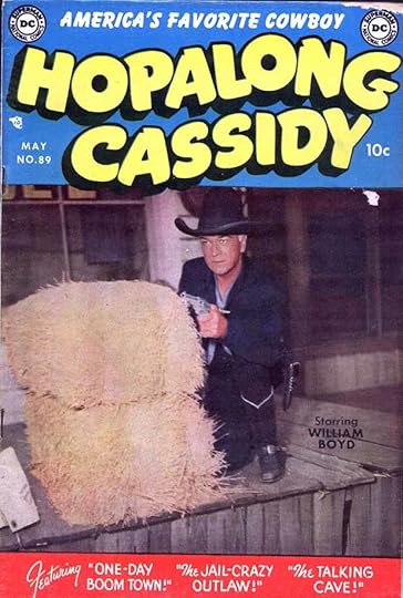
Issue #89 put story titles by Schnapp in a banner at the bottom. There were various strategies to get cover blurbs to work with the photos, most of them not very successful to my eye.

One of the best was on issue #99, which put a rare smiling photo of the actor in a circle, allowing Ira’s story title to go in the white frame.

A few covers have Ira adding not only lettering but art to the cover in an attempt to make it work better with the photo, but usually failing, as here. Nothing wrong with the lettering, but the sign post does not seem at all part of the photo, which features Hop’s horse Topper.
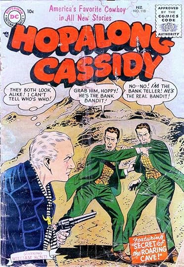
By issue #110, the series finally gained the drawn art of most comics, and I think looked much better. Ira’s thought and word balloons, and his caption work fine, and he even lettered the actor’s name. Boyd was born in 1895, so was almost the same age as Ira Schnapp. He was 40 when he began portraying Hop, and by the final film in 1948 he was 53. His white hair was not dyed, and I think makes him distinctive. From 1949-54, Boyd played Hop on TV, then retired from the role.

Here’s an unusual painted look for a cover of the series, inked in gray wash and separated by Jack Adler, who used Ira’s lettering but removed the caption and balloon borders. I think that works quite well.
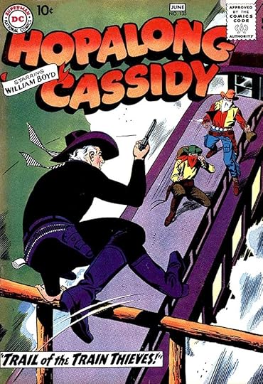
The final issue, #135, has a dynamic scene with two Schnapp captions. By 1959 the character was no longer appearing in new films or TV shows, and that might have hurt sales enough to end the series, but that just a guess.
Here are the covers lettered by Ira Schnapp, not counting the repeats: 86, 89, 91-102, 104-135. That’s 46 in all.

Here a page from the first of three stories in the book lettered by Ira. Many of the others were lettered by Gaspar Saladino, including all the Hop stories in issues 86-94. Ira Schnapp’s stories are:
#110 Feb 1956: The Dangerous Stunts of Hopalong Cassidy 10pp, Secret of the Roaring Cave 8pp
#127 Jan/Feb 1958: Hopalong Cassidy’s Golden Riddle 8pp
That’s 26 pages in all.

Congo Bill was a long-running series that began in MORE FUN COMICS #56 in 1940, then moved to ACTION COMICS in 1941. It was similar to the comic strip Jungle Jim, the adventures of a white explorer in Africa. In ACTION COMICS #191 in 1954, Bill was joined by Janu the Jungle Boy, similar to a young Tarzan, with both often working with a Golden Gorilla. This dual feature gained its own title for seven bimonthly issues a bit later in 1954. The first cover, above, features cover lettering and logos by Ira Schnapp. The logo style is very Art Deco, an odd choice for a jungle series. Ira did no lettering inside the book, but lettered all the covers.

Issue #4 has more traditional cover lettering by Schnapp, similar to what he was doing on many other DC titles.

The final issue has more familiar Schnapp lettering. Though the series must have sold poorly, it continued in ACTION for years. In 1959, Bill and the Golden Gorilla began switching minds somehow, creating the character Congorilla, a gorilla with great strength and human intelligence, who has continued to appear occasionally.
As I said, Ira Schnapp lettered all seven covers of the series, though the word balloons on issue #6 are pulled from an inside story and are not by Ira.
More articles in this Ira Schnapp series are on the Comics Creation page of my blog.
Hopalong Cassidy on Wikipedia.
Congo Bill/Congorilla on Wikipedia.
The post Ira Schnapp in HOPALONG CASSIDY and CONGO BILL appeared first on Todd's Blog.


November 9, 2020
Ira Schnapp in STAR-SPANGLED WAR STORIES
 Images © DC Comics
War comics were a definite hit with readers in the early 1950s, and DC Comics made an unprecedented jump into the genre with three titles cover-dated August 1952. I’ve already written about two, OUR ARMY AT WAR and ALL-AMERICAN MEN OF WAR. The latter was converted from a western series, and this one was converted from STAR-SPANGLED COMICS, originally a superhero title that had degenerated into a strange mixture of genres looking for an audience. As with ALL-AMERICAN, the first three issues continued the numbering of the previous version, #131-133, then restarted with #3, meaning there was an extra issue in there. Since the title eventually ran to 204 issues, it also meant there were two sets of issues 131-133 separated by fifteen years. Readers weren’t likely to notice that at the time. Unlike the other two new DC war comics, this one was not initially edited by Robert Kanigher. The likely editor was Murray Boltinoff. With issue #17, though, the title was handed to Kanigher, who was having great success with his war books, and he edited it for many years.
The logo was designed by Ira Schnapp using a similar style and layout as his logo for ALL-AMERICAN MEN OF WAR. The stars on the banner are a nice touch and the only nod to the comic this came out of. The top line is type, but Ira lettered the word balloon, the caption and probably the sound effect. He would letter most of the covers until early 1968, but only a few stories inside.

Here’s the first issue of the renumbered series. As was typical, DC did not put an issue number on it hoping retailers would not consider it a new series and thereby reject it from their already full magazine racks. Ira has lettered the top line on this one. Most early covers had a caption listing story titles, some highlighting one, as here, some not.

By issue #6 DC still was not putting the issue number on the cover, an unusual move. The underwater jeep here presages the more fanciful stories that would be common much later in the series.

Issue #34 from 1955 continues to have a similar caption style, with the story title decorated by snow this time.

Issue #60 from 1957 has some Schnapp radio balloons in a style he rarely used.

Issue #84 saw the debut of the first hit feature of this title, Mademoiselle Marie, the French resistance fighter. She would be cover-featured for the next group of titles, and would be a continuing character for years. Somehow I think calling her a “Battle Doll” would not go over well today.

By issue #90 in 1960 the series had dropped from monthly to bimonthly, a sign that sales were down, and editor Kanigher decided to try something different by pitting soldiers against dinosaurs. The series known as “The War That Time Forgot” must have been popular, as it was cover-featured for the next few years. If readers were tired of traditional war stories, this was a new, fanciful option, and most kids like dinosaurs.

By issue #101 in 1962, Kanigher was throwing just about anything into the mix including robots. I was never a war comics fan myself, but some of these covers do look interesting!

There must have been some mockery of the dinosaur theme in this book leading to this Ira Schnapp caption, “DC BREAKS ALL THE RULES!”

With issue #133 from 1967, a new Ira Schnapp logo appears with major emphasis on WAR. I think it’s effective and one of Schnapp’s best late-career logos. The ragged edges on the stroke ends are something more often seen on Marvel Comics logos at the time.

With issue #138 from 1968, a new lead feature, Enemy Ace, begins with a logo by Gaspar Saladino. This is the last cover with lettering by Ira Schnapp, probably finished not long before he left the company.
Here are the covers lettered by Ira: 131-133, 3-27, 29-34, 36-38, 40, 42-73, 75-138. That’s 134 in all, a fine run.

Gaspar Saladino lettered a few stories in the early issues, but I can’t put a name to much of the other lettering. Once Kanigher took over as editor and used up the inventory from Boltinoff, Saladino became the main letterer, as on Kanigher’s other war books, often doing entire issues. Ira Schnapp lettered just five stories. A page from the first one in issue #5 is above.

Ira’s final story lettering for this title was in issue # 53 in 1957. I suspect he did not enjoy working on war stories and only did them when no one else was available, but that’s just my guess. Here are the stories with Schnapp lettering:
#5 Jan 1953: Three Volunteers 8pp
#11 July 1953: The Kid and the Kraut 6pp
#31 March 1955: Blue Piping 6pp
#44 April 1956: The Iron Soldier 6pp
#53 Jan 1957: The Silver Skis 6pp
Just 32 pages on this title. Other articles in this series are on the Comics Creation page of my blog.
Star-Spangled War Stories on Wikipedia.
The post Ira Schnapp in STAR-SPANGLED WAR STORIES appeared first on Todd's Blog.
November 8, 2020
Rereading: SPACE CADET by Robert A. Heinlein
 Cover art and illustrations by Clifford N. Geary
This is the second of Heinlein’s “juveniles,” a series of books for younger readers, first published in 1948. With it, he hit his stride in the series, producing a fine story with well-integrated scientific and moral themes and appealing characters.
As the book opens, Matt Dodson is reporting to a center in Colorado as a cadet trainee in the Interplanetary Patrol, an organization which acts as a police force and deterrent throughout the solar system of the year 2075, a solar system which includes several colonies on other worlds. The Interplanetary Patrol controls a satellite-based nuclear weapon system that acts as a deterrent to war and conflict on Earth and elsewhere. As the story develops, we learn that cadets must be willing to put their loyalty behind the Patrol over their home planet, home country, and even family. Matt is soon befriended by cadets Tex Jarman from Texas, Oscar Jensen from Venus, and Pierre Armand from Ganymede. Their training is a winnowing process where they must pass many kinds of tests, both physical and mental, and the large class of trainees gradually dwindles. Those who are deemed space-worthy continue training on the school ship James Randolph in permanent orbit around Earth.
The training process is well told, based on Heinlein’s own training in the U.S. Naval Academy but with additional challenges like weightlessness, space navigation, and the airless vacuum of space. Matt’s path is not always easy, and he considers leaving to become a Space Marine, where battle and glory are the goal, while a roommate opts for the Merchant Service, dedicated to commercial shipping. In the end he stays with the Patrol and is assigned to a working Patrol ship, where he must learn more. His first mission is to the Asteroid Belt in search of a missing ship. Later he is part of a mission that lands on Venus, where the training and skills of Matt and his friends are put to a real-life test dealing with angry natives, and their landing craft is lost, sinking into the swamps of Venus.
I enjoyed this novel just as much this time as when I first read it as a boy. I had no interest in a military career, the closest I came to the kind of experiences Heinlein describes was being in the Boy Scouts for a few years, and I wasn’t particularly good at that, though I liked some things about it. Even though the military life was not for me, Heinlein makes it understandable and appealing through his skillful writing, and the moral choices presented to the characters are ones I understood and appreciated. The science and glamor of space travel is well represented, even though it’s now largely outdated by modern computers and technology. It feels real, and there are a few prescient hits, like the use of cell phones. Heinlein’s title, “Space Cadet” led to an unrelated TV show and successful media property, “Tom Corbett, Space Cadet,” which never had the appeal of this book for me, and the phrase became common in our language, though not always with positive meaning.
Recommended, and a good place to sample Heinlein if you haven’t before.
The post Rereading: SPACE CADET by Robert A. Heinlein appeared first on Todd's Blog.
November 5, 2020
Ira Schnapp in PHANTOM STRANGER and PETER PANDA
 Images © DC Comics
The original PHANTOM STRANGER comic ran for just six issues from Aug/Sept 1952 to June/July 1953. It was edited by Julius Schwartz. I can only imagine that sales were poor for it to be cancelled so quickly. Despite that, the title character remains an important part of the DC Comics universe, and had a much longer series later, as well as many guest appearances. His origin, name and powers remain a mystery. This was an anthology title with several stories in each issue, along the lines of HOUSE OF MYSTERY, some with the Stranger, some without.
Ira Schnapp designed the logo, and I find it one of his least effective efforts, especially for this time period. Ira never did scary or spooky very well, and this is a good example of that. Rather than looking scary, to me it just looks badly drawn. Ira also lettered this and all the covers.

The Carmine Infantino art on the cover of issue #3 is effective, but marred by a too-large logo and poor coloring in my opinion. It features a Schnapp word balloon.

The final issue is the most interesting in concept, and the lettering by Ira is fine, too. Schwartz later reused the idea on the cover of JUSTICE LEAGUE OF AMERICA #2 in 1960. As I said above, Schnapp lettered all six covers of this brief series.

Most of the stories inside were lettered by Gaspar Saladino, but Ira Schnapp did four stories, one in each of the first four issues. Here’s his lettering for the first issue with an appealing smoky title.
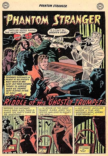
And this is the first page of his story in issue #4. The story may reflect editor Julie’s interest in jazz music, but the script is by John Broome. Here are the stories Ira Schnapp lettered:
#1 Aug/Sept 1952: Goblin In The Bottle 6pp
#2 Oct/Nov 1952: Three Signs of Evil 8pp
#3 Dec 1952/Jan 1953: Ghosts For Sale 6pp
#4 Feb/March 1953: Riddle of the Ghostly Trumpet 6pp
That’s 26 pages in all.

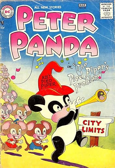
Switching gears, PETER PANDA was a fantasy title that ran 31 issues from 1953 to 1958 edited by Larry Nadle. It’s not exactly a funny animal book because Peter, a talking panda with no real origin given, interacts with two human children and most of the stories involve magic and/or magical beings of some kind. The closest thing to it at DC is probably the Jimminy stories in late issues of MORE FUN COMICS. A regular backup was Stanley the Timid Scarecrow, probably taking a cue from the Scarecrow in the Wizard of Oz. It’s obviously aimed at young children. The main and perhaps only artist was Rube Grossman, also working on DC’s RUDOLPH THE RED-NOSED REINDEER and various funny animal comics.
Ira Schnapp designed the logo, which I find appealing, and lettered the fanciful story title. Both were much more in his comfort zone than PHANTOM STRANGER. Ira lettered most of the covers on this series and many of the stories inside.

The cover of the second issue has a different but equally charming fancy story title, and many issues followed that plan.

Issue #4 adds word balloons by Schnapp. I find the idea that Mother Nature has been vacationing in Atlantic City amusing.

And look, issue #11 from 1955 has a previously unknown-to-me appearance of Sandman! I bet Neil Gaiman would have worked this into his series somehow if he’d known about it. Lots of charming Schnapp lettering here.

As you can see, candy and food were common themes, another indication the comic was aimed at young kids. More fine Schnapp lettering on issue #16 from 1956.
Ira Schnapp’s story titles for this series are creative and appealing. I think he also lettered the name on the hat.

The final issue’s cover has gray washes and color probably by Jack Adler. Ira’s title is short but perfect. Here are the covers lettered by Schnapp: 1-7, 9-28, 30-31. That’s 29 in all.

Ira Schnapp lettered all but two of the stories in the first 16 issues, and many after that, though there are a few later issues with nothing lettered by him except the cover. This first page from the first issue introduces Peter Panda and three frogs who will soon star in their own stories. The first few issues had long stories divided into three chapters. After that it was all unconnected short stories.

Here an example of Stanley, the second feature, with lettering by Schnapp. He probably did the character logo as well.

This Peter Panda page from issue #10 has fun with the lettering. Similar creative lettering ideas appeared in many of the stories.

A sample page with the three frogs from issue #16 in 1956. Their stories would qualify as funny animal ones, I think. The dialogue here is along the lines of what Walt Kelly was doing in the Pogo comic strip.

The title page of the only story Ira lettered in the final issue, #31. Other letterers with similar styles did the rest.
Here are the stories lettered by Ira Schnapp. Peter Panda (PP) usually had three or four stories. In issues where Ira only did some, I’ve numbered his.
#1 Aug/Sept 1953: PP 6pp, 8pp, 6pp, Stanley 4pp
#2 Oct/Nov 1953: PP 6pp, 8pp, 6pp, Stanley 4pp
#3 Dec 1953/Jan 1954: PP 6pp, 8pp, 6pp, Stanley 4pp
#4 Feb/March 1954: PP 6pp, 8pp, 6pp, Stanley 4pp
#5 April/May 1954: PP 6pp, 4pp, 6pp, Stanley 4pp, Hop Skip & Jump 4pp
#6 June/July 1954: PP 6pp, 6pp, 4pp, Stanley 4pp, HS&J 4pp
#7 Aug/Sept 1954: PP 6pp, 6pp, 6pp, Stanley 4pp
#8 Oct/Nov 1954: PP 6pp, 6pp, 4pp, 6pp, Stanley 4pp
#9 Dec 1954/Jan 1955: PP 6pp, 4pp, 4pp, 6pp, Stanley 4pp
#10 Feb/March 1955: PP 6pp, 4pp (1-2), Stanley 4pp, HS&J 4pp
#11 April/May 1955: PP 6pp, 4pp, 4pp, 6pp, HS&J 4pp, Stanley 4pp
#12 June/July 1955: PP 6pp, 4pp, 4pp, 6pp, HS&J 4pp, Stanley 4pp
#13 Aug/Sept 1955: PP 6pp, 6pp, 6pp, Stanley 4pp, HS&J 4pp
#14 Oct/Nov 1955: PP 6pp, 4pp, 6pp, Stanley 4pp, HS&J 4pp
#15 Dec 1955/Jan 1956: PP 6pp, 4pp, 4pp, 6pp, Stanley 4pp
#16 Feb/March 1956: PP 6pp, 4pp, 4pp, 6pp, HS&J 4pp
#17 April/May 1956: PP 6pp, 4pp, 6pp (1, 3-4), Stanley 4pp
#19 Aug/Sept 1956: PP 6pp, 4pp, 6pp, 4pp
#20 Oct/Nov 1956: PP 6pp, 6pp, 6pp, Stanley 4pp
#21 Dec 1956/Jan 1957: PP 6pp, 4pp, 4pp, 6pp, Stanley 4pp
#22 Feb/March 1957: PP 6pp (1)
#23 April/May 1957: PP 6pp, 4pp, 4pp, 6pp, Stanley 4pp
#25 Aug/Sept 1957: PP 6pp (1), Stanley 4pp
#26 Oct/Nov 1957: PP 6pp, 4pp, 4pp, 6pp, Stanley 4pp
#28 Feb/March 1958: PP 6pp, 4pp, 4pp, 6pp, Stanley 4pp
#29 April/May 1958: PP 6pp, 4pp, 4pp, 6pp, Stanley 4pp
#30 June/July 1958: PP 6pp, 4pp, 6pp (1, 3-4), Stanley 4pp
#31 Aug/Sept 1958: PP 6pp (3)
That’s a total of 612 pages. More articles in this series are on the Comics Creation page of my blog.
Phantom Stranger on Wikipedia.
More on Peter Panda.
The post Ira Schnapp in PHANTOM STRANGER and PETER PANDA appeared first on Todd's Blog.
November 2, 2020
Ira Schnapp in OUR ARMY AT WAR
 Images © DC Comics
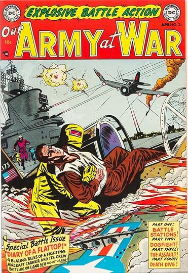
DC’s first war comic had been BOY COMMANDOS created by the Simon and Kirby shop in the 1940s. In the early 1950s, war comics had a new wave of popularity, and many publishers were issuing them. Editor Robert Kanigher jumped on this bandwagon with the bimonthly ALL-AMERICAN MEN OF WAR, the first issue having an Aug/Sept 1952 cover date. This title began at the same time as a monthly with an August 1952 cover date. It would have a long and successful run of 301 issues ending in 1977. Kanigher remained the editor until the late 1960s when he was replaced by his most popular war artist, Joe Kubert.
Ira Schnapp designed this logo, using the same word WAR as on the other new title, and doing ARMY in the same style. The smaller words OUR and AT are not as well designed as Ira’s usual script upper and lower case letters in my opinion, but they remained on the logo for its duration all the same. Ira also did the top line and its creative exploding caption, which was reused for later issues, and the word balloon. Schnapp’s major contribution to this title was cover lettering, he did most of it until issue #189 in 1968. He also lettered a few stories inside the book in its first few years.

Issue #8 from 1953 is typical of many early covers for this series, with a Schnapp top line and a caption holding the story titles.
Issue #21 from 1954 adds another caption describing the contents, a four-part story.

After the comics code seal was added in the upper right corner of each issue, this series often put the logo on two lines, as seen here on issue #41 from 1955.

Issue #77 from 1958 has a particularly large story title with open letters at the bottom and two word balloons, which were gradually being used more often.

The star characters of the book were Sgt. Rock and his Easy Co. soldiers. Rock emerged gradually over a few issues. This is an early version from issue #81 in 1959. Joe Kubert became the regular Rock artist and cover artist around this time in stories mostly written by Kanigher.

Fans loved the feature, and by issue #91 from 1960, the Rock stories sometimes filled whole issues, or were two-thirds of it with an unrelated backup story. Ira lettered the blurb BY POPULAR DEMAND, something you didn’t see on DC covers very often.

Issue #112 from 1961 had the full roster of Easy Co. to that point drawn by Joe Kubert with lettering and captions by Schnapp.

Kubert’s covers were action-filled, and Schnapp’s lettering helped sell the story, as here on issue #140 from 1964.

This story filled two issues, #147 above and #148 from 1964, both designed to look like book covers with help from Ira’s open lettering.

Issue #151 from 1965 teased the first appearance of another popular feature, Enemy Ace about a World War One German pilot. It would run as a backup here and later get its own series.

From issue #158 in 1965, Sgt. Rock’s own logo took the limelight below the book title. Ira Schnapp did all the cover lettering, but the Sgt. Rock logo is by Gaspar Saladino, possibly his first for DC. The clue to that is the way the R in ROCK is shaped. It’s designed like a letter P with the right leg added, as indicated by the position of the notch on the right side, something Gaspar always did with his block letters.

Issue #162 from 1966 features a surprising team-up of Rock and the Viking Prince, a character created by Kanigher and Kubert for the first issue of THE BRAVE AND THE BOLD in 1955. Lots of large, handsome lettering by Ira here!

In addition to twelve monthly issues, from 1966 on there was an annual-sized collection of older stories like this second one from 1967. I think the only new thing was the cover by Kubert with lettering by Schnapp. The characters were drawn from all the Kanigher war comics.

In the late 1960s, cover lettering was gradually shifted from Ira to Gaspar Saladino. Issue #189 from 1968 was the last with Schnapp lettering. Ira would leave the company soon after. His run as cover letterer for this title was a long one. Here’s a list of the covers he lettered: 1-66, 68-77, 79-156, 158-169, 171-172, 174-181, 183-187, 189. That’s a total of 181 covers. The uninterrupted run of Ira’s lettering for 78 issues from #79-156 might be a record!

The main letterer on this series, as with other Kanigher war titles, was Gaspar Saladino. In the early years, Ira Schnapp lettered 13 short stories. Other letterers also did a few, but Gaspar often lettered entire issues. In the early 1960s, Gaspar was mainly lettering just the Sgt. Rock stories until about 1965 with other letterers on the backups, and then taking over for many later issues. Above is the first page of Ira’s first story from issue #4 in 1952.

Here’s a page from Ira’s last story on this title in issue #40 from 1955. Ira’s lettering was much smaller than Gaspar’s, which helped in the last three panels on this page.
Here’s a list of Ira Schnapp lettering in this series:
#4 Nov 1952: Replacement 6pp
#6 Jan 1953: Battle Flag 8pp, Kid Private 6pp
#8 March 1953: Rear-Guard 4pp
#9 April 1953: Undersea Raider 6pp
#29 Dec 1954: Mule P.F.C. 6pp
#31 Feb 1955: Howitzer Hill 6pp
#32 March 1955: Battle Mirror 8pp
#33 April 1955: Combat Courier 6pp
#35 June 1955: Infantry Admiral 6pp
#36 July 1955: Clay Pigeon Paratrooper 6pp
#38 Sept 1955: Walking Sailor 6pp
#40 Nov 1955: War On Wheels 6pp
That’s 80 pages in all.
Other articles in this series are on the Comics Creation page of my blog.
OUR ARMY AT WAR on Wikipedia.
Sgt. Rock on Wikipedia.
The post Ira Schnapp in OUR ARMY AT WAR appeared first on Todd's Blog.
October 30, 2020
Ira Schnapp in DEAN MARTIN & JERRY LEWIS
 Images © DC Comics
With the success of THE ADVENTURES OF BOB HOPE, launched in 1950, DC Comics decided to try a similar title with the team of Martin and Lewis. Dean Martin was a singer who played straight man for comedian Lewis. They first teamed up in 1946 and were a success on stage, screen, radio and TV until their partnership ended in 1956. DC’s bimonthly comic began in 1952 and ran 40 issues to 1957. After the breakup it continued as a solo title for Jerry for 84 more issues, ending with #124 in 1971, making it the longest-running Hollywood-related title at the company. The editor was Larry Nadle for many years, then Murray Boltinoff. The main artists were Howard Post, then Owen Fitzgerald, then Bob Oksner, though a few late issues were drawn by Neal Adams.
The logo is one of the more lively efforts of Ira Schnapp, except for THE ADVENTURES OF, which is type. Schnapp also did lettering on most of the covers until 1967, and lettered most of the interior stories from the first to issue #83 in 1964, making this title one of his most prolific. Like BOB HOPE, this series generally had one long story broken into three chapters, an unusual style for the time, as well as other short stories in the early years.

Here’s a typical gag cover from issue #2 with Schnapp balloon lettering. Martin and Lewis, and later just Lewis, were always surrounded by beautiful women, but Jerry was generally oblivious to their charms, unlike Bob Hope in his title, playing on his goofily innocent character from the movies and other venues.

Another example of a typical gag cover with Schnapp balloons on issue #17 from 1954.

And another with some additional label lettering by Ira as well as his contest caption running on all the DC titles. The top line of the logo is now lettered by Schnapp with the added word NEW.

With issue #41 from 1957, Jerry had sole possession of the title, and Ira Schnapp redid the word JERRY to match LEWIS. This made the logo less wordy and less cluttered, always a good thing.

Issue #50 from 1959 has lots of fine Schnapp lettering. As was often the case, the girl seems surprised to be there, and was ignored by Jerry.

Issue #61 from 1960 has no word balloons, but I’m sure Ira did the signs and towel lettering, all in the style of Trajan’s column in Rome. Ira worked with this style in his high school years when helping to create the inscriptions on the Farley Post Office building in New York, more on that HERE.

Issue #68 from 1962 was one of several adapting Jerry Lewis films, and in this case using a still from the film on the cover. I’m sure Ira lettered the caption at the top. The one at the bottom might have been a last-minute addition by someone else in the DC production department to tie into the photo.

By issue #85 in 1964 sales may have been slipping, and editor Boltinoff was trying things like giving Jerry a rambunctious nephew to interest readers.

By issue #94 in 1966 we are into the nadir of DC cover design with too much lettering and those regrettable “Go-Go Checks” at the top. I do like Ira’s new top line, though.

Ira’s final cover lettering appeared on issue #105 from 1968, appropriately with his Superman logo redesign from 1940. This cover therefore brackets Ira’s career at DC with his very first job for them and one of his last.
Here are the covers lettered by Ira Schnapp: 2-21, 23-75, 78-82, 84-88, 90-91, 93-96, 98-100, 102-103, 105. That’s a total of 95 covers.

The first page of the first book-length story in issue #1 with lettering by Ira Schnapp in balloons drawn by the artist, Howard Post. As far as I know, Post lived and worked in the New York City area, and the usual process would be for lettering to be done on pencilled art, but since Post was also writing and inking the first few issues, he was allowed to turn in finished art which Ira then lettered. These balloon shapes are fine, actually, just not Ira’s. Lots of signs on this page by Ira, too. As I said above, the series had one long Martin and Lewis story in each issue divided into three chapters. These were made to appear as separate stories with a Martin & Lewis logo on the first page of each chapter, but the final page of the first two chapters said “Continued” at the bottom.

Schnapp also sometimes lettered the unrelated short humor stories that filled out many of the early issues like this one from issue #10 with art by Mort Drucker.

By issue #30 from 1956, the art was by Owen Fitzgerald working out of California, and also doing THE ADVENTURES OF BOB HOPE. These balloon shapes look like Ira’s work, so a plan must have been worked out to allow for that.

Most DC comics from the 1940s to early 1960s had several shorter stories in each issue. The long stories in this title and BOB HOPE were usually lettered by Ira Schnapp, but he was also doing lots of other work for the company, and sometimes simply couldn’t letter an entire long story. DC’s solution for that was to use another letterer whose name I don’t know with either a very similar natural style to Ira’s, or one who could imitate Ira well. This makes identifying Schnapp lettering more difficult, but there are a few differences that became clear to me when I was looking at the pages. On the left side above are two panels by this unknown Ira Schnapp clone, on the right are two panels lettered by Ira, both from issue #38 in 1957. Look at the question marks. The clone, on the left, uses a traditional question mark like a backwards C over a dot. Ira’s distinctive questions marks on the right are like a tiny number 2 over a dot. There are other differences, but that’s the most obvious one. This Schnapp clone’s lettering is not as hard to separate from Ira’s work as the letterer from the 1940s I call Proto-Schnapp, but it did keep me looking carefully. Most of the long stories in this series are all Ira, but a few are divided between Ira and the clone, and the clone did a few entire stories too. Later, after Ira stopped working on stories in this series, the main letterer was Stan Starkman for a while, then Gaspar Saladino.

Here’s a typical Schnapp-lettered page from JERRY LEWIS #53, which soon veered into more fanciful storylines than when Martin was aboard.

Ira also often lettered one or two-page fillers for this book with art by Mort Drucker, such as this example from issue #70. Not all of them have enough lettering for me to be sure they’re by Ira, but most do, and Drucker and Schnapp had worked side-by-side in the DC production department for a few years, so it’s likely they would have enjoyed working together when possible.

The first page of Ira’s final story lettering for this title in issue #83 from 1964. As with BOB HOPE, the stories now had titles and chapter markings, which DC now saw as something to promote, even though they’d always been present in this series.
Here are the stories and features lettered by Ira Schnapp. All stories feature Martin & Lewis (or just Lewis from issue #41 on) unless otherwise noted. I’ve kept the chapter page counts separate until late in the run when they began to be numbered as one long story.
#1 July/Aug 1952: 8pp, 10pp, 8pp
#2 Sept/Oct 1952: 8pp, 8pp, 8pp, Kitty Karr 6pp, The Martin & Lewis Story 3pp
#3 Nov/Dec 1952: 8pp, 10pp, 8pp, Kitty Karr 7pp
#4 Jan/Feb 1953: 10pp, 8pp, 10pp, Kitty Karr 4pp
#5 March/April 1953: 6pp, 10pp, 10pp
#6 May/June 1953: 8pp, 10pp, 9pp, Kitty Karr 5pp
#7 July/Aug 1953: 8pp, 10pp, 9pp, Tips to Teens 2pp, Willy 4pp
#8 Sept/Oct 1953: 8pp, 10pp, 8pp, Rusty 5pp
#9 Nov/Dec 1953: 8pp, 10pp, 9pp, Hubie 6pp
#10 Jan 1954: 8pp, 10pp, 10pp, Willy 6pp
#11 Feb 1954: 8pp, 10pp, 10pp
#12 April 1954: 8pp, 10pp, 10pp
#13 May 1954: 8pp, 10pp (chapters 1-2), Willy 6pp
#14 July 1954: 8pp, 10pp, 10pp, Kitty Karr 4pp
#15 Aug 1954: 8pp, 10pp, 10pp, Datewise 2pp, Kitty Karr 3pp
#16 Oct 1954: 8pp, 10pp, 10pp
#17 Nov 1954: 8pp, 10pp (chapters 1-2)
#18 Jan 1955: 8pp, 8pp, 8pp
#19 Feb 1955: 8pp, 8pp, 8pp
#20 April 1955: 8pp, 8pp, 8pp
#21 May 1955: 8pp, 8pp, 8pp
#22 July 1955: 8pp, 8pp, 8pp, Liz 5pp
#23 Aug 1955: 8pp, 8pp, 8pp
#24 Oct 1955: 8pp, 8pp, 8pp, Pam 3pp
#25 Nov 1955: 8pp, 8pp, 8pp
#26 Jan 1956: 8pp, 8pp, 8pp
#27 Feb 1956: 6pp, 8pp, 8pp, Liz 4pp
#28 April 1956: 6pp, 8pp, 8pp
#29 May 1956: 8pp, 8pp, 8pp, Date Duds 2pp
#30 July 1956: 8pp, 8pp, 8pp
#31 Aug 1956: 8pp, 8pp, 8pp
#32 Oct 1956: 8pp, 6pp (chapters 2-3)
#33 Nov 1956: 6pp, 8pp, 8pp
#34 Jan 1957: 8pp, 8pp (chapters 1-2), Buzzy 4pp
#35 Feb 1957: 8pp, 8pp (chapters 1-2)
#36 April 1957: 8pp, 8pp (chapters 1-2)
#37 May 1957: 6pp, 8pp, 8pp, Tommy 6pp
#38 July 1957: 6pp (chapter 3)
#39 Aug 1957: 8pp, 6pp (chapters 2-3)
#40 Oct 1957: 8pp, 6pp (chapters 2-3)
#41 Nov 1957: 8pp, 8pp, 8pp
#42 Jan 1958: 8pp, 8pp, 8pp
#43 Feb 1958: 8pp, 8pp, 8pp, Tips to Teens 2pp
#44 April 1958: 8pp (chapter 3), Fittin’ Thing 2pp
#45 May 1958: 8pp, 8pp, 8pp
#46 July 1958: 8pp, 8pp, 10pp, Tips to Teens 2pp
#47 Aug 1958: 8pp, 10pp, 8pp
#48 Oct 1958: 10pp, 8pp, 8pp, Fittin’ Thing 2pp
#49 Nov 1958: 8pp, 8pp, 10pp
#50 Jan/Feb 1959: Tips to Teens 2pp
#51 March/April 1959: 6pp, 12pp, 8pp
#53 July/Aug 1959: 26pp, Fittin’ Thing 2pp
#54 Sept/Oct 1959: 26pp
#55 Nov/Dec 1959: 26pp, Music Music Music 1pp
#56 Jan/Feb 1960: 26pp, Young Ideas 1pp
#57 March/April 1960: 26pp, Teen’s Eye View 1pp
#58 May/June 1960: 26pp, Beat Nick 1pp
#59 July/Aug 1960: 26pp, On The Beach 1pp, Beat Nick 1pp
#60 Sept/Oct 1960: 26pp
#61 Nov/Dec 1960: 26pp, Teen Age 1pp
#62 Jan/Feb 1961: 26pp
#63 March/April 1961: 26pp
#64 May/June 1961: 26pp, Teen Beat 1pp, Teen Age 1pp
#65 July/Aug 1961: 26pp, Teen Age 1pp
#66 Sept/Oct 1961: 26pp
#67 Nov/Dec 1961: 26pp, Teen Beat 1pp, Teens through the Ages 1pp
#69 March/April 1962: 26pp, Polka-dot Kid 1pp
#70 May/June 1962: 26pp, Beau Teen 1pp, Teen Age 1pp
#71 July/Aug 1962: 26pp, Teen Dictionary 1pp
#72 Sept/Oct 1962: 26pp
#73 Nov/Dec 1962: 26pp, Lola 1pp
#74 Jan/Feb 1963: 26pp, Beat Nick 1pp
#75 March/April 1963: 26pp, Beat Nick 1pp
#76 May/June 1963: 26pp
#77 July/Aug 1963: Kid Stuff 1pp
#78 Sept/Oct 1963: 26pp, Teen Age Views 1pp
#79 Nov/Dec 1963: 26pp
#80 Jan/Feb 1964: 8pp (chapter 2)
#81 March/April 1964: 26pp
#82 May/June 1964: 26pp
#83 July/Aug 1964: 25pp
That’s a total of 2,002 pages on this series, an impressive number, especially if you add the covers. More articles in this series are on the Comics Creation page of my blog.
Jerry Lewis (with and without Dean Martin) on Wikipedia.
The Adventures of Dean Martin and Jerry Lewis on Wikipedia.
The post Ira Schnapp in DEAN MARTIN & JERRY LEWIS appeared first on Todd's Blog.
October 29, 2020
Rereading: MOOMINLAND MIDWINTER by Tove Jansson
 Cover and illustrations by the author.
Continuing my reread of these delightful books for young readers, this is the sixth novel in the series, published in 1957.
Moomins always hibernate for the winter. The familiar family of Moominpapa, Moominmama, Moomintroll, and their friend The Snork Maiden (possibly others) are hibernating in their house in Moomin Valley this winter when Moomintroll suddenly wakes up and can’t get back to sleep. He decides to go out into the very odd and different world of winter to explore it. Snow is completely new to him, and when he is able to escape the house through a hatch in the roof, he is soon wandering around the frozen landscape looking for anyone to talk with. He finds Too-ticky, who spends the winter living in the Moomin’s bath house at the edge of the sea with some invisible helpers. Meanwhile, Little My has also awakened in her winter quarters, a cave, and is also out exploring. She is much quicker to adapt to things. Other creatures arrive in Moomin Valley including a skiing Hemulen, and a Little Creep. Everyone is hungry, and Moomintroll offers them jars of jam from Moominmamma’s fall preservings. It keeps everyone going. When Moomintroll hears about Christmas, he doesn’t understand it, but feels he should try to wake his family so they can all participate in what sounds like a thrilling event.
This book has a darker tone than the previous Moomin novels, as Moomintroll struggles to understand and survive in unknown winter, but it also has good doses of humor and many charming moments and characters. Any of the Moomin novels can be enjoyed as one’s first, but they are best read in order.
Recommended.
The post Rereading: MOOMINLAND MIDWINTER by Tove Jansson appeared first on Todd's Blog.
October 28, 2020
Ira Schnapp in ALL-AMERICAN MEN OF WAR
 Images © DC Comics
ALL-AMERICAN COMICS was the flagship title of the publisher of the same name, a sister company of National (DC) comics in the early 1940s. When those two publishers merged in 1946, it continued as a super-hero title for a while. When interest in superheroes waned, it became ALL-AMERICAN WESTERN for a few years. Finally, in 1952, the book made another genre change, becoming one of three new DC war titles under the editorship of Robert Kanigher, who also wrote some of the stories. It was a success, moving from bimonthly to monthly after the first year, and continuing so until returning to bimonthly in 1960. It ran 118 issues. The numbering is unusual because the first two issues continued the numbering from ALL-AMERICAN WESTERN, #127 and 128. Then it was renumbered, but beginning with issue #2 instead of the correct #3.
The new logo for the war book is by Ira Schnapp. I love the banner and the overall design, but I’m not crazy about the inner border on MEN and WAR, which looks to me like an afterthought. It makes the inside shapes inconsistent, and I also don’t like the blunted points. Still, it’s a fine logo, and with the right coloring is very effective. Ira also lettered the top line and probably the rather wimpy sound effect. He would go on to letter nearly all the covers of the series, but only four interior stories.

The second issue has a typical Ira Schnapp caption. Most early issues had only captions or story titles.

The first issue of the renumbered series is #2 on the indicia, but as is typical for DC, no issue number is on the cover. The thinking, I believe, was that vendors might reject a new series because their displays were already too full of comics, so while first issues became a valuable selling point later in the direct and fan markets, they were often disguised before that. Note that Ira’s hand-lettered top line has been replace with set type.

Many early issues like #8 from 1954 had only a list of story titles in a caption with no other info.

Issue #24 from 1955 has the first Schnapp word balloon on this title. The former top line is now hand-lettered in the caption.

Issue #35 from 1956 has been called the first DC painted cover. The art is by Jerry Grandenetti and was probably done in gray watercolors, then enhanced by the colors of Jack Adler. The story title at bottom left is not typical of Ira Schnapp’s work, but is probably his. The color separations may have required it be redrawn by the separator, which in this case was probably Adler, who might also have redrawn the inner shapes on MEN and War.

By issue #62 in 1958, the inner shapes of MEN and WAR were thinner, making the overall look better to my eye. The contrast between those words and OF between them was always an excellent choice. Beginning with this issue, story titles by Ira, either open and floating or in a caption box, became much bigger for a while.

Issue #79 from 1960 is one of many gripping covers by Joe Kubert who became the artist most associated with DC’s war comics. The word SHOWDOWN is in both the thought balloon and the caption for extra emphasis, I guess.

Issue #82 from 1960 features the debut of Johnny Cloud, ace pilot, perhaps the first native American featured character outside of westerns. It also has an Ira Schnapp radio balloon. I like the way the logo is obscured by the translucent cockpit cover.

Issue #89 from 1962 begins a run of covers split into three images with a repeating caption by Schnapp. I’ve only listed his lettering below on the first of them.

Reaching issue #100 in 1963 warranted only a small top line by Ira, but the fine art by Russ Heath is the best selling point on this exciting cover.

By issue 112 in 1965, interest in war comics was waning, and editor Kanigher tried to attract readers with a new logo treatment and character from World War One. The ALL-AMERICAN banner is so small as to be almost unreadable here, making room for a new Ira Schnapp character logo. I think removing the inner shapes from MEN and WAR is an improvement.

Even exciting covers like this final one from 1966 were not enough to save the book, though it would return for a second run in 1977.
Here are the covers lettered by Ira Schnapp: 128, 2-6, 8-89, 94, 96-103, 105-117. That’s 110 in all.

Nearly all of the stories in this title were lettered by Gaspar Saladino. In the first 50 issues, I saw only a few stories lettered by anyone else. Four of those were by Ira Schnapp, whose first was in issue #2, above.

Ira’s last story lettering was for issue #27, above. Clearly editor Kanigher thought Gaspar was the perfect choice for his war comics and used him as much as possible. After issue #50 the work of other letterers shows up more often, but Gaspar continued to letter many of the stories until the final issue.
Here are Ira Schnapp’s stories:
#2 Dec 1952/Jan 1953: Secret Weapon 6pp
#3 Feb/March 1953: 60-Second Veteran 4pp
#14 Oct 1954: The Soldier and the Tiger 6pp
#27 Nov 1955: Fix-it Fighter 6pp
That’s just 22 pages in all. I should add that Ira might have lettered a few one or two-page “fillers” for this series. Those were usually given to DC production staffers like Morris Waldinger and Joe Letterese, and others whose style is hard for me to tell from Schnapp, possibly because they were told to imitate him. I’ve opted not to try to pick out Ira’s work on such pages. It was probably minimal. He was already doing a ton of other work, including house ads and public service pages as well as so many covers and story pages, so my guess is his work on filler pages was not significant.
All-American Men of War on Wikipedia.
More articles in this series can be found on the Comics Creation page of my blog.
The post Ira Schnapp in ALL-AMERICAN MEN OF WAR appeared first on Todd's Blog.
October 26, 2020
Ira Schnapp in HOWIE and HARVEY
 Images © DC Comics
 This post looks at two short-lived teen humor titles from DC published in the early 1950s. They were already publishing A DATE WITH JUDY, BUZZY, and LEAVE IT TO BINKY in this genre, and these were attempts to expand in that area that did not sell well enough to last long. HOWIE was drawn in California by animator Owen Fitzgerald, who was already doing THE ADVENTURES OF BOB HOPE and other DC humor work. HARVEY was probably handled completely in New York. Whitney Ellsworth is the editor of record on both, as on all DC titles at the time, but the actual editing was probably handled by Jack Schiff or Larry Nadle. HOWIE ran 18 issues, HARVEY only seven.
Ira Schnapp was the the main and almost the only letterer on both titles’ covers and stories. I don’t think he designed the logo for HOWIE, though, as it doesn’t look like his work, so perhaps that was done by artist Owen Fitzgerald or someone else in California. HERE’S HOWIE COMICS ran from Jan/Feb 1952 to Nov/Dec 1954. COMICS was added to the logo and indicia with issue #2.

With issue #2 we see a familiar Ira Schnapp word balloon. They appeared on nearly all the remaining covers. Howie began as a typical teen humor title with Howie and his friends in high school and on dates.

That must not have been selling, so with issue #5 later in 1952, Howie and his friend Melvin were drafted, and the book became a soldier-in-training humor title along the lines, perhaps, of Mort Walker’s comic strip “Beetle Bailey,” but with more dating and romance. To spell it out, Ira added a new top line in a banner. I don’t know if that increased sales, but the book did last another year and a half.

Issue #13 has a large Ira Schnapp sign in addition to his word balloon.

The final issue, #18, features a spelling joke in the Schnapp word balloon and a few signs too. Here are the covers lettered by Ira: 2-3, 5-18, that’s 16 in all.

Inside issue #1, Ira’s lettering filled balloon shapes by artist Fitzgerald, as was the method at the time with West Coast artists. These balloon shapes work pretty well, so perhaps Fitzgerald had learned from earlier work.

A regular second feature was Winnie the WAC (Women’s Army Corps) also drawn by Fitzgerald.

Howie’s friend Melvin also headlined some stories like this one in issue #12, again drawn by Fitzgerald. Note that Ira Schnapp has used the older style of marks around the word GULP in the first panel, dashed parentheses.

A story from the final issue, #18. The placement of the lettering in the second balloon in panel 2 is odd. I think Ira was asked to make room for the balloon border to be moved up and the art extended, but that wasn’t done.
Here are the stories lettered by Ira Schnapp on this title. There are usually at least two Howie stories, so I’ve numbered them.
#1 Jan/Feb 1952: Howie 8pp, 4pp, 6pp (1-3), Melvin 4pp
#2 March/April 1952: Howie 8pp, 6pp, 6pp (1-3) Melvin 4pp, Fittin’ Thing 2pp
#3 May/June 1952: Howie 8pp, 6pp (1-2), Melvin 4pp, Date Duds 2pp
#4 July/Aug 1952: Howie 6pp, 6pp (1-2), Melvin 5pp, Date Duds 2pp, Coby 3pp
#5 Sept/Oct 1952: Howie 6pp, 6pp, 4pp (1-3), Melvin 5pp, Winnie 5pp
#6 Nov/Dec 1952: Howie 6pp, 7pp (1-2), Melvin 6pp, Winnie 6pp
#7 Jan/Feb 1953: Howie 6pp, 6pp (1-2) Melvin 6pp, Winnie 4pp
#8 March/April 1953: Howie 6pp, 5pp (1-2), Melvin 6pp, Winnie 4pp
#9 May/June 1953: Howie 6pp (2), Winnie 5pp, Melvin 5pp
#10 July/Aug 1953: Howie 6pp, 6pp (1-2), Melvin 6pp, Winnie 5pp
#11 Sept/Oct 1953: Howie 6pp, 6pp (1-2), Melvin 6pp, Winnie 6pp
#12 Nov/Dec 1953: Howie 6pp, 6pp (1-2), Melvin 6pp, Winnie 6pp
#13 Jan/Feb 1954: Howie 6pp, 6pp (1-2), Melvin 6pp, Winnie 5pp
#14 March/April 1954: Howie 6pp, 6pp (1-2), Melvin 6pp, Winnie 6pp
#15 May/June 1954: Howie 6pp, 6pp (1-2), Melvin 6pp, Winnie 6pp
#16 July/Aug 1954: Howie 6pp, 5pp (1-2), Melvin 6pp, Winnie 6pp
#17 Sept/Oct 1954: Howie 6pp, 6pp (1-2), Melvin 6pp, Winnie 5pp
#18 Nov/Dec 1954: Howie 6pp, 6pp (1-2), Winnie 6pp
That’s a total of 406 pages.

EVERYTHING HAPPENS TO HARVEY ran just seven issues from this first one in 1953 to the last in 1954. It focused on Harvey’s dating adventures and problems at home, like similar teen humor titles. The first issue cover and inside stories are credited to Bob Oksner, most of the rest aren’t credited on the Grand Comics Database. I think this logo is by Ira Schnapp, as is the word balloon. Ira lettered all the covers and almost all of the stories.

Issue #2 has an attempt, perhaps, to interest science fiction fans in this high school play.

The final issue, #7, has a cover with an unusually oval balloon shape by Ira Schnapp. To repeat myself, Schnapp lettered covers on issues #1-7.

Here’s the first page of the first issue with typical Ira Schnapp lettering and balloon shapes, supporting the idea that the book used local New York artists like Bob Oksner, allowing Ira to do his lettering on pencilled pages.

The lettering on this two-page feature in issue #5 is by Ira, but not the title, which is probably by the artist, or is picked up from some earlier example of this feature by another letterer.

The first page of the final issue with art that does not look like Oksner, though I have no guesses as to who did it. Ira’s lettering at least was consistent! In a few early issues, the Harvey stories were continued in three chapters labeled as separate stories, as was done in THE ADVENTURES OF BOB HOPE.
Here are the stories lettered by Ira Schnapp. Harvey had at three or more stories in each issue, so are numbered.
#1 Sept/Oct 1953: Harvey 8pp, 8pp, 6pp (1-3) Coby 3pp
#2 Nov/Dec 1953: Harvey 8pp, 8pp, 6pp (1-3), Willy 3pp
#3 Jan/Feb 1954: Harvey 8pp, 8pp, 6pp (1-3), Tips to Teens 2pp
#4 March/April 1954: Harvey 6pp, 6pp, 6pp (1-3)
#5 May/June 1954: Harvey 6pp, 6pp, 6pp, 6pp (1-4), Tips to Teens 2pp
#6 July/Aug 1954: Harvey 6pp, 6pp, 6pp (1-3), Willy 5pp
#7 Sept/Oct 1954: Harvey 6pp, 6pp, 6pp, 6pp (1-4)
That’s a total of 165 pages on this title.
More articles in this series and others you might enjoy are on the Comics Creation page of my blog.
Owen Fitzgerald info.
Bob Oksner on Wikipedia.
The post Ira Schnapp in HOWIE and HARVEY appeared first on Todd's Blog.
October 25, 2020
And Then I Read: THE AMERICAN CLAIMANT by Mark Twain
 First edition image found online.
Continuing my reading of Mark Twain’s novels (though I’ve skipped Huckleberry Finn since I had read it a few years ago in an annotated version before starting my blog), this one was published in 1892, and was, according to Twain, the first novel written by phonographic dictation. It’s a comedy of mistaken or disguised identities taking place in Washington, DC in the book’s present time. Another amusing idea is that Twain avoids all mention of the weather in the main narrative, but there’s a selection of weather written at the end which the reader can turn to at will.
It’s also a sequel of sorts to Twain’s first novel, The Gilded Age, and features Colonel Sellers from that book, who Twain describes as a “scheming, generous, good-hearted, moonshiny, hopeful, no-account failure.” His schemes are often wildly unlikely to succeed, but he believes in them completely. Also returning is his friend Washington Hawkins, who plays the unwitting and gullible accomplice to Sellers. Then there’s Seller’s clever and beautiful daughter Sally, who takes after her father in some ways, but is very different in others.
New to this story is Berkeley Rossmore, heir to the British Rossmore fortune and title, who learns that a family of Americans have long laid claim to being the rightful heirs of Rossmore, and have, for several generations, been writing to the Rossmores claiming those rights, to no effect. Berkeley decides he’s going to travel to America, look up the family, and offer to trade places with the American Claimant, so that man can finally realize his dreams, and so Berkeley can learn to make his way in the world without all the privileges he’s accustomed to, a noble plan. Berkeley’s father thinks this a mad scheme, but can’t stop it. When Berkeley arrives in Washington, he takes the name Howard Tracy, to keep his real identity secret. And as fate would have it, Colonel Sellers has recently become the new American Claimant.
Berkeley finds his desired new life a difficult struggle. He has no marketable skills, and is soon out of money. Meanwhile, Sellers and Hawkins think he’s a criminal they’ve been trying to capture, and lay traps for him. When Berkeley meets Sellers’ daughter, it’s love at first sight, but a romance that’s full of problems and complications.
I enjoyed this book a great deal, much more than Connecticut Yankee. Here, Twain lectures less, and entertains more with an amusing plot and characters, while still managing to make good points with social and political satire.
Recommended.
The post And Then I Read: THE AMERICAN CLAIMANT by Mark Twain appeared first on Todd's Blog.
Todd Klein's Blog

- Todd Klein's profile
- 28 followers

