
Todd Klein's Blog, page 106
September 8, 2020
Ira Schnapp in ROMANCE TRAIL and JIMMY WAKELY
 This and all images © DC Comics
There’s very little work by Ira Schnapp in these two late 1940s titles from DC Comics, but I’m including them as part of my effort to list all of Ira’s lettering for the company. ROMANCE TRAIL ran for only six issues under editor Julius Schwartz, and is an early example of a relatively rare crossover genre, “romance western.” On the cover of the first issue, July/Aug 1949, is singing cowboy Jimmy Wakely who would soon get his own title. The logo is probably by Ira Schnapp, with ROMANCE in script made with rope. It reminds me of a logo I think Ira designed in 1937 for a pulp magazine published by DC Comics owner Harry Donenfeld, below, more on that HERE.
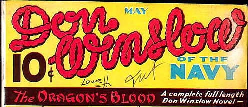
The word TRAIL in the comic logo is based on an old tree stump or rustic wood font from Victorian times that I’ve seen but can’t find to compare. I think it was more complex than the one seen here. The entire logo seems like the kind of thing Ira Schnapp would draw to me. The rest of the lettering on the cover does not seem quite right for Schnapp, though. While other covers in the series used some of the same cover lettering, they were all photo covers and did not have word balloons. None have work by Ira other than the logo.

ROMANCE TRAIL #5 is famous, at least in my mind, as the home of the very first DC lettering of Gaspar Saladino, as I described in a series of blog posts beginning HERE. Also in that issue is the only story lettering by Ira. As you can see, many pages in these comics are full of lettering, and Ira’s small style at least helps it fit. Schnapp lettering on this title can be summed up here:
#5 March/April 1950: Once and For Always 8pp

In 1949 DC started a new title featuring Jimmy Wakely, also edited by Julius Schwartz, that ran for 18 issues. Wakely was an actor, songwriter and singer, and is described as one of the last singing cowboys. He was never as popular as others like Gene Autry and Roy Rogers, but perhaps that made a licensing deal for comic books more affordable for DC. The logo of his comic suggests to me it was based on his signature. Ones I’ve found, as below, are at least somewhat similar.

The comics logo might have been designed by Ira Schnapp, but all the other lettering on the first issue’s cover is by another unknown person I’ve nicknamed Proto-Schnapp because I think his work was the model for Ira’s own lettering. It makes sense, therefore, to suggest that Proto-Schnapp also designed the logo.

Later issues in the series, like #10, have more traditional comics art and lettering, and I think this is the first one with a caption by Ira Schnapp. Note that a drop shadow has been added to the logo to make it read better over artwork.

Ira’s caption for issue #12, July/Aug 1951, is a handsome scroll with some of Ira’s Old English style in the story title.

On the final issue, #18, we find a typical Schnapp word balloon and a nice borderless caption. The image by artist Gil Kane is striking and exciting, but too late to save the book, I guess. In summary, I see Ira’s lettering on the following covers of this title: 10, 12, 15, 16 and 18, five in all.

Ira lettered only one story for JIMMY WAKELY in issue #15, sample page above. The story title is “Tommyguns on the Range,” and it’s 8pp. Many stories in this title were lettered by Gaspar Saladino.
More about Jimmy Wakely on Wikipedia.
Other articles in this series and more you might enjoy are on the Comics Creation page of my blog.
The post Ira Schnapp in ROMANCE TRAIL and JIMMY WAKELY appeared first on Todd's Blog.


September 6, 2020
Rereading: COMET IN MOOMINLAND by Tove Jansson

After reading the first Moomin book by Jansson, The Moomins and the Great Flood for the first time, I’m now rereading the rest of the series in order. This is the first of those. My copy of the book is the original English translation. Jansson revised the book afterward and that new version is now the standard one. I’ll talk about the revisions later in this review. The creations of Tove Jansson are unique fantasy animals in a northern European natural setting that is inspired by her home in Finland and in some cases by the myths and legends of that area. Though they are animals, they act much like humans in many ways, and are sometimes funny, sometimes annoying, but usually charming.
The Moomins: Moominpapa, Moominmama and Moomintroll have been living in their new home in Moomin Valley for a few weeks since the flood when strange signs and portents signal something unusual is coming their way, a huge comet. Moomintroll and his friend Sniff decide to make an expedition to the Lonely Mountains where there is an observatory. They hope the professors there will tell them all about the comet and what it means. Along the way they meet Snufkin, a wanderer who plays the harmonica, and together they get into trouble and are rescued by a Hemulen on a butterfly-collecting trip. Snufkin joins the expedition, and when they reach the observatory, a professor tells them that the comet, which is already growing much brighter and hotter, is going to hit the Earth in a few days. Moomintroll and his friends decide they must hurry back to Moomin Valley to tell everyone and help them prepare. On the way they find the Snork and the Snork Maiden being attacked by a poisonous bush and rescue them. These creatures seem to also be Moomins by their appearance, and Moomintroll is attracted to the Snork Maiden. She and her brother join the expedition, and they all must make a dangerous crossing of the sea-bed, which has been dried up by the looming comet. More adventures follow, and it seems they’ll never get back to Moomin Valley in time.
I think this is probably the most exciting Moomin novel, with its end-of-the-world plot and many thrilling moments. The introduction of new characters that will return in many books of the series helps make it a good starting point even if you haven’t read the first short novel. The relationships between characters is handled well making them fun to follow, and everyone has their moments to make mistakes and to overcome them and shine.
In THIS Wikipedia article you can read about the changes made to the story in the later edition, which I haven’t read. After learning about that, I think I’m just as happy to stick with this one. There’s more danger and more character flaws here, from what I gather.
The Moomin series is fun reading, and this one is highly recommended.
<br />
The post Rereading: COMET IN MOOMINLAND by Tove Jansson appeared first on Todd's Blog.
September 4, 2020
And Then I Read: CAPTAIN GINGER Season 2 #2
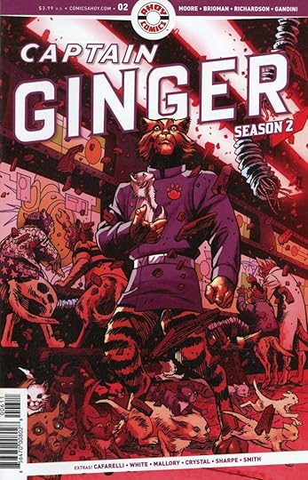 Image © Stuart Moore, June Brigman and Ahoy Comics. Written by Stuart Moore, art by June Brigman and Roy Richardson, colors by Veronica Gandini, letters by Comicraft’s Jimmy Betancourt.
If you can imagine a spacecraft like the Starship Enterprise having lost its entire human crew due to disease and being run by intelligent cats, you have the premise of this series…to a point. You must add to that the inherent nature of cats not being team players, leading to chaos on board, as well as the fact that the cats do not well understand the workings of the ship, leading to more chaos. The storyline has until now been a mix of science fiction, adventure and humor. This issue the humor is set aside for a crisis in progress: the ship is being attacked by a superior craft manned by aliens with no interest in taking prisoners. Captain Ginger can only do damage control and try to get his crew onto lifeboats for a descent to the surface of the world they’re orbiting…a world run by dogs.
I think that about sums it up! I liked the writing and art on this one the best of the series so far, and look forward to the next issue with interest.
Recommended.
Link to the issue on the Ahoy website.
The post And Then I Read: CAPTAIN GINGER Season 2 #2 appeared first on Todd's Blog.
September 3, 2020
Ira Schnapp in DALE EVANS COMICS and ALL-AMERICAN WESTERN
 This and all images © DC Comics
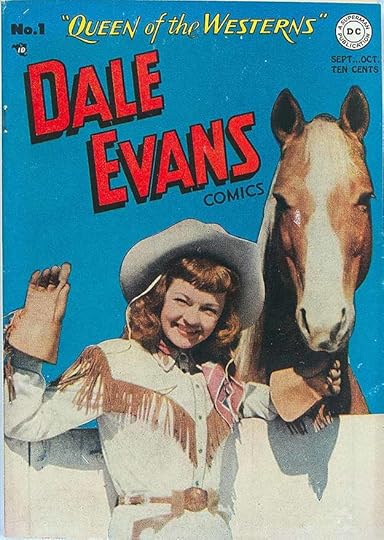
In 1948 DC published the first of many comics featuring Hollywood stars, DALE EVANS COMICS #1. It ran for 24 issues, ending with the July/Aug 1952 issue. Dale Evans had a complicated and eventful early life with four marriages, the first at age 14, the last in 1947 to cowboy star Roy Rogers that lasted until Rogers’ death in 1998. Dale broke into show business as a jazz singer in the 1930s and began making films in 1942 with a gradual emphasis on Westerns. She and Roy are probably best remembered for their popular TV Western show that ran from 1951-1957, for which Dale wrote the theme song “Happy Trails.” Many of the comic book covers are photos of her from her films. The top line lettering, “QUEEN OF THE WESTERNS,” is certainly by Ira Schnapp, and he probably also designed the logo. That top line appeared on many issues, and was often the only cover lettering until late in the run.
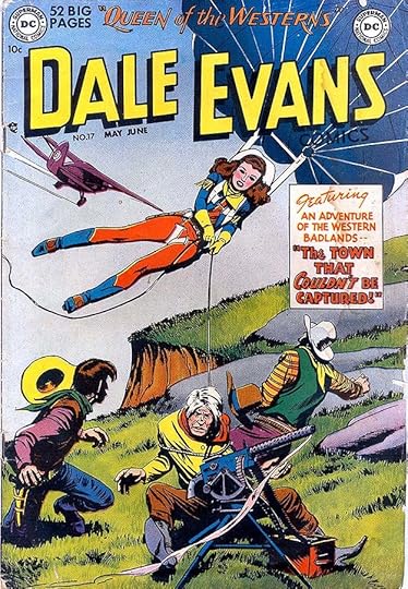
By issue #17, May/June 1951, the covers had become more typical drawn art, and this is the first one with cover lettering in a caption by Ira Schnapp. As you can see, the stories had also become more fanciful in an effort to hold reader interest.

Issue #18 has what I think is the most interesting cover caption with an upper and lower case style that Schnapp rarely used. Note the unusual wheelchaired character Uncle Six. Here are the covers lettered by Ira, not counting the multiple appearances of the top line: 1, 17-24. That’s nine covers.
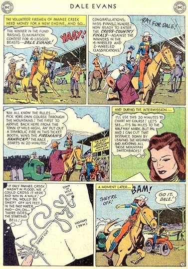
Ira lettered only three stories for the series, here’s a page from the first one in issue #19.
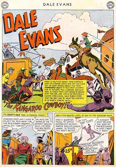
Ira’s final lettered story in issue #23 shows how far the stories had moved from traditional western fare with a kangaroo cowboy. Here are the stories Ira lettered:
##19 Sept/Oct 1951: Jumbo on the Range 10pp
#21 Jan/Feb 1952: Cowgirl Schoolmarm 8pp
#23 May/June 1952: Kangaroo Cowboy 8pp
That’s 26 pages for this series.

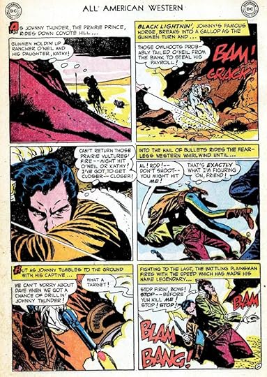
ALL-AMERICAN COMICS had once been the flagship title of the company of that name started by M.C. Gaines in 1939. It hosted many of their most famous characters including The Flash and Green Lantern. After the company merged with National (DC) Comics in 1946, it continued as a mainly superhero anthology for a while, but when that genre began to wane in popularity, it was retitled ALL-AMERICAN WESTERN with issue #103, above, in 1948. DC was looking for new genres to attract fans, and westerns seemed a good bet. Under this title the book lasted until issue #126, June/July 1952. I’m not sure who designed this logo, it might have been Ira Schnapp, but the rest of the lettering on this cover is not by him. NOTE: I did not find any Ira Schnapp lettering in ALL-AMERICAN COMICS.
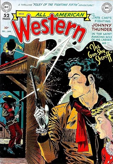
The first cover that I see Schnapp lettering on is #111, Dec 1949/Jan 1950, though the top line is probably by someone else from a previous issue.

Issue #113, April/May 1950 has more typical Ira lettering, and he’s redone the top line as well. I like the bottom lettering in script. Ira lettered most of the covers from this point on.
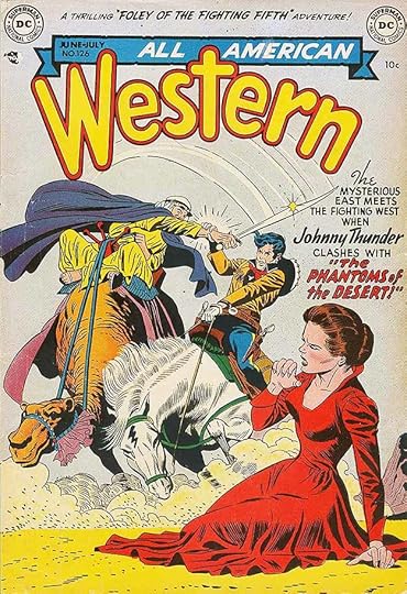
The final issue has handsome lettering by Ira, and as was often the case, shows the content veering far from typical Western fare to try to hang on to readers. I see Ira’s cover lettering on these issues: 111-121, 123-124, 126. That’s 14 covers.
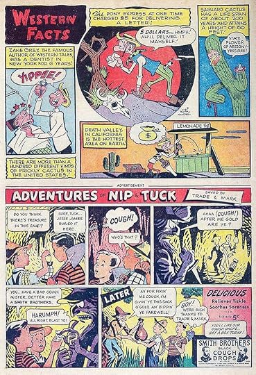
Ira did only a few stories in this series. For issue #104 he lettered two half-page stories, probably both on one page when he did them but on separate pages in the book. This is one. Julius Schwartz was the editor of the book and he was soon using his new in-house letterer Gaspar Saladino on many of the stories.
Here’s an example of Gaspar’s story lettering on the first story in issue #123. It’s very different from Ira’s work with large, exciting sound effects, open initial capital letters in some captions, and wide lettering made with a wedge-tipped pen.
And a page lettered by Ira Schnapp later in the same issue. It’s interesting to see that, while Ira’s lettering is typically smaller and narrower, here he’s tried to imitate some of the Saladino style: an open letter A in one odd scroll caption and an open sound effect. This suggests Ira saw the skill in this new staffer’s work and on a title mostly lettered by Gaspar, tried to emulate it.
Here are the stories lettered by Schnapp in this book:
#104 Dec 1948: Western Facts 1/2 page, Cactus Charlie 1/2 page
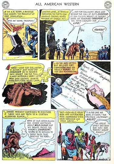
#123 Dec 1951/Jan 1952: Foley of the Fighting 5th 8pp, Overland Coach 6pp
That’s 15 pages total. More articles in this Ira Schnapp series can be found on the Comics Creation page of my blog.
Dale Evans on Wikipedia.
The post Ira Schnapp in DALE EVANS COMICS and ALL-AMERICAN WESTERN appeared first on Todd's Blog.
September 1, 2020
Ira Schnapp in SCRIBBLY and MISS BEVERLY HILLS OF HOLLYWOOD
 This and all images © DC Comics.
Sheldon Mayer’s character Scribbly, the boy cartoonist, had a long history that predates DC Comics. He first appeared in POPULAR COMICS #6 from Dell, dated July 1936, where young Mayer was working for M.C. Gaines. Mayer was a teenager himself when he began writing and drawing Scribbly, and he continued to do so for Dell. When Gaines started his own comics publishing company, All-American Comics, he brought Mayer along as his editor. Their first effort, ALL-STAR COMICS, debuted in 1939, and Scribbly appeared in the first 59 issues. Then Shelly decided he was tired of the character and stopped drawing him. When All-American merged with National (DC) Comics, Mayer came over to edit his titles for a while, then when freelance full time as a cartoonist of humor and funny animal stories for DC. In 1948 he restarted Scribbly in a new title of that name with the first issue dated Aug/Sept 1948, above. I feel sure the logo is by Mayer, and lettering on the early issues may be as well. The series ran for only 15 issues, so sales were probably not great. Scribbly made a few later appearances in other DC humor comics.

Ira Schnapp’s involvement in the DC SCRIBBLY title was only on the last few issues. I think issue #14, Oct/Nov 1951, was the first cover he lettered, and it’s a charming one, though you can tell Ira was not a musician, as he has the shapes of the music notes backwards. Ira also lettered issue #15, the final one.

In issue #12 Ira lettered two stories, here’s the first page of one. If you look close at the word SOB in the first panel, you’ll see Ira has surrounded it with radiating teardrops, a nice touch.

Issue #13 has some unusually large lettering for Ira which I suspect was pencilled by Shelly Mayer and Ira just inked it.
Here are the stories Ira lettering in SCRIBBLY:
#12 July/Aug 1950: Scribbly 12pp (1), Scribbly 12pp (3)
#13 Sept/Oct 1950: Scribbly 12pp (1)
#15 Dec 1951/Jan 1952: “Clover’s Debut” 11pp
That’s 47 pages on this title.

In 1949 DC was testing the waters with this new title to see if readers were interested Hollywood starlets and Hollywood stars, some of whom also appeared in the book. It’s a long title with a fine logo by Ira Schnapp, who probably also did the cover lettering. Ira’s fondness for Art Deco lettering styles was a good fit for BEVERLY HILLS, and MISS is very much his script. The title ran from March/April 1949 to issue #9, July/Aug 1950. Probably not a big seller, but DC went ahead with many comics featuring Hollywood stars anyway, some with long runs. (They already had one, DALE EVANS COMICS, beginning in 1948.)

I’m not sure Ira lettered the cover of issue #4, it might have been done by the unknown letterer I’ve nicknamed Proto-Schnapp because I think Ira used his lettering as a model for his own. The top line does not look much like Ira’s work, but the bottom line does.

Issue #5 is another puzzler, the top line looks like Ira’s work more than the caption. I guess I will say Ira probably lettered the covers of issues 1, 4 and 5, no others.

Ira lettered a number of stories in issues 5 to 9 beginning with this one in issue #5.

This page from issue #6 is a better and busier example of his work with signs as well as plenty of dialogue.

Here’s a page Ira lettered in the final issue, #9. No one other than Proto-Schnapp could make those wavy balloon shapes work as well.
These stories are lettered by Ira:
#5 Nov/Dec 1949: Miss Beverly Hills (hereafter MBH) 7pp (1)
#6 Jan/Feb 1950: MBH 7pp (1), MBH 5pp (2), Janie 4pp, Beverly’s Designs on You 2pp, MBH 4pp (3)
#7 March/April 1950: MBH 7pp (1), MBH 7pp (2), Road to Stardom 3pp, Designs on You 2pp, Janie 3pp, MBH 5pp, MBH 7pp
#8 May/June 1950: MBH 10pp, MBH 5pp, Janie 3pp, Designs on You 2pp, MBH 4pp, MBH 6pp
#9 July/Aug 1950: Janie 5pp, MBH 4pp, MBH 5pp
That’s a total of 107 pages on this title. More in this series of articles and others that might interest you can be found on the Comics Creation page of my blog.
The post Ira Schnapp in SCRIBBLY and MISS BEVERLY HILLS OF HOLLYWOOD appeared first on Todd's Blog.
August 29, 2020
And Then I Read: THE PRINCE AND THE PAUPER by Mark Twain
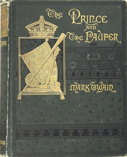 First edition courtesy of Heritage Auctions, ha.com
I like Mark Twain’s writing but somehow I managed to miss reading this 1882 novel of his until now. I guess I felt I knew the story from the Disney version I saw on TV in 1962 at age 11. I also lettered a comic book version of the Mickey Mouse version in the 1990s. What I thought I knew about the story was mostly wrong beyond the initial idea that two identical boys from the year 1547, one the crown prince of England and one a poor lad from the slums of London, change places.
Tom Canty is the poor boy, and his life is a hard one, though he’s used to it. His job is to beg on the streets of London and bring back any coins he gets to his father and grandmother, a pair of unsavory characters who will whip Tom at any excuse, though Tom’s mother and sisters try to comfort and help him. Edward Tudor, the son of Henry VIII is the other boy, who Tom tries to see up close in front of the royal palace. He’s beaten by the guards for his trouble, but the prince calls them off and invites Tom into the palace to his rooms. Once there they realize how exactly similar they look. Edward offers to let Tom try on his royal clothes, and decides to don Tom’s rags as a lark, but once they’ve done that, the Prince is ejected from the palace as an interloper, and neither he nor Tom can ever convince anyone of their true identities, not even their parents. (This is the hardest part of the story to swallow, but necessary to make it work.)
The rest of the book follows each boy trying to understand and fit into the very different life and world they find themselves prisoners of. The prince refuses to take any crap from Tom’s father, and of course is beaten for it. He runs away the first chance he gets, and ends up with a former soldier returned to England from Europe, Miles Hendon. Miles is a good man, but nearly as poor as the penniless Edward, and the two are thrown into bad company, painful treatment and jail as the prince learns about the lives of his poorer subjects in a way he can’t forget.
Tom, meanwhile, is thought to be temporarily insane or to at least have amnesia since he knows so little about his life as the prince, but he gradually learns from Edward’s sisters and servants, and eventually does a credible job with things he previously knew nothing about. Decisions he makes in judgement in royal audiences impress the court. But the death of his father throws Tom into a panic. Soon he will be crowned King, a job he does not want.
This is not only entertaining and at times exciting reading, it’s thought provoking and educational. Highly recommended.
About the book on Wikipedia.
The post And Then I Read: THE PRINCE AND THE PAUPER by Mark Twain appeared first on Todd's Blog.
August 28, 2020
Ira Schnapp in LEAVE IT TO BINKY
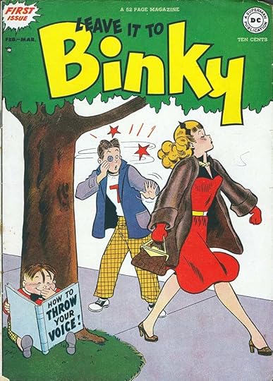 This and all images © DC Comics
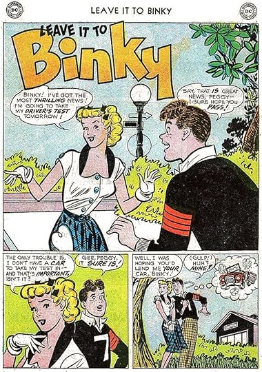
Having had moderate success with BUZZY and A DATE WITH JUDY, in 1948 DC started this new teen humor title. It was similar to those in content with teenager Binky, his family, and girlfriend Peggy taking the main roles. Little Allergy, seen on this cover also featured in some stories as a pest and spoiler. Similar characters sometimes had the lead. The book was edited by Larry Nadle, the regular DC humor editor at the time. I think the logo is by Ira Schnapp based on style. The title ran bimonthly or eight times a year until issue #58, Jan/Feb 1957, then there were two issues over the next year, probably to use up inventory. In 1968 the book was revived by editor Joe Orlando. It continued the same numbering. Issues 59-68 were largely reprints, though a few unseen stories emerged from inventory. After that, new stories were produced. The title became simply BINKY with issue #72, April/May 1970, and ran for another ten bimonthly issues. One final issue was published in 1977. Ira Schnapp had no work in the first eleven issues.
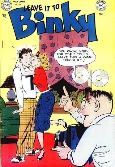
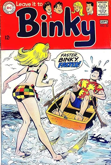
The first cover with Ira’s balloon lettering is #26, May/June 1952. Note the value of 25¢ at the time.
I think this cover with lettering by Schnapp sort of sums up the title nicely. Binky was all about the physical attraction of Peggy, but often distracted by other young women. Peggy was often annoyed by Binky’s antics, but appreciated his attention. At least this is what I think after having skimmed through but not actually reading the stories.
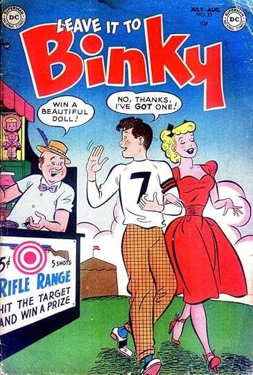
The cover of issue #53, March/April 1956, was one of several with a four-panel story on it, something rarely seen at DC on anything other than humor titles.
After the title returned from a long hiatus in 1968, it had a new logo and cover lettering by Gaspar Saladino. Ira Schnapp left DC in 1968 and died in 1969.
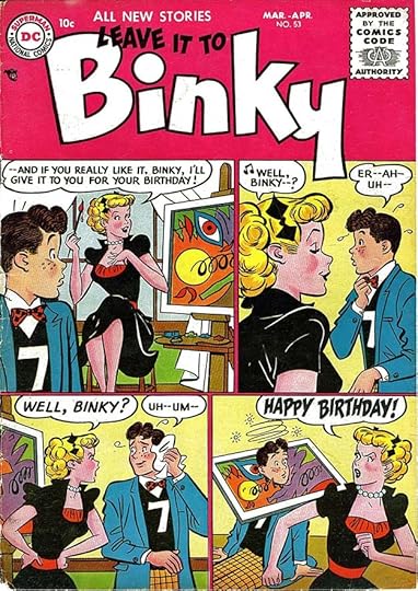
Here are the covers I see Ira’s lettering on: 26, 28-29, 31-33, 35-42, 45, 47-54, 56-57, 59. That’s 26 in all.
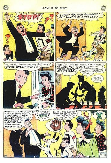
As I expected, Ira Schnapp lettered plenty of stories for this title once he got started, sometimes doing entire issues. I suspect humor titles were his favorite to work on, and he did lots of them. This page from issue #12, Jan/Feb 1950, the first issue Ira had work in. I like the art in the balloons in the last panel, probably done by the artist, but who knows?
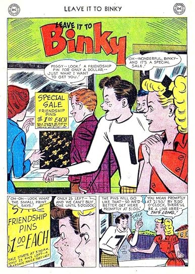
A typical Ira Schnapp-lettered page from issue #27, July/Aug 1952. For one thing, the humor titles were somewhat lighter on dialogue than most DC comics of the time.
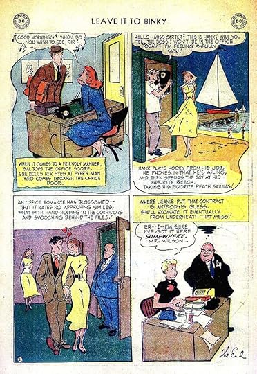
Ira also lettered his share of the two-page fillers that featured dating tips, like this one from issue #35.
This page from issue #55, July/Aug 1956, has an interesting lettering artifact: the parentheses around the word GULP! in the last panel. This was the original style for what we now call breath marks, those radiating lines on each side of such words indicating voiceless utterances. Ira used breath marks at times, but forgot to here, and went back to the old style.
While most of the Ira Schnapp lettering in the revived title was on reprints, a few stories seem to be previously unpublished, meaning they sat in inventory for many years. This is one of the last to be published in issue #68, Aug/Sept 1969, but probably lettered at least ten years earlier. Note Ira’s use of breath marks around YAWN in the last panel.
Here’s a list of all the stories Ira Schnapp lettered for this title, not including reprints. There are usually more than one Binky story in each issue, the numbers in parentheses show their order.
#12 Jan/Feb 1950: Binky 4pp (3), Lora 1pp
#13 March/April 1950: Pam 3pp
#14 May/June 1950: Binky 7pp (2), Howie 1pp
#15 July/Aug 1950: Allergy 5pp, Lucy 7pp, Ginny 1pp
#16 Sept/Oct 1950: Binky 12pp (1), Binky 7pp (4)
#17 Nov/Dec 1950: Binky 8pp (2), Binky 10pp (3)
#18 Jan/Feb 1951: Binky 5pp (3)
#19 March/April 1951: Lucy 5pp
#20 May/June 1951: Binky 6pp (1), Lucy 4pp
#21 July/Aug 1951: Binky 8pp (1)
#23 Nov/Dec 1951: Binky 7pp (3)
#24 Jan/Feb 1952: Binky 6pp (1), Binky 7pp (2), Coby 3pp
#25 March/April 1952: Binky 9pp (3)
#26 May/June 1952: Binky 6pp (1), Binky 9pp (2)
#27 July/Aug 1952: Binky 6pp (1), Allergy 4pp, Binky 7pp (2), The Fittin’ Thing 2pp
#28 Sept/Oct 1952: Binky 6pp (1), Binky 8pp (2), Fittin’ Thing 2pp, Lucy 3pp, Binky 6pp (3), Binky 6pp (4)
#29 Nov/Dec 1952: Binky 8pp (1), Coby 4pp, Tips to Teens 2pp, Binky 6pp (2), Lucy 3pp, Allergy 3pp, Binky 6pp (3)
#30 Jan/Feb 1953: Binky 6pp (1), Binky 8pp (2), Binky 6pp (3), Allergy 5pp, Binky 4pp (4)
#31 March/April 1953: Binky 8pp (1), Binky 6pp (2), Fittin’ Thing 2pp, Binky 4pp (3), Binky 3pp (4), Binky 8pp (5)
#32 May/June 1953: Binky 6pp (1), Binky 7pp (2), Fittin’ Thing 2pp, Binky 3pp (4)
#33 July/Aug 1953: Binky 6pp (1), Binky 5pp (2)
#34 Sept/Oct 1953: Binky 6pp (1), Binky 7pp (2), Fittin’ Thing 2pp
#35 Nov/Dec 1953: (all Schnapp) Binky 6pp, 8pp, 6pp, Allergy 5pp, Binky 4pp
#36 Jan 1954: Hubie 6pp, Tips to Teens 2pp, Binky 6pp (3)
#37 Feb 1954: Binky 6pp (2), Date Duds 2pp, Toni 5pp, Binky 6pp (3)
#38 Mar 1954: Binky 6pp (2), Binky 6pp (3), Tips to Teens 2pp, Binky 6pp (5)
#39 May 1954: Binky 6pp (1), Fittin’ Thing 2pp, Coby 5pp, Binky 6pp (3), Liz 4pp, Binky 6pp (4)
#40 July 1954: Fittin’ Thing 2pp
#41 Aug 1954: Binky 7pp (2), Binky 6pp (3)
#42 Sept 1954: Binky 3pp (3), Binky 6pp (4)
#43 Nov 1954: Binky 6pp (1), Coby 3pp, Binky 6pp (3)
#44 Jan 1955: Binky 6pp (1), Binky 3pp (2), Fittin’ Thing 2pp, Liz 6pp, Binky 6pp (3)
#45 Feb 1955: Binky 6pp (1), Binky 6pp (2)
#46 March 1955: Binky 6pp (1), Liz 6pp, Binky 6pp (3)
#47 May 1955: Binky 6pp (1), Binky 6pp (2), Binky 4pp (3), Kitty Karr 4pp, Binky 6pp (4)
#48 July 1955: Liz 3pp
#49 Aug 1955:Binky 6pp (1), Binky 6pp (2), Kenny 6pp, Binky 6pp
#50 Sept 1955: Binky 8pp (1), Binky 6pp (2), Binky 6pp (3)
#51 Nov 1955: Binky 8pp (1), Binky 6pp (2), Binky 6pp (3)
#52 Jan/Feb 1956: Binky 6pp (2), Binky 4pp (3), Binky 6pp (4)
#53 March/April 1956: Binky 4pp (2), Binky 6pp (3)
#54 May/June 1956: Pinky 6pp (1), Binky 4pp (2), Binky 4pp (3), Binky 6pp (4)
#55 July/Aug 1956: Binky 6pp (1), Binky 6pp (2), Liz 7pp, Binky 6pp (3)
#56 Sept/Oct 1956: Allergy 4pp, Binky 6pp (3)
#57 Nov/Dec 1956: Binky 6pp, 6pp, 6pp (1-3)
#58 Jan/Feb 1957: Binky 6pp (1), Allergy 3pp, Binky 6pp (2), Allergy 3pp, Binky 6pp (3)
#59 Oct 1957: Binky 7pp, 7pp, 6pp (1, 3-4)
#60 Oct 1958: Binky 6pp, 6pp, 6pp (1-3), Date Duds 2pp, Binky 6pp, 6pp (4-5)
#67 June/July 1969: Binky 5pp (3)
#68 Aug/Sept 1969: Binky 6pp, 6pp (3-4)
That’s a total of 825 pages if I’ve counted right. Lots more Ira Schnapp articles to come, previous ones in this series are on my Comics Creation page.
The post Ira Schnapp in LEAVE IT TO BINKY appeared first on Todd's Blog.
August 26, 2020
Ira Schnapp in WESTERN COMICS
 This and all images © DC Comics
With this January 1948 title, DC jumped on the western comics bandwagon. Sales of superheroes were falling, and all comics publishers were looking for new genres to gain new readers. Westerns had been popular at least since the dime novels of the 1800s, and it was a natural move for comics. The editing team was led by Jack Schiff with his assistants Murray Boltinoff and George Kashdan. The lettering and probably also the logo on this cover is by the unknown person I’ve nicknamed Proto-Schnapp because I believe he was an older letterer working on staff at DC whose work was a model for Ira’s own lettering. Some of the styles are similar to things Ira did, but there’s a looser, bouncier, more cartoony quality to much of it that Ira rarely achieved. The word COMICS is one that had been used on many previous DC titles. This book ran to issue #85 dated Jan/Feb 1961 and was always an anthology featuring several continuing strips in each issue, but rotating in new ones periodically. Proto-Schnapp did a lot of the cover and interior lettering on early issues.

Here’s the first cover I think was lettered by Ira Schnapp, issue #19 dated January 1951. Notice how Ira used some styles similar to Proto-Schnapp, but his was generally more even and regular.

Issue #24, June 1951 is an interesting mix. The top line is by Proto-Schnapp, carried over from an earlier issue. The rest is by Ira, but he’s tried to imitate Proto’s S in STARRING in his word SUDDEN, and given his open story title more bounce than usual to better match the top line. The balloons are pure Ira.

The color hasn’t reproduced well on this scan of issue #30, December 1951, but I thought the use of different colors in the open title was interesting, and also the fact that it’s in a word balloon rather than a caption.

Ira’s open titles usually followed familiar patterns, but here on issue #40, Sept/Oct 1953, he’s artfully extended the bottoms of FF in BLUFF to give it an art deco feel. The F in FEATURING is also handsome.
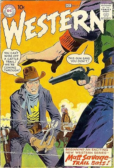
Issue #77, Sept/Oct 1959, showcases a new feature about a cattle drive trail boss, perhaps trying to attract fans of the TV show “Rawhide” that began earlier that year.
The final issue’s cover includes a nice example of Ira Schnapp’s most familiar open story title style seen on so many DC covers.
These are the covers I think are lettered by Ira: 19, 24-28, 30-32, 34-54, 56-57, 59, 61-65, 67-70, 72-85. That’s 55 covers.

Here’s an example of Proto-Schnapp story lettering from the first issue. Notice the generally wide letters and the curled C’s in the larger lettering, also the emphasized words in the top two panels are bold but not italic.

The first story I think is lettered by Ira is this one from issue #10, July/Aug 1949. Notice the narrower letters overall, and the emphasized words are bold and italic, as per Ira’s usual style.

Here’s a page from the second story that I think was lettered by Ira, the Nighthawk feature in issue #15, June/July 1950. Proto-Schnapp’s work was fading out around this time, and Ira did a small but consistent number of stories from here on. When the editing was handed over to Julius Schwartz with issue #43, Julie’s on-staff letterer Gaspar Saladino began lettering many of the stories.

This Wyoming Kid story lettered by Ira in issue #50 March/April 1955, uses a logo done much earlier by Proto-Schnapp when the title was beginning.

This page from issue #69, May/June 1958, is typical of Ira’s work at the time. One reason editors liked his lettering was because it was about the smallest of anyone working for DC then, and many of their stories needed lots of lettering.
Here are the stories I believe Ira lettered in this title:
#10 July/Aug 1949: Nighthawk 8pp
#15 June/July 1950: Nighthawk 8pp
#20 Feb 1951: Nighthawk 8pp, Cowboy Marshal 10pp
#21 March 1951: Nighthawk 8pp
#27 Sept 1951: Rodeo Rick 8pp
#28 Oct 1951: Cowboy Marshal 10pp
#32 March/April 1952: Wyoming Kid 8pp
#37 Jan/Feb 1953: Wyoming Kid 8pp
#40 July/Aug 1953: Wyoming Kid 8pp
#42 Nov/Dec 1953: Cowboy Marshal 6pp
#46 July/Aug 1954: Rodeo Rick 6pp
#50 March/April 1955: Rodeo Rick 6pp, Wyoming Kid 8pp
#51 May/June 1955: Pow-Wow Smith 6pp, Rodeo Rick 6pp
#52 July/Aug 1955: Wyoming Kid 6pp
#53 Sept/Oct 1955: Wyoming Kid 6pp
#54 Nov/Dec 1955: Wyoming Kid 6pp
#55 Jan/Feb 1956: Colorful Western Names 1pp
#56 March/April 1956: Wyoming Kid 6pp
#59 Sept/Oct 1956: Nighthawk 6pp, Wyoming Kid 4pp
#62 March/April 1957: Nighthawk 6pp, Wyoming Kid 6pp
#69 May/June 1958: Wyoming Kid 6pp
That’s a total of 175 pages if I’ve counted right. Not a lot for Ira. More articles in this series can be found on the Comics Creation page of my blog along with many other letterer articles.
The post Ira Schnapp in WESTERN COMICS appeared first on Todd's Blog.
August 25, 2020
And Then I Read: THE MOOMINS AND THE GREAT FLOOD by Tove Jansson
 Written and illustrated by Tove Jansson.
I first encountered the Moomins in novels written for children by their creator Tove Jansson in libraries in the late 1960s-early 1970s. Jansson was a Swedish-speaking citizen of Finland, and her characters are not only charming and funny, they inhabit an environment and are part of a mythology very different from any I had found elsewhere. Moomin Valley is full of odd characters and an atmosphere of the far north in Europe. Their adventures are inventive and sometimes thrilling. It’s fantasy unlike any other, having little to do with Norse or Celtic myths or any other European traditions. Most of it comes from the imagination of the author. There was also a long-running Moomin comic strip in English that ran in newspapers in Great Britain, but I didn’t see that until it was reprinted in America a few years ago. The strip is fun, but lighter in tone, and restricted mostly to satire and comedy without the deeper thoughts and atmosphere of the books.
I bought or borrowed Jansson’s Moomin novels when I came across them, but I was never sure of the reading order, and the relationships of the main characters to each other was often puzzling. Moominpapa and Moominmama had a son Moomintroll, that was clear enough. The three of them are pear-shaped with long snouts something like a cross between a cow and a hippo perhaps, but more agile than either, walking on hind legs, and acting like humans in many ways. Then there’s the Snork and his sister the Snork-maiden who look the same. Are they Moomins? I was never sure, but it seems so. All the other characters look quite different from them, and each seems to be of a tribe or species of their own.
The first book Jansson wrote about Moomins is this one. It’s short, what’s now called a chapter book, sixty pages with Tove’s charming illustrations on nearly every page. She wrote it during World War Two in Finland, and there is an atmosphere of anxiety and fear hanging over the story that now seems likely to have been caused by real world fears. This book was not translated and released in English until 2005, and I didn’t know about it until recently. In it we meet Moomintroll and Moominmama on a quest through perilous terrain and past dangerous creatures in search of Moominpapa, who has gone off wandering with an odd tribe called the Hattifatteners. They are joined by a small fearful creature (called Sniff in the other books) and for a while by a flower fairy, Tulippa. Despite the short length of the book, it’s full of incident and characters, and the dangerous journey seems long, culminating in a storm at sea. It ends well in Moomin Valley, where the lives of the Moomins will continue in the other books, now a bit more clear to me. I am reading through all of them in the correct order this time, and will review the others here too.
This one is recommended and a good place to start.
Tove Jansson on Wikipedia.
The post And Then I Read: THE MOOMINS AND THE GREAT FLOOD by Tove Jansson appeared first on Todd's Blog.
August 24, 2020
Incoming: LEGION OF SUPER-HEROES OMNIBUS 1
 Image © DC Comics
In 1989, Keith Giffen and Tom and Mary Bierbaum relaunched a grim and gritty version of the Legion of Super-Heroes. I’ve just received this massive collection of the first half of that run, almost three inches thick. I lettered the first thirteen issues, but I have to say this was my least favorite version of the long-running DC super-team of the future, and I was happy to leave it behind. I’m sure it has fans, though, and if you’re one, you might want this collection. The retail price is $150, so you will need to really want it! Should be available soon in shops and online.
The post Incoming: LEGION OF SUPER-HEROES OMNIBUS 1 appeared first on Todd's Blog.
Todd Klein's Blog

- Todd Klein's profile
- 28 followers

