
Todd Klein's Blog, page 109
July 11, 2020
Rereading: HENRY REED’S JOURNEY by Keith Robertson

I think this second book in the Henry Reed series was my favorite when I first read them as a child. It was just as funny and entertaining as the first one, but with added travel descriptions to places I’d never been that sounded interesting.
Henry’s second summer in America begins in San Francisco this time. His diplomat father has been transferred to Manila in the Phillippines, and Henry flew from there. Fortunately, his friend from New Jersey, Midge Glass and her parents are in San Francisco for her father’s business convention. Mr. and Mrs. Glass fill the same roles in this book as Henry’s aunt and uncle did in the first one. Mr. Glass has been convinced by Henry’s Uncle Al that Midge and Henry are chaos agents: trouble and commotion erupts wherever they are, even if they seem to be innocent. He’s right, it’s true. Some of the adventures they get into are: capturing a lost parakeet, witnessing an explosion in their hotel, and falling off a cable car. That’s in San Francisco before the journey really starts. On the way to Yosemite, Midge and Henry trigger a gold rush. In Los Angeles, a monkey gets locked in their car. In Disneyland, Midge falls into the river in the jungle ride. In Arizona, Midge and Henry become honorary members of the Hopi tribe and are featured in a parade. In the Grand Canyon, Midge seems to have fallen off the trail, and Henry causes trouble with a horned toad. Well, you get the idea.
Henry’s obsession this trip is finding and buying fireworks. I understood that completely as a kid. The only place I was ever able to buy them was in Canada on summer vacations. Now, home fireworks annoy me, but then I’m old! As you can imagine, fireworks are found and create a spectacular finale to the book.
Highly recommended summer reading.
My review of Henry Reed, Inc., the first book.
Keith Robertson on Wikipedia
The post Rereading: HENRY REED’S JOURNEY by Keith Robertson appeared first on Todd's Blog.


July 8, 2020
And Then I Read: GREENSLEEVES by Eloise Jarvis McGraw

Shannon Lightley is eighteen and completely confused about the direction she wants to go next. The daughter of a famous actress and a TV news reporter, she has been traveling around Europe for most of her childhood, after a few years in idyllic Oregon that she remembers fondly. She decided to finish high school there, but it all turned into a mess. The other kids shunned her, her aunt and uncle failed to understand her problems, and now she is set to fly back to Europe to be with her father, but she doesn’t want to go. Everyone in her family has plans and expectations for Shannon except herself. At the last minute she doesn’t get on the flight, and and turns to an old family friend, a lawyer she calls Uncle Frosty because of his white hair, and who has a practice in Portland, for help.
Uncle Frosty has an interesting job for her. He needs an undercover agent to investigate people named as beneficiaries in a will by an eccentric old lady, Mrs. Dunningham. The will is being contested by her daughter. Shannon jumps at the chance to become someone completely different for the summer. She has her red hair redone in a beehive and adopts the personality and mannerisms of the hairdresser, becoming Georgetta Smith. She rents the room that Mrs. Dunningham had lived in in a boarding house, and takes a waitress job at the local cafe, and is soon meeting all the people named in the will. Her job is to uncover any plot or scheme by those people to cajole or trick the elderly Mrs. Dunningham out of her money. As the summer progresses, she gets to know all the beneficiaries and comes to like them, making her job difficult and building her guilt at fooling them. Not everyone is fooled, but her cover is not blown. When she starts to fall in love with one of the beneficiaries, though, Shannon/Georgetta has some hard choices to make.
Eloise Jarvis McGraw’s books previous to this were all historical novels for young readers, many of which I’ve enjoyed. This was her first contemporary story, and has recently been reissued as an e-book. I liked the characters and the storyline as described here, which is about the first two thirds. Then it takes a turn away from the detective aspect and becomes a teen romance story, which I found less appealing. I enjoyed reading it, but would have preferred the author sticking to the original idea. Still, recommended.
Eloise Jarvis McGraw on Wikipedia.
The post And Then I Read: GREENSLEEVES by Eloise Jarvis McGraw appeared first on Todd's Blog.
July 3, 2020
13 Blog Years

This is the 13th anniversary of this blog. It seems every year now I’m saying that I’ve been neglecting the blog and not posting as much as I used to, and it’s true. One new reason this time is that I’m very busy working on a book about lettering that has not yet been announced, so I can’t say more about it. Once that’s done, I should have more time and energy to post here, and once the book is published, assuming that happens, I will have lots more to say here about letterers and lettering, things that did not fit into the book.
Looking back through the past year’s posts, I see the majority are reviews, mainly of books and comics. My comics reading has dwindled since this March. For some time I’ve mainly been reading them in digital form, and the production of new comics that interest me has dropped to almost none, while availability of new issues has done the same due to the virus. I could reread old comics, but I rarely have the desire to do that. Books, on the other hand, continue to be read daily, and are a comfort and a fine form of entertainment I’ve enjoyed since I learned to read. All the book reviews on my blog are on THIS page. I went to two comics conventions last year, San Diego and Baltimore, and had a great time at each. No cons are in my future now until there’s a vaccine for Covid-19. Most public activities have been halted, so there won’t be any sand-castles at the beach, fireworks, restaurant visits, vacations and concerts in the near future. It’s a new world we’re in, and while I don’t find it difficult on a daily basis, it certainly has restricted our activities.
I have many things to be thankful for. I live in a wonderful natural environment that I enjoy every day, my wife and I are happy together here with our two cats, Tigger and Leo, and we have friends we keep in touch with by phone and email. My lettering work has become occasional; I’m doing one regular book for DC, BOOKS OF MAGIC, and a few other short things only. I am semi-retired from lettering. This worked out well for the research and writing I’m doing for the book, work which I find absorbing and fulfilling. We are in good shape financially, and are managing to stay home and stay safe most of the time.
It will be interesting to see how the coming 12 months work out for all of us. I wish you well on your journey through them, and I will post here as often as I have something to say. Be safe.
The post 13 Blog Years appeared first on Todd's Blog.
June 30, 2020
Rereading: HENRY REED, INC. by Keith Robertson

I’m not sure if this was the first Keith Robertson book I read, but it was an early one, first published in 1958. I would have found it in my grade school library some time after spring 1960. I was probably already familiar with the illustrator, Robert McCloskey, even if I didn’t know it, as we had his picture book for young children, Make Way For Ducklings. His style is full of charm and humor, just right for this book, which is not unlike McCloskey’s own novels for children, Homer Price and Centerburg Tales, which I also enjoyed.
Henry Reed’s father is an American diplomat in Italy, where the family lives. In a series of journal entries we learn that Henry is spending the summer in the tiny community of Grover’s Corner, New Jersey (near Princeton) with his mother’s brother Uncle Al and Aunt Mabel, who live close to where Henry’s uncle and mother grew up. That family home is gone, but a large barn remains, which Henry is delighted to discover he owns, along with the property it’s on. Before long, Henry and his new friend Midge Glass as well as Henry’s beagle pet Agony, have opened a research center in the barn. Henry’s been asked by his teacher in Italy to engage in some free enterprise business on his vacation, and that’s how he decides to do it.
Henry and company seem to attract trouble and excitement like honey attracts bees, which Uncle Al says was also true of his mother. Midge offers to contribute a pair of tame rabbits to the pigeons and turtles Henry soon accumulates, but one of them escapes, and the kids and Agony spend the rest of the summer trying to catch Jedediah. Meanwhile, Agony also tangles with Siegfried, the cat of neighbor family The Apples. Mr. Apple has something odd going on in his back yard that the kids can’t figure out, but if they or their animals set foot in it, they’re in big trouble, which happens a lot.
Henry and Midge manage to make a surprising amount of money in various ways while chaos happens around them, or because of them, with adventures like Agony getting stuck in a pipe, Midge dousing successfully for oil, Henry finding a rare pot, and Jedediah jumping out of a mailbox into the face of the mailman. Their final adventure involves a hot air balloon carrying both Siegfried the cat and Agony the dog inadvertently into the sky. Several of these adventures end up in the local paper, entertaining Uncle Al, but Mr. Apple is not amused.
Not only is this a great read, as are all Keith Robertson’s many books, but it held a particular fascination for me because I lived not too far from Princeton, NJ when I read it, and had been there a few times. Henry Reed returned in several more books that I’ll be rereading this summer, and I think they all are easy to find online.
Recommended.
<br />
The post Rereading: HENRY REED, INC. by Keith Robertson appeared first on Todd's Blog.
June 28, 2020
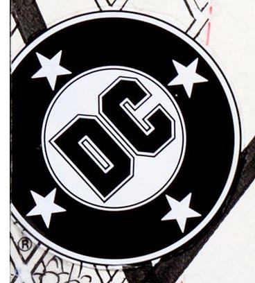
Milton Glaser and the DC Bullet
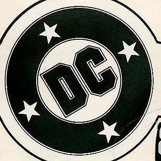 DC Bullet from World’s Finest #248, Jan. 1978. This and all images © DC Comics. This and all images (except the next one) courtesy of Heritage Auctions, HA.com
With the recent passing of veteran acclaimed designer Milton Glaser, his work is getting new attention, including the symbol he created for DC Comics in 1976. This and all other versions of the generally round symbol are known by company staff as the “DC Bullet.” I think the reference is to the old typesetting term for a large round black spot: • which is used today for “bullet point lists” in manuscripts or ad copy. Originally bullet was also another name for a period in typography. Imagine that tiny black spot much larger with letters in it and you have the DC bullet. Here’s the Glaser version compared to earlier ones:
 Image found online
The 1949 version was designed by Ira Schnapp. The 1974 predecessor to Glaser’s was designed by Michael Uslan. It’s not clear who did the others. You can see that the squared letter shapes used for “DC” came into use in 1972, and Uslan’s version added two stars, both elements included in Glaser’s design, but there’s no denying his use of a thick black band with four white stars and having the entire logo tilted brought a fresh and appealing look to the bullet. Reportedly Glaser was paid a lot for the design, far more than any logo they’d had to that point, but I never heard anyone in management say it wasn’t worth it. But is that 1976 logo exactly the same as the first one above? If you look closely you’ll see that the thin outer circle is not as thin or as close to the black band as above. This is actually a version from about 1988, one of several later variants.
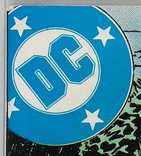 DC Bullet from Action Comics #471, May 1977.
When the Glaser bullet first began appearing on DC Comics covers, it usually looked like this, with the left side and top cropped off in varying amounts. That was as planned. The logo was often held in a color, as here, where it’s 100% Cyan or Blue. The colorist decided the outer thin circle should remain black to better align with the cover art, and the blue printing plate with the rest of the logo is slightly out of alignment down and to the left, most obvious where the white circle disappears at lower left. At the time, DC was still using letterpress printing for all their comics. Glaser’s design, with it’s thin lines and thin white spaces, looked great at a larger size, but comics printing wasn’t really up to making it work well at the small size used on covers. In the 1980s DC began gradually transitioning away from letterpress to offset printing with much better and more accurate presses, and then the original DC bullet would have worked fine.
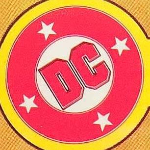 DC Bullet from DC Special Series #5, 1977
Here’s a version where most of the bullet was held in 100% Magenta and 100% Yellow giving it a solid red appearance, but the thin outlines around the letters DC was kept in black. This made a mess when printed.
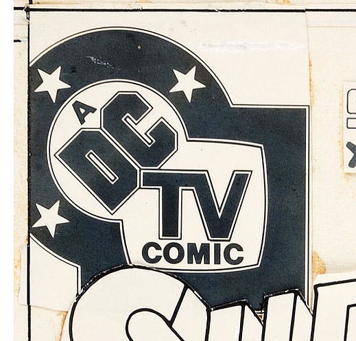 DC TV logo from Super Friends #5, April 1977
The first and probably best variation of the logo was this one, I suspect also by Milton Glaser or one of his associates. The T tucked into the corner of the D and C is clever and it all looks good. This scan of original cover art also helps it look good, the printed version may not have worked quite as well, but as a design I think it’s quite fine.
 Logo from DC Special #27, May 1977.
Not long after the logo went into general use, this version was created for the title DC Special. I’m sure it wasn’t done by Glaser, it’s probably by someone in the DC Production department. They avoided all those thin lines around DC by removing them and filled in the ones around the circular banner making the stars look smaller. They also removed the tilt. It sure eliminated the printing issues with those thin lines, but the logo is not nearly as appealing or well designed as Glaser’s.
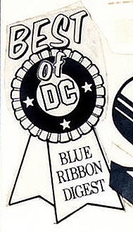 Logo, Best of DC Blue Ribbon Digest #8, Dec. 1979
Another variant created in the DC Production Department, again not nearly as good as Glaser’s original.
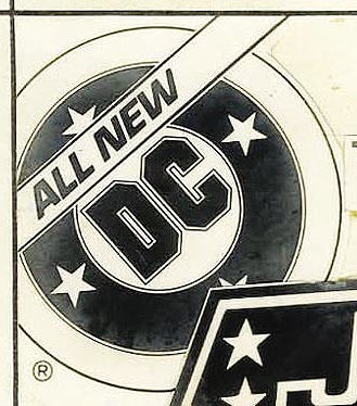
 Logo for DC Comics Presents #10, June 1979
By 1978 I was working at DC as a production artist and beginning to design logos. In fact, this was the very first one. My assignment was to come up with a way to make COMICS PRESENTS work with the Glaser design. My idea was a curved banner emerging from behind the bullet having a switchback with one word on each level. (The ALL NEW was added later, not by me.) Everyone was happy with this. Being well aware of the printing problems the close thin outlines on Glaser’s design often caused, I put mine around the letters I did a little further away.
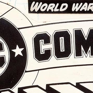 DC Comics Presents logo detail
A closer look shows that. Even then, the thin outlines tended to mush together with each other and the letters in printing at times, but this wider spacing had a slightly better chance of looking right.
 DC Bullet from Justice League of America #165, April 1979.
Around the same time DC decided to put the bullet in a much larger circle. This helped it stand out from the cover art and made registration of any color hold less likely to be a problem. There was always a lot of complaining about Glaser’s thin outlines, though, and this did not help that.
 DC Bullet from Action Comics #547, Sept. 1983
In 1983 I was asked to do a version with a wider white space between the black band and the outer thin circle. I also added slightly more white space between the letters DC and the thin outlines around them, as well as between the thin circle inside the black band and the band itself. This actually worked well to keep any color hold from overlapping the white space and generally improved the image in print, and as the 1980s progressed, comics printing continued to advance, giving the Glaser design better chances to look right on covers.
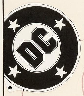
 DC Bullet from Superman comic in 1988
Around 1988 this slight variation with a thicker outer line became the standard version, and it’s the one in the comparison image above. By the end of the 1980s, printing had mostly caught up to the quality of Glaser’s original design, and his original version with the thin outer line and thin white gap could have been used, but I don’t think it ever was. This version stayed on covers until a new logo was introduced in 2005 to much agony and snarkiness on the internet.
I have a fondness for the Ira Schnapp version of my childhood, but I have to say the Glaser DC Bullet, in use for my entire career there on staff and many years as a freelancer, is my favorite. I can’t say I’m a huge fan of Milton Glaser’s work in general, but this one he got right, even if it took a while for the rest of the comic to match it in image quality.
More logo studies can be found on my LOGO LINKS page.
Milton Glaser’s WEBSITE.
The post Milton Glaser and the DC Bullet appeared first on Todd's Blog.
June 25, 2020
And Then I Read: A BRIGHTNESS LONG AGO by Guy Gavriel Kay

Kay’s newest novel takes place in the same slightly fantastic version of Europe as his Sarantium books. The only fantasy elements really are the fact that this world has two moons, a speaking role for a ghost, and the power of some characters to foresee the future. Otherwise it’s as accurately historical to medieval Italy (mostly) as the author can make it.
Guidano Cerra is the narrator and storyteller, an old man retelling events from his youth that changed his life, and the course of the country’s history. We begin in the city of Mylasia where Guidano is serving in the household of the ruler, Count Uberto, nicknamed “The Beast” because of his habit of raping and killing young women periodically in his private rooms. Guidano and the other staff are horrified by this, but can do little to stop it. Guidano recognizes one young woman brought to the Count’s bedroom, though, as a noblewoman in disguise, Adria Ripoli. Her presence signals something different is going to happen this time, and it does. Adria succeeds in poisoning Count Uberto, but not before being stabbed in the thigh by him. Adria has an escape plan, the entire operation has been planned by her cousin the warlord Folco D’Accorsi in order to create chaos in Mylasia that he can exploit. Not quite understanding why himself, Guidano helps Adria escape, and remains haunted by her. Their paths will cross again.
This is only one of the stories told in the book, which includes battles, court intrigues, romance, power struggles, and the craziest horse race since Ben Hur, where Adria is one of the riders. Like all of Kay’s books I’ve read, it’s engaging, with great characters and wise insights into human nature along with surprising plot twists. The overall feel of the book is one of melancholy as the aged Guidano looks back on the bright moments of his youth and mourns what he’s lost, but often the story is so involving you forget that and are absorbed in the moment. Beautifully written and recommended.
Other books of his I’ve reviewed:
The post And Then I Read: A BRIGHTNESS LONG AGO by Guy Gavriel Kay appeared first on Todd's Blog.
June 17, 2020
And Then I Read: POGO, The Complete Syndicated Comic Strips Volume 5
 Cover art by Walt Kelly and Linda Medley.
Volume Five of this delightful hardcover series includes the daily and Sunday strips (in color) for 1957 and 1958. There is surprisingly little political satire in these years, but plenty of wonderful art, slapstick humor, wordplay, character confusion, silliness, superstition, arcane knowledge, animal misbehavior, excitement and so much more I’ve run out of descriptors. We meet Pogo’s sister and her family for the first time, with her children looking like ever-smaller versions of Pogo, leading to some funny moments. The whole book is pretty funny, really. One nice thing about the series is you can pick up any one and enjoy it without having read the previous volumes. Volume Five is a particularly good place to start I would say. Walt’s Pogo strip is fully developed and brimming with charm and fun here, yet not bogged down by any one theme, a fine variety.
Highly recommended.
Previous volumes are reviewed here:
The post And Then I Read: POGO, The Complete Syndicated Comic Strips Volume 5 appeared first on Todd's Blog.
June 14, 2020
Rereading: THE BORROWERS AVENGED by Mary Norton

The final book in the Borrowers series, number five, was published in 1982, twenty-one years after book four, The Borrowers Aloft, which Mary Norton had presented as the end of the series. Avenged is about twice as long as the others. Despite that, it’s exactly the same in tone and style, and continues from the end of Aloft. I read the first four books when I was a child myself, probably several times, and rereading them recently I remembered many events in those books. I read this one when it came out, but I was 31 then, and only read it once. I didn’t remember a single thing about it! That actually made it more fun to read, a brand new book to me, and a fine one.
The Clock family: Pod, Homily and Arrietty, the tiny people of the race of Borrowers, have escaped from the attic prison in the home of The Platters by balloon, as told in The Borrowers Aloft. First they return to their previous home in the model village of Mr. Pott, but they know they can’t stay there long. Reuniting with their friend, the wild Borrower, Spiller, he and Pod scout for a new home. They find on in the rectory in the nearby town of Little Fordham. The church itself has Borrowers, the family of Hendreary and Lupy, who the Clocks lived with for a while in The Borrowers Afloat. Homily is quite firm on the fact that they should not try that again, but the rectory seems a good alternative, and is right next to the church. Spiller brings the Clocks to the rectory with all their belongings, and just in time, as their former captors, the Platters arrive at the model village to try to catch them again.
In the rectory, the Clocks find one young Borrower living on his own, a boy with a bad leg who was left behind by his family years earlier when they moved away. Peagreen has made a life for himself, and recently moved to a different home in the rectory, opening up his former one for the Clocks, who are happy to get it. Pod is soon busy converting the space inside an old chimney to a comfortable new home for them, and Arrietty is happy to be allowed to go out borrowing herself at last, gathering food from the rectory garden. The Clocks find the two humans living in the rectory easy to avoid, and have no trouble getting what they need. Arrietty and Peagreen become friends and spend time together, and Arrietty also goes borrowing with her young cousin Timmus, and explores the church with him.
Trouble begins again with The Platters when they learn there may be Borrowers in the church, and soon they are on the hunt for the Clock family again during a festival when there is lots of coming and going at the church. How will things work out this time? Can the Clocks finally find peace and freedom and get the revenge on the Platters promised in the book’s title? The path to that is fraught with danger.
Of course you would want to read the other books first, but this final one is an excellent and satisfying conclusion. Recommended.
June 10, 2020
And Then I Read: THE MYSTERIOUS BENEDICT SOCIETY AND THE RIDDLE OF THE AGES by Trenton Lee Stewart
 Cover and illustrations by Manu Montoya
It’s been a while since I read the previous books in this series, and the cast continues to grow, so it took a few chapters to settle into this new adventure and remember who everyone was. Once I did, it was a great adventure. Mr. Benedict, the founder of the Society, is absent for most of the book, in fact the mission is partly to rescue him. His students have been well trained, and are older now, though still fraught with doubt and anxious about whether they are up to the situation. Their deadly enemies, the Ten Men, have escaped from prison, and are not only intent on finding them but also freeing their worst enemy, Mr. Curtain from his maximum security prison on an island just outside their home city of Stonetown. Mr. Benedict is there with him, the two locked away in separate but adjacent rooms. The Ten Men have a plan to break in, but so does the Benedict Society. Each side has information the other doesn’t, but things are made more complicated by two telepaths.
The Benedict Society are Reynie, a brilliant problem solver, Sticky, a science whiz, Kate, an action-loving secret agent-in-training and Constance, a troubled and angry girl with the ability to read minds. She’s angry because the Ten Men have also found a telepath, and the two of them are in a constant mental battle for information. These four are joined by a young boy, Tai, who has been sent to them for protection because he also has latent mental abilities that must be protected from the Ten Men.
The first half of this book is about the group regathering after going their separate ways for a while and relearning how well they can work together. Then plans must be laid, and clues sent by Mr. Benedict unraveled. Kate has an encounter with some of the Ten Men, who are dangerous indeed. The second half of the book is the caper, as the Society breaks into the prison with all the traps and tests of that before them and the Ten Men hot on their heels. It’s thrilling stuff, and beautifully plotted.
I like the characters and the writing of this series. There are some quirks: there are almost no guns in the world of the story except for one dart gun, and the violence is kept relatively tame, more a threat than a reality. Also, the pun-laced names of some characters and places are distracting at times. On the whole, this is good fun and entertaining for readers of any age. Recommended.
June 6, 2020
Listening to: TOM’S MIDNIGHT GARDEN Audiobook
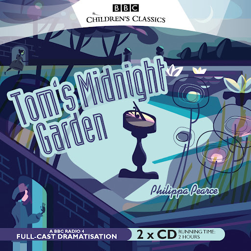
A favorite book by Philippa Pearce that I’ve reviewed here. A friend who read that review, enjoyed the book, and then found and enjoyed this audiobook version from the BBC sent it on to me. I don’t often listen to audiobooks, but found time for this one. Produced in 2012, it’s on four CDs, total running time two hours.
The book is magical, and of course the audio version can’t get in everything written, but this production does an admirable job of adapting the story, with a fine cast of actors and an excellent script. Reading is the most immersive experience for me, as the words create a world and characters in my mind, but audio, when well done, comes close, usually closer than movies or TV, as the experience still requires mental participation.
Tom has been sent to stay with an aunt and uncle in a boring flat because his brother is ill and contagious. He hates it until one night he hears the old grandfather clock in the downstairs hall chime thirteen. Intrigued, Tom goes down and out into the back garden, which has been magically restored to its glorious Victorian splendor. There he meets Hattie, an orphan girl living in the house at that time who thinks Tom is a ghost. Tom thinks the same of her, but in fact neither are quite right, as the book reveals slowly and masterfully, with many wonderful adventures on the way.
Highly recommended. Look for it wherever you get your audiobooks.
Todd Klein's Blog

- Todd Klein's profile
- 28 followers

