
Todd Klein's Blog, page 101
November 24, 2020
Incoming: PROMETHEA DELUXE EDITION BOOK 3
 Image © DC Comics
Just arrived from DC is the third and final volume of this new collected edition of PROMETHEA, written by Alan Moore, art by J.H. Williams III and Mick Gray. It holds issues 24-32 as well as Promethea segments of other ABC comics (TOMORROW STORIES SPECIAL #2, TOM STRONG #36 and a few other brief bits), plus Alan Moore’s script for PROMETHEA #29 and a 14 by 20 inch double-sided poster of issue #32, which formed two large images when the pages were combined. Very small on the text, but readable. A nicely-produced package slightly larger than original size on good paper with excellent printing, though it’s a glued binding. This three volume reprint is not nearly as large or well made as the PROMETHEA ABSOLUTE EDITION of some years ago, if you can find that, but it’s quite a good buy at the lower price of $39.99 per volume. This one is due out the third week of December. Check with your comics provider, or here’s an Amazon link.
The post Incoming: PROMETHEA DELUXE EDITION BOOK 3 appeared first on Todd's Blog.


November 23, 2020
Ira Schnapp in THE BRAVE AND THE BOLD
 Images © DC Comics
In 1955, DC began a new adventure title that went through several incarnations. Initially it was an anthology featuring fighting heroes from the past, as seen on the cover of the first issue, above. With issue #25, it became a tryout book like DC’s SHOWCASE, most famously for The Justice League of America. With issue #50 it became a team-up title allowing DC heroes and heroines who did not normally interact to appear together. After #75, Batman was featured in every team-up until the series ended with #200 in 1983, so it essentially became a Batman title. The editor in the original adventure anthology was Robert Kanigher. For the tryout issues, each feature had an editor, so it was a rotating assignment, and for the later team-up series the most frequent editors were Murray Boltinoff and George Kashdan, though others sometimes filled that role.
Ira Schnapp designed the large logo in a waving banner that would continue to be used for many years, though it got smaller later. The letters are Ira’s own mix of Old English and classic serif font styles. The rest of the cover is set in type on this issue, but Ira lettered most of the covers until issue #77 in 1968. He also designed many character logos for the book’s covers and interior title pages, but only lettered two story pages inside.

Here are the logos Ira designed for the three features in the first issue, with Golden Gladiator based on the ancient Roman font used on Trajan’s Column and the other two using versions of his Old English style. Ira’s work added an old world elegance to the features.

Issue #2 has the kind of caption that Schnapp often lettered for these early issues, and this one was used again on issue #3. More often he did new variations on the same theme.

Issue #5 highlights the addition of Robin Hood, replacing The Golden Gladiator, with a small but appealing character logo. This is also the first cover in the series with a Schnapp word balloon. The following year DC would publish ROBIN HOOD TALES, continuing the Quality Comics series.

This series gave Ira lots of chances to use his Old English technique, as on the cover of issue #10 from 1957.

For issues #23 and 24, Ira redid the series title at a much smaller size and added a flagpole at the left end which the banner flies from, leaving room for a new character logo for The Viking Prince. Issue #24 was the last in this iteration and featured two long stories as described in Schnapp’s handsome caption.

The small version of the title logo continued to be used for a long time. Here it is on #25 from 1959, the first of the tryout issues featuring a new logo by Ira for Suicide Squad. It has some Art Deco characteristics, and is very bold and demanding of attention. I would have picked this book up if I’d seen it. The caption is set in type that looks like actual typewriter text, and probably is. Kanigher was the editor for this feature, whose tryout ran three issues, and there was a second run on issues #37-39.

This is the tryout that had the most lasting effect, featuring the first large-scale team-up of DC’s most popular heroes since the demise of The Justice Society of America in ALL-STAR COMICS in 1951, and edited by Julius Schwartz in issues #28-30 of this series. Ira Schnapp’s new logo for the team is, I think, one of his best. The bold letters reversed on a black shield with stars and inset areas to create a red, white and blue theme look great. Ira also did the cover lettering. JLA went on next to their own very long series using the same logo.

The third tryout series was Cave Carson, who appeared in issues 31-33 and 40-41. Ira Schnapp’s logo creates an appropriate illusion of great depth on INSIDE EARTH, reminding me of some science fiction movie logos. CAVE CARSON is in the script style he sometimes used on covers. The feature was edited by Jack Schiff. I thought it was a great idea, but it must not have sold enough to get its own series.

The second successful tryout was Hawkman, who appeared in issues 34-36 and 42-44 before landing his own series. Like The Flash and others, it was a revamped Golden Age character edited by Julius Schwartz, part of his Silver Age superhero revival that fans loved. Ira Schnapp’s Hawkman logo is again, I think, one of his best efforts, and the logo of his that’s most reminiscent of the Trajan style from Rome that Ira worked with in his youth. The pointed serifs give it more bite than many of Schnapp’s logos, and are fitting for the hawk theme. Ira also lettered the caption and signs. Hawkman moved into his own series using the same logo.

With their second tryout run Suicide Squad gained a new top line in their logo, TASK FORCE X. Ira’s caption reads, “Back by Popular Request!”, but it must not have sold well enough to gain a series. In 1987, a new version emerged with a new long series.

From issues #45-49, Julius Schwartz presented STRANGE SPORTS STORIES, an odd anthology that combined sports with mystery and science fiction themes. Despite the long tryout, it did not gain a series until 1973. Schnapp’s curved logo for STRANGE SPORTS allows room for the other parts of the logo in the openings, making a well-balanced design. This logo again uses some Art Deco elements, particularly in the letter S.

With issue #50 the series changed again to a team-up book, and Ira was often called on to letter character logos, either because the character didn’t have one, or didn’t have one that would fit in the logo space. Here he letters both character names in similar styles to create a pleasing design, and also the thought balloon.

For issue #51 in 1964, Ira reworked his Aquaman logo to fit a narrower space, though his Hawkman one needed no changes.

Issue #52 featured Robert Kanigher war heroes with a busy new logo by Schnapp and character heads by Joe Kubert. Schnapp did a similar logo for 6 Battle Stars on OUR ARMY AT WAR #164 a year or two later.

For issue #53, Ira did a narrower version of his THE ATOM logo, while his THE FLASH logo could be used as is.

Issue #54 in 1964 saw the beginnings of The Teen Titans in this teamup story with three new character logos in similar styles by Schnapp. Despite so many words in these logos, Ira made them work without crowding.

For issue #55, Ira created a wider and less tall version of his METAL MEN logo, while THE ATOM could be used as is.

For issue #56, Ira made a narrower version of his FLASH logo and a new logo for MANHUNTER FROM MARS. THE BRAVE AND THE BOLD PRESENTS was the main unifying theme of all these teamup issues, but they were also unified by Ira Schnapp’s distinctive logo and cover lettering style.

For issues #57-58, the series went back, briefly, to being a tryout title, introducing METAMORPHO, THE ELEMENT MAN, a new character created by Bob Haney and Ramona Fradon. Schnapp’s logo has a handsome curved upper line, and the coloring adds interest. The character was popular enough to continue right into his own series using the same logo.

For issue #59, the first of many Batman teamups, Ira was finally able to use existing logos for both characters and just focus on the cover lettering.

With issue #60, the teamup from issue #54 added Wonder Girl and officially gained the name TEEN TITANS, with a new logo by Schnapp, which uses thick block letters and a telescoped drop shadow. The team moved into their own series using the same logo in 1966.

Issue #61 featured two Golden Age heroes that were returning with the rest of the Justice Society of America in annual appearances in JUSTICE LEAGUE OF AMERICA. The concept of heroes from different eras appearing together seemed to appeal to fans, and editor Julius Schwartz kept promoting them. This cover has too much lettering by Ira Schnapp, but I do like his character logos.

Batman’s second teamup came in issue #64, and he appeared more and more often until with #75 he was in every issue. Here he stars with Eclipso using the logo Ira Schnapp created for his HOUSE OF MYSTERY appearances. The logo area is crowded, and the caption is too large, but we’re now in that most dismal time for cover designs at DC.

Issue #77 from 1968 is the last one with Schnapp cover lettering, and his caption is full of bounce and energy, perhaps in an attempt to mimic what his replacement, Gaspar Saladino, was doing in cover lettering. Ira would soon leave the company and Gaspar would take over most of the covers and logos for a number of years.
Here are the covers lettered by Ira Schnapp (not counting repeats): 2, 4-21, 23-24, 26-39, 41-71, 73-77. That’s 71 in all.

Most of the inside stories in the initial adventure hero run of 24 issues were lettered by Gaspar Saladino. Gaspar also lettered most of the Julius Schwartz and Robert Kanigher tryout issues, and some of the later team-up ones. The only story lettering by Schnapp is this two-page filler from issue #31, supporting the first Cave Carson appearance.
More articles in this series are on the Comics Creation page of my blog.
The Brave and The Bold on Wikipedia, with details on the characters in each issue.
The post Ira Schnapp in THE BRAVE AND THE BOLD appeared first on Todd's Blog.
November 22, 2020
Rereading: WHO WILL COMFORT TOFFLE? by Tove Jansson

In addition to the Moomin novels I’ve been rereading, Tove Jansson also wrote and illustrated three charming picture books for younger readers that are part of the Moomin series. They were unknown to me when I was young, but have been reprinted in America in this century, and I have added them to my library. This is the second, and it tells of a sad, lonely young Toffle who is afraid of all the other creatures who live around him, including Hemulens, Fillyjonks, even Moomin friends Mymble and My, but especially the truly frightening Groke, whose presence freezes the very ground it walks on. This book follows Toffle as he searches for a friend, while trying to avoid all the boisterous activity around him. Even solitary Snufkin, playing his flute in a field of flowers, is too scary for Toffle to approach. At last he arrives at the seashore, and he finds a note in a bottle from a young female Miffle, who is also looking for a friend, and asks for help. Toffle decides he must finally be brave and seek out Miffle. He sets out on the wide ocean in his suitcase to look for her.
If you have only seen Tove Jansson’s black and white illustrations for the Moomin novels or even her comic strips, the gloriously bright and charming large illustrations for these picture books will give you new insight into her artistic talent. The story is equally charming, and is ideal to read to a young person, if you know one. The translation is by poet Sophie Hannah, and the lettering (in the style of Tove) is by Peter Blegvad.
Recommended.
The post Rereading: WHO WILL COMFORT TOFFLE? by Tove Jansson appeared first on Todd's Blog.
November 20, 2020
Ira Schnapp in MY GREATEST ADVENTURE
 Images © DC Comics
In early 1955 DC launched a new adventure anthology along the lines of STRANGE ADVENTURES and HOUSE OF MYSTERY where the idea was to have each story depict the personal adventure of one man (or rarely woman) in the most remote reaches of our world, or in the most exciting situations writers could dream up. It was edited by Jack Schiff with his team of assistants Murray Boltinoff and George Kashdan. Boltinoff took over as sole editor with issue #75.
Ira Schnapp designed the logo using thick block letters with a slightly Art Deco feel on the main words, and an open telescoping drop shadow, while the first word MY was thinner, rounded and with the Y in lower case. The telescoping gives the logo depth to help pop it off the page, and also a feeling of importance, like a movie logo. Ira also lettered the word balloon and captions on this and many covers of the series. He lettered 14 stories inside the book too.

The series did not take long to often veer into completely unrealistic fantasy, drawing from science fiction, monster movies, and adventures from history and literature for themes and visual ideas, and touching on many genres, including war stories in issue #9, above. On the logo, the word MY is now much smaller, and the new Comics Code seal is over the right end of the logo, which still reads fine. Schnapp’s cover lettering includes a nice upper and lower case top line in the caption.

Issue #24 from 1958 again combines war and science fiction for this cover image, and features a large story title by Ira, and the MY in the logo has changed again. The book must have been popular because it moved from bimonthly to monthly with issue #23.

The idea of personal adventure reached new heights (or depths) on this cover for #52 in 1961, with the narrator becoming a destructive sun creature. As a child, I found this scene irresistible, and I think it was the only issue I bought.

With Boltinoff as full editor, a new regular feature began, The Doom Patrol, with issue #80 in 1963. The book was in danger of cancellation, and writers Arnold Drake and Bob Haney created a team of odd survivors of disaster, each with personal flaws and strange powers that caught on with readers. Soon after, Marvel premiered THE X-MEN with similarly agonized and argumentative characters. This first cover was NOT lettered by Ira Schnapp. I don’t know who did it, possibly Joe Letterese.

Schnapp’s first cover lettering for the new team was on issue #82, including a fine top caption and a rare thought balloon. The connection of Robotman’s speech balloon to his thought balloon is even more rare.

The final issue, #85, has cover lettering by Ira, though the top caption is by Gaspar Saladino, picked up from his cover lettering on issue #81. MY GREATEST ADVENTURE became THE DOOM PATROL with issue #86, and I’ll cover that separately later.
Here are the covers lettered by Ira Schnapp: 1-6, 8-9, 11-25, 27-56, 58-79, 82-85. That’s 79 in all.

Schnapp’s lettering on stories for this series got off to a slow start with the first one being for issue #22 in 1958, above.

Ira’s story in issue #37 from 1959 is one of a TV trophy hunter who seems to be encountering Congorilla. (I haven’t read the story to see if that’s true.) The story title is classic Schnapp.

Ira’s last story lettering was in issue #67 from 1962, above. He didn’t have a big presence in the series, as it was not a regular assignment, but was in it enough to have some impact. Here are the stories with Ira Schnapp lettering:
#22 July/Aug 1958: I Was a Stand-in for a Feudal Baron 8pp
#24 Oct 1958: I Was the First Future Man 6pp
#37 Nov 1959: I Hunted the Legendary Creatures 8pp
#44 June 1960: I Found the Fantastic Wheel 8pp
#45 July 1960: I Unleashed the Light-Ray Creature 8pp
#47 Sept 1960: I Was King of the Sea-Beasts 9pp, We Became Partners of the Beast Brigade 8pp
#57 July 1961: I Wore the Faces of Doom 8pp, A Beast Was My Judge 9pp
#61 Nov 1961: We Controlled the Earth’s Weirdest Weapon 8pp
#62 Dec 1961: I Was a Captive of the Doomed City 9pp
#63 Jan 1962: We Braved the Trail of the Ancient Warrior 9pp
#66 April 1962: He Made Me Into a Robot 9pp
#67 May 1962: I Protected the Idols of Idoro 8pp
That’s a total of 115 pages on this series.
More articles about Ira’s work are on the Comics Creation page of my blog.
My Greatest Adventure on Wikipedia.
The Doom Patrol on Wikipedia.
The post Ira Schnapp in MY GREATEST ADVENTURE appeared first on Todd's Blog.
November 18, 2020
Ira Schnapp in SUPERMAN’S PAL JIMMY OLSEN
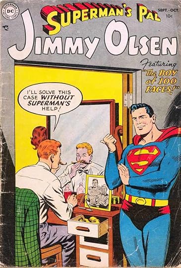 Images © DC Comics
It seems like Jimmy Olsen has been around as long as Superman, and it’s nearly true, though he didn’t get his own comic until 1954, first issue above. Jimmy was first introduced in the Adventures of Superman radio show in 1940, moving into ACTION COMICS in issue #13 in 1941, but he only appeared in a few issues before disappearing again. In 1953 actor Jack Larson was playing “Jim Olsen” on the Adventures of Superman TV show, and his popularity there warranted giving Olsen his own comic. It was edited by Mort Weisinger, like all the Superman-related titles, and was published eight times a year through most of the period we’ll discuss here.
The logo is by Ira Schnapp, who first extended his SUPERMAN logo redesign to include the apostrophe S and PAL in the same style, then rendered JIMMY OLSEN in appealing, bouncy block letters with a very large J and large O. The logo left some blank spaces between the words, but it worked fine in general. Ira also did the cover balloon and caption, and he lettered most of the covers until issue #108 in 1968. Ira lettered only a few stories inside the book.
While many DC Comics began their runs with somewhat serious storylines, JIMMY OLSEN was wacky from start to finish, as Jimmy found countless ways to get into trouble, become transformed, take on unlikely jobs, and generally cause havoc, only to have things set right by his pal, Superman. The cover of issue #4 gave Ira Schnapp a chance to use his Old English style in the story title.
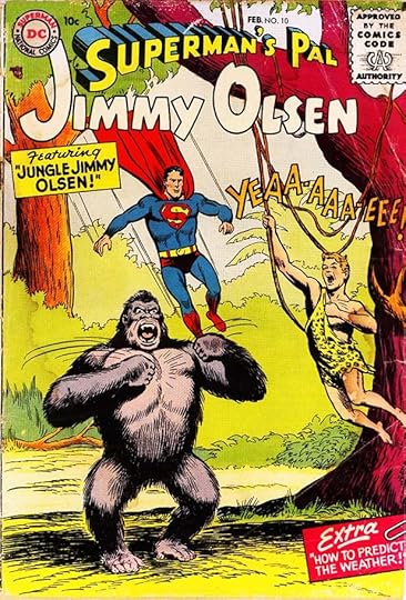
Issue #10 from 1956 is an example of DC’s love for apes, which were thought to sell comics . I like Jimmy’s jungle call, and also the paper-clipped caption box by Ira at bottom right.
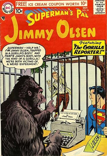
Issue #24 from 1957 is another gorilla cover, and has an unusual color treatment of the logo with all the black lines removed. It still reads fine.
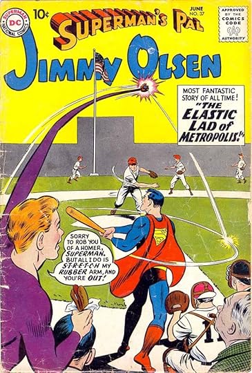
One of Jimmy’s more memorable repeated roles was as Elastic Lad, as in issue #37 from 1959, following the model of Plastic Man, but predating Marvel’s Mr. Fantastic and DC’s Elongated Man.
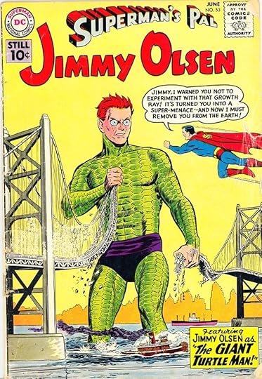
Another memorably odd role was the Giant Turtle Man in issue #53 from 1961. Editor Weisinger recycled this idea from a Thrilling Wonder Tales pulp magazine he edited before he came to DC.
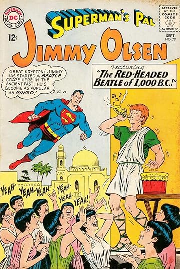
Jimmy’s roles got particularly silly when they were meant to be satirizing current fads, like this one on issue #79 in 1964, as The Beatles were taking America by storm. Yeah, yeah, yeah.
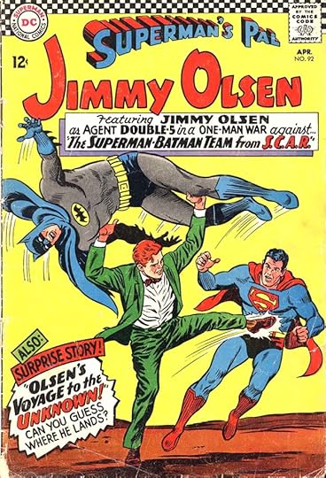
By issue #92 in 1966, DC was in their worst period for cover design with usually too much cover lettering, but Ira made this one work pretty well anyway.
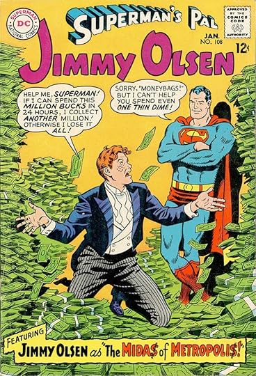
Ira’s final cover lettering for the title was this fine work on issue #108 dated January 1968, but done in 1967. Ira would soon leave the company.
Here are the covers lettered by Ira Schnapp: 1-25, 27-32, 34-65, 67-68, 71-73, 75-77, 79-85, 87-93, 96-98, 100-102, 104-108. That’s 96 in all.

Ira lettered only a few stories in this series. It seems that Mort Weisinger had his own regulars who handled most of the lettering on his books, and Schnapp probably just filled in occasionally. Above is a page from a story he lettered in issue #9 showing a different electric balloon than he usually used.

On this page from issue #36 in 1959, Ira’s story title is very familiar, but the wavy caption border is unusual. Perhaps he was just following what the artist pencilled.

Ira’s last story was in issue #47 from 1960. Perhaps it was an editorial choice to have the lettering in thought balloons all italic.
Here are the stories lettered by Ira Schnapp:
#9 Dec 1955: The Million Dollar Question 8pp
#36 April 1959: Lois Lane’s Sister 9pp, How Jimmy Olsen First Met Superman 8pp
#40 Oct 1959: The Invisible Life of Jimmy Olsen 9pp
#41 Dec 1959: Jimmy Olsen, The Boy Swordsman 9pp
#44 April 1960: The Wolf-Man of Metropolis 9pp
#46 July 1960: Irresistible Jimmy Olsen 9pp, Jimmy Olsen, Orphan 9pp
#47 Sept 1960: The King of Crime 9pp
That’s a total of 70 pages. Other articles in this series are on the Comics Creation page of my blog.
Jimmy Olsen on Wikipedia.
The post Ira Schnapp in SUPERMAN’S PAL JIMMY OLSEN appeared first on Todd's Blog.
November 17, 2020
Incoming: THE NEIL GAIMAN LIBRARY Volume 2
 Cover art by Fábio Moon
Just arrived from Dark Horse is the second oversized collection of Neil Gaiman adaptations. I lettered and did the script adaptation (from a treatment by Olga Nunes) of Miss Finch and lettered Troll Bridge. I enjoyed Harlequin Valentine but haven’t read Likely Stories yet, so I look forward to that. Like the first volume, this is in the large 8 by 12 inch format on top quality thick paper with excellent printing, though the binding is glued. U.S. retail price is $49.99. Even if you have some or all of these in the original smaller format, this is a fine addition to your library. It should be out in stores next week, so if you’d like one, check with your comics supplier, or here’s an Amazon link:
The post Incoming: THE NEIL GAIMAN LIBRARY Volume 2 appeared first on Todd's Blog.
November 16, 2020
Ira Schnapp in OUR FIGHTING FORCES
 Images © DC Comics
Having had success with three war titles that launched in 1952, in 1954 DC began another one also edited by Robert Kanigher. I’ve looked but haven’t found out anything about Kanigher’s wartime service in the U.S. Army, but he certainly had a way with war stories, both as writer and editor. DC relied on him for many years in those roles, and readers seemed to love his comics. This title ran to issue #181 in 1978. In the 1970s it featured “The Losers” by Jack Kirby, but that’s beyond the time period I’ll discuss here.
The logo is by Ira Schnapp. The rounded letters are a surprising choice for a war comic, though they do set this one apart from the earlier ones. A telescoping drop shadow on FIGHTING FORCES added depth and made room for more than one color, and the script OUR is a nice contrast and similar to what Ira did on the other war logos. Despite the roundness, there’s a monumental elegance to this logo that seems appropriate to the subject. Ira also did the caption lettering, and would letter nearly all the covers until issue #111 in 1968, but he only lettered one story inside the book.

Issue #4 shows how Ira soon began highlighting one story title, sometimes with special effects like the flames here. Ira might have lettered the names on the bomb, but it’s more likely those were done by the artist, Jerry Grandenetti.

With issue #9 in 1956, the telescoping is gone from the logo, leaving just the letters. The word OUR is now smaller and in block capitals rather than script. This left more room for art, and the letters are thick enough to read well even against a busy background like this one. No one at DC seemed to mind if the Comics Code Seal covered part of the logo, as it often did on many titles, though I think it looks awful myself.

Here’s a much better trade dress on issue #45 from 1959 with a smaller logo that clears both the Code Seal and the DC Bullet, and OUR is now closer to the original version. Around this time Ira’s story titles were getting larger, and mention is made of continuing characters “Gunner & Sarge,” who first appeared in this issue and would be featured for many years.

A third member of the team was their German Shepherd Pooch, who was often colored brown on covers but always white inside the book, possibly to avoid confusion with REX THE WONDER DOG, another white German Shepherd in his own title. The two dogs were later revealed to be brothers, both originally in the K-9 Corps.

Issue #87 in 1964 featured a new Ira Schnapp logo with FIGHTING FORCES now in similar block letters to the other DC war titles. I think this is a better look, and helps tie the genre books together. As you can see, Pooch is white on the covers by now, a few years after the end of Rex’s book.

Issue #96 from 1965 briefly featured “The Fighting Devil Dog,” who was Lt. Larry Rock, brother of Sgt. Rock. Schnapp did his topline logo and the rest of the lettering on this busy cover.

With issue #99, a new lead series featured Captain Hunter, a Green Beret fighting in Vietnam, as writer/editor Kanigher tried to keep pace with real world events. Ira’s tilted caption fits the space well.

Issue #103 from 1966 features a new, large Capt. Hunter logo by Gaspar Saladino, though the caption is by Schnapp.

Sales must have been sliding, as the cover logo changed again with issue #106. LT. HUNTER’S HELLCATS is by Ira Schnapp, as is all the lettering here. This period is the worst for cover designs and trade dress at DC, but this one works well for me, and Ira’s burst at the left of the logo adds excitement. The notched look of HELLCATS suggests that Ira was looking at the work of his fellow letterer Saladino for inspiration, as that’s a technique Gaspar used to add interest to some of his story titles.

Ira’s final cover lettering on this series was a large balloon on the cover of issue #111 with a Jan/Feb 1968 cover date, no doubt produced in 1967. Here are the covers with lettering by Ira Schnapp: 1-29, 31-52, 54-84, 86-103, 105-107, 109-111. That’s 133 covers in all, an impressive run.

Ira’s only lettering inside the book was this six page story in issue #7 from 1955. As with other Kanigher war titles, Gaspar Saladino was the main letterer. He lettered all but two stories in the first 26 issues, for example, and the majority of stories for many years after that, though by the mid 1960s the work of other letterers was appearing more often.
Other articles in this series are on the Comics Creation page of my blog.
Our Fighting Forces on Wikipedia, with details on continuing features.
Robert Kanigher on Wikipedia.
The post Ira Schnapp in OUR FIGHTING FORCES appeared first on Todd's Blog.
November 15, 2020
And Then I Read: LOLLY WILLOWES by Sylvia Townsend Warner
 Cover art: Witches’ Heads (detail) by August Neter, 1919.
This book was chosen as a favorite by Neil Gaiman. I own and like two other books by the author and decided to try it, her first novel.
Laura Willowes is a shy child of late nineteenth century England who loves country walks in and around her family estate, collecting herbs and making herbal teas. The family owns a brewery and is secure enough for her to not worry about money. As she becomes a young woman, prospects for marriage seem slim, something she seems unconcerned about. Laura is happy with her life, and takes care of her father in his later years. On his death, Laura is moved to her brother’s home in London almost without her having a say in the matter, and for twenty years she becomes a household helper and nanny for her brother’s children. Laura, renamed Lolly by those children, comes to feel increasingly stifled by her life and duties, and longs to return to the countryside. A visit to a florist is the final spark. She decides to move to the small, isolated village of Great Mop as if by chance choice, though the choice proves to be an important one. Laura’s family is against this move, but she stubbornly carries out her plans, renting a room in a cottage in Great Mop, and beginning a new life.
Great Mop is a strange place, and Laura gradually begins to uncover its secret life and make new friends there. That process is interrupted when her nephew Titus decides to also move to the town to become a writer, and soon has Laura under the thumb of family obligations again. What Laura does in her desperation makes up the final section of the book, and is the only part involving an element of fantasy. Laura makes a pact and becomes a witch.
This book is much more about the place of women in English life than about magic, and that surprised me a bit. In fact, it ended just when I thought it was about to really begin. I enjoyed reading it all the same. Laura is a type of woman I know from my own family, and one that exists in many families. The unmarried helper, assumed to be always ready and willing to do whatever is asked of her by family. It’s a role unmarried men can usually escape, but women often can’t, at least in times past. Perhaps that’s changing through the influence of writers like Warner and the feminist movement. The writer’s own life was unconventional, and this book must represent many of her own feelings, I think. It’s well written, but I would have enjoyed seeing the story go further. It certainly kept me thinking about what might have happened next.
Recommended.
The post And Then I Read: LOLLY WILLOWES by Sylvia Townsend Warner appeared first on Todd's Blog.
November 13, 2020
Ira Schnapp in DODO & THE FROG, NUTSY SQUIRREL and RACCOON KIDS
 Images © DC Comics
These three funny animal titles are similar in many ways: start and end date, origin and contents. Each came out of a previous DC funny animal anthology where the characters were the lead feature. Each was retitled with the Sept/Oct 1954 issue, each was bimonthly for about eight issues, then appeared three times in 1956 and once or twice in 1957 before being cancelled, bringing an end to most of DC’s funny animal titles. All three were edited by Larry Nadle. DODO AND THE FROG came out of FUNNY STUFF. The transition was gradual. Issues 77-79 of FUNNY STUFF included this logo, with the FUNNY STUFF logo shrinking until it vanished with issue #80. I believe Ira Schnapp designed the logo, though it was loosely based on the story logos drawn by the artist inside, Otto Feuer. On this and the other titles Ira lettered many of the covers and lettered about half the stories inside. Some are by Sheldon Mayer, who sometimes did his own balloon shapes that Ira put lettering into.

Issue #81 has an Ira Schnapp word balloon, for example with a rounder balloon shape than usual.

Issue #87 has more Schnapp lettering than most as the book parodies then-popular frontier hero Davy Crockett.

The final issue, #92, has a typical Schnapp balloon and sight gag. Ira lettered these covers: 81-92, twelve in all.

Inside, while Dodo and the Frog usually had at least two short stories, the rest of each issue was filled out with other features from FUNNY STUFF and other similar titles. This is a page from “Blabber Mouse” in issue #80.

A page lettered by Ira from issue #85. The Dodo was not only that by species, but by intellect, with Fenimore Frog usually able to fool him, only to come to a bad end.

A page lettered by Ira from the final issue, #92. The Dodo is about to go extinct again.
Here are the stories in this series lettered by Ira Schnapp. Dodo and the Frog (DF) stories are numbered, as there was more than one.
#80 Sept/Oct 1954: Blabber Mouse 4pp, Dizzy Dog 4pp, DF 4pp (3)
#81 Nov/Dec 1954: Doodles Duck 3pp
#82 Jan/Feb 1955: DF 5pp (4)
#83 March/April 1955: DF 4pp, 4pp (2-3), Doodles Duck 6pp
#84 May/June 1955: DF 4pp, 4pp (2-3), Blackie Bear 4pp, Dizzy Dog 6pp
#85 July/Aug 1955: DF 4pp, 4pp (2-3), Doodles Duck 4pp, Biggety Bear 4pp
#86 Sept/Oct 1955: DF 4pp, 4pp (2-3)
#87 Nov/Dec 1955: DF 8pp, 4pp (1-2), Dizzy Dog 6pp
#88 Jan/Feb 1956: Goofy Goose 6pp, Nutsy Squirrel 4pp, Dizzy Dog 6pp
#89 Aug/Sept 1956: DF 6pp, 4pp (1-2), Biggety Bear 6pp, Bo Bunny 6pp
#90 Oct/Nov 1956: DF 6pp, 4pp (1-2), Bo Bunny 6pp, Nip & Chip 4pp, Custer Cat 4pp
#91 Sept 1957: DF 6pp, 6pp (3-4)
#92 Nov 1957: DF 6pp, 6pp, 6pp (1, 3-4), Doodles Duck 4pp
That’s a total of 198 pages.

This title came from FUNNY FOLKS, which had become HOLLYWOOD FUNNY FOLKS first. Nutsy began appearing in the first issue and was the lead feature by issue #9. Nutsy’s own title ran from issue #61 to #72. Again the transition was somewhat gradual, with Nutsy’s logo on the cover of the previous comic’s last two issues. The logo is by Ira Schnapp, but once more based on the story logos from the original artist Irving Dressler. Later Rube Grossman drew a lot of the Nutsy stories.

The cover of #63 is the first with an Ira Schnapp word balloon.

Issue #65 has one of the larger Schnapp word balloons with two sizes of emphasized words.

Ira also lettered the final cover, #72. Here are all the ones he worked on: 63-65, 67-72, that’s nine in all.

Here’s a page from issue #61 lettered by Ira with a nice selection of signs and large lettering.

I like the fight balloons by Ira on this page from issue #65, sure to amuse most kids.

A page from the last issue lettered by Ira Schnapp. Here are the stories he worked on. Nutsy Squirrel (NS) had more than one per issue, so they’re numbered.
#61 Sept/Oct 1954: NS 6pp, 6pp (1 & 3)
#62 Nov/Dec 1954: NS 6pp, 7pp (1 & 3), Dizzy Dog 6pp
#63 Jan/Feb 1955: NS 4pp, 4pp (2-3)
#64 March/April 1955: Fraidy Cat 4pp
#65 May/June 1955: NS 4pp, 4pp, 4pp, 5pp (2-5), Dizzy Dog 5pp
#66 July/Aug 1955: NS 6pp, 4pp, 4pp, 5pp (1, 3-5)
#67 Sept/Oct 1955: NS 6pp, 4pp, 6pp (1-2, 4)
#68 Nov/Dec 1955: NS 4pp, 6pp (2-3), Bo Bunny 6pp
#69 Jan/Feb 1956: NS 6pp, 4pp, 4pp (1-3), Bo Bunny 6pp
#70 Aug/Sept 1956: NS 6pp (1), Dizzy Dog 6pp
#71 Oct/Nov 1956: NS 6pp, 4pp (1-2), Dizzy Dog 6pp
#72 Nov 1957: NS 6pp, 6pp (3-4), Bo Bunny 6pp
That’s a total of 182 pages.

THE RACCOON KIDS grew out of ANIMAL ANTICS, which previously was renamed MOVIETOWN’S ANIMAL ANTICS. The Kids began in the earliest issue of the previous title, and were the featured series by issue #6, usually drawn by artist Otto Feuer. Once again the transition was gradual, with the RACCOON KIDS logo appearing on the final two issues of the previous comic, #50-51, before taking the entire title with issue #52, above.
Ira Schnapp did this version of their logo, based on the one used on stories by Feuer. He also did the balloon lettering on this and other covers.

Issue #59 is a typical cover with a Schnapp word balloon and an amusing sight gag.

The final issue, #64, is another with a more symmetrical Schnapp balloon than usual. He probably also lettered JELLY BEANS. Ira lettered these covers: 52-55, 59-60, 62, 64, eight in all.

A page from issue #52 lettered by Ira. Note his usual solution for too many words in a panel was overlapping the panel above, as in panel three.

The same thing happens on this page from issue #57, which also has a nicely lettered story title, though that might be by the artist.

This page from the last issue has an unusually large sound effect for Schnapp.
Here are the stories lettered by Ira Schnapp. Raccoon Kids (RK) have more than one story per issue, so those are numbered.
#52 Sept/Oct 1954: RK 4pp (1)
#53 Nov/Dec 1954: RK 6pp, 5pp (1-2), Bo Bunny 6pp, Doodles Duck 5pp
#54 Jan/Feb 1955: RK 6pp, 4pp, 4pp (1-3), Doodles Duck 4pp
#55 March/April 1955: Dizzy Dog 6pp, Bo Bunny 6pp
#56 May/June 1955: RK 4pp (3), Bo Bunny 5pp, Dizzy Dog 5pp
#57 July/Aug 1955: RK 6pp, 4pp, 4pp (1-3), Doodles Duck 6pp, Dizzy Dog 6pp
#58 Sept/Oct 1955: RK 4pp, 6pp (2-3), Bo Bunny 6pp
#59 Nov/Dec 1955: RK 6pp, 6pp (1 & 3)
#60 Jan/Feb 1956: RK 6pp (3), Doodles Duck 6pp
#61 Aug/Sept 1956: RK 6pp, 4pp (1-2), Fraidy Cat 4pp
#62 Oct/Nov 1956: RK 6pp (1)
#63 Sept 1957: RK 6pp, 6pp, 6pp, 6pp (1-4), Nip & Chip 4pp, Biggety Bear 4pp
#64 Nov 1957: RK 6pp, 6pp (1-2)
That’s a total of 194 pages.
More about Dodo and the Frog, Nutsy Squirrel and The Raccoon Kids from Don Markstein’s Toonopedia.
Other articles in this series are on the Comics Creation page of my blog.
The post Ira Schnapp in DODO & THE FROG, NUTSY SQUIRREL and RACCOON KIDS appeared first on Todd's Blog.
November 12, 2020
Incoming: BOOKS OF MAGIC OMNIBUS VOL. 1
 Image © DC Comics
Just arrived from DC is another gigantic book collecting the original miniseries (which I lettered), a Mister E miniseries, The Children’s Crusade #1-2 (I worked on that too), Arcana, the Books of Magic Annual #1, Vertigo Visions Doctor Occult #1, Books of Magic #1-32 and Auberon’s Tale #1-3. The book is in the slightly oversized deluxe format. It has 1,504 pages, is three inches thick, and weighs eight pounds. Looks like a glued binding. The original miniseries has been reprinted recently, but this is the first collection of the monthly series since some 1990s trade paperbacks, and other items may never have been collected. It’s due out December 8, 2020, cover price is $150 US. If you’re interested, check with your comics supplier, or here’s the Amazon link:
The post Incoming: BOOKS OF MAGIC OMNIBUS VOL. 1 appeared first on Todd's Blog.
Todd Klein's Blog

- Todd Klein's profile
- 28 followers

