
Todd Klein's Blog, page 99
December 26, 2020
Rereading: THE LIFE AND ADVENTURES OF SANTA CLAUS by L. Frank Baum
 Dover Publications edition, 1976
Every year around this time I reread something related to the season, and this is it for 2020. I first knew about Frank L. Baum’s Oz from the 1939 MGM film, but came to love his Oz books when my grade school librarian lent me her own childhood editions of many of them in the early 1960s when I was about 12. Granted, Baum’s first Oz book was not as good as the movie, in my opinion then and now, but the second one of the series, “The Marvelous Land of Oz,” was even better, and many later titles were equally fun to read. Baum wrote many other fantasy novels for young readers, but I didn’t know about most of them until later when I began to find them at used book sales and stores in my twenties. This one remained unknown to me until I was able to buy this 1976 reprint from Dover Books. Martin Gardner’s excellent introduction explains the complex history and development of the character from diverse European origins that were brought to America and gradually developed a new life and new stories here. Washington Irving of “The Legend of Sleepy Hollow” fame was the first American author to write about St. Nicholas in 1809, but it was Dr. Clement Clarke Moore’s poem, “A Visit From St. Nicholas” of 1823 that brought many of our ideas about Santa Claus to the public through continued newspaper printings. More attention and details were added by illustrator Thomas Nast in many pictures of the character he now called Santa Claus beginning in 1863. In the 1800s, little was known in America about the European origins of the character, and it was in this light that Baum decided to create for him a new origin and story that was first printed in 1902.
In Baum’s version, an entirely new mythology is created for the northern forest of Burzee with a hierarchy of many races of magical beings, drawing on European ideas but with Baum’s new abilities and societies and sometimes new names. A young boy baby is found at the edge of the forest and rescued by a wood-nymph named Necile, and the ruler of the forest, the Master Woodsman Ak, is persuaded to let her and the other forest immortals raise the child. The boy is named Claus, and as he grows, he comes to understand the ways of all the forest spirits, the Nymphs, the Knooks, the Ryls, and the Fairies, each with their own duties and responsibilities. When he is a young man, Claus is shown his own human people in the rest of the world by Ak, and he comes to particularly love human children, many of whom are sad and poor. Claus takes up residence in the Laughing Valley outside the forest of Burzee and hits on the idea of making toys to amuse the sad children he has seen. Gradually his career as a toy maker and toy deliverer develops, but not without opposition. Evil creatures led by the invisible Awgwas object to Claus’s plans, as they delight in bringing sadness and pain to humans, and eventually there’s a war between the immortals of Burzee and the evil forces led by the King of the Awgwas.
This story is quite different from others about Santa Claus, and some elements of it are a bit hard to believe in, but at least it has an imaginative mythology to add depth, and the life of Claus is well told. Rankin-Bass did a simplified animated version in the 1980s, and there was a graphic novel version by writer/artist Mike Ploog in 1992. The original book is a fun read, and recommended.
The post Rereading: THE LIFE AND ADVENTURES OF SANTA CLAUS by L. Frank Baum appeared first on Todd's Blog.


December 23, 2020
Ira Schnapp in BLACKHAWK
 Images © DC Comics
BLACKHAWK began as a feature in MILITARY COMICS #1 in 1941, and in 1944 gained its own title with issue #9 above (taking over the numbering of UNCLE SAM QUARTERLY). The man with the cap is Blackhawk, leader of a squadron of ace fighter pilots from many countries who operate independently from their own island base first in the Atlantic, later in the Pacific. In the Quality years they often fought Nazis, but after the war there were more typical villainous opponents like King Condor and Killer Shark. They flew Grumman XF5F Skyrocket planes, but much of the time they were on the ground taking on their enemies. The series’ first logo is very standard block letters.

With issue #33 in 1950, the book gained this handsome logo with narrow Art Deco influenced block letters in a strong upward arc and a black telescoping drop shadow. I don’t know who designed it, but it’s one of the better logos from the 1950s, and it remained on the book for many years.

DC Comics bought Quality’s properties when they left the comics business in 1956, and BLACKHAWK was one of only three books that DC continued without interruption. In fact they hired the Quality writer and artists to continue it. As it was probably Quality’s best seller, at one time a rival in sales for SUPERMAN, that made sense. DC’s first issue was #108, above, keeping the same logo, and for the cover text they used type, as most of the Quality issues had done, or perhaps this cover was already assembled by Quality staff. It was published monthly, and that continued until 1967, so it must have sold well. DC’s editors originally were Jack Schiff with associates George Kashdan and Murray Boltinoff. Later it was edited by Jack Miller, and later still by Kashdan again. The initial DC run was a long one, from issue #108 to #243 in 1968. The run was continued with two long pauses to issue #273 in 1984. Blackhawk was one of only a few DC properties that continued uninterrupted from the 1940s to the 1960s, though at two publishers. Ira Schnapp lettered many of the covers until issue #238 in 1968, but lettered only two stories and one full issue inside the book.

With issue #109, Ira’s cover lettering began in typical fashion, though he seems to be trying to imitate type with his story title.

By issue #112 Ira was using more typical story title styles familiar from many other DC books.

The story title on issue #120 from 1958 has a more angular variation, perhaps to suggest Greek or to echo the robot.

By issue #129, the Blackhawks were facing all kinds of fanciful opponents from aliens to monsters, as was true in many DC titles at the time. The Old English display lettering on the scroll is fine work by Schnapp.

Lady Blackhawk sometimes opposed and later guest-starred with the team, though she was never a regular member. Perhaps the editors thought the idea of a woman alone on an island with a group of men was too risque a situation for their audience.

Most issues had three Blackhawk stories, there were never any second features, and by issue #165 in 1961, they were trying longer stories. That trend continued to increase. The opponents became more and more like costumed super-villains, too. I like this wordy caption by Ira.

Issue #197 from 1964 saw an attempt to revamp the team with new uniforms and a new Ira Schnapp logo. I like it, but not as much as the previous one. The hawk emblem is a great addition, but the logo shape leaves void spaces above it. The inset panel and word balloon are an interesting storytelling idea.

Issue #199 took it even further, with a four-panel story on the cover. Only a few of the DC humor titles followed this theme occasionally.

This cover from issue #215 in 1965 has head shots like a JUSTICE LEAGUE OF AMERICA splash page and lots of lettering. Ira makes it work.

With issue #230 the team was revamped again as a sort of Mission: Impossible super-team, and Blackhawk’s word balloon at the top is DC’s idea of hip language. If you’ve been paying attention, the transformation of Chop-Chop from horrible Asian caricature to an effective part of the team has fully taken place. Also, you can finally see that usually-hidden upper right leg of the K in BLACKHAWK with its angled end, which sort of balances the top of the B.

Ira’s final cover lettering for this book appeared on issue #238 dated January 1968, but done in the previous year. Surprisingly, he would have story lettering in the next issue.
Here are the covers lettered by Ira Schnapp: 109-130, 132-184, 186, 188-192, 194-197, 199-204, 206-209, 211-215, 217-233, 235-238. That’s 121 in all, an impressive run.

The first story lettered by Ira is this one from issue #109, the second DC issue. I can’t identify most of the letterers used on the book, but editor Schiff must have had his own regulars, and seldom asked for Schnapp.

Here’s a page from Ira’s second story lettering in issue #128. To force correct reading order, he needed to add a small arrow pointing from the fourth to the fifth panel. Readers might still have read panel six first.

The last and most surprising story lettering from Schnapp is the 23-page story from issue #239, probably done in late 1967. Ira’s story lettering had dwindled by this time, though he was still doing romance stories. I can only guess that none of the book’s regular letterers were available and Ira was. It may have been one of his final story lettering assignments.
Here are the stories lettered by Ira Schnapp:
#109 Feb 1957: Blackhawk the Sorcerer 8pp
#128 Sept 1958: The Vengeful Bowman 8pp
#239 Feb/March 1968: The Killer That Time Forgot 23pp
That’s a mere 39 pages on this title.
More articles like this are on the Comics Creation page of my blog.
Blackhawk on Wikipedia.
The post Ira Schnapp in BLACKHAWK appeared first on Todd's Blog.
December 21, 2020
Raymond Perry at DC Comics
 At left, Raymond Perry, date and source unknown, found on “Dial B for Blog.” At right, Raymond Perry late 1950s by Jack Adler.
My friend and fellow comics historian Alex Jay writes on his blog, “Raymond K. Perry was born on September 16, 1876, in Sterling, Illinois. The birth date is from his World War I draft card and Social Security application. (Who’s Who of American Comic Books 1928–1999 has Perry’s middle initial as W and the birth year 1883, both are incorrect. There was an artist and educator named Raymond Wilson Perry who was born in 1883.) For more on Perry’s life and full career, I highly recommend Alex’s blog post. To summarize his early career, Perry attended the Chicago Art Institute and began working as an illustrator for books and magazines there in about 1898. By 1905 he was living in New York, where he married his first wife, a professional musician and singer, in 1907.
 Raymond illustration for the book
The First Twenty Years: A History of the Growth and Development of the American Rolling Mill Company, Middletown, Ohio, Beginning 1901 and Ending 1922
.
Raymond illustration for the book
The First Twenty Years: A History of the Growth and Development of the American Rolling Mill Company, Middletown, Ohio, Beginning 1901 and Ending 1922
.Raymond had a successful and celebrated career as a freelance illustrator and fine art painter from that time on, with many gallery exhibitions, and he also did newspaper and book illustrations. He moved in fine art and high society circles, painting the rich and famous and traveling to Europe from a home he and his wife built on Long Island. That life was greatly curtailed when the Great Depression hit in 1930. The Perrys returned to a rented apartment in Manhattan where Raymond advertised as giving private art lessons and did painting demonstrations at schools. It’s likely the market for his paintings had largely vanished.
 From NEW FUN COMICS #1, Feb. 1935. This and all following images © DC Comics.
Raymond entered the comics business in 1935 when Major Malcolm Wheeler-Nicholson hired him to illustrate a comics version of Walter Scott’s novel Ivanhoe from a script by the Major for the first comic book series from his company National Allied Publications, NEW FUN COMICS, sample above. Perry continued on the feature when the series title changed to MORE FUN COMICS, doing 26 two-page chapters, the entire story, which ended in MORE FUN #27 dated Dec. 1937. The story of knights in medieval England was probably also lettered by Perry, and the strip is similar in some ways to Hal Foster’s PRINCE VALIANT, though that did not begin until Feb. 1937. Perry’s skill as an illustrator is obvious, though somewhat hampered by the many small panels of the script, and the low-quality printing and paper did not help.
 From DETECTIVE COMICS #142, Dec. 1948
Wheeler-Nicholson’s company added titles NEW COMICS and DETECTIVE COMICS, but struggled with mounting debt, and by the time another title, ACTION COMICS, was launched in 1938, the Major’s company had been taken over by pulp magazine publishers Harry Donenfeld and Jack Liebowitz. That company, of course, became DC Comics. Several accounts have Raymond Perry employed by DC as a staff colorist and “art editor” from 1940 to his death in 1960, making him the earliest production staffer at the company I have a name for. Jerry Robinson told Robert Greenberger that Perry was the colorist on most of the covers for the company in the early 1940s. What his other duties were I don’t know, but I think he sometimes did spot illustrations for text pages. Comic books could qualify for lower second class mail rates if they included at least two pages of text, and that saved the company money when they mailed subscription copies. Many early text page stories were simply set in type, but sometimes they included a small illustration with the title. By 1948, spot illustrations on them were common, and as in the example above, Ray Perry began not only doing an illustrated title but also the title lettering for many of them. Perry’s illustration style shows much more skill than others doing the same kind of thing, though his linework was sometimes lost in the color and crude printing. His titles were excellently crafted. Some readers then and now might assume they were set in type, but a close look reveals that each letter is different, and in his early years of doing this, Perry used a variety of styles.
 From ALL-AMERICAN WESTERN #107, April 1949
Another early example, above, has Perry doing the title in outline form, a signal it’s not set type. Too bad the linework in his illustration is hard to decipher. From this point on, Perry did hundreds of text page illustrations and hand-drawn titles like this across the entire DC line until the late 1950s. I suspect this was mostly a freelance job for him, something to do at home for a little extra money, but that’s just a guess. Raymond also continued to work as a painter, and did portraits of some of his fellow employees, though I don’t have any examples. A search online will turn up many of his paintings. Below are some of his text page illustrations, mostly from 1949-1951, though I close with one late example from 1959.
 From ACTION COMICS #134, July 1949
Like his fellow DC employee Ira Schnapp, Raymond Perry drew on lettering styles learned in his earlier career, but while Schnapp embraced the Art Deco styles of the 1920s and 1930s, Perry seems to have stopped well before that, drawing on magazine and newspaper title styles from the 1890s to 1910s. Perry was most active as an illustrator then, so it makes sense.
 From ACTION COMICS #137, Oct. 1949
Perry did sometimes use more stylized ideas for his drawings, like this one, but the titles stayed rooted in his past. He was 72 years old in 1948, so that’s not surprising.
 From ACTION COMICS #139, Dec. 1949
Like Ira Schnapp, Perry drew on older styles like this one suggesting Old English. Both men handled them skillfully.
 From ACTION COMICS #140, Jan. 1950
Another one based on Old English and Celtic styles with a fanciful scroll caption. I have a feeling Perry and Schnapp had a lot in common and enjoyed each other’s company and work as they sat together in the DC Comics production department from 1949 to the late 1950s.
 From ACTION COMICS #142, March 1950
Some of Perry’s illustrations were simpler, and therefore easier to understand. This title style is one he often used.
 From ACTION COMICS #143, April 1950
Perry’s script lettering was quite different from Schnapp’s, but equally appealing.
 From ALL-AMERICAN WESTERN #113, May 1950
Another script style, and notice how well Perry uses white space.
 From ACTION COMICS #144, May 1950
The text stories themselves were probably often written by the editors, though few have recognizable author credits. The silly title of this one about the origins of chewing gum is made elegant by Perry’s title lettering.
 From ACTION COMICS #147, Aug. 1950
Perry was sometimes called on to do caricatures of popular entertainers, and did a fine job with this one, which appeared in several DC issues.
 From COMIC CAVALCADE #40, Sept. 1950
Perry’s design and illustration skill, as well as his fine lettering, gave otherwise dull text pages something to catch readers’ eyes, and a way for Raymond Perry to use his talents. Comics creator Jerry Robinson was interviewed by Jim Amash in Alter Ego #39, August 2004, and recalled Perry at DC.:
…One other guy I should mention who should be remembered—and was a wonderful man—was Raymond Perry, though I just called him “Mr. Perry.” He was the colorist who worked in the bullpen. He was a fine, old illustrator; a white-haired man that I really looked up to. I felt terrible that someone of his age and illustrious past should be reduced to coloring comics.
 From ADVENTURE COMICS #159, Dec. 1950
Robinson may have forgotten or not known about Perry’s work on DC text pages like this one.
 From WORLD’S FINEST COMICS #48, March 1951
A nice combination of lettering styles here, though the details of the fox are hard to make out.
 From ADVENTURE COMICS #163, April 1951
A fine example of title, spot illustration and color, all probably by Raymond Perry. Many more examples can be found through the 1950s.
 From ALL-STAR WESTERN #105, Feb. 1959
By 1959, most generic text stories had been replaced by letters from readers pages at DC, which not only fulfilled the second class mailing requirement but actively engaged the fans. That meant fewer chances for Perry to use his skills, though he did a few letter-column headers like this one at the end of his time at DC. Perry died in November of 1960, age 84. His work is little remembered, and I hope this post will change that for those of you who read it.
More articles like this are on the COMICS CREATION page of my blog.
The post Raymond Perry at DC Comics appeared first on Todd's Blog.
December 20, 2020
Rereading TOM SAWYER ABROAD by Mark Twain
 Early edition found online, I read a digital one.
Continuing my reading of Mark Twain’s novels, this is one I remember from my childhood. Then I found it an entertaining comical adventure story. Tom, Huck Finn and their black friend Jim travel to St. Louis, Missouri to see a new invention being demonstrated by its quirky inventor, a hot air balloon which can be steered by mechanisms he created. The three sneak aboard the balloon at the end of the day’s demonstration, and are still aboard when the inventor decides to launch his long-planned around-the-world voyage. The inventor is clearly not in his right mind, and grows ever more suspicious and aggressive toward the three unwitting passengers who clamor to be returned home as they sail across America and out over the Atlantic Ocean. Eventually he and Tom Sawyer have a fight, and the inventor falls overboard and perishes, leaving the three on their own. Fortunately, Tom had been watching the inventor’s steering and management of the balloon, and is soon able to take over as pilot. They don’t know where they are, but wake up one morning over a vast desert that Tom thinks is the Sahara in Africa. They spot some lions and land to have a closer look. The lions find this a fine idea for their own breakfast, as depicted in the cover illustration above. Later adventures have them caught in a sandstorm and encountering a caravan of Arabs and the gang of thieves preying on them. Tom saves a baby and returns it to its mother. Later they bring aboard a local guide who speaks English, and who takes them to see the pyramids and the sphinx in Egypt.
When I first read this book, I hadn’t yet read Jules Verne’s Five Weeks In A Balloon, of which this book is something of a parody, and of Verne’s work in general. It’s a fun story if you can overlook the impossible science and the racist depiction of Jim and other characters, though I’ll add Twain makes almost as much fun of Huck’s ignorance and Tom’s slightly better schooling that leads him to believe he knows everything. This story is not nearly as well-developed as Tom Sawyer’s own first book, and well behind Twain’s masterpiece Huckleberry Finn, but I still enjoyed reading it again.
Recommended.
The post Rereading TOM SAWYER ABROAD by Mark Twain appeared first on Todd's Blog.
December 18, 2020
Ira Schnapp in HEART THROBS
 Images © DC Comics
HEART THROBS began publication from Quality Comics in 1949 at the height of the romance comics boom. The logo, seen above on the first issue, continued for the rest of the Quality run, though the double hearts were soon dropped. When Quality left the comics business in 1956, DC Comics bought their assets. This title continued with the same numbering after a hiatus of a few months with issue #47 from 1957:

DC kept the Quality logo for a while, but added typical Ira Schnapp cover lettering. He would letter most of the covers and many of the stories until issue #112 in 1968. It’s not clear if Robert Kanigher was involved in the editing. Editors probably included Zena Brody, Phyllis Reed, Jack Miller and Barbara Friedlander for the issues I’m covering here. The plan of the book was the same as the other DC romance titles, each issue had several short stories, and there were no continuing characters or series until 1966. It bore the Schnapp-designed DC Romance Group bullet at upper left like the others for a while.

With issue #59 from 1959, a new Ira Schnapp logo was introduced putting the title on one line. Schnapp used an odd mixture of differently sized upper and lower case letters that are in one of his familiar styles with added curves. This logo lasted for some time. It was certainly easy to read and find on the newsstand. The caption is typical for the series and for all the DC romance books, some melodramatic text and a handsome story title.

Issue #82 from 1963 has a particularly skillful engagement party invitation lettered by Ira, perhaps showing a style he had employed in the past outside of comics.

Issue #93 from 1965 has another new Schnapp logo using his standard block letters in a rectangle with only the heart in the O representing the theme, a more subdued but effective approach.

Perhaps the most famous cover in the series is this one from 1966 because of the appearance of The Beatles. It also has three wordy captions by Ira and those awful go-go-checks at the top from this nadir of DC cover design.

With the next issue, a continuing series began, and Ira lettered the logo, which shared space with the book’s title. This was very much a soap opera, which seems like an obvious plan to attract and keep readers. I’m surprised it took so long to be tried.

Ira’s final cover lettering appeared on issue #112 cover-dated March 1968, so probably done in 1967. Here are the covers with Schnapp lettering: 47-56, 58-89, 91-98 (word balloons by someone else, the rest by Ira on 97-98), 99-107, 109-112. That’s 62 in all.
These are the stories lettered by Ira. As with the other romance titles, Schnapp was the main letterer, though Gaspar Saladino and others did some too.
#47 April/May 1957: Wondering Heart 8pp, So Sure of Love 7pp, Girl With a Lonely Heart 7pp, Johnny’s Back in Town 8pp
#48 June/July 1957: Victim of Love 7pp, A Love of My Own 7pp, Second Chance 7pp, End of a Dream 8pp
#49 Aug/Sept 1957: Love Isn’t Everything 7pp, Lost in Loneliness 7pp, Blame It On My Heart 7pp, Listen to Love 8pp
#50 Oct/Nov 1957: Tomorrow’s Fool 7pp, Heartbreak Ahead 7pp, Weep and you Weep Alone 8pp
#51 Dec 1957/Jan 1958: Sweetheart’s Hill 8pp, Sometime Sweetheart 7pp
#52 Feb/March 1958: My Heart’s Desire 7pp, Which Way to Happiness? 7pp
#53 April/May 1958: Love Is Not Blind 7pp
#54 June/July 1958: A Kiss From a Stranger 7pp, All My Love 7pp, A Waiting Heart 7pp, Care a Little More 8pp
#55 Aug/Sept 1958: Summer Heartbreak 7pp, Ring of Gold 7pp, Yesterday’s Dream 8pp
#56 Oct/Nov 1958: All I Want is Billy 9pp, Someday is Never 7pp, Storm in My Heart 8pp
#57 Dec 1958/Jan 1959: Melody of Spring 7pp, Kiss Me Goodbye 7pp
#58 Feb/March 1959: Farewell With Love 8pp
#59 April/May 1959: A Kiss for Cinderella 7pp, There Goes Love 7pp, This Was Eileen 7pp, My Love Is Yours 8pp
#60 June/July 1959: Listen, Darling 8pp, Guilty Heart 7pp. Once And Always 7pp
#61 Aug/Sept 1959: Love, Come Home 9pp, I Remembered Love 7pp, Her Winning Smile 8pp
#62 Oct/Nov 1959: We Can’t Be Strangers 8pp, One Summer Morning 7pp, In Spite of Love 7pp, Come Home to Heartbreak 8pp
#63 Dec 1959/Jan 1960: A Proud Goodbye 7pp, The Same Kind of Love 8pp, Too Long to Wait 7pp, I Know My Love 1pp of 7
#64 Feb/March 1960: Your Dreams Are Mine 7pp, Love Came Too Late 7pp, My Heart Kept On Counting 5pp, Take My Heart 11pp
#65 April/May 1960: The Nearness of Love 7pp, My Love Was a Dream 7pp, You’re My Fate 7pp, Hold Back the Stars 8pp
#66 June/July 1960: Encounter in the Rain 8pp, Love Love Love 6pp, Saturday Night Love 7pp, I’ll Love You Forever 8pp
#67 Aug/Sept 1960: The Young Man for Me 7pp, Still In My Heart 7pp, Honor-bound Heart 7pp, The Time for Tenderness 8pp
#68 Oct/Nov 1960: The Truth About Tony 7pp, A Smile for Someone 8pp, New Love for Old 7pp, One More Kiss 8pp
#69 Dec 1960/Jan 1961: Ring Around My Heart 8pp, Winter Meeting 8pp, All Time to Come 5pp
#70 Feb/March 1961: A Moment With Miranda 7pp, A Call From Kenny 7pp, No Cure for Love 8pp
#71 April/May 1961: Battle For Love 7pp, A Gift of Roses 8pp, A Picture of My Love 7pp, Glimpse of Heartbreak 8pp
#72 June/July 1961: Just We Two 8pp, Stranger On the Beach 7pp, Forbidden Heart 7pp
#73 Aug/Sept 1961: Wish You Were Mine 6pp, Love Without Heart 7pp, Love From the Shadows 8pp
#74 Oct/Nov 1961: Today’s Love, Tomorrow’s Heartbreak 8pp, When Dreams Come True 7pp, See With Your Heart 7pp, Honeymoon Heartbreak 8pp
#75 Dec 1961/Jan 1962: Imaginary Love 7pp, My Impatient Heart 7pp, Holiday Love 7pp, Too Good To Be True 8pp
#76 Feb/March 1962: A Summer Interlude 6pp, Memory of Love 7pp
#77 April/May 1962: The Empty Heart 7pp, Love, Take My Hand 8pp, She Loves You Not 7pp, Somebody Else’s Bride 8pp
#78 June/July 1962: That Summer Night 7pp, Promise of Love 9pp, Once Choice for Romance 6pp, The Girl In His Arms 8pp
#79 Aug/Sept 1962: Winner Take All 8pp, The Magic of a Kiss 7pp, Listen to Love 7pp, Invitation to Heartbreak 8pp
#80 Oct/Nov 1962: On the Lips of Love 8pp, Only In My Dreams 7pp, A Fool’s Return 7pp, Cast-Off Romance 8pp
#81 Dec 1962/Jan 1963: Beloved Stranger 8pp, Love Letters 7pp
#82 Feb/March 1963: I Dreamed Alone 8pp, Heartbreak For One 7pp, Garden of Love 8pp, Empty Dreams 8pp
#83 April/May 1963: Deceiving Heart 7pp, Three Lost Loves 7pp, Come To My Arms 7pp, Never Look At Love 8pp
#84 June/July 1963: My Last Romance 8pp, What Are We Doing? 7pp, Sisters In Heartbreak 8pp
#85 Aug/Sept 1963: Come Back To Loving 7pp, Love Me, Leave Me 7pp, Tears For a Dream 8pp
#86 Oct/Nov 1963: His Old Flame 8pp, Before My Time 7pp, Is It Really Love? 7pp, One Love Too Many 8pp
#87 Dec 1963/Jan 1964: I Did Not Belong 8pp, The Right Answer 7pp, Home To His Arms 7pp, Whose Heart Do You Love? 8pp
#88 Feb/March 1964: My Kind of Love 8pp, Can There Be Someone Else? 7pp, This Is Our Moment 7pp, Love Me Not for Beauty Only 1pp of 8
#89 April/May 1964: All Of Your Life 8pp, He Changed Everything 7pp, My Love Lingers On 8pp
#90 June/July 1964: Until He Told Me 8pp, Afraid To Love 7pp
#91 Aug/Sept 1964: Chain Around My Heart 8pp, Shadow In My Arms 12pp
#92 Oct/Nov 1964: Don’t Speak To Me of Love 10pp, The Nights That Never Ended 11pp
#93 Dec 1964/Jan 1965: I Was Too Much In Love 9pp, A Date With Heartbreak 13pp
#94 Feb/March 1965: I’ve Come To Say Goodbye 9pp, Something Called Love 7pp
#95 April/May 1965: Destination Heartbreak 6pp
#96 June/July 1965: Don’t Throw Away My Love 6pp, Take My Love–He’s Yours 12pp
#97 Aug/Sept 1965: Whom Love Passes By 7pp
#98 Oct/Nov 1965: Blind Date 12pp
#99 Dec 1965/Jan 1966: Meant For Each Other 11pp
#100 Feb/March 1966: Another Case of Heartbreak 9pp
#101 April/May 1966: The Man In My Future 7pp, Secret Life, Secret Love 9pp
#102 June/July 1966: Last Stop For Love 6pp, 3 Girls 13pp
#103 Aug/Sept 1966: What About All Those Other Girls? 11pp, 3 Girls 12pp
#104 Oct/Nov 1966: Something About Love 8pp
#105 Dec 1966/Jan 1967: Take My Hand 7pp, 3 Girls 14pp
#106 Feb/March 1967: 3 Girls 13pp
#107 April/May 1967: A Heart In A Hurry 7pp
#109 Aug/Sept 1967: 3 Girls 14pp
#110 Oct/Nov 1967: 3 Girls 15pp
#111 Dec 1967/Jan 1968: Unlock My Yearning Heart 6pp
That’s a total of 1,351 pages on this title, a solid body of work, especially considering all the other books he was lettering.
Heart Throbs on Wikipedia.
Other posts in this series are on the Comics Creation page of my blog.
The post Ira Schnapp in HEART THROBS appeared first on Todd's Blog.
December 16, 2020
Ira Schnapp in ROBIN HOOD and CHARLIE CHAN
 Images © DC Comics
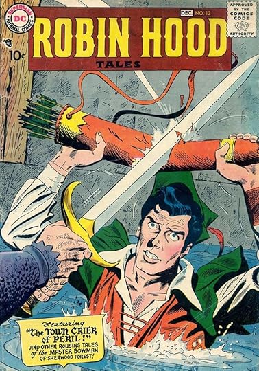
When DC Comics acquired the rights to the properties of Quality Comics in 1956, only three titles continued uninterrupted. Two, G.I. COMBAT and BLACKHAWK, became long-running successes for DC. The third, ROBIN HOOD TALES, lasted only eight issues. DC picked it up with issue #7, so perhaps the six Quality issues did not have a chance to find an audience. It must not have sold well despite some fine art by Ross Andru and Mike Esposito among others. Robert Kanigher was the editor. Ira Schnapp created the logo loosely based on the original from the Quality issues:

Ira’s version added interest with small points on the vertical sides of ROBIN HOOD and a larger hand-lettered TALES. Ira also did the caption on this and all the covers, his only involvement with the book. Interior stories were nearly all lettered by Gaspar Saladino. Since I have the space in this article, I’ll show all the DC covers.

Issue #8’s cover has a handsome shield caption with some of Ira’s Old English lettering on the story title.

The caption on issue #9 is similar with added points at the top of the shield.

Even when some of the text is the same, as here on issue #10, Ira did it anew. Three story titles required a simpler version of his Old English style.

Issue #11’s caption is again similar but much wider to fit the space available.
All these covers follow a similar pattern, no word balloons, just a caption. The art tells the story.

Issue #13 puts the caption along the bottom for a change, and the art by Andru and Esposito features one of the largest heads I can recall seeing on a DC comic.

Despite surviving so much danger, Robin Hood and Maid Marion could not survive cancellation, and issue #14 was the last issue. On the logo here, TALES is almost unreadable, it should have been dropped out in yellow, but the main selling point was ROBIN HOOD anyway. So, eight covers by Ira Schnapp on this book.

An even shorter-lived title was this one, begun in 1958 and based on the Charlie Chan television series starring J. Carroll Naish as Charlie Chan and James Hong as his son, Barry Chan. It was edited by Julius Schwartz and lasted just six issues. Ira Schnapp designed the logo using the faux Asian style he turned to for such things, which is now frowned upon by Asian Americans, but then the entire Charlie Chan concept probably is too. The frame with rounded ends is an interesting choice. Ira lettered five of the six covers too, and as I have room, I will show all of them. Ira did no story lettering, again they were all or nearly all lettered by Gaspar Saladino.

Issue #2 has the the story titles knocked out in white against a mauve background. That could have been hard to read if Ira’s lettering wasn’t as bold as it is here.

Perhaps struggling to find interesting story ideas for the character, for issue #3 editor Schwartz turned to the kind of thing he used in his science fiction anthologies, switching minds.

On issue #4, Ira did the small sound effect as well as the caption. I’m always kind of surprised his sound effects are so small. A gunshot should be large and loud to help sell the danger of the situation.

The cover of issue #5 has lettering by Gaspar Saladino, probably because Ira wasn’t available when it was needed. Gaspar didn’t letter many covers until Ira left the DC staff, but as you can see, he certainly had the skills.

The final issue is back to Schnapp lettering, so Ira did five of these covers. One thing that’s a bit surprising on this title is that there’s no reference to the TV show it’s based on, though DC must have had to acquire licensing rights. In any case, sales must have been poor for it to be cancelled so quickly.
The New Adventures of Charlie Chan TV show on Wikipedia.
More articles in this series are on the Comics Creation page of my blog.
The post Ira Schnapp in ROBIN HOOD and CHARLIE CHAN appeared first on Todd's Blog.
December 14, 2020
Ira Schnapp in G.I. COMBAT
 Images © DC Comics
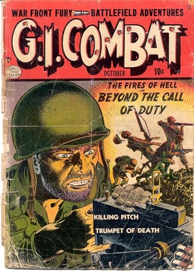
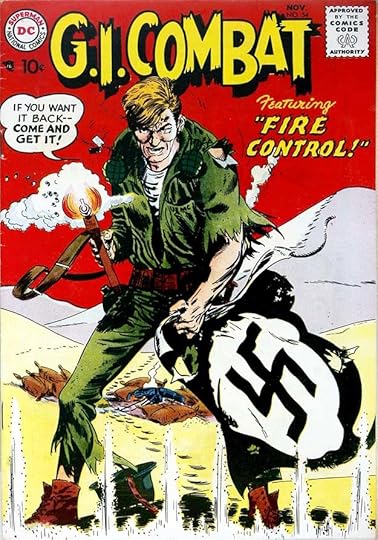
Despite its long association with DC, this title began at another company, Quality Publications, with the first issue appearing in 1952, above. The logo was excellent, though I don’t know who designed it. With the second issue, the bullet holes were removed, and that version of the logo remained on the title through 42 Quality issues and 245 DC issues to March 1987, making it one of the longest runs for a logo at the company. Quality got out of the comics business in 1956, and DC bought the rights to their properties. G.I. COMBAT was one of only three Quality titles that continued without interruption, the others being BLACKHAWK and the short-lived ROBIN HOOD TALES. (A fourth title, HEART THROBS, continued after a lapse of a few months.) At DC, the book was added to Robert Kanigher’s already successful war comics titles, and he edited it until Joe Kubert took over in the late 1960s. Many of the DC issues had cover lettering by Ira Schnapp, though he did not letter any of the stories. As with the rest of Kanigher’s books, his go-to letterer was Gaspar Saladino, who lettered most of the stories in the 1950s, and many after that.
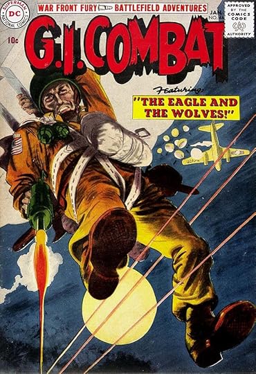
The first DC issue was #44 dated January 1957. In addition to the logo, DC kept Quality’s typeset top line for a while, and on this issue, the story title was also typeset. as had been the case on most of the Quality issues. Only the word FEATURING is by Ira Schnapp, and that could have been pulled from another cover, so I’m not counting this as having any Schnapp lettering.

With issue #45, Ira began lettering a caption on most issues in his usual styles, though word balloons were rare.
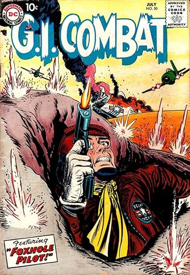
Another typical example on issue #50. Ira often used open letters with a drop shadow for his story titles.
Issue #54 is the first one with a word balloon.

For a while the story titles became larger, as on issue #70, as they did on the other Kanigher war books. Then there was a stretch of covers with no captions or balloons, just atmospheric painted art, giving this title a different feel from the other DC war magazines.
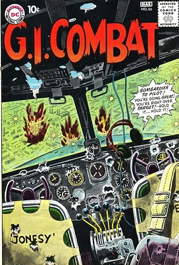
Issue #86 has an unusual switch, a radio balloon but no figures. The grim story takes a few moments to be understood.

There were a few continuing characters and features, the most popular being “The Haunted Tank,” which first appeared in issue #87. By issue #90 it rated an Ira Schnapp top line which was used on many subsequent issues. Where there’s no other cover lettering I don’t count those.

Issue #100 has an addition marking that milestone, but I believe it’s type, and there’s no other Schnapp lettering beyond the existing top line.

With issue #104 in 1964, Ira’s lettering returns in typical fashion similar to the many other DC covers he was doing at the time.
Issue #115 from 1966 shows the trend then for lots of cover lettering, and the beginnings of the team of continuing war heroes later called “The Losers.” It’s a complete turnaround from the wordless covers of two years earlier.
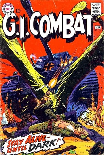
Issue #125 from 1967 has a burst caption by Schnapp that I think is one of his best, and I believe it shows him looking at the work of fellow letterer Gaspar Saladino for ideas. Gaspar would soon be taking over the company’s cover lettering after Ira departed.

Ira’s final cover work was on issue #128 from 1968, but undoubtedly lettered in 1967. He would leave the company soon after.
Here are the covers with Ira Schnapp lettering, not including repeats: 45-66, 68, 70-74, 84, 86, 90, 97-98, 104-128. That’s 56 in all.
As I said, no stories were lettered by Ira, a rare occurrence for any DC title that began in the 1950s. Some of the one page fillers look like his work at first glance, but I think they were all done by others imitating his familiar style.
G.I. Combat on Wikipedia.
More articles like this are on the Comics Creation page of my blog.
The post Ira Schnapp in G.I. COMBAT appeared first on Todd's Blog.
December 13, 2020
Rereading: MOOMINPAPPA AT SEA by Tove Jansson

The next to last of the longer Moomin novels for young readers published in 1965 takes the family away from Moomin Valley for most of the book. Moominpappa has been feeling sad and out of sorts and finally realizes it’s because his life is too planned and too easy. He decides they must all go out to sea on a new adventure, in search of a small island with a lighthouse that somehow Moominpappa feels is calling to him. Everyone is excited by the idea and they are soon underway, Moominmamma, Moomintroll, and their friend Little My, who is fearless and wants to be in on any adventure. Unknown to them they are followed by The Groke, a frightening creature who freezes the very ground and water it walks on.
Somehow they find the island with the lighthouse, which is not working. The island is uninhabited except for an old fisherman who has built a shack at the far end away from the lighthouse, and who doesn’t seem to want to talk to them. The Moomins move into the lighthouse, and Moominpappa tries to get the light going, but can’t manage it, so he settles for trying to understand the ways of the sea. Moominmamma misses her home and garden, and spends time painting the inside of the living space near the top of the lighthouse with pictures of home that become so real to her she almost forgets where she really is. Moomintroll sees some wild, magical sea horses one night frolicking on the beach, and becomes obsessed with one of them. When he does get to speak to her, she mocks and taunts him. Meanwhile, The Groke has also arrived on the shore of the island, and Moomintroll is soon involved in a risky and dangerous relationship with that creature, too. What will happen when a big storm hits the island?
Tove Jansson’s Moomins are charming, and if anything the books get better and better as they go along. This one is excellent and highly recommended. One good thing about it is the small cast, giving space for lots of character development, and you don’t have to have read the other books to understand and enjoy it.
The post Rereading: MOOMINPAPPA AT SEA by Tove Jansson appeared first on Todd's Blog.
December 11, 2020
And Then I Read: POGO, THE COMPLETE SYNDICATED COMIC STRIPS VOLUME 6
 Images © Okefenokee Glee & Perloo Inc.
As with all of these large collections of the Pogo comic strips, this one is a delight in every way. It takes me over a month to read one at about 15 minutes per day, as I find the strip too dense and full of content to go longer at one sitting. There’s so much to look at in the amazing art, and so much to enjoy in the humor and wordplay on each page. These daily and Sunday strips are from 1959 and 1960. In the dailies, a lot of time is spent covering the potential Presidential campaign of Fremount the baby bug whose only words are “Jes’ fine.” There are some appearances of a Russian bear resembling Kruschev, but otherwise the book is largely about things other than politics, with the usual silliness, confusion and droll humor among the regulars. The Sundays are even more fun, with long sequences about a purple cow and the Pogo equivalent of Boy Scouts, the Cheerful Charlies. Best of all, as if it was created just for me, is a sequence of Sundays about lettering! I think they were actually meant to amuse Walt Kelly’s letterer at the time, Henry Shikuma, who Kelly hired in 1958, and who lettered the strip even better than Kelly himself, no mean feat. Here’s a sample, reconfigured to be readable at the size I can show it on this blog:


There are more along these lines, but all the strips are terrific. This came out last year, but it and any of these strip collections are top notch reading. Highly recommended!
<br />
The post And Then I Read: POGO, THE COMPLETE SYNDICATED COMIC STRIPS VOLUME 6 appeared first on Todd's Blog.
Ira Schnapp in JACKIE GLEASON, SGT. BILKO and PVT. DOBERMAN
 Images © DC Comics
From 1956 to 1958, DC Comics launched three new Hollywood comedy titles that did not last as long as their earlier successes with Bob Hope and Jerry Lewis. JACKIE GLEASON AND THE HONEYMOONERS ran for 12 issues from 1956-1958, probably edited by Larry Nadle, and was based on several Gleason TV shows with various titles of the 1950s. I think in each case with this type of book a contract must have been negotiated with either the star, his agent, or the network outlining what the content would be. In this one, The Honeymooners was the lead and longest feature, with the rest of the book filled by shorter stories featuring other Gleason characters from his TV variety show like Reginald Van Gleason III, the Poor Soul, and Stanley Sogg. In that way it was more like the TV show than most of these Hollywood books, with Gleason (and to a lesser extent co-star Art Carney) appearing in different roles in the same series. This idea is emphasized on the first cover, above, with Honeymooners characters playing parts in a movie they’re making.
Ira Schnapp designed the logo, as he did with almost every DC title in the 1950s, and did the cover lettering and signs. Schnapp’s take on Gleason’s temper and loud voice works well, I think. Ira lettered all the covers and many of the stories inside.

On the cover of issue #2 we have the Honeymooners in more typical costumes and more great balloon lettering from Ira. Anyone who has seen the show can hear the characters saying these lines.

One advantage the comic had over the TV show was outside locations at no extra cost. Despite a good effort, the book did not continue past issue #12. Possibly the contract was for just that many issues and wasn’t renewed, or more likely the book didn’t sell well enough. To repeat, Ira Schnapp lettered covers 1-12.

On this first page from the first issue, the unknown writer seems to capture the feel of the TV show well, abetted by Ira Schnapp’s lettering.

With his lettering for the Reggie Van Gleason III story in issue #7, Ira included a handsome logo. Again we see the advantage of comics, no TV show had a budget for this kind of story!

A page from the final issue. Some of the Gleason characters are ones I don’t recall, even though my family and I watched Gleason’s shows regularly. Here are the stories lettered by Ira Schnapp, identified by series name or character:
#1 June/July 1956: Honeymooners 10pp, Fenwick Babbitt 4pp, Reggie Van Gleason III 5pp, Stanley Sogg 1pp
#3 Oct/Nov 1956: Honeymooners 10pp
#4 Dec 1956/Jan 1957: Honeymooners 12pp, Stanley Sogg 2pp
#5 Feb/March 1957: Honeymooners 10pp, Stanley Sogg 2pp
#6 April/May 1957: Stanley Sogg 2pp, Charlie Bratton 4pp
#7 June/July 1957: Honeymooners 12pp, Rudy Repairman 3pp, Poor Soul 1pp, Reggie Van Gleason 4pp, Stanley Sogg 2pp, Charlie Bratton 3pp, Poor Soul 1pp
#8 Aug/Sept 1957: Honeymooners 10pp, Poor Soul 1pp Stanley Sogg 1pp, Charlie Bratton 6pp, Reggie Van Gleason 5pp, Stanley Sogg 2pp
#9 Oct/Nov 1957: Honeymooners 12pp, Reggie Van Gleason 4pp
#10 Dec 1957/Jan 1958: Fenwick Babbitt 6pp
#11 Feb/March 1958: Honeymooners 12pp, Charlie Bratton 4pp, Poor Soul 1pp, Stanley Sogg 2pp, Reggie Van Gleason 5pp
#12 April/May 1958: Stanley Sogg 2pp, Poor Soul 1pp (first of two)
That’s a total of 162 pages.

SGT. BILKO ran 18 issues from 1957 to 1960, probably again edited by Larry Nadle, and based on The Phil Silvers Show on TV (at first called You’ll Never Get Rich) running from 1955 to 1959. In this case, each issue had one book-length story. Early issues had no ads, so the stories ran 32 pages, unusually long for any DC Comic at the time other than the annual RUDOLPH THE RED-NOSED REINDEER issues. After that ads were included, shortening the stories, which were divided into pseudo-chapters, as with other DC Hollywood comedy books. Ira Schnapp again designed the logo, this time with more bounce and an open drop shadow to allow the use of a second color. A CBS logo is in the bottom right corner, so the network may have been involved in the negotiations and format. Ira lettered most of the covers.

Speaking of negotiations, with the second issue the logo adds star Phil Silvers as a top line, and his head is in the O of Bilko. Perhaps Silvers or his agent had a hand in that. The writer does a good job with Silver’s comedic delivery in Ira’s word balloons. The CBS logo is now larger.

Issue #7’s cover is crowded with characters, lettering and logos, but still works fine to my eye, a tribute to Ira’s skill.

With issue #16 there’s a new Schnapp logo using more conservative block letters, and the Bilko head is on the left off the logo. The black and white photo doesn’t work very well with the colorful caption and trade dress. Here are the covers lettered by Ira Schnapp: 1-4, 6-9, 13-14, 16-18, thirteen in all.

Here’s the first page of the first story with Schnapp lettering. Ira worked on all the stories, though in two cases only lettered parts of them.

Here’s the last story page of issue #3 with far too much dialogue, but Ira gets it in somehow. Note the rare “32” page number.

The final story page from the final issue, #18 with a Schnapp sign. Ira’s distinctive “The End” in script is one of the ways I can identify his work.
Here’s the list of Schnapp story lettering, all stories feature Sgt. Bilko:
#1 May/June 1957: 32pp
#2 July/Aug 1957: 32pp
#3 Sept/Oct 1957: 32pp
#4 Nov/Dec 1957: 32pp
#5 Jan/Feb 1958: 32pp
#6 March/April 1958: 32pp
#7 May/June 1958: 30pp
#8 July/Aug 1958: 26pp
#9 Sept/Oct 1958: 26pp
#10 Nov/Dec 1958: pages 21-26 (6pp)
#11 Jan/Feb 1959: 26pp
#12 March/April 1959: 26pp
#13 May/June 1959: 26pp
#14 July/Aug 1959: 26pp
#15 Sept/Oct 1959: 26pp
#16 Nov/Dec 1959: pages 1-8 of 26 (8pp)
#17 Jan/Feb 1960: 26pp
#18 March/April 1960: 26pp
That’s a total of 470 pages, a lot for this many issues.

SGT. BILKO is the only DC Hollywood title to have a spin-off, and it featured Private Doberman. It was again probably edited by Larry Nadle and ran for 11 issues from 1958-1960, ending at the same time as Bilko’s book. Ira Schnapp designed the logo using very regular block letters with an open drop shadow and a different version of SGT. BILKO. The CBS logo again appears at lower right. Ira lettered this and many of the covers and stories too.

Issue #3 has some signs by Schnapp as well as word balloons.

The final issue, #11, drops the character head from the logo and features a well-designed sign by Ira. His cover lettering is on these issues: 1-3, 7-8, 10-11, seven in all.

Like the parent title, the stories were book-length but divided into chapters, and most were lettered by Schnapp, like this first one.

A story page from issue #6 with some nice Schnapp signs.

The final page from the final issue with Doberman as a failed Elvis Presley imitator. Here are the stories lettered by Schnapp, all feature Pvt. Doberman:
#1 June/July 1958: 28pp
#2 Aug/Sept 1958: 26pp
#4 Dec 1958/Jan 1959: 26pp
#5 Feb/March 1959: 28pp
#6 April/May 1959: 26pp
#7 June/July 1959: 26pp
#8 Aug/Sept 1959: pages 1-18 of 26 (18pp)
#9 Oct/Nov 1959: 26pp
#10 Dec 1959/Jan 1960: 26pp
#11 Feb/March 1960: 26pp
That’s a total of 256 pages for this short series.
More articles like this are on my Comics Creation page.
Jackie Gleason on Wikipedia, with a list and description of his characters.
The Phil Silvers Show on Wikipedia with cast credits.
The post Ira Schnapp in JACKIE GLEASON, SGT. BILKO and PVT. DOBERMAN appeared first on Todd's Blog.
Todd Klein's Blog

- Todd Klein's profile
- 28 followers

