
Todd Klein's Blog, page 91
May 12, 2021
Ira Schnapp in HOUSE OF SECRETS
In 1951 DC launched the anthology HOUSE OF MYSTERY, the first of what they called their “mystery” line. Early on, before the Comics Code, it was a much milder version of the horror anthologies published by others. After the Code went into effect in late 1954, the content switched from traditional horror themes like ghosts and werewolves to fantasy and science fiction based stories often involving some kind of alien monster. The book did well and was coming out monthly by mid 1952. Surprisingly, it took until 1956 for the company to begin this companion title along the same lines. It was edited by Jack Schiff with help from George Kashdan and Murray Boltinoff. It must also have done well, as it moved from bi-monthly to monthly in 1958. Ira Schnapp designed the logo, which has very thin outlines and open telescoping, and it remained unchanged through this book’s run. He lettered most of the covers and also one of the usual three stories in many issues until #59 in 1963.

Issue #7 from 1957 is a typical early example with a story title and a word balloon. Interestingly, the tail of the balloon does not point toward the character’s head, but perhaps it was placed wrong on the cover. Cover lettering was always done separately and then cut out and pasted on the cover art by someone in the DC production department.
[image error]Issue #13 from 1958 has a special wavy balloon shape for the ghostly face in the mist, something Ira did not do often.

Issue #23 from 1959 has lots of Schnapp lettering including a handwritten note. In this issue a new reoccurring character begins: Mark Merlin, an investigator of unusual things. He would continue to appear for many years in one story per issue.

By issue #30, a Schnapp blurb in a circle proclaimed “A Mark Merlin Mystery,” and the character is shown with his secretary/assistant Elsa. There was usually an alien or monster involved.
[image error]Science fictional storylines were also used. This cover could have appeared on MYSTERY IN SPACE.

In issue #61 from 1963, another new regular feature began, starring DC’s first combined hero and villain, Eclipso. He and Mark Merlin both appeared separately, and eventually together after Merlin went through a transformation of his own to become Prince Ra-Man, Mind Master.
[image error]Issue #75 from 1965 puts HOUSE OF MYSTERY in a corner to leave room for new Ira Schnapp logos for Eclipso and Prince Ra-Man. This move toward characters looking and acting more like superheroes may have been an attempt to boost sales, which were flagging.

Issue #80 dated Sept-Oct 1966 was the last of this run, and the last to feature Ira Schnapp lettering. The book would be revived a few years later by editor Joe Orlando, but Ira was gone by then.
Here are the covers lettered by Schnapp: 1-7, 9-14, 17-27, 29-80. That’s 76 in all.

Here’s the first page of the first story lettered by Ira in this series, from issue #3 of 1957. His style is evident in the title and the small, squareish lettering with question marks that are like a tiny 2 over a period. There’s one in the thought balloon in the first panel.
[image error]This story from issue #13 needed some newspaper headlines, which were no problem for Ira.
[image error]The story Schnapp lettered in issue #22 from 1959 has a title very much like ones he used on covers.
[image error]Schnapp lettered the first Mark Merlin story in issue #23, and his circular blurb began here.
[image error]For a character with no powers, Merlin sure got around! For this story title in issue #37 from 1960, Ira added wavy outlines to his standard open letters with less than successful results.
[image error]I like the title on this one from issue #56 much better.
[image error]By issue #59 from 1963, Ira had created a handsome new feature logo for Mark Merlin that first appeared in issue #56. It would not be used for long, though, as the character became transformed into Prince Ra-Man in issue #73. Schnapp did a logo for him as well, seen above. This is the last story lettered by Ira in this series. The most frequent letterer after this was Stan Starkman.
Here are the stories lettered by Ira Schnapp:
#3 March-April 1957: The Bad-Luck Charms 6pp
#13 Oct 1958: The Face In The Mist 6pp
#17 Feb 1959: The Man Who Hated Good Luck 6pp
#18 March 1959: The Criminal Who Couldn’t Be Caught 6pp
#21 June 1959: The Girl From 50,000 Fathoms 7pp
#22 July 1959: The Man Who Changed History 8pp
#23 Aug 1959: Mark Merlin 8pp
#25 Oct 1959: Prisoners of Mechanical Island 8pp
#26 Nov 1959: Mark Merlin 8pp
#34 July 1960: Bodyguard to a Planet 8pp
#37 Oct 1960: Mark Merlin 9pp
#41 Feb 1961: The Wizard’s Revenge 8pp
#43 April 1961: The Imprisoned Mind 8pp
#44 May 1961: The Valley of Doomed Creatures 9pp
#46 July 1961: The Pied-Piper Creature 8pp
#49 Oct 1961: Captives of the Parallel World 9pp
#50 Nov 1961: Pageant of the 300-Year Doom 8pp
#52 Jan-Feb 1962: The Alien Trap That Backfired 8pp
#59 March-April 1963: Mark Merlin 10pp
That’s a total of 152 pages on this title. Not much for Ira, but he was very busy elsewhere!
Articles like this on every DC title Schnapp had work in are on the COMICS CREATION page of my blog along with others you might enjoy.
The post Ira Schnapp in HOUSE OF SECRETS appeared first on Todd's Blog.


May 10, 2021
IRA SCHNAPP’S DC NEWSPAPER STRIPS Part 3
 This and all images © DC Comics. From Batman Sunday #119, Feb 10 1946.
 Original art images courtesy of Heritage Auctions, ha.com
There have been several Batman newspaper strips since the character was created in 1939. None lasted nearly as long as the Superman strip. The first ran from 1943 to 1946, and much of the run was lettered by Ira Schnapp, as with the Superman strip. In fact, Ira started on the Batman one a few months before Superman. In this article I’ll cover his work on the dailies first, then the Sundays. I’ve looked at examples from the brief 1953 version and I’ve also looked at the version that began in 1966, examining all the strips through 1969. I didn’t find any Schnapp work in those. Later versions ran after Ira’s death. Above is a panel from the only Sunday I could find from the early Batman strip. The lettering by Ira is very similar to what he was doing on the Superman strip at the same time. The original art is very large, about 19 by 26 inches, allowing the lettering to be about a half inch tall, twice the size of what I was doing when I started lettering comics in 1977. The daily strip originals are equally large, in fact slightly wider.
 From Batman Daily Oct 10, 1943
All my scans of printed dailies come from the book “Batman The Dailies 1943-1946” published by Sterling in 2007, but reprinting the earlier three volumes published by Kitchen Sink Press/DC Comics in 1990, so the introductions by Joe Desris date from that time. They are excellent and full of great information. One thing I was interested to learn is that Bob Kane is credited as penciller on many of the dailies. Kane was well known as an artist who hired ghosts and assistants to produce much of the Batman work with his name on it, though having his name as sole creator was in his contract with DC. The work of his assistants and ghost artists like Jerry Robinson, George Roussos and Dick Sprang is well known, but even though he did little work on the Batman comics after 1943, Kane did like working on the daily strip. Like many artists of his generation, he considered comics small time and strips big time. This panel is credited as Kane pencils and Charles Paris inks. For lettering, Joe Desris simply says it was done by the DC bullpen. I think this and other early strips were lettered by George Roussos. He and Robinson had been hired directly by DC to work on Batman material by 1943, and both worked in the DC bullpen, a large room with desks for staffers and freelancers. Roussos used a distinctive exclamation point with a triangular wedge over a large period, as here.
 From DETECTIVE COMICS #83, Jan 1944
Compare this panel lettered by Roussos from a comics story of the same period. The pen used for the letters has more of a wedge tip giving thick and thin variation to the lines, but the exclamation points are the same and so are the letter shapes.
 From Batman daily Feb 14, 1944
Other letterers followed Roussos, such as the one in this example. I don’t have names for them, they were probably also working in the DC bullpen.
 From Batman daily Aug 18, 1944
This panel is from the first strip I believe was lettered by Ira Schnapp. Many of the letter shapes here are similar to the style Ira would settle on later in his career, and the small question marks are beginning to look like that too. Even the balloon shapes composed of large scallops are similar. This work is actually closer to 1950s Schnapp lettering than what he did early in his Superman strip run, suggesting that there he was trying to follow what Frank Shuster, the letterer before him, had done. On this example notice that the letter M has two variations. Some have vertical sides, which is what Ira would stick with later, while some have angled sides, which is what the previous letterers on this strip were doing. I think that shows Ira was trying to match his lettering style to the strip at least somewhat, though over time those differences disappeared and his own preferred style dominated.
 From Batman Daily Sept 2, 1944
As with the Superman strip, Ira didn’t letter them all once he started, there were a few gaps lettered by others. Above is a panel from the last strip lettered by Schnapp in his first batch.
 From Batman daily Sept 4, 1944
The next strip is lettered by someone else, I don’t know who. Notice the wider spacing between lines, the more angular S and a very different question mark.
 From Batman daily Sept 18, 1944
Ira’s lettering returned on this strip, inked by Charles Paris, who was the main inker throughout this run of dailies. Joe Desris interviewed Paris about his work on the strip, and quotes him in this paragraph:
“When I first started inking, Kane’s father was bringing Bob’s stuff into the office.” After passing through the hands of editor [Jack] Schiff, Paris explains that “The strip came to me with all the panels pencilled and all the balloons lettered. Ira Schnapp lettered most of this material. Sometimes he worked at home and sometimes he worked in the bullpen. I do remember taking stuff up to his apartment; he lived around 72nd or 73rd Street, on the west side.”
This is great confirmation of Ira’s lettering work! Ira and his family lived in an apartment at 515 West 110th Street from about 1935 until Ira’s death in 1969, so Paris has that detail wrong, but the rest sounds right. Ira’s son Martin remembers his father working on his lettering at home beginning in the early 1940s when he was a boy, though Martin did not recall exactly what that work was or when it started. Paris’s memory of Ira sometimes working in the DC bullpen in this period (1944-46) puts him there earlier than I expected, but seems perfectly plausible. Many freelancers would spend some time in the bullpen even if they also worked at home.
 From Batman daily Oct 2, 1944
This example has very typical Schnapp question marks. Some of the R’s have upward curved right legs coming from a loop that does not connect to the left leg. This is a style point Ira must have picked up from looking at the lettering of Frank Shuster on Superman strips, which he was taking over right around this time. It’s interesting to see it appearing here in Batman, not something that happened often. The lettering is also wider than Ira’s later work, another tendency he might have picked up from Frank.
 From Batman daily Oct 30, 1944
On the other hand, when he had less space and needed to make his letters narrower to fit, Ira’s work is much more like what he usually did later. George Roussos lettered another batch of strips from Nov 20 to Nov 25, 1944, then Ira returned for a long stretch.
 From Batman daily Jan 27, 1945
On this example there are no open loops or curves on the R, but the M still has slanted sides, unlilke what he was doing on the Superman strip.
 From Batman daily original art, April 28, 1945
Heritage Auctions has a handful of original dailies, and they give a much clearer look at the lettering, which was always somewhat distorted in printing. In this example, Ira is again using upcurved right legs on the R in some places. Notice how the S is getting narrower and often has a straight section in the center, a trend that would eventually take over. Ira apparently didn’t feel it was necessary to point the woman’s balloon toward her mouth. The line through the art at the bottom shows where the daily strips were rephotographed at a smaller height for some papers. The bottom strip of art would have been covered by a pasted-on strip of white paper for that. The strips were sent out to newspapers in both versions.
 From Batman daily original art, May 5, 1945
Another example with a large sound effect by Ira. Larger than he usually did at the time, so he was probably following what was pencilled by Jack Burnley in this case. Note also that the modern version of a thought balloon is in the first panel, nothing like what Ira was doing in the Superman strip at the time following the style used there established by Frank Shuster. Another example of ways in which Schnapp was tailoring his lettering to work best in each strip.
 From Batman daily original art, July 23, 1945
This art example shows more clearly how DC prepared the strip. They added the copyright text at lower left, photographed the strip at full size, then drew the line for the less tall version, covered the part below the line with pasted-on white paper (now removed) and added another copyright text for that version. Emphasized words were less common in the Batman strip than in the Superman one. Here Ira uses the same thicker pen point for that as on Superman, and there are a few R’s with curved right legs, even though the M’s have angled sides. Perhaps it was hard to keep his style points in mind!
 From Batman daily Oct 30, 1945
This panel shows a different style for emphasis on the personal pronoun I: it’s slanted and bold, and retains the serifs that such personal pronouns usually had to make them read well, even though most of the other letters had no serifs. Bold italic for emphasis became the standard style eventually.
 From Batman daily Jan 29, 1946
This sample from a few months later is back to non-italic emphasis. Note that Ira’s question marks were not all the same, he often did larger and rounder ones at the end of a balloon. Here all the M’s have vertical sides but the R’s still have curved right legs. Most of the letters would fit into a square, typical of Ira’s later mature style.
 From Batman daily Feb 11, 1946
This is a panel from a series of strips dated Feb 11 to March 23 pencilled and lettered by Dick Sprang and inked by Stan Kaye. It was the only work by either on the strip. Sprang’s lettering style is similar to that of George Roussos. One may have copied the other, I don’t know. Both have similar letter shapes and exclamation marks. It’s possible the lettering was actually by Sprang’s wife Lora. She lettered much of his work under the pen name Pat Gordon, though why she even needed a pen name isn’t clear since the lettering was never credited, but I suppose to keep things separate for DC accounting and payment. Lora had been taught lettering by her husband, and their styles are about the same. After this storyline, Ira returned to letter most of the remaining strips.
 From Batman daily April 24, 1946
This panel has a rare radio balloon from Ira, and an even rarer sound effect inside that balloon. Note that the lettering in that balloon is all italic to set it apart from the spoken dialog.
 From Batman Daily Nov 28, 1946
The final panel from the final daily strip in this run. Joe Desris presents several theories as to why the strip did not do as well as Superman, and one is the cartoony approach, which did not compete well with other adventure strips of the time like Tarzan, Flash Gordon and Prince Valiant. Whatever the reason, it went no further for many years.
 From Batman Sunday Nov 11, 1943
Like the dailies, I think some of the early Sunday strips were lettered by George Roussos, as above.
 From Batman Sunday Jan 16, 1944
And here’s lettering by the same unknown person doing the dailies in early 1944. The S’s are very angular reminding me of what John Workman would do a few decades later.
 From Batman Sunday April 16, 1944
Another unknown letterer whose letters are more similar to what Ira Schnapp would soon be doing. Perhaps he took this person’s work as his style guide for the Batman strip.
 From Batman Sunday Aug 27, 1944
A panel from Ira’s first Sunday strip, probably done around the same time as his first dailies. The question mark is clearly his, and the letter shapes, but the letters are again wider than what he would do later. This may be partly because he had the room. Those large Sundays must have seemed expansive.
 From Batman Sunday Oct 22, 1944
In this example Ira’s letters are getting narrower perhaps partly to fit them in to the space available.
 From Batman Sunday Nov 5, 1944
This handwritten letter by Ira uses an older version of the script letter E that Ira often used in his display lettering, but I haven’t found it on many other similar hand-written notes in the comics. While the note was lettered carefully, it suggests Ira was using that E in his own handwriting at the time, which makes sense, and is a gratifying discovery.
 From Batman Sunday Jan 14, 1945
Once he started on the Sundays, Ira lettered nearly all of them, even when he wasn’t doing the dailies. This was possible because the artists on Sundays and dailies were often different, and the storylines were not connected. This panel has an even earlier use of the now standard thought balloon which Schnapp did not begin to use in the Superman strip for several more years. Again we see he doesn’t feel it important to point the tails toward the character’s mouths or heads.
 From Batman Sunday, July 8, 1945
In this example the M’s have vertical sides rather than angled, and the R’s have curved right legs. Ira’s early lettering sometimes leans slightly to the left, as here.
 From Batman Sunday Nov 4, 1945
The second balloon in this example shows how letterers change the width of letters in some lines to make them fit better. The fourth line is much more condensed than the others. This is something that comes with practice, you can tell when you need to make that adjustment and it’s made almost automatically.
 From Batman Sunday Sept 1, 1946
As the strip gets close to its end, compare the examples above to this one and notice how it has changed subtly even in these three years, yet there are also enough consistent elements to confirm it’s by the same person. There’s also the factor of how quickly it had to be done to meet a deadline, that can alter the look of the lettering, too.
 From Batman Sunday Nov 27, 1946
A panel from the very last Sunday, and with Ira Schnapp lettering to close it out. Ira would move on to lots of other work at DC Comics and of course would continue to letter the Superman strip for decades. Below is a list of the Batman strips lettered by Schnapp. I’m using the strip numbers, but they are often missing or hard to read on the strips, and there were a few numbering errors. I’ve counted all the strips to make sure the amounts are right, and the strip dates are the best way to find them.
DAILIES
#251 (8-18-44) to #264 (9-2-44), #277 (9-18-44) to #331 (11-18-44), #338 (11-27-44) to #715 (2-9-46), #752 (3-25-46) to #913 (9-28-46), #920 (10-7-46) to #943 (11-2-46)
SUNDAYS
#43 (8-27-44) to #153 (10-6-46), #156 ( 10-27-46)
That’s 632 dailies, which is roughly equivalent to 316 comics pages and 112 Sundays which is roughly equivalent to 224 comics pages for the equivalent of about 540 comics pages on this strip.
This wraps up my look at Ira Schnapp lettering in comic strips. DC also did a Wonder Woman strip, but that was lettered by Jim and Margaret Wroten using the Leroy template system as the Wonder Woman comics were at the time. DC’s sister company All-American Comics put out a newspaper strip for their character Hop Harrigan in 1942 that lasted just a few months and it was not lettered by Ira.
More articles you might enjoy are on the Comics Creation page of my blog.
The Batman newspaper strip on Wikipedia.
The post IRA SCHNAPP’S DC NEWSPAPER STRIPS Part 3 appeared first on Todd's Blog.
May 9, 2021
And Then I Read: PIRANESI by Susanna Clarke

This is a remarkable recent book by the author of “Jonathan Strange and Mr. Norrell” and “The Ladies of Grace Adieu.” Piranesi has lost much of his memory, all that happened to him before he came to the The House, an immense building that seems to have no end, but he doesn’t realize that as the story opens. He is the narrator of the book, but not a reliable one, though through the discoveries he makes as the story takes place, he gradually regains his memory and the entirety of what has happened to him is revealed.
The House seems to be a place not of our world. It is generally calm and quiet. An unseen ocean must lap around it because tides from that ocean come and go on the lower floors, and occasionally rise into the upper ones. The building has countless rooms and stairways, and decorating most of them are beautiful statues depicting people, animals, mythic beings, and all kinds of events and activities. There are birds that enter and sometimes live in the House. There are sea creatures in the watery lower levels, where Piranesi fishes and gathers shellfish and seaweed for sustenance, but mostly the vast building is empty. Piranesi spends much of his time exploring and writing about The House in his journals. One other person is sometimes there, who Piranesi calls “The Other.” He is a man who seems to be from another place, a man who wears fine clothes and has odd devices. Sometimes he helps Piranesi by giving him things he needs like clothes, and Piranesi often helps The Other with his rituals and reports to him on what he’s found in his explorations. The Other believes The House holds the key to great powers, and he wants to find them.
Gradually, as the story unfolds, Piranesi begins to learn more about The Other and how he came to be in The House. There are many things that trouble him, and even his own memories are suspect. Clues to the truth are found in things The Other tells him, and when Piranesi meets another person in The House, more clues are revealed. There are things in Piranesi’s own early journals that help him regain memories he has lost, but The Other tells Piranesi that they are both in danger from yet another person that is trying to find him and kill him, adding suspense and drama to the story. Piranesi himself is brave and resourceful, but also afraid not only of the dangers predicted by The Other, but by his own past and uncomfortable flashes of memory. When he begins to find signs of another person in The House, he feels he must contact her to find out the truth.
This is the best book I have read in a long time. The language and atmosphere are beautiful and intriguing, the mystery of the main character is fascinating, and Piranesi himself is complex and simple at the same time, a person I felt kinship with. The setting is equally fascinating, and the book is full of wonders. There are subtle connections to the painter Piranesi and also C.S. Lewis’s book “The Magician’s Nephew,” but they aren’t really important to the story.
Highly recommended.
The post And Then I Read: PIRANESI by Susanna Clarke appeared first on Todd's Blog.
May 6, 2021
IRA SCHNAPP’S DC NEWSPAPER STRIPS Part 2
 All images © DC Comics. From Superman Sunday Oct 23, 1949
As with the Superman daily strips, Ira had a very long run on the Sundays. Above is the top half of a full-page version of the strip (it was provided in several formats to newspapers: full page, half page and third page) and it includes a variation of Ira’s Superman logo done by him for the strip at this time. Ira’s small, square letters are in his familiar style then, but let’s begin at the beginning.
 From Superman Sunday Nov 14, 1943
Joe Shuster’s brother Frank had been the regular letterer on both the Sunday and daily Superman strips from early 1940. Above is a panel from the last Sunday I think he lettered. Notice his wide, regular style and the letter R with the loop not connected to the left leg. Note also his question mark style which has a single loop over a period. For more on Frank’s strip lettering see THIS post.
 From Superman Sunday Nov 21, 1943
The following Sunday has a similar style, but I think it’s lettered by Ira Schnapp imitating Frank Shuster. For instance, Frank’s letter G is an oval with a serif at the center, while Ira usually used one with a vertical right side, as in the word AGAIN here in the last balloon, though the other G in LONG is more like Frank’s. The R’s here are similar to Frank’s but not quite the same, and that’s true of many of the letters.
 From Superman Sunday Nov 28, 1943
The next Sunday has typical Ira Schnapp question marks which have a double curve like a small 2 over a period, a style he used through most of his lettering career. Again, this example is similar in general to Frank Shuster’s work, but not the same. Ira had revamped Joe Shuster’s Superman logo in 1940 (his version first appeared on the cover of SUPERMAN #6 cover-dated September 1940), and Superman creators Siegel and Shuster certainly knew his work on that. Ira created several variations of that logo in the early 1940s for copyright applications, and I think would have been available as a letterer in 1943, as he was not yet very busy with similar work on DC comics story pages. That made him a good choice to replace Frank when he was called into the Army in late 1942, though Frank somehow was able to continue on the strips for about a year.
 From Superman Sunday Dec 5, 1943
The next Sunday has another typical Schnapp question mark in the first balloon, and a less convincing one in the second balloon, but I think this is Ira’s work. He became the regular letterer on Superman Sundays from this time forward.
 From Superman Sunday Nov 26, 1944
By about a year later, Schnapp’s style had gradually become more like what he would do for the rest of his career. The letter R is now made like a P with the right leg coming down from the loop.
 Superman Sunday Dec 10, 1944, this and other images of original art courtesy of Heritage Auctions, ha.com
Here’s the original art for the earliest Schnapp-lettered Sunday I could find. Note that Ira’s Superman logo is being used at the top, it replace one drawn by Joe Shuster with the strip for Jan 16, 1944. It would continue until the one shown at the top of this post began in 1949. The creator credit for Siegel and Shuster is still present, as it had been from the strip’s beginning, but by this time Siegel was in the army and no longer scripting, Joe Shuster was doing very little drawing because of his worsening eyesight, and most of the strips were being drawn by his assistant Wayne Boring. Boring had been hired directly by National (DC) Comics to draw the strip. Scripts were probably by DC editor Whitney Ellsworth, and Ira was lettering. As with the daily strip, the art was very large, this strip is 19.5 by 25.5 inches, and created on two pieces of paper. You can see the join line between the second and third tiers. Half of a Sunday was about the size of two daily strips, and the entire Sunday was roughly the same amount of work as two comics pages.
 From Superman Sunday Dec 10, 1944
A closer look at one panel. Already some influences of Frank Shuster are fading: the letters are less wide, many would fit into a square, as was usual for Ira Schnapp’s work, and the question marks are looking more like what he would do later. Emphasis still follows the Frank Shuster style of bold but not italic. I estimate the lettering height to be about a half inch, about twice what I was asked to do when I started lettering comics in 1977.
 From Superman Sunday Jan 20, 1946
Another panel from original art of 1946. The overall look is similar, but a little less even, suggesting it was done in a hurry. The letter S is beginning to often have a straighter middle bar. Some R’s have curved right legs, some don’t. The open next week title letters are pretty rough for Ira, again a sign this was lettered quickly, probably to meet a deadline.
 From Superman Sunday Nov 7, 1948
By late 1948, Siegel and Shuster’s credit had been removed after they sued DC in a failed attempt to get ownership of their creation, Superman, replaced by an art credit for Wayne Boring. That would continue for years. You can see how the Superman logo is getting crowded out, which is probably why they went to the thin header across the whole strip seen earlier.
 From Superman Sunday Nov 7, 1948
A closer look at one panel of the same strip shows lettering that’s even more like typical Ira Schnapp work, including narrower letters, and the question mark is getting smaller and more angular.
 From Superman Sunday Jan 29, 1950
As with the daily strips, Ira did not letter all the Sundays, there are gaps, but usually not more than one to three strips, perhaps when he was away on vacation or otherwise unable to do them. On two larger gaps in 1950, the lettering, sample above, somewhat resembles that of Frank Shuster with R’s that have loops that don’t quite connect and underlined words for emphasis. I considered whether this could be Frank’s lettering, but it seems unlikely that DC would have hired him then so soon after the lawsuits began, and this isn’t really all that close to what Frank was doing. I think it’s by someone else imitating his style, perhaps Wayne Boring himself, but that’s a guess. Boring had worked with Frank since the Siegel-Shuster studio days in Cleveland, Ohio, so he certainly knew the style.
 Superman Sunday Nov 26, 1950
This original art from November, 1950 shows the half-page format with a different small title panel only crediting Wayne Boring.
 From Superman Sunday Nov 26, 1950
A close look at one panel shows typical Ira Schnapp lettering for the time. Most of the R’s have straight right legs. The G is made with a single stroke and has a vertical right side. Where he had room, as here, Ira was still going somewhat wider.
 From Superman Sunday June 8, 1952
By 1952, the lettering was nearly always this narrow, again with most letters fitting in a square, and the S is getting more angular.
 From Superman Sunday Sept 12, 1954
Very typical Schnapp lettering for 1954. Note that Superman’s thought balloon now uses the later standard tail of diminishing bubbles and the emphasized words are bold italic.
 From Superman Sunday April 28, 1957
Here’s an odd style point from 1957, the words PUFF! are surrounded by parentheses, the early style for words that are breath only, but these are within thought balloons, so how does that work, exactly? I’m sure Ira was just following the script.
 From Superman Sunday March 8, 1959
Another original art panel from 1959 with very typical and recognizable Schnapp lettering, but notice the R in ETHEREAL has a curved right leg, a holdover from Frank Shuster’s influence. The S in GHOST is very narrow and angular, one way Ira saved space when the words were a tight fit. I like that you can see individual pen strokes here, something you can’t make out on printed strips.
 From Superman Sunday Jan 28, 1962
At some point in the late 1950s, editor Mort Weisinger added the strips to his editorial duties, and usually that meant plots for the strips were pulled from past comics. This sort of time travel story is one, where Superman flies through large year numbers, of course lettered by Ira. Mort made a few style changes. One was to make all thoughts and captions italic. This did help set them apart from regular speech balloons. Mort also rehired Superman creator Jerry Siegel to write/adapt the stories into strip form, reuniting him with artist Wayne Boring, though Jerry’s involvement was kept quiet and he received no public credit.
 From Superman Sunday March 1, 1964
As the strip began to show its age and run out of steam, so did Ira’s lettering. He was about seventy when this was lettered, and it shows in the uneven look. His horizontals and verticals are no longer as straight as they once were, and the letter shapes are somewhat wobbly. Note that around the word GASP! are the later version of breath marks.
 From Superman Sunday May 1, 1966
Here are the last two panels of the very last Superman Sunday strip. Too bad Superman couldn’t add Ira Schnapp, Jerry Siegel and Wayne Boring to his list of people to thank!
Below is a list of all the Sunday strips lettered by Ira Schnapp.
#212 (11-21-43) to #252 (8-27-44), #255 (9-17-44) to #304 (8-26-45), #306 (9-9-45) to #316 (8-18-45), #318 (12-2-45) to #320 (12-16-45), #324 (1-13-46) to #362 (10-6-46), #364 (10-20-46) to #386 (3-23-47), #388 (4-6-47) to #464 (9-19-48), #467 (10-10-48) to #532 (1-8-50), #542 (3-19-50) to #564 (8-20-50), #569 (9-24-50) to #584 (1-7-51), #587 (1-28-51) to #588 (2-9-51), #593 (3-11-51) to #636 (1-6-52), #639 (1-27-52) to #726 (9-27-53), #729 (10-18-53) to #772 (8-15-54), #775 (9-5-54) to #804 (3-27-55), #809 (5-1-55) to #854 (3-11-56), #857 (1-1-56) to #882 (9-23-56), #885 (10-14-56) to #980 (8-10-58), #988 (10-5-58) to #1042 (10-18-59), #1047 (11-22-59) to #1096 (10-16-60), #1099 (11-6-60) to #1148 (10-15-61), #1151 (11-5-61) to #1171 (3-25-62), #1173 (4-8-62) to #1193 (8-26-62), #1196 (9-16-62) to #1213 (1-13-63), #1218 (2-17-63) to #1222 (3-17-63), #1225 (4-14-63) to #1248 (9-22-63), #1252 (10-20-63) to #1273 (3-15-64), #1278 (4-19-64) to #1303 (10-11-64), #1307 (11-8-64) to #1326 (3-21-65), #1333 (5-9-65) to #1353 (9-26-65), #1358 (10-31-65) to #1380 (4-3-66), #1386 (5-1-66)
If my math is right, that’s 1,083 Sundays, or the rough equivalent of 2,166 comics pages, lots of work for Ira. Next time I will look for his lettering in Batman newspaper strips.
Other posts like this are on the Comics Creation page of my blog.
The post IRA SCHNAPP’S DC NEWSPAPER STRIPS Part 2 appeared first on Todd's Blog.
May 3, 2021
IRA SCHNAPP’S DC NEWSPAPER STRIPS Part 1
 All images © DC Comics. From Superman Daily March 9, 1948, image courtesy of Heritage Auctions ha.com
In addition to his comic book lettering, I’ve long known that Ira Schnapp worked for many years on the Superman newspaper strip. The sample above from original strip art of 1948 has his distinctive question mark and characteristic square letters, but when did he start? That question is one I’ve been researching over the last few weeks, looking closely at the many strip reprint books and, where those are not yet available, printed strips in period papers at newspapers.com. My conclusion is that Ira took over lettering the strip in late October 1943, replacing Frank Shuster, the brother of original Superman artist Joe Shuster, who had been the main letterer since early 1940. For more on that, see THIS article. Lettering on the strip has never been officially credited, so I have only style comparisons to work with, but Ira seems like a good candidate for the job. He had revamped Joe Shuster’s Superman logo in 1940 (Ira’s version first appeared on the cover of SUPERMAN #6 cover-dated Sept-Oct 1940), and Superman creators Siegel and Shuster certainly knew his work on that. Ira created several variations of that logo in the early 1940s for copyright applications, and I think would have been available as a letterer in 1943, as he was not yet very busy with similar work on DC comics story pages. In this post we’ll look at examples through the 1940s and into the 50s and 60s when Ira was the main letterer, seeing if we can trace consistent style elements.
 From Superman daily Oct 21, 1943
I think the last week of daily strips lettered by Frank Shuster are dated Oct 18-23. Above is a panel from one of those. Notice the shape of the question mark as Frank usually made them: a single curve over a period. Frank’s letter R’s continue to usually have unconnected loops, his round letters are very round, and his lettering in general is very regular.
 From Superman daily Oct 25, 1943
With the daily strips of the following week I detect a change of style, but it’s subtle and it took me a while to notice it. The letterer is successful in imitating Frank Shuster’s style in general, but these letters are not quite as regular. Some of the letter R’s don’t connect, as per Frank, but some do, as if that was not a natural choice. Most telling are the question marks like the two in the last balloon here. They’re smaller, and they make a double curve sort of like the number 2. That question mark style is one of the best ways to identify the lettering of Ira Schnapp, and I believe he took over the Superman dailies at this time.
 From Superman daily Oct 27, 1943
Another panel from the same week with another Schnapp question mark, and if you compare these examples with the ones above, I find it believable that they are by two different people.
 From Superman Daily Nov 24, 1944
By 1944, Ira’s lettering on the dailies is getting more regular and confident. He’s still using some style elements from Frank, especially the unconnected R, but again he doesn’t always remember to do it that way.
 From Superman Daily Nov 27, 1944
This strip from a few days later seems a bit farther from the Frank Shuster model. In some ways it’s clearly an imitation of what Frank was doing, with wider letters than what we saw later from Ira, but those letters are generally less curvy than Frank’s, and the R is often constructed differently. It’s made like a P with the right leg descending from the loop in a separate stroke. The question marks are not quite what Ira would do later, but they’re close. The balloon shapes match Frank’s exactly, but perhaps they were pencilled in by artist Wayne Boring on both strips. In 1942, DC hired Joe Shuster assistant Wayne Boring directly to draw the strips for them, and that may have made the transition to Schnapp as letterer easier. Note that DAILY PLANET is italic or slanted letters, something Frank Shuster never did. Frank would have underlined it.
 From Superman Daily Dec 11, 1944
By December 11th, the lettering is looking more like what Ira Schnapp would be doing for most of his career, less wide, very regular, with straight horizontals and verticals.
 From Superman Daily Jan 24, 1945
Jerry Siegel had an unusual way of indicating thoughts to be lettered, surrounding them with parentheses, AND quote marks AND dashes. The balloon shape still has the same style and tail as speech balloons. By the time of this early 1945 example, Jerry was serving overseas in the Army, and no longer writing the strip, but his styles like this one continued to be used for years, I suppose to keep from confusing regular readers. I don’t think this style for thoughts was used anywhere else other than on Superman.
 From Superman Daily March 5, 1945
Ira also followed the styles for emphasis of Frank Shuster, using both a thicker pen for the most emphasis and underlining for less. The line BEEN SO EMBARRASSED is a tight fit, and Ira has lettered it with narrower letters that look more like his later work. The Ogies in the story are invisible, hence the odd balloon tail going to no one.
 From Superman Daily March 31, 1945
Sometimes the R’s have right legs that curve up at the end, similar to what Frank Shuster did, but still constructed differently, with those legs attached to the bottom of the loop. Perhaps this was Ira trying to keep that element from the earlier lettering. Everything else matches his style. R’s like this with curved right legs were often used in Ira’s early years and continued to show up occasionally right to the end of the strip in 1966.
 From Superman Daily April 30, 1945, image courtesy of Heritage Auctions ha.com
Newspaper reproduction of the strips was never great, and the original art, where I can find it, better represents what the lettering actually looked like. For one thing the lettering strokes are thinner than nearly all the printed versions. As was usually the case, original strip art was done quite large in the early years. The strip this is from measures 19.5 inches wide by 6 inches high. I estimate the letters are about a half inch high, about twice the size of what I was doing when I started lettering comics in 1977. That was after art size for comics in general had been reduced to save paper and make color separations easier in the early 1960s. It seems like it would have been a bit easier to make such large letters. Wayne Boring used Craftint paper which had a preprinted halftone dot screen that was revealed when you brushed a Craftint chemical on it. The dots have faded, but you can see how it worked.
 From Superman Daily July 27, 1945
An early appearance of Superman annoyance Mr. Mxyzptlk, and again where there’s less room, Ira’s lettering looks more like what he did later. The S becomes noticeably narrower, for instance.
 From Superman Daily Aug 27, 1945
While Ira was the main letterer on Superman dailies, he didn’t do all of them. There are brief breaks with strips lettered by others, and this is from the first one of those running from August 27 to September 8 1945. This lettering is very standard comics work with none of the style points I associate with Schnapp. Note the G has a wide serif in the middle extending both ways, which Ira’s does not. I don’t know who did it.
 From Superman Daily Sept 10, 1945
With the September 10 strip, Ira is back. There are gaps like this through his entire run, rarely more than a week or two of strips. A newspaper strip is a relentless grind, and everyone needs a break from that at times.
 From Superman Daily Nov 8, 1945
Ira’s question marks were not always the same, especially early ones. These are more rounded than what he would usually do later, but even then there was some variety.
 From Superman Daily April 6, 1946
The question marks here are closer to the angular look of his most frequent later style. Note that Ira is now following Frank Shuster’s style for newspaper names by underlining them. Generally underlining is not considered proper style for comics, but it continued to be used for years in this strip.
 From Superman Daily May 22, 1946
Ira usually did thicker pen lines for emphasis, but on the word I here he’s also made it italic and given the letter serifs at the top and bottom. The non-emphasized I above that also has serifs, and they began to appear on personal pronouns in the previous months, but they were not used a year earlier. I’m thinking that way of making personal pronouns stand out and read correctly began around this time. An I without serifs works best inside words, and that was always the standard.
 From Superman Daily Nov 26, 1946
Clark’s thought balloon in this strip is now using the more modern border style of a trail of bubbles rather than a tail, though the Siegel thought style is still present in the lettering.
 From Superman Daily Feb 5, 1947
In this larger lettering for YOWLP! I see the beginnings of the display lettering style Ira would later use on comics covers.
 From Superman Daily May 27, 1947
The parentheses around the words GASP are the earliest style for words that indicate breath only, no voice. Later they became broken or dashed parentheses, and the dashes gradually turned to point toward the letters in the style most common by the early 1960s, what I call breath marks.
 From Superman Daily Nov 29, 1947
Signs in the art, like these newspaper headlines, were usually also done by the letterer, and these are clearly in Schnapp’s style. Note that Lois’s thought balloon does not use the Siegel style, but that may have been an error by the writer, as it continued to be used later. The question mark in her balloon is Ira’s typical later style like a small 2 over a period.
 From Superman Daily Jan 29, 1948, image courtesy of Heritage Auctions ha.com
And that brings us back to the standard Ira Schnapp lettering style of the late 1940s that began this post. Note that the black line through the bottom of this strip indicates where it was photographed for reproduction at a smaller height. The strips were offered to papers in both the taller and shorter versions. Other than brief stints by others, Ira continued to letter most of the dailies until they ended in 1966.
 From Superman Daily Nov 28, 1949 in the Honolulu Star-Bulletin
The earliest Superman strips were first reprinted by DC Comics and Kitchen Sink Press starting in 1999. Those dailies ran from 1939 to 1942. Then IDW issued two series of daily strip hardcovers reprinting strips from 1942 to 1949 (Golden Age) and 1959 to 1966 (Silver Age). A third series (Atomic Age) is planned to fill the gap, but not yet published, so for those I had to find the strips in scans of old newspapers on the website newspapers.com. I did find them all to complete my tally, but while readable they are often poorly reproduced, so I won’t show many here. The sample above is one of the clearer examples.
 From Superman Daily Dec 31, 1951 in the Honolulu Star-Bulletin
One interesting surprise was a run of 18 strips from Dec 31, 1951 to Jan 20, 1952 lettered by Gaspar Saladino, sample above. Gaspar had only been at DC about two years at this point, and was considered a good choice to fill in for Ira, something he also did on comics covers when Schnapp wasn’t available. Gaspar’s style is quite different, wider and more angular, but it worked fine.
 From Superman Daily Oct 13, 1954 in the National City (California) Star News
By 1954, Ira’s style was generally always narrower than in the 1940s, with most letters fitting into a square. The loops of the P and R are more triangular, and the S is less rounded and often has a nearly straight section at the middle. The question mark is usually small and in this style. Emphasis is now usually done with bold italic letters rather than just bold or underlined. This is essentially the same lettering style Ira was using on comics pages at the time.
 From Superman Daily July 11, 1957 from The Valley Times, N. Hollywood, CA
By 1957 the quirky Siegel thought balloon style had been left behind, though an equally quirky treatment of an IDEA is used here. Curt Swan was now the regular penciller.
 From Superman Daily Aug 23, 1960
Around 1960, all thoughts became italic, perhaps a suggestion from editor Mort Weisinger to make them stand apart. I always tried to make the bubble tail point toward the character’s brain rather than his mouth, but there’s room for neither in this panel. It still works, we know who’s thinking.
 From Superman Daily Nov 24, 1962
For a while Ira seemed to be using more rounded question marks, perhaps another directive from Mort Weisinger, though he sometimes forgot and reverted to his usual style. Wayne Boring had returned as regular daily artist by 1962, and I think he was inking the balloon borders with a brush here, something Ira wouldn’t have done. It’s interesting to know that Jerry Siegel had also returned as scripter, though that information was not made public, so two of the original team worked together on the final years of the strip. Most of the stories were adapted from ones used previously in the comics.
 From Superman Daily Nov 6, 1964
By 1964, Ira’s question marks were almost all in his typical style, but thoughts remained italic. Ira’s work was getting less even and regular by this time. He was seventy years old when he lettered this strip, and very busy with all kinds of work at DC. I don’t know how he kept up with it, and his lettering accuracy is showing the strain of the workload and his age, I think. The art size was also somewhat smaller, about 17 inches wide by 5 inches high, so Ira was also required to letter smaller than in the past.
 From Superman Daily April 9, 1966.
As the strip came into its last years, there were more gaps when it was lettered by someone other than Ira, though he did letter the final week. Above is the very last panel of the final strip. There were 8,516 dailies in all, quite a long run from 1939 to 1966. Below is a list of those lettered by Schnapp.
#1496 (10-25-43) to #1760 (8-26-44), #1767 (9-4-44) to #2072 (8-25-45), #2085 (9-10-45) to #2414 (9-28-46), #2421 (10-7-46) to #2714 (9-6-47), #2721 (9-15-47) to #3026 (9-4-48), #3039 (9-20-48) to #3644 (8-26-50), #3651 (9-4-50) to #3752 (12-30-50), #3771 (1-22-51) to #4063 (12-29-51), #4081 (1-19-52) to #5096 (4-16-55), #5104 (4-26-55) to #5840 (8-31-57), #5853 (9-16-57) to #5960 (1-18-58), #5962 (1-21-58) to #6032 (4-12-58), #6034 (4-15-58) to #7232 (2-24-62), #7245 (3-12-62) to #7376 (8-11-62), #7397 (9-3-62) to #7490 (12-22-62), #7515 (1-21-63) to #7556 (3-9-62), #7571 (3-25-63) to #7712 (9-7-63), #7737 (10-7-63) to #7862 (2-29-64), #7877 (3-18-64) to #8018 (8-29-64), #8043 (9-28-64) to #8162 (2-13-65), #8199 (4-5-65) to #8312 (8-14-65), #8337 (9-13-65) to #8480 (2-26-66), #8511 (4-4-66) to #8516 (4-9-66)
If my math is right (and there’s a lot of math here) Ira lettered 6,696 daily strips. Using the rough rule of thumb of two daily strips equal one page of comics in amount of work, that’s the equivalent of about 3,348 comics pages, and all in addition to the many actual comics pages, covers, house ads and logos Ira was also doing for DC in these years.
Next time we’ll look for Ira’s work on the Superman Sunday pages. Other articles you might enjoy are on the Comics Creation page of my blog.
More info on the strip reprints.
The post IRA SCHNAPP’S DC NEWSPAPER STRIPS Part 1 appeared first on Todd's Blog.
May 2, 2021
And Then I Read: WYRD SISTERS by Terry Pratchett

The sixth book of Terry Pratchett’s epic fantasy series Discworld features the return of Granny Weatherwax from “Equal Rites,” teamed with two other witches in a small coven. They are Nanny Ogg, head of a large clan in the mountain kingdom of Lancre, and junior witch Magrat Garlick, who also lives in Lancre, not far from Granny’s home in the forest. There’s trouble in Lancre when the king is murdered by his ambitious cousin, and the king’s only son Tomjon is smuggled away anonymously and adopted by traveling players who are returning to their headquarters in Ankh-Morpork. The new king and his wife treat the people of Lancre and even the land itself badly, until the magic-filled country itself begins to rebel. The three witches realize they must do something to right the wrong before everyone is destroyed. Magrat becomes friends with the king’s fool, who helps them from inside the palace and who plays an important part in thwarting the evil king and queen. Granny Weatherwax’s plan to turn events to a better course involves a terribly difficult spell that will jump Lancre ahead in time fifteen years, but can the coven manage it while also being persecuted by the king and the townsfolk?
A typically fun Pratchett romp with funny, creative ideas and engaging characters. Fans of Shakespeare and American comedy film stars will find references to enjoy. Recommended.
The post And Then I Read: WYRD SISTERS by Terry Pratchett appeared first on Todd's Blog.
April 29, 2021
FRANK SHUSTER, SUPERMAN LETTERER Part 2
 This and all images © DC Comics. From ACTION COMICS #1, June 1938
In Part 1 of this article I showed a full page from the first published Superman story in ACTION COMICS #1, here’s a panel from it. I believe it was lettered by artist Joe Shuster, as it matches his lettering in other early comics work published previously. Joe was soon so busy with Superman that he needed to hire other artists to help, forming a studio in a small office in Cleveland, Ohio where he and writer Jerry Siegel lived. Some of the assistants did lettering, but in late 1939 Joe’s brother Frank began doing most of the Superman lettering on the daily and Sunday newspaper strips. By spring 1940 he was also lettering most of the Superman stories in ACTION COMICS. Here are some samples.
 From ACTION COMICS #22, March 1940
This lettering predates Frank Shuster’s work, and is probably by one of Joe Shuster’s other assistants, or possibly by him. There’s little attention to style, the main thing was readability, and that’s the case here, using upper case block letters, the most common in comic strips and comic books then. Underlining was one method of indicating emphasis. The only style point is the first letter in the caption, which is a barely readable open E in a black circle.

 From ACTION COMICS #26 pages 1 and 9, July 1940
I believe the first story in ACTION lettered by Frank is this one from issue #26. His letter R’s here are not quite in the style he would soon use, but some have loops that aren’t connected to the left leg, as was often his habit, and his lettering is wider and more regular and even than what came before. Also note his tendency to have balloon tails start a little inside the balloon.
 From ACTION COMICS #35, April 1941
By 1941, Frank’s mature lettering style was in evidence, with his R’s that have a wide loop continuing into an upward curved right leg. The rest of the letters are slightly curved or very round while still being even and regular. This is the style most often used in the newspaper strips from 1940 to 1943, though it did evolve and change some over that time.


 From ACTION COMICS #46, March 1942
Above is a page from 1942 with Frank’s lettering becoming more confident. I’d like to draw your attention to two style points: his question marks usually have a single loop above a period, and his THE END is upper case in box. Both are typical of Frank’s stories and their absence will become important below.
 From ACTION COMICS #54, Nov 1942
Note that another way Frank fits things in is to overlap his second balloon in panel 1 on the caption above and the second panel. Frank usually added large page numbers in a circle, like the one at bottom left.

 From ACTION COMICS #59, April 1943
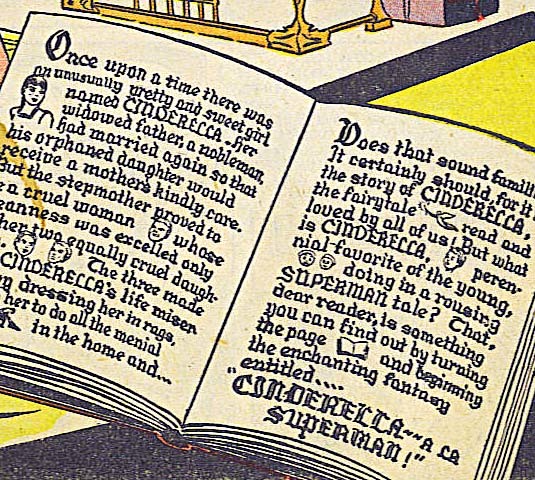
Frank’s title CINDERELLA on this story is beautifully lettered in an Old English style. His caption also does that, though the smaller size makes it hard to read in places, but this is proof that Frank’s lettering went beyond just the standard comics alphabets.
 From ACTION COMICS #60, May 1943
The final panels from the Superman story in the following issue have Frank’s lettering on the left, but the balloon on the right looks like someone else’s work, perhaps a DC staffer making a last-minute change. I think this was the final ACTION story lettered by Frank, and includes his question mark and THE END styles.

 From ACTION COMICS #61, June 1943
A page from the next Superman story, and I see some changes in the style overall, though it’s pretty close. I think it’s Ira Schnapp imitating Frank Shuster. One telltale clue is the question marks in the third panel, above. They are much smaller than Frank’s and have the backwards S shape that Ira almost always used. As I said in the first part of this article, Schnapp was a good choice to replace Frank when he was no longer able to do Superman lettering (probably because of his military service). Jerry Siegel and Joe Shuster knew his work from the Superman logo he revamped in 1940, and Ira was a long-time non-comics letterer, but just starting to get work at National (DC) Comics, so he was likely to be available.
 From ACTION COMICS #63, Aug 1943
Another clue is the script THE in this story from two issues later, though I only have a poor copy of it. Ira often used upper and lower case script for these final words of stories he lettered. In this case, he just used it on the first word, but the style is very much like what he did on other stories for decades. For more about Ira’s work inside ACTION COMICS, see THIS post.
 From SUPERMAN #5, Summer 1940
Frank Shuster’s work on SUPERMAN started more sporadically. On the first story in issue #5 he lettered only pages 9, 10 and 13, which suggests an all-hands-on-deck approach to make a deadline.

 From SUPERMAN #8, Jan-Feb 1941
Frank next lettered the second story in issue #8. You can see his style becoming more evident in the R’s and some of the other letters now have more curves too, like the N.
 From SUPERMAN #16, May/June 1942
Frank’s became the regular letterer on SUPERMAN with issue #16, where he lettered three of the four stories. SUPERMAN was bimonthly at this point, coming out every other month, but each issue at the time had four all-new Superman stories of either 12 or 13 pages. Frank lettered all four in issues 17 to 27, lots of work.


 From SUPERMAN #21, March-April 1943
A page from early 1943. Frank should have been serving in the Army by now, but probably had a desk job and perhaps was stationed close enough to Cleveland to be able to continue working on Superman lettering. Note again his style points of a question mark with a single curve and THE END all caps in a box.


 From SUPERMAN #25, Nov-Dec 1943
I believe this third story from issue #25 is the last one lettered by Frank. Note again his characteristic question marks and THE END, and this story includes a parody of Ira Schnapp’s Superman logo on the title page. There’s no telling when this story was actually produced, it could have been held in inventory for a while.
 From SUPERMAN #24, Sept-Oct 1943
I have only poor images of issue #24, but this story has a typical Ira Schnapp question mark.
 From SUPERMAN #25, Nov-Dec 1943
The first story in issue #25 also has this very typical Ira Schnapp THE END in script. I think Ira’s lettering begins appearing in this series in issues #24 and 25 at the same time as the last work from Frank Shuster, and most stories were lettered by him from that point on. For more on Schnapp’s SUPERMAN lettering see THIS post.
 From WORLD’S FINEST COMICS #6, Summer 1942
One Superman story appeared in each issue of the large anthology WORLD’S FINEST COMICS, and Frank Shuster lettered the ones in issues 6-10. These were again 12 or 13 pages long, and the book came out four times a year. The sample above has quite a lot of lettering for Superman, whose stories by Jerry Siegel were often less wordy than this.
 From WORLD’S FINEST COMICS #10, Summer 1943
Frank’s R’s are very curvy in this example from the last story I think was lettered by him in this series.
 From WORLD’S FINEST COMICS #10, Summer 1943
And on the last panel we see both Frank’s question marks and his THE END.

 From WORLD’S FINEST #11, Fall 1943
On the next Superman story we see typical Ira Schnapp question marks and THE END. I think Ira was the letterer of these from this point on. His ability to imitate Frank is pretty convincing, and it took me a while to figure it out, but I think by the summer or early fall of 1943, Schnapp was the main letterer for all the Superman stories. For more on Schnapp’s lettering in WORLD’S FINEST, see THIS post.
Below is a summary of Frank Shuster’s lettering in comics, all on Superman stories.
ACTION COMICS
#26 July 1940 13pp, #35 April 1941 13pp, #36 May 1941 13pp, #46 March 1942 13pp, #47 April 1942 13pp, #48 May 1942 13pp, #49 June 1942 13pp, #51 Aug 1942 13pp, #52 Sept 1942 13pp, #53 Oct 1942 13pp, #54 Nov 1942 13pp, #55 Dec 1942 13pp, #56 Jan 1943 13pp, #57 Feb 1943 13pp, #58 March 1943 13pp, #59 April 1943 13pp, #60 May 1943 12pp
SUPERMAN (story numbers in parentheses)
#5 Summer 1940 (1) pp 9-10, 13, #8 Jan/Feb 1941 (2) 13pp, #16 May/June 1942 (2) 12pp (3) 13pp (4) 13pp, #17 July/Aug 1942 (1) 13pp (2) 12pp (3) 13pp, (4) 13pp, #18 Sept/Oct 1942 (1) 13pp (2) 13pp (3) 13pp (4) 13pp, #19 Nov/Dec 1942 (1) 13pp (2) 13pp (3) 13pp (4) 13pp, #20 Jan/Feb 1943 (1) 13pp (2) 13pp (3) 13pp (4) 13pp, #21 March/April 1943 (1) 13pp (2) 13pp (3) 13pp (4) 13pp, #22 May/June 1943 (1) 12pp (2) 12pp (3) 12pp (4) 13pp, #23 July/Aug 1943 12pp (2) 12pp (3) 12pp (4) 12pp, #24 Sept/Oct 1943 (2) 12pp, #25 Nov/Dec 1943 (3) 12pp
WORLD’S FINEST COMICS
#6 Summer 1942 13pp, #7 Fall 1942 13pp, #8 Winter 1942 13pp, #9 Spring 1943 13pp, #10 Summer 1943 13pp
That’s a total of 706 comics pages. If we add the estimated 943 pages of similar work for the strips, Frank Shuster’s grand total is roughly 1,649 pages, a substantial amount of lettering.
The Siegel and Shuster studio had become fragmented by the mid 1940s. Writer Jerry Siegel was drafted and served mostly in Hawaii from 1943 to 1946. He had stockpiled scripts before he left, but when those ran out, DC Comics assigned other writers to the strips and comics. Editor-in-chief Whitney Ellsworth wrote some, as did editor Jack Schiff. Also tapped for Superman scripts were DC writers Alvin Schwartz, Bill Finger and others.
DC had begun hiring artists directly to produce Superman stories as early as the summer of 1940, when a run of stories in ACTION COMICS #28 to #34 were pencilled by Jack Burnley, inked by Jack and his brother Ray, and lettered by his sister Betty Burnley Bentley. In 1942, DC hired Joe Shuster assistant Wayne Boring to produce Superman work directly for them, and he was one of the most prolific artists on Superman strips and comics from then until 1967. Frank Shuster lettered many of those stories up to about mid 1943, so it’s possible DC was paying him directly too. When Jerry Siegel was released from the service in 1946, he found much of his Superman work taken over by others, and Joe Shuster’s increasingly poor eyesight meant that he wasn’t drawing much Superman either. The two had long felt the injustice of their financial deal, and in 1947, they began suing DC to regain the rights to Superman. That and subsequent lawsuits dragged on for years and were mostly unsuccessful. When the suits started, DC cut Siegel and Shuster off from all new work. It’s likely that even if Frank had wanted to continue lettering Superman stories and strips, he would have been forced to stop then. Siegel and Shuster launched a new series, FUNNYMAN, at Magazine Enterprises in 1948, but it didn’t last long. It was the last time their dual byline would appear on new material. I don’t see any of Frank’s lettering there.
In 1947 Jerry Siegel moved to the New York area. He probably wanted to look for new writing work while keeping an eye on his court case, and he was getting divorced from his first wife. Jerry did find some writing work in and out of comics, but struggled and had to take non-comics jobs. Eventually he was allowed to write again for DC, but that was never credited or acknowledged publicly. Joe Shuster and his family also moved to Queens, New York. His mother Ida and sister Jean lived together in one apartment, and Frank and Joe lived in another nearby. Frank found steady employment with the Nielson TV ratings company working on their ratings charts, where his lettering experience probably came in handy. Joe found comics work here and there, some of it very much not for children, but Frank essentially supported Joe for a number of years. After many legal struggles and appeals to DC by Jerry and Joe and their fans and professional colleagues like Jerry Robinson and Neal Adams, Jerry and Joe were awarded lifetime pensions by Time/Warner, now the owner of DC Comics, a move that headed off what could have been very bad publicity right before the release of the first Superman movie with Christopher Reeve in 1978. After that, both Jerry and Joe moved to California near each other. Frank stayed in Queens for the rest of his life. As far as I know he never married. After the death of their mother Ida in 1974, sister Jean eventually married and moved to Texas. Frank and Jean became the heirs to Joe’s estate when he passed in 1992. Frank Shuster died in Flushing, Queens on November 7, 1996.
As was often the case, letterers did not receive credit in Superman comics and newspaper strips in the 1940s, where it was usually considered something done by the artist. I’m glad I was able to finally give Frank Shuster credit for his lettering on Superman, and put a name to the artful style I have long admired.
Jerry Siegel on Wikipedia.
Joe Shuster on Wikipedia.
I highly recommend Brad Ricca’s biography of them, “Super Boys,” link below.
&amp;amp;amp;lt;br /&amp;amp;amp;gt;&amp;amp;lt;br /&amp;amp;gt;&amp;lt;br /&amp;gt;&lt;br /&gt;<br /><br />
The post FRANK SHUSTER, SUPERMAN LETTERER Part 2 appeared first on Todd's Blog.
April 26, 2021
FRANK SHUSTER, SUPERMAN LETTERER Part 1
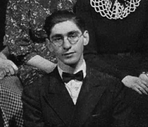 Frank Shuster, 1937, from senior play cast photo, John Hay High School yearbook.
I’ve been researching the lettering of Ira Schnapp at DC Comics for some time, and the one area still to be done is DC’s newspaper strips, beginning with Superman. I’ve gradually acquired all the reprints of the strip available so far, and I thought I should begin at the beginning to see if I could determine who had lettered them. At the start of any strip, it’s almost always the artist who does his own lettering, and it was so with Superman. Writer Jerry Siegel and artist Joe Shuster became friends in high school in Cleveland, Ohio, drawn together by common interests like science fiction, movies and comic strips. They spent years working on Superman strip samples and trying to sell them to newspaper syndicates which distribute strips to newspapers around America and the world. They had no success, and finally offered Superman to National Allied Publications, soon to become National/Detective Comics (DC), as Major Malcolm Wheeler Nicholson’s company was taken over by Harry Donenfeld and Jack Liebowitz around the same time. Siegel and Shuster had already been doing comics for the Major beginning in 1936, but they were struggling to make a living from it.
Editor Vin Sullivan wanted Superman as the lead feature in a new title they were launching, ACTION COMICS, so Jerry and Joe cut up and reworked some of their newspaper strips to fit the comic book format. It was a huge hit, and history was made. Jerry and Joe’s deal with DC was a terrible one, but it took a while for them to realize quite how terrible, and they were paid well at first once Superman proved a success. Meanwhile, DC was anxious for them to supply as much Superman material as they could. Soon a side deal was made between DC and the McClure Syndicate for a Superman daily newspaper strip, and later a Sunday strip as well, making Jerry and Joe’s original plan a reality. In addition to his stories in ACTION, a comic with only stories about him (SUPERMAN) was launched, and the character also began appearing in WORLD’S FINEST COMICS. Before long Siegel and Shuster were swamped with work and making enough money to hire help in getting the Superman strips and comic pages done, and the Siegel-Shuster studio in Cleveland began to grow.
 From MORE FUN COMICS #7, Jan 1936.
 This and all following images © DC Comics except as noted.
One of the first Siegel and Shuster sales to the Major was Doctor Occult, under the pen names Leger and Reuths. Above is a page from his second appearance, which was surely lettered by Joe Shuster.

Here’s a closer look at two panels. The lettering by Joe is pretty typical for newspaper strips and comics of the time, though there was a lot of variety in that work. Block capital letters were most common. Underlining words for emphasis was seen as often as making those words bolder. Joe might have formed his lettering ideas from favorite newspaper strips he and Jerry both liked such as Buck Rogers:
 From the Buck Rogers strip of Jan 8, 1929 by Philip Nowlan and Dick Calkins, © John F. Dille Co.
Joe’s lettering is not far from what Dick Calkins was doing on the Buck Rogers strip. His balloon shapes were different, but rounded rectangular shapes like Joe’s were also common. The main concern at the time was making the text easy to read, style was not an important issue, though some strips definitely had a lettering style.
 From DETECTIVE COMICS #1, March 1937
Another early feature from Siegel and Shuster was Slam Bradley, sample panel above, again surely lettered by Joe. The lettering is similar to that of Dr. Occult from a year earlier.
 From ACTION COMICS #1, June 1938
This brings us to Joe’s lettering on the early Superman strips used in ACTION, which again is quite similar to the previous examples.

A closer look at the first panel confirms this. Joe’s lettering makes little effort toward style, it just gets the job done with generally square block letters that are easy to read.
 The first two Superman daily strips, Jan 16-17 1939

When the syndicated daily Superman strip began in January, 1939, Joe Shuster’s lettering again matches his earlier work, though his balloons are now rounder, but things were already changing in his studio. In an article by James Vance published in the Superman strip collection, “Superman: The Dailies 1939-1940,” he describes a help wanted ad Jerry and Joe ran in Cleveland newspapers in 1938 looking for artists. One of the first they hired was Paul Cassidy, and he soon had the job of “ghosting” art for Siegel and Shuster strips like Slam Bradley, Federal Men and Radio Squad, all published by Major Malcolm Wheeler-Nicholson. Also hired around the same time was artist Wayne Boring, and Cassidy and Boring were the initial core of Cleveland’s Siegel and Shuster comics studio or shop, soon joined by others like Leo Nowak, John Sikela, Ed Dobrotka and more. Once Superman work increased, these artists were called on to do whatever they could to keep things moving. Vance quotes Cassidy as saying, “I did all kinds of stuff, from pencilling to lettering to inking everything but the faces. Shuster’s vision was pretty bad by then, but he still inked all the faces.” Joe Shuster had struggled with poor vision since childhood, and it would make his career in comics a constant battle that he gradually lost. Some of the early daily strip lettering seems to be by other hands, though it’s all close to Joe Shuster’s work.
 The Shuster Family, from The Saturday Evening Post, June 21, 1941. Left to right, brother Frank, mother Ida, Joe, father Julius and sister Jean. Image © Curtis Publishing.
Frank Shuster, Joe’s brother, was about four years younger, born April 29, 1918. I haven’t found out a lot about him, but my friend and fellow comics historian Alex Jay provided some helpful research and I also learned a few things from Brad Ricca’s fine book “Super Boys.” Like Joe, Frank had artistic talent, and did cartoons for his school newspaper, the John Hay Ledger, where he’s listed as Staff Cartoonist and Humor Editor. Frank acted in school plays like “Merton of the Movies,” and he wrote a jokes and humor column for the school paper, so in that way was also like Jerry Siegel, who did the same. In fact, Jerry and Frank tried to launch a mail-order school for humor writing, one of many projects that went nowhere. In October 1940, Frank and Joe were almost the same size and weight, according to their draft cards. Frank was 5 feet 5 inches and 125 pounds. Joe was 5 feet 6 inches and 127 pounds. Brad Ricca says, “Frank was a rebel soul; after graduating high school in 1938, he became a hobo by choice at seventeen and rode the trains for a while, wanting to see more of the country around him. He came back, though, and did some clerical work and was never very far from Joe.”
When Frank returned, it’s likely he began helping out at the comics studio, and apparently lettering is what he did best. In the Ricca book, his sister Jean mentions he lettered Superman, and there’s another source for that. Around June 1940, New York reporter John Kobler came to Cleveland to interview and write a story about the kids who created Superman for The Saturday Evening Post. It was published in the June 21, 1941 issue. When Kobler introduces the Shuster family, he writes of “brother Frank—who now works as a letterer on the Siegel-Shuster staff.” He also mentions that staff consisted of five artists, including Frank, “jammed cheek-by-jowl into one of the world’s tiniest rooms, furiously pencilling and lettering panels at the rate of one thirteen-page story, one Sunday page and six daily strips a week.”

 Superman Daily strip Jan 29, 1940
With that information, I looked for a distinctive style starting around 1940, and I found one. The lettering is more even and regular than Joe’s model, with letters that lean slightly to the left and are sometimes wider than a square. Notable features include a tendency to not connect the loop of the R with the left leg, not always the case, but often. The word balloons are made of scalloped, rounded shapes with open tails that tend to extend into the balloon. Emphasis is sometimes done with underlines, but also with bolder letters, as in BLITZEN. This seemed likely to be the first Frank Shuster lettering, and this style continued and gradually evolved into an even more distinctive version over the next few years. There is one gap with lettering by someone else, but otherwise Frank lettered all the daily strips from this point until ones dated mid November 1943. Lets look at examples.
 From Superman Daily Sept 5, 1940
By September 1940, Frank’s letters have become more curved. The right side of the R is now usually made with a large upper loop that continues into an upward curved right leg, again often not connected to the left leg. The right leg of the N is more curved, and there are subtle curves in many of the horizontal strokes. The round letters O and C continue to be almost perfectly round. The G is also round with a serif in the center. This style is one I had already seen in Superman stories in the comics, and I was happy to be able to put Frank’s name to it.
 From Superman Daily March 8, 1941
Scripter Jerry Siegel had an unusual way of indicating thoughts to be lettered. He surrounded them with parentheses AND quote marks AND dashes too. In this example, Frank has made it clearer by using a dotted border on that balloon, though it still has a normal tail.
 From Superman Daily May 3, 1941
Here’s Frank’s version of a radio or burst balloon with sound coming from a speaker, though the burst shape might be by the artist. Frank uses two different pen thicknesses to create emphasis on these panels.

 From Superman Daily Nov 1, 1941. Image courtesy of Heritage Auctions ha.com
Original art from a few early Superman strips can be found on the Heritage Auctions site, allowing us a closer look at Frank’s lettering. These samples from a typical page during Frank’s tenure show his work with more accuracy than the printed volumes. You can also see that the words to be lettered were put in roughtly by the pencil artist in blue, the common method at the time. This allowed the artist and letterer to both know exactly where the balloons would fall so enough room was left and the artist wasn’t drawing things that would be covered by lettering. Frank then drew horizontal guides for the top and bottom of each line of lettering in blue pencil probably using an Ames Guide before adding his letters in ink with two pen points, a thinner one for regular letters and a thicker one for emphasized words like SUPERMAN. Frank used a dead-line point that gives a line of even thickness, unlike the wedge-tipped pens many letterers use that create thicker and thinner lines depending on the direction of the stroke. Frank’s elegant style is even more evident here than in print. Notice how close together some letters were, often touching, but it still reads fine.
 From Superman Daily Dec 19, 1942
This panel from 1942 shows how Frank’s style continued to evolve, and also that he could letter in other styles when appropriate. These letters are either stretched horizontally or compressed vertically, whichever way you want to think of it. There’s less roundness than before in many of the letters, though the shape of the R is about the same, if less curved. The serif on the G now goes only inward.

One area of information Alex Jay found is both helpful and puzzling, and that’s Frank’s military service. Here’s his draft card from 1940 listing his mother Ida as his primary contact and brother Joe as his employer. The family name had been Schuster when they were in Canada, and Ida still used that spelling. Frank did here too, though the draft board has typed at the top SEE FRANK SHUSTER and corrected his address, perhaps because he moved after filling this out.

The second image, the other side of the card, has personal details and a note that he wears glasses. Joe’s very poor eyesight would have made him ineligible to serve. Frank’s eyes were not as bad, and he served as a Warrant Officer, which often meant a desk job. His records show he enlisted (or perhaps was drafted) on Nov 2, 1942 (another record says Oct 19) and was released on March 3, 1946. Somehow Frank was able to continue lettering Superman dailies almost a year into this service, and a bit longer on Sundays. Some strips could have been done well ahead, but not enough to cover that entire time. Possibly Frank was stationed near home so he could get to the studio when on leave. Perhaps he was able to do it in the evenings and on weekends while serving. Gus Arriola, the writer and artist of the Gordo comic strip had to halt it when he was called up, but then resumed the Sunday strip, keeping up with it that way while serving in the Los Angeles area. It’s also possible that another letterer took over using a very similar style to Frank’s, but it sure looks like his work to me. There’s no record of where Frank served. Alex reports many such records were lost in a fire.
 From Superman Daily March 22, 1943
This panel from 1943 is surely still by Frank, matching the ones above, and again slightly more curved than the 1942 example.
 From Superman Daily Oct 21, 1943
I think the last week of daily strips lettered by Frank is Oct 18-23. Above is a panel from one of those. Notice the shape of the question mark as Frank usually made them: a single curve over a period. Frank’s letter R’s continue to usually have unconnected loops, his round letters are very round, and his lettering in general is very regular.
 From Superman daily Oct 25, 1943
With the daily strips of the following week I detect a change of style, but it’s subtle and it took me a while to notice it. The letterer is successful in imitating Frank Shuster’s style in general, but these letters are not quite as regular. Some of the letter R’s don’t connect, as per Frank, but some do, as if that was not a natural choice. Most telling are the question marks like the two in the last balloon here. They’re smaller, and they make a double curve sort of like the number 2. That question mark style is one of the best ways to identify the lettering of Ira Schnapp, and I believe he took over the Superman dailies at this time.

Another panel from the same week with another Schnapp question mark, and if you compare these examples with the ones above, I find it believable that they are by two different people. Ira Schnapp was a good candidate to take over from Frank. Jerry and Joe knew his work from his redesign of the Superman logo that first appeared on SUPERMAN #6 in 1940. Schnapp was an accomplished lettering man, though not yet doing much comics work, so he was available, and also a good choice on that basis.
 From Superman Daily Nov 27, 1944
From that time forward, Schnapp was the regular letterer on the daily strips for decades, right up until they ended. I’ll be covering Ira’s work in another post.

 Superman Sunday 1A Oct-Nov 1939
Now let’s look at the Sunday pages. The first one, above, was an introduction to the character and not part of the regular series. It would have been offered to papers wanting to run the strip as a teaser, and probably ran on different dates in different papers. The lettering is by Joe Shuster, and two of the panels are reused from ACTION COMICS #1.
 From Superman Sunday Nov 5, 1939
The first regular Sunday page debuted on November 5, 1939, and the lettering is a little different and I think not by Joe. Assistants were already at work by then, and this looks like the lettering of Paul Lauretta, who had a distinctive wide round-topped A. Lauretta only worked with Shuster for a short time, and lettered (and perhaps did some inking) on several early Sundays.
 From Superman Sunday Dec 3, 1939
This Sunday is lettered by someone else, probably another assistant.
 From Superman Sunday Dec 10, 1939
The sixth Sunday page of December 10, 1939, sample above, has lettering by Frank Shuster, the earliest by him to be published. The balloon shapes are still very much like Joe’s, but the lettering is larger and has those distinctive R’s.
 From Superman Sunday March 17, 1940
Perhaps this was a tryout of sorts because Frank’s lettering does not return on Sundays until #20 dated March 17, 1940 even though he was lettering the dailies by the end of January. (Some earlier Sundays might be lettered by Frank still finding his style, I’m not sure.) Now Frank’s balloon shapes are rounded and scalloped like what he did on the dailies.
 From Superman Sunday June 16, 1940
Frank’s lettering appeared on some Sundays, but not all, until #33 dated June 16, 1940. Frank then lettered all the Sundays to November 14, 1943, missing only one on Sept 19, 1943. Again, many of these had to have been lettered when he was in the service. Let’s look at some examples.
 From Superman Sunday Nov 17, 1940
Sound effects were not yet an important part of Superman strips, but appeared occasionally, as here. It’s impossible to say if they were lettered by Frank or by the artist.
 From Superman Sunday March 21, 1943
By March 1943, Frank’s lettering usually had a wider look when there was room. Wider examples are here except on the right side where he lettered narrower to fit.
 From Superman Sunday Nov 14, 1943
Here’s a panel from the last Sunday I think Frank lettered. Note his question mark shape, a single loop and his characteristic letter R’s.
 From Superman Sunday Nov 21, 1943
The next Sunday has no question marks, but I think the style is noticeably different, and matches the Schnapp examples I gave for the dailies pretty well.
 From Superman Sunday Nov 28, 1943
The following Sunday has Ira Schnapp question marks with a double bend, and while the lettering is a good match for Frank’s style, I see enough differences to be convinced it’s not by him. This is also not typical for Ira Schnapp’s later work, so at this point I think he was still finding his way and trying his best to imitate his predecessor.
 From Superman Sunday June 4, 1944
By 1944, Ira’s lettering was getting more confident, though it’s still fairly different from his later work. I will talk about that in another post, but I think Ira was also the main letterer of the Superman Sundays for the rest of the run.
Below is a list of Sundays and dailies I believe were lettered by Frank Shuster.
Dailies: #325 (1-29-40) to #372 (3-23-40), #397 (4-22-40) to #1494 (10-23-43)
Sundays: #6 (12-10-39), #20 (3-17-40) to #23 (4-7-40), #26 (4/28/40), #33 (6-16-40) to #202 (9-12-43), #204 (9-26-43) to #211 (11-14-43)
Look Magazine 2/27/40 special color strip 4pp
That’s 1,146 dailies and 184 Sundays plus that 4-pager, which was equivalent to one Sunday, so make it 185 Sundays. How does that compare to comics pages? I filled in as letterer a few times for Gaspar Saladino on the DC strip The World’s Greatest Superheroes (later just Superman) in the late 1970s to early 1980s. Dailies were drawn two on a page of comics art paper turned sideways, and two daily strips were considered (and paid) the same as one page of comics lettering. Sundays were much larger and considered the same amount of work as two comics pages. Using that as a rule of thumb, Frank’s work on Superman strips was roughly equivalent to 943 pages of comics lettering, quite a lot of work. And he did more on Superman comics stories, which I will look at in Part 2.
The post FRANK SHUSTER, SUPERMAN LETTERER Part 1 appeared first on Todd's Blog.
April 23, 2021
Incoming: BATMAN, THE DARK KNIGHT DETECTIVE Vol 5
 Image © DC Comics
This trade paperback just arrived. It reprints Batman stories from DETECTIVE COMICS #612-614, #616-621 and DETECTIVE COMICS ANNUAL #3. The monthly issues are written by Alan Grant, pencilled by Norm Breyfogle and inked by Steve Mitchell. The Annual is written by Archie Goodwin with art by Dan Jurgens and Dick Giordano. I lettered all of it. I’m rarely tempted to reread past comics work, but I don’t recall the Annual story, and I might revisit that one. Not sure when this is out in shops, but Amazon has it available on May 25th. For some reason their listing shows a different cover. Ask at your comics retailer if you’re interested, or try the link below.
The post Incoming: BATMAN, THE DARK KNIGHT DETECTIVE Vol 5 appeared first on Todd's Blog.
April 22, 2021
Ira Schnapp’s DC Ads: 1968
 All images © DC Comics. From ACTION COMICS #358, Jan 1968
This was Ira’s final year at DC Comics, and his ad output was much reduced. New policies from Editorial Director Carmine Infantino, including the shift of house ad and cover lettering from Ira to Gaspar Saladino, are now in evidence, and their places were essentially switched, with Ira doing just 21 new ads, and Gaspar creating about 65, with another 25 coming from Henry Boltinoff and various unidentified DC production artists. Ira’s final ad ran in a December 1968 title, and it was probably created in August, or even earlier. I have no evidence, but I think Ira left staff and retired in either July or August. DC was definitely changing from the place he had worked so many years as new blood was brought in: artist Joe Kubert became editor of the war titles, and new editor/artists Joe Orlando and Dick Giordano joined the staff. Artist Neal Adams had begun working for DC in 1967, and by 1968 was gaining new fans for the company and inside the company with his excellent art that added previously unseen levels of realism, dynamic layouts, and in-your-face action to the mix. Steve Ditko launched new properties The Creeper and Hawk and Dove, and other projects that would probably not have been okayed in the past were being tried out like Angel and the Ape, Anthro, Enemy Ace, Bat Lash and more. DC comics in general were gaining a fresh look enhanced by the dynamic work of Saladino, beside which Ira’s lettering often did look old fashioned. The ad above that Ira lettered is prescient: new things were coming, and they would not include him. Ira turned 73 in October 1967. His time in comics was almost over, but these ads show his skills were still present, if showing their age.
 From ACTION COMICS #358, Jan 1968
To me this ad suggests that Ira was now looking at the lettering of Gaspar Saladino for ideas. Having just a small amount of ad copy gave him room to go big, as Gaspar often did, and the roughened treatment of MENACE has a Gaspar feel.
 From ACTION COMICS #358, Jan 1968
The second issue of TEEN BEAT had to be renamed TEEN BEAM. Apparently no one at DC knew there was another Teen Beat magazine hitting the stands just before theirs. This is Ira’s idea of lettering with teen appeal, and it’s not bad, but Gaspar did it better.
 From ADVENTURE COMICS #364, Jan 1968
Here we see a very old school ad with lots of text. Ira does his best with it, but it seems stodgy compared to what Saladino was doing, though often with much less text, example below from the same issue.
 From ADVENTURE COMICS #364, Jan 1968
Gaspar had been lettering at DC since fall 1949, but he was 33 years younger than Schnapp. He’d been filling in for Ira on covers, ads and stories for years when Ira wasn’t available, and now that he had the chance to shine, he grabbed it, and who could blame him?
 From ACTION COMICS #359, Feb 1968
Ira did a last one of these paid ads that I think were all for the same vendor, as they have similar mailing addresses. Handsome work. The next one was lettered by Gaspar.
 From FALLING IN LOVE #97, Feb 1968
This ad in the form of a quiz I think epitomizes everything that was wrong with DC’s attempt to engage teenagers. It’s talking down, it’s throwing lots of slang that’s either outdated or overdone, and it reeks of old folks who are sure they know how kids think.
 From OUR ARMY AT WAR #189, Feb 1968
Ira’s lettering on this Teen Titans cover was one of his best efforts in the last year he was on staff, and this ad for it is pretty good too, though hard to read in places.
 From THE ATOM #35, Feb/March 1968
Gaspar also did an ad for the issue. Each has its strengths, but I find Gaspar’s has more energy and perhaps teen appeal.

Another quiz ad that’s a little less obnoxious, and I love the title lettering by Ira.
 From THE ADVENTURES OF JERRY LEWIS #105, March/April 1968
Here’s the dullest DC ad ever, a boring list of numbers. If this was editor Julius Schwartz’ idea, it was one of his worst, but Ira soldiered through it.
 From AQUAMAN #38, March/April 1968
A very silly cover deserves a somewhat silly ad, and this is one. I like Ira’s work on it, though.
 From THE ADVENTURES OF JERRY LEWIS #105, March/April 1968
There was a time when Ira’s design touches like flaming letters were fresh. Now this ad also seems old-fashioned.
 From HOUSE OF MYSTERY #173, April 1968
Again we see DC looking to the past for ideas, and Ira’s lettering simply reinforces that.
 From G.I. COMBAT #129, April/May 1968
In this case looking to the past was not a bad idea. DC war titles had not made much use of World War One as a topic, and Enemy Ace was also a fresh idea because it made the enemy the main character. It’s sobering to realize that Ira himself lived through this war, and was 24 years old in 1918.
 From THE BRAVE AND THE BOLD #78, June/July 1967
Here’s what Ira came up with as a teaser for this new series.
 From DETECTIVE COMICS #378, Aug 1968
Gaspar’s version is much better, though admittedly he had more room and I think art from Bob Oksner.
 From THE UNEXPECTED #107, June/July 1968
This third-page ad for Enemy Ace is not as good as Ira’s full-page one.
 From LOIS LANE #86, Sept/Oct 1968
The one area where I think Ira’s styles still worked well are on ads for romance books, and this ad for them that appeared in LOIS LANE marks the end of a very long separation between DC’s romance line and their other titles.
 From LOIS LANE #87, Oct 1968
As you can see, editor Mort Weisinger’s ad and story ideas had not changed much. It would take a few more years for Superman to get a new approach.
 From GIRL’S LOVE STORIES #139, Nov 1968
 From HEART THROBS #116, Nov 1968
 From HEART THROBS #116, Nov 1968
At the very end of his DC time, Ira was asked to do these three full-page romance ads, and they are full of great work. He always did seem to do his best in this area.
 From ADVENTURE COMICS #375, Dec 1968
Ira’s last house ad, at least the last to appear, was this one, a clever teaser for a one issue tryout in SHOWCASE. It was the end of an era.
So, 20 new house ads for Ira and one paid ad for a total of 21 in 1968. Everyone’s story must reach an end some time, and Ira’s did in July of 1969 when he died suddenly at home of a heart attack at age 74. His passing went unmarked by DC, which since he was never credited for his work is not surprising, but it is sad.
This is not the end of my Schnapp research, though. I have another area to explore and catalog, DC’s newspaper strips. A new series of posts will begin on that topic soon.
Other articles you might enjoy are on the Comics Creation page of my blog.
A series of articles on my blog about Ira Schnapp’s life and work begins HERE.
Ira Schnapp on Wikipedia.
The post Ira Schnapp’s DC Ads: 1968 appeared first on Todd's Blog.
Todd Klein's Blog

- Todd Klein's profile
- 28 followers

