
Todd Klein's Blog, page 80
December 21, 2021
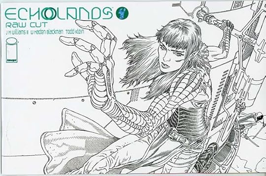
Incoming: ECHOLANDS 5, ECHOLANDS RAW CUT 4


 Images © J H Williams III and W Haden Blackman
The fifth issue of this fine series by JH Williams and company has arrived with a variant cover by Langdon Foss, and the Raw Cut version of issue four (without Dave Stewart’s colors) is also here with a variant cover by Gabriel Rodriguez. Issue five had some challenges for me as a letterer that I enjoyed tackling, the entire book is beautiful and exciting in my opinion, and I recommend it highly. These should be in shops soon if they aren’t already, or there are links below.
<br />
The post Incoming: ECHOLANDS 5, ECHOLANDS RAW CUT 4 appeared first on Todd's Blog.


December 20, 2021
GASPAR SALADINO in AMBUSH BUG
 All images © DC Comics. From AMBUSH BUG #1, June 1985
For those who aren’t familiar, Ambush Bug was one of the funniest and most irreverent characters ever seen at DC. Created by artist/writer Keith Giffen, he first appeared in two issues of DC COMICS PRESENTS, where he was so popular, editor Julius Schwartz commissioned a miniseries. That led to another and several specials in quick succession. As you can see above in his first miniseries cover, the character was funny in a manic, enthusiastic way that goes beyond what former DC humor characters had achieved, and the books were full of on-point satires of every DC character and genre, skewering everyone involved, including the creative team of Giffen, writer Robert Loren Fleming, artist Bob Oksner, regular letterer John Costanza, colorist Anthony Tollin, and editor Julius Schwartz. Gaspar Saladino lettered all the covers, and also the first issue of the second miniseries. The covers are so much fun, I’m going to show them all. You probably recognize the parody of SUPERMAN #1’s cover above, there are plenty more in the books. I designed the logo, the rest of the lettering is by Saladino.
 From AMBUSH BUG #2, July 1985
Part of the character’s appeal is that he can’t even take himself or his role as a superhero seriously, as seen on this cover, and Gaspar’s lettering does the right thing and makes it funnier by playing it straight.
 From AMBUSH BUG #3, Aug 1985
At the time this came out, DC’s crossover event, CRISIS ON INFINITE EARTHS had changed a lot of decades-long DC continuity, and this cover has fun with that idea. An actual DC comic series of two large issues called HISTORY OF THE DC UNIVERSE by Marv Wolfman and George Perez was also in the works and would come out a few months later.
 From AMBUSH BUG #4, Sept 1985
Saladino continued to play it straight in his cover lettering, which I think makes the results funnier. I love the story title on this one.
 From AMBUSH BUG STOCKING STUFFER #1, Feb 1986
Next up was this Annual-sized special making fun of other more traditional holiday fare from DC. Lots of great Saladino lettering here, though the top line is type. Again, Gaspar plays it all straight, and even goes for the kind of rough-edged styles he might use for superheroes, which makes it more amusing. I love the X-ed out K in Chanukkah.
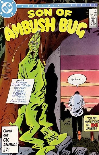
 From SON OF AMBUSH BUG #1, July 1986
The first cover of the second miniseries is funny in itself, and even moreso to me, as a DC staffer at the time. Some of Gaspar’s lettering is new, like the blurbs listing the creators, but many of these effusive captions came from other past DC cover lettering that he did. I had made a collection of many of those for reference, and Keith Giffen reused them in this amusing way, purposely too many, and such a great contrast to the very nonplussed character, who has even been conked on the head by one of the logo letters. There’s more about my collection of Gaspar’s cover lettering on my blog beginning HERE.
 From SON OF AMBUSH BUG #1, July 1986
The first issue of this second miniseries is the only one lettered by Gaspar. I’m not sure if he had agreed to be the regular letterer this time, or was just filling in for John Costanza, but Giffen and Fleming have accurately added below his credit line, “Wishes that John Costanza lettered this!” I’m sure it was true, this book required lots of extra time and effort. If Gaspar did agree to do the whole miniseries, he bailed out after this first issue, and Costanza did the rest.
 From SON OF AMBUSH BUG #1, July 1986
Here’s an example of what I mean, a page satirizing DC’s war comics with lots of extra lettering needed. The joke is that the “medic” is actually Ambush Bug’s favorite stuffed toy, Cheeks, who is inanimate and can help no one.
 From SON OF AMBUSH BUG #2, Aug 1986
The thought balloon on this cover ties into Keith Giffen’s original concept for the character, which was “Bugs Bunny as a supervillain.”
 From SON OF AMBUSH BUG #3, Sept 1986
This parody of the famous FLASH #123 cover that introduced the idea of multiple Earths at DC is also a dig at editor Julius Schwartz, of that book and this one. The original cover had lettering by Ira Schnapp.
 From SON OF AMBUSH BUG #4, Oct 1986
While this is funny, Gaspar continues to play it straight in his lettering, which is the right idea, in my opinion. By the way, a small balloon with multiple tails is not easy to do convincingly, but no problem for Saladino.
[image error]From SON OF AMBUSH BUG #5, Nov 1986This miniseries ran to six issues rather than four. The clue to the mystery lawyer is on the coin, an easy guess for Batman fans.
 From SON OF AMBUSH BUG #6, Dec 1986
The final issue is a parody of many comics covers showing similar scenes, and the balloon is perfect, the only convincing use of that silly word ever. There was another long one-shot in 1992, AMBUSH BUG NOTHING SPECIAL, which I did cover lettering for, and a new miniseries in 2008 that Saladino was not involved in. His work on these issues was perfect, and if you thought he didn’t get the humor in them, I’d say you’d be wrong. I can just hear him laughing about that blurb he had to letter under his name in the credits.
To sum up, Saladino lettered 11 covers and 22 interior pages for this character. Other articles in this series are on the COMICS CREATION page of my blog with more you might enjoy.
The post GASPAR SALADINO in AMBUSH BUG appeared first on Todd's Blog.
December 19, 2021
And Then I Read: THE MYSTERIOUS ISLAND by Jules Verne
 First American edition.
Near the end of the American Civil War, a group of five Northern prisoners and a dog escape from Richmond in a hot air balloon during a fierce storm. They are railroad engineer Captain Cyrus Harding (Smith in the original French version), his black servant Neb, a career sailor Pencroft (Pencroff originally), his adopted son Herbert Brown (Harbert originally), and journalist Gideon Spilett, as well as Harding’s dog Top. After moving rapidly in the storm for several days, the balloon crashes in the ocean near a large volcanic island in the South Pacific far from any other land or country, and the escapees are marooned there for several years. They name it Lincoln Island. Strange help from some unknown source comes occasionally when they most need it, as right in the beginning when Captain Harding is presumed drowned after the balloon crash, but is found unconscious but alive some way inland, carried there by an unknown method. When he recovers, Harding begins the work of gradually creating a new life and civilization for the men through his knowledge and raw materials they find, and helped by another gift of tools. They created a secure home in a cave, gather and farm food plants, capture and raise animals, and explore the island. Their unknown benefactor remains a mystery, but help from him arrives in times of direst need, as when a shipload of pirates arrives and attacks the colony. After the colonists build a small sailing ship, a message in a bottle sends them to another distant lonely island where a criminal has been living as a hermit for years, and has reverted to a primitive state. The hermit is brought back to Lincoln Island and his senses and intelligence gradually return, but his deep sorrow over his past wicked deeds haunts him. After some years, the secret of their benefactor is finally revealed when that benefactor is on his death bed. Both the benefactor and the rescued criminal are characters from previous Verne books.
Later, as they work to build a larger sailing ship to finally take them away, the volcano on Lincoln Island erupts and throws everything into chaos. Will the colonists be able to survive the violent explosion, flows of lava, and earthquakes, or will they finally perish?
This was a good read, though it’s a very long book. The original French version is almost 200,000 words. I read a much abridged version many years ago, the one I found online from Project Gutenberg is, I think, about 180,000 words, so still somewhat abridged, but closer to the original work. It’s a classic men’s adventure story with plenty of the science and information Verne liked to include in these stories, but also plenty of action and drama. It connects to two earlier Verne books, though the timeline does not match up at all. If you can ignore that, and I could, it’s a fun return to those characters. This is sort of Verne’s version of “Robinson Crusoe” and “Swiss Family Robinson,” but he starts his stranded men off with almost nothing. A single match and a single grain of corn, for instance. Their intelligence and resourcefulness must do the rest, with a little help from their benefactor, and things don’t always go well, but they persevere. Recommended. You can find the free ebook online, as I did, or try this recent translation that might be better.
<br />
The post And Then I Read: THE MYSTERIOUS ISLAND by Jules Verne appeared first on Todd's Blog.
December 17, 2021
GASPAR SALADINO in ALL-STAR WESTERN
By the early 1950s, superheroes were no longer selling well, and DC shifted some of their titles to other genres they thought might appeal to readers. ALL-STAR COMICS became ALL-STAR WESTERN with issue #58 and must have sold well, it had a long run ending in 1961. ALL-STAR editor Julius Schwartz continued as the editor, he was already editing other western titles for the company, and he brought with him his regular artists and writers, and his letterer Gaspar Saladino. From what I can see, Gaspar probably liked lettering western stories for this and other Schwartz titles. For one thing, they were generally short, making it easier to fit into his schedule than the long 32-pagers he’d been lettering for ALL-STAR COMICS. And Gaspar seemed to like stories with action, which these usually had. Gaspar did not letter any of the covers, which were done by DC veteran Ira Schnapp. I’ve written about those HERE. Saladino did letter many of the stories in the book, sometimes all the feature stories and even a few of the short one or two-page fillers, at least until near the end when other commitments must have taken priority. Only two issues had no story lettering by Gaspar at all.
The lead feature in the early years was the Trigger Twins, as seen above. The logo on this and all the features in the book were by Ira Schnapp, but Saladino did the rest, including TWO-FISTED made with a brush, and also notice the page number is in a spade shape for some reason.
 From ALL-STAR WESTERN #59, June-July 1951
Don Caballero was often up second, a hero in the style of Zorro, but without the mask. The caption is in a nice scroll. Gaspar’s wide, angular lettering was well suited to western subjects.
 From ALL-STAR WESTERN #60, Aug-Sept 1951
Another early feature was The Roving Ranger, a hero in the mold of The Lone Ranger, but again without a mask. Julie Schwartz and his writers were aiming at fans of other popular western stars. The calligraphy in the story title is unusual for Saladino, and works fine.
 From ALL-STAR WESTERN #61, Oct-Nov 1951
Strong Bow was a heroic Native American character at a time when they often were villains instead. I love Saladino’s treatment of SWAMP SPIRIT in the title, the graduated dot shading adds to the atmosphere, and slightly predicts his approach to SWAMP THING two decades later.
 From ALL-STAR WESTERN #66, Aug-Sept 1952
The script in this Trigger Twins story calls for a tricky lettering effect to suggest two gramaphones playing alternate words of a message. It kind of works, though without the footnote readers might not have understood. I bet this was a Julie Schwartz idea, he was a jazz records fan.
 From ALL-STAR WESTERN #67, Oct-Nov 1952.
After ALL-AMERICAN WESTERN, another Schwartz title, changed format to war stories edited by Robert Kanigher with the June-July 1952 issue, the most successful features there moved to this title, bumping out some that perhaps were not as popular. Johnny Thunder was one, and it eventually became the lead feature in this book. The western sheriff character was similar to many on TV. Gaspar’s balloon shapes are made with looping ovals that sometimes become quite angular, as in the first panel, and the thought balloon in panel 5 is about the same except for the tail made of bubbles.
 From ALL-STAR WESTERN #67, Oct-Nov 1952
I like Gaspar’s title on this story, he’s getting more confident and going larger, and the style of the first word echoes the feature logo treatment by Schnapp.
 From ALL-STAR WESTERN #88, April-May 1956
A few years later, Gaspar’s titles are even larger and more diverse. I love the treatment of MIRAGE, with gaps that make it seem half there.
 From ALL-STAR WESTERN #93, Feb-March 1957
This looks like an interesting story pitting Strong Bow against Vikings.
 From ALL-STAR WESTERN #103, Oct-Nov 1958
This splash page gave Gaspar a chance to try some fancy lettering on the poster. It works pretty well. Saladino was not as good at script titles as Schnapp early on, and the words THE and OF in this story title are weak.
 From ALL-STAR WESTERN #119, June-July 1961
In the last few issues before the book was cancelled, a new feature combined a Native American character with superheroic ideas and powers as well as science fiction plots. It was not enough to save the book, which ended with this issue.
 From ALL-STAR WESTERN #1, Aug-Sept 1970
In 1970, DC began a new version of the book edited at first by Dick Giordano, then by Joe Orlando. The first issue was reprints, but the rest contained mostly new material. Gaspar had lettered some of the reprints, but I don’t see any new story lettering by him in the eleven issue run. By this time, though, Gaspar had become DC’s main cover letterer, taking over from Ira Schnapp in 1968, and he lettered many of the covers, including this first one. The thought balloon is classic Saladino work for the time, and the blurb is enhanced by the treatment of FADEAWAY, made more effective reversed white out of the purple background.
 From ALL-STAR WESTERN #2, Oct-Nov 1970
The second issue shows the direction being taken, with new features Outlaw and El Diablo and a great Neal Adams cover. In addition to the logos, word balloon and caption, Saladino did a fine job on the wanted poster.
 From ALL-STAR WESTERN #3, Dec 1970-Jan 1971
The third issue has another great cover by Adams with fine Saladino lettering and logos, different from the ones on the previous issue.
 From ALL-STAR WESTERN #6, June-July 1971
This cover is full of action and not afraid to show gun violence, something that didn’t happen often during the original run. Gaspar’s lettering at the top stays out of the image.
 From ALL-STAR WESTERN #10, Feb-March 1972
The penultimate issue saw the introduction of Jonah Hex, probably DC’s most popular and longest-lasting western character. With issue #12, the book was retitled WEIRD WESTERN TALES with Hex as the lead feature. He would later get his own long-running title.
Below are the stories from the first version of ALL-STAR WESTERN lettered by Gaspar Saladino. Features are abbreviated after the first appearance.
#58 April-May 1951: Trigger Twins 10pp, Don Caballero 8pp, Roving Ranger 8pp, Strong Bow 10pp
#59 June-July 1951: TT 10pp, DC 8pp, RR 8pp, Big Teepee & Little Teepee 1pp, SB 10pp
#60 Aug-Sept 1951: TT 10pp, DC 10pp, RR 8pp, BTLT 1pp, SB 10pp
#61 Oct-Nov 1951: SB 10pp, DC 8pp, RR 2pp, TT 10pp
#62 Dec 1951-Jan 1952: SB 8pp, The Man Who Discovered Texas 2pp, TT 8pp
#63 Feb-March 1952: SB 6pp, TT 6pp
#64 April-May 1952: TT 8pp, RR 6pp, DC 6pp, SB 6pp
#65 June-July 1952: TT 8pp, DC 6pp, RR 4pp, SB 6pp
#66 Aug-Sept 1952: TT 8pp, Foley of the Fighting 5th 6pp, RR 4pp, King Woolsey 2pp, SB 6pp
#67 Oct-Nov 1952: TT 6pp, SB 6pp, FF5 6pp, Johnny Thunder 8pp
#68 Dec 1952-Jan 1953: TT 6pp, SB 6pp, FF5 6pp, JT 6pp
#69 Feb-March 1953: TT 6pp, SB 6pp, FF5 6pp, JT 8pp
#70 April-May 1953: TT 6pp, SB 6pp, FF5 6pp, JT 6pp
#71 June-July 1953: JT 6pp, TT 6pp, FF5 6pp, SB 6pp
#72 Aug-Sept 1953: JT 6pp, SB 6pp, FF5 6pp, TT 6pp
#73 Oct-Nov 1953: TT 6pp, SB 6pp, FF5 6pp, JT 6pp
#74 Dec 1953-Jan 1954: TT 6pp, SB 6pp, FF5 6pp, JT 6pp
#75 Feb-March 1954: TT 6pp, SB 6pp, FF5 6pp, JT 6pp
#76 April-May 1954: TT 6pp, SB 6pp, FF5 6pp, JT 6pp
#77 June-July 1954: TT 6pp, FF5 6pp, JT 6pp
#78 Aug-Sept 1954: TT 6pp, SB 6pp, FF5 6pp
#79 Oct-Nov 1954: SB 6pp, FF5 6pp, TT 6pp
#80 Dec 1954-Jan 1955: TT 6pp, SB 6pp, FF5 6pp, JT 6pp
#81 Feb-March 1955: TT 6pp, SB 6pp, FF5 6pp, JT 6pp
#82 April-May 1955: TT 6pp, SB 6pp, FF5 6pp, JT 6pp
#83 June-July 1955: TT 8pp, SB 6pp, JT 6pp
#84 Aug-Sept 1955: SB 6pp, JT 6pp
#85 Oct-Nov 1955: TT 8pp, SB 6pp, JT 6pp
#86 Dec 1955-Jan 1956: TT 6pp, SB 6pp, FF5 6pp, JT 6pp
#88 April-May 1956: TT 6pp, JT 6pp, SB 6pp
#89 June-July 1956: TT 6pp, SB 6pp, FF5 6pp, JT 6pp
#90 Aug-Sept 1956: TT 6pp, JT 6pp
#91 Oct-Nov 1956: TT 6pp, SB 6pp, JT 6pp
#92 Dec 1956-Jan 1957: TT 6pp, SB 6pp, JT 6pp
#93 Feb-March 1957: SB 6pp, JT 6pp
#94 April-May 1957: TT 6pp, JT 6pp
#95 June-July 1957: TT 6pp, JT 6pp
#96 Aug-Sept 1957: TT 6pp, FF5 6pp
#97 Oct-Nov 1957: TT 6pp, FF5 6pp, JT 6pp
#98 Dec 1957-Jan 1958: TT 6pp, SB 6pp, JT 6pp
#99 Feb-March 1958: TT 6pp, FF5 6pp, JT 6pp
#100 April-May 1958: TT 13pp
#101 June-July 1958: TT 12pp, JT 8pp
#102 Aug-Sept 1958: JT 8pp
#103 Oct-Nov 1958: TT 10pp, JT 9pp
#104 Dec 1958-Jan 1959: TT 10pp
#105 Feb-March 1959: TT 10pp, FF5 7pp, JT 8pp
#106 April-May 1959: TT 8pp
#107 June-July 1959: JT 10pp, FF5 7pp, TT 8pp
#108 Aug-Sept 1959: JT 16pp
#109 Oct-Nov 1959: JT 10pp, TT 8pp
#111 Feb-March 1960: FF5 7pp, TT 8pp
#112 April-May 1960: JT 11pp, FF5 7pp, TT 8pp
#113 June-July 1960: JT 11pp, FF5 7pp, TT 8pp
#114 Aug-Sept 1960: JT 10pp, FF5 7pp, TT 8pp
#115 Oct-Nov 1960: FF5 7pp, TT 8pp
#116 Dec 1960-Jan 1961: JT 17pp, TT 8pp
#117 Feb-March 1961: JT 13pp, Super Chief 12pp
#118 April-May 1961: JT 14pp
#119 June-July 1961: JT 14pp, SC 12pp
That’s a total of 1,245 pages on this series.
Gaspar also lettered these covers for the second version of ALL-STAR WESTERN: 1-7, 10-11, making it nine in all. There were plenty of other books he was working on, too.
Other articles in this series and more you might enjoy are on the COMICS CREATION page of my blog.
The post GASPAR SALADINO in ALL-STAR WESTERN appeared first on Todd's Blog.
December 15, 2021
GASPAR SALADINO in ALL-STAR SQUADRON and AMERICA VS. THE JUSTICE SOCIETY
 All images © DC Comics. From ALL-STAR SQUADRON #1, Sept 1981
As you might have noticed, I’m trying to do these alphabetically, and where Gaspar lettered only a few covers it’s hard to justify a separate article. These books share some characters, so it seems to work covering both. Saladino was the main cover letterer for DC from 1968 to 1978, and he did plenty of covers after that, too, but was not as dominant, as I was also doing some, as were Joe Letterese and others occasionally. I’m sure Roy Thomas, the writer of these books, wanted Gaspar to letter his covers as often as possible, and he did. This first one features his appealing logo as well his cover lettering in three areas, and he might have lettered the character names too, it looks like it to me. Saladino had been lettering Justice Society stories in ALL-STAR COMICS when the original series ended in 1951. He was a good choice to letter this new incarnation, but probably he was too busy to do the stories, so was only lettering the covers.
 From ALL-STAR SQUADRON #5, Jan 1982
The lettering on this cover by Saladino looks fine except for the black arrow at upper left. The color separator forgot to reverse some of the lettering that should have appeared there in white or yellow. INTRODUCING should have gone above FIRE-BRAND, and below it was meant to read THE HOTTEST NEW HEROINE OF ALL! The corrected arrow was shown on the letters page of issue #6.
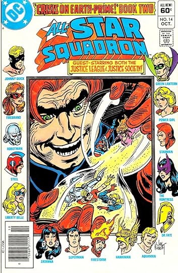 From ALL-STAR SQUADRON #14, Oct 1982
A time-tested method of getting many characters on a cover was to line up head shots along the edges, and that’s what cover artist Joe Kubert did here. Gaspar’s lettering appears in two nice banners at the top, the rest is typeset.
 From ALL-STAR SQUADRON #22, June 1983
Again, Saladino’s lettering here is all at the top, leaving the bottom two thirds for the fine art by Ordway and Machlan. Gaspar could always be counted on to add style and variety to character names.
[image error]From ALL-STAR SQUADRON #35, July 1984More expressive character names on this cover, and lots of energy in both the burst and the banner at the bottom, where Gaspar adds a new version of his All-Star logo.
 From ALL-STAR SQUADRON #50, Oct 1985
The first major crossover event at DC was CRISIS ON INFINITE EARTHS, and it impacted every title, including this one. Gaspar finds room for three appealing captions on this busy cover.
 From ALL-STAR SQUADRON #64, Dec 1986
This is a fun cover idea, and Saladino’s lettering helps make it work. This title ended with issue #67, a long and successful run. Longer than the original Justice Society appearances in ALL-STAR COMICS, in fact.
 From AMERICA VS. THE JUSTICE SOCIETY #1, Jan 1985
Speaking of the Justice Society, Roy Thomas also kept them in the public eye in this four-issue series with more fine cover lettering by Saladino. Long-time DC fans loved this sort of thing, but newer ones found it confusing, and the Golden Age characters were written out of DC continuity for a while after CRISIS ON INFINITE EARTHS.
 From AMERICA VS. THE JUSTICE SOCIETY #4, April 1985
Just one blurb by Saladino on this final issue. Later decades brought back the Golden Age superheroes, so they were not gone forever.
To sum up, Gaspar Saladino lettered the following covers of ALL-STAR SQUADRON: 1-9, 11-32, 35-53, 55-64, 66-67 and Annual #2. That’s 63 in all. And he lettered all four covers of AMERICA VS. THE JUSTICE LEAGUE.
Other articles in this series, and more you might like are on the COMICS CREATION page of my blog.
The post GASPAR SALADINO in ALL-STAR SQUADRON and AMERICA VS. THE JUSTICE SOCIETY appeared first on Todd's Blog.
December 13, 2021
GASPAR SALADINO in ALL-STAR COMICS
ALL-STAR began as an anthology from All-American Comics, sister company of National (DC) comics, but with issue #3 it became the home of the Justice Society of America, featuring long stories divided into chapters featuring superheroes like Green Lantern, The Flash and Hawkman, the original golden-age versions. When All-American merged with National, the book continued under original editor Sheldon Mayer for a while, then was edited by Julius Schwartz, who also came over from All-American. When Julie hired Gaspar Saladino to letter his books in the fall of 1949, he not only assigned him western stories, but started him right in on ALL-STAR, and Gaspar did fine on these long superhero stories until the title was cancelled in 1951. Above is a page from Saladino’s first issue showing some of his early style points: open letters over a black shape to begin each caption and wavy borders at the bottom of some captions. His balloon lettering was excellent from the start, if a bit larger than other letterers of the time, but he made it work. A team book is generally text heavy with many speaking characters, but then nearly all DC comics of the time were, so this one was not unusual.
 From ALL-STAR COMICS #54, Aug-Sept 1950
Gaspar did a creative CIRCUS on this issue’s title, but the feature logo at the top was picked up from an earlier issue. His scroll caption is well-made.
 From ALL-STAR COMICS #55, Oct-Nov 1950
Another page with lots of text, but Saladino finds room for a nice scroll caption over the last panel. These stories, though divided into chapters, were quite long for the time, often 32 pages. Most comics then were anthologies with stories running from four to twelve pages.
 From ALL-STAR COMICS #56, Dec 1950-Jan 1951
Most issues at this time also had a Johnny Peril backup story, and Saladino lettered a few of those too. This example is scanned from microfilm, so a poor image, but you can read the lettering pretty well. Gaspar’s story titles were not yet very good, the word AQUATERRA here is squashed and hard to read, but he would improve that area with time. Issue #57 was the final one of this run.
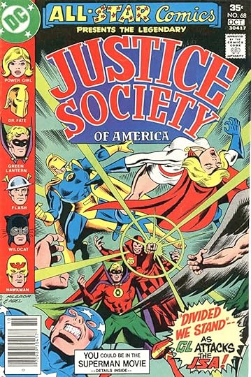
 From ALL-STAR COMICS #58, Jan-Feb 1976
In 1976, DC revived the title and the Justice Society after Julie Schwartz brought them back in the pages of JUSTICE LEAGUE OF AMERICA. Gaspar did not letter any of the stories in this revival, but he did letter some of the covers, including this first one. Saladino had taken over the role of main cover letterer at DC from Ira Schnapp in 1968, and by this time was doing many of DC’s covers with finely crafted balloons and captions. He probably also lettered the SUPER SQUAD subtitle.
 From ALL-STAR COMICS #62, Sept-Oct 1976
Here he not only did the burst and caption on the main image, but also the Superman blurb in the top banner, adding excitement with his energetic lettering.
 From ALL-STAR COMICS #68, Sept-Oct 1977
Gaspar did not design this Justice Society logo, which is by Joe Staton and perhaps an unknown inker, but he did the burst at the lower right.
 From ALL-STAR COMICS #73, July-Aug 1978
Covers divided into several sections can be difficult to letter, but Gaspar did well on this one, keeping the lettering off as much of the art as possible. This revival ended with issue #74, cut short by the infamous “DC Implosion” where management canceled almost half the comics line. The Justice Society did continue in ADVENTURE COMICS for a while.
Here are the stories lettered by Saladino in the first run of ALL-STAR COMICS:
#52 April-May 1950: Justice Society of America 32pp, Johnny Peril 5pp
#53 June-July 1950: JSA 30pp
#54 Aug-Sept 1950: JSA 32pp
#55 Oct-Nov 1950: JSA 32pp
#56 Dec 1950-Jan 1951: JSA 32pp, JP 5pp
#57 Feb-March 1951: JSA pages 2-26 only (25pp), JP 6pp
That’s a total of 199 pages in this short run of issues.
Gaspar also lettered these covers on the revived series of 1976-78: 58, 62, 64, 68, 73 and 74. That’s six in all.
Other articles in this series are on the COMICS CREATION page of my blog with more you might enjoy.
The post GASPAR SALADINO in ALL-STAR COMICS appeared first on Todd's Blog.
December 12, 2021
Rereading: NO BOATS ON BANNERMERE by Geoffrey Trease

Bill and Susan Melbury live with their mother in a rented flat, barely making ends meet after their father left, when suddenly the bequest of their mother’s Cousin Fay changes everything. Fay has left her a cottage beside a lake in England’s Lake District on the condition that she and her family live there year round. The Melburys decide to make the move, and are soon living in the cottage outside the small town of Bannermere at the southern end of the lake of the same name, in Bannerdale Valley, under the shadow of Black Banner, a crag hanging over the east side of the lake. They all love the small cottage and the surrounding wild lands. Bill and Susan’s mother is not sure how she can make a living there, but an idea arises when a hiker arrives and asks if they serve tea. Before long, the cottage is serving tea and scones to hikers regularly. Cousin Fay has even left them a small rowboat housed in a boathouse on the lake’s edge across the road from the cottage. But when Bill and Susan take the boat out to a small island in the lake opposite the big manor house of the local rich landowner, Sir Alfred, they are soon in trouble. Sir Alfred turns up with complaints to their mother and insists that no boats are allowed on Lake Bannermere. He doesn’t exactly own the lake, but he owns most of the land around it, including the patch where the boathouse is, so the children reluctantly give up their imagined boating adventures. Everyone is annoyed about this, including their farmer neighbor, who has nothing good to say about Sir Alfred.
Bill and Susan are enrolled in schools in nearby Winthwaite, each segregated by sex. Bill is intimidated by the stern aged headmaster of his school, but he soon makes a good friend there, Tim, who fancies himself an amateur detective. Susan also finds a good friend, Penny, and the four children begin spending time together on weekends and after school. Sir Alfred’s odd, secretive behavior becomes their obsession. They’re sure he’s hiding something, and digging operations on his land suggest he might be looking for buried treasure. Gradually the children find out more, while barely escaping Sir Alfred’s men. What are they after, and is the small island in the lake part of the mystery?
I’m not sure when I first read this book, but probably in the 1970s. I knew the author’s historical novels, I’d tried a few and liked them pretty well, but this one about more modern children and a mystery about buried treasure was much more to my liking. A few years ago I learned that it was the first book of a five book series, but the only one published in America. The Bannermere series had been popular enough in England, but I guess Trease’s American publishers didn’t think it would sell well enough here to put out the rest. I looked for them online and found them rare and high priced. Books two to five had even been reprinted by a small specialty publisher of British school stories, Girls Gone By, in the early 2000s, but those editions were also scarce, out of print, and highly priced. This year I decided my curiosity needed to be satisfied, and I bought the rest of the books, paying more than I’d like. I’ve read and enjoyed them all, but hesitate to recommend them here, as I know they are priced out of most readers’ budgets. Perhaps if you’re in England you’d have better luck finding them in libraries. I enjoyed them all, the series is a rare one where the children grow and age through the series, ending in college years, and each book has its mystery, but the real charm is the engaging characters.
Meanwhile, “No Boats On Bannermere” is not too hard to find in America in libraries and perhaps as a used book, and if you can find it, I think you’ll enjoy it. Someone could make money getting the rights and putting these out as ebooks.
The post Rereading: NO BOATS ON BANNERMERE by Geoffrey Trease appeared first on Todd's Blog.
December 10, 2021
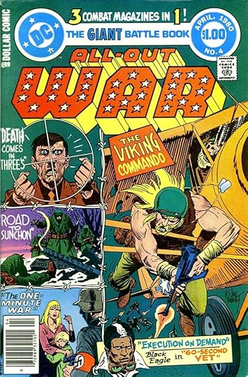
GASPAR SALADINO in ALL-OUT WAR
 All images © DC Comics. From ALL-OUT WAR #2, Nov-Dec 1979
It was about a year after the infamous “DC Implosion,” when management cut almost half the comics line and laid off some staff. The company was beginning to make a comeback thanks in part to the success of the first Superman movie released in December 1978. The Dollar Book line was doing well enough that it was decided to add a war title, and rather than have it be reprints, most of the content was new. This was a relief to creators whose work had been cut back like writer Robert Kanigher, and some of the war artists like George Evans, Gerry Grandenetti and Joe Kubert, and also to letterer Gaspar Saladino. War comics had always been one of his favorite genres, and he jumped into this one gratefully, lettering a majority of the stories and covers. I designed the logo and I think Joe Letterese did the lettering on the first cover,but from the second issue on, it was all Gaspar cover lettering, as seen above, and no one did it better, especially on war books. Editor Murray Boltinoff and Kanigher were pulling out all the topics they thought readers would be drawn to, like Vikings, air fighters, war dogs, and Nazis. Despite all this enthusiasm, I think sales were only moderate, and the title lasted just six issues, but they were large ones.
 From ALL-OUT WAR #4, March-April 1980
Hey, let’s put Hitler on the cover, too, and why not a black air fighter? This is a busy cover, but Gaspar’s creative and varied lettering adds to the excitement.
 From ALL-OUT WAR #6, July-Aug 1980
Unfortunately, there was no longer a big market for war comics, especially after the Vietnam War, when many young people turned away from military ideas. It was a good effort, but readers had moved on.
 From ALL-OUT WAR #1, Sept-Oct 1979
Inside the book, Gaspar’s lettering was vibrant, exciting, full of energy. His sound effects and titles were never better. Gaspar had been the main logo and house ad designer from 1968 until the Implosion, but after that his work in both areas was much reduced, and I think he would have enjoyed getting to letter many stories for this title.
 From ALL-OUT WAR #1, Sept-Oct 1979
 DC was now getting some of their art from Philippines artists to save money, and often they were lettered there as well, but editor Boltinoff managed to keep Saladino on stories like this one, I’m not sure how. think the story title was at least penciled by artist E.R. Cruz.
 From ALL-OUT WAR #1, Sept-Oct 1979
Most of the stories stuck to World War Two, but this one had echoes of more recent conflicts. I love Gaspar’s textured, gritty feature logo.
 From ALL-OUT WAR #3, Jan-Feb 1980
The titles on these E.R. Cruz stories look like his designs, so perhaps he sent in pencils for Saladino to letter, and Gaspar simply inked what Cruz had done. The art is also inked by Cruz, though, so it must have been sent back to him for that.
 From ALL-OUT WAR #3, Jan-Feb 1980
I love the large logo and titles on this story, again full of character and interest. All the creators listed had been instrumental in the success of DC’s war comics in the early 1950s, and it’s nice to see them reunited here, and credited by name, as they were not back then.
 From ALL-OUT WAR #4, March-April 1980
More great feature logo and story title work here from Saladino, as well as fine sound effects. This character seems like a good idea, and there’s plenty of action.
 From ALL-OUT WAR #6, July-Aug 1980
Look at these fine sound effects and balloons, and the story couldn’t get much more action on one page: a Viking Commando, an enemy officer, and an active volcano! Too bad this book wasn’t able to continue longer.
Gaspar lettered the covers of issues 2-6, that’s five in all. Here are the stories he lettered inside, features are abbreviated after the first appearance:
#1 Sept-Oct 1979: Viking Commando 18pp, Gunner & Sarge 7pp, Guerrilla War 12pp
#2 Nov-De 1979: VC 15pp, Black Eagle 10pp, GW 12pp
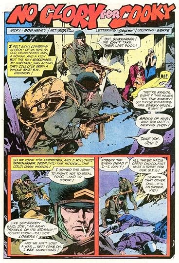
#3 Jan-Feb 1980: VC 15pp, No Glory for Cooky 7pp, GW 12pp
#4 March-April 1980: VC 14pp, BE 12pp, GW 13pp
#5 May-June 1980: VC 15pp, BE 13pp, GW 11pp
#6 July-Aug 1980: VC 16pp, BE 12pp, GW 12pp
That’s a total of 226 pages on this book. More articles in this series and others you might enjoy are on the COMICS CREATION page of my blog.
The post GASPAR SALADINO in ALL-OUT WAR appeared first on Todd's Blog.
December 8, 2021
GASPAR SALADINO in ALL-NEW COLLECTORS’ EDITION and other DC Tabloid Comics
 All images © DC Comics. From THE AMAZING WORLD OF SUPERMAN METROPOLIS EDITION, 1973
This article has become a sort of catch-all for the lettering work of Gaspar in DC’s tabloid-size issues, which began with the one above, an unusual project. It was intended to promote a Superman theme park that never opened, and while the cover is in color, the interiors are black and white with gray tones. Some of the book is reprints, some is non-fiction articles with photographs, but this 15-page origin story for Superman was new. Gaspar was already becoming the go-to person at DC for high-profile projects, and this was one that should have been very high profile, but kind of fizzled when the theme park did. The story was often reprinted elsewhere in color. Below are all the other DC tabloids with Saladino lettering in date order. Most of the DC tabloids after this first one were identified by issue numbers beginning with the letter C, but the series began with C-20 for some reason, and there were several different series within that numbering: LIMITED COLLECTORS’ EDITION, which was mostly reprints, FAMOUS FIRST EDITIONS, which was oversized replicas of important early DC comics, and ALL-NEW COLLECTORS’ EDITION, which was mostly new material, and that’s where the majority of Gaspar’s lettering work is found, though he did contents pages and other short features elsewhere. SUPERMAN VS. THE AMAZING SPIDER-MAN, a collaboration with Marvel Comics, does not have a C number, and there were three later tabloids that didn’t either, being part of the DC SPECIAL SERIES instead.
 From LIMITED COLLECTORS’ EDITION C-27, SHAZAM, June 1974
Once DC had figured out how to do tabloid size comics, they kept at it, though many like this one were mostly reprints. Gaspar did some contents pages, as here, which are certainly much more appealing with his lettering than they would have been using only type, though some were also done that way. Most of the covers in this series used type other than the logo.
 From LIMITED COLLECTOR’S EDITION C-31, SUPERMAN, Oct-Nov 1974
Another one with some great Saladino lettering, full of variety in styles and sizes, and even a nice scroll caption. If I were picking up this book at a newsstand, I’d be more likely to buy it after seeing this. Incidentally, that Superman painting, also on the cover, is the one by H.J. Ward that once hung in the office of Harry Donenfeld, but was then lost track of by DC when he took it home at retirement. DC retained a good photograph of the painting, which allowed them to use it here. It’s now owned by Lehman College in the Bronx, and is often on display in their library. Gaspar also lettered the How To Draw Superman feature by Curt Swan.
 From LIMITED COLLECTORS’ EDITION C-34, CHRISTMAS WITH THE SUPER-HEROES, Feb-March 1975
While most of these used existing logos and had no cover lettering, this one is an exception. The handsome logo by Saladino is new, as is the lettering in the bow. The logo was reused on a later issue too. This is certainly a case where Gaspar did his lettering to fit the existing space in the art.
 From LIMITED COLLECTORS’ EDITION C-35, SHAZAM, April-May 1975
Another appealing contents page with great variety, and notice how the elements are divided into sections for easier reading.
 From LIMITED COLLECTORS’ EDITION C-37, BATMAN Aug-Sept 1975
This contents page is full of appealing lettering and atmosphere, with great rough-edged paper captions, and look at that wild 3-D!
 From SUPERMAN VS. THE AMAZING SPIDER-MAN #1, DC Comics and Marvel Comics, April 1976
At the time this was being created, Gaspar Saladino was working for both Marvel and DC, though much more for the latter. He was the perfect choice to letter this ground-breaking crossover epic, and it cemented his reputation as the go-to person for such projects. If ever a sound effect could make a punch more convincing, this is it.
 From LIMITED COLLECTORS’ EDITION C-49, SUPERBOY AND THE LEGION OF SUPER-HEROES, Oct-Nov 1976
While having less room on this contents page, Saladino makes good use of it with open titles that were filled with a gray tone.
 From LIMITED COLLECTORS’ EDITION C-51, BATMAN, Aug-Sept 1977
This was the only cover in the LIMITED COLLECTORS’ series to have new lettering by Saladino. Sorry for the small reproduction of it, but I wanted to show both the front and back.
 From ALL-NEW COLLECTORS’ EDITION SUPERMAN VS. WONDER WOMAN C-54, Jan 1978
When DC decided to create some all-new tabloids, Gaspar was once again tapped to letter them, other than the Rudolph ones, which were lettered by writer-artist Sheldon Mayer or his Philippine inkers, who also lettered the tabloid based on The Bible. Gaspar is on record as feeling these new tabloids held some of his best work, as the large page size gave him more room to be creative.
 From ALL-NEW COLLECTORS’ EDITION C-55, SUPERBOY AND THE LEGION OF SUPER-HEROES, March 1978
Team-up stories were nothing new to Gaspar, but the sheer number of characters in this one must have made the lettering more time-consuming. Even though his work is larger than many letterers, it rarely looks cramped.
 From ALL-NEW COLLECTORS’ EDITION C-56, SUPERMAN VS. MUHAMMAD ALI, March 1978
This is the best known of the original DC tabloids, and all the creators were doing excellent work, from writer Denny O’Neill to artists Neal Adams and Dick Giordano, colorist Cory Adams, and letterer Gaspar Saladino. I was privileged to do production work on the pages early in my DC career, and it was a glorious thing to see them. Previously I hadn’t really known the work of Saladino, or at least not put his name to it, but this job made him my favorite letterer and role model from then on.
 From ALL-NEW COLLECTORS’ EDITION C-58, SUPERMAN VS. SHAZAM, May 1978
The last one lettered by Saladino, and this page has a great burst at lower right. All the lettering adds interest and energy to the art and subject. I was assigned the cover lettering, and I did my best, but I sure wish Gaspar had done it instead, his would have been much better.
 From DC SPECIAL SERIES #26, SUPERMAN AND HIS INCREDIBLE FORTRESS OF SOLITUDE, Summer 1981
As mentioned earlier, the last three DC tabloids of this period were part of the DC SPECIAL SERIES, but I’m including them here instead of with the rest of that run. Gaspar designed the logo and lettered the front and back covers of this one.
 From DC SPECIAL SERIES #26, SUPERMAN AND HIS INCREDIBLE FORTRESS OF SOLITUDE, Summer 1981
He also lettered the entire main story inside, making this a fine companion to his earlier tabloid work. His title here uses Gaspar’s horror style effectively for the word FEAR, and I also love the trail of SSSS behind Superman.
 From DC SPECIAL SERIES #27, BATMAN VS. THE INCREDIBLE HULK, Fall 1981
The second Marvel-DC crossover has front and back cover lettering by Saladino…
 From DC SPECIAL SERIES #27, BATMAN VS. THE INCREDIBLE HULK, Fall 1981
…and he also lettered these character summaries on the inside front cover. The rest of the book was lettered by John Costanza.
Here’s a summary of Gaspar’s work on DC Tabloids:
THE AMAZING WORLD OF SUPERMAN METROPOLIS EDITION, 1973: The Origin of Superman 15pp
LIMITED COLLECTORS’ EDITION SHAZAM, C-27, June 1974: Contents 1pp
LIMITED COLLECTORS’ EDITION SUPERMAN, C-31 Oct-Nov 1974: Contents 1pp, How To Draw Superman 2pp
LIMITED COLLECTORS’ EDITION CHRISTMAS WITH THE SUPER-HEROES, C-34 Feb-March 1975: Cover
LIMITED COLLECTORS’ EDITION SHAZAM, C-35 April-May 1975: Contents 1pp
LIMITED COLLECTORS’ EDITION Batman, C-37 Aug-Sept 1975: Contents 1pp
SUPERMAN VS. THE AMAZING SPIDER-MAN #1, April 1976: The Battle of the Century! 93pp
LIMITED COLLECTORS’ EDITION SUPERBOY AND THE LEGION OF SUPER-HEROES, C-49 Oct-Nov 1976: Contents 1pp
LIMITED COLLECTORS’ EDITION BATMAN, C-51 Aug-Sept 1977: Cover
ALL-NEW COLLECTORS’ EDITION SUPERMAN VS. WONDER WOMAN, C-54 Jan 1978: 72pp
ALL-NEW COLLECTORS’ EDITION SUPERBOY AND THE LEGION OF SUPER-HEROES, C-55 March 1978: 72pp
ALL-NEW COLLECTORS’ EDITION SUPERMAN VS. MUHAMMAD ALI, C-56 March 1978: 73pp
ALL-NEW COLLECTORS’ EDITION SUPERMAN VS. SHAZAM, C-58 May 1978: 72pp
DC SPECIAL SERIES #26, SUPERMAN AND HIS INCREDIBLE FORTRESS OF SOLITUDE, Summer 1981: Cover, 64pp
DC SPECIAL SERIES #27, BATMAN VS. THE INCREDIBLE HULK, Fall 1981: Cover, Inside Front Cover 1pp
To sum up, I found Saladino lettering on three wraparound covers and a total of 469 pages inside these oversized comics. There would not be any more tabloid-size ones from DC until a series by Paul Dini and Alex Ross beginning in 1998. Other articles in this series and more you might like are on the COMICS CREATION page of my blog.
The post GASPAR SALADINO in ALL-NEW COLLECTORS’ EDITION and other DC Tabloid Comics appeared first on Todd's Blog.
December 6, 2021
GASPAR SALADINO in ALL-AMERICAN WESTERN
 All images © DC Comics. From ALL-AMERICAN WESTERN #113, April-May 1950
When superhero sales began to wane, DC followed the lead of other comics companies by trying different genres that were popular with kids, and westerns was one of them. Editor Julius Schwartz handled the western titles at National (DC) Comics, including this one when it made the transition from ALL-AMERICAN COMICS with issue #103 dated Nov 1948. When Julie hired Gaspar Saladino to letter his comics in the fall of 1949, this was one of the first titles he worked on, right after his earliest work in ROMANCE TRAIL #5. Issue #113 was the first with lettering by Saladino, and on this page you can see some of the characteristic style points of his early work like the small zig-zags in the final caption border, the open first letter in the first caption with a black brush shape behind it, and the wavy panel border below that. Gaspar started out strong, a talented letterer from the beginning who was not simply content to do the least amount of work possible, he also made creative choices that set his work apart. This bimonthly title lasted a little more than two years after Saladino started working on it, and he lettered the majority of the stories until it changed format again, becoming ALL-AMERICAN MEN OF WAR. See my article about that for Gaspar’s many pages lettered there. All of the covers for this series were lettered by Ira Schnapp, DC’s veteran and regular letterer for that high-profile task, and I’ve written about that HERE. But Schnapp lettered only a few stories inside the book, and a few were lettered by others I can’t name.
 From ALL-AMERICAN WESTERN #114, June-July 1950
The book had a lineup of regular features that didn’t change much during this time, along with one or two page fillers that Gaspar didn’t letter many of. Johnny Thunder always had the lead spot, one of several characters at DC with that name over the years, and usually second up was Overland Coach, as seen here, with Miss Tony Barrett behind the reins. Comics from DC at the time were often text-heavy and over-written, with the top panels here a good example. Note the extra effort of Gaspar’s scroll caption over the last panel.
 From ALL-AMERICAN WESTERN #115, Aug-Sept 1950
This short feature appeared in many issues, some lettered by Saladino, some not.
 From ALL-AMERICAN WESTERN #116, Oct-Nov 1950
Another regular feature was this one about a singing cowboy, under a logo by Ira Schnapp, who I think did all the feature logos for the book. Gaspar adds interest to the caption by putting it on ragged paper.
 From ALL-AMERICAN WESTERN #117, Dec 1950-Jan 1951
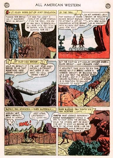
Usually rounding out the regular features was Foley of the Fighting 5th, working in an army fort in Indian territory. Saladino adds to the charm of his lettering with three handsome scroll captions here. In the last panel he struggled to fit the balloon text in around the figures, and just managed it by overlapping the previous panel, something Ira Schnapp had been doing for years.
 From ALL-AMERICAN WESTERN #122, Oct-Nov 1951
An even more copy-heavy page from the Johnny Thunder story in this issue. Though he was a freelancer being paid by the page, Saladino worked at a drawing board in the office shared by DC editors Schwartz and Robert Kanigher at the time, so he was handy to work on their stories and do any corrections needed. He told me on average he was able to letter nine pages a day, and this is why it was only that many. He worked 9 to 5 every weekday, so that meant on average he was lettering 45 pages a week, and for it he was paid two dollars per page, or $90. Very little by today’s standards, but he considered it good money at the time, and he was happy to get it and have regular work. Assuming some time off, he was probably lettering about 2,000 pages a year. Over time, I hope to find out if that’s the case as I index his work in these posts.
Here’s a list of the stories lettered by Saladino in ALL-AMERICAN WESTERN. I’ve abbreviated the feature names after the first appearance.
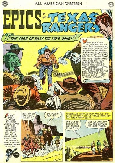
#113 April-May 1950: Johnny Thunder 12pp, Overland Coach 8pp, Minstrel Maverick 8pp
#114 June-July 1950: JT 8pp, OC 8pp, MM 8pp, Epics of the Texas Rangers 3pp, Foley of the Fighting 5th 8pp
#115 Aug-Sept 1950: JT 10pp, OC 8pp, ETR 3pp, MM 8pp, Charge of the Wagon Brigade 2pp
#116 Oct-Nov 1950: JT 12pp, OC 8pp, ETR 3pp, MM 8pp
#117 Dec 1950-Jan 1951: JT 12pp, OC 8pp, MM 8pp, FF5th 8pp
#118 Feb-March 1951: JT 12pp, Rocky Hill 1pp, Dusty Trail 1pp, ETR 3pp, FF5 8pp
#119 April-May 1951: OC 8pp, MM 8pp, ETR 2pp, FF5 8pp
#120 June-July 1951: JT 12pp, OC 8pp, MM 8pp, Big Teepee & Little Teepee 1pp, FF5 8pp
#121 Aug-Sept 1951: JT 12pp, OC 8pp, MM 8pp, FF5 8pp
#122 Oct-Nov 1951: JT 10pp, OC 8pp, FF5 8pp
#123 Dec 1951-Jan 1952: JT 8pp
#124 Feb-March 1952: JT 6pp, OC 6pp, MM 6pp, FF5 6pp
#125 April-May 1952: JT 8pp, OC 6pp, MM 4pp, FF5 6pp
#126 June-July 1952: JT 8pp, OC 6pp, MM 4pp, FF5 6pp
That’s a total of 391 pages on this book. Other articles in this series are on the COMICS CREATION page of my blog along with more you might enjoy.
The post GASPAR SALADINO in ALL-AMERICAN WESTERN appeared first on Todd's Blog.
Todd Klein's Blog

- Todd Klein's profile
- 28 followers

