
Todd Klein's Blog, page 78
January 23, 2022
Rereading: THREE STUFFED OWLS by Keith Robertson

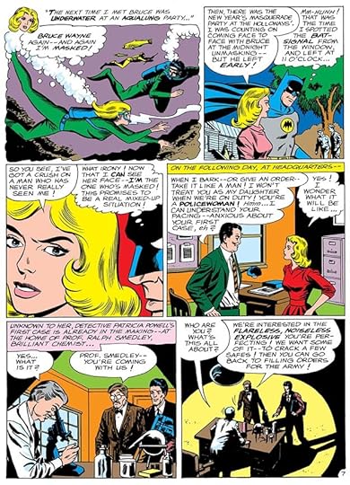
Robertson is a favorite author of my childhood, and over the years I’ve gathered a complete collection of his novels for young readers with one exception. There are four books featuring the Carson Street Detective Agency. The first is “The Mystery of Burnt Hill,” and sadly that book is impossible to find, there are no available copies at any price. Fortunately, the second book, above, is easier to locate, and a great read.
Neil Lambert and Swede Larson are two teenage boys living in a small town south of Princeton, NJ. Most people think their detective agency, located in the loft of the barn/garage of Neil’s home is an amusing activity for the boys, but their success in solving the Burnt Hill case gave them some credentials. Not that there’s much call for their services, but when Ginny Haggard arrives to hire them one summer day, they are happy to take her case. Ginny had borrowed her brother’s bicycle to go to the soda shop in town, and it had been stolen there while she was inside. This is a surprising crime in sleepy Belleville, and Neil and Swede get on their own bikes to look for the missing one. Their quest takes them to the local fairgrounds, where a raffle lands them with an unusual prize, a baby pig. Getting the pig home becomes a challenge, and when the pig gets loose in Eckleberry’s Drug Store where the crime occurred, a funny scramble is the result.
Neil and Swede find the missing bike almost by accident at the train station in a nearby town, and that leads them to the home of a man named Von Brugge who moved to Belleville recently and has a business doing taxidermy and acting as a buyer of stuffed animals and birds from other countries for museums. Von Brugge had hired an assistant, but the man disappeared suddenly. Could he be connected to the stolen bike? Neil and Swede make friends with Von Brugge, who seems a harmless soul, and learn more about his business. They find three stuffed barn owls in his front display window fascinating, especially when the taxidermist explains that one of them is hooked up to a barn owl recording that’s loud and scary. Neil and Swede get permission to borrow the owl for some practical jokes. Someone else is very interested in those stuffed owls, though, a man from New York City, who is connected to a jewel smuggling operation. The plot thickens, and the boys soon find themselves in deep trouble from the man’s criminal henchmen.
This book is fun and exciting, a good mystery, a thriller, and with a healthy dose of humor. The characters are appealing and realistic, and I recommend it highly.
The post Rereading: THREE STUFFED OWLS by Keith Robertson appeared first on Todd's Blog.


January 21, 2022
GASPAR SALADINO in BLUE BEETLE and BLUE DEVIL
 All images © DC Comics. From BLUE BEETLE #1, June 1986
Once again I am combining two titles with the same first word simply to create an article of the right length, they have no other connection. Gaspar Saladino lettered only covers for each title.
Blue Beetle’s comics history goes back to 1939 at Fox Comics, but he came to DC through a run at a later publisher, Charlton Comics, where he was sometimes drawn by Steve Ditko. That version of the hero, an alias of Ted Kord, came over to DC when they bought some of the Charlton heroes in the mid 1980s. The character did well at DC. His own series ran 24 issues, and he joined the Justice League. Later versions of the character were also reasonably successful for DC. The logo on this first DC issue is by Saladino, but based on one that was created by Charlton. The burst and the scroll caption are Gaspar’s fine work, adding excitement to this launch. Too many exclamation points, maybe, but that wasn’t his choice. By now, DC had recognized the value of first issues to comics fans, and they were not tempted to continue the numbering from Charlton’s version.
 From BLUE BEETLE #2, July 1986
Saladino seemed to have a knack for doing flaming letters, he had several styles for them. This one has flames blowing to the left, and the letters seem partly consumed at the top. Despite all that texture, they’re still easy to read.
 From BLUE BEETLE #8, Jan 1987
Gaspar’s large display lettering takes up almost half of this cover, and while the letters might have been simple block shapes, he’s made them more interesting using unusual angles and variations. There’s also a subtle rough edge to it all. It adds a great deal to the cover.
 From BLUE BEETLE #12, May 1987
This is a crowded cover, but Gaspar’s two arrow captions work well to make it more understandable. I like the texture on THE HYBRID.
 From BLUE BEETLE #20, Jan 1988
A similar treatment is used for CATALYST here, but what really stands out is the reversed white lettering in the black area, something that would have been done by making a negative photostat in the DC production department. Another version of the Blue Beetle appeared some years later, but without Gaspar’s work.
 From BLUE DEVIL #1, June 1984
Blue Devil was created by writers Gary Cohn and Dan Mishkin along with artist Paris Cullins, and his series ran for 31 issues plus an Annual. I designed the logo, Gaspar added the top line above it. DC was definitely catering to the direct market comics retailers and their buyers by this time, and they loved first issues.
 From BLUE DEVIL #2, July 1984
Saladino’s caption on this issue includes a clever treatment of SHOCKWAVE, with multiple thin outlines suggesting tremors.
[image error]From BLUE DEVIL #7, Dec 1984The romance theme of this cover gave Gaspar a chance to utilize appropriate styles and a fancy border on the top caption, while the bottom one kept things a bit more heroic.
 From BLUE DEVIL #14, July 1985
This cover is an homage to DETECTIVE COMICS #38 from 1940, where the cover introduced Batman’s sidekick Robin. Saladino’s lettering follows that lead also with well-crafted Old English letters for the character name.
[image error]From BLUE DEVIL #19, Dec 1985More fun is had with this comparison in issue #19, which guest-stars Robin.
 From BLUE DEVIL #24, May 1986
Saladino was an old hand at making things fit, and he does a fine job here with this blurb. Even with much of the word TOYS covered, it still reads fine.
 From BLUE DEVIL #31, Dec 1986
The final issue includes more fiery effects. I particularly like the little crown over the L in LUCIFER, and the flames atop the bottom caption, which the colorist has left white. Like Blue Beetle, Blue Devil popped up elsewhere from time to time, but not as often, and to date he hasn’t had a new series.
To sum up, Gaspar Saladino lettered these BLUE BEETLE covers: 1-4, 6-15, 20-22 for a total of 17. On BLUE DEVIL he did issues 1-2, 4-5, 7-31 and Annual 1 for a total of 30.
Other articles in this series and more you might like are on the COMICS CREATION page of my blog.
The post GASPAR SALADINO in BLUE BEETLE and BLUE DEVIL appeared first on Todd's Blog.
January 19, 2022
GASPAR SALADINO in BLACKHAWK
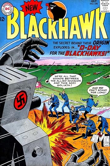
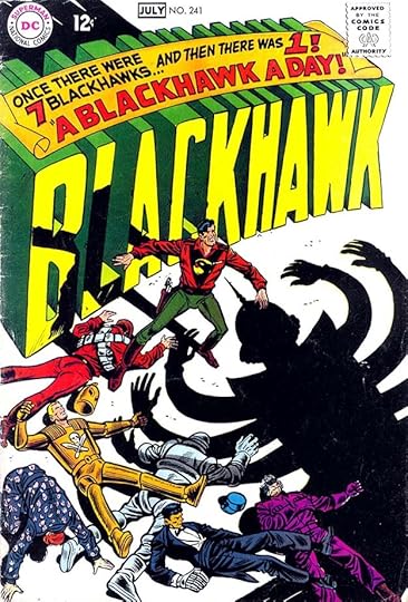
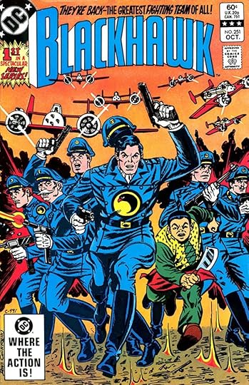
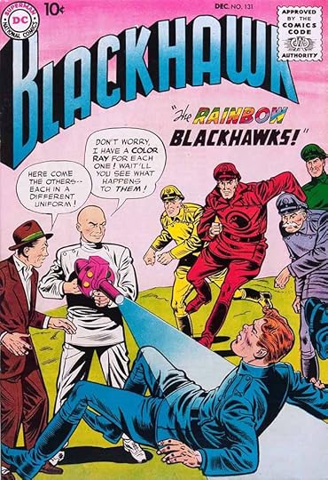 All images © DC Comics. From BLACKHAWK #131, Dec 1958
Blackhawk and his band of air fighter pilots began at Quality Comics in 1941, largely the creation of Chuck Cuidera, and it quickly became the company’s best-selling title, at times rivaling Superman. When Quality decided to get out of comics in 1956, they sold or leased many of their properties to National (DC) Comics. DC knew a good thing, and they not only continued BLACKHAWK as a monthly comic, and there were only a few of those at the time at DC, they kept the creative team as well. Whether they also kept the letterer I don’t know, but Ira Schnapp was soon lettering all the covers, with Gaspar Saladino occasionally filling in for him, as on the one above. This cover lettering is more like what Saladino was doing on stories that anything else, and his wide, angular balloon lettering is clear and readable. Sometimes he tried harder to imitate Schnapp on covers, but not here. In the story title the word BLACKHAWKS has the top of each K angled, like the first K in the Quality logo by Al Grenet that DC continued to use for many years, but the bottoms of each K are horizontal like the second K.
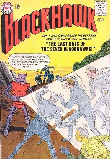 From BLACKHAWK #185, June 1963
For some reason, and it may just be coincidence, Gaspar lettered more fill-in covers on this series than most. Here the word balloon is definitely by Saladino, but the story title is type.
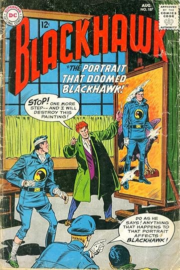 From BLACKHAWK #187, Aug 1963
Two issues later, another fill in by Gaspar has him giving the word balloons more of a special treatment, as Schnapp always did. The letters are thicker and the end of each stroke is squared off probably with a small pen point. The story title on this one has the Ks in BLACKHAWK copying the first one in the logo more closely.
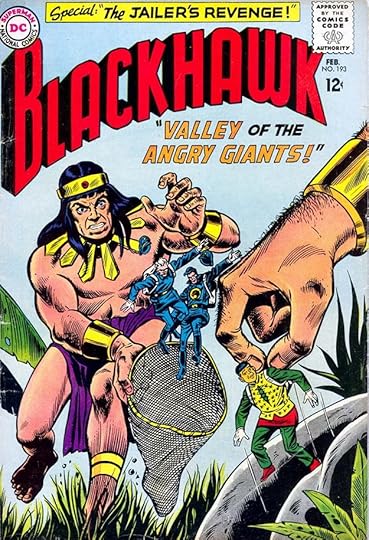 From BLACKHAWK #193, Feb 1964
The story title here is similar to the previous one in approach, while the top blurb is taking cues from what Ira Schnapp often did in similar situations.
 From BLACKHAWK #198, July 1964
This cover lettering is similar to the last two, I see it as Saladino trying to conform to the styles of Schnapp, but with his own distinct approach peeking through in the wider letters.
 From BLACKHAWK #205, Feb 1965
Much the same here, and you can see the book was drifting further and further from its World War Two roots and becoming more like other DC mystery, adventure, and science fiction titles.
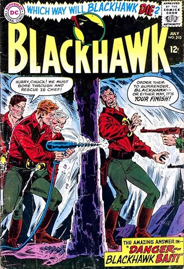 From BLACKHAWK #210, July 1965
The last of the Saladino fill-in covers is looking less like Schnapp and a little more like what Gaspar would be doing a few years later on all the covers. Again, I don’t know why he did so many on this title.
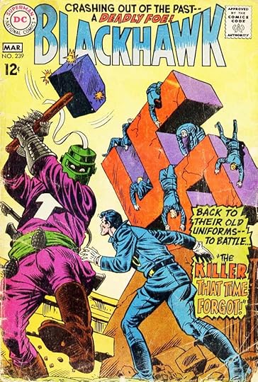 From BLACKHAWK #239, Feb-March 1968
Some time in 1967, Gaspar was given a mandate by Carmine Infantino, who had moved from freelance artist to management, to take over Ira Schnapp’s role as the style setter for the company on logos, covers and house ads. Ira was still doing some of each, but on books with 1968 cover dates, their roles had switched, and Saladino was doing the majority of them. Schnapp was retired some time in 1968, and for the next decade Gaspar was the main DC style setter. He rose to the challenge with more energetic and creative cover lettering, but it took him a while to settle in. This cover is getting there, but still a bit uneven. Notice the blank space in the center of the caption, for instance.
[image error]From BLACKHAWK #240, April–May 1968The following issue shows Saladino getting more creative and diving into the psychedelic styles that were popular at the time. Note that the frequency of publication had dropped from monthly to bimonthly, usually a sign of falling sales, so everyone on the book would have been trying hard to grab reader attention.
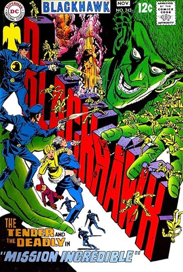
 From BLACKHAWK #241, June-July 1968
This one-off logo treatment certainly grabs attention! I’m sure Gaspar lettered the handsome scroll caption on top of it, the logo might have been pencilled by cover artist Dick Dillin and inked by Saladino, it’s hard to say. Lots of drama here!
 From BLACKHAWK #242, Aug-Sept 1968
Mark Evanier and I disagree about who designed this one-off logo, it might be by cover artist Pat Boyette, but certainly the large cover lettering at the bottom is by Saladino. The perspective on the first four lines is effective, too bad the story title doesn’t match it, but I think Gaspar felt it wouldn’t fit that way.
 From BLACKHAWK #243, Oct-Nov 1968
Another one-off logo embedded in the Pat Boyette cover art, and probably Saladino was not involved. Did he do the cover blurb at the bottom? The block lettering is rather far from his usual styles, and somewhat uneven, so perhaps Boyette did that as well, and I won’t count this for Saladino. DC added the series name at the top in type so buyers wouldn’t miss it. This was the final issue of this series for a while.
 From BLACKHAWK #249, Nov-Dec 1976
The book returned in 1976 for seven more issues, all with story lettering by Saladino except this issue, for which he did only the cover lettering. With eight more years of experience under his belt, Saladino’s work shows his confidence and established styles. This revival must not have sold well enough to continue.
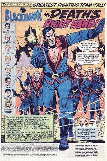
 From BLACKHAWK #251, Oct 1982
In 1982 there was another relaunch with writer Mark Evanier and artist Dan Spiegle on interiors. This one did better and lasted two years. The series went back to its roots in World War Two, with the original uniforms and a logo based on the Quality Al Grenet one by Tom Orzechowski. Saladino lettered some of the covers, including the burst on this one touting it as a first issue, though the original numbering was continued.
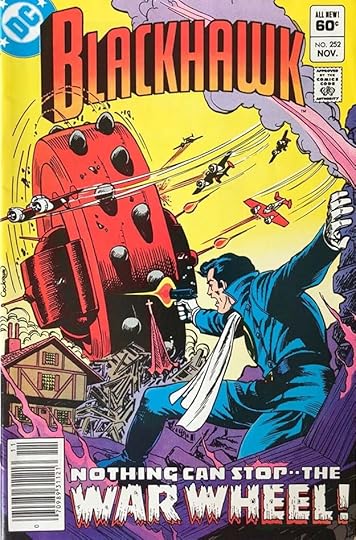 From BLACKHAWK #252, Nov 1982
One of the most visually frightening threats in the series was the War Wheel, and Gaspar’s weathered, bullet-ridden display lettering on this cover sells it well.
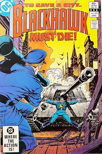 From BLACKHAWK #254, Jan 1983
Here’s a good example of working the logo into the cover blurb. More effective textured lettering on the final line.
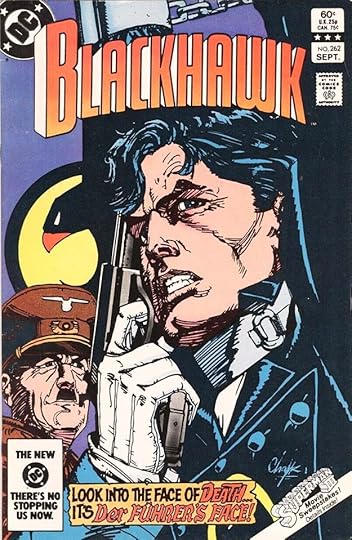 From BLACKHAWK #262, Sept 1983
Putting Hitler on this Howard Chaykin cover upped the ante, and Saladino’s caption adds to the tension with his version of German Blackletter style in the last line.
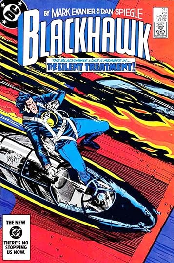 From BLACKHAWK #271, July 1984
Dan Spiegle’s own cover art is a perfect choice for this title, and perhaps it should have been used more. I think I lettered the Evanier-Spiegle credits above the logo (picked up from previous issues), but the caption is by Gaspar.
 From BLACKHAWK #244, Jan-Feb 1976
As I said earlier, Saladino lettered the interior stories of most of the 1976 issues beginning with this one, and it’s fine work with an exciting title. The second word balloon is almost a rectangle, a style more often seen from Artie Simek at Marvel. Partial credits were now common at DC, but did not yet include colorists and letterers.
[image error]From BLACKHAWK #245, March-April 1976This page has an amazingly energetic sound effect, and the character name burst in the second panel is great, too.
[image error]From BLACKHAWK #247, July-Aug 1976More dynamic sound effects on this page that add a lot to the storytelling.
To sum up, I found Gaspar Saladino lettering on these covers: 131, 185, 187, 193, 198, 205, 210, 239-242, 250-252, 254-256, 258, 262, 271-273, a total of 22. He also lettered the following Blackhawk stories:
#244 Jan-Feb 1976: 18pp
#245 March-April 1976: 18pp
#246 May-June 1976: 17pp
#247 July-Aug 1976: 17pp
#248 Sept-Oct 1976: 17pp
#250 Jan-Feb 1977: 17pp
That’s 104 pages in all. Other articles in this series are on the COMICS CREATION page of my blog along with more you might enjoy.
The post GASPAR SALADINO in BLACKHAWK appeared first on Todd's Blog.
January 17, 2022
GASPAR SALADINO in BLACK CONDOR and BLACK LIGHTNING
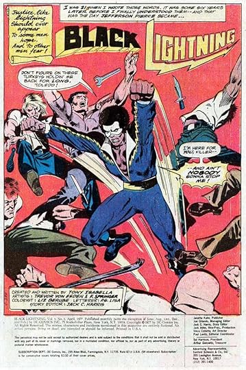
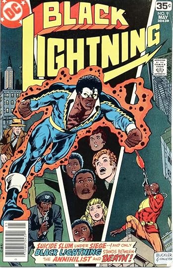 All images © DC Comics. From BLACK LIGHTNING #9, May 1978
These two DC series that begin with the same word are grouped here simply to create an article of the right length, and they have no other connection. Surprisingly, most of the lettering on them by Gaspar Saladino is on story pages, but he did letter two covers for BLACK LIGHTNING, so I’ll start there. The character was created by Tony Isabella and Trevor Von Eeden, and Gaspar designed the lightning bolt logo, but most of the covers in the 11-issue series were lettered by Joe Letterese, John Workman, and perhaps others. Issue #9, above, has a typical Saladino caption with a variety of styles that work well together.
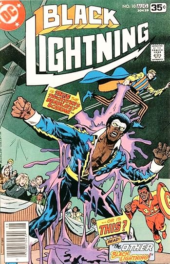 From BLACK LIGHTNING #10, July-Aug 1978
For issue #10, Saladino makes good use of arrow captions that include his fine open lettering. Note the subtle drop shadows on them to help them read against the cover art. As was usually the case, Gaspar would have lettered on separate one-ply art paper, which was sized, phototstatted and pasted onto the cover art by a DC production person, probably Bob LeRose at this time.
 From BLACK LIGHTNING #1, April 1977
Gaspar also lettered the book-length story in the first issue, though for some reason he used a pen name in the credits, P.G. Lisa. Letterer credits were just beginning to appear at DC at the time, this is one of the earliest. I don’t know why he used a pen name, but I do know what it means: P and G were his sons Peter and Gary, and Lisa was his daughter. Gaspar’s fine lettering gave the series a good start.
Unfortunately, the book fell victim to the DC Implosion in the fall of 1978, but the character appeared in other titles and later returned in his own.
 From BLACK CONDOR #1, June 1992
Black Condor was created by Brian Augustyn and Rags Morales, and the series ran for twelve issues in 1992 and 1993. Surprisingly, I see no evidence that Gaspar Saladino lettered any of the covers, but he did letter the stories in ten issues. The credit box on the first one, above, shows how he often credited himself with just his first name in an upper and lower case style similar to his handwriting. I think one reason was to avoid having to cram in his long last name. The title is stylish, and I like the different caption shapes.
 From BLACK CONDOR #2, July 1992
This page from issue #2 has an elaborate oversized check in the first panel and signs in the second with Saladino lettering. The color chosen for the captions is too dark in my opinion, but it may have worked okay in the actual comic. I like the way the two captions at lower left fit together, space was tight, and that helped.
 From BLACK CONDOR #3, Aug 1992
Some creative and energetic sound effects from Gaspar on this page help tell the story, and I like the use of lower case in the small final balloon.
 From BLACK CONDOR #6, Nov 1992
Speaking of sound effects, when given the chance to go big, Saladino never disappointed! This one is fabulous. Today having all those elements in front of the letters could be done digitally with masking, then it was simply lettered on the pencilled art.
 From BLACK CONDOR #12, May 1993
At this time, Saladino’s balloon lettering was loosening up and getting bouncier, and the lettering on this page has lots of that, and lots of variety, including small lower case, large bursts, a thought balloon, and a radio balloon from the phone. I don’t know why the series didn’t last longer, low sales is the likely reason. It certainly wasn’t because of the writing, art or lettering.
To sum up, Gaspar Saladino lettered two covers for BLACK LIGHTNING: #9-10, and the first issue, 17 pages.
For BLACK CONDOR, he lettered these issues:
#1 June 1992: 22pp
#2 July 1992: 22pp
#3 Aug 1992: 22pp
#4 Sept 1992: 22pp
#5 Oct 1992: 22pp
#6 Nov 1992: 22pp
#7 Dec 1992: 22pp
#8 Jan 1993: 22pp
#11 April 1993: 22pp
#12 May 1993: 22pp
That’s 220 pages in all. Other articles in this series and more you might like are on the COMICS CREATION page of my blog.
The post GASPAR SALADINO in BLACK CONDOR and BLACK LIGHTNING appeared first on Todd's Blog.
January 16, 2022
And Then I Read: A GIRL, A RACCOON, AND THE MIDNIGHT MOON by Karen Romano Young
 Cover art by Jessixa Bagley
Pearl Moran spends much of her free time in the Lancaster Avenue library, a run-down branch of the New York Public Library where her mother is the circulation librarian. Pearl was actually born in the library, and loves books and reading, but she and her mother are forced to face the fact that the library is failing, and may not be their true home much longer. Local interest is way down, patrons are scarce, and a crushing blow is dealt when a statue of poet Edna St. Vincent Millay that’s the star attraction of the library’s small green space suddenly loses its head. When Pearl sees this, her scream brings a crowd, and it seems like the end of their cherished library is nearer than ever.
Pearl decides to fight back with every resource and idea she can muster. She is helped by a growing number of friends, each of which contributes ideas, and even the reporter who at first makes things worse comes round to her plans and tries to help, as do the other employees of the library. Pearl and her friends put on entertainment at the foot of the headless statue, and gather library patrons there and at her school, but there are still many who want the library to go for their own reasons, including a pair of developers who want to turn it into apartments. Pearl’s allies include a family of raccoons who live on the grounds, and who seem to have an uncanny amount of wisdom and intelligence, some of them can even read and write, and they help in their own way, but will all this new interest be enough to hold off the library’s impending demise?
I enjoyed this book and its clever and appealing characters and plot. There are sidebars throughout written by another unknown writer that were distracting at times, but eventually they dovetail into the main plot in a satisfying way. There are also lots of footnoted references to other fine books I like and some I don’t know, which is an appealing idea, though again the footnotes were sometimes distracting. The illustrations by Bagley are appealing, and there’s just enough fantasy to make the story work without it becoming too unrealistic. Recommended.
The post And Then I Read: A GIRL, A RACCOON, AND THE MIDNIGHT MOON by Karen Romano Young appeared first on Todd's Blog.
January 14, 2022
GASPAR SALADINO in BEWARE THE CREEPER and BOOSTER GOLD
 All images © DC Comics. From BEWARE THE CREEPER #1, May-June 1968
This article focuses on two titles that Gaspar Saladino lettered only covers for, and I’ve combined them to make the article a good length, they have no other connection. BEWARE THE CREEPER was a Steve Ditko creation that lasted just six issues, and Ditko departed before that, possibly due to health issues at the time. Even when he was drawing the book, someone else was writing dialogue, but it’s still an interesting character and I liked the series when it came out. This cover would have been produced in late 1967 or early 1968, a time when Saladino was transitioning to a new role as the main cover letterer for DC, taking over from Ira Schnapp, who would leave the company in a few months. Gaspar had been filling in for Schnapp on covers occasionally for years, but was mostly used to lettering story pages, and his own cover styles had not yet fully emerged. The burst here is uneven in approach, the two styles don’t go together in my opinion, and the letters don’t fill the burst shape very well, so he was still finding his way, though I love Saladino’s logo for the book, one of his best from the time.
 From BEWARE THE CREEPER #2, July-Aug 1968
I like the cover lettering better on issue #2, it fills the space left by Ditko well, and is all of one style, with texture added on the last word. I also like the laughing around the logo, adding a slightly demented feel.
 From BEWARE THE CREEPER #3, Sept-Oct 1968
Issue #3 shows Gaspar hitting his stride, with a handsome block letter story title across the bottom gracefully arched downward along the top, and the laughter is more curved and fluid, dancing around the cover art.
 From BEWARE THE CREEPER #4, Nov-Dec 1968
I also like the laughter on this cover. The placement of the story title is a bit odd, on the giant face, but perhaps that’s where Ditko had indicated he wanted it.
 From BEWARE THE CREEPER #5, Jan-Feb 1969
Filling the space between two characters with a large balloon is never a good idea, and this one barely reads as a word balloon, but again, it may have been where Ditko wanted it. There isn’t much room on the rest of the cover. the reverse letters, white and colors on black, work well (something that would have been done in DC’s production department by making a negative phototstat), and the colors help sell it.
 From BEWARE THE CREEPER #6, March-April 1969
The final cover has art by Gil Kane, showing that Ditko had departed, and Saladino’s caption has deeply angled perspective, but is still readable. This is not easy to do. Perhaps Kane had roughed it in with perspective lines to give him direction. I think it works well. The Creeper continued to appear in other titles, and has had a long history at DC.
 From BOOSTER GOLD #1, Feb 1986
Booster Gold, created, written and penciled by Dan Jurgens, was the first new launch after DC’s CRISIS ON INFINITE EARTHS. He joined the Justice League, and his own title had a good run of 25 issues, most with cover lettering by Gaspar. I designed the logo, the rest here is by Saladino, including the top blurb. Superheroes were something he did well, and this title was right up his alley.
 From BOOSTER GOLD #4, May 1986
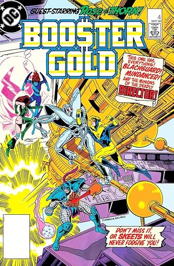
At first glance, all this cover lettering seems similar, but there are actually several styles at work, including slightly different ones for Rose and Thorn at the top, and DIRECTOR is open block letters. The caption styles add interest.
 From BOOSTER GOLD #9, Oct 1986
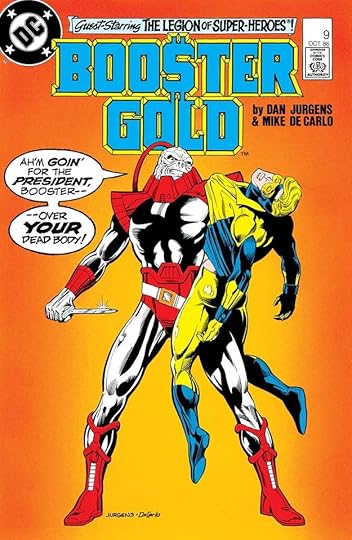
Like his predecessor Ira Schnapp, Gaspar often did larger and more artful display lettering in balloons on covers, as seen here, with extra emphasis on YOUR accomplished by the larger size and heavier weight. A threatening villain suggests a rough voice, and Saladino subtly suggests that with a rough balloon border.
 From BOOSTER GOLD #17, June 1987
On this cover, Saladino has some fun with the word MEXICO by giving it a zig-zag band suggesting native pottery, but the colorist has chosen a dark color for it that makes the word harder to read, something Gaspar wouldn’t have known about until the book was printed. I think it still reads okay.
 From BOOSTER GOLD #23, Dec 1987
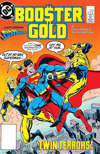
When the hero becomes the threat (times two), they get the rough balloon borders. Gaspar rarely missed a cue like adding an open drop shadow to TWIN to double it, and TERRORS is energetically appropriate.
To sum up, Saladino lettered all the BEWARE THE CREEPER covers, six in total, and these BOOSTER GOLD covers: 1-10, 12-13, 15, 17-25, a total of 22. More articles in this series and others you might enjoy are on the COMICS CREATION page of my blog.
The post GASPAR SALADINO in BEWARE THE CREEPER and BOOSTER GOLD appeared first on Todd's Blog.
January 12, 2022
GASPAR SALADINO, DC COMICS FASHION ARTIST
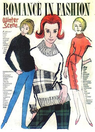
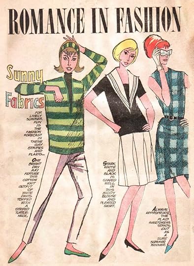
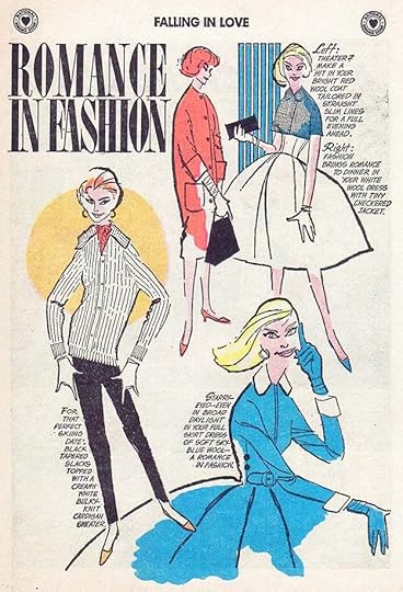 All images © DC Comics except E.M. Larson fashion art. From FALLING IN LOVE #31, Dec 1959
Going through issues of DC’s romance comics looking for the lettering of Gaspar Saladino, I found many examples of this feature, usually one page, but occasionally two, beginning in 1959 and running to 1966 in all seven titles in the DC Romance Group of the time. There’s no doubt the lettering is by Saladino, and he might also have hand-drawn the feature title, as some of the curved shapes seem a bit off model for type. Comparing the art to other romance comics art in the issues, I gradually came to focus on two unusual things. First, the style is not typical of romance artists in those books like John Romita, Tony Abruzzo, Bill Draut, Arthur Peddy and Jay Scott Pike. The art is very stylized, almost impressionistic, purposely exaggerated, but beyond that, the faces and and anatomy seem a little amateurish too, as if done by someone who was not as accomplished a figure artist as those men. Second, the inking is done with a dry brush almost exclusively, something rarely seen on other DC romance art. This made me wonder if Gaspar might be the artist as well as the letterer.
Saladino had studied fashion illustration in high school with the idea of pursuing that as a career. His plans were interrupted by service in the Army right after World War Two, but when he was back home in New York in 1947, he tried to get work as a fashion illustrator with little success, and finally gave up that idea and followed many of his high school classmates into comics, being hired by DC editor Julius Schwartz as a letterer in late 1949. Gaspar worked mainly in pen and ink, but on logos and titles he often used a dry brush with great effect. I wondered if someone at DC, or even Gaspar himself, had suggested he do fashion illustration art for the romance comics. It seemed a plausible idea.
 From GIRLS’ ROMANCES #109, June 1965
I contacted Gaspar’s daughter Lisa, who thought it was an interesting question, and she looked around in her mother’s house, Gaspar’s home for decades until his death in 2016. In a closet she found a large pile of romance pages like this one, mostly Romance in Fashion. My theory was right! There’s no other reason Gaspar would have the original art for those pages than that he was the artist. She sent photos of a few like this one. I was hoping to get some of them scanned, but Lisa told me they’re too fragile, saying “the paper is yellowed and starting to shred,” so I gave up on that idea. (Note that I’ve brightened them in these photos.) Lisa added that Gaspar never protected anything, he just threw things in a closet. My guess is these art pages were returned to him in the early 1980s when DC was clearing out a large backlog of original art from storage and returning it to artists when they could identify and find them. These pages have likely been in that closet for about 40 years. In this photo, the dry brush line work is even more obvious, notice how all the lines are uneven and textured, and vary greatly in width.
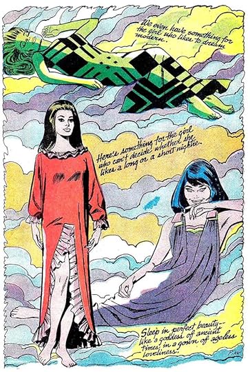
[image error]From SECRET HEARTS #107, Oct 1965This photo from Lisa shows an example with lots of detail and texture, and it must have taken a long time to do. Having no full figures left room for lots of items.
 Detail from image above
This closer look shows the dry brush line work, especially on the thickest lines, but also others, while the textures are a combination of pen and brush. I remembered seeing art like this in newspapers and magazines growing up, and I wondered if I could find examples that might have inspired Gaspar. I asked my friend and fellow comics historian Alex Jay to look, and among those he found, the work of one artist stood out.
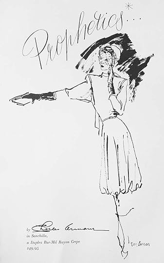 Fashion illustration by E.M. Larson, 1947, found online
Esther M. Larson was born in Connecticut in 1919. As a child she showed precocious art talent, and after graduating from high school in Greenwich, CT, she was awarded a scholarship at The American School of Design, where she studied fine art. Her professional career started in 1942 at “Women’s Wear Daily,” and after changing jobs a few times, she found a home with upscale department store Bergdorf Goodman in New York City, where she worked as their fashion illustrator for 30 years.
[image error]Bergdorf Goodman ad by E.M. Larson dated March 15, 1956, found onlineAll of Larson’s fashion designs Alex found have a similar impressionistic look, and often use dry brush as seen in these examples. They appeared in many newspapers and magazines like “The New York Times,” “The New York Herald Tribune,” VOGUE, HARPER’S BAZAAR and TOWN AND COUNTRY. She also worked editorially for these and other magazines.
 E.M. Larson for Bergdorf Goodman, 1963
After Bergdorf Goodman was sold in the 1970s, Larson worked for Lord & Taylor and other companies, and she created unique fashion illustrations for stores throughout America. She was the highest paid fashion illustrator of her time. Larson died in 2015 at age 96, an obituary is I see a lot of her influence in Gaspar’s fashion art, from the dry brush line work to the loose, impressionistic figures and the detailed patterns.
[image error]From HEART THROBS #63, Dec 1959These Romance in Fashion pages appeared often in all the DC romance titles from late 1959 to late 1966. In the beginning, as above, they were probably written by the romance editor or assistant editor with reference provided from current fashion magazines, probably editor Phyllis Reed at the start.
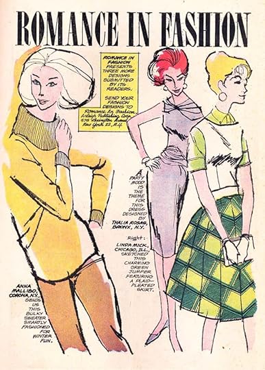 From GIRLS’ LOVE STORIES #96, July 1963
Readers must have liked the feature, and after a while they began mailing in their own fashion ideas. That made things easier for the editors and Gaspar, who only needed to adapt reader ideas in the style he was using, and perhaps he consulted fashion magazine photos or even Larson illustrations for poses. As you can see, the address for mailing in fashion drawings became part of the feature. Arleigh Publishing was the name DC used for the Romance Group at the time, but the address is the same as the one for National (DC) Comics, 575 Lexington Avenue, NYC.
 From GIRLS’ ROMANCES #99, March 1964
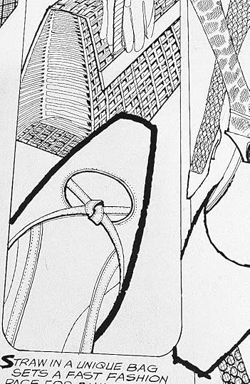
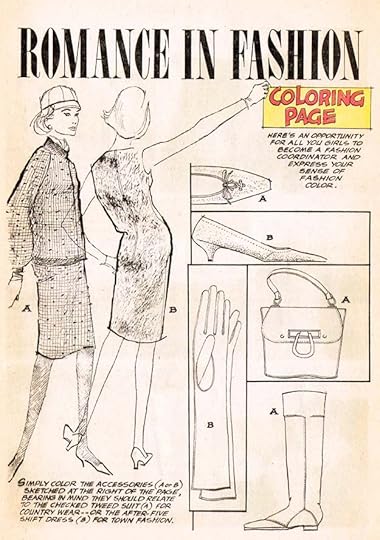
Here’s an example offered as a coloring page, and the line work and textures are even more striking without color on them.
 From YOUNG LOVE #41, Jan 1964
Examples of Romance in Fashion appear in all the romance titles in these amounts, FALLING IN LOVE (14), GIRLS’ LOVE STORIES (17), GIRLS’ ROMANCES (13), HEART THROBS (13 including one two-pager), SECRET HEARTS (15 including two two-pagers), YOUNG LOVE (14 including one two-pager), and YOUNG ROMANCE (11) for a total of 97 features and 101 pages.
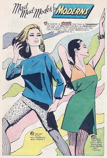
 From YOUNG LOVE #70, Sept 1968
After Romance in Fashion ended, a similar fashion feature began called Mad Mad Modes for Moderns. It was usually two pages, and the art was often by DC regular Jay Scott Pike, as in the signed example above, or by newcomer Elizabeth Berube. Notice how different the figures are, much more in the typical romance comic style. Like Saladino, Berube’s art was also very stylized, but in a different way, influenced by Peter Max and other 1960s pop art.
 from FALLING IN LOVE #98, April 1968
Gaspar did letter some of these, like this one also drawn by Pike, whose linework sometimes has elements of dry-brush similar to Gaspar, but most of his lines are smoother, and his faces are definitely more in the romance comics style.
 From FALLING IN LOVE #107, May 1969
A few of them from this title in 1969 again seem to have both art and lettering (except for the feature title) by Gaspar. Look how different the faces are from the one above, for instance.
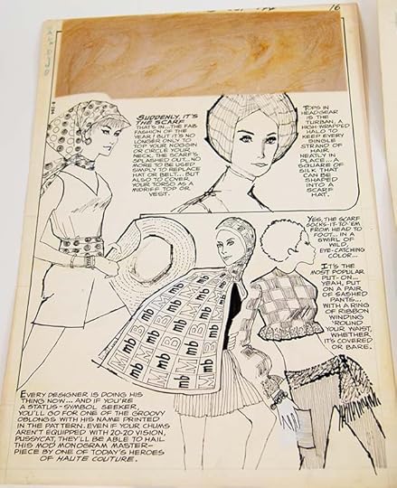
 From GIRLS’ ROMANCES #144, Oct 1969
These photos from Lisa of the original art from the Mad Mad Modes feature in GIRLS’ ROMANCES #144 confirm that he did do some of them. The brown square on the first page is where the pasted-on title was, it’s fallen off. I love the large music note with lettering in it in the second page, and Gaspar’s dry brush line work is even in use on the outer border. Gaspar was very busy at DC in 1969 doing logos, covers and house ads as well as story lettering, so he must really have enjoyed doing these fashion pages to manage to fit them in.
I believe Saladino did both the lettering and the art on these Mad Mad Modes two-pagers: FALLING IN LOVE #107-111 and GIRLS’ ROMANCES #144 & 147. It’s possible there are a few more, as I don’t have art scans for all of the 1969 Romance Group issues, but that’s seven features or 14 pages.
[image error]At least one two page Mad Mad Modes was completed by Saladino but not used, as this photo from Lisa attests. At the top are the reference number B370 and the note “Written Off 5/23/75.” Items that were written off were in inventory but never printed, and this one was returned to Gaspar.
 From YOUNG LOVE #44, July-Aug 1964
The Grand Comics Database is the source of record for comics creator credits, and for most of these features they list either no credits, or just Gaspar as the letterer. A few have artist guesses with a question mark, regular DC romance artists like Jay Scott Pike. The GCD changes over time as new information comes in and new indexers take part. Some romance issues are more complete than others. For YOUNG LOVE, two of the Romance in Fashion features are credited to artist Jay Scott Pike with a source. #41 says “Pike listing from Nadle’s paybook,” and #44 says “Pike is the credit for this story in Miller’s paybook.” That refers to editors Larry Nadle and Jack Miller. I don’t know anything about their pay record books, but I think if they do show that, these are errors. The Romance in Fashion page from #41 was shown earlier in this article, and the one from #44 is above. Both are in the Saladino style and not in Pike’s style, as also shown above.
After reading this, Gaspar’s daughter Lisa wrote, “My dad’s first love was always fashion illustration. He is definitely smiling — and probably embarrassed over the attention (smile).” Gaspar Saladino has long been hailed as one of the best letterers in comics history, but his work as a fashion artist for DC has been unknown up to now. I hope he can be credited for these pages of art in the Grand Comics Database in the future, adding to his accomplishments listed there. Below are the art credits in detail.
Romance in Fashion feature, one page except as noted:
FALLING IN LOVE #31, 33-35, 37, 39, 49-51, 54, 72, 76-77, 81
GIRLS’ LOVE STORIES #84-85, 89-90, 96, 98, 101, 105-106, 108, 112-115, 117, 121-122
GIRLS’ ROMANCES #77, 82, 95, 99 (2 single pages), 100 (2 single pages), 103, 105, 109, 111-112, 117
HEART THROBS #63, 65-67, 69-70, 75, 91 (2 single pages), 94, 97, 98 (2 pages), 101-102
SECRET HEARTS #61, 63, 65 (2 pages), 70, 76, 78, 80, 85, 88, 96 (2 single pages), 106 (2 pages), 107-109
YOUNG LOVE #39 (2 single pages), 40 (2 single pages), 41 (2 single pages), 42 (2 single pages), 44 (2 single pages), 49, 52, 55 (2 pages), 58
YOUNG ROMANCE #126 (2 single pages), 127 (2 single pages), 128-129, 130 (2 single pages), 137 (2 single pages), 138
Mad Mad Modes for Moderns feature, all two pages each:
FALLING IN LOVE #107-111
GIRLS’ ROMANCES #144, 147
I’ll show more examples when I catalog Gaspar’s lettering for each DC romance title in the series of articles “GASPAR SALADINO in” on the COMICS CREATION page of my blog.
The post GASPAR SALADINO, DC COMICS FASHION ARTIST appeared first on Todd's Blog.
January 10, 2022
GASPAR SALADINO in THE BEST OF DC
 All images © DC Comics. From THE BEST OF DC #2, Nov-Dec 1979
In the early 1970s, DC had had great success with tabloid-size comics, and in 1979 they explored the other direction, digest-size. Many supermarkets and big box stores had racks for comics that size, which was well-utilized by Archie Comics, and DC thought they could compete with a line of reprints. This title did well, running to 71 issues by 1986, and I’m sure many readers enjoyed them. I never liked the small art size, and when superhero comics were used in them, the lettering often had to be enlarged to be readable, making a mess of many page layouts. In the beginning, type was used on covers to describe the contents, with issue #2, above, being the only one lettered beautifully by Saladino, but starting with issue #14 he lettered the majority of the rest of the run, and sometimes did logos for it as well.
 From THE BEST OF DC #14, July 1981
This example has both a logo and appealing cover lettering by Gaspar. It’s possible these logos were billed as part of the cover lettering, but as they were sometimes reused later in the series, probably not.
 From THE BEST OF DC #18, Nov 1981
One problem with doing this article is that good images of many of the covers are hard to find. This blurry one is the best I could do here. I like the fact that the cover includes a promotional gag for the issue, and there was a rare new story in it.
 From THE BEST OF DC #19, Dec 1981
DC had been drowning in reprints through the 1960s, but the amount of those had declined in the 1970s, so readers were more interested in them again. And many purchases of these books were probably by those who were not regular DC readers anyway, so it was all new to them. I love this scroll caption by Saladino, really selling the dichotomy.
 From THE BEST OF DC #21, Feb 1982
Usually the covers were new even if the contents were not, and there are many fine ones, often with appealing Saladino lettering.
 From THE BEST OF DC #25, June 1982
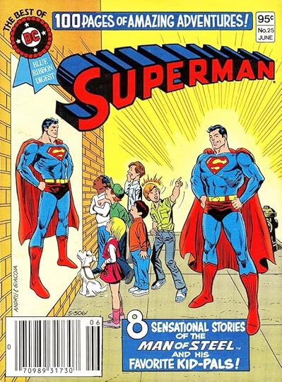
I like Saladino’s large numbers in the captions of these issues, but what exactly is a kid-pal? Not sure that wording would work today. These digests were something of a cottage industry for certain DC production staffers, who spent lots of time at home pasting larger copies of the lettering onto the pages as a freelance job. They all also had to be recolored I think.
 From THE BEST OF DC #37, June 1983
Perhaps the best use of the digest format was reprinting funny animal stories from the 1950s by creators like Sheldon Mayer, who did this new cover. Often the lettering was large enough to pass unchanged, and it gave Gaspar a chance to do some humorous lettering and captions, which most of the DC line did not at the time.
 From THE BEST OF DC #46, March 1984
The round caption on this cover also has some fun with the famous Superman motto, and that SUPERLAD was a tricky design that Gaspar did well.
 From THE BEST OF DC #55, Dec 1984
Another funny animal cover with a lettering joke that must have amused Gaspar when he was lettering it. My guess is the gag was by cover artist Chuck Fiala.
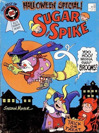 From THE BEST OF DC #68, Jan 1986
Sugar and Spike were another good use of the digest format, and some had new stories by creator Sheldon Mayer. I love his cover on this one, and the balloon is great too. Gaspar even gets to use his spooky lettering at the top.
To sum up, these are the covers lettered by Saladino: 2, 14-15, 18-19, 21-34, 36-37, 39-50, 52-59, 62, 64-70. That’s 49 in all. I have to admit I did not look inside these for new work by Gaspar. They were almost all reprints, so I doubt there was any.
Other articles in this series are on the COMICS CREATION page of my blog with more you might enjoy.
The post GASPAR SALADINO in THE BEST OF DC appeared first on Todd's Blog.
January 9, 2022
And Then I Read: IGRAINE THE BRAVE by Cornelia Funke
Igraine and her brother Albert live in magical Pimpernel Castle with their parents, the magicians Sir Lamorak and the Fair Melisande. Albert is following in their footsteps and learning magic, but Igraine would much prefer to be a knight, even though lady knights are unknown in their medieval imaginary world. Igraine tries her best to train for an unlikely knighthood, and her bravery is put to the test when trouble comes to Castle Pimpernel. Her parents have had a spell go wrong, turning them into pigs that can’t do any magic. The only way to turn them back is to find and bring back the hair of a giant. Just when the magic castle is most vulnerable, an enemy invader, Osmund the Greedy, arrives to lay siege to the castle. He wants the magic books it holds. While Albert tries to hold off the invaders, Igraine goes on a solitary quest to distant hills where giants are said to live. While there she meets The Sorrowful Knight who agrees to help her and reluctantly also agrees to train her as his page. They have a perilous journey and many difficult tasks ahead.
This was a fun read. It’s intended for a younger audience than Funke’s excellent “Inkheart” trilogy, and though the adventures are exciting, Igraine never seems to get into trouble as serious as in those books, but the characters are fun, and sometimes amusing, and the world Funke creates for them is appealing. Recommended.
The post And Then I Read: IGRAINE THE BRAVE by Cornelia Funke appeared first on Todd's Blog.
January 7, 2022
GASPAR SALADINO in BATMAN
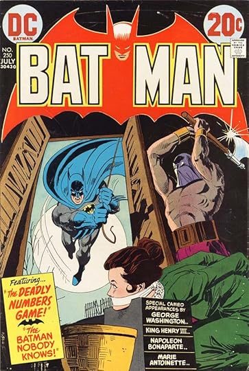
 All images © DC Comics. From BATMAN #120, Dec 1958
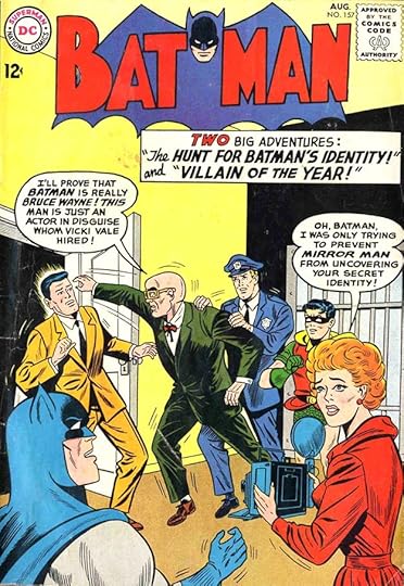
BATMAN is one of the longest running titles at DC Comics, and one of their best known characters. It’s no surprise that Gaspar Saladino did a good amount of work on this series, but his cover work and interior work followed different timelines. On covers, Gaspar filled in occasionally for DC’s main cover letterer Ira Schnapp until Ira retired in 1968 and Saladino took his place as the main cover letterer. He then lettered most of the covers for the next ten years, and quite a few after that. On stories, Gaspar was never a regular early Batman letterer, though he did do one story in 1953. When the book was given to editor Julius Schwartz in 1964, Schwartz brought in many of his freelancers, including Gaspar, who lettered stories until 1968, and a few later ones. The added workload he took on doing covers, logos and house ads starting in 1967 meant some of his lettering assignments had to be turned over to others, and that’s what happened here. I’ll discuss the covers first, starting with the fill-in above. The caption looks like an attempt to imitate Schnapp’s style, and isn’t very successful. The balloon lettering is closer to what Gaspar was doing in stories, but not really much like his later cover lettering. Still, I’m calling it for him.
 From BATMAN #157, Aug 1963
By 1963, Gaspar had more experience, with about 13 years of story lettering under his belt, but he was still not doing many covers. This again seems like an attempt to imitate Ira Schnapp, and is equally unsuccessful at that, but the lettering holds up pretty well on its own. The balloon lettering is getting closer to what Gaspar would be doing on covers soon, but the caption lettering is spaced poorly.
 From BATMAN #169, Feb 1965
More than a year later, Saladino is beginning to find his cover lettering style, and the caption has a better layout and better use of different sizes, with open letters for emphasis. The balloon is very much like his interior balloon work, which was in most issues of BATMAN by this time.
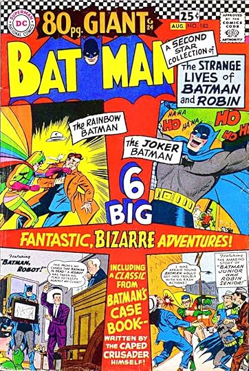 From BATMAN #182, July-Aug 1966
This is the kind of busy copy-filled cover that Ira Schnapp did lots of, and Gaspar’s version is pretty good too. You can see more of his style coming through in some places like 6 BIG. This is still Gaspar trying to blend in with Schnapp’s house style, though.
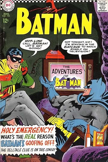 From BATMAN #183, Aug 1966
With this cover we finally see Saladino’s cover style emerging from the shadow of Ira Schnapp and staking out its own territory. The caption is particularly good with a variety of energetic styles that work well together. It probably helped that by this time, the Batman TV show had become a hit, and Julie Schwartz was trying to capture some of its camp humor and over-the-top melodrama in the comics. This was not a trend long-time fans liked, but sales soared as many TV show fans came looking for the comics, so it was kind of inevitable.
 From BATMAN #189, Feb 1967
Saladino’s lettering on this cover is fine, but suffers from some poor color choices, especially the black parts of the story title at right, which should have been reversed white or a light color to be readable. The drama of the scene is undercut by the campy caption text., and putting the caption in front of the birds but behind the moon is a horrible choice, but perhaps not one made by Gaspar, but by whoever in DC’s production department assembled the cover elements.
 From BATMAN #198, Jan-Feb 1968
By now, Gaspar was doing most of the cover lettering, under a mandate from Carmine Infantino to update the DC design presence in covers, house ads and logos. This one is no longer trying to match what Ira Schnapp had been doing, it’s full of Saladino’s energetic and creative display lettering. I always thought the negative art on this cover was a silly idea, but it does make it stand out.
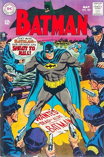 From BATMAN #201, May 1968
Saladino’s balloon definitely adds to the drama here, and the the wanted poster in perspective is well done.
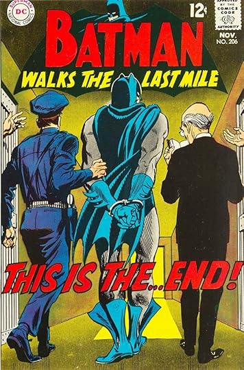 From BATMAN #206, Nov 1968
With the sillliness of the TV show left behind, Batman could now become more serious and dramatic with the realistic art that editor Julius Schwartz preferred over the more cartoony approach of previous decades. Gaspar’s large lettering helps sell this scene. I wonder why Batman’s boots are open?
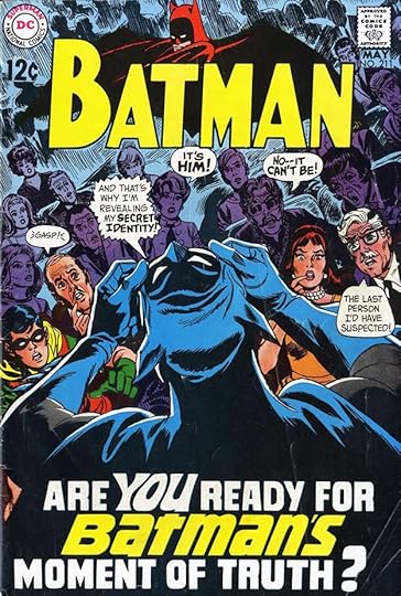 From BATMAN #211, May 1969
Saladino’s caption takes up a large part of this cover, and uses an unusual style for the word BATMAN with a mix of upper and lower case letters. I find it appealing.
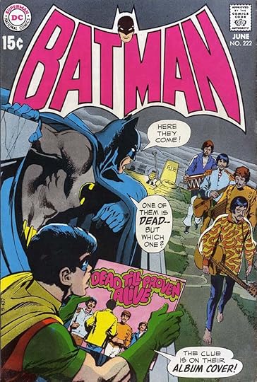 From BATMAN #222, June 1970
Sporting a new logo by Saladino, this cover has some fun with the then-current conspiracy theory that one of the Beatles had died and the news was being hidden. Gaspar’s balloon lettering has opened up a bit with thinner pen strokes and wider letters.
 From BATMAN #250, July 1973
Here another new Saladino logo with block letters for the name returns to a more classic look, while the captions tout the contents. I like the small bat shape by Gaspar in the left caption.
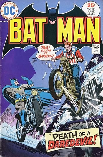 From BATMAN #264, June 1975
By 1975, Saladino was doing cover lettering for both DC and Marvel Comics, and I’m sure he was careful to not make this word DAREDEVIL anything like the Marvel character logo.
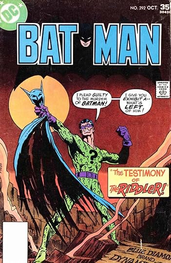 From BATMAN #292, Oct 1977
Take a moment to appreciate the skill and creativity of Saladino’s THE RIDDLER in this caption. It’s full of energy and bounce with a playful lower case E. Many letterers would simply have done an even line of block letters.
[image error]From BATMAN #309, March 1979A beautiful scroll caption by Gaspar with Old English style open letters and his rough alternates in red.
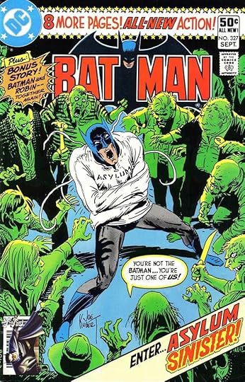 From BATMAN #327, Sept 1980
Lots of Saladino lettering on this cover, but it doesn’t seem overcrowded. The top banner was probably used on other titles. The lettering in the balloon shows Gaspar going back to some of his earliest cover balloon styles.
[image error]From BATMAN #340, Oct 1981The treatment here of the word MOLE perfectly expresses such a character, with texture and letters that are thickest on the bottom, as if rising up from below.
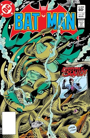 From BATMAN #357, March 1983
An even more creative expression is on this cover for the word SQUID, made of organic tentacles and adorned with suckers. Too bad it’s not larger.
[image error]From BATMAN #382, July 1985The caption here is again creative and unusual, with rough outlines and texture adding interest to CATWOMAN, and look at the unusual style of the F in OF.
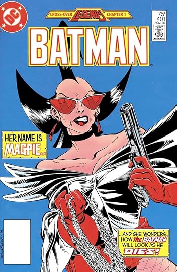 From BATMAN #401, Nov 1986
As DC entered the mid 1980s, traditional cover lettering was often giving way to type-based treatments, but Gaspar’s unique abilities were still in use on some covers, like this one. I’ll list all his BATMAN covers at the end of this article.
 From BATMAN #80, Dec-Jan 1953-1954
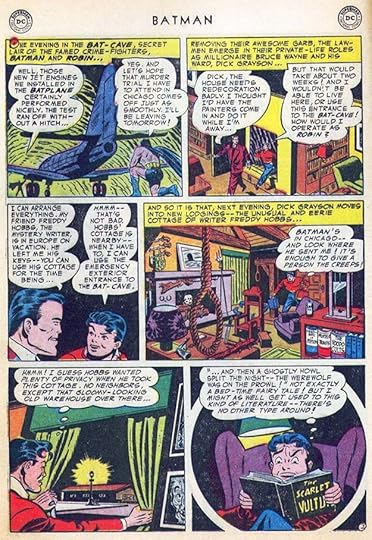
In the 1950s, when Gaspar was starting out at DC, he mainly worked for editors Julius Schwartz and Robert Kanigher, even sitting at a desk in their office for a while. Other editors would occasionally ask him to do stories, perhaps to meet a tight deadlne, but it was never a regular thing. Above is a page from the only BATMAN story he lettered in this decade.
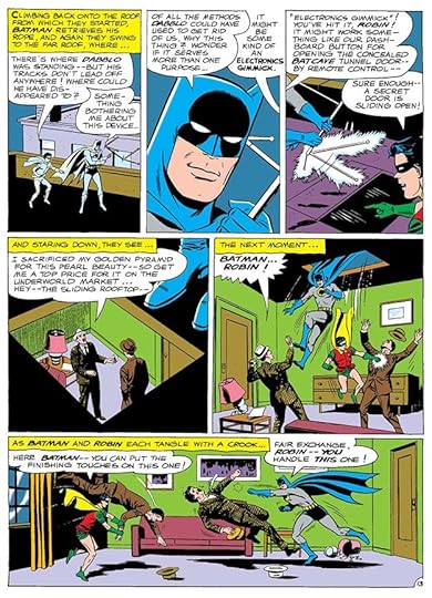 From BATMAN #164, June 1964
When Julius Schwartz took over the title as editor from Jack Schiff in 1964, he assigned many stories to Saladino, this being the first. I couldn’t find a scan of the actual comic, this is from the Archives Edition, which is recolored, but the black line art and lettering are accurate. Gaspar’s balloon lettering had gotten somewhat wider at this time compared to the previous example.
 From BATMAN #165, Aug 1964
Another Archives image, this one has a more typical amount of lettering for the time. Gaspar adds interest with some organic caption borders and the last panel has a balloon with open sides.
 From BATMAN #170, March 1965
An Archives image with a large, effective title by Gaspar. Bob Kane had not drawn the feature for many years, but his name was contractually required to be on the stories.
 From BATMAN #178, Feb 1966
Back to images from the comics, I like the title and sound effects on this splash page. Where he has room, Saladino puts more air in the balloons, the space between the lettering and the balloon border.
 From BATMAN #180, May 1966
Now we’re in the era where the comics were trying to imitate the TV show, and large sound effects were part of that. I think Saladino’s were better than the ones on the show, which were designed by DC staffer Joe Letterese I believe.
 From BATMAN #184, Sept 1966
More of that, and here the art is also taking on a humorous tone, with a smiling Batman.
 From BATMAN #219, Feb 1970
As I said earlier, Gaspar had to give up regular story lettering on BATMAN in 1968 due to the press of other work, but he did letter this Neal Adams story, which gained a lot from his creative song lyrics.
 From BATMAN #258, Sept-Oct 1974
By 1974 the series often included much larger issues with one new story up front and the rest reprints. Julie Schwartz was able to get Gaspar on the introduction/contents pages of some issues, and other one or two-page fillers. I think he did a fine job of selling the stories.
 From BATMAN #259, Nov-Dec 1974
This was part of a two-page feature on costume suggestions for Robin. Gaspar’s title adds excitement, and the rest of the page was easy.
To sum up, here are the BATMAN covers lettered by Saladino: 120, 157, 169, 182-183, 189, 193, 198, 201-204, 206-212, 214-223, 225-229, 231-237, 239-253, 255-265, 267-268, 271-272, 278-281, 283, 287-288, 291-292, 294-295, 302, 307, 309, 313, 318-323, 327-354, 356-357, 359-362, 364-365, 368, 372-383, 385-388, 390-392, 397, 401-403, 412, Annual 10 (1986)
That’s a total of 154 covers. Inside stories are below, almost all feature Batman and Robin, where Gaspar lettered one of two stories, I’ve given the story number in parentheses:
#80 Dec 1953-Jan 1954: 10pp (2)
#164 June 1964: 14pp, 12pp
#165 Aug 1964: 13pp (2)
#166 Sept 1964: 12pp (1)
#167 Nov 1964: 24pp
#169 Feb 1965: 14pp, 10pp
#170 March 1965: 13pp, 12pp
#171 May 1965: 25pp
#172 June 1965: 13pp, 12pp
#173 Aug 1965: 13pp, 12pp
#174 Sept 1965: 12pp (2)
#175 Nov 1965: 24pp
#177 Dec 1965: 12pp, 12pp
#178 Feb 1966: 12pp, 12pp
#179 March 1966: 12pp, 12pp
#180 May 1966: 24pp
#181 June 1966: 12pp, 12pp
#183 Aug 1966: 14pp, 10pp
#184 Sept 1966: 14pp, 10pp
#186 Nov 1966: 14pp, 10pp
#188 Dec 1966: 14pp (1)
#189 Feb 1967: 23pp
#190 March 1967: 23pp
#191 May 1967: 13pp, 10pp
#192 June 1967: 13pp, 10pp
#194 Aug 1967: 10pp (2)
#195 Sept 1967: 23pp
#196 Nov 1967: 13pp, 10pp
#200 March 1968: 21pp
#206 Nov 1968 24pp
#208 Jan-Feb 1969: 13pp (Dilemma of the Detective’s Daughter)
#219 Feb 1970: 8pp (2)
#258 Sept-Oct 1974: Contents 1pp
#259 Nov-Dec 1974 Contents 1pp, Robin Costumes 2pp, Comedy Covers 1pp
#260 Jan-Feb 1975: Contents 1pp, Trivia 1pp
#261 March-April 1975: Contents 1pp, Women in Batman’s Life 2pp
#262 May-June 1975: Trivia 2pp, Comedy Covers 1pp
That’s a total of 664 pages on this title. More articles in this series are on the COMICS CREATION page of my blog, with others you might enjoy.
The post GASPAR SALADINO in BATMAN appeared first on Todd's Blog.
Todd Klein's Blog

- Todd Klein's profile
- 28 followers

