
Todd Klein's Blog, page 74
March 7, 2022
GASPAR SALADINO in OTHER F TITLES
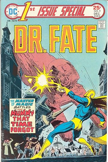 All images © DC Comics. From 1ST ISSUE SPECIAL #9, Dec 1975
 Once again, this article is a catch-all for titles beginning with F that didn’t have enough Saladino lettering to warrant a separate article in my opinion. For the title above, I’m counting it as FIRST, though the actual title is 1ST. It was a tryout title that ran 13 issues in 1975-76, and surprisingly Gaspar lettered only two covers. The caption is full of well-made open lettering, and I think he also designed both the series logo and DR. FATE.
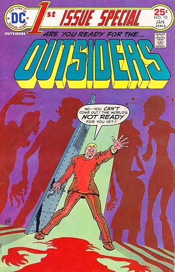 From 1ST ISSUE SPECIAL #10, Jan 1976
Saladino did the logo and its topline as well as the word balloon here. Other covers were lettered by DC staffers like John Workman and Joe Letterese, or used type.
 From FORBIDDEN TALES OF DARK MANSION #6, July-Aug 1972
This “mystery” anthology ran for 11 issues, and only this cover had lettering by Saladino. The way the two captions intersect is a bit unusual, and THE in the second one is very much like Ira Schnapp’s work.
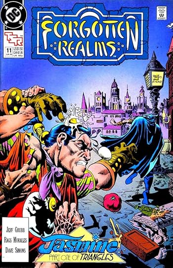 From FORGOTTEN REALMS #11, June 1990
FORGOTTEN REALMS was one of several collaborations with the game company TSR. The DC comic ran 25 issues from 1989 to 1991. Gaspar lettered six of the covers. This one had an elaborate treatment of JASMINE, though the J almost reads as a T, and the M is not so readable either. I like it anyway.
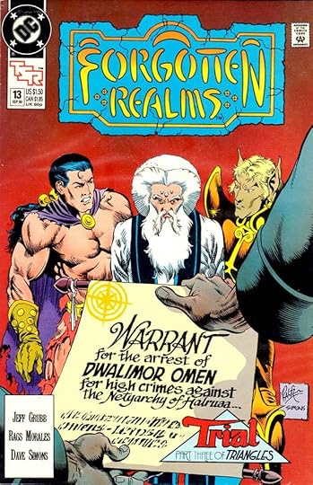 From FORGOTTEN REALMS #13, Sept 1990
In addition to the triangle, Saladino also did the large display lettering on the arrest warrant here, using a calligraphic style that works well.
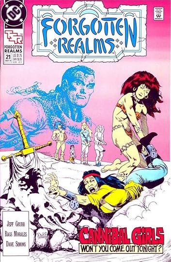 From FORGOTTEN REALMS #21, May 1991
The Saladino caption here is somewhere between horror and humor, as the text parodies the song “Buffalo Gals.”
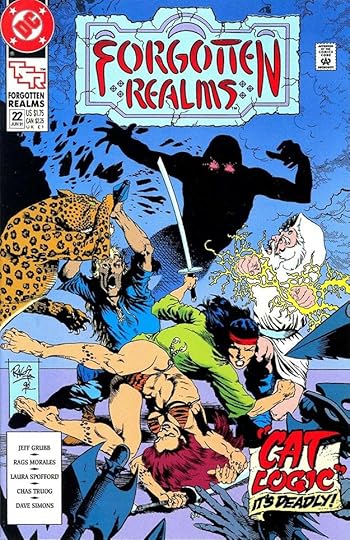 From FORGOTTEN REALMS #22, June 1991
There’s a lot to like about the caption on this cover, from the cool clawed title to the textured scroll behind it. This is pretty late for Saladino cover lettering, but it looks terrific.
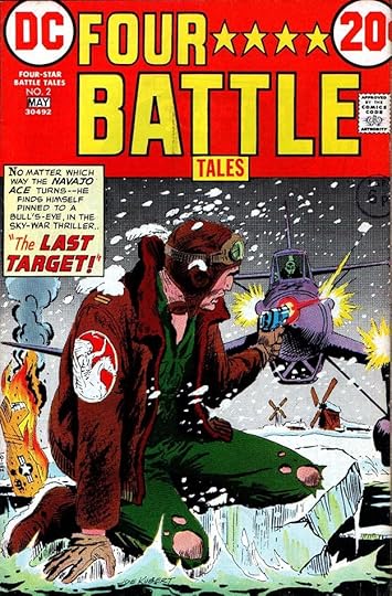 From FOUR STAR BATTLE TALES #2, April-May 1973
This war reprint series ran just five issues in 1973. The clever Saladino logo uses stars instead of the word STARS. The caption works fine, it’s almost like the first caption of a story page.
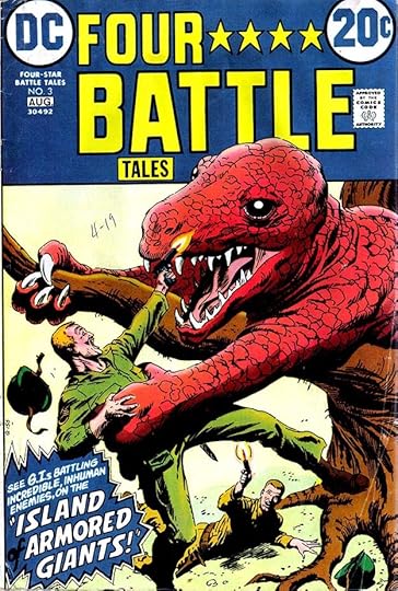 From FOUR STAR BATTLE TALES #3, July-Aug 1973
The burst caption on this cover adds excitement, though the word OF is hard to see. I often stole this border style for my own bursts, a heavy inner border and a thin outer one to allow for another color.
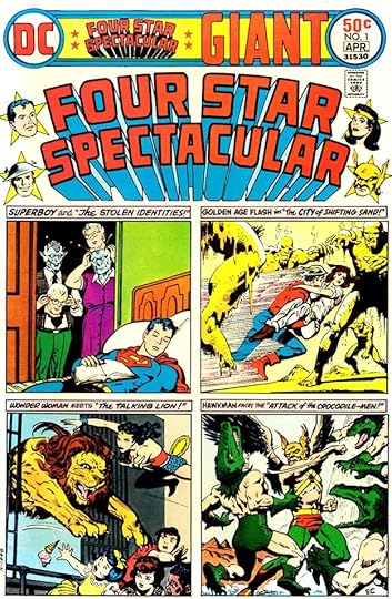 From FOUR STAR SPECTACULAR #1, March-April 1976
This was a superhero reprint title that ran six issues from 1976 to 1977. Gaspar’s lettering on the first one is small titles over each image. I would have suggested putting each on two lines to allow them to be larger.
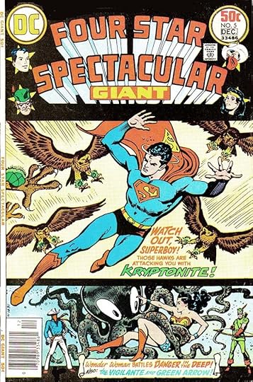 From FOUR-STAR SPECTACULAR #5, Nov-Dec 1976
Having only two features on the cover of this issue allows the lettering to be larger and more effective.
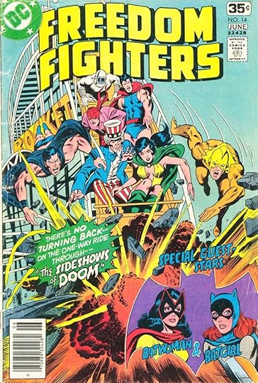
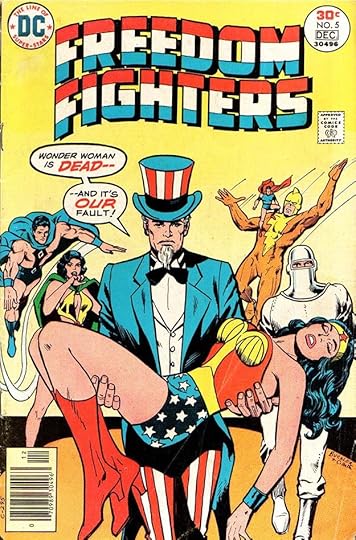 From FREEDOM FIGHTERS #5, Nov-Dec 1976
This patriotic series ran 15 issues from 1976 to 1978. Gaspar’s balloons on this cover are typical, but the large emphasized words in red add interest, as do the heavy balloon borders.
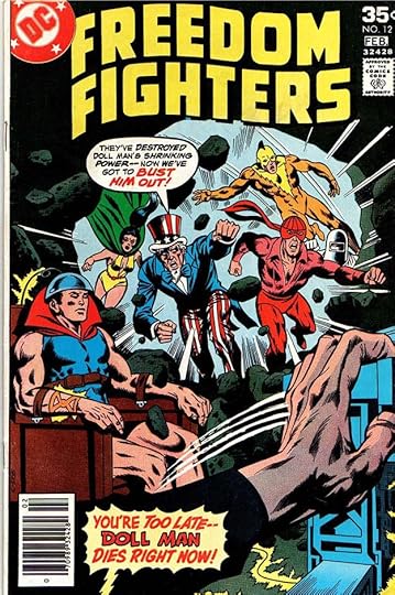 From FREEDOM FIGHTERS #12, Jan-Feb 1978
There’s a similar word balloon on this caption for Uncle Sam, and a larger burst balloon below with more color enhancements. The tail is electric, but why? You’ll have to read the issue to find out.
 From FREEDOM FIGHTERS #14, May-June 1978
The penultimate issue has a fine burst caption and more open lettering to the right. This was one of the series cancelled by the “DC Implosion” of 1978.
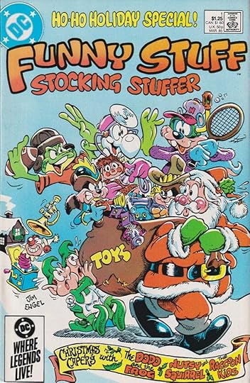 From FUNNY STUFF STOCKING STUFFER #1, March 1985
FUNNY STUFF was a long-running funny animal series from DC in the 1940s and 1950s. This one-shot was an attempt to revive it, but it only had one issue. Gaspar’s fun scroll caption at the bottom and rounded top line capture the flavor and the holiday spirit.
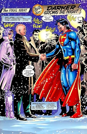
 From FINAL NIGHT #1, Nov 1996
All the other entries in this article are for Saladino cover lettering, this one is for story lettering. FINAL NIGHT was a four issue series all published the same month, so essentially an 89 page story divided into four comics. Gaspar lettered the whole thing. I like the creative alien language in panel 2 of this page.
 From FINAL NIGHT #2, Nov 1996
This splash page from the second issue has a fine variety of lettering styles from Saladino that add a lot to the story.
To sum up, I found Gaspar lettering on these covers:
1ST ISSUE SPECIAL 9-10
FORBIDDEN TALES OF DARK MANSION 6
FORGOTTEN REALMS 11-13, 21-23
FOUR STAR BATTLE TALES 2-3, 5
FOUR-STAR SPECTACULAR 1, 5-6
FREEDOM FIGHTERS 5-6, 12, 14-15
FUNNY STUFF STOCKING STUFFER 1
A total of 21 in all.
Here are the listings for story pages in FINAL NIGHT:
#1 Nov 1996: 23pp
#2 Nov 1996: 22pp
#3 Nov 1996: 22pp
#4 Nov 1996: 22pp
That’s 89 pages in all. More articles in this series and others you might like are on the COMICS CREATION page of my blog.
The post GASPAR SALADINO in OTHER F TITLES appeared first on Todd's Blog.


March 6, 2022
And Then I Read: DRAGON’S MILK by Susan Fletcher
 Cover art by Jos. A. Smith
Kaeldra’s world is a medieval-flavored one. She lives with her family in a mountain community where sheep herding is a main occupation. Her Granmyr is a wise old woman who has some insights not given to everyone, and she senses the same abilities in her granddaughter. When a pregnant dragon arrives in the mountains nearby, a wizard arrives hoping to find it, and others are also searching for the elusive dragon, wanting to kill it to protect their sheep, and also because a dead dragon is of great value for medicine and magic. Kaeldra’s sister Lyf is ill with a fever that might kill her, and Granmyr tells Kaeldra that the only cure is dragon’s milk. She sends the frightened girl to find the dragon and somehow gather its milk. Surprisingly, Kaeldra finds the dragon and makes a bargain with it. She can have the milk in exchange for becoming a nanny of sorts to the dragon’s newborn young.
This was a pretty good read, but I feel dragons have been done better by others. Perhaps it was a mistake to read it so soon after rereading all of Ursula K. LeGuin’s dragon stories. Fletcher’s world feels derivative. Her main characters are good, but less important ones feel sketched in. The plot is full of action and adventure, and kept me reading, but in the end I didn’t like the book enough to want to read the rest of the series.
Mildly recommended for dragon fans.
The post And Then I Read: DRAGON’S MILK by Susan Fletcher appeared first on Todd's Blog.
March 5, 2022
Incoming: DEATH THE DELUXE EDITION Hardcover
 Image © DC Comics.
Just arrived is a newly printed collection of Neil Gaiman’s stories about Sandman’s sister Death. It’s in the deluxe hardcover format, slightly larger than the original comics, and has a glued binding. The contents are mostly the same as THE ABSOLUTE DEATH boxed hardcover of some years ago, and it has the same Dave McKean cover art, but is smaller and less costly at a retail price of $29.99 US. I haven’t opened it (no need), but the paper quality looks good and I expect this would be a nice addition to the Gaiman library of anyone who doesn’t have the ABSOLUTE one. This appears to be a new printing of a book issued in 2012, I don’t see a new listing for it yet on Amazon or on the DC website, so perhaps it’s been sent to me well in advance of release. Check your comics retailer or bookstore if you’d like one.
The post Incoming: DEATH THE DELUXE EDITION Hardcover appeared first on Todd's Blog.
March 4, 2022
GASPAR SALADINO in FROM BEYOND THE UNKNOWN
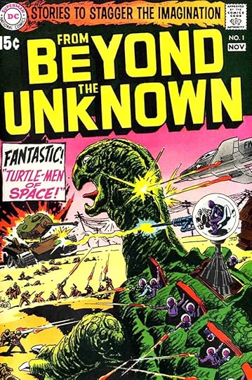 All images © DC Comics. FROM BEYOND THE UNKNOWN #1, Oct-Nov 1969
This title was created to reprint stories from the DC science fiction titles MYSTERY IN SPACE and STRANGE ADVENTURES, each of which had run for over ten years as anthologies from the early 1950s to the early 1960s under editor Julius Schwartz. The covers were the only new thing, and many were lettered by Gaspar Saladino. I think the top line, which was also on later issues, is headline type. The caption is by Gaspar. The caption layout has too much extra white space, something Saladino was still working to perfect.
 FROM BEYOND THE UNKNOWN #4, April-May 1970
The caption on this cover has a much better layout, and the large word balloon is effective too.
 FROM BEYOND THE UNKNOWN #5, June-July 1970
There’s lots of fine Saladino lettering on this cover, including a top line specific to the issue, and effective sign lettering.
 FROM BEYOND THE UNKNOWN #8, Dec 1970-Jan 1971
This cover suggests a science fiction anthology rather than a comic. Much of the text is typeset, with only the large words in the side banner and the balloons by Saladino.
 FROM BEYOND THE UNKNOWN #10, April-May 1971
This cover is much the same, but the large words at the left have been redone to make them bolder. Gaspar’s rough balloon edges add interest and energy.
 FROM BEYOND THE UNKNOWN #16, April-May 1972
Here the typeset in the side banner is gone and it’s all Saladino lettering, which I find more interesting. Look at the variety of styles he used!
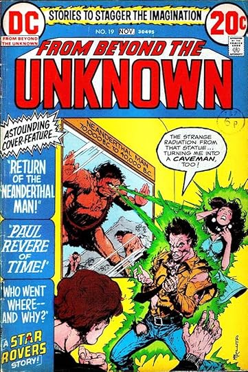 FROM BEYOND THE UNKNOWN #19, Oct-Nov 1972
As the page count decreased, the stories did too, leaving more room for Gaspar’s creative lettering in the side banner.
 FROM BEYOND THE UNKNOWN #21, Feb-March 1973
More creative style choices by Saladino on this cover, and icy letters in the word balloon.
To sum up, these covers have lettering by Gaspar: 1-12, 14, 16-21, 23-25, a total of 22. More articles in this series and others you might like are on the COMICS CREATION page of my blog.
The post GASPAR SALADINO in FROM BEYOND THE UNKNOWN appeared first on Todd's Blog.
March 3, 2022
GASPAR SALADINO in THE FOREVER PEOPLE
 All images © DC Comics. From THE FOREVER PEOPLE #1, Feb-March 1971
Part of Jack Kirby’s Fourth World, this title ran eleven issues in 1971-72, and Gaspar Saladino did cover lettering on each one. In 1988 a new Forever People miniseries ran six issues, and Gaspar lettered the first three covers. He did no interior lettering for either series. He also designed the logo seen above. There’s quite a bit of cover lettering on this first issue. The caption at upper right is an odd shape leading toward the round SUPER TOWN blurb, which is typeset. DC was excited about having Kirby, one of Marvel’s top artists, creating this new line of comics for them, but they were already hedging their bets by promoting Superman’s appearance in this issue.
 From THE FOREVER PEOPLE #2, April-May 1971
Kirby’s characters and art are full of movement and energy, and I think Saladino’s lettering is a good match for it. The perfectly round balloon is practically unheard of for Gaspar, and it commands attention. All the lettering is large, perhaps a response to Kirby’s larger than life figures.
 From THE FOREVER PEOPLE #3, June-July 1971
The drama is even more intense on this cover, helped by effective coloring. The lettering tells enough of the story to be intriguing, and also adds to the drama.
 From THE FOREVER PEOPLE #4, Aug-Sept 1971
I wonder how many readers had heard the name Desaad (spelled differently) before seeing it here? Kirby was playing with powerful associations. I like the Kirbyesque energy of the bottom caption border.
 From THE FOREVER PEOPLE #8, April-May 1972
Just one round blurb on this cover with the main story’s title and one for a Sandman reprint. The coloring separates them effectively.
 From THE FOREVER PEOPLE #9, June-July 1972
This cover is throwing out all kinds of information in hopes of gaining readers. The main image is much like Frankenstein, and we have another DC character, Deadman, making an appearance with scary Saladino lettering. I like the sandy texture in SANDMAN. The roster on the left works well on the black background.
 From THE FOREVER PEOPLE #11, Oct-Nov 1972
DC must have been disappointed with the sales of these Fourth World books, as none lasted much more than two years. I think if anything they were ahead of their time, and the characters and stories have remained popular and often reprinted since. Gaspar’s lettering is somewhat subdued here, and the caption reminds me of Sam Rosen’s work.
 From FOREVER PEOPLE #1, Feb 1988.
Kirby was not involved in the 1988 mini-series, but the work clearly draws on his original series. I designed this logo, Gaspar did the bottom title.
 From FOREVER PEOPLE #3, April 1988
Saladino’s creative, textured, scary lettering at the lower left of this cover is perhaps as effective as the art in convincing potential buyers to look inside. That exclamation point is way off model, but clear in context.
To sum up, Saladino lettered covers on issues 1-11 of THE FOREVER PEOPLE and issues 1-3 of FOREVER PEOPLE, a total of 14. Other articles in this series are on the COMICS CREATION page of my blog.
The post GASPAR SALADINO in THE FOREVER PEOPLE appeared first on Todd's Blog.
March 2, 2022
GASPAR SALADINO in THE FLASH (1987)
 All images © DC Comics. From THE FLASH #1, June 1987
After a long run of 104 issues in the 1940s for the Golden Age Flash and a longer run from 1959 to 1985 for the Silver Age Flash, a new title was launched in 1987 with Wally West, the former Kid Flash, in the lead. It also had a long run ending in 2006. Gaspar Saladino lettered many of the covers for a few years, and starting in 1993 he became the regular story letterer, returning to a position he’d had for several years in the 1960s on the Silver Age Flash’s book. That’s covered in a separate article, here I’ll look at the covers and then the stories he lettered for this title. I designed the logo, but the word PRESENTING is by Saladino in the example above. The triangular shape above the logo made it more difficult to add lettering there, but Gaspar always made it work.
 From THE FLASH #10, March 1988
Another good example is on this cover, where Gaspar also plays up the word SAVAGE with rough outlines and texture.
 From THE FLASH #29, Aug 1989
The top cover copy is fine here too, but I particularly like the creative story title below.
 From THE FLASH #38, May 1990
A new logo removed that open triangle at the top of the cover, and here Saladino’s radio burst balloon is filled with energetic display lettering that fairly crackles with excitement.
 From THE FLASH #67, Aug 1992
Cover lettering by Saladino declined in the 1990s. Many covers used type instead, and of those with lettering, a lot of them were by me, usually done digitally after 1994. This example shows that Gaspar had lost none of his cover lettering skill, it was simply a matter of changing tastes on the part of DC’s art directors and cover editors. Saladino’s biggest impact on this book was years of story lettering, which I will cover next.
 From THE FLASH #82, Oct 1993
Starting with this issue, Gaspar became the regular story letterer until he was pushed out when DC went to an all-digital workflow in 2002. While his years of work on many of DC’s war titles are still being inventoried, this may be his longest run on a non-anthology title. Look at the variety of styles employed on the page above, all of them appealing and full of energy. Even the titles are tilted slightly to add interest and perhaps tie into the door kick in the art. As usual, Gaspar uses just his first name in script in the credits.
 From THE FLASH #84, Nov 1993
One thing that had changed since Saladino was lettering most of the Flash stories in the 1960s is the amount of lettering on each page. Styles had changed there too, writers were less wordy and more willing to let the art carry the story. I’d say this is about a third of the work Gaspar was doing on story pages in 1964, and there’s room for creative sound effects and display lettering, too. Not all the pages were this light on text, but the average was much lower.
 From THE FLASH #87, Feb 1994
Instead of going the usual Old English holiday route on the word CHRISTMAS here, Gaspar does something more original and more appropriate for the story. He was always thinking. He probably did the signs here, too.
 From THE FLASH #98, Feb 1995
And no one did more exciting explosion sound effects. Larger, perhaps, but not more exciting.
 From THE FLASH #104, Aug 1995
If you wanted a scary title, Saladino was the best at that, too. There was little he couldn’t do, really.
 From THE FLASH #116, Aug 1996
Many DC writers had moved away from traditional thought balloons, but Mark Waid was still using them, and Saladino did them well. I also like the angular sound effects and burst balloon in the third panel.
 From THE FLASH ANNUAL #9, Sept 1996
In addition to the monthly series, Gaspar also lettered the 1996 Annual, giving the title a fabulous tall treatment, and going more organic with the sound effect for contrast.
 From THE FLASH #125, Aug 1997
Again, this amount of lettering per page must have seemed easy to Saladino after the heavy copy pages of his early years.
 From THE FLASH #138, June 1998
As we get into the late 1990s, Gaspar’s balloon lettering gradually gets more angular, and some of the letter forms change. This may be the effects of age and declining motor skills, as he turned 71 in 1998, or it may simply be the way he wanted the lettering to look at this point.
 From THE FLASH #150, July 1999
There was certainly no decline in overall creativity and skill, as seen on this page, with dynamic sound effects and display lettering.
 From THE FLASH #164, Sept 2000
As we enter a new century, Saladino is still doing fine work, though it’s getting a little harder to read. The reverse white on black here (done in the DC production department) doesn’t help. Great title, though.
 From THE FLASH #190, Nov 2002
Gaspar’s final story lettering on the series was for this issue. As I said, the lettering may be a bit harder to read than a decade earlier, but it’s still exciting and appealing to my eye. Times were changing, and DC decided to move to an all digital workflow, so hand lettering was something they no longer wanted, and Gaspar had no interest in learning to letter digitally. Saladino turned 75 in this year, he’d been a hard-working letterer at DC since late 1949, so perhaps he was ready to retire. I know that when I talked to him some years later, he seemed happy with his life, and did not speak of this change with bitterness, he accepted it. DC did occasionally bring him back for cover lettering, as on BATMAN ’66, and he sometimes did work for others, but his lettering work life was much diminished after this.
To sum up, I found Saladino lettering on these covers: 1-4, 6-11, 13, 15-20, 22, 24-25, 27-35, 37-39, 41, 43-46, 67, Annual 1, a total of 39. Below are the stories lettered by Gaspar, all feature The Flash.
#82 Oct 1993: 22pp
#83 Oct 1993: 22pp
#84 Nov 1993: 22pp
#85 Dec 1993: 22pp
#86 Jan 1994: 22pp
#87 Feb 1994: 22pp
#88 March 1994: 22pp
#90 May 1994: 22pp
#91 June 1994: 22pp
#92 July 1994: 22pp
#93 Aug 1994: 22pp
#0 Oct 1994: 22pp
#95 Nov 1994: 22pp
#96 Dec 1994: 22pp
#97 Jan 1995: 22pp
#98 Feb 1995 23pp
#100 April 1995: 38pp
#101 May 1995: 22pp
#102 June 1995: 22pp
#103 July 1995: 22pp
#104 Aug 1995: 22pp
#106 Oct 1995: 22pp
#107 Nov 1995: 22pp
#108 Dec 1995: 22pp
#109 Jan 1996: 22pp
#110 Feb 1996: 22pp
#111 March 1996: 22pp
#112 April 1996: 1-14 of 22pp (14pp)
#113 May 1996: 22pp
#114 June 1996: 22pp
#115 July 1996: 22pp
#116 Aug 1996: 22pp
#117 Sept 1996: 22pp
#118 Oct 1996: 22pp
#119 Nov 1996: 22pp
#120 Dec 1996: 22pp
#122 Feb 1997: 22pp
#123 March 1997: 22pp
#124 April 1997: 22pp
#125 Aug 1997: 22pp
#126 June 1997: 22pp
#127 July 1997: 22pp
#128 Aug 1997: 22pp
#129 Sept 1997: 22pp
#130 Oct 1997: 22pp
#131 Nov 1997: 22pp
#132 Dec 1997: 22pp
#133 Jan 1998: 22pp
#134 Feb 1998: 22pp
#135 March 1998: 22pp
#136 April 1998: 22pp
#137 May 1998: 22pp
#138 June 1998: 22pp
#139 July 1998: 22pp
#140 Aug 1998: 22pp
#141 Sept 1998: 22pp
#142 Oct 1998: 23pp
#1,000,000 Nov 1998: 22pp
#143 Dec 1998: 22pp
#144 Jan 1999: 22pp
#145 Feb 1999: 22pp
#146 March 1999: 22pp
#147 April 1999: 22pp
#148 May 1999: 22pp
#149 June 1999: 22pp
#150 July 1999: 38pp
#151 Aug 1999: 22pp
#152 Sept 1999: 22pp
#153 Oct 1999: 22pp
#154 Nov 1999: 22pp
#155 Dec 1999: 1-19 of 22pp (19pp)
#156 Jan 2000: 22pp
#157 Feb 2000: 22pp
#158 March 2000: 1-11 of 22pp (11pp)
#159 April 2000: 22pp
#160 May 2000: 22pp
#161 June 2000: 22pp
#162 July 2000: 22pp
#163 Aug 2000: 22pp
#164 Sept 2000: 22pp
#165 Oct 2000: 22pp
#166 Nov 2000: 22pp
#167 Dec 2000: 22pp
#168 Jan 2001: 22pp
#169 Feb 2001: 22pp
#170 March 2001: 22pp
#171 April 2001: 22pp
#172 May 2001: 22pp
#173 June 2001: 22pp
#175 Aug 2001: 22pp
#176 Sept 2001: 22pp
#177 Oct 2001: 22pp
#178 Nov 2001: 22pp
#179 Dec 2001: 22pp
#180 Jan 2002: 22pp
#181 Feb 2002: 22pp
#182 March 2002: 22pp
#183 April 2002: 22pp
#184 May 2002: 22pp
#185 June 2002: 22pp
#186 July 2002: 22pp
#187 Aug 2002: 22pp
#188 Sept 2002: 30pp
#189 Oct 2002: 22pp
#190 Nov 2002: 22pp
Annual #9 1996: 38pp
That’s a total of 2,368 pages, an impressive volume of work, and almost twice as many as he did on the 1959 series. More articles like this are on the COMICS CREATION page of my blog.
The post GASPAR SALADINO in THE FLASH (1987) appeared first on Todd's Blog.
March 1, 2022
GASPAR SALADINO in THE FLASH (1959)
 All images © DC Comics. From THE FLASH #159, March 1966
Gaspar Saladino’s lettering career at DC Comics was a long one. He began in late 1949, hired by editor Julius Schwartz, and he continued to letter stories until 2002. Along the way he also became the company’s style setter on logos, house ads and covers from 1968 to 1978, and did more of that work until the early 1990s. I think Gaspar’s longest association with one character has to be The Flash. When Schwartz decided to revamp and revive the golden age character in 1964, he tapped Saladino to letter many of the stories until Gaspar got too busy to do that regularly in 1968. At that point he was lettering most of the covers after the departure of his predecessor Ira Schnapp, and continued to do so until the Silver Age Flash series ended in 1985. When a new series began in 1987, Saladino was the regular cover letterer for a while, and in 1993 he became the regular story letterer again, a role he continued until he was pushed out by digital lettering in 2002. I’m going to cover the 1959 series in this post, first covers, then stories. The 1987 series will be in a separate article. The cover above has a caption and sign by Ira Schnapp, but I think the note pinned to the tree is by Saladino, his first cover lettering on the book.
 From THE FLASH #161, May 1966
The same sign appears on the first page of this story in issue #161. The work is different but the styles are similar, both by the same hand. The cover and story were meant to be in the same issue, but something went wrong and they appeared in different ones. Gaspar often worked closely with Flash artist Carmine Infantino, and he may have been asked to do that note on the cover by Carmine before the cover was turned in to editor Schwartz. I’ll still count it as Saladino’s first cover lettering for the series.
 From THE FLASH #167, Feb 1967
At this time, Ira Schnapp was still the regular cover letterer, but when Ira wasn’t available, Gaspar was often asked to fill in. This cover uses type at the top and on the newspaper, but the large blurb at the bottom is by Saladino. It definitely adds excitement to the rather dull cover art and type, helped by the bright colors.
 From THE FLASH #176, Feb 1968
By this time, Gaspar was taking on the role assigned to him by Editorial Director Carmine Infantino to update the DC Comics style on covers, though Schnapp was still lettering some of them. The creepy balloon lettering at the top is effective, though the color treatment makes it hard to see the balloon border and pointer. The blurb right of the logo is uneven, showing that Saladino was still figuring out how to do this, but the Flash balloon is strong and effective.
 From THE FLASH #184, Dec 1968
Here we see Gaspar taking full control of a cover with confidence in his lettering abilities. The white lettering is done with a dry brush, and no one did that better than Saladino, then reversed by the DC production department as was the rest, to read on the black background. The logo at the bottom is not the same as Ira’s at the top. Instead it’s Gaspar’s version. His THE has more energy, for instance. I doubt Saladino was paid any extra for filling most of this cover, but he should have been.
 From THE FLASH #187, April-May 1969
Giant reprint issues like this one were appearing occasionally in many DC titles in addition to regular issues. Only the cover was new, and this creative design gave Gaspar a chance to do some large, impressive display lettering in the black areas, while much of the art was pulled from earlier covers. Saladino’s work is again more about half the cover.
 From THE FLASH #204, March 1971
Some regular issues were also pretty busy, as this one, with Saladino lettering at the top, center, and bottom.
 From THE FLASH #217, Aug-Sept 1972
The lettering in these balloons is not regular balloon lettering, it’s display lettering, larger and with more variety for emphasis than what’s usually seen on story pages. The caption at the bottom is steeply angled to add interest, though that might have been the choice of the production person who put Gaspar’s blurbs on the art. Cover lettering was nearly always done on separate art paper, and generally photostats were made and pasted down.
 From THE FLASH #232, March-April 1975
I’ve never been a fan of covers where the art is divided by story as it is here, but Saladino’s lettering makes it work better. The trade dress at the top is too large, too.
 From THE FLASH #263, July 1978
By 1978, the trade dress was simpler and less intrusive, helped by the Milton Glaser Studio DC Bullet symbol and full cover art. Gaspar’s question mark caption shows why he was the very best at this!
 From THE FLASH #285, May 1980
The trick with a long-running series is to keep it fresh, and Saladino’s creative lettering helps with that. I love his treatment of THE TRICKSTER in the bottom caption.
 From THE FLASH #309, May 1982
Burst captions are always a good way to get attention, and Saladino’s were dynamic and full of energy.
 From THE FLASH #328, Dec 1983
DC did not do many multiple panel covers. This one is effective, and Saladino’s display lettering in the balloons adds to the drama.
 From THE FLASH #350, Oct 1985
This final issue of the series, the numbering of which began in the 1940s with the Golden Age FLASH COMICS, was indeed a farewell to long-time Flash artist Carmine Infantino, but Gaspar would be back when a new series began in 1987.
 From THE FLASH #106, April-May 1959
Gaspar’s story lettering for the Silver Age Flash began on his SHOWCASE appearances, and continued with the first issue of the new series (picking up the numbering from the Golden Age version with issue #105). This story from the second new regular issue brings in one of Flash’s most effective opponents, Gorilla Grodd. The logo is by Ira Schnapp, the rest of the lettering is by Saladino.
 From THE FLASH #111, Feb 1960
Many of the images I have for early Silver Age Flash stories are from the recolored collected editions, I can’t find ones from the actual comics, but at least the lettering is reproduced well. The Kid Flash logo is again by Schnapp, but Saladino’s story title is bold and impressive, and his lettering works fine.
 From THE FLASH #117, Dec 1960
I loved these stories when they came out, and they still look good to me. Artist Infantino was at his best, and the bottom caption shows his fondness for pointing hands.
 From THE FLASH #123, Sept 1961
When editor Julius Schwartz decided to bring back the Golden Age Flash in this issue, comics history was made, and the return of the Golden Age characters had begun. More of those crazy pointing hands. I don’t know if they were inked by Saladino or by the inker of the art Joe Giella, either is possible.
 From THE FLASH #130, Aug 1962
Saladino didn’t letter all the Flash stories, but he did a lot of them. Here both the caption and word balloon are italic, perhaps that saved him a bit of time, I don’t know. The story title is perfect, and the character art nearby is cool too.
 From THE FLASH #134, Feb 1963
Not only did FLASH writers Gardner Fox and John Broome do exciting stories, they came up with some of the greatest villains ever. Saladino makes good use of the icy connection in his caption.
 From THE FLASH #139, Sept 1963
Another great villain and a clever costume idea. Also, Infantino’s future cities were the best. Again the character art on each side of the first caption is a fine addition.
 From THE FLASH #153, June 1965
Infantino and Saladino work together to create a memorable title for this story. PUNCH has never been more dynamic.
 From THE FLASH #167, Feb 1967
Every series needs a change of pace now and then, and this humorous story was a good one. There’s one of those pointing hands again. Saladino’s time as the regular FLASH story letterer was growing short, after issue #174 he only did that occasionally.
 From THE FLASH #200, Sept 1970
Issue #200 was something of a special event, and Gaspar came in to letter it. His story title shows the rock poster style he was influenced by at the time, and it’s full of creative elements, including an hourglass.
[image error]From THE FLASH #229, Sept-Oct 1974For some of the larger reprint issues, Gaspar did the contents page using a wide variety of styles, and here putting some of them in perspective.
 From THE FLASH #293, Jan 1981
After a long absence on stories, Saladino lettered this issue in 1981. His story title is great. Note that by this time full credits were listed, including letterer, and Gaspar’s is just his first name in script similar to his signature, his preferred method.
 From THE FLASH #328, Dec 1983
Saladino’s final story lettering for the series was on this issue. Thought balloons were still common, but would fade away in a few years. The sound effects are classic Gaspar.
To sum up, these covers have Saladino lettering: 159, 167, 178, 180-208, 210-213, 215-234, 237, 239, 244-245, 248-249, 251-257, 261, 263-264, 266, 285, 288-289, 292-293, 295-301, 303-315, 318-319, 324, 327-346, 349-350. That’s a total of 132.
Below are the stories lettered by Gaspar. Features are abbreviated after the first appearance. Where he lettered only one of two stories, the story number is in parentheses.
#105 Feb-March 1959 Flash 12pp, 13pp
#106 April-May 1959: F 15pp, 10pp
#107 June-July 1959: F 10pp (2)
#108 Aug-Sept 1959: F 10pp, 14pp
#111 Feb-March 1960: F 13pp, Kid Flash 12pp
#112 April-May 1960: F 13pp, KF 12pp
#113 June-July 1960: F 12pp, 13pp
#114 Aug 1960: KF 12pp (2)
#115 Sept 1960: F 13pp, Elongated Man 12pp
#116 Nov 1960: KF 11pp (2)
#117 Dec 1960: F 13pp, 13pp
#118 Feb 1961: F 14pp, KF 11pp
#119 March 1961: F 14pp (2)
#120 May 1961: F 25pp
#121 June 1961: F 12pp, 13pp
#122 Aug 1961: F 15pp, KF 10pp
#123 Sept 1961: F 25pp
#124 Nov 1961: F 16pp (1)
#125 Dec 1961: F 25pp
#126 Feb 1962: F 13pp, 12pp
#127 March 1962: KF 10pp (2)
#128 May 1962: F 18pp (1)
#130 Aug 1962: KF 11pp (2)
#131 Sept 1962: F 24pp
#134 Feb 1963: F 15pp (1)
#135 March 1963: F 25pp
#136 May 1963, F 15pp, 10pp
#137 June 1963: F 25pp
#138 Aug 1963: F 14pp, KF 11pp
#139 Sept 1963: F 25pp
#140 Nov 1963: F 10pp (2)
#142 Feb 1964: F 13pp, 12pp
#143 March 1964: F 25pp
#144 May 1964: F 15pp, KF 10pp
#145 June 1964: F 12pp (2)
#146 Aug 1964: F 13pp (1)
#149 Dec 1964: F 14pp (1)
#150 Feb 1965: F 12pp (1)
#151 March 1965: F 25pp
#153 June 1965: F 25pp
#154 Aug 1965: F 15pp (1)
#156 Nov 1965: F 24pp
#158 Feb 1966: F 10pp (2)
#159 March 1966: F 12pp (1)
#161 May 1966: F 14pp, 10pp
#162 June 1966: F 24pp
#163 Aug 1966: F 15pp (1)
#164 Sept 1966: F 14pp, KF 10pp
#165 Nov 1966: F 24pp
#167 Feb 1967: F 13pp, KF 10pp
#168 March 1967: F 23pp
#170 May 1967: F 23pp
#171 June 1967: F 23pp
#172 Aug 1967: F 13pp, 10pp
#173 Sept 1967: F 23pp
#174 Nov 1967 F 23pp
#200 Sept 1970: F 23pp
#229 Sept-Oct 1974: Contents 1pp
#232 March-April 1975: Contents 1pp
#293 Jan 1981: F 12pp (1)
#328 Dec 1983: F pp2-23 (22pp)
That’s a total of 1,219 pages on this series, a substantial amount of work. Other articles in this series and more you might enjoy are on the COMICS CREATION page of my blog.
The post GASPAR SALADINO in THE FLASH (1959) appeared first on Todd's Blog.
February 28, 2022
GASPAR SALADINO in FIRESTORM
 All images © DC Comics. From FIRESTORM #1, March 1978
Firestorm was created by writer Gerry Conway and artist Al Milgrom and launched in a monthly series in early 1978. That initial run was cut short at issue #5 by the “DC Implosion,” which cancelled nearly half the company’s line of comics. The character appeared in other titles until a new series was launched in 1982, and had a long and successful run. The cover of the first issue, above, has an interesting logo. The word FIRESTORM is by John Workman, created for a house ad. Gaspar Saladino added the second line and did the cover lettering. The art is dynamic and I think the lettering in a burst is equally so. Gaspar’s main involvement with this character’s two series was as a cover letterer, though he also did one story.
 From FIRESTORM #3, June 1978
On these cover blurbs note the matching style for FROZEN and FROST. Gaspar tried to add some visual connection to the words when he could. The first caption also has icy drips, but the red color negates that.
 From FIRESTORM #5, Oct-Nov 1978
The final issue of the original series has a word balloon that’s half oval and half burst to add emphasis to the last line, with the lettering held in red to carry that further. It almost looks like the two character heads are also speaking, which would work fine too, but I’m not sure it was intended.
 From THE FURY OF FIRESTORM #1, June 1982
When the character returned in a new series, the title was THE FURY OF FIRESTORM perhaps to set it apart from the original run. The book went through two title changes, first to just FIRESTORM again, then to FIRESTORM THE NUCLEAR MAN, but the numbering continued throughout, so I will cover all that here. The new logo is by Gaspar, and is full of style and energy, though the wavy approach didn’t always work well with cover lettering above it. Even on this first issue, there are awkward gaps between the top lettering and the logo. The burst on the left is well done.
[image error]From THE FURY OF FIRESTORM #3, Aug 1982Another solution was to curve the top lettering along the shape of the logo, as Saladino did on this cover, which I think works well. Gaspar adds ice where appropriate too.
 From THE FURY OF FIRESTORM #5, Oct 1982
Here the shaped top line includes a stylish logo of sorts for Pied Piper that I think goes quite well with the art.
 From THE FURY OF FIRESTORM #7, Dec 1982
Another fine character logo for Plastique is part of the cover lettering on this issue. No extra charge, just part of the job at the time, but Saladino did wonderfully creative ones.
 From THE FURY OF FIRESTORM #8, Jan 1983
This is my favorite Saladino character logo in the series, so full of energy, depth and movement! I also like the unusual structure of the Y.
 From THE FURY OF FIRESTORM #14, July 1983
Words with an obvious visual tie are fun to letter, but a more challenging task is ones with no visual tie, as here. Gaspar makes them interesting and exciting all the same. I bet this cover lettering on its own would make a good meme. Note that a new version of the logo has been done to remove the wavy approach, making a better fit for art and lettering.
 From THE FURY OF FIRESTORM #16, Sept 1983
Here’s an example of cover lettering greatly increasing the impact and drama of the art. Without that large word balloon, this cover would only be mildly exciting. With it, the story is revealed and the reader engaged.
 From THE FURY OF FIRESTORM #24, June 1984
Lots of Saladino lettering on this cover as the sidebar touts a free sample inserted inside in addition to the regular cover lettering. Gaspar makes it all work without looking crowded.
 From THE FURY OF FIRESTORM #42, Dec 1985
Two fine blurbs enhance this cover, and look at all the different styles used, but they work together well. I love the tomahawk T in that character’s name.
 From THE FURY OF FIRESTORM #53, Nov 1986
For a while the logo was type, which I find less interesting than Saladino’s fine cover lettering. Even his small version of the character’s name is better than the logo.
 From THE FURY OF FIRESTORM #58, April 1987
Here’s the splash page from the one issue with story lettering by Saladino. As usual, he identifies himself in the credits with just his first name in script similar to his handwriting.
To sum up, I found Gaspar’s cover lettering on these issues:
FIRESTORM (1978): 1, 3-5
FURY OF FIRESTORM 1, 3-5, 7-9, 11-12, 14-25, 27-29, 31-35, 37-49, 51, 53, 55-56, 58-61, 63-64
That’s 56 in all. His story lettering for issue #58 was 22 pages. Other articles in this series and more you might like are on the COMICS CREATION page of my blog.
The post GASPAR SALADINO in FIRESTORM appeared first on Todd's Blog.
February 27, 2022
And Then I Read: THE ENOLA HOLMES MYSTERIES 1-6 by Nancy Springer

I love the original Sherlock Holmes mysteries by A. Conan Doyle, but I’m wary of Holmes stories by other authors. While they can be entertaining, they never seem quite up to par as far as the depiction of Holmes and Watson and other Doyle characters goes. I was pleasantly surprised when I tried the first of this series. I loved it, and soon read the rest of the six books Springer wrote that were published from 2007 to 2010. Each book is exciting and historically convincing while at the same time revealing a side of British Victorian life barely touched by Doyle, the feminine side. The books are so good that they seem too short, and I found that these six together make a more complete and satisfying story, which is why I’m reviewing them as a group, as they’re often sold.
Enola Holmes is the young sister of Sherlock and Mycroft Holmes (much younger) who lives with her mother in a small country estate. The brothers are estranged from their mother, and their father died when Enola was an infant, so mother Eudoria, and the small staff of the estate, are her only housemates. Eudoria encourages her daughter to be independent and learn from the books in their library rather than sending her to school. Enola’s mother is herself unconventional, an advocate of women’s rights who spends much of her time doing watercolor paintings. Enola grows up something of a tomboy who likes to climb trees and ride her bicycle, not realizing how atypical her life is. When she turns fourteen, Eudoria suddenly disappears. Foul play is ruled out, and it seems she has simply abandoned Enola and the estate for a new life somewhere unknown. She leaves behind a book of rhymes for Enola that turn out to be cryptic messages in a code that Enola gradually deciphers, messages that reveal hidden caches of bank notes.
Meanwhile, Sherlock and Mycroft have been informed of Eudoria’s disappearance, and they arrive at the estate, finding the house, grounds, and living arrangements shocking. Mycroft is the legal owner of the estate, and he has been sending his mother regular payments for all kinds of upkeep and a large staff of servants, money that has not been used as such (some is now secretly in the hands of Enola). The brothers decide that Enola must be sent to a boarding school where she can be turned into a marriageable young lady, something Enola is dead set against. Enola makes her plans, and runs away herself to London. On the way she becomes entangled in the mystery of a missing heir. Vowing to help find him, Enola explores London’s seamy East End, and soon finds herself captive alongside the missing boy.
Each of these books has a mystery involving a missing person that Enola must solve, and she gradually establishes herself as an expert at such cases, all the while eluding her brothers, who want to find her and send her off to finishing school. The stories are cleverly plotted, exciting, and full of fascinating information and well-rounded characters from all levels of society at the time, many of them women. Through the six books we see Enola becoming more confident in her own abilities, and eventually earning the respect of her brothers, who she often helps out without their knowledge. Enola sets up her own business, makes allies and enemies, and using a variety of disguises, becomes a part of London’s mystery-solving, crime-fighting elite like her brother Sherlock, though her adventures generally involve more personal danger.
These books are excellent, and I highly recommend them. While researching this article, I discovered that Nancy Springer has begun a new series of Enola Holmes books, and I’ve just bought the first one on Kindle. I look forward to reading it. I also read about the Netflix film based on the character, and decided I wouldn’t like it much, as it’s only slightly based on the books and goes in other directions. You can order the set below, or find them as ebooks. The most fun I’ve had with the Holmes family since I reread all the Doyle stories a few years ago.
The post And Then I Read: THE ENOLA HOLMES MYSTERIES 1-6 by Nancy Springer appeared first on Todd's Blog.
February 25, 2022
GASPAR SALADINO in FALLING IN LOVE
 All images © DC Comics. From FALLING IN LOVE #73, Feb 1965
Gaspar Saladino’s work at DC is well known in some genres like superhero and war comics, but he also had a presence in the company’s romance line from the beginning. Many DC romance stories were lettered by Ira Schnapp, whose style was a good fit for them, but he was also a very busy letterer for the company, and some romance stories were lettered by others, including Gaspar. Saladino also worked on quite a few short fashion features, an interest he’d had since high school, and he did the art on some of them. Romance covers were mostly lettered by Schnapp, but Gaspar filled in for him occasionally, as on the one above. Gaspar’s wide, angular balloon and caption lettering is markedly different from Ira’s, and easy to spot once you know it. Later, when Schnapp left the company in 1968, Gaspar lettered nearly all the covers for this series. I’ll look at covers first.
 From FALLING IN LOVE #76, July 1965
The clearest sign of Saladino cover lettering on this cover is the style of the display lettering in the bottom blurb. This is made with a large-point round dip pen, and the end corners of each stroke are squared off with a very small dip pen like a crowquill. It took time, but the result looked good, and Schnapp rarely used that approach.
 From FALLING IN LOVE #87, Nov 1966
The borders on these whisper balloons are a bit thick for Gaspar, but that made the broken lines more obvious.
 From FALLING IN LOVE #89, Feb 1967
Ira Schnapp did several logos for this series, this final one is the most unusual. It created a challenge for the cover letterer if he needed to fit a blurb around the logo, but Gaspar does it well here.
 From FALLLING IN LOVE #92, July 1967
Ira Schnapp often used script for story titles on romance covers, and Saladino is following that style here. His script is not as consistent as Ira’s but it’s not bad.
 From FALLING IN LOVE #99, May 1968
With this issue, Saladino became the regular cover letterer, charged by Executive Editor Carmine Infantino with updating the style of this and all the company’s cover lettering. There’s not much of it here, unless he lettered the large sign in the art, which he might have. As you can see, DC was trying for styles that might appeal to teens, with Op Art clothes and rock poster graphics.
 From FALLING IN LOVE #106, April 1969
With this issue the book featured a fine new Saladino logo that goes a long way to modernizing the overall style, and his lettering is great too. I love the stars in the round burst.
 From FALLING IN LOVE #113, Feb 1970
DC tried hard to hold onto their romance comic audience, but times were changing, and fewer readers were interested in them. Why read about romance when you could experience it? The push toward Astrology seems like a play for readers of teen magazines, but I don’t know if they were interested in comics.
 From FALLING IN LOVE #128, Jan 1972
The fine Saladino lettering on this cover is joined by type on the top line and GLAMOR GIRL, perhaps another attempt to appeal to older readers, but I find Gaspar’s lettering much more interesting.
 From FALLING IN LOVE #136, Sept 1972
Try as they might, DC’s romance ideas remained generally old-fashioned and out of touch with current trends in society. Gaspar’s vivid lettering and the fine cover art could only do so much.
 From FALLING IN LOVE #142, Aug 1973
More fine captions by Saladino with lots of variety and artful additions like the hearts in the left one. It was not enough, the series ended with the next issue.
 From FALLING IN LOVE #1, Sept-Oct 1955
DC’s romance line had almost no paid ads in early years, and they did not cross-promote the rest of their comics, so fillers like this one were sometimes used on inside back covers, as here. Printed on glossy white cover paper, it gives us a great look at Gaspar’s story lettering of the time. I like the italics and wavy balloon shapes for poetry recitations. Many of Saladino’s contributions to this book were on short features, though he did letter stories as well.
 From FALLING IN LOVE #2, Nov-Dec 1955
As on covers, Gaspar’s approach to open lettering for titles was often quite different from Ira Schnapp, even when both were using upper and lower case script styles. Note the fine scroll caption on the last panel.
 From FALLING IN LOVE #6, July-Aug 1956
Page one of two, another short feature on a famous woman. The feature logo is typeset or headline type.
 From FALLING IN LOVE #9, Jan-Feb 1957
Another nice open story title from Gaspar. The sign looks like the work of Ira Schnapp, so perhaps that was added later.
 From FALLING IN LOVE #31, Dec 1959
This one page feature ran in 14 issues of the series. The lettering is by Saladino on all, and I believe he also drew the feature title by hand. More importantly, Gaspar did the art as well. See THIS article for more on that. To summarize, Saladino had studied fashion art in high school, and this was a continuation of the skills he developed there. When Gaspar first got out of the Army and was looking for work, he tried to find it as a fashion design artist with little or no success before turning to comics. Gaspar’s art skill and facility with dry brush linework is often seen in his logos and titles, and the figure work here uses similar techniques. At the same time, the anatomy, though purposely distorted, has kind of an amateurish look in places, as if done by someone with less experience on figures. To me, it all points to Saladino as the artist as well as the letterer on these feature pages. This was confirmed by Gaspar’s daughter, who has many of the original art pages.
 From FALLING IN LOVE #37, Sept 1960
Another example with the same approach and anatomy that’s more believable, perhaps copied from printed ads used for reference. The open letters of FALL WRAPS are very Gaspar.
 From FALLING IN LOVE #50, May 1967
Here the brushwork on READER’S SKETCHPAGE is also very much in Saladino’s wheelhouse. Using ideas submitted by readers was a good way to save on research time and encourage submitters to buy more comics, so a win all around.
 From FALLING IN LOVE #65, Feb 1964
This eight-page story has a first page lettered by Schnapp, and the rest by Saladino. Perhaps Ira couldn’t finish it in time, so Gaspar filled in for him. Note the tiny zig-zags on the bottom edges of the captions, something Saladino did to add interest. On the story “My Heart Is Yours” from issue #87, only the story title is by Schnapp, the rest is Saladino.
 From FALLING IN LOVE #75, May 1965
This is all Gaspar except the caption at lower right by Schnapp, which might have been picked up from an earlier story.
 From FALLING IN LOVE #80, Jan 1966
On this splash page, Saladino isn’t even trying to match the Schnapp title style, it’s right out of his superhero playbook, and full of energy.
 From FALLING IN LOVE #97, Feb 1968
Even though he was now very busy doing logo designs, house ads and cover lettering, Gaspar still found time to letter a few romance stories like this one. Again, his story title is dynamic, like his superhero ones.
 From FALLING IN LOVE #99, May 1968
The title on this story is psychedelic, to match similar art on the cover, seen above.
 From FALLING IN LOVE #107, May 1969
This two-page feature is similar to the “Romance in Fashion” pages seen earlier. Previous ones had art by others, but this example again looks like the work of Gaspar.
To sum up, I found Saladino lettering on these covers: 73, 76, 87, 89, 92, 99-123, 126-143, a total of 38. Below are the inside pages with Gaspar lettering.
#1 Sept-Oct 1955: Love Song 1pp
#2 Nov-Dec 1955: Waiting for Heartbreak 7pp
#3 Jan-Feb 1956: One Lonely Winter 7pp, Remember My Love 6pp
#6 July-Aug 1956: A Woman to Remember 2pp
#7 Sept-Oct 1956: A Woman to Remember 2pp
#9 Jan-Feb 1957: Lesson In Love 8pp
#16 Feb 1958: Listen to Love 7pp
#31 Dec 1959: Romance in Fashion 1pp (hereafter RIF)
#33 March 1960: RIF 1pp
#34 May 1960: RIF 1pp
#35 June 1960: RIF 1pp
#37 Sept 1960: RIF 1pp
#39 Dec 1960: RIF 1pp
#49 March 1962: RIF 1pp
#50 May 1962: RIF 1pp
#51 June 1962: RIF 1pp
#54 Nov 1962: RIF 1pp
#65 Feb 1964: Leave Us Alone pp 2-8 (7pp)
#69 Aug 1964: No Mood For Love 15pp
#72 Jan 1965: RIF 1pp
#73 Feb 1965: Why Must I Love Him? 10pp
#75 May 1965: Second-Hand Heart 12pp
#76 July 1965: RIF 1pp
#77 Aug 1965: RIF 1pp
#80 Jan 1966: Everybody Loves Me But the One I Love 14pp
#81 Feb 1966: RIF 1pp
#87 Nov 1966: My Heart Is Yours 12pp (Schnapp title)
#98 April 1968: Mad Mad Modes for Moderns 2pp (hereafter MMM)
#99 May 1968: Slave to Love 12pp
#101 Aug 1968 Stay Away From My Heart 15pp
#102 Oct 1968: MMM 2pp
#107 May 1969: MMM 2pp
#108 July 1969: MMM 2pp
#109 Aug 1969: MMM 2pp
#110 Oct 1969: MMM 2pp
#111 Nov 1969: MMM 2pp
That’s 165 pages in all. More articles in this series, and others you might enjoy, are on the COMICS CREATION page of my blog.
The post GASPAR SALADINO in FALLING IN LOVE appeared first on Todd's Blog.
Todd Klein's Blog

- Todd Klein's profile
- 28 followers

