
Todd Klein's Blog, page 70
April 19, 2022
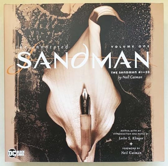
Incoming: THE ANNOTATED SANDMAN VOLUME ONE New Edition
 Images © DC Comics.
The Sandman onslaught continues with this new arrival, a new printing of the first book of four, originally released in 2012. This is identical to the first printing as far as I can tell except for the replacement of the Vertigo imprint label with a DC Black Label, and perhaps the price is different, not sure. There doesn’t seem to be any changes in the text or new material. I devoured many other Annotated classics over the years, and have a half dozen in my own library. The annotations by Leslie Klinger are mainly for literary references, he doesn’t consider, or perhaps doesn’t know about many of the references in the art and writing to other things in comics, and really doesn’t have much to say about the art at all, but what he does cover is thoroughly done. Still, lots of pages of the comic, reproduced in black and white with colors rendered as gray tones in some places, with no notes at all. I thought when it came out, and still think, that having a co-writer from the comics history arena would have made a more interesting book, but it is what it is, and I’m sure these will still be enjoyable and interesting for many Sandman fans. Original retail price is $49.99. Check with your comics retailer or use the Amazon link below to order. Should be out soon if it isn’t already.
The Annotated Sandman Volume One
The post Incoming: THE ANNOTATED SANDMAN VOLUME ONE New Edition appeared first on Todd's Blog.


GASPAR SALADINO in L.E.G.I.O.N.
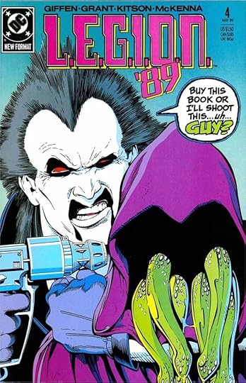 All images © DC Comics. From L.E.G.I.O.N. ’89 #4, May 1989
This Legion of Super-Heroes spinoff ran from 1989 to 1994. The title changed with each year of publication just to make things more difficult for indexers like me, but the numbering was maintained throughout, which is helpful. Those letters and periods are a pain to type, too. By this time, Gaspar Saladino was not lettering many covers, and he did only a few for the series, but he did letter nearly all the stories, so this was a main source of income for him in these years. The balloon on the cover above is full of Saladino style and energy.
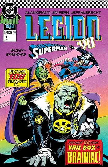 From L.E.G.I.O.N. ’90 ANNUAL #1, Sept 1990
There were also four annuals, each with a different title because of the year changes, but numbered consecutively. Gaspar did two large banner captions for the first one that add to the drama.
 From L.E.G.I.O.N. ’90 #20, Oct 1990
Gaspar’s last cover lettering for the series is above. It has his distinctive R shape in FIRST, and his S is also diagnostic. The perspective is well done.
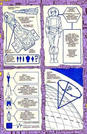 From L.E.G.I.O.N. ’89 #1, Feb 1989
Most of Gaspar’s story lettering was standard balloons and captions, but in the first issue he lettered this diagram in a slightly different style that I like. Some letters are more rounded than usual, and some M’s and N’s have unusual shapes. I think it’s meant to be computer graphics, but this computer is stylish.
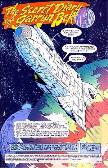 From L.E.G.I.O.N. ’89 #6, May 1989
This splash page has an unusual upper and lower case title, and the diary entries are very similar to Gaspar’s own elegant handwriting except for the emphasized words.
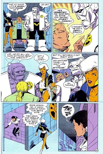 From L.E.G.I.O.N. ’89 #9, Nov 1989
Here’s a more typical story page except for the alien thought balloon in the last panel, which is quite creative.
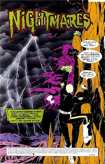 From L.E.G.I.O.N. ’90 #15, March 1990
Great scary title on this splash page, though the colorist (or separator) has missed the openings between some letters that should have been gray or black.
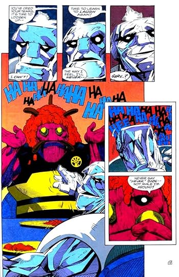 From L.E.G.I.O.N. ’91 #27, May 1991
I love the laughter on this page by Saladino.
 From L.E.G.I.O.N. ’91 ANNUAL #2, Oct 1991
Gaspar also lettered some of the Annuals, adding to his page count.
 From L.E.G.I.O.N. ’92 #39, May 1992
Sometimes the letterer was asked to make the story title part of the spoken lettering, and Saladino does a fine job with that here. I also like the curved credits on the helmet.
 From L.E.G.I.O.N. ’93 #50, March 1993
Fine sound effects and display lettering by Gaspar on this page.
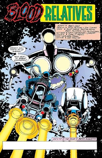 From L.E.G.I.O.N. ’93 ANNUAL #4, Dec 1993
The word BLOOD in this story title is wonderful, suggesting Kirby dots. The blue areas between the letters should have been filled black, but the blue works okay. In this credit box, everyone gets the same style that Saladino usually uses only for his own first name.
 From L.E.G.I.O.N. ’93 #61, Dec 1993
The stylized captions on this splash page work well, as does the story title.
To sum up, Saladino lettered these covers: 4-5, 9, 20, Annual 1, five in all. Below are the details of his story lettering, all stories feature L.E.G.I.O.N.
#1 Feb 1989: 24pp
#2 March 1989: 24pp
#3 April 1989: 24pp
#4 May 1989: 24pp
#5 June 1989: 24pp
#6 July 1989: 24pp
#7 Aug 1989: 24pp
#8 Sept 1989: 24pp
#9 Nov 1989: 24pp
#10 Dec 1989: 24pp
#11 Jan 1990: 24pp
#12 Feb 1990: 24pp
#13 March 1990: 24pp
#14 April 1990: 24pp
#15 May 1990: 24pp
#16 June 1990: 24pp
#17 July 1990: 24pp
#18 Aug 1990: 24pp
#19 Sept 1990: 24pp
#20 Oct 1990: 24pp
#21 Nov 1990: 24pp
#22 Dec 1990: 24pp
#23 Jan 1991: 40pp
#24 Feb 1991: 24pp
#25 March 1991: 24pp
#26 April 1991: 24pp
#27 May 1991: 24pp
#28 June 1991: 24pp
#29 July 1991: 24pp
#30 Aug 1991: 24pp
#31 Sept 1991: 24pp
#32 Oct 1991: 24pp
#33 Nov 1991: 24pp
#34 Dec 1991: 24pp
#35 Jan 1992: 24pp
#39 May 1992: 24pp
#40 June 1992: 24pp
#41 July 1992: 24pp
#42 July 1992: 24pp
#44 Aug 1992: 24pp
#45 Sept 1992: 24pp
#46 Nov 1992: 24pp
#49 Feb 1993: 24pp
#50 March 1993: 43pp
#51 March 1993: 24pp
#53 June 1993: 24pp
#54 June 1993: 24pp
#55 July 1993: 24pp
#56 July 1993: 24pp
#57 Aug 1993: 24pp
#58 Sept 1993: 24pp
#59 Oct 1993: 24pp
#61 Dec 1993: 24pp
#62 Jan 1994: 24pp
#63 Feb 1994: 24pp
#64 March 1994: 24pp
#65 April 1994: 24pp
#66 May 1994: 24pp
#67 June 1994: 24pp
#68 July 1994: 24pp
#69 Aug 1994: 24pp
#70 Sept 1994: 41pp
Annual #2 1991: 57pp
Annual #3 1992: 56pp
Annual #4 1993 pp 3-14 (12pp)
That’s a total of 1,665 pages on this title. Other articles in this series and more you might enjoy are on the COMICS CREATION page of my blog.
The post GASPAR SALADINO in L.E.G.I.O.N. appeared first on Todd's Blog.
April 18, 2022
GASPAR SALADINO in OTHER LEGION TITLES
 All images © DC Comics. From LEGION OF SUPER-HEROES #1, Feb 1973
Rather than trying to jam them into the other Legion articles, this one collects the remaining Legion books with Gaspar Saladino lettering, mostly on covers, and not much on each title. In 1973 DC Comics put out a four-issue series reprinting Legion stories from ADVENTURE COMICS, first issue above, which has new art. Gaspar did the dramatic balloon and the first of two captions, the other is typeset.
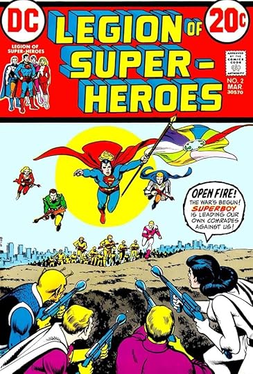 From LEGION OF SUPER-HEROES #2, March 1973
Saladino did the balloon on the second cover, also with new art. The other two issues had reprinted covers with Ira Schnapp lettering.
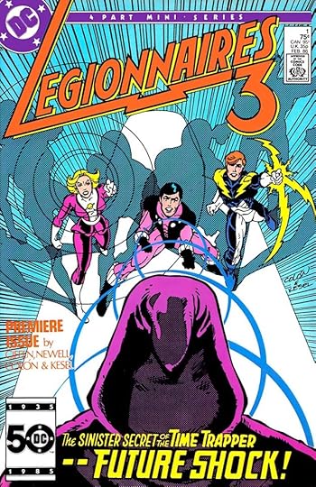 From LEGIONNAIRES 3 #1, Feb 1986
In 1986, this Legion spinoff appeared, a four issue miniseries. Gaspar did the large blurb at the bottom of the first cover, and it’s much more eye-catching and effective than the typeset used on the rest. Gaspar also did the unusual logo.
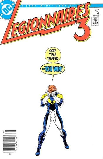 From LEGIONNAIRES 3 #4, May 1986
Gaspar did the balloons on the last cover, and they and the figure have equal importance. There would be almost no story to it without them.
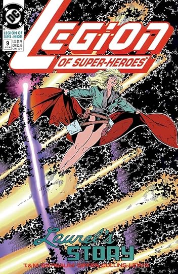 From LEGION OF SUPER-HEROES #9, July 1990
In 1989, DC launched a revamp of the characters that began far from previous stories, but slowly headed back to familiar territory. After some shocked reactions, it became just as popular as past Legion books, and lasted 127 issues until 2000. Gaspar only lettered a few early covers, this is the first, and it uses charming script for LAUREL’S.
 From LEGION OF SUPER-HEROES #12, Oct 1990
I think the open letter blurb at the bottom of this cover is by Saladino. It’s not by me, and I was the other main cover letterer at the time. It has an odd style point. Gaspar usually lined up the notch on this kind of R with the bottom of the center horizontal stroke. Here it’s well below that, which looks wrong. Otherwise the letters look like his work, so perhaps this was an experiment, or perhaps the notch got moved somehow.
 From LEGION OF SUPER-HEROES #13, Nov 1990
The central circular blurb on this cover is by Saladino, and it’s cleverly done. Notice how only a tiny bit of the bottom horizontal stroke of the final E is visible, but it still reads fine partly due to context. The U at the front of that word is similarly off-model, being much closer to a V, but again context makes it work. I also love the shape of the first S.
 From LEGIONNAIRES #51, Aug 1997
This Legion spinoff ran 83 issues from 1993 to 2000. Gaspar’s only work for it was lettering the inside pages of this one issue. As usual, his story title and credit box are creative.
To sum up, I found Saladino lettering on these covers:
LEGION OF SUPER-HEROES (1973): 1-2
LEGIONNAIRES 3: 1-2, 4
LEGION OF SUPER-HEROES (1989): 9, 12-13
That’s eight in all. The story from LEGIONNAIRES #51 has 22 pages.
Other articles in this series and more you might like are on the COMICS CREATION page of my blog.
The post GASPAR SALADINO in OTHER LEGION TITLES appeared first on Todd's Blog.
April 15, 2022
GASPAR SALADINO in LEGION OF SUPER-HEROES (1984)
 All images © DC Comics. From LEGION OF SUPER-HEROES #6, Jan 1985
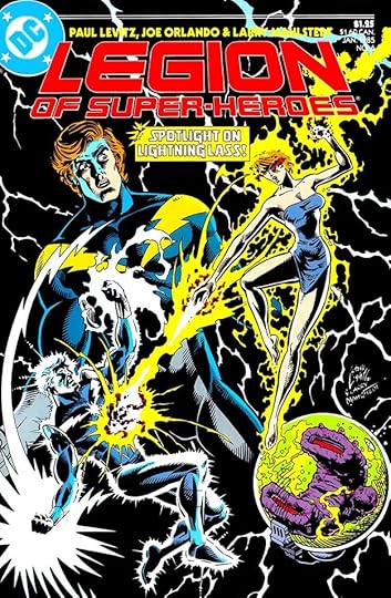
In 1984, DC Comics was trying something new with several of their popular titles. They had a new offset printed format with higher quality printing and paper than the typical letterpress comics they’d always put out, but which would have to sell at a higher price. They aimed them at the direct market, comic shops and retailers who would take them on a non returnable basis. At the same time they didn’t want to lose their newsstand buyers, so for a year there were two titles for this and other books. A new LEGION OF SUPERHEROES began with a new first issue, and came out monthly in the improved format and going to the direct market, while the existing comic continued with new material too. At the end of twelve months, the existing title was renamed TALES OF THE LEGION OF SUPER-HEROES and began reprinting the stories from the other title one year later. This was based on the “hardcover, softcover” model used in book publishing. It worked for a while, and when the LEGION stories were reprinted in TALES OF, they had new covers. Gaspar lettered some of the covers in both series, but more for TALES OF than for LEGION. He didn’t letter any of the stories inside. I’ll discuss LEGION first, then the TALES reprint covers. Early LEGION covers had no lettering, and that was also true for other issues, but eventually Gaspar’s work became more common there. His first LEGION lettering was for the cover above, the caption under the logo.
 From LEGION OF SUPER-HEROES #10, May 1985
Gaspar did the bottom open lettering on this cover as well as the solid lettering on the poster. Both work well.
 From LEGION OF SUPER-HEROES #11, June 1985
I love the banner lettering on this cover, and I can’t think of a better use for rounded, bouncy letters.
 From LEGION OF SUPER-HEROES #18, Jan 1986
Gaspar has established a somewhat rounded style of block letters for this title that work well on INFINITE MAN, and the top two lines provide good contrast.
 From LEGION OF SUPER-HEROES ANNUAL #2, Oct 1986
Gaspar also lettered the caption on this Annual cover, using different approaches on each word that all work together well.
 From LEGION OF SUPER-HEROES #30, Jan 1987
Sometimes the lettering is the star, or at least co-star of a cover, and this is a good example. The contrast between the upbeat wording and the art reveals it as an ironic statement, and makes the reader want to know more.
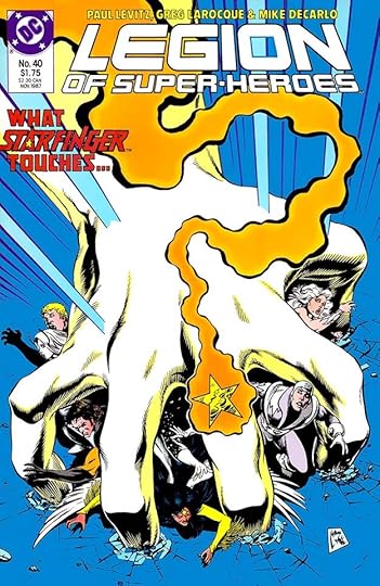 From LEGION OF SUPER-HEROES #40, Nov 1987
Gaspar added a creative touch to STARFINGER by putting a small star in the A. Everyone must have liked it, he did the same thing on other covers where the character’s name appeared.
 From LEGION OF SUPER-HEROES #51, Oct 1988
This one is really a tour-de-force. The large lettering follows the perspective of my logo, and also works as a huge word balloon. Awesome!
 From TALES OF THE LEGION OF SUPER-HEROES #326, Aug 1985
The first of the new covers over the reprints from LEGION, this book continued the numbering from the original series. The burst makes reference to “the stories you’ve heard about,” and newsstand readers could read them here at a lower price, though on cheaper paper with poorer printing.
 From TALES OF THE LEGION OF SUPER-HEROES #329, Nov 1985
These covers often seemed to take a more melodramatic approach than the other title, and Gaspar was a good choice to letter them. This one year later idea would probably never work today, where spoilers for everything abound.
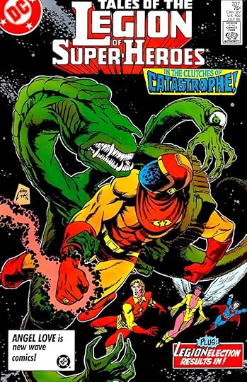 From TALES OF THE LEGION OF SUPER-HEROES #337, July 1986
Gaspar makes CATASTROPHE seem pretty awful with his effective lettering.
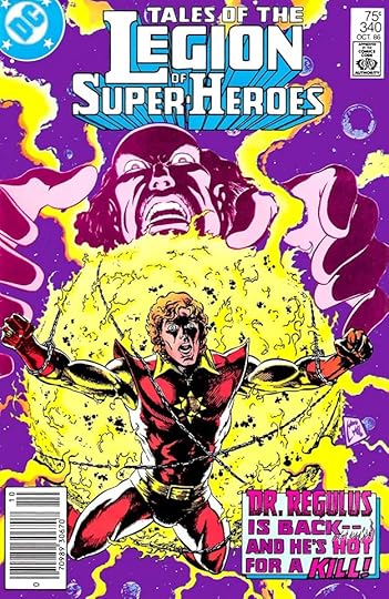 From TALES OF THE LEGION OF SUPER-HEROES #340, Oct 1986
Even in pink, Saladino’s flaming letters for HOT are effective.
 From TALES OF THE LEGION OF SUPER-HEROES ANNUAL #4, Oct 1986
More effective melodrama on the one TALES Annual with Gaspar’s lettering. TALES ended in 1987, and the above version of LEGION in 1989, but there were more versions, and the franchise remains popular. I’ll show more Gaspar lettering on other Legion books in the next article.
To sum up, I found Saladino lettering on these covers:
LEGION OF SUPER-HEROES (1984): 6, 10-11, 15, 18-21, 23-31, 40, 42, 44, 47, 49, 51, Annual 1-2
TALES OF THE LEGION OF SUPER-HEROES: 326-334, 337-342, 344, 346, 349-350, 352-354, Annual 4
That’s 48 covers in all. Other articles in this series and more you might like are on the COMICS CREATION page of my blog.
The post GASPAR SALADINO in LEGION OF SUPER-HEROES (1984) appeared first on Todd's Blog.
April 14, 2022
GASPAR SALADINO in LEGION OF SUPER-HEROES (1980)
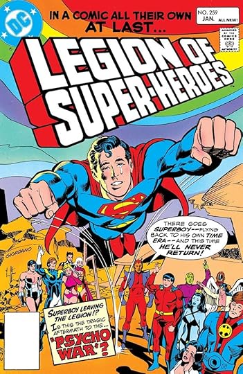 All images © DC Comics. From LEGION OF SUPER-HEROES #259, Jan 1980
The Legion of Super-Heroes was created in a Superboy story in ADVENTURE COMICS #247 in 1958. Fans wanted more, and the Legion grew in popularity, a future Earth team of super-powered teens from many worlds. Their publication history is complicated, and I’ve divided it into three articles. After gradually dominating Superboy’s own title, that title was renamed for the group with this issue, while Superboy left to mainly occupy his own book. Gaspar Saladino didn’t letter any stories for this run of 55 issues, but he did letter many of the covers, including the first one, above. Earlier Legion covers he lettered are indexed in my article on Adventure Comics. I did the logo here, the rest is by Gaspar, including the energetic story title and top banner.
 From LEGION OF SUPER-HEROES #262, April 1980
The Saladino top banner on this cover has art deco elements, like the rounded E’s, which he sometimes used to suggest the future. To make the story title as bold as possible, some letters have no space between the strokes. It would have read better in a lighter color, but it works fine.
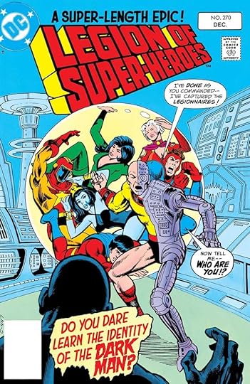 From LEGION OF SUPER-HEROES #270, Dec 1980
The placement of the caption in front of the figure at the bottom of this cover is unfortunate, but there isn’t room for it anywhere else. I would have made it smaller, moved the second word balloon up near the first (again clearing the figure), and moved the smaller caption to that open area right of the metal leg. These were decisions that the production person assembling the cover could have made.
 From LEGION OF SUPER-HEROES #274, April 1971
The heavy red outline on the burst balloon here doesn’t seem typical of Gaspar, perhaps the person assembling the cover made it thicker. The clue is the tail to the character would have been wider if Saladino did it. I like the bounce in the top blurb.
 From LEGION OF SUPER-HEROES #280, Oct 1981
Superboy wasn’t gone long, was he? The blurbs by Gaspar are appealing and celebratory.
 From LEGION OF SUPER-HEROES #283, Jan 1982
You want variety in your cover blurbs? Gaspar could supply that. I love the flaming letters of WILDFIRE and the romance style of LOVE.
 From LEGION OF SUPER-HEROES #294, Dec 1982
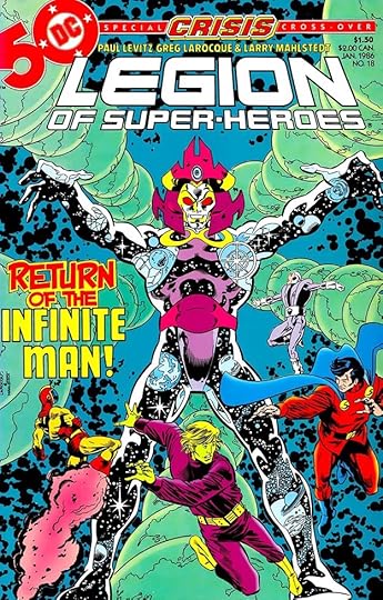
The Great Darkness Saga pitting the Legion against Jack Kirby’s Darkseid is a fan favorite, but most of the issues had little or no cover lettering. This final one includes a fine top blurb by Gaspar.
 From LEGION OF SUPER-HEROES #298, April 1983
At this time, free comics inserts sampling new titles were being added to popular books as a promotion, and this is one. Lots of Saladino lettering in the frame, and he hasn’t skimped on the main story title either.
 From LEGION OF SUPER-HEROES #311, May 1984
This is my favorite Saladino blurb of the run, near the end of it. So much character in that lettering! After two more issues, this series split into two books, a new Legion title beginning with #1, and TALES OF THE LEGION OF SUPER-HEROES continuing the numbering of this one. I’ll explain more about that in a separate post.
To sum up, I found Saladino lettering on these covers: 259, 262-263, 265, 270-275, 277, 279-287, 289-291, 294-299, 302-307, 309-312. That’s 38 in all. Other articles in this series and more you might like are on the COMICS CREATION page of my blog.
The post GASPAR SALADINO in LEGION OF SUPER-HEROES (1980) appeared first on Todd's Blog.
April 13, 2022
GASPAR SALADINO in OTHER K TITLES
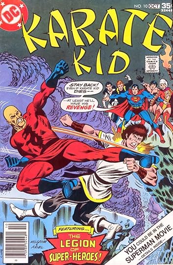 All images © DC Comics. From KARATE KID #10, Sept-Oct 1976
This article features four DC Comics titles beginning with the letter K that didn’t have enough Gaspar Saladino involvement to warrant a separate article. Most of his work is cover lettering, but there are two stories inside the books as well. The series above was a spinoff from The Legion of Super-Heroes that ran 15 issues from 1976 to 1978. Gaspar lettered three covers, the first is above. The burst at the bottom is an odd shape, and the lettering in it seems a bit small, but it works fine.
 From KARATE KID #12, Jan-Feb 1978
The Saladino caption on this cover works better in my opinion, and his word balloons always add energy and drama.
 From KARATE KID #15, July-Aug 1978
The final issue featured a crossover with Kamandi, but both books were soon cancelled, so it wasn’t enough to keep readers buying, plus the “DC Implosion” ended KAMANDI prematurely. I like Gaspar’s captions and the art deco style of some words, with a rounded letter E.
 From KOBRA #2, April-May 1976
KOBRA was a rare attempt at DC to have a series starring a villain, running seven issues in 1976-77. The other one that comes to mind was THE JOKER begun the previous year. Saladino lettered three covers. The first, above, has four blurbs, a lot for this time, and they all work for me.
 From KOBRA #3, June-July 1976
This one has one blurb and four balloons, all well done by Gaspar, but perhaps suggesting the storytelling wasn’t strong to need that much explanation.
 From KOBRA #6, Jan-Feb 1977
The original Kobra logo by John Workman was replaced with this issue. The Grand Comics Database says: “As revealed in the letters section of Kobra # 7 the new logo was designed by Martin Pasko and Paul Levitz and rendered by Gaspar Saladino.” It’s too tall, but otherwise an improvement, I think. Saladino’s three blurbs and two balloons work fine with this more dynamic art, too.
 From KORAK #48, Sept-Oct 1972
In 1972, DC Comics acquired the license to create and publish comics featuring characters created by Edgar Rice Burroughs, including Tarzan and his son Korak, who were previously appearing in comics from Western Publishing. DC continued the numbering of those, and their issues of KORAK ran from #47 to #59 in 1972-75. Gaspar lettered just five of the covers. I don’t think he did the lettering above the Saladino logo here, but I could be wrong. He definitely did the bottom caption.
 From KORAK #50, Jan-Feb 1973
Artist Joe Kubert left more room for lettering on this cover, and Saladino used it well for a large blurb utilizing several styles of display lettering, all reversed out of the dark background by the color separators, following the color guide DC provided.
 From KORAK #59, Sept-Oct 1975
Gaspar’s final work on the covers is above, a nice blurb using open letters that run over the art.
 From KRYPTON CHRONICLES #1, Sept 1981
This three-issue miniseries was based on the comics and not the first Superman movie. Gaspar lettered the blurb above his logo and the balloon.
 From KRYPTON CHRONICLES #2, Oct 1981
The two balloons on this cover explain the action and the color holds on the lettering work well.
 From KOBRA #3, June-July 1976
Inside the books, Gaspar lettered the third issue of KOBRA. Panel four has a nice burst balloon, and the tail goes behind the figure, something letterers tried to avoid, but it works here.
 From KORAK #47, July-Aug 1972
He also lettered the first installment of the Carson of Venus backup in KORAK. I think artist Michael Wm. Kaluta did the feature logo and story title, but PIRATES OF VENUS is by Gaspar.
To sum up, I found Saladino lettering on these covers:
KARATE KID 10, 12, 15
KOBRA 2-3, 6
KORAK 48-50, 53, 59
KRYPTON CHRONICLES 1-2
That’s 13 in all. Here are the details on the stories:
KOBRA #3 June-July 1976: 17pp
KORAK #47 July-Aug 1972: Carson of Venus 6pp
More articles in this series and others you might like are on the COMICS CREATION page of my blog.
The post GASPAR SALADINO in OTHER K TITLES appeared first on Todd's Blog.
April 12, 2022
GASPAR SALADINO in KAMANDI
 All images © DC Comics. From KAMANDI, THE LAST BOY ON EARTH #1, Oct-Nov 1972
This was by far the longest-running title from writer/artist Jack Kirby at DC Comics, running from 1972 to 1978. A post-apocalyptic future tale of a human boy in a world of sentient animals took cues from “Planet of the Apes,” but certainly went in its own direction, and readers liked it. Kirby’s involvement ended with issue #40, and the book continued by others until issue #59, when the “DC Implosion” did it in. What would have been the next two issues ran in CANCELLED COMICS CAVALCADE. Gaspar Saladino lettered many of the covers, but only one backup story in the final issue. The first cover, above, includes his logo as well as a top blurb and a round burst at the bottom. In 1972, Kirby at DC was still worth promoting, though his Fourth World titles were not selling well and getting cancelled. Fans seem to have preferred this title.
 From KAMANDI #3, Feb 1973
Kirby didn’t seem to pay much attention to lettering, but he did like it large, and his favorite letterer at Marvel was Artie Simek because Artie would fill the top third of the first page with the title so there was less for Jack to draw, or so I’ve heard. At DC, I think Saladino was a good match for Kirby, they both added lots of energy to their work.
 From KAMANDI #4, March 1973
Gaspar thought a talking human-like tiger should have a special balloon style, and I like what he did. I doubt it was followed on the inside.
 From KAMANDI #7, July 1973
Some of these covers have barely any Saladino lettering, and used type instead. Here only the words BUT IT DOES are by Gaspar. The rest of the top blurb is done on the DC headline machine, and I suspect Gaspar did it himself that way. The machine allowed you to set a line of large type one letter at a time on a roll of photographic paper, which ran through developing chemicals and came out ready to cut and paste. There are other books at this time using similar mixes of headline type and Saladino lettering, and perhaps he enjoyed the chance to change things up.
 From KAMANDI #11, Nov 1973
More headline type at the top, but a nice Saladino word balloon as well. The talking tiger now has a regular speech balloon.
 From KAMANDI #17, May 1974
The Saladino scroll caption at the top includes a few serif letters, something he didn’t do often.
 From KAMANDI #24, Dec 1974
In my opinion, no one did scary lettering better than Gaspar, and there’s some in the top blurb and the word balloon here.
 From KAMANDI #27, March 1975
A good example of Saladino’s energy in the lettering working well with Kirby’s energy in the art.
 From KAMANDI #32, Aug 1975
For a short time, the book had more pages for reprints and special features. This has to be the first time a creator’s photo appeared on the cover of a DC Comic, at least one that’s labeled as such. Gaspar’s lettering is full of intriguing blurbs and handsome styles.
 From KAMANDI #36, Dec 1975
By this time, DC’s loss of faith in Kirby as a selling point was obvious. They replaced him with Joe Kubert on covers, and two issues later, Gerry Conway took over as writer. Kirby would soon move on and return to Marvel. Gaspar’s top blurb and the large display lettering in the balloon work well here.
 From KAMANDI #41, May 1976
With Kirby gone, the burst on this cover promises more action than ever before…as if that were possible, but maybe some readers bought into it.
 From KAMANDI #49, Feb-March 1977
I find both the art and the lettering less interesting on this cover than most of the previous ones, but I’m sure everyone was doing their best.
 From KAMANDI #57, June-July 1978
Saladino’s final cover lettering for the series appeared on this interesting Jim Starlin cover, and the blurb is also more interesting, showing where the book might have headed.
 From KAMANDI #59, Sept-Oct 1978
Starlin also began a backup series featuring another Kirby creation, OMAC. The first chapter has the only Saladino story lettering in the series, and features a fine title. Note that the credit box is lettered by someone else. The next chapter was finished, but the series ended before it could see print and it appeared in CANCELLED COMICS CAVALCADE, and later in WARLORD #37. It was also lettered by Gaspar.
To sum up, I found Saladino lettering on these covers: 1-7, 9, 11-13, 15-30, 32-36, 38-39, 41, 43, 45, 49, 51, 57. That’s 39 in all. The story in issue #59 is 8 pages.
Other articles in this series and more you might enjoy are on the COMICS CREATION page of my blog.
The post GASPAR SALADINO in KAMANDI appeared first on Todd's Blog.
April 11, 2022
GASPAR SALADINO in OTHER J TITLES
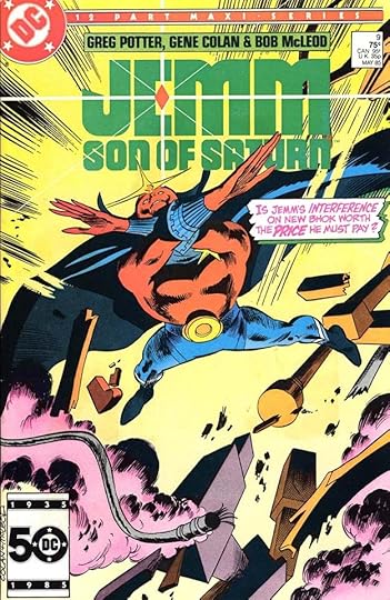
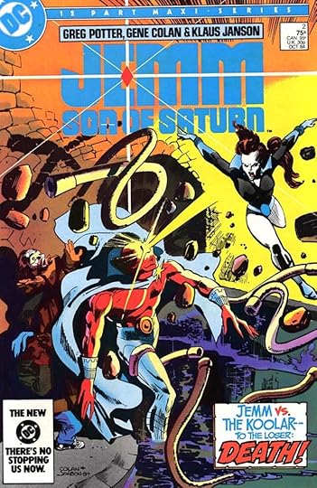 All images © DC Comics. From JEMM SON OF SATURN #2, Oct 1984
This article is for DC Comics titles beginning with J that didn’t have enough Gaspar Saladino work to warrant a separate article. All the entries are for cover lettering. First up is JEMM, SON OF SATURN, a twelve-issue series of 1984-85, which had Saladino lettering on eight of its covers. The blurb on the one above uses several appealing display lettering styles with the emphasis on DEATH, as it often is in comics.
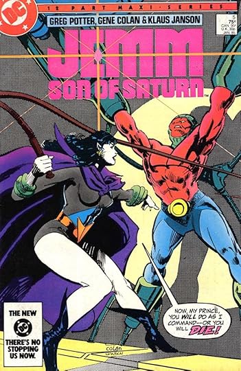 From JEMM SON OF SATURN #5, Jan 1985
If the word DEATH didn’t appear, the word DIE or DIES often did, as here. Love and Death are the classic themes of literature, and for most comics the second of those is by far the most common.
 From JEMM SON OF SATURN #9, May 1985
The Saladino caption on this cover tells the story that the art only vaguely suggests, that of the hero taking great risks. I don’t know that the magenta color hold on the lettering adds anything, but at least it’s still clear and readable.
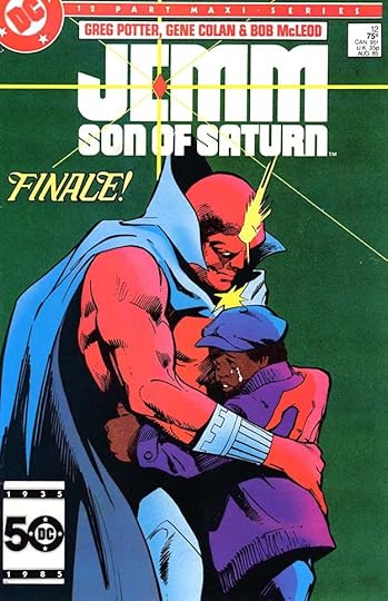 From JEMM SON OF SATURN #12, Aug 1985
The final issue has an almost literary single word blurb, and the cover suggests the theme of Love has triumphed in the end.
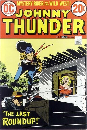 From JOHNNY THUNDER #1, Feb-March 1973
The western gunfighter Johnny Thunder had been a popular feature of DC’s western titles from the late 1940s to the mid 1950s, and in 1973, some of them were reprinted in this three issue series. Even the cover is a reprint here, with only Gaspar’s dry-brush blurb at the bottom a new addition.
 From JOHNNY THUNDER #2, April-May 1973
The second issue has a fine new banner caption by Saladino, and a tiny one at the bottom over typeset.
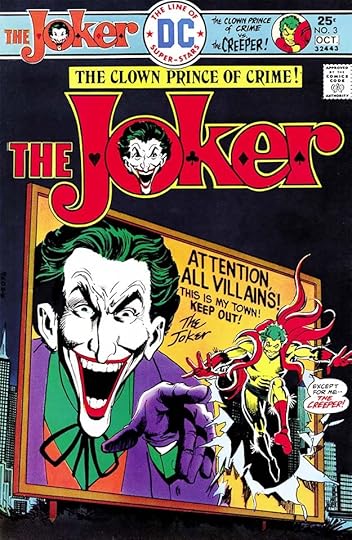
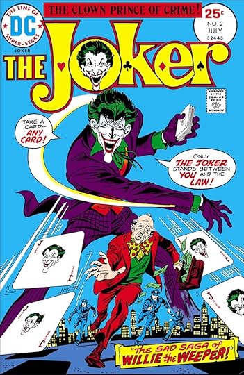 From THE JOKER #2, July 1975
I think this was the first DC series to feature a super-villain, and it ran nine issues from 1975-76. Gaspar lettered four of the covers and none of the stories inside. This one has two balloons and a well-designed banner caption.
 From THE JOKER #3, Sept-Oct 1975
With the advent of this new trade dress, lettering was usually added in the top bar, as here, and this cover also has a small word balloon and a billboard lettered by Saladino.
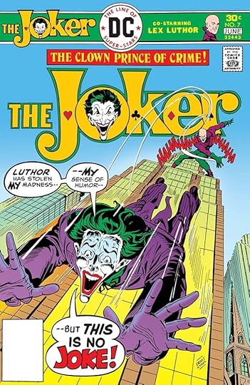 From THE JOKER #7, May-June 1976
Gaspar knew how to build drama with escalating balloon emphasis, and the final one on this cover is a beauty.
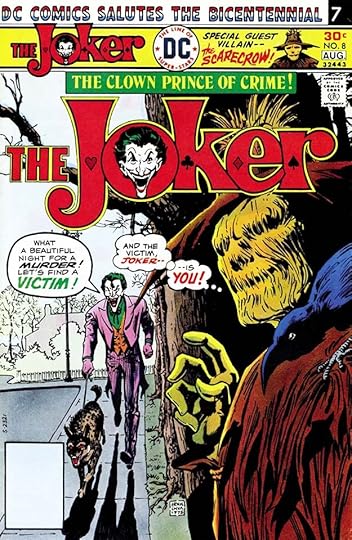 From THE JOKER #8, July-Aug 1976
There’s too much trade dress on this cover, but at least it includes a Saladino blurb, and I like the thought balloons.
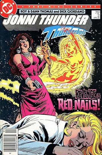
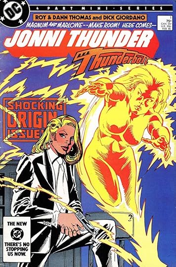 From JONNI THUNDER #1, Feb 1985
For this miniseries, DC gave the golden age Thunderbolt character a new female alter ego, and made her a detective. Interesting idea, but it didn’t go any further. Gaspar lettered all four covers. Here he did the blurb above the logo and the SHOCKING ORIGIN ISSUE one, which is partially covered but still reads fine.
 From JONNI THUNDER #2, April 1985
The blurb on this cover is classic Saladino rough block lettering with texture in the second line.
 From JONNI THUNDER #4, Aug 1985
The final issue has a nice scroll caption. The word FAREWELL is hard to read because of the color choice, but that’s something Saladino wasn’t involved in. I love the dramatic burst balloon.
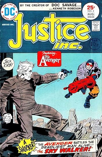 From JUSTICE, INC. #2, July-Aug 1975
The second to fourth issues of this short-lived 1975 series had Jack Kirby work on the covers and inside, and Gaspar Saladino lettering on the covers of issues 2 and 3. They featured pulp character The Avenger, as described in Gaspar’s scroll caption, though the book couldn’t use that name as a title for obvious reasons.
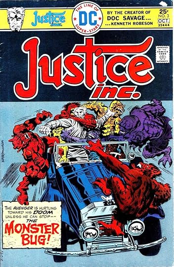 From JUSTICE INC. #3, Sept-Oct 1975
Gaspar also designed the excellent logo for this book, and on this cover, his caption makes good use of one of his scary styles.
To sum up, I found Saladino lettering on these covers:
JEMM SON OF SATURN: 2-5, 9-12
JOHNNY THUNDER (1973): 1-2
THE JOKER 2-3, 7-8
JONNI THUNDER: 1-4
JUSTICE INC.: 2-3
That’s 20 in all. Other articles in this series and more you might like can be found on the COMICS CREATION page of my blog.
The post GASPAR SALADINO in OTHER J TITLES appeared first on Todd's Blog.
April 10, 2022
And Then I Read: SECRET IDENTITY by Alex Segura

This is a noir murder mystery taking place in New York City in 1975, a time when the city itself was in financial trouble, the streets were dirty and could be dangerous, and noir seems the right description for them. New York is also the traditional birthplace of comic books, with companies like National (DC) Comics, Timely/Atlas/Marvel, Dell, Fawcett and many others having great success there with them in the 1940s and 1950s, but by the mid 1970s, sales were way down, and comics pundits were predicting the demise of the industry at any moment. I started working in the DC Comics production department in 1977, and most of the comics creation and production insider information in the book as well as many of the characters based on real people or composites of real people seemed quite familiar to me. I found nothing in the book that hit a wrong note, or presented an impossible circumstance, except perhaps for the actual murders, but then it is a murder mystery.
Carmen Valdez is the secretary and right-hand person of Triumph Comics’ boss Jeffrey Carlyle, a small publisher trying to compete with the big boys, DC and Marvel, and just getting by with a few popular titles. Carmen is 28, and her love of comics has brought her here from Miami in the hope of finding work as a comics writer, but her boss, who depends on her people skills, is not really interested in her script proposals. Frustrated, she teams up with a fellow Triumph production staffer, Harvey Stern, who also wants to write for the company. Since Carmen’s attempts have hit a wall, they agree to put Harvey’s name as sole author of their new character, The Lynx. Most of the ideas and text are by Valdez, incorporating things she’s been thinking about for years, but Stern helps her mold them into several good scripts, or so they hope. They end up on the desk of Triumph boss Carlyle, he loves them, and puts his best artist to work on them. Sample pages of the comic that also contribute to the plot are interspersed through the book. Meanwhile, Carmen is feeling cheated of credit for her work, and goes to Harvey’s apartment to confront him about it. She’s shocked to find him killed by a single gunshot. His murder is the first but not the last, and Carmen soon finds herself not only a suspect, but a possible target.
Alex is a comics insider himself, but the era in question involved much research, as it’s well after his time in the business. I think he got it right. The story is well done, the characters and plot drew me right in. At times the name checking of actual comics creators was a bit distracting, but in all I found this a great read and I highly recommend it. Well done!
Secret Identity by Alex Segura
The post And Then I Read: SECRET IDENTITY by Alex Segura appeared first on Todd's Blog.
April 8, 2022
GASPAR SALADINO in OTHER JUSTICE LEAGUE TITLES
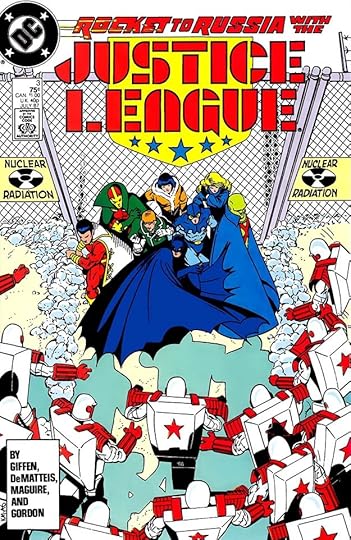
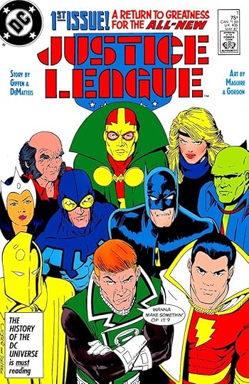 All images © DC Comics. From JUSTICE LEAGUE #1, May 1987
Immediately after the demise of the original long-running JUSTICE LEAGUE OF AMERICA series, a new version was launched with a new creative team and a somewhat more humorous take on some of the characters and situations. It proved very popular and became a franchise branching out into several titles running through the 1990s. At first the new title was simply JUSTICE LEAGUE, but it became JUSTICE LEAGUE INTERNATIONAL with issue #7. Gaspar did not letter any of the stories in these new series, his only involvement was lettering covers, and not many of those. I’ll show some of them here. Gaspar did the handsome top blurb on the first issue over a new logo by Alex Jay. I did the single word balloon, which I think was a last-minute addition.
 From JUSTICE LEAGUE #3, July 1987
Gaspar’s creativity is evident in the speed lines on the word ROCKET in this issue’s top blurb.
 From JUSTICE LEAGUE #5, Sept 1987
Saladino’s top blurb on this cover is full of energy, adding to the anger of Guy Gardner in the art.
 From JUSTICE LEAGUE INTERNATIONAL #9, Jan 1988
As DC moved into the late 1980s, though, Saladino’s cover lettering dwindled. Many covers used only type instead of hand lettering, and on those that did, I was often given the assignments. I moved from working on staff full time to freelancing in 1987, and I was grateful for the work, and not really aware that I was kind of replacing Gaspar in some ways. It wasn’t something I thought about, to be honest, and I did still see plenty of his work on story pages. Here the word MANHUNTERS has a trademark TM, suggesting DC wanted to use it in other places, and I think they did.
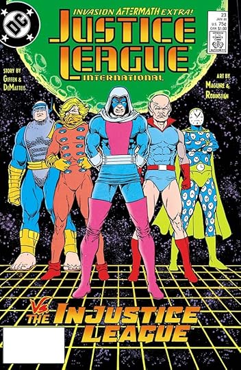 From JUSTICE LEAGUE INTERNATIONAL #23, Jan 1989
I had to study the blurb on this cover, as I thought it might be my work, but the brush lettering on VS is not something I would have done that way, and there are other subtle style points that convince me this is by Gaspar, like the way the bottom leg of the E in THE sticks out beyond the other two horizontal strokes. Also the shape of the S in INJUSTICE is more Gaspar than Klein, so I’m sure it’s by him. Gaspar was my favorite letterer, and I certainly copied his styles in my own cover lettering at times.
 From JUSTICE LEAGUE EUROPE #12, March 1990
JUSTICE LEAGUE EUROPE was spun off from the main title and lasted a while. The blurb on this cover is definitely by Saladino, and works well.
 From JUSTICE LEAGUE EUROPE #19, Oct 1990
When Gaspar did rough display lettering in balloons, there was something unique about his approach that I can spot in a second, so this cover is also lettered by him, but there were only two on this series.
 From JUSTICE LEAGUE AMERICA #42, Sept 1990
With issue #26, JUSTICE LEAGUE INTERNATIONAL became JUSTICE LEAGUE AMERICA, and soon JUSTICE LEAGUE EUROPE became JUSTICE LEAGUE INTERNATIONAL. Talk about confusing! On this cover, Saladino lettered the balloons, the burst at upper left, and also the larger lettering on the paper at the bottom. In fact, the word GREETINGS looks a bit like his signature.
 From JUSTICE LEAGUE AMERICA #61, April 1992
The blurb on this cover is another one I had to think about, as it uses display lettering styles that both Gaspar and I utilized, but the shape of the burst is distinctively Saladino’s, so this one is by him. It’s a late cover blurb for Gaspar, and the last one I could find on any of the Justice League titles.
To sum up, I found Saladino lettering on these covers:
JUSTICE LEAGUE (1987): 1, 3-5, Annual 1
JUSTICE LEAGUE INTERNATIONAL (1988): 8-9, 23
JUSTICE LEAGUE EUROPE (1989): 12,19
JUSTICE LEAGUE AMERICA (1989): 42, 61
That’s twelve in all. Other articles in this series and more you might enjoy are on the COMICS CREATION page of my blog.
The post GASPAR SALADINO in OTHER JUSTICE LEAGUE TITLES appeared first on Todd's Blog.
Todd Klein's Blog

- Todd Klein's profile
- 28 followers

