
Todd Klein's Blog, page 69
April 29, 2022
GASPAR SALADINO in NEW GODS
 All images © DC Comics. From THE NEW GODS #1, Feb-March 1971
When DC Comics accomplished the recruitment of Marvel Comics’ top artist, Jack Kirby, they were giddy with excitement, crowing “KIRBY’S HERE!” on early covers and house ads. The initial deal was for Jack to edit, write and draw four titles, and this one was the center of his Fourth World saga. As with other DC Kirby titles, the covers had a mixture of type and Gaspar Saladino lettering, he did the two captions at the bottom of this one, though the word READ is probably type. The logo was developed by Jack, who found an advertisement with letters he liked, which he cut up and pasted together. Gaspar did his version based on that. Kirby did eleven issues in 1971-72 that sold well at first, but perhaps it was not the blockbuster DC was hoping for. The book was revived by others for eight more issues in 1977-78, and as with all the Kirby DC creations, continued in new popular series later. Saladino did cover lettering for many issues of the first several series, and lettered just one inside story.
 From THE NEW GODS #2, April-May 1971
There’s lots of Saladino lettering on the second issue cover, but also some type. ORION is a larger and wider version of what he did on the first cover with a second outline to make it read better. On both, the notch on the right side of the R is barely there. On the first issue, it’s lowered, as is usual for Gaspar, here it’s centered. There’s headline type in the bottom banner and the caption above it as well as lettering, possibly done by Gaspar on DC’s headline machine.
 From THE NEW GODS #3, June-July 1971
These captions are all lettered by Saladino. I like the rough treatment of DEATH.
 From THE NEW GODS #4, Aug-Sept 1971
The top blurb here is headline type, the rest is Saladino lettering, including the first word balloon on the series covers.
 From THE NEW GODS #6, Dec 1971-Jan 1972
I think this is all Saladino hand lettering except MANHUNTER, which is the font Albertus created in 1932-40 by Berthold Wolpe. Gaspar may have put it into his caption using press-down type, DC usually had a selection of that from Letraset. Another pop culture use was all the signs in the Patrick McGoohan TV show, “The Prisoner.”
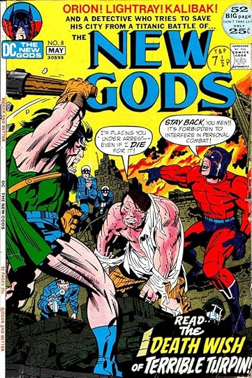 From THE NEW GODS #8, April-May 1972
Generally I don’t think the mix of type and hand lettering on these covers works very well, it often seems mismatched. The type at the top is bland and dull compared to Saladino’s exciting caption at the bottom.
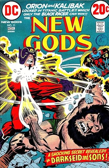 From THE NEW GODS #11, Oct-Nov 1972
The final Kirby issue has only Saladino lettering, which I feel works better. I like the Art Deco approach on the open letters of the bottom caption, though I don’t know if it’s really the right choice for the character.
 From NEW GODS #1, June 1984
In 1984, DC republished the original Kirby issues in a prestige format with new covers and a new final issue from Kirby. Fans were now eager to see it, and Jack was pleased with the project, though it extended into a separate graphic novel, The Hunger Dogs. I did the new logo and Gaspar lettered most of the covers.
 From NEW GODS #2, July 1984
One good thing about these reprints is the much simpler trade dress and cover text. Here Saladino’s work shines in two large blurbs, letting the dynamic art do the rest.
 From NEW GODS #5, Oct 1984
I just love The Bug, both the character and the Saladino lettering for him.
 From NEW GODS #6, Nov 1984
At last! I don’t know if the bottom burst was drawn by Kirby, or by Saladino, but either way it works well around Gaspar’s lettering.
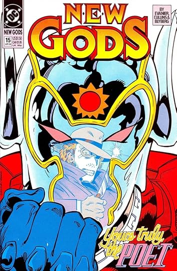 From NEW GODS #15, April 1990
In 1989 DC relaunched the title again without Kirby, and it ran 28 issues to 1991. Gaspar lettered several of the covers beginning with this one. Sadly, his script lettering for YOURS TRULY, THE is held in yellow, and hard to see.
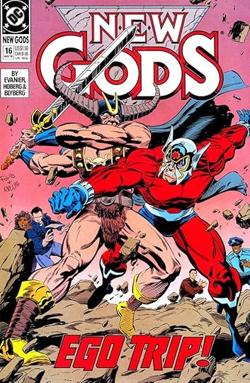 From NEW GODS #16, May 1990
There are small details in this Saladino bottom blurb that delight me: the subtle up and down stagger of the letters, the connection of the TR, and the way the right side of the R overlaps rather than joins like the rest.
 From NEW GODS #23, Feb 1991
Another fine blurb on this cover by Gaspar, making miles of difference between two similar words. Note the unusual and creative shape of the O in the second one.
 From NEW GODS #22, Jan 1991
Saladino’s only story lettering for any of these series was for this issue, a fill-in, as the rest were by others. I love the lower case title, and the scroll caption for the credits.
To sum up, I found Saladino lettering on these covers:
THE NEW GODS (1971): 1-11
NEW GODS (1984): 1-3, 5-6
NEW GODS (1989): 15-17, 19, 23-24
That’s 22 in all. The inside story above was 24 pages. Other articles in this series and more you might like are on the COMICS CREATION page of my blog.
The post GASPAR SALADINO in NEW GODS appeared first on Todd's Blog.


April 28, 2022
GASPAR SALADINO in THE NEW ADVENTURES OF SUPERBOY
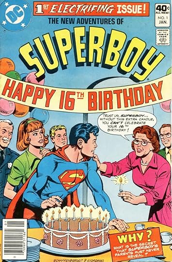 All images © DC Comics. From THE NEW ADVENTURES OF SUPERBOY #1, Jan 1980
Superboy had long been appearing with the Legion of Super-Heroes, and in 1980, DC thought the Legion could support their own series and started this new one for Superboy, returning him to Earth-bound adventures in Smallville. There was an audience for that and it did well, running 54 issues until 1984. Gaspar Saladino lettered many of the covers. This first one is infamous for the spelling mistake in the top blurb, it should be ELECTRIFYING. No one caught it. Otherwise the lettering is well done, and my guess is many readers never noticed the mistake.
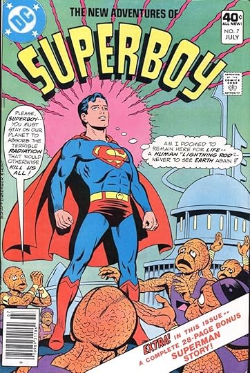 From THE NEW ADVENTURES OF SUPERBOY #7, July 1980
Well, they weren’t all Earth-bound adventures, obviously! Most were. The narrow balloon on the left here is a lesson in word stacking.
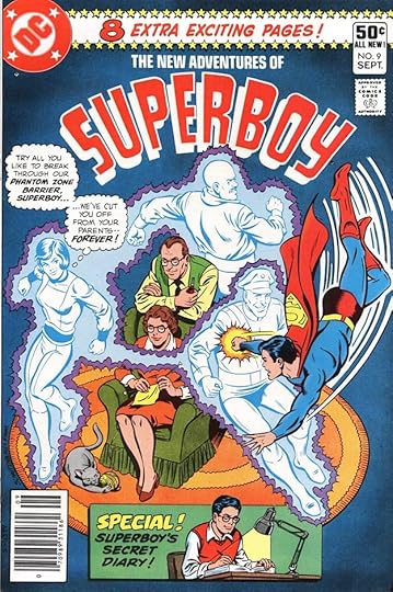 From THE NEW ADVENTURES OF SUPERBOY #9, Sept 1980
The series returned to many past ideas from decades of Superman and Superboy stories, like the Phantom Zone, also used in the first two Superman movies.
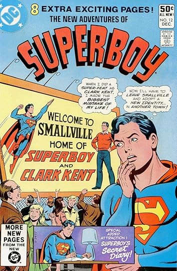 From THE NEW ADVENTURES OF SUPERBOY #12, Dec 1980
Lots of fine Saladino lettering on this cover, from the large sign to the SECRET DIARY script.
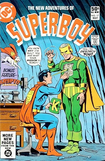 From THE NEW ADVENTURES OF SUPERBOY #17, May 1981
I always thought it interesting that Superman and Superboy could build sophisticated robots that looked and acted like humans with no apparent training or tools for that. The vise and drill press seen here must have been important. The Krypto logo is one Saladino had done previously.
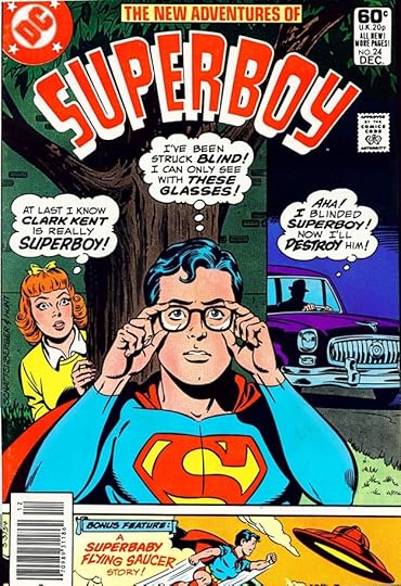 From THE NEW ADVENTURES OF SUPERBOY #24, Dec 1981
The thought balloons on this cover are larger than usual, perhaps because there’s plenty of room. Those are dramatic thoughts!
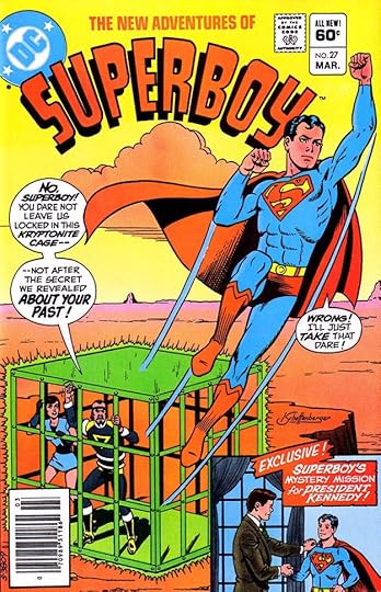 From THE NEW ADVENTURES OF SUPERBOY #27, March 1982
There’s no doubt this series was intended to appeal to long-time readers, and featuring President Kennedy seems a good idea for that. Gaspar’s word balloons and captions sell the retro look well.
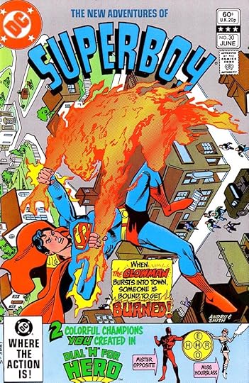 From THE NEW ADVENTURES OF SUPERBOY #30, June 1982
More fine Saladino lettering on this cover as the backup becomes another revived series from the past, one that readers could participate in.
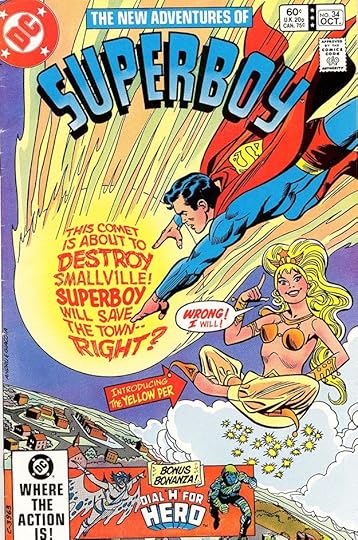 From THE NEW ADVENTURES OF SUPERBOY #34, Oct 1982.
The comet blurb on this cover with the fish-eye bulge toward the reader is masterful work by Saladino. There’s another error in the arrow caption, the character’s name is The Yellow Peri, but that wasn’t Gaspar’s fault, the final I was dropped during color separations.
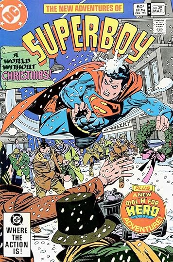 From THE NEW ADVENTURES OF SUPERBOY #39, March 1983
Gaspar’s calligraphy and Old English styles are evident in the scroll caption, and Dial H is in a new round caption that works well here.
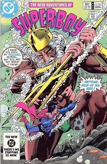 From THE NEW ADVENTURES OF SUPERBOY #44, Aug 1983
Toward the end of this run, Gil Kane did some impressive covers, and Gaspar gave Neptune an intriguing balloon style on this one.
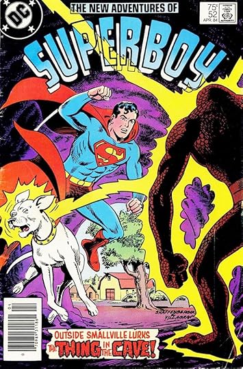 From THE NEW ADVENTURES OF SUPERBOY #52, April 1984
Gaspar’s scary styles were always on call when needed, as in the caption here.
To sum up, I found Saladino lettering on these covers: 1, 7-9, 12-13, 15-17, 19-21, 23-48, 50, 52. That’s 40 in all. Other articles in this series and more you might enjoy are on the COMICS CREATION page of my blog.
The post GASPAR SALADINO in THE NEW ADVENTURES OF SUPERBOY appeared first on Todd's Blog.
April 27, 2022
GASPAR SALADINO in OTHER M TITLES
 All images © DC Comics. From MADAME XANADU #1, July 1981
This article collects information on lots of DC Comics titles beginning with M that have some Gaspar Saladino lettering but not enough for a separate article. I believe the one-shot above was published to use up inventory from from the previously cancelled DOORWAY TO NIGHTMARE. Gaspar did the logo and the cover lettering. Interesting to see DC promoting creators in the cover blurbs, something they barely acknowledged ten years earlier.
 From MAN-BAT #2, Feb-March 1976
The issue above again has a Saladino logo and cover lettering, his only work on the two-issue series. Despite that, the character had a long life elsewhere. I always felt the character and the logo were a misfire, a too-obvious result of someone switching the two halves of the name BATMAN around, and the logo has none of the interest of Batman’s own logo.
 From MASK #1, Feb 1987
This series based on a toy line followed a four issue miniseries and ran nine issues, all but one with Saladino cover lettering. I like the way he fit FIRST ISSUE into an oval shape here.
 From MASK #4, May 1987
Lettering held in a color looks best when at least one ink is used at a solid 100%, as was done here with the magenta ink.
 From MASK #6, July 1987
A suitably rough and organic character name for a woman riding a monster.
 From MASK #9, Oct 1987
Gaspar’s melty story title works perfectly with the similar effect in the art, and remains easy to read.
 From MASTERS OF THE UNIVERSE #3, Feb 1982
Another miniseries based on a toy line, Saladino lettered only this cover.
 From ‘MAZING MAN #1, Jan 1986
This charming series mixing humor and heroics ran twelve issues and three specials, and Gaspar lettered many of the covers. By this time, DC was totally into the comic collecting idea, promoting it in the top blurb. The character names are headline type.
 From ‘MAZING MAN #6, June 1986
In the early days of comics, multiple exclamation marks were common, but they were generally frowned on by this time. The top blurb here uses them, and I think they work fine. I also like the burst.
 From ‘MAZING MAN #10, Oct 1986
Gaspar could always be counted on for exciting flaming letters, as here. The blurb in the UPC Code box would have appeared only on Direct Sales copies in comics shops.
 From ‘MAZING MAN SPECIAL #3, Aug 1990
A nice example of an infinity cover, where the image is repeated in ever smaller sizes. Naturally, the lettering was only done on the largest size, and the smaller versions were created with photostats except for the character faces.
 From METAMORPHO #7, July-Aug 1966
Metamorpho, an early attempt at DC at an anti-hero, starred in his own title for 17 issues in 1965 to 1968, and Gaspar lettered several of the covers, starting with this one. At this time he was still filling in for Ira Schnapp, the main cover letterer, and not quite up to speed. The caption shape is odd, and its border seems too thick here.
 From METAMORPHO #9, Nov-Dec 1966
The caption on this cover works better for me, the shading on the border gives it depth, and the shape is better.
 From METAMORPHO #10, Jan-Feb 1967
In all three of these early covers we see Saladino striking out in his own direction, not trying to imitate Schnapp. He got better as he went along, I think this caption is the best of the three.
 From METAMORPHO #13, July-Aug 1967
By this final fill-in issue, Gaspar had arrived at a better approach to open lettering using wide letters with thin outlines, except on WITCH, which has a scary approach. That question mark at the end is crammed in, perhaps an afterthought.
 From METAMORPHO #17, March-April 1968
By the final issue, Schnapp had left DC, and Gaspar was doing nearly all the cover lettering.
 From MILLENNIUM #1, Jan 1988
 From MILLENNIUM #2, Jan 1988
 From MILLENNIUM #6, Jan 1988
This eight issue event series had Saladino lettering on every issue, but all followed the same layout except for issue #2. They were probably all done at the same time, and only that issue needed a different layout because of the cover art.
 From MR. DISTRICT ATTORNEY #67, Jan-Feb 1959
This crime series ran from 1948 to 1959, and Saladino lettered only the final cover.
 From MR. DISTRICT ATTORNEY #35, Sept-Oct 1953
Gaspar also lettered this one four-page story for the series, his only interior work.
 From MY GREATEST ADVENTURE #81, Aug 1963
Another long running series at DC for which Saladino lettered only this one cover as it was about to change titles to THE DOOM PATROL.
To sum up, I found Saladino lettering on these covers:
MADAME XANADU: 1
MAN-BAT: 2
MASK: 1-6, 8-9
MASTERS OF THE UNIVERSE: 3
‘MAZING MAN: 1-2, 4, 6-7, 9-11, Special 3
METAMORPHO: 7, 9-10, 13, 16-17
MILLENNIUM: 1-8
MR. DISTRICT ATTORNEY: 67
MY GREATEST ADVENTURE: 81
That’s a total of 36. His story inside MY GREATEST ADVENTURE #35 was four pages.
Other articles in this series and more you might like are on the COMICS CREATION page of my blog.
The post GASPAR SALADINO in OTHER M TITLES appeared first on Todd's Blog.
April 26, 2022
GASPAR SALADINO in MYSTERY IN SPACE
 All images © DC Comics. From MYSTERY IN SPACE #84, June 1963
When Julius Schwartz came to DC Comics through the merger with All-American Comics around 1946 (he had been hired there first), he continued to edit some of the All-American titles and then moved into editing westerns when that genre became popular. Julie’s roots were in science fiction fandom, and he had also been a science fiction writers’ agent for a few years, so in 1950 he convinced DC to launch its first science fiction anthology, STRANGE ADVENTURES. It did well, and this companion anthology began in 1951. Schwartz had hired Gaspar Saladino to letter his books in late 1949, and Gaspar lettered many of the stories in this book, though at times increased work on other Schwartz titles like THE FLASH and GREEN LANTERN as well as work for editor Robert Kanigher cut back on his involvement with the science fiction anthologies. When the books were reassigned to editor Jack Schiff in 1964, Gaspar did little on them. The original run ended in 1966 with issue #110. It was revived in 1980 for seven more issues. Saladino lettered a few covers for this book, and I’ll look at them first. Ira Schnapp was the main DC cover letterer until 1967, but when he wasn’t available, Gaspar often filled in for him, as on the one above. Saladino’s wide, angular style is quite different from Schnapp’s.
 From MYSTERY IN SPACE #85, Aug 1963
Gaspar also lettered the next cover. The word balloons on both work fine, but the captions are not designed well, they have too much empty space. Gaspar was still figuring out how to do cover captions at the time, and also trying to fit into Schnapp’s style.
 From MYSTERY IN SPACE #89, Feb 1964
The third and last Saladino fill-in cover lettering has similar issues with his caption. The Adam Strange one is by Schnapp from an earlier issue.
 From MYSTERY IN SPACE #112, Oct 1980
When the book was revived, Saladino lettered this fine top banner, matching others on other titles at the time. I did the new logo and the line above it (not a favorite).
 From MYSTERY IN SPACE #114, Dec 1980
The caption on this cover is by Saladino, and it works well, it would have been better larger, but there wasn’t room.
 From MYSTERY IN SPACE #116, Feb 1981
The captions on this cover have room to be larger and are more effective, especially the burning logs in the second one.
 From MYSTERY IN SPACE #1, April-May 1951
First page of the first issue. As was the usual practice at the time, Ira Schnapp did the feature logo, the rest is by Saladino. The caption lettering is great, and I like the Old English initial F at the beginning, but the story title is rather bad. It took Gaspar a few years to find his footing with those, but of course some were better than others.
 From MYSTERY IN SPACE #1, April-May 1951
Also in the first issue is a rare Frank Frazetta short story lettered by Gaspar. Notice the slightly wavy and organic shape of the first caption, and the banner caption on panel five, both typical of him at the time.
 From MYSTERY IN SPACE #2, June-July 1951
The broadcast in the fifth panel of this story uses some larger display lettering reversed white by the DC production department.
 From MYSTERY IN SPACE #4, Oct-Nov 1951
At the time, most DC stories were quite talky, as seen in the lower third of this page. I like the unusual electric balloon in the third panel and the sound effects.
 From MYSTERY IN SPACE #6, Feb-March 1952
Here’s a better and more creative story title from Saladino, showing his talent with a dry brush on MELTED. It may seem odd for the writer and only the writer to get credit, but Schwartz was imitating the science fiction anthology magazines there, hoping to draw readers from them. Dion Anthony was a pen name of Robert Kanigher. At the time writers were not credited in other DC titles, and with artists it was hit or miss. If they signed the first page, sometimes it was left in, sometimes not.
 From MYSTERY IN SPACE #9, Aug-Sept 1952
The initial capital H behind a black brush shape to begin a caption was another style point Gaspar was using at the time. This story title is solid and effective.
 From MYSTERY IN SPACE #13, April-May 1953
Many DC titles had one or two-page fillers generally following the theme of the book. They were most often lettered by production staffers as freelance work, but Gaspar did a few of them too.
 From MYSTERY IN SPACE #15, Aug-Sept 1953
There’s a gradual but noticeable improvement in Gaspar’s story titles over these issues, this one is large and exciting. The wavy letters on PHANTOM work fine, but he would develop better styles for things like that.
 From MYSTERY IN SPACE #16, Oct-Nov 1953
Another great story title and another very wordy page, the beginning of new series. Several came and went, none really hit it big with fans until the introduction of Adam Strange a few years later.
[image error]From MYSTERY IN SPACE #19, April-May 1954Artist Virgil Finlay was a well-known and loved illustrator of science fiction and fantasy pulp magazines and books, and this is a rare example of comics work from him. Note his signature in the first panel. I’m struck by how much the figure work looks like that of Murphy Anderson.
 From MYSTERY IN SPACE #21, Aug-Sept 1954
The first story in another series, one that never had a feature logo. All the early MIS features seem kind of mundane: Knights of the Galaxy was a King Arthur idea, then we have an insurance salesman and a taxi driver. Nothing very science-fictional at heart. I like the scroll caption at lower left.
 From MYSTERY IN SPACE #25, April-May 1955
In general all the stories started with a familiar premise or genre and just added science fictional trappings. New ideas were few and far between.
 From MYSTERY IN SPACE #26, June-July 1955
Gaspar’s treatment of CALLING in this story title is unusual for him, and the title does not fill the space well.
 From MYSTERY IN SPACE #31, April-May 1956
Another Space Taxi story that could hardly be more dated, but I enjoyed them at the time. Saladino’s story titles were much improved and consistent now.
 From MYSTERY IN SPACE #43, April-May 1958
Another nice story title with effective dry brush lettering on INVADERS.
 From MYSTERY IN SPACE #57, Feb 1960
Saladino did not letter the first few Adam Strange stories, but did many after that. The feature logo is by Schnapp, the rest is by Saladino. At last this series had a lead with real science fiction appeal.
 From MYSTERY IN SPACE #60, June 1960
Adam Strange stories were exciting and full of cool ideas and visuals, like this tentacled planet. Saladino’s story title is a good match.
 From MYSTERY IN SPACE #70, Sept 1961
The treatment of DUST in the story title is a great example of Gaspar’s thoughtful creativity.
 From MYSTERY IN SPACE #90, March 1964
Hawkman had joined Adam Strange in the series, and they appeared together for the first time here. The logos are by Ira Schnapp, Saladino did the rest. Note the clever double circle representing two planets.
 From MYSTERY IN SPACE #102, Sept 1965
Once the editorship was passed to Jack Schiff, Saladino lettered only this one story for the original run, probably at the request of artist Gil Kane.
 From MYSTERY IN SPACE #113, Nov 1980
When the title was revived briefly in 1980, Gaspar lettered a few stories like this one. The rough letters of BEASTS are masterful.
 From MYSTERY IN SPACE #115, Jan 1981
This Steve Ditko story not only has a fine title, it includes interesting alien speech balloons.
To sum up, I found Saladino lettering on these covers: 84-85, 89, 112, 114-117, eight in all. Below are the details of his many story pages.
#1 April-May 1951: Knights of the Galaxy (hereafter KotG) 10pp, Spores From Space 8pp, The Men Who Lived Forever 10pp
#2 June-July 1951: KotG 10pp, Secret of the Ages 8pp, The Comet Peril 10pp, Professor Brainstorm 1pp, The Micro-Men 10pp, Destination Earth 1pp
#3 Aug-Sept 1951: KotG 10pp, Heroes Out Of Time 10pp, Vengeance of the Moth 8pp, Big House of Space 10pp
#4 Oct-Nov 1951: KotG 10pp, The End of the World 10pp, The Man Who Walked Through Walls 8pp
#5 Dec 1951-Jan 1952: KotG 8pp, Kidnaped in Space 4pp, The Pool of Time 8pp, The Secret Story of Ray-Gun 64 8pp
#6 Feb-March 1952: KotG 8pp, The Boy Who Saved the Earth 6pp, The Man Who Hated Science 4pp
#7 April-May 1952: KotG 8pp, The Man Who Weighed 20 Tons 6pp, The Case of the Counterfeit Humans 4pp, The World Where Dreams Come True 8pp
#8 June-July 1952: It’s a Woman’s World 8pp, Earth—The Forbidden Planet 8pp, KotG 8pp
#9 Aug-Sept 1952: The Seven Wonders of Space 8pp, The Perfect Planet 6pp, The Meteor of Revenge 4pp
#10 Oct-Nov 1952: The Last Time I Saw Earth 8pp, The Dream Adventurer 6pp, The Cosmic Gamble 6pp, Interplanetary Enemy Number One 6pp
#11 Dec 1952-Jan 1953: The Unknown Spaceman 6pp, Cosmic Capsule 4pp, Rocketeer For Hire 8pp
#12 Feb-March 1953: The Sword in the Sky 6pp, The Human Magnet 6pp, The Great Stone Faces on the Moon 6pp
#13 April-May 1953: Signboard in Space 6pp, The Hothouse World 6pp, The Toy Earth 6pp, Micro-Meteors 1pp
#14 June-July 1953: Hollywood in Space 8pp, Destination – Star 6pp, The Interplanetary Restaurant 4pp, Earth’s Double Invasion 6pp
#15 Aug-Sept 1953: The Doom from Station X 8pp, The Strange Case of the Disappearing Earthmen 6pp, Treasure Planet 4pp, The Phantom Spaceman 6pp
#16 Oct-Nov 1953: Honeymoon in Space 6pp, Interplanetary Insurance, Inc. (Hereafter III) 6pp, The Earthman and the Robot 6pp, Planet In Reverse 6pp
#17 Dec 1953-Jan 1954: The Last Mile of Space 6pp, The Man In The Moon 6pp, III 6pp, The Magnetic Duel 6pp
#18 Feb-March 1954: The Chain Gang of Space 6pp, III 6pp
#19 April-May 1954: The Great Space-Train Robbery 6pp, The Mad Planet 6pp, The Studio Beyond the Stars 6pp, III 6pp
#20 June-July 1954: The Man in the Martian Mask 6pp, The Planet of No Return 6pp, The Boomerang Meteors 6pp, III 6pp
#21 Aug-Sept 1954: Interplanetary Merry-Go-Round 6pp, Destination–Earth 6pp, Space-Taxi (hereafter ST) 6pp, III 6pp
#22 Oct-Nov 1954: The Men Who Bombed the Sun 6pp, The Venus Sky-Trap 6pp, III 6pp
#23 Dec 1954-Jan 1955: Monkey-Rocket to Mars 6pp, The Trojan Horse of Space 6pp, Stone-Men of Luna 6pp, III 6pp
#24 Feb-March 1955: ST 6pp, The Planet that Imitated Earth 6pp, The Unearthly Earthman 6pp, III 6pp
#25 April-May 1955: Station Mars On The Air 6pp, The First Interplanetary Fair 6pp, Rescue Squad of Tomorrow 6pp, III 6pp
#26 June-July 1955: Earth Is The Target 8pp, Calling Space-Doctor Duncan 6pp,
#27 Aug-Sept 1955: Mystery of the Runaway Meteor 6pp, Rip Van Winkle of Space 6pp, ST 6pp
#28 Oct-Nov 1955: The Radio Planet 6pp, Journey to the Pygmy World 6pp, ST 6pp, The Last Television Broadcast on Earth 6pp
#29 Dec 1955-Jan 1956: Space-Enemy Number One 6pp, ST 6pp, The Science-Fiction Story That Saved the Earth 6pp
#30 Feb-March 1956: The Impossible World Named Earth 6pp, The Patent Planet 6pp
#31 April-May 1956: Secret of the Scientific Doodads 6pp, ST 6pp, The Robot Magician 6pp
#32 June-July 1956: Riddle of the Vanishing Earthmen 6pp, Secret of the Space-Bomb 6pp, ST 6pp
#33 Aug-Sept 1956: The Wooden World War 6pp
#34 Oct-Nov 1956: The Man Who Moved the World 6pp, ST 6pp, Interplanetary Trouble Shooter 6pp
#35 Dec 1956-Jan 1957: The Counterfeit Earth 6pp
#37 April-May 1957: ST 6pp
#38 June-July 1957: The Canals of Earth 6pp
#39 Aug-Sept 1957: Sorcerers of Space 6pp
#40 Oct-Nov 1957: Secret of the Star Warriors 6pp
#42 Feb-March 1958: Secret of the Skyscraper Spaceship 7pp
#43 April-May 1958: Invaders From the Space-Satellites 8pp
#44 June-July 1958: Earthman Go Home 6pp
#46 Sept 1958: The Devil’s Island of Space 8pp
#49 Feb 1959: The Sky-High Man 9pp
#50 March 1959: The Runaway Space-Train 10pp
#51 May 1959: Battle of the Moon Monsters 9pp, The Man Who Discovered the Earth 8pp
#52 June 1959: Mirror Menace of Mars 9pp
#54 Sept 1959: Amazing Ark of Space 8pp, Riddle of the Counterfeit Earthmen 8pp
#55 Nov 1959: The Day the Earth Surrendered 6pp
#57 Feb 1960: Adam Strange (hereafter AS) 9pp, The Living Statues of Venus 8pp, Secret of the Strange Satellite 8pp
#58 March 1960: AS 9pp, The Dancing Trees of Polaris-Seven 8pp, The Amazing Journeys Into Space 9pp
#59 May 1960: Terra of the Spaceways 8pp, Glory Ride to Pluto 8pp
#60 June 1960: AS 9pp, Doom Bombs from Jupiter 8pp, Mystery of the Synthetic Man 8pp
#61 Aug 1960: AS 9pp, The Sleeping War 8pp, Escape From Earth 8pp
#62 Sept 1960: AS 9pp, The Magic Lamp From Space 8pp, Trapped by Telepathy 8pp
#63 Nov 1960: AS 9pp, Quest of the Star-Flowers 8pp
#64 Dec 1960: The Luckiest Man in the Solar System 8pp
#65 Feb 1961: AS 9pp, Weapon of the Great Brains 8pp, Our Home is In The Stars 8pp
#66 March 1961: Beauty and the Robot 8pp, Who Caught the Loborilla? 8pp
#67 May 1961: AS 9pp, Language-Master of Space 8pp
#68 June 1961: The Sleeping Peril of Mars 8pp
#69 Aug 1961: AS 9pp
#70 Sept 1961: AS 9pp, The Billion-Year Evolution 8pp
#71 Nov 1961: AS 17pp
#73 Feb 1962: The Answer Man of Space 10pp
#74 March 1962: AS 14pp
#75 May 1962: AS 25pp
#78 Sept 1962: Gateways to the Stars 10pp
#79 Nov 1962: AS 15pp
#81 Feb 1963: AS 25pp
#82 March 1963: AS 16pp, The Planet Patrol Peril 9pp
#83 May 1963: AS 15pp
#84 June 1963: AS 15pp, The Alien Earthmen 10pp
#85 Aug 1963: AS 15pp
#86 Sept 1963: AS 15pp
#88 Dec 1963: AS13pp
#89 Feb 1964: AS 13pp
#90 March 1964: AS/Hawkman 25pp
#91 May 1964: The No-Name Planet 10pp
#102 Sept 1965: Operation Phobos 8pp
#113 Nov 1980: Beasts of Burden 5pp
#114 Dec 1980: Killing Time 7pp
#115 Jan 1981: The Planet of Loathing 3pp, Diplomatic Immunity 4pp
That’s a total of 1,429 pages, a solid amount of work. Other articles in this series and more you might enjoy are on the COMICS CREATION page of my blog.
The post GASPAR SALADINO in MYSTERY IN SPACE appeared first on Todd's Blog.
April 25, 2022
Incoming: THE SANDMAN BOOK 4 Trade Paperback

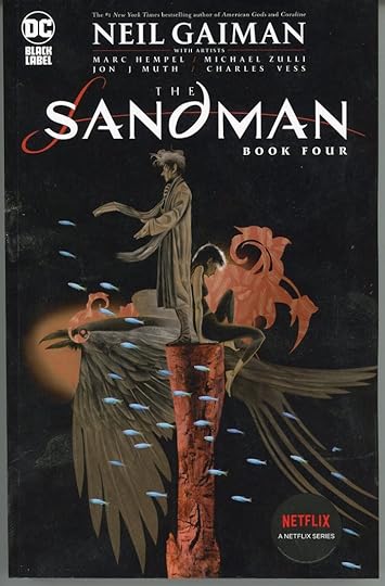 All images © DC Comics. Covers by Michael Wm. Kaluta and Dave McKean
The fourth and final volume of new Sandman trade paperbacks has arrived, with two variant covers. Note the tie-in to the upcoming Netflix live-action series, which does not have a release date as I write this, but will certainly be out this year. DC Comics is making sure book and comics retailers have lots of the source material on hand for potential new readers when it does. Many probably still have the hardcover editions as well, and some retailers have their own special versions too. Then there’s THE ANNOTATED SANDMAN, which is also being reprinted. All good, but is anyone reading them? This one is due out in May. If you’d like it or the other recent versions, check with your retailer or use the link below for Amazon.
The post Incoming: THE SANDMAN BOOK 4 Trade Paperback appeared first on Todd's Blog.
GASPAR SALADINO in MISTER MIRACLE
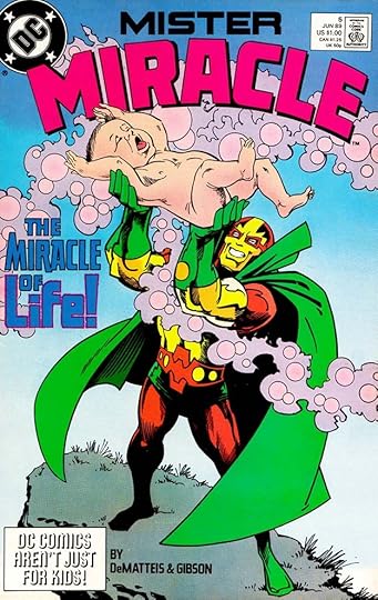
 All images © DC Comics. From MISTER MIRACLE #1, March-April 1971
This series was part of Jack Kirby’s Fourth World, several connected titles that DC thought would reverse their sales slump and gradual loss of top selling publisher position to rival Marvel Comics. Jack Kirby had been at DC before, but his Marvel work elevated him to superstar status, and DC trumpeted in type on this cover, “Kirby’s Here!” The plan didn’t work out so well, sales were okay but not the avalanche DC hoped for, and the Kirby books didn’t last too long. This one did better than some, running to 18 issues from 1971 to 1974, and it was revived for another seven issues in 1977-78. As with all the Kirby Fourth World creations, fans eventually came to love them, and the character had several later series that were popular. Gaspar Saladino lettered only covers for comics featuring Mister Miracle, including many for the original Kirby run, though the covers also often used type. The top blurb on the first cover, above, has type on the first line, and Saladino lettering on the second, for instance. The logo and most of the remaining cover blurbs are his.
 From MISTER MIRACLE #2, May-June 1971
All the cover blurbs on this issue are effectively lettered by Gaspar, making good use of the space available.
 From MISTER MIRACLE #3, July-Aug 1971
The same is true for the third issue. Note the diagnostic shape of the R in PARANOID, with the notch on the right side below the center as if it’s a P with the right leg added.
 From MISTER MIRACLE #6, Jan-Feb 1972
For this issue, the subtitle SUPER ESCAPE ARTIST has been redone in headline type, which I don’t like as much as Gaspar’s version, but it does fit into a circle better. The rest of the cover blurbs are by Saladino.
 From MISTER MIRACLE #9, July-Aug 1972
As the series went on, the cover lettering became stranger. Here the word HIMON is pulled from the Mike Royer story title inside, and has headline type above it. The blurb above the logo is also headline type except for BUST-OUT, which is the only Saladino hand lettering on the cover. I will still credit this as partial Saladino work.
 From MISTER MIRACLE #10, Sept-Oct 1972
Here the balloons and burst are by Saladino, the rectangular caption at the bottom uses headline type. Gaspar might have been setting these himself on the headline machine in the DC offices, the way they’re integrated suggests that. Perhaps he saw it as a way to expand his options. Having used that machine myself, I can say it was slower than hand lettering.
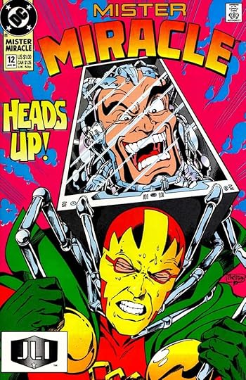
 From MISTER MIRACLE #12, Jan-Feb 1973
Both blurbs on this cover are by Gaspar, but the line spacing on the first one seems too wide, as if space was added or the entire caption was reorganized. The second one looks better.
 From MISTER MIRACLE #14, June-July 1973
Both blurbs here are by Saladino, and work well.
[image error]From MISTER MIRACLE #18, Feb-March 1974The final Kirby issue is another odd one. The large balloon is definitely not by Saladino, I don’t know who lettered it. He did do the second line of the top blurb.
 From MISTER MIRACLE #20, Oct 1977
Gaspar lettered only one of the revival covers, adding excitement and drama with his captions.
 From MISTER MIRACLE #5, June 1989
Another revival ran 28 issues from 1989 to 1991. Saladino lettered several of the covers beginning with this one. I love the use of lower case in LIFE.
 From MISTER MIRACLE #12, Jan 1990
The blurb on this cover is unusual for Gaspar, but I believe he did it. A nice blend of heroic and comedy styles.
 From MISTER MIRACLE #14, April 1990
Here SHOWDOWN follows the arc of a new logo. Extensions of several strokes and internal texture add interest.
 From MISTER MIRACLE #21, Nov 1990
The large vertically stacked BOOM on this cover is cleverly done, even though the M gets a bit squished. The exclamation point in the UPC box is also clever. The newsstand version would have had the UPC code there, the direct version had it this way.
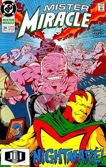 From MISTER MIRACLE #24, Feb 1991
By this time, Saladino wasn’t lettering many covers, but these rough, scary letters show he still had plenty to offer, though the dark color isn’t helping it read well.
To sum up, I found Saladino lettering on these covers:
MISTER MIRACLE (1971): 1-3, 6-8, 9 (partial), 10-12, 14, 17-18, 20
MISTER MIRACLE (1989): 5, 12, 14, 21, 23-25
That’s 21 in all. Other articles in this series and more you might enjoy are on the COMICS CREATION page of my blog.
The post GASPAR SALADINO in MISTER MIRACLE appeared first on Todd's Blog.
April 24, 2022
Rereading: TREASURE OF GREEN KNOWE by L. M. Boston

The Green Knowe series of fantasy novels for young readers has been a favorite since I discovered them in my own teen years. Lucy Maria Boston had an unusual life, and did not become an author until in her sixies, you can read about her HERE. I reread the first and probably the best of the Green Knowe books in 2010 and wrote about it HERE. I’ve decided to reread the rest. One of the unique things about these books is that they are set in Boston’s home, an ancient British manor house dating to the 1100s, which I was able to visit and tour it in 1999, a memorable experience. The scratchboard illustrations by Boston’s son Peter are excellent too.
In the story, Green Knowe, near Cambridge, England, is owned and inhabited by elderly Grandmother Oldknow, and once again her great grandson Tolly has come to stay with her for the Easter holidays, an exciting prospect after the adventures of the previous Christmas holidays, where he met some of the ghost children that remain tied to the house. In these holidays, a different group of ghosts gradually make themselves known to Tolly, from a different time in the house’s history. They are from the time of Captain OldKnow, who owned the house in the late 1700s, though he was often away at sea. His daughter, Susan, was born blind, and she’s one of the spirits that Tolly meets, learning about her life and times through stories told by his great grandmother over the patchwork quilt she’s making in the evenings. The Captain’s wife and older son Sefton are in charge of the household when he is away on long sea voyages, and Susan’s life is often miserable, as she isn’t allowed to do or even touch anything, and considered a helpless cripple by her family, except for her father. When the Captain is home, he encourages Susan to learn as much as she can, and to help her, he brings back from the West Indies a young black boy to be her personal helper. Jacob is unlettered, but also eager to learn, and the two of them are given lessons by a family friend. Everyone but the Captain think this is a waste of time, especially the head servant Caxton. He is a man with great ambition, and he’s drawn Sefton into shady activities and debt which he hopes will someday make him the owner of the house.
The Captain’s trading voyages make him prosperous, and his wife is showered with rich gifts, including jewelry. Despite that, she and Sefton laugh at him behind his back as they keep busy attending society events and spending the Captain’s money frivolously. In time, though he is treated badly by everyone in the house but Susan and her tutor, Jacob learns much about the devious plans of Caxton, and does what he can to thwart them. Tolly is able to see and speak with Susan a few times, and even becomes a part of her own story. That story reaches a climax when the manor house catches fire and burns, while Susan is forgotten inside by everyone but Jacob.
A fine story and an exciting plot make this a great read. Boston’s characters spring to life, and her writing is excellent. Highly recommended.
Treasure of Green Knowe by L M Boston
The post Rereading: TREASURE OF GREEN KNOWE by L. M. Boston appeared first on Todd's Blog.
April 22, 2022
GASPAR SALADINO in METAL MEN
 All images © DC Comics. From METAL MEN #3, Aug-Sept 1963
METAL MEN was the creation of writer/editor Robert Kanigher with artists Ross Andru and Mike Esposito. After a four issue tryout in SHOWCASE, it ran 56 issues from 1963 to 1978, though there were two long gaps in publication after issue #40. Gaspar Saladino lettered most of the first 19 issues and a few after that, and he lettered most of the covers from issue #32 on after Ira Schnapp, the previous cover letterer, had left the company. The early cover above is one that Gaspar did as a fill-in when Schnapp wasn’t available, and it shows him trying to fit into the Schnapp style, though his wider and more angular letters are different. Notice the word INVISIBLE in the top blurb is broken by open lines at the bottom, something Saladino liked to do with such words. I’ll look at covers first, then stories.
 From METAL MEN #30, Feb-March 1968
By late 1967, Gaspar was doing the majority of the cover lettering, having gradually taken the lion’s share from Schnapp at the request of Editorial Director Carmine Infantino. Saladino’s mandate was to give DC’s overall design look a fresh approach, and he’s no longer trying to stay in the Schnapp model, but going his own way. The top blurb is full of energetic, creative display lettering.
 From METAL MEN #33, Aug-Sept 1968
Sales may have been dropping, and a new approach was tried with a new art team. The logo has been modified and simplified by Gaspar, and his lettering on the top line and signs is effective and exciting.
 From METAL MEN #36, Feb-March 1969
The original Schnapp logo is back on this issue, and Saladino does a rare round cover blurb with several styles that work well together and some texture.
 From METAL MEN #39, Aug-Sept 1969
As the original run drew to a close, DC was desperate to attract readers, and the title characters are not even seen on the cover, at least in their usual way. Gaspar’s large open blurb conveys the drama and has fine brush lettering on BEAST.
 From METAL MEN #46, June-July 1976
A revival issue with art by Walt Simonson includes lots of Saladino cover lettering in the banner and on three blurbs.
 From METAL MEN #54, Oct-Nov 1977
Near the end of the series, Saladino’s cover blurbs make this sound like the final issue, but there were two more.
 From METAL MEN #1, April-May 1963
Saladino was writer/editor Robert Kanigher’s favorite letterer, they worked together often, and did so on this title’s early years.
 From METAL MEN #1, April-May 1963
In addition to the main story, Gaspar lettered some of these short features too.
 From METAL MEN #4, Oct-Nov 1963
At times, lettering these stories was no picnic. Almost half this page is lettering. Gaspar makes things work by going beyond the panel borders where necessary.
 From METAL MEN #7, April-May 1964
The design of these splash pages was always clear and inviting, and the title on this one is intriguing.
 From METAL MEN #9, Aug-Sept 1964
As you might expect with metal characters, there were often sound effects, which Saladino always handled well.
 From METAL MEN #14, June-July 1965
The ability of the characters to be torn apart every issue and be rebuilt was one of their attractions, and Chemo was probably their best villain. Lots of action enhanced by a dynamic story title.
 From METAL MEN #19, April-May 1966
Kanigher knew how to appeal to kids, and Gaspar’s display lettering sells it.
 From METAL MEN #47, Aug-Sept 1976
Saladino also lettered a few of the later issues, as here. I can’t help thinking the sound effect is a tribute to long-time Batman artist Dick Sprang.
 From METAL MEN #50, Feb-March 1977
Issue #50 was mostly a reprint, but with new framing pages lettered by Gaspar to go with the reprinted ones he also lettered.
To sum up, I found Saladino lettering on these covers: 3, 30, 32-39, 41, 46-48, 52, 54-55. That’s 17 in all. Below are the details of his story lettering. All feature the Metal Men except as noted.
#1 April-May 1963: 25pp, Metal Facts and Fancies (hereafter MF&F) 1pp
#2 June-July 1963: 25pp, MF&F 1pp
#3 Aug-Sept 1963: 25pp
#4 Oct-Nov 1963: 25pp, MF&F 1pp
#5 Dec-Jan 1963-64: 25pp
#6 Feb-March 1964: 25pp
#7 April-May 1964: 25pp, MF&F 1pp
#8 June-July 1964: 25pp, MF&F 2pp
#9 Aug-Sept 1964: 25pp, MF&F 1pp
#10 Oct-Nov 1964: 25pp
#11 Dec-Jan 1964-65: 24pp, MF&F 1pp
#12 Feb-March 1965: 25pp, MF&F 1pp
#13 April-May 1965: 26pp, MF&F 1pp
#14 June-July 1965: 25pp, MF&F 1pp
#15 Aug-Sept 1965: MF&F 1pp
#16 Oct-Nov 1965: 24pp
#17 Dec-Jan 1965-66: 25pp
#18 Feb-March 1966: 24pp
#19 April-May 1966: 24pp
#21 Aug-Sept 1966: 24pp
#47 Aug-Sept 1976: 17pp
#48 Oct-Nov 1976: 17pp
#50 Feb-March 1977: 4pp (new, the rest reprints)
#51 April-May 1977: 17pp
Thats a total of 538 pages. Other articles in this series and more you might like are on the COMICS CREATION page of my blog.
The post GASPAR SALADINO in METAL MEN appeared first on Todd's Blog.
April 21, 2022
GASPAR SALADINO in MANHUNTER and MEN OF WAR
 All images © DC Comics. From MANHUNTER #11, March 1989
Once again I am pairing two titles to get an article of the right length, they have no other connection. This version of MANHUNTER ran 24 issues from 1988-1990. Gaspar Saladino lettered four covers and nine stories for the book. His first cover lettering is above, a burst with an unusual shape that helps tell the story, under my logo design.
 From MANHUNTER #13, May 1989
I like the style of CAT-MAN in this blurb, and the way the letters are attached.
 From MANHUNTER #16, Aug 1989
Around this time, Saladino was getting fewer cover lettering assignments and therefore available to letter more stories. With this issue, he became the regular letterer and did all the remaining issues. He adds energy and drama on this page.
 From MANHUNTER #18, Oct 1989
When given the room for a large sound effect, Saladino never disappointed. You can almost hear this massive explosion.
 From MANHUNTER #24, April 1990
On this page from the final issue there are regular balloons, burst balloons, thought balloons, and a whisper balloon with upper and lower case to emphasize the difference.
To sum up, Saladino lettered these covers: 11-13, 15, four in all. Below are the details for his story lettering. All stories feature Manhunter.
#16 Aug 1989: 22pp
#17 Sept 1989: 22pp
#18 Oct 1989: 22pp
#19 Nov 1989: 22pp
#20 Dec 1989: 22pp
#21 Jan 1990: 22pp
#22 Feb 1990: 22pp
#23 March 1990: 22pp
#24 April 1990: 22pp
That’s 198 pages in all.
 From MEN OF WAR #1, Aug 1977
In 1977, DC launched this new war title under the editorship of Paul Levitz. It ran for 26 issues until 1980, thus weathering the “DC Implosion.” Saladino lettered many of the covers and a few stories. On this first cover, Gaspar is already setting the stage for the character Gravedigger with some scary lettering. He did not do the file lettering in the art, and one section, “His very existence is classified” might be a late addition by someone else. Gaspar also did the logo.
 From MEN OF WAR #6, May 1978
Artist Joe Kubert left room for a large balloon here, which Gaspar made good use of. This cover image I found is trimmed at the bottom, but the caption is almost complete.
 From MEN OF WAR #8, Aug 1978
I think the burst shapes were at least pencilled and maybe also inked by artist Joe Kubert, but Saladino has filled them well.
 From MEN OF WAR #16, May 1978
This balloon and caption balance the composition and add energy and style.
 From MEN OF WAR #23, Dec 1979
Fine top banner and balloon on this cover, and the tomb inscription is also by Saladino.
 From MEN OF WAR #1, Aug 1977
Saladino lettered the first Gravedigger story, though he didn’t credit himself. Credits for letterers were just starting at the time, and he may have forgotten or not been told to do that yet. His effective feature logo was used on the rest of the stories.

 From MEN OF WAR #10, Nov 1978
Gaspar lettered both main stories for this issue, Gravedigger and Enemy Ace with art by Howard Chaykin. Both are full of exciting aerial war sound effects.
To sum up, I found Saladino lettering on these covers: 1, 6-9, 12, 14, 16, 18, 20, 23, and 25, that’s twelve in all. Below are the details for his story lettering.
#1 Aug 1977: Gravedigger 12pp
#10 Nov 1978: Gravedigger 12pp, Enemy Ace 6pp
That’s 30 pages in all. Other articles in this series and more you might enjoy are on the COMICS CREATION page of my blog.
The post GASPAR SALADINO in MANHUNTER and MEN OF WAR appeared first on Todd's Blog.
April 20, 2022
GASPAR SALADINO in OTHER L TITLES
 All images © DC Comics. From LEADING SCREEN COMICS #72, Dec 1954
There are quite a few DC Comics titles beginning with L that Gaspar Saladino did only a small amount of work for, and they cover almost his entire career. The earliest is the lettering on the cover above, where Gaspar was filling in for regular cover letterer Ira Schnapp. Gaspar’s wider letters and angular style stand out from Ira’s work. I’m not sure why the red letters in the caption are so faded, but I’ve seen it on other old covers. Something unstable in the ink one would guess, but the red on the character looks fine. Perhaps water damage. This was Gaspar’s only work on the title.
 From LEAVE IT TO BINKY #61, June-July 1968
When Ira Schnapp left DC in early 1968 or so, Saladino took over as the company’s main cover letterer and logo designer, and he did both for this cover and many later ones on this title until it ended. I think Gaspar’s work gives them a fresher and more modern look, but the genre of teen humor was gradually fading.
 From LEAVE IT TO BINKY #62, Aug-Sept 1968
The main draw was the cute girl art by Bob Oksner and others, at least on the covers. The humor was labored.
 From LEAVE IT TO BINKY #63, Oct-Nov 1968
Cover lettering on such comics usually meant one or two word balloons, so they were at least an easy assignment for Saladino, and perhaps made up for copy-heavy titles like the Superman ones.
 From LEAVE IT TO BINKY #67, June-July 1969
Occasionally a different style was needed, as with the shaky letters here, but still easy work.
 From BINKY #72, April-May 1970
With this issue the title became simply BINKY with a dynamic new Saladino logo, and his word balloon works fine too, but the book was almost done.
 From BINKY #78, April-May 1971
At the end, larger issues were adding teen TV and music stars in a desperate attempt to draw in readers, but it didn’t work for long.
 From LEGENDS #1, Nov 1986
Jumping ahead to 1986, this mini-series had fine Saladino lettering on three of its covers. I like the caption shapes here.
 From LEGENDS #4, Feb 1987
This Saladino caption follows a layout he often used, a longer word that arcs up at each end around a smaller word above it. I find it more effective than just making both words the same. I also like the joined CR.
 From LEGENDS #6, April 1987
I like this blurb the best, great contrast between CONCLUSION and the rest, which is full of energy.
 From LORDS OF THE ULTRA-REALM #2, July 1986
Another mini-series with most covers lettered by Gaspar. The word MADNESS on this one is amazing, and is clearly planned to read well behind the character.
 From LORDS OF THE ULTRA-REALM #3, Aug 1986
Gaspar’s burst balloon could have gone below the other one, but this way it draws attention to what’s happening in the art.
 From LORDS OF THE ULTRA-REALM #6, Nov 1986
On the final issue, the blurb is cleverly divided by a large ampersand, a fine idea. Gaspar was always thinking.
 From THE LOSERS SPECIAL #1, Sept 1985
The Saladino logo on this one-shot is not new, but SPECIAL is, and the blurb to the left of the logo. I’m not sure he did the story title, he might have, but it’s in a style I haven’t seen him use elsewhere.
 From THE LOSERS SPECIAL #1, Sept 1985
Gaspar also lettered the story inside revealing the final fate of these long-running DC war comics characters that he had often lettered stories for. As always, his sound effects were dynamic.
 From LOBO ANNUAL #1, June 1993
Both Saladino and I lettered stories featuring Lobo, but strangely, Gaspar did none for Lobo’s regular series except this Annual.
 From LOBO PARAMILITARY CHRISTMAS SPECIAL #1, Feb 1992
He did letter this one-shot, which is full of great work by him including a wonderful splash page.
 From LOBO: I QUIT #1, Dec 1995
Gaspar also lettered this Lobo one-shot on the perils of tobacco use among other things. I like the title and the credit box is amusing.
 From LOONEY TUNES #3, June 1994
Finally we have this short story for the long-running Warner Brothers funny animal series from DC, the only work he did for it. Isn’t that icing title great?
To sum up, I found Saladino cover lettering on these comics:
LEADING SCREEN COMICS: 72
LEAVE IT TO BINKY: 61-67, 69-71
BINKY: 72, 74-76, 78
LEGENDS: 1, 4, 6
LORDS OF THE ULTRA-REALM: 2-6
THE LOSERS SPECIAL: 1
That’s 25 in all. Below are details on the story lettering described here:
THE LOSERS SPECIAL Sept 1985: 40pp
LOBO ANNUAL 1 June 1993: 56pp
LOBO PARAMILITARY CHRISTMAS SPECIAL 1 Feb 1992: 46pp
LOBO: I QUIT 24pp
LOONEY TUNES 3 June 1994: Pepé Le Pew 6pp
That’s 172 pages in all. More articles in this series and others you might enjoy are on the COMICS CREATION page of my blog.
The post GASPAR SALADINO in OTHER L TITLES appeared first on Todd's Blog.
Todd Klein's Blog

- Todd Klein's profile
- 28 followers

