
Todd Klein's Blog, page 71
April 6, 2022
GASPAR SALADINO in JUSTICE LEAGUE OF AMERICA

DC editor Julius Schwartz had had success with his revamps of the golden age characters Flash and Green Lantern, and with this series he and his writers and artists revived the idea of a superhero team made up of the company’s most popular characters, as had been done in the 1940s with The Justice Society of America. It too was a hit, and not only cemented the return of superhero team books at DC, it inspired other companies like Marvel to follow. Gaspar Saladino, Julie’s favorite letterer, was on board lettering stories from the beginning and didn’t miss one of the initial 29 issues. Most of the cover lettering was by Ira Schnapp at first, but Gaspar occasionally filled in for him, as he did on the cover above. Gaspar’s more angular style sets it apart from Ira’s, and the caption is effective, though there’s unneeded white space. Saladino took over as the regular cover letterer in 1968 and did many of them until the series ended in 1987. We’ll look at covers first, then go back to stories.
 All images © DC Comics. From JUSTICE LEAGUE OF AMERICA #49, Nov 1966
Both the balloon and caption work well on this second fill-in cover, adding energy and interest.
 From JUSTICE LEAGUE OF AMERICA #54, June 1967
On this third fill-in by Gaspar there isn’t much room for lettering, and the caption runs over Batman’s arm. Cover lettering was usually done on separate art paper and then pasted on the cover art, or a photostat of it was, and the caption could have been reduced a little to clear that arm, but perhaps that would have made it seem too small. In any case, that wasn’t up to Gaspar. Another option would have been to put WHAT A REMATCH at the bottom right.
 From JUSTICE LEAGUE OF AMERICA #60, Feb 1968
Some time in 1967, editorial director Carmine Infantino gave Gaspar the mission of updating the company’s design look, and I think he had begun that by this time, though Ira still lettered a few more covers. The display lettering in the balloon has lots of energy, and the open titles do too.
 From JUSTICE LEAGUE OF AMERICA #63, June 1968
From this point on, Saladino lettered most of the JLA covers. You can already see more confidence in his approach as he found the styles he would use going forward.
 From JUSTICE LEAGUE OF AMERICA #64, Aug 1968
The same is true on this cover, and I love the way the caption seems to be broken by the impact of the punch.
 From JUSTICE LEAGUE OF AMERICA #69, Feb 1969
Large display lettering in these balloons ups the drama. The left art border was usually the one place where lettering could get close, as it was not trimmed off like the other three, but sometimes the uneven printing processes of the time would cause the left edge to be rolled around to the back cover, and that might have happened here.
 From JUSTICE LEAGUE OF AMERICA #76, Nov-Dec 1969
These Giant issues were mostly reprints except for the cover. I think Saladino did a fine job with the lettering here to describe the contents in interesting ways.
 From JUSTICE LEAGUE OF AMERICA #89, May 1971
This is a gimmick cover, but Saladino sells it well in the balloons and burst caption. Red color holds chosen by the colorist help.
 From JUSTICE LEAGUE OF AMERICA #105, April-May 1973
Without the balloons, this cover would be static and dull, the lettering makes it intriguing.
 From JUSTICE LEAGUE OF AMERICA #114, Nov-Dec 1974
Another even longer size change with more reprints following the main story. There’s a lot of content for the lettering to describe, and Saladino does it with style and energy. I love the Greek-style letters in ANAKRONUS.
 From JUSTICE LEAGUE OF AMERICA #145, Aug 1977
This Giant has one long new story instead of reprints, a more appealing idea to me, and Gaspar’s lettering fills in the details.
 From JUSTICE LEAGUE OF AMERICA #159, Oct 1978
DC was running out of superheroes to fill out these team-up stories, leading to some strange combinations. Having the JLA so often apparently defeated on covers was not a great selling point in my opinion.
 From JUSTICE LEAGUE OF AMERICA #172, Nov 1979
The balloon by Gaspar fits perfectly in the space available, and his caption works well to sell the story idea.
 From JUSTICE LEAGUE OF AMERICA #184, Nov 1980
Jack Kirby’s Fourth World characters, including his greatest villain Darkseid of Apokolips, had not been able to sustain sales for more than a year or two in the early 1970s, but by 1980 they had accumulated enough fans to make them work in JLA. Saladino’s caption fits the character perfectly.
 From JUSTICE LEAGUE OF AMERICA #190, May 1981
I think this is my favorite cover of the series, a brilliant one by Brian Bolland, and Gaspar’s captions make it even better. I love the little Starro in the A of his name.
 From JUSTICE LEAGUE OF AMERICA #193, Aug 1981
Lots of Saladino work on this cover touting a free preview as well as the main story. Look at all the different styles he used, and they work well together.
 From JUSTICE LEAGUE OF AMERICA #207, Oct 1982
By this time, JLA had been going strong for over twenty years, and these team-ups were getting overcrowded. At least the character names were set in type so Gaspar didn’t have to letter them all, but his captions are more interesting.
 From JUSTICE LEAGUE OF AMERICA #224, March 1984
Team books had become so common that dismantling teams became a thing. I love the dry-brush graffiti caption by Gaspar on this cover.
 From JUSTICE LEAGUE OF AMERICA #239, June 1985
A new more diverse team was assembled, but they didn’t have the staying power of the originals. Here Vixen gets a chance to shine with a fine Saladino caption to help.
 From JUSTICE LEAGUE OF AMERICA #259, Feb 1987
The series ended with this four-part story, and Gaspar’s fine caption to help sell it. The JLA would soon be reborn, and then become a franchise with multiple titles. I’ll look at those in another post.
 From JUSTICE LEAGUE OF AMERICA #1, Oct-Nov 1960
Continuing from a three issue tryout in SHOWCASE, Gaspar lettered many issues of the series until 1967, and made other small contributions after that. Unlike many DC titles of the time, this was always one long story, but divided into chapters. There was plenty of work to do on this and many of the pages, both because overwriting was the style then, and because there were so many characters.
 From JUSTICE LEAGUE OF AMERICA #3, Feb-March 1961
This page has some well-made display lettering in the last panel.
 From JUSTICE LEAGUE OF AMERICA #4, April-May 1961
I used to look at the elaborate top half of this splash page and think how well Gaspar had imitated Ira Schnapp, but I’ve changed my mind, I now think the top half IS by Schnapp. Schwartz probably asked him to do it, as it was the kind of thing he was good at. The bottom half is lettered by Gaspar.
 From JUSTICE LEAGUE OF AMERICA #10, March 1962
The cover logo by Schnapp has been widened here to fill the space, the rest is by Saladino.
 From JUSTICE LEAGUE OF AMERICA #16, Dec 1962
The story title not only had to be lettered on the first page, it had to be lettered again on the first page of each chapter for the early issues.
 From JUSTICE LEAGUE OF AMERICA #23, Nov 1963
This page has Saladino sound effects in the third panel and large letters in the first, but those may have been done by the artists.
 From JUSTICE LEAGUE OF AMERICA #34, March 1965
There’s a fine large title on this page with well-made lower case letters as well as upper case ones.
 From JUSTICE LEAGUE OF AMERICA #42, Feb 1966
Gaspar rarely had room to letter as large as the NO here, but of course he does it well, I think using a brush, or perhaps a large brush pen. It looks kind of like markers, but they weren’t allowed at the time.
 From JUSTICE LEAGUE OF AMERICA #50, Dec 1966
Like many other titles from DC in 1966, this one was influenced by the Batman TV show and its large sound effects. I like Gaspar’s better than the ones on the show.
 From JUSTICE LEAGUE OF AMERICA #66, Nov 1968
By this time Gaspar was too busy doing house ads, logos and covers for the entire DC line to letter many stories, he managed just this one in 1968.
 From JUSTICE LEAGUE OF AMERICA #111, May-June 1974
From that point on he mainly worked on short features and pinups like this one. I love the calligraphy character labels. I’m leaving the page in sideways format because if I rotate it the lettering won’t look good at the smaller resolution.
 From JUSTICE LEAGUE OF AMERICA #113, Sept-Oct 1974
Gaspar lettered this short feature, and it has more nice calligraphy in the second panel.
 From JUSTICE LEAGUE OF AMERICA #115, Jan-Feb 1975
For some of the larger issues, Saladino was asked to letter the contents page, which he did well.
 From JUSTICE LEAGUE OF AMERICA #191, June 1981
Gaspar came back to letter one more story in 1981 for editor Len Wein, and if anything his story title is even better than many of his earlier ones.
To sum up, I found Saladino lettering on these covers: 25, 49, 54, 60, 63-73, 75-92, 94-106, 108-120, 122-125, 127-128, 132, 135, 145-148, 150, 156-159, 161, 172-174, 177-179, 183-185, 187-210, 212-216, 220-222, 224-226, 229-232, 237, 239-249. That’s a total of 137, an impressive body of cover work. Below are the details of Gaspar’s story lettering, all entries feature the JLA except as noted.
1 Oct-Nov 1960: 26pp
2 Dec-Jan 1960-61: 26pp
3 Feb-March 1961: 26pp
4 April-May 1961: 26pp
5 June-July 1961: 26pp
6 Aug-Sept 1961: 26pp
7 Oct-Nov 1961: 25pp
8 Dec-Jan 1961-62: 26pp
9 Feb-March 1962: 26pp
10 March 1962: 26pp
11 May 1962: 26pp
12 June 1962: 26pp
13 Aug 1962: 26pp
14 Sept 1962: 25pp
15 Nov 1962: 25pp
16 Dec 1962: 25pp
17 Feb 1963: 25pp
18 March 1963: 25pp
19 May 1963: 25pp
20 June 1963: 25pp
21 Aug 1963: 25pp
22 Sept 1963: 25pp
23 Nov 1963: 26pp
24 Dec 1963: 25pp
25 Feb 1964: 25pp
26 March 1964 25pp
27 May 1964: 25pp
28 June 1964: 25pp
29 Aug 1964: 24pp
31 Nov 1964: pp2-24 (23pp) page 1 is by Ira Schnapp
32 Dec 1964: 24pp
33 Feb 1965: 24pp
34 March 1965: 25pp
35 May 1965: 25pp
36 June 1965: 25pp
37 Aug 1965: 24pp
40 Nov 1965: 24pp
41 Dec 1965: 24pp
42 Feb 1966: 24pp
43 March 1966: 24pp
44 May 1966: 24pp
45 June 1966: 24pp
46 Aug 1966: 24pp
47 Sept 1966: 24pp
49 Nov 1966: 24pp
50 Dec 1966: 24pp
51 Feb 1967: 23pp
52 March 1967: 23pp
53 May 1967: 23pp
54 June 1967: 23pp
55 Aug 1967: 23pp
56 Sept 1967: 23pp
57 Nov 1967: 23pp
66 Nov 1968: 23pp
110 May-April 1974: Justice Society of America pinup 2pp
111 May-June 1974: Seven Soldiers of Victory pinup 1pp
112 July-Aug 1974: Contents 1pp
113 Sept-Oct 1974: Contents 1pp, Freedom Train 2pp
114 Nov-De 1974: Contents 1pp, Superhero Boots 1pp, JLA Trivia Quiz 1pp, JLA Heroes of the Past 1pp
115 Jan-Feb 1975: Contents 1pp, DC Cover Gallery 1pp, JLA Membership Quiz 1pp
116 March-April 1975: Contents 1pp
191 June 1981: 25pp
That’s 1,371 pages in all on this book. Other articles in this series and more you might like are on the COMICS CREATION page of my blog.
The post GASPAR SALADINO in JUSTICE LEAGUE OF AMERICA appeared first on Todd's Blog.


April 5, 2022
GASPAR SALADINO in JONAH HEX
 All images © DC Comics. From JONAH HEX #4, Sept 1977
Jonah Hex, the facially scarred gunman who became surprisingly popular with readers, first appeared in ALL-STAR WESTERN #10, then was a regular feature in WEIRD WESTERN TALES for a few years. In 1977 he gained his own title that ran to 1985 and 92 issues. Gaspar Saladino lettered many of the covers, and a few backup stories inside. He also designed the logo. On this cover, Gaspar’s word balloon sets the tone with the large open letters of DEATH.
 From JONAH HEX #9, Feb 1978
That word is prominent again on this cover, which I think is the best of the series, both art and lettering. That clever parrot’s balloons explain the dilemma with appealing display lettering. Squak!
 From JONAH HEX #25, June 1979
One thing you could often expect for Jonah was a painful experience like this one. Gaspar’s old west wanted poster style in the caption sets the time period well.
 From JONAH HEX #29, Oct 1979
Saladino’s balloon on this cover has an almost square shape, but it’s also rough edged, suggesting a rough voice. This top blurb explains the situation.
 From JONAH HEX #39, Aug 1980
Jonah’s adventures went in some unusual directions, as here. The word SAMURAI is creative.
 From JONAH HEX #45, Feb 1981
The addition of a backup feature was touted in the bottom banner of this issue with more creative Saladino lettering.
 From JONAH HEX #48, May 1981
Jonah’s title did well enough that backup features were included that allowed for the return of characters not seen for a decade. El Diablo’s top banner and logo are beautifully done, and I also like the serif letters in the caption.
 From JONAH HEX #51, Aug 1981
Perhaps the antithesis of Jonah was the western character Bat Lash, but he also appeared as a backup, and with a fine top banner from Gaspar.
 From JONAH HEX #63, Aug 1982
The top blurb here combines fine wanted poster lettering with Gaspar’s horror style for the story title. They work together unexpectedly well.
 From JONAH HEX #68, Jan 1983
Death was always waiting for Hex. More nice serif lettering in the top blurb and on the sign.
 From JONAH HEX #72, May 1983
Gaspar’s treatment of TARANTULA is terrific here, as creepy as the insect itself.
 From JONAH HEX #83, April 1984
This top blurb uses a style more typical of superhero comics, as Saladino switches things up for variety. This image makes me wonder how Hex could even eat and drink with that weird string of flesh across his mouth. And why didn’t he get a doctor to remove it? That would have spoiled the series, of course.
 From JONAH HEX #92, Aug 1985
Well, problem solved, I guess. Despite Saladino’s fine lettering, this was not the end for the character who turned up in a dystopian future series called simply HEX soon after the finale of this one.
 From JONAH HEX #49, June 1981
Bat Lash appeared in three backups, all lettered by Saladino. Here he (and artist Dan Spiegle) return to some of the style points of his lettering on the original BAT LASH series like rough edged round-cornered panels and balloons open at the panel edge. The feature title in the burst is amazing.
To sum up, these are the covers lettered by Saladino: 4-5, 9, 11-12, 15, 25-26, 29, 31, 36, 42, 45-51, 53 (partial with Ben Oda), 54, 55 (partial with Ben Oda), 56-60, 62-69, 80, 83, 85-86, 88, 90, 92, a total of 42. His story lettering is listed below.
#49 June 1981: Bat Lash 8pp
#51 Aug 1981: Bat Lash 8pp
#52 Sept 1981: Bat Lash 8pp
That’s 24 pages in all. Other articles in this series and more you might enjoy are on the COMICS CREATION page of my blog.
The post GASPAR SALADINO in JONAH HEX appeared first on Todd's Blog.
April 4, 2022
GASPAR SALADINO in JIMMY WAKELY
 All images © DC Comics. From JIMMY WAKELY #17, May-June 1952
Wakely was a second-tier singing cowboy film star, not as well known or popular as Roy Rogers or Gene Autry, and DC published 18 issues of his adventures from 1949 to 1952, edited by Julius Schwartz, who handled all the DC western comics at the time. Soon after Schwartz hired Gaspar Saladino to letter pages for him, he put him to work on Jimmy Wakely stories, and they began appearing in issue #5 and continued to the end of the series. Most of the covers were lettered by Ira Schnapp except the one above, which is by Gaspar. This early in his career, Saladino was not yet comfortable doing cover lettering, and the layout of the caption is awkward, while the text doesn’t fill the space well. It’s interesting to see him using the little zig-zags in the caption borders that he also used on some story captions.
 From JIMMY WAKELY #5, May-June 1950
On this early Saladino page, his story title is full of charm and energy, and the scroll captions are a nice addition. I think he also lettered the feature logo, which is similar to one in previous and later issues, but looks different here. His lettering has not quite settled into it’s familiar style, so perhaps this is one of the first stories he worked on for Schwartz.
 From JIMMY WAKELY #6, July-Aug 1950
An issue later his letters are more regular and have settled into his familiar angular style, though it would get somewhat wider over time. This is from the Sheriff Kit Colby story, there was one in most issues which were otherwise filled out with Wakely stories. A female sheriff in the old west seems like a progressive idea for the time.
 From JIMMY WAKELY #7, Sept-Oct 1950
Gaspar’s balloon lettering is a little wider in the next issue, but his story title here is not as interesting as the one in issue #5. It took him a while to find his own style for those. The scroll is well done.
 From JIMMY WAKELY #10, March-April 1951
This story title is more interesting and more creative, with horizontal white gaps at the bottom to suggest something vanishing, an idea he often used later.
 From JIMMY WAKELY #11, May-June 1951
Most short features or fillers were lettered by others, but Gaspar did this one-pager. The title is type.
 From JIMMY WAKELY #12, July-Aug 1951
I like the title on this story. The word KING is similar to the type on the previous image, but I think it’s lettered by Saladino, and his script on the rest is appealing. The cover logo is by Schnapp.
 From JIMMY WAKELY #13, Sept-Oct 1951
Alex Toth, the artist on this page, was a fine letterer himself, and the sound effect and question marks on this page are at least penciled by him. Gaspar might have inked them, or perhaps Toth did, hard to say, but the style is his and not Saladino’s. I like the telephone balloons in the last panel.
 From JIMMY WAKELY #16, March-April 1952
The feature logo on this page is by Ira Schnapp, the rest is by Saladino. He liked to do open first letters in front of a black shape at the beginning of captions, and there are two here.
To sum up, Saladino lettered just one cover, #17, and his story lettering is detailed below. Jimmy Wakely stories are marked JW, Kit Colby ones are marked KC. Where not all Wakely stories are lettered by Gaspar, the story numbers are in parentheses.
#5 May-June 1950: JW 11pp, 8pp, KC 8pp, JW 8pp
#6 July-Aug 1950: JW 11pp (1), KC 8pp, JW 6pp (3)
#7 Sept-Oct 1950: JW 8pp (2), KC 9pp, JW 8pp (3)
#8 Nov-Dec 1950: JW 11pp, 8pp, 8pp
#9 Jan-Feb 1951: JW 9pp, 10pp, KC 8pp, Canyon Trap 2pp
#10 March-April 1951: JW 8pp (2), KC 8pp, JW 10pp (3)
#11 May-June 1951: JW 11pp, The Story Behind the Cover 1pp, JW 8pp, KC 8pp, The Flight For Life 3pp, JW 8pp
#12 July-Aug 1951: JW 12pp, 8pp, KC 8pp, Indian Buffalo Hunter 3pp, JW 8pp
#13 Sept-Oct 1951: JW 12pp, 8pp, KC 8pp, JW 9pp
#14 Nov-Dec 1951: JW 10pp, 6pp, 8pp
#15 Jan-Feb 1951: JW 6pp, 6pp (1-2)
#16 March-April 1951: JW 6pp, 6pp, KC 6pp, JW 6pp
#17 May-June 1951: JW 6pp, 6pp, KC 6pp, JW 6pp
#18 July-Aug 1951: JW 6pp, 6pp, KC 6pp, JW 6pp
That’s a total of 390 pages on this book. More articles in this series and others you might like are on the COMICS CREATION page of my blog.
The post GASPAR SALADINO in JIMMY WAKELY appeared first on Todd's Blog.
April 3, 2022
Incoming: BATMAN, THE DARK KNIGHT DETECTIVE Volume 6 Trade Paperback
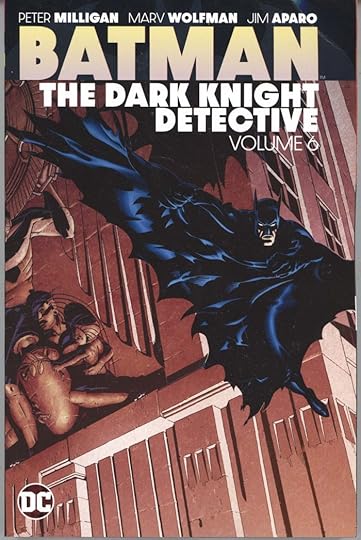 Image © DC Comics, cover art by Michael Golden
DC continues their reprints of Batman material with this volume. It collects DETECTIVE COMICS #622-633 from 1990-1991. Writers are Peter Milligan, Marv Wolfman, John Ostrander and Alan Grant. Pencilers are Jim Aparo, Flint Henry, Mike McKone, Norm Breyfogle and Tom Mandrake. Inkers add Mike DeCarlo, José Marzán Dr., Steve Mitchell and Steve Leialoha. I lettered four of those issues. It’s kind of fun to see them again, but I have to admit I don’t have any desire to reread them. If you do, or if you haven’t read them, these collections are a good value for the retail price of $24.99, about two dollars per issue. Amazon lists the release date as May 3rd, comics retailers may get it sooner. Check with yours, or there’s an Amazon link below.
Batman The Dark Knight Detective Volume 6
The post Incoming: BATMAN, THE DARK KNIGHT DETECTIVE Volume 6 Trade Paperback appeared first on Todd's Blog.
And Then I Read: FEET OF CLAY by Terry Pratchett

I’m continuing to read Pratchett’s Discworld novels focused on The Night Watch, as I’ve found them more interesting than some of the other Discworld themes. In this one, golems are the focus for the first time. Made from clay and brought to life by magic, they are the least human of Ankh-Morpork’s inhabitants perhaps, but very useful to those who own them. They never sleep, never tire, never eat, and don’t require pay. They tend to be abused therefore, and their only rebellious acts thus far have been to work so hard and so fast that they overwhelm their workplaces with excess product. Now twelve of them have worked together to create a new golem they want as their king, with the help of a priest and a dwarf baker to bake the clay. Meshugah is given to the owner of a candle factory, but conflicting instructions cause him to go on a mad rampage of revenge and destruction.
Commander Vimes is having his usual problems at home and with the upper crust society he’s found himself an uneasy part of. He’s much happier at the Night Watch station house and patrolling the streets. Meanwhile, a plan is made by some of that upper crust to replace Ankh-Morpork’s leader, Lord Vetinari, which leads to him being poisoned and causes the death of several innocent citizens. Vimes enlists the help of a new recruit, a female dwarf, Cheery Littlebottom, who has the skills to become the Watch’s first forensics expert, if not many of the tools. The city’s favorite Watchman, Captain Carrot, and his partner the werewolf Angua are put on the poisoning case, and soon find themselves facing the wrath of the rogue golem along with Vimes.
This was a great read, the characters continue to grow and Pratchett always finds new ways to make them entertaining. The mystery here is a good one, and the book has plenty of action and suspense as well as humor. Recommended.
Feet of Clay by Terry Pratchett
The post And Then I Read: FEET OF CLAY by Terry Pratchett appeared first on Todd's Blog.
April 2, 2022
Incoming: THE SANDMAN BOOK THREE Trade Paperbacks

 Images © DC Comics. Cover art by Michael Wm. Kaluta and Dave McKean
 These new trade paperback printings in advance of the upcoming Netflix TV series are arriving here at the astonishing rate of one per week. There’s no release date yet for the show other than 2022, but comics retailers and bookstores should be ready for any new readers if they’ve ordered these. One cover is new from Dave McKean I think, the other reprints the Kaluta cover from the recent hardcover edition. Volume Three includes original issues 38 to 56 and a story from VERTIGO PREVIEW #1. This book was just listed on Amazon as coming out in May, Books One and Two are listed as coming out in April. A link below will show what’s currently available there, or check with your comics retailer or bookstore.
The post Incoming: THE SANDMAN BOOK THREE Trade Paperbacks appeared first on Todd's Blog.
April 1, 2022
GASPAR SALADINO in OTHER I TITLES
 All images © DC Comics. From ISIS #7, Oct-Nov 1977
This will be a very brief article, as there are only two other DC titles beginning with I with Saladino lettering. I expected to find more on ISIS, above, but he only lettered the cover of this issue. Note the first I in ISIS in the caption has serifs. Gaspar often did that, especially with names, a style point we didn’t agree on. I only use the serif I for the personal pronoun I and contractions like I’m and I’ll, but it works fine here.
 From INVASION #1, Winter 1988
INVASION was a space war epic involving many DC characters and races who travel the galaxy from writer/artist Keith Giffen. Gaspar lettered the first and third annual-sized issues. His sound effects are full of energy here. I imagine he was not too familiar with the characters in many cases. In the next to last panel he’s added a hyphen to Omega Men, though it’s right in the third panel, and the editor and proofreader missed it.
 From INVASION #3, Jan 1989
When given the chance and room, Gaspar could be depended on to provide large, exciting lettering like the scream in the final panel here. So much agony!
To sum up, we have just one cover, ISIS #7 to report, and below are the details for INVASION.
#1 Winter 1988: 80pp
#3 Jan 1989: 80pp
160 pages in all. More articles in this series and others you might enjoy are on the COMICS CREATION page of my blog.
The post GASPAR SALADINO in OTHER I TITLES appeared first on Todd's Blog.
March 31, 2022
GASPAR SALADINO in INFINITY INC.
 All images © DC Comics. From INFINITY INC. #1, March 1984
This title was spun off from ALL-STAR SQUADRON, and was writer Roy Thomas’s attempt to create a new Justice Society of America. It had a healthy run of 53 issues, and Gaspar Saladino did cover lettering for many of them, though he didn’t letter any of the stories. The burst at upper left is a bit awkward because of the tiny logos, but works fine. I did the new series logo. The banner caption at the bottom is great, but I’m not sure why it was placed beneath the characters’ boots when it looks like it could have just been lowered a bit to clear them. I would say that’s not Gaspar’s doing but the choice of the DC production person who assembled the cover.
 From INFINITY INC. #2, May 1984
More effective captions and display lettering on this cover.
 From INFINITY INC. #5, Aug 1984
Extra drama can be added with burst balloons, as here, signifying loud, excited speech. This is a busy cover, but artist Jerry Ordway left just enough room for them.
 From INFINITY INC. #8, Nov 1984
THE GENERATIONS SAGA was a continuing story blurb that repeated on several covers, each handled a bit differently.
 From INFINITY INC. #13, April 1985
Gaspar was always trying to emphasize things in different ways. Here THORN has letters that can’t get any thicker, and the R barely reads as one, but is clear in context.
 From INFINITY INC. #16, July 1985
I love Gaspar’s treatment of MR BONES here. Roy Thomas and DC must have also liked it, they put a TM (Trademark symbol) on it, and it appeared on later covers.
 From INFINITY INC. #19, Oct 1985
Three effective blurbs here, each handled in a different way for variety, each with different kinds of display lettering. I particularly like the angled VS. in a double circle. Artist Todd McFarlane first came to the attention of fans on this book before going on to Spider-Man at Marvel and his own Spawn at Image.
 From INFINITY INC. #23, Feb 1986
Gaspar gets maximum impact from SOLOMON GRUNDY by overlapping the energetic letters and then adding a heavy outline around them.
 From INFINITY INC. #38, May 1987
Mr. Bones’ rough double-bordered balloons here suggest a rough, unpleasant voice, as is appropriate. Gaspar has relettered his Mr. Bones character logo instead of having DC copy and paste the one from issue #16, perhaps because it wouldn’t have worked as well at this size, or simply because that’s how Saladino often did things.
 From INFINITY INC. #43, Oct 1987
This scroll caption adds atmosphere and appeal with rock poster inspired letters and texture, or that’s what I see in it at least.
 From INFINITY INC. #47, Feb 1988
The letters on HARLEQUIN’S are somewhat similar, but HOWL is pure rough energy, and the inner shapes are probably made with a dry brush.
 From INFINITY INC. #52, July 1988
Gaspar’s final cover lettering for the book uses one of his familiar scary techniques, a little drippy, and perhaps suggesting graphitti as well. As always, he had a wide variety of styles to choose from.
To sum up, Saladino lettered these covers: 1-6, 8, 10-11, 13-29, 31-35, 37-40, 42-43, 46-47, 49, 52, Annual 1-2, and Special 1, a total of 44. Other articles in this series and more you might enjoy are on the COMICS CREATION page of my blog.
The post GASPAR SALADINO in INFINITY INC. appeared first on Todd's Blog.
March 28, 2022
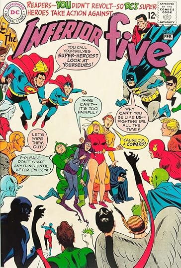
GASPAR SALADINO in INFERIOR FIVE
 All images © DC Comics. From THE INFERIOR FIVE #3, July-Aug 1967
This was a humorous take on superheroes written by E. Nelson Bridwell. Some stories and covers were lettered by Ira Schnapp near the end of his DC career. Gaspar Saladino did no story lettering, but he lettered seven of the twelve covers. The initial ten issue run was in 1967-1968 after tryouts in SHOWCASE. In 1972, the SHOWCASE stories were reprinted in two more issues with new covers. The cover above is clearly a parody of Tarzan, and I imagine the cover blurbs were written by Bridwell. Gaspar’s lettering works fine, but I think the warnings not to buy the issue might not have been a good idea. Maybe kids thought that was funny, maybe it convinced them to pass on the book.
 From THE INFERIOR FIVE #6, Jan-Feb 1968
This cover idea works better for me, and having all the balloons in pale colors is not a bad idea on a white background.
 From THE INFERIOR FIVE #7 March-April 1968
This issue has a new logo by Saladino that I like better than the original. The joke is clear and improved by Gaspar’s lettering.
 From THE INFERIOR FIVE #8, May-June 1968
On the other hand, I don’t understand the situation on this cover, and the word balloons do nothing to clarify it. That’s a failure of the writer, Bridwell, I think. He was trying for MAD humor, but not always succeeding.
 From THE INFERIOR FIVE #9, July-Aug 1968
A much clearer gag here, though a familiar one. I’m not sure who the audience would be for this series. Superhero fans like me thought it was too silly and somewhat demeaning, while humor fans might not have been interested in heroics.
 From THE INFERIOR FIVE #10, Sept-Oct 1968
Making fun of Marvel was a more promising idea, and adding Superman to any DC cover is always a good selling point, but it was too late for this book.
 From THE INFERIOR FIVE #12, Oct-Nov 1972
When the last two issues came out in 1972 to reprint the SHOWCASE stories, they featured another new logo by Saladino and mildly amusing covers. Perhaps Bridwell was hoping sales figures on these would lead to more issues, but apparently it didn’t work out that way.
To sum up, Gaspar lettered these covers: 3, 6-10, and 12, a total of seven. More articles in this series and others you might like are on the COMICS CREATION page of my blog.
The post GASPAR SALADINO in INFERIOR FIVE appeared first on Todd's Blog.
March 27, 2022
And Then I Read: ENOLA HOLMES AND THE BLACK BAROUCHE by Nancy Springer
 Cover illustration by Tara Phillips
Not long ago I read the first six Enola Holmes books, written from 2007 to 2010. Each book is well written and fast-paced, and if anything, too short, but together they form an admirable coming of age story for the young sister of Sherlock Holmes, who must strike out on her own in London at the age of 14, and proves herself just as capable as her brother of solving mysteries. This new book, published in 2021, is the beginning of new Enola Holmes novels by Springer, and it’s just as good as the first six.
The book has a prologue and epilogue by Sherlock, who fills in new readers on Enola’s history. She is now accepted by Sherlock as independent, his equal in many ways, and in this book they sometimes work together to solve a missing persons case; a young wife who has been reported dead by her husband, something the woman’s sister refuses to believe. The circumstances are indeed strange, and both Holmes siblings go to work on the case separately at first, and then together. Enola, as usual, finds herself in lots of trouble with the angry and possibly guilty husband, and this time the help of Sherlock and his friend Dr. Watson are helpful in saving her and solving the case.
There’s also a new Enola Holmes short story available as a one dollar ebook, “Enola Holmes and the Boy in Buttons,” which is worth reading. I love these characters and Springer’s stories, they feel right in every way as far as historical and social context. I’m a little uneasy about the Sherlock point of view text of the prologue and epilogue, I think looking into his thoughts in that way is perhaps not a good idea, but in general this is an excellent read.
Enola Holmes and the Black Barouche
The post And Then I Read: ENOLA HOLMES AND THE BLACK BAROUCHE by Nancy Springer appeared first on Todd's Blog.
Todd Klein's Blog

- Todd Klein's profile
- 28 followers

