
Todd Klein's Blog, page 75
February 24, 2022
GASPAR SALADINO in OTHER E TITLES
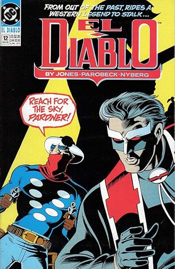 All images © DC Comics. From EL DIABLO #12, Aug 1990
Other than Eclipso, there isn’t much Gaspar Saladino lettering on DC titles beginning with the letter E, and it’s only on covers. I’ve included them all in this post. I find this cover interesting because it brings together a revamp of the 1970s DC western character El Diablo and another DC western character, the original Vigilante, created in 1941. Saladino’s bold, exciting display lettering in a rough balloon is held in red for even more impact, and looks great. This was the only Saladino lettering on the title.
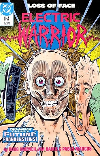 From ELECTRIC WARRIOR #8, Dec 1986
Most issues of this 18-issue series from 1986-87 used only type on the covers, but this one includes a Saladino blurb at lower left. I find it far more interesting than the type. Again, the only Gaspar lettering on this title.
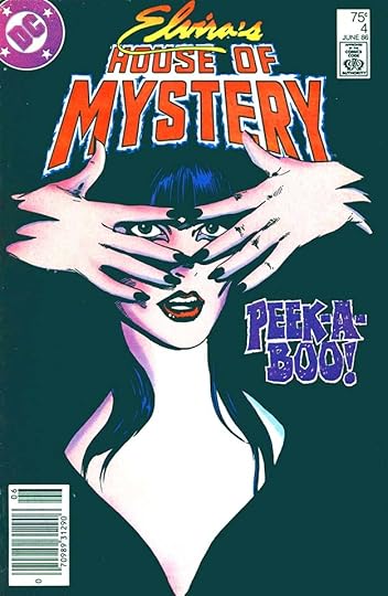
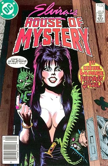 From ELVIRA’S HOUSE OF MYSTERY #1, Jan 1986
By 1986, DC’s “mystery” anthologies had all been cancelled due to poor sales, and someone had the idea of reviving this one with then-popular TV horror host Elvira as the host of the comic. Not a bad idea, but it didn’t last very long. Perhaps Elvira fans were not comics readers. The first cover, above, has a balloon and a fine round blurb by Gaspar combining large block letters and one of his horror styles.
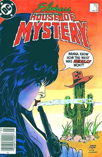 From ELVIRA’S HOUSE OF MYSTERY #3, May 1986
A fine Gaspar balloon here with display lettering and open lettering for emphasis. Display lettering is larger and more carefully done than regular balloon lettering, generally.
 From ELVIRA’S HOUSE OF MYSTERY #4, June 1986
The blurb on this cover is very large display lettering with white openings to add texture. I love it, a great example of Saladino’s creativity.
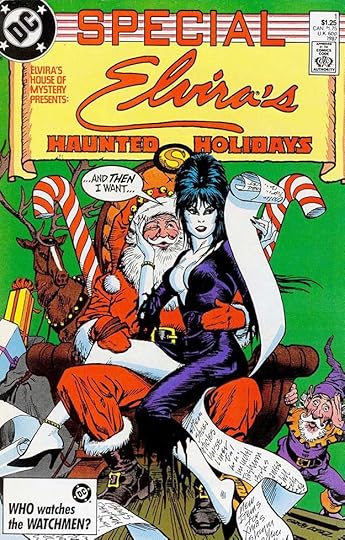 From ELVIRA’S HAUNTED HOLIDAYS SPECIAL #1, 1987
This annual-sized one-shot has a word balloon by Gaspar, and he also lettered HAUNTED HOLIDAYS.
To sum up, I found Saladino lettering on these covers:
EL DIABLO #12
ELECTRIC WARRIOR #8
ELVIRA’S HOUSE OF MYSTERY 1, 3-4
ELVIRA’S HAUNTED HOLIDAYS SPECIAL 1
That’s six in all. Other articles in this series are on the COMICS CREATION page of my blog.
The post GASPAR SALADINO in OTHER E TITLES appeared first on Todd's Blog.


February 23, 2022
GASPAR SALADINO in ECLIPSO
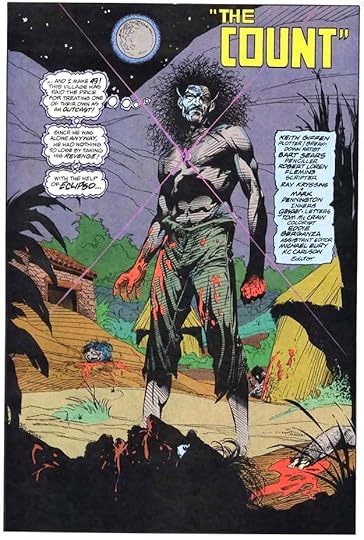
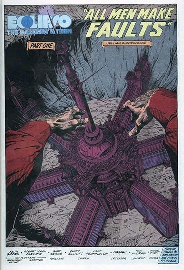 All images © DC Comics. From ECLIPSO: THE DARKNESS WITHIN #1, July 1992
By 1992, Gaspar Saladino was rarely being asked by DC Comics to design logos, or letter house ads or covers, but he was still a busy story letterer. This series was two annual-sized issues followed by an Eclipso monthly series that ran 18 issues, and Gaspar lettered nearly all of them. Eclipso was created as a villain in 1966, the dark Hyde personality of the Jekyll and Hyde character Bruce Gordon. With this series, writers Keith Giffen and Robert Loren Fleming made him into a super-villain with much greater powers. On this opening page of the first issue, Saladino has credited himself in his favorite way, just his first name in upper and lower case letters similar to his signature.
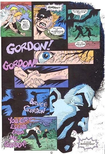
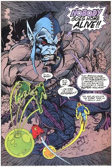 From ECLIPSO: THE DARKNESS WITHIN #2, Oct 1992
On this page from the second issue, you can see the style Gaspar developed for the character with double-bordered balloons, normal inside and flame-like on the outside. The colorist has added violet between the two shapes, making the tails a bit hard to see on this page, but the large display lettering in the first burst is terrific.
 From ECLIPSO #1, Nov 1992
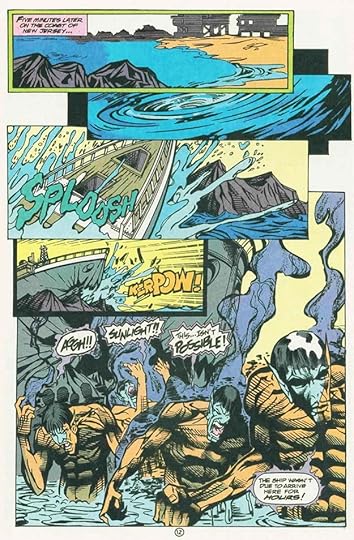
The first issue of the monthly series came out the following month, so clearly this was the plan all along, DC wasn’t waiting for sales results on the miniseries. The violent and bloody actions of the character go far beyond his original concept, as Giffen brought in a horror movie approach. I can only wonder what Saladino thought about this, but it was a job and he did it.
 From ECLIPSO #2, Dec 1992
I’ve shown some first pages, but Gaspar often also did some fine display lettering on final pages, as here, where there was room.
 From ECLIPSO #4, Feb 1993
Giffen also brought in other dark DC characters like Steve Ditko’s The Creeper and his characteristic laugh, which Gaspar always did well.
 From ECLIPSO #6, April 1993
Here Eclipso speaks in large open letters that are effectively creepy. I haven’t read these, but apparently his alter ego Bruce Gordon is now a separate character.
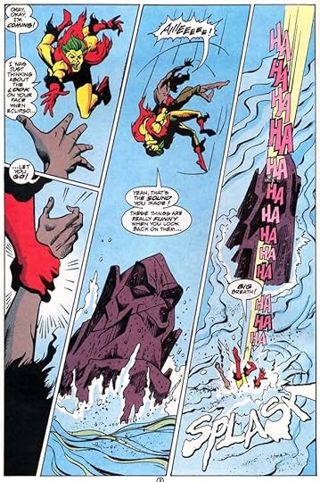 From ECLIPSO #9, July 1993
More fun with Creeper’s laughter and a great sound effect in the last panel. Notice that it has perspective drawing the eye down toward the character.
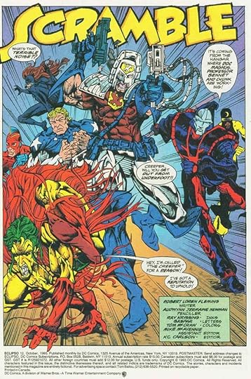 From ECLIPSO #12, Oct 1993
Lots of other DC characters are present on this page under a dynamic story title. I don’t care for the art, but I do admire the lettering.
 From ECLIPSO #16, Feb 1994
This was Saladino’s final issue as letterer, the last two were by someone else. His sound effects and display lettering in the balloons are great on this page.
Here are the stories lettered by Gaspar, he didn’t letter any of the covers.
ECLIPSO: THE DARKNESS WITHIN
#1 July 1992: 56pp
#2 Oct 1992: 56pp
ECLIPSO
#1 Nov 1992: 22pp
#2 Dec 1992: 22pp
#3 Jan 1993: 22pp
#4 Feb 1993: 22pp
#5 March 1993: 23pp
#6 April 1993: 21pp
#7 May 1993: 22pp
#8 June 1993: 22pp
#9 July 1993: 22pp
#10 Aug 1993: 22pp
#11 Sept 1993: 22pp
#12 Oct 1993: 22pp
#13 Nov 1993: 23pp
#14 Dec 1993: 21pp
#15 Jan 1994: 22pp
#16 Feb 1994: 22pp
Annual #1 1993: 48pp
That’s 512 pages in all, a good amount of work. Other articles in this series and more you might enjoy are on the COMICS CREATION page of my blog.
The post GASPAR SALADINO in ECLIPSO appeared first on Todd's Blog.
February 22, 2022
GASPAR SALADINO in OTHER D TITLES
 All images © DC Comics. From DC 100-PAGE SUPER SPECTACULAR #5, 1971
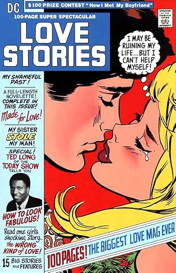
This article is a catch-all for titles beginning with the letter D that I felt didn’t have enough Gaspar Saladino work to warrant a separate article. First up is his only cover lettering for a strange series that began with issue 4, ran to issue 6, and then later issues were absorbed into the numbering of other series. It was mostly reprints, but this cover lettering and logo by Gaspar are full of creativity, variety, and appealing styles. I particularly like the calligraphy of READ ONE GIRL’S SHOCKING STORY.
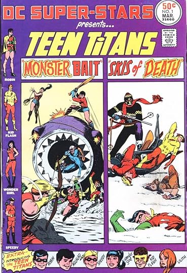 From DC SUPER-STARS #1, March 1976
Another reprint series from DC in the 1970s, though some issues had new material. This one is all reprints, and I’m not crazy about the design, but Gaspar’s lettering works fine.
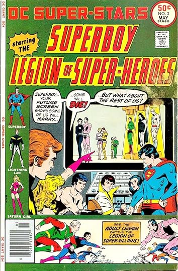 From DC SUPER-STARS #3, May 1976
Another jumbled and unfocused cover design. I like Saladino’s balloons and caption, but the trade dress is a mess, and it uses one of my least favorite of Gaspar’s logo designs, for the Legion, though it’s been changed by someone else to make it worse.
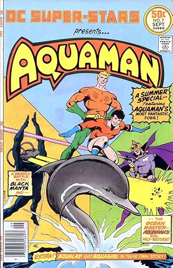 From DC SUPER-STARS #7, Sept 1976
The Aquaman logo on this cover is almost as bad, with the original Ira Schnapp design given heavy-handed additions. Gaspar’s cover lettering is fine, but is overpowered by the logo, and the color holds on the lettering also make it less noticeable.
 From DC SUPER-STARS #9, Nov 1976
One large art image makes this cover work much better. Gaspar’s logo is striking, and his cover lettering works well too.
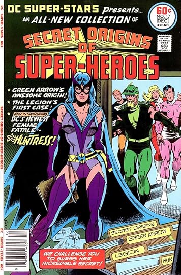 From DC SUPER-STARS #17, Nov-Dec 1977
Toward the end of its eighteen issue run, the series did feature more new material, including this story introducing The Huntress. All lettering and logos are by Saladino including the names on the file folders.
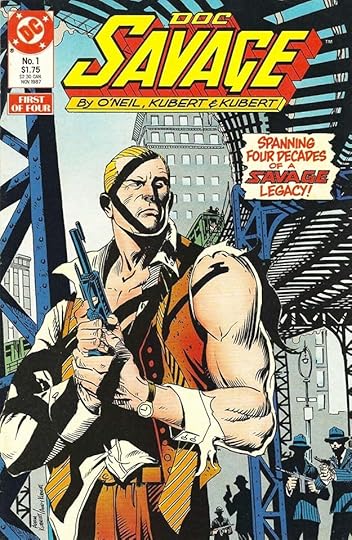 From DOC SAVAGE #1, Nov 1987
This four-issue miniseries about the famous pulp magazine hero has a nice cover blurb by Gaspar on the first issue, his only work on the four.
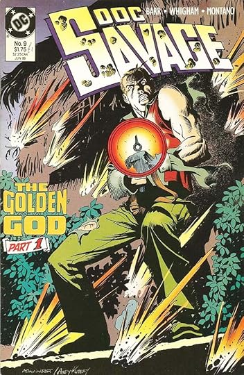 From DOC SAVAGE #9, June 1989
The miniseries did well enough to launch a monthly series that ran 24 issues. Gaspar lettered a few of the covers. It was the style at the time to do multi-part stories within a series, and having the cover lettering reflect that, so Gaspar did this blurb and it ran on issue 10 with the PART 1 replaced by PART 2. I’ll still count it for him.
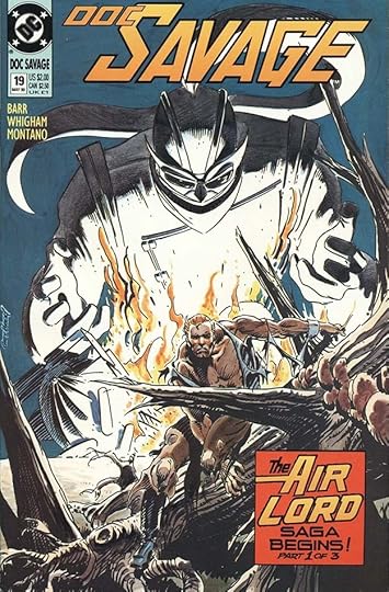 From DOC SAVAGE #19, May 1990
The same thing happened here, though Saladino did add different subtitles in each similar caption for issues 20 and 21.
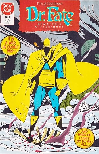 From DR. FATE #1, July 1987
The long-running character Doctor Fate followed a similar path, with just the first issue of his four-issue miniseries having round captions by Gaspar, using his rough style with squared stroke ends.
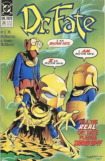 From DR. FATE #23, Dec 1990
A monthly series followed, and Saladino lettered only one cover for it. I love the humor in the art and cover copy, and Gaspar has captured it in his lettering I think.
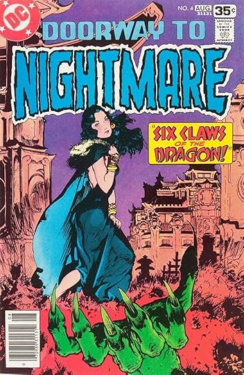 From DOORWAY TO NIGHTMARE #4, July-Aug 1978
This mystery title had a short run, it was cancelled by the “DC Implosion” of 1978. The logo is by John Workman, Gaspar lettered the caption for this issue, his only involvement in the series.
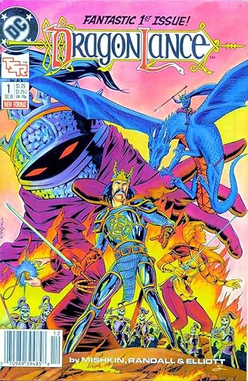 From DRAGONLANCE #1, Dec 1988
DRAGONLANCE was one of several titles licensed from TSR games. Gaspar did the top line on this first issue cover.
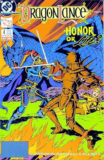 From DRAGONLANCE #4, Jan 1989
The blurb on this cover is beautifully done, with LIFE probably made with a brush and then outlined in pen.
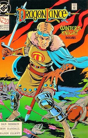 From DRAGONLANCE #17, March 1990
The blurb here signals the beginning of a multi-part story…
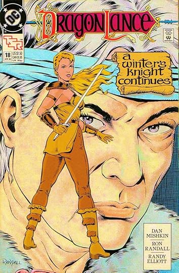 From DRAGONLANCE #18, April 1990
…but Saladino goes with a different approach on the rest of the chapters, fine calligraphy on a textured scroll. Notice how well the words fit together even with upper and lower case.
 From DC SCIENCE FICTION GRAPHIC NOVEL #1, “Hell on Earth,” Dec 1985
This series from editor Julius Schwartz ran seven issues from 1985-1987. Each was larger than a typical comic, what they call album size in Europe or Graphic Novel format in the U.S. They were square bound and printed well on glossy paper. Gaspar lettered two of them, this being the first. The upper and lower case captions are similar to his handwriting, and the pattern of words behind the last panel was probably pencilled in by artist Keith Giffen, but Saladino made it scarier.
 From DC SCIENCE FICTION GRAPHIC NOVEL #2, “Nightwings,” Feb 1986
Gaspar lettered this one in more traditional styles, though I like his electric word balloons. One small creative touch is the circle behind the large A in the first caption.
 From DEATHSTROKE THE TERMINATOR #10, May 1992
Deathstroke was a villain from NEW TEEN TITANS spun off into his own series in the 1990s. Gaspar lettered two consecutive issues, this being the first. Again, the handwritten captions on the album are similar to his own elegant handwriting, and I like the story title.
 From DEATHSTROKE THE TERMINATOR #11, June 1992
This page from the second story shows Saladino’s occasional use of straight top and bottom edges on a word balloon that was a tight fit, and the double border around the final balloon adds emphasis in a subtle way.
To sum up, I found Saladino cover lettering on these issues.
DC 100-PAGE SUPER SPECTACULAR 5
DC SUPER-STARS 1, 3, 5, 7-9, 11-12, 17
DOC SAVAGE Miniseries 1
DOC SAVAGE 9-10, 19-21
DR. FATE Miniseries 1
DR. FATE 23
DOORWAY TO NIGHTMARE 4
DRAGONLANCE 1, 4, 17-20
That’s a total of 25. Below are the stories lettered by Saladino.
DC SCIENCE FICTION GRAPHIC NOVEL #1 “Hell on Earth” 46pp
DC SCIENCE FICTION GRAPHIC NOVEL #2 “Nightwings” 46pp
DEATHSTROKE THE TERMINATOR #10 24pp
DEATHSTROKE THE TERMINATOR #11 25pp
That’s 141 pages in all. Other articles in this series are on the COMICS CREATION page of my blog.
The post GASPAR SALADINO in OTHER D TITLES appeared first on Todd's Blog.
February 21, 2022
GASPAR SALADINO in DOOM PATROL
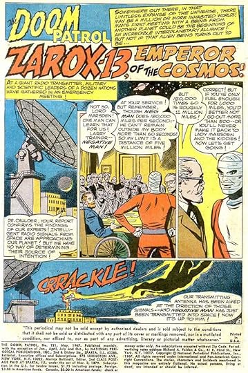
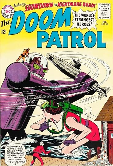 All images © DC Comics. From DOOM PATROL #93, Feb 1965
The Doom Patrol first appeared in MY GREATEST ADVENTURE #80 dated June 1963. They were popular, and with issue #86 in 1964, that title became THE DOOM PATROL, running to issue #121 in 1968 before being cancelled. There were three more issues in the numbering in 1973, all reprints. In 1988, the characters were brought back in a new series that was also popular and lasted for many years. Some call them DC’s X-Men, and the teams do have similarities. The regular cover letterer was Ira Schnapp when the series began, but Gaspar Saladino sometimes filled in when Ira wasn’t available, and that happened on this cover. The logo and burst are by Schnapp, the top lettering and balloon are by Saladino. Both his balloon lettering and open block lettering are markedly different from Schnapp’s, more angular and wide for the balloon lettering, more square for the block lettering.
 From DOOM PATROL #112, June 1967
This cover is another fill-in for Schnapp, though at this time Saladino was beginning to get more cover lettering assignments, gradually taking over that job from Ira. The caption is full of energy, and I like the unusual shape of The Brain’s word balloon.
 From DOOM PATROL #118, March-April 1968
By this time, Gaspar had taken over as the regular cover letterer for this and nearly all DC titles, and his open lettering here shows more confidence and creativity as he rises to the mandate from DC’s Carmine Infantino to give the company a fresh look. The subtle bounce and variety adds interest and perhaps is meant to suggest mental instability from the villain.
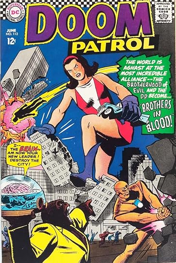
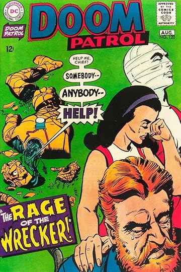 From DOOM PATROL #120, July-Aug 1968
Multiple balloons growing larger and more frantic was an idea making the rounds at DC at this time, and Gaspar’s lettering makes it more exciting. His caption works well, though the W in WRECKER is cramped to avoid going off the page.
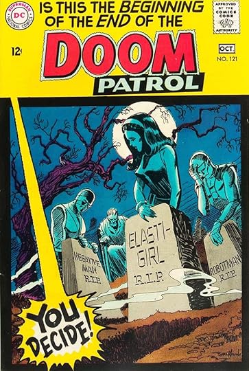 From DOOM PATROL #121, Sept-Oct 1968
As you can see from Saladino’s lettering, this was the last new issue of the series. I’m not sure why the burst seems to be a voice coming from above, but the idea presented inside was to encourage readers to write in with support for the team. If they did, it wasn’t enough to save it, but they had several popular revivals later.
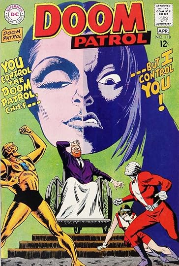
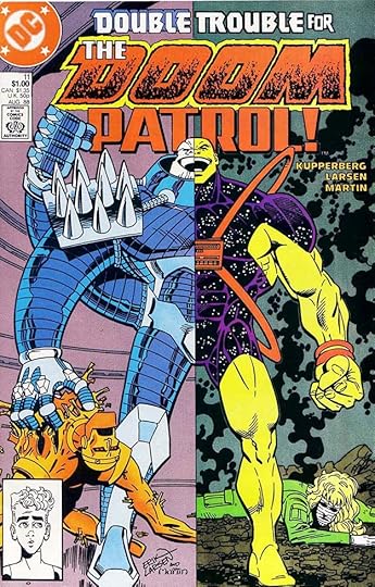 From THE DOOM PATROL #11, Aug 1988
In 1987 a new series began, and had a long and successful run to 1995. Gaspar lettered four of the many covers, this is the first. His top lettering takes advantage of the word DOUBLE by doubling it with an open drop shadow.
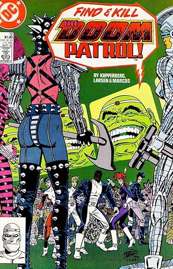 From THE DOOM PATROL #12, Sept 1988
The cover lettering around the logo (designed by me) by Saladino makes it a giant word balloon that grabs attention and adds excitement. Too bad it covers part of the figure, but avoiding it would probably have made it too small.
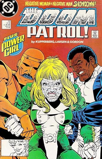 From THE DOOM PATROL #13, Oct 1988
Three of Saladino’s regular styles are on display on this cover. The top line is rough letters with square ends on the character names, and a wonkier approach to SHOWDOWN, while the round caption features his block lettering. POWER GIRL is a logo he designed around this time, and I think the logo is pasted onto his round shape.
 From THE DOOM PATROL #111, May 1967
In addition to covers, Gaspar lettered the two stories inside this issue of the original run. I find the titles and sound effect exciting and effective on this opening page. Gaspar had come a long way on title design from his tentative and sometimes pedestrian efforts in the early 1950s.
 From THE DOOM PATROL #46, Aug 1991
Gaspar also lettered one issue of the second series, probably filling in for John Workman, who did most of the Grant Morrison run. The story title is creative and the texture in it adds interest.
To sum up, Saladino lettered these covers in the first series: 93, 112, 118-121, and these on the second series: 11-14, a total of 10. Below are the credits for the stories he lettered.
#111 May 1967: Doom Patrol 15pp, Negative Man 8pp
#46 Aug 1991: Doom Patrol 24pp
That’s 47 pages in all. More articles in this series and others you might enjoy are on the COMICS CREATION page of my blog.
The post GASPAR SALADINO in DOOM PATROL appeared first on Todd's Blog.
February 20, 2022
And Then I Read: MEN AT ARMS by Terry Pratchett
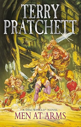
This is the 15th book in Pratchett’s Discworld series, the second focused on the Night Watch division of the City Watch in Discworld’s largest city, Ankh-Morpork. I’ve decided to read the rest of the Night Watch books next, as I enjoyed the two I’ve already read.
Captain Samuel Vimes of the Night Watch is about to marry Sybil Ramkin, the richest woman in the city, and retire from his duties. He’s not very happy about the retirement, or the social life Sybil has lined up for him. He’s more comfortable walking the city streets in search of crime. The Watch has been directed to diversify its officers, and has taken on several new recruits from previously unheard-of city groups: a dwarf Cuddy, a troll Detritus, and a werewolf Angua. The best officer in the squad is Carrot, a strong, handsome young man with charisma who is able to get almost anyone to do what’s right, but he has his hands full with the feuding factions of trolls and dwarves, not to mention other groups like the Assassins’ Guild and the Sorcerers. One of the Assassins’ Guild has secretly discovered that Carrot is actually the heir to the long-empty throne of Ankh-Morpork, and decides to turn the people against their current chief executive, Lord Veterinari, through a series of mysterious assassinations that will make Veterinari look bad and allow the rise of Carrot as the new king (something Carrot is not in favor of). To accomplish these killings, a rare weapon is stolen and used, the only gun in Discworld, and it not only kills effectively, it preys on the mind of the user. Vimes has been told not to investigate these killings, a sure way to get him to do so, but will Carrot and his new recruits be able to solve the mystery of the killer and track him down before Veterinari’s own life is taken?
A fine, fun read, and recommended.
The post And Then I Read: MEN AT ARMS by Terry Pratchett appeared first on Todd's Blog.
February 18, 2022
GASPAR SALADINO in DETECTIVE COMICS
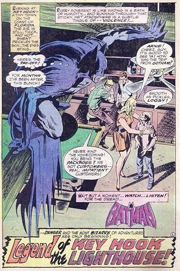
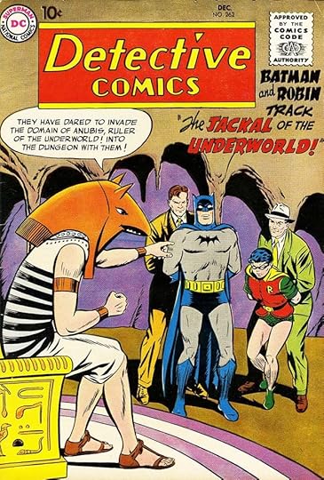 All images © DC Comics. From DETECTIVE COMICS #262, Dec 1958
DETECTIVE COMICS is one of the longest-running titles at DC, having begun as the third title under original publisher Major Malcolm Wheeler Nicholson in 1937, and running uninterrupted for over 800 issues until 2011. It may also be the title with the longest span of work from Gaspar Saladino, beginning with a story in 1952, and ending with a cover in 1990, a length of almost 40 years. Gaspar was not a regular letterer on the covers until his predecessor Ira Schnapp left the company in 1968, but thereafter he lettered most of the covers until the late 1980s. Inside the book, Gaspar did only one early story, but became a regular letterer when editorial reins were handed to Julius Schwartz in 1964, along with Batman’s own title. From then until early 1968, when he got too busy with other work, Gaspar lettered at least one of two stories for the series, and often both. I will begin with his cover lettering, then move to stories. This will be a long post. I considered breaking it into two parts, but decided to keep it all in one. Before 1968, Gaspar occasionally filled in on covers for Schnapp when Ira wasn’t available, and the one above shows his typical balloon lettering and a blurb using his story title styles, more angular than Schnapp. On some early fill-in covers, Gaspar seemed to be trying to match the Schnapp style at least a little, but not here. The treatment of the words BATMAN and ROBIN is almost a parody of Schnapp, but the rest is all Saladino.
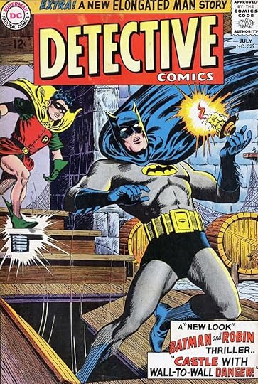 From DETECTIVE COMICS #329, July 1964
Julie Schwartz wanted a more realistic look for the art on his issues, and that’s evident on this cover compared to the previous one. Gaspar did fine on the top blurb, but the caption is poorly organized with too much white space. It would take him a while to get used to doing cover lettering, some early examples like this one are not so good.
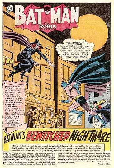
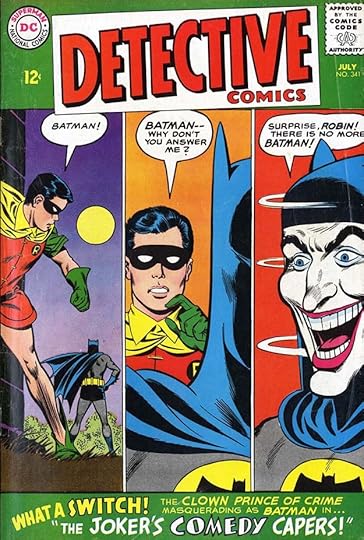 From DETECTIVE COMICS #341, July 1965
The Saladino caption at the bottom of this cover is a little better, but the word COMEDY doesn’t look right in this context, the letters are too thin in places and too thick in others, even allowing for the intended humorous style.
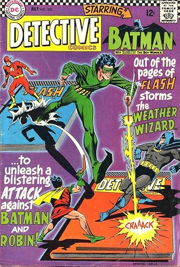 From DETECTIVE COMICS #353, July 1966
Gaspar’s large lettering on this cover, probably worked out with artist Carmine Infantino, looks much better than the previous effort and adds excitement to the cover, though the style of the words BATMAN and ROBIN again seems like a poor imitation of Ira Schnapp’s Art Deco style as seen in the Batman logo. It’s interesting that the two titles are visualized as hardcover books, something that wouldn’t really happen for decades.
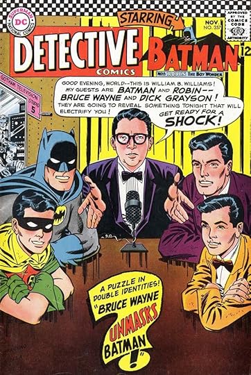 From DETECTIVE COMICS #357, Nov 1966
With Saladino now lettering most of the stories, it made sense for him to be on the covers too when possible, and this one is full of cover text probably written by Schwartz. The large word balloon is a bit uneven, and might have worked better split into two balloons. The question-mark caption is great, though, and shows a good use of the space available.
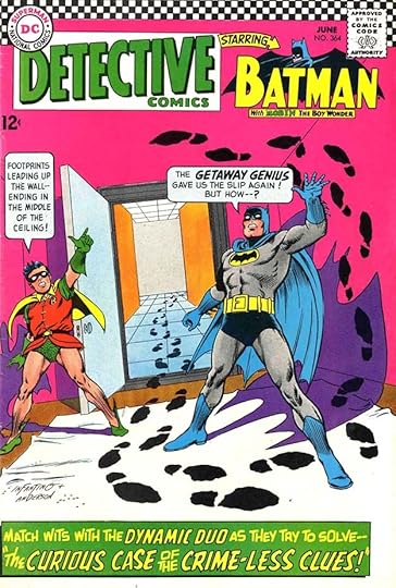 From DETECTIVE COMICS #364, June 1967
The lettering on this cover is all well done, and I like the unusual rounded rectangles of the balloon shapes, something Saladino would try off and on for a few years. The caption shows a good use of the space, and of different styles that work well together. Around this time Carmine Infantino had joined the DC staff as Art Director, giving him more say in who lettered what, and over the next year he would gradually shift the more important lettering tasks—logos, covers and house ads—from Schnapp to Saladino. It makes sense that covers he drew himself might be among the first to see this change, but Schnapp did still letter some of them for a while until he left the company.
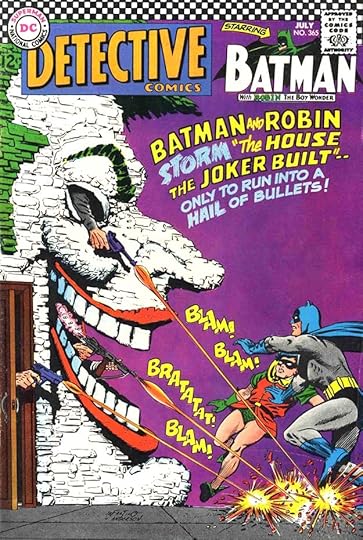 From DETECTIVE COMICS #365, July 1967
This issue was again planned out by Infantino and Saladino I think, and each did stellar work on it. I particularly like the rough brush-like treatment of the word STORM in the blurb. Notice that Gaspar is now using his own block letter style for the words BATMAN and ROBIN and not trying to imitate Ira.
 From DETECTIVE COMICS #371, Jan 1968
With this issue, Saladino became the regular cover letterer of the series, though Schnapp did letter issue #373, his last. Gaspar had been given the mandate of providing a fresh approach to DC’s public image through his cover lettering, logos and house ads, and he rose to the challenge with fine work like this. The subject is humorous, but his word balloons manage to make it exciting anyway, and the blurb is full of interesting shapes and energy. The series was still feeling the influence of the camp comedy of the Batman TV show (1966-68), subverting editor Schwartz’s preference for a more serious approach.
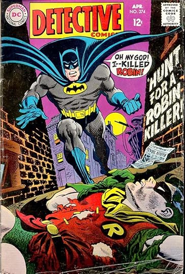 From DETECTIVE COMICS #374, April 1968
That serious approach is evident on this cover. Saladino’s display lettering in the balloon is now masterfully adding to the drama, and I love the dry-brush story title on the wall.
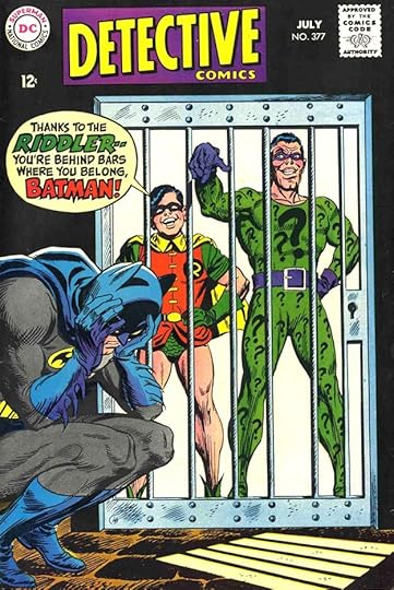 From DETECTIVE COMICS #377, July 1968
The book would try to hover on the cusp of humor and drama for a while until the boost in sales from the TV show faded. This one is leaning toward humor again. Fine lettering in the balloon, though.
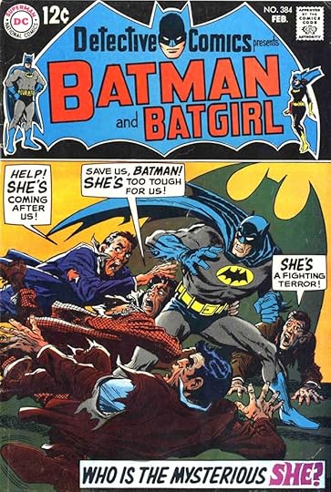 From DETECTIVE COMICS #384, Feb 1969
By this issue, under a new Saladino logo, the balance is leaning toward drama (or melodrama) again. Another example of Saladino’s experiments with rectangular balloons, and I like the style of SHE in the caption.
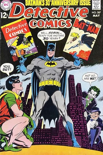 From DETECTIVE COMICS #387, May 1969
This charming cover seems to suggest the book is refocusing on its roots, though the villains might be right out of the TV show.
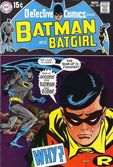 From DETECTIVE COMICS #393, Nov 1969
One way the book could return to its roots was for the Batman and Robin team to split, as it began to do here. Soon Batman was solo in most of these stories with Robin sometimes in his own backup stories or teamed with Batgirl. Did that large Saladino caption intrigue buyers enough to make the sale?
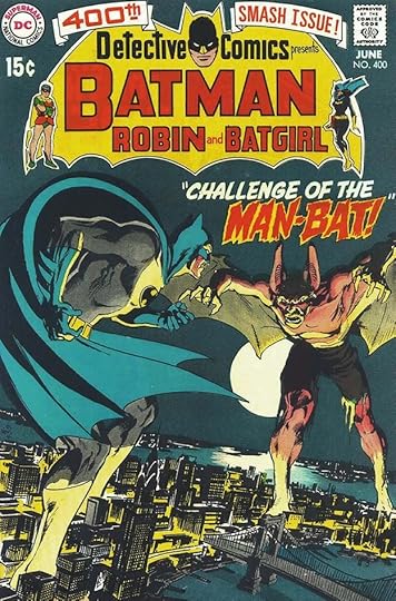 From DETECTIVE COMICS #400, June 1970
The dramatic but more realistic art of Neal Adams on covers further signaled that the comedy was over and mystery and intrigue would increase. I don’t know whose idea Man-Bat was, perhaps Julie, perhaps writer Frank Robbins, but Gaspar’s scary treatment of his name helped make him more menacing.
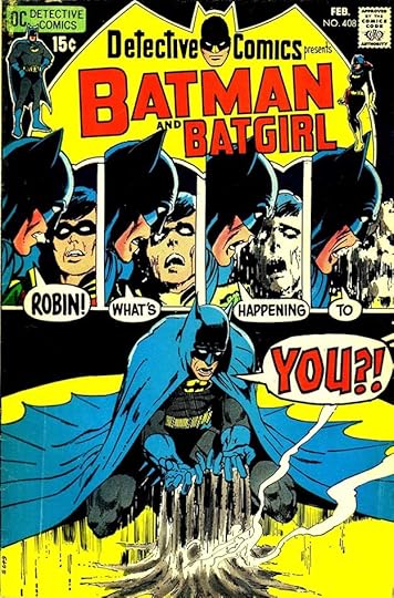 From DETECTIVE COMICS #408, Feb 1971
In this era of the title, almost anything might happen as long as it was scary and dramatic. Saladino’s lettering helps sell it in this unusual multiple panel cover.
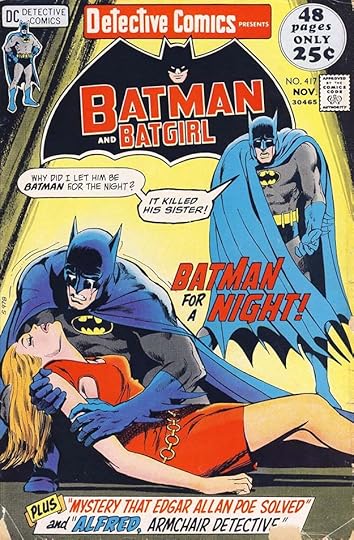 From DETECTIVE COMICS #417, Nov 1971
Perhaps having Batman appear helpless so often was not such a good idea, but that was definitely a theme at DC at this time. The company was trying to figure out a formula that would work against the rise of Marvel Comics, and they thought this was it. Lots of fine Saladino lettering adds to the drama.
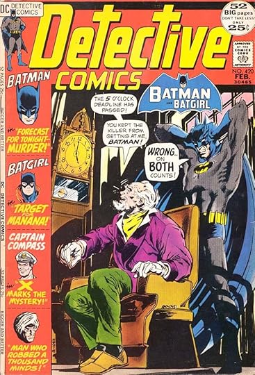 From DETECTIVE COMICS #420, FEB 1972
With this issue, the series became more of an anthology again, though with the backups being reprints. A new Saladino logo and sidebar made the cover busier, but the image is still effective. The old logo is present small, and would soon vanish.
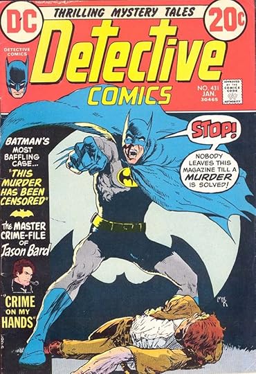 From DETECTIVE COMICS #431, Jan 1973
By this issue the size was again smaller, and there was only one backup, but it was not a reprint. Gaspar’s sidebar lettering makes it seem like more, though the story title is type. The style of STOP gets attention, and perhaps some sales.
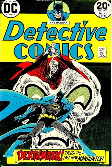 From DETECTIVE COMICS #437, Oct-Nov 1973
With this issue, editorial duties passed to Archie Goodwin, and the title returns even more to its roots by going back to the original logo. Gaspar’s bottom banner is excellent, and the new Manhunter series was perhaps the best thing in the Goodwin issues, but notice that the book is now bi-monthly, a sign of slipping sales.
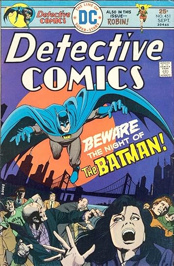 From DETECTIVE COMICS #451, Sept 1975
By this time, the book was back under Julius Schwartz with help from E. Nelson Bridwell and Bob Rozakis. It had returned to monthly publication, a sign that sales had increased, and the caption by Saladino is creative and exciting. I love his version of THE BATMAN, notice the importance of THE.
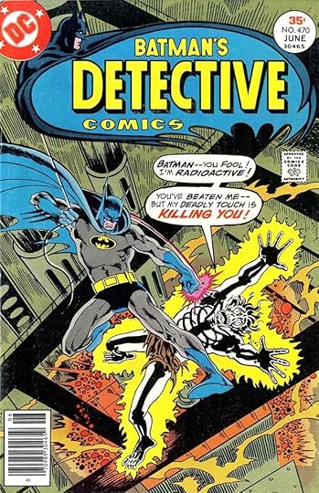 From DETECTIVE COMICS #470, June 1977
This era of the series, with scripts by Steve Englehart and soon art by Marshall Rogers, was one I loved. The cover would not work nearly as well without Saladino’s explanatory balloons. Sorry to skip ahead a lot now, but I have to get to the end of this article somehow!
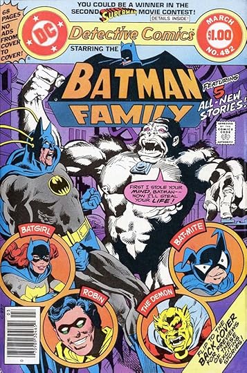 From DETECTIVE COMICS #482, Feb-March 1979
At this time, the series had become a large Dollar Comic featuring the entire Batman supporting cast, and even Jack Kirby’s Demon. A very busy cover, but Saladino’s labels, balloon and captions help make sense of it.
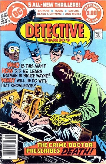 From DETECTIVE COMICS #494, Sept 1980
A simpler layout on this cover makes room for dramatic Saladino lettering that adds excitement and mystery.
 From DETECTIVE COMICS #515, June 1982
I’m not a fan of the busy and fragmented layout on this cover, but it does have lots of great Gaspar lettering.
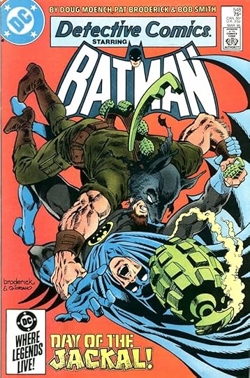 From DETECTIVE COMICS #548, March 1985
There’s only room for one small cover blurb here, so it needs to be distinctive and intriguing. Saladino succeeds on both counts, with texture adding grit to the character name.
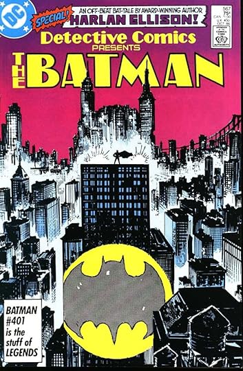 From DETECTIVE COMICS #567, Oct 1986
Saladino not only did the top caption on this cover, but also the one-use Art Deco logo treatment, which I love and think should have been used more. He probably just did it as part of his cover lettering, perhaps from a layout by cover artist Klaus Janson.
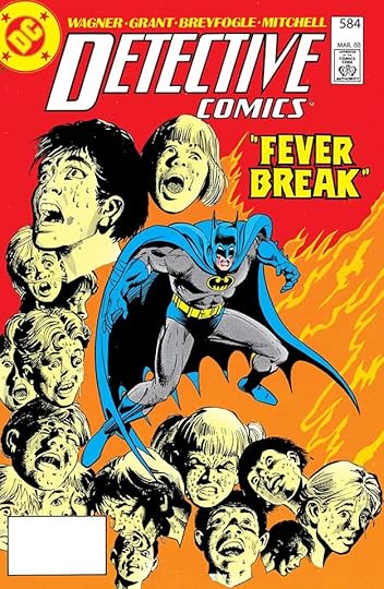 From DETECTIVE COMICS #584, March 1988
As we get into the late 1980s, more and more DC covers used type for cover blurbs, and I did a lot of the ones that were hand-lettered. This is one of the final examples by Gaspar, who adds interest by giving the letters a slight up and down bounce and a rough outline.
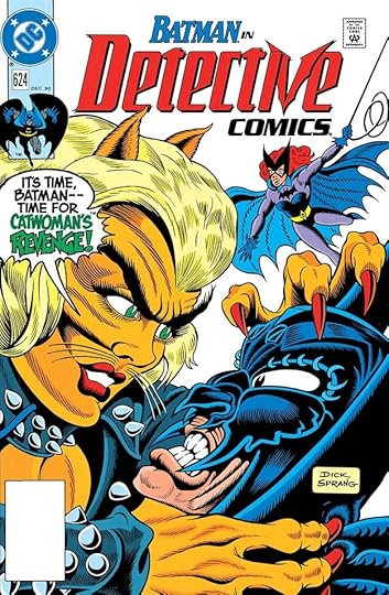 From DETECTIVE COMICS #624, Dec 1990
Saladino’s final cover lettering was for this cover by Dick Sprang, one of the first Batman artists (working as an uncredited ghost artist for Bob Kane). Clearly, Gaspar had lost none of his skill for dramatic balloons. It’s too bad that changing styles prevented him from doing more.
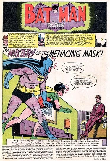
 From DETECTIVE COMICS #190, Dec 1952
Now, on to story lettering. The only story lettered by Saladino before 1964 was this one early in his career, probably a fill-in he was asked to do. Gaspar’s wide, angular lettering stands out from the crowd, and this page features some of his early style points: an open letter beginning the first caption with a black shape behind it, and captions with organic edges and small notches.
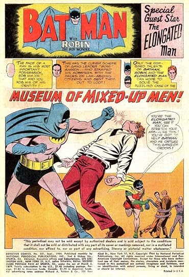
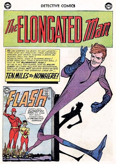 From DETECTIVE COMICS #327, May 1964
Editor Julie Schwartz’s approach to Batman and Robin was completely different from his predecessor Jack Schiff, and I found it a welcome change. Julie also brought in Elongated Man as the regular backup, a popular character from his THE FLASH title, as detailed here with handsome Saladino lettering. Gaspar was soon assigned as many DETECTIVE stories as he could handle. At least one story in each issue, and often both, featured his work.
 From DETECTIVE COMICS #331, Sept 1964
Occasionally all three characters worked together in one book-length story. Carmine Infantino’s pencil art was often seen in the book, as here.
 From DETECTIVE COMICS #336, Feb 1965
By this time, Saladino’s story titles were much improved from his early work, and his captions were well designed too, like this scroll.
 From DETECTIVE COMICS #338, April 1965
Like the art, the lettering was confident, bold, energetic, and appealing.
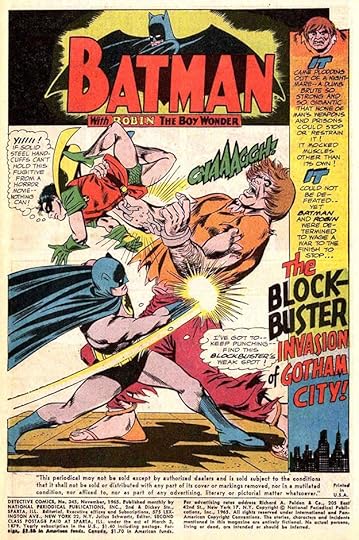 From DETECTIVE COMICS #345, Nov 1965
It was a winning combination, the art and lettering played on each other’s strengths.
 From DETECTIVE COMICS #352, June 1966
Then the Batman TV show hit the airwaves and was a big success. Editor Schwartz was pressured to make the comics more like the TV show, including the giant sound effects. Fortunately, Saladino was perfect for that. His were better than the TV ones.
 From DETECTIVE COMICS #356, Oct 1966
Elongated Man had always had elements of humor, but they were now played up to a somewhat absurd degree, like the weird waggling nose on this page.
 From DETECTIVE COMICS #365, July 1967
Both the stories and art were pushed toward the camp humor of the TV show, and the old Bob Kane style of art (usually by others) returned at times, as in this depiction of The Joker. Great story title by Saladino, but in a few months he had to give up his regular story lettering on the Batman titles. He was too busy doing logos, house ads, and cover lettering for the entire DC line.
 From DETECTIVE COMICS #373, March 1968
This was Gaspar’s last regular story lettering on the book. He did more story lettering, but only occasionally, and others took over the bulk of it. Julie Schwartz turned to staffers like Milt Snapinn and Joe Letterese, and soon new freelancers Ben Oda and John Costanza were doing a lot too.
 From DETECTIVE COMICS #414, Aug 1971
Gaspar found time to letter this Batman story. I like the brushed borders on the bottom caption.
 From DETECTIVE COMICS #442, Aug-Sept 1974
Beginning with this issue, Saladino lettered the contents pages of some of the longer issues with an impressive variety of styles to make each feature unique.
 From DETECTIVE COMICS #444, Dec1974-Jan 1975
This filler was probably a Julie Schwartz idea, Gaspar lettered a few of them at the time.
 From DETECTIVE COMICS #463, Sept 1978
Another rare late Saladino Batman story. Note the addition of creator credits by this time, but he did not include his own name, though he could have. Perhaps he wasn’t used to doing that yet.
 From DETECTIVE COMICS #484, June-July 1979
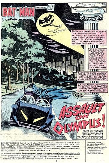
This was the last Batman story lettered by Gaspar in this title, and here he does include his lettering credit. The style of OLYMPUS suggests Greek carvings.
 From DETECTIVE COMICS #544, Nov 1984
The last Saladino story lettering in DETECTIVE was for this insert promoting a toy line. His lettering is still creative and full of energy, and I like the connection of GF in the story title. This story also appeared in other DC titles, but I will only count it here.
To sum up, these are the covers with Gaspar Saladino lettering: 262, 329, 341, 353, 357, 364-365, 371-372, 374-411, 413-441, 443-447, 449, 451-452, 456-457, 464-467, 470-471, 482, 484-501, 503-504, 506-516, 518-525, 527-529, 533, 535-536, 538, 541-543, 545, 548-551, 553-555, 557, 559, 562, 564, 566-567, 573, 584, 624. That’s 159 in all.
Below are the stories lettered by Saladino. Features are abbreviated after the first appearance.
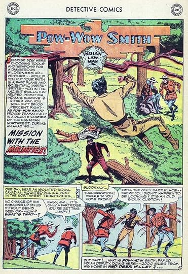
#190 Dec 1952: Pow-Wow Smith 8pp
#327 May 1964: Batman & Robin 15pp, Elongated Man 10pp
#328 June 1964: B&R 15pp
#329 July 1964: B&R 15pp
#330 Aug 1964: B&R 15pp, EM 10pp
#331 Sept 1964: B&R 24pp
#332 Oct 1964: B&R 15pp, EM 9pp
#333 Nov 1964: EM 10pp
#334 Dec 1964: EM 9pp
#335 Jan 1965: B&R 15pp
#336 Feb 1965: B&R 15pp
#337 March 1965: B&R 15pp, EM 10pp
#338 April 1965: B&R 15pp, EM 10pp
#339 May 1965: B&R 16pp, EM 9pp
#340 June 1965: B&R 15pp, EM 10pp
#341 July 1965: B&R 16pp, EM 9pp
#342 Aug 1965: EM 10pp
#344 Oct 1965: B&R 14pp
#345 Nov 1965: B&R 14pp, EM 10pp
#346 Dec 1965: B&R 14pp
#347 Jan 1966: B&R 14pp
#348 Feb 1966: B&R 14pp, EM 10pp
#349 March 1966: B&R 14pp, EM 10pp
#350 April 1966: EM 10pp
#351 May 1966: EM 10pp
#352 June 1966: B&R 14pp, EM 10pp
#353 July 1966: B&R 15pp, EM 9pp
#354 Aug 1966: B&R 14pp, EM 10pp
#355 Sept 1966: B&R 14pp, EM 10pp
#356 Oct 1966: B&R 15pp, EM 9pp
#357 Nov 1966: B&R 14pp, EM 10pp
#358 Dec 1966: B&R 15pp, EM 9pp
#359 Jan 1967: B&R 16pp, EM 8pp
#360 Feb 1967: B&R 14pp, EM 9pp
#361 March 1967: B&R 14pp
#362 April 1967: B&R 14pp, EM 9pp
#363 May 1967: B&R 15pp, EM 8pp
#364 June 1967: B&R 14pp, EM pp 2-9 (8pp)
#365 July 1967: B&R 14pp, EM 9pp
#366 Aug 1967: B&R 14pp
#367 Sept 1967: B&R 14pp, EM 9pp
#368 Oct 1967: B&R 14pp, EM 9pp
#370 Dec 1967: B&R 14pp
#371 Jan 1968: EM 8pp
#373 March 1968: EM 9pp
#414 Aug 1971: Batman 15pp
#442 Aug-Sept 1974: Contents 1pp
#443 Oct-Nov 1974: Contents 1pp
#444 Dec 1974-Jan 1975: Contents 1pp, Comedy Covers 1pp
#445 Feb-March 1975: Contents 1pp
#463 Sept 1976: Batman 11pp
#484 June 1979: Contents 1pp, Batman 16pp
#485 Aug-Sept 1979: Contents 1pp
#486 Oct-Nov 1979: Alfred 7pp
#487 Dec 1979-Jan 1980: The Odd Man 7pp (already listed under CANCELLED COMICS CAVALCADE in the article OTHER C TITLES, but the Grand Comics Database says heavily rewritten, so I will count it here too.
#496 Nov 1980: Batgirl 10pp
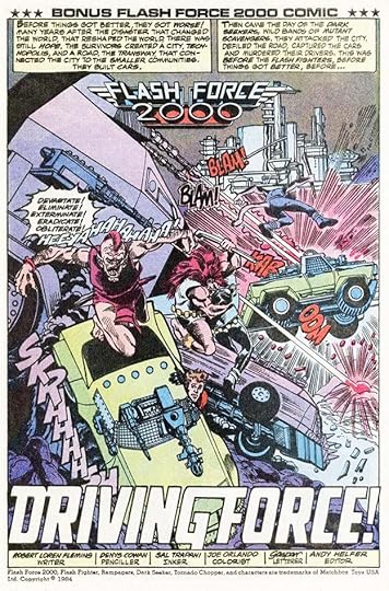
#544 Nov 1984: Flash Force 2000 14pp
That’s a total of 951 pages on this series, a solid body of work. Other articles in this series and more you might enjoy are on the COMICS CREATION page of my blog.
The post GASPAR SALADINO in DETECTIVE COMICS appeared first on Todd's Blog.
February 17, 2022
GASPAR SALADINO in THE DEMON
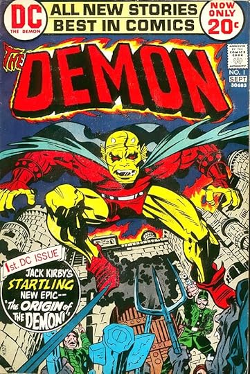 All images © DC Comics. From THE DEMON #1, Aug-Sept 1972
Jack Kirby’s arrival at DC in early 1971 was huge news for fans, but his Fourth World saga of connected titles were running out of steam and not selling well a year and a half later. As those titles were headed for cancellation, Jack created a second wave of books, and this was one of them. It ran for 16 issues, and there was Gaspar Saladino lettering on all the covers, but often with type as well. I’m not sure whose idea that was. The logo was designed by Gaspar from a sketch by Len Wein, and the circular blurb is by Saladino, as is the banner over it, but the words in that banner are type. Was this a last-minute change that replaced something lettered? Possibly. Gaspar was the perfect choice for scary lettering as in THE DEMON in that blurb. One oddity is that the period is missing from the exclamation point after it, perhaps an error made when the negative photostat was pasted in. Many of the covers that followed also combined hand-lettering and type. Gaspar didn’t letter any of the stories inside the books.
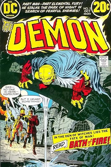 From THE DEMON #2, Oct 1972
There’s lots of Saladino lettering on the second issue: above the logo, word balloons, and in the lower caption, but also some type there. Was this copy added after Gaspar’s lettering was finished? Or did Saladino ask for typeset there?
 From THE DEMON #3, Nov 1972
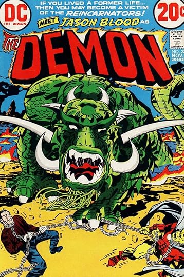
The combination of type and Saladino lettering is even more puzzling on this cover. REINCARNATORS and MEET JASON BLOOD are his work, the rest is type. I don’t see how anyone other than Saladino could have planned this, so perhaps he was experimenting on this book himself with combining type and his hand lettering.
 From THE DEMON #5, Jan 1973
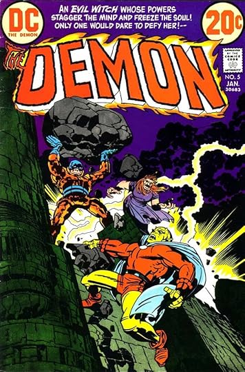
The entire top blurb on this cover is Saladino’s effective lettering, with EVIL WITCH in a scary style.
 From THE DEMON #8, April 1973
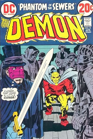
The title at the top and the thought balloon on this cover are by Saladino, with no type other than the trade dress at the top.
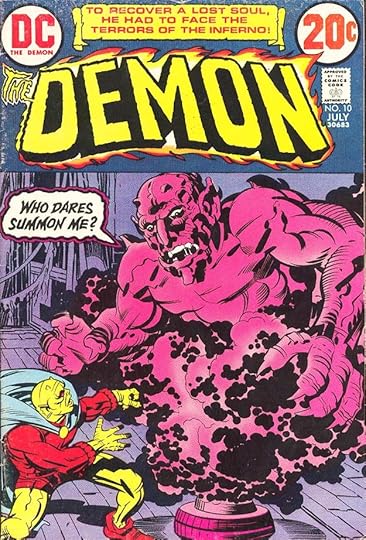 From THE DEMON #10, July 1973
The demonic word balloon with scary letters and rough double outlined balloon is fine work by Saladino on this cover. The caption at the top has a handsome scroll shape by Saladino, but is filled with headline type. I’m thinking this is again Saladino experimenting. Headline type could be done in the DC Production Department on a machine they had that set it one letter at a time on photographic paper. Somewhat time consuming to do, but a lot quicker than getting type from a type house outside the company. Perhaps Gaspar was doing this himself.
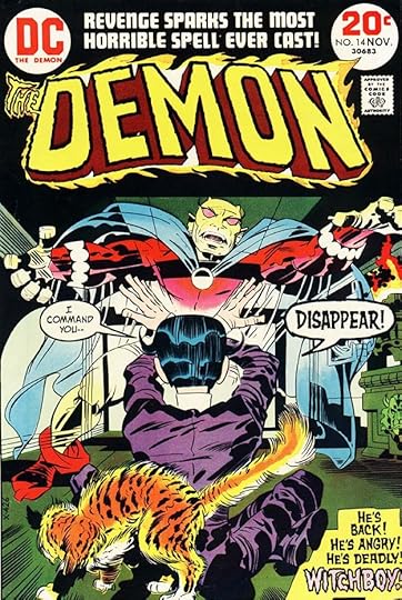 From THE DEMON #14, Nov 1973
More headline type is at the top of this cover, but the rest is hand-lettered by Saladino. Some of the bottom blurb is cut off on the right side, but that may just be the way this cover image was cropped.
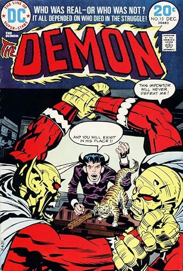 From THE DEMON #15, Dec 1973
Headline type at the top of this cover again, and then the mysterious missing balloon copy. As reported by Mark Evanier, Gaspar’s original lettering in the second balloon began with KILL HIM! DC asked for those two words to be in a red color hold, so the separator should have added it to the magenta and yellow plates and removed it from the black plate. The removal happened, but the adding was forgotten. Apparently the cover was printed before anyone noticed the error. It should have been caught in cover proofs sent by the separator in Connecticut to the DC offices in Manhattan, but something went wrong in that backup system.
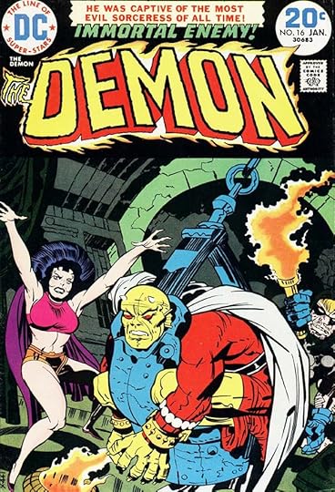 From THE DEMON #16, Jan 1974
All type at the top of this cover except for Gaspar’s IMMORTAL ENEMY. The more I look at these, the more likely it seems that Saladino was the one creating these type and lettering combinations. I don’t think they’re particularly successful, and I would have preferred he do it all in his own excellent hand-lettering. In any case, this was the last issue of the original Kirby run.
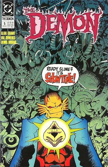 From THE DEMON #5, Nov 1990
As with all of Jack Kirby’s DC creations, they were often revived by others. In 1990, The Demon appeared in a new long-running monthly series. Gaspar did lettering for only one of the covers, above. As far as I’m concerned, his work was still excellent and I wish they had used him more.
To sum up, Saladino lettered all 16 covers of THE DEMON in it’s original Kirby run and issue 5 of the 1990 series, 17 in all. More articles in this series and others you might enjoy are on the COMICS CREATION page of my blog.
The post GASPAR SALADINO in THE DEMON appeared first on Todd's Blog.
February 16, 2022
GASPAR SALADINO in DC SPECIAL SERIES
 All images © DC Comics. From DC SPECIAL SERIES #1, Sept 1977
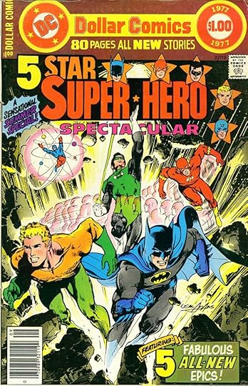
Perhaps the most maddening of all DC series for collectors and indexers like myself, this one never had the actual series name on the cover, only in the indicia inside. Many issues were annual-sized comics, but four were digest-size and three were tabloid size. (I’ve already covered those in THIS article.) I think the idea was to have fans see the issues as one-time specials, but even that didn’t hold true for the Swamp Thing reprints, which were clearly a series. It was also a catch-all for issues of regular series that somehow didn’t fit into the regular numbering, at least once through clerical error. I had work in a few issues, and even now I found that a surprise. I remembered doing the work, but had no memory of what the issue name and number was. The first issue, above, was a trial effort in the Dollar Comics format initiated by new publisher Jenette Kahn a few years earlier to see if it could support a superhero anthology. Most DC books of this kind were full of reprints, but this one was all new, as Gaspar was instructed to spell out in his caption, and also mentioned in the trade dress. It must not have sold well, as there weren’t any more issues.
 From DC SPECIAL SERIES #3, Oct 1977
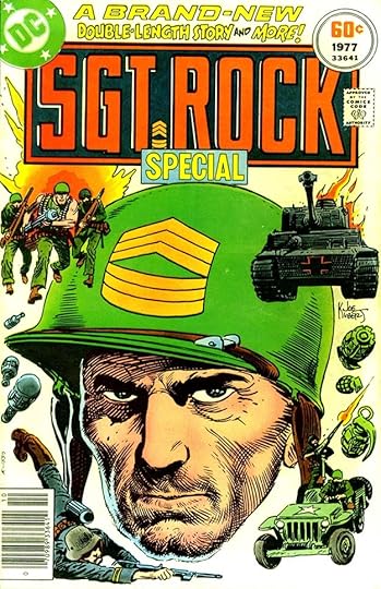
Issue #3 was also all new material, mainly a 30-page Sgt. Rock story and a few short fillers. Gaspar’s top lettering promotes the newness. The length of this book was 52 pages, less than the Dollar Comic, and bit longer than an annual. Again, using this strange series for things that didn’t fit into the usual mold.
 From DC SPECIAL SERIES #10, April 1978
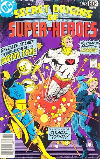
Some issues were reprints, like the ones featuring the original Swamp Thing series, but others were new material like this one. I’m surprised it doesn’t say that on the cover, but Gaspar’s captions are exciting and full of appealing variety, and most readers were attracted to origin stories.
 From DC SPECIAL SERIES #17, Sept 1979
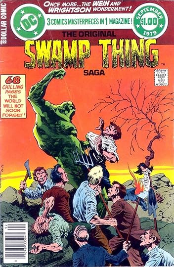
This is one of the Swamp Thing reprints with great new top lettering and caption by Saladino. Gaspar had lettered that original series, so was the perfect choice. Many assume this version of the Swamp Thing logo was also by him, but I believe it’s by John Workman.
 From DC SPECIAL SERIES #18, Nov 1979
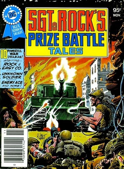
This was the first of the four digest-sized issues. Why they appeared here and not in one of the two DC digest series I don’t know, possibly they had extras of these small reprint collections ready and used them because there was nothing else available. Gaspar always did a fine job with war comics lettering.
 From DC SPECIAL SERIES #22, Sept 1980
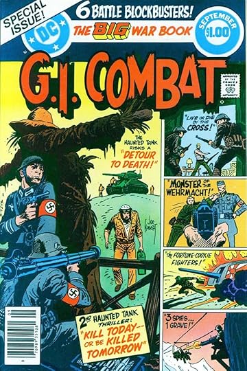
Here’s a regular comic size issue in Dollar Comics format, and looking just like a large issue of G.I. COMBAT. The Grand Comics Database does have an explanation for it. The book was originally intended as G.I. COMBAT (DC, 1957 series) #222, as the title converted from bi-monthly to monthly frequency, but due to a clerical error in making the necessary changes in the UPC the contents were shifted to this series at the last moment. The stories are all new, and the cover lettering was probably done by Gaspar when they expected it to be a regular issue.
 From DC SPECIAL SERIES #24, Feb 1981
Saladino’s lettering for the back cover of this digest-sized reprint issue is great, I like it better than the front cover. Powerful display lettering! As noted earlier, the three final issues of the series were tabloid size, and covered in another article.
 From DC SPECIAL SERIES #1, Sept 1977
Saladino also lettered a few stories in the run, beginning with the Flash story in the first issue, above. This recreation of The Flash’s origin must have brought back a few memories, as Gaspar lettered the original version.
 From DC SPECIAL SERIES #7, Dec 1977
This issue, a GHOSTS Special from editor Murray Boltinoff, has two stories credited as Gaspar Saladino lettering on the art. I’m not sure either credit is correct, but this one might be his lettering other than the story title and sound effects. The other story definitely does not look like his work, so may have been an error by Boltinoff. I will count this story only.
 From DC SPECIAL SERIES #15, Summer 1978
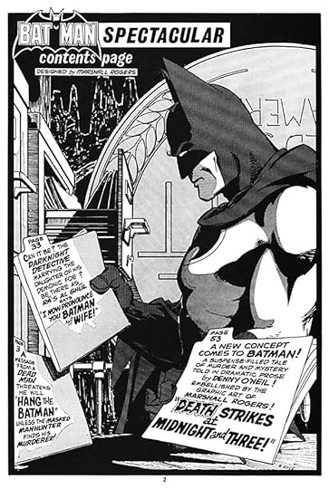
This Batman Spectacular Dollar Comics issue has only one page of new Saladino lettering, the contents page. This is a poor scan, but areas of the first two file folders have gray dot shadows, and Gaspar did a fine job of fitting things in around that.
 From DC SPECIAL SERIES #22, Sept 1980
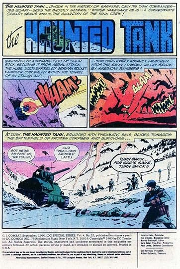
Finally, for the repurposed issue of G.I. COMBAT, Gaspar lettered two Haunted Tank stories, something he was probably doing regularly on the series. As always, his sound effects are impressive.
To sum up, I found Saladino lettering on these covers: 1, 3-6, 10, 17-18, 20, 22-24, a total of 12. Below are his story credits.
#1 Sept 1977: The Flash 13pp
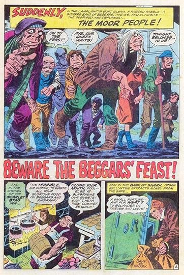
#7 Dec 1977: Beware the Beggar’s Feast 9pp
#15 July 1978: Contents 1pp
#22 Sept 1980: Haunted Tank 13pp, 11pp
That’s 47 pages in all. More articles in this series and others you might like are on the COMICS CREATION page of my blog.
The post GASPAR SALADINO in DC SPECIAL SERIES appeared first on Todd's Blog.
February 15, 2022
GASPAR SALADINO in DC SPECIAL BLUE RIBBON DIGEST
 All images © DC Comics. From DC SPECIAL BLUE RIBBON DIGEST #1, March-April 1980
DC had had success with their first digest-size comic, BEST OF DC BLUE RIBBON DIGEST, and in 1980 they added another, also nearly all reprints except for the covers. It ran 24 issues, and Gaspar Saladino lettered many of the covers, often front and back, though I will treat each issue as a single entry to keep it simple. Type was also used, as seen on the first cover above, where Gaspar’s only work is on the small top line. Some back covers used type, some were full of Saladino lettering describing the issue’s contents. The printed result was small, but the paper and printing on covers was good enough to make everything reproduce well.
 From DC SPECIAL BLUE RIBBON DIGEST #3, July-Aug 1980
This cover uses Saladino word balloons only, allowing the characters to introduce the stories, a charming idea.
 From DC SPECIAL BLUE RIBBON DIGEST #4, Sept-Oct 1980
This is the first of the series to make good use of Gaspar’s lettering on the back cover, with just one blurb on the front cover. The contents list here is so much more interesting than a typeset list would have been.
[image error]From DC SPECIAL BLUE RIBBON DIGEST #8, April 1981Two burst captions and a rare circular one add interest and excitement to this cover, as well as the top line by Saladino.
[image error]From DC SPECIAL BLUE RIBBON DIGEST #11, JULY 1981Often the back covers were more interesting than the front ones because of the fine Saladino lettering, at least that’s what I thought. Imagine this text as a typewritten script. There might have been some underlined or bold words to indicate which things to emphasize, but otherwise it was all up to Gaspar to make it interesting, and he never failed to do so.
[image error]From DC SPECIAL BLUE RIBBON DIGEST #15, Nov 1981A five-sided space for the issue’s contents? No problem! The circled numbers are type and probably added by the DC production person assembling the cover to make it clearer which illustration went with which blurb.
[image error]From DC SPECIAL BLUE RIBBON DIGEST #16, Dec 1981The front covers also often had Saladino lettering. the burst shape is a bit odd on this one, but it works fine. The GREEN LANTERN pattern in the background is headline type, and much less interesting.
[image error]From DC SPECIAL BLUE RIBBON DIGEST #17, Jan 1982Look at the variety of styles on this back cover, from horror in the descriptions to Art Deco for the creator credits, and what an odd circular burst that is.
[image error]From DC SPECIAL BLUE RIBBON DIGEST #18, Feb 1982That back cover of this issue gave artist Joe Kubert and Gaspar a chance to name the members of Easy Company, Sgt. Rock’s command, with lots more fine lettering in the center.
 From DC SPECIAL BLUE RIBBON DIGEST #24, Aug 1982
The back cover of the final issue is perhaps the most entertaining, with editor Karen Berger, or possibly Len Wein having fun with the creators and contents. It almost has a MAD MAGAZINE feel, and made me laugh.
To sum up, these are the covers with Saladino lettering: 1-4, 8, 10-19, 21-22, 24, a total of 18. More articles in this series and others you might like are on the COMICS CREATION page of my blog.
The post GASPAR SALADINO in DC SPECIAL BLUE RIBBON DIGEST appeared first on Todd's Blog.
February 14, 2022
GASPAR SALADINO in DC SPECIAL
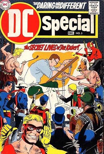
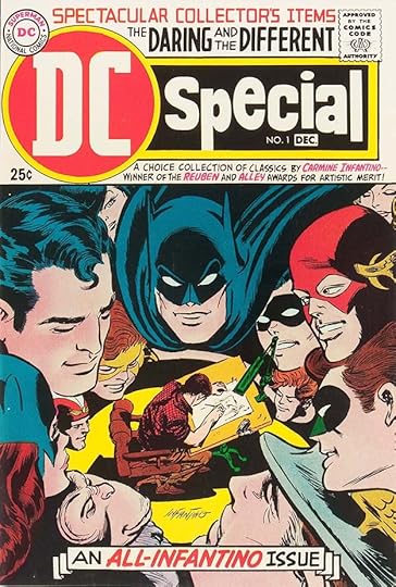 All images © DC Comics. From DC SPECIAL #1, Oct-Dec 1968
There are three DC titles with similar names that often cause confusion to me and others writing about them. DC SPECIAL ran 29 issues from 1968 to 1977 and was always standard comics size. DC SPECIAL BLUE RIBBON DIGEST ran 24 issues from 1980 to 1982 and was digest-sized. DC SPECIAL SERIES ran 27 issues from 1977 to 1981 and, just to be difficult, had issues that were comic size, some digest size, and some tabloid size. To make matters worse, that last series never had the actual series title on the covers, only on the indicias. I’ll discuss each in a separate post beginning with DC SPECIAL. At the time of this first issue, artist Carmine Infantino had joined the DC staff first as Art Director, then as Editorial Director. Perhaps he thought it was about time DC began promoting one of their artists, and who better? With this issue DC did that for the first time. The stories were all favorite reprints selected by Carmine with notes from him on each, and the cover featured not only a fine new Gaspar Saladino logo, but lots of his cover lettering as well.
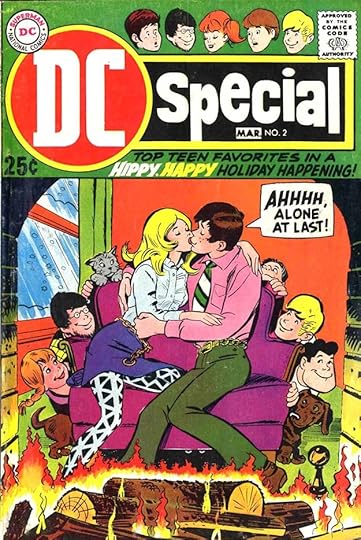 From DC SPECIAL #2, Jan-March 1969
The second issue established that the series would feature reprints from many different genres and titles, this one featuring teen humor. Gaspar’s lettering looks great, but the text itself is the usual lame attempt to be hip that never worked for me. The nearly rectangular balloon shape is something Saladino was trying at the time, but it didn’t last long.
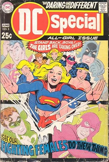 From DC SPECIAL #3, April-June 1969
The idea of this reprint collection is a good one, but again the cover text is lame and somewhat offensive. The tone is condescending, even if the lettering looks fine. At the time, DC was often using the words Daring and Different, but rarely managing to be either.
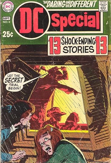 From DC SPECIAL #4, July-Sept 1969
Gaspar could always be counted on to add to the impact of a “mystery” anthology with his effective lettering. The Neal Adams cover art is amazing, too.
 From DC SPECIAL #5, Oct-Dec 1969
Joe Kubert, an artist at DC as long as Carmine, and recently hired as an editor for the war titles, also got his showcase issue of this series. Gaspar only lettered the title under the logo, but uses upper and lower case well. Apparently there were no other artists at DC that were deemed worthy of such a retrospective, though they could easily have done one for Murphy Anderson, Gil Kane, Shelly Mayer, Alex Toth, and many others, though of course much of their DC work had not been credited in the stories. From here on, it was simply genre or themed reprints.
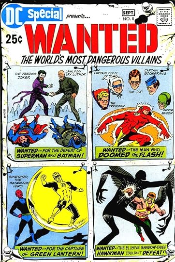 From DC SPECIAL #8, July-Sept 1970
One theme that proved popular was collections of villain stories, and there were several under the Wanted title. Lots of lettering by Gaspar here, and it all works well and doesn’t crowd the art.
 From DC SPECIAL #11, March-April 1971
As effective as this Neal Adams cover art is, without Saladino’s fine lettering it would not work as well. Lots of variety in the title list, too.
 From DC SPECIAL #12, May-June 1971
One thing DC was strong in was a wide variety of old stories that newer readers knew little or nothing about, such as these from the early days of THE BRAVE AND THE BOLD. I think DC did too much reprinting in the 1960s, but at least this series was mining less-known material.
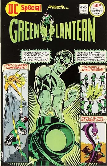 From DC SPECIAL #17, Summer 1971
Of course superheroes were DC’s main draw, and not left out. I like Gaspar’s lettering of the Green Lantern oath, though I don’t like the square white areas behind it, but that was not his choice. Notice that the three scroll captions are all slightly different shapes.
 From DC SPECIAL #23, Aug-Sept 1976
More old adventure stories that were probably new to readers at this time. Saladino’s captions are creative and exciting. These features ran for several issues.
 From DC SPECIAL #27, April-May 1977
The last few issues of the series had new material rather than reprints. The top of the cover, the trade dress, is overcrowded, and I think the top line is by someone else, but Gaspar’s logo is great, and I also like his burst on the left. It was the last issue he worked on.
To sum up, I found Saladino lettering on these DC SPECIAL covers: 1-14, 17-18, 20, 22-25, and 27, that’s 22 in all. He did no new work inside the books, though some issues were full of his reprinted lettering. More articles in this series and others you might enjoy are on the COMICS CREATION page of my blog.
The post GASPAR SALADINO in DC SPECIAL appeared first on Todd's Blog.
Todd Klein's Blog

- Todd Klein's profile
- 28 followers

