
Todd Klein's Blog, page 72
March 26, 2022
Incoming: SANDMAN BOOK TWO Trade Paperback

 Images © DC Comics
The Sandman avalanche continues with more trade paperback editions. Book Two contains original issues 21-37 plus THE SANDMAN SPECIAL #1 and the Sandman stories from VERTIGO: WINTER’S EDGE 1-3. I received two cover versions, one is the Michael Wm. Kaluta cover from the recent hardcover edition, the other is by Dave McKean, not sure if it’s new or not. Retail price is $34.95. Check with your comics retailer, or use the Amazon link below. Should be out next month.
The Sandman Book Two Trade Paperback
The post Incoming: SANDMAN BOOK TWO Trade Paperback appeared first on Todd's Blog.


March 25, 2022
GASPAR SALADINO in OTHER H TITLES
 All images © DC Comics. From HAMMERLOCKE #5, Jan 1993
This article is for all the DC titles beginning with H that did not have enough Gaspar Saladino work to warrant their own post. For instance, the issue above from HAMMERLOCKE (1992-1993) is the only one with Saladino cover lettering, nicely done in perspective at the top. I know his styles intimately, having studied them since I began working at DC in 1977, but the clincher here is the shape of the R in CYBERSPACE. If you look closely, you’ll see the notch on the right side where the right leg is joined is low, suggesting it’s a P with the right leg added, something Gaspar did throughout his career.
 From HERCULES UNBOUND #7, Oct-Nov 1976
Similarly, this cover for HERCULES UNBOUND (1975-77) is the only one with Gaspar’s cover lettering. He also did the top banner and designed the logo, which again has that characteristic R.
 From HERO HOTLINE #1, April 1989
This humorous take on superheroes had Saladino cover lettering on all six issues. Here he did the top blurb over my logo.
 From HERO HOTLINE #3, June 1989
The best thing by Saladino on this cover is SNAFU, the name of the villain, with each letter having a different texture. I love it.
 From HERO HOTLINE #5, Aug 1989
No one did flaming letters better than Saladino, and this is a prime example. Many letterers, including myself, add flames, but Gaspar’s are the most convincing, and he also captures the charring effect of fire in the letters.
 From HEROES AGAINST HUNGER #1, 1988
Many DC writers and artists worked on this charity fund-raiser. Gaspar did the logo and the cover lettering, both add gravitas and drama.
 From HEX #1, Sept 1985
Long a popular hero of the old west, Jonah Hex took the lead in this dystopian future series from 1985 to 1987. Saladino lettered many of the covers, including this first one.
 From HEX #3, Nov 1985
The burst on this cover works well, but I really like the bottom blurb with its clever overlaps and variety of shapes.
 From HEX #6, Feb 1986
Fine large balloon and blurbs on this cover sell the drama and the character.
 From HEX #14, Oct 1986
The layout of this cover leaves too much open space at the left, but Saladino fills much of it with great display lettering.
 From HOT WHEELS #1, March-April 1970
This brief series based on Mattel toy cars had cover lettering on three issues by Saladino. I suspect the balloon shapes here are by cover artist Alex Toth, but the letters in them are by Gaspar, who also did the character names. Toth did his own cover lettering on some of these.
 From HOT WHEELS #2, May-June 1970
These balloons are all Saladino, and I think he also did the lettering on the cars.
 From HOT WHEELS #4, Sept-Oct 1970
One way to add excitement is with large display lettering in the balloons if there’s room, and there was here. Notice how the letters in the second balloon have the rounded corners squared off with a small pen point for variety.
 From HAYWIRE #4, Winter 1988
Finally we have an inside story lettered by Saladino in this issue of HAYWIRE. The large title with open telescoping is impressive, and not typical of Gaspar’s work, so perhaps it was done over pencils by the artist Vince Giarrano, but that’s a guess.
To sum up, I found cover lettering by Saladino on these comics:
HAMMERLOCKE 5
HERCULES UNBOUND 7
HERO HOTLINE 1-6
HEROES AGAINST HUNGER 1988 one-shot
HEX 1-6, 9-10, 12, 14-18
HOT WHEELS 1-2, 4
That’s 26 in all. The story in HAYWIRE was 24 pages.
Other articles in this series and more you might like are on the COMICS CREATION page of my blog.
The post GASPAR SALADINO in OTHER H TITLES appeared first on Todd's Blog.
March 24, 2022
GASPAR SALADINO in HOUSE OF SECRETS
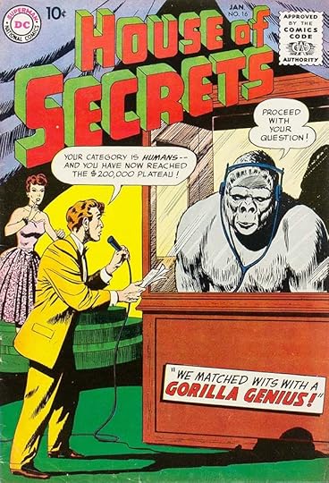 All images © DC Comics. From HOUSE OF SECRETS #16, Jan 1959
Unlike its sister title, HOUSE OF MYSTERY, Gaspar Saladino’s involvement with HOUSE OF SECRETS was minor. He lettered no stories or features inside the book and just eleven covers. The first one, above, was a fill-in for regular cover letterer Ira Schnapp. Gaspar’s style, more angular and with wider letters than Schnapp, is the main clue. The original run ended in 1966. When editor Joe Orlando revived it in 1969, the majority of the covers had no lettering, relying instead on the storytelling of fine cover artists like Neal Adams, Berni Wrightson and Michael Kaluta. Some covers that did have lettering were handled by other letterers like Joe Letterese. Both books were often places for promising new artists to get some experience, but Orlando seemed to favor HOUSE OF MYSTERY with the exception of the story in HOUSE OF SECRETS #92 by Len Wein and Berni Wrightson that led to the launch of SWAMP THING. Gaspar Saladino was the letterer of that new title, but the initial story in this book was lettered by Ben Oda. When artists from the Phillippines were hired to provide stories for DC’s anthologies, they filled many of the pages of this title, and those were often lettered in the Phillippines too. When the book was cancelled during the “DC Implosion,” it was combined with another similar anthology, THE UNEXPECTED to use up inventory and hopefully combine readerships.
 From THE HOUSE OF SECRETS #86, June-July 1970
Saladino did a fine new logo for the Orlando relaunch, similar to the one he did for HOUSE OF MYSTERY, but I like this one better. Unfortunately, it soon became distorted and lost all the qualities that made it great. The Saladino caption on this cover makes an interesting but puzzling image into an intriguing mystery.
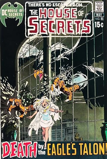 From THE HOUSE OF SECRETS #91, April-May 1971
Here you can see how the logo has been essentially ruined. The open letters have been made thicker by adding to the inside spaces, distorting those spaces and destroying Gaspar’s well-crafted shapes. Sadly, this version was used on the rest of the series. Saladino’s bottom blurb works fine, increasing the drama with the threat of death.
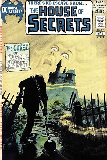 From THE HOUSE OF SECRETS #97, April-May 1972
 Again, Gaspar’s scroll and creepy lettering add a lot to this cover.
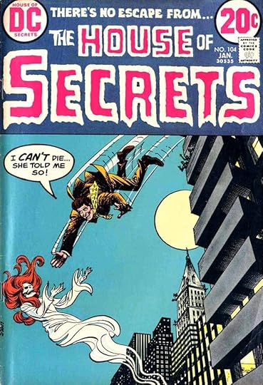 From THE HOUSE OF SECRETS #104, Jan 1973
I think this word balloon is by Saladino, but I’m not positive. I will count it for him, as it doesn’t look like the work of Joe Letterese, the other most frequent cover letterer.
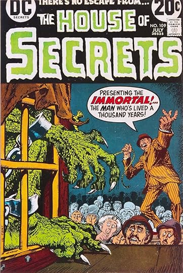 From THE HOUSE OF SECRETS #109, July 1973
There’s no mistaking Saladino’s display lettering in the balloon on this cover, and it helps sell the bombastic speech of the showman.
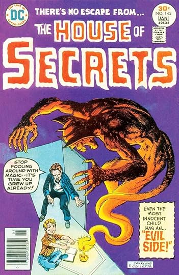 From THE HOUSE OF SECRETS #143, Dec 1976-Jan 1977
The caption on this cover definitely looks like Gaspar’s work, though the lettering may have been reduced in size inside the border perhaps to add quote marks, but the balloon is probably by John Workman, possibly a late addition.
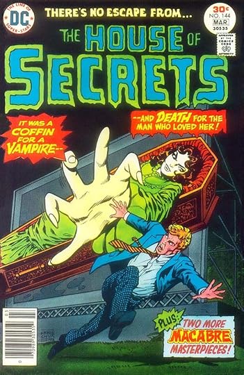 From THE HOUSE OF SECRETS #144, Feb-March 1977
Gaspar’s three blurbs on this cover tell the story, and have a nice variety of styles.
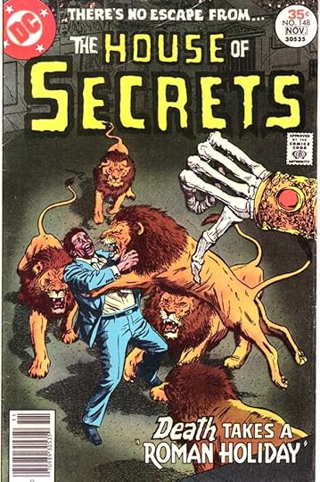 From THE HOUSE OF SECRETS #148, Oct-Nov 1977
Gaspar’s blurb at the bottom of this cover is creative and effective, but take a moment to compare this logo with the one on issue #86, above. It really has become an embarrassment.
 From THE HOUSE OF SECRETS #149, Dec 1977-Jan 1978
At least some of the covers continued to have wonderful and scary art like this one, and Saladino’s burst adds to the impact.
 From THE HOUSE OF SECRETS #153, Aug-Sept 1978
Gaspar’s final work on the book, his word balloons have letters held in red to add emphasis.
To sum up, I found Saladino lettering on these covers: 16, 86, 91, 97, 104, 109, 143-144 (143 is partial), 148-149, 153, a total of eleven. More articles in this series and others you might enjoy are on the COMICS CREATION page of my blog.
The post GASPAR SALADINO in HOUSE OF SECRETS appeared first on Todd's Blog.
March 23, 2022
Incoming: THE SANDMAN BOOK ONE Indigo Hardcover
 Image © DC Comics
New printings of THE SANDMAN are coming to my mailbox in ever increasing numbers probably because DC Comics and their bookstore vendors are preparing for a rise in interest from the upcoming Sandman TV series. This hardcover edition was produced for Canada’s Indigo bookstore chain. It has a plain black cover with gold foil decorations that include symbols for each of The Endless, and a white title. If you’re in Canada, check with your bookstore for a release date, I don’t see it there yet. The book is the same as the other most recent hardcover versions, and contains issues 1-20 of the original series. I’ve linked to other editions available on Amazon below.
The Sandman Book One Hardcover
The post Incoming: THE SANDMAN BOOK ONE Indigo Hardcover appeared first on Todd's Blog.
GASPAR SALADINO in HOUSE OF MYSTERY
 All images © DC Comics. From HOUSE OF MYSTERY #144, July 1964
HOUSE OF MYSTERY was a long-running anthology title that began in 1951 and ran 321 issues, ending in 1983. Gaspar was never a regular story letterer for the book, but he did a few stories or features in each decade of its existence. The regular cover letterer for many years was Ira Schnapp, but Saladino filled in for him quite a few times before becoming the most frequent cover letterer in the 1970s and 1980s, though many issues in those years had no cover lettering. This was a “mystery” anthology most of the time, DC’s euphemism for horror, though their ideas weren’t all that horrific. For a while in the 1960s, it featured superheroes, beginning with The Manhunter From Mars, above. Gaspar’s lettering is very much in the styles he used for stories and story titles.
 From HOUSE OF MYSTERY #156, Jan 1966
DC also tried this unique feature where young Robby Reed could be transformed into a variety of heroes using a magic dialer. I don’t know who designed the Dial H for Hero logo, it wasn’t Gaspar, but he did the rest of the lettering on this page. A variety of heroes called for a variety of styles, and Saladino was the right person for that.
 From HOUSE OF MYSTERY #160, July 1966
Ira Schnapp lettered the top line here, and designed the HOUSE OF MYSTERY logo, the rest of the lettering is by Saladino, again showcasing his versatility. I never bought any of these, but the use of Plastic Man is intriguing.
 From HOUSE OF MYSTERY #163, Dec 1966
Another cover with two letterers. Saladino did the banner under the logo, while Ira Schnapp did the lettering on the image. Either one or the other must have been a second thought by editor George Kashdan. DC’s inept attempts at teen slang is evident in the word SOCKAMAGEE.
 From HOUSE OF MYSTERY #173, March-April 1968
The final one of these has appealing Saladino lettering at the bottom. With the following issue, Joe Orlando became the editor, and he returned the book to a “mystery” anthology with a fine new logo by Saladino, but for a while many of the covers had no lettering.
 From HOUSE OF MYSTERY #190, Jan-Feb 1971
When they did have lettering, it was usually by Saladino using his scary styles, and here you can also see his logo, which included the top blurb.
 From HOUSE OF MYSTERY #193, July-Aug 1971
Many of the covers were powerful images by top DC artists like Neal Adams, Berni Wrightson and Michael Kaluta that often told the story without need for lettering, but when it was needed, Gaspar’s work added to the drama.
 From HOUSE OF MYSTERY #195, OCT 1971
Another fine example. The image is already frightening, Gaspar’s blurb makes it moreso.
 From HOUSE OF MYSTERY #224, April-May 1974
When the book expanded to include more new stories and reprints as well as short features, Saladino’s lettering became important to let readers know what was inside. I don’t generally like covers with many images like this, but the lettering works fine.
 From HOUSE OF MYSTERY #228, Dec 1974-Jan 1975
This one works better because the top image runs under the logo. Look at the variety of styles in Saladino’s captions.
 From HOUSE OF MYSTERY #245, Sept 1976
The blurb in the top banner is definitely by Saladino, but I think the balloons are by someone else, I don’t know who. My policy is to credit Gaspar in cases like this, even though it’s shared.
 From HOUSE OF MYSTERY #249, Jan 1977
No sharing here, all this fine lettering is by Saladino. I like the ghost’s balloon, enhanced by the color treatment.
 From HOUSE OF MYSTERY #258, May-June 1978
By this time, the book had become a Dollar Comic with lots of new material. Gaspar’s caption at the bottom is quite effective.
 From HOUSE OF MYSTERY #270, July 1979
Back to regular comic size at this time, with an excellent caption by Saladino. The letters of BLACK MASS could not be any bolder, there are only tiny gaps between them, but they read fine.
 From HOUSE OF MYSTERY #290, March 1981
Now being edited by Karen Berger, a continuing vampire feature begins with a fine Saladino caption.
 From HOUSE OF MYSTERY #300, Jan 1982
Few DC anthology series reached an issue 300, so this was reason to celebrate with a fine Kaluta cover and Saladino lettering. He also did the balloon shape around the logo.
 From HOUSE OF MYSTERY #321, Oct 1983
All things must come to an end, but the host character Cain returned in Neil Gaiman’s THE SANDMAN and other places, and there was also a revival of this title in 2008 that ran 42 issues. Here Gaspar also did the FOR SALE sign.
 From HOUSE OF MYSTERY #2, Feb-March 1952
Saladino’s lettering inside the book goes back almost to the beginning, he did three short stories in the second issue. One clue to his early work is the open letters over black brush shapes in the first caption, but also his wide and angular style is apparent.
 From HOUSE OF MYSTERY #9, Dec 1952
Some interesting sound effects on this story. The editor was probably Jack Schiff, but the book may have been handled by one of his assistants, Murray Boltinoff or George Kashdan. Gaspar was busy with regular assignments from editors Julius Schwartz and Robert Kanigher, but when he had time he would take work from other editors.
 From HOUSE OF MYSTERY #13, April 1953
I like the scroll caption on this page with a black square behind the open letter for a change.
 From HOUSE OF MYSTERY #33, Dec 1954
Saladino’s titles went through an evolution and gradually improved over time. There’s nothing wrong with the story titles on any of these early examples, but they are all typical of the period and have no particular Saladino style points.
 From HOUSE OF MYSTERY #178, Jan-Feb 1969
During the tenure of editor Joe Orlando, Gaspar was still not a regular story letterer, but he did a few filler pages like this one.
 From HOUSE OF MYSTERY #179, March-April 1969
Another more elaborate page with more lettering. Funny, but not a game I would try!
 From HOUSE OF MYSTERY #182, Sept-Oct 1969
He did letter a few stories as well, like this one by Wayne Howard.
 From HOUSE OF MYSTERY #223, March-April 1974
Gaspar’s title on this story is rounder than usual for him, but he had lots of styles to choose from. I like the devil balloon.
 From HOUSE OF MYSTERY #228, Dec 1974-Jan 1975
When the book became a longer anthology, Gaspar was asked to letter credit banners like this one, though he didn’t do the balloon lettering. The art by Alcala may have been done in The Phillippines, and lettered there. The caption with Joe Orlando’s name should have been reversed, I think, making it white letters on black, but that was missed.
 From HOUSE OF MYSTERY #280, May 1980
During the final years of the book under editors Jack C. Harris and then Karen Berger, Gaspar also lettered a few stories. This is an interesting one by former editor George Kashdan and veteran artist Dick Ayers. The title is excellent, and I like the electric balloon too.
 From HOUSE OF MYSTERY #300, Jan 1982
Another story with a veteran artist, Johnny Craig was one of the artists at EC Comics along with Joe Orlando. I think Craig penciled the story title and Gaspar inked it.
 From HOUSE OF MYSTERY #313, Feb 1983
This story teams Saladino with his long-time friend and former boss Carmine Infantino and features another great story title. It was the last one lettered by Gaspar for the series.
To sum up, I found Saladino lettering on these covers: 144, 156, 160, 163 (partial), 168, 173, 190, 193, 195, 197-201, 208, 224-229, 233, 236-237, 244-246 (245 is partial), 249-250, 254, 258-259, 261, 266, 270-271, 273-275, 279-282, 286-304, 306-307, 309, 319, 321. That’s a total of 68. The inside pages lettered by Gaspar are below.
#2 Feb-March 1952: Mark of X 8pp, Secret of Salzo the Great 4pp, Strange Experiment of Dr. Grimm 6pp
#9 Dec 1952: The Unwanted Guest 8pp
#13 April 1953: The Theater of a Thousand Thrills 6pp
#33 Dec 1954: The Girl From the Looking Glass 6pp
#34 Jan 1955: Sorcery From the Skies 6pp
#178 Jan-Feb 1969: Page 13 1pp
#179 March-April 1969: Page 13 1pp
#182 Sept-Oct 1969: Grave Results 3pp
#223 March-April 1974: Upon Reflection 8pp
#225 June-July 1974: Room 13 1pp
#226 Aug-Sept 1974: Contents 1pp
#227 Oct-Nov 1974: Contents 1pp (not balloon)
#228 Dec 1974-Jan 1975: Contents 1pp (not balloon), Halloween Monster Cards 2pp
#229 Feb-March 1975: Contents 1pp (not balloons)
#280 May 1980: Flash of Fire 5pp
#299 Dec 1981: I…Vampire 12pp
#300 Jan 1982: Crash Dive 4pp
#303 April 1982: I…Vampire 12pp
#3134 Feb 1982: Germ of Greed 5pp
That’s 237 pages in all on this book. Other articles in this series and more you might like are on the COMICS CREATION page of my blog.
The post GASPAR SALADINO in HOUSE OF MYSTERY appeared first on Todd's Blog.
March 22, 2022
GASPAR SALADINO in HOPALONG CASSIDY
 All images © DC Comics. From HOPALONG CASSIDY #86, Feb 1954
Hopalong Cassidy was created for a series of stories and novels begun in 1904 by Clarence E. Mulford. In 1935, actor William Boyd starred as Hop in a series of popular films, later continuing on a TV series. Fawcett published a successful comic about the character from 1943 to 1953. When they got out of comics, DC took over with issue #86 and the series continued until issue #135 in 1959. As with all the DC westerns of the time, the editor was Julius Schwartz, and he brought in his favorite letterer, Gaspar Saladino, who lettered most of the stories in the DC issues. The covers were all lettered by Ira Schnapp, Gaspar didn’t do any of them. The first DC story is above, which includes name checks for the original author and the actor. In early issues, Saladino seemed to be trying to make his letters narrower to leave more room for the art, and the stories were usually very wordy, but after a while he reverted to his regular wider style. This page shows style points such as his angular S’s with a horizontal bar in the center, G’s with a vertical right side, and large exclamation marks that identify it as Saladino lettering.
 From HOPALONG CASSIDY #87, March 1954
Even this story in the second DC issue shows Gaspar’s lettering getting wider, and I know from experience that it’s very difficult to go against your lettering habits. Saladino had already been a very busy letterer at DC for four years at this point. The sound effects on this page are also typical of early Saladino work.
 From HOPALONG CASSIDY #90, June 1954
By the fifth DC issue, Gaspar’s lettering is about the same as on other books he did at the time. Note the open M in front of a black brush shape in the first caption and more typical sound effects. Where the artist didn’t leave enough room at the top for lettering, as in panels 2 to 4, there was no choice but to cover things as little as possible.
 From HOPALONG CASSIDY #96, Dec 1954
Typical western plots got stale after a while, and writers tried to mix things up with stories like this one. Saladino has joined in with an Old English influenced KNIGHTS in the title.
 From HOPALONG CASSIDY #100, April 1955
Another unusual plot for a western character. The word CORONADO is done with dry brush inking.
 From HOPALONG CASSIDY #107, Nov 1955
Gaspar’s title on this story is a bit too large, running over the figure. The colorist wanted to make the last line blue, but realized the exclamation point would get lost against the blue boot, so he made it yellow, or perhaps it was supposed to be red, but the magenta was left out by the separator. At least it reads clearly.
 From HOPALONG CASSIDY #115, July 1956
Another wordy page, but one where the artist left enough room, and here the characters have a chance to act, as they did in the films.
 From HOPALONG CASSIDY #123, May 1957
Short features were usually lettered by others, but Gaspar did this one written and drawn by Joe Kubert, who likely did the decorative frame around the first caption. Color registration was often poor on comics, this example is quite bad.
 From HOPALONG CASSIDY #135, May-June 1959
This page from the last issue shows Gaspar lettering everything on the same slant, something he was doing in this period. Perhaps it saved him a little time to not have to switch gears mentally between regular and italic.
Here are the details of Saladino’s lettering on this series, all stories feature Hopalong Cassidy unless otherwise noted. Where he didn’t letter all three Hop stories, the story numbers are in parentheses.
#86 Feb 1954: 8pp, Long & Short 2pp, 8pp, 8pp
#87 March 1954: 8pp, 8pp, 8pp
#88 April 1954: 10pp, 8pp, 6pp
#89 May 1954: 10pp, 8pp, 6pp
#90 June 1954: 10pp, 8pp, 6pp
#91 July 1954: 8pp, 8pp, 6pp
#92 Aug 1954: 8pp, 8pp, 8pp
#93 Sept 1954: 8pp, 8pp, 8pp
#94 Oct 1954: 10pp, 8pp, 6pp
#95 Nov 1954: 8pp, 8pp (1 & 3)
#96 Dec 1954: 10pp, 6pp, 8pp
#97 Jan 1955: 8pp, 8pp, 6pp
#98 Feb 1955: 10pp, 6pp, 8pp
#99 March 1955: 8pp, 8pp, 8pp
#100 April 1955: 8pp, 8pp, 8pp
#101 May 1955: 10pp, 8pp, 6pp
#102 June 1955: 8pp, 8pp, 8pp
#103 July 1955: 10pp, 8pp, 6pp
#104 Aug 1955: 8pp, 8pp, 8pp
#105 Sept 1955: 8pp, 8pp, 8pp
#106 Oct 1955: 8pp, 8pp, 8pp
#107 Nov 1955: 10pp, 8pp, 6pp
#108 Dec 1955: 8pp, 8pp, 8pp
#109 Jan 1956: 8pp, 8pp, 8pp
#110 Feb 1956: 6pp (3)
#111 March 1956: 8pp, 8pp, 8pp
#112 April 1956: 8pp, 8pp, 8pp
#113 May 1956: 8pp, 8pp (2 & 3)
#114 June 1956: 8pp, 8pp, 8pp
#115 July 1956: 8pp, 8pp, 8pp
#116 Aug 1956: 8pp, 8pp, 8pp
#117 Sept 1956: 8pp, 6pp (2 & 3)
#118 Oct 1956: 8pp, 8pp (1 & 2)
#119 Nov 1956: 8pp (2)
#120 Dec 1956: 8pp, 8pp, 8pp
#121 Jan-Feb 1957: 8pp, 8pp, 8pp
#122 March-April 1957: 8pp, 8pp (1 & 3)
#123 May-June 1957: 8pp, 8pp (1 & 3)
#124 July-Aug 1957: 7pp (2)
#125 Sept-Oct 1957: 8pp, 7pp (1 & 2)
#127 Jan-Feb 1958: 8pp (1)
#128 March-April 1958: 8pp (2)
#129 May-June 1958: 10pp, 8pp, 6pp
#130 July-Aug 1958: 8pp, 8pp (1 & 2)
#131 Sept-Oct 1958: 10pp, 8pp, 6pp
#133 Jan-Feb 1959: 10pp, 7pp (1 & 3)
#135 May-June 1959: 10pp, 8pp (1 & 2)
That’s a total of 865 pages on this book. More articles in this series and others you might like are on the COMICS CREATION page of my blog.
The post GASPAR SALADINO in HOPALONG CASSIDY appeared first on Todd's Blog.
March 21, 2022
GASPAR SALADINO in HELLBLAZER
 All images © DC Comics. From HELLBLAZER #28, April 1990
In the late 1980s, DC editor Karen Berger was putting out titles aimed at a more adult audience like THE SANDMAN and this one, HELLBLAZER, with the focus on horror that seldom pulled punches or looked away from every kind of bloody and terrible imagery, just the kind of thing that EC Comics of the early 1950s had focused on, and that caused the Comics Code to be instituted, which some feel restricted the industry to comics for children for decades. HELLBLAZER had a long and successful run of 300 issues from 1988 to 2013, an impressive figure for a non superhero book. It had several regular letterers, including Gaspar Saladino from issue #28 to #74, a run of more than four years, even as the book became part of Karen Berger’s new Vertigo imprint. Horror is not something I associate with Gaspar, but he did fine work on this title. My hardest task was to find pages to show that weren’t too gory or otherwise difficult while still displaying his fine lettering.
 From HELLBLAZER #31, July 1990
I don’t know if this kind of comic was appealing to Gaspar, my guess is it wasn’t, but it was steady work and steady income, and as usual he did his best on it. I love the title on this splash page, and the upper and lower case balloons for Bible readings are effective.
 From HELLBLAZER #37, Jan 1991
If anything, Gaspar’s work was too mainstream for the book at times, especially over art like this that was more like illustration than comics, but it was always effective.
 From HELLBLAZER #42, June 1991
When special styles were called for, he came through with display lettering to fit the situation, as here.
 From HELLBLAZER #48, Dec 1991
Ghost lettering was also no problem for Saladino, here with the two speakers separated by subtle color fills.
 From HELLBLAZER #59, Nov 1992
Gaspar’s titles were always dramatic and compelling, but perhaps not necessarily right for a horror book. Soon after this, the editor asked him to leave them out and they were done with type instead, a loss to the reader in my opinion, but I can understand why it was done.
 From HELLBLAZER #74, Feb 1994
A page from Gaspar’s final issue shows him doing fine work, though by this time his balloon lettering had become even more angular than it had been in the past. It still reads fine.
Here are the details on Saladino’s story lettering for the series, and he did plenty of it. All stories feature John Constantine, Hellblazer.
#28 April 1990: 24pp
#29 May 1990: 24pp
#30 June 1990: 24pp
#31 July 1990: 24pp
#32 Aug 1990: 24pp
#33 Sept 1990: 24pp
#34 Oct 1990: 24pp
#35 Nov 1990: 24pp
#36 Dec 1990: 24pp
#37 Jan 1991: 24pp
#38 Feb 1991: 24pp
#39 March 1991: 24pp
#40 April 1991: 33pp
#41 May 1991: 24pp
#42 June 1991: 24pp
#43 July 1991: 24pp
#44 Aug 1991: 24pp
#45 Sept 1991: 24pp
#46 Oct 1991: 24pp
#47 Nov 1991: 24pp
#48 Dec 1991: 24pp
#49 Jan 1992: 24pp
#50 Feb 1992: 38pp
#51 March 1992: 24pp
#52 April 1992: 24pp
#53 May 1992: 24pp
#54 June 1992: 24pp
#55 July 1992: 24pp
#57 Sept 1992: 24pp
#58 Oct 1992: 24pp
#59 Nov 1992: 24pp
#60 Dec 1992: 24pp
#61 Jan 1993: 24pp
#62 Feb 1993: 24pp
#63 March 1993: 24pp
#64 April 1993: 24pp
#65 May 1993: 24pp
#66 June 1993: 24pp
#68 Aug 1993: 24pp
#69 Sept 1993: 24pp
#70 Oct 1993: 24pp
#71 Nov 1993: 24pp
#73 Jan 1994: 24pp
#74 Feb 1994: 24pp
That’s a total of 1,079 pages on this title. More articles in this series, and others you might like are on the COMICS CREATION page of my blog.
The post GASPAR SALADINO in HELLBLAZER appeared first on Todd's Blog.
March 20, 2022
Reading: THE OXUS BOOKS by Katharine Hull and Pamela Whitlock
 American edition cover and illustrations by Charles E. Pont, 1938
There’s a genre of novels for young readers made popular in England by Arthur Ransome and others, holiday stories, in which a group of children have adventures during their school holidays, usually far from home somewhere in the countryside. Adults are present, but generally unimportant, and the children have permission to be outside on their own most of the time. Ransome’s holiday adventures are my favorites, beginning with his “Swallows and Amazons” of 1930. Many of his books take place in England’s Lake District or on the Norfolk Broads.
One day in March, 1937, Ransome received in the mail an unsolicited manuscript for a novel somewhat like his own by two teenage girls, Hull and Whitlock, “The Far-Distant Oxus.” While he was not in the habit of doing so, he read it and liked it so much that he took it to his publisher, Jonathan Cape, saying it was “the best children’s book of 1937.” Cape published it in similar format to Ransome’s own novels for children, with illustrations by Whitlock. It sold well, and there were two more, “Escape to Persia,” and “Oxus in Summer” published in 1938 and 1939. Then World War Two brought the series to a halt, and the two authors went on to other things, publishing only one more unrelated book together.
The stories are about children from two families, and take place on a farm in Dartmoor and the surrounding moors and open country as well as a small nearby town. Both families are what I would call upper middle class. Bridget, Anthony and Frances Hunterly have been sent to stay at the Dartmoor farm of The Fradds, who rent out rooms to children as well as Dartmoor ponies to ride where they will. The Hunterly’s parents are away in India (a common solution for such books). Peter and Jennifer Cleverton live in the next farm year round with their father, who works in London, and is therefore not around much, another familiar tactic for getting adults out of the way. They have their own ponies.
Soon after they arrive to begin their holiday stay at the Fradd farm, the Hunterley’s are challenged by a mysterious boy riding a spirited black pony to join him for an early morning adventure on the moors. Thus begins a friendship that the Cleverlys soon join. Maurice’s background remains a mystery, something he prefers, and he, his pony Dragonfly, and black Labrador Ellita seem to be living rough on the moors for the summer. Maurice’s imagination has been captured by the Matthew Arnold poem “Sohrab and Rustum” about warriors in ancient Persia, and the children name all the landmarks in their vicinity after places and people in the poem, beginning with Oxus as the river that flows through it. The children build a rustic cabin for Maurice beside the “Oxus,” which becomes their headquarters and launching point for many adventures, including building a raft and riding on it all the way to the sea.
In the second book, “Escape to Persia,” the Hunterlys are spending their Christmas holidays in London with a boring aunt. A chance meeting with Maurice leads them to hatch an escape plan in which they run away at night and travel to Dartmoor on their own by train, bus, hitchhiking, and bicycle. The Fradds are not expecting them, but take them in with some persuasion from Mr. Cleverly, who is a good ally and also helps smooth things with their aunt. Maurice joins them for more adventures including a ride to Doone Valley and preventing a poacher they have befriended from being arrested.
The third book, “Oxus in Summer” takes a different turn when Maurice finds the Hunterlys in his cabin seemingly reading his diary. Furious, he sets fire to the cabin and declares war on them, enlisting help from a local family Maurice has met. The Hunterlys want desperately to find Maurice and tell him they were not reading his diary, but are stymied at every turn until a long chase across the countryside finally reunites them, and leads to an even crazier adventure where they stay out all night.
These books are great reads, and well written, with appealing characters and clever plots that never drag. I don’t like them quite as much as Arthur Ransome’s books, but they’re almost as good. They haven’t been printed nearly as often as the Ransome series, but can be found as used books, a link is below to the first one, which is an abridged version. At least two of them had American editions. They’re pricey, but worth a try, and something to look for. Recommended.
The post Reading: THE OXUS BOOKS by Katharine Hull and Pamela Whitlock appeared first on Todd's Blog.
March 18, 2022
GASPAR SALADINO in HEART THROBS
 All images © DC Comics. From HEART THROBS #113, April-May 1968
HEART THROBS began at Quality Comics in 1949, and ran 46 issues at that publisher. When Quality decided to get out of the comics business, they sold many of their properties to DC. This title continued with the same numbering, running 100 more issues from 1957 to 1972. Then it had a brief run as LOVE STORIES before being cancelled. Unlike the other titles in the DC Romance Group I’ve already covered, FALLING IN LOVE, GIRLS’ LOVE STORIES and GIRLS’ ROMANCES, Gaspar Saladino did not letter any of the stories for the first few years, most of them were lettered by Ira Schnapp. Gaspar also did not fill in for Ira on cover lettering, but he did take over that assignment when Schnapp was retired in 1968, and thereafter lettered nearly all the covers. Saladino’s first cover is above. The logo and the 3 GIRLS blurb are by Schnapp, carried over from past issues, while the top blurb and balloons are by Saladino. Gaspar’s more angular display lettering is quite different from Ira’s more rounded work, and adds energy and drama.
 From HEART THROBS #115, Aug-Sept 1968
Actually, these covers are more melodrama than drama, the comics version of a TV soap opera, which is what the 3 GIRLS continuing feature was going for.
 From HEART THROBS #118, Feb-March 1969
By this issue there was a new, more angular logo by Saladino that I think goes well with his cover lettering, though the 3 GIRLS and tagline continue with Schnapp’s lettering. I think the art on DC romance books at the time is great, but sales were dropping as times changed and interest in reading about romance dropped.
 From HEART THROBS #125, April-May 1970
There’s certainly nothing wrong with Saladino’s cover lettering, he does a fine job of selling the situations.
 From HEART THROBS #143, July 1972
Another more decorative logo by Gaspar appeared near the end of the run, and captions sometimes used type, as here at lower left, perhaps imitating other kinds of teen magazines.
 From LOVE STORIES #147, Nov 1972
With this issue, the title was changed to LOVE STORIES with another fine Saladino logo. I think it’s a better title, but readers were no longer interested in these kinds of stories, and the book ended after a few more issues.
 From HEART THROBS #63, Dec 1959-Jan 1960
Inside the book, Saladino’s first appearance was on this one-page feature that he also did the art for. See THIS article for more information about that. To summarize, Gaspar had studied fashion art in high school, and tried to find work in that field, but did not succeed, so he followed many of his classmates into comics, where he was hired by editor Julius Schwartz as a letterer in 1949. Later, someone at DC, or perhaps Gaspar himself, suggested he do that kind of art for the romance line, and he did many of these features for all the books, and of course lettered them too.
 From HEART THROBS #65, April-May 1960
I find them charming, even if the figure work is not as accomplished as what other artists were doing in the romance books. Gaspar’s dry brush inking style is distinctive and appealing, like his lettering.
 From HEART THROBS #67, Aug-Sept 1960
Saladino’s inspiration may have been the fashion art of E.M. Larson for high-end department store Bergdorf-Goodman, seen in many newspapers and magazines of the time. She also often used dry brush line work. The fashions themselves may have come from magazines like VOGUE.
 From HEART THROBS #70, Feb-March 1961
I’m showing more of them here than usual because they’re the only examples of Gaspar’s lettering in this title at the time.
 From HEART THROBS #76, Feb-March 1962
In 1962, Gaspar also began occasionally lettering stories as well. The large, strong title on this one reminds me more of his superhero work than typical romance titles lettered by Ira Schnapp and others.
 From HEART THROBS #81, Dec 1962-Jan 1963
The title on this story is oddly small, and does not fill the space well. I don’t know why it was done this way, perhaps there was more art or more lettering in that area that was dropped.
 From HEART THROBS #88, Feb-March 1964
Sometimes stories were begun by one letterer and finished by another, perhaps to help someone with a deadline crunch or who was ill or away. The first page of this story is by Ira Schnapp, the rest are by Saladino.
 From HEART THROBS #91, Aug-Sept 1964
These fashion pages by Saladino were, I think, something he enjoyed doing, both to use his skills as an artist, and as a change from lettering only.
 From HEART THROBS #94, Feb-March 1965
Another large story title that’s more like one for a superhero story except for the attractive script LOVE.
 From HEART THROBS #101, April-May 1966
A few of these pages were almost tutorials, perhaps written by a female editor. Lots more lettering than usual.
 From HEART THROBS #116, Oct-Nov 1968
Gaspar was very busy in 1968, having taken over the role of DC’s main style setter on logos, cover lettering and house ads from Ira Schnapp, but he found time to letter a few romance stories. Here he’s working a little smaller than usual to leave more room for the art.
 From HEART THROBS #117, Dec 1968-Jan 1969
This splash page is unusual, with a creative use of type in the background. Saladino’s large subtitle may have been lettered right on that pasted-in type, and it’s bold enough to read well.
 From HEART THROBS #129, Dec 1970-Jan 1971
Gaspar’s final interior lettering for the book was on this story, which looks more like art for a typical DC Comic like SUPERBOY than a romance story, perhaps something they were trying in a desperate attempt to gain new readers. Saladino’s title is again large and impactful.
To sum up, I found Saladino lettering on these covers: HEART THROBS #113-133, 135-146, and LOVE STORIES 147-152, a total of 39. Below are Gaspar’s interior lettering credits.
#63 Dec 1959-Jan 1960: Romance in Fashion (hereafter RIF) 1pp
#65 April-May 1960: RIF 1pp
#66 June-July 1960: RIF 1pp
#67 Aug-Sept 1960: RIF 1pp
#69 Dec 1960-Jan 1961: RIF 1pp
#70 Feb-March 1961: RIF 1pp
#75 Dec 1961-Jan 1962: RIF 1pp
#76 Feb-March 1962: Token of Tears 8pp
#81 Dec 1962-Jan 1963: First Love 7pp, Never Be Mine To Kiss 8pp
#88 Feb-March 1964: Love Me Not For Beauty Only pp 2-8 (7pp)
#91 Aug-Sept 1964: RIF 1pp, 1pp
#94 Feb-March 1965: RIF 1pp, Don’t Bet On Love 13pp
#97 Aug-Sept 1965: RIF 1pp
#98 Oct-Nov 1965: RIF 2pp
#101 April-May 1966: RIF 1pp
#102 June-July 1966: RIF 1pp, 1pp
#112 Feb-March 1968: 3 Girls pp 2-17 (16pp)
#116 Oct-Nov 1968: 3 Girls 16pp
#117 Dec 1968-Jan 1969: I Confess 8pp
#119 April-May 1969: 3 Girls page 1 (from cover lettering, not counted)
#129 Dec 1970-Jan 1971: I Can’t Give You Anything But Love 8pp
That’s a total of 107 pages, not a lot for Saladino, but his art on the features would have taken extra time. More articles in this series and others you might like are on the COMICS CREATION page of my blog.
The post GASPAR SALADINO in HEART THROBS appeared first on Todd's Blog.
March 17, 2022
GASPAR SALADINO in HAWKMAN
 All images © DC Comics. From HAWKMAN #6, Feb-March 1965
Editor Julius Schwartz had great success revamping DC Golden Age characters like The Flash and Green Lantern, and Hawkman was another in that trend. As with most Schwartz books, Gaspar Saladino was the main story letterer from its beginning in 1964 to 1967, when he became too busy doing covers, logos and house ads. Ira Schnapp was the main DC cover letterer when the book started, but Gaspar filled in for him on issue #6, above, where his balloon lettering is wider and more angular than Ira’s, and his caption lettering is also more angular. When Ira was retired in 1968, Gaspar took over as the main cover letterer for the rest of the book’s run, just three more issues. He also lettered covers for a new Hawkman series begun in 1986. I’ll look at covers first, then stories.
 From HAWKMAN #25, April-May 1968
Gaspar’s early cover lettering is sometimes tentative and not so good, as was the case here in my opinion. The letter shapes in DEATH GODDESS and COLLECTORS’ CLASSIC are too uneven and don’t work well.
 From HAWKMAN #26, June-July 1968
The burst on this cover is better, but the lettering does not fill the space well, and the burst has a few angles that seem off, too.
 From HAWKMAN #27, Aug-Sept 1968
The blurb at the bottom of this issue is better still, and I like the rough shapes of SNOW-FIEND. This was the final issue of Hawkman’s first solo series, as he moved to a new title co-starring with another Schwartz revamp, THE ATOM AND HAWKMAN. That effort only lasted a few more issues, but both characters had fans and continued to appear in other titles, and each had successful later series.
 From HAWKMAN #1, Aug 1986
After a new miniseries, Hawkman starred in a new monthly series using the original Ira Schnapp logo, and with cover lettering by Saladino here.
 From HAWKMAN #2, Sept 1986
On this cover, Gaspar lettered the caption in perspective at the bottom, and possibly the lettering on the wall too.
 From HAWKMAN #3, Oct 1986
Two fine captions by Gaspar add to the story on this cover, and his use of serif letters is unusual and works well.
 From HAWKMAN #10, May 1987
The large blurb at the bottom of this issue uses several of Saladino’s display styles that work together.
 From HAWKMAN #17, Dec 1987
This was the final issue of the series, and again Saladino’s blurb adds to the drama. There were several more Hawkman series after this, but Gaspar did no work on them.
 From HAWKMAN #2, June-July 1964
Saladino did not letter the first issue, but he lettered all the stories in issues 2 to 21 in the original series. The story title here has nice variety, and the captions have small images to help tell the story, probably by artist Murphy Anderson. Gaspar sometimes did all the lettering slanted, as here, perhaps it saved him a little time.
 From HAWKMAN #3, Aug-Sept 1964
One of the character’s sillier powers was the ability to talk to birds, though all the lettering for that consisted of tweets and wheets.
 From HAWKMAN #5, Dec 1964-Jan 1965
The Shadow-Thief was perhaps the most interesting Hawkman opponent. He would have been a good candidate for a special balloon style, but that was rarely done at the time. The sound effects on this page are clever.
 From HAWKMAN #7, April-May 1965
I like the texture in CROCODILE in this story title. The Egyptian pictorial writing is probably by artist Murphy Anderson.
 From HAWKMAN #12, Feb-March 1966
Lots of lettering on this page, but Gaspar keeps it off the art as much as possible.
 From HAWKMAN #14, June-July 1966
Saladino uses an Old English inspired upper and lower case style on this page’s captions that works okay, though he was not as good at it as Ira Schnapp. Notice that the emphasized words are typical bold italic comics style.
 From HAWKMAN #17, Dec 1966-Jan 1967
The word ROBBING in this story title uses dry brush lettering effectively.
 From HAWKMAN #21, Aug-Sept 1967
Saladino’s final story lettering was for this issue, and his lion roars are impressive. I especially like the radiating lines as a balloon border for the second one.
To sum up, I found Gaspar’s lettering on these covers:
HAWKMAN (1964): 6, 25-27
HAWKMAN (1986): 1-4, 6, 8-10, 12-14, 16-17
That’s 17 in all.
Below are the stories lettered by Saladino in the first series, all featuring Hawkman.
#2 June-July 1964: 13pp, 12pp
#3 Aug-Sept 1964: 15pp, 9pp
#4 Oct-Nov 1964: 13pp, 11pp
#5 Dec 1964-Jan 1965: 24pp, Hunting Hawks 1pp
#6 Feb-March 1965: 24pp
#7, April-May 1965: 15pp, 10pp
#8 June-July 1965: 13pp, 12pp
#9 Aug-Sept 1965: 24pp
#10 Oct-Nov 1965: 13pp, 11pp
#11 Dec 1965-Jan 1966: 24pp
#12 Feb-March 1966: 24pp
#13 April-May 1966: 24pp
#14 June-July 1966: 24pp
#15 Aug-Sept 1966: 24pp
#16 Oct-Nov 1966: 24pp
#17 Dec 1966-Jan 1967: 12pp, 12pp
#18 Feb-March 1967: 23pp
#19 April-May 1967: 23pp
#20 June-July 1967: 11pp, 12pp
#21 Aug-Sept 1967: 23pp
That’s a total of 480 pages on this title. More articles in this series and others you might enjoy are on the COMICS CREATION page of my blog.
The post GASPAR SALADINO in HAWKMAN appeared first on Todd's Blog.
Todd Klein's Blog

- Todd Klein's profile
- 28 followers

