
Todd Klein's Blog, page 68
May 10, 2022
GASPAR SALADINO in OUR FIGHTING FORCES
 All images © DC Comics. From OUR FIGHTING FORCES #85, July 1964
Like the other DC Comics war titles, this one, running from 1954 to 1978 was edited by Robert Kanigher for many years, and he used his favorite letterer, Gaspar Saladino on most of the stories until the mid 1960s. Gaspar returned to letter lead stories for the final two years. Ira Schnapp was the regular cover letterer, but Gaspar filled in for him occasionally, as on the cover above, which has his wider and more angular balloon and caption lettering. When Schnapp left the company in 1968, Saladino became the regular cover letterer. I’ll continue with covers first, then stories.
 From OUR FIGHTING FORCES #104, Nov-Dec 1966
By 1966, interest in World War Two was waning, and DC tried to gain new readers with a series about the war in Vietnam. The strong new Capt. Hunter logo is by Saladino, and his caption works well in the open area of the art.
 From OUR FIGHTING FORCES #108, July-Aug 1967
A new Schnapp logo replaced Gaspar’s on this cover, but the jagged caption is by Gaspar with dry brush lettering on KILL.
 From OUR FIGHTING FORCES #112, March-April 1968
With this issue, Saladino became the regular cover letterer.
 From OUR FIGHTING FORCES #113, May-June 1968
Saladino’s lettering is getting more confident here, and adding energy and excitement to the image.
 From OUR FIGHTING FORCES #117, Jan-Feb 1969
The treatment of THINGS in this burst balloon is unusual and effective.
 From OUR FIGHTING FORCES #121, Sept-Oct 1969
I like this Hellcats logo by Saladino better, and the large display lettering in the balloons adds to the drama.
 From OUR FIGHTING FORCES #124, March-April 1970
The formation of The Losers gathered featured characters from this and two other books and they headlined this title for the rest of its run. I’m guessing the large logo box was the idea of Joe Kubert, now the editor of the war titles.
 From OUR FIGHTING FORCES #132, July-Aug 1971
Kubert played with the Losers feature logo in his cover art in many ways, while the logo by Saladino became smaller. Here again the large display lettering in the balloons dominates the image.
 From OUR FIGHTING FORCES #147, Feb-March 1974
I suspect this Losers logo is by Kubert, but the balloons and fine banner caption are by Saladino.
 From OUR FIGHTING FORCES #154, April 1975
For a while Jack Kirby took over the book and The Losers, which gained a better logo by Saladino and, in this case, a caption by him as well with interesting style choices.
 From OUR FIGHTING FORCES #178, March-April 1978
Near the end of the run, Ira Schnapp’s title logo was replaced by this excellent new Saladino one, and he also did the balloons and the bottom blurb in perspective. The book was cancelled with many others during the “DC Implosion” a few months later.
 From OUR FIGHTING FORCES #1, Oct-Nov 1954
Saladino lettered most of the stories in the series for its initial decade. The book was an anthology with no continuing characters at first.
 From OUR FIGHTING FORCES #1, Oct-Nov 1954
He also lettered the captions on this filler page, the logo is by Ira Schnapp. While it seems to be setting up a series, this is the only one I found.
 From OUR FIGHTING FORCES #2, Dec 1954-Jan 1955
Gaspar’s story titles on the war books seem to improve before ones in other genres, suggesting he found the subject easier to design for. It didn’t hurt when the artist left plenty of room.
 From OUR FIGHTING FORCES #4, April-May 1955
Here we see Saladino developing some of his signature title styles, flaming letters and block letters with rough edges.
 From OUR FIGHTING FORCES #6, Aug-Sept 1955
Gaspar’s sound effects were often an important part of these stories, and when there was room, they were large and impressive.
 From OUR FIGHTING FORCES #11, June-July 1956
This story title is on a log I think Gaspar also drew, or at least inked. Captions in the rest of the story were on smaller logs.
 From OUR FIGHTING FORCES #17, Jan 1957
Saladino always tried to find appropriate styles, like the one here for CLOUD.
 From OUR FIGHTING FORCES #23, July 1957
His radio balloons were full of crackling energy.
 From OUR FIGHTING FORCES #37, Sept 1958
Making a story title work inside a word balloon is tricky, but this one succeeds.
 From OUR FIGHTING FORCES #45, May 1959
Beginning with this issue, Gunner and Sarge became the lead feature. Saladino’s story title commands attention.
 From OUR FIGHTING FORCES #71, Oct 1962
Gunner and Sarge were soon joined by a German Shepherd, Pooch.
 From OUR FIGHTING FORCES #90, Feb 1965
It was the era of peace marches and anti-war rallies, and DC tried to fit into that mindset where it could.
 From OUR FIGHTING FORCES #96, Nov 1965
For a while Sgt. Rock’s brother was tried as a lead feature, but he didn’t last long. More fine flaming letters from Saladino in the title.
 From OUR FIGHTING FORCES #99, April 1966
Capt. Hunter’s stories took place in Vietnam in the next new feature, with fine title lettering by Saladino. It lasted a while longer. Around this time Gaspar stopped lettering stories regularly as he was too busy elsewhere.
 From OUR FIGHTING FORCES #124, March-April 1970
He did find time for this story by John Severin featuring an unusual title.
 From OUR FIGHTING FORCES #170, Nov-Dec 1976
After Jack Kirby’s run ended, Saladino came back as the regular letterer of The Losers until the book was cancelled.
 From OUR FIGHTING FORCES #177, Jan-Feb 1978
It’s hard to see, but on this story Gaspar was finally allowed to add his own name to the credits, as DC finally caught up with what Marvel had been doing for over a decade.
 From OUR FIGHTING FORCES #181, Sept-Oct 1978
A new backup spy feature was begun with Saladino lettering, but this was the final issue, and it went no further.
To sum up, I found Saladino lettering on these covers: 85, 104, 108, 112-122, 124-138, 140-151, 154-155, 159-162, 166, 169-171, 174, 178, 180. That’s 54 in all. Below are the details of his story lettering. Features are abbreviated after the first appearance.
#1 Oct-Nov 1954: Human Booby Trap 6pp, Battle Stamps 1pp, The Pied Piper Private 6pp, Tag for a Tail Gunner 6pp, Front-Line House 6pp
#2 Dec 1954-Jan 1955: Mile-Long Step 6pp, Frogman Delivery 6pp, Combat Chauffeur 6pp, Battle Tourist 6pp
#3 Feb-March 1955: Winter Ambush 8pp, PT Boat Slide 6pp, Walkie-Talkie Quarterback 6pp, Flying Truck 6pp
#4 April-May 1955: The Hot Seat 8pp, Battlefront Water Boy 6pp, Danger Dictionary 6pp, Battle Flare 6pp
#5 June-July 1955: The Iron Punch 6pp, The Tortoise and the Hare Went to War 6pp, A Flower for the Front 6pp, G.I. Model 6pp
#6 Aug-Sept 1955: The Sitting Tank 8pp, Battlefield Taxi 6pp, Combat Bugle 6pp, War Around the Clock 6pp
#7 Oct-Nov 1955: Battle Fist 8pp, T.N.T. Duel 6pp, The Dynamite Decision 6pp
#8 Dec 1955-Jan 1956: No War For a Gunner 8pp, Battle Ramp 6pp, Fit to Fight 6pp, Objective Nowhere 6pp
#9 Feb-March 1956: Crashlanding At Dawn 6pp, Empty-Handed Soldier 6pp, Battle Map 6pp, The Safe War 6pp
#10 April-May 1956: Grenade Pitcher 8pp, Fair Weather Fighter 6pp, Junkman’s War 6pp, Three Doors to War 6pp
#11 June-July 1956: Diary of a Sub 8pp, Private Diary 1pp, Return to Beach Red 6pp, Combat Inch 6pp, Beached Frogman 6pp
#12 Aug 1956: Jump Seat 8pp, War Bird 6pp, Tank for Beach Green 6pp, Hitch-Hike to War 6pp
#13 Sept 1956: Beach Party 6pp, Hickory-Foot Soldier 6pp, Compliments Of 6pp, The Green Pigeon 6pp
#14 Oct 1956: Unseen War 6pp, Tank on the Run 6pp, Twin Punch 4pp, PT Boat Log 6pp
#15 Nov 1956: Target for a Lame Duck 6pp, Foxhole Break 6pp, Torpedo for a Frogman 4pp, The Mountain 6pp
#16 Dec 1956: Night Fighter 6pp, Cover Me 6pp, Jungle Enemy 6pp, Battle Page 6pp
#17 Jan 1957: Anchored Frogman 6pp, The Cloud that Went to War 6pp, Battle Mirror 6pp, The Unsinkable Gun 6pp
#18 Feb 1957: The Cockpit Seat 6pp, G.I. Speed-Box 6pp, The Sands of War 6pp, Flak Alley 6pp
#19 March 1957: The Flying Corridor 6pp, Underwater Obstacle 4pp, Step This Way–War 6pp
#20 April 1957: The Floating Pilot 8pp, Combat Thumb 6pp, The Weapon 4pp, Ring Around the Battlefield 6pp
#21 May 1957: The Bouncing Baby of Company B 6pp, One Man Task Force 6pp, Borrowed War 6pp, Lonely Captain 8pp
#22 June 1957: 3 Doorways to War 8pp, TNT Passenger 6pp, Battle Slot 6pp, Count the Guys on Hill 90 6pp
#23 July 1957: Tin Fish Pilot 8pp, Police Up The Area 6pp, Rookie Tank 6pp, Don’t Fire Back 6pp
#24 Aug 1957: Frogman Duel 6pp, Keep Going 6pp, A Bundle for Baker 6pp, The Wall Around the War 6pp
#25 Sept 1957: Dead End 6pp, The Fort Without a Name 6pp, The Face of a Fighter 6pp, Wooden Gun 6pp
#26 Oct 1957: Tag Day 6pp, Battle Light for Easy 6pp, Finger Man 6pp, The Soldier Without a Name 6pp
#28 Dec 1957: All Quiet at C.P. 6pp, Private Battlefield 6pp, Pressure Point 6pp, Floating Pigeon 6pp
#29 Jan 1958: Letter to a Jet 6pp, Bottom of the War 6pp, Tank Wrecker 6pp
#30 Feb 1958: Fort for a Gunner 7pp, War is a One-Way Street 6pp, Don’t Miss 6pp, Dry Run Frogman 6pp
#31 March 1958: Silent Sub 6pp, Wanted–War 6pp, The Pigeon Run 6pp, T.N.T. Ringer 8pp
#32 April 1958: Paper Work War 6pp, Wait Here For Us 6pp, Easy Does It 6pp, Checkpoint 6pp
#33 May 1958: Frogman in a Net 13pp, Silver Star for a Tin Can 6pp
#34 June 1958: Calling U-217 14pp, Ace on my Back 6pp, Stop–War Going On 6pp
#35 July 1958: Mask of a Frogman 8pp, Tiger Alley, 6pp, Dry Run 6pp, No War Before Breakfast 6pp
#36 Aug 1958: Steel Soldier 12pp, Flying Jungle Fighter 6pp, Proud Gun 6pp,
#37 Sept 1958: Frogman in a Bottle 12pp, Way Out In Front 6pp
#38 Oct 1958: Sub Sinker 13pp, Rubber Stamp 6pp, The War is Over 6pp
#39 Nov 1958: The Last Torpedo 6pp, No Holiday for a G.I. 6pp, The Face of War 6pp, No Man’s Ocean 6pp
#40 Dec 1958: The Silent Ones 13pp, Diary of Two Aces 6pp, Jackpot Target 6pp
#41 Jan 1959: Battle Mustang 13pp, Unknown G.I. 6pp
#42 Feb 1959: Sorry – Wrong Hill 13pp, Bull’s-Eye Fort 6pp, Fire Jumper 6pp
#43 March 1959: Rendezvous for a Jet 6pp, Reef of No Return 6pp
#44 April 1959: Big Job for Baker 6pp, Torpedo Bait 6pp, Last Man In 6pp, Ready Rifle 6pp
#45 May 1959: Gunner & Sarge (G&S hereafter) 13pp, The Third Enemy 6pp, The Lonely Tank 6pp
#46 June 1959: G&S 13pp, Battle Funnel 6pp
#47 July 1959: G&S 11pp, Pigeon for a Tiger 6pp, The Three Unknown Commandos 8pp
#48 Aug 1959: G&S 12pp, Frogman on Ice 6pp, Grandpop’s Jet 6pp
#49 Sept 1959: G&S 13pp, Ace–Minus One 6pp, Tanks on the Hour 6pp
#50 Oct 1959: G&S 13pp, It’s Always Six O’Clock 6pp, The Walking Bridge 6pp
#51 Nov 1959: G&S 13pp, Frogman Trap 6pp, Combat Check 6pp
#52 Dec 1959: G&S 13pp, Home Town Jet 6pp, Non-Stop Patrol 6pp
#53 Jan-Feb 1960: G&S 13pp, Bomber Party 6pp, I Can’t Win 6pp
#54 March-April 1960: G&S 13pp, Fighting Switch 6pp, G.I. Shock Absorbers 6pp
#55 May-June 1960: G&S 13pp, Tic-Toc Sub 6pp, The Flying Bridge 6pp
#56 July-Aug 1960: G&S 13pp, Letter to a Frogman 6pp, Ace on the Spot 6pp
#57 Sept-Oct 1960: G&S 13pp, The Frogman and the Porpoise 6pp, Soften ‘Em Up 6pp
#58 Nov-Dec 1960: G&S 18pp, UDT 3 is Missing 6pp
#59 Jan-Feb 1961: G&S 13pp, No Place to Land 6pp, Beach Prize for a Frogman 6pp
#60 March-April 1961: G&S 13pp, Balloon for a Hawk 12pp
#61 May-June 1961: Pass to Peril 15pp, Ace in the Snow 10pp
#62 July-Aug 1961: G&S 13pp, Tank Jockey 6pp, Battle Mess 6pp
#63 Sept-Oct 1961: G&S 13pp, Wanted: An Ace 6pp, Time Bomb Tank 6pp
#64 Nov-Dec 1961: G&S 13pp, Frogman in a Fog 6pp, They Took Away the Sky 6pp
#65 Jan 1962: G&S 13pp, Combat Gunner 6pp, Chained Lightning 6pp
#66 Feb 1962: G&S 13pp, Ski-Trooper in a Frying Pan 6pp, The Secret Battle Eye 6pp
#67 April 1962: G&S 13pp, The Sitting Duck’s Last Stand 6pp, Dogtag Hero 6pp
#68 May 1962: G&S 13pp, The Blind Snowbird 6pp, Loser Take All 6pp
#69 July 1962: G&S 13pp, T.N.T. Mailman 6pp
#70 Aug 1962: G&S 13pp, Periscope Pigeon 6pp, Gunner and the Bird 6pp
#71 Oct 1962: G&S 15pp, Battle of the Ghost Ships 10pp
#72 Nov 1962: G&S 15pp
#73 Jan 1963: Pass Out the Silver Stars 4pp, Buck Fever 6pp
#74 Feb 1963: G&S 13pp, The Flattened Point 4pp
#75 April 1963: G&S 15pp, No Target for a Frogman 10pp
#76 May 1963: G&S 15pp, No Place for a PT Boat 10pp
#77 July 1963: Double-Cross 4pp, G&S 13pp
#82 Feb 1964: Prisoner of the Runaway Fort 10pp
#83 April 1964: G&S 15pp, The Blind Tank 10pp
#84 May 1964: G&S 15pp, Score or Scram 10pp
#85 July 1964: The Flying Coffin 10pp
#86 Aug 1964: Battle Seas Hitchhiker 10pp
#87 Oct 1964: G&S 15pp
#90 Feb 1965: G&S 16pp, Number One 9pp
#91 April 1965: G&S 15pp, Aces Always Die On The Last Day Of The War 10pp
#92 May 1965: G&S 15pp
#93 July 1965: Bring Me Back, Buddy 10pp
#94 Aug 1985: The Zep and the Mosquito 9pp
#95 Oct 1965: Foul-Ball Frogmen 9pp
#96 Nov 1965: Lt. Rock the Fighting Devil Dog 15pp
#99 April 1966: Capt. Hunter 15pp, Odds on Death 9pp
#111 Jan-Feb 1968: Lt. Hunter’s Hellcats 14pp
#124 March-April 1970: Parable 8pp
#170 Nov-Dec 1976: The Losers 12pp
#171 Jan-Feb 1977: Losers 12pp
#172 March-April 1977: Losers 11pp
#173 May-June 1977: Losers 11pp
#174 July-Aug 1977: Losers 12pp
#175 Sept-Oct 1977: Losers 12pp
#176 Nov-Dec 1977: Losers 12pp
#177 Jan-Feb 1978: Losers 13pp
#178 March-April 1978: Losers 13pp
#179 May-June 1978: Losers 11pp
#180 July-Aug 1978: Losers 12pp
#181 Sept-Oct 1978: Losers 11pp, H.Q. Confidential Super-Spy 10pp
That’s 2,185 pages on this series, as usual lots of Gaspar war lettering. More articles in this series and others you might like are on the COMICS CREATION page of my blog.
The post GASPAR SALADINO in OUR FIGHTING FORCES appeared first on Todd's Blog.


May 9, 2022
GASPAR SALADINO in OUR ARMY AT WAR
In the early 1950s, DC editor Robert Kanigher oversaw a popular and successful line of war comics. This book ran from 1952 to 1977, then was retitled SGT. ROCK, which I will cover separately. Gaspar Saladino was hired by editor Julius Schwartz in late 1949 to letter his comics, and he was soon sitting in the office Schwartz shared with Kanigher. They had moved over from All-American Comics together when that company merged with National (DC) around 1946. Kanigher and Schwartz both loved Gaspar’s lettering, and he was soon very busy working on all their titles. He seemed to have an affinity for Kanigher’s war books, and for many years lettered most of the stories inside. When regular cover letterer Ira Schnapp wasn’t available, Gaspar was sometimes given those assignments, and later, when Schnapp left the company in 1968, Saladino became the regular cover letterer, though by that time he was no longer lettering stories because he was too busy elsewhere. I’ll look at his covers first, then go back to the stories. The one above has a fine burst word balloon and two well-designed captions, all full of exciting display lettering (the one above the logo is by Schnapp from a previous issue). Sgt. Rock and Easy Company had become the stars of the title with issue #81, and they were featured in every issue from then on.
 From OUR ARMY AT WAR #170, Aug 1966
This second fill-in cover features a new Sgt. Rock logo by Saladino under the main logo by Schnapp. The jagged-edged blurb is again full of handsome display lettering enhanced by color holds.
 From OUR ARMY AT WAR #173, Nov 1966
The caption on this cover is definitely by Gaspar, but the word balloon might be by cover artist Joe Kubert, who could also letter. His style is similar to Saladino’s, but less even and bouncier. The sound effects could be by either.
 From OUR ARMY AT WAR #182, July 1967
The blurb at lower right fills the open space nicely on this final fill-in cover. Sometimes on fill-in covers, Gaspar tried harder to fit in with Ira Schnapp’s style, but on these he simply went his own way, and the lettering is better for it.
 From OUR ARMY AT WAR #190, Feb 1968
From this point on, Saladino was the regular cover letterer, though somehow Schnapp lettering appeared on issue #198, well after he had left the company. Perhaps that cover was held in inventory for a while. This issue is all reprints, and Saladino gets every character and story in with fine display lettering.
 From OUR ARMY AT WAR #191, March 1968
Gaspar’s lettering is angular and dynamic, making him the perfect choice for war comics covers and stories, though he did equally well on other genres. By this time, with almost twenty years experience, he’d developed a wide range of effective styles.
 From OUR ARMY AT WAR #192, April 1968
Large Saladino word balloons with a mix of solid and open display lettering were common on war covers, adding to the drama.
 From OUR ARMY AT WAR #194, June 1968
Saladino and Kubert worked well together, each adding to the other’s strengths. Joe left room for the lettering to be a good size, Gaspar filled the spaces expertly.
 From OUR ARMY AT WAR #196, Aug 1968
This cover is an effective nod to op art styles of the time, and the light blue background highlights the figure and the lettering.
 From OUR ARMY AT WAR #200, Dec 1968
Few DC titles without superheroes lasted 200 issues let alone 300, and the war ones may have succeeded where other genres failed because of Kanigher’s writing and Kubert’s art. They also tried to change with the times, even though most of the stories took place in the 1940s.
 From OUR ARMY AT WAR #207, June 1969
War is loud, and Saladino’s word balloons were often loud to match, adding to the excitement.
 From OUR ARMY AT WAR #213, Dec 1969
For this cover Saladino had extra work to do on that envelope, and he did it well.
 From OUR ARMY AT WAR #216, Feb 1970
Another large reprint issue, with Kubert’s clever layout and Saladino’s fine lettering making it seem less crowded and jumbled than many such covers.
 From OUR ARMY AT WAR #224, Oct 1970
Kubert had also become the war title editor in 1968, and by this time the book had a new logo he may have designed, perhaps in collaboration with Saladino. The top line is definitely by Gaspar.
 From OUR ARMY AT WAR #244, April 1972
Adding strong patterns to open lettering, as with TIGER here, can make them hard to read, but this example works okay. I like the angular S in SEE.
 From OUR ARMY AT WAR #251, Nov 1972
Is the hawk shape around the bottom blurb by Kubert or Saladino? I’m not sure, but it looks great.
 From OUR ARMY AT WAR #274, Nov 1974
Another eye-catching caption shape, this iron cross is probably by Saladino.
 From OUR ARMY AT WAR #295, Aug 1976
One of Saladino’s final cover lettering assignments on this title, though he would do many for SGT ROCK when it was renamed. The blurb on the right in the top banner and the ’76 are his.
 From OUR ARMY AT WAR #1, Aug 1952
Now we’ll look at Saladino’s story lettering, and he was there from the first page of the first issue. Some of his story titles at this early period in his career were not so good, but on the war books he seemed to find his way early. His balloon lettering is angular, wider, and a somewhat larger than the work of his contemporaries, and I feel it was a great match for this genre. Obviously editor Kanigher did too.
 From OUR ARMY AT WAR #1, Aug 1952
In addition to all the longer stories, Gaspar lettered some of the short fillers in early issues, like this one by Irwin Hasen. Later they were done by others. The handwritng here is quite different from what he did in later years.
 From OUR ARMY AT WAR #2, Sept 1952
Another fine title on this story, and it’s short so could be large. Gaspar’s sound effects were often called for and always strong.
 From OUR ARMY AT WAR #3, Oct 1952
More Saladino sound effects. Some artists preferred to ink their own, but in my opinion Gaspar’s looked best.
 From OUR ARMY AT WAR #8, March 1953
While many stories at this time were full of text and balloons, the war stories seemed more open, and with room for a strong title. In the last two panels, Gaspar makes things fit by running balloons over the panel border, something Ira Schnapp did often.
 From OUR ARMY AT WAR #12, July 1953
Even Gaspar’s radio balloons were full of energy, with large spikes and very jagged tails.
 From OUR ARMY AT WAR #14, Sept 1953
While most stories were about Word War Two, other eras were touched on, as here, where Saladino’s sound effects again play a strong role.
 From OUR ARMY AT WAR #23, June 1954
This story title is a nice change of pace, and similar to things he was doing in DC’s romance books, also for Kanigher.
 From OUR ARMY AT WAR #33, April 1955
The titles continue to impress. The sound effects on this page are probably by artist Irv Novick, not as good as Saladino’s in my opinion, but they do the job.
 From OUR ARMY AT WAR #37, Aug 1955
Great title and sound effects by Saladino on this one.
 From OUR ARMY AT WAR #47, June 1956
When a title word suggested a particular graphic treatment like the wooden pieces here, Saladino was on it.
[image error]From OUR ARMY AT WAR #54, Jan 1957I find this story title particularly energetic and exciting, enhanced by the white inside.
[image error]From OUR ARMY AT WAR #61, Aug 1957This is the first title mention of Easy Company, not sure if it’s the same one that Sgt. Rock would head in a few years, as it was one of the common company nicknames.
 From OUR ARMY AT WAR #74, Sept 1958
The mix of lower case and tall capitals in this title is appealing, as is the large sound effect.
 From OUR ARMY AT WAR #78, Jan 1959
A rare starring role for a woman in this he-man title. The color in BATTLE really sells it.
[image error]From OUR ARMY AT WAR #81, April 1959The first regular installment of Sgt. Rock and Easy Company, which would be this book’s lead feature from here on. For a long time there was no feature logo, but usually a mention of Easy Company in the title or on the first page. Joe Kubert lettered some of the early Rock stories himself.
 From OUR ARMY AT WAR #91, Feb 1960
Here’s a good example of Rock narrating the story, as he often did. Kubert had not quite settled on his final look yet.
 From OUR ARMY AT WAR #104, March 1961
When your letterer is great at sound effects, why not write a story that features them?
 From OUR ARMY AT WAR #125, Dec 1962
Air war stories were also popular, as this World War One tale shows, and there was usually more room for sound effects.
[image error]From OUR ARMY AT WAR #137, Dec 1963Here we see a regular feature top line beginning to be used, which I think is by Kubert, and the title is a rare sideways one.
 From OUR ARMY AT WAR #151, Feb 1965
Air war stories found their lead with this character, a German World War One ace. Kanigher’s focus on the enemy made it memorable, and Saladino would soon do a better logo for him.
 From OUR ARMY AT WAR #159, Oct 1965
Here’s the Rock and Easy feature logo in final form on a nice scroll, perhaps added by Saladino. The title with open drop shadow commands attention, helped by the burst around it. Fine work by Gaspar.
 From OUR ARMY AT WAR #164, Feb 1966
This splash page intro has amusing caricatures of the creators by Kubert, and lots of fine lettering by Gaspar. Soon after he would stop lettering stories for the book probably due to other commitments.
Here are the covers I found with Saladino lettering: 157, 170, 173, 182, 190-197, 199-255, 257, 259-265, 267-281, 284, 290, 293, 295-296. That’s 97 in all. Below are the details from the many stories he lettered. Easy Company becomes EC and Sgt. Rock and Easy Company becomes SR, with Enemy Ace as EA.
#1 Aug 1952: Last Performance 6pp, Private Diary 1pp, Dig Your Foxhole Deep 8pp, Radar Feet 6pp, SOS Seabees 6pp
#2 Sept 1952: Champ 8pp, Second Best 6pp, This Ain’t The Army 1pp, A Letter From Joe 6pp, Private Diary 1pp, Survival for Shorty 6pp
#3 Oct 1952: Patrol 8pp, No Exit 6pp, Private Diary 1pp, Lucky Charm 6pp, Frightened Hero 6pp
#4 Nov 1952: Last Man 8pp, Special Delivery 6pp, Soft Job 6pp,
#5 Dec 1952: Battle Souvenir 8pp, Baby Face 6pp, This Ain’t the Army 1pp, Private Diary 1pp, T.N.T. Bouquet 4pp, Ranger 6pp
#6 Jan 1953: Killer Sub 4pp, Sgt. Route Step O’Malley 1pp, Last Laugh 6pp
#7 Feb 1953: Dive Bomber 8pp, I The Gun 6pp, Counterattack 4pp, Mountain Trooper 6pp, Private Diary 1pp
#8 March 1953: Toy Soldier 6pp, Pusan Pocket 6pp
#9 April 1953: Runaway Hero 6pp, Fatal Choice 6pp, Eyes of the Artillery 6pp
#10 May 1953: Soldiers of the High Wire 6pp, Deadlock 6pp, Fighting Mess Sergeant 6pp
#11 June 1953: Scratch One Meatball 6pp, Guerrilla Fighters 6pp, Combat Report 6pp, Soldier’s Luck 6pp
#12 July 1953: Flying Blind 6pp, Death Relay 6pp, End of the Line 4pp, The Big Drop 6pp
#13 Aug 1953: Ghost Ace 6pp, Combat Fever 6pp, Phantom Frogman 6pp, Minutemen of Saratoga 6pp
#14 Sept 1953: Drummer of Waterloo 6pp, Double or Nothing 6pp, Soldier Without Armor 6pp, Killer Tank 6pp
#15 Oct 1953: Thunder in the Skies 8pp, Tourist with T.N.T. 6pp, A Sunday Walk 4pp, The Fifteen-Minute War 6pp
#16 Nov 1953: The Million to One Shot 8pp, Battle of the Bugles 6pp, Traffic Cop Soldier 6pp
#17 Dec 1953: The White Death 6pp, Sword for a Statue 6pp, Battle Without Bullets 6pp, Washed-Out Cadet 6pp
#18 Jan 1954: The Duel 6pp, Frontier Fighter 6pp, Delayed Action 6pp, Wake Up–And Fight 6pp
#19 Feb 1954: The Big Ditch 8pp, No Rank 6pp, G.I. Tarzan 6pp
#20 March 1954: Abandon Ship 6pp, The Flying Crackerbox 6pp, The Blue and the Gray 6pp
#21 April 1954: Diary of a Flattop 24pp
#22 May 1954: Ranger Raid 8pp, Killer Clock 6pp, The Billion Dollar Umbrella 6pp, The Door 6pp
#23 June 1954: Jungle Navy 8pp, Quiet Please – War 6pp, The Dry-Run Sub 6pp, The Hounds and the Hare 6pp
#24 July 1954: Surprise Landing 6pp, Last Ditch 6pp, Kindergarten Patrol 6pp, Borrowed Wings 6pp
#25 Aug 1954: Take ‘Er Down 6pp, Battle Junk 6pp, Unluckiest G.I. 6pp, Operation Avalanche 6pp
#26 Sept 1954: Sky Duel 6pp, Battle Baton 6pp, Bullet for a Spy 6pp
#27 Oct 1954: Diary of a Frogman 8pp, Beachhead in Reverse 6pp, Secret of the Maginot Line 6pp, Touchdown Gun 6pp
#28 Nov 1954: Detour–War 6pp, The Iron Fox-Hole 6pp, The Runner 6pp, Battle Postcard 6pp
#29 Dec 1954: Grounded Fighter 6pp, The Wayward Jeep 6pp, Fort Lighthouse 6pp
#30 Jan 1955: Torpedo Raft 6pp, Battlefield Payoff 6pp, 20th Century Trojan Horse 6pp, Frogman’s Treasure 6pp
#31 Feb 1955: Target for Tommy 6pp, The Golden Foxhole 6pp, Jackpot Parachute 6pp
#32 March 1955: Glory Dive 6pp, Feathered Fighter 6pp, Sea Soldier 6pp
#33 April 1955: Fighting Gunner 8pp, No Foxhole Today 6pp, Battling Bazookaman 6pp
#34 May 1955: Point-Blank War 8pp, Frogman Attack 6pp, Rainy Day Soldier 6pp, Lost: One War 6pp
#35 June 1955: Frontline Tackle 8pp, Battle of the Broken Bow 6pp, I.O.U.- One Pair of Dogtags 6pp
#36 July 1955: Foxhole Mascot 8pp, Air-Conditioned War 6pp, Doughfoot With Wings 6pp
#37 Aug 1955: Walking Battle Pin 8pp, Book Sergeant 6pp, Flivver Fighter 6pp, Foxhole in the Sky 6pp
#38 Sept 1955: Floating Pillbox 8pp, The Flag on No-Man’s Hill 6pp, Bombing Bus Driver 6pp
#39 Oct 1955: Trench Trap 8pp, Under Three Flags 6pp, The Windmill War 6pp, Deliver: One Rifle 6pp
#40 Nov 1955: Tank Hunter 8pp, Frogman Combat Book 6pp, AWOL Fighter 6pp
#41 Dec 1955: Jungle Target 8pp, Parade for a Statue 6pp
#42 Jan 1956: Shadow Targets 8pp, Battle Line 6pp, Combat Size 6pp, Soldier in the Dark 6pp
#43 Feb 1956: A Bridge for Billy 8pp, Man Against Tank 6pp, Soldier of Misfortune 6pp, Operation Decoy 6pp
#44 March 1956: Thunder in the Desert 8pp, Soldier On The Spot 6pp, The Talking Gun 6pp, Invasion Beach Taxi 6pp
#45 April 1956: Diary of a Fighter Pilot 8pp, Frogman Battle Album 6pp, G.I. Without a Gun 6pp, Shortcut–War 6pp
#46 May 1956: Prize Package 8pp, Absent War 6pp, Salute to a Mustang 6pp, Split-Second Combat 6pp
#47 June 1956: Flying Jeep 8pp, Wooden Soldier 6pp, Target Town 6pp, Clay Pigeon Sub 6pp
#48 July 1956: Front Seat 8pp, Wanted: Fighting Man 6pp, Foxhole Town 6pp, Battle Bell 6pp
#49 Aug 1956: Landing Postponed 8pp, The War That Wasn’t There 6pp, Negative Soldier 6pp, The Talking Drum 6pp
#50 Sept 1956: Mop-Up Squad 4pp, Combat Summons 6pp, Battle League 6pp
#51 Oct 1956: Battle Tag 6pp, The Talking Gunsight 6pp, The Iron Horse 4pp, The Phantom Sergeant 6pp
#52 Nov 1956: Pony Express Pilot 6pp, Streamboat Corporal 6pp, Battle Time 4pp, Wall for a Fighting Man 6pp
#53 Dec 1956: One Ringside–For War 6pp, A Target Called Tommy 6pp, The G.I. Who Hooked a Sub 6pp, The Camera Patrol 6pp
#54 Jan 1957: No-Man’s Street 6pp, C.O.D.–Combat On Delivery 6pp, Battle Star for a Tree 6pp, Battle Line 6pp,
#55 Feb 1957: No Rest for a Raider 6pp, Flight Report 6pp, The Invisible G.I. 6pp, Battle Binoculars 6pp
#56 March 1957: You’re Next 8pp, Combat Carousel 4pp, The Tree in No-Man’s Land 6pp, Face of the Enemy 6pp
#57 April 1957: Ten-Minute Break 6pp, The Big Eye 6pp, Battlefield Bow 4pp, Silent Gun 8pp
#58 May 1957: The Fighting Snowbird 6pp, Sleepytime Soldier 6pp, The Golden Gladiators 2pp, No Fighting Room–Upstairs 6pp, Battle Hats 6pp
#59 June 1957: The Mustang Had My Number 8pp, The Silent Sergeant 6pp, Sweep Your Alley 6pp, Battle Zoo 6pp
#60 July 1957: Ranger Raid 6pp, The Main Battery 6pp, Whirlybird Pilot 6pp, Invisible Battleground 6pp
#61 Aug 1957: A Pigeon for Easy Co. 6pp, Sgt. Time 6pp, The Green Gun 6pp, Battle Sun 6pp
#62 Sept 1957: Trigger Man 6pp, Fence Fighter 6pp, Mile-Away War 6pp, The Battle Key 6pp
#63 Oct 1957: The Big Toss 8pp, Deliver: One Tank 4pp, Three Stripes to Omaha 6pp, Sky Battleground 6pp
#64 Nov 1957: The New Hand 6pp
#65 Dec 1957: Scramble–War Upstairs 6pp, Paper Tiger 6pp, The Big Overhaul 6pp, Desert Frogman 6pp
#66 Jan 1958: Gunner Wanted 6pp, Combat Size 6pp, A Piece of Cake 6pp
#67 Feb 1958: Push-Button War 6pp, Out In Front 3pp, Stay Down–And Fight 6pp, Boiling Point 9pp
#68 March 1958: Combat Log Book 6pp, Battle Star Beach 6pp, Pilot for a Sub 6pp, End of the Line 8pp
#69 April 1958: Combat Cage 13pp, Open Up 6pp, Broomstick Pilot 6pp
#70 May 1958: Torpedo Tackle 13pp, Combat Cool 6pp
#71 June 1958: Flying Mosquitoes 8pp, Second-String Soldier 6pp, Combat Crossroads 6pp, Mile-High Booby Trap 6pp
#72 July 1958: No. 1 Pigeon 10pp, Fighting Man 8pp, Clear Tracks to War 6pp
#73 Aug 1958: Shooting Gallery 12pp, A Straight Run to Wonju 6pp, The Soldier Saw Red 6pp
#74 Sept 1958: Ace Without Guns 12pp, The G.I. and the General 6pp, The Fighting Mosquitoes 6pp
#75 Oct 1958: Blind Night Fighter 12pp, Steel Hedgerow 6pp, Field Strip 6pp
#76 Nov 1958: Clipped Hellcat 13pp, The Anthill 6pp, The Big Marker 6pp
#77 Dec 1958: Jets Don’t Dream 13pp, The Pin-up Tank 6pp
#78 Jan 1959: Battle Nurse 13pp, No Sunset for a Jet 6pp, Town for a Green Apple 6pp
#79 Feb 1959: No Easy Road 6pp, Patrol to Nowhere 6pp
#80 March 1959: The Sparrow and the Hawk 13pp, Tank Bait 6pp, Fit For a Fighter 6pp
#81 April 1959: The Rock of Easy Company (hereafter EC) 6pp, Fighting Footsteps 6pp, Umbrella Pilot 6pp, EC 6pp
#82 May 1959: Gun Jockey 13pp, The Lonely Jet 6pp, EC 6pp
#83 June 1959: EC 11pp, Flying Baby Sitter 6pp, The D-Day Sun 8pp
#84 July 1959: EC 13pp, Flameout 6pp, Cleared to Combat 6pp
#85 Aug 1959: EC 11pp, G.I. Cage 5pp, Something for the Sarge 8pp
#86 Sept 1959: Last Ride for a Mustang 6pp, Bring Up the Bazooka 6pp
#87 Oct 1959: Tiger Twister 6pp, Worm’s-Eye-War 6pp
#88 Nov 1959: EC 13pp, Frogman Anchor Jockey 6pp, A Sarge is 10 Feet Tall 6pp
#89 Dec 1959: EC 13pp, Salute to a Buzzard 6pp, Junk Pile Fighters 6pp
#90 Jan 1960: A Jet Called Ace 6pp, Rearguard 6pp
#91 Feb 1960: EC 13pp, EC 4pp, EC 8pp
#92 March 1960: EC 13pp, Bait for a Desert Hawk 6pp, The D-Day Commandos 6pp
#93 April 1960: EC 13pp, Nightmare Jet 6pp, The Comeback Tank 6pp
#94 May 1960: EC 13pp, Test for a Snowbird 6pp, The Last Commando 6pp
#95 June 1960: EC 13pp, Topsy-Turvy Fighters 6pp, 3 Tanks to Tangu 6pp
#96 July 1960: EC 13pp, Bring Back Your Ship 6pp, Two Men–One Hill 6pp
#97 Aug 1960: Secret of the Ace’s Helmet 6pp, You Can’t Borrow a Star 6pp
#98 Sept 1960: EC 13pp, Last Bell for a Jet 6pp, A Patrol Lasts Forever 6pp
#99 Oct 1960: We’re Still Flying 6pp, Booby Trap Tank 6pp
#100 Nov 1960: Baby-Sitter in the Sky 6pp, Four-Legged Tank 6pp
#101 Dec 1960: EC 15pp, One of Our Jets is Missing 10pp
#102 Jan 1961: EC 13pp, Green Apple Ace 6pp, Frogman Fury 6pp
#103 Feb 1961: EC 18pp, Who Says You Can’t Sink an Island? 6pp
#104 March 1961: EC 13pp, My Rival, The Jet 6pp, Combat Racket 6pp
#105 April 1961: EC 13pp, No Home For A Frogman 6pp, Double Bait 6pp
#106 May 1961: EC 13pp, Valley of Missing Aces 12pp
#107 June 1961: EC 13pp, The Sixty-Second Ace 6pp, Underwater Cowboy 6pp
#108 July 1961: EC 13pp, Ace On My Wing 12pp
#109 Aug 1961: EC 15pp, Drop One For Me 10pp
#110 Sept 1961: EC 15pp, Return of the Ghost Bomber 10pp
#111 Oct 1961: EC 13pp, Bring Back the Enemy’s Flag 6pp, Butterfingered Bombardier 6pp
#112 Nov 1961: EC 13pp, The Fighting Blip 6pp, Tell it to the Marines 6pp
#113 Dec 1961: EC 13pp, Target of the Black Ace 6pp, Big Bazookaman 6pp
#114 Jan 1962: EC 13pp, The Doomed Crew 6pp, Santa Claus Commando 6pp
#115 Feb 1962: EC 13pp, No Glory for George 6pp, Kindergarten Fighter 6pp
#116 March 1962: EC 13pp, One Must Get There 6pp, The Tank Was a Lemon 6pp
#117 April 1962: EC 13pp, No-Ace Squadron 6pp, The Sarge was a Mule 6pp
#118 May 1962: EC 13pp, Kamikaze PT Boat 6pp, The Seesaw Aces 6pp
#119 June 1962: EC 13pp, Battle Eagle 6pp
#120 July 1962: EC 15pp, The Fort had a Heart 10pp
#121 Aug 1962: The Sergeant With Borrowed Stripes 10pp
#122 Sept 1962: Battle of the Bucket Ship 12pp
#123 Oct 1962: EC 13pp, The Secret Convoy Killer 6pp, Pick Up the Pieces 6pp
#124 Nov 1962: EC 18pp, Flattop Tank 7pp
#125 Dec 1962: EC 13pp, Wings of Shame 6pp
#126 Jan 1963: EC 15pp, The Fort That Wouldn’t Stay Up 10pp
#127 Feb 1963: EC 25pp
#128 March 1963: EC 17pp, The Ghost Patrol 8pp
#129 April 1963: EC 13pp, The Drowned Bomber 6pp, Undying Ski Fighter 6pp
#130 May 1963: EC 15pp
#131, June 1963: EC 15pp
#132 July 1963: EC 15pp, Wings for a Washout 10pp
#133 Aug 1963: EC 19pp, The Candy Spad 6pp
#134 Sept 1963: EC 15pp, The Mouse and the Tiger 10pp
#135 Oct 1963: EC 15pp
#136 Nov 1963: EC 15pp, I The Bazooka 10pp
#137 Dec 1963: EC 17pp
#138 Jan 1964: EC 15pp
#139 Feb 1964: EC 15pp
#140 March 1964: EC 25pp
#141 April 1964: EC 15pp, Operation Egg 10pp
#142 May 1964: EC 15pp
#143 June 1964: EC 15pp
#144 July 1964: EC 15pp, Tin-Can Tank 10pp
#145 Aug 1964: EC 15pp
#146 Sept 1964: EC 15pp, No Score for a Frogman 10pp
#147 Oct 1964: Intro 1pp, Sgt Rock of Easy Co. (hereafter SR) 15pp
#148 Nov 1964: Intro 1pp, SR 15pp, The Sour Milk-Run 10pp
149 Dec 1964: SR 15pp, Jackass Patrol 10pp
#150 Jan 1965: SR 15pp, Kite Jockey 9pp
#151 Feb 1965: Enemy Ace (hereafter EA) 15pp
#153 April 1965: SR 11pp, EA 14pp
#154 May 1965: Slowpoke Spad 9pp
155 June 1965: SR 15pp, EA 10pp
#156 July 1965: SR 17pp
#157 Aug 1965: SR 15pp
#158 Sept 1965: SR 24pp
#159 Oct 1965: SR 16pp
#160 Nov 1965: SR 15pp
#161 Dec 1965: SR 15pp, Mig Bait 9pp
#163 Feb 1966: SR 15pp, My Hands are a Bomb Bay 9pp
#164 Feb 1966: Intro 1pp
#165 March 1966: SR 15pp
That’s an impressive 3,560 pages on this title. Other articles in this series and more you might enjoy are on the COMICS CREATION page of my blog.
The post GASPAR SALADINO in OUR ARMY AT WAR appeared first on Todd's Blog.
May 8, 2022
And Then I Read: JINGO by Terry Pratchett

Continuing to follow the City Watch thread in Pratchett’s Discworld because I’ve enjoyed the characters and stories, this was another good one.
Ankh-Morpork is the largest and most powerful city on the main continent of Discworld, you might equate it with Rome in Europe. Across a wide ocean bay is the desert country of Klatch and its capital Al Khali, which you might think of as Cairo in Egypt. As the book opens, two groups of fishermen discover an island newly risen from the ocean centered between the two countries, one group from each country. Each fishing boat wants to claim the island of Leshp for their country, and with that small event, a war is launched. And as you can imagine, there’s plenty of silliness and satire in Pratchett’s handling of it.
Back in Ankh-Morpork, a visiting prince of Klatch barely survives an assassination attempt, just thwarted by City Watch Commander Samuel Vimes, who seems to find it was staged by one of their own men. This is the last straw for each city’s military types, and war is declared. Military leaders take over the Ankh-Morpork government and the citizens enthusiastically join up to go fight in an invasion of Klatch. The city watch is disbanded, but those loyal to Vimes form their own unit. Meanwhile, the Watch’s werewolf member Angua is captured by Klatchians and taken to Klatch. Vimes and his group set off to rescue her, commandeering a ship. Meanwhile, former Ankh-Morpork ruler Lord Veterinari and two Watch policemen are off on a secret mission in a new invention of Veterinari’s captive genius Leonard Quirm, a submarine. They discover some interesting things about the new island of Leshp, then continue on to Klatch. Soon, everyone from Ankh-Morpork in Klatch, where things continue to go wrong in various funny ways, and the so-called war is mostly groups wandering around in the desert and sniping at each other.
Good fun, though the Klatch sections drag a bit. Still a fine read and recommended.
The post And Then I Read: JINGO by Terry Pratchett appeared first on Todd's Blog.
May 6, 2022
GASPAR SALADINO in THE OMEGA MEN
 All images © DC Comics. From THE OMEGA MEN #1, April 1983
The Omega Men were created by writer Marv Wolfman and artist Joe Staton in the pages of GREEN LANTERN, and they appeared as guest stars in several titles, and had a connection to THE NEW TEEN TITANS through Starfire. They moved to a prestige format series in 1983 that lasted 38 issues and two Annuals to 1986. Gaspar Saladino lettered several covers for the book, and I’ll show them here, beginning with the first issue, above, where he did the blurb above the logo I designed. The lettering has an interesting style and fits the logo curve well. Saladino did not letter any of the stories.
 From THE OMEGA MEN #3, June 1983
By contrast, Gaspar’s top blurb on this cover is straight, not following the logo, and that works too. I like Art Deco curves in Prisoner and Citadel.
 From THE OMEGA MEN #4, July 1983
These cover blurbs use standard open block letters, but the bottom one adds subtle variety with some letters or letter parts extending down a little below the rest. I also like the way the open letters extend over the top of the caption box, an idea which I also used.
 From THE OMEGA MEN #7, Oct 1983
On this top blurb, Saladino has chosen the third likely option, making the top of the open letters straight and having the bottoms follow the curve of the logo. I think it looks great. Note that Gaspar liked to give a word beginning with I a serif version of that letter sometimes.
 From THE OMEGA MEN #11, Feb 1984
For a blurb directly under the logo, following the curve worked best, as here. NIGHTMARE has a slightly rough edge for variety.
 From THE OMEGA MEN #12, March 1984
For this bottom blurb, Gaspar echoes the curve of the logo and pulls the lower edge of the bottom line down straight for another type of curved open lettering.
 From THE OMEGA MEN #15, June 1984
Word balloons make an appearance for the first time on this cover, with a fine burst and open letters on the second one. This is an issue I wrote, and you’d think I could then answer the question, “Who wrote the cover balloons?” Unfortunately I don’t remember! I might have, or it could have been one of the editors, Marv Wolfman or Alan Gold.
 From THE OMEGA MEN #18, Sept 1984
Most letterers would have chosen to put a cover blurb over some of the rocks at the bottom. Gaspar’s idea was better, and the curved shape of his open letters again echo the logo.
 From THE OMEGA MEN ANNUAL #1, Nov 1984
Here he thought the bottom was the best place, and the caption box separates the open letters from the background art for easier reading.
To sum up, Saladino lettered these covers: 1, 3-4, 6-8, 11-12, 15, 18, and Annual 1, a total of eleven. Other articles in this series and more you might enjoy are on the COMICS CREATION page of my blog.
The post GASPAR SALADINO in THE OMEGA MEN appeared first on Todd's Blog.
May 5, 2022
GASPAR SALADINO in OMAC
 All images © DC Comics. From OMAC #1, Sept-Oct 1974
In 1974, toward the end of his 70s time at DC Comics, Jack Kirby created this science fiction – superhero title that lasted eight issues. Gaspar Saladino lettered all the covers, some of which also included type, like this first one. The large logo is by Gaspar, as is the bottom blurb THE WORLD THAT’S COMING, but type is used above that and above the logo. I don’t know whose choice that was, and the type was probably all produced on a phototypeset headline machine that DC had in their production department. It set a line of large type on a roll of photo paper one letter at a time, and was slow and tedious, but certainly quicker and cheaper than sending out to a type house for it. Saladino may have set some or all of that himself, but that’s only my guess. I prefer Gaspar’s hand lettering, but the combination works okay. He did no story lettering for the series. I have room, so I’ll show all the covers.
 From OMAC #2, Nov-Dec 1974
This is all Saladino except for the repeating type over the logo, and I think there’s too much cover copy. Kirby has drawn enough art for about half the cover, and the rest is filled with blurbs, but they don’t fill the space well. The round blurb is kind of a mess with lots of extra space.
 From OMAC #3, Jan-Feb 1975
Gaspar’s lettering works much better on this cover, and the art also works better without a frame around it so the lettering can float. Again nearly all hand-lettered.
 From OMAC #4, March-April 1975
The blurb at the bottom of this cover is more typical of Saladino’s work at the time, especially the small banner around READ. It’s a bit odd to have it behind the character’s foot as if he’s about to step on the story title, but most readers wouldn’t notice that.
 From OMAC #5, May-June 1975
This compelling image is enough to sell the comic on its own, but Gaspar’s blurb tells us it’s some kind of cheat, which is even more intriguing.
 From OMAC #6, July-Aug 1975
The art is back to a nearly square size here with Saladino’s work above the logo. His scary lettering is put to good use.
 From OMAC #7, Sept-Oct 1975
The trade dress has changed from two circles to a central circle on a banner, with room for lettering on the right. This is only the second cover with a word balloon, which helps explain the image. Red color holds for cover lettering were popular at the time and help attract the eye.
 From OMAC #8, Nov-Dec 1975
The final issue has a cover by Joe Kubert that works fine and another word balloon. When Jack Kirby went back to Marvel around this time, some of his current books were continued with other creators, but this one was not except for this one cover.
To sum up, Saladino lettered all eight covers on this title. Other articles in this series and more you might enjoy are on the COMICS CREATION page of my blog.
The post GASPAR SALADINO in OMAC appeared first on Todd's Blog.
May 4, 2022
GASPAR SALADINO in OTHER N TITLES
 All images © DC Comics. From NIGHT FORCE #1, Aug 1982
This article collects Gaspar Saladino work from three DC Comics titles that didn’t have enough to support a separate article. First up is NIGHT FORCE, above, for which Gaspar did a fine logo and two burst captions (the top line was part of the logo). The dark color in the open letters makes some of them hard to read, especially SPECTACULAR, but that wasn’t Saladino’s choice.
 From NIGHT FORCE #11, June 1983
For this cover, Gaspar did a new top line in a similar scary style to the previous one.
 From NIGHT FORCE #13, Aug 1983
The Saladino blurb on this cover is more like his superhero comics work, and it effectively adds excitement to the image. I’m not sure if the arrow was cut off on most covers, or if that’s just the way this image was cropped.
 From THE NEW ADVENTURES OF CHARLIE CHAN #2, July-Aug 1958
In 1958, DC licensed comics rights to a Charlie Chan TV show, and Julius Schwartz edited the short-lived series of six issues. Several stories were lettered by Gaspar, and his work is similar to what he was doing on other Schwartz titles like THE FLASH. I like the textured letters of MUMMY.
 From THE NEW ADVENTURES OF CHARLIE CHAN #5, Jan-Feb 1959
On this story page, Saladino added some advertising signs. The balloon lettering varies from slightly italic to more italic, and all works fine.
 From 9-11 – THE WORLD’S FINEST COMIC BOOK WRITERS AND ARTISTS TELL STORIES TO REMEMBER #2, April 2002
Finally, we have this brief story in the large anthology put out by DC to remember the 9-11 attacks and help raise money for the victims.
To sum up, I found Saladino cover lettering on NIGHT FORCE #1, 11, 13-14, four in all. Below are the story lettering details for these comics.
THE NEW ADVENTURES OF CHARLIE CHAN
#2 July-Aug 1958: 10pp (story 2)
#3 Sept-Oct 1958: 11pp, 14pp
#5 Jan-Feb 1959: 16pp, 10pp
9-11 #2 April 2002: 4pp
That’s a total of 65 pages. More articles in this series and others you might enjoy are on the COMICS CREATION page of my blog.
The post GASPAR SALADINO in OTHER N TITLES appeared first on Todd's Blog.
May 3, 2022
GASPAR SALADINO in NEW TEEN TITANS (1984)
 All images © DC Comics. From THE NEW TEEN TITANS #6, March 1985
In 1984, DC Comics split their popular teen superhero series into two books. This one began with a new first issue and continued for a lengthy run first under this title, then as simply THE NEW TITANS to 130 issues by 1996. Early covers had no lettering, but soon Gaspar Saladino was lettering many of them. The cover above is painted by George Pérez, but I believe the sign and button are by Gaspar, effectively held in color to look like part of the painting. Saladino also lettered two interior stories later in the run.
 From THE NEW TEEN TITANS #10, July 1985
Most of the covers used line art, more typical of the DC line, and Gaspar’s lettering, like this large arrow caption, complemented it well. The faceted style of CRYSTAL is beautifully done and took extra time I’m sure.
 From THE NEW TEEN TITANS #12, Sept 1985
Saladino coule always be depended on for scary lettering, and GHOST STORY here is particularly well done in my opinion.
 From THE NEW TEEN TITANS ANNUAL #1, Sept 1985
DC Annuals often had no cover lettering, but this one includes a Saladino character (team) logo for the guest stars.
 From THE NEW TEEN TITANS #15, Dec 1985
This clever cover idea allowed Saladino lots of space and he used it well with attention-grabbing display lettering.
 From THE NEW TEEN TITANS #18, March 1986
A large, powerful bottom blurb makes this otherwise static cover compelling.
 From THE NEW TEEN TITANS #24, Sept 1986
More fine scary lettering by Saladino. I like the underscore connected to the Y. I don’t know why it’s there or what it means, but it makes the word memorable.
 From THE NEW TEEN TITANS #33, July 1987
Unusual shapes and bounce make this title stand out, and tie it to the meaning.
 From THE NEW TEEN TITANS #36, Oct 1987
This large blurb in perspective works well to tell the story and combines perfectly with the logo.
 From THE NEW TEEN TITANS #46, Aug 1988
I guess the instruction to Gaspar here was: the “Dial H for Hero” idea but backwards and evil.
 From THE NEW TITANS #62, Jan 1990
I find this treatment of PLAGUE effective and creepy. It almost makes me itchy. The texture is probably done with a dry brush.
 From THE NEW TITANS #69, Sept 1990
Two words in this blurb, each in a creative and appropriate style, with lots of energy in the second.
 From THE NEW TITANS #77, July 1991
Lots of Saladino lettering here to add to the drama. The stenciled approach to the bottom blurb works well.
 From THE NEW TITANS #93, Dec 1992
Again, lots of Gaspar blurbs to sell the idea here on one of his last cover lettering assignments on this title. No one did it better, but DC was gradually moving away from the hand-lettered look toward type.
 From THE NEW TITANS #68, Aug 1990
For two issues, this series was handled by an all-guest lineup of creators, perhaps a fancy way to label a fill-in story, but Gaspar’s work shines.
To sum up, I found Saladino lettering on these covers:
THE NEW TEEN TITANS: 6, 10, 12, 15, 17-20, 22-25, 28, 31, 33-34, 36-37, 41-42, 46, Annual 1
THE NEW TITANS: 62, 69, 77, 93-94, Annual 6
That’s 27 in all. Below are the details of his story lettering.
#68 Aug 1990: 24pp
#69 Sept 1990: 24pp
That’s 48 in all on this title. More articles in this series and others you might like are on the COMICS CREATION page of my blog.
The post GASPAR SALADINO in NEW TEEN TITANS (1984) appeared first on Todd's Blog.
May 2, 2022
GASPAR SALADINO in THE NEW TEEN TITANS (1980)
 All images © DC Comics. From THE NEW TEEN TITANS #2, Dec 1980
The Teen Titans had been a popular team of superhero sidekicks in the 1960s. Writer Marv Wolfman and artist George Pérez reinvented them in 1980, adding new characters, and the series became one of DC’s most popular launches of the decade. This first series ran to 40 issues by 1984, then the title changed to TALES OF THE TEEN TITANS, which I’ll cover in a later post when I get to the T’s. I did the logo, Gaspar Saladino lettered many of the covers beginning with this one. The cover images I have are from reprints, so the colors may not match the original printings, like the airbrushing inside the Saladino balloons here, but there are two fine examples of how burst balloons and larger display lettering add drama and emphasis.
 From THE NEW TEEN TITANS #3, Jan 1981
Blue is not a typical choice for cover balloons and captions, but of course it’s perfect for a color scheme like this one. I love the scroll caption and the treatment of FEARSOME FIVE.
 From THE NEW TEEN TITANS #5, March 1981
Gaspar had two chances to letter creative versions of the monster’s name on this cover, and both work well, with the open letters and inside texture making the first one the best in my opinion.
 From THE NEW TEEN TITANS #6, April 1981
Special styles for particular characters was not yet common at this time, but Saladino had pioneered it for the original SWAMP THING series, and he does impressive balloons for Trigon here, adding a rough energy that suggests a rough voice. The color also helps.
 From THE NEW TEEN TITANS #7, May 1981
Don’t look too closely at the letter shapes in the perspective story title below the logo, they’re strange in places, but the overall effect works fine.
 From THE NEW TEEN TITANS #10, Aug 1981
The curved perspective title here is designed better and sells the bullseye in the art perfectly.
 From THE NEW TEEN TITANS #13, Nov 1981
I like Gaspar’s treatment of DOOM PATROL on this cover, and the sign lettering is great too.
 From THE NEW TEEN TITANS #15, Jan 1982
The display lettering in the balloons on this cover work well, and the banner caption does too, all adding to the drama.
 From THE NEW TEEN TITANS #21, July 1982
One of those free previews makes lots of lettering work for Saladino, which he handles well. The book did not yet have a logo, but Gaspar did three small ones here, and later a much better one for the title itself.
 From THE NEW TEEN TITANS #23, Sept 1982
Fine captions on this cover tell the story and introduce the villain.
 From THE NEW TEEN TITANS #28, Feb 1983
If rough and textured is right for a villain’s name, what works for a character that might or might not be? Gaspar decided on strong open letters with a rounded E to soften the impact and perhaps suggest the feminine.
 From THE NEW TEEN TITANS #32, June 1983
Characters with visual names are easier, and Saladino delivered on the electric style of LIGHTNING.
 From THE NEW TEEN TITANS #38, Jan 1984
This cover was a change of pace, with painted art by Pérez and stylish but neutral open lettering by Gaspar, who also did the creator credits in thin Art Deco letters.
 From THE NEW TEEN TITANS #40, March 1984
The final issue with this title gets back to impressive line art and equally effective character name work on BROTHER BLOOD.
To sum up, I found Saladino lettering on these covers: 2-3, 5-7, 9-11, 13-19, 21-26, 28-32, 34-36, 38, and 40. That’s 31 in all. I’ll cover the next New Teen Titans series in a separate post. Other articles in this series and others you might enjoy are on the COMICS CREATION page of my blog.
The post GASPAR SALADINO in THE NEW TEEN TITANS (1980) appeared first on Todd's Blog.
April 30, 2022
And Then I Read: CROWNS by Katharine Hull & Pamela Whitlock


Many years ago I discovered the three Oxus novels by these two teenage authors, writing holiday adventures of kids and ponies in wild Dartmoor, England in the manner of their favorite author, Arthur Ransome. This was their only other book and while it’s available online, it’s expensive. I finally decided to buy one, and here’s what I think: it’s a very odd book, but worth reading. The book is sharply divided into two parts, a central fantasy section of 195 pages framed by a mundane London section of 90 pages at the front and 30 pages at the end. The same four children star in each part, with the London sequence representing their real lives, and the fantasy sequence the wished for dreams of their imagination.
The children are cousins, brother and sister Rob and Eliza Jardine, and Andrew Gunn and Charlotte Roper. They live upper-class family lives in London some time in the 1940s (the book was published in 1947), and the opening section details their lives and personalities well. Readers of the authors’ Oxus books will recognize some similarities to the children there. Charlotte is headstrong, brave, and at times rude. Andrew is solitary, bookish and withdrawn, Rob likes to take charge of things, and is good at that, while Eliza is timid and somewhat more childish than the rest. They and many other cousins and relatives are preparing for an annual Christmas gathering where presents, mountains of food, and games will be on the program. One game is Sardines, where one person is chosen to hide, and with the lights off, all the others must find that person, but when they do, they simply join them until everyone is together and the game is over. Rob is chosen to hide, and he goes up to the attic of the house where only the three other cousins can find him. There, in the dark, somehow they imagine themselves as Kings and Queens in a far off land, though we don’t actually see or hear that, but it’s implied in the next long section.
Part two of the book opens, with no explanation, in a world where Rob, Charlotte, Eliza and Andrew are Kings and Queens together, though still children. Everyone bows to their authority, including their elderly advisor, the Chancellor. There is an old palace that they are having renovated to suit their desires, and each child has his special place planned in it. Rob takes on the role of leadership, sitting in the council chamber to hear complaints and petitions from the people, while the others mostly do what they like. Over days and months, they explore their realm, and learn more about it. Charlotte is the most active in this, pushing even beyond the borders of their kingdom, and putting herself and her courtiers in great danger. Andrew finds being a king not to his liking, and he runs off to live anonymously in the wilderness, having different sorts of adventures. Eliza prefers to stay at the palace, where she gradually becomes aware that all is not well in her realm, and that a plot to overthrow them is afoot. After many adventures, some full of peril, all four Kings and Queens are finally together again for a grand celebration…and then suddenly they are back in their real lives as their hiding place is discovered by the other children at the Christmas party.
The final section attempts to wrap things up, but oddly, almost no mention of their adventure is made, and the children don’t seem to have been changed by it at all. That’s where I think the book goes wrong, but I did enjoy reading it, and recommend it as an interesting experiment, and a finely crafted and creative story in the fantasy sequence. Of course, unless you find an old copy at a library, or want to spend too much money to buy one as I did, this isn’t easy.
The post And Then I Read: CROWNS by Katharine Hull & Pamela Whitlock appeared first on Todd's Blog.
April 29, 2022
GASPAR SALADINO in NEW GODS
 All images © DC Comics. From THE NEW GODS #1, Feb-March 1971
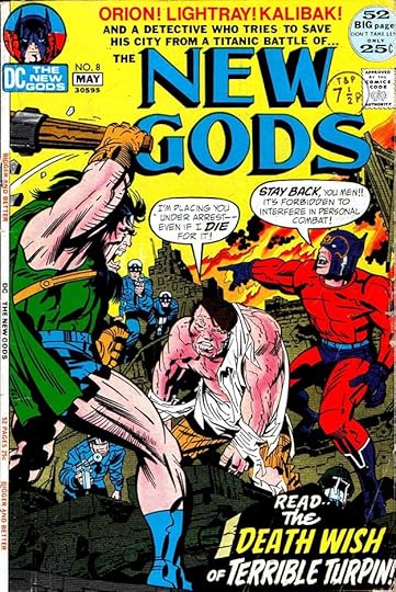
When DC Comics accomplished the recruitment of Marvel Comics’ top artist, Jack Kirby, they were giddy with excitement, crowing “KIRBY’S HERE!” on early covers and house ads. The initial deal was for Jack to edit, write and draw four titles, and this one was the center of his Fourth World saga. As with other DC Kirby titles, the covers had a mixture of type and Gaspar Saladino lettering, he did the two captions at the bottom of this one, though the word READ is probably type. The logo was developed by Jack, who found an advertisement with letters he liked, which he cut up and pasted together. Gaspar did his version based on that. Kirby did eleven issues in 1971-72 that sold well at first, but perhaps it was not the blockbuster DC was hoping for. The book was revived by others for eight more issues in 1977-78, and as with all the Kirby DC creations, continued in new popular series later. Saladino did cover lettering for many issues of the first several series, and lettered just one inside story.
 From THE NEW GODS #2, April-May 1971
There’s lots of Saladino lettering on the second issue cover, but also some type. ORION is a larger and wider version of what he did on the first cover with a second outline to make it read better. On both, the notch on the right side of the R is barely there. On the first issue, it’s lowered, as is usual for Gaspar, here it’s centered. There’s headline type in the bottom banner and the caption above it as well as lettering, possibly done by Gaspar on DC’s headline machine.
 From THE NEW GODS #3, June-July 1971
These captions are all lettered by Saladino. I like the rough treatment of DEATH.
 From THE NEW GODS #4, Aug-Sept 1971
The top blurb here is headline type, the rest is Saladino lettering, including the first word balloon on the series covers.
 From THE NEW GODS #6, Dec 1971-Jan 1972
I think this is all Saladino hand lettering except MANHUNTER, which is the font Albertus created in 1932-40 by Berthold Wolpe. Gaspar may have put it into his caption using press-down type, DC usually had a selection of that from Letraset. Another pop culture use was all the signs in the Patrick McGoohan TV show, “The Prisoner.”
 From THE NEW GODS #8, April-May 1972
Generally I don’t think the mix of type and hand lettering on these covers works very well, it often seems mismatched. The type at the top is bland and dull compared to Saladino’s exciting caption at the bottom.
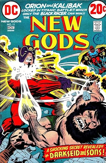 From THE NEW GODS #11, Oct-Nov 1972
The final Kirby issue has only Saladino lettering, which I feel works better. I like the Art Deco approach on the open letters of the bottom caption, though I don’t know if it’s really the right choice for the character.
 From NEW GODS #1, June 1984
In 1984, DC republished the original Kirby issues in a prestige format with new covers and a new final issue from Kirby. Fans were now eager to see it, and Jack was pleased with the project, though it extended into a separate graphic novel, The Hunger Dogs. I did the new logo and Gaspar lettered most of the covers.
 From NEW GODS #2, July 1984
One good thing about these reprints is the much simpler trade dress and cover text. Here Saladino’s work shines in two large blurbs, letting the dynamic art do the rest.
 From NEW GODS #5, Oct 1984
I just love The Bug, both the character and the Saladino lettering for him.
 From NEW GODS #6, Nov 1984
At last! I don’t know if the bottom burst was drawn by Kirby, or by Saladino, but either way it works well around Gaspar’s lettering.
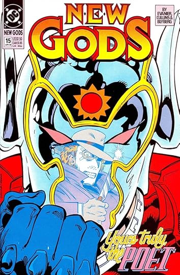 From NEW GODS #15, April 1990
In 1989 DC relaunched the title again without Kirby, and it ran 28 issues to 1991. Gaspar lettered several of the covers beginning with this one. Sadly, his script lettering for YOURS TRULY, THE is held in yellow, and hard to see.
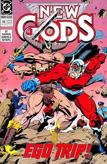 From NEW GODS #16, May 1990
There are small details in this Saladino bottom blurb that delight me: the subtle up and down stagger of the letters, the connection of the TR, and the way the right side of the R overlaps rather than joins like the rest.
 From NEW GODS #23, Feb 1991
Another fine blurb on this cover by Gaspar, making miles of difference between two similar words. Note the unusual and creative shape of the O in the second one.
 From NEW GODS #22, Jan 1991
Saladino’s only story lettering for any of these series was for this issue, a fill-in, as the rest were by others. I love the lower case title, and the scroll caption for the credits.
To sum up, I found Saladino lettering on these covers:
THE NEW GODS (1971): 1-11
NEW GODS (1984): 1-3, 5-6
NEW GODS (1989): 15-17, 19, 23-24
That’s 22 in all. The inside story above was 24 pages. Other articles in this series and more you might like are on the COMICS CREATION page of my blog.
The post GASPAR SALADINO in NEW GODS appeared first on Todd's Blog.
Todd Klein's Blog

- Todd Klein's profile
- 28 followers

