
Todd Klein's Blog, page 64
June 27, 2022
GASPAR SALADINO in REX THE WONDER DOG
 All images © DC Comics. From REX THE WONDER DOG #43, Jan-Feb 1959
Unlike some comics publishers such as Dell, DC rarely title featured animals unless they were cartoon-inspired funny animals, but Rex was an exception. Writer Robert Kanigher made the stories exciting, setting them in different time periods and many locations around the world, even in the past and outer space. He and editor Julius Schwartz made a minor success of the idea that ran 46 issues from 1952 to 1959. The art initially was by Alex Toth, but Gil Kane soon took over Rex’s stories, and a frequent second feature, Detective Chimp, had art by Carmine Infantino. Gaspar Saladino was friends and work-mates with all those people, and he lettered many of the stories throughout the run. The regular cover letterer was Ira Schnapp, but Gaspar filled in for him on the cover above, his only cover for the series. (There are two others not by Schnapp, but also not by Saladino in my opinion.) Schnapp’s logo is one of his best, and Gaspar’s blurb below it works well. His word balloon shows his typical wide, angular style. THE ADVENTURES OF was always part of the title, but I’m skipping it in this article to save keystrokes.
 From REX THE WONDER DOG #1, Jan-Feb 1952
When the series began, Saladino was still fairly new to comics lettering, having started about two years earlier, but his balloon lettering was always solid and professional. His story titles took a while to reach the same level, but this one is pretty good. Note his style point of open letters against a black shape in the upper captions.
 From REX THE WONDER DOG #3, May-June 1952
The usual lineup for the book was two Rex stories with a second feature between them. This is an early one of those that appeared only once.
 From REX THE WONDER DOG #4, July-Aug 1952
With the fourth issue, this became the regular second feature, a mix of humor and drama with a smart chimp, the pet of a Florida sheriff, who is able to solve mysteries and help capture criminals. Saladino lettered many of his stories, too.
 From REX THE WONDER DOG #5, Sept-Oct 1952
Rex’s life began during World War Two, and some of his adventures take place in that setting, at least in early issues.
 From REX THE WONDER DOG #10, July-Aug 1953
While Rex’s stories were dramatic, Bobo the chimp’s were often played for humor as well.
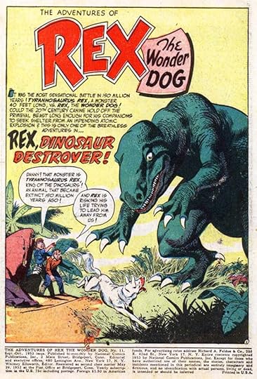 From REX THE WONDER DOG #11, Sept-Oct 1953
It didn’t take long for writer Kanigher to start adding elements that were selling in other comics, like this dinosaur, even if the concept was far-fetched. It’s Rex vs. Rex.
 From REX THE WONDER DOG #16, July-Aug 1954
Once the stories slipped away from reality, any idea was fair game, as seen here. While Rex’s first master in WW2 was Major Dennis, later he was most often with that man’s son Danny on his adventures.
 From REX THE WONDER DOG #20, March-April 1955
Sound effects were not often a main story feature in this book, but when they were, Gaspar did fine ones.
 From REX THE WONDER DOG #23, Sept-Oct 1955
On Detective Chimp, Infantino’s version of Bobo became increasingly stylized and cartoony, and in the first panel here he even talks to the readers.
 From REX THE WONDER DOG #34, July-Aug 1957
By this time, with a few more years of experience, Saladino’s story titles had greatly improved. The crocodile texture here is impressive.
 From REX THE WONDER DOG #41, Sept-Oct 1958
Another place where sound effects by Saladino add to the drama.
 From REX THE WONDER DOG #46, Sept-Oct 1959
By the final issue, Kanigher was trying science fiction ideas to help sell the book, but it wasn’t enough to keep it going. Still, there can’t be many comics featuring a “real life” animal that lasted as long.
To sum up, in addition to the cover of issue #43, here are the details of Saladino’s story lettering. All stories feature Rex unless otherwise noted.
#1 Jan-Feb 1952: 8pp, 8pp, 8pp
#2 March-April 1952: 10pp, 6pp, 8pp
#3 May-June 1952: 8pp, Winged Fury 8pp, 8pp
#4 July-Aug 1952: 8pp, Detective Chimp (DC) 8pp, 8pp
#5 Sept-Oct 1952: 10pp, Leapin’ Lena 6pp, 8pp
#6 Nov-Dec 1952: 10pp, DC 6pp, 8pp
#7 Jan-Feb 1953: 10pp, 8pp
#8 March-April 1953: 10pp, DC 6pp, 8pp
#9 May-June 1953: 10pp, DC 6pp, 8pp
#10 July-Aug 1953: 8pp, DC 6pp, 8pp
#11 Sept-Oct 1953: 10pp, 8pp
#12 Nov-Dec 1953: 10pp, DC 6pp, 8pp
#13 Jan-Feb 1954: 10pp, 8pp
#14 March-April 1954: 10pp, 8pp
#15 May-June 1954: 10pp, DC 6pp, 8pp
#16 July-Aug 1954: 8pp, DC 6pp, 8pp
#17 Sept-Oct 1954: 10pp, DC 6pp, 8pp
#18 Nov-Dec 1954: 10pp, DC 6pp, 8pp
#19 Jan-Feb 1955: 8pp, DC 6pp, 8pp
#20 March-April 1955: 10pp, DC 6pp, 8pp
#21 May-June 1955: 10pp, DC 6pp, 8pp
#22 July-Aug 1955: 10pp, DC 6pp, 8pp
#23 Sept-Oct 1955: 10pp, DC 6pp, 8pp
#24 Nov-Dec 1955: 10pp, DC 6pp, 8pp
#25 Jan-Feb 1956: 10pp, DC 6pp, 8pp
#26 March-April 1956: 10pp, 8pp
#27 May-June 1956: 10pp, DC 6pp, 8pp
#28 July-Aug 1956: 10pp, DC 6pp, 8pp
#29 Sept-Oct 1956: 8pp, DC 6pp, 8pp
#30 Nov-Dec 1956: 10pp, 8pp,
#31 Jan-Feb 1957: 10pp, DC 6pp, 8pp
#32 March-April 1957: 10pp, DC 6pp, 8pp
#33 May-June 1957: 10pp, 8pp
#34 July-Aug 1957: 10pp, 8pp
#35 Sept-Oct 1957: 10pp, 8pp
#37 Jan-Feb 1958: 10pp (1)
#38 March-April 1958: 10pp, DC 6pp, 8pp
#39 May-June 1958: 10pp, DC 6pp
#40 July-Aug 1958: 10pp, DC 6pp
#41 Sept-Oct 1958: 10pp (1)
#42 Nov-Dec 1958: 11pp, 8pp
#43 Jan-Feb 1959: 11pp (1)
#44 March-April 1959: 10pp, DC 6pp, 9pp
#45 May-June 1959: 10pp, 10pp
#46 Sept-Oct 1959: 10pp, DC 7pp, 8pp
That’s a total of 954 pages. More articles in this series and others you might enjoy are on the COMICS CREATION page of my blog.
The post GASPAR SALADINO in REX THE WONDER DOG appeared first on Todd's Blog.


June 26, 2022
Rereading: THE WOLVES OF WILLOUGHBY CHASE by Joan Aiken
 Cover art by Edward Gorey
This is the first of a 13 book series by Aiken known as the Wolves Chronicles. In some ways it differs from most of them in that the main characters are two upper class children who fall on hard times in a Dickensian way, while other books in the series generally features lower class children as the main characters.
Sylvia lives with her frail and elderly Aunt Jane in London, but that loving woman is finding it hard to manage for both of them, so when Sir Willoughby, Sylvia’s uncle, writes offering to take in the girl as a companion for his own daughter Bonnie in their country estate of Willoughby Chase, Aunt Jane and Sylvia accept the offer. Soon Sylvia is on a train heading north into wintery hills where wolf packs are a constant danger, and one even attacks the train. Arriving at the estate, Sylvia and Bonnie are soon fast friends, but their new governess Miss Slighcarp proves to be a cold-hearted, stern taskmaster that the girls hate. Unfortunately, Bonnie’s parents have been advised by Lady Green’s doctor to take a sea voyage to a warmer climate for her health, and Miss Slighcarp is to take charge of the estate while they’re gone.
Before long Sylvia and Bonnie realize that Miss Slighcarp has a wicked plan, helped by nasty friends, to take over the estate in her own name. The girls meet a boy, Simon, who lives in the estate woods raising geese, and he helps them when he can, but before long the girls are sent off to a horrible school in a nearby town, really more of a workhouse and prison, run by one of Miss Slighcarp’s friends. How can they ever recover what they’ve lost and set things right?
A fun read full of exciting events and appealing characters, set in early 1800s England, and full of interesting period social history (though perhaps some is alternate history) as well as down to earth adventure. Recommended.
The Wolves of Willoughby Chase by Joan Aiken
The post Rereading: THE WOLVES OF WILLOUGHBY CHASE by Joan Aiken appeared first on Todd's Blog.
June 24, 2022
GASPAR SALADINO in SUPERMAN (1939)
 All images © DC Comics. From SUPERMAN #76, May-June 1952
Here we go with one of the most important DC Comics series. I’m dating this post 1939 for the original run of 423 issues because there will be another for the 1987 revamp. The letterer most associated with Superman’s first few decades is Ira Schnapp, and he lettered many Superman stories and covers until 1968, but when he was unavailable, Gaspar Saladino occasionally filled in for him, and that happened on the cover above. This is very early for Saladino cover lettering, and it may be his first. Despite the fact that he’d been lettering stories at DC since late 1949, Gaspar was not used to doing covers, and made a rookie mistake on this one by underlining the emphasized words in the balloons. It may have been in the script that way, but in comics scripts, underlining is one way to indicate bold italic display lettering, and that’s what he should have done. In general the lettering is trying to imitate Ira Schnapp’s cover work, but Gaspar’s lettering is more angular and often wider than Ira’s. I don’t know what the editor thought, but his next cover lettering on this title was about 14 years later! When Schnapp retired, Saladino became the regular cover letterer for many years, and he also occasionally lettered stories and inside pages, but was never a regular. I’ll look at covers first.
 From SUPERMAN #182, Jan 1966
When next asked to fill in for Schnapp, Gaspar’s cover lettering had improved greatly, and was now full of energy and appealing styles he had developed. The balloon shapes are a nod to Schnapp, but otherwise this is all Saladino’s style, angular and artful.
 From SUPERMAN #188, July 1966
Editor Mort Weisinger’s opinion of Saladino’s cover lettering must have improved, as from this point on he was asked to do more and more of the covers, even though Schnapp was still doing some of them. Aside from the boot over the banner at the bottom, which I always find weird, this is all good work, adding to the drama, and showing why Gaspar was the successor to Ira Schnapp on covers. If anything, Saladino’s display lettering had more energy and drama than Schnapp’s in my opinion.
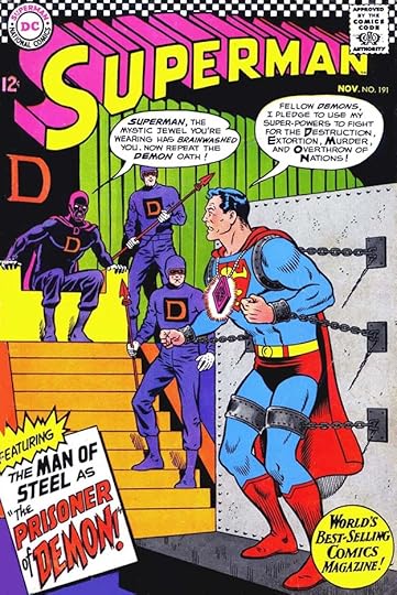 From SUPERMAN #191, Nov 1966
The round blurb at bottom right is by Schnapp, continuing from earlier covers, but the rest is by Gaspar. His caption is bold and intriguing.
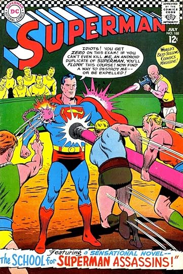
 From SUPERMAN #198, July 1967
The ideas in these comics were old, recycled, and tired, but Gaspar’s strong lettering makes them interesting anyway.
 From SUPERMAN #204, Feb 1968
Though Ira Schnapp’s lettering made one final appearance on the next cover, I feel this is the beginning of Gaspar’s best work on the covers, under a mandate from Editorial Director Carmine Infantino to give DC’s style a more modern and exciting look. With artist Neal Adams, you can see a fresh approach taking hold. I’m not sure who did the giant LL, it could have been either of them, but my guess is pencils by Adams, inks by Saladino. The blurb lettering jumps out and grabs you.
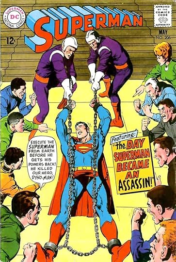 From SUPERMAN #206, May 1968
Not every cover had room for such large lettering, of course, but Saladino’s work was always full of energy.
 From SUPERMAN #207, June-July 1968
DC, and especially Weisinger, tended to look back rather than forward, often featuring reprints, as here. Mort thought that was the best way to celebrate an anniversary, instead of creating exciting new stories. Lots of fine Saladino lettering here.
 From SUPERMAN #211, Nov 1968
I like the way the bottom blurb follows the curve and perspective of the floor, and Saladino’s version of SUPERMAN is modern and creative.
 From SUPERMAN #213, Jan 1969
Another trend I think may have hurt sales was the tendency then at DC to show the hero defeated, in distress, or even dead, as here. The lettering is the best thing on this cover in my opinion.
 From SUPERMAN #220, Oct 1969
This is a much more interesting cover idea, and one I would have picked up to read.
 From SUPERMAN #228, July 1970
More defeat and punishment for Superman.
 From SUPERMAN #233, Jan 1971
Finally, with this issue, and under new editor Julius Schwartz, Superman gets to be heroic again. We’re also promised NEW adventures by Gaspar’s lettering, and the end of that tired story gimmick, Kryptonite. Yay!
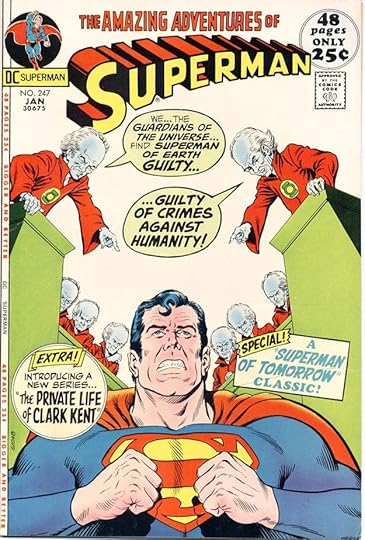 From SUPERMAN #247, Jan 1972
Well, here’s our hero in duress again, but at least the accusers are more interesting! Note also a reprinted story cued by the word “Classic,” to fill out the longer page count, but at least there’s also a new second feature.
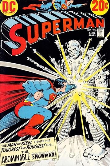 From SUPERMAN #266, Aug 1973
I much prefer to see him in action, and Gaspar’s caption helps sell it.
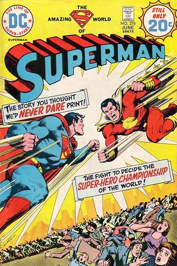 From SUPERMAN #276, June 1974
The trade dress (all the stuff at the top) was often an awkward jumble in this period, but at least the art and lettering are exciting. Long-time readers might remember the character on the right as Captain Marvel, though in this story it’s not him.
 From SUPERMAN #288, June 1975
Here’s something you don’t often see, a character speaking quietly on a cover, with appropriate small balloon lettering except for the last two lines.
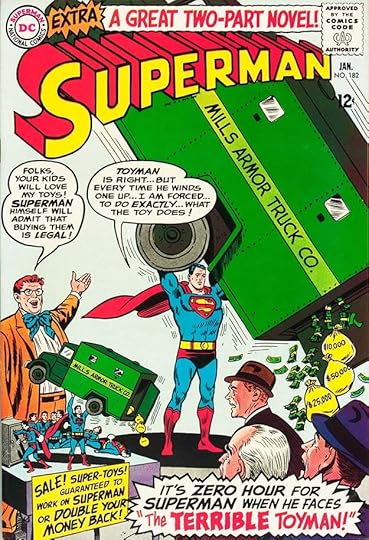
 From SUPERMAN #305, Nov 1976
My favorite thing in this cover lettering is the way the letters TH and TO are joined in THE TOYMAN.
 From SUPERMAN #316, Oct 1977
Not all of Saladino’s efforts were equally great. Here the caption has too much open space, and could have been done with three lines of lettering instead of five. Perhaps it was, and it was rearranged to cover less of the figure.
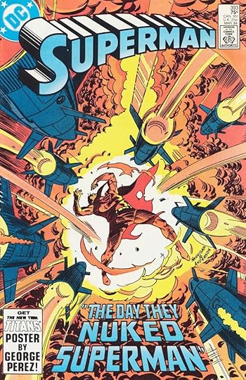
 From SUPERMAN #333, March 1979
On the other hand, the top caption here makes good use of several effective styles that work well together.
 From SUPERMAN #352, Oct 1980
I love all the lettering on this cover. The special balloon style for Destiny is great, as is the inset blurb at right.
 From SUPERMAN #370, April 1982
Four captions, two rectangles, a circle, and an arrow, and they all work fine and add interest.
 From SUPERMAN #393, March 1984
Well-designed perspective block letters add depth to this cover.
 From SUPERMAN #423, Sept 1986
And then, 34 years after his first Superman cover lettering, Saladino does a wonderful job on the final issue of this run, as the title and character made way for a revamp and new series. This cover is a nod to the early Superman annuals, and Gaspar’s lettering is a nod to the work of Ira Schnapp on them.
 From SUPERMAN #278, Aug 1974
Saladino did not letter a story in this series until this one, for Julie Schwartz, the man who hired him in 1949. This faux western has display and title lettering that remind me of the work of Sam Rosen at Marvel.
 From SUPERMAN #284, Feb 1975
On this issue Gaspar did only the contents page. I don’t know if he was paid extra for all that work, but he should have been.
 From SUPERMAN #312, June 1977
Here’s another long story with a fine perspective title. Letterers were about to start getting credit along with the other creators in a few months.
 From SUPERMAN ANNUAL #9, Sept 1983
I think I lettered the top blurb here, but the story lettering is all by Saladino, paired with his old work mate and friend Alex Toth. Some of the earliest work Gaspar did for DC was on Toth stories in westerns and science fiction comics.
 From SUPERMAN #400, Oct 1984
This issue was another commemorative one, but this time with all new material by top creators. Gaspar lettered several sections of the multi-part story. Lots of year dates for him to do on this page.
 From SUPERMAN #409, July 1985
Toward the end of the series, Gaspar found time to letter several longer stories, including this one. The title is excellent, and I also like the open YOU? in the caption.
To sum up, these covers have Saladino lettering: 76, 182, 188, 191, 198, 203-204, 206-239, 241, 247-251, 253-266, 268-288, 291-292, 294-296, 298, 302, 304-307, 314, 316-318, 324-326, 330, 333-335, 341, 346-348, 350, 352-354, 356-372, 374-376, 378-385, 387-390, 392-393, 395-399, 401-410, 412-417, 419-421, 423. That’s a total of 164.
Below are the inside pages lettered by Gaspar. All stories feature Superman unless otherwise noted.
#278 Aug 1974: 20pp
#284 Feb 1975: Contents 1pp
#312 June 1977: 17pp
#400 Oct 1984: 13pp (1-4, 31-33, 35-40)
#406 April 1985: 16pp
#409 July 1985: 16pp
#410 Aug 1985: 24pp
#420 June 1986: 24pp
Annual #9 Sept 1983: 30pp
That’s 161 pages in all. The numbering of this series was continued with the title THE ADVENTURES OF SUPERMAN, which I will cover in another article. More in this series, and others you might like are on the COMICS CREATION page of my blog.
The post GASPAR SALADINO in SUPERMAN (1939) appeared first on Todd's Blog.
June 23, 2022
GASPAR SALADINO in SUPERGIRL
 All images © DC Comics. From SUPERGIRL #1, Nov 1972
While Supergirl was a popular character with long runs in ACTION COMICS, SUPERMAN FAMILY, and ADVENTURE COMICS, she wasn’t able to sustain her own monthly series for very long until the 1990s. The first one ran just ten issues, and Gaspar Saladino lettered all but one of the covers. Above, the top line is partly headline type, but Gaspar did the rest. I always liked his arrow captions.
 From SUPERGIRL #3, Feb 1973
Who could resist this charming art and emotional cover? Lots of male readers, apparently. Zatanna, another female hero, was paired with Supergirl as a backup.
 From SUPERGIRL #4, March 1973
The robot’s balloon style is a subtle variation, but effective, and I like the matching captions.
 From SUPERGIRL #6, June 1973
Perhaps one problem was the attempt to blur the line between romance and heroics, as in this idea perhaps suggested by “West Side Story.” Just to clarify things, Gaspar had to label the “Gang Lords’ Clubhouse.”
 From SUPERGIRL #7, Oct 1973
I bet male readers were more comfortable with this more standard heroic approach. Gaspar’s caption is stylish and creative.
 From SUPERGIRL #10, Sept-Oct 1974
There was a long gap between the final issue, above, and the one before it. Prez’s short-lived comic had also ended a few months earlier. There’s a lot of air in the word balloons, suggesting something was changed after Saladino lettered them.
 From SUPERGIRL #14, Dec 1983
In 1982, a new Supergirl series launched titled THE DARING NEW ADVENTURES OF SUPERGIRL, which I’ve already covered. Here the title had changed to just SUPERGIRL, with a logo inspired by her solo film debut, which was not a hit. That might be one reason why the series ended with issue #23, which is still a pretty good run. Gaspar’s blurb adds depth and excitement.
 From SUPERGIRL #16, Feb 1984
Gaspar was always ready for humor, and Ambush Bug was the perfect time for it.
 From SUPERGIRL #17, March 1984
The impact of the car on this cover is enhanced by the impact of Gaspar’s powerful display lettering in the balloons.
 From SUPERGIRL #21, July 1984
Saladino’s captions on this cover are a bit small, but the art left little room. I don’t think the texture in HALF works very well, but it’s still readable.
 From SUPERGIRL #23, Sept 1984
The final issue of this run has great display lettering by Saladino, but it was not enough to save it. The character would soon become a casualty of CRISIS ON INFINITE EARTHS, too.
 From SUPERGIRL ANNUAL #1, June 1996
A more successful Supergirl series ran from 1996 to 2003. Saladino didn’t letter any of the covers, but he did all three stories in this first Annual, a total of 38 pages.
To sum up the covers, these had Saladino lettering:
SUPERGIRL (1972): 1-4, 6-10
SUPERGIRL (1983): 14, 16-18, 20-23
That’s 17 in all. More articles in this series and others you might enjoy are on the COMICS CREATION page of my blog.
The post GASPAR SALADINO in SUPERGIRL appeared first on Todd's Blog.
June 22, 2022
GASPAR SALADINO in SUPER FRIENDS
 All images © DC Comics. From SUPER FRIENDS #15, Dec 1978
Super Friends was a Hanna-Barbera cartoon series based on DC’s Justice League of America comics, but more cartoony and aimed at a younger audience, that ran from 1973 to 1986. DC’s comic book version had a good run of 47 issues from 1976 to 1981. Some early issues had cover lettering by Joe Letterese and others, but beginning with the issue above, Gaspar Saladino lettered many of them. If anything, the job was simpler than the average DC cover, but Saladino always did his best.
 From SUPER FRIENDS #16, Jan 1979
As with the JLA, many characters meant less room for lettering sometimes, but Gaspar knew how to fit things in.
 From SUPER FRIENDS #18, March 1979
In a way it was a chance to hone DC ideas down to their essence and make them clear to young readers, as here. Superman is the most powerful DC hero, so if even he can’t escape the Time Trapper, that villain is someone powerful indeed.
 From SUPER FRIENDS #20, May 1979
The other job for Saladino was to sell silly ideas with exciting captions like the one here, and no one did that better.
 From SUPER FRIENDS #27, Dec 1979
Another silly idea made more intriguing by the argument between two heroes, well lettered by Saladino.
 From SUPER FRIENDS #32, May 1980
How to make The Scarecrow believably scary without giving young readers nightmares was the task here, so Gaspar’s lettering is just a little scary.
 From SUPER FRIENDS #38, Nov 1980
The bottom banner touts a new backup feature. Saladino’s EXTRA! helps make it important.
 From SUPER FRIENDS #42, March 1981
The bottom banner on this cover is equally appealing.
 From SUPER FRIENDS #43, April 1981
But the Plastic Man blurb on this cover is the best of all, surrounded by the stretchy guy himself, probably pencilled and inked by the artists, but still great.
 From SUPER FRIENDS #46, July 1981
Sales must have been dropping, and the series ran out of steam, but Gaspar’s work always made it better.
To sum up, I found Saladino lettering on these covers: 15-18, 20-22, 27, 32, 37-38, 41-43, 46. That’s 15 in all. More articles in this series and others you might like are on the COMICS CREATION page of my blog.
The post GASPAR SALADINO in SUPER FRIENDS appeared first on Todd's Blog.
June 21, 2022
GASPAR SALADINO in SUPER DC GIANT
 All images © DC Comics, from SUPER DC GIANT #14, Sept-Oct 1970
This title was one of many efforts by DC Comics to reuse stories from their vast and varied past, in other words, a reprint title with no set theme. For readers new to the stories, it was a bargain. For some reason they began with issue #13, and at first issues were put out three at a time. Gaspar Saladino had lettering on most of the covers, though on some it was minor and type was also used. I’m beginning with this issue because I like Saladino’s story titles along the left side. He also did the logo, though TOP GUNS closely follows an Ira Schnapp one.
 From SUPER DC GIANT #15, Sept-Oct 1970
More fine story titles by Saladino here, and good variety too. This logo is an old one by Schnapp.
 From SUPER DC GIANT #16, Sept-Oct 1970
Lots more fine Gaspar lettering on this cover, except for the original Ira Schnapp caption on the upper BRAVE & BOLD cover reprint. The lower one seems to have been relettered by Saladino perhaps because it was too small to read otherwise.
 From SUPER DC GIANT #19, Oct-Nov 1970
Jerry Lewis’s title was the longest running and most successful of DC’s many Hollywood humor comics, and Gaspar had fun with all the lettering on this one, except for Jerry’s balloon at center right, which is by Schnapp from the reprint. The balloon on the poster at left is cleverly put in perspective as if the paper is curved.
 From SUPER DC GIANT #20, Oct-Nov 1970
DC’s “mystery” titles were right up Gaspar’s alley, and his logo is used on this one, which includes more of his story title and balloon lettering.
 From SUPER DC GIANT #24, May-June 1971
This is my favorite of the lot, I love the large display lettering at the bottom, and the rest is fine too. Also a Saladino logo.
 From SUPER DC GIANT #27, Summer 1971
The final issue has a unique Saladino logo and he lettered the captions, though they didn’t reproduce so well reversed and held in yellow on a red background. The middle right caption seems to be missing a first line.
To sum up, Saladino did cover lettering for issues 13-24 and 27, a total of 13. Other articles in this series and more you might like are on the COMICS CREATION page of my blog.
The post GASPAR SALADINO in SUPER DC GIANT appeared first on Todd's Blog.
June 20, 2022
GASPAR SALADINO in SUPERBOY
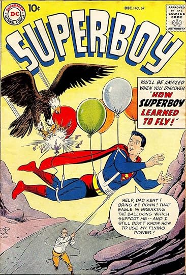 All images © DC Comics. From SUPERBOY #69, Dec 1958
Superboy, the adventures of Superman as a boy in rural Smallville, first appeared in MORE FUN COMICS #101 in 1945, and had a popular run as the lead feature there. In 1949 his own title began, and it ran to 1977. Later relaunches continued regularly. Gaspar Saladino was never a story letterer for the feature or solo book, and only lettered a few individual pages that appeared inside, but he did letter many of the covers after regular cover letterer Ira Schnapp left the company in 1968, and he also did two fill-ins for Ira before that, the first is above. Gaspar’s balloon lettering is generally wider and more angular than Schnapps, his letter S is a good example, having a wide, straight center stroke with curves above and below. His display lettering in the caption is also more angular than Ira’s, and not yet as good, as it took him a while to find his footing on cover lettering.
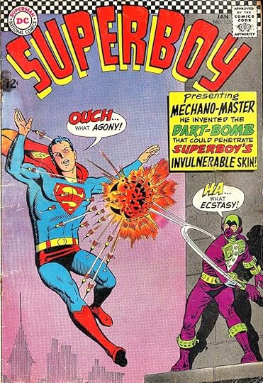 From SUPERBOY #135, Jan 1967
This second fill-in cover is better, but the caption is still a bit stiff and not laid out well. He would improve soon.
 From SUPERBOY #146, April 1968
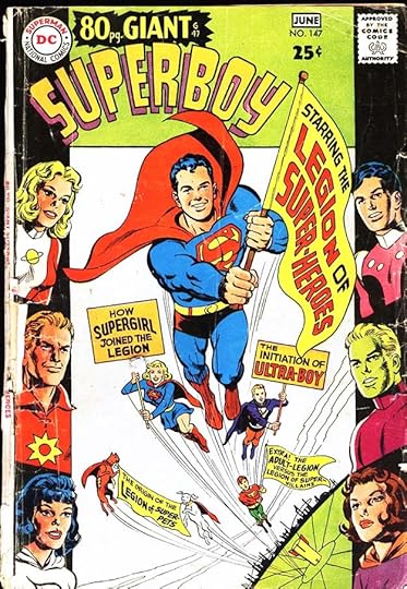
With this issue, Gaspar became the regular cover letterer, as was the case with the entire DC line, replacing Ira Schnapp, who had been retired. No longer trying to fit into the Schnapp style, Gaspar’s work is fresh, diverse, and exciting as he rose to the mandate given to him by Editorial Director Carmine Infantino to give the company’s design presence a more modern look.
 From SUPERBOY #147, May 1968
This all-reprint issue shows the direction the title was going, with the Legion of Super-Heroes gradually taking over, but not for a while yet. Saladino does a good job fitting his lettering into the wavy banners.
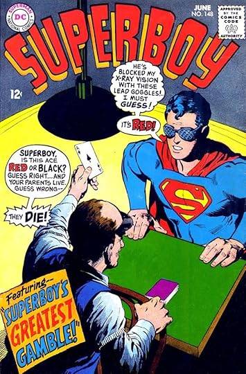 From SUPERBOY #148, June 1968
Superboy’s Smallville adventures seemed small time compared to those of the adult Superman, and writers struggled to interest readers with ideas like this. Cover lettering was usually done on separate art paper, then photostats were made, cut out, and pasted on the finished cover art along with the trade dress, the logo and everything else at the top. On this cover, the production person doing that did a poor job. The balloons on the left from the card dealer should be read first, and therefore those balloons should be at least as high as Superboy’s. Also, there’s no tail to the dealer.
 From SUPERBOY #150, Sept 1968
There was also a tendency to have heroes on DC covers seem helpless or defeated, a theme I think may have hurt sales, and a poor comparison to many Marvel Comics covers. Even great art by Neal Adams was not always able to help.
 From SUPERBOY #153, Jan 1969
Gaspar did his best to add to the drama with exciting lettering, as here, with perspective adding depth.
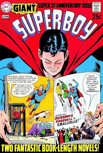 From SUPERBOY #156, May-June 1969
On this reprint cover, some of Ira Schnapp’s original lettering is retained, while the balloons and top and bottom blurbs are by Gaspar. Note that the best way the editor could think of to celebrate the title’s 20th Anniversary was with reprints.
 From SUPERBOY #162, Jan 1970
Often the book kept returning to the same tired themes and ideas, as editor Mort Weisinger neared retirement and seemed to have no new thoughts.
 From SUPERBOY #165, May-June 1970
More reprints and recycled ideas here, but lots of lettering for Saladino, and he makes it all seem exciting.
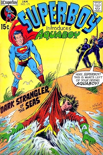 From SUPERBOY #171, Jan 1971
With Weisinger gone, SUPERBOY was able to explore new ideas and interact with other DC characters more often, as here. Gaspar’s character logo starts with Ira Schnapp’s Aquaman logo, but adds his own flair.
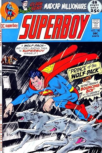 From SUPERBOY #180, Dec 1981
A new Saladino logo was introduced by the time of this cover. I don’t like it as much as Schnapp’s original version, but it does have a more modern look, and Gaspar’s lettering is dynamic and effective.
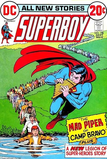 From SUPERBOY #190, Sept 1972
Writers and artists continued to try off-beat ideas to attract readers, but the real draw is mentioned in the last caption on this cover.
 From SUPERBOY #197, Sept 1973
Here’s the beginning of the Legion moving into cover status on the book, and fans found more to enjoy in their future adventures with Superboy than they had in his Smallville stories.
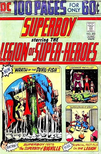 From SUPERBOY #202, May-June 1974
This issue is again mostly reprints, but now the Legion gets equal billing with Superboy. The resulting Saladino logo is too long and awkwardly designed, one of my least favorite ones by him, but fans got the message.
 From SUPERBOY #216, April 1976
In general the trade dress in the early to mid 1970s was my least favorite in DC history, often awkward and too large, as here. The best thing on this cover is the charming blurb at bottom right by Saladino.
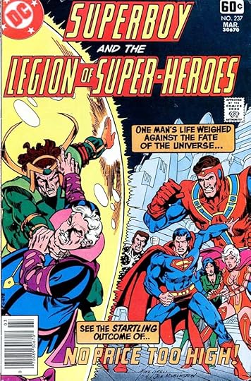 From SUPERBOY AND THE LEGION OF SUPER-HEROES #237, March 1978
By this time the book’s title in the indicia had changed to include the Legion, and the trade dress was simpler and better, but that logo was still a problem. Fans cared not, they loved the book, and Gaspar’s captions add to the drama.
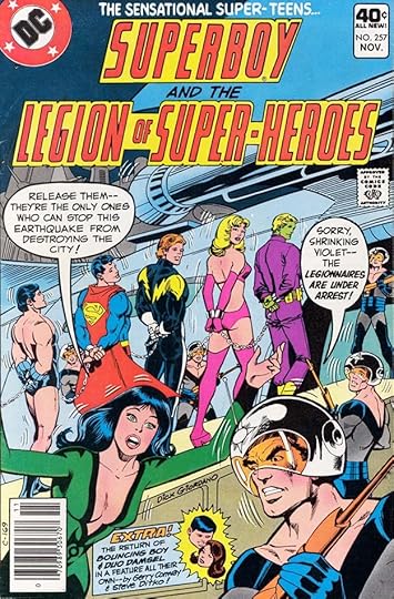 From SUPERBOY AND THE LEGION OF SUPER-HEROES #257, Nov 1979
This run of SUPERBOY was about to end. Superboy left the Legion for a while to star in his own title, and this one continued under the name LEGION OF SUPER-HEROES, which I’ve already covered HERE. I’ve also covered the next Superboy title, THE NEW ADVENTURES OF SUPERBOY.
 From SUPERBOY SPECTACULAR #1, 1980
This one-shot was commissioned by a school system and then became DC’s first experiment with doing books just for the direct market comics shops. Lots of fine Saladino lettering down the left side and at the top. Interesting that they went with the Schnapp logo, perhaps to appeal to older fans.
 From SUPERBOY #6, July 1990
In 1990 a new Superboy series began and lasted 22 issues. Gaspar lettered several covers beginning with this one. His stylish script FEATURING is a good clue. I suspect the rest of the blurb was open letters filled in black by the colorist.
 From SUPERBOY #9, Oct 1990
Here Gaspar creates a special rough style for this character that I think works well.
 From SUPERBOY #10, Nov 1990
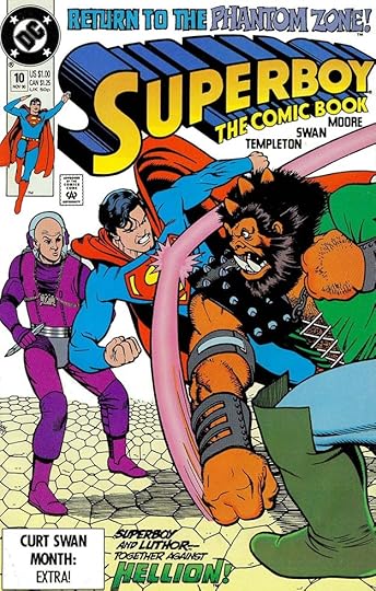
The top and bottom blurbs here are by Saladino, I like the treatment of PHANTOM ZONE, slightly reminiscent of The Twilight Zone.
[image error]From SUPERBOY #12, Jan 1991Gaspar’s CHRISTMAS WISHES blurb is stylish and fits the season.
 From SUPERBOY #13, Feb 1991
All the titles on this newspaper are by Saladino, and he also did the word balloon, but it was flipped to read backwards by the DC production department.
 From SUPERBOY #3, April 1994
Another popular Superboy series ran 102 issues from 1994 to 2002. The cover blurb on this issue is the only one I feel sure is by Saladino. There are a couple of others that might be, but I’m not sure, so I won’t count them. Sadly, cover lettering is almost never credited in comics.
 From SUPERBOY #149, July 1968
I found only three pages of Gaspar’s lettering inside these books. This one is sort of an introduction page to the rest of the story, lettered by someone else, with fine display lettering, some of it in Art Deco style.
 From SUPERBOY #202, May-June 1974
On just this issue, Gaspar did an elaborate title page for a large reprint issue. It was something he did more often for other titles. The variety of styles and sizes makes it so much more interesting than type.
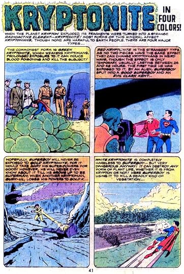 From SUPERBOY SPECTACULAR #1, 1980
For the one-shot, Saladino lettered this single page explaining the colors of Kryptonite, or at least four of them.
To sum up, these covers have Saladino lettering:
SUPERBOY (1949): 69, 135, 146-176, 180-212, 215-217, 219-221, 223-224, 231, 233-235, 237, 239, 250, 257
SUPERBOY SPECTACULAR 1
SUPERBOY (1990): 6, 9-10, 12-13
SUPERBOY (1994): 3
That’s 89 in all. The story pages shown above total three. Other articles in this series and more you might like are on the COMICS CREATION page of my blog.
The post GASPAR SALADINO in SUPERBOY appeared first on Todd's Blog.
June 19, 2022
And Then I Read: THE FIFTH ELEPHANT by Terry Pratchett

Continuing to follow the Night Watch thread of Discworld books, I really liked this one. Samuel Vimes, the head of Ankh-Morpork’s City Watch (their police force) has been assigned an unwelcome duty: to go to the distant and dangerous area known as Überwald as an ambassador representing the city and its home area at the crowning of a new Dwarf King. Fortunately, Vimes will have his high society but no-nonsense wife Sybil with him to help with the actual diplomacy, and he’s also bringing some of his Watch members like the fearsome troll Detritus and the dwarf Cheery. Assisting Vimes is Inigo Skimmer, ostensibly a government official, but he soon proves to have other skills.
Überwald is the mountainous home of many supernatural-based populations of Discworld. In addition to the dwarves, there are vampires, werewolves and trolls among others. Vimes and his group waste no time finding trouble as their coaches are attacked by bandits along the way. Meanwhile the City Watch werewolf, Angua, has also been called home to the area on family business, and her partner, Carrot, has followed her into different kinds of trouble with real wolves. And once Vimes and company reach the Überwald capital for the ceremony, he finds his troubles are only beginning. The Scone of Stone, needed for the coronation, has been stolen, and his police skills might help if he can stay alive long enough to use them.
A fun read, and it fills in background on some of the City Watch as well as the politics of all those unusual groups. Recommended.
The Fifth Elephant by Terry Pratchett
The post And Then I Read: THE FIFTH ELEPHANT by Terry Pratchett appeared first on Todd's Blog.
June 17, 2022
GASPAR SALADINO in SUICIDE SQUAD
 All images © DC Comics. From SUICIDE SQUAD #3, July 1987
Two versions of the Suicide Squad appeared in the 1960s, one in THE BRAVE AND THE BOLD for six issues, another in STAR SPANGLED WAR STORIES, both created by Robert Kanigher with the artists involved. It was not until 1987 that the concept finally became a monthly series, and a successful one, where DC villains and other outliers were conscripted to take on missions too dangerous for most heroes. Gaspar Saladino lettered some of the covers on the 1987 series, but none of the stories, and he was not involved in any later versions. His first cover, above, has a fine burst at the bottom, and he also did the name on the door.
 From SUICIDE SQUAD #4, Aug 1987
The well designed caption on this cover fills the first line with a wide WHO to match the width of the rest, while the question mark is centered at the bottom, something I wouldn’t have thought of, but it works fine.
 From SUICIDE SQUAD #11, March 1988
Reader interest was gained by including guest heroes from other series. On this bottom blurb, both character logos are by Saladino, but Vixen is an old one reused, I’m not sure about Speedy.
 From SUICIDE SQUAD #16, Aug 1988
Another cover where existing logos are used, while only THE RETURN OF is new lettering by Saladino.
 From SUICIDE SQUAD #19, Nov 1988
Here the lettering on the “photos” is by Gaspar.
 From SUICIDE SQUAD #27, May 1989
The Saladino blurb on this cover is graphic, and shows how comics were changing. In previous decades, DC rarely showed blood as red even in lettering.
 From SUICIDE SQUAD, Jan 1990
This large and effective Saladino blurb has contrasting styles and texture that add interest.
 From SUICIDE SQUAD #50, Feb 1991
Another bottom blurb with effective texture giving the words a sinister meaning to match the image. I also like the burst at upper left.
To sum up, these covers have Saladino lettering: 3-5, 7, 11, 16, 19, 21, 27, 37, 50 and Annual 1. That’s twelve in all. Other articles in this series and more you might like are on the COMICS CREATION page of my blog.
The post GASPAR SALADINO in SUICIDE SQUAD appeared first on Todd's Blog.
June 16, 2022
GASPAR SALADINO in SUGAR AND SPIKE
 All images © DC Comics. From SUGAR AND SPIKE #77, June-July 1968
This humor title by Sheldon Mayer is perhaps the best-loved and most successful thing that pioneer creator did in his long career. Mayer lettered the stories in the beginning, and then Ira Schnapp lettered the stories and covers for many years. When Ira left the company, Gaspar Saladino stepped in to do many of the covers from this point on, though none of the stories. Gaspar is not usually associated with humor, but he did fine work in that genre too, as these covers show. My guess is that Mayer added lettering layouts to his pencils for Gaspar to follow, but Saladino’s work is both charming and full of energy.
 From SUGAR AND SPIKE #78, Aug-Sept 1968
Even on work like this, which is full of rounded letter shapes, Gaspar manages to add excitement.
 From SUGAR AND SPIKE #81, Feb-March 1969
Even with all this busy display lettering (surely written out on the art by Mayer), Gaspar adds his own touches, like the wet raspberry balloon style around the sound effect balloon. Gaspar also created a new perspective version of the logo with telescoping adding depth to the letters.
 From SUGAR AND SPIKE #82, April-May 1969
One thing Saladino did on humor lettering but rarely elsewhere was a differently shaped letter Y with curved upper arms. There are plenty on this cover. His other letters are also more curved and bouncy than what he usually did.
 From SUGAR AND SPIKE #84, Aug-Sept 1969
On this cover, Gaspar has moved away from that more cartoony style to his regular display lettering. The sound effect is by Mayer.
 From SUGAR AND SPIKE #87, Dec 1969-Jan 1970
Gaspar has relettered the top line, TOMORROW’S TEENAGERS here. The book had faithful readers who appreciated the humor, but getting new readers on board may have been tough.
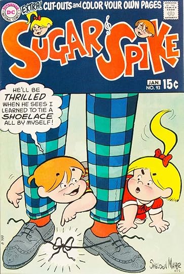 From SUGAR AND SPIKE #93, Dec 1970-Jan 1971
Back to the more rounded, cartoony letters on this cover. The logo on these is by Mayer.
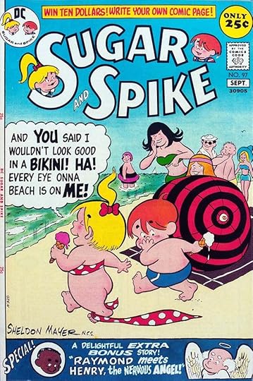 From SUGAR AND SPIKE #97, Aug-Sept 1971
This penultimate issue goes back to an earlier logo by Ira Schnapp. The balloon lettering looks less like Gaspar than usual, so either Mayer inked it or Saladino inked what Mayer pencilled very closely. The top and bottom blurbs are more typical of Gaspar’s work.
 From SUGAR AND SPIKE #98, Oct-Nov 1971
The final issue of the original run returns to an upper and lower case style for Sugar’s balloon that had been the regular style some years earlier, but this one is clearly lettered by Saladino, though Mayer did the sound effects. Mayer continued to produce stories for the overseas market, and one more issue came out in 1992 with a few of those stories.
To sum up, here are the covers with Saladino lettering: 77-78, 81-98. That’s 20 in all. Other articles in this series and more you might enjoy can be found on the COMICS CREATION page of my blog.
The post GASPAR SALADINO in SUGAR AND SPIKE appeared first on Todd's Blog.
Todd Klein's Blog

- Todd Klein's profile
- 28 followers

