
Todd Klein's Blog, page 73
March 16, 2022
GASPAR SALADINO in THE HAWK AND THE DOVE
 All images © DC Comics. From THE HAWK AND THE DOVE #1, Aug-Sept 1968
This team of brother superheroes was created in 1968 by artist Steve Ditko and writer Steve Skeates in response to current political themes of the time pitting pro-war “hawks” against anti-war “doves.” After a SHOWCASE tryout, their title began, but only ran six issues. Ditko and the editors had very different ideas about the role of Dove from Skeates, and Ditko left after the second issue, while Skeates left after the fourth, leaving Gil Kane handling both story and art. Later versions of the team with different players were less ideological and more successful. Saladino did no story lettering for any of their appearances, but he lettered all the covers of the first run, and quite a few of the second, which began in 1988. The first cover, above, has some fine display lettering in thought balloons by Gaspar. Those must have been powerful thoughts!
 From THE HAWK AND THE DOVE #2, Oct-Nov 1968
The second cover has equally effective display lettering, this time in word balloons, a burst from Hawk and a standard balloon from Dove. You can see why Skeates had a problem with Dove’s role, he’s portrayed as the ultimate wimp.
 From THE HAWK AND THE DOVE #3, Dec 1968-Jan 1969
Gil Kane’s cover art at least gives Dove something heroic to do, and I like his wavy balloon shape, as if he’s half out of breath.
 From THE HAWK AND THE DOVE #4, Feb-March 1969
We’re back to wimpy Dove on this cover, and aggressive Hawk. The almost rectangular balloon shapes are something Gaspar was trying on covers at the time. They didn’t last too long, but I like them.
 From THE HAWK AND THE DOVE #5, April-May 1969
With Kane in charge, Dove finally gets angry on this dramatic cover. Saladino’s fine balloons and display lettering are enhanced by holding some parts in red.
 From THE HAWK AND THE DOVE #6, June-July 1969
The final issue has more large balloons, and it’s interesting that none of the issues in this series had any captions. Kane’s art is dramatic, but as was often the case at DC, the heroes are shown failing.
 From HAWK & DOVE #2, Nov 1988
When the concept was revamped in this 1988 miniseries, Dove was more appealing and proactive. Gaspar’s blurb at upper right is somewhat swamped by the color around it, but still works fine.
 From HAWK & DOVE #3, Dec 1988
On the following issue, the lettering is easier to see and even more effective, with a large, textured KILLS.
 From HAWK & DOVE #4, Sept 1989
The miniseries did well and a monthly book soon began that also did well. Twenty years had passed since the original series, and Saladino’s display lettering styles had changed somewhat, but are still effective.
 From HAWK & DOVE #5, Oct 1989
The symmetrical layout at the bottom of this cover is kind of unusual, and Gaspar’s lettering between the two boxes feels constrained by it, but works fine.
[image error]From HAWK & DOVE #12, May 1990Gaspar’s blurb at the bottom of this cover is creative and full of energy. The one at the top uses a logo by someone else, but the words above and below are his.
 From HAWK & DOVE #21, Feb 1991
Gaspar was always ready to use an appropriate style for any situation, and the word LADIES’ here is in handsome script, though the red letters are a bit hard to read.
To sum up, I found Saladino lettering on these covers:
THE HAWK AND THE DOVE (1968): 1-6
HAWK & DOVE MINISERIES (1988): 2-3
HAWK & DOVE (1989): 4-5, 8, 12, 14, 21-22, Annual 1
That’s 16 in all. More articles like this are on the COMICS CREATION page of my blog.
The post GASPAR SALADINO in THE HAWK AND THE DOVE appeared first on Todd's Blog.


March 15, 2022
Incoming: THE SANDMAN BOOK ONE Trade Paperback
 All images © DC Comics. Michael Wm. Kaluta cover
 Barnes & Noble edition, Bilquis Evely & Matheus Lopes cover
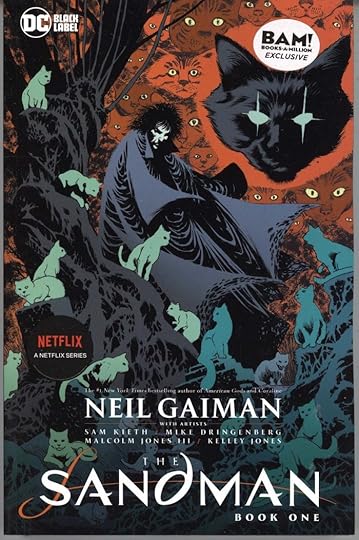 Books-A-Million edition, Kelley Jones & Dave McCaig cover
About 18 months after the release of THE SANDMAN DELUXE EDITION BOOK ONE, DC has begun putting out the same material in trade paperback form. I received three cover variants, as seen above. The paper might be a bit thinner than on the hardcovers, but otherwise I think they’re the same. Scheduled release is for next month. Retail price is $29.99. Check with your comics retailer for the Kaluta cover, check with those bookstores for the others if you’d rather have those. Or use the Amazon link below to order. (I see they have different cover art.)
The post Incoming: THE SANDMAN BOOK ONE Trade Paperback appeared first on Todd's Blog.
GASPAR SALADINO in OTHER G TITLES
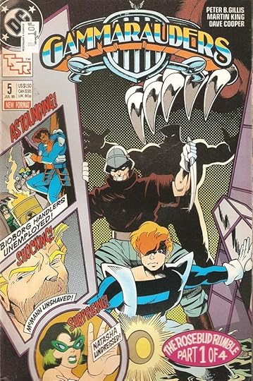
 All images © DC Comics. From GAMMARAUDERS #1, Jan 1989
This article is for DC titles beginning with G that didn’t have enough Gaspar Saladino involvement to warrant a separate article. First up is this title, one of several co-published with TSR featuring their games. Gaspar did the blurb above the logo.
 From GAMMARAUDERS #4, MAY 1989
Another Saladino blurb over the logo is joined by lots of his lettering elsewhere on this cover. That smaller white lettering at lower left is taking a chance against the art, but it reads okay.
 From GAMMARAUDERS #5, July 1989
More lettering here effectively done in perspective to match the art. The four-part story would have the oval chapter blurb on each with just the part number changed.
 From GAMMARAUDERS #10, Dec 1989
I think the western lettering on the poster is type, but Gaspar did fine dry-brush work on DEAD OR ALIVE as well as the top blurb. The series ran just ten issues in 1989.
 From GANG BUSTERS #34, June-July 1953
Going way back to early in his career at DC, Saladino lettered two stories in the crime comic GANG BUSTERS. It was not a regular assignment, he was probably asked to fill in for someone on these.
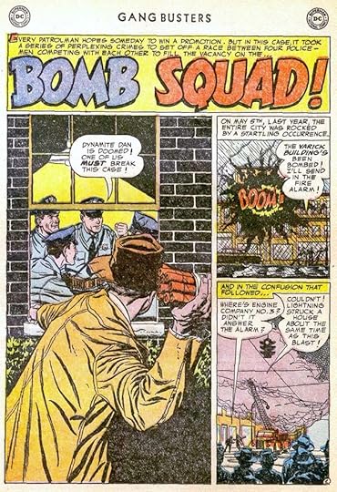 From GANG BUSTERS #43, Dec 1954-Jan 1955
I love the dynamic title on this second one.
 From GREEN ARROW #1, May 1983
Though Green Arrow had been around since the early 1940s and appeared in many titles, surprisingly he did not get his own title until this 1983 miniseries. Gaspar did the logo and the lettering above it.
 From GREEN ARROW #2, June 1983
On the second issue, the artists, the DC production person assembling the cover, and Gaspar had fun putting all the cover elements at odd angles. I like his treatment of VERTIGO in the caption.
 From GREEN ARROW #7, Aug 1988
A later monthly Green Arrow series used mostly type on the covers, but this one issue has a more appealing credits scroll by Saladino.
 From GREEN LANTERN/GREEN ARROW #2, Nov 1983
In 1983 the fan favorite stories featuring these characters by writer Denny O’Neil and artist Neal Adams were reprinted in a high-quality format with new Adams covers. Some reused Saladino lettering from the original covers, but this one has a new round blurb by him. The top blurb was done by me for the first issue.
 From GREEN LANTERN #5, Oct 1990
A new Green Lantern series began in 1990. Gaspar did cover lettering for only this one issue, and it’s large and effective, adding interest to the cover art and intriguing buyers.
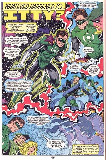 From GREEN LANTERN CORPS QUARTERLY #5, Summer 1993
In the 1990s, the Green Lantern franchise expanded to include this annual-size quarterly anthology. Gaspar lettered one story for it, above. The story title shows his preference for a serif I at the beginning of a name for ITTY, and Itty’s narration is in blob-shaped captions.
To sum up, these covers have Saladino lettering:
GAMMARAUDERS: 1-2, 4-10
GREEN ARROW (1983): 1-2
GREEN ARROW (1988): 7
GREEN LANTERN/GREEN ARROW: 2
GREEN LANTERN (1990): 5
That’s 14 in all.
Below are the stories lettered by Gaspar.
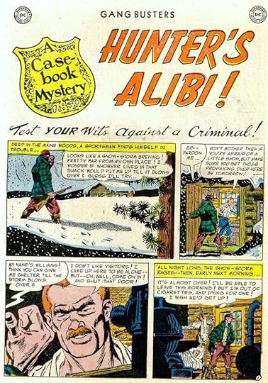
GANG BUSTERS #34 June-July 1953: Casebook Mystery 4pp
GANG BUSTERS #43 Dec-Jan 1954-1955: Bomb Squad 8pp
GREEN LANTERN CORPS QUARTERLY 5 Summer 1993: Whatever Happened to Itty? 8pp
That’s twenty pages in all. Other articles in this series and more you might like are on the COMICS CREATION page of my blog.
The post GASPAR SALADINO in OTHER G TITLES appeared first on Todd's Blog.
March 14, 2022
GASPAR SALADINO in GREEN LANTERN (1960)
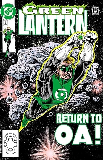
 All images © DC Comics. From GREEN LANTERN #30, July 1964
DC Comics editor Julius Schwartz had great success with his revamp of the Golden Age Flash, his new version was a hit, and he was given permission by management to try others. Green Lantern was the second, and was equally successful. Writers Gardner Fox and John Broome, and artist Gil Kane breathed fresh air into the concept of a man with a power ring that could do almost anything the owner’s will power could devise, and Gil’s new costume design was just as innovative as Carmine Infantino’s costume for the new Flash had been. As with The Flash, Schwartz enlisted his favorite letterer, Gaspar Saladino, to be the main story letterer, and Gaspar has said Gil Kane was one of his favorite artists, so they made an effective team, and Saladino hardly missed a story in the first few years of the series. More about that later, I’ll start with covers. Ira Schnapp was the main DC cover letterer, and continued in that role until around 1967, but when Ira wasn’t available, Gaspar often filled in for him, as happened with the cover above. For these fill-in covers, Gaspar tried to fit in with the established Schnapp style, and that’s particularly true in the caption, but Gaspar’s block letters are more square than most of Ira’s. Saladino’s balloon lettering was wider and more angular than Schnapp’s, too.
 From GREEN LANTERN #38, July 1965
The speech balloon on this fill-in cover is again Gaspar trying to copy Ira’s style, the scalloped balloon border is not something he usually did to this degree, and even the letters inside are narrower than usual for him, but the caption is all Saladino with a variety of angular styles and a partial burst at the top.
 From GREEN LANTERN #46, July 1966
This cover has lettering by both Schnapp and Saladino. The round blurb at the bottom is by Ira, perhaps added at the last minute, and the jagged caption is by Saladino, who often did his own version of a character’s logo in his cover lettering, as he did here.
 From GREEN LANTERN #54, July 1967
On this final fill-in cover, Gaspar’s lettering is more original and more confident, no longer trying to imitate Schnapp. This may indicate the beginning of the time when editorial director Carmine Infantino had given Gaspar the mandate of updating DC’s overall design presence, but Schnapp was also still doing a lot of the covers and logos, and Saladino replaced him gradually.
 From GREEN LANTERN #60, April 1968
With this issue, Saladino became the main cover letterer, and did most of them for many years, while Schnapp was retired and sent home. Gaspar had been working alongside Ira since he joined DC in late 1949, so he was more than ready for his new role as the company’s style-setter, and he rose to the occasion with fine work on covers, logos and house ads.
 From GREEN LANTERN #63, Sept 1968
Ira’s logo continued for a while, but Gaspar’s dynamic lettering upped the drama on many covers like this one.
 From GREEN LANTERN #65, Dec 1968
When given room, Saladino’s lettering was large and appropriate to the subject and the art, as here, where his textured letters seem to be rising from the sand. And while cover lettering was usually done on separate paper and then pasted onto the art, in this case it might have been lettered on the cover.
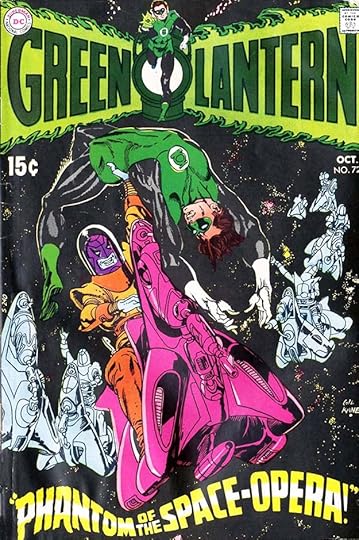 From GREEN LANTERN #72, Oct 1969
With this issue, a new logo by Saladino appeared. The words in perspective add depth to the logo, and the figure by Gil Kane is effective too. The cover lettering deftly fills the space available at the bottom and adds movement and depth to the cover art.
 From GREEN LANTERN #76, April 1970
Just four issues later, the logo was modified by Gaspar to include Green Arrow’s name on the right side, as an award-winning and ground-breaking series of stories by writer Denny O’Neil and artist Neal Adams began. Gaspar’s lettering above the logo and in the balloons is dramatic to match the art.
 From GREEN LANTERN #85, Aug-Sept 1971
These stories took on big issues in a way that may have shocked some readers. Again, Saladino’s lettering helps sell it.
 From GREEN LANTERN #90, Aug-Sept 1976
Despite critical acclaim, the O’Neil-Adams issues did not sell well, and the book was cancelled for a while. It returned with this issue in 1976. Gaspar’s lettering in the top banner and the burst work well to attract buyers.
 From GREEN LANTERN #102, March 1978
The book returned to popularity with less meaningful but fun adventures for the two heroes. The green thought balloons here are an odd choice, and not one made by Saladino.
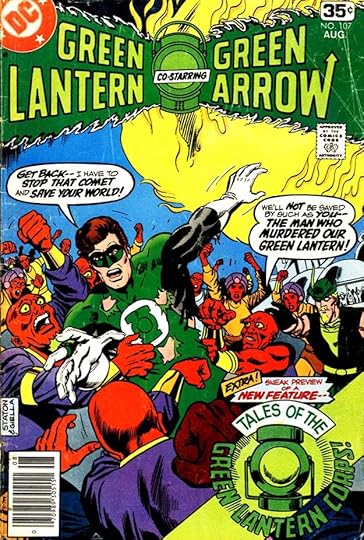 From GREEN LANTERN #107, Aug 1978
Here’s a cover which would make no sense without the explanatory balloons by Gaspar, and he also adds a large promotional blurb for a new backup series.
 From GREEN LANTERN #123, Dec 1979
With this issue, Green Lantern returned to solo adventures while Green Arrow appeared elsewhere. Gaspar’s top lettering and handsome caption add to the fine art by Gil Kane. His logo from issue #72 also returns.
 From GREEN LANTERN #144, Sept 1981
The colorist called for reversed white lettering here on dark blue-black captions, something that was probably done by the color separator, Chemical Color, in Connecticut. In pre-digital times, they handled most of the DC color separations.
 From GREEN LANTERN #150, March 1982
A busy cover and an early attempt to make Hal Jordan a villain, at least briefly. Gaspar’s ever larger words DESTROY at the bottom add to the drama.
 From GREEN LANTERN #155, Aug 1982
I like Saladino’s perspective version of Green Lantern’s oath on this cover, with two kinds of emphasis on the last two lines.
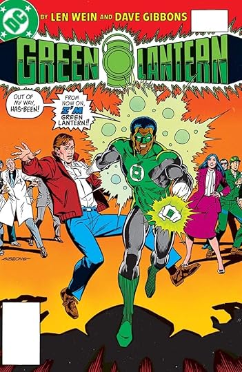
 From GREEN LANTERN #172, Jan 1984
With this issue, Len Wein and Dave Gibbons became the creative team under a new logo version by myself. Gaspar’s bottom caption works well and has some creative letter shapes.
 From GREEN LANTERN #183, Dec 1984
In this issue, John Stewart takes charge, with effective word balloons by Saladino adding emphasis and impact.
 From GREEN LANTERN #196, Jan 1986
Another Green Lantern, Guy Gardner, steps up in this issue with Gaspar’s top line and effectively soft-spoken word balloon adding drama to Howard Chaykin’s art.
 From THE GREEN LANTERN CORPS #206, Nov 1986
With this issue, the title officially changed but kept the same numbering, with a new logo by Alex Jay and exciting display lettering at the top by Saladino.
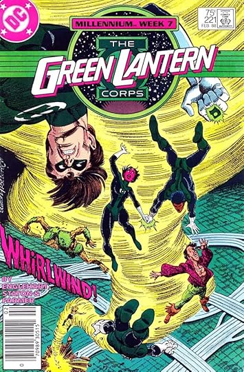 From THE GREEN LANTERN CORPS #221, Feb 1988
The series ended in 1988 with issue #224, and this issue is the last one to have Gaspar’s cover lettering, WHIRLWIND. Many more Green Lantern series and spinoffs would follow.
 From GREEN LANTERN #1, July-Aug 1960
Gaspar’s story lettering began on the initial SHOWCASE issues and continued with the first issue of the new series. I can’t find scans of the actual comics for many early issues, and must use these recolored ones from collected editions, but the lettering looks fine on them. On this title, Saladino was doing all the lettering in italic for a while, and on other projects too at this time, perhaps it made the work go a little faster for him. The story title is effective, with emphasis on DOOMED.
 From GREEN LANTERN #2, Sept-Oct 1960
At the time, most DC stories were still full of lettering on many pages. In the last panel of this page, Gaspar does a bold italic version of Green Lantern’s oath, used when he charged his ring, as explained in the Editor’s Note, where Gaspar snuck in an extra line for the word POWER.
 From GREEN LANTERN #5, March-April 1961
Surprisingly, the scripts did not call for many special styles in this book, though today these thought balloons would be considered one. Gaspar’s captions have wavy, organic edges, and the sound effect is great.
 From GREEN LANTERN #10, Jan 1962
A special style was requested for the voice coming from the ring on this page, and here the colorist has improved it with a green edge.
 From GREEN LANTERN #13, June 1962
When editor Julius Schwartz’s revamps began appearing together, fans loved it, even though the stories became more talky. Note that arrows are necessary to direct the reader to the correct panel reading order, something Gaspar would have added.
 From GREEN LANTERN #26, Jan 1964
Back to comics scans. The logo is by Ira Schnapp, the rest of the lettering is by Saladino. His dry-brush lettering is used for UNMASKS.
 From GREEN LANTERN #36, April 1965
Gaspar was just able to fit in a large background sound effect across two panels of this busy page. Note that the lettering is now a mix of straight and slanted.
 From GREEN LANTERN #40, Oct 1965
The Green Lantern mythology began to expand with this story about the mysterious Guardians. The original Green Lantern blurb at top right is not by Saladino, added by the DC production artist who pasted in the logo. Story credits were now appearing in some Schwartz titles, but just for the writer and artists.
 From GREEN LANTERN #46, July 1966
Here’s the Gil Kane pinup with lettering by Gaspar at the bottom. It filled two pages and is shown sideways, but I will count is as one page.
 From GREEN LANTERN #50, Jan 1967
I love Gaspar’s large title on this story, with more dry brush work on WICKED. In the credits box, there’s an attempt to imitate Marvel’s humorous nicknames for creators.
 From GREEN LANTERN #59, March 1968
This montage page allows Saladino to use arrow captions effectively. This was the last Green Lantern story lettered by Gaspar, who was now very busy doing most of the DC cover lettering, logos and house ads, and had to give up some of his regular story lettering work.
To sum up, I found Saladino lettering on these covers: 30, 38, 46, 54, 60-79, 81-90, 93, 97, 102, 106-108, 110, 114, 117-118, 123, 128, 130, 135, 136-142, 144, 146-162, 164-165, 170, 172-175, 177-183, 185-188, 190-194, 196-199, 202 (THE GREEN LANTERN CORPS) 206-207, 209, 212-216, 218-219, 221. That’s 112 in all.
Below are the stories lettered by Saladino, all feature Green Lantern. Where he lettered only one of two, the story number is in parentheses.
#1 July-Aug 1960: 15pp, 10pp
#2 Sept-Oct 1960: 13pp, 12pp
#3 Nov-Dec 1960: 13pp, 12pp
#4 Jan-Feb 1961: 13pp, 12pp
#5 March-April 1961: 25pp
#7 July-Aug 1961: 16pp, 9pp
#8 Sept-Oct 1961: 25pp
#9 Nov-Dec 1961: 13pp, 12pp
#10 Jan 1962: 15pp, 10pp
#11 March 1962: 16pp, 10pp
#12 April 1962: 18pp, 7pp
#13 June 1962: 26pp
#14 July 1962: 13pp, 12pp
#15 Sept 1962: 18pp, 7pp
#16 Oct 1962: 15pp, 10pp
#17 Dec 1962: 25pp
#18 Jan 1963: 13pp, 12pp
#19 March 1963: 15pp, 10pp
#20 April 1963: 25pp
#21 June 1963: 15pp, 10pp
#22 July 1963: 13pp, 12pp
#23 Sept 1963: 13pp, 12pp
#24 Oct 1963: 15pp, 10pp
#25 Dec 1963: 25pp
#26 Jan 1964: 15pp, 10pp
#27 March 1964: 13pp, 12pp
#28 April 1964: 15pp, 10pp
#29 June 1964: 12pp (2)
#30 July 1964: 13pp, 12pp
#31 Sept 1964: 12pp (2)
#32 Oct 1964: 12pp, 12pp
#33 Dec 1964: 12pp, 12pp
#35 March 1965: 15pp
#36 April 1965: 13pp, 12pp
#37 June 1965: 12pp, 13pp
#38 July 1965: 12pp, 12pp
#39 Sept 1965: 10pp (2)
#40 Oct 1965: 24pp
#41 Dec 1965: 14pp, 10pp
#42 Jan 1966: 24pp
#43 March 1966: 24pp
#44 April 1966: 12pp, 12pp
#45 June 1966: 24pp
#46 July 1966: 12pp, Pinup 1pp, 12pp
#47 Sept 1966: 24pp
#48 Oct 1966: 24pp
#49 Dec 1966: 24pp
#50 Jan 1967: 14pp, 10pp
#51 March 1967: 23pp
#52 April 1967: 23pp
#53 June 1967: 13pp (1)
#54 July 1967: 23pp
#55 Sept 1967: 23pp
#56 Oct 1967: 23pp
#57 Dec 1967: 23pp
#59 March 1968: 23pp
That’s a total of 1,312 pages on this book. More articles in this series and others you might enjoy are on the COMICS CREATION page of my blog.
The post GASPAR SALADINO in GREEN LANTERN (1960) appeared first on Todd's Blog.
March 13, 2022
Incoming: CHIVALRY by Neil Gaiman adapted and illustrated by Colleen Doran

Just arrived is the latest entry in the long-running Neil Gaiman Library from Dark Horse, one of my favorite short stories by Neil adapted and beautifully illustrated in watercolor by Colleen Doran. She also did magnificent calligraphy in the style of Mediaeval manuscripts on some pages. I did the regular comics lettering. Following on the success of Colleen’s adaptation of “Snow, Glass, Apples,” this is another triumph that I enjoyed being a small part of, and the fact that the story is full of gentle humor and British understatement as well as Arthurian legends and high fantasy makes it highly appealing, and a good introduction to Neil and Colleen for young readers, or readers of any age. Masterful! Look for it at your comics retailer, or use the link below.
The post Incoming: CHIVALRY by Neil Gaiman adapted and illustrated by Colleen Doran appeared first on Todd's Blog.
Rereading: THE MONEY MACHINE by Keith Robertson

This is the fourth and final book in Robertson’s “Carson Street Detective Agency” series, published in hardcover in 1969 and in paperback in 1971. It’s the easiest and cheapest to find as a used book, though the entire series is long out of print. The Agency is two teenage boys, Neil Lambert and Swede Larsen, and Carson Street has the loft over Neil’s garage where they have their headquarters in a small west central New Jersey town south of Princeton.
The book begins with a device Neil buys by mail from a magic tricks catalog that gives the appearance that it can print real money from a blank piece of paper. Actually, the real money has to be hidden inside first. Their use of the trick on friends leads to a visit from a Secret Service agent who is investigating a real counterfeiting case in the area. Before long the two boys are deeply involved in helping solve the case, making friends with an old man who used to be an engraver, and staking out the home of a likely suspect with the help of a new friend, Myrtle Cavanaugh, who happens to live next to the stakeout. Myrtle is a stamp collector who helps by spotting another case of counterfeiting, this time some old stamps, and she’s also a quirky songwriter who pens tunes about Neil and Swede. As usual, the boys get into tough fixes, like being trapped in the basement of the stakeout house, and their adventures and the mystery are told with humor and thrilling action.
Think of these books as The Hardy Boys but written with considerably more skill and talent. It’s a shame they haven’t been reprinted (the first book is impossible to find), but if you want to try one, this is the easiest to get. Recommended.
The post Rereading: THE MONEY MACHINE by Keith Robertson appeared first on Todd's Blog.
March 11, 2022
GASPAR SALADINO in GIRLS’ ROMANCES
 All images © DC Comics. From GIRLS’ ROMANCES #102, July 1964
As with other DC romance titles, Gaspar Saladino was involved as a story letterer from the early issues on. His story lettering slacked off in the late 1950s as Ira Schnapp took over most of that work, but Gaspar continued to letter a few stories until the book ended, as well as a series of feature pages that I believe he also did the art for. The series ran 160 issues from 1950 to 1971, and was initially edited by Robert Kanigher, and thereafter by many other editors, some female. Most of the covers were lettered by Ira Schnapp until 1968, when Saladino replaced Ira as the main DC cover letterer, but even before that he sometimes filled in when Ira wasn’t available, as on the cover above. On these fill-in covers, the lettering seems somewhat tentative, as if Gaspar was still finding his way and trying to fit into the Schnapp mold. The balloon shapes on this one are kind of odd, and not typical of Gaspar’s work, as if he’s trying to do them like Ira.
 From GIRLS’ ROMANCES #114, Jan 1966
On the second fill-in cover, he seems to be trying less to mimic Schnapp, and is going more toward his own styles. The wavy brushed borders of the top banner are interesting.
 From GIRLS’ ROMANCES #126, July 1967
This third fill-in cover has more confident lettering by Saladino, and looks better than the first two to me. DC’s Editorial Director Carmine Infantino had given Gaspar the task of updating the company’s design look, and I think this is a good example, even though Schnapp was still doing many of the covers.
 From GIRLS’ ROMANCES #131, March 1968
With this cover, Gaspar took over as cover letterer for the remainder of the run, as Ira’s time at DC grew short and he was retired soon after. The logo is by Schnapp, the rest has the energy and exciting styles of Saladino.
 From GIRLS’ ROMANCES #138, Jan 1969
At this time, Gaspar was experimenting with more rectangular balloon shapes on some covers, as here.
 From GIRLS’ ROMANCES #142, July 1969
Unlike the other romance books, this one kept a Schnapp logo to the end, but Gaspar jazzed it up a bit with a new top line.
 From GIRLS’ ROMANCES #151, Sept 1970
DC tried everything they could think of to keep readers, but times were changing, and reading about romance was no longer as appealing. Gaspar’s lettering played up the melodrama.
 From GIRLS’ ROMANCES #160, Oct 1971
The final issue was still trying hard, but it was not enough, even with Saladino’s intriguing caption. Did he leave a letter out of GOODBYE, or was it written that way in the script given to him by the editor?
 From GIRLS’ ROMANCES #2, April-May 1950
Work on stories for the first issue of this title must have been completed just before Gaspar was hired by Julius Schwartz to letter his books, with Julie’s office-mate Robert Kanigher also giving Saladino lots of work. There’s plenty of it in the second issue of the series, and in the next five issues. Gaspar’s lettering was still a work in progress at this point, but certainly looked professional. The black brush shape behind an open letter in the top caption is something he liked to do, and the jagged caption border adds energy, but the story title is bland.
 From GIRLS’ ROMANCES #2, April-May 1950
This page is more typical of the amount of lettering required on many DC stories at the time, and explains why Gaspar considered nine pages lettered a day a good target. His style was naturally wider and a bit larger than other DC letterers then, but he made things fit. Note the small zig-zags in the top border of the last panel, another style point Gaspar was using at the time.
 From GIRLS’ ROMANCES #4, Aug-Sept 1950
Two issues and many pages later, Saladino’s work had become more confident, and he was sometimes adding decorations to captions like the heart at bottom left. His brush story title is also appealing. I think the decorative letter A in the top caption is clip art pulled from a Speedball Lettering Textbook.
 From GIRLS’ ROMANCES #5, Oct-Nov 1950
In these early issues, Saladino was also lettering some of the one-page fillers and features like this one. Later they would be done by other DC production artists, or by the story artists.
 From GIRLS’ ROMANCES #7, Feb-March 1951
Unlike other DC titles, the romance books had few paid ads, especially early on, and inside back covers were often filled by illustrated poems like this one lettered by Saladino.
 From GIRLS’ ROMANCES #11, Oct-Nov 1951
Gaspar’s story lettering gradually gave way to that of Ira Schnapp, whose style was, I think, better suited to the genre. Here Gaspar is doing a pretty good imitation of an Ira Schnapp script story title. Even when Ira was lettering most of the stories, Saladino continued to do some of them.
 From GIRLS’ ROMANCES #18, Dec 1952-Jan 1953
Saladino’s title on this story reminds me of some of he did on later DC books, and I think the clouds around the last caption and the pennant in it are probably by him as well.
 From GIRLS’ ROMANCES #33, June-July 1955
The strong title on this story is more like what Gaspar would do on superhero comics in the near future, and more energetic than most of Ira Schnapp’s titles. The word balloon is by Schnapp because this art had been used on the cover, and Ira had lettered it there. It made more sense to reuse it, but Saladino did the rest of the story.
 From GIRLS’ ROMANCES #77, July 1961
As in other DC romance titles, this recurring feature began appearing around this time with lettering by Saladino, and I also think he did the art. See THIS article for more about that. To summarize, Gaspar had studied fashion design in high school and tried to find work in that field after getting out of the service, but had little luck, so he went into comics lettering instead. I think someone at DC, or perhaps Gaspar himself, suggested he do similar work for them. One clue is the dry brush inking style, something Saladino was good at, but as far as I can see, it wasn’t being done much by other DC artists.
 From GIRLS’ ROMANCES #99, March 1964
This example is used without color, giving an even better look at the inking, which I like a lot.
 From GIRLS’ ROMANCES #107, March 1965
By contrast, most inking at DC was done with a wet brush and even strokes, as seen in this story lettered by Saladino.
 From GIRLS’ ROMANCES #117, June 1966
After a while, readers began to send in fashion sketches, which made Gaspar’s work easier. This example has lots of fine lettering as well as fine inking. It was the last in the series in this title, perhaps because Saladino was getting too busy with other work.
 From GIRLS’ ROMANCES #134, July 1968
By 1968, Saladino rarely had time to letter romance stories, but he did do this three-page cross-promotion with Palisades Amusement Park.
 From GIRLS’ ROMANCES #147, March 1970
This fashion feature replaced ROMANCE IN FASHION, and most had no Saladino involvement, but he did letter this one, and also did the art. I love the logo.
To sum up, these covers were lettered by Saladino: 102, 114, 126, 131-160, a total of 33. Below are the stories and features lettered by Gaspar.
#2 April-May 1950: Tragic Choice 10pp, Fashioned For Romance 8pp, My Discarded Wedding Dress 8pp, Goodbye My Love 10pp, Through The Years 1pp (Inside Back Cover)
#3 June-July 1950: Lost Springtime 8pp, Unhappy Triangle 8pp, Love At Second Sight 12pp, Our Love 1pp (IBC)
#4 Aug-Sept 1950: Stars Never Weep 8pp, Lovely But Unloved 8pp, Lili 1pp, Substitute Sweetheart 8pp, Oddities In Romance 1pp, Jo-Anne 1pp, Heartbeats In Harmony 1pp (IBC)
#5 Oct-Nov 1950: Romantic Crossroad 8pp, Oddities In Romance 1pp, A Talent for Tears 8pp, Johnny and Janie 1pp, Lili 1pp
#6 Dec 1950-Jan 1951: Love Wears No Crown 10pp, One-Sided Romance 8pp, Johnny and Janie 1pp, Linda Lee 1pp, Oddities In Romance 1pp, Binny 1pp, My Desire 1pp (IBC)
#7 Feb-March 1951: No Escape from Tomorrow 8pp, Call Me Sweetheart 8pp, My Love’s Like a Red, Red Rose 1pp (IBC)
#11 Oct-Nov 1951: Pursuit of Heartbreak 8pp
#13 Feb-March 1952: Castoff Sweetheart 8pp, Maytime 1pp (IBC)
#14 April-May 1952: Shadow of Love 8pp
#15 June-July 1952: Love Held Me Prisoner 9pp, Unforgettable Kiss page 1 only, Remember Me 10pp, A Lover’s Doubt 1pp (IBC)
#16 Aug-Sept 1952: Love Is Not Enough 11pp, Heart of a Man 1pp (IBC)
#17 Oct-Nov 1952: Kisses Without Love 8pp, Lovebirds 1pp (IBC)
#18 Dec 1952-Jan 1953: Reunion 7pp
#21 June-July 1953: No Man of My Own 8pp
#22 Aug-Sept 1953: Sudden Heartbreak 8pp
#23 Oct-Nov 1953: My Heart Broke Twice 7pp, The Last Kiss 8pp
#24 Dec 1953-Jan 1954: Love Must End 6pp, No Orchids For Me 8pp
#25 Feb-March 1954: Dark Past 7pp
#26 April-May 1954: Beware of Love pp 2-8 (7pp)
#27 June-July 1954: No Ticket for Romance 8pp
#30 Dec 1954-Jan 1955: Call Me Darling 7pp, Hidden Heart pp 1-7 (7pp)
#31 Feb-March 1955: Lost Paradise 8pp
#32 April-May 1955: The Night I Lost You 8pp
#33 June-July 1955: Stranger at the Wedding 8pp
#34 Aug-Sept 1955: Let Me Leave You 7pp
#36 Dec 1955-Jan 1956: Never Lose Heart 8pp
#39 June-July 1956: Summertime Love 7pp
#49 Jan 1958: Love is a Summer Dream 8pp
#50 March 1958: With This Ring 7pp
#77 July 1961: Romance in Fashion 1pp
#82 March 1962: Romance in Fashion 1pp, Lonely Time, Lonely Place 8pp
#86 Sept 1962: My Love and Me 7pp
#95 Sept 1963: Romance in Fashion 1pp
#99 March 1964: Romance in Fashion 1pp, 1pp
#100 April 1964: Romance in Fashion 1pp, 1pp
#101 June 1964: Tears for Sale 7pp
#102 July 1964: Something In Common 8pp, Out Of A Dream 7pp
#103 Sept 1964: Romance in Fashion 1pp
#105 Dec 1964: Romance in Fashion 1pp
#107 March 1965: Alone In Love 14pp
#109 June 1965: Romance in Fashion 1pp
#111 Sept 1956: Romance in Fashion 1pp
#112 Oct 1965: Romance in Fashion 1pp
#117 June 1966: Romance in Fashion 1pp
#134 July 1968: Princess–American Style 3pp
#147 March 1970: Mad, Mad, Modes for Moderns 2pp
That’s 431 pages of lettering in all on this title. More articles in this series and others you might like are on the COMICS CREATION page of my blog.
The post GASPAR SALADINO in GIRLS’ ROMANCES appeared first on Todd's Blog.
March 10, 2022
GASPAR SALADINO in GIRLS’ LOVE STORIES
 All images © DC Comics. From GIRLS’ LOVE STORIES #116, Jan 1966
DC’s line of romance comics kicked off with this title in 1949, following a popular trend begun by Joe Simon and Jack Kirby in YOUNG ROMANCE from Prize. GIRLS’ LOVE STORIES had many editors over the years, including several female ones. I believe the original editor was Robert Kanigher, and Gaspar Saladino began lettering stories for him with the fifth issue in 1950, not long after he had been hired by editor Julius Schwartz to letter pages. Kanigher and Schwartz had both begun as editors at All-American Comics, and when that company merged with National (DC) Comics, they shared an office and continued to work closely together. Both editors liked the penwork of Saladino, and he was their first choice as letterer on their books. Gaspar sat at a drawing board in their office for some years early in his career, where he was handy to make corrections and begin new assignments. I’ll cover his story lettering later, let’s begin with his cover lettering. Ira Schnapp was the regular DC cover letterer and logo designer when this series began, and he lettered most covers until 1968, but when he wasn’t available, Saladino filled in for him. There’s lots of lettering on this cover, and the angular style of the letters themselves are quite different from Schnapp’s more rounded approach, as seen in his logo.
 From GIRLS’ LOVE STORIES #123, Nov 1966
This second fill-in cover has a different rounded logo by Schnapp, and again Saladino’s angular work is in contrast to it. The upper and lower case in the caption is quite different from what Schnapp did.
[image error]From GIRLS’ LOVE STORIES #128, July 1967Another rounded Schnapp logo is on this cover (rapid logo changes suggesting a desperate attempt by the editors to stem the flow of dropping sales), and for the story title of this one, Saladino is trying to imitate Schnapp’s upper and lower case script style, and doing it pretty well. The balloon is an odd one, as it has the oval shape of a word balloon, but the bubble trail of a thought balloon.
 From GIRLS’ LOVE STORIES #136, July 1968
With this issue, Saladino took over from Schnapp as the regular cover letterer, under a mandate from Editorial Director Carmine Infantino to give the company a fresh design look. It didn’t all happen right away, but Gaspar’s lettering feels more confident here, as if he’s no longer trying to fit into the Schnapp style. His script lettering is quite good.
 From GIRLS’ LOVE STORIES #139, Nov 1968
More fine script here and a large dry-brush WHY? The entire cover has an open feel that’s different from the crowded look of many DC covers, and makes it appealing.
 From GIRLS’ LOVE STORIES #142, April 1969
With this issue, a new Saladino logo appears, not one of his best, but it does add some energy. This thought balloon has the usual bubbly border.
 From GIRLS’ LOVE STORIES #168, April 1972
By the 1970s, romance comics sales were down across the industry. Changing times made them less relevant, even though DC tried desperately to follow teen trends. They weren’t good at that, using lame slang as in these word balloons, but Saladino’s lettering is fine, even with some type in the mix.
 From GIRLS’ LOVE STORIES #180, Nov-Dec 1973
The last few issues went back to an old Ira Schnapp logo, but it didn’t help, and this was the final issue, still having lots of fine Saladino lettering.
 From GIRLS’ LOVE STORIES #5, April-May 1950
A page from Gaspar’s first story lettering for the series is above, and it has several style points to confirm that beyond the angular letters themselves. In the first caption, an open first letter against a black brush shape, and the zig-zags of the caption border in panel five are two examples. I think he also did the squares below the caption in panel four to fill that void. This was probably lettered in late 1949, not long after Gaspar was hired, so it’s clear he was already busy working for both editors Schwartz and Kanigher.
 From GIRLS’ LOVE STORIES #6, June-July 1950
This story in the next issue has a story title that doesn’t fill the space left for it well, and the two styles used don’t mesh. Gaspar wasn’t so good at titles early on, but that improved over time. I do like the texture in CAST-OFF made by scratching some of the ink away.
 From GIRLS’ LOVE STORIES #7, Aug-Sept 1950
The title on this story is better, but still not great. I do like the handwriting in the art background, and it’s more traditional than many later examples from Gaspar.
 From GIRLS’ LOVE STORIES #9, Jan-Feb 1951
On the other hand, the story title here is simply awful. Thankfully, Saladino didn’t do many that are this bad.
 From GIRLS’ LOVE STORIES #11, May-June 1951
Unlike most DC titles, the romance books had few paid ads, and they filled inside back covers with pages like this. Charming art and fine Saladino lettering.
 From GIRLS’ LOVE STORIES #18, July-Aug 1952
Gaspar’s story title is much improved here and includes nice dry-brush work on TRAPPED.
 From GIRLS’ LOVE STORIES #24, July-Aug 1953
More dry-brush on this title, and some clever decoration on MEXICO.
 From GIRLS’ LOVE STORIES #32, Nov-Dec 1954
An odd combination of Saladino caption and Ira Schnapp word balloons. It’s because this art was used on the cover, and since Ira lettered the balloons for that, they just used them again here. Gaspar did the rest of the story.
 From GIRLS’ LOVE STORIES #84, Feb 1962
From issues 34 to 83 there was no Saladino story lettering. He was getting busy on war stories for Kanigher and science fiction ones for Schwartz, so probably gave up much of the romance work, except for this feature, which I believe he not only lettered but also penciled and inked. See THIS article for more information on that. To summarize, Gaspar had studied fashion art in high school with the idea of finding work in that area, but it didn’t pan out for him. I think someone had the idea of having him do fashion pages for the romance books, and the dry brush inking style used is something Gaspar was good at, and one that was was rarely used by other DC artists.
 From GIRLS’ LOVE STORIES #85, March 1962
There are just a few stories lettered by Saladino after 1955, this is one.
 From GIRLS’ LOVE STORIES #96, July 1963
Romance in Fashion continued to appear regularly until 1966 in this title. Material for it was sent in by readers, making Gaspar’s job easier.
 From GIRLS’ LOVE STORIES #121, Aug 1966
This one includes some typical Saladino sound effects.
 From GIRLS’ LOVE STORIES #134, April 1968
Saladino’s final story lettering for the series is above. His script titles have come a long way from the early days, but the R in ANYMORE is still odd.
To sum up, Gaspar lettered these covers: 116, 123, 128, 136-161, 163-180, a total of 47. Below are the stories and features lettered by Saladino.
#5 April-May 1950: Partners In Romance 8pp
#6 June-July 1950: You Belong To Me 8pp, Cast-Off Romance 8pp, The House On Heartbreak Hill 8pp
#7 Aug-Sept 1950: Romantic Illusion 10pp, Romance In The Window 7pp
#8 Oct-Nov 1950: Welcome Home, My Heart 10pp, Binny 1pp, Jo-Anne 1pp, Linda Lee 1pp, Tragic Impersonation 8pp
#9 Dec 1950-Jan 1951: Two Roads to Romance 10pp, Binny 1pp, Johnny and Janie 1pp, Sweethearts’ Moon 8pp, Taken For Granted 7pp, A Friend of the Groom 8pp, A Birthday 1pp (Inside Back Cover)
#10 March-April 1951: Kiss Love Goodbye 10pp
#11 May-June 1951: Come Be My Love 10pp, The Wind of Love 1pp (IBC)
#12 July-Aug 1951: I’ll Always Remember You 8pp
#13 Sept-Oct 1951: Too Late For Romance 8pp
#15 Jan-Feb 1952: Forbidden Future 10pp, Love’s Philosophy 1pp (IBC)
#16 March-April 1952: My Beloved Enemy 10pp, Wake Up And Dream 8pp, Secret Love 10pp, Corinna 1pp (IBC)
#17 May-June 1952: My Last Heartbreak 12pp, Love Song 1pp (IBC)
#18 July-Aug 1952: Trapped By Love 10pp, Romance of a War Nurse 12pp, Meeting At Night 1pp (IBC)
#19 Sept-Oct 1952: Decision Against Romance 10pp
#21 Jan-Feb 1953: The Man I Wanted 8pp
#22 March-April 1953: Gazing At The Stars 2pp
#23 May-June 1953: No Other Love 8pp
#24 July-Aug 1953: Dancing Doll 7pp, Heartbreak in Mexico 6pp
#25 Sept-Oct 1953: Forbidden Destiny 8pp, Reckless Heart 8pp
#27 Jan-Feb 1954: Double Wedding 6pp, Castoff Love 8pp
#29 May-June 1954: Borrowed Heaven 8pp, Love Laughs Last 8pp
#30 July-Aug 1954: His Secret Past 8pp
#32 Nov-Dec 1954: No Heart To Give 7pp, Unknown Rival 8pp
#33 Jan-Feb 1955: Frozen Heart 8pp
#84 Feb 1962: Romance In Fashion 1pp
#85 March 1962: Summer Guest 8pp, Romance In Fashion 1pp
#88 Aug 1962: All The Love There Is 7pp
#89 Sept 1962: Romance in Fashion 1pp
#90 Nov 1962: Romance in Fashion 1pp
#96 July 1963: Romance in Fashion 1pp
#97 Aug 1963: A Romantic Interlude 7pp
#98 Oct 1963: Romance in Fashion 1pp
#101 Feb 1964: Romance in Fashion 1pp
#104 July 1964: The Dark In My Heart 9pp
#105 Aug 1964: Romance in Fashion 1pp, 1pp
#106 Oct 1964: Romance in Fashion 1pp
#108 Jan 1965: Romance in Fashion 1pp
#112 July 1965: Romance in Fashion 1pp
#113 Aug 1965: Romance in Fashion 1pp
#114 Oct 1965: Romance in Fashion 1pp
#115 Nov 1965: Romance in Fashion 1pp
#117 Feb 1966: Romance in Fashion 1pp
#120 July 1966: The Hate That Turned To Love 13pp
#121 Aug 1966: Romance in Fashion 1pp
#122 Oct 1966: Romance in Fashion 2pp
#134 April 1968: I Don’t Love You Anymore 9pp
#138 Oct 1968: Mad Mad Modes for Moderns 2pp
#139 Nov 1968: Mad Mad Modes for Moderns 2pp
That’s a total of 413 pages on this title. Other articles in this series, and more you might like, are on the COMICS CREATION page of my blog.
The post GASPAR SALADINO in GIRLS’ LOVE STORIES appeared first on Todd's Blog.
March 9, 2022
GASPAR SALADINO in G.I. COMBAT
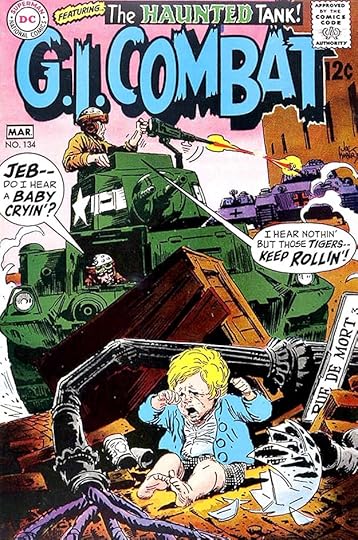
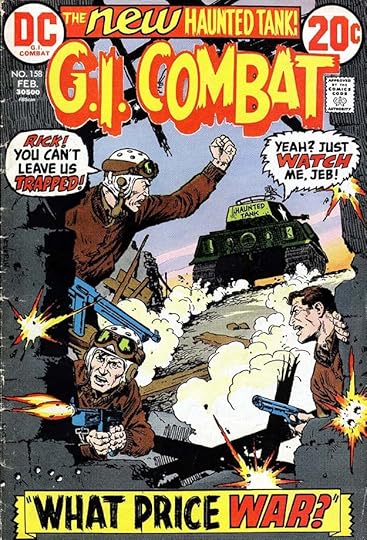
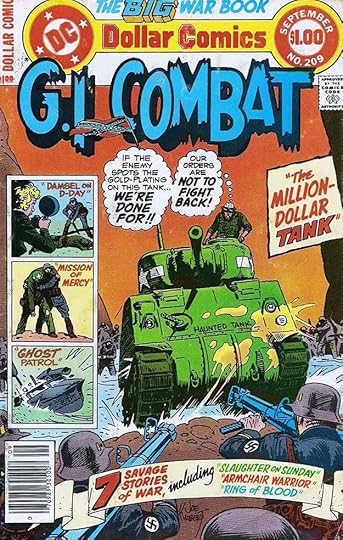
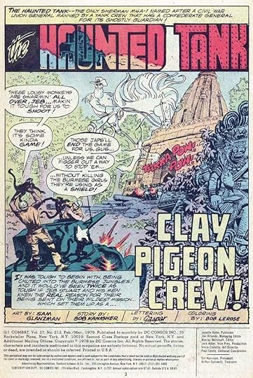
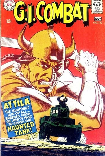 All images © DC Comics. From G.I. COMBAT #130, June-July 1968
This series had a long run beginning at Quality Comics in 1952. DC editor Robert Kanigher took it over when Quality got out of comics in 1956 and DC purchased their properties, continuing the numbering with issue #44, and it ran until issue #288 in 1987. Gaspar Saladino was the regular story letterer in two periods: at the beginning from 1957 to 1965, and again from 1977 to 1987, making this one of his most prolific titles. He was also the regular cover letterer from 1968 to 1987, and we’ll begin there. Ira Schnapp had been the regular cover letterer until Saladino took over with the issue above. Some of his early covers were uneven as he learned how to do it, but Gaspar seemed to have an affinity for war books, perhaps because of his own service time after World War Two, and he soon developed effective styles for their covers. The first one is tentative, but still effective. The Haunted Tank had become the main feature in the book, and would remain so for most of its run.
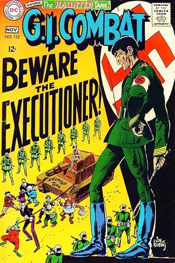 From G.I. COMBAT #132, Oct-Nov 1968
On this cover, Gaspar makes excellent use of the open background with tall perspective lettering that seems even larger above the small figures.
 From G.I. COMBAT #134, Feb-March 1969
Many of the covers followed this plan, with large word balloons using large display lettering. The top line is a holdover from Ira Schnapp.
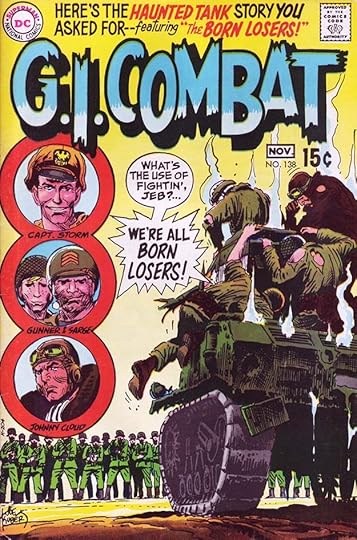 From G.I. COMBAT #138, Oct-Nov 1969
This issue shows the formation of The Losers, a group comprised of recurring solo characters that would become a mainstay of another DC war title, OUR FIGHTING FORCES.
 From G.I. COMBAT #140, Feb-March 1970
The bursts on this page have the impact of exploding grenades, and the large word balloon adds to the drama. Even the top line by Saladino is full of energy.
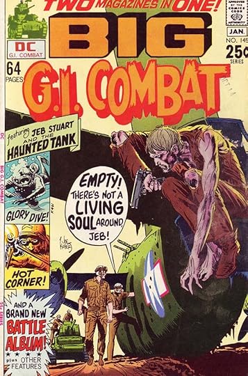 From G.I. COMBAT #145, Dec 1970-Jan 1971
From this time forward, some issues of this title were larger than standard comic size, full of original stories and often featuring covers by Joe Kubert and exciting lettering by Gaspar.
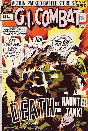 From G.I. COMBAT #150, Oct-Nov 1971
The thickly outlined open letters of DEATH on this cover with the art showing through inside are a technique used more often decades later, showing that Saladino was ahead of his time on this idea, though of coure the reversed letters were done by the DC production staff.
 From G.I. COMBAT #158, Feb 1975
When Gaspar had room, his lettering was a major part of these covers, and made them more interesting and dramatic.
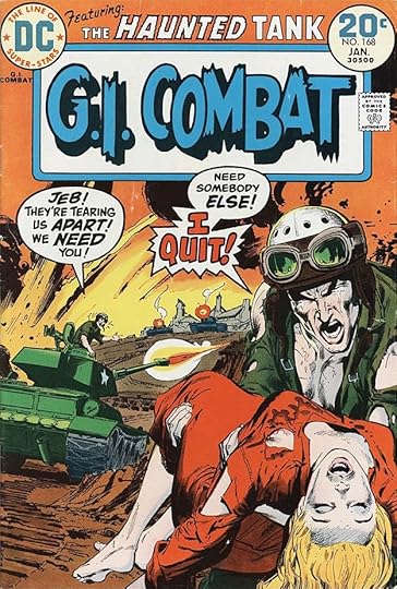 From G.I. COMBAT #168, Jan 1974
Artist Neal Adams also did a few covers, adding impressive realism to the war scenes. Gaspar’s large I QUIT would have made readers want to know more.
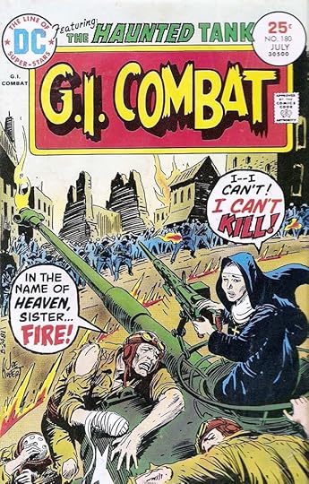 From G.I. COMBAT #180, July 1975
Most of the Haunted Tank stories were written by Robert Kanigher, at this point no longer the editor of the book, which had been passed to Joe Kubert, and Kanigher was a master of moral dilemmas like this one. I think it’s the main reason the DC war titles survived so long, much longer than those from many other companies.
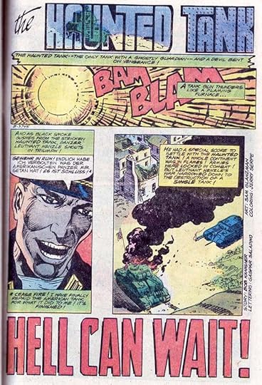
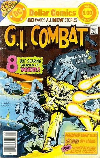 From G.I. COMBAT #201, April-May 1977
By 1977, the series had expanded to 80 pages under the Dollar Comics format. The increased page count was filled with all new material, much of it written by Kanigher, and with Saladino returning to letter many of the stories. He continued to do fine work on the covers too, though here some of the impact is lost due to the color choice of orange letters on an orange background.
 From G.I. COMBAT #209, Aug-Sept 1978
The Haunted Tank continued to be the popular lead feature, but these issues had room for lots of other stories too, and this cover format with inserts was sometimes used. Saladino’s banner at the bottom is impressive.
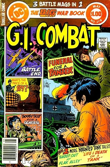 From G.I. COMBAT #219, April-May 1981
These are busy covers, but Saladino carefully fits the lettering in the inserts into the open backgrounds, and does his best to avoid covering too much of the art in the large panel.
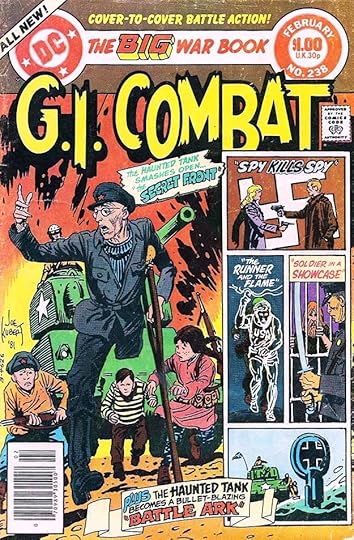 From G.I. COMBAT #238, Feb 1982
This cover is even more crowded, but Kubert’s open art style helps. Gaspar would have done his cover lettering on separate art paper, which was photostatted to the size wanted and pasted on the cover by DC’s production artists. Here I think the bottom banner should have been placed lower to avoid covering the tank in the lowest insert.
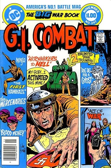 From G.I. COMBAT #247, Nov 1982
This cover is even more crowded, but open areas for lettering make it work better. Gaspar’s display lettering in the word balloon really sells the dilemma.
 From G.I. COMBAT #282, March 1986
Toward the end of its long run, this new feature was started to try to bring in readers, but it doesn’t seem to have helped much. The time for war comics had largely passed. I think the feature logo is type with an extended M at the beginning, the rest is by Saladino.
 From G.I. COMBAT #288, March 1987
The last issue has what seems like a fitting finale to the Haunted Tank saga that had lasted for so many years.
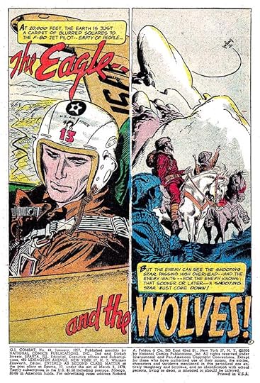 From G.I. COMBAT #44, Jan 1957
Saladino’s story lettering began with the first DC issue, and for a while he was lettering nearly all the stories. He was editor/writer Kanigher’s favorite letterer, and Gaspar seemed to like war stories, so he was the perfect choice. His wide, angular balloon lettering was a good match for the subject, and his strong titles were also a plus.
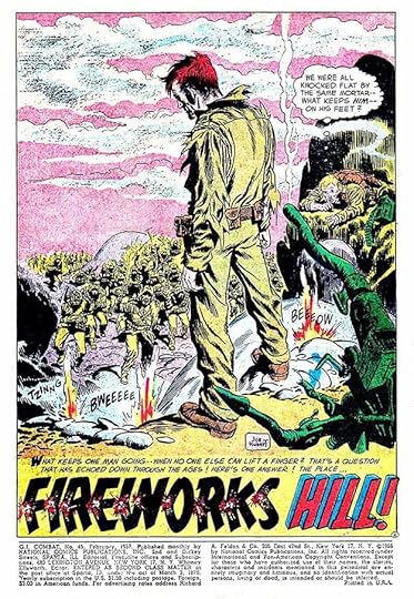 From G.I. COMBAT #45, Feb 1957
Here FIREWORKS has each letter being exploded, a clever and effective visual connection.
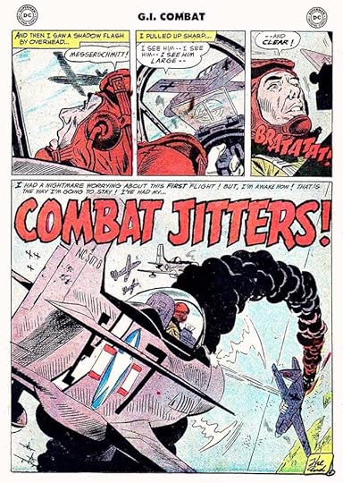 From G.I. COMBAT #46, March 1957
When he first started lettering stories in late 1949, Saladino’s titles were often not very good, but by this time he’d mastered that skill. His open letters are full of energy and impact, with thick rough edges to increase the effect.
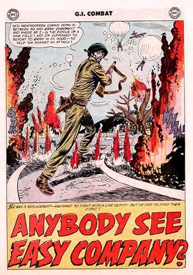 From G.I. COMBAT #50, July 1957
This story might be an early incarnation of Sgt. Rock’s famous group of soldiers, or not, as Easy Company was an army name for E Company, as Charlie was for C Company.
 From G.I. COMBAT #56, Jan 1958
As you might expect, sound effects were an important part of many war tales, and Gaspar’s were always effective.
[image error]From G.I. COMBAT #62, July 1958Sound effects were perhaps best of all on air war stories, where open backgrounds left room for large ones. And what a dynamic title by Gaspar on this story!
 From G.I. COMBAT #68, Jan 1959
This story featured a prototype of DC’s most famous war character, Sgt. Rock, not yet the leader of Easy Company. That would happen later in 1959 in DC’s OUR ARMY AT WAR. The lettering in the word balloons here is surprisingly thin, it might have been put in by artist Joe Kubert.
 From G.I. COMBAT #75, Aug 1959
More large and energetic title and sound effect lettering on this page from Saladino.
 From G.I. COMBAT #87, April-May 1961
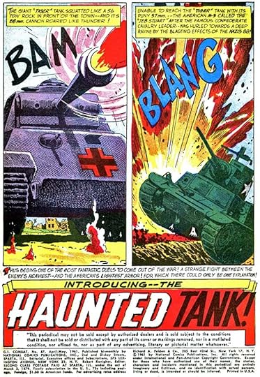
This story introduced The Haunted Tank, which soon became the lead feature in the book. Saladino’s treatment of the word HAUNTED uses rough outlines with small openings or gaps and a drop shadow for a memorable result.
 From G.I. COMBAT #98, Feb 1963
Great dry brush title work on this page.
 From G.I. COMBAT #196, Nov 1976
From 1966 to 1976, Saladino did almost no story lettering on this title, probably because he was too busy elsewhere, but he returned to Haunted Tank stories in this year with even more dynamic sound effects.
 From G.I. COMBAT #201, April-May 1977
In 1977, the book became a larger anthology, and Saladino returned to letter many of the stories, with Haunted Tank being the most frequent, but others too, like this one. The treatment of SKIRTS in the title is elegant.
 From G.I. COMBAT #205, Dec 1977-Jan 1978
Credits on stories had gradually become the norm at DC in the early 1970s, but it wasn’t until the second half of 1977 that letterers were allowed to add their own credit to the title page. This is the first Saladino lettering credit in this title. Afterward he was usually credited.
 From G.I. COMBAT #212, Feb-March 1979
Here’s the way Gaspar usually credited himself, just his first name in script similar to his handwriting. At this time the DC line had been drastically cut back by the “DC Implosion,” but this title continued as a large bimonthly anthology, providing work for many DC regulars, including Saladino.
 From G.I. COMBAT #213, April-May 1979
These Dollar Comics had no ads for a while, so inside covers often had features like this one lettered by Saladino.
 From G.I. COMBAT #231, July 1981
The same sort of thing also appeared on some back covers, as here. I’m counting this as a story page rather than a cover.
 From G.I. COMBAT #265, May 1984
Another feature Saladino sometimes lettered in later years was O.S.S., some stories were drawn by Phillippine artists and lettered by Phillippine letterer Esphid Mahilum, but Saladino continued to do Haunted Tank stories until the final issue.
To sum up, I found Saladino lettering on these covers: 130-158, 160-162, 165-171, 173, 175-180, 182-185, 187, 189-190, 193-194, 196-198, 200-201, 204-206, 208-210, 212-216, 219, 221-245, 247-257, 259-265, 267-282, 285-288, a total of 135.
Gaspar’s extensive story lettering is below. Haunted Tank is abbreviated as HT once it begins as the regular lead feature. There were often two or three Haunted Tank stories in an issue, where Saladino didn’t do them all, I’ve added the story number in parentheses unless he only did the first story.
#44 Jan 1957: The Eagle and the Wolves 8pp, An Inch of Sand 4pp, I’ve Been Here Before 6pp, The Brave Tank 6pp
#45 Feb 1957: Fireworks Hill 8pp, Frogman Vs. Sub 6pp, The TNT Tank 6pp, The Flying Mustang 6pp
#46 March 1957: The Long Walk To Wonsan 8pp, Combat Jitters 4pp, The 48 Inch Fort 6pp, Frontline Rodeo 6pp
#47 April 1957: The Sniper 6pp, The Walking Weapon 6pp, No-Man’s Land 6pp, Tank Busters 6pp
#48 May 1957: No Fence For A Jet 8pp, Three Seconds of War 6pp, Battle Wheels 6pp, Bring ‘Em Back 6pp
#49 June 1957: Frying Pan Seat 8pp, No Cover 6pp, Go All The Way 6pp, Night Fighter of the Skies 6pp
#50 July 1957: Foxhole Pilot 8pp, Anybody See Easy Company? 6pp, The Clean Sleeve 6pp, The First Time 6pp
#51 Aug 1957: Desert Stand 6pp, Bunker Hill Beachhead 6pp, Jump-Off Town 6pp, The Walking Grenade 6pp
#52 Sept 1957: Call For A Tank 8pp, The Big Sweep 6pp, How Does He Do It? 4pp, Battle Arithmetic 6pp
#53 Oct 1957: The Paper Trap 6pp, Infantry Town 6pp
#54 Nov 1957: Sky Tank 6pp, The Silent Snowbirds 6pp
#55 Dec 1957: Call for a Gunner 6pp, Combat Tag 6pp, The Floating Street 6pp
#56 Jan 1958: The D.I. and the Sand Fleas 12pp, Combat Mile 6pp, 20,000 Foot Curtain 6pp
#57 Feb 1958: Live Wire for Easy 7pp, There’s No One Left 6pp, Sheriff of No-Man’s Land 6pp, Channel Fighter 6pp
#58 March 1958: Flying Saddle 8pp, No Hill for Easy 6pp, The Last Man Out 6pp, A Carrier Has Nine Lives 6pp
#59 April 1958: Hot Corner 8pp, Battle Buzzards 6pp, Have Bazooka–Will Travel 6pp, Silent Snow War 6pp
#60 May 1958: Bazooka Crossroads 13pp, Long Tom and Little Tom 6pp,
#61 June 1958: The Big Run 8pp, A Hatful of War 6pp, You’ve Got To Go Out 6pp, The Flying Mine 6pp
#62 July 1958: Drop An Inch 9pp, A Jet’s No Pet 6pp, Visit To A Small War 6pp, Iron Hat 6pp
#63 Aug 1958: Last Stand 12pp, Hero Without A Name 6pp, Cracker Barrel Combat 6pp
#64 Sept 1958: Periscope Quarterback 6pp, Line of Departure 6pp
#65 Oct 1958: Battle Parade 7pp, Beach Club 6pp, War on the Hour 6pp
#66 Nov 1958: The Eagle of Easy Company 6pp, The Last Flight 6pp, The Invisible Escort 6pp, Look Out Below 6pp
#67 Dec 1958: Tank Killer 13pp, Where’s Beach Red? 6pp
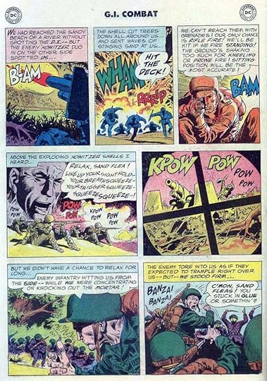
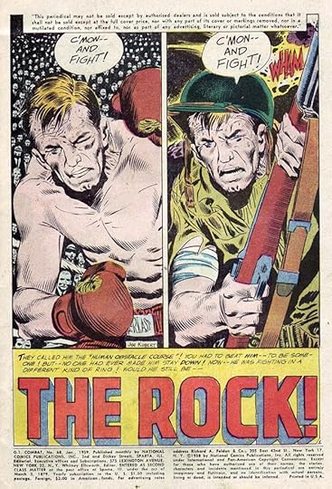
#68 Jan 1959: The Rock 13pp Write Your Own Book 6pp
#69 Feb 1959: The Steel Ribbon 13pp, The Big Haystack 6pp, The Second Line 6pp
#70 March 1959: The Hot Spot 6pp, The Battle Look 6pp, Bull’s-Eye Bridge 13pp
#71 April 1959: Last Stand 13pp, Eyes For A Fort 6pp, Don’t Come Back Alone 6pp
#72 May 1959: The G.I. and The Tank 6pp, The Three Frogmen 8pp, Ground Fire 11pp
#73 June 1959: Window War 13pp, Floating Pilot 6pp, The Big Fist 6pp
#74 July 1959: A Flag for Joey 14pp, Six-Gun Beach-Head 6pp, No Word For A G.I. 6pp
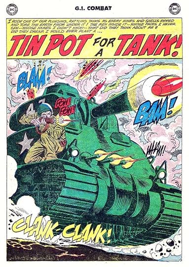
#75 Aug 1959: Dogtag Hill 12pp, Buck Private Jet 6pp, Tin Pot for a Tank 6pp
#76 Sept 1959: Rendezvous For A Fort 6pp, The Second Champ 6pp, Don’t Look Back 6pp
#77 Oct 1959: H-Hour For A Gunner 13pp, Last On A Match 6pp
#78 Nov 1959: Who Cares About The Infantry? 13pp, Get The Whirly-Birds 6pp, High Water Mark 6pp
#79 Dec 1959: Big Gun–Little Gun 13pp, No Test For A Mustang 6pp, Flying Jeep 6pp
#80 Feb-March 1960: The Flying Horsemen 13pp, The Nine Second Sub 6pp, Downhill Soldiers 6pp
#81 April-May 1960: Jump For Glory 13pp, Tiger In Town 6pp, Fire Lane 6pp
#82 June-July 1960: Get Off My Back 13pp, The Rope Fighters 6pp, Bird Dog For A Tank 6pp
#83 Aug-Sept 1960: Too Tired To Fight 13pp, 3 Bullets For An Ace 6pp, Handful of Beach 6pp
#84 Oct-Nov 1960: Dog Company is Holding 13pp, Skipper of the Doomed Duck 6pp, The Third One Is Fatal 6pp
#85 Dec 1960-Jan 1961: The T.N.T. Trio 18pp, A Fort Called Lucky 6pp
#86 Feb-March 1961: Secret of the Fort Which Did Not Return 13pp, Soldier In The Dark 6pp, Battle Parrot 6pp
#87 April-May 1961: Introducing–The Haunted Tank 18pp, Dead End 6pp
#88 June-July 1961: Haunted Tank Vs. Ghost Tank 13pp, Don’t Dig In 4pp, Everything’s A Straight Line 8pp
#89 Aug-Sept 1961: Tank With Wings 13pp, Danger Sniper 6pp, Nothing On The Nose 6pp
#90 Oct-Nov 1961: Tank Raiders 15pp, Patrol In The Parlor 6pp, Flame Fighter 6pp
#91 Dec 1961-Jan 1962: The Tank And The Turtle 13pp, Wings For A Wash-Out 6pp, Secret War of a Snowbird 6pp
#92 Feb-March 1962: The Tank of Doom 7pp, No Place Like The Front 6pp, The Desert Wins ‘Em All 6pp, Battle of the Bugles 6pp
#93 April-May 1962: No-Return Mission 13pp, One Pilot Too Many 6pp, Take Fury Hill Twice 6pp
#94 June-July 1962: The Haunted Tank Vs Killer Tank 15pp, No-Gun Crew 10pp
#95 Aug-Sept 1962: The Ghost of the Haunted Tank 13pp, Deliver–One Hero 6pp, Grounded at 10,000 Feet 6pp
#96 Oct-Nov 1962: The Lonesome Tank 13pp, Flying PT-Boat 6pp, The Biggest Sitting Duck In The Navy 6pp
#97 Dec 1962-Jan 1963: The Decoy Tank 13pp, Sgt. Route-Step Omalley 1pp, Graveyard of Sunken Subs 8pp, A Promise to Joe 4pp
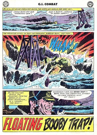
#98 Feb-March 1963: Trap of the Dragon’s Teeth 17pp, Floating Booby Trap 8pp
#99 April-May 1963: Battle of the Thirsty Tanks 19pp
#100 June-July 1963: Return of the Ghost Tank 13pp, The Big Jump 6pp
#101 Aug-Sept 1963: Kayo From A Dead Fort 6pp
#102 Oct-Nov 1963: Battle Window 19pp
#103 Dec 1963-Jan 1964: Rabbit Punch for a Tiger 15pp
#104 Feb-March 1964: Blind Man’s Radar 15pp
#105 April-May 1964: Time-Bomb Tank 15pp, The Plane That Wouldn’t Die 10pp
#106 June-July 1964: Two-Sided War 15pp, Boobytrap Souvenir 10pp
#108 Oct-Nov 1964: The Wounded Won’t Wait 15pp
#109 Dec 1964-Jan 1965: Battle of the Tank Graveyard 15pp
#110 Feb-March 1965: Battle Exterminator 10pp
#111 April-May 1965: Death Trap 15pp
#112 June-July 1965: Ghost Ace 15pp, Bail-Out Blues 10pp
#113 Aug-Sept 1965: Tank Fight in Death Town 14pp
#114 Oct-Nov 1965: Battle Origin of the Haunted Tank 15pp, My Witness–The Enemy 9pp
#115 Dec 1965-Jan 1966: Medal for Mayhem 15pp
#140 Feb-March 1970: Haunted Tank Intro 1pp
#194 Sept 1976: Haunted Tank (hereafter HT) 12pp
#195 Oct 1976: HT 11pp
#196 Nov 1976: HT 12pp
#197 Dec 1976: HT 12pp
#198 Jan 1977: HT 12pp
#199 Feb 1977: HT 12pp
#200 March 1977: HT 17pp
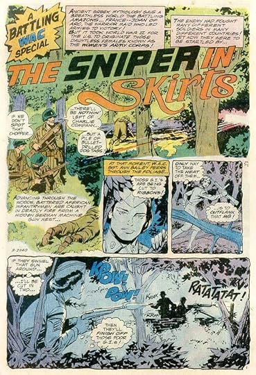
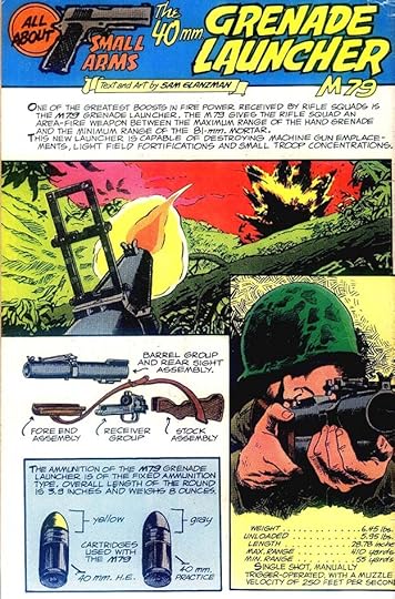
#201 April-May 1977: HT 14pp, O.S.S. 5pp, The Sniper in Skirts 7pp, Tank M4A2 2pp, A Weird War Tale 6pp, HT 10pp
#202 June-July 1977: HT 12pp, A Weird War Tale 4pp, Private Life of a Tanker 5pp, HT 14pp
#203 Aug-Sept 1977: HT 13pp, 10pp, 12pp
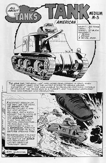
#204 Oct-Nov 1977: HT 12pp, All About Tanks 2pp, The Black and the Baron 6pp, HT 12pp, Women In War 6pp, HT 10pp
#205 Dec 1977-Jan 1978: HT 11pp, Women At War 6pp, HT 12pp, Stop–War Ahead 6pp, HT 11pp
#206 Feb-March 1978: HT 13pp, Combat Curiosities 1pp, Women At War 6pp, HT 10pp, The Rangers 6pp, All About Tanks 2pp, HT 11pp
#207 April-May 1978: HT 11pp, Gus Grey 5pp, HT 14pp, If A Bullet’s Got Your Name 3pp, HT 8pp
#208 June-July 1978: HT 12pp, The Flying Front 5pp, HT 12pp, Women At War 5pp, HT 13pp
#209 Aug-Sept 1978: HT 12pp, 13pp, 12pp
#210 Oct-Nov 1978: All About Tanks 1pp (Inside Front Cover), HT 12pp, 12 pp, Women At War 7pp, HT 13pp
#211 Dec 1978-Jan 1979: All About Tanks 1pp (IFC), HT (2) 11pp, Women At War 5pp
#212 Feb-March 1979: All About Tanks 1pp (IFC), HT 12pp, 13pp
#213 April-May 1979: All About Tanks 1pp (IFC), HT 12pp, 12pp, O.S.S. 10pp, HT 11pp
#214 June-July 1979: All About Tanks 1pp (IFC), HT 12pp, 11pp, 14pp
#215 Aug-Sept 1979: All About Small Arms 1pp (IFC), HT 24pp, Women At War 6pp, The Murderous Moles 6pp, HT 12pp, All About Tanks 1pp (Inside Back Cover)
#216 Oct-Nov 1979: Women At War 6pp, O.S.S. 8pp
#217 Dec 1979-Jan 1980: HT 10pp, A Fine Day For Hanging 3pp, The 3000-Mile Nightmare 7pp, HT (3) 13pp
#218 Feb-March 1980: HT 10pp, O.S.S. 11pp, HT (3) 10pp
#219 April-May 1980: HT 12pp, 8pp, Battle Without End 7pp, HT 11pp
#220 June-July 1980: HT 12pp, 13pp, 8pp
#221 Aug 1980: HT 13pp, The Square Battlefield 5pp, Ht (3) 12pp
#222 Oct 1980: HT 12pp, 8pp, 12pp
#223 Nov 1980: HT 12pp, 8pp, 11pp
#224 Dec 1980: Lifeline In The Sky 5pp, HT (2) 12pp, All About Tanks 1pp (Back Cover)
#225 Jan 1981: Live Wire 1pp (Inside Front Cover), HT 12pp, Hero Without Honor 7pp, HT 12pp, All About Tanks 1pp (Back Cover)
#226 Feb 1981: 2-Ton Tombstone 1pp (Inside Front Cover), HT (1) 12pp, All About Tanks 1pp (Back Cover)
#227 March 1981: Moving Target 1pp (IFC), HT 13pp, O.S.S. 7pp, Helping Hand 2pp, HT (3) 12pp, Secret Weapon 1pp (IBC), All About Tanks 1pp (BC)
#228 April 1981: Booby Trap 1pp (IFC), HT 13pp, 10pp, Aid From the Enemy 1pp (IBC), All About Small Arms 1pp (BC)
#229 May 1981: Do Only Cowards Quit? 1pp (IFC), HT 14pp, 8pp, Deadly Questions 1pp (IBC), All About Small Arms 1pp (BC)
#230 June 1981: Blind Target 1pp (IFC), HT 14pp, 8pp, Psychic Warfare 1pp (IBC), All About Small Arms 1pp (BC)
#231 July 1981: HT 13pp, O.S.S. 10pp, HT 10pp, All About Small Arms 1pp (BC)
#232 Aug 1981: HT (2) 10pp, All About Small Arms 1pp (BC)
#233 Sept 1981: HT 13pp, Kickback 1pp (IBC), All About Tanks 1pp (BC)
#234 Oct 1981: HT 15pp, 6pp, All About Tanks 1pp (BC)
#235 Nov 1981: HT (2) 8pp
#236 Dec 1981: HT (2) 12pp, All About Small Arms 1pp (BC)
#237 Jan 1982: All About Tanks 1pp (BC)
#238 Feb 1982: HT (2) 8pp, All About Small Arms 1pp (BC)
#239 March 1982: HT 16pp
#241 May 1982: Call To Battle 1pp
#242 June 1982: HT 11pp
#243 July 1982: All About Tanks 2pp, HT (2) 8pp
#244 Aug 1982: HT 15pp, 8pp
#245 Sept 1982: HT 14pp, 7pp
#246 Oct 1982: HT Part 4 11pp, Part 6 8pp, Part 7 10pp
#247 Nov 1982: HT 14pp
#248 Dec 1982: HT 15pp
#249 Jan 1983: HT 15pp, 9pp
#250 Feb 1983: HT 13pp, 9pp
#251 March 1983: HT 14pp, 9pp
#252 April 1983: 13pp
#253 May 1983: Dogbait 1pp, HT (2) 9pp
#254 June 1983: HT (2) 8pp
#255 July 1983: HT 14pp, 10pp
#256 Aug 1983: HT 14pp, Cover-Up 1pp, The Silent Service 7pp, HT (2) 9pp
#257 Sept 1983: HT 13pp, 9pp
#258 Oct 1983: HT 12pp
#259 Nov 1983: HT 13pp, 10pp
#260 Dec 1983: 15pp, 9pp
#261 Jan 1984: 14pp, 9pp
#262 Feb 1984: HT 14pp, 9pp
#263 March 1984: HT 12pp, 9pp
#264 April 1984: HT 14pp
#265 May 1984: HT 12pp, O.S.S. 7pp
#266 June 1984: HT 10pp, 9pp
#267 July 1984: HT 16pp, Death Waits 1,000 Years 7pp
#268 Aug 1984: HT 11pp, 11pp
#269 Sept 1984: HT 12pp, 9pp
#270 Oct 1984: HT 16pp, Secrets of the Sub Service 6pp
#271 Nov 1984: HT 15pp
#272 Dec 1984: HT 15pp
#273 Jan 1985: HT 16pp
#274 Feb 1985: HT 15pp, Fatal Hit 1pp
#275 March 1985: HT 15pp
#276 April 1985: HT 12pp, 4pp
#277 May 1985: HT 15pp
#278 July 1985: HT 12pp, 3pp
#279 Sept 1985: HT 12pp, 3pp
#280 Nov 1985 HT 12pp, 3pp
#281 Jan 1986: HT 13pp, 2pp
#282 March 1986: The Mercenaries 22pp
#283 May 1986: The Mercenaries 10pp, 12pp
#284 July 1986: The Mercenaries 22pp
#285 Sept 1986: HT 15pp
#286 Nov 1986: The Mercenaries (1) 10pp
#287 Jan 1987: HT 15pp
#288 March 1987: HT 16pp
That’s a total of 3,653 pages if my math is right, a large amount of work! Certainly Gaspar’s war story lettering must amount to more than his work for other genres. Other articles in this series and more you might like are on the COMICS CREATION page of my blog.
The post GASPAR SALADINO in G.I. COMBAT appeared first on Todd's Blog.
March 8, 2022
GASPAR SALADINO in GHOSTS
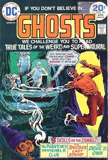
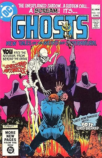
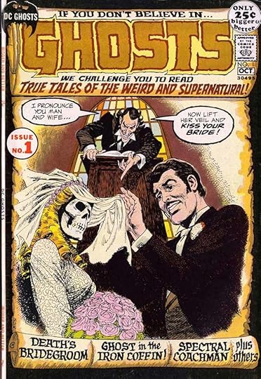 All images © DC Comics. From GHOSTS #1, Sept-Oct 1971
This entry in DC’s “mystery” line ran for 112 issues from 1971 to 1982, edited in early years by Murray Boltinoff, and by Jack C. Harris later. As with other similar DC titles, it was meant to be spooky but not gory to garner Comics Code approval. Gaspar lettered many of the covers, and a few stories in later issues. This first cover shows the original layout of a large scroll used on the earliest issues. The logo and all the cover lettering is by Gaspar using several of his scary styles, including a calligraphic one at the bottom. Even the word balloons have rough balloon borders to up the tension.
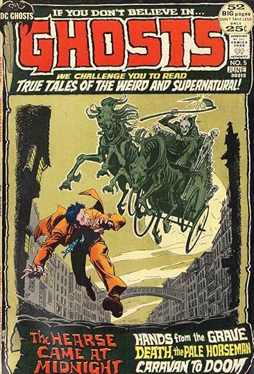 From GHOSTS #5, May-June 1972
The only new lettering on this cover is at the bottom, but that was a good deal of work, and again shows variety.
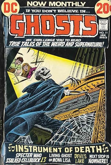 From GHOSTS #11, Jan 1973
NOW MONTHLY at the top of this cover is type, and it shows the book was selling well. Again, all the new lettering is at the bottom. I like the shaky music notes as if played by the cover figure.
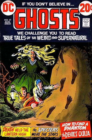 From GHOSTS #17, Aug 1973
By this issue the scroll layout had been dropped, and some of the top text is in type, with the third line relettered by Saladino. Now the story titles are in captions at the bottom, and able to spread out a bit more.
 From GHOSTS #25, April 1974
Saladino did special balloon styles for the ghosts when it seemed appropriate, as here. As always, each story title had distinctive styles.
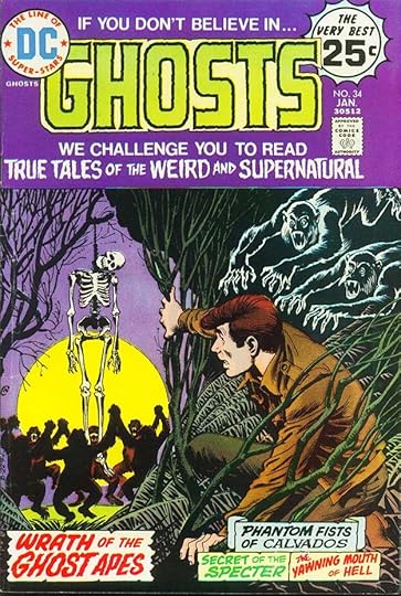 From GHOSTS #34, Jan 1975
If the image was strong enough to tell the story, no word balloons were needed, as here, just a descriptive caption.
 From GHOSTS #37, April 1975
On this cover the story captions have moved slightly away from horror to more typical Saladino styles for other genres, though there’s still some scary stuff in the mix.
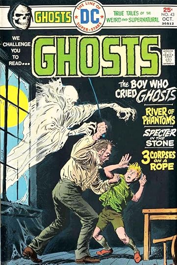 From GHOSTS #43, Oct 1975
On a black backround, the caption boxes weren’t needed, giving Gaspar more room for the story titles, which then could be larger. These are all inked in black and then reversed by the DC production department. The word GHOSTS in the first story title is done with a dry brush to add texture.
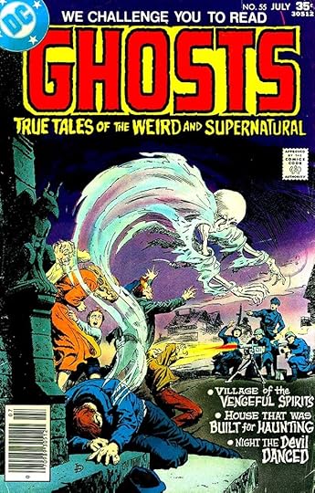 From GHOSTS #55, July 1977
The same thing was done here. Look at the variety in the letter forms in those story titles.
 From GHOSTS #75, April 1979′
This book escaped the drastic cuts of the “DC Implosion” in 1978, suggesting it was still selling well, and making money for the company. One way they saved costs was to use artists from The Phillippines at lower pay rates than U.S. artists on some stories. The book was also a tryout title for new, young artists, also paid less than the company’s regulars.
 From GHOSTS #93, Oct 1980
Cover art by Michael Wm. Kaluta was always a great selling point, and Saladino’s caption added to the drama.
 From GHOSTS #101, June 1981
Another one, and here a new Gaspar top line replacing the tired original adds chills, as does his caption at left.
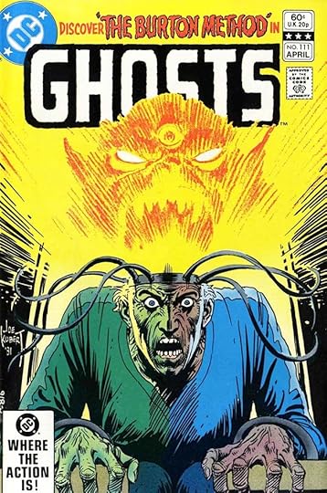 From GHOSTS #111, April 1982
As the book neared its end, a Saladino top line is the only cover copy, and rather cryptic, but the Joe Kubert art is effective.
 From GHOSTS #60, Jan 1978
The first story lettered by Gaspar has him joining many of the regulars on DC’s war titles. By 1978, all the story creators were credited, but since artist Jerry Grandenetti added his in the art, he’s not in the credit box. Saladino’s story titles were always impressive.
 From GHOSTS #68, Sept 1978
Another Grandenetti story, so perhaps he asked for Gaspar. They had often worked together on war stories.
 From GHOSTS #71, Dec 1978
Bill Draut was another veteran, and at this time probably happy to have work in DC’s new smaller lineup. Gaspar’s story title is excellent, with dry brush on HAUNTED.
To sum up, these covers have Saladino lettering: 1-39, 41-44, 46-51, 55, 57-60, 62-68, 74-75, 82-83, 85, 87, 91-95, 97-112, a total of 88. Below are the stories lettered by Gaspar.
#60 Jan 1978: The Spectral Smile of Death 6pp
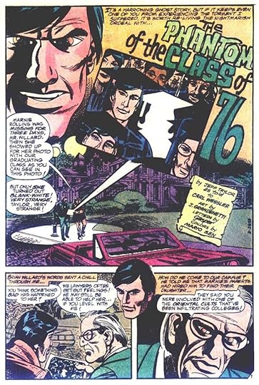
#68 Sept 1978: The Phantom of the Class of ’76 6pp, Funeral for a Phantom 5pp
#70 Nov 1978: Haunted Honeymoon 6pp
#71 Dec 1978: The Haunted Undertaker 5pp, The Spectre from 1 Million B.C. 4pp
#72 Jan 1979: The Ghost of the Washington Monument 6pp
#73 Feb 1979: The Ghost’s Last Ride 4pp
#74 March 1979: The Gem that Haunted the World 8pp
#78 July 1979: The World’s Most Famous Phantom 6pp
That’s 56 pages in all. More articles in this series and others you might like are on the COMICS CREATION page of my blog.
The post GASPAR SALADINO in GHOSTS appeared first on Todd's Blog.
Todd Klein's Blog

- Todd Klein's profile
- 28 followers

