Todd Klein's Blog, page 76
February 13, 2022
Rereading: THE CROW AND THE CASTLE by Keith Robertson

This is the third book about the Carson Street Detective Agency, the creation of teenagers Neil and Swede housed in the loft over Neil’s garage in their small central New Jersey town. Sadly, all these fine books are long out of print and hard to find, they deserve new printings. The first book, “The Mystery of Burnt Hill” is impossible to find at any price, the others are out there on the used book market, but pricey.
This time, Neil has a pet crow, Hector, who is entertaining in his own right, and becomes a crucial element of the story when he steals a valuable chess piece belonging to a new friend of Neil and Swede, the ornery Captain Wudge, who is a collector of rare chess sets and an authority on them. Neil and Swede are fascinated by his collection, and convince the Captain to exhibit some of his sets at the town library. That’s when Hector steals the castle, and Neil and Swede must try to track down his hiding place and retrieve it before the Captain finds out it’s missing. Their detecting skills are no match for the crow. Another chess expert is also very interested in this set for a different reason. He believes its history includes the hiding of a valuable ruby in one of the set’s castles, and he and his somewhat inept henchmen capture Neil and Swede to try to get at the missing castle, which might hold the ruby. There’s plenty of action and thrills as this villain, the Captain, the henchmen, and the two clever boys all try to find where Hector has hidden the chess piece, and who will get there first?
As always, Robertson’s books are believable and exciting while including a good dose of humor and intriguing information. The human characters are appealing, even if the crow does steal the spotlight. Highly recommended if you can find it, check local libraries.
The post Rereading: THE CROW AND THE CASTLE by Keith Robertson appeared first on Todd's Blog.
February 11, 2022
GASPAR SALADINO in DC COMICS PRESENTS
 All images © DC Comics. From DC COMICS PRESENTS #1, July-Aug 1978
By 1976, THE BRAVE AND THE BOLD had become a regular team-up book for Batman with every other DC character, and this one was created by Superman editor Julius Schwartz to fill the same role for his main character. It ran 97 issues from 1978 to 1986. The logo was my first cover logo for DC, but the cover lettering on this and many other issues was by Gaspar Saladino. Gaspar had been working for Julie since late 1949, and he knew Superman and many of the DC characters well, so he was the perfect choice, and his lettering added drama and excitement, as it does here. Art by Jose Luis Garcia-Lopez on many early issues didn’t hurt either!
 From DC COMICS PRESENTS #16, Dec 1979
One function of the title was to give characters who might not be appearing in their own books at the moment a chance to shine and be remembered by readers, as with Black Lightning here (also sometimes a way to keep them trademarked). I love the scary treatment of the word DOOMED in the balloon.
 From DC COMICS PRESENTS #19, March 1980
The series might have been cancelled before it really got rolling during the “DC Implosion” of 1978, but fortunately it wasn’t, and it joined the popular titles SUPERMAN, ACTION COMICS and WORLD’S FINEST COMICS as venues for DC’s longest-running and best known superhero. More great spooky lettering in the caption on this one.
 From DC COMICS PRESENTS #24, Aug 1980
Deadman was essentially a ghost who could inhabit the bodies of other characters. Should he have a special balloon style to remind readers he wasn’t an ordinary person? That idea varied over time, but Gaspar thought so and did that here. I agree.
 From DC COMICS PRESENTS #26, Oct 1980
This cover represents the beginning of a different kind of promotion for new series at DC, a free 16-page preview inserted in this and other titles to grab reader interest. There was also a backup story, so lots of lettering for Saladino, and it’s handled beautifully. All that cover copy does distract from the main image, but at least that image is framed separately.
[image error]From DC COMICS PRESENTS #31, March 1981Look at the variety of styles in the upper and lower blurbs here, and Gaspar even made the extra effort of giving ROBOTMAN tiny rivets.
 From DC COMICS PRESENTS #39, Nov 1981
At times the main stories got silly, but that seems appropriate for a Plastic Man adventure. Again, one of the reasons for the “Whatever Happened To” backups was to give dormant characters a published appearance to protect their trademarks, as with Richard Dragon here.
 From DC COMICS PRESENTS #47, July 1982
Another use for this book was to cross-promote licensed characters who were getting their own miniseries at DC, as with this one. It made for strange combinations. I love the treatment of DIE in the second thought balloon. That’s a powerful thought!
 From DC COMICS PRESENTS #56, April 1983
The often-repeated image of one hero holding the apparently dead body of another is seen here, though I’m sure readers did not believe Power Girl was dead. Still, they might have bought the issue to find out more. The caption is an interesting combination of a scroll at the top and open telescoping at the bottom, but both are the same color, so it’s not obvious.
[image error]From DC COMICS PRESENTS #61, Sept 1983By 1983, DC was starting to list writer and artist credits on covers, a move I applauded. DC had come a long way from the days when they didn’t allow creators to be credited in most comics. The credits here are done with headline type. Gaspar’s excellent caption is below, filling the open area with appealing display lettering and then knocking it out of the park with that great villain name.
 From DC COMICS PRESENTS #68, April 1984
Vixen had been one of the new titles planned for 1978 that was killed by the “DC Implosion.” This may be the first time the logo Saladino designed for her appeared on a cover. I also like his caption and villain name.
 From DC COMICS PRESENTS #79, March 1985
This is an interesting way to fit Superman’s name in open letters into a word balloon. A bit awkward, but it works okay.
 From DC COMICS PRESENTS #86, Oct 1985
This is a busy cover, but Saladino’s caption still stands out due to the appealing display lettering and unusual border treatment.
 From DC COMICS PRESENTS #96, Aug 1986
The last few issues had a different logo, and this one has some fine Gaspar balloons and a large sign by him. He’s managed the perspective on the sign reasonably well without actually getting in quite right, the O’s are the main problem, and it’s not helped by the fact that the Superman logo does not follow the perspective at all.
 From DC COMICS PRESENTS #86, Oct 1985
While Gaspar lettered many of the covers, he did only three stories for the series, this being one. I like the choice of solid black rounded display lettering for the story title with a thin outline around it for a color.
 From DC COMICS PRESENTS #96, Oct 1986
He also lettered the penultimate issue teaming Superman with Blue Devil. Often letterers were expected to letter any signs in the story, but something like the Daily Planet globe was a gray area. Gaspar might have inked it, or it might have been done by Schaffenberger. The other story Saladino lettered was for the fourth Annual, which I could not find a usable image for. He did not letter any of the Annual covers.
To sum up, Gaspar lettered these DC COMICS PRESENTS covers: 1, 16, 18-22, 24, 26, 28, 30-35, 38-50, 53, 55-63, 65, 68, 70, 72-75, 79-81, 86, 91, 94-97, a total of 55 on this series. Below are his story credits.
Annual #4 Oct 1985: 40pp
#86 Oct 1985: 23pp
#96 Oct 1986: 22pp
That’s 85 pages in all. Other articles in this series and more you might enjoy are on the COMICS CREATION page of my blog.
The post GASPAR SALADINO in DC COMICS PRESENTS appeared first on Todd's Blog.
February 10, 2022
GASPAR SALADINO in DATE WITH DEBBI and DEBBI’S DATES
 All images © DC Comics. From DATE WITH DEBBI #1, Jan-Feb 1969
These two teen humor sister titles ran almost simultaneously from 1969 to 1971, with this title beginning first and running to 18 issues, the other lasting 11 issues, many with cover lettering by Gaspar. They also featured Gaspar’s logos. The lettering was generally simple, one or a few word balloons at most, and must have been a welcome change from the often copy-heavy covers on other genres. DC was trying to compete with Archie Comics in this genre, but their efforts never did as well, and by this time many comics readers had turned away from this kind of 1950s style fluff, but they did have appealing art by Henry Scarpelli and others.
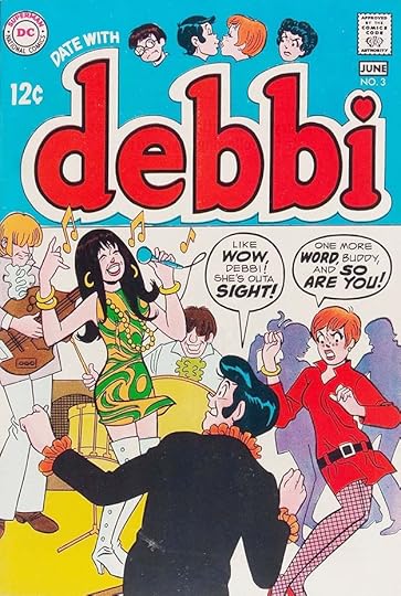 From DATE WITH DEBBI #3, May-June 1969
Gaspar has fun with larger display lettering for emphasis on these balloons. The art tried hard to be stylish, but always seemed behind the curve to me.
 From DATE WITH DEBBI #4, July-Aug 1969
Many of the cover ideas were recycled from earlier series like LEAVE IT TO BINKY and A DATE WITH JUDY, but it’s likely readers hadn’t seen those. The best thing on this cover is the flying surfer in the background.
 From DATE WITH DEBBIE #5, Sept-Oct 1969
At least on the covers, these characters had nothing to do but have fun and flirt, which I suppose is a teenage dream. The second logo by Saladino makes this one more interesting.
 From DATE WITH DEBBI #6, Nov-Dec 1969
Rather than laughing with the characters, though, readers were often intended to laugh at them. This may have been one reason why the books didn’t last. I wonder how many now remember the teen dating game of post office?
[image error]From DATE WITH DEBBI #8, March-April 1970Many of the ideas seemed stuck in 1950s sitcom territory, as here.
 From DATE WITH DEBBI #13, Jan-Feb 1971
Later issues of this title became large anthologies perhaps to use up inventory as the series ended. Even Archie artists like Stan Goldberg and Henry Scarpelli were not enough to bring in readers. Gaspar did his best with the lettering.
[image error]From DEBBI’S DATES #1, April-May 1969I’m not sure why there were two Debbi titles, perhaps it was an attempt to get readers buying one every month, as they alternated while this one lasted.
 From DEBBI’S DATES #3, Aug-Sept 1969
The second logo on this book matches the revised logo on the other title, and both are more interesting than the earlier Archie-like ones. Did kids really bring small TVs to the beach? I never saw one.
 From DEBBI’S DATES #6, Feb-March 1970
Gaspar’s balloon lettering style eventually became rounder on humor titles, as here. Notice the U shaped loop of the Y in ONLY. The last few issues of each title had cover lettering by others.
Here are the covers of DATE WITH DEBBI I see Saladino lettering on: 1, 3-16, and on DEBBI’S DATES: 1-8. That’s 23 in all. Other articles in this series and more you might like are on the COMICS CREATION page of my blog.
The post GASPAR SALADINO in DATE WITH DEBBI and DEBBI’S DATES appeared first on Todd's Blog.
February 9, 2022
GASPAR SALADINO in THE DARING NEW ADVENTURES OF SUPERGIRL
 All images © DC Comics. From THE DARING NEW ADVENTURES OF SUPERGIRL #1, Nov 1982
I considered saving this to add to other Supergirl series, as it’s only a 13 issue run with this title, but Gaspar Saladino lettered all the covers except one, so I decided to give it a separate article. Supergirl had been around since the 1950s, and had long runs as a backup in ACTION COMICS and the lead in ADVENTURE COMICS. I suspect the reason for this new series launch was an upcoming film about her then in the works. I designed the logo including the top line, and the burst is by Gaspar. The burst shape is a bit unusual in that the points all curve in the same direction, as if it’s rotating slightly.
 From THE DARING NEW ADVENTURES OF SUPERGIRL #2, Dec 1982
This cover has Saladino blurbs in two places as the book adds a Lois Lane backup. The word CRISIS would become important at DC in a few years, but here it’s just an exciting description. I love the pun of BOGIE-MAN.
 From THE DARING NEW ADVENTURES OF SUPERGIRL #4, Feb 1983
The Saladino burst on this cover has an even more rotational look, almost suggesting a saw blade. Perhaps this was Gaspar trying out a new idea. And have the words SECRET IDENTITY every been lettered better? I say they haven’t.
 From THE DARING NEW ADVENTURES OF SUPERGIRL #5, March 1983
Sorry if this one gives you a headache, it is hard to look at, but Gaspar’s blurb following the concentric circles is beautifully done in a kind of rock poster way.
 From THE DARING NEW ADVENTURES OF SUPERGIRL #8, June 1983
I like these three captions, though the color in REACTRON is making it hard to read. Pink in a caption is rare outside of romance comics, but it contrasts well with the blue color hold.
 From THE DARING NEW ADVENTURES OF SUPERGIRL #10, Aug 1983
This is my favorite cover of the run. Gaspar did a great job on the captions, giving the second one a classy feel, and he also lettered the signs and cover artist credits I think.
 From THE DARING NEW ADVENTURES OF SUPERGIRL #13, Nov 1983
With the final issue still using this title in the indicia, the logo has changed to just SUPERGIRL using the style of the movie logo, but simplified, and her new costume is closer to the one in the film (and perhaps what DC was shown for that). Gaspar’s two banners work well. This series went on as just SUPERGIRL for ten more issues. Sadly, the film was not a hit, and that may have affected sales, but the character has been revived and reinvented many times.
To sum up, Saladino lettered the covers of issues 1-10 and 12-13, twelve in all. Other articles in this series and more you might like are on the COMICS CREATION page of my blog.
The post GASPAR SALADINO in THE DARING NEW ADVENTURES OF SUPERGIRL appeared first on Todd's Blog.
February 8, 2022
GASPAR SALADINO in DANGER TRAIL
 All images © DC Comics. From DANGER TRAIL #1, July-Aug 1950
Editor Julius Schwartz had had success with westerns at DC Comics, and with this series he decided to try a spy thriller anthology. The lead feature in the first four issues was King Faraday, an American anti-espionage secret agent usually working overseas, while the rest of the book was filled out with non-continuing stories about similar characters. The book only lasted five issues, and I think making it an anthology might have been a mistake. Having book-length stories about Faraday could have created more reader interest, but that’s just me second-guessing Schwartz. And it’s possible penciller Carmine Infantino couldn’t have produced that much work anyway. As it was, other Schwartz regulars like Alex Toth and Frank Giacoia had some stories too. Julie had recently hired Gaspar Saladino to letter stories for him, and he put his new letterer to work on most of the contents of these issues, but for the first King Faraday story he had veteran letterer Ira Schnapp do the first page and character logo, above, perhaps because Gaspar had not yet proven himself on story titles and feature logos. Schnapp lettered all the covers, but this was his only story page other than the last story in issue #5.
 From DANGER TRAIL #1, July-Aug 1950
The second page of the King Faraday story shows many typical style points of early Saladino lettering, including open first letters in two captions, one against a black drop shadow, and a tiny scroll caption for the page number, something he kept up through all the stories. I think the KF on a scroll below the second caption is also a creative touch by Gaspar.
 From DANGER TRAIL #1, July-Aug 1950
The second story has art by Alex Toth, and here Gaspar’s title seems to be imitating Ira Schnapp, something Schwartz might have told him to do. Saladino had known Toth and Infantino since high school, and had already been working with them since his first stories at DC in ROMANCE TRAIL #5, so I expect he was happy to get these assignments. His balloon and caption lettering was excellent from the start, but it took him a few years to get comfortable with titles and logos.
 From DANGER TRAIL #2, Sept-Oct 1950
These stories were often copy heavy with too much lettering, but Saladino did the best he could with it. Perhaps the hourglass in the center caption is his.
 From DANGER TRAIL #3, Nov-Dec 1950
Where he has room on this page, Gaspar uses decorative scroll captions, and his favorite open first letter against a black brush shape in the first caption. I like the sound effect in panel three.
 From DANGER TRAIL #3, Nov-Dec 1950
Usually Saladino only lettered the longer stories, but on this book he also did many of the one page fillers that were more often done by DC production staffers. This one is a poem, there were similar poems in other issues.
 From DANGER TRAIL #3, Nov-Dec 1950
Another one-pager, but this is more on topic than most fillers, and I would call it a one-page story. Gaspar’s treatment of the title word SLIM is unusual and a bit hard to read, but I like it.
 From DANGER TRAIL #4, Jan-Feb 1951
Another page full of lettering, and I suspect Gaspar did all those small pictures in the captions. It’s unlikely story penciller Bob Oksner would have done them, as he didn’t know for sure how much space the lettering would need, and in fact he left too much, but that’s better than not enough. Saladino could have shortened the captions as he did in panel four, but decided to get creative instead. I think at this early time in his career he might have been showing off a bit!
 From DANGER TRAIL #5, March-April 1951
For the final issue a new lead feature appeared, Johnny Peril, a somewhat mysterious adventurer who had appeared as a backup feature in several titles since 1947. He might have worked in this one, but it was too late. The feature logo is by Ira Schnapp, the rest is by Saladino, including a hard to read capital I to begin the caption and the handsome ragged scroll caption around the story title.
Here are the stories lettered by Gaspar on this series:
#1 July-Aug 1950: King Faraday pp 2-10 (9pp), Appointment in Paris 8pp, 3 Steps to Mr. Sandino 8pp, Guide for Treasure Hunters 1pp, Mystery of the Highland Queen 8pp, Dream Pirate 1pp
#2 Sept-Oct 1950: Faraday 12pp, The Silver Key 1pp, Shadows Over London 8pp, Trouble in Trinidad 8pp, Two on the Isle 1pp, Colonel Cornwall 1pp, Toreador From Texas 10pp, Slim Chance 1pp
#3 Nov-Dec 1950: Faraday 12pp, Norton of the North 1pp, Hawaiian River God 8pp, Slim Chance 1pp, Ice Queen 1pp, Colonel Cornwall 1pp, Ghost Ship of the South Seas 8pp, Two on the Isle 1pp
#4 Jan-Feb 1951: Faraday 12pp, Vengeance of the Matterhorn 8pp, Colonel Cornwall 1pp, The Vanishing Island 8pp, Slim Chance 1pp, Prisoner of Gold 1pp, The End of the Arctic 8pp
#5 March-April 1951: Johnny Peril 12pp, Mission to Malaya 8pp, London Laughs 1pp, Return of the Pharaoh 8pp, Lester the Lumberjack 1pp, Eternal Egypt 1pp
That’s 180 pages in all. More articles in this series and others you might like are on the COMICS CREATION page of my blog.
The post GASPAR SALADINO in DANGER TRAIL appeared first on Todd's Blog.
February 7, 2022
GASPAR SALADINO in OTHER C TITLES
 All images © DC Comics. From CENTURIONS #1, June 1987
This article is a catch-all for titles that didn’t have enough Gaspar Saladino work to warrant a separate entry, in my opinion. The first cover of CENTURIONS, above, is the only thing he lettered for this miniseries based on a toy line, for instance. The way NOW overlaps is somewhat unusual for him.
 From CHAMPION SPORTS #1, Oct-Nov 1973
CHAMPION SPORTS was a series from editor/writer Joe Simon that lasted only three issues. As a fan when it came out, I was certainly not interested in sports comics, and apparently not many other readers were either. I’d completely forgotten this title until it came up alphabetically in my Saladino search. He lettered stories for all three issues. This example from the first issue has a fine large title and a nice display burst and sound effect in the first panel.
 From CHAMPION SPORTS #2, Dec 1973-Jan 1974
Each story began with a baseball card idea at upper left, and I don’t think the title of this one is by Saladino, possibly it’s by Joe Simon. The rest of the lettering is Gaspar’s.
 From CHAMPION SPORTS #3, Feb-March 1974
This story breaks the mold a bit, being about a race horse and a rider, and I think I would have enjoyed reading it. Gaspar’s sound effects add to the excitement.
 From COSMIC BOY #1, Dec 1986
Saladino designed the logo for this Legion of Super-Heroes spinoff miniseries, and lettered three of the covers. I love the treatment of WILD on this one.
 From COSMIC BOY #3, Feb 1987
The art and color holds are the best thing about this cover, but Saladino’s lettering following the flow of the art is also good.
 From COSMIC BOY #4, March 1987
The blurb on this cover is a little small, but it still works fine with the art and adds excitement.
 From THE CRIMSON AVENGER #3, Aug 1988
Another series for which Saladino lettered only this one cover, but his caption makes excellent use of a symbol in the second word.
 From CRISIS ON INFINITE EARTHS #2, May 1985
This series was one of the most important at DC in the 1980s, and the cover design was developed by Neal Pozner. It was a busy design, and had busy cover art, so Saladino’s lettering above the logo kind of gets lost, but it reads fine.
 From CRISIS ON INFINITE EARTHS #3, June 1985
Much the same on this cover. Saladino’s lettering over the logo could have been larger, but there’s already so much to take in it still would have been a minor element.
 From CRISIS ON INFINITE EARTHS #4, July 1985
Finally on issue #5, Saladino’s top line is larger open letters, and he adds a large arrow caption.
 From CRISIS ON INFINITE EARTHS #6, Sept 1985
Back to less impact for Gaspar’s lettering on this issue, but the art and concept were selling it anyway.
[image error]From CRISIS ON INFINITE EARTHS #10, Jan 1986Finally, on this cover, Gaspar had room for a larger scroll caption. It’s crowded, but the lettering is interesting and helps sell the confrontation.
 From CANCELLED COMICS CAVALCADE #2, Fall 1978
In 1978, DC’s line was cut drastically by upper management, an event nicknamed “The DC Implosion.” Many issues and covers that were in the process of being made ready for print were stopped as is. Photostats were made for DC’s library in case of later use, and then the art was returned to the creators. In addition, reduced-size photocopies were made that could fit on 8.5 by 11 inch copy paper. The results of that were highly uneven. Stories and covers that were pencilled, lettered, and inked reproduced fairly well, but stories that were not inked, or did not even have finished pencils, were hard to read and looked awful. These photocopies were sent to a small print shop in DC’s basement where at least 35 copies of each page were made, and the results collated into two thick stapled collections with the humorous title CANCELLED COMICS CAVALCADE issues 1 and 2. DC used one set to secure copyrights on the material, others were distributed to creators and staffers. I got a set because I designed the logo and assembled the covers, which were done just for those books. The two issues were avidly sought by fans, and eventually photocopies of the photocopies began to appear, and are now online as scans. I sold mine in 1989 for a good price, some creators still have theirs, others are out there in the market.
Gaspar Saladino had only a small amount of work in the two books, all in issue #2. Above is the first page of a story that would have appeared as a backup in SHADE, THE CHANGING MAN #9. It features a new Steve Ditko character. I think the feature logo is by Steve, Gaspar lettered the rest, including the handsome story title. It finally saw print in THE STEVE DITKO OMNIBUS #1 of 2011.
 From CANCELLED COMICS CAVALCADE #2, Fall 1978
Gaspar also lettered the cover of that unpublished issue, which again features The Odd Man, and was also reprinted in that Ditko Omnibus.
 From CANCELLED COMICS CAVALCADE #2, Fall 1978
Finally, Saladino also lettered this Omac story intended as a backup in KAMANDI #60. It did not go unpublished as long, it ran in WARLORD #37, Sept 1980.
To sum up, here’s the Saladino work found in this titles:
CENTURIONS 1 cover
CHAMPION SPORTS #1 Oct-Nov 1973: The Kid Who Beat the Oakland A’s 8pp, Little Racer 6pp
CHAMPION SPORTS #2 Dec 1973-Jan 1974: Street Fighter 8pp
CHAMPION SPORTS #3 Feb-March 1974: Horse Story 9pp
COSMIC BOY covers 1, 3-4
THE CRIMSON AVENGER 3 cover
CRISIS ON INFINITE EARTHS covers 2-4, 6-7, 10
CANCELLED COMICS CAVALCADE #2:
The Odd Man 8pp, Omac 8pp, SHADE #9 cover
That’s 12 covers and 47 story pages on these titles. Other articles in this series and more you might like are on the COMICS CREATION page of my blog.
The post GASPAR SALADINO in OTHER C TITLES appeared first on Todd's Blog.
February 6, 2022
Rereading: BEYOND THIS HORIZON by Robert A. Heinlein

This early Heinlein novel was serialized in two parts in 1942 under the pen name Anson McDonald, then published as his second novel in 1948 by Fantasy Press. My paperback is from 1964, probably bought around then or a year later.
Hamilton Felix lives on a far-future Earth where genetic engineering has become widespread, and Felix himself comes from a line of superior genetic ancestors on both sides. He is smart and clever, making a living as an inventor, but he lacks the perfect memory needed to become one of the true leaders in society, and he finds his pampered life unrewarding. He is shaken out of complacency when he learns that genetics specialists are anxious for him to have children to pass on his superior genes. Felix doesn’t want that, but the woman he meets and the adventures he’s thrown into eventually change his mind. Plans are being made to overthrow the government, and Felix is asked to become an spy on those plans. His friends are involved, and Felix’s research into the true meaning of life is disrupted when the move is made against the government, putting him and those he cares about in jeopardy.
There are interesting ideas in this book, but the male-female relationships seem way off base today. One starts with a fight and a spanking, another begins with a stalking incident. Felix is often obnoxious and hard to like, even when he does the right thing, and the future society is an unlikely one. The book has its moments, but I would call it uneven at best. Mildly recommended.
The post Rereading: BEYOND THIS HORIZON by Robert A. Heinlein appeared first on Todd's Blog.
February 4, 2022
GASPAR SALADINO in CLAW THE UNCONQUERED and COPS
 All images © DC Comics. From CLAW #1, May-June 1975
These two titles are grouped to create an article of the right length, they have no other connection. CLAW was clearly DC’s attempt to mimic Marvel’s success with Conan, but it did not do as well. It ran to twelve issues, but with a year and a half break between issues 9 and 10. Saladino did not letter any of the stories, but he did letter half the covers. The top line and round blurb on this cover are type, but the beautiful scroll caption with Art Deco-influenced lettering is by Gaspar. It’s a textbook example of making the important words stand out. The logo is by Saladino from a layout by Jim Steranko.
 From CLAW #2, July-Aug 1975
The scroll caption on this issue takes a different approach with scary letters for DOOM and tattered and textured paper for the scroll, but the last line does have some Art Deco elements.
 From CLAW #5, Jan-Feb 1976
The caption here uses several styles, with calligraphy for SWORD, and scary letters for SORCERY, while the story title is rough and blocky. The caption border is kind of a compromise between a burst and a rectangle. The lettering in the top bar is probably by Joe Letterese, and was used on several covers.
 From CLAW #10, April-May 1978
When the book returned after its hiatus, Saladino lettered the final three covers. The image I have of this one is not very good, but the lettering still reads fine. All traces of Art Deco and calligraphy are gone from the captions.
 From CLAW #11, June-July 1978
The rough lettering and caption border add to the sense of danger here.
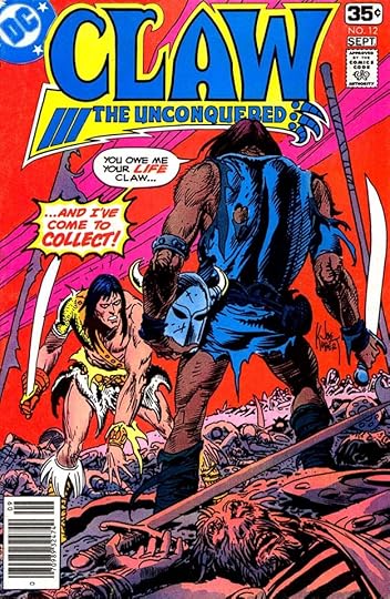 From CLAW #12, Aug-Sept 1978
These are standard cover balloons for Saladino with a burst for emphasis and letters held in red by the colorist and separator to draw attention. There would have been more issues, but the book’s run was cut short by the “DC Implosion” that happened in this year.
 From COPS #8, Jan 1989
COPS was a fifteen-issue series from 1988-89 based on an animated TV series. Saladino’s involvement was minimal, he lettered three covers including this one, and one book-length story. Here the thick, rough edge on the balloon suggests a rough voice.
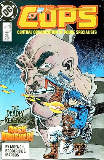 From COPS #9, Feb 1989
The blurb at lower left is a fine example of Saladino’s work, with rough letters above and rough open letters with texture below, though the texture is obscured by the color hold. I see this is credited to me in the Grand Comics Database referencing the Lettering Archives pages on my website. I will fix that, as it’s definitely by Gaspar. Possibly I did something else that wasn’t used.
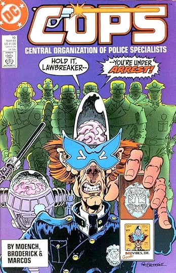 From COPS #10, March 1989
More fine display lettering on these word balloons by Saladino, keeping them wide to fit in the space.
 From COPS #2, Sept 1988
The first page from the only Saladino story lettering in the series with a creative title and energetic sound effect. Some books at DC had regularly assigned letterers, for others it seemed to be “whoever is available,” and that’s probably the case here. Or, the regular letterer couldn’t fit it into his schedule and Gaspar was asked to fill in for him.
To sum up, I found these covers of CLAW THE UNCONQUERED lettered by Saladino: 1, 2, 5, 10-12, six in all, and no stories. For COPS, he lettered covers on issues 8-10, three in all, and the 22-page story in issue #2.
More articles in this series, and others you might like, are on the COMICS CREATION page of my blog.
The post GASPAR SALADINO in CLAW THE UNCONQUERED and COPS appeared first on Todd's Blog.
February 3, 2022
GASPAR SALADINO in CHECKMATE!
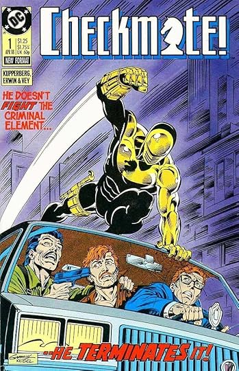 All images © DC Comics. From CHECKMATE! #1, April 1988
This title with a logo by me combining spy and superhero genres from writer Paul Kupperberg, artist Steve Erwin and others had a successful run of 33 issues from 1988 to 1991. Gaspar Saladino lettered some of the covers and also some of the stories, sharing those duties with others, but making a significant contribution in both areas. His lettering on this first cover adds excitement through his distinctive styles that I think are so much better than the type treatments DC was turning to more often around this time. I particularly like the bounce of TERMINATES here.
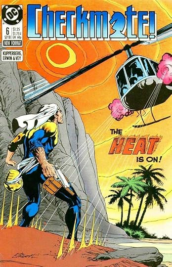 From CHECKMATE! #6, Sept 1988
Saladino could always be depended on to make a word like HEAT more interesting with a flaming treatment and textures.
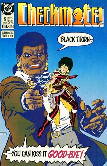 From CHECKMATE! #8, Nov 1988
In the hands of any average letterer, words balloons like these would be readable, but Gaspar adds excitement with his angular, rough-edged display lettering styles. All those square corners had to be created with a fine-tipped pen, adding corners to the more rounded strokes Saladino would have started with, and adding rough edges too. It took time, but the result was worth it.
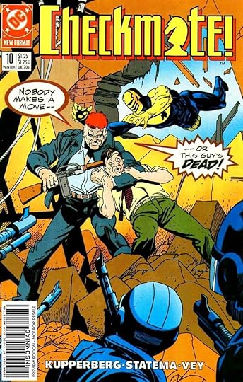 From CHECKMATE! #10, Winter 1988-89
These word balloons are closer to Gaspar’s interior style, but larger, and with extra emphasis on DEAD.
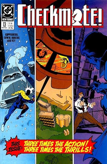 From CHECKMATE! #13, March 1989
Here’s a good example of lettering making the cover work. Without it, you have three seemingly unrelated scenes with no connection or flow. Gaspar’s exciting blurb connects them in the readers’ minds and makes them want to know more.
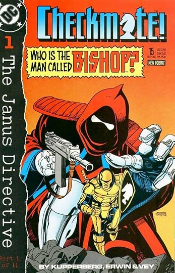 From CHECKMATE #15, May 1989
A distinctive villain and a distinctive Saladino logo for him, though probably not used again. In 1991 Marvel had a hero with the same name. I designed a logo for his miniseries in 1994, but I like this one better.
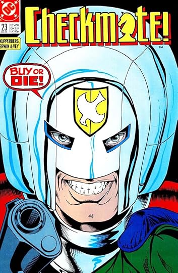 From CHECKMATE! #23 Dec 1989
This display balloon is short and to the point, and made more interesting by the treatment of each line and the double border.
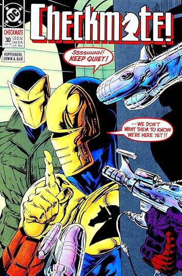 From CHECKMATE! #30, Aug 1990
Gaspar’s final cover lettering for the series has perhaps the loudest quiet balloons in comics history, made moreso by the red color holds.
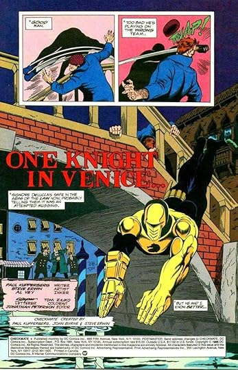 From CHECKMATE! #4, July 1988
Inside the book, Gaspar lettered several entire issues, including both stories in this one. The story title here is a bit subdued for him, so perhaps it was penciled in by artist Steve Erwin and Saladino just inked it. As usual, Gaspar credits himself with just his first name in script similar to his signature.
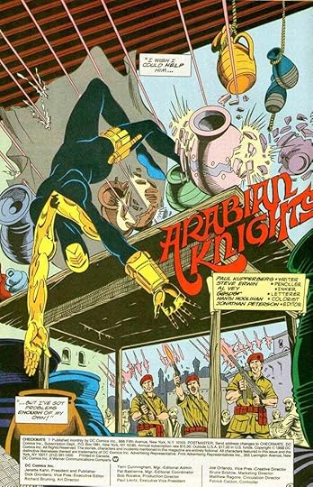 From CHECKMATE! #7, Oct 1988
By contrast, his story title on this issue is larger and full of Saladino creativity as he goes for a fanciful Arabian Nights approach.
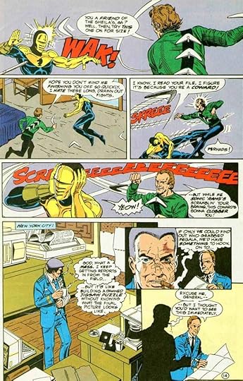 From CHECKMATE! #16, May 1989
Some artful sound effects on this page, and thought balloons, back when they were in more common use than they are today.
 From CHECKMATE! #18, June 1989
A nice perspective title here. Gaspar sometimes saved space by doing large balloons with horizontal top and bottom edges. I also like the Art Deco top title.
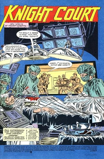 From CHECKMATE! #28, June 1990
Saladino’s title can’t be contained by the box around it, it breaks the edge in several places, and runs off to the left on the K. This adds excitement to an otherwise fairly ordinary two words.
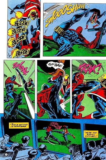 From CHECKMATE! #31, Oct 1990
More graceful and creative sound effects here with gunfire in the first panel right out of Saladino’s war comics past.
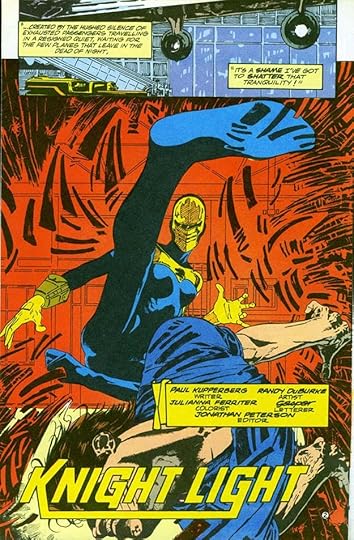 From CHECKMATE! #33, Jan 1991
On this story from the book’s final issue, Gaspar pulls interest from connecting two letters in the story title that’s otherwise a bit quiet. I hadn’t seen any of this lettering previously, as this was not a title I read, and it was great to see it today.
To sum up, I found Gaspar Saladino lettering on these covers: 1, 6, 8, 10, 13, 15, 23, 29-30, nine in all. Below are the stories he lettered. Where he did one of two, the story number is in parentheses.
#4 July 1988: 16pp, 8pp
#7 Oct 1988: 24pp
#9 Dec 1988: 24pp
#16 May 1989: 24pp
#18 June 1989: 24pp
#20 Sept 1989: 24pp
#28 June 1990: 25pp
#31 Oct 1990: 24pp
#33 Jan 1991: 8pp (2)
That’s a total of 201 pages on this book. More articles in this series and others you might enjoy are on the COMICS CREATION page of my blog.
The post GASPAR SALADINO in CHECKMATE! appeared first on Todd's Blog.
February 2, 2022
GASPAR SALADINO in CHALLENGERS OF THE UNKNOWN
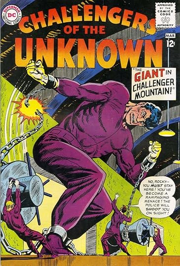 All images © DC Comics. From CHALLENGERS OF THE UNKNOWN #36, Feb-March 1964
The original artist and co-creator of Challengers was Jack Kirby, but by the time Gaspar Saladino began working on the title, he was long gone, having reimagined his team of daredevil adventurers with Stan Lee as The Fantastic Four. Gaspar was never a regular story letterer on this book, though he did letter four stories. Mainly he was the cover letterer, filling in often for Ira Schnapp in the mid 1960s, and taking over from him as the regular letterer with issue #62 in 1968. There were two earlier fill-ins by someone else in my opinion, the cover above is the first one that I believe is by Saladino. It features his wide, angular balloon lettering and his square title lettering that set it apart from the work of Schnapp.
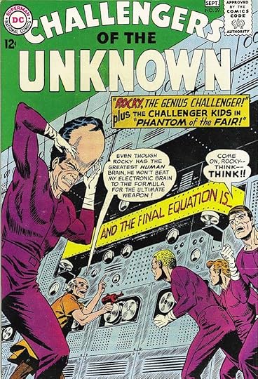 From CHALLENGERS OF THE UNKNOWN #39, Aug-Sept 1964
On these early examples, Gaspar’s cover lettering works fine, but the captions are still somewhat tentative, as he was not yet used to doing them. The layout in the caption box tends to leave open spaces rather than filling it evenly.
 From CHALLENGERS OF THE UNKNOWN #45, Aug-Sept 1965
A better example of that is on this cover, where the caption has lots of empty space that could have been filled with better-arranged lettering. It still reads fine and adds excitement.
 From CHALLENGERS OF THE UNKNOWN #53, Dec 1966-Jan 1967
There are so many early Saladino covers on this title, I have to think editor Murray Boltinoff preferred him to Ira Schnapp, and used him as often as he could. This one shows Gaspar getting a better handle on caption layout, and adding interest with an arrow caption.
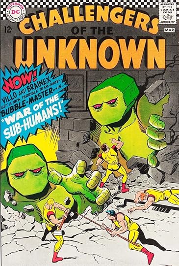 From CHALLENGERS OF THE UNKNOWN #54, Feb-March 1967
Saladino really ramps up the energy in this burst caption with the emphatic WOW!, though the burst border is not as well done as later ones. He hasn’t yet hit on the correct idea of having all the inward points aiming at the center. It was around this time the title was recognized with an Alley Award for “Best Non-Superhero Group.” I have to wonder why DC didn’t give them powers, but it did make them unique.
 From CHALLENGERS OF THE UNKNOWN #57, Aug-Sept 1967
This cover lettering is looking more tentative again, not filling the caption well, and with shapes that seem too uneven.
 From CHALLENGERS OF THE UNKNOWN #62, June-July 1968
This was the point where Saladino took over from Ira Schnapp on most of the DC covers, and Schnapp left the company soon after. Gaspar’s open lettering here is more creative and typical of his preffered styles, no longer trying to fit in with Schnapp’s traditions. I think it adds a lot to the cover, and gives it a fresh feel.
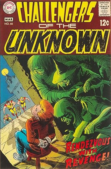 From CHALLENGERS OF THE UNKNOWN #66, Feb-March 1969
By issue #66, Schnapp’s logo had been replaced by a Saladino one. Not his best effort, but certainly adding energy with the textured letters of UNKNOWN. Gaspar’s open story title floats over the art, feeling more integrated.
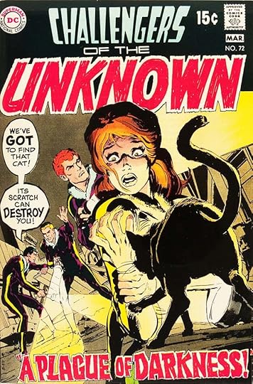 From CHALLENGERS OF THE UNKNOWN #72, Feb-March 1970
The lettering on this cover shows Saladino adding more diverse display lettering in the balloons, and effective textured lettering in the story title.
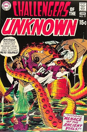 From CHALLENGERS OF THE UNKNOWN #77, Dec 1970-Jan 1971
This is an interesting combination. By this time slipping sales had turned the book to a reprint title filled with early Kirby stories from the SHOWCASE tryouts. The cover art and balloon by Saladino are new, but the caption is by Ira Schnapp from the original issue, SHOWCASE #12. The book ended here for about two years…
 From CHALLENGERS OF THE UNKNOWN #80, June-July 1973
…then came back with a few more issues of Kirby reprints under new covers. Gaspar lettered the handsome burst balloon on this one. Compare the burst here with the one on issue #54 to see how much he’s improved his technique.
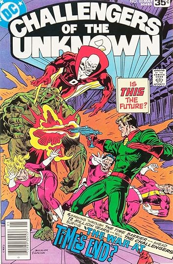 From CHALLENGERS OF THE UNKNOWN #86, April-May 1978
In 1977 the book returned again with a new logo and all new stories. Saladino did cover lettering for this and the following issue, and I think it’s excellent, though the placement over the figures is not ideal. On the other had, where else could it go? If I were in charge, I would have dropped the top caption, shortened the bottom one and put it where the top one is now.
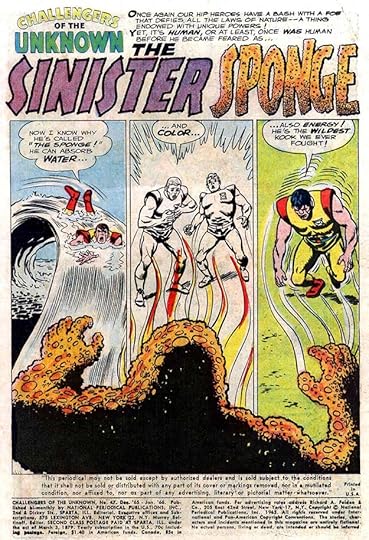 From CHALLENGERS OF THE UNKNOWN #47, Dec 1965-Jan 1966
At this time, Challengers stories were being lettered by Stan Starkman and others. When I came to this splash page for issue #47, the obvious creativity and style of Saladino’s story title jumped out at me. It really is excellent!
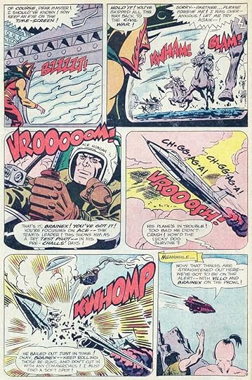 From CHALLENGERS OF THE UNKNOWN #52, Oct-Nov 1966
Saladino’s sound effects were also far superior to what others were doing on the book. His years of war comics experience paid off here. notice how he adds a thicker outline around all the letters in some to make them bolder.
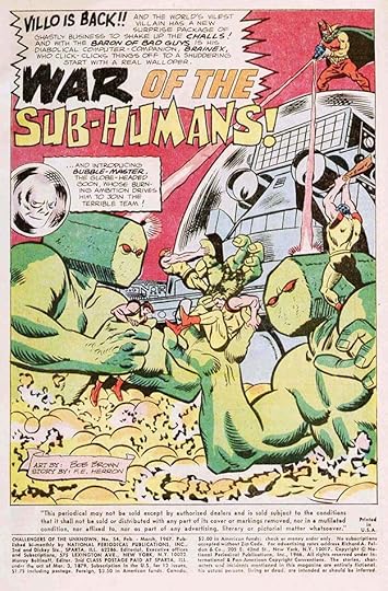 From CHALLENGERS OF THE UNKNOWN #54, Feb-March 1967
The title on this issue is wacky, but works for the odd creatures in the story.
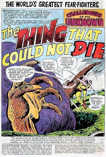 From CHALLENGERS OF THE UNKNOWN #60, Feb-March 1968
Gaspar’s final story lettering for the series has another energetic title, though I’m not sure the mix of styles is as successful here. I do like the texture in THING, though.
To sum up, I found Gaspar Saladino lettering on these CHALLENGERS OF THE UNKNOWN covers: 36, 39, 45, 53-54, 57, 62-77, 80, 86-87, that’s 25 in all. He also lettered the stories below:
#47 Dec 1965-Jan 1966: 11pp (first story)
#52 Oct-Nov 1966: 23pp
#54 Feb-March 1967: 24pp
#60: Feb-March 1968: 24pp
That’s 82 pages in all on this title. Other articles in this series and more you might enjoy are on the COMICS CREATION page of my blog.
The post GASPAR SALADINO in CHALLENGERS OF THE UNKNOWN appeared first on Todd's Blog.
Todd Klein's Blog
- Todd Klein's profile
- 28 followers


