
Todd Klein's Blog, page 79
January 6, 2022
Incoming: SANDMAN DELUXE HC BOOK FIVE
 Image © DC Comics. Cover by Michael Wm. Kaluta
The fifth and final volume of this reprint series with new covers has arrived. It contains issues 70-75 of the original series plus THE SANDMAN: ENDLESS NIGHTS, both the prose and illustrated versions of THE SANDMAN: THE DREAM HUNTERS, and a new afterward by Neil Gaiman. The price is $49.99, the size is slightly larger than typical collected editions on good quality paper with a glued binding. If you don’t already have a collected version of the series, these are well done. Look for it at your comics retailer, or there are links for all volumes below. Note that Book Two has the wrong cover image but is the right item, and Book Five is a preorder on Amazon.
&amp;lt;br /&amp;gt;&lt;br /&gt;<br /><br />
&lt;br /&gt;<br /><br />
<br /><br />
<br />
The post Incoming: SANDMAN DELUXE HC BOOK FIVE appeared first on Todd's Blog.


January 5, 2022
GASPAR SALADINO in BAT LASH
 All images © DC Comics. From BAT LASH #1, Oct-Nov 1968
After a SHOWCASE appearance, this humorous western adventure series gained its own title which lasted seven issues. The approach was similar to the TV show “Maverick,” a reluctant gun fighter who would rather gamble and spend time with ladies. Gaspar Saladino designed the logo and the top tag line, which had already appeared in several house ads and the SHOWCASE issue, so I’m not sure if this is the first appearance in this exact style. I’m going to count it for him anyway. Saladino also lettered a few more covers and nearly all the story pages in the book.
 From BAT LASH #5, June-July 1969
Throughout the book, western wanted poster letters were often used in sound effects, and are seen here in the balloon on DRAW. The logo used a similar style, of course, and it gave the book’s lettering a cohesive feel.
 From BAT LASH #6, Aug-Sept 1969
Here the mood is a somber one, perhaps an attempt to draw new readers. The thought balloon uses display lettering but with lots of air around it, an interesting choice.
 From BAT LASH #7, Oct-Nov 1969
More of that wanted poster lettering at the top and on an actual wanted poster on this final cover of the series.
 From BAT LASH #1, Oct-Nov 1968
Some examples of the same style inside the book as sound effects, and there are several other unique approaches in the lettering. The panels are all round-cornered (letterers usually inked panel borders then), with some balloons open at those borders, and the last balloon mirrors the panel shapes, almost a rectangle with rounded corners. This all served to give the book a more open feel than many DC titles at the time.
 From BAT LASH #2, Dec 1968-Jan 1969
All those style points are seen here as well as an unusual burst balloon shape and some music.
 From BAT LASH #3, Feb-March 1969
This splash page has a large, dynamic burst with the character’s name. Unfortunately, the speaker’s head is off-panel, so the tail has to go to his arm. Notice the even more rectangular balloons below. That was something Gaspar was trying at the time, it didn’t last too long.
[image error]From BAT LASH #5, June-July 1969This splash page has another dynamic character name and a large credit box that might have been a late addition. I think it’s by Saladino, and I don’t think I’ve seen the artist referred to as “Nicky” anywhere else. That might have been editor Joe Orlando’s wording. Credits were still not appearing on many DC books, nice to see them here, though of course Saladino’s name is not there. He wouldn’t start getting credited until 1977.
 From BAT LASH #6, Aug-Sept 1969
More wanted poster sound effects and an unusual wavy border on the last panel, perhaps to add to the drama. This was a clever and appealing series, too bad it didn’t sell well enough to last longer.
To sum up, Saladino lettered these covers: 1, 5-7, four in all, and below are his story lettering credits:
#1 Oct-Nov 1968: 24pp
#2 Dec 1968-Jan 1969: 24pp
#3 Feb-March 1969: 24pp
#4 April-May 1969: 23pp
#5 June-July 1969: pages 1-14 only
#6 Aug-Sept 1969: 24pp
#7 Oct-Nov 1969: 22pp
That’s a total of 155 pages. Other articles in this series are on the COMICS CREATION page of my blog.
The post GASPAR SALADINO in BAT LASH appeared first on Todd's Blog.
January 3, 2022
GASPAR SALADINO in OTHER A TITLES
As you might have noticed, I’m doing this series of blog articles about the cover and story lettering of Gaspar Saladino in alphabetical order. This post collects images, mostly covers in this case, from books that didn’t have enough of his work to justify a separate article in my opinion. For this title, Saladino lettered covers on seven issues, but that lettering was for two multi-part stories, so on this one, there were four parts with nearly the same lettering, only the last line changed for each part. This is a handsome scroll with appealing lettering in perspective.
 From ADVANCED DUNGEONS & DRAGONS #34, Oct 1991
The other continued story Gaspar did cover lettering for began with this issue, and features another nice scroll with more open lettering this time. The next two issues were the same except for the last line.
 From ANGEL LOVE #1, Aug 1986
ANGEL LOVE was a different kind of romance comic for DC written and penciled by Barbara Slate, one of the experimental efforts by the company of its time. It lasted only eight issues and a special, and Gaspar did cover lettering for seven of them. Here he did the top line and the thought balloon, already somewhat rare at DC then.
 From ANGEL LOVE #5, Dec 1986
Another thought balloon on this cover has a somewhat different lettering style, perhaps meant to increase the soap opera drama.
 From ANGEL LOVE #8, March 1987
The final regular series issue has two word balloons, one with a burst to add interest.
 From ARION, LORD OF ATLANTIS #4, Feb 1983
ARION had been a backup series in THE WARLORD and moved to its own series in 1982 with a logo by me. Many issues had no cover lettering, the ones that did were mostly lettered by Saladino, as in the burst here.
 From ARION, LORD OF ATLANTIS #13, Nov 1983
The cover blurb on this issue is an elaborate one with beautiful art behind it. I’m not sure if that’s by Saladino or cover artist Jan Duursema, probably the latter. The lettering is full of character.
 From ARION, LORD OF ATLANTIS #24, Oct 1984
The story title at the bottom of this cover is wonderful, with texture, rounded shapes, perspective, and a flag-wave curve. Knowing the usual stories about Atlantis, one can’t help be reminded of its end.
 From ARION, LORD OF ATLANTIS #34, Aug 1985
This cover blurb shows Gaspar creating interest with two contrasting styles, regular block letters and rough ones that look like they were done with a brush.
 From ARION, LORD OF ATLANTIS SPECIAL #1, Nov 1985
As was sometimes the case, when a series was cancelled, a special was produced to wrap up all the ongoing storylines. Gaspar’s blurb for this cover says it all.
 From ARION THE IMMORTAL #6, Dec 1992
Arion returned in a six-issue miniseries in 1992. Only the last issue had lettering by Saladino at the bottom right, and most of that is his Power Girl logo, but I will count it anyway.
 From ATARI FORCE #1, Jan 1984
In a decade of experiments and partnerships, DC’s ATARI FORCE stands out, perhaps because it didn’t have many obvious connections to Atari video games, but was simply a good space adventure series with excellent art by Jose Luis Garcia-Lopez. Gaspar lettered many of the covers, and his lettering for the series was often inspired. For this one he did the top blurb and the bottom burst with an appealing mix of his styles.
 From ATARI FORCE #2, Feb 1984
Perhaps Saladino was encouraged by the art, but his lettering for the series always adds to the excitement.
 From ATARI FORCE #3, March 1984
Another example of adding interest through two contrasting styles in this blurb. I love the letter shapes and textures on WILD!
 From ATARI FORCE #9, Sept 1984
Give Gaspar a visual word and he would always embellish it appropriately, as with SHADOWS here.
 From ATARI FORCE #12, Dec 1984
The top blurb on this cover would have been more effective if it had been larger. The bottom blurb shows the success Keith Giffen was having at the time.
 From ATARI FORCE #15, March 1985
To me, it’s a clear sign that Saladino was enjoying his work when he got as creative as he did here on the word SIEGE.
 From ATARI FORCE #16, April 1985
Gaspar’s delightful treatment of TAZLINGS with a tiny Tazling head on the I is one of my favorite cover lettering jobs by him. So playful and original, yet exciting! I think the burst word balloon is by interior letterer Bob Lappan.
 From ATARI FORCE #20, Aug 1985
I don’t know if ending this series was due to sales or to a management decision to cut ties with Atari, but Saladino’s creative lettering added a great deal to the covers right to the end.
 Page 10 from ARKHAM ASYLUM Hardcover, Nov 1989
In some ways, this book is one of Gaspar’s most important later works, though it was not well received. This Grant Morrison story with painted art by Dave McKean required lots of unique styles, and Gaspar did a fine job providing them, but some did not reproduce well over the art, and in general the lettering appeared smaller than usual. That’s because McKean’s art was larger than usual, I encountered the same thing when I lettered over his pages on BLACK ORCHID. There’s also something of a disconnect between Gaspar’s very 1970s comic book style and the moody, illustrational art. I love what he did, but as I said, many did not.
 Page 16 from ARKHAM ASYLUM, Nov 1989
In this example are samples of Gaspar’s style choice for The Joker, scratchy display lettering with lots of creative flair, but it doesn’t work as shown against the painted art with no balloon shapes around it and held in red, particularly here over black stripes.
 Page 60 from ARKHAM ASYLUM, Nov 1989
Overall this book was difficult to understand, especially for long-time Batman fans, and the lettering did not help, though it was somewhat a victim of circumstances that Saladino did not have any way to anticipate. He probably worked over photocopies of the art and did not even see it in color. I call this a noble effort by Saladino that missed the mark, but it may be his longest lettering project at 102 pages.
To sum up I found Gaspar Saladino lettering on the following covers:
ADVANCED DUNGEONS & DRAGONS: 5-8, 34-36
ANGEL LOVE 1-2, 4-8
ARION LORD OF ATLANTIS 1, 4, 9, 13, 24, 27, 29, 34, 35 Special 1
ARION THE IMMORTAL 6
ATARI FORCE 1-4, 9, 11-13, 15-16, 20
That’s a total of 36 covers on these A titles. More articles in this series are on the COMICS CREATION page of my blog.
The post GASPAR SALADINO in OTHER A TITLES appeared first on Todd's Blog.
January 2, 2022
And Then I Read: THE DIAMOND-STUDDED TYPEWRITER by Carlton Keith (Keith Robertson)

Jeff Green is a handwriting expert working out of a small office in 1950s Manhattan, helping clients certify wills and other legal documents, but he’s more interested in cases involving murder, like the one brought to him by Aice Anthony involving the murder of her estranged father, James Garvin. Garvin’s past is a tangled web of several identities and the smuggling of gems from Europe, and his Manhattan apartment, where he was found shot, becomes the crossroads for several parties searching for a missing diamond necklace and more loose diamonds, as well as the scene of a second murder. The reader finds out right away where those gems are, Garvin has hidden them inside the roller of his typewriter, but no one else, including Jeff Green, figures that out for a long time. Meanwhile, Green’s investigation takes him to some dodgy nightclubs, pits him against other smugglers and their henchmen, and takes him to a farm in Virginia, and a remote hunting cabin in the New Jersey pine barrens where the murderer is waiting to kill him.
I’m generally not a fan of murder mysteries unless they’re Sherlock Holmes ones from A. Conan Doyle. Several authors of novels for young readers that I like did murder mysteries too under a pen name, and this is one of them from Keith Robertson, author of the Henry Reed books and many others I like. Sadly, the things I enjoy most about his writing, including a good dose of humor, are mostly missing from this book, which is trying to be like the hard-boiled detective stories of writers like Dashiel Hammett. I haven’t read those, but I didn’t enjoy this one much. It’s very plot-driven, and Jeff Green, the lead, is not such an appealing character. His moral compass wavers, and he does things Robertson’s teen characters would not, nor does he seem to be particularly smart at either solving mysteries or avoiding trouble. He’s certainly no Sherlock Holmes. Robertson wrote more of these, but I won’t be searching for them.
The post And Then I Read: THE DIAMOND-STUDDED TYPEWRITER by Carlton Keith (Keith Robertson) appeared first on Todd's Blog.
December 31, 2021
GASPAR SALADINO in THE ATOM
 All images © DC Comics. From THE ATOM #14, Aug-Sept 1964
The Silver Age of DC superheroes was born when editor Julius Schwartz decided to revamp and revive some of the 1940s characters that had fallen out of favor and were no longer appearing. Each of them first had tryouts in SHOWCASE, then most went on to their own titles. He began with THE FLASH, then GREEN LANTERN, and THE ATOM was not far behind. The character gained his own title in 1962. At that time, veteran Ira Schnapp was lettering nearly all the DC covers, but when he wasn’t available, Gaspar Saladino sometimes filled in for him. That happened on this issue of THE ATOM. If you compare the balloon and caption lettering on this cover to any of the first 13 issues, you’ll see a marked difference in approach and style. Saladino’s balloon letters were wider and more angular, and his block letters were usually different from Ira’s, as is true here. Gaspar was the main story letterer on this and other Schwartz superhero titles, and I’ll cover that below, but I’m going to discuss his covers first.
 From THE ATOM #20, Aug-Sept 1965
The same thing happened a year later on this cover. The fact that Saladino was lettering nearly all the stories inside the book probably gave him an inside track on these cover assignments, and Ira was plenty busy everywhere else. I think putting all that cover copy into one large burst may have been a novice mistake, Gaspar wasn’t yet used to doing covers, and later he probably would have made two separate bursts, perhaps putting one at lower right. The story title might have looked better as open letters, too.
 From THE ATOM #28, Dec-Jan 1966-1967
This third fill-in cover lettering assignment is the best of the three, and the large caption is in an unusual shape that fits well in the space available. The display lettering inside it is in several styles that work well together. Note the lower case letters in THE in the story title, something that Schnapp pioneered, as seen on his logo, but Saladino made his own.
 From THE ATOM #37, June-July 1968
By 1968, Ira Schnapp had been replaced as the main cover letterer by Saladino, under a mandate from Carmine Infantino to update and revitalize the company’s style, and this is the first of his covers on this title after Ira stopped doing them, and was soon retired. The top tagline is by Schnapp, held over from previous issues, but the burst is by Saladino, now showing more confidence in his cover lettering, and developing the styles he would be using over the next decade and beyond. He’s given the emphasis to the characters by putting their names in open letters, and the rest is equally energetic and varied.
 From THE ATOM AND HAWKMAN #39, Oct-Nov 1968
With issue #39, the Atom’s title was joined with Hawkman’s, perhaps in hopes of increasing sales by pulling in fans of each. It worked for only a short time. The top line and new logo were by Saladino, and he lettered the remaining covers. This one fits the story title neatly into the small amount of space available at the bottom. The logo is an awkward shape that was usually running into the cover art, but it was at least clear and readable.
 From THE ATOM AND HAWKMAN #41, Feb-March 1969
On this cover Saladino cleverly imitates the angle and curve of his logo for the title banner at the bottom, and manages to fit in both long titles well. I’m not sure if he did the tombstone sign, but he probably did.
 From THE ATOM AND HAWKMAN #45, Oct-Nov 1969
The final issue of the series again has the logo running into the art, and just one burst word balloon. I like the cover art by Joe Kubert, but the series went no further. Both characters would remain in the Justice League of America and would appear in other places for decades.
 From THE ATOM #1, June-July 1962
As I said above, Gaspar was the go-to letterer for editor Julie Schwartz’s new superhero books, and this one was no exception, he lettered nearly all the stories to issue #36. The logo here is by Ira Schnapp, an elongated version of his original cover logo for first story pages. It’s interesting to see that the writer and artists are credited, something DC did not do regularly until the early 1970s, but Schwartz was more of a fan than the other editors, and I think he understood that readers would want to know who was making their stories. Of course, Gaspar received no credit, nor did the colorist, those assignments would not make regular appearances in stories until the mid 1970s or later, generally 1977 for letterers.
 From THE ATOM #2, Aug-Sept 1962
This action-filled page from the second issue has many fine Saladino touches. The POW! sound effect is dynamic, the burst balloons add energy, and even the captions have wavy, organic borders.
 From THE ATOM #7, June-July 1963
In issue #7, The Atom was already teaming up with Hawkman. There’s more to letter on this page, but it’s still relatively light for the time. Editor Schwartz loved getting some real science into the stories, as noted in the lower right caption.
 From THE ATOM #9, Oct-Nov 1963
My favorite thing on this page is the treatment of the word PHANTOM in the story title. Gaspar has inked it solid black, then scratched away some of the ink to create that faded effect, probably with an X-Acto knife, a common tool of the time. I also like the open drop shadow emphasizing DOUBLE.
 From THE ATOM #12, April-May 1964
Writer Gardner Fox had some fun sending The Atom into the past, here meeting Edgar Allan Poe. Gaspar’s large story title is great!
 From THE ATOM #14, Aug-Sept 1964
This page is more typical in the amount of lettering to be done, and it’s a page full of science that I’m sure Julie Schwartz loved.
 From THE ATOM #17, Feb-March 1965
The art on this page presented challenges for Gaspar, as the figures fill so much of the last three panels. We have collisions of thought balloons with a dialogue burst and a sound effect with the bubble tails over things they shouldn’t have to go over, but it all reads okay.
 From THE ATOM #21, Oct-Nov 1965
One of The Atom’s gimmicks was that, even at his small size he could pack a powerful punch. It was up to Saladino to sell this through his sound effects, and I think he succeeds.
[image error]From THE ATOM #26, Aug-Sept 1966An even more impressive THUNK! is the focus of this page, at least right after The Atom. I like the title, too. Gaspar lettered most of the story pages until issue #36 dated April-May 1968. At that point he had become increasingly busy lettering covers and house ads for DC, and this was one of the story lettering assignments he had to give up. He only lettered the covers on the Atom and Hawkman issues.
To sum up, these are the covers lettered by Saladino: 14, 20, 28, 37-45, twelve in all. Below are the stories he lettered inside the book. All feature The Atom, where Gaspar only lettered one of two stories, I’ve added a story number in parentheses.
#1 June-July 1962: 25pp
#2 Aug-Sept 1962: 13pp, 12pp
#3 Oct-Nov 1962: 15pp (1)
#4 Dec 1962-Jan 1963: 15pp (1)
#5 Feb-March 1963: 15pp (1)
#6 April-May 1963: 13pp, 12pp
#7 June-July 1963: 25pp
#9 Oct-Nov 1963: 13pp, 12pp
#10 Dec 1963-Jan 1964: 13pp, 12pp
#11 Feb-March 1964: 13pp, 12pp
#12 April-May 1964: 13pp, 12pp
#13 June-July 1964: 15pp, 10pp
#14 Aug-Sept 1964: 24pp
#15 Oct-Nov 1964: 12pp (2)
#16 Dec 1964-Jan 1965: 24pp
#17 Feb-March 1965: 14pp, 10pp
#18 April-May 1965: 11pp (2)
#19 June-July 1965: 25pp
#20 Aug-Sept 1965: 13pp, 11pp
#21 Oct-Nov 1965: 13pp, 11pp
#22 Dec 1965-Jan 1966: 24pp
#23 Feb-March 1966: 13pp, 11pp
#24 April-May 1966: 24pp
#25 June-July 1966: 13pp, 11pp
#26 Aug-Sept 1966: 24pp
#27 Oct-Nov 1966: 13pp, 11pp
#28 Dec 1966-Jan 1967: 15pp, 9pp
#29 Feb-March 1967: 23pp
#30 April-May 1967: 23pp
#31 June-July 1967: 23pp
#32 Aug-Sept 1967: 23pp
#33 Oct-Nov 1967: 23pp
#34 Dec 1967-Jan 1968: 23pp
#36 April-May 1968: 23pp
That’s a total of 767 pages on this series. Other articles in this series are on the COMICS CREATION page of my blog along with others you might enjoy.
The post GASPAR SALADINO in THE ATOM appeared first on Todd's Blog.
December 29, 2021
GASPAR SALADINO in ARAK, SON OF THUNDER
 All images © DC Comics. From ARAK, SON OF THUNDER #1, Sept 1981
This creation of Roy Thomas and Ernie Colón was an interesting sort of historical fantasy taking place in pre-colonial America. Gaspar Saladino did not letter any of the stories, but he did letter most of the covers, and I’ll show some I like here. There are two bursts on this cover with his lettering, each has a different style of border, one is rounded scoops, the other is straight points. The story title is fanciful and creative. Gaspar also did the monumental logo.
 From ARAK, SON OF THUNDER #2, Oct 1981
I believe I did the story title at lower left, but Gaspar did the handsome burst near the logo. I was on staff at DC at the time, and the story title might have been a last-minute addition I was asked to provide, I don’t recall. A rare treat to share a cover with Gaspar!
 From ARAK, SON OF THUNDER #3, Nov 1981
Here Saladino did the top line burst and the story title at left with deep telescoping. I’m not sure why he went in that direction, but it is similar to the logo.
[image error]From ARAK, SON OF THUNDER #5, Jan 1982That space above the RA in the logo seems tailor made for a small blurb, and here’s another one. The story title makes good use of block letters.
 From ARAK, SON OF THUNDER #7, March 1982
Two well-made captions on this cover, the first in a banner with great texture on BEHEMOTH, the second in a notched paper look.
 From ARAK, SON OF THUNDER #8, April 1982
The ragged scroll on this cover uses letters with a Celtic influence, which successfully steers clear of any religious connotations.
 From ARAK, SON OF THUNDER #12, Aug 1982
This cover blurb gives Saladino a chance to use his horror style on HELL, but I also like the tall lower case F in FERRYMAN, creative and unusual.
 From ARAK, SON OF THUNDER #13, Sept 1982
I like the Valda burst coming out of the inset art circle here, and the texture and creepy styles in the caption.
 From ARAK, SON OF THUNDER #17, Jan 1983
Both the scroll caption and circle are well done here, and the large size of the scroll, since there was room, makes it more effective. BYZANTIUM never seemed more exotic than with Gaspar’s creative letter shapes!
 From ARAK, SON OF THUNDER #20, April 1983
Another impressive scroll caption, this one has lots of texture and appealing open letters.
 From ARAK, SON OF THUNDER #24, Aug 1983
Saladino’s additions to this burst-through scroll add excitement.
 From ARAK, SON OF THUNDER #29, Jan 1984
That space at the top is again well used, and the story title has well-crafted creepy letters.
 From ARAK, SON OF THUNDER #32, April 1984
This caption is short and to the point, but Gaspar’s contrasting styles add a lot to its appeal.
 From ARAK, SON OF THUNDER #33, May 1984
This scroll caption works well, but the white letters make the top and bottom lines recede and put the emphasis on the two center lines. It should have been the reverse, but that was not Saladino’s doing.
[image error]From ARAK, SON OF THUNDER #37, Sept 1984Valda had long been a popular character in this book, and here she gets the cover with a fine story title by Gaspar. I had been commissioned to do a Valda character logo, this one by Saladino would have worked perfectly.
 From ARAK, SON OF THUNDER #40, Jan 1985
I love the style of BAGHDAD in the burst at upper left, too bad it isn’t bigger, but that would have made the A in the logo even harder to read.
 From ARAK, SON OF THUNDER #50, Nov 1985
The fiftieth issue was the last, as Gaspar’s lettering attests. It was a good run, I’d say, and I think the logo and cover lettering helped it succeed. Saladino lettered these covers: 1-33 (#2 partial), 35-47, and 50, for a total of 47 in all, a nearly unbroken run.
More articles in this series are on the COMICS CREATION page of my blog.
The post GASPAR SALADINO in ARAK, SON OF THUNDER appeared first on Todd's Blog.
December 27, 2021
GASPAR SALADINO in AQUAMAN
 All images © DC Comics. From AQUAMAN #25, Jan-Feb 1966
Aquaman had been around as a DC character since 1941, but his own series did not happen until 1962. When it did, it was popular and lasted years, and later series featuring the character have been published ever since. I haven’t found any stories in the books lettered by Gaspar Saladino, but he did letter quite a few of the covers, and I’m going to show many of them here. When the series began, Ira Schnapp was the regular DC cover letterer, but when he wasn’t available, Saladino would sometimes fill in for him. That happened on this cover, where Gaspar certainly lettered the top double burst and the word balloon. I’m less sure about the two arrows, they don’t look like his work, and may have been added later by someone else. Perhaps it was a last-minute addition from the editor, George Kashdan in this case.
 From AQUAMAN #30, Nov-Dec 1966
The same thing happened on this cover, Saladino did the top blurb. The addition of a mourning wreath to the Ira Schnapp logo is a nice idea from cover artist Nick Cardy, who was one of the best at the time.
 From AQUAMAN #34, July-Aug 1967
Around the end of 1966, popular DC artist Carmine Infantino was made art director and given the job of designing all DC’s covers, in other words doing layouts for the cover artists other than himself. He soon was made the editorial director. One of the changes he implemented was to gradually replace the aging Ira Schnapp as DC’s main logo designer and cover letterer with Gaspar Saladino, who he felt would bring a fresh look to the company’s overall presence. Gaspar had been lettering stories at DC since late 1949, and he rose to this new challenge with lots of excellent, dynamic work. I think this cover is the first one he did on AQUAMAN after his new mandate, and it shows him beginning to get more creative with the caption and lettering style.
 From AQUAMAN #38, March-April 1968
Soon Gaspar and cover artist Nick Cardy were working together to create even more interesting combinations of art and lettering that stood out from the crowd. I love the three-dimensional depth on this one.
 From AQUAMAN #39, May-June 1968
It was the era when psychedelic art was popular with both kids and young adults, and many of these designs play to that style. Note that Aquaman was in a cartoon show on TV at the time.
 From AQUAMAN #40, July-Aug 1968
These covers are pretty trippy, and Gaspar’s lettering helps sell them. The unusual shape of the E’s here was also used by him in other places around this time, and I like the way the A’s echo the logo.
 From AQUAMAN #41, Sept-Oct 1968
I couldn’t tell you exactly what’s happening here, but Gaspar’s large cover blurb makes it more exciting! The first line is in his horror style, with the rest in block letters that follow the perspective of the art.
 From AQUAMAN #42, Nov-Dec 1968
Nick Cardy was experimenting too, and here adds a unique version of the logo to his art. DC felt the book’s name had to be added in type at the top in case the bottom was covered on newsstands.
 From AQUAMAN #44, March-April 1969
One of the things Gaspar was trying at this time was rectangular word balloons, though the last one defies all description. They certainly add to the drama and interest on this cover. Note that Ira Schnapp’s logo has had a bolder outline added to it to punch it up.
 From AQUAMAN #45, May-June 1969
So many of these covers are unusual, it’s hard to skip by them. Here the note lettered by Saladino tells the part of the story the art can’t convey, and it all works together perfectly.
 From AQUAMAN #47, Sept-Oct 1969
Gaspar really gets loose on this blurb, as if the letters are swaying and drifting in the water.
 From AQUAMAN #50, March-April 1970
Great perspective on the top blurb, and effective contrast provided by the last word. The bottom blurb uses Schnapp’s Deadman logo.
 From AQUAMAN #51, May-June 1970
The tilted balloons add to the dizzy feeling of vertigo as the character seems to fall toward us. The curved title pulls us back into the picture.
 From AQUAMAN #71, Jan-Feb 1971
A similar idea from the other side as the character is pulled away from us, and his word balloons follow.
 From AQUAMAN #56, March-April 1971
Great perspective lettering that makes the creature seem even further away and larger. The period on the exclamation point is cropped on this particular cover, but it still reads.
 From AQUAMAN #58, Oct-Nov 1977
There was a hiatus of about six years in this series, and when it came back, Jim Aparo was doing the covers over his own interior art. Gaspar lettered a few of these issues, but though well drawn, they don’t have the impact of the Cardy covers in my opinion, and the lettering is less inspired. The logo has also gained an ugly double outline.
 From AQUAMAN #62, June-July 1978
The revival did not last long, and this is the penultimate cover, and the last one lettered by Saladino. He probably also did the lettering on the tombstone, which works well.
 From AQUAMAN #2, March 1986
There were other Aquaman books in the 1980s and 1990s, this is the only one with Saladino lettering. Writer and DC art director Neal Pozner was often a proponent of type on covers, but he also liked Gaspar’s work, and used it on three of the four issues of this miniseries.
 From AQUAMAN #3, April 1986
Neal’s logo design is very modern and type-based, so the hand lettering by Gaspar is not exactly a perfect fit, but I like it anyway, it kind of suggests the old shaking hands with the new.
 From AQUAMAN #4, May 1986
The final cover of the series is very symmetrical, and the lettering works that way too. I think it’s the best of the lot.
To sum up, Saladino lettered these covers of the original 1962 series: 25, 30, 34, 38-47, 49-51, 53-56, 58-59, 62. He also lettered issues 2-4 of the 1986 miniseries. That’s 26 in all. Not many, but there are some fine ones. Other articles in this series and more you might like are on the COMICS CREATION page of my blog.
The post GASPAR SALADINO in AQUAMAN appeared first on Todd's Blog.
December 24, 2021
GASPAR SALADINO in ANGEL AND THE APE and ANTHRO
 All images © DC Comics. From ANGEL AND THE APE #1, Nov-Dec 1968
This short-lived series was an odd mixture of mismatched detectives (girl and ape) and teen humor. I don’t think readers knew quite what to make of it, but Bob Oksner’s art was always terrific, as was Gaspar Saladino’s cover lettering. Here they’re going for a hippie/Woodstock vibe for the creative lettering and foreground figure, with kung-fu action behind. The logo is one of the first from Saladino after he was given a mandate by Carmine Infantino to update DC’s presence, taking over from the aging Ira Schnapp. DC was trying new things, and they didn’t all work, but the attempts were going in the right direction, and away from the company’s fixation on past glories.
 Fron ANGEL AND THE APE #2, Jan-Feb 1969
The gag is subtle on this cover, you have to notice the direction of the guy’s eye and the beads of sweat on his face to realize he’s just noticed who’s behind him. Gaspar’s word balloon helps by going from loud, large display lettering to increasingly smaller words.
 From ANGEL AND THE APE #3, March-April 1969
Sometimes a word balloon is all that’s needed to make a cover work, and that’s the case here. Without it, Oksner’s art would present a mystery. With it, we have a funny situation and perhaps a comment on Angel’s intelligence on top of that.
 From ANGEL AND THE APE #4, May-June 1969
Fans seemed more interested in Oksner’s beautiful girls than his amusing ape, and with this issue a new logo by Saladino promoted that. Angel’s attitude seems innocent and cheerful despite what they’re seeing, which is funny. Saladino’s balloon lettering here is looser than usual, perhaps it was done quickly, but I like it.
 From ANGEL AND THE APE #4, May-June 1969
Gaspar lettered only one story inside the book, the first of two in issue #4. Script credits are scarce on this series, but the title makes a clever joke on the war slogan, “Remember the Main!”
 From ANGEL AND THE APE #5, July-Aug 1969
More of that cheerful cluelessness here, and Saladino’s sign lettering adds to the gags.
 From ANGEL AND THE APE #6, Sept-Oct 1969
Perhaps the inspiration for these last two issues came from “The Munsters” on TV. Again, Gaspar’s signs add to the humor. Sales must have been too low to keep the book going, but the characters have returned several times since.
 From ANGEL AND THE APE #1, March 1991
Another miniseries from 1991 has cover lettering by Saladino on the first three issues under a logo I designed. I like the way the cover blurb echoes the one on the first issue of the original series, also by Gaspar.
 From ANGEL AND THE APE #2, April 1991
Cover lettering on issues 2 and 3 is minimal, as seen here, but also by Saladino. Another miniseries from 2001 used only type on the covers.
To sum up, Gaspar lettered nine covers for these characters, and one 12-page story for issue #4 of the first series.
 From ANTHRO #1, July-Aug 1968
Another unusual series from about the same time was created and drawn by Howie Post, a long-time animator and artist on humor comics for DC and other companies. ANTHRO was the adventures of a teenage boy in prehistoric times, sometimes played for teen humor, sometimes for action/adventure. It also did not last long, but was another interesting experiment from DC. The logo for this first issue was drawn as part of the art by Post. I was puzzled by the caption lettering, which is kind of like Saladino’s work, but kind of not…
 From ANTHRO #1, July-Aug 1968
…until I saw it had been pulled from Gaspar’s story title inside the book, and put in a too-large caption box. Then it made sense. The balloon shapes here are not typical of Saladino’s work, so I think they were drawn in by Post either before or after they were lettered. Howie was used to placing and writing in all the lettering on his humor stories, and probably also used to inking the caption and balloon borders, so he did the same here.
 From ANTHRO #1, July-Aug 1968
Gaspar might also have done the lettering on vellum overlays that were photostatted and pasted onto the finished art in some places, as seen for the last caption on this page, which clearly didn’t fit into the space Post left for it in the art. In general, the team worked fine together.
 From ANTHRO #2, Sept-Oct 1968
Pasting photostats of cover lettering on covers was the usual plan, and that was probably done here. The caption is cryptic but intriguing. Note that Saladino did this new logo, probably with input from Post, but a more typical logo for a comic.
 From ANTHRO #2, Sept-Oct 1968
Some of the sound effects and display lettering, as seen here in issue #2, are not typical for Saladino, though others are. These examples were probably pencilled by Post and just inked as is by Saladino. Gaspar lettered the stories in the first two issues of the series. After that he did only cover lettering.
 From ANTHRO #3, Nov-Dec 1968
Gaspar could always be depended on for spooky lettering, as in EVIL here. The outline around the entire blurb made it work over the busy art.
 From ANTHRO #5, March-April 1969
This cover has another cover blurb by Saladino in a box with a heavy outline. Could it have been drawn on the art by Post? I can’t think of any other reason it was done this way.
 From ANTHRO #6, July-Aug 1969
The final cover also has a caption in a heavily bordered box, but here the lettering seems to fit better. The appeal is toward teen humor with great inking by Wally Wood. Anthro was another unusual series that didn’t find an audience, but it was an interesting effort.
To sum up, Saladino lettered five of the six covers, and these stories:
#1 July-Aug 1968: 24pp
#2 Sept-Oct 1968: 23pp
A total of 47 interior pages for the book. Other articles in this series and more you might enjoy can be found on the COMICS CREATION page of my blog.
The post GASPAR SALADINO in ANGEL AND THE APE and ANTHRO appeared first on Todd's Blog.
December 23, 2021
A Forgotten Christmas Story by Elizabeth Enright
 © 1947, 1951 Elizabeth Enright Gillham
Elizabeth Enright is a favorite author of novels for children, perhaps best known for her four books about the Melendy family, which I’ve written about HERE and HERE. There are other books of hers I like just as much, including her Newbery Award winner, “The Sea Is All Around.” In 1947 she wrote a short Christmas story for “Woman’s Home Companion” magazine called “A Tree for Lydia.” In 1951 it was published as a small book intended to be a Christmas present for children, price one dollar. My copy is show above. It’s just 4 by 5 inches and 40 pages with charming illustrations by the author, but my copy has a stiff binding, and I can’t open it far enough to scan them without fear of breaking it, so I’m not going to do that. The book has never been reprinted. Copies can be found from rare book dealers for about $50, and for such a short book I’m not sure it’s worth it to most readers, unless you’re a dedicated Enright fan like me.
So, I’ve decided to type out the entire story here for anyone who wants to read this 1940s New York City tale. It’s undoubtedly a copyright violation, but I won’t be making any money from sharing it, so I’ll take my chances. Hope you enjoy reading it.
—
A CHRISTMAS TREE FOR LYDIA by Elizabeth Enright
Lydia first learned about Christmas when she was one year old. Draped over her mother’s shoulder she drooled and stared, and the lights of the Christmas tree made other lights in her large tranced eyes and in the glaze of spittle on her chin.
When she was two years old she learned about Santa Claus. She paid very little attention to him then, but when she was three she talked about him a lot and they had some difficulty persuading her that he and the infant Jesus were not father and son. By the time she was four she had come to accept him as one of the ordered phenomena that ruled her life, like daytime and nighttime: one seven o’clock for getting up and another seven o’clock for going to bed. Like praise and blame and winter and summer and her brother’s right of seniority and her mother’s last word. Her father did not exist in her field of magnitudes; he had been killed in Cassino the winter she was born.*
[*note: the World War Two Battle of Monte Cassino in Italy, 1944]
“Santa Claus will come,” Lydia said, and knew it was as true as saying tomorrow will come. “He will bring a Christmas tree. Big. With lights. With colors.”
When she was four, her brother Eddy was nine and had long ago found out the truth concerning the matter. No mote of illusion deceived his eye when he passed the street-corner Santas at Christmas time, standing beside their imitation chimneys, ringing their bells; he saw them for what they were. He saw how all their trousers bagged and their sleeves were too long, and how, above the false beards tied loosely on like bibs, their noses ran and their eyes looked out, mortal and melancholy.
“You’d think the kid would catch on,” Eddy said to his mother. “Gee, when you notice the differences of them all.”
Lydia believed in every one of them, from the bell-ringers on the street corners to the department-store variety who always asked the same questions and whose hired joviality grew glassy toward the evening. She had faith in the monster idol in the store on Fourteenth Street which turned its glaring face from side to side and laughed a huge stony machinery laugh all day long, filling the region with sounds of compulsive derangement. For Lydia, the saint was ubiquitous, ingenious, capable of all, and looking into the different faces of his impersonators she beheld the one good face she had invented for him.
“Eddy, don’t you tell her now, will you?” his mother said. “Don’t you dare to, now. Remember she’s only four.”
Sure, let the kid have her fun, thought Eddy, with large scorn and slight compassion. He himself remembered long-ago Christmas Eves when he had listened for bells in the air, and watched the limp shape of his sock hung up over the stove.
“How can he come in through the stove, Mum?”
“In houses like this he comes in through the window. Go to sleep now, Eddy, like a good boy.”
Eddy went to public school in the daytimes and Lydia went to a day nursery. Her mother called for her every evening on the way home from work. She was a thin dark young woman whose prettiness was often obscured by the ragged shadows of irritation and fatigue. She loved her children, but worry gnawed at her relations with them, sharpening her words and shortening her temper. Coming home in the evening, climbing up the stairs to the flat with one hand pressing the bags of groceries to her chest, and Lydia loitering and babbling, dragging on her other hand, she wished sometimes to let go of everything. To let go of Lydia, perhaps forever; to let go once and for all of the heavy paper grocery bags. It would be a savage happiness, she felt, to see and hear the catsup bottle smashed on the stairs, the eggs broken and leaking, and all the tin cans and potatoes rolling and banging their way downward.
They lived in a two-room flat with linoleum on the floor and a lively corrugated ceiling. In the daytime, from noon on, the rooms were hot with sunshine, but in the morning and at night they were as cold as caves unless the stove was going. The stove and the bathtub and the sink were all in the front room where Eddy slept. Sometimes at night the bathtub would gulp lonesomely, and the leaky tap of the sink had a drip as perfect in tempo as a clock.
Lydia and her mother slept in the back room, a darkish place, painted blue, with a big dim mirror over the bureau, and a window looking onto a shaft. The toilet was by itself in a little cubicle with a window also looking onto the shaft. When the chain was pulled it was as though one had released a river genie; a great storming and rumbling rose upward through the pipes, shaking all the furniture in the flat, then there was a prolonged crashing of waters lasting for minutes, and at last the mighty withdrawal, thundering and wrathful, growing fainter at last, and still fainter, till silence was restored, docile and appeased.
Sometimes when Eddy was alone and the stillness got to be too much for him he went into the water closet and pulled the chain just for the company of the noise.
He was often alone during the first part of his vacation. At noon, wearing his blue and gray Mackinaw and his aviator’s helmet with the straps flying, he came stamping up the stairs and into the sun-flooded crowded little flat. Humming and snuffling, he made his lunch: breakfast food, or huge erratic sandwiches filled with curious materials. When he was through he always cleaned up: washed the bowl or dish and swept up the breadcrumbs with his chapped hand. He had learned to be tidy at an early age, and could even make his bed well enough to sleep on it.
In the afternoons and mornings he voyaged forth with Joey Camarda, and others, to the street for contests of skill and wit. Sometimes they went to the upper reaches of the park with its lakes, bridges, battlegrounds and ambushes. Or rainy days they tagged through the museums, shrill and shabby as sparrows, touching the raddled surfaces of meteorites without awe, and tipping back their heads boldly to stare at the furious mask of Tyrannosaurus Rex.
“He isn’t real. They made him out of pieces of wood, like,” Joey said. “Men with ladders made him.”
“He is, too, real,” Eddy said. “He walked around and ate and growled and everything. Once he did.”
“Naw, he wasn’t real. Jeez he couldn’t be real. You’d believe anything. You’d believe in Santy Claus even.”
Christmas and its symbols were more and more in their conversation as the time drew near. They speculated on the subject of possible gifts to themselves. Joey said his uncle was going to give him roller skates and a real Mauser rifle.
“It’s one he got when he was in It’ly. What are you going to get, Eddy?”
Eddy said he thought he’d probably get a bike. It was just as likely that he would be given a bike as that he would be given the new moon out of the sky, but having made the statement, he went on to perfect it. He said that it would be a white bike with red trimming and a red piece of glass like a jewel on the back of it, and two raccoon tails floating from the handlebars.
“There’s going to be two kinds of bells on the handle bars. One will be kind of a si-reen.”
“Will you let me ride on it sometimes, Ed?”
That night he rode the bike all around the flat with the raccoon tails lying out on the speed-torn air. The taillight blazed like a red-hot ruby, and the siren was as terrible as human voice could make it.
“Watch me now, I’m taking a curve,” shouted Eddy, “Eee-ow-oooo-eee. Just missed that truck by half an inch!”
Lydia sad safely on the bed in the back room questioning him as he flashed by.
“Is it a plane, Eddy?”
“No.”
“Is it a car?”
“No.”
“Is it a—is it a train?”
“No. Gosh, it’s a bike. Look out now. I got to make that light. Eee-ow-ooo-eee!”
“Eddy, will you please for pity’s sake shut up!” cried his mother. “I can’t hear myself think, even!”
He came to a stop. “Gee, Mum, what are you cross about?”
She didn’t look at him; she pushed the potatoes and onions around the frying-pan with a fork. Then she shook salt over them, and spoke from a certain distance.
“Eddy, you kids don’t get a tree this year.”
“Heck, why not? What did we do? Why not?”
“I can’t afford it, that’s why!” she cried loudly, angry with him because she was hurting him. Then she lowered her voice. “They don’t want me back at the store after Christmas, they told me today. They don’t need me any more. I don’t dare to get you any presents even but just the things you have to have like socks and mittens.” She looked at him. “Maybe some candy,” she added.
A stinging hot odor arose from the frying pan to join the robust company of cooking smells from other flats on other floors: herring and chili and garlic and pork.
“Gee, Eddy, I’m scared to spend another cent. How do I know I’ll get another job?”
“What are you going to tell Lydia? She talks about the Christmas tree all day long.”
“She’ll have to do without, that’s all. Other people have to do without.”
“But, gee, she talks about it all day long.”
His mother threw down the fork and whirled on him.
“I can’t help it, can I? My God, what am I supposed to do?”
Eddy knew better than to go on with it. He leaned against the sink and thought, and when they ate supper he was kind and forbearing with Lydia who was both hilarious and sloppy. After a while his kindness became preoccupied, like that of one who drinks secretly at a spring of inspiration, and when Lydia had gone to bed he made a suggestion to his mother.
“I have an idea. If we put Christmas off for a few days, maybe a week, I can fix everything.”
His mother, as he had expected, said no. It was this response on the part of his mother which was the starting point of all his campaigns, many of them successful. He leaned against the sink and waited.
“What good would it do? And anyway what would Lydia think!” she said.
“Tell her Santa Claus is late. Tell her we made a mistake about the day. She’s too dumb to know the difference. Everyone’s dumb when they’re four.”
“And anyway, it seems kind of wrong.”
“What would Jesus care if we put his birthday off a couple of days?”
“Oh, Eddy, don’t be silly. There won’t be any more money than there is now.”
“No, but I got an idea. Please, Mum, please. Please.”
Eddy knew how to pester nicely. He had a quiet attentive way of looking and looking at one; of following one with his eyes and not saying anything, the request still shimmering all around him like heat-lightning. He waited.
His mother hung up the wet dishtowel and turned the dishpan upside down. She looked into the little mirror above the sink and looked away again. Then she sat down in the rocker and opened the tabloid newspaper.
“Oh, all right,” she said. “For pity’s sake, Eddy. What do you expect, a miracle?”
“Isn’t there ever any miracles? Anyway I’m not thinking about a miracle, I’m thinking about something smart,” Eddy said.
***
Christmas came, and for them it was a day like any other, except that their mother was at home. But it was easy to explain to Lydia that this was because her job at the store had ended for good, just as it was easy to explain Lydia’s own absence from nursery school by the simple method of rubbing Vick’s ointment on her chest. Eddy thought of that one, too.
“Gee, Eddy, I hope you know what you’re doing,” his mother said.
“I do know,” Eddy said.
“You should at least tell me what you’re going to do.”
“It has to be a surprise for you, too,” Eddy said, not so much because he wanted to surprise his mother as because he knew if he revealed his plan he would come in contact with a “no” which none of his stratagems could dissolve.
“It will be okay, Mum.”
“And when is it to be, if I may ask?”
“On New Year’s Day, I guess,” Eddy said, and went in search of Joey Camarda whose help he had enlisted.
On New Year’s Eve, early, he shut Lydia and his mother into their room.
“No matter what noises you hear, you don’t come out, see? Promise.”
“But, Eddy, I don’t think—”
“You promise.”
“Well—” his mother conceded, and that was as good as promising. She went in and shut the door, and before the extraordinary sounds of toil and shuffling commenced in the hall she was lost in the deep sleep of the discouraged: that temporary death which is free from all the images of fear or joy.
At midnight the city woke up and met the New Year with a mighty purring. In the streets people blew horns and shook things that sounded like tin cans full of pebbles. Lydia woke up too and thought that it was Santa Claus.
“I wanna get up, Mum. I wanna see him.”
“You lay down this minute or he won’t leave a single thing. He doesn’t like for people to be awake when he comes,” said her mother crossly, clinging to the warm webs of sleep.
But Lydia sat up for a while in her cot, rocking softly to and fro. Through the crack under the door came a fragrance she remembered well from Christmas a year ago, and the Christmas before that.
In the morning it was a long time before Eddy would let them out of their room.
“Eddy, it’s cold in here,” said his mother.
“I wanna see the tree, I wanna see the tree,” chanted Lydia, half singing, half whining. “I wanna see the tree, I wanna see the tree.”
“Heck, wait a minute,” said Eddy.
“I wanna see the tree, I wanna see the tree,” bayed Lydia.
There were sounds of haste and struggle in the next room.
“All right, you can come in now,” said Eddy, and opened the door.
They saw a forest.
In a circle, hiding every wall, stood the Christmas trees; spare ones and stout ones, tall ones and short ones, but all tall to Lydia. Some still were hung with threads of silver foil, and here and there among the boughs the ornaments for a single tree had been distributed with justice; calm and bright as planets they turned and burned among the needles. The family stood in a mysterious grove, without bird or breeze, and there was a deep fragrance in the room. It was a smell of health and stillness and tranquillity, and for a minute or two, before she had thought of the dropping needles and the general inconvenience of a forest in the kitchen, Eddy’s mother breathed the smell full into her city lungs and felt within herself a lessening of strain.
“Eddy, Eddy, how? How?”
“Me and Joe Carmarda,” Eddy whispered. “We went all around last night and dragged them out of gutters. We could of filled the whole entire house with them if we wanted to. Last night in here it was like camping out.”
It had been like that. He had lain peacefully in his bed under the branches, listening to the occasional snow-flake tinkle of a falling needle, and to the ticking of the leaky tap, hidden now as any forest spring.
“Eddy, honey, look at Lydia.”
Lydia still looked new from her sleep. She stood in her flannel nightgown with her dark hair rumpled and her eyes full of lights, and her hands clasped in front of her in a composed, elderly way. Naturally a loud exuberant girl, the noise had temporarily been knocked out of her.
“All the Christmas trees,” she remarked gently.
“Gee,” said Eddy. “Don’t get the idea it’s going to be this way every year. This is just because he was late, and it’s instead of presents.”
It was enough for Lydia, anyone could see that. In a way, it was enough for Eddy, too. He felt proud, generous and efficient. He felt successful. With his hands in his pockets he stood looking at his sister.
“All the Christmas trees,” Lydia said quietly, and sighed. “All the Christmas trees.”
The post A Forgotten Christmas Story by Elizabeth Enright appeared first on Todd's Blog.
December 22, 2021
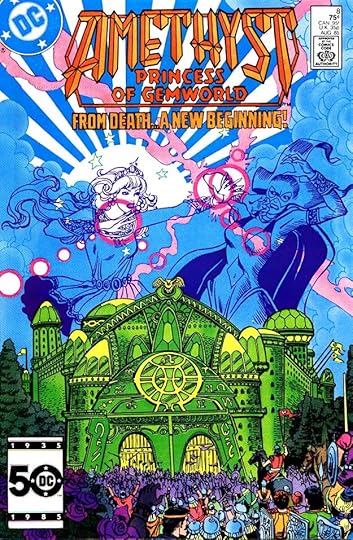
GASPAR SALADINO in AMETHYST
 All images © DC Comics. From AMETHYST, PRINCESS OF GEMWORLD #1, May 1983
Amethyst was a fantasy series begun in 1983, created by writers Dan Mishkin and Gary Cohn and artist Ernie Colón, about a girl from our world who enters a fantasy gem world as a princess in danger from powerful enemies. Gaspar Saladino only lettered covers for the feature through several series, and one single-issue logo. I will show most of them here. The interior letterer was often John Costanza. The first series was a limited 12-issue one, and Saladino lettered the top line above the logo I designed. Many covers of this first series had no lettering.
 From AMETHYST, PRINCESS OF GEMWORLD #7, Nov 1983
One exception was this interesting cover blurb on issue #7 where Gaspar used one of his horror styles to add to the creepiness. The first series went over well with readers, and an ongoing series was begun in 1984.
 From AMETHYST #1, Jan 1985
Though the logo is the same, this series was simply called AMETHYST. Ernie Colón was still involved, but he did considerably less of the art after doing all of it on the first series. Other artists worked on some of the covers and interiors, like Paris Cullins and Romeo Tanghal on this cover. Saladino did a nice banner above the logo, though the dark color makes it hard to see the banner.
[image error]From AMETHYST #3, March 1985More of the covers in this series have lettering by Saladino, though not all. The caption seen here is one of the best examples with creative, expressive designs for the words FIRE and JADE.
 From AMETHYST #4, April 1985
Some covers only require word balloons, and Gaspar’s were always effective, helping tell the story.
 From AMETHYST #5, May 1985
And here’s another with emphasis on the important words. Cover lettering was generally done on separate, thinner art paper, and DC’s production staffers like Bob LeRose would order photostats from DC’s darkroom photographer Shelly Eiber at the size they thought worked best. The photostats were cut out and pasted onto the art. In this case, I would have made the word balloon a little larger. Gaspar generally did not get consulted on such things.
 From AMETHYST #7, July 1985
Here’s another case where I would have made Saladino’s story title larger. It seems like there’s plenty of room, and it would have been more effective. I did work on cover assembly from time to time when I was on staff, but not often. Most of the time I was doing corrections on story pages.
 From AMETHYST #8, Aug 1985
On this one I like the lettering size better, as it matches the width of the logo. Editor Karen Berger would also have had a say in such things. Assembled covers would be shown to her for approval, and if she wanted the lettering changed in size or position, that would be done.
[image error]From AMETHYST #9, Sept 1985Ernie Colón was back on covers with this issue, and his art and the Saladino lettering look fine to me.
 From AMETHYST #11, Nov 1985
This cover has no cover lettering, but I thought I’d show it for Gaspar’s wonderful logo done just for this issue. I’ve already shown it in my articles on his logos, but I love it and couldn’t pass up the chance to show it again. I don’t know if Saladino was paid a logo rate for this, as it might have been considered cover lettering instead, but I hope so, and he probably was.
 From AMETHYST #14, April 1986
Nothing like weird open lettering surrounded by a menacing black shadow to up the tension! I really liked it when Saladino went in this direction, loose and angular.
 From AMETHYST #15, June 1986
There’s more of that on this cover for FLAW and THE CHILD over the more standard block letters of APOCALYPSE.
 From AMETHYST #16, Aug 1986
The series was cancelled abruptly, and this was the final regular issue. It had already dropped from monthly to bimonthly, never a good sign. Storylines were left unfinished, but they did get resolved in the issue below.
 From AMETHYST SPECIAL #1, Oct 1986
An annual-sized book allowed Mishkin and Cohn as well as artist Ernie Colón to wrap up their ideas for the series, and it featured a beautiful scroll caption by Gaspar. The book also introduced another creative team that would handle the next short series.
[image error]From AMETHYST #1, Nov 1987Writers Keith Giffen and Mindy Newell were joined by legendary Spanish artist Esteban Maroto for this miniseries, and Gaspar Saladino once again handled the cover lettering perfectly.
 From AMETHYST #2, Dec 1987
I love both the art by Maroto and the lettering on these covers, so I’m going to show all of them. Cover coloring probably by Tatjana Wood really enhances the art and the lettering here, and Gaspar goes the extra mile to imitate my complex logo in the first caption.
 From AMETHYST #3, Jan 1988
Here’s another fine example of Gaspar’s creative title lettering with added texture to make it even better.
 From AMETHYST #4, Feb 1988
The final issue for this team, and the final Amethyst lettering for Saladino. The dark purple in the letters makes them a bit hard to read, but this still works fine.
To sum up, Gaspar lettered 17 Amethyst covers. Other articles in this series, and more you might enjoy are on the COMICS CREATION page of my blog.
The post GASPAR SALADINO in AMETHYST appeared first on Todd's Blog.
Todd Klein's Blog

- Todd Klein's profile
- 28 followers

