
Emily Henderson's Blog, page 90
May 18, 2023
Is Sunbrella Fabric Worth It? An Outdoor AND Indoor Review, 2 Years In The Making

Hey friends – do you trust me? Because I have been living with and testing some incredible pet-/baby-/child-/chaotic-adult-proof fabric over the past 2 years and I’m finally ready to share the honest pros and cons. That’s right, baby: TODAY, WE’RE TALKIN’ ABOUT SUNBRELLA. You’re probably familiar with the name (maybe you’re even rocking some Sunbrella fabric on your outdoor furniture as we speak!), but I’ve tested it out in a ton of different applications – Curtains! Pillows! Outdoor cushions! Indoor upholstery! – and have since amassed a whole lot of first-hand experience that I’m excited to relay to my fellow home-loving companions. You’ve probably read my blurbs about this material in a variety of blog posts over the last few years, but I’m so excited to partner with the brand (!!!) to compile my thoughts in one place.
So if you’ve ever wondered if Sunbrella fabric is comfortable, or easy to clean, or stain-resistant, or pet-friendly…well, I have all the answers you’ll ever need below. (Spoiler: I LIVED IT, I LOVED IT.) Let’s take it back to the beginning of my journey…
My OG Inspiration
 photos by sara ligorria-tramp | styled by emily henderson and emily bowser | from: after three years we can actually use our upper deck
…or, uh, Spring 2021. (Same thing.) I saw these photos of Em’s mountain house deck, read her Sunbrella fabric testimonial, and was pretty immediately #emfluenced. Weather-resistant? Fade-resistant? stain-resistant? Easy to find at the stores I already patronize? SOLD. See, I was working on my own outdoor space at the time – a tiny 4’x10′ balcony, just off a major 6-lane road in Los Angeles (so, uh, basically the opposite of Em’s idyllic mountain retreat) – and I decided to invest in a few pieces with Sunbrella fabric for my own home.
My First Trial Run
 photos by sara ligorria-tramp | styled by emily bowser | from: caitlin’s hard-to-design balcony gets a palm beach regency refresh (+ her #1 balcony must-have rec)
And y’all, I am SO GLAD that I did. I hung those sweet cabana stripe curtain panels made with Sunbrella fabric over the summer in 2021 and they still look brand new after nearly 2 years of near-daily sun exposure (same with the pillows – they’ve held up beautifully).
My favorite part, though, was the cushion I grabbed for my secondhand rattan loveseat. This thing exceeded my expectations in every way – the fabric is easy to clean with a wet towel and some soap (essential for those of us who live near roads and often find our outdoor possessions covered with a thick layer of black dust), it is mold and mildew-resistant (I didn’t feel bad about leaving it outside during the freak rainstorms we’ve been having in 2023, which is awesome for those of us who lack storage), and the kicker: after a lot of testing, I can confirm that Sunbrella is a GREAT fabric choice for pet owners.
Buff, my cat, spends a ton of time out here on this cushion – making biscuits (kneading? You know, whatever your regional term is :)), stretching in the sun, playing, jumping, zoomie-ing, all that jazz – and while no fabric is totally indestructible, the stuff out here REALLY held up to the elements. To that end, I knew that Sunbrella fabric was going to be the most durable choice for my indoor upholstery, too.
Wait, Can You Use Sunbrella Fabric On Indoor Furniture? can you spot buff?
You sure can! And it’s pretty widely carried at many of our favorite EHD retail destinations. My search for indoor, stain-resistant, pet-friendly furniture for my home brought me to Mitchell Gold + Bob Williams, which carries a really lovely variety of Sunbrella fabric.

I landed on the Sunbrella performance basket weave fabric (in ‘Almond,’ in case you want to match!) because I fell in love with the texture – it looked classic and timeless, but the weave also felt pretty sturdy and forgiving and easy to maintain long-term. (And for the record, MG+BW carries a really nice assortment of other types of Sunbrella fabric! I eyed their Sunbrella two-tone linen weave and their Sunbrella chenille fabric for these chairs, but am SO happy that I landed on the basket weave.
Is It Comfortable?
YES, BIG TIME. I think that a lot of the time, when people hear “performance fabric,” they think “canvas.” (Guilty as charged.) And while you can absolutely use canvas indoors, there are SO MANY more options and textures to choose from! Case in point: the Sunbrella basket weave texture I landed on doesn’t just look luxe – it feels great, too. It’s soft and comfortable while also being tough enough to stand up to daily life.
Is It Actually Stain-Resistant?
Yes, THANKFULLY. I got these chairs delivered back in September 2022 and the upholstery has absolutely seen its fair share of spills and “whoops” moments in the many months that have passed since. True to form, I accidentally got dirt ALL OVER this chair about a week after it was delivered. (The cut of the arms is perfect for those who love to pull their legs up underneath them – just forgot I had sandals on!) It was pretty nerve-wracking at first – had I just ruined my new furniture before I had a chance to share it with the world? – but then I remembered that this kind of situation was exactly why I wanted to use Sunbrella fabric on my indoor upholstered furniture.
All Sunbrella fabrics are manufactured with technology that saturates every fiber with color and UV-stabilized pigments before being spun into yarns and woven, which means that you can easily clean up messes when life happens. Much like the cushions on my patio, all the muck and gunk removed super easily with just a little bit of soap and water. CRISIS AVERTED. (If you opt for a piece that’s been slipcovered, you can also throw your Sunbrella fabric straight into the washer!) This is why we CAN have nice things. 🙂
Is It Pet-Friendly?
ABSOLUTELY. And while I can only speak to the experience I’ve had with Sunbrella fabric and a cat who loves to climb and claw, I’d emphatically recommend this fabric to any pet owners out there. Look – long-lasting, quality furniture is an investment (as it should be!), and it makes sense to protect that investment by choosing a fabric that will give your pieces the best possible chances at survival, you know?
While I don’t want to make any extraordinary claims, I’ve been so pleased by the way that the tight weave of the basket weave Sunbrella fabric I chose has held up to daily wear-and-tear from Buff, a nearly 13-year-old cat whose sprightly movements and constant zoomies could rival any kitten. I definitely don’t encourage her to use these chairs as a scratching post, but I do feel like I have the freedom to be a little less precious. It’s awesome to be able to sit back and enjoy my furniture without worrying that it’s on the constant verge of destruction, you know? (PS. Dog owners, you can read Em’s firsthand testimonial about choosing Sunbrella for her dining nook right here!)
TL;DR – Yes, Sunbrella Fabric Is Worth The Investment
Y’all, it is SUCH A TREAT to have the opportunity to write this post. I don’t take my recommendations lightly, and it’s been a dream to write about something that I’ve tested (both indoors and outdoors!) that I genuinely love and believe in. With Sunbrella fabric, I’ve been able to get the aesthetic look I wanted (soft, textured, tailored, clean, and comfortable) without any of the stresses or the extra mental load that usually come along with maintaining white or upholstered furniture.
Since Sunbrella fabric is designed to withstand the toughest messes, it’s the PERFECT choice for those whose interiors often take a beating. 🙂 I, a person who spills constantly (and who spilled that Hawaiian Punch all over immediately after taking this photo), am still no match for Sunbrella fabric. Buff, a cat who is seemingly in the running to become the nation’s preeminent feline-free climber, is no match either! I’ve written about my experience with this fabric ad nauseam in tinier chunks over the past year and a half and it’s been so exciting to be able to share all my thoughts and opinions in one place. (Can you tell I genuinely love it?)
Let me know if you have any questions. Here’s to making our lives a little easier and a little more beautiful, too. 🙂
This post was sponsored by Sunbrella but all words and opinions are all mine🙂
*Design by Caitlin Higgins (me!)
**Styled by Emily Bowser
***Photos by Sara Ligorria-Tramp (unless otherwise noted:))
The post Is Sunbrella Fabric Worth It? An Outdoor AND Indoor Review, 2 Years In The Making appeared first on Emily Henderson.


May 17, 2023
The IKEA Headboard Hack For Charlie’s Room That Only Took Emily One Day To Make

Today I have a fun Charlie room update for you – a new, bigger bed, with a DIY IKEA no-sew headboard. This time around I’m trying to involve the kids in their projects as much as physically (and for me, mentally) possible – while keeping it positive. I want to do some more DIY’s with them, but they need to be fairly basic and I know they need to actually enjoy the process. So we came up with something really simple to make that involved, well, a staple gun (the new trigger pull version that is admittedly very fun). Tuft & Needle had reached out about a social partnership and I love their mattresses (we have them in the kid’s bunk room at the mountain house which I actually need to shoot as I never have). Technically Brian and I didn’t need a new mattress (although after laying on this one I’m very jealous, it’s extremely comfortable). But Charlie needed both a proper bed and a new mattress as we wanted to upgrade his to a Queen (not because he needed one but more because his room is big enough to be a second guest room which we are going to need this summer as families with multiple kids will be staying here). I know that couples can technically sleep in full beds, but as an enthusiastic King bed sleeper, I figured at least a queen would be nice to provide. Here’s where we last landed when we showed you his room a few weeks ago:
 photo by kaitlin green | from: designing with an almost tween boy: charlie’s room update/progress with a thrifted 80s vibe
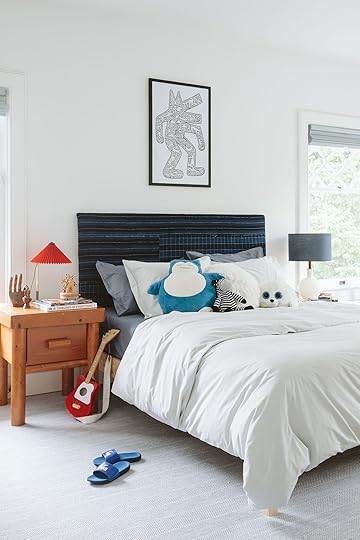
This room now won’t be shot for the magazine (it’s just not very close and we have so many rooms to shoot) which is fine by me because I want to do a Banyan Bridges-style mural but Racheal is so busy with her show, Artfully Designed, that she won’t be able to help me til fall. But in order to keep moving we hacked this bed to give him a proper headboard (and Kaitlin took home this old frame and mattress to her daughter for her big girl bed.)

This DIY won’t break the internet (like Brady’s DIY headboard that we all still talk about) but it’s a vintage plaid that I love, over a simple IKEA frame that looks cute and does the job and simple enough that Charlie was able to help me with it (sorry, he helped the day before Kaitlin came over to shoot so no photos of him, but he is in the reel).


We bought this bed from IKEA – attracted to the pine sides and how easy it would be to hack. Realizing we wanted it taller we then added a foot with a 1x12x6 piece of lumber, secured with some straight/flat braces. We then wrapped two layers of batting using a staple gun, a 9 year old boys dream diy tool.

We thought about playing with the shape but figured once we get a playful mural up on the walls something more linear was safer.

This post isn’t sponsored by Tuft & Needle, but in case you are in the market this is their new mint hybrid mattress which has both springs and their patented foam technology and is EXTREMELY comfortable. I love a softer mattress and this one is really really good.
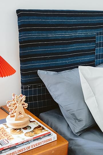

The fabric is one of my quilted Japanese Boro plaids that I love, and this one was dark and really pulled your eye in a good way.
There you go! It took a day of gathering stuff and a day for Gretchen and I to do – with Charlie’s staple gunning help of course. The bed itself wasn’t that easy to put together but it is SOLID.

Y’all these pups will NOT allow for a photo shoot without them. They follow me around all day and I can’t not put them in shots (which I love because it adds “life” and keeps my kids for the most part off the internet :))
I still need to figure out if I want to strip or paint that nightstand (and the matching chair) or leave its 1970s orange, which honestly does kinda work in here. Thoughts??!!
Resources:
Window Treatments: Decorview
Carpet: Stark Carpet
Wall Color: Extra White by Sherwin-Williams
Outlet Covers: Rejuvenation
*Photos by Kaitlin Green
The post The IKEA Headboard Hack For Charlie’s Room That Only Took Emily One Day To Make appeared first on Emily Henderson.
May 16, 2023
How To Build A Stylish Room Around The Neutral Classics (A Gray Sofa, Walnut Dining Table, And More) + Another Chance To Win A $2,000 Article Gift Card

2023 marks the seventh year of me working in this industry so I think it’s fair to say that I’ve seen my share of furniture companies wonderfully evolve while still maintaining their style and ethos…and others, sadly not. Article is one that I am consistently impressed by and even more so recently. Y’all if you haven’t been on their site lately might I suggest you take a scroll. Every product still looks like a classic, is made with high-quality materials, oozes comfort, and is fairly priced… and to my complete delight, they are playing with even more fun shapes and pretty materials. There are so many pieces that are just cool (but not in an overly trendy way). So when Article reached out about doing a sponsored post together for their Memorial Day sale, I was pumped. Not only because we get to give a lucky reader a $2000 Article gift card again (YES, I KNOW!!) but we get to show you how you can build a truly beautiful and eclectic room that will stand the test of time, with just their products. Article has been an EHD go-to for yeeears because it’s a brand we love and can always count on. I mean did you see the basement makeover Emily just did?? Plus, the customer service is ridiculously good and the delivery times are fast.
So to make this post both fun and helpful we thought we’d show you how to build a room around a classic “anchor piece” or “staring piece”. All of the anchor pieces are on sale (exciting!). Should you want to purchase any of them, you’ll know how to build a stylish room around each one. Oh and to enter for the $2000 gift card, all you have to do is check out their site and leave a comment here with the piece that you’d love to bring home. Let’s start with the living room!
 photo by sara ligorria-tramp | from: styling to sell: the playroom/family room and the 4 lessons i learned along the way…
Sofa | Green Pillow | Grid Lumbar Pillow | Wood Coffee Table | Gray Pouf | Rug | Sheepskin | Floor Lamp | Sconce | Side Table with Leather Shelf | Accent Chair | Striped Lumbar Pillow | Black Side Table | Media Console
Ah, the heart of the home (well aside from the kitchen of course:)). I wanted to start with the famous Sven Sofa. We are big ole fans of this modern MCM-style sofa. Sara has literally owned three (seen here, here, and here), Emily had one in her LA house, and one of my best friends has had her eyes set on the leather one for years, although I think the sectional version would look great in her space:) But enough about us and more about this sofa. It’s got personality without taking over the whole room – meaning it’s super versatile. This is great since it gives you so much room to play with lots of different styles and colors. I decided to keep things pretty neutral in color and focus more on shapes and light patterns. As I am looking at it now I realized I worked in triangles. By that I mean that most of the elements are spaced out, making it all look balanced (at least to me, ha). For example, all of the upholstered pieces are different tones of gray yet none of them look drab. The sofa has clean, structured lines, the pouf is lightly patterned and round, and the accent chair has a beautiful and interesting wood frame. There is also a good balance of round and squared-off shapes as well as a variety of wood tones.
So while technically “neutral,” I still wanted the room to have visual depth. An easy way to do that was to choose a dark rug and this one is SO pretty. The color is rich but the pattern and fringe make it feel a little playful and fun. After the rug was selected I went with that incredible black side table, that beautiful floor lamp, and pillows that had dark tones. I also feel that the leather shelf on the other side table brings some extra depth to that side. Speaking of that side table, how good is it? Secret: It’s actually a nightstand. Shhh, no one will ever know! And that media console???? Article is killing it! And yes my love of nesting coffee tables knows no limit:)
 design by arlyn hernandez | photo by sara ligorria-tramp | from: arlyn’s moody dining room reveal
Dining Table | Dining Chair | Brass Pendant | Rug | Accent Chair | Side Table | Sideboard | Mirror | Table Lamp
Moving onto the dining room. I chose this dining table as the anchor piece because not only is it super versatile style-wise but it’s also extendable! It’s nice to have a furniture piece that can be upgraded to have multiple seating options. Now, while I love the MCM look, I didn’t want to lean into it too much hence the contemporary dining chairs. They have a 2023 feel which is a nice style contrast to the table, and the dark tones of the chairs and table work really well together. And who doesn’t love a comfy upholstered chair?! Another bonus is that the dark blue colorway hides accidental food mishaps, win-win!
Moving to the floor, I wanted to add a little pattern. I think this rug is SO good. The pattern is subtle but cool, and the rug has a low pile so it’s great for a dining room where food and drinks are consumed (and sometimes spill). Pattern is important to any room (no matter how small) but so is texture! That’s where this beautiful sideboard comes in to save the day. The chunkiness perfectly balances out all the legs of the dining table and chairs. In addition, the rattan adds such beautiful visual interest and depth (and actual storage). It also helps the overall design from leaning too dark.
Speaking of that, you know this room needed a little luxury: Enter the brass pendant and gold table lamp. They add just enough sparkle without the space feeling too glam. The final element in this sideboard vignette is the wall mirror. The shape is so great and the wood tone speaks to the dining table. Mirrors almost always make a room feel bigger too which is an added bonus.
Now, not every dining room has room for a seating area, but I figured this room could be whatever I wanted and stuck one in! The warmth of those swivel leather chairs really makes the space pop in the best way and the side table’s black top pulls in the dining chairs and sideboard. What’s not to love??

Bed | Nightstand | Sconce | Pouf | Rug | Pendant | Floor Mirror | Dresser | Table Lamp | Accent Chair | Side Table
Every time I start to write about a new room design in this post I think, “Oooo I really like this one!” That’s mostly a compliment to Article and their furniture:)
So starting out with our anchor piece: The Bed. Simple, classic, and the wood grain is so pretty. It’s really interesting how deeply I’ve fallen in love with dark walnut. The richness just makes my heart feel full so this bed and dresser were no-brainers. Also that dresser is so beautiful. Wow wow!
In order to maintain that rich depth, I went with those pretty black nightstands. Look at all that storage! And since I went with black nightstands, I wanted to choose decor that had that same richness. For lighting, I chose sconces with a black accent (and don’t take up any nightstand real estate) and a black table lamp that would likely go across the room. I also added a tall beautiful black floor mirror and a black side table for the reading/lounge chair. For a liiittle color, I went with yet another beautiful rug with a subtle but impactful pattern as well as those incredible rust velvet poufs! Then lastly for texture and lightness, I chose that very cool rattan pendant and awesome ivory bouclé chair. Overall this is a rich but calm space that I would happily sleep in:) Would you??
 design and styled by emily bowser | photo by sara ligorria-tramp | from: emily bowser’s back unit yard reveal, 2022 musings, new year resolutions, and other meanderings…
Sectional | Black and White Pillow | Light Clay Pillow | Umbrella | Pink and White Rug | Rattan Ottoman | Rattan Lantern Set | Bar Cart | Modular Corner Seat | Side Table | Soft Pouf | Tall Planter | Medium Planter | Floor Rattan Lantern
Our final Article look is, of course, an outdoor one. I personally have this table and LOVE it so much. But if you want a real example of what outdoor Article furniture can do check out Emily Bowser’s back house’s back patio. It’s such a special space! And the exact outdoor sectional she used is on sale people!! This is not a drill! Naturally, it had to be my anchor piece. Plus when you compare Bowser’s design and mine above it only proves how versatile this piece is.
Article had lots of pattern and texture options which made me extremely happy. Look at all the rattan lanterns, the double ottoman, the pillows, the umbrella, the rugs! They all make for a very happy design don’t you think? But given that the sectional’s cushions are a dark charcoal, I wanted to make sure that dark tone was evenly sprinkled throughout the space. That of course creates balance but also grounds the design. I must stop and give a special shoutout to the clay-colored modular corner seat. It’s such pretty color while still being relatively neutral and brings the whole space to a new level. If I had that chair I would live in it. No question. Especially if it’s as comfortable as the other outdoor Article chairs I’ve sat in.
So who’s excited about the $2k gift card now??? Article really is a near one-stop shop for modern, quality furniture that’s also nice on the wallet (with most products getting to you FAST). We really appreciate Article sponsoring this post, not only so I could flex my design skills (jk jk) but also to give one of our readers a truly awesome opportunity to make their home more beautiful. As a reminder, to enter for the $2000 gift card, just check out their site and leave a comment here with the piece that you’d love to bring home. But also their Memorial Day Sale is gooood so don’t miss your chance for a great deal if you’re in the market. And if you need an extra bit of motivation, EHD readers are also being offered an extra deal of $50 off their first purchase of $200 or more until May 29. Click here to have the discount apply automatically at checkout.
Love you, mean it.
Opening Image Credits: Photo by Sara Ligorria-Tramp | From: A Quick Update: The Changes I’ve Made to My LA Living Room
The post How To Build A Stylish Room Around The Neutral Classics (A Gray Sofa, Walnut Dining Table, And More) + Another Chance To Win A $2,000 Article Gift Card appeared first on Emily Henderson.
May 15, 2023
The Case For The Quiet Neutral Wallpapers

When people ask me “What wallpaper did you end up choosing for the ______ room,” I find myself responding with a classic Emily caveat, “You are going to be underwhelmed… lower your expectations…” Then I show them the sample and sure enough, they are underwhelmed and often confused, like “why that one?”. Here’s the thing (for me) – I LOVE pattern, texture, and color but if you have all of that in a room it will have a lot of contrast which is fine for people who like a more exciting and visually stimulating home. But (and I feel like a broken record) I want a calm, quiet, warm home. This is virtually impossible with my job (so much production here), kids, pups, and years of hoarding/collecting wonderful things that I want to play with. So for me, the solution is to go big at times (on the floor, like our sunroom) but keep what is at eye level more calm/tonal/quiet. This is the first time I’m doing this strategy so I’m not saying that this it’s foolproof, I’m just trying it to ensure that on a messy Thursday afternoon, after a long week, I don’t look around and see utter chaos and want to escape my own home in search of calm (which used to be the case in LA and why I loved the neutrality of mountain house so much). So if I like “stuff” (which I do) and I like color (which I do) then it’s my current theory that I need to go quieter OR tonal/monochromatic (which is quiet in its own way) on the prominent walls in order for me to be able to still explore with color, pattern and all my vintage “stuff”. So that leads me to gravitate towards and use what you could say are very, very neutral wallpapers.
I also want to quickly say that I did indeed also choose at least two busier/more colorful wallpapers in the house already (Elliot’s room and the guest bath which hasn’t been installed yet). And I have two left to choose and I’m not sure what way I’ll go. That means we’ll have a total of six papers in the house, btw 🙂 See? I like pattern and texture 🙂
The Entry Wallpaper
Y’all. It’s so pretty. It’s the Scalamandre Raphael Sandberg wallpaper in white. This wallpaper for this room was extremely hard to choose because of the following:
It’s the literal first impression of the house so I wanted it to set a happy, calm tone. The window to the left is the star, so whatever pattern we choose needs to complement it, and while I did consider some more linear patterns, something more organic would look better with the window’s lines. You see this entry from the living room, dining nook, etc, so has to look good with everything.At the same time, this is an enclosed space and could be an opportunity to do something more fun. I didn’t want to just paint.After looking at more bold florals for months and months and months, some of them I got tired of looking at if I’m being honest. This might be due to again, the fact that I stare at design on the internet all day and I see these patterns repeat (which is going to happen if they are good!), but slowly I began eliminating the ones that I felt that I would tire of or were just wrong for a variety of reasons. And what was left were all the soft neutrals.

Bench | Pendant Source | Rug (vintage)
I really really really love it. After living with it for two weeks I’m even happier. I had a literal nightmare about it being underwhelming, but when I woke up that morning and came to look at it again I was like, “Nope, this means I get to have more powerful art”.
That light fixture is vintage from the Antiques and Vintage part of Rejuvenation. I LOVE that they still carry vintage on their site since as we all know the profit margin isn’t necessarily high for this compared to manufacturing new. I love that three-way bulb fitter in this as well. Thank you, Jordan 🙂


Let’s talk about that bench real quick. It is from Thos Moser and it’s just stunning. I ordered it months ago, awaiting this exact spot. It’s two different kinds of wood – marrying the darker and lighter wood tones we have in the house and the craftsmanship is out of this world. It’s an heirloom piece that we’ll keep forever, by a company that I’ve loved since I was an assistant stylist in New York. Thank you Thos Moser for this beautiful piece that greets our guests. That swoop is just so pretty!!! Also, I may or may not paint the inside of the door 🙂

See what I mean??
The Stairway Wallpaper
Blue Wall Color | White Trim Color
That window from Sierra Pacific is just ridiculously beautiful. White oak on the interior, a custom pattern that ARCIFORM helped me design. So many high fives. Also, the blue on the walls (SW 9631 Mantra by Sherwin-Williams) is reading bluer than it does in person (but it does change throughout the day for sure). If you look REALLY, REALLY HARD you’ll see that the stairway is indeed papered in a tiny subtle pattern.

Do you see it here!!??? It’s a very light warm gray/blue and white ticking stripe. I’m ABSOLUTELY obsessed with it and it makes me so happy every time I walk up the stairs. The reason I went so quiet here is that I’m going to be hanging a ton of family photos/personal kids’ art all up the stairway. So I wanted to do something here, but it had to be super quiet in order for it not to look chaotic.


It’s all up on the landing, too (the hallway that enters all the bedrooms) and it looks SO PRETTY. I feel like I’m trying to convince you here (and I must be) and no, it doesn’t necessarily read on camera well (like at all). I guess this shows/proves that I’m designing for me and my experience in this house and less for the camera/photos (which is both good and bad).
See? There it is 🙂 Here’s my case for it – it’s like limewash or a textured paint treatment. For this house, we didn’t choose a paint texture anywhere but a quiet wallpaper like this does the job of adding texture and interest, without busyness.
Here you can see both work together and what it looks like from the living room. Both make me so happy and allow me to go a little more nuts on art/rugs. Now the real challenge is how to do a family gallery wall up the stairs without damaging the wall with a million holes… I might, for the first time, try a different technique to ensure that where we hang everything the first time is the right place. Wish me luck 🙂
Resources:
Wood Flooring: Oregon White Oak by Zena Flooring
Windows and Doors: White oak, Aspen Casement by Sierra Pacific Windows
Floral Wallpaper: Scalamandre Raphael Sandberg Wallpaper via Lulu and Georgia
S
triped Wallpaper: OSCAR – 6263 by Scandinavian Wallpaper
Stairwell Color: Smoky Blue by Sherwin-Williams
Wall Color: Mantra by Sherwin-Williams
Trim Color: Extra White by Sherwin-Williams
Lighting and Hardware:
Rejuvenation
Bench:
Thos Moser
*Photos by Kaitlin Green
The post The Case For The Quiet Neutral Wallpapers appeared first on Emily Henderson.
May 14, 2023
The Link Up: The One Piece Swimsuit Em Bought Mulitple Of, Caitlin’s Perfect Wedding Guest Dress, And A Great Summer Walking Sandal

Happy Sunday and most definitely Happy Mother’s Day to everyone who celebrates. We know this holiday is such a joyous one but is also not easy for everyone for many reasons. So whatever you choose to do for the mother in your life or for yourself, we celebrate that. Let’s get to these fun links, ya?
This week’s house tour is like looking at the most relaxing vacation in house form. This makes sense since it’s an actual summer home in Spain by architect, Alessia Schoor. The way she used microcement is truly incredible but there is so much to take and enjoy…so go enjoy!


From Emily: We packed very light for Costa Rica (carryons) so I had to think hard about what swimsuit to bring. Since it was a family trip I wasn’t puttin’ together “lewks”. I’ve had this Andie swimsuit for a year and it’s what I want to wear most swimsuit days because it doubles as a tank top – meaning you don’t feel super exposed and can easily pair it with jean shorts or my favorite nylon shorts that I swim in. In my opinion, it looks cool, the buttons come low (so it can be sexy), it has a support shelf (I literally don’t understand one pieces that don’t), and has a double compression layer (so it hides the small bumps). I burn easily so I like that it’s more coverage without it needing to be a full rash guard. I will say that one of the snaps popped off (after probably 30 wears) and I was annoyed, but the first thing I did was reorder a new one (so that should say something). I just saw that it comes in plaid so I’m ordering that. I wear a size small, normal (not long torso). It also has good coverage, medium rise. Two of my friends have it too – all different body types. I’m sure if you are smaller up top this might not be your go-to but for those of us who don’t mind showing off some cleave, without putting it all out there (and covering our armpit areas), this is one to check out.
From Jess: Boy oh boy do I have some niche recs for you today! My brother is very good at telling me what he wants for his birthday and Christmas presents. I used to get bummed out that the gifts wouldn’t be a surprise but our interests could not be more different so it’s for the best. I want him to love what he gets. I do the same for him and I am always excited to get my gift in the mail which is why I don’t care about the surprise part anymore. His birthday is a couple of weeks away and he is very into archery (which is actually really fun if you’ve never tried it) and needed a bow rack. Yep, the man (I almost called him a kid because I’m his older sister but since he’s turning 33 I’ll give him some credit:)) has multiple bows. This was the hanging leather bow rack he sent me. It’s handmade and in Oregon, where my brother lives, so it also doesn’t have to travel all that far. Both things that are important to him (and me too but he’s stricter and better). I usually keep my Etsy searches far and wide but putting in a location close to you is an easy hack to keep the carbon footprint down. Not always possible but nice to try first! This could also be a good Father’s Day gift for any archery dads out there:)
Also From Jess: Niche item #2… if you are still on the gel x nail train like we are, this is for you. I’ve started to daaaaable into nail charms. I doubt I’ll ever be into a heavily charmed nail, but one or two on one or two nails is something I’m into. I love a minimalist look and it’s getting harder to find designs that I like and am willing to rock for 4-5 weeks. Anyway, as y’all may know I LOVE an abstract shape, so when I found these little cuties on Etsy I immediately hit purchase. Oh, and when I got my nails done the manicurist asked for the link!!
From Ryann: This summer all I really want to wear is easy to throw on flowy dresses and this one certainly fits the bill. I love the neckline and the tiered shape makes it really flattering.
From Caitlin: I know I technically included this in yesterday’s post, but there were lots of picks in there and this one in particular deserves its own paragraph!!! GUYS, I’VE FOUND SUCH A GOOD SUMMER WEDDING GUEST DRESS (or, honestly, the white could also be a great shower/rehearsal dinner option for the cool gal brides out there!). You can dress it up or down, the fabric is cool and comfortable, and the silhouette is SO pretty. The cut and length are perfect, too – it looks polished and considered, but there’s a good amount of chest coverage and a super sweet length (so if you’re in the market for something that could be a little more modest, this would be a great pick!). It’s 100% cotton and fits true to size. I’m usually a 12/14 and went with the 14 to accommodate my chest, which was the right call. I’m headed to an art museum wedding in June (so fun, right?!) and I can’t wait to bust this one out! Going to be a struggle not to wear it a ton before then, though, because it’s unbelievably flattering and too freakin’ adorable to sit in the closet. Anyway. HUGE THUMBS UP FROM ME ON THIS DRESS THAT MAKES ME FEEL LIKE A BUDGET VERSION OF REESE WITHERSPOON AT THE 2007 GOLDEN GLOBES. (You know the look I’m talking about, I swear.)
Also From Caitlin: This article about – written and photographed by two Connies, no less! – is SUCH A GREAT READ. Join me in WEEPING towards the end – the whole piece was viscerally kind and hopeful and optimistic and I totally loved it. Remember how season 1 of Ted Lasso made you feel during the throes of the pandemic? This is that, but in written form. SO GOOD. This was my favorite part: “At the photo shoot, the photographer, Connie Aramaki, 46, told Ms. Chung that she’d originally thought her parents had chosen the name Connie because they wanted their daughter to become a journalist like Ms. Chung. Now, she’d come to appreciate what they actually intended: ‘What it means is your parents want you to work hard, and be brave, and take chances.’ Ms. Chung’s voice, normally clear and confident, was barely audible on the tape I’d been sent: ‘I did do that,’ she said quietly, and I felt something unfasten in my chest.“
From Mallory: I just bought these sandals for summer and could not love them more. I love a classic leather sandal (I basically wear them every day in the summer) and these check all my boxes. They’re completely flat so they’re not annoying to walk in, they’re leather so they look nice and elevate any outfit, plus they’re very comfy. I have them in black but the tan color is also VERY cute:)
From Arlyn: The older I get, the more and more seeing a tangle of cords everywhere gives me agita. Maybe because I have more and more things to plug in? These appliance cord organizers have been great, especially for things I don’t normally keep plugged in. Just wrap the cord neatly behind and it actually stays put. I have a few more in my junk drawer that have yet to claim an appliance, so I may try it on things actually on the counter to reduce cordage (a word??) and see how I like that, too.
Again, Happy Mother’s Day and see y’all tomorrow! xx
Opening Image Credits: Design and Styled by Emily Henderson | Photo by Kaitlin Green | From: How I Convinced My Friend To Paint Her Room Really Dark: A Kid/Dog-Friendly Basement Makeover With Article Furniture
The post The Link Up: The One Piece Swimsuit Em Bought Mulitple Of, Caitlin’s Perfect Wedding Guest Dress, And A Great Summer Walking Sandal appeared first on Emily Henderson.
May 13, 2023
More Than Madewell: 15 Similar Brands To Shop For Comfortable, Stylish, Wear-Everyday Pieces

What’s that thing called where the clock strikes midnight, you turn 30, and suddenly you’re like, “uh, where am I supposed to shop now?” If you’re like me, or Em, or literally anyone who has ever worked at EHD the answer has probably been “Madewell” – but what happens if you want to expand your options a bit?
THAT’S WHERE I COME IN, PAL! Today, I’m introducing you to 15 tried-and-true retailers at different price points who capture that same cool, effortless, Madewell aesthetic that we all know and love. Each brand is labeled with their available sizing – I’m recommending some businesses that carry sizes through 4X! – and I’ve also noted the price points (from $ to $$$$, to avoid any “Say Yes to the Dress” syndrome where you fall in love with something that’s not currently in the budget). Let’s begin with an EHD fav…
ABLE
1. Ann Twill Straight Leg Pant | 2. Nera Sneaker | 3. The Merly Jacket | 4. Mamuye Classic Tote | 5. Ginnie Wide Leg Jean | 6. Harris Oversized Button Down Shirt
Price Point: $$
Sizes: XXS – 3X
Our Review: Ooooh, y’all are gonna love this one: ABLE is a sustainable brand working to create jobs for women…and their leather goods, jewelry, apparel, denim, and shoes are heirloom-quality at an achievable price, to boot. (Amy Poehler had it right: women do get things done!) Check out ABLE for quiet, cool, put-together looks and ethical Madewell lookalikes.

1. Phoebe Pant | 2. Nico Chunky Cardigan | 3. Double-Button Shirt | 4. Indigo Dyed Crosby Half Zip Pullover | 5. Button-Back Crewneck Sweater | 6. Britt Work Jacket
Price Point: $$$
Sizes: XXS – XXL, 24-33, 0-14
Our Review: If you also love scrolling the Alex Mill website, it’s for a good reason: this is some LEGACY good design. The team behind the scenes? Alex Drexler (the OG, who started selling shirts in 2012), Somsack Sikhounmuong (the former Creative Director of Madewell and J. Crew), and, uh, Mickey freakin’ Drexler (founder of Old Navy and Madewell; former CEO of The Gap and J. Crew). If you’re missing the Madewell and J. Crew of yore – you know, the kinds of clothes with clean colors, simple silhouettes, and fresh, delightful details – THIS IS WHERE THEY’RE ALL AT NOW. You’re welcome! (The back on that white shirt? Worth a peek. And that button-back crewneck sweater comes in solids, too!)

1. The Pool Boy | 2. The Beat | 3. The Extra Extra | 4. The Easy Breezy | 5. The Deep End | 6. The New Age
Price Point: $$$
Sizes: XS-XL, 24-34
Our Review: That yellow striped button-up inspired this entire post, actually! A few weeks ago, I mentioned that AYR’s button-ups were the best out there (this is coming from a gal who name-drops two Madewell pieces in her author bio) and it turns out that a lot of you agree! Visit AYR for quality, true-to-size, coastal Nancy Myers movie-esque pieces that’ll last the test of time (seriously, this is even one of Oprah’s go-to basics brands!). And while you’re at it, be sure to peek at their sale section for huuuuuge markdowns. I love a business that knows how to throw us a deep discount, you know?

1. A-Line Short-Sleeved Shirt Dress | 2. French Toile Linen Shorts | 3. Draped Open Back Mini Dress | 4. Elasticated Pleated Midi Skirt | 5. Boxy Short-Sleeved Poplin Shirt | 6. Pleated Elasticated Pants
Price Point: $$
Sizes: XS-L, 24-32, 2-14
Our Review: Elephant in the room: COS has work to do on the sizing front. But if you fall into the “straight size” basket right now, this is a great source for chic, interesting, on-trend clothing that won’t feel dated this time next year. COS excels at the classic details (those pleats! Toile shorts!), but they can also make a basic piece feel a little extra special (the back on that dress is incredible).

1. The A-Line Denim Short | 2. The Tread-Bare Sneaker | 3. The Tencel™ Way-High® Taper Pant | 4. The Boxy Oxford | 5. The Linen Boxer Short | 6. The Organic Cotton Cutaway Tank
Price Point: $$
Sizes: XXS-XXL, 23-33, 00-16
Our Review: If you’re also a little nosy (I am), you’ll LOVE the material cost breakdowns at the bottom of each product. Everlane’s whole thing is “radical transparency” – they were one of the first movers to embrace the “cutting out the middleman to reduce our prices” messaging that the world’s since come to know and love. Check them out for well-fitting denim, breezy linen (can confirm: those shorts are a dream), organic cotton tops, and special pieces that can take you from office to night out (hi, printed pants!).

1. Ireland Long-Sleeve Playsuit | 2. Mcloghlin Utility Shirt | 3. Wicklow Italian Chino | 4. Theo Perfect Tee | 5. Jameson Utility Jogger | 6. Patrick Popover Henley
Price Point: $$$$
Sizes: XXS-XL, 0-12
Our Review: This is one of Em’s favorite brands right now! (You can watch her video review of the romper above right here.) If you’re the “save up, buy once, buy for life” type, Frank & Eileen ABSOLUTELY needs to be on your radar. They’re a women-owned, women-led business producing ethical, sustainable pieces that’ll stand the test of time. I mean, that shacket? Those chinos? Even the cut of the t-shirt is considered and a little special! If you have the budget and you’re ready to buy *THE* basic that you’ll turn to for the rest of your life, this is a great option.

1. The Sea Stripe Boxy Cardigan | 2. The Bonfire Short | 3. The Hemingway Top | 4. The Short Nightingale Dress | 5. The Sailboat Lodge Cardigan | 6. The Dakota Dress
Price Point: $$$$
Sizes: 0-3 (read: 0-14, for us normies who only know regular sizing numbers)
Our Review: Had to fit in one more splurge-y recommendation for those of you on the hunt for investment pieces! The Great is an incredible resource for the kind of clothing that people will stop you in the street to ask about (and I know this for a fact, because Em gets a BANANAS number of DMs on Instagram anytime she appears in stories wearing a piece from here, haha). If you’re a Madewell lover who also enjoys the quirk and charm of Anthropologie, spend a few minutes browsing The Great’s website – it’s fun, even to just look, I swear!).

1. Slim Demi-Boot Chino Pant | 2. Natasha Skirt | 3. A-Line Stretch Cotton Poplin Midi Dress | 4. Squareneck A-Line Dress | 5. Gwyneth Slip Skirt | 6. Maxine High-Neck Shift Dress
Price Point: $$
Sizes: XXS-3X, 23-37, 00-24
Our Review: HOLD UP. J. CREW IS SO, SO, SO GOOD AGAIN? There were a few years there where it feels like J. Crew kind of fell out of the cultural conversation, but if you haven’t shopped there in a second, pop back in – OLD J. CREW IS BACK. Simple cuts, easy-to-mix-and-match basics, UNBELIEVABLY flattering dresses (I bought this one and will be writing a full-length ode to it tomorrow, never fret!), MAJOR sales (the pink version of that slip skirt is on sale for $36!), and all in a beautifully-selected, curated color palette. I did a major wardrobe refresh with a ton of stuff from J. Crew last December and have been THRILLED with how well everything’s held up so far (and it all looks good together, too!).

1. Utility Pants | 2. Supersoft Fleece Boyfriend Sweatshirt | 3. Supersoft Sweater Knit Flare Pants | 4. Poplin Shorts | 5. Supersoft Sweater Knit Checkered Bomber | 6. Poplin Maxi Dress
Price Point: $$
Sizes: XS-XL
Our Review: Monrow is a go-to shop for those cool girls who embody the “I woke up like this/I just threw this on” vibe. Their pieces drape beautifully, come in gorgeous earthy colors, and are cut in such a thoughtful way! (Like the back of that maxi dress – low enough to be a little flirty and breezy, but high enough that you won’t be the subject of conversation at your next family barbecue.) Their sizing leaves a bit (or a lot) to be desired, but the oversized fit and flexible construction of their clothing means that their XL still feels comfortable and breezy. And, I mean…how good is that bomber sweater?

1. All-Day Woven Heeled Mule | 2. Catalina Slide Sandal | 3. Go-To Flatform Sandal | 4. Emma d’Orsay Oxford | 5. Stella Go-To Block Heel Sandal | 6. Women’s Huarache Sandal
Price Point: $$
Sizes: 5-11
Our Review: As the owner of not one, not two, not three, but SIX pairs of Nisolos, I say this: these shoes last forever and look better with age. I grabbed my first pair – the d’Orsay oxford – in 2019 after joining the team at EHD, and my collection has only grown since. Their summer sandals and slides are so cute, but their Chelsea boots and winter flats are ESSENTIAL (I survived multiple walking tours in icy, salted-out Quebec in these heeled boots). Their pieces come in a variety of colors and tones, so you can find a nude shade that works for you! HIGHLY RECOMMEND.

1. Linen-Blend Tie-Shoulder Top | 2. Striped Linen-Blend Boyfriend Shirt | 3. High-Waisted Jean Shorts | 4. Flutter-Sleeve Mini Swing Dress | 5. Slouchy Jean Cut-Off Short Overalls | 6. Fit & Flare Mini Dress
Price Point: $
Sizes: XS-4X, 0-30 (plus petite and tall offerings!)
Our Review: OK GIRL, I SEE YOU. If you’re used to the Old Navy of olden times – you know, the place where you’d stop in to buy an American flag shirt on your way to a July 4th celebration – you’re missing out on high-quality, SUPER size-inclusive clothing that looks and feels WAY more expensive than you’d expect. I mean, be real – if this didn’t say “Old Navy” up top, I would have assumed these were from Madewell! Pop on over to the site and enjoy being pleasantly surprised by the new Old Navy.

1. Cotton Modal Muscle Tank | 2. 100% Washable Silk Skirt | 3. Organic Cotton Twill Overalls | 4. Washable Silk V-Neck Cami | 5. 100% European Linen Jumpsuit | 6. Fit & Flare Dress
Price Point: $
Sizes: XS-XL, 25-33, 0-16
Our Review: Quince will be a new brand to a lot of y’all, and you’re in for a treat! If you’re looking at these prices and thinking “Wait, you can’t sell a responsibly-made, washable silk skirt for $60?” – QUINCE DOES, AND IT ROCKS. (Thousands of nearly-unanimous 5-star reviews can’t be wrong!) The founders of Quince built their careers working at high-end brands but wanted to make the same high-quality essentials at an achievable price point for the average person. Mission accomplished, right?

1. Bea Skirt | 2. Frieda Linen Dress | 3. Marla Zip Sweatshirt | 4. Catarina Dress | 5. Bucatini Linen Dress | 6. Kathleen Dress
Price Point: $$$
Sizes: XS-XL, 0-12, 14-24
Our Review: Before I praise their clothing, I wanna take a second to call them out: Reformation, GIRL, WHAT ARE YOU DOING? Why are the extended sizes banished to separate listings in a niche, difficult-to-find part of the website? It’s SO FRUSTRATING. I don’t want to “Where’s Waldo” my way around your website, I just want to buy a cute dress that I saw on Instagram! (For ease, here’s the separate link to shop if you’re a 14-24.)
ANYWAY. If you can manage to navigate the website without pulling an Andy Bernard (screaming; punching a hole in a wall), Reformation does make gorgeous, sustainable clothing. They’re most well-known for their dresses – you may recognize them as the go-to wedding guest dresses of millennial women across America – but their everyday basics, like this skirt or this quarter-zip, are well-made and durable. (And to give them their flowers, they do have models with diverse body types! And they do make clothes that fit larger bodies! Except again, it does feel like it’s been banished to the boonies, so ¯\_(ツ)_/¯.)
I clearly have a love/hate relationship with Reformation (like why do this and this have to have totally separate pages? You could link a pair of shoes, but not the same dress in a larger size?), but I do have a platform here, and maybe it’s big enough that they’ll stop making my fellow 12/14 + gals feel like freakin’ lepers when we’re just trying to give them a bunch of money! Anyway. Great clothes that will make you look/feel like a princess, UI that actively works against extended-size shoppers. PLEASE FIX IT, REFORMATION! (I’ll buy so much more, I swear!!!!)
Sezane
1. Leana Dress | 2. Tomboy Shirt | 3. Solana Dress | 4. Marino Trousers | 5. Nicolo Shorts | 6. Aurena Dress
Price Point: $$$
Sizes: 2-14, 23-36, 0-16
Our Review: Here’s another one of Em’s recent go-to brands! (You may recognize the Leana Dress from our recent Article shoot, or from this video review – be sure to follow us on LTK for more real-time fashion reviews!) ANYWAY. Man, Sezane does it so right. That button-up shirt is covered with sweet blue embroidered dots, but their pieces come with tons of different color/print options – embroidered flowers, sweet stripes, you name it! If you’re looking for clothes with an effortless, charming, Parisian vibe…look no further. Happy shopping 🙂

1. Ribbed Tank Bodysuit | 2. Danica Platform Loafers | 3. Picnic Midi A-Line Skirt | 4. Sleeveless Eyelet Sun Dress | 5. High-Rise Wide Leg Pants | 6. Relaxed T-Shirt
Price Point: $
Sizes: XXS-4X, 00-30
Our Review: PSA: The ‘A New Day’ line at Target, in particular, is FILLED with good Madewell dupes. (I’ll let the photos speak for themself.) But let me call out two pieces in particular – that bodysuit has a fuller-coverage bottom, which is a DREAM for those of us who don’t love thong bodysuits; I will scream about those $6 t-shirts ad nauseam until EACH OF YOU tries one. (I bought mine years ago – including one in that olive color – and they’re the best t-shirts I own. Drape-y without clinging, perfect cut, nice sleeve length, and fabric that holds up to hundreds of washes. Feel one in person on your next Target run!

1. Nico Dress | 2. Mandrn Atlas Woven Fann Pack | 3. Paloma Linen Pant | 4. Shelter Cotton Cardigan | 5. Midi Heirloom Claw | 6. Box Button Up
Price Point: $$$
Sizes: XXS-4X
Our Review: A final, super-size-inclusive brand for my slow fashion fans! The cuts here are simple, oversized, and clean and the details are SO thoughtful (think reinforced buttons, fabrics that get better with each wash, and constant product iterations based on real customer feedback). If your style is unfussy, a bit earthy, and timeless…Tradlands might be your new favorite store, I think.
That’s it for me today – are there any brands you’ve tried that you’d like to recommend to the class? We’re all ears… xx
Opening Image Credits: Styling by Suzanne Trudelle | Photo by Veronica Crawford | From: Six Fall Sweaters I’m Loving (+ How To Wear Them)
The post More Than Madewell: 15 Similar Brands To Shop For Comfortable, Stylish, Wear-Everyday Pieces appeared first on Emily Henderson.
May 12, 2023
The Case For Plug-In Sconces And Non-Hardwired Lighting (+ Where To Buy The Good Ones)


As a long-term renter who is currently apartment hunting yet again, I am a big proponent of no-fuss, versatile, renter-friendly design. While hardwired lighting is by no means inadvisable for renters (my fellow EHD comrades will attest to that), I’m currently not in a place where I want to invest in it. As I said, my husband and I plan to move to a larger place soon so buying and installing new hardwired lighting in my current apartment feels like an unwise investment. This is a personal choice that stems, in part, from my fear of spending big money on temporary things–a topic for another day or perhaps a therapist :). As much as I love customizing my home, I can be quite noncommittal when it comes to lighting and at this time in my life I am okay with creating ambiance and style through plug-in lighting. Is anyone else with me?? I hope so, because today is all about non-hardwired lighting and where to buy it if you are in the market.
Wait, What Are The Benefits Of Non-Hardwired Lighting? photo by kaitlin green | from: our custom farmhouse dining nook reveal
Before we go any further, I must admit that there are many pros to hardwired lighting. It makes your home look custom and intentional and as design lovers we want our homes to look as good as possible. But sometimes it’s not the most practical, budget-friendly, or even a possibility if you don’t have the ability to remodel. It’s important to know there are other options out there. It also should be noted that I personally like the relaxed look of a swagged cord and find no offense to it (to each their own–I know it’s not for everyone). That said, there are some pros to non-hardwired lighting, too:
You have more freedom where you put the light. Hardwired lighting needs to be wired to a junction box, and unless you are renovating, you don’t have control over where that junction box is located.While a hardwired light is often specifically tailored to fit a space, non-hardwired lighting is more versatile and can easily be moved from room to room. If you are a renter this is especially helpful if you move or plan to move eventually.You don’t have to hire an electrician. This saves money and time thus making the plug-in options more budget-friendly.Along with those pros, I think that plug-in lighting can be just as stylish as its hardwired counterparts. Especially now that there are so many great companies that make high-quality non-hardwired lighting, you don’t have to sacrifice style for function. For example…
 design by arlyn hernandez | styled by emily bowser | photo by sara ligorria-tramp | from: arlyn’s bedroom reveal
In Arlyn’s bedroom, she flanked her headboard with two gorgeous plug-in sconces from Hudson Valley Lighting to provide stylish bedside lighting. Hanging sconces is a great way to add height to your lighting plan as the light from lamps and floor lamps can only go so far. But since Arlyn is a renter, she didn’t have the option to hardwire the sconces. Instead, she opted for these plug-in sconces and the impact is really special and looks more custom than if she would have gone with table lamps. If you are not a fan of the hanging cord look (as I know many of you are not ;)), placing it behind a nightstand or another piece of furniture is a simple hack to make the cord less obvious. You also get more nightstand real estate which is very nice.
 photo by sara ligorria-tramp | from: our guest room/office basement suite
Can I direct your attention to the above sconce in Emily’s basement guest room at her last LA house? This “sconce” is actually a vintage table lamp that Emily retrofitted and attached to the wall. Genius! It’s a really simple and unexpected trick that adds a lot of personality.
Now hopefully I have done my job in convincing at least some of you that plug-in lighting is not so bad after all (and maybe preferable in some cases:)). If you are in the market or just want to see what options are available, here are some of our favorite places to shop for them:
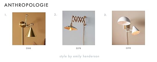
1. Zig-Zag Task Sconce: Here’s a sleek modern swing arm sconce that would be a great addition to any room.
2. Accordion Sconce: I love the vintage-inspired lampshade and the accordion-style arm adds a ton of personality.
3. Mixed Shape Multi-Arm Sconce: The mixed shade shapes add a really cool touch to this multi-arm sconce.

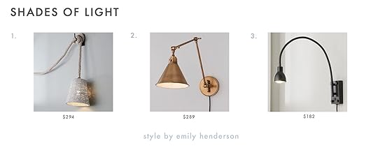
1. Leggero Black Pole Sconce: This long and slim sconce will add height and visual interest to your walls.
2. Mantis Swivel Wall Sconce: The shape of this elegant brass sconce is really lovely (reviewers say it’s bigger than expected so make sure to check out the measurements before buying!).
3. Swing Arm Sconce: I love the simplicity of this black swing arm sconce with an exposed bulb, and the attached cord has a stripe pattern that adds a little flair.

1. Plug-In Industrial Copper Pendant Light: This copper zigzag pendant is really unique.
2. 1970s Vintage Crystal Clear Glass Ceiling Light Swag Pendant Lamp: This 1970s vintage glass ceiling pendant would instantly add charm to a space.
3. Mark D. Sikes 1 Light Hampshire Plug In Wall Sconce: This vintage Hudson Valley Lighting sconce has a lovely aged brass finish.

1. Seguin Burnished Brass 2-Light Plug In Wall Sconce: This traditional double light sconce has a nice brass finish and an elegant shape.
2. Pixi Rose Metal and Wood Swivel Plug-In Wall Sconce: Add a pop of color with this wood swivel sconce!
3. Morgan Black Adjustable Arm Plug In Wall Sconce Light: Modern and cool and you know we are big fans of the accordion arm style.
 photo by kaitlin green | from: birdie’s room progress – are you ready for this?
1. Edvin Plug-in Wall Sconce: Reviewers rave about the quality and style of this sconce. The seller also offers hardwired options!
2. Pendant Light Ceramic Shade Brass Ceiling Light: I am obsessed with these and think they would look so cute in a vintage farmhouse-style kitchen.
3. KRINOLIN Mid-modern Plug-In Wood Pendant: This handmade wood pendant is really special and affordable.

1. Noah Wall Light: Gantri is known for design forward plug-in lighting that is made from plant-based materials. This oversized bulb light wall light was inspired by the designer’s son and recalls the shape of a pregnant belly. How cool is that?
2. Carve Wall Light (Right): This light would add a sculptural element to your walls.
3. Gio Wall Light: This one is 70s inspired and comes in a variety of colors.

1. Navin: Simple, elegant, and could work with a ton of styles.
2. Cranbrook: There are so many lovely details on this one that really stand out and make a quiet statement.
3. Fifi: The scallop detail on this picture light is really special.

1. Level Wired: This minimal wall light is 44″ long and would add architectural interest to a room.
2. LAHM 04+ Pendant Wired: The geometric shade on this pendant creates a warm and diffused light.
3. Otha Sconce Wired: How cool is this asymmetrical cube light?
 photo by sara ligorria-tramp | from: our guest room/office basement suite
1. Alameda Plug-In Sconce: The twisted arm is so cool and modern and I like that it is paired with a traditional shade for a balanced look.
2. Dellon Double Plug-In Sconce: I LOVE this modern take on the accordion-style sconce.
3. Sereno 2-Light Plug-In Sconce: This sconce has rotating slim brass arms so you can angle the light in different ways.

1. Nelson Cigar Bubble Wall Sconce: A true classic that will never go out of style! Remember when Em had the ball version in her primary bedroom??
2. Vernon Picture Light: A picture light that’s a plug-in is such a dream. No commitment to sconces or art placement needed. These also come in a couple of other sizes.
3. Platet LED Cone Wall Sconce: A cool, modern statement wall light!

1. “Potence” Style Otis Light: This long arm sconce is incredible and the wood ball handle is a really nice detail.
2. Double-Jointed Swing Lamp: You can customize this double-jointed swing lamp and mix and match the finishes.
3. Night Shelf: A shelf and a sconce! This would be perfect for a small space.

1. Darcie Sconce: This French Midcentury-inspired sconce has an articulating arm so you can direct the light as you please. I love the wood detail, too.
2. Carson 12″ Plug-In Indoor/Outdoor Pendant With Cage: I am a sucker for vintage lighting. I would love to see this in a retro kitchen!
3. Cypress Double Swing Arm Pin-Up Sconce: I want to see this double swing arm sconce in an MCM-style home immediately!

1. Isaac Plug-In Sconce: I have always loved this bright red Schoolhouse sconce. The color is intense but looks VERY cool in the right space.
2. Apartment Plug-In Pendant: There are so many customizable options available for this pendant.
3. Gantry Pivot Plug-In Sconce: This sconce reaches over 36″ and provides great direct light.
1. Looped Rope Convertible Pendant: This rope pendant would add texture and warmth to any room.
2. Cyrus Arched Swing Arm Sconce: This one is vintage industrial-inspired and I love the aged finish.
3. LED Gooseneck Reading Light: Simple, modern, and perfect for bedside lighting!

1. Modern Swing Arm Wall Lamp: This sleek swing arm wall lamp comes equipped with a full range dimmer switch.
2. Swing Arm Adjustable Wall Lamp: The rattan shade adds softness add warmth to this modern wall lamp.
3. Cleo 1-Light Matte Black Plug-In Sconce: If you are looking for an affordable modern wall sconce this is a great option.

1. Fatboy® Bolleke Indoor/Outdoor Pendant: This battery-operated light can be used both indoors and outdoors and the silicone loop can be twisted however you’d like.
2. UO Fabric Cord Kit: With this pendant light cord kit, you can find the perfect shade to complete the look.
3. Bradley Sconce: I love the color and finish on this one.
Are there any other lighting roundups you would like to see from us? Sound off in the comments below. xx
Opener Image Credit: Design by Brady Tolbert | Photo by Tessa Neustadt | From: Brady’s Bedroom Makeover With Parachute
The post The Case For Plug-In Sconces And Non-Hardwired Lighting (+ Where To Buy The Good Ones) appeared first on Emily Henderson.
May 11, 2023
Design Agony: The “Too Small” Coffee Table Has An EASY Solution (We’ll Prove It)

In what is now my second time fully designing a living, I have fallen madly in love with a coffee table that is yet again “too small”. Jess, “What makes a coffee table too small?” Well, a coffee table should be at least half the length of your sofa. So naturally, this measurement is completely dependent upon the sofa you have. In my first apartment, I was dealing with two other issues – 1. My living room was small and narrow, not leaving me with a lot of coffee table size options in general and 2. I had fallen madly in love with and secured the navy pouf you see in the photos above and below. Whoops! I clearly didn’t consider that the height of my pouf was equal to or taller than most coffee tables…coooooool. But after hours and hours of searching, that sweet little black metal oval table came to my rescue and was the perfect height, shape, and material I wanted to beautifully contrast the pouf. So yes, today I’m going to talk about the wonders of nesting coffee tables and your many options in this category! I’m also going to walk you through my current coffee table situation because, “oops I did it again” 🙂
 design by jess bunge | photo by sara ligorria-tramp | from: makeover takeover: jess’ long awaited (small space) living room reveal
But before we get much further let’s go over the three basic “rules” (or our recommended guidelines since rules can always be broken).
RULE #1: I know I just said this but your coffee table should be at least half the length of your sofa. The right scale is going to look and feel so good. The last thing you want is for a coffee table to make your living room look smaller than it is. Scale is crucial to a well-designed room.
RULE #2: Your coffee table should be no more than 4″ higher or shorter than the top of your sofa seat cushions. This gives you A LOT of room to play so I wouldn’t stress about it. Just make sure you’re going to be happy with the height you’re setting your coffee cup down:)
RULE #3: 16″ to 18” is the ideal distance between the sofa and coffee table. Don’t cramp the space! This also means you want to watch out for the width of your coffee table so you don’t end up with something too big that takes up the area. This has been (and currently is) a pain point for me and has limited my coffee table options.
What I’m Working With
Did I know the coffee table was too small when I bought it? Yes. But I knew I wanted to do nesting coffee tables again because I wanted a round shape and my living layout couldn’t handle a large round coffee table. I also honestly love the nesting table look as it’s an opportunity to bring in another material, texture, and potentially a pattern. This particular vintage coffee table was also just too unique to pass up. I must have seen it on Craigslist for at least a month, never being able to get it out of my head. Now, while I LOVE it, coming up with its ideal “nesting buddy” hasn’t been as easy as I’d hoped (it’s my overthinking that’s been the problem to no one’s surprise).

Naturally, I tried it with the metal table first. It’s not terrible but it also isn’t right. I want the wooden table to be the star and having the metal table tower over it, it’s taking a back seat. Oh, and it you’re wondering where my beloved navy pouf is, don’t worry, it’s currently acting as my office chair footrest. It’s too tall to nest with my new table which I sadly also knew when I bought it. But speaking of poufs let’s start playing with my first option…
Option #1: Upholstered Pouf/Ottoman
This idea is seeming like the frontrunner at the moment but that’s currently all it is, an idea. It’s easy to come up with cool ideas in your head but finding “the right” piece that is the perfect size, color, and price is easier said than done (like with my first living room coffee table height issue). And because I’m me, I might see if I can get one made but that adds another challenge (the money challenge). I’ve been dreaming of a custom-made pouf because I’d love to use a patterned fabric. All of the patterned poufs that I could potentially buy or get gifted are simply not my style or aren’t the right size or not the right color. Is there another pouf option? Of course!

I am open to a more pillow-like soft pouf which might be a nice look in a room with A LOT of structured lines. With this style, I could potentially have an extremely talented, beautiful, smart, cool friend that knows how to sew *cough* Arlyn *cough* help me. Do you think public flattery will work on her? Working moms typically have lots of free time to help their friends make pieces of decor, right?? It also might not be as expensive as I’m thinking to get made since it’s basically a pillow and not a more solid piece of furniture that requires a wooden frame. This one is also a little easier to find if I’m ok with a solid color.
Option #2: Stacked Pillows
In my last(?) blog post about this room, I talked about all of the coffee table and rug options I had considered as well as my floor pillow idea with fabric samples. This option is that idea but I’ve realized that I need to be extremely careful with the pattern choice. I have some decor pieces you can’t see in this photo (I’m saving them for the reveal) that make me very nervous about adding more than one pattern. The impulse to overdecorate, given the hundreds of ideas in my head, is STRONG. I keep reminding myself that I need to cool it. With all that said, I think I can find a pattern that works and brings in color (likely a dark blue). When I originally had this patterned pillow idea, I was planning to mix two or three patterns, now I think only one pattern for both pillows or one patterned and one solid. Arlyn did technically offer to help make these after I gently asked if she’d be willing…but I asked her after I hung her dining room pendant a couple of weeks ago. That wasn’t my plan I promise! I had zero ulterior motives! I still might find some I like but so far no dice.
Option #3: Another Coffee Table
Another super legitimate option is simply another round (ish) or oval coffee table that’s shorter than the one I have. Ideally, this would also be vintage to add additional soul and depth to the room. My graphic is comically bad but as you can see I’m looking for something visually lighter, maybe with legs. The size is just my biggest challenge. Finding a coffee table I like that is under 15″ tall, under 24″ in diameter (at most), and not very expensive is a tall order. But who knows! Maybe one day soon the perfect option will pop up on a late-night Craigslist or Facebook Marketplace search. Anything is possible!
But enough about me and let’s talk about YOU. First, let me make sure you know that no matter the size of your living room, you can always have nesting coffee tables. This isn’t just for small space dwellers. Actually, if you have a really large living room, it’s a perk to be able to separate your coffee tables to accommodate guests sitting in various areas. Now that we can all have them, there are two types – matching and non matching. One is not better than the other. It’s simply preference. So naturally, I rounded up some options in both categories so if you need a coffee table setup and don’t want to have to search, hopefully this with help.
Matching SetsMatching sets are great for a couple of reasons – it creates less decision-making to create your “nest” and they are visually calmer since they aren’t contrasting each other (like a mixed set would). Here are my current favorites:

1. The Morro Tables: Simple, organic yet modern, and would look good with so many styles.
2. Nesting Coffee Table: Perfect if you want a little drama that isn’t too visually heavy.
3. Pompeo Round Ivory Cast Resin Nesting Coffee Table Set: Trendy but in the best way and can be used outdoors!
4. Wade Nesting Coffee Tables: Emily has used these before and they are SO pretty in person. Modern traditional at its finest. They come in all three of those wood tones so you can mix and match or go with one tone.
5. Cannellini Nesting Coffee Table Set: Another trend-forward set that I adore. If I didn’t think the small one was too chunky I’d grab it for my living room. Also, I’m pretty sure they are only sold as a set…
6. Jewel Round Coffee and Side Table Set: Affordable, cute, and lots of texture, what’s not to love?!
I was reminded of a few things when I was putting these together. Not all coffee tables are meant to be nestable. Unless it’s a set made for each other, you need to make sure the main coffee table has an overhang. That’s what makes most nesting possible. As you’ll see below, you can have your small table be taller than the main but then that table needs an overhang. Just some thoughts before we get into these combos (measurements have all been checked:))
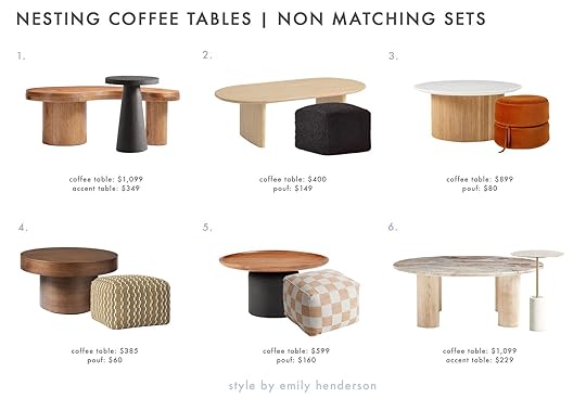
1. Augie Oak Wood Coffee Table + Willy Charcoal Brown Round Pedestal Side Table: I love the modern chunky look and it’s making me think maybe I just need a smaller pedestal table instead of my “larger” oval one. The coffee table does actually have a matching nesting buddy in case you prefer that look.
2. Zeke Oval Brushed Oatmeal Coffee Table + Boucle Black Pouf: Simple, chic, AND affordable!
3. Ellington Round Coffee Table + Olivia Round Pouf: Playful with that pretty fluting and pretty rust ottoman (that actually comes apart into two floor cushions!)
4. Volume Round Pedestal Coffee Table + Hopedale Modern Jute Pouf: This feels like a refined organic vibe, right? Also, those prices aren’t bad either.
5. Miri Coffee Table + Square Ivory And Rust Checkered Pouf: For a more contemporary look, this is perfect. While the pouf is a little more on trend, that coffee table will last a long time stylistically.
6. Homage Round White Oak Wood and Marble Coffee Table + Cassius Side Table: Oh I really love this one. Lots of different materials. Chunky yet delicate. Just perfect:)
I hope this was a fun read that got you thinking about the wild world of nesting coffee tables and if you needed one, maybe you found it! Wish me luck on my continued journey:)
Love you, mean it.
Opening Image Credits: Design by Jess Bunge | Photo by Sara Ligorria-Tramp | From: Makeover Takeover: Jess’ Long Awaited (Small Space) Living Room Reveal
The post Design Agony: The “Too Small” Coffee Table Has An EASY Solution (We’ll Prove It) appeared first on Emily Henderson.
May 10, 2023
How I Convinced My Friend To Paint Her Room Really Dark: A Kid/Dog-Friendly Basement Makeover With Article Furniture

Today, we have for you a makeover for a friend who likes to play it safe and ran out of design steam – both reactions I have felt in the past (that have spawned regret). Kaitlin Green is our photographer in Portland who I’ve become close with so when Article reached out for another makeover, we were brainstorming about empty room candidates on set and she raised her hand REALLY, REALLY HIGH. She and her family had recently remodeled but ran out of steam/resources on the basement so it was a fresh empty white box with old furniture and no design direction. I knew that they had good taste and would hand over some creative freedoms (mostly :)). Plus I could easily relate to their situation – two kids, busy jobs, needing a media room that was kid/dog-friendly that they would actually like to hang out in. I got you, Kaitlin. I got you.
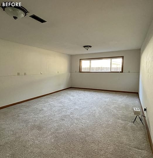
Here it is before they remodeled and added the wood flooring. It has one east-facing window, but otherwise just a box with a foundation that came up half the wall.

Before I met them they put their old sofa downstairs and had this IKEA cabinetry put in.

They had installed the desk and shelf, and it’s where Kaitlin did all of her editing after the kids went down (she would also watch Love is Blind on a laptop next to her monitor where she edits). In other words, this room was used mostly for TV/movie watching with the kids and editing for her – AKA all dark room compatible activities.
On Handing Over The ReinsWe had six weeks to do this project and the “before” was totally fine, obviously, but if given the opportunity to have a design brain and more resources on the room she was happy to hand over the reins. Well, kinda. Listen, it’s still their house and after a year of renovating while having a baby (and a 4-year-old), they were kinda done taking big design swings and generally liked to play it safe because they really really didn’t want to do something they would have to undo. They were scared. And of course, I can relate to that. But it’s a basement and you have a designer volunteering their experience to make it not just better, but potentially great! Let me do my thing! That was my spiel, anyway.
The Paneling

We knew we could just paint the drywall, but felt more confident that installing paneling would take it next level (and we were right). We reached out to Metrie to partner on the paneling – it’s a simple 1×6 V groove and it took two days to install (and cost around $3000 for installation, $900 to paint, plus $2k in traded materials). And yes, EHD covers these labor costs if it’s a sponsored makeover to make sure that we create beautiful backdrops for partnerships and not force people to pay for design elements they might not have done outside of a partnered makeover. Again, we had only about six weeks from beginning to reveal, which sounds fast (and it is) but y’all Article ships FAST. So it was actually totally doable.
I had a deal with Kaitlin that she would be my design assistant on this one and I tasked her with creating product boards of Article pieces that would physically fit in the basement and obviously be their preference (instead of me guessing). She sent through two boards for me to choose from:

Sectional | Grid Pillow | Geometric Pillow | Coffee Table | Pouf | Floor Lamp | Light Wood Side Table | Table Lamp | Accent Chair | Black Marble Side Table | Office Chair | File Cabinet | All Black Table Lamp

Sectional | Grid Pillow | Geometric Pillow | Black Marble Side Table | Table Lamp | Coffee Table | Rug | Pouf | Accent Chair | Wood Side Table | Floor Lamp | Office Chair | File Cabinet | All Black Table Lamp
They were both great, but I had a strong preference based on my personal experience. Last summer I myself got this Article sectional at the Mountain House right when it launched and couldn’t believe how comfortable, soft, cozy, and beautiful it was – all the things. I said to Kaitlin (and I quote), “As your friend I’m going to insist that you get the Beta in green, not the leather. I can’t let you not get this sectional”. We all love the look of leather and it of course wears well, but no, it’s just not as cozy as a velvety corduroy. I think she was initially bummed to not have the beauty of the leather but likely relieved to have someone with sofa experience literally INSIST on one thing over another. Let’s just say their whole family knows we made the right choice.
THE REVEAL!!!!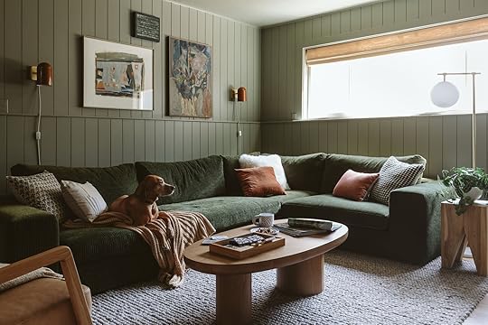
My friends, I am happy to report that my pushiness totally paid off and this room SINGS – in such a low, cozy, baritone kinda way. You walk down into the basement and with the sectional and the walls being monochromatic, the vibe is so strong, mellow, and extremely good.
The Beta Sectional
Sectional | Sconces | Coffee Table | Rug | Side Table | Floor Lamp
There are days when I’m jealous this isn’t the sectional in our living room and I wonder if I’m going to regret my choice – that’s how much I love this sectional. Is Article paying for this post and makeover? Yes, but if I There are days when I’m jealous this isn’t the sectional in our living room and I wonder if I’m going to regret my choice – that’s how much I love this sectional. Is Article paying for this post and makeover? Yes, but if I didn’t love it so much I would tell you my thoughts and show you the pretty photos. The reason that I’m harping on this so much is that buying what looks like comfortable and good-looking sofas online is so scary because you truly can’t trust the quality/look and comfort without experiencing your own butt on the cushions. So I will hereby swear on my children that this is one of if not the best cozy sectionals I have ever owned and sat on. The cushions are filled with some magic powder/foam that has give but remains in shape with the right amount of bounceback. Granted that we’ve only had ours for less than a year (and Kaitlin less than a month), so I can’t speak to longevity here. But having owned other Article furniture (remember this from the Glendale house?) for years, I have enough experience in the quality they bring to their offerings that I can extend that confidence to this sectional, too. Oh and the comfort is at 100%.

The shape/style is great for a low 70s-style sectional, for sure, and might not work in every living room should you want it more formal or sculptural (that was my conundrum). But what makes it more special than other 70s-style sofas IMHO is the wide whale corduroy fabric that reflects the light so beautifully (same as in the mountain house – it looks ethereal when the natural light hits it). It’s far prettier and more high-end than what a linen would look like. So with the corduroy, you get a slight pattern (tiny tonal stripe), texture (varying heights of velvet), a fabric that reflects the light, AND the softness of mother-loving velvet!!!!! I’ve been trying to find a good corduroy for other pieces of furniture ever since we got this sofa (in blue) at the mountain house. It’s obviously going to make a comeback.
Another feature of this sectional is that it’s completely modular. The set up here is comprised of a few different pieces from the Beta collection to create the perfect configuration for this corner. I love that you can order pre-built options or go a la carte and order pieces individually to make your ideal lounge-worthy piece.
I want to get to the rest of the Article elements but first the other star of the room…
The Dark Green Moody Paint Color On Convincing My Friend (And Myself) To Trust Me Despite Having Made Paint Mistakes This Year…
After a year of paint fumbles in my own home, and subsequent repainting of those rooms, I was nervous, not fully trusting my own eye as I tried to pick the right color. Kaitlin has been along this paint mistake journey with me, shooting the house weekly, and has watched my extreme frustration as we have repainted many rooms. So I think neither of us 100% trusted me, which is why we really belabored this “not as safe” darker color choice.
We knew that the color we picked needed to work effortlessly with the sofa color, so we basically brought a sofa cushion to the paint store and held it up against as many different greens as possible. We were open to other colors as long as it looked good with our star piece of furniture. That was non-negotiable. This is, AGAIN, why I believe in choosing the paint color last (should you be able to which often you can’t in a renovation) – there aren’t a million fabrics but there are so many paint colors that work with fabrics. So I tend to choose the furniture/decor first and then hone in on the exact shade of paint after. And so we did.
On Finding The Right Color/ToneWe came home with 3-4 that we felt OK about. But the fluorescent lights of the store, next to the extreme natural lights of the store windows was just not going to be accurate. You have to, I repeat HAVE TO try the color in your own room.
A quick anecdote about that – the Still Water dark blue/green that I chose for the family room looks rather bright teal in a brightly lit room. Even with the lights on it looks different. So we practically chose it in the dark with a lamp on because that’s when/how we were going to be in that room.
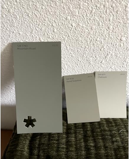
We loved the tone of Mountain Road with the sofa and in the space but they were SO NERVOUS, and so was I. Because of their hesitation, I made the safe call – let’s just paint the paneling white. The room looked fine in white, the green sectional would pop. White it would be!!!
Just as I was texting Kaitlin to confirm our safe color choice, she texted, “Corey and want to go dark. We promise. Let’s do dark”. I pushed back with a lot of, ‘”Are you sures?? Are you going to hate me if I’m wrong and it doesn’t look good? There are no guarantees with any paint color that once you get it on all four walls that you’ll love it”. They assured me that they knew the risk they were taking and that they agreed that this room would be a missed opportunity going white. I can’t wait to show you the rest of their house – they have great taste and a distinct Scandi + PWN vibe. We all felt as good about it as we could. We ordered the paint and I went on vacation.
So that’s the chapter of my memoir titled “The Journey to Get Myself and a Friend to Trust My Risky Paint Suggestion After a Year of Paint Missteps and Self-Doubt,” with the subtitle, “Why Making Mistakes, Analyzing the Hell Out of Them and Honing Your Eye Can Make You So Much Better at Your Job”. Alt title could be, “How Emily Got Her Paint Groove Back”.
Y’all, We NAILED This Paint Color
It’s just so pretty and with all that furniture??!!!!! It’s so good! You walk down into the basement and my goodness it’s so cozy and inviting. If I didn’t get grossed out by words like “delicious” I would use that word. It’s such a vibe. We brought in 100% Article furniture (they even had some pieces already) and with the help of some accessorizing, we pulled this room together. Remember one of the best things about Article is their speedy delivery – often within just a week or two and that was the only way we were going to get this done in time.

Throw Blanket | Far Right Pillows: Jaipur Floral Block Pillow + Gray and Ivory Patchwork Lumbar Pillow | Middle Pillows: Velvet Throw Pillow + Black/White Grid Pillow + Oversized Textural Woven Throw Pillow | Left Pillows: Oblong Boucle Color Blocked Throw Pillow + Sheepskin Pillow
Little almost 2-year-old Mara showing us the scale on the sectional 🙂 We went with a new favorite color palette of mine: Mostly green + some brown/earthy tones. It’s like a forest! And my goodness it works – especially for a cozy PNW basement.

I bought all the vintage art at Urbanite and at the Rose City Flea last year. They work pretty darn well in here, especially in combination with those Schoolhouse sconces. Also, Remi is doing a great job of showing how deep the sofa is – she is a decent-sized dog 🙂


The coffee table is a lovely and chunky one that is perfectly in scale with the sectional (should you just want to replicate it). Also, that wood tone perfectly warms up the space so it doesn’t go too dark. Plus it brings in the Scandi part of their aesthetic. Not to mention, rounded sturdy coffee tables are my preference with young kids:) We also hired our painter to paint the credenza fronts, and Kaitlin/Corey took off the sides and top because they were essentially empty. Wow, what a difference it made to have it just be a credenza and not a full “media unit”.

Faux Aloe Plant | Ceramic Candlestick Holder
I’m not big in the faux plant world (but understand the desire to not kill real plants), but that faux aloe is so good (we have the same one on top of our closet that looks VERY real).


Sconce | Side Table | Table Lamp
The black side table and lamp are also from Article – don’t sleep on their decor pieces because these are so good. Perfect accents to help keep the space feeling modern and fresh. Since there wasn’t room for a lamp on the far side of the sectional we added these sconces from Schoolhouse which you can also aim upwards or diagonally (and with a low wattage bulb they wash the walls in a very lovely way).

Faux Succulent | Candle | Chair | Pillow | Throw Blanket | Pouf
Lastly, Kaitlin got her leather wish in the form of a chair – the Denman chair and pouf from Article. Wonderfully proportioned, perfectly ergonomic (the back has the perfect support for a casual but not too loungey lean) and that caramel leather is extremely buttery.

I even matched my spray tan to the color palette 🙂 The rug is nubby and super soft (and might take a while to stop shedding, FYI like most looped wool rugs). That texture really brings the cozy vibe home in a big way. I also love that while the rug and ottoman are similar in texture, the pattern scales are different so the contrast is minimal (easy on the eyes) but not boring at all. While Article does sell some pretty pillows we supplemented with pillows from Target and World Market to give an extra cozy eclectic feel.
The Office/Editing Zone
File Cabinet | Office Chair | Planter | Sconce
On this side of the room we styled out the desk and shelves a bit, but mostly just added a few Article pieces that Kaitlin needed – the chair, lamp, and filing cabinet all served their purposes beautifully. Pretty, functional, and reasonably priced office furniture isn’t easy to come by so I was so excited to see these awesome pieces as options. The striped pot is from a local maker named A Handbuilt Ceramics and the painting was a $35 score from Stars (the local wonderful antique mall).
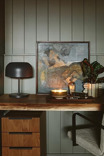
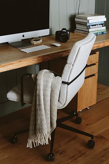
Table Lamp | Candle | Match Cloche
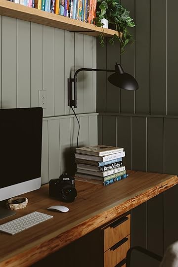

I had the Rejuvenation sconce in my storage awaiting its debut in our home, but it looked so good that I brought it over (I might need to snag it back) and hung it on the wall. I love it because it can also be aimed to wash the wall in a way that provides a lovely ambiance.

And there we have it! I was honestly super nervous about getting this done in time, with all the stuff we have going on at the farm, but with the help of Kaitlin and my PNW team (Gretchen and Emily M), it turned out soooo wonderfully.

I’m also extremely happy to report that Corey, Kaitlin’s husband who also couldn’t be happier with this room, so I’m a total hero over there. They have promised delicious lattes forever. I’m so glad/grateful that it turned out well, not just for the partnership or for the photos, but when you are in there it’s genuinely a lovely, cozy, pulled-together basement family room that any family would feel lucky to have.
Thank you Article for partnering on this. They really are such a great resource if you’re in the market for quality furniture at great prices that ships quickly. Which is basically everyone, right? Shopping with them is always so easy and a delight. All designs and words are our own. Please ask any questions about them in the comments. xx
*Design and Styled by Emily Henderson
**Photos by Kaitlin Green
***Contractor: Don Lunan Construction
The post How I Convinced My Friend To Paint Her Room Really Dark: A Kid/Dog-Friendly Basement Makeover With Article Furniture appeared first on Emily Henderson.
May 9, 2023
How Much Is Too Much To Spend On The Design Of Your Rental? Long-Term Renter, Arlyn, Gives Us All Her Opinions And Tips

Moving sucks. For so many reasons I’m sure I don’t need to expound upon because this is a universally known fact of human existence. Beyond the normal terrible things about it (exhausting, infuriating), my recent moving experience has left me a bit introspective about some things. You see, the last home that I lived in with my husband for five years was the first home I poured myself into making just right. I picked furniture that was the exact measurement needed for a nook. I arranged art and got things framed in specific sizes for my existing wall space. I hunted down an armoire for months (years?) that I had no guarantee would work anywhere else we’d ever live.
That apartment felt really, really good. I was so proud of it. I didn’t do it for anyone’s approval—IRL or even the internet. I did it for myself and how I like to feel in my spaces (but the hypothetical flowers thrown at me from visitors weren’t bad, either).
But you see, that last home was a rental. And if you missed my 1,000-word explanation of why I no longer live there, hop on over to my bedroom reveal to read all about it. The short of it? The landlords wanted our apartment. The landlords gave us some money to leave so they didn’t have to evict us. We left. The end.
All those items I painstakingly selected, things I loved dearly, things that made that home sing, ::cough:: things we spent a lot of money on ::cough:: well…they don’t all work in our new place. Some logistically in that they actually do not fit, and others stylistically.
 oh how I love these sconces from hudson valley lighting, but there are no hardwired sconces in our new home to swap out with these. so they are now currently living in boxes in the garage. the same goes for our dining room chandelier.
Those first few days in our current home (also a rental) were filled with a strange cocktail of emotions. I was mourning everything that was relegated to the garage and likely either had to stay there until we moved or until we sold them/gave them away. I was also mourning the feeling of our old place. About 40% of our furniture and decor makes sense here, but 60% is a bit like a square peg in a round hole large enough that it can slide through, but you know while you’re doing it, it’s not actually the right answer.
It all made me think of something my older brother said to me years ago. While I don’t remember his exact words or even the circumstance in which he said them to me, the gist was this: don’t spend money or invest in anything if you’re just renting. “But don’t you want to like where you live and feel good when you’re home?” I said to him (or something like that). Ever the pragmatist, he flatly and without any doubt in his mind said no, and we moved on.
 charles and i designed this bench and we had sara’s brother shade build it to measurements that were specifically chosen to sit where we wanted under our front window. it’s currently too big for where it makes sense visually now, and too small for anywhere it actually fits. in fact, it just…doesn’t make sense anywhere because of our new layout.
His words rang in my ears while I thought of the sheer amount of money, time, and passion that was spent on things we wouldn’t or couldn’t be using here. Now, don’t get me wrong, I plan on keeping most of the things I’m not totally loving here. We have a daughter who likes to eat and wear clothes her own size, which are far more important to me than whether the doors on the media console are too warm of a gray against the stark landlord-special white on the walls. But truly, some things just don’t make sense.
It’s not just furniture or decor items. If you’ve seen any MOTO (Makeover Takeover) reveal around these parts, you know an EHDer loves to go hard on making their rentals their own, be it through wallpaper (and not removable kinds), lighting, custom-built furniture, and shelving.

 photos by sara ligorria-tramp | left from: caitlin’s first moto reveal – a vintage bathroom gets a modern update | right from: makeover takeover: jess’ long awaited (small space) living room reveal
These are things that have completely transformed Caitlin’s and Jess’ homes, and probably how they feel (felt) in there. If I knew them at all, the work they put into these apartments has seeped into their lives in the most positive ways. Their work. Their social lives. I’m not exaggerating.
 after photo by zeke ruelas | from: brady gives a refresh to his vintage bathroom
And remember Brady’s old apartment? He changed nearly everything in his bathroom (I believe with his landlord’s approval though…but I might be wrong about that).
Are we…absurd for doing this? Yes, some brands are nice enough to gift us items that we are not paying for just for the photos and promotion. But the fact is, a lot of this stuff is either staying in place or not being used in the next place we go to.
So, I couldn’t help but wonder (hope that phrase isn’t copyrighted), was my brother right all along? Is it a waste of money and energy to invest in furniture, decor, and art as renters when the nature of it is so impermanent and transient? I’m of two mindsets about it all, and lucky for you readers, I’m going to lay them both out here. Spoiler alert: there isn’t going to be a right answer, because the decision is highly personal, but let’s just see where this takes us, shall we?
Mindset #1: Not Absurd: You Value How You Feel At Home Based On DesignThere have been plenty of studies proving the positive impact a well-designed room can have on your mental health. None of you would be here reading this if you didn’t think the state of your home mattered to you. I know I don’t have to argue that, but I would be remiss if this wasn’t one of the biggest backing points for why investing in your home—rental or not—is worth it. (And I just want to say that how I’m using the word “invest” isn’t necessarily just monetarily, but emotionally, with effort or time.)
When I first started talking to Jess and Ryann about this topic, I used the phrase “depreciation for appreciation.” This was in regards to buying something for the time you live in any given place and then reselling it at a lower price (will go into this further later on in the post). Meaning, there is absolutely a value to the length of time you get to enjoy something and it improves your life in one way or another.
But is a rental home any less well-designed if it cost less, or wasn’t custom-designed, or didn’t push the limits of a security deposit?
Mindset #1.A: You Don’t Want To Buy Disposable Things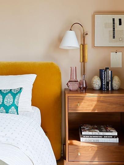 the nightstands i used in my bedroom are pricey. they just are. but they are well-built pieces that i’ll have forever, whether i use them in my room in the next home or not. i’ll always find a way to use them because they’re worth it.
Apart from everything mentioned above, there’s the very big and possibly paramount discussion point of waste. I’m not going to sit here and pretend I’m an environmentalist that gets an A+ in all my efforts. I have my (large) faults. I could do far, far better than I do. But I can’t help but feel an immense responsibility to not buy a bunch of poorly made “for now” pieces that are destined for the garbage dump when I’m onto the next thing.
It’s kind of like the idea of not buying quality clothes for a body you swear will be smaller in the coming months or years. I’ve been guilty of talking myself out of purchasing something well made or that fit my body really well over a certain price tag because…what if I lose weight? I have been meaning to work off those 30 or so pounds I’ve been carrying around for, oh, a decade. I’m renting my size. I don’t own this size. Let’s delay gratification for much, much later…or never. So I often rely on fast (cheap) fashion, because it feels like squandering funds to “invest” in a lasting wardrobe when I hope to get back to my pre-pregnancy (or beyond) figure.
I feel like I’m writing in circles, and it’s because I kind of am. As I said a few paragraphs ago, there is no right answer here, but I do have some ideas to share to make more sense of all this if you keep reading.
Mindset #2: Yes, Absurd: Save Your Money If Homeownership Is What You Want could charles and i own a home if we didn’t have this $1,200 article sideboard (that was gifted to us by the brand)? ha, yeah right.
That same very practical brother I have would likely tell me that perhaps homeownership would be in the cards for me if I didn’t spend all my money on rugs and case goods. Of course, this is a hyperbolic overreach of the truth. It’s like every article ever written about how Millenials can’t buy houses because of all the money they spend on avocado toast or iced coffee. While yes, you can only spend the same dollar once, the promise of the American dream that looks like “work hard, buy a house, live happily ever after” is just not realistic anymore for many of us, depending on where we live, what our finances look like based on income or circumstances…like how much money we had to borrow just to get a college degree.
This leads me to…
Mindset #2.A: Maybe Homeownership Is Unattainable For Some Of UsMy parents bought our family home in 1990 for right around $100,000. Their mortgage, if I remember correctly, was about $800. Including a line of credit for our pool. My mother was an elementary school teacher and my dad was a pharmaceutical sales rep. We were always squarely middle class, definitely not “upper” middle class by any means. This was in Orlando, Florida, where the average cost of a home is now $366,135 according to Zillow, and the average household income is $54,000.
A quick search for “how much house can I afford making $54,000” leads me to the answer: $165,000. That’s a far cry from $366,135. And this is in Orlando, which I left many years ago because my earning potential in my chosen industry was nowhere near where I wanted or needed it to be.
So I moved to Los Angeles after a stint in South Florida, where the home values are even higher, but the salaries are a little higher, too. Let’s take a look at figures in the city of Los Angeles.
Median household income: $69,778 (in 2021)
Median home value: $705,900
Uh…good grief. “Then leave Los Angeles and move somewhere with a lower cost of living.” That is the very easy, very straightforward suggestion someone might offer me. Heck, even you might be thinking it. You’re not wrong, but in the industry my husband works in specifically, moving somewhere else would surely cut his take-home pay in half.
 my beloved armoire sits in my garage now, waiting for another time and place, if that ever comes.
There are many variables I’m not diving into here since this story isn’t titled “Why It Feels Impossible to Buy a House Right Now Even Though My Partner & I Make Good Money,” but of course, debt to income ratio, interest rates, home inventory and where you live all play huge roles. Regardless, it’s completely understandable why many of the 30-somethings I know, in the greater Los Angeles area, and even some in much smaller cities, feel like owning is a pipe dream.
The townhome my husband and I rent is valued at roughly $1 million. It sold in 2009 for around $500k. With 20% down ($200,000), our very high credit scores, and current interest rates, a mortgage at that cost would be about $4,500, before property taxes, HOA fees, and insurance. For a two-bedroom, two-and-a-half-bath home of less than 1,500 square feet.
My friends, the math ain’t mathin’. This landscape is bleak for many my age or for anyone in my income bracket or lower.
So…can we be blamed for wanting to cover our rental kitchen floors in peel-and-stick checkerboard tiles? Or changing all the light fixtures? Or installing that custom floor-to-ceiling library bookshelf system in the homes we have right now being that our “forever” homes (or heck, even a starter home) are very far off, if attainable at all? When we have the itch to design and decorate and build out solutions for ourselves that maybe don’t make sense given the temporary nature of renting, are we supposed to just…not?
Yes, the king-size bed we upgraded to last year was super limiting when we were searching for a new apartment. Maybe we should have waited for something that size until we put down roots in a home. But the extra space has been so great with the baby and my need to not be touched at night. Is not saving my marriage worth it? (This is a joke, my marriage is fine…now…with a king-sized mattress.)
So…What Is The Solution Here? Glad You Asked.We’ve reached the part of this long, possibly inane article where I offer some useful tips if you’re staring down the long runway of being a long-time or forever renter.
Tip 1: Buy Quality From The Get-Go If You Can.Hear me out: If you buy the best you can for the money you have, there’s a lot you can do with those pieces later on. Their resale value will be higher if you need to offload them. Quality will (hopefully) be better, so they have a longer shelf life. My mind specifically goes to real wood vs. MDF or particle board for furniture. Real wood is always a good investment because:
It can be easily repaired if it gets damaged during a move. It can see many lives through painting, staining, sanding, new hardware, no hardware, etc. It holds its value. Tip 2: Buy Secondhand (And If You Plan On Reselling, Know Its Resale Value). i picked up this awesome dresser from a local vintage seller via craigslist for $800. it’s solid wood, beautiful, and has so much soul. and if ever the day were to come that i didn’t need it anymore, i could likely fetch something close to that same amount by reselling it.
Honestly, the best thing you can do if you know your home design choices have an expiration date is to buy second-hand, and I’m not just talking about vintage. Electronics, lighting, soft goods like curtains and rugs…all of this can be found locally through peer-to-peer selling or even online through sites like eBay.
Prepare yourself, I’m going to talk about the armoire again: While it was heartbreaking, I’m glad I bought my armoire on Facebook Marketplace for $500, rather than the new $2,000 versions I was considering. If we choose to sell it and move on, it could easily be listed for $500 again (or maybe even more), whereas the new armoire would never get what we paid for it.
Tip 3: Buy The Longest Curtains You Can Find/Afford.Hot Tip: If you’re buying something super customized in space or style to your current living situation, do some searches in your area for what other things like it are selling for. It’ll give you a good idea of what market pricing is should you need to sell it down the line.
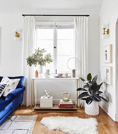 the ceiling line here was fairly low, so I hemmed these to about 84″, but they’re actually much longer curtains because I knew i’d want to use them in another home should the time come…and it did. now, i just released the hem and they fit my very tall sliding glass door.
I learned this one the hard way, but now that I know, it’s been a game-changer. As long as it’s not super cost restrictive, I opt for the 108” curtain panels, even if my windows only allow for 84”, for example. Get them hemmed (iron-on hemming tape is a Godsend) to the height you need, leaving all the extra fabric to give you flexibility as you move around and your window heights change.
Tip 4: Be Prepared For A Little Heartbreak, And Then Move On.One word (again): armoire. In the end, everything is just “stuff.” Release yourself of the weight of things and find an opportunity for new things to love, while hopefully giving your items a new home.
Tip 5: Take Your Time.Yes, invest in your home, no matter what the permanence situation looks like, but also…take your time. A home doesn’t come together as quickly as a 27-minute HGTV show leads you to believe. Don’t rush to fill a space. Obviously, buy what you need to live your life, but everything doesn’t have to be finished or fully rounded out *right now* either. It’s okay. Pick the spaces you spend the most time, and start there.
So…I’ve reached the end of my mental loopty loop. This is where I hand it off to you, dear readers to throw in your own points of discussion or considerations. If you’re a long-time renter, how do you justify home expenses that some people might question your sanity on? If you’re a homeowner that used to be a long-time renter, where do you stand on this? I can’t wait to hear everyone’s thoughts here.
See you in the comment section.
Opening Image Credits: Design by Arlyn Hernandez | Photo by Sara Ligorria-Tramp | From: Arlyn’s Moody Dining Room Reveal Is All About the Insane Power of Paint
The post How Much Is Too Much To Spend On The Design Of Your Rental? Long-Term Renter, Arlyn, Gives Us All Her Opinions And Tips appeared first on Emily Henderson.
Emily Henderson's Blog

- Emily Henderson's profile
- 10 followers

