
Emily Henderson's Blog, page 93
April 20, 2023
How Much Do You Need To Stick To The Architectural Style While Decorating Your House? Is The Farmhouse Really Looking Like A “Farmhouse” After All????

Close friends of ours rented a 14th-century castle in Spain seven years ago where we stayed for a couple of weeks. It was dark, weird, full of stone and narrow passageways, and creepy historical secrets. Then, as you rounded the corner, the kitchen was flat panel cabinetry and stainless steel countertops. As an American, who doesn’t have to work with truly “historic” properties, this was unsettling. But this happens all over Europe – old building shells with contemporary vessel sinks and stainless countertops, offering the latest non-historic amenities. I think there is something kinda badass about it – as if historic homes are so normal there that you don’t feel this preciousness to restrain yourself and “reference the era”. If you want fresh and contemporary ya just do it. When it’s done right it’s SO EXCITING, but when it’s done cheaply/generically it feels sad and soulless like something was taken without giving back. Like a pop-up generic sunglass kiosk in the middle of a thriving cultural farmers market. No! Not here!
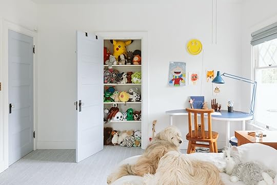
 photo by sara ligorria-tramp | from: a refresh of the kids’ room in the mountain house
Another Example: When I revealed the kid’s fabric headboard wall at the mountain house (in a cute animal fabric) many readers commented that it was so not “mountain” and that it was more “safari”. It hadn’t occurred to me AT ALL until that moment and I remember thinking, “Are they right? Did I just do something weird and non-sensical? Does this fabric just not fit??” Ultimately it doesn’t really matter because life is a lot bigger than this, but at the same time when you walk into a space that has a clear, cohesive look, something about that clarity feels reassuring and calming. Is having a super cohesive themed vibe better for experiencing a space?
It just begs the question – how much do you have to reference the original architectural style of your home when doing an extensive remodel? Furthermore how much do you need to align the decorating and furnishing with the architectural style?
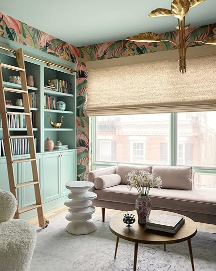
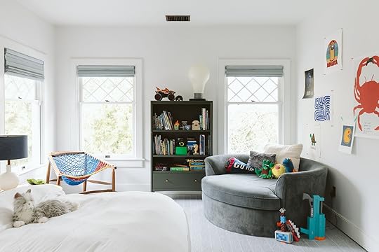
I LOVE A THEME… And Love A Mix Even More In My Home photo by sara ligorria-tramp | from: living room update – again – our new sofa, my dream floral chaise and the pop of red i always wanted in my life
I find that experiencing a room with complete design cohesion feels just so clear and calming. Your brain and eyes don’t have to “figure it out,” they just experience the intent of the space and enjoy it in its clarity. That sounds pretty great and is like most great hotels (and now that I’m thinking about it, has a very singular vibe). But due to my natural eclectic nature, and my now very sentimental attachments to so many pieces that I have collected and loved SO MUCH over the years, one style isn’t possible over here. It’s a mashup, that without a lot of attention can look like a thrift store, but also feels like capital H Home.
When we bought the farm I knew that I wanted it to feel casual and solid, with some classic country motifs (plaid, stripes, wood, quilt). The real question was how rustic do we go? I look at Claire Zinnecker’s farm, full of so much rusticness and charm, antiques, chippy paint, and quirk, and at times I wish I had gone in that direction (it’s so good). And then I look at Sara Sherman Samuel’s home, also a very clear style and I want that!! Both of their interior styles matched the architectural styles so perfectly (as intended). But what about those of us whose style doesn’t totally match our architecture? I love the country/nature A LOT, but I’m not hyper-traditional. Sure, I love plaids and ticking stripes, but it wasn’t until I found “shaker farmhouse” that I decided marrying my love of simplicity and the warmth of country might be the combination. But even that I haven’t stuck to it! I have recently brought in some more contemporary pieces and it’s making this place feel alive in such a good way!
Those following along for a long time (thank you) have seen me design/decorate many houses of different architectural styles. They all tend to have an “EHD vibe” – but have been very, very different. I personally love to lean into the architecture and let it lead the design (especially when remodeling) because I get to play with a new style, a new point of view, and learn more about that design style/era. It’s an excuse to flex that muscle, explore that genre, and dive into something totally different. I used to say that my style was “Footloose meets Marie Antoinette meets Wes Anderson”. I’m not sure how accurate that is – I think we all fancy ourselves more interesting than we are, which is OK and probably just part of existing on the internet. But the “Footloose part” of it has always been plaid, leather, and casual woods (maybe worn brass like Kevin Bacon’s belt buckle?)
So today I’ll talk through some things that I did right, and some I’m certainly still learning about.
Lean Into The Architectural Style/Era/Location, But Don’t Fall… photo by sara ligorria-tramp | from: portland project: the living room reveal
Look at the architectural style as an opportunity (not all houses have them), a built-in point of view. Sure, modern farmhouse is everywhere, but it is for a reason – in general they are just warm, inviting, and homey spaces. I tried to marry what I love about the farmhouse (homey, casual, comfort, with farm motifs) with what I love about the mountain house (simplicity, minimalism, so easy to live in), but with all our stuff from LA and lots of stuff from that I’ve been holding onto. So hilariously it’s a total mix of all the projects you’ve seen here. So yes, “shaker farm” was a jumping-off point, but let’s just say it’s a real mix from there.
Permanent Finishes Are PERMANENT, Y’all photo by kaitlin green | from: the farmhouse kitchen reveal
I’m going to go ahead and rebrand that to “forever finishes” just to remind us to intend to not replace them. Listen, you can do anything you want, it’s your home but if you are worried about renovation regret, the safest thing to do is go classic (if in an older home) or streamlined/simple in a postmodern or contemporary home. And I’m hesitant to say this – but if you can, avoid going too cheap on these fixtures because that is really what dates a house. Ideally, those scary forever finishes (tile, flooring, plumbing) would reference, or give a nod, to the original style so that they look like they “belong” there. It does NOT have to match or be literal, and if you don’t like this advice don’t follow it. Also if you buy a Spanish bungalow you do not need bold patterned terra cotta tile, just lean towards a Zellige in whatever color speaks to you. If you have an English Tudor you don’t need old-world cross-handled faucets, but yes leaning “classic” will always work. It’s my theory/hope that if you try hard enough you can find a “you” version of every architectural style. Is our bathroom tile “farm” like? Not necessarily, but it’s simple enough that they work within a shaker farm style. Do I wish I had gone for the delft tile? Or done a custom floral tile? Put in a salvaged hutch in our pantry? I mean that all sounds so beautiful and I want to stay in that Airbnb really badly, but no, I’m still pretty happy that it feels quiet, simple, and layered. To be fair this could also be confirmation bias, snobbery, and fear of not getting it right so I took a lesser risk with our materials 🙂
You Don’t Need To “Theme” Your Furniture To Your Architecture (But Some Sort Of Cohesion Is A Very Good Idea) design by christa martin | photo by sara ligorria-tramp | from: miss mid-century modern design? this mcm palm springs condo’s history and 2021 glow up will fix that asap
 styled by emily edith bowser and erik kenneth staalberg | photos by sara ligorria-tramp | from: the new design rules
Your house doesn’t need to wear a costume unless you want it to (again, which I think can be so fun). I kept falling into this trap with the pieces that we really did need – they had to be “FARM,” but I wasn’t finding what I actually liked. Don’t buy a Spanish-style sofa that you don’t like just because you live in a Mediterranean bungalow. I tend to bring some of the theme into the decor because it helps with cohesion (which as discussed can be calming), but after years of collecting my favorite pieces I would never not buy something that I love because it might not look or feel like a “farm”. NO. But would I lean towards a style more based on the architecture? Yes. Definitely.
Interesting Is Better Than “Right” photo by kaitlin green | from: moving through some regret – the first look at the farmhouse living room plus what I’m loving so far 🙂
When buying something new that I actually need (i.e. a bookshelf behind our sofa for instance) I first try to make sure that it meets functional/practical needs (right height and depth, right amount of storage, complimentary finish, etc), then I look for a style that I think would be appropriate in the home. But if I’m shopping and fall in love with a piece that could go in a prominent place and it sings to me on a cellular level, I don’t let the fact that it would never have been in a farmhouse stop me. For instance, so many people are confused about the Fernweh chair on the landing of our stairs. And I get it! Who puts a large wood and leather chair on a stair landing? But the fact is that I LOVE that chair so much. It reminds me of the project I did with my brother (which was memorable because that house taught me how to renovate), and I just love looking at it so much. Would I have bought that chair just to live on the landing? NO. But I’m not going to let the fact that it’s not a chair that would be in a farmhouse deter me from staring at it all day.
Think About The Rooms Obituary….
 photos by sara ligorria-tramp | from left: mountain house reveal: the coziest upstairs guest “bunk” bedroom
| right: mountain house reveal: our soft yet secretly sultry downstairs guest bed + bath
Here’s a fun if not odd exercise: When designing a room think about the impact that this room might have on those inside it. What would you say about this room after leaving it? What starts a conversation? Creates a vibe or mood? Not every room has to be memorable, but if you are spending the time and money designing it what do you want people to remember about it? It can be that it’s so inviting and warm, or so exciting and fun, or the perfect mix of calm but interesting (maybe that’s what I’m going after all??). The guest rooms at the mountain house admittedly look boring, but in person, everyone remembers them as being calm, warm, so comfortable, and well-appointed. Everyone sleeps well there and that’s what they’d say at that room’s funeral. Told you it was a fun if not totally esoteric exercise.
To Avoid It Looking Messy And Hodge Podgy I’ll Control The Color Palette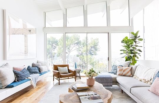
 photos by tessa neustadt | from: how we styled our living room to sell
I still, to this day, implement this, and when I don’t I end up shifting back to a more controlled color palette. The other day I brought in a bunch of art from the prop storage room and really went for it. It was exciting for a couple hours and then as the normal Sunday cleaning went by I was already done with how busy I had made it. This is totally personal and many people can handle more color/pattern and busyness/clutter than I can. So if you are a maximalist that likes an all-color palette approach, I get that and we’ve all seen it done in such exciting ways. But yes, I have found consistently over the years, that you can mix all styles together as long as you have a paired back color palette. Our living room is finally coming together, with so many different styles happening but all in the blue/green/brown/white/black world…
Lean Into The Theme For Newer Pieces (Should You Need Them) Then Mix In New/Contemporary To Create Contrast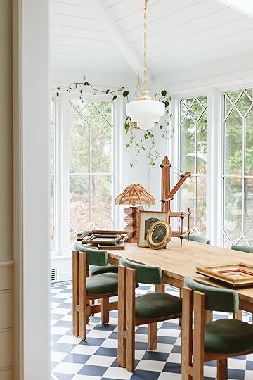 photo by kaitlin green | from: my latest vintage haul including more pictures of dead strangers and a show-and-tell of our new dining chairs (not vintage) that bring me joy all day every day…
When we moved here we didn’t have a lot of major furniture. Our “theme” (which admittedly we have strayed from a bit) was shaker farmhouse, so less country and more simplicity. So for the major pieces that we needed to buy I tried to stay within that theme at first (i.e. our dining table, our rug, our stools). But the dining/sunroom is a great example – mixing in the contemporary dining chairs with the classic oval farm table, made that room SING. They were so incredibly perfect for the room and created a new vibe. Once I brought in those chairs I realized that’s what the rest of the house needed – new, simpler, more postmodern contemporary pieces to balance out the sweetness and simplicity of the more traditional farm elements. And now I’m getting SO EXCITED.
So that’s where I am right now, trying to convince myself that I don’t have to be 100% farm in the house to create the experience that I want here. Just like I’m not 100% anything, none of us are 100% anything. I wear athleisure, overalls, drop crotch, sequins, cowboy boots, and princess sleeves – I’m all over the place and always have been – matching my outfit very clearly to the task/occasion to varying degrees of success. Does that mean that some rooms are going to be more themed farm than others? Maybe! I think they are all going to be a mashup of casual farm, some old-world elements, and some contemporary pieces all within a color palette. LET’S HOPE THAT IT WORKS!!!!
Opening Image Credits (From Left to Right): Photo by Tessa Neustadt, From: How We Styled Our Living Room to Sell | Photo by Sara Ligorria-Tramp, From: Portland Project: The Living Room Reveal | Photo by Kaitlin Green, From: My Journey To FINALLY Choose A Wall Color For Our Living Room (And How I Feel Now That It’s Painted)
The post How Much Do You Need To Stick To The Architectural Style While Decorating Your House? Is The Farmhouse Really Looking Like A “Farmhouse” After All???? appeared first on Emily Henderson.


April 19, 2023
This Is How You Add An Addition To A Historic Home The Right Way (Warning: Beautiful Photos Ahead)

I recently had the opportunity to style a beautiful home located in the Macalester-Groveland neighborhood of St. Paul, Minnesota and it was one of those projects that I just knew I wanted to be a part of and experience for myself. It felt like a great opportunity to ‘play’ in such a beautiful, character-filled home and write about it here. I couldn’t think of a better place or audience to share this gem with. I knew you all would appreciate how this family updated and modernized their home for their family as well as their decision to add a two-story addition onto a 1924 beauty without compromising the exterior aesthetics. I won’t keep you in anticipation any longer, let’s dive right in!

Upon entering this home you are instantly greeted by this gorgeous, original staircase. The homeowners previously resided in a new high-rise condo located across the river in Minneapolis so moving into this home was quite a change as you can imagine. After researching and selecting to work with the design, build, and remodeling team at JKath, the homeowners tell me it all just clicked! That statement got me thinking about how important it is to really know your team and feel all the feels because you’re going to go through some real (and sometimes tough) feels during the process. It’s so valuable to trust the process and allow yourself and everyone involved some grace because things happen no matter how many years of experience or how carefully a project is planned. As long as you have the right team, you can roll with the punches and proceed accordingly. That’s what happened with this 1924 home but we’ll get into that later. First, are you ready for a little before of this entryway?

Not bad right? But I do love how they updated it and gave it new life with just a few cosmetic changes. It’s evidence that paint really does go a long way!
Now, before I take you into the kitchen can we just take another moment and check out this powder bath?
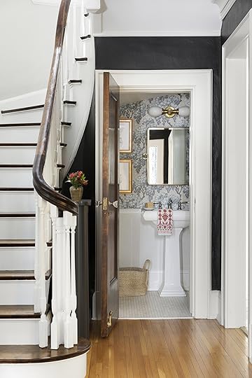
It’s tiny but so full of personality! One nugget of design advice I have is to splurge on your powder bath, since they’re typically a smaller space you don’t need as many materials, thus keeping costs down, and because there isn’t any shower or bath to create steam and moisture you can get more creative and bring in personality through wallpaper and art, as these homeowners did.
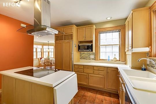
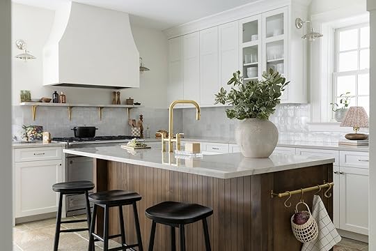
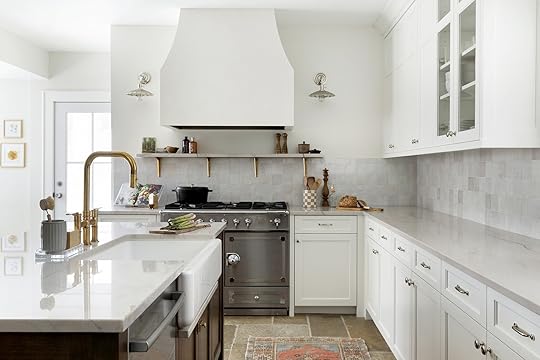
Moving into the kitchen, the homeowners always knew they wanted to update it because the previous layout was really tricky and small, and it didn’t fit the family’s aesthetic and function. So they went back and forth on how to transform their kitchen within the original footprint which proved to be equally challenging. That’s when things changed and the scope of the project evolved into a new plan. Fully trusting in Jkath, the homeowners decided to add onto their historic all-brick home. The decision was not taken lightly as it was very important to them that it looked like the addition was always part of the original house. In order to do so, they installed brick on the entire outside of the new addition to blend with the home’s existing brick as well as continued the clay tile roof in order to preserve the home’s historic exterior. Inside, this new addition allowed them the space for a larger kitchen and mudroom and converted their previously small second-floor bedroom into a primary suite with a dedicated bathroom, walk-in closet, and vaulted ceiling.
Ready to see their newly remodeled kitchen?
Wall & Cabinet Color | Countertop | Wall Sconces | Backsplash | Faucet | Flooring
The homeowners really wanted an all-white kitchen and again trusting in the design team, they ultimately chose a softer perimeter color with this contrasting rich, alder wood island with beautiful kerf panel detail. When I walked in, I instantly fell in love with the softer white they chose along with the gorgeous wood on the island and the custom framed and plastered vent-hood.

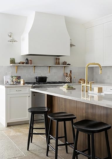

I love the added detail of the alder wood cabinet interiors and how they contrast with the creamy cabinetry color along with the doors that slide back and out of the way in the pantry area. It is proof details really do matter, especially when you’re making such a large decision and investment.
Sink | Shelf Brackets | Cabinet Pulls | Cabinet Knobs
When I first walked in, I felt like I was being embraced by a warm hug (maybe even literally because the in-floor heating system warmed my feet as I walked across these gorgeous limestone pavers). Fun fact: these pavers are outdoor pavers, which JKath expertly researched for indoor use while reinforcing the floor for the weight of the stone.

Island Utility Rail | Ceiling Fixture
I love and respect how they mixed the unlacquered brass with the polished nickel hardware on the perimeter cabinets and light fixtures. And if this kitchen couldn’t get any better, I love that they chose to restore and reuse the existing cabinetry hardware. They were able to repurpose it on the island and the custom-built hutch in their dining room.


Light Fixture | Wall Color | Dining Chairs
In the dining room, the homeowners went back and forth a bit between deciding to add a drink fridge or a coffee bar but ultimately they chose to create a special piece of custom furniture instead. I’m so happy they did and more importantly, they are SO happy they did. It truly warms up the space and looks so special as it echoes the island and cabinetry interiors.
Like I said before, with the new addition here they were able to gain a full-sized mud room! In the before you’ll see this door previously led outside and there was a small closet next to the kitchen area:


Wall Trim and Cabinet Color | Faucet | Pull | Knobs | Countertop
Tada! Their new mudroom is now the perfect place to store coats and shoes and all the gear and things. I especially love the Larder cabinet air vents. It is such a special detail and one that pays homage to the home’s time period. It’s also a trend that EHD called out in their kitchen trends post this year:)

The bench is custom-built by JKath in Alder with a custom finish that echoes the wood tones in the kitchen.

I equally love that they decided to tuck a beverage fridge in here versus the previous idea of installing one in the dining room area.

The moody green walls and cabinetry paired with the gorgeous wallpaper give this hardworking space so much life! Oh, and never underestimate the utility of a simple and functional peg rail. I DIY’d one (well, my brother-in-law DIY’d one) in my bathroom and I love it. So naturally I think this is a great design choice and proof that utilitarian spaces such as this needn’t go without a good dose of personality.

Heading upstairs, the addition of the primary suite felt so seamless, I felt like it was truly hard to differentiate which parts of their home were original and what was new and ultimately that was the goal for JKath which they executed perfectly.
Previously the homeowner’s primary bedroom was small but with the addition, they were able to gain more space in their bedroom as well as vault the ceiling which visually makes the room feel larger as well as fit in a full walk-in closet and primary bath. (Side note: With this remodel, the homeowners also had budgeted into the project plan to remove the radiators and install central heating and cooling which also created more space).

Ceiling and Trim Color | Wall Color | Ceiling Fixture | Wall Sconce
The choice to use a soft but contrasting trim and ceiling color really helps to create instant coziness, making it feel less “new build”. Just a simple but impactful detail.


Faucets | Knobs | Wall Sconces | Mirrors | Towel Ring | Countertop
Can we just talk about the details of their custom bathroom vanity? My jaw dropped at the scalloped detail and the beveled profile. JKath’s custom in-house cabinetry team showed up and showed out! The homeowners say it makes their primary bath feel so special and luxurious. I mean…


Again, they mixed metals and finishes and I’m here for it! Also, notice that beautifully curved backsplash. Swoon!

Shower Tile | Floor Tile | Wall Color | Trim Color
This tile color choice was perfect given that it calls to the stone color of the trim. It’s cohesive but still visually interesting since there’s a lot of color variation in the tiles.

At the end of the day, I asked the homeowners what their home means to them: “Our home is the ultimate safe space for our family. It’s a place for us to be together or enjoy a moment of time alone, it’s a place to play and rest. It’s a place where we love to invite friends and family to enjoy meals and where they hopefully feel welcome and comfortable!”
I think they achieved all of that and more and have the perfect home for their family for many, many years to come.
*Design, Cabinetry, and Remodel by: JKath
**Styled by: Lea Johnson at Creekwoodhill
***Photography by: Spacecrafting
The post This Is How You Add An Addition To A Historic Home The Right Way (Warning: Beautiful Photos Ahead) appeared first on Emily Henderson.
April 18, 2023
Power Couples: Affordable Sofas & Armchairs (+ All The Rules For Getting The Perfect Match)

I hope what I’m about to say doesn’t come off snobby or controversial (but if you’re on this blog, I hope you understand it’s purely out of love and also to be helpful): Step away from the matching sofa and armchair sets. Yes, it’s so very easy to walk into a store and pluck a pre-determined pairing straight from the sales floor. Easy is great! I get it. I ADORE things to be easy. But easy doesn’t always = interesting in the design world.
That said, marrying a sofa with an accent chair or two doesn’t have to be hard. In fact, with a few simple rules, it can be nearly as easy as that matching combo. Pinky promise. Let’s get into all the things you need to know and then we’ll do some shopping together!
Sofa & Armchair Combos: The Rules to FollowI pulled these from a post Emily wrote in 2018 on sofa and armchair power couples, without the “affordable” angle like today. I still very much agree with them all (though I’ll go ahead and disagree with part of #2 below and say that I love a velvet sofa paired with a velvet chair of another color. So bold and maximalist).
Scale: This one is pretty obvious, but your chair shouldn’t be petite if you have a massive and grand sofa. They should both complement each other in scale and be relatively the same size and proportion.Fabrics: Although this rule can sometimes be broken, typically you will want the pairing to have two complementary fabrics. Steer clear of having a leather couch paired with a set of leather chairs, or a velvet couch paired with two velvet chairs. The same goes with patterns – if you have a patterned chair then get a solid sofa. As mentioned this rule can be broken, but is a bit harder to pull off so play it safe by sticking to the rule.Seat Height: This is a big one that a lot of people forget when they start purchasing. The seat height of your sofa and chairs should be within 4″ of each other, if not less. That means if the seat height of your chair is 17″, the seat height of your sofa should be as close as possible to that (ideally no shorter than 14″ and no taller than 20″). This will prevent you and your guests from being at awkward differing heights when you are all seated together. When in doubt, pick a taller sofa and lower armchairs.Legs: This rule applies to other furniture pairings as well, but if your sofa is quite heavy and boxy then consider having a chair that has a longer leg profile to help balance out the visual weight. Or visa versa, if your chair is really heavy then look for a sofa that has a little bit of a leg to it so that neither feels too heavy or too light.Style: This is an add-on from Arlyn in 2023 because I think it needed to be said. You can have a lot of fun mixing and matching styles, but there should be something that unites the pairing visually. You can combine mid-century and Hollywood Regency, Art & Crafts, and neo-classical. Have a ball, but consider the silhouette and material mix when you do. If you have a curved sofa, try looking for an armchair with a more sinuous shape if the style and era don’t relate. Have walnut legs on an old Chesterfield? A modern chair with a walnut frame will bring things together stylistically. photo by sara ligorria-tramp | from: reveal: a budget and rental-friendly living and dining room (with 80% thrifted finds)
What’s an EHD post without some visual examples, right? I’ll walk you through a few now that we have guidelines in place to show you things in practice.
In the above living room, the vintage sofa is a hefty, blocky baby, while the blue velvet armchairs (in a nice color contrast to the white bouclé) are lighter with peg legs and no arms. And since those are a bit more traditional, the vintage leather sling chair—with a wood tone similar to those of the other seating—bridges the gap and keeps things funky.

 photos by sara ligorria-tramp | from: my friend’s kid- and pet-friendly family room reveal
There is so much flexibility with armchair style when your sofa is clean-lined like the one above. Almost anything could work here (though I’d avoid something overly glam or Victorian, for instance). The low-slung embroidered chair pops against the white walls and the denim-y fabric of the sectional still feels earthy and casual. I also like how the sloping arm counterbalances the straight lines of the larger piece.
 photo by sara ligorria-tramp | from: how to design a pass-through room — reveal: the portland family room
This is a great example of so many of our rules together in one photo: a linen slipcover contrasts beautifully with the warm nutmeg leather of the chairs. An open wood frame is airy and interesting as an answer to the simple, blocky sofa silhouette. And while my eye is only estimating it, a lower seat on all pieces will keep this conversation area comfortable and effortless without anyone towering over anyone else.
 photo by sara ligorria-tramp | from: reveal: arlyn’s bright & happy rental living room makeover
Gee, I wonder what this room is doing here? Kidding, it’s my living room, of course, and admittedly, I didn’t consider any rules when putting it together. I just bought what I liked and went with it (which is also always an option…there is no power couples police that’ll come and take your things and put a lock on your door).
But looking at it with unbiased eyes, the wood and cane chairs add warmth to the cobalt velvet of the sectional and because it has such a deep seat, I opted for two chairs rather than one since they were a bit more petite. Otherwise, the sofa would have overpowered the accent seating in scale.
 photo by sara ligorria-tramp | from: brady’s living room refresh with the citizenry
And now, for all of our favorite part: the shopping. I put together 14 power couples that check most if not all of the rules boxes, including seat height (I checked them all for you). However, before proceeding, I just want to bring some attention to the word “affordable” here. This word is absolutely, without a doubt, completely suggestive. What is affordable to me might be completely out of the question for someone else, and vice versa. But as someone who has worked in the furniture business for the last three years, I know how much prices have become inflated. It’s, well…really bad.
To give you a quick example without fully diving into it, a sofa my previous company sold for $1,500 when I started in 2020 is now roughly $2,400. For the same piece of furniture. They didn’t start sprinkling gold coins inside the cushions. The frame is not suddenly made of platinum. Same sofa. Shipping costs for manufacturers have skyrocketed, materials cost upwards of 40% more (from the wood to the foam to the fabric), and the craftsmen who build the pieces are charging more for their time. These costs are passed down to the consumer.
To think that a standard sofa at IKEA will run you close to $1,000 (and sometimes more) should tell you everything you need to know about the state of furniture prices today. Buying thrifted and secondhand is a fantastic way to sidestep a lot of this, not to mention is far better for all of us. Be sure to look around for similar pieces and beyond on sites like Facebook Marketplace, Craigslist, Chairish, and your local shops.
All that said, I had to pick some fair and realistic parameters for today’s shopping picks while still trying to keep a semblance of quality in mind. Sure, you can get a $300 sofa from Amazon, but well…you’re gonna get a $300 sofa from Amazon.
Our sofa budget here is $2,000 while our armchair threshold is $700.

Combo 1: Brynn Feather Filled Sofa | Arbon Wood Dowel Accent Chair with Cushion Arms
Why It Works: The blocky, straight-forward shape is super versatile, but I picked a cushion-heavy spindle-y armchair to add some visual interest.
Combo 2: Ella Custom 3-Seater Sofa | Modern Armchair in Cream & Walnut
Why It Works: I love the look of this sofa from Interior Define (it comes in a massive number of color options, FYI). The single bench cushion is sleek and pairs well with the equally sleek (yet light due to the metal frame) chair.
Disclaimer – We know that Interior Define had a lot of issues in the last couple of years but they have been acquired by Havenly (the company that owns The Inside) and they’re now handling all operations.

Combo 3: Aria Sofa | Everse Ivory Wool Bouclé Lounge Chair
Why It Works: Interesting + interesting = very interesting. Curved shapes echo each other here while the bouclé is a great counterpoint to the rust faux suede (which is a performance fabric so it can take a beating).
Combo 4: Bari 91.25” Upholstered Sofa | Marna Petite Accent Chair
Why It Works: Man I’m really into this look. Eclectic, “grand-Millenial” chic. It wasn’t easy to find a chair that paired well enough with this Chesterfield without feeling overly heavy-handed or too mismatched, until I came across this fun print from Anthropologie (it’s on sale!). The subtle wingback picks up on the more classic vibe while the pattern play keeps things interesting and fresh.
Combo 5: Liz 102” Upholstered Sofa | Higgins Sling Armchair
Why It Works: This is a large and in-charge sofa, so really, I’d get two of these chairs from Target to go with it, otherwise a single one may be a bit dwarfed. While the seat comes in a few more subdued fabrics and colors, I picked the evergreen velvet because the cream upholstery was screaming for some drama.
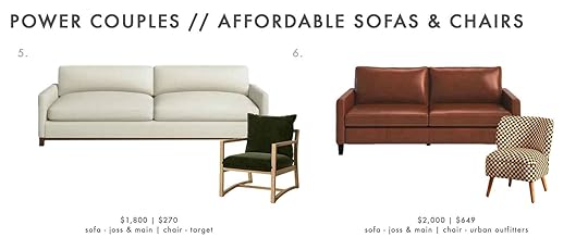
Combo 6: Portland 81″ Square Arm Leather Sofa | Bria Checkered Chair
Why It Works: Two small-scale pieces perfect for a compact apartment or room. A leather option south of $2,000 is not an easy feat, so this one barely squeaks by. The trend-forward print on the chair adds some playfulness to the seriousness of the sofa at just the right proportion.

Combo 7: Leanna Camel Channel Tufted Velvet Sofa | Vivian Park Upholstered Swivel Chair Cream
Why It Works: Channel tufting, while very trendy right now, is actually rather classic (first finding popularity in the 1920s), which I think pairs so nicely with the traditional slope arm and skirted slipcover of the swivel armchair here.
Combo 8: Maxwell Custom Sofa | Leroy Upholstered Accent Chair
Why It Works: I own this same sofa but in the sectional version (and in cobalt blue velvet) and also very similar chairs (which I decided to marry with a different sofa below). The Maxwell Sofa is low, with a seat height of 16″, so the 15″ seat height of Leroy here keeps everything roughly on the same level.

Combo 9: Winona Armless Sofa | SAFAVIEH Couture Colette Rattan Accent Chair
Why It Works: Here is a version of the armchair I own (which is just a reproduction of a Pierre Jeanneret chair you see everywhere now). Since the frame is complex and eye-catching, mixing it with a simple armless sofa keeps it as the star of the space.
Combo 10: Sven Charme Tan Leather Sofa | SAFAVIEH Couture Osmond Linen Sling Chair
Why It Works: A canvas sling chair and a camel-colored buttery leather sofa will always be a match made in living room furniture pair heaven. They have a very campy, safari vibe that just works. These happen to comply in terms of seat height and scale, as well.

Combo 11: The Essential Sectional | Noemi Charcoal Gray And Ivory Dash Print Chair
Why It Works: Sabai is a newcomer on the scene. Black-founded, sustainable, and ethically built, they’re definitely one to check out on your furniture hunt. Since this sectional nearly crosses the line of our budget, I opted for a very affordable slipper-like chair from World Market. As the sofa is a bit serious, the shape and casual print of the chair adds in a bit of fun.
Combo 12: Eddy Sofa | Donovan Upholstered Swivel Barrel Chair
Why It Works: If you haven’t noticed, the barrel swivel chair is *the* chair of the moment. This shape is absolutely everywhere right now but for good reason. It works so well with a multitude of sofa styles, including a contemporary choice like this one from West Elm. The exposed legs offset the bottom-heavy armchair.

Combo 13: Chamberlin Velvet Sofa | Saboor Upholstered Swivel Barrel Chair
Why It Works: A little glitz for the glam lovahs here. A straightforward yet plush sofa in a fabulous lavender velvet gains some structure from the barrel (ha, again) swivel chair. Bouclé and velvet keep things fancy schmancy, if that’s your look of choice.
Combo 14: Vivian Park Upholstered Sofa | Penn Chair
Why It Works: And finally a wonderfully priced pairing (together they’re less than $1,300!) that’s a little prim and proper classic via the sofa, and a little…rock and roll? Not really, but these great Penn chairs nullify the visual blockiness of the sofa’s skirt as well as making sure nothing gets too stuffy or serious.
And there you have it! Another set of power couples under your design belts. I hope this was helpful and you feel armed and ready to bring together a sofa and a chair in holy living room matrimony.
As always, please leave any suggestions in the comments for other Power Couples that would be useful to you. We’ve done a lot over the past several years, but happy to bring more into the world.
See you next time, friends.
Opening Image Credits: Photo by Sara Ligorria-Tramp | From: A Quick Update: The Changes Ive Made to My LA Living Room
The post Power Couples: Affordable Sofas & Armchairs (+ All The Rules For Getting The Perfect Match) appeared first on Emily Henderson.
April 17, 2023
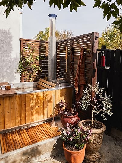
Can A No Plumbing, No Electricity Hot Tub Live Up To The Hype? Bowser’s Goodland Hot Tub Review (+ A Yard Reveal)

I’m back and excited to share this controversial space with you all!
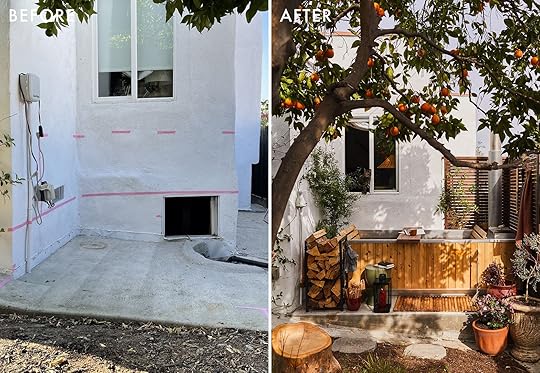
Waaaaaaay back in August of last year I shared that I was planning a space to put a hot tub from Goodland. We had the teeny tiny issue that Gremmy had escaped (out of this very window!) during this time and was gone for 6 long weeks. We got the Goodland hot tub at some point during that 6 weeks and it sat in the driveway making parking/getting into my garage almost impossible. You see, there was a crawl space under the window where we had successfully trapped him twice before so we had to (obvi) halt everything and wait until we trapped him (Sept 2nd) to move forward with the construction. It was a long saga. See my saved Instagram stories “Gremmy” if you are so inclined. Once we finally trapped Gremmy we had to lay the foundation for the hot tub because it was on a slight hill.

We made the plans, we decided to keep it simple and cheap, a concrete base with a wood L shaped wall (like that technical drawing?) to enclose it a little bit for privacy. They framed it out and then on Sept 10th Daffy started having seizures, on the 15th we went to say goodbye to her, and on the 19th a miracle happened and we brought her home, a lot poorer but very, very happy.
The poorer part was a problem though. Because I am an absolute oversharer, here’s a breakdown of the cost for something very “simple” like this…

We were between a rock and a hard place. The hot tub was already in our possession and I had agreed to this shoot. At the same time, I was shooting our back unit’s yard and installing the kitchen cabinets for my kitchen reveal. All of that costs money. Doing these reveals is so fun and we get some real perks that I am so thankful for, but it isn’t cheap and takes up a lot of time as well. Luckily, Goodland has been very gracious with us because this has been the longest turnaround of any shoot of mine ever. We had nowhere else to put the tub so we had to wait another month before we were able to save up money, know that Daffy was ok, and not going to cost us more money before starting work again.

As you can see, they covered half of the crawl space entrance, don’t worry it’s not the only way to enter or exit that space, we have two other areas. We wanted to keep it as a vent though, so they replaced it with a permanent screen. The wood wall is made of pine (because it was cheap) and obviously, it needed to be stained to help protect it and I wanted there to be some contrast between this wood and the wood hot tub. While they were doing this work I was working on a big job so I have essentially no photos of the process other than the two above until October 22nd, which I think is the first time we filled up the hot tub…

The stain on the wood wall turned out way darker than I wanted but, you know, I was busy and couldn’t micromanage the situation. I wanted it to be darker than the wood on the hot tub but not that dark, but here we are. As a fix, I decided I would just need plants to grow on it so it didn’t feel so much like a dark hole.
So it’s now the end of October, why couldn’t I shoot the space then? Well, at first it was because I needed time and money to plant things to make the space look nicer. I found that the amount of space I had between the hot tub and the house was perfect for fitting one of my Veradek planters. Veradek has beautiful planters that you can see in this post and you will see in my next post about my front garden. In this case though I wanted it to disappear against the side of the house and their Blok Span Planter was perfect for the job.
I planted this crawling vine in November and then…it rained.

And rained and rained and rained and rained.
If you’re curious, the wire grid already existed because on the other side of that wall is a jasmine plant we are encouraging to climb around this area, as well as around the other corner onto the patio. You can see some of her tendrils coming in from the left side of the photo. Let’s get to some reveals so we can understand a little more about where this hot tub area is.
Directly to the left of this photo is my patio which still hasn’t been properly revealed because I don’t know…I’m tired? But you can see some of it in this Halloween post or in this post (from almost three years ago?!?) about the process of my backyard. We’ll get to it eventually. There’s a door to that patio and you walk around where the jasmine is to get to the hot tub. We quickly found out that we needed to make a proper walkway because walking through the garden we were getting dirt in the hot tub and then in the house as we walked in or out. You can see one of our stepping stones near the jasmine in the photo above.
Here’s an old process photo from summer 2020 for more context…

Awww…look at that baby Jasmine. The grass will get greener like this as the weather warms up.

 jasmine on left with stepping stones to hot tub
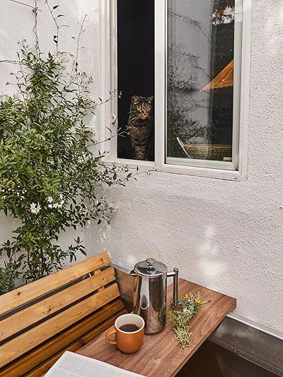
This reveal was finally photographed on February 17th, between rain storms. Apparently, it’s rained more in LA this year than it has in Seattle. It’s been wild – and my garage agrees. I *may* have been able to do the shoot in January between the rain but I was gone in Utah for half of the month and 2 days after we got home (one day after I shot my kitchen) we found out Puck had an aggressive case of cancer. The window above the hot tub was his favorite so he hung out and watched us for the entirety of the shoot. I was in a bit of a haze of shock on this day tbh, but there’s so many sweet pictures of him that I will treasure forever and I’m happy in the end that the timing worked out this way.
 wild hair and my sweet boi, puck
The window above the hot tub is in our bedroom. Puck’s basket that he slept in every day sits on our dresser in this window, we can’t bring ourselves to move it. He always had a fascination with water and really loved watching us in the hot tub.

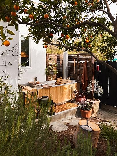
She’s a beaut, eh? The rain helped everything grow so fast and now, a month later the vine (potato vine) on the left is up on the roof. I took this bad iPhone pic to show you how much it’s grown:


It may need me to go out there and tame it a little bit, but I’m really enjoying the view from my bed with all the little flowers in the window.
Surprisingly adding this little space feels like getting a lot of bang for our buck. As you may remember from one of the process posts about this, a big reason we wanted this tub is because our one and only bathtub (in our one and only bathroom) is tiny and way too shallow to soak in and my husband is a BIG bath boy – a BBB if you will. For us, this adds a lot of value to our lives and is another place to hang out together. However, I was thinking about if we ever move out of this house and took the tub with us, it would be a nice (more) private and definitely more shaded place to sit outside. Because our backyard is a walk-through for the back unit and their living room and bedroom windows look out onto our backyard, you’re sort of on display for them. This isn’t a problem for us now because we love and are friends with our back tenants, but who knows what the future brings? Also, the shade factor. Our patio is in full sun most of the day. It would actually be nice in that situation to replace the window here with a door from the primary bedroom to make it an on-suite situation. This fact makes the $$ spent seem well invested outside of the hot tub of it all.


This photo is taken standing up so you can imagine if you were sitting down, especially later in the spring/summer, the plants and the house tuck you in a bit.
Back to the hot tub though…
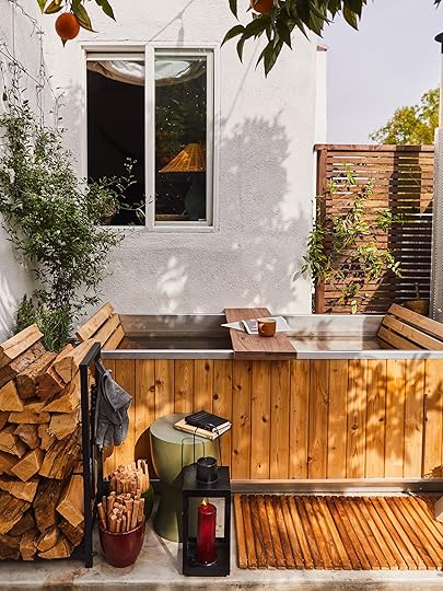
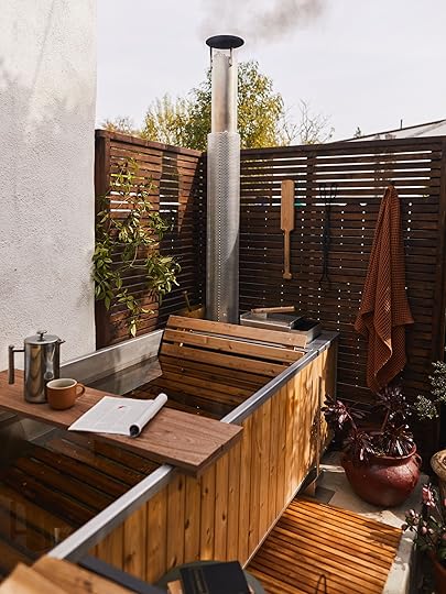
The tub itself is absolutely beautifully made. The tubs are made in Canada from 100% recyclable materials. Goodland uses marine grade aluminum, western red cedar as well as oak and raw brass detailing. The quality is outstanding and it was very easy to assemble. Goodland as a company is so good at getting information out there. You can ask away in the comments but I will also direct you to their FAQs and YouTube channel. On the YouTube channel, you can find a set up video. When I say it’s easy to set up, I mean you could probably figure it out without instruction – it’s that intuitive, maybe takes 15 minutes, and doesn’t require a professional as no plumbing or electricity is needed. As far as moving it to the desired location, the cedar planks on the side easily slide out, and if you do so the tub itself is only 125 lbs and all the other pieces can be moved separately.
Couple of honorable mentions before we get into how the hot tub works…
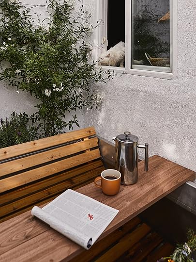
The tub is nice and deep, which is exactly what we needed, but we were having a hard time finding a side table to set things on that would 1) fit in this small area and 2) was tall enough to be easy to reach. Our trusty Article Hendry accent table is great but sometimes we need more real estate. For example, when I’ve handed Andrew his lunch through this very window so he could enjoy it WHILE BATHING (I mean, if that’s not luxury, what is?), it’s helpful to have a surface that is big and accessible. My conclusion was that what we needed was a bath tray. After searching far and wide on the internet and either not finding one long enough or not wanting to spend HUNDREDS OF DOLLARS, I tasked my husband to make one for us. It’s a simple construction as you can see, I bought a 1”x6”x8’ piece of walnut and a smaller piece that I believe was 1”x2”x24”(not online that I can find). Andrew cut the smaller piece in half to use for the ends (so it doesn’t slide around or accidentally fall into the water) and the 8’ piece he cut into 2 pieces, enough to be wider than the hot tub which is 29” wide + 2” for the end pieces +1” wiggle room (so two 34” long pieces). He screwed the end pieces in from the bottom on each side, finished with a matte poly we had in the garage, and voila! A beautiful (and very secure!) bath tray. It was a little more pricey because I chose walnut but nowhere near what I was finding online and a huge plus that we made it to fit exactly. FYI, we don’t keep it outside, we just grab it from our storage bench on the side of the house when we need it.

It also doubled as a cat bridge when Puck would get curious enough to jump out. *single tear*
Goodland also makes a very beautiful firewood holder but we simply didn’t have the space. I bought this cheap one on Amazon that works just fine for us and has even done ok with all the rain, probably because we cover it with this firewood rack cover. It’s leaked some rusty- residue but one of the benefits of having a concrete slab is I don’t really care about that kind of thing.


Firewood Holder | Net | Heat-Resistant Gloves | Teak Bath Mat | Green Accent Table | Lantern (similar)
We keep the net, heat-resistant gloves, axe, and lighter on the hooks around the firewood holder. The final mention is the extra long teak bath mat that also assists in keeping our feet from getting too dirty on the way in or out of the bath. Teak is expensive but I splurged on it so I wouldn’t have to worry about leaving it outside. Lanterns are vintage Target, I’ve talked about them before and have had them for years. Every year I spray them with a high heat spray paint to keep them looking new. I hung one on the edge of the wood wall with this hook. All the pots are collected over time from local nurseries. I keep a couple of smaller pots of small-diameter kindling ready to go. Which brings us to how this gorgeous Goodland hot tub works…
Lantern Hook | Lantern (similar)
Craig from Goodland does a great video on how to start your fire here. He recommends starting with some balled-up paper but I’m going to let you in on a little secret…toilet paper rolls filled with lint are the best fire starters out there. I keep a roll on my dryer at all times, when it is filled up I throw it in a bag by my back door to use when I need it.

We have a few trees so it’s easy for us to grab a handful of small limbs along with the small-diameter kindling. We have a stump in the garden for cutting the wood up into the kindling and smaller pieces of wood (seen below with the net we forgot to move before taking the pic 🙂 ).
Arrange paper (or toilet paper rolls of lint), smaller sticks if you have them, and small-diameter kindling in the bottom and once the fire gets going, you can add slightly larger pieces of wood (up to 4” diameter).


As Craig explains in the video, there should be very little smoke coming out of the chimney, and if there is it means the fire needs more air. The lid can slide around to allow more or less air in.
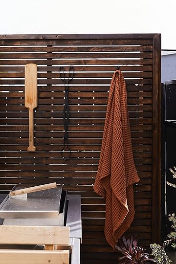
After the fire is going, we cover the tub so the heat doesn’t escape. We’ve found that the tub takes about 90 minutes to heat up. Every 20 minutes or so we will check on the fire and add wood if necessary, pull the cover back and stir with the Goodland paddle that comes with the tub. I have the paddle and the fireplace tongs mounted close by for easy access.


The seats inside are cedar and have I mentioned that it still smells like cedar every time we heat it up? I hope that lasts forever. Speaking of smells, I have strategically (and accidentally) planted herbs and flowers around and near the hot tub so that I can easily throw together a bundle for the bath. There’s lavender and rosemary in the planter with the potato vine. I used them, along with a cutting from the potted eucalyptus tree next to the tub, some fragrant Mexican marigolds, and some other variants of rosemary that are planted in the garden nearby. If it’s the first time we are using the tub after cleaning and filling it, I put a half a (almost 20 lb) bag of Epsom salt in it as well.

Goodland has a number of bath accouterments, including this brass hand shower. You can tell just by looking at that photo how fun and relaxing it is to be under it. We have left it outside to patina naturally and I think it’s more beautiful than it was the day we got it. It’s also a great over-the-top gift for a loved one who likes bathing.
We keep our water for 10-14 days if we are using it regularly. There is a hose attached underneath on the left side. There’s just enough room between the house and the planter to shove it back there after it’s drained the tub. We use the hose, along with large watering cans to use the water to hydrate the garden and all of our pots and planters especially those that don’t have irrigation. Being able to recycle the water this way, along with not having drying and irritating chemicals on our skin, is the main reason we wanted this tub. Goodland does note that “Our hot tub’s water returns to ambient temperature when not in use, which doesn’t allow harmful bacteria to thrive as they do in always-warm hot tubs. The use of safer alternatives like bromine or hydrogen peroxide can prolong the life of your tub water to three weeks of daily use.” We have not had the need so personally, I haven’t tried using bromine or hydrogen peroxide. A quick Google shows that neither are dangerous for plants though, so I assume you can still use the water for your garden if you chose to go that route.
After emptying, I throw some vinegar in and give it a good scrub with my power scrubber brush (makes it way easier), rinse with the hose and I’m done. Protip: the bottom of the tub is very square and therefore a little hard to empty all the way. You *can* tip the whole thing over when cleaning, but that would be hard with one person and given the space I have. Last time our tub was empty we put a couple of shims on the right side so it tilts slightly towards the drain to help empty completely. Before we did that I would have to sop up the remaining water with a old towel, which wasn’t the end of the world. Before we build our next fire for the tub, we use the Goodland Ash Scooper to clean out the old ash, which is good to do for fire safety.
In case you’re curious about where the hose is to fill it back up it’s next to the Jasmine bush around the corner:)

Some final thoughts:
There were a LOT of opinions on the process post about this hot tub. Mostly people being concerned about the proximity to the house (it’s a smidge closer than Goodland recommends) and to other houses in an area that is prone to fire. I know now, after having and using it for a number of months that yes, of course, you must practice fire safety. We never leave while the fire is burning and we follow the guidelines of the city. If there is a fire ban, for instance, we would not use the hot tub. We can use it as a cold plunge though and I’m excited to try that! There should be little to no smoke or burning ash. The fire that you make for the tub feels way safer to me than a fire pit for instance or even a charcoal grill. It’s more contained and the chimney helps in keeping debris from flying around. I will have to be even more careful in the dry season but if LA keeps up this weird weather, it seems like for half the year I don’t need to be very concerned at all. It was wonderful using the tub in the rain because I didn’t have to worry about anything and it was such a sensory experience!
We have enjoyed having this relaxing space, especially in this very busy, stressful, and grief-filled season. We have had a lot going on, even more than I share here of course, and then there’s the wildness that it is to be a human in 2023… It’s all a lot and I hope everyone is ok. I feel like everyone I know is just going through it and I have a feeling it may be bigger than my group of friends and family. It’s important that we find ways to slow down and connect with each other. This tub has been a part of that practice for me and I want to thank Craig and Goodland, EHD, and of course all of you for engaging. If you have any questions, pop them below, maybe I can even get Craig over here to talk to you all 🙂 Or honestly, if you have any ways you are keeping sane in 2023 or just want to complain/connect as humans, do that below as well. See you soon to talk about another way I’m staying sane – my Down to Farm urban garden!

*Design and Styled by Emily Bowser
**Photos by Sara Ligorria-Tramp
The post Can A No Plumbing, No Electricity Hot Tub Live Up To The Hype? Bowser’s Goodland Hot Tub Review (+ A Yard Reveal) appeared first on Emily Henderson.
April 16, 2023
The Link Up: Em’s New Demin Dress She’ll Be Wearing ALL Spring, Mal’s $9 Product To Help You Self-Tan Your Back, And A $13 Countertop Vacuum That’s A GAMECHANGER

Happy Sunday! Hope y’all are hanging in there. Emily has been busier than ever with photoshoots which only means beautiful things for us all to look at in the near future. Also, did you see that the farm has grass?? It’s the small (but also not so small) victories. Ok, ready for some links??

 design by michelle cage interior design | styled by kristi hunter | photo by brian wetzel
This week’s house tour is that of a young professional couple that really wanted color in their new build home. Michelle Cage and her team created just that! We really love the two working spaces because they really tell a story about each of the homeowners individually. And isn’t that custom walnut tambour wall treatment so good? Go check it all out here!
From Emily: I just got this new denim dress and I might be wearing it all spring out of its sheer comfort and adorableness. It’s one of those dresses you can dress up or down. I actually paired it with some combat boots and it was really cute but it’s equally cute with flip-flops. It’s also super roomy so you can have unlimited burritos and have zero issues:)
From Jess: I have been WAITING for this Spring Designer Collection from Target! FeNoel is where I bought this beautiful swimsuit last year. Their clothes aren’t necessarily affordable…so getting a Target collab was music to my ears!! I also see Rhode on Instagram all the time and love their casual yet bold dresses. Agua Bendita is new to me but if their Target collab is any indication of their style (which of course it is) I am a new fan. I rounded up six of my favorite products but there are so many more. GO check it out!!


Asymmetrical Metallic Cut Out High Leg Cheeky One Piece Swimsuit | Small Crochet Tote Bag | Peony Botanical Print Jumpsuit


Large Lotus Floral Print Rope Tie One Shoulder Mini Dress | Lily Floral Print Underwire Bikini Top + Bottom | Sketch Palm Leaf Print Ruffle Trim Cover Up Dress
From Caitlin: Guys, the all-time greatest summer sandal is back in stock in all sizes and in a bunch of colors! (I feel like most folks will be able to guess which ones I’m talking about – they’re real popular in the comments every year, too. Did you get it right?!) ANYWAY. I own these in black and white, Brenda owns them in silver, Dennis owns them in olive – they’re great for everyone and every style, supremely comfortable, and they last FOREVER (I’ve had mine for…7 years? And honestly, at only $49 bucks, they may be the best shoe investment I’ve made). I always find that they run out of stock at the beginning of the summer (at least in 9.5s/10s!) so run, don’t walk, if you need a new pair! I just bought the candy pink color and I CAN’T WAIT to get them:)
Speaking of shoes, did y’all see that Joy (of OhJoy!) has a shoe line with Rockport?! It’s pretty, happy, and perfect for this spring and summer. Congrats Joy!
From Mallory: It’s almost (self) tan season!! And boy do I have some fun fresh new products to share with you!!! We all know by now Emily’s favorite self-tanner, but does anyone else struggle to apply self-tanner to your back? Same. Enter this tanning mitt set. I just purchased this set because it comes with a back tanning applicator that’s a stretchy long piece you can rub side to side on your back. I cannot wait to use it because I think it’s going to really change the game for me. Also, I found this product that I continue to get marketed to (this is the video that sold me) and it’s honestly great for doing some touch-up tanning on the chest area or arms if you’re wearing some warm weather clothing. It doesn’t smell and it dries SO FAST which is awesome. Note it’s not for your entire body because it’s a lil thicker than normal tanning mouse but it does a really good job of bronzing me up a bit. I hear a lot of people use it on their face as a semi-permanent bronzer so they don’t have to put on makeup every day which I haven’t tried but sounds genius. This is the brush I use it with btw and it’s awesome. Happy tanning friends 🙂
From Arlyn: I could be wrong, but I don’t remember so.many.crumbs. being EVERYWHERE at all times before my daughter was born. Every time I turn around, more crumbs. Are they falling from the ceiling? I’d alternate between sweeping them into my hands (which doesn’t work when said hands are covered in yogurt or spaghetti sauce from feeding my girl), or grabbing yet another paper towel. And then I leveled up my life with…a countertop vacuum. I’m not talking about a dust buster but rather a 3″x3″ handheld countertop vacuum. It’s actually been a game changer for quick clean-ups in the kitchen, the dining table, and even our desks. Best $13 I’ve spent in a handful of months by far.
We are pretty freaking excited about the Christian Siriano x Sherwin-Williams collab! It’s chic, earthy, and super approachable. Plus you can order peel & stick kits!
From Ryann: After years of searching, I think I found the perfect bikini bottoms for me. They are high cut on the legs so they sit above the hip and hug my curves in such a nice way – plus the very cheeky bottom is reallyyy flattering. As a curvy size 12/14 gal, I am so happy I found this brand because they are actually true to size which is a rarity when it comes to swimsuits. I will 100% be buying from them again!
From Albie: To know me is to know I love my teas! I came across Olivia Amitrano a few years back — before she had teas — and began following her for her wellness content. Now she has teas and they are staples in my daily tea routine. Yes… I have a tea routine. I decided to start with her bundle to see which ones would be the best for my needs & to be honest, there isn’t a single one I don’t drink. My favorites are Open Heart, Healer, and Right Mind.
That’s it from us today. Have a good and safe rest of your weekend. xx
Opening Image Credits: Design by Michelle Cage Interior Design | Styled by Kristi Hunter | Photo by Brian Wetzel
The post The Link Up: Em’s New Demin Dress She’ll Be Wearing ALL Spring, Mal’s $9 Product To Help You Self-Tan Your Back, And A $13 Countertop Vacuum That’s A GAMECHANGER appeared first on Emily Henderson.
April 15, 2023
What I’ve Been Putting On My Body Lately – Comfortable Spring Clothes For When I Attempt To Leave The House

It’s been a minute since I did a fashion post (or put on fashion that wasn’t these pants), but I have a few shoots coming up as well as I had a spring break to pack for (Costa Rica, which I still need to fill you in on – it was wonderful). So here are just a few things that I’ve loved a lot lately.


Blouse | Jeans | Purse | Shoes
I find that a white blouse and black pants combo to be challenging because it can go “catering” so fast, but this menswear-inspired shirt is oversized in a cool way (I love this one even more now) and over those washed stretchy but not too stretchy black Cali jeans it feels still modern/fresh. And look at me attempting to wear heels! In Oregon! In the Spring! I’ve had these clogs for 5 years now and they are still going strong (probably because I wear them 10 times a year). Whenever I want to feel cute but still look casual (date nights), I throw these on and I feel like I’ve tried.

My new Claire V belt bag is EXCELLENT, not necessarily because of how it looks (which is very cool) but because of how it drapes and lies on my body. The material of the bag and strap make it so that it tucks so perfectly in the boob-armpit area and stays put. My other belt bag (of which I have four) always sneaks into the armpit area, which is fine but this one stays on my front because of its moon shape, scale, and the flexibility of the fabric. It’s also much bigger than my other one, fitting my wallet, phone, and Kindle more easily. It’s become my everyday purse and dresses up and down so easily.
A big yes to this A-line washed black denim dress – with pockets!! So forgiving, so easy to wear, and so versatile. Not super heavy, but sturdy enough to maintain the A-line shape. You can eat SO MANY BREAKFAST BURRITOS with zero discomfort!! And y’all this boring white room is getting a heavy dose of paint color REALLY SOON. And that dope desk is likely being returned (or hoarded for a future project) – it doesn’t work there.


I didn’t need this Nike pullover, but it was just so flattering. This could be because I was in Dicks Sporting Goods trying on new yoga clothes (I’ve had a huge yoga resurgence, y’all – obsessed again). However, I was so unbelievably horrified by the shopping experience (the most unflattering lights/mirrors) and this still looked so cute/flattering that it felt like a worthwhile investment. Or maybe I just needed to feel good about myself after trying on so many unflattering yoga sets (WHO MAKES THE GOOD ONES????). I have worn it a ton when I want to wear athleisure but also want to still feel cute (the shoulders are nicely structured, making the waist look smaller). I am wearing a medium.
The shorts are the same from the last two summers, from Madewell, with that cute little kick-out that doesn’t hug your legs and makes them look longer (IMHO). They are pretty true to size if you want them to be baggy (otherwise if you want them tighter, size down).

Windbreaker | Shorts | Shoes
For Costa Rica, I wanted a thin layer for the morning walks/hikes/ziplining and this was PERFECT, and I wore it almost every day. It is extremely lightweight, adding no “warmth,” but just a layer between you and the wind (or if you just aren’t ready to be in a tank top at 7 am). I’ll also wear this a ton this summer walking dogs in the morning before it’s too hot, but when I still like to have a layer. BTW, I secretly want to start a whole line of dog-walking clothes. Remember that I was a professional dog walker in New York in my early 20s and I truly feel there are some holes in the apparel market for those of us power walking our dogs. Not necessarily for fashion, but utility – I want pockets with different functions, fabric that is warm but doesn’t retain heat when you are at mile 3… I’m sure this all exists functionally, but I’d like it to be just better.

Windbreaker | Shorts | Shoes
Anyway, I bought this windbreaker in white and green and I sized it up to be more oversized. This is a medium, but the small fit, too – just didn’t have the same boxiness. I love the pockets (they close easily, but no zipper making it easy to grab your phone if needed). And we have officially entered our Teva phase – I wore these almost every day in Costa Rica because they are so comfortable/supportive, breathable (obviously) and I think they look cool (while they don’t mask my bunion, the location of the strap de-emphasizes it).

Last is my Everlane windbreaker which is a bit warmer than the other one and covers the bum/thighs for when it’s a bit chillier. It looks heavier than it is – it’s really lightweight and it is NOT a raincoat, but it is rain resistant if it’s misting. I’m wearing my buttery soft Vuori tights (I have 3 pairs now and it’s all I wear, honestly).
Have a lovely weekend, y’all. xx
Bedroom Resources:
White Oak Windows and Doors – Sierra Pacific (Aspen casements)
Window Treatments – Decorview
Flooring – Zena Forest Products(Oregon grown and milled)
Sconces, Switches, and Outlets – Rejuvenation
Wall Color – Sherwin Williams, “Extra White” (which is a cool white, FYI).
Skylights – Velux (with room darkening shades, of course).
The post What I’ve Been Putting On My Body Lately – Comfortable Spring Clothes For When I Attempt To Leave The House appeared first on Emily Henderson.
April 14, 2023
Designing With An ALMOST Tween Boy: Charlie’s Room Update/Progress With A Thrifted 80s Vibe
As you might know, the kids are now in separate rooms after 5 years of opting to share. With that comes a lot of new independence and asserting a sense of who they are (or want to be). It’s incredibly fun and also full of new challenges for me. After some initial immature pushback on my part last year I’ve taken the approach of back seat designer, letting them guide the process, tell me what they are into, and then definitely curating it along the way behind the scenes (so that there aren’t literal pokemon and Minecraft murals on all the walls). If you are wondering about my methods on such manipulation I wrote a whole post about it (and not going on Pinterest with them is my #1 piece of advice). Obviously, kids don’t need fully designed rooms, we surely never had them growing up. But due to my wonderful job of creating inspiration and avoiding pitfalls for others, our kids get the full treatment – to their benefit (and likely detriment :)). Today, you’ll see where we are at after two months of settling into Charie’s solo room. It’s definitely not done but headed in a good direction and he and I are both LOVING IT.
Charlie is nine and in that sweet age between being a snuggly little kid and wanting to be a teenager. He hasn’t been as forthcoming when it comes to his style as Birdie, but once I opened the door and showed him some ideas he came in with a lot of his own opinions. He mostly likes funky stuff – things that are unexpected, irreverent, that make you laugh (think fart jokes, for the walls), and make him feel like a big kid with a sense of humor (he has a GREAT affinity towards puns that is pretty impressive). He also wants a lot of graffiti-based prints so I’m doing a pretty strong redirect to “street art” (as you’ll see below). Also, that stuffie closet is not for stuffies – the shelves were just recently installed and he put all his stuffies in there, but obviously hoping to use it for more function (seasonal sports gear, games, nerf guns, etc).
Wall Color | Roman Shades | Carpet
We centered his bed which might stay here, might not, and have yet to buy a more complete bed (it’s currently just on an Ikea frame). Part of me wants to design a bed that is wacko and so fun, while the other part of me wants to do something simple that can be easily styled around. I’m very tempted by this bed in pine green. I’m currently waiting for inspiration to strike or for the mental brain space to dedicate to it properly. I also can’t decide if I want to upgrade to a queen just in case we need extra guest space – the room can def handle it and it’s better for sleepovers. We’ve had the green bookshelf for years (same with the white lamp with blue shade from Schoolhouse) but almost everything else was found used in Portland.

Red Lamp | Side Table with Drawer (vintage) | Keith Haring Poster | Blue and White Lamp | Side Table
I have plans to paint or strip the vintage nightstand (left) and desk chair (which have such playful round lines and are SOLID wood – so heavy), but waiting to decide what direction I want to go in. The table on the right is an Ikea table that I got at a thrift store (and love).
Net Chair (Made by Purl aka @total_nonsequitur | Green Bookcase | Light Bulb Lamp (similar option and smaller version) | Rounded Chair (thrifted)
Both those chairs are EPIC, with good stories. The one on the left was made by my new friend Purl (IG: @total_nonsequitur). I bought it from Urbanite, through another dealer I love (@thingspdx) but he makes them in all different colorways (he lived on a commune for 18 years where they made hammocks to support the community so he knows what he’s doing). Charlie and I were shopping on Mother’s Day and he picked it out and I said, “YES!!”. He loved that it looks like a basketball net and I loved it because it was unique/funky, so it was a win/win and in a lot of ways our jumping-off point. The massive round chair was a FB marketplace purchase. The guy selling it had it in a storage unit so he wouldn’t tell me how big it was nor measure it, but kept saying “really big”. I thought it was like a Satellite chair – something I’ve wanted forever and usually very expensive. And like a lot of FB marketplace purchases I bought it sight unseen – just hired a lugger to pick up in Vancouver and bring it to our house. Y’all it’s HUGE – like 6′ in diameter. It barely made it up the stairs and it’s not going anywhere. We all love it, but is this the right room for a 6′ round chair? Probably not (a huge basement TV room would be more appropriate) but he loves it so much and all four of us can snuggle/read in it. I need to style it right (which would include playful/soft pillows + stuffies). But it’s big enough for a kid to sleep on during a sleepover (which we’ve decided to opt out of these days except for special/important occasions because nobody sleeps, like at all, and we regret it every time).

“&” Poster (David Shrigley) | Impasta Print | Sus Print | Turdle Print | Blue Lines Print | Pac Man Print | Second Rodeo Print | Mix Tape Print | Crab Print | Keith Haring Walking Dog Collage Figure
We were watching High School Musical: The Musical: The Series (which is a solid TV show that Bri and I even love a lot – it’s like a G-rated version of Glee) and Ricky (one of the characters) had a room full of posters like this. Charlie perked up and said, “I want that!!” and I loved the idea. They were all layered and haphazard which is a great vibe (and one that I’m tweaking). So I went on to Etsy and Society 6 and started pinning the ones that I loved. I made the mistake of googling “graffiti-inspired posters” with him and y’all it was mostly bad (think if Home Goods hired AI to create “graffiti” art), but once I shifted to David Shrigley and Keith Haring (which he learned about in art class at school) I was able to convince him to change. I am still looking for more graffiti-style art because he’s not satisfied, so I might reach out to my friend Timothy Goodman and see if he has any ideas 😉
Also, try to explain that rodeo print to children if they haven’t heard that phrase – it’s REALLY HARD.

Door Color | Desk (vintage) | Chair (vintage) | Smiley Face Neon Sign | Blue Light (vintage)
That desk was an expensive consignment shop purchase (shout out to PDX Hoot-N-Annie). It was $400 which I think is still overpriced, but Charlie was with me and LOVED IT. Then the more I thought about it the more I actually thought it was just so fun and perfect for him and that corner. I got it down to $350 (should be $125, but it is in perfect condition) and honestly, I LOVE the vibe. I got that smiley face neon sign from Urban Outfitters and Charlie hung it on his own – REALLY REALLY HIGH. But the more we hang his art around it the more I’m into the high art. When I asked him why he put it where he did he said, “the sun is really high, so …” and then it made total sense to me.


The desk is actually really big and spacious. And please note that he pulled my vintage wood hand sculptures from the prop room and put them on his desk!!! It was one of the first things that he really responded to (whereas Birdie wants almost everything in the prop room). It made me real happy. I got the blue lamp on Craigslist last year in Portland and the red lamp from Hay four years ago.

I can’t wait to fill that wall full of his art, or posters, or other things he loves. It should be a big old casual mashup. I’m not sure if I’m going to do a huge corkboard, masonite, or just tape to the wall but the vibe will be casual and something he can add to himself.
I have a few ideas I’m toying with – a simple stripe or spiral stripe mural throughout the room (and ceiling?), a fun mural on the ceiling, or using contact paper to create a pattern or graphics all over the walls. I think something extra special like that could make all the haphazardness feel even more fun. It’s all happening in the background so stay tuned… xx
Resources:
Window Treatments: Decorview
Carpet: Stark Carpet
Wall Color: Extra White by Sherwin-Williams
Door Color: Upward by Sherwin-Williams
Outlet Covers: Rejuvenation
Lighting: Rejuvenation
*Photos by Kaitlin Green
The post Designing With An ALMOST Tween Boy: Charlie’s Room Update/Progress With A Thrifted 80s Vibe appeared first on Emily Henderson.
Designing With A Tween Boy: Charlie’s Room Update/Progress With A Thrifted 80s Vibe
As you might know, the kids are now in separate rooms after 5 years of opting to share. With that comes a lot of new independence and asserting a sense of who they are (or want to be). It’s incredibly fun and also full of new challenges for me. After some initial immature pushback on my part last year I’ve taken the approach of back seat designer, letting them guide the process, tell me what they are into, and then definitely curating it along the way behind the scenes (so that there aren’t literal pokemon and Minecraft murals on all the walls). If you are wondering about my methods on such manipulation I wrote a whole post about it (and not going on Pinterest with them is my #1 piece of advice). Obviously, kids don’t need fully designed rooms, we surely never had them growing up. But due to my wonderful job of creating inspiration and avoiding pitfalls for others, our kids get the full treatment – to their benefit (and likely detriment :)). Today, you’ll see where we are at after two months of settling into Charie’s solo room. It’s definitely not done but headed in a good direction and he and I are both LOVING IT.
Charlie is nine and in that sweet age between being a snuggly little kid and wanting to be a teenager. He hasn’t been as forthcoming when it comes to his style as Birdie, but once I opened the door and showed him some ideas he came in with a lot of his own opinions. He mostly likes funky stuff – things that are unexpected, irreverent, that make you laugh (think fart jokes, for the walls), and make him feel like a big kid with a sense of humor (he has a GREAT affinity towards puns that is pretty impressive). He also wants a lot of graffiti-based prints so I’m doing a pretty strong redirect to “street art” (as you’ll see below). Also, that stuffie closet is not for stuffies – the shelves were just recently installed and he put all his stuffies in there, but obviously hoping to use it for more function (seasonal sports gear, games, nerf guns, etc).
Wall Color | Roman Shades | Carpet
We centered his bed which might stay here, might not, and have yet to buy a more complete bed (it’s currently just on an Ikea frame). Part of me wants to design a bed that is wacko and so fun, while the other part of me wants to do something simple that can be easily styled around. I’m very tempted by this bed in pine green. I’m currently waiting for inspiration to strike or for the mental brain space to dedicate to it properly. I also can’t decide if I want to upgrade to a queen just in case we need extra guest space – the room can def handle it and it’s better for sleepovers. We’ve had the green bookshelf for years (same with the white lamp with blue shade from Schoolhouse) but almost everything else was found used in Portland.
Red Lamp | Side Table with Drawer (vintage) | Keith Haring Poster | Blue and White Lamp | Side Table
I have plans to paint or strip the vintage nightstand (left) and desk chair (which have such playful round lines and are SOLID wood – so heavy), but waiting to decide what direction I want to go in. The table on the right is an Ikea table that I got at a thrift store (and love).
Net Chair (Made by Purl aka @total_nonsequitur | Green Bookcase | Light Bulb Lamp (similar option and smaller version) | Rounded Chair (thrifted)
Both those chairs are EPIC, with good stories. The one on the left was made by my new friend Purl (IG: @total_nonsequitur). I bought it from Urbanite, through another dealer I love (@thingspdx) but he makes them in all different colorways (he lived on a commune for 18 years where they made hammocks to support the community so he knows what he’s doing). Charlie and I were shopping on Mother’s Day and he picked it out and I said, “YES!!”. He loved that it looks like a basketball net and I loved it because it was unique/funky, so it was a win/win and in a lot of ways our jumping-off point. The massive round chair was a FB marketplace purchase. The guy selling it had it in a storage unit so he wouldn’t tell me how big it was nor measure it, but kept saying “really big”. I thought it was like a Satellite chair – something I’ve wanted forever and usually very expensive. And like a lot of FB marketplace purchases I bought it sight unseen – just hired a lugger to pick up in Vancouver and bring it to our house. Y’all it’s HUGE – like 6′ in diameter. It barely made it up the stairs and it’s not going anywhere. We all love it, but is this the right room for a 6′ round chair? Probably not (a huge basement TV room would be more appropriate) but he loves it so much and all four of us can snuggle/read in it. I need to style it right (which would include playful/soft pillows + stuffies). But it’s big enough for a kid to sleep on during a sleepover (which we’ve decided to opt out of these days except for special/important occasions because nobody sleeps, like at all, and we regret it every time).
“&” Poster (David Shrigley) | Impasta Print | Sus Print | Turdle Print | Blue Lines Print | Pac Man Print | Second Rodeo Print | Mix Tape Print | Crab Print | Keith Haring Walking Dog Collage Figure
We were watching High School Musical: The Musical: The Series (which is a solid TV show that Bri and I even love a lot – it’s like a G-rated version of Glee) and Ricky (one of the characters) had a room full of posters like this. Charlie perked up and said, “I want that!!” and I loved the idea. They were all layered and haphazard which is a great vibe (and one that I’m tweaking). So I went on to Etsy and Society 6 and started pinning the ones that I loved. I made the mistake of googling “graffiti-inspired posters” with him and y’all it was mostly bad (think if Home Goods hired AI to create “graffiti” art), but once I shifted to David Shrigley and Keith Haring (which he learned about in art class at school) I was able to convince him to change. I am still looking for more graffiti-style art because he’s not satisfied, so I might reach out to my friend Timothy Goodman and see if he has any ideas 😉
Also, try to explain that rodeo print to children if they haven’t heard that phrase – it’s REALLY HARD.
Door Color | Desk (vintage) | Chair (vintage) | Smiley Face Neon Sign | Blue Light (vintage)
That desk was an expensive consignment shop purchase (shout out to PDX Hoot-N-Annie). It was $400 which I think is still overpriced, but Charlie was with me and LOVED IT. Then the more I thought about it the more I actually thought it was just so fun and perfect for him and that corner. I got it down to $350 (should be $125, but it is in perfect condition) and honestly, I LOVE the vibe. I got that smiley face neon sign from Urban Outfitters and Charlie hung it on his own – REALLY REALLY HIGH. But the more we hang his art around it the more I’m into the high art. When I asked him why he put it where he did he said, “the sun is really high, so …” and then it made total sense to me.
The desk is actually really big and spacious. And please note that he pulled my vintage wood hand sculptures from the prop room and put them on his desk!!! It was one of the first things that he really responded to (whereas Birdie wants almost everything in the prop room). It made me real happy. I got the blue lamp on Craigslist last year in Portland and the red lamp from Hay four years ago.
I can’t wait to fill that wall full of his art, or posters, or other things he loves. It should be a big old casual mashup. I’m not sure if I’m going to do a huge corkboard, masonite, or just tape to the wall but the vibe will be casual and something he can add to himself.
I have a few ideas I’m toying with – a simple stripe or spiral stripe mural throughout the room (and ceiling?), a fun mural on the ceiling, or using contact paper to create a pattern or graphics all over the walls. I think something extra special like that could make all the haphazardness feel even more fun. It’s all happening in the background so stay tuned… xx
Resources:
Window Treatments: Decorview
Carpet: Stark Carpet
Wall Color: Extra White by Sherwin-Williams
Door Color: Upward by Sherwin-Williams
Outlet Covers: Rejuvenation
*Photos by Kaitlin Green
The post Designing With A Tween Boy: Charlie’s Room Update/Progress With A Thrifted 80s Vibe appeared first on Emily Henderson.
April 13, 2023
Malcolm’s First London Reveal – His Modern Traditional Dining Room (+ The Easiest “Chair Rail” Hack)
I’ve finally found a dining chair I love for my London flat but would it be a post from me if there wasn’t a deeply introspective underlying revelation involved?? …Nah. This time, I’ve dissected what’s so appealing about trends, discovered how they can make it difficult to change one’s mind about design decisions, and highlighted how I’ve been inspired by the ubiquitous modern-meets-traditional design scheme present throughout the UK.
If you read about my dining chair dilemma here on the blog a couple of months ago, you might be surprised (or not-so-surprised if you actually know me) that I didn’t choose any of the options I was initially interested in. They were certainly all viable options, but each was missing something important and necessary—be it comfort, cohesion with the rest of my flat, or the right price tag. I decided to keep looking for something that checked all the boxes while being mindful of the elements that spoke to me initially: a classic form, vintage feel, and metallic detailing that would align with the chrome finishes throughout the rest of the apartment. As a reminder, here is where we left off:

Somewhere along my continued search for the perfect chair, I stumbled across these Breuer beauties on Vinterior (an online marketplace for vintage homewares that’s fairly popular in London). These chairs immediately caught my attention and incited a viscerally positive reaction within me, but I (falsely) thought that if I went with a classic Breuer chair, it would need to have a woven seat and/or back—because that’s the current trend…not leather. So I kept searching for a woven version, which ultimately didn’t yield any options that made me feel anything.
While I’m writing this article—funny enough—I’m seated for lunch at a restaurant in central London that’s using that exact type of chair…
…which highlights the comfortable thing about design trends. They’re visible. They’re tested. They allow us to make decisions without doing the heavy work required to understand the “why” and the “so what” associated with beautiful things. They usually just work—straight out of the box—and can make us proud of our “on-trend” choices. And that’s not a bad thing at all! Most of us don’t have the a) time b) background, or c) resources to do the deep work to understand the elements/principles/sciences of art and design that make trendy trends trendy.
For me, though, trends can be pretty stifling. Like many of you, I spend a lot of my time looking for design inspiration on Instagram, Pinterest, and too many hours of Magnolia Network shows. Invariably, that content is eventually embedded into my brain and influences what I think I like. You are what you eat, and I think I ate way too many woven-back Breuer chairs for my own good.
…poor analogy, but I think you catch my drift.

Table | Vase | Kitchen rails | Kitchen hooks

As such, I found myself continuing to fall back to the leather option. Each time I glanced at pictures of them on Vinterior, my stomach dropped. Eventually, I decided to forego my presumptions about what kind of chair I thought I needed because, at the end of the day, that presumption was based on the idea that in order to be “successful”, I needed to adhere to some arbitrary definition of what other people liked. Bump that noise. Ultimately, if something makes you happy, that’s enough. Regardless of how trendy—or unpopular—it is.
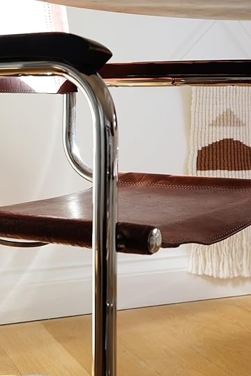
To be fair, though, this choice isn’t a massive departure from my initial pick (and this certainly isn’t an unpopular chair). The form of the chair is identical to one of my top contenders, but the leather seats are so much more comfortable than a woven alternative. I’ve sat my booty in these chairs for hours on end, and there is no soreness to be had!
 i can’t get over how handsome this photo is
The way these chairs play off my marble table is magical. Somehow, they match each other’s energy. The delicacy of the table’s curves speaks to the softness of the chair’s leather seats, and the darkness of the chairs begs to be balanced out by the brightness of the table. The black, worn-in wood arms of the chairs also toes the line between hard and soft. Such a classic pairing, no doubt, but one that I haven’t seen very much of as of late.

The warm color of the leather just warms my heart. I’m lucky enough to get very bright evening light in this space (as you can tell from these photos), and the way the leather eats up the sunlight makes for such a sumptuous scene. The cognac color of the chairs is neutral enough to stand the test of time, but vibrant enough to really make a statement (similar to the red chair I was previously drawn to). These chairs were certainly investment pieces, but I’m fairly certain that I’ll hold onto them for the rest of my life. They feel worth it. One hundo percent.
OTHER DINING ROOM DETAILS
More broadly, while this room doesn’t boast any of the high-impact DIYs of my past work (but don’t worry, that’s coming…), it does boast a quiet and harmonious energy that feels very natural for this home. I made some very intentional and functional design decisions for this little nook that make it feel quite special.

Mirror (vintage from Community Forklift)
As I was conceptualizing ideas for this space, I had a random dream about a chair rail/wainscoting kind of situation. Yes, I am strange and often have inspiring dreams about projects (that’s also how my Arlington bedroom headboard came to be). I woke up from that dream and thought “…that could actually work,” and subsequently rushed over to Ikea to grab several of these black kitchen rails and hooks.

I love that these rails serve multiple purposes. Primarily, they allow me to hang a canvas bag to hold my recyclables (recyclable storage has been tremendously difficult for me in this flat for some reason). Additionally, the way I’ve installed the rails throughout the entire space creates the illusion of a sort of chair rail, which breaks up the tall height of the ceiling and makes the dining nook feel more like an intentional and dedicated space.

Oil Paintings (vintage from artsper.com)
The rails also allow me to hang beautiful objects in an impermanent way, which will be great for rotating out plants and artwork—like this string of pearls and fabric art I bought in Spain.

I’ve always wanted to own vintage seascape oil paintings, and seeing Emily pursue a seascape-centric gallery wall in her new TV room inspired me to finally take the leap. I was lucky enough to be gifted these two paintings from Artsper: an online resource for sourcing original artwork from across the globe. These paintings of the New England shire—painted in 1891 by a Dutch artist named Peter Koster—were shipped to London from Rockport, Massachusetts. Something felt appropriately fitting about the America-Europe story of the artist, considering my current circumstances in London.

You might recognize this mirror from my Arlington dining room project. It felt apropos to bring it with me to London and hang it in this space, as a small homage to the lessons I learned from creating spaces in that home.
Ultimately, I’m proud of my choice of dining chair in this space, and the continued choices I’m making to make this rental flat into an intentionally-designed landing pad during my European adventures over the next few years. The architecture of the flat and the building itself (and so much of the UK) is an interesting study in the balance of modernism and traditionalism, which is a theme that I’m inspired to replicate and study here at home.
So, what do you think about my pick? And what’s your hot take on design trends—sound and important, or arbitrary and unnecessary?

*Design and Photos by Malcolm Simmons
The post Malcolm’s First London Reveal – His Modern Traditional Dining Room (+ The Easiest “Chair Rail” Hack) appeared first on Emily Henderson.
April 12, 2023
Say Goodbye To The Boob Light – Awesome Flush Mounts For All Budgets

I feel pretty confident that over half of everyone reading this post has been victim to the “boob light” at some point in their life. You know the one…outdated metal trim, fluted or frosted glass, and of course the nipple (or more appropriately known as a finial). And look if you love them that’s great. But I’ve primarily seen them in rentals because they are generally super affordable, thus ideal to buy in bulk. This one is only $16 which I can understand is hard to pass up as a landlord. But if you are a renter or a homeowner that needs a flush mount style light PLEASE know they are other options for you! Aside from my short stint aboard, I have never not replaced the lighting in my rentals. It not only instantly modernizes a space but also makes it feel more personalized. Exhibit A – Caitlin’s Hallway:

 right: design by caitlin higgins | styled by emily edith bowser | photo by sara ligorria-tramp | from: caitlin’s long, dark hallway makeover
I know we’ve said that 100x over so I’ll stop, but as proven above the results are UNDENIBALE. Now, replacing a builder-grade boob light isn’t the only reason someone might need a flush mount (or semi-flush mount) light. You might live in a building with low ceilings. Someone in your household could be extremely tall so chandeliers end up being a total nuisance (something I myself will never have to endure:)). Maybe you just like them! Whatever your reason may be, I tried my best to show you really solid (and pretty) options with a large range of price points (two are under $35!). Time to shop…
Under $125 design by emily edith bowser | photo by sara ligorria-tramp | from: emily bowser’s beautiful hardworking, multipurpose room reveal (+ get ready for her diys)
Understandably there’s a lot of debate about whether one should invest in a rental or not. I’m probably not the best example for the latter but affordable lighting is your friend. Of course, tighter budgets are not exclusive to renters. I mean owning a house and having a mortgage costs a lot of money so finding more affordable lighting options is equally as valuable. Here are some of my favorite options:
1. White Metal Dome Adjustable Semi Flush Mount Ceiling Light: I love the organic modern feel of this one! It’s technically a semi-flush mount but perfect for a directional light look.
2. Eshe Rattan Semi Flush Mount: A great fixture to add some visual texture and soften a room.
3. Tapered Flush Mount Ceiling Light: This light is the ideal balance of modern and traditional. Plus that shade is going to give off a lovely glow.
4. REGNSKU: I am obsessed with the vintage versions of these! But for $28 how can you beat this one?
5. Semi Flushmount Ceiling Light: Another modern traditional light but with a bit more drama with that black shade:)
6. Scalloped Semi-Flush Mount Ceiling Light: Mallory bought this for her entry and loved the look of it (it’s pretty freaking cute). She did mention that it doesn’t give off a ton of light so this is better for a space that doesn’t need to be super well-lit. It’s more of a mood:)
7. Rattan Pendant: So cute! The scalloped bottom is such a nice detail.
8. Fabric Shade Drum Flushmount: Simple, elegant, and works with a ton of styles.
9. Drum Jute Flush Mount Light: I love the tone of this drum shade because it feels a little more unique than the standard white. Plus it’s on clearance for such a great price!
 design by kirsten blazek | photo by alex zarour of virtually here studios | from: tour creative director and founder of a1000xbetter kirsten blazek’s soulful, vintage filled home
 left: design by julie rose, photos by sara ligorria-tramp, from: a refresh of our favorite “child client’s” – bedroom 8 years later | right: design by megan hopp, photo by kelsey ann rose, from: how megan hopp stretched her design budget to transform her three-story townhouse (you have to see the before & afters)
As most things in life go, if you have a bit of a bigger budget you have some more options stylistically. Also, I tried to have most of these options sizable enough for a bedroom or kitchen but remember to look at the diameters:)
1. Natural Jute Woven Semi Flush Mount Ceiling Light: Natural, geometric, and pretty. What’s not to love?
2. Allegra Large Linen Flush Mount Light: I LOVE ceramic light fixtures and this one looks so beautiful with tons of texture.
3. Semi Flush Hand Carved Light Fixture: Perfectly vintage-inspired and I have looked around my home a couple of times to see where it could work.
4. Stevie Flush Mount: A great California Casual organic look.
5. Copa Tiered Natural Rattan Flush Mount Light: Naural with a hint of glam. So fun!
6. Rattan Semi Flush Mount: I love how neutral and subtle it looks at first but as you get closer you can see all that beautiful texture.
7. Nodes Flushmount: Very similar if not identical to the one in the photo above which proves it’s a perfect splash of understated modern glam.
8. Small Jake Flush: This one is on the smaller side but is so simple and elegant.
9. Liz Rattan Flush Mount: For me personally, if I were to get a rattan flush mount this would be a top contender. The style is right up my alley!

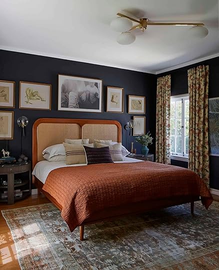 left: photo by sara ligorria-tramp, from: styling to sell: the playroom/family room and the 4 lessons I learned along the way… | middle: design by emily edith bowser, photo by sara ligorria-tramp, from: emily bowser’s kitchen reveal! plus the 8 ways she really maximized her galley kitchen storage | right: design by dee murphy, photos by zeke ruelas, from: emily’s friend dee murphy’s bedroom blew up on instagram – here’s why it’s so good…
As we up the price, here are three different types of rooms that each have a beautiful flush (and semi-flush) mount light. They truly are great in every room:)
1. Moxie Semi Flush: Another vintage-inspired light that I would happily have in my home. I think it would add an insane amount of style to whatever room it was in.
2. Tisse Oversized Woven Rattan Flush Mount Light: In the competition of my favorite rattan flush mount this might be number one. It’s from Athena Calderone’s Crate & Barrel collection so I shouldn’t be surprised.
3. Carneros Milk Glass Flush Mount: Industrial yet a little traditional (could easily work with a modern farmhouse style). I think this is such a cool light.
4. Cruz Flushmount: Now we’re getting a little more midcentury with that sleek, elegant cone shade. But I really love how the blub drops down from the center! Such a nice little touch.
5. Sago Rounded Rattan Flush Mount Light: This is the last rattan fixture that really has a hold on my heart. You don’t typically see rattan that shade of brown and it’s so chic.
6. Ariel Fluted Marble Flush Mount Light: What’s not to love?! And given it’s 12″ in diameter it’s a perfect and versatile light for a small space.
7. Rainier Brass Conical Flush Mount Light: The simplicity of the metal and the tone of the brass is so pretty!
8. Zara Semi Flush: A wonderful nod to a very Parisian vibe. Simple yet very lux looking:)
9. Nodes Semi-Flushmount: I’ve had my eye on this one for a while. A bit modern brutalist feel and I love it.
10. Tiered Drum Semi-Flush Mount Fixture: This is a newer light from Rejuvenation and it’s beautiful! Classic, simple, and from the looks of it gives off a beautiful warm light.
11. Wally Flush Mount Light: A great trend-forward option!
12. Conical 16″ Drum Semi-Flush Mount: A very classic and simple piece that still feels very textured.

 right: photo by tessa neustadt, from: elliot’s nursery reveal | left: design by megan hopp, photo by kelsey ann rose, from: how megan hopp stretched her design budget to transform her three-story townhouse (you have to see the before & afters)
There are definitely guidelines for flush mount sizing based on room size. The general rule is to add the width and length of a room together by feet and then convert those feet into inches, giving you your “ideal diameter size.” For example, a bedroom is 12′ x 12′ which equals 24 feet. That would then mean my ceiling light should be around 24 inches.
But of course, you don’t have to follow those rules! As you can see in Birdie’s old nursery on the left, that beautiful flush mount would likely be considered “too small” for that room but it looks beautiful. Then on the right, Megan Hopp used that same fixture where a recessed light might have gone. Actually, there are at least two of them in the room (you can’t see the other in this photo). Now, for a recessed light replacement, this fixture might be thought of as too big but look how awesome it looks! So take a look at the rules and then if you want, throw them out:)

1. Breton Flushmount: A classic style with the prettiest patina.
2. Astor 12″ Flush Mount: The perforated detail gives it a cool, interesting look.
3. Blair 10″ Flush Mount: I just love the shape and it comes in a bunch of other metals.
4. Turio Oversized Black Flush Mount Light: This is perfect if you want the vibe of a chandelier but don’t have a lot of ceiling height.
5. Capiz Flushmount: Love the honeycomb detail and would really draw your eye up.
6. Auden Blackened Brass Flush Mount Light: This one is right up my alley. I love a chic saucer light.
7. 6 Light Perforated Elegant Ceiling Flushmount: Another vintage-inspired piece that I adore. It also comes in a ton of other metal options.
8. Champignon 5-Light Flushmount: This is a great piece if you want a large light and a little whimsy:)
9. Ankeny 16″ Alabaster Flush Mount: This one is super chic and feels very Architectural Digest which you know I love.
10. Renato Flush: This says “sophisticated glam” in the best way.
11. Clark Flush Mount: As you can see from the photos above this is a real showstopper and is so pretty in person.
12. Lamina Polished Brass Flush Mount Light: Vintage-inspired, of course, and a really incredible piece to make a visual (but not overwhelming) impact.
 design by asom home | styled by velinda hellen, emily edith bowser, and julie rose | photo by sara ligorria-tramp | from: tour this eclectic midcentury modern house designed by asom home + 10 approachable design tricks anyone can do
You know I had to include some dream pieces:) But also we all have different budgets and these beauties might be just what you’re looking for. Let’s jump right in…

1. Rotonde X: Roman and Williams Guild sells only a few light fixtures but they are all so special. This one also comes in two sizes.
2. Ray 17″: Emily just got this one for an exciting project she’s been working on! It looks incredible and we can’t wait to show you.
3. Sarah Ceiling Fixture: When I saw this new Lostine line I nearly fell off my chair. I love these leather and brass pieces so much. The table lamps are also to die for.
4. 24″ Ormandy Semi-Flush Mount: You know Rejuvenation was going to be on here at least a few times because their style and quality are so good. And this one is so beautiful! The suspended semi-flush mount is such a great detail.
5. Flush Dome 20″: We’ve all been Allied Maker fans for years and Em got to work with the for the mountain house! This oversized piece is incredible and I love everything about it.
6. Uno Shade Flush Mount: I just think this one is awesome and there are so many ways to personalize it!!
If you were searching for a flush mount I hope you found one or at least this helped you to narrow down your search:)
Love you, mean it.
Opening Image Credits: Design by Asom Home | Styled by Velinda Hellen, Emily Edith Bowser, and Julie Rose | Photo by Sara Ligorria-Tramp | From: Tour This Eclectic Midcentury Modern House Designed by ASOM Home + 10 Approachable Design Tricks Anyone Can Do
The post Say Goodbye To The Boob Light – Awesome Flush Mounts For All Budgets appeared first on Emily Henderson.
Emily Henderson's Blog

- Emily Henderson's profile
- 10 followers

