
Emily Henderson's Blog, page 97
March 14, 2023
Small Kitchen Ideas To Steal (For Renter And Renovators)

As someone who has never had a big kitchen in any of the apartments I’ve lived in, I really love and appreciate the ingenious ideas that come out of designing a small space (most notably, kitchens). I myself have had to get a little creative with this specific type of room so if you have a small kitchen you want to upgrade, I have truly been in your shoes. Actually, I’m in your shoes right now! I look at my sweet little kitchen every day and ask it, “How can I make you better?! Talk to me!” So my hope today is to inspire some cool ideas that you can use whether you are a renter or renovator. Maybe I’ll get some fun ideas too:)
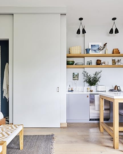
Project M+’s Studio Kitchen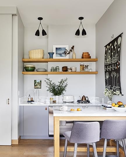 design by project m plus | styled by velinda hellen and emily edith bowser | photo by sara ligorria-tramp | from: the new design rules
Ok, ok I know that you just saw this kitchen last week but since it was the inspiration for this post I thought it should be first. I think the most notable first idea to steal is the timeless design idea. While it was shot and styled for Em’s new book, this kitchen was actually designed at least seven years ago. Could you tell?? Me neither. The classic materials (white oak and white marble), the neutral but chic color pallet, the clean lines, and the simple appliances are all ingredients for a kitchen design that is going to look awesome for many many years.

 design by project m plus | styled by velinda hellen and emily edith bowser | photos by sara ligorria-tramp | from: the new design rules
One thing that Ryann pointed out in the post was how the island and kitchen countertops were made out of the same marble. Not only is it simple and pretty but it helps to make that corner area look more cohesive. Your eyes are also able to rest. That is a great thing since they went with open shelving. As you will see in a second, I am a HUGE fan of open shelving when it makes sense. I especially think really small kitchens are a perfect place for them. Why? Well, if you live alone or with just another person you likely don’t have a need for a ton of dishware, glassware, etc. This makes it waaaay easier to maintain and keep everything looking organized. It also opens up the top half of your kitchen, making it feel bigger and visually lighter. And lastly, it’s an easy way to make your kitchen look pretty and give it some personal style. You can effortlessly add color with plates or glasses, style some pretty vases and bowls, the sky’s the limit. It’s a fun playground:)
Oh, and I of course have to mention the transformer-like capabilities of that island. As shown above, it can be an island but it can also be a desk. And if necessary, it can be moved into the center of the studio and become a dining table for four (maybe even six:))
Jess’ Tiny Longish Kitchen design by jess bunge | photo by sara ligorria-tramp | from: jess’ moto: you have to see how she hacked her rental kitchen with diys
And here is my former little oasis. While I don’t miss the lack of usable closed storage (peep the cabinet facing the oven – less than easy access) and UGLY flooring, I do miss most everything else. This kitchen was a real labor of DIY love that likely made my dad consider disowning me due to my “specific and detailed” requests.

 design by jess bunge | photos by sara ligorria-tramp | from: jess’ moto: you have to see how she hacked her rental kitchen with diys
So what did I actually do to my truly tiny kitchen?? Fun fact: this was not the smallest kitchen I lived with – Hey, San Francisco! Ok here’s the list:
Custom alder plywood counter cover and backsplash by my dad (no damage to actual ugly “stone” countertop). There were a few tries before it was perfect:) Remember the disowning joke??Replaces cabinet knobs (I loved the pop of matte black to ground the space a bit and balanced with the dark tones in the decor and banquette backrests). Added metal shelf as a spice rack to free up counter space and added some more visual interest to the wall. Added a mirror (family heirloom) to make the light bounce around and help the space to feel a tiiiiny bit bigger. Ha. But truly I think it helped!If you are wondering if I removed the cabinet doors off of the uppers, I did not. They were already like that. Although I think once upon a time they did have doors. I loved getting to style them out and displaying all of the things I loved to look at and use. Having doors would have been such a missed design opportunity in my opinion. Sooo if you have enough closed storage consider taking down some (or all) of your upper cabinet doors and paint everything the same color so it looks intentional (unless everything is already the same color). I’m actually considering this in my new kitchen.

 design by jess bunge | photos by sara ligorria-tramp | from: jess’ moto: you have to see how she hacked her rental kitchen with diys
So then to the left is my other love – my old banquette. Look, I could have plopped a pretty bistro table and two dining chairs and called it a day. But a) I tend to like to make things more complicated for myself but more so b) I wanted to really utilize as much of the square footage as possible – something everyone should try to do if they can when designing a small space. Every. Inch. Counts. Plus I can say from experience this made the area feel much bigger. I temporarily had a bistro set in there and it really did make it feel smaller.
All the wood pieces were made from stair risers! This meant that the front of each piece was already rounded. Now, I was crazy lucky that my dad had friends with cool tools that could round the corners and sides very easily. But if you want to make a bench or banquette between two walls, then you don’t have to worry about that! I then made those blue velvet backrests with my cousin (not sewing machine necessary) and the brass poles were cut-down Restoration Hardware curtain rods from their outlet store that my dad’s girlfriend found. I get into all of the details in the original post but I just wanted to show you that even if you are renting there is SO MUCH you can do still. Don’t let the “I’m only renting” keep you from really designing a home you really love.
My only regret with the kitchen (aside from not doing something about those floors) is that I didn’t get a freaking roman shade for the window. Always room for improvement right?? 🙂
Now let’s see the most inventive yet beautiful 49-square-foot kitchen maybe ever.
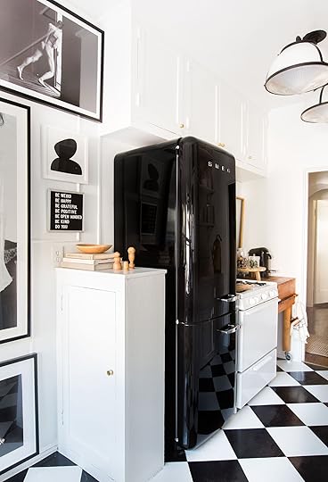
Velinda’s Basement Kitchen design by velinda hellen | photo by sara ligorria-tramp | from: velinda’s tiny kitchen makeover takeover (with tons of smart storage hacks)
Welcome to Velinda’s basement apartment kitchen. It lives in an apartment, or as she kindly refers to it, “the 400-square-foot tiny hobbit-home that my 980-square-foot bungalow sits above” that she rents out. There are truly so many ideas so buckle up. First, let’s talk appliances. That little oven you see there is actually a 5-in-1 oven! According to her “it bakes, grills, broils, cooks and microwaves…and can fit in a 24” cabinet.” I am SO sorry to report that I don’t think that one is available anymore but you get the idea, when it comes to appliances and small spaces, see what you can combine.
 design by velinda hellen | photo by sara ligorria-tramp | from: velinda’s tiny kitchen makeover takeover (with tons of smart storage hacks)
Another really smart and out-of-the-box thing she did was take a standard-size sink and rotated it sideways. I’ll let her tell you why:
“I didn’t want the standard, mini-kitchen sink. I wanted something that’d fit a stock pot or dutch oven but still maximize counter space. So I turned a standard-sized sink sideways…meaning the drain isn’t centered. Uncouth, I know, but this utilized every inch allowed by the narrow 20” wide (yet 24” deep!!) base cabinet. PLUS, it maximized the storage space below by positioning the garbage disposal (which was one of my must-haves) off to one side instead of centering it, freeing up half the cabinet!”
Smart, right!!!!? Also, notice how she chose a wall-mounted faucet so she didn’t need the counter space when she turned the sink’s orientation. It all feels so intentional…because it is.
 design by velinda hellen | photos by sara ligorria-tramp | from: velinda’s tiny kitchen makeover takeover (with tons of smart storage hacks)
Velinda also mentioned that she chose those glazed Zellige tiles to help bounce the light around. It’s such a great way to make the space feel bigger. It’s like a mirror but without having to look at yourself! Basically, think twice before using a matte tile in a tiny kitchen for that reason.
Did you notice those beautiful super-skinny shelves too?? Since she made a bigger design statement with the tiled walls and hood, choosing those slim metal shelves was the perfect choice to not overwhelm the space yet not compromise the needed storage. Plus they look so good!
 design by velinda hellen | photo by sara ligorria-tramp | from: velinda’s tiny kitchen makeover takeover (with tons of smart storage hacks)
The last little Velinda’s tiny kitchen hack (but seriously go read her full post) are the metal bars she used as a kitchen tool storage rack. One is a hand towel bar that is next to the hood for heavier pots and the other on the side of the cabinet is a tie bar. It was the perfect size, had lots of hooks, and helped to free up drawer space. A must when a kitchen is fun-sized:)
Ready for another rental kitchen and a really good DIY?
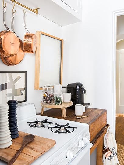
Brady’s DIY Kitchen design by brady tolbert | photo by tessa neustadt | from: brady’s kitchen reveal
Yes, I am talking about those DIY vinyl floor tiles. How good do they look? And it all cost UNDER $50! This isn’t the only steal-worthy idea but boy will it forever be a great one.
 design by brady tolbert | photo by tessa neustadt | from: brady’s kitchen reveal
So unless you’ve been around for a long time you might not be super familiar with Brady Tolbert. He is an incredible designer and was one of Emily’s first blog help hires (who also worked at EHD for 5 years). He is also a bit of a rebel as you will soon see why:) Those shelves were not always there. Originally there was an upper cabinet on one side that he decided to take down and replace with all open shelving. He may or may not have cleared it with the landlord but I don’t think anyone can say they don’t look amazing! He clearly stands by the idea that open shelving is ideal for small kitchens. Clearly, there’s already A TON of closed storage so why not make the whole space look bigger, right? But maybe check in with your landlord first unless you are willing to gamble your deposit.
Aside from that, see how using all those brass accents helps to warm up and brighten the space??
 design by brady tolbert | photo by tessa neustadt | from: brady’s kitchen reveal
Always remember that a pretty cutting board on your stove burners can also give you more display or prep space. Just remove it before you turn anything on, k?
 design by brady tolbert | photos by tessa neustadt | from: brady’s kitchen reveal
I now want to point your eyes to that rolling butcher block island/table. First off, stylishly they add so much warmth and character. Second, the extra counter/prep space they provide is wild. I have one that I was given in my kitchen by a family friend and now I can’t remember how I prepped food before it. Plus they are usually small which is great when square footage is tight. They can be pricy but if you keep an eye out on Craigslist or FB Marketplace, you might get lucky.
Sara’s Galley Kitchen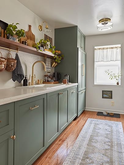 design and photo by sara ligorria-tramp | styled by emily bowser | from: how sara’s new galley kitchen actually looks in the everyday and how it functions for their needs
Ok, Sara’s new beautiful kitchen may not be tiny but it’s definitely not farmhouse size, right? So a lot of thoughtful and clever planning had to go into maximizing all the storage capabilities in order to get everything they wanted.

 design and photos by sara ligorria-tramp | styled by emily bowser | from: how sara’s new galley kitchen actually looks in the everyday and how it functions for their needs
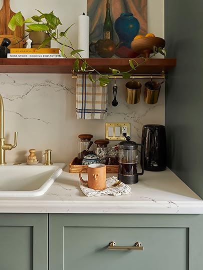
She also went for a single open shelf on one side of her galley kitchen to keep it feeling happy and airy (and also so she could store all her cookbooks, pretty cutting boards, and art openly). But she doubled the functionality of that shelf with those pretty brass rails underneath. See how they are perfect for storing garlic, onions, potatoes, etc? Think of how much that frees up the countertop.

 design and photos by sara ligorria-tramp | styled by emily bowser | from: how sara’s new galley kitchen actually looks in the everyday and how it functions for their needs
Sara also really utilized kitchen organization products to help keep everything in there place and accessible.
 design and photo by sara ligorria-tramp | styled by emily bowser | from: how sara’s new galley kitchen actually looks in the everyday and how it functions for their needs
When a kitchen is small and starts to decline into chaos because things don’t have a place, it makes life so much harder. You could obviously say that for any kitchen but a small kitchen, since it has fewer places to shove things, can get and stay crazy SO FAST without a dialed-in system. Sara’s has a great system:)
Mel’s Minimalist Open Plan Kitchen design by mel burstin | photo by tessa neustadt | from: mel’s moto reveal – it’s the breath of minimalist, uncluttered air we all need
The biggest idea to steal from Mel’s kitchen (aside from the stunning warm but minimal aesthetic) is designing a custom island that works best for you. What is also so impactful about making an island for a kitchen that is open to a communal space is that it helps to create a definitive “kitchen zone”. If you go to the end of her revel post you will see what I mean. And with this island specifically, I love how she used the side facing the dining/living room to display her beautiful kitchen things. It invites you in as opposed to having a solid piece of wood which might look visually heavy and abrupt, especially since this island isn’t raised.
 design by mel burstin | photo by tessa neustadt | from: mel’s moto reveal – it’s the breath of minimalist, uncluttered air we all need
While her appliances came with the home, I love that they are smaller than standard US sizes but not mini if that makes sense. This is a two-bedroom apartment, meaning there likely wouldn’t be enough people to big need a full-sized dishwasher or range, right?
 design by mel burstin | photo by tessa neustadt | from: mel’s moto reveal – it’s the breath of minimalist, uncluttered air we all need
Of course, everyone has different size needs, but if you have a small kitchen and not a lot of people living in the home, why not create more space for storage or counter space, right? However, I will say that while I love my small SMEG fridge so much and it was perfect in my last place, my life would be minimally 10% better if I had a larger freezer since my love for cooking and using fresh veggies in a timely manner is still a work in progress. Mel’s fridge lives in my dreams.
Orlando’s Rental Kitchen design by orlando soria | photo by zeke ruelas | from: orlando’s kitchen reveal
Last but most definitely not least is Orlando’s rental kitchen that got renovated. This was his LA kitchen before he left for Yosemite a couple of years ago. As a design influencer, he desperately wanted to update his kitchen and got his landlord’s permission.

 design by orlando soria | photos by zeke ruelas | from: orlando’s kitchen reveal
What Orlando did such a great job with is toeing the line between expressing his style while also honoring the style of the home (and the fact that many people were going to have this kitchen after him). The two-tone cabinets feel special and yet are an easy way to make the kitchen feel lighter (the white uppers) and yet grounded (the darker lowers). He also went with classic, affordable tiles for both the walls (fun tan grout!) and flooring. Then for some real Orlando-ness, those modern brass knobs were the perfect addition (and something he could have taken with him and replaced with a super affordable option).
 design by orlando soria | photo by zeke ruelas | from: orlando’s kitchen reveal
Another Orlando design stamp is a fun, geometric shape. So freeing up the counter space and using a spice rack that screams “THIS IS ORLANSO’S KITCHEN, DUH” was a great and easy way to make this kitchen really look like it belonged to him. Basically, it can be scary to invest in risky permanent finishes so still make sure to add pieces that really speak to your individual style.
Lots of ideas, right?! Fingers crossed if a small (or big) kitchen design has been on your mind that your creative juices are really flowing and you’re ready to go:) If you saw a kitchen you love, please be sure to read the original post (and maybe even the intro if it has one). They are filled with A LOT more information that will probably be pretty helpful.
Love you, mean it.
Opening Image Credits: Design by Velinda Hellen | Photo by Sara Ligorria-Tramp | From: Velinda’s Tiny Kitchen Makeover Takeover (with Tons of Smart Storage Hacks)
The post Small Kitchen Ideas To Steal (For Renter And Renovators) appeared first on Emily Henderson.


March 13, 2023
Every Measurement Of Our Farmhouse Kitchen and How I Feel About It After Six Months…
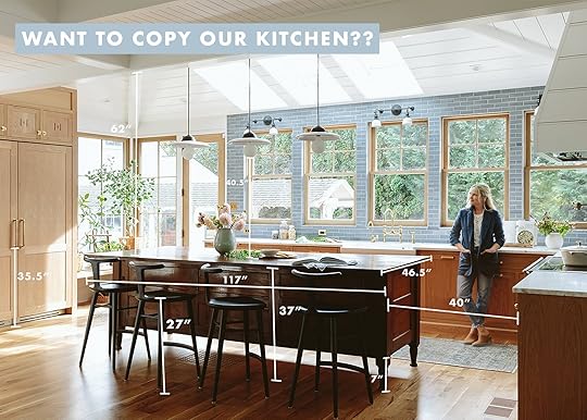
When we first revealed the kitchen we had many comments asking for exact measurements of literally every. single. thing. As a total design nerd myself I, too, wanted to see the exact measurements. So we started working on the post that got pushed and pushed due to holiday stuff. Finally, 2 weeks ago it was ready to go except for me writing it (that’s always the hold-up). So when we saw literally the exact same concept published by the super talented Chris loves Julia team, with literally the same graphics, we exploded on slack, jokingly accusing each other of being the mole (Caitlin wanted me to publish the timestamped slack about it all which would be funny but perhaps more in the
“the lady doth protest too much” category). We almost scrapped it entirely but it was almost all done! So much went into it and heck, it’s a different kitchen full of different measurements, therefore full of totally different information. Then we figure if you are renovating you are likely curious about everyone’s measurements and you should definitely check theirs out, too, HERE. I found it so helpful and interesting. So back from the “almost deleted drafts” archive today I have for you all of our kitchen measurements and how I feel about them.
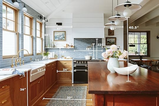
Now there are many measurements that are standard (and even dictated by code) and then there are preferences based ones depending on how you cook, how many cooks are literally in the kitchen, how tall you are, how high you want to reach (how long are your limbs??), how tall your ceilings are, etc. Most of that is based on your own anecdotal experience of being a human being in your own body, in your own kitchen. So this post is obviously all about ours – Emily and Brian Henderson’s bodies and y’all this kitchen functions SO WELL for us to cook in and almost as important, to hang out in.
Most cabinets are 36″ tall and 24″ deep – nothing newsworthy there. What I have found the most interesting and more specific are clearances (the space between furniture even when you have the drawers open) and adjustable heights of things that come from the ceiling. So as you can see the clearance between the sink cabinet and the island is big – weighing in at 50″ wide. Now 40″ is ample clearance (much less is also very doable if you don’t have a dishwasher). We were nervous that it would be too wide and feel vacuous, but y’all, it’s wonderful. I want to, of course, state the obvious that many kitchens can’t warrant this much clearance so just saying “more space is awesome” can be unhelpful to people. But if you are wondering if going larger on the clearances has its downsides I’ll tell you right now that we haven’t found one yet. The kids can unload the dishwasher and while I’m begging them to do so, I can chop onions and Brian can be at the stove – we can spread out easily on this side of the island.

You’ll notice the vintage island is higher than the cabinets – and no one has ever noticed. If you are wondering why we didn’t take the upper fridge cabinets to the ceiling it’s because when we ordered the cabinets (from Unique Kitchen and Baths) we hadn’t built the ceilings yet so we decided to do them lower and fill in with white oak whatever was left.
Also a random note – 2″ is ALWAYS bigger than you think it is. I think we talk about 2″ like it’s nothing, so I’m always surprised when a 2″ thick something is actually pretty thick (generally 1 1/2″ thick for a shelf or a stile/rail is plenty).
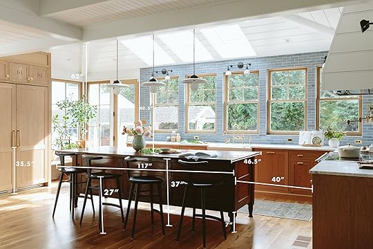
I think I stressed about the height of the fridge handle for so long that Jamie just DID IT, thank god. As you can see, the bottom of out pull handle started at 35.5″ – but ultimately just put your hand on your fridge as if you were going to pull and then screw it in where your hand naturally lands (I think I was afraid of it interacting with the horizontal panel in an odd way). You’ll notice that the bottom of the bulb of our pendants landed at 40.5″ which is higher than it needs to be but it’s perfect in here since our ceilings are very tall on that half of the kitchen. If we had lower ceilings they could have been closer to 36″. But honestly I’d rather have them above even the tallest person’s head so that the light doesn’t shine in their eyes let alone block conversation (so err on the side of higher).
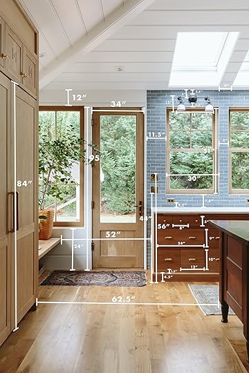
As you know we divided up the cabinets there into three little drawers, one big and two small and while that cost a decent amount more to do (full custom) I will say that those tiny little drawers are far less annoying than you’d think. They are essentially three small junk drawers, but since they are so small nothing gets lost and they can have their own dedication. Also, the Velux Skylights are exactly the width of the Sierra Pacific Windows (at 30″) which was intentional and I love how it turned out.

The height of a floating or bracketed shelf can be SO HARD to determine. We found that 18″ gives us enough height to work underneath it, but since our paneling lined up at 17″ Jamie installed it there (which works perfectly). The depth of the shelves is 11.5″ which is great because much deeper (more than 14″) and things get lost/hard to put away and less than 10″ is not enough space for a lot of plates. So keeping them around 12″ is the sweet spot.

Me, for scale. Weighing in at 5’3″ 🙂 I don’t think we missed one measurement in this kitchen (thank you Mal for the many Facetimes pulling this together). But certainly, let me know any questions in the comments. I will say I have zero placement regrets to tell you about, thank goodness but I know that when you are in the middle of a kitchen remodel it feels like a wrong measurement can be life or death 🙂 Hopefully, this post can help. xx
Kitchen Resources:
Cabinetry: Unique Kitchens & Baths (Get 10% off with the code “EH2022”)
Countertops: Bedrosians Tile & Stone
White Oak Windows and Doors: Sierra Pacific Windows
Skylights: Velux
Tile: Pratt + Larson
Appliances (sans Fridge and Freezer): Build with Ferguson
Fridge and Freezer: BlueStar
Flooring: Zena Forest Products(Oregon grown and milled)
Lighting, Switches, Outlets, and Sink: Rejuvenation
Wall Color: Sherwin Williams, “Extra White”
Faucets: deVOL Kitchens
Vintage Island: Aurora Mills
Counter Stools: Fernweh Woodworking
Rug: District Loom
Brass Gallery Rods: Pepe and Carols
*Design by Emily Henderson and ARCIFORM
*Photos by Kaitlin Green
The post Every Measurement Of Our Farmhouse Kitchen and How I Feel About It After Six Months… appeared first on Emily Henderson.
March 12, 2023
The Link Up: Emily’s Got A New Favorite Cookbook, Mallory’s Cute PJ Sets, And A Collection One Of Us Was NOT Prepared For

Happy Sunday everyone! In case you missed it, the one and only Caitlin Higgins shot her living room reveal!! We all are going to have to wait a minute for the reveal post but needless to say, we can’t wait. So in the meantime let’s get into some links.
This week’s house tour is once again not really a house tour but a pop-up one-room hotel installation for this year’s Milan’s Salone del Mobile. It expertly mixes Scandi Minimalism and Italian Baroque. Curious to see what that looks like? You should be. It’s impossible to not fall completely in love with this 13th-century Italian palazzo and designer, Julie Cloos Mølsgaard, truly did a beautiful job incorporating all the Scandi decor. AND if you happen to be in Milan anytime between April 18 to May 18 then you can book a stay for yourself:) Check it all out in this Remodelista article.
From Emily: I’m EXTREMELY excited to cook from my new cookbook this weekend, “Vegetarian Salad For Dinner“. Jeanne Kelley is an old colleague of mine whom I LOVE so much and couldn’t be happier to promote her food. Before DesignStar and all this blog stuff, she and I worked consistently for Bon Appetit magazine, to shoot/style recipes together. I LOVE her food and think that she is one of the coolest ladies on the planet. When I was in my early 30s and she had teenagers I remember thinking, “I want to be that type of mom and have the type of relationship with my kids that Jeanne does”. She and her family live in Eagle Rock, have chickens and a huge community garden, and were never caught up in the stuff that a lot of us were in LA (including myself). Anyway, I know that this food might not have “kid” or the broadest appeal, but I went through it last night and I bookmarked four recipes I want to try this weekend for Brian and I (the kids likely won’t be into it as they aren’t super veggie-forward and I don’t want to waste food on them, honestly). I love a Sunday meal prep day where I make new challenging recipes to teach myself new things. And while many of hers are simpler, of course, there are so many dressings and ways to roast vegetables that I’m excited to learn and try. So if you know anyone who is vegetarian or like me, a vegetable enthusiast, I think this is a FANTASTIC, beautiful book written and developed by a fantastic woman.
From Caitlin: AHHH. We finally shot my living room this week, guys!!! (It only took, uh…about a million years for me to finally feel brave enough to share with the world, I guess, but it’s done!) Pretty much everything in there is vintage, but I did want to call out my new swivel chairs – they’re 30% off through the end of the day (which equals BIG savings). I really wanted some light, simple upholstered chairs to balance out my leather sofa and I hit the jackpot with these – they are holding up BEAUTIFULLY to cat (the weave on the Sunbrella fabric I picked is unbelievable, I swear) and I forced Sara to take a bunch of close-up shots of Buff’s favorite daily claw spots so you can see the magic for yourself. It’s pretty rare that I recommend new pieces of furniture (your girl will always love the flea market/FB Marketplace hunt!) but I am just so genuinely pleased with the quality, construction, finish options, etc. and if you’re in the market or ready to switch things up in your home, I hope you can take advantage of this huge discount!!
From Mallory: I’m on a mission to have good pajama sets so I can retire some of the gross baggy t-shirts I’ve been wearing to bed. You know when you get a free t-shirt from somewhere and think “I’ll never wear this but I guess I can use it for a PJ shirt” yeah…that’s my current PJ selection. SO in an effort to feel less gross when I’m going to bed and waking up in the morning, I purchased two sets that I really really like. The first is this black satin set (matching shorts link here). I’m honestly so impressed with how soft and comfy it is – especially because they were out of my size so I sized down and I still find them perfectly roomy. The next set I bought was this long sleeve striped shirt with these long pants. I have this set in green already but the blue is just SO CUTE and I love the pants version. It’s so soft and cozy while simultaneously being very breathable which is a win for us hot sleepers. If you’re in the market for new jams, these are both awesome:)
For any of you who have been eyeing something at Lulu and Georgia, tomorrow might be the time to hit purchase! Starting tomorrow they are having their Friends and Family Sale, giving 25% off sitewide (with some exclusions). We have been lucky enough to own countless items from them that have stood the test of time and that we love. Again the sale starts tomorrow and ends on March 20th.
From Albie: Hi my name is Albie and I’m your fave comfort influencer lol. One of my fave new comfort finds is this jumpsuit from Old Navy! So good! I purchased two colors to start and now I want em in every color. What I especially love is that I can wear em around the house with a robe and then switch out my robe for a shacket to pick up the mini from school or do a quick Target run. There’s a built-in shelf bra that’s surprisingly supportive considering how too heavy I am, although to leave the house, I pair it with a bralette to be safe.
From Ryann: I have been burning incense a lot lately and thought about revisiting my favorite incense ever. The problem is that particular incense is pretty expensive ($18 for 15 sticks) so I decided against it. Instead, I had the bright idea to see if they have the same scent in candle form and THEY DO. So, of course, I bought it and it smells amazing.
From Jess: Julie sent me this TikTok last weekend and it put me into a glass box of emotions! As a previously avid American girl doll collector, I am always excited to see what the next doll will be. But as a girl that grew up in the 90s…I was not prepared. I mean the mini Tamagotchi®?! The inflatable chair?!! It’s all too good and yet too much!
Also From Jess: Dare you to not smile after seeing this picture.
Hope you enjoyed this week’s links and see y’all tomorrow!
Opening Image Credits: Design and Styled by Emily Bowser | Photo by Sara Ligorria-Tramp | From: Emily Bowser’s Back Unit Yard REVEAL, 2022 Musings, New Year Resolutions, And Other Meanderings…
The post The Link Up: Emily’s Got A New Favorite Cookbook, Mallory’s Cute PJ Sets, And A Collection One Of Us Was NOT Prepared For appeared first on Emily Henderson.
March 11, 2023
Are We Making Vision Boards Again??

It was a chilly night in January when three of my friends and I gathered for a fun night of Indian food and wine. After an ab workout’s worth of belly-aching laughs, my friend announced that she has just gone to a vision board-making party. I sat there perplexed. “Are people still making vision boards?” I thought to myself. I probably even made a tiny joke making a little fun of her. But the joke’s on me because the answer I would come to find over the next few weeks was a resounding YES! People are most definitely still making vision boards, so should I make one? What actually sold me was a week after our dinner a very exciting “goal” on my friend’s board was already becoming a reality. That’s when I thought, “hey, I like scrapbooking and it’s not like making a vision board is going to hurt me, right?” But you should know that I am not a vision board pro. I can only assume I must have attempted to make one at some point with friends. However, I have zero evidence. Also, I should say that it’s not that I think vision boards went away. I was just shocked by the number of personal friends, in their 30s, who had never brought them up before, who were deciding 2023 was the year they were getting back into it.
I actually think this is really sweet and hopeful. And aside from a few supplies, it doesn’t cost much of anything. I know personally, it has felt kind of scary to believe really good, big things could start to happen. So the idea of even writing dreams or goals down in the past few years felt like I was almost jinxing them. But now, as we are days away from the three-year lockdown anniversary, we might collectively be ready to freely and boldly put some true personal goals out into the world despite the immense amount of pain and struggle that is still going on. Holding space for joy and progress alongside our personal and collective pain is the only way we are going to move forward. At least that’s how I feel.

In terms of spirituality, I fall in the middle of the road. I grew up around deeply spiritual women who at times went a little too deep. For that reason, I tend to tense up slightly when spiritual vernacular veers too far from “reality”. However, I very much have my own spiritual beliefs and deeply believe in the power of thought (along with some action:)). So that’s what my attempt with a 2023 vision board is – a visual reminder of my goals to keep them top of mind and push me into doing things that consciously (or unconsciously) get me closer to those goals. I still stand by the fact that one of the reasons I moved to New York a mere four days after college graduation was well, a lot of luck, but also that every day for two years I looked at those two brass NY figurines pictured above. I don’t think they have magical powers (necessarily:)) but seeing them, thinking about New York, and talking about New York constantly kept my eye on the prize. I will never get rid of them. I even took them with me when I moved to Australia. They’ve been with me for about 18 years…whoa time is flying!
Ok, let’s get into my board. Well, most of it. I think we can all agree that sharing dreams and goals, both personal and professional, is extremely vulnerable. In a perfect world, I would show you the whole thing but this world is far from perfect, and some things I’m just not willing to post on the internet. Maybe someday:) However, writing this post and not showing you something isn’t helpful. So let’s talk about the general ideas.

I decided to get a tri-fold poster board (you know the ones you get for a science fair project). I liked the idea of being about to prop it up by my desk but if someone were to come over I could easily close her up and stick her in the closet. Ha. The tri-fold not only stands on its own but for me, it helped to visually categorize everything. So if you look at the board, the left side is more for personal goals, the right is work-related and the center is a bit of a mix along with more long-term goals.
After I planned that out, I went into my 2005 scrapbooking supplies and chose a color scheme for my board. I’m sure no one is shocked I wanted it to be aesthetically pleasing. So I went for neutral pieces of cardstock and put keywords I wanted to focus on in those gold sticker letters I got from the drugstore. Some of the letter spacing is better than others:)
Then I got out the magazines I had, as well as a few new purchases. FYI new/international magazines are not cheap so I only got three. I’m not totally done yet because I still need to hit the internet and print out some more pics. I didn’t realize until I started the magazine part that the world has moved so far into digital that old-school vision boarding, mood boarding, etc is a different game in 2023. Not impossible but not as accessible since our homes are likely not as filled with physical magazines. Bittersweet.
The most important thing to remember is that it doesn’t have to be perfect (I am very much saying this to myself). It’s supposed to be fun and help us to dream big. I know you can feel dumb when you’re hypothetically really reaching for the stars but we are the only ones standing in our way (just me?). So here are some board-making resources to get you started:
MagazinesAs I just said, you might not have a ton of magazines lying around and/or you may not want to spend big bucks on buying a bunch of new ones. You can actually buy old magazines and clippings (less work for you and your scissors) on the internet. The ones below are from Etsy but I am sure there are other resources. Now, this is more of a gamble but it is a fun option.


Magazines Craft (1-2 premium magazines): Oldies but (premium) goodies!
50pc Magazine Cutout Clippings: This is a gamble for sure but the less cutting the better, right?
CatalogsDon’t recycle your catalogs just yet! There could be vision board gold in those puppies! Interiors, style, and other stuff I can’t think of. You never know!


 Photos
Take a gander through your old photos. There might be gems in there too.
StickersStickers aren’t necessary but neither is making a vision board. Plus stickers are fun:) You can use letters for custom words, fun shapes for decoration, themed stickers (like travel ones) to help visualize your goals, etc. The sky’s the limit.

1. 202 Pieces Self-Adhesive Vinyl Letters Numbers Kit: Similar to the ones I used and come in different sizes.
2. 52 ct. Gold Word Bubble Scratch & Reveal Stickers: So these are scratchers which is fun but you can also just write fun words or saying on top!
3. Wanderlust Stickers: As a travel lover myself, I forgot what a deep and positive impact it has on my life and mental health. But it’s wild how easy it is to push it off and not prioritize. These stickers are a cute reminder to make sure you stick to it.
4. Dimensional Gold Star Stickers: Boards should be pretty and who doesn’t like a gold star??
5. New York City Stickers: I, of course, love NYC but there are stickers for hundreds of cities. Find the one you want to go to more or next.
6. 24ct House Plants Stickers: As someone who has the farthest thing from a green thumb, I like the idea of adding something like thriving plants as a goal.
7. 494ct Mini Alphabet Foam Stickers: More letters but minis! If you don’t love your handwriting (like me) and want to add more custom words these would be so cute.
8. Contemporary Dance Dimensional Stickers: I think that moving our bodies in whatever way we love should always to a priority/goal. Dance is that for me and maybe you? 🙂
9. Beach Vibes Stickers: Maybe you aren’t a beach lover per se but prioritizing even just 5 mins a day for relaxation is really important!
Because I need things like this to look like a school project I like to use pretty paper to back things. On my board, I just used them for my keywords but there are a million ways you can jazz up your board with cute and colorful paper. There are also endless options with patterns if sounds fun to you!

1. Neutrals 4.5″ x 6.5″, 87 Sheets: I love these Mat Stacks and is what I used on my “keyword cards” on my board
2. Neutral Paper Pad, 12″ x 12″: Here is another neutral pack where the papers are larger and the color range is also a little bigger.
3. Smooth Cardstock Paper Pad – A2 – 4.25 x 5.5 – 40 Sheets: I just think this is a really pretty color range and I like the smaller paper size.
4. Jewel Textured Cardstock Paper Pad, 4.5″ x 6.5″: In case you wanted a not-neutral option in my favorite paper size.
5. Neutral Metallics 12″ x 12″ Single-Sided Cardstock Paper, 48 Sheets: I love these metallic papers and these are the larger ones.
6. The Metallic Mat Stack 69 Prints , 4.5” X 6.5”: And this is the smaller version that I actually own and love because the less cutting the better.
To make a vision board you are going to need some general supplies. But general supplies don’t need to be boring. Let me show you…
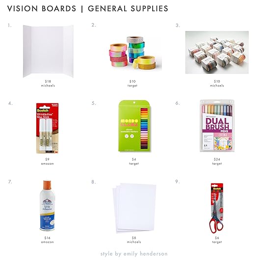
1. White 36″ x 48″ Foam Tri-Fold Display Board: This is what I got (or a similar version) and I am a big fan. It stands up on its own and I can easily close her up and put her away when friends come over:)
2. 11pk Bright Glitter Washi Tape: These are flashy but fun! They add some personality and can potentially help you avoid needing to use glue.
3. 5 Colors Washi Tape Combo: The same as above but for those of us that aren’t into things that are super colorful and shiny:)
4. Scotch Wrinkle-Free Glue Stick (Set of 2): I used this and it was great.
5. 20ct Washable Markers Super Tip Classic Colors: Markers are great for adding little words or sayings. This set has a great color range and is a great price.
6. 10ct Dual Brush Pen Art Markers: Fancier markers with different brush options!
7. Elmer’s Spray Adhesive: I bought something similar and it worked great for the thicker cardstock. I do recommend wearing a glove and spraying into a box.
8. 16″ x 20″ Foam Boards (Set of 3): If the trifold is too big for your liking this is a great smaller alternative.
9. 8″ Precision Scissors: If you don’t have scissors, you are going to need them.
Lastly, when I brought up this idea, Emily thought I should touch on the idea of “spiritual elitism”. Spirituality, like most everything else, has been co-opted by capitalism making it feel almost inaccessible to those who can’t buy all the fancy oils, or crystals, go on expensive retreats, or practice at a beautiful yoga studio multiple times a week. While all of these things are absolutely nice, none of them have ownership over the best way to practice spirituality. And what is so great about a vision board is that anyone can do one. Manifestation, if you are interested in that, is free and takes only the time you want or can put into it. And if you don’t want to spend money on board-making supplies but you have a computer, then you have the option to make a digital version and put it as your background. The more we move away from this expensive and commercialized way of participating spirituality, I say the better. Just do what’s right for you because that’s the best way.
If you are inspired to make a vision board, dream big and have the best time.
Love you, mean it.
The post Are We Making Vision Boards Again?? appeared first on Emily Henderson.
March 10, 2023
The Credit Card Hack That Has Saved Caitlin THOUSANDS Of Dollars

It’s time to admit it: I, Caitlin Higgins, am one of those credit card freaks. You know – the kind of person who reads blogs and forums about the best cards and redemptions and offers and points valuations and 5/24 strategies (that’s a deep cut for my fellow dorks out there, hi!!!)…and, well, I’m sure you get the picture, right?
That brings us to today’s post: I have a money-saving “hack” that I want to share with the class. You don’t need to sign up for anything, you don’t need to scan or upload receipts, you don’t need to mail anything in, and it’s saved me thousands (no joke – THOUSANDS) of dollars over the past few years while also allowing me to support brands, restaurants, and hotels (especially small ones!) that otherwise would have been a little out of my budget. You ready for the secret?
CHECK YOUR CREDIT CARD’S REWARD OFFERS. (Cue: sound of deflated balloon to play concurrently along this anticlimactic information.) I know, I know – it’s not rocket science, or a groundbreaking hack, or even a particularly novel idea (sorry), but I’m going to walk you through the entire process (and we’ll tally up my savings at the end, because what is a blog for if NOT consistently oversharing my personal financial information?). Let’s kick it off with…
1. Find Your OffersMost major credit card providers have a section of their app or website dedicated to these rewards. Today, I’m going to show you screenshots of my actual American Express backend, but Chase and Bank of America also offer similar deals with similar brands (though in my experience, the AmEx offers are THE BEST out there). These rewards change frequently and new offers are added daily, so I like checking in once a week.

Before we get too excited, my inner meemaw needs to step in – I do want to remind you that having a 20% cashback offer from Chairish does not mean that you need to spend $750 at Chairish right now. These are awesome money-saving tools that have been built into credit cards that many of us already use, but please be careful! Budgeting is important. I don’t want anyone going on an impromptu spending spree – MEEMAW IS LOOKIN’ OUT FOR YOU, OK? These offers often have a pretty long shelf life, so you have a while to plan for your new purchases!
That said, these price qualifications (e.g. “spend $500”) also include the tax, shipping, incidentals, tip, etc. which I love! You can also stack them on top of a site-wide sale or coupon code for EXTRA SAVINGS. (We’ll get there.) But before you can earn big rewards, you need to…
2. Add An Offer To Your CardIt’s super simple – just click to add an offer to your card before making any purchases! I have 63 offers currently saved on my Amex, and WAY more across my other cards. Do I plan on using them all? No, but it’s nice to have them all in one place. When I realize I need something – be it bedding, or a hotel, or skincare, or a dress, or a restaurant recommendation – I can see if any relevant offers fit what I’m looking for.


I’m currently in the market for an extra pair of sheets, an outfit for my friend’s Elvis-themed birthday, more overnight moisturizer, and a not-dried-out mascara, so here are a few of the offers currently catching my eye:
Spend $300, get $60 back at Parachute. I upgraded to a king bed and Em gave me a set of their linen sheets – they’re UNBELIEVABLE. (They’re also the only set of king-sized sheets I have so far and my cat recently vomited on them which led to an emergency 7 AM laundromat run, so this feels like it’s the most pressing.) Spend $250, get $50 back at Shopbop. So many of my favorite retailers! Spend $200, get $50 back at Alex Mill. This is pretty compelling – I’m crazy about their high-end basics, but they’re not always in the budget. Spend $400, get $80 back at Boll & Branch. I bought their bath sheets a few years ago and I love the size and weight – their bedding is just as nice! Spend $150, get $40 back at CUUP. THESE BRAS ROCK. I love them. I want more! Spend $150, get $30 back at Girlfriend Collective. Do I need new leggings right now? Yes. Is that my current priority? No (but I wish it were). Spend $10.99, get $10.99 back (up to 2 times) from Showtime. Two free months of binge-able TV? I can do that! Spend $150, get $30 back at Turo. I know Em has used Turo and she loves it – maybe this is a good car rental option for my east coast trip later this month?Spend $75, get $20 back at Armstrong Garden Centers. Catch me here this weekend as I try to buy some hanging spring planters! Spend $750, get $150 back at 1stDibs. I mean…this ROCKS.3. Make Sure You’re Getting the Best DealIf you have more than one card, cross-check your offers. Case in point, my AmEx and my Bank of America card both offer Parachute deals, but one seems to be superior for me:


If my cart total is greater than $300 – I suspect it will be – I’ll pay with my AmEx and get that sweet $60 statement credit. And if it’s less than $300, I’ll pay with my BoA card and happily collect my 10% cash back. (In a past life, I would have shoved stuff in my cart to reach the $300 threshold EVERY TIME – more savings! – but as an adult, I’ve had to come to terms with the whole “buying things you don’t actually need leaves you with too much inventory to manage, even if you think it’s saving you money” thing. My brain is constantly like “DON’T MISS OUT ON THE BIG DEAL,” but the big deal isn’t always worth it!!! It’s a work in progress over here 🙂
4. Make Your Purchase (and Stack Your Coupons!)Lemme fill you in on the trifecta real quick:
A Site-Wide Sale: These usually launch around holidays (or on the weekend). A lot of brands have standard discounts – like, you can almost always find a 15% off coupon with a little digging or by signing up to receive emails – but ideally, you’d be capitalizing on one of the bigger deals.The Sale Section: OH BABY. We all see these pop up occasionally – you know, with messaging like “take an extra 40% off sale items for a limited time” – and those are the BEST deals to grab, obviously.A Special Coupon Code: Think personalized birthday discounts or referral codes here. Example: in 2018, I was eyeing one of Madewell’s Transport Totes. The color I wanted (a deep green – it was around $160) went on sale, and then a site-wide holiday event knocked an additional 30% off the price. I used my birthday coupon to bring the cost down even further, and an AmEx offer got me $50 cash back. All in, I ended up paying about $40 for a bag I still love and use today! IT ROCKS.5. Proof’s In The PuddingOK. That brings us up to speed, right? Time for some first-hand, real-time documentation.
Parachute is currently running a “Last Chance” sale that offers an extra 20% off of sale items, so the stars have aligned for me. (It literally could not have happened at a better time – I am SO EXCITED to get a second set of sheets for my new bed.) Here’s what’s in my actual cart right now:

THAT’S A LOT OF STUFF. Ready to do the money math?
The Traditional Purchase Price: $798. I know that number is pretty big and jarring (to me, at least), but I actually don’t think it’s unreasonable – I spend 4 months per year asleep; I keep and use my bedding for years; their linen feels incredible. I think it’s a totally fair price for this type of high quality product, but it’s definitely not anywhere CLOSE to being within my budget. New Sale Pricing: $679. We’re getting closer here!Plus An Extra 20% Off: $543.20. This is a pretty good deal, but still no dice.Combined With My AmEx Offer: $483.20. DING DING DING! We have a winner, folks! I was willing to save up to buy these sheets at full price, but this discount means that I can take the plunge and place my order now. Final Savings: $315. NOT TOO SHABBY, right?I don’t want to sound flippant or out of touch – $483 is still a ton of money to me (it’s more than my car payment!!!) – but I’ve been budgeting for this splurge since I upgraded my mattress and I’m SO EXCITED to bring home some new bedding that I’ll enjoy using for many years, if not the rest of my life.
In any case, figuring out how to optimize these built-in credit card deals has made it possible for me to splurge on some nicer, heirloom-quality pieces without totally destroying my budget. I hope that maybe this can help you, too – even the smaller offers (you know, the “get $5-10 cash back” ones) REALLY add up over time. Happy saving, happy shopping, HAPPY FRIDAY. (PS. If you added any offers to your cards after reading this, I’d love to hear about it!!! Let’s chat??) xx
Opening Image Credits: Photo by Tessa Neustadt | From: Master Bedroom Refresh with Parachute Home
The post The Credit Card Hack That Has Saved Caitlin THOUSANDS Of Dollars appeared first on Emily Henderson.
March 9, 2023
You’ll Never Guess Where The Bathroom Is In This 325 Square Foot Studio Apartment

When Cleo and McShane Murnane of Project M Plus built their home, they knew they wanted to carve out space for an attached studio apartment. Whenever parents come to visit or friends need a place to stay, this apartment is here for exactly that. When it is not occupied by guests, they list it on Airbnb so it needed to be functional for short-term living while also paying homage to their style and aesthetic. What you are about to see is 325 square feet of beautiful, practical design. And fun fact: many years ago when this space was first built, Emily and Ginny Macdonald helped with the design by sourcing furniture and decor. So suffice it to say, this is a project close to EHD that we are thrilled to finally showcase.

From the jump, Cleo and McShane knew they wanted the studio to feel like a calm, restorative place. To create this effect, they focused on light finishes and colors that complement each other to evoke ease and tranquility. The walls have a light gray limewash to inspire a sense of calm, and the furnishings and decor are practical, elegant, and simple. Functionally speaking, the kitchenette is equipped with everything you would need for short-term living. A small stove top with two burners, a dishwasher, a sink, and a table that can act as more counter space, a dining table, or a WFH desk. Finally, open shelving stores the dishes and other kitchen utensils, and lower cabinetry offers closed storage.

When planning the layout, it was important to them to leave as much square footage open, which is why they opted for functional furniture that wouldn’t take up a ton of space. The kitchen “island” is not built in so it can pull away from the wall to accommodate more guests or stay put for kitchen prep. I really love how they matched the marble tabletop and countertop to create continuity.
And now onto the awesome water closet…

This is one of the most innovative “design risks” I’ve seen, but it was actually done out of necessity more than anything else. The single shared wall was the only place they could set up the kitchenette and the bathroom plumbing so they had to be creative when carving out the space. Instead of creating a full powder room, they separated the toilet from the sink and shower and arranged them where a closet would normally be. This layout saved SO MUCH space. The closet door slides over to provide privacy but one side is always uncovered so the pops of blue paint color are always visible. Also please note the incredible hanging rope pendant light! It adds a touch of drama to accent the bold walls. They sourced it from Lawson-Fenning but it’s no longer available there (but I would never leave you hanging (HA) so I found similar versions here and here).
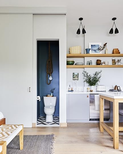
As you can see the door slides over which then opens up the separate area where the sink and shower are. I really love how the blue paint pops and creates a subtle yet impactful design moment.
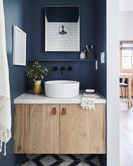
In the sink and shower room, they really made the most of such a small space. A small shelf creates open storage for toiletries and the built-in vanity has a closed storage underneath. The vanity was actually built by Cleo’s dad (who helped with a lot of the construction for this project) from leftover pieces of wood flooring. The shower lives opposite the sink and is properly mechanically ventilated through the roof to avoid any water damage. One tip Cleo shared with me when it comes to designing a small space is to optimize square footage by opting for a small but practical shower. Large showers are great but not when you are fighting to utilize every inch of a space 🙂

When it comes to studio living, it’s important to maintain a cohesive color palette throughout. In this case, the white walls lay the backdrop for pops of blues, grays, black accents, and light wood tones. With such a neutral color palette, pattern and texture play an important role in creating a dynamic, lived-in look. The throw pillows add that pattern and texture as well as the two benches at the end of the bed. Also, do you see how the floor tile and bench seat patterns almost imitate each other? It’s a really cool detail that adds a ton of personality.

Please note what we now formally refer to as the “book ladder”. Without a coffee table or bookcase, there was little space to display books, so Velinda and Emily Bowser styled the books by draping them over the rungs of the ladder. We are all quite obsessed with this trick and need to see more of it!

What you don’t see in these pictures is the breathtaking view of the Hollywood sign and Griffith Observatory, so of course Cleo and McShane made it a priority to put in wrap-around windows. The hinges allow them to open up completely and with such a small space, this is a real luxury. I love that they made space for a daybed here so one could relax, read a book, and take in the fresh air and incredible view.

That’s a wrap, ladies and gentlemen. What detail is your favorite? I think you already know that mine is the awesome water closet 🙂 Sound off in the comments below! xx
*Design by Project M Plus
**Styling by Velinda Hellen & Emily Edith Bowser
***Photo by Sara Ligorria-Tramp
The post You’ll Never Guess Where The Bathroom Is In This 325 Square Foot Studio Apartment appeared first on Emily Henderson.
March 8, 2023
How Much Are Custom/Authentic Shutters? + See Our Exterior Trim Painted White

I appreciate the heck out of you – especially those of you who so clearly said “no shutters” or “just wait til landscaping grows in” on the exterior post last week. Sometimes I think we all just like to be told what to do (especially when it saves us so much money). I think there can be a lot of immediate and emotional reactions in this remodeling and landscaping process – wanting a house to look “better” before you are done and perhaps being a bit desperate. It’s like putting tons of concealer on blemishes when really you need to let your skin breathe and get naturally more healthy. It’s a real lesson in patience with landscaping and we truly try to exercise it every day knowing how lucky we are to be in this position. We always thought we wanted shutters back on the house, but with the house looking so harsh with less mature shrubs/trees in I think we were getting ahead of ourselves a bit – desperate for it to look like the inviting home we always pictured. I didn’t love how the outside of the house was looking but couldn’t put my finger on it. So perhaps I thought that shutters would solve that problem. If you missed this post on trim and shutter options check it out… But essentially I hired someone to photoshop a ton of options that you can see here:

It was so fun to see, but no clear winner for us. The all-white felt boring. The blue trim felt busy. The dark windows felt intense. etc. A lot of you thought they looked cluttered, clunky, and busy. Some of you worried about it looking cheesy – which I had also feared.
Our Dream Shutter Scenario
Here is what we were imagining – a light blue/gray that felt happy and sweet. Misty, our graphic designer, sent this through the day after the post and I was like, “yes this! this is what we were hoping for!” Many of you were concerned, understandably, that I was going to not do it “right” (too small, wrong hardware, etc.) but I promise you that we were only looking at the authentic shutters (which as you’ll learn below is cost prohibitive).
A couple of weeks ago (during the week that we published that post) we had a dry break in the weather and that same week a former painter subcontractor, who we liked a lot, stopped by to offer his time for any projects. So while I was debating the shutters with you in real time, we went ahead and booked him to paint the trim work white that weekend. We started with just one window, making sure that we liked it and once they were all painted this wave of relief fell over me. I LOVED IT.


It is so clean and fresh, letting the pretty windows pop more and still feeling really “farmhouse”. Is it boring? Not to me. The blue doors look so good with the white (sans the gray trim) and then the copper Rejuvenation sconces are the perfect accent (as is the brickwork). I feel like we got over the “a white house with white trim is so boring” hurdle and we are embracing the simplicity while we wait for trees and shrubs to explode. Have we for sure decided “no” on shutters forever? Nope. But that’s because I won’t be definitive about almost anything in our lives 🙂 We are waiting and here is why…
Good Shutters Are Not CheapWe knew they would be a real investment – not hundreds but tens of thousands – as everything in the home remodeling industry is really expensive these days – especially custom. But how much they possibly could cost? We were committed to doing the “authentic” versions, with the nice-looking hardware, and installing them so they look like they could close. Our first quote (which wasn’t detailed and didn’t have all the hardware) came in at roughly $17k (before install). While this is a lot of money, it seemed pretty realistic to us. This was for shaker panels and only on the bedroom windows upstairs – 12 total. Then we had another local shutter broker come measure and quote, this time adding the hardware and it came in closer to $50k (including all the bells and whistles and install), with no trade discount. That quote was for 19 windows (adding 6 big ones downstairs).
A few days later our third quote came in (the same company as the first, but with the right hardware and raised panels instead of shaker, with 19 instead of 12 windows). With a nice trade discount (not a press discount just a normal design trade) it came in at $27K, not including install. They guessed that install would be around $300 per window. At 19 windows we are at $5,700 to install. So we are now closer to $33k all in to add shutters to our house. Without disrespecting the craft at all – as I know that custom anything can and should cost a lot, we were still so alarmed. We’d have to REALLY, REALLY want shutters to invest in that, and let’s just say we didn’t want them that bad. So imagine my relief when literally all of you (with a more objective perspective) told us to skip them or wait. A lot of you even said that they would look bad and clunky (which I don’t necessarily agree with but I definitely see your point). At that price we really couldn’t do it so it was so nice to get others’ opinions that we, in fact, should skip shutters, regardless of cost.
So no, we are not putting shutters on the house but I wanted to give you the amount so that if you are in the market you have some sort of idea how much they could be.
Now, as we are all waiting for the landscaping to do its magic, I wanted to show you what Cali (Studio Campo), our landscape designer has sketched to give us hope for the future.

They are all really small right now (as you can see in the iPhone photos) but spring is right around the corner and once they explode we’ll have a much better idea of what it will look like. We still might add some more mature shrubs, but our contractor has done a great job of laying the literal groundwork – grading, good drainage, soil prep, irrigation where needed, and flagstones – so that should we add more plants ourselves we can fairly easily.

We are nixing the shutters for now, feeling SO GOOD about the decision and leaning into patience as we await spring to show us what our garden will look like. Again a huge thanks to you all for weighing in so respectfully on the shutter situation.
Before I leave you today, Misty sent through a rendering of the red door stripped and stained to just be wood. If I could snap my fingers and have it this wood door I would 🙂 I’m going to reach out to ARCIFORM and see how long this could take and compare it to just painting the door the same blue as the rest of the doors.

Oh, and she plugged in/photoshopped the grass and shrubs – its still mud with some little plants over there 🙂
The post How Much Are Custom/Authentic Shutters? + See Our Exterior Trim Painted White appeared first on Emily Henderson.
March 7, 2023
Sculptural Sconces? The Design Hack That Will Make Your Home Look Very Cool (+ The One Jess Picked For Her Living Room)

I’ve had a love affair with statement sconces for a long time. I’m a sucker for a simple yet dramatic design moment. For statement sconces specifically, not only are they a piece of art in their own right but they also have a very useful function–lighting up a room. What’s not to love?? To me, it reads “I love design and know how to put it into action”. Honestly, they are kind of a design hack. Take Brady’s old bedroom sconce in the opening photo. His room would have still been amazing without it BUT with it, it’s completely elevated, visually interesting, and it adds an inherent chicness in my opinion. Bring on the drama, baby!

 photos by sara ligorria-tramp | from: how we designed our super kid-friendly family room
Emily did a similar thing with her family room gallery wall at the mountain house. I love how she made a gallery wall that was filled with sentimental and personal things from their life. Again, without the sconce, it still would have been a great-looking gallery wall. But do me a favor and use your finger to cover it. See?? I think we can all agree the stunning sconce adds that “designer touch” and makes the whole wall feel more sophisticated.
I also want to note that for this awesome visual effect, this sconce must be big and wide. Something small could have still looked pretty, but it’s the inherent size and simplicity that makes this wall extra special, extra cool, and like a professional designed it. So if you want something similar GO FOR IT, K???
 design by rob diaz & anastasia ratia | styled by sarah brady of the platform experiment | photo by virtually here studios & la light photo | from: is this the new “california casual”? step inside this modern double a frame home that is contemporary and dripping with soul
What is also incredible about a large sculptural wall sconce is that it can act as a big enough piece of artwork that you may not need anything else on the wall that it’s on like in Rob Diaz and Anastasia Ratia‘s incredible design.
 design by brady tolbert | photo by sara ligorria-tramp
But let’s say, you like the idea of a super wide sculptural sconce but you don’t need or want it to take over the majority of your wall… just add something more vertical to a gallery wall like the sconce master himself, Brady Tolbert, did in one of his last versions in his old apartment. It still has that oversized sculptural, geometric feel but is a liiitle less intense. If you’re into that sorta thing:)
 design by shanty wijaya of allprace homes | styled by a 1000x better | photo by jenna peffely | from: the house tour that took all of our breaths away – shanty’s japandi style oasis
Scale and those dramatic geometric lines are really the most important elements to think about when shopping for your own. Repeat in your head, “This is the kind of drama I want in my life.”
 design by lea johnson | photo by sage e imagery | from: lea’s living room reveal: her pet and family-friendly open concept design agony solved
See how Lea’s perfectly oversized Serge Mouille-inspired living room sconce takes the design of the whole space up a notch? It says, “Yes, I’m a pro.” It’s moments and design choices like this that really change a space. Do the finger thing again to see. I know I sound like a broken record already but I want to prove my point. SORRY!
 design by jess bunge | photo by sara ligorria-tramp | from: the feel-good modern romantic bedroom makeover jess did for her dear friend (all thanks to the company store)
I actually also played with scale when I designed my friend/neighbor’s bedroom. I LOVE Katy Skelton’s lights and have always wanted to use one of her pieces. So when it was looking like their room need a hint of modern drama, I knew I wanted to use that sconce. My friend told me that it was the one decision she was a bit hesitant about but after it arrived and was installed it was one of her favorites. So like I pushed her (because I believed in it so deeply), I want to push you to play with scale in your sconces. It’s fun, I promise.
Now let’s get into the real reason I decided to write this post (per Em’s request). I knew the moment I stepped into my apartment’s living room that I wanted a statement, sculptural sconce on this wall (see photo below).

I didn’t want to simply do a gallery wall like my last place (even though I LOVE a gallery wall). Also FYI my beautiful, unfluffed sofa was only against that wall because I was having my birthday dinner party and needed space for another table. It is now back facing the fireplace where it belongs:) For a few reasons, I couldn’t take a more current photo. SECRETS…
Back to the sconce idea. I photoshopped out the “original” sconce that came with the apartment to give you a clean visual slate but there is a junction box in case you were wondering. But truly, isn’t this wall begging for a gorgeous huge sconce?? I wanted (as always for my spaces) to create a California/European vibe and a sculptural sconce would do that beautifully.
 design by lea johnson | photo by sage e imagery | from: lea johnson’s basement reveal: workspace by day and family-friendly living room by night
I’d been searching for a while and kept coming back to this Serge Mouille-inspired light fixture that Lea used in her basement as a ceiling light. For a second it made sense. It was going to feel very French/European, check. It was a HUGE visual statement, double-check. And I had always loved them, check, check, check! Plus I found one around the $500 mark which felt doable if they weren’t able or interested in gifting. They have some examples of it as a wall sconce if you look at the photos. It’s very cool if you have the space. Also, while these lights have gone in and out of being “trendy,” ultimately they are a classic.
But then I taped it out…

Honestly, even taped out I was still on board (remember that’s not the real location of the sofa). However, after I realized how far into the room it would protrude I knew I had to say goodbye. I’m sure a ton of you can relate to those moments. You think you’ve figured out a perfect piece to your design puzzle only to realize it doesn’t actually fit. RUDE. Someday I’ll have a larger room where I can use this as a sconce but that day is not today.
So what next?? Well, I had another secret French lover that I kept swooning over but this one wasn’t “inspired,” it was the real deal. If you haven’t heard of Wo & We, you’ve definitely seen his lights. You will have a hard time looking at any design magazine or site and not see one at least once. And I’m not just saying this but I have been a fan since I think before I worked for Emily. Getting one of his sconces would be a piece I would keep forever. I should also mention I am working with the amazing BuildLane to design a custom “shelving unit” and the light I wanted to get was going to work perfectly with my idea. So with all of that in mind, I knew this was the sconce and it was purchased.

Ok, the photo is bad on purpose because I want the reveal photos to really feel like a WOW. I stare at it every day and can’t believe I have one. While absolutely not cheap, the price wasn’t as outrageous as I was expecting and was very on par with the market. Plus all of the lights are made in Lyon, France in the Wo & We factory. I even emailed directly with Oliver the owner and he was wonderful to work with. I was also able to slightly customize the length of the center pole since originally it was too long and going to come too far into my space. The thing I was most excited about was that I was going to finally get what I have fondly referred to as the “taco shade”! He calls it “bented” which is much cooler:) So that’s my little sneak peek surprise for today.
Now of course I wouldn’t leave you without some options for you to shop from if you are in the market. If you can’t tell I think you should do it.

1. Articulated Modern Brass Two Arms Sconce | 2. Cypress Champagne Double Wall Sconce | 3. French Articulating Double Zig Zag Light Sconce in the Style of Serge Mouille | 4. Onda Plug-in Sconce | 5. Adjustable 3-Arm Wall Lamp | 6. Staggered Glass Adjustable Sconce | 7. Simms Long Arm Double Sconce | 8. Sereno 2-Light Plug-In Sconce | 9. Mid-Century Brass and Perforated Metal Shade Wall Light (Set of 2) | 10. Alyra Steel Swing Arm Sconce (Set of 2) | 11. Pivot Double Wall Sconce with Articulating Arms Made | 12. Journey 2-Light Swing Arm Wall Sconce | 13. Adelone Two Arms Rotating Swing Arm Sconce Wall Sconce Lamp | 14. Paz Light with 2 Arms | 15. Awkward Wall Sconce

I tried to give lots of options with a variety of prices and styles. But most importantly each of these is at least 3 feet wide. That’s the kinda width you want for making a visual statement. As I have stated 8,348 times already in this post, if you are looking for a show-stopping yet simple statement this is a truly great option where there’s something for every price point. Take a risk and go oversized. Oh and this is renter-friendly too (especially the plug-ins)! I can say from experience it’s so worth it.
Love you, mean it.
Opening Image Credits: Design by Brady Tolbert | Photo by Tessa Neustadt | From: Brady’s Bedroom Makeover With Parachute
The post Sculptural Sconces? The Design Hack That Will Make Your Home Look Very Cool (+ The One Jess Picked For Her Living Room) appeared first on Emily Henderson.
March 6, 2023
Make Your Shelves Look Better With These 4 Easy Bookshelf Styling Formulas


Bookshelves can be one of the most daunting things to style. I always say my dream would be to have a grand room with floor-to-ceiling bookshelves but the truth is, staring at those shelves would be like staring up at a huge mountain I have to climb. Thankfully, four years at EHD has taught me that there is a styling formula for almost anything. Lo and behold, we have discovered some no-fail shelf styling formulas that EHD has been using for years and years. If you feel lost, stuck, or just plain exhausted with making decisions, the following four formulas are foolproof and will make your shelves look like they were styled by an actual pro (that’s you!).
First, to help guide your quest, a couple of ground rules we swear by:
1. Maintain a consistent color palette.
2. Mix up the shapes, sizes, and scales.
3. Include a little greenery.
Now that you know the basic rules, let’s dig into the formulas.
FORMULA #1: 2-3 Books Stacked Horizontally + Object On Top design by corbett tuck | styled by velinda hellen, erik kenneth staalberg, emily edith bowser, and julie rose | photo by sara ligorria-tramp
Our first tip for styling bookshelves is to start by stacking books horizontally. This will immediately add visual interest and will inform how much more space you have to style with objects other than books. When you stack books horizontally, there is often space above so our favorite trick to take up that unused space is to add an object on top. This could be a lidded bowl, a precious family heirloom, a vintage vessel from your travels, or truly anything you love and want to look at every day. Above, a stack of three books (in ascending size) is coupled with an aged sculptural vessel which adds shape and color to their shelves.
 photo by zeke ruelas | from: moody midcentury home office
In the above home office, Ginny peppered in books and objects to create an open yet collected look. The horizontal books are topped with round, sculptural objects which adds movement and texture to the shelves. How cool is that wood-lidded bowl??
FORMULA #2: Art leaning + Multi-Sized Objects Layered in Front design by dee murphy | styling by velinda hellen | photo by sara ligorria-tramp
Adding art to your shelves is one of our favorite styling tips that can add color, shape, height, and personality. We love the relaxed look of leaning art (as shown above) which also draws your eye to the back of the shelves, making them seem deeper and more open. Now the trick to styling around leaning art is to layer layer layer. Depending on the scale of the art, you can layer 1-3 pieces in front which will create a collected look and will impress all your friends. Just make sure your objects are varying in height, shape, and scale so it is easier for your eye to understand.
 design by velinda hellen | photo by sara ligorria-tramp | from: velinda renovated & furnished her “fixer upper” for under $55k…here’s how
If you have several art pieces you want to display, you can absolutely layer art in front of art. Just make sure the frames are different sizes and layer the smaller one is in front. We love how Velinda executed this on her custom shelves in her living room.
FORMULA #3: Display A Collection Of Objects Of Varying Shapes And Heights
 photos by tessa neustadt | from: glendale living room
I am someone who loves my things. I know I am not alone and it’s something we design enthusiasts have to come terms with. I love my vintage coupe glasses, my collection of antique candle sticks, and what would I do without my many lidded bowls and vessels?? Luckily for us, shelves are the perfect display case for objects if done right. Remember the second rule from the beginning? It will come very handy here. Basically, you can absolutely group together several objects as long as they vary in height, size, and shape. If you have a collection of similar objects you want to showcase just make sure they are not identical to avoid your shelves looking too uniform.
For example, in Emily’s Glendale home, she styled her built-ins with many of her favorite objects and some collections, too. The three teal vessels on the right are similar but not identical so they add personality without being too matchy-matchy.
FORMULA #4: 3-5 Books Vertically Flanked By Bookend Or Object design by rosa beltran | styled by velinda hellen | photo by sara ligorria-tramp
As much as I love my things, I might love my books even more. If you saw my living room reveal you know I have a bookshelf entirely dedicated to books. This reminds me, you can always style your bookshelves with just your books, full stop. However, if you have a lot of books AND want to sprinkle in objects and found things that is of course an option too. To accomplish this look, again start by stacking your books both horizontally and vertically. Once you have done that you can see where your objects make the most sense. With the grouping of vertical books, we suggest flanking them with objects or bookends to create space between the individual vignettes within the shelves. The more sculptural the object the better to add intrigue and movement to your shelves.
And there you have it! These four formulas have never failed us and make styling shelves so easy and fun.

Do you have any other styling questions for us? Be sure to drop them down below. xx
Opener Image Credit: Design by Velinda Hellen | Photo by Sara Ligorria-Tramp | From: How To Make Your Smallest Room, The Coziest Room In Your Home + Sara’s TV Room Reveal
The post Make Your Shelves Look Better With These 4 Easy Bookshelf Styling Formulas appeared first on Emily Henderson.
March 5, 2023
The Link Up: The Newsletter We INSTANTLY Signed Up For, Caitlin’s Necessary Household Tool, And Jess’ $12 Butter-Soft Long Sleeved Shirt

Happy Sunday and our first one in March! As you probably saw yesterday, Emily has some exciting things coming up and needs some hired help and some rooms to make over. If you live in the PDX area and might be interested, go read that post now. For the rest of us non-PDXers let’s jump right into this link up.
This week’s house tour is more of a home/office tour and it. is. beautiful. Ghia is a spirits-free apéritif company that works out of a Tudor home in Beachwood Canyon, LA. We can’t get over what looks like handpainted murals. They are so stunning and welcoming. Actually, every design detail feels like a stylish hug. Go check it out!
From Emily: If you haven’t signed up for Orlando’s new Substack newsletter, The Lost Arrow, then I HIGHLY recommend you do that right now. It’s Orlando talking about whatever he wants and it’s, as always, extremely entertaining. I think we all get excited when an Orlando post shows up here so now you can have his humor and his warmth even more. You can get occasional posts for free or subscribe for $8 a month. There’s a bit of a discount if you buy a whole year’s worth. I’m so happy we are getting more Orlando:)


 photo by anna spaller I via chasing paper
Did y’all see David Quarles, IV’s new wallpaper line with Chasing Paper?? Not only is it wonderful but these designs were inspired by the strong women in David’s life. You can feel the joy coming from the colors and patterns. Then to top it off, these papers come in either a traditional material or a faux grasscloth! He is as talented as he is kind (read: VERY) so go check them out and his Instagram account!
From Jess: I impulse-bought this striped shirt the day before my Paris trip and I am SO glad I did. It’s so soft, thin (so great for layering), and the “brown” color is the perfect neutral. It went with almost every outfit. And to top it off, it’s currently on sale for $12.
Also From Jess: I want to cut my citrus like this now.
From Mallory: Thinking about getting this dress to wear to my friend’s wedding but I’m on the fence – I LOVE the silhouette but is the color too much for a wedding guest?? It’s in Palm Springs so I feel like I can get away with going a bit brighter but you guys tell me. Do I cop yay or nay?!?!
From: Ryann: I have a beautiful new podcast to share. It’s called My Mother Made Me and it’s hosted by author Jason Reynolds who talks so poetically about life, his upbringing, and of course, his mother. She is also on the podcast and it’s part story-telling part real-time conversation and just SO GOOD. His voice is so soothing and the way he speaks is so poetic and breathtaking. His mother is just the sweetest and the wisest. I love it so much and I hope you give it a listen.
From Caitlin: What’s like, the least sexy product you could imagine? Because that’s what I’m about to share with you, and I need you to manage your expectations. Last week I purchased this sink plunger (oh baby!!!) after my kitchen sink seemingly regurgitated a bunch of stuff and refused to drain (#fun!! #blessed!!). I didn’t want to use any chemicals and I also didn’t want to bother my landlord, so I had this delivered same-day and it fixed the problem SO QUICKLY. My sink has literally never drained better! I now keep it in my shower (is that gross?) and it’s been GAME-CHANGING at rectifying my slow drain (which clogs weekly with just product – I don’t even let hair get in there). I now do a few little plunges before turning the water off and getting out and the difference is incredible every time. It seems like most of my friends don’t have a sink-size plunger, so highly recommend adding one to your emergency artillery (you know, before you splurge on Drano or attempt some homemade drain-cleaning concoctions)! 10/10.
Thanks for stopping by and see you tomorrow. xx
Opening Image Credits: Photo by Anna Spaller I via Chasing Paper
The post The Link Up: The Newsletter We INSTANTLY Signed Up For, Caitlin’s Necessary Household Tool, And Jess’ $12 Butter-Soft Long Sleeved Shirt appeared first on Emily Henderson.
Emily Henderson's Blog

- Emily Henderson's profile
- 10 followers

