
Emily Henderson's Blog, page 101
February 11, 2023
After A Year And A Half In Portland Here’s How It’s Going – Is It Everything We Predicted Or Expected? It’s A Long One…

When we moved to New York 23 years ago we immediately loved it but got physically sick from sensory overload (it’s a thing). When we moved to LA 13 years ago we both felt so bored and lonely from sensory deprivation that I auditioned for a reality show. Both times we adapted, but just like wood flooring – it takes time to acclimate properly and unlike wood flooring, adapting to a new city, culture, and weather doesn’t have a prescriptive lead time. Everyone asks, “how’s it going living in Portland?” so over the break I took a cool 10-15 hours to write about how we’ve acclimated to Portland – and similar to a journal entry, it’s full of self-reflection, with a heavy dose of self-indulgence. Moving is never an easy decision and this move was fraught with equal parts insecurity and excitement. We talked about it all day every day for months and months while locked down at the mountain house, with lots of pros and cons lists. Once we made the decision (with forced urgency) we really tried to be realistic about impending challenges. Our expectations were low for the first year because as you know, disappointment only arises when expectations aren’t met (this is my general life hack, especially with parenting or things you can’t totally control). But before I go into how reality has faired against these predictions/expectations, I want to break down the timeline a little better for you as this move was a long time coming and had some plot twists that affected our decision.
1979 – 1995: Born and Raised in Coos Bay, Oregon, way out in the country and it was cloudy 80% of my life.
1995 – 2001: Moved to Portland with family, then college at U of O. Retained same childhood best friends (and added one more). Met Brian my senior year and fell in love. Broke up once. My best friends moved to Portland.
2001 – 2007: Lived in New York, Brian went to grad school for acting then started his theater career. We broke up again for a longer separation. I walked dogs, tended bar, worked at Jonathan Adler then styled for magazines, catalogues, etc. Decided to follow the gold rush to LA for Brian’s acting.
2007 – 2015: Moved to LA from New York, my career took off, had a baby, and bought our first house. Brian’s story is in this blog post :).
2015: Had Second Baby and in a state of overwhelm with two under two and an insane schedule, began looking to move to Portland. Spent the holidays up there where it rained for 12 days straight, came back to 70 degrees LA in January, and changed my mind mostly because of the weather.
August 2019: Revisited the idea of moving (“we can handle the rain!” they said). Started looking again online (Portland and Bend), practiced some newly discovered manifesting skills (JK but not jk), found the listing for the farmhouse, flew up to see it, fell in love, and put in an offer. The owner changed his mind, not ready to sell, we were disappointed but kept in touch, and I felt it was just a matter of timing (i.e. woo woo universe stuff).
March 2020: Pandemic lockdown, we moved to the mountain house full-time and loved living there more than we could have predicted. Uh oh.
July 2020: The farm owner texted that he was ready to sell and wanted us to know first before he took it to market. We freaked out. This is what we wanted, right???

August 2020: We flew up with kids to see the property again to make sure this was “IT”. It was. We knew it in our bones (Right?? August in PNW can be very seductive).
September 2020: Put our LA house on the market. Dropped out of escrow, had to do some repairs, and waited to put it back on til after the holidays. Sold in February.
October 2020: Closed escrow on the farm, hired ARCIFORM, and began plans for a major renovation realizing this was not the DIY fixer that Brian and I had naively predicted. Decided to stay at the mountain house while renovating instead of moving up to do remote learning in a rental house.
September 2020 – August 2021: This is where it all changed. Two huge things were happening simultaneously 1. We were realizing that we genuinely loved living in Lake Arrowhead full-time. We never got bored and our lives felt grounded and full. Despite everything happening in the world, we found mountain living really agreed with our family and doubts crept in on whether we should leave. We both agreed that had we not been so heavily invested in the farm we would not have kept looking to move to Portland and we would have given this life a real shot. But meanwhile, we were also 2. Deep in a massive renovation, already demoed down to the studs, a lot of partners involved, and truly no turning back. We were still so excited about it, but yes, very much wondering if our family would thrive as well since we were so content in Arrowhead. But lockdown isn’t real life, the kids weren’t in school, etc. We couldn’t predict the future so we stopped trying.
August 2021: Moved up to Portland, into a rental nearby, and started masked school and activities. Put our house in Arrowhead on Airbnb so it didn’t just sit there empty (and as a backup plan).
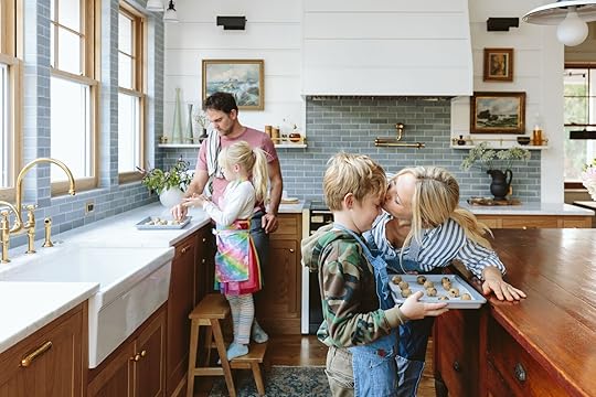
August 2022: After a year and a half of construction and 3 years since we had originally fallen in love with the property, we moved into Farmhouse – not fully finished but certainly very livable. YAYAYY!!!! And we were so happy, relieved, and ready to decorate and fix some of my regrets.
**Before I go much further I’ll give the disclaimer that this post is inherently dripping with privilege – having options in life is something we are so incredibly grateful for and most might see as the ultimate freedom. If this is triggering in any way know that I have so much compassion for people who feel truly stuck in a situation. This post, however, could make you feel better or worse – sometimes choice can be paralyzing and create its own pathologies. (Hopefully, you’ll feel better, but if not I’m sorry).
This post is also full of a lot of confirmation bias – you know, you HAVE to make the case for yourself constantly that you are doing the right thing for your family, which clouds your objectivity, and perhaps amps up your judgments about the other life not chosen. It’s 100% my perspective based on my set of experiences and it’s very, very personal and flawed. So there’s that.
Wait, Backup. So Why Did You Want To Move To Portland In The First Place?
A more accurate question is why did we want to move from Los Angeles? A: To have a slower, simpler, less draining, and less expensive life. We wanted to live in a neighborhood where the kids can go elementary through high school with the same friends. We wanted to be close to my childhood best friends, parents, siblings, and their kids. We wanted what every former Angeleno wants – more space, less traffic, and crowds (which gave me low-grade all-day anxiety). We wanted to be close to a city for professional and cultural opportunities. This property gave us the possibility of living out a former city person’s fantasy – a farm in a country setting, only 15 minutes away from a city, and 5 minutes to cute neighborhood restaurants and stores. There are safe parks everywhere. It felt like this was the magical combination of what we both wanted long-term for our family. After realizing my job didn’t need to be in LA, we knew it was time to go (and we miss our friends A LOT), so once we found the farm we did. But was Portland the right decision for us? Let’s explore.
Couldn’t You Get those Things In Lake Arrowhead?Maybe! But we didn’t know. It was all so confusing because it was the pandemic, not real life and we didn’t know how it would be in 4 years. Would we really like being in such a small town? Did the daily year-round trail runs through the forest to plunges into the lake provide enough stimuli for us after being in huge cities for 20 years? Or was that just our lockdown pandemic agoraphobia talking??? Arrowhead, historically extremely conservative (in the year-round-large-Trump-sign kind of way), is changing a lot right now and there was no way to predict how it would be in 10 years. We weren’t sure it was the right environment long term for us and our kids (we also don’t identify with some of the Portland politics TBH, but more on that below). If you did or are raising your kids in Arrowhead please don’t take this as us thinking it’s not a good place to raise kids, I actually think in most ways it’s magical and perhaps might be as close to perfect as possible. As parents, you simply try to make the choice that gives you confidence at the time of the decision, and our friends/family in Portland were highly convincing.
So again, we just didn’t know – life wasn’t “real”. The kids were 4 and 6 when we moved up full time, the ages where they just wanted to hang out with us and yet can put on their shoes and make their own cereal. Due to the pandemic, my production schedule disappeared for months, freeing me up to be present with my kids, play, cook, craft, read, hike, walk, and realize how unbelievably overscheduled and addicted to being busy I had been. I was off the hamster wheel for the first time in my life and like so many of you, I had new clarity about our priorities and values. I wasn’t going to get back on the hamster wheel, and for a while, it was working because the proximity to LA meant I could commute to shoots a couple of times a month (an hour and a half drive) and see my friends, team and get a dose of city life. We began to ask ourselves if we could live in a small vacation town year-round. “Impossible!!” They say. Or is it?? We thought. We worked from there (with three hours of help a day for the kids), I ran the blog from there, we moved our bodies in nature every day (300 days of sun up here), cooked most meals, and our life was just so simple without feeling boring at all. But the rest of the world hadn’t moved on yet and we feared that when it did we would have regretted passing up the farm and we were concerned that we were still “city people”.
Going into the move up to the rental I KNEW nothing could compare to that year. The kids would be back in school and daily activities. The begging to get their shoes on and brush their teeth and get out the door was back. The deadlines to finish this massive project began to loom. And this time I didn’t have a local team to help me…
Prediction/Expectation #1: The First Years Would Be Very Challenging For Me, Specifically.
Winner Winner Chicken Dinner! We were right! When people asked me how it was going I would answer pleasantly, “Well not every year can be your best or you won’t appreciate the good ones!” And I actually meant it. We were extremely lucky to have what our lockdown life was – we NEVER took that for granted. I think because I KNEW that this year was going to be really hard on me I was prepared for it, but I’m not sure that made it any easier. At first, I cried a lot and had to lean hard on my tools to keep up my endorphins and not feel depressed (and ruin the year for our kids). Renovating a house is stressful, expensive, and requires so much mental and physical time and decisions even if you’ve done it before. Doing it publicly multiplies that by 100. And I felt the weight of it all. We knew this going into it and Brian tried to share in the weight, believe me, but it’s mostly me. Meanwhile, he got into an awesome writing masters program and continued to be the lead parent so he was really, really busy, too. But the renovation, the business (where numbers dove quickly after the lockdown house building/remodeling boom), and supporting us financially is really all on me. Without a local team for daily support to make content and to help make it fun, I felt very alone and the pressure felt extreme. I missed my team (and sadly, the wonderful Jess, Mal, Ryann, or Caitlin didn’t want to move up to Portland). I feel like I had always appreciated everyone before, but now I REALLY missed everyone, present and past, all my people who helped me day-to-day create design content. I wasn’t really having fun anymore and I’m an enneagram 7 so this girl really likes to have fun:) I needed a design buddy, a creative companion, someone who was excited about social media and I just couldn’t find the right fit.

Plus at first, I missed Arrowhead, our home, and the environment/lifestyle so much. Here’s my analogy: It’s the summer fling that turned into my true love… but a true love that wasn’t sure they wanted to have kids with me, and my steady high school boyfriend that I reconnected with (Portland) was ready to settle down. So yes, we moved for our kids to provide what we sincerely hoped was a well-rounded childhood, but the doubts nagged at us if that was even true. Was that just a story that society tells us these days? That you can’t raise kids in a small town without the opportunities of a larger city?? There is no way to know and despite how much we all want it, there is no perfect place to raise your kids. No perfect school. No perfect town. No perfect house. No perfect job. The goal is to align your choices as closely with your values as possible, and Portland fell closer than Arrowhead in many categories. Once up there, Brian was more on board with Portland, seeking out culture more than myself but he was struggling, too. I also very much knew that I was being such a baby, feeling sorry for myself despite having so much. “California girl doesn’t like the rain,” wah wah. “Privileged blogger cries that renovation is so stressful,” poor baby. I KNEW and still do know that I don’t have real problems. Everyone is healthy and isn’t that all that matters? I filled up gratefulness journals (which worked), went to a happiness conference (which hilariously did enlighten me a lot to reframe the second half of my life), and when I was down I would go on long walks with my best friends or spend time with my brother’s/sisters family and kids, now 10 minutes away after decades of only seeing them twice a year. I was quickly reminded why we were here. This. Family. Community. Long-term stuff. By February it started getting easier. I actually loved going on 6 am sunrise walks with the pups, the green everywhere felt invigorating and once the drywall went up I felt some hope. Our new normal was settling in and I thought about Arrowhead and my summer fling less and less. This life could be really really good, I could feel it. A huge credit to…
Prediction/Expectation #2: We Would Find A Community For Our Kids Within Our Neighborhood

Ding ding ding!!! This has FAR exceeded our expectations. Somehow we have wiggled our way into a group of friends with kids the same ages, who all go to the same school and it’s far better than we could have hoped. I’m sure it’s weird for them to read this right now (if they do) but we feel like we seriously won the community lottery. They are wonderful. Brian took the lead while I was depressed and agoraphobic and basically hit on the dads at soccer practice, got their numbers (last September) and the friendships with the parents and kids have become truly one of the best things about living up here. The weekly playdates at our house after school, the carpool to activities because we all sign up for the same stuff, the drinks before or after the school parties – IT’S ALL SO GOOD. On the darker days (literally and figuratively) we know that THIS IS WHY WE MOVED AND IT IS BETTER THAN IMAGINED. Thank god. Community, y’all. It’s just so important.
Prediction/Expectation #3: The Rain Would Be Hard But We Could Handle It
Unfortunately, and to no one’s surprise but ours, this has been far more difficult for us than we had predicted. I’m not here to complain about the rain, I’m more disappointed in us for not handling the rain last spring well. We were fine through the winter because it’s winter almost everywhere and it makes the summers so green and beautiful. But when it was still going every day in May and then every single weekend through the end of June and early July, we found ourselves turning into terrible, negative versions of ourselves (it was an 80 record). We felt very naive, embarrassed, and dumb that we reacted so poorly. Typically, I can reframe everything and see the positive – it’s one of my superpowers, but in June I felt like I had lost that power. I was a shadow version of myself and I’m sure hard to be around. We tried hard – we went on rain hikes and played in the mud. I had to delete the weather app after seeing that Arrowhead had moved into boat weather, our friends who we share a boat with were out swimming every weekend. I felt so jealous, mad, regretful, and then ashamed and embarrassed for having those emotions as someone who is so privileged. We were genuinely worried that we bought and were investing in this awesome property that you couldn’t enjoy for 8 months of the year (at the time it was under construction, so our fears were clouded in mud).
You might ask, But aren’t you from there? Didn’t you know about the weather in the Pacific Northwest? And the answer is Yes. Kinda. Maybe not. “Knowing” something is so different than experiencing it every day. It would be like moving to LA and complaining about the traffic – you know you can’t leave your neighborhood from 7-10 am and 3-7 pm, that’s just LA. But what if you couldn’t get on the freeway on Saturdays or Sundays? What if it was rush hour all day every day? That’s how we felt last year when it didn’t stop. I was and continue to be very disappointed in myself for letting it get to me so badly last year specifically. Did I have SAD? Probably. I felt like a weak little spoiled baby. But again, it was an extra rainy year and it was our first – I’m just grateful we still have friends. We were not our best selves.
This year is predicted to be just as wet but we are ready, we are in our home and not the rental, I have a bathtub (dumb, but I’m a nightly ritual bather), and we have planned a few trips to warmer weather to help us get to summer. I’ve got my books, cold plunges, friends, workouts, sauna blanket, and soups – I’m armed up!! And oh, the long summer days and incredible fall colors are just so glorious, green, lush, and sunny that of course, we found ourselves saying, “it was all worth it” in August/September/October. This year we feel already so much happier – our situation has changed and we’ve acclimated/accepted it a bit more. We are learning to ski, doing more weekend trips, and when its nice out the Hendersons are OUT 🙂
Prediction/Expectation #4: We Would Love The City Of Portland, Knowing It’s Maybe Not Having Its Best Moment Right Now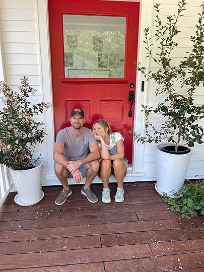
This is pretty much as predicted and the only reason I’m attempting to address it is because literally every person asks. Uber drivers. Distant relatives. Everyone. So here’s what I’ll say: We love the people we have met so much. We love the general vibe which is unpretentious, casual, easy, family-oriented, outdoorsy, and grounded. We love so many of the neighborhoods. We appreciate the access to culture – i.e. art, theater, concerts while probably not taking as much advantage as we should (we did go to Hamilton). And the access to nature is incredible (so much beauty within a 20-minute drive). The restaurant scene is so amazing when we seek it out. Do we think that the city is handling the drug, mental illness i.e. the homeless problem well? Er, No. No one here does. And no one wants a California lady to come up here and criticize their city after living here for a year so I’m going to be brief: it’s a great lesson in the importance of having a balance of common sense and compassion. To be clear, it’s not a job I would want – it feels almost impossible to solve. And listen, every west coast major city is not exactly thriving post-pandemic, there are so many lessons that all of us are learning. There is room for improvement and certainly compassion – both for the local government trying to appease their upset constituents and especially those who are in dire situations on the streets.
But it’s also thriving in a lot of cool ways, post-pandemic. It seems to be on the upswing with a community that cares more about supporting local businesses than anywhere I’ve ever been. I LOVE that about Portland – there is so much local pride and spirit and it’s just so family and community-oriented, while still being cool and weird should you want that. The city itself is like it was when I was in high school – beautiful and quirky, with so many neighborhoods that are walkable and fun to explore. And the shopping – oh the vintage shopping is EXCELLENT. So that’s all to say that we kinda knew what version of the city we were moving into and I think everyone collectively hopes for improvement, but still loves what it has to offer (which is a lot). And y’all I’ve never felt like a New Yorker or Angeleno, I’ve always felt like an Oregonian living and growing my career in those cities. Maybe that’s just the story I want to tell myself but I do feel very, very, very at home and at ease in Oregon, specifically in the suburbs…
Prediction/Expectation #5: We Wouldn’t Mind Living In The Suburbs
To be clear – I wanted country, Brian wanted a more traditional suburban life and y’all, we LOVE living in the suburbs so much – FAR MORE than we thought we would. He was totally right on this one. Technically we are 15 minutes outside the city and in Portland, everyone knows Southwest as the suburbs (don’t try to guess or hint in the comments if you know where we are, please, SW is huge as you all know). We love it. I remember specifically the first time I went to Target which took 6 minutes to get to, 5 seconds to find a close parking spot, was joyfully empty, with stocked shelves, and no lines in the checkout. I almost wept I was so happy (I also got recognized 6 times that day and everyone was so nice!). Running errands in Los Angeles is a different experience from the sheer volume of cars on the streets and people in the stores. It’s just life there and you have to accept it and arrange your schedule around it or choose a different choice. The suburbs are everything that you think you don’t need or value when you are 25 – ease, family restaurants, lots of grocery stores with parking spots, zero pressure to look cool, cute schools, sports facilities, parks – and everything that we want now. It’s just wonderful. And like I said, we are close to a couple of really cute neighborhoods with commerce should we want to go out to dinner. It’s an incredible merging of a suburban community with a country setting that’s near a city. We feel very, very lucky. But yes, the suburban family life totally agrees with us 🙂
Prediction/Expectation #6: The Kids Would Thrive


First off, kids can thrive in most places with the right loving environment. But yes, our kids are doing really really GREAT. I think because everyone was coming back from distance learning they were able to make friends quickly (no hard friend groups to crack). They have nice teachers and enjoy school as much as any 1st and 3rd grader does. There is access to a lot of sports with their friends, lots of downtime on the weekends with us, and they get to hang with cousins which is so fun (Birdie and my niece are best friends which brings me so much joy). I’m so grateful I get to work from home and that they are the ages where they can mostly take care of themselves after school. I mean, it’s not perfect every day, and I try not to schedule conference calls after 3 pm (probably should have put in an enclosed home office, TBH) but all in all I think they are happy, healthy and love living up here. Do I still worry that my job and our situation will make them spoiled and entitled? Yep. It’s my daily/lifetime battle to fight it and let’s just say the reason we are getting alpacas and chickens isn’t for fun or food – these kids need some poop to pick up and eggs to gather, full stop 🙂 But they love living on the farm and Brian is fulfilling his dreams of seeing them ride bikes safely in the neighborhood with their friends. I didn’t grow up with neighbors so this wasn’t something important to me (thus my wanting to live in the country) but Brian did and we can both see how awesome it is for our kids to have a strong community so young.
 Prediction/Expectation #7: Working Remotely In Two States Will Be Great!
Y’all I have good news and stuff I need to work on. Everything is good and I’m so so so grateful that my team has stayed with me, but I’m learning a lot about how to run a business that is 100% remote, in two different states. They are working so hard but without an office space everyone is alone and I think that is hard. I think post-pandemic we need more connection, more team hang time so this year I’m going to try more retreats and more get-togethers to ensure that everyone feels happy, connected, and moving forward in their careers.
Additionally, up until recently I have been working on my own and have realized that while I like alone time, I need creative collaboration to thrive. I think that’s where a lot of the mistakes/regrets have come from – from me feeling creatively dead and just making decisions to check a box. The good news is that I have finally found a wonderful small team up here – Emily M. and Kaitlin (my photographer) and they have brought my mojo back and helped create a balance between work and fun. We’ve got a rhythm, it’s helping pump out reveals, I’ve got my design/styling buddies, and I feel excited again. I know I can get so busy that I forget to check in enough with everyone and that is something I feel like I will work on for the rest of my life. I think this will be another year of figuring it out and trying new things and that’s ok. I consulted with a very experienced HR person this year, someone who has worked for 20+ years for large companies and she confirmed what I felt – that there is no one right way to do things and that the best companies remain flexible, put people first, try new things, take risks and change, fail, move on and grow. Of course, I wish that I was learning fewer lessons this year, but two years ago my astrological chart did say that this year was going to be remarkably challenging and I’m glad that so far it’s not due to marital or family health issues.
 Prediction/Expectation #8: We Would Love Living At The Farm
WE. LOVE. IT. Every night when I cook in the kitchen or bathe in the beautiful bathroom I feel, we all feel, SO GRATEFUL. Balancing being grateful and not bragging is hard to do on the internet, but trust me that we feel so lucky that this is our home and that I get to spend years decorating, living in and hopefully raising our kids. Let’s catch you up – we are basically done on the inside, barring some paint changes I’m going to make and wallpaper going up which you’ll hear about, and of course, decorating (I haven’t even started some rooms and they only have leftover furniture). Certain rooms are already so wonderful to be in, others are more challenging to figure out for sure. Right now I’m trying to divide my time between finishing up each room and making major decisions on the landscaping.

The outside is a thing:) What the internet doesn’t tell you is that exterior and landscape construction is as expensive as the interior. It’s just so laborious and requires so much machinery. We are so grateful to be doing it and very excited for a lot of it around the house to be done by spring. But let’s just say that we bit off a lot, far more than predicted so I’m back to hustling (in a healthy way??) to be able to manage the budget. I remind myself, daily, that we are intensely lucky to have this space, but y’all, maybe we didn’t need 3 acres. Like maybe 1 acre is enough space?? Once it’s done, like giving birth, I hope we’ll be settled and can enjoy being outside, but the labor can be painful and that’s ok. It was our choice and I continue to use my “to renovate your home is the utmost privilege” mantra. Seeing grass instead of mud this spring will be GLORIOUS. When we first found the property 3 years ago, I remember telling Brian with sheer excitement in my eyes – “I’ll have projects for years!!” But that was workaholic pre-pandemic Emily. Some days I still feel that excitement, others It feels truly never-ending and I have to remind myself to expand the timeline and be ok with it taking years (and years).


Obstacles are part of the journey, y’all. I suppose I’m learning (again) what a lot of you might have already, that having more property and more house just means more work, more money spent, and more maintenance. Of course, our hope is that we are investing in the initial design to look natural, setting ourselves up for the future, and then in a couple of years it will just look like it’s always been here and be easy to maintain. And even though those other buildings are absolutely falling down, I know I’ll be really excited to tackle them once we are done with this house and my brother’s river house project. We have a painter scheduled to come and do a quick coat to make them look temporarily better which will buy us a few years before we decide what to do with them (and of course save up for it). Turns out that house up there needs to be lifted to put in a whole new foundation, and it never even had electrical or plumbing so…
A Big Positive Shift Has Happened
I wrote the first version of the post over the holidays. But I didn’t feel right publishing it. It was pretty dark and negative, despite my trying to make my tone light and playful. A couple of weekends ago I went on a weekend retreat with some of my closest friends, some books, a journal, and lots of moving my body. And a huge personal shift happened. I hesitate to tell you too much, but it was pretty life-altering and I’m hoping this shift sticks (it takes daily work). A real mind/body/spirit experience that was actually so simple. I was berating myself pretty terribly last year and now I’m not. I released those thoughts, surrendered, asked for help, and feel totally and wildly different. Those of you who can relate are nodding heads, others are scratching them or eyes are rolling. IYKYK. I have my daily mantras, journal, and meditate and all I can say is that I feel like a cloud has lifted and even on the darkest and wettest of days I can see the positive again. On January 4th I was crying to Brian saying that I’m worried I lost my superpower forever, and I can honestly say that since that experience I’m back. It’s a whole thing that I’ll tell you about someday (I read this book – ignore the cover – if you are curious for yourself). Still processing what happened to drive me into that negative space, and what amazing thing happened that brought me out, but yes, the next chapter of my spiritual journey is underway (read this post about my experience in the Mormon religion if you haven’t). I feel pretty darn excited and full of gratefulness and hope. I’ve stopped comparing myself to others (something that was a daily battle for the last two years) and just feel so much healthier mentally.
So Was Moving To Portland The Right Decision????YES. I mean, I’m so happy to report that in February 2023 I really, really really think Portland is such a great fit for our family. I can now recognize that while my life in Arrowhead was full of ease and simplicity, left to my own devices up there I don’t think I would have challenged myself, creatively or personally. I feel like my biggest challenge will be retaining that sense of slowness when deadlines are looming, and y’all I think it’s going OK. Those who have followed for a long time (thank you) will hopefully feel or see a difference – yes, the reveals are more spread out, but there is so much more balance which allows me to love it so much more again.
Do You Still Miss Arrowhead?Sure, in theory, but not the day-to-day ache like it was at the beginning. Time does really mellow that longing. Plus going back twice a year for a chunk of time (if not more) and knowing that it will always be there helps tremendously. It’s just not our time right now:) But the truth is I think what I loved so much about it was the easy energy, the family time, nature, me learning how to relax for the first time in my adult life, with no pull from a busy city – and I can get all of those things here on the farm. I will always miss the morning plunges in the winter lake after a run, but y’all, we are figuring out where we can put in a cold plunge, so there’s that! While I think about my summer fling, right now I am so happy we chose this life for our family.
Thank you 🙂I told you it would be self-indulgent. I think I just needed to get it out. For those of you still reading, thank you. You are the reason I’m still here and I’m SO grateful, especially for you daily (or weekly) readers. And always, thanks to my team for being with me, supporting me more on the days that I need it, and being open to sharing all our ups and downs which actually makes us all feel safer, better, and less alone. The ups don’t feel as good without the downs, and while I don’t tell you everything that is happening in my personal or even professional life, I know that I’m not alone and neither are you. Thank you so much for being here. xx
The post After A Year And A Half In Portland Here’s How It’s Going – Is It Everything We Predicted Or Expected? It’s A Long One… appeared first on Emily Henderson.


February 10, 2023
Help Malcolm Decide Which Dining Chairs To Get For His NEW LONDON FLAT

The art of starting over in a different country. Ahhhh (…a pleasant sigh, or a silent scream? YOU decide.) I’ve been living in London now for about six months, and I’m finally feeling quite settled into my new flat and the overall vibe of the city. To say I’ve found unexpected inspiration during my short time here would be an understatement. The history, gravitas, and culture of London is unlike anything I’ve ever experienced. From vintage tiling in tube stations to the innumerable historical buildings I’ve walked through, it’s safe to say I’ve found my muse in the UK. After taking it all in, I’m feeling ready to start pulling some of that inspiration into my rental flat.
While I brought most of my furniture and belongings with me from the US to the UK, I decided not to bring any of my dining room furniture. I had a good sense of the floorplan and style of my new flat before I moved, and I knew that my existing dining room furniture wasn’t really going to fit—neither stylistically or functionally.

The new dining space is decidedly more modern than I’m used to. It’s connected directly to the kitchen, which is composed of cabinetry faced with glossy, off-white lacquer, which seems to be a recurring feature in newly built or renovated European kitchens (in my limited experience, anyway). As such, I’ve needed to pivot a bit from the American colonial design sensibilities I’d developed over the last few years in Virginia. The space also boasts beautiful high ceilings with traditional (and THICC) crown molding, a large window, and the cutest little radiator. This little space is a pretty telling snapshot of the entire flat: an interesting study of the relationship between modern and traditional.

I don’t think it’s a coincidence that I’ve been focusing so much on the dining space in my new flat. I last left you with a DIY-heavy dining room makeover in my Virginia home, which I promptly packed up and moved into storage before getting on a flight across the Atlantic. Sadly, I missed out on using that space to its full potential. So, I’ve spent an inordinate amount of time thinking about how to make the best use of the dining area in the new spot.

First offfffff, the table. Look at this table. The table of my dreams.
After much deliberation, I settled on an Eames-inspired, marble-topped dining table for this space. For years, I had a cheap CB2 version of this type of table (I don’t recommend it… it did not fare well over the years), and I yearned for the day I’d be able to splurge on a higher-quality model. Today is the day, fine folks. Well…the day was like a month ago. When I bought it.

I love how the brightness of the marble top complements the medium value of the kitchen countertops, but also looks different enough to feel like an intentional pairing. Also, the iconic, lacquered texture and movement of the table base vibes with the kitchen cabinetry in a very cohesive way. With the table procured, I’ve naturally pivoted to picking out some dining chairs. BUT I CANNOT MAKE UP MY MIND. I’ve assembled a few options here and I’m hoping you can help me decide! Let’s dive right in…
OPTION 1: TRADITIONAL AND INSPIRED
I’ve been eyeing these Cesca-style chairs for a while, which feel both stylistically fitting and historically relevant to my new European environment. The original Cesca chair was designed by Marcel Breuer in the early 1900s, and I admire how it—and other pieces he designed—inspired an entire wave of modern and functional furniture that we still regard pretty highly today. The softness of the woven cane seat and back seems like a nice complement to not only the hardness of the marble table but also the dark wood furniture I have throughout the rest of my flat. Also, the chrome structure of the chair speaks to the chrome hardware used throughout the rest of the rental, which either feels very cohesive…or too on the nose. I can’t quite decide!
While I’ve found plenty of authentic vintage Cesca chairs online, I’d more likely buy a new reproduction instead. Mostly due to cost limits, but also because I’m not sure vintage caning would hold up very well to a lot of use.
OPTION 2: HANDSOMELY VINTAGE
Now, aesthetically, this chair just feels like me. It embodies everything I like: Classic lines. A tailored form. Collected by nature.

Built in the 1950s, these dining chairs boast a dramatic, metal red frame and a striking black seat and the back is made of Bakelite (a material I’m learning about as I type this). There are a couple of reasons I’m drawn to this chair. The dark seat would make for a nice contrast against the lighter elements in the kitchen and dining spaces: the floors, dining table, cabinets, and walls. I’m also really drawn to the interesting color of the metal frame. I’ve been thinking it would be really cool to incorporate a burgundy or oxblood tone into this space, and this could be the place to do it. However, there are potential cons with this option as well…the biggest one being a question of comfort. Might its age and material make for numb butts during long dinners? Moreover, would the metal legs scratch the floors in my rental into oblivion?
OPTION 3: BLUESY WILDCARD
So, I’m having quite a “blue period” at the moment. I’ve been drawn recently to adorn the new flat blue accents—like the huge IKEA area rug I purchased for my living room—and blue dining chairs could be a sensible way to introduce the color into the kitchen/dining room. These chairs in particular are decidedly more modern than my other two options, but I think I would grow to appreciate the touch of femininity they would bring to my otherwise masculine design choices in this flat. Also, if you know me…you know I LOVE a brassy moment, and these chairs would introduce a sleek, warm metal that would contrast nicely against the chrome accents seen elsewhere throughout the rental. However, are they tooooo different from many typical tastes? Would I regret it?!?
HONORABLE MENTION
To accommodate some extra seating, I’ve been eying these foldable chairs from Zara Home. They’d definitely go with the Cessca chairs, but I’m not so sure they’d fit as nicely with the other two options I’ve laid out.
I’ll never forget the positive and affirming reactions I received from Emily and her team when I told them about my upcoming move to London, and I feel grateful that I can continue to share my journey here on the blog! Design is universal, after all, and I feel lucky to be able to share my tiny slice of perspective with all of you.
What do you think of these options? Do you have any different ideas you think would suit the space or compliment the table any better than what I’ve picked? Sound off in the comments below and let me know.
*Photos by Malcolm Simmons
The post Help Malcolm Decide Which Dining Chairs To Get For His NEW LONDON FLAT appeared first on Emily Henderson.
February 9, 2023
The Challenges Of Our Upstairs Landing (AKA Our Kids Garbage Storage Room/Play Space) + How To Design Long Term For Rapidly Growing Kids


Welcome to no man’s land, and yet a space that has SO MUCH potential. We’ve only had “hallways” at the top of stairs before, not landings that are almost as big as a room. It’s such a lovely, inviting, gracious space to “land” (in theory) before you head into one of the three bedrooms, the kid’s shared bathroom, or the laundry closet. It’s a pretty darn big space (with a new huge Velux skylight that did wonders) that has become the upstairs “drop zone”. And you all know what that means – she is MESSY, unorganized, and currently purposeless. Here is where we are in the house:

It’s big enough to have a lot of function, but we need to live in the house long enough to know what that function really is. Our kids are 7 and 9 and all parents know that interests and therefore functional needs change as fast as they age, really keeping us on our toes and requiring most things to be flexible and able to work in other places should they not work here. It’s a challenge but one I don’t want to rush solving (and yes, we are shooting the house in May so rush I will :))
Three Years Ago…
As you can see the landing had this 90s flooring (the bedrooms had bad carpet with no hardwood flooring underneath) and we decided early on that this is where we would “save” money. We’d paint the landing floor and stairs, add a harlequin pattern or stencil at some point, and not spend the money to re-floor the second floor at all. What we didn’t realize is that this floor was in bad shape, so instead of painting it they actually replaced it with affordable 2″ Douglas fir flooring (what was originally appropriate to the age of the house). This is great because we had a better product and we approved it quickly over the phone. But had we thought about it more we would have either A. Stained the new yet generic wood floor a wood tone, B. Painted the OG bad flooring without any prep work so you saw the cracks, etc which is a specific look that we like, or C. Put in more of our beautiful Zena flooring from downstairs. We originally made the decision to paint it because we hated this particular “before” wood flooring, not because we really wanted painted wood flooring if that makes any sense. Everything has a domino effect and those of you who have remodeled know that you make a decision, it affects other decisions. Something just always comes up and changes the other decision or the original decision, and yet you often don’t go back and rethink every decision along the way because you are overwhelmed with newer, more immediate decisions. So basically if we could go back in time with the knowledge that we had to replace the bad wood flooring we would have replaced it with wood that we loved, not wood just to then paint it. It’s all fine, honestly, and there are a ton of solutions for this space – but I just wanted to explain why it’s just a bright wood floor (as opposed to that more rustic painted patterned wood floor that we had originally planned on).
Everything you see today (besides the doors, trim work, light fixtures, and light switches) is up for grabs design-wise. But we needed time to live here to figure out what to do with it.
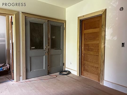
Below you can see what it looked like in progress – the original doors and the salvaged doors were both rehabbed to function perfectly for us.

 The Landing Today (Well, Right Before Christmas)
Here is what is happening now. We have a bookshelf I got at a garage sale for $20, the IKEA pedestal table I’ve had forever, a cheap rug that I bought for our rental that I immediately regretted but never returned, and a white floor that is begging for its painted moment. So currently I’m stumped on how to design this space the best for our family and having a hard time prioritizing such an interim space when other spaces feel more immediate.
Well, What Do We Do In This Room Right Now?Uh, I mostly clean it….and we fold laundry on the floor (because no one really folds laundry on their laundry counter, FYI). Here’s a fun fact about kids – they don’t like to play in their own messes (or others’ messes). Sure, if they make a mess they will play in it for the rest of that messy session, but then they’ll avoid that space or just find it “boring” – truly my least favorite response to their own disasters. Once you clean it up all of a sudden they are engaging with it again. I totally get it – I hate cooking in a messy kitchen regardless if I’m about to make a new mess. You don’t want to inherit an older mess, you want to focus on the new mess you can make. So if it’s clean they legit use the sewing machine and the new 3D printer they got for Christmas, but if it’s messy they are “SO BORED”.
Another fun fact that will make you rethink having children – some of their friends will do this monstrously baffling thing and take every single box/game/puzzle out of the bookshelf and dump it on the floor, one by one. Not all kids do this, (I hope to god my kids don’t do this at other people’s homes, but I fear they have) but I’ve seen it enough times. It’s a thing. Now to be fair, I know that other kids’ toys are these mysterious magical boxes and it feels like Christmas to the new kids. And TBH we leave them unattended for hours so we shouldn’t be so shocked when we come up and it looks like we’ve been robbed. But that gives you more context on what “purpose” this room has right now – a large shelf of temptation and future mess.
We are also in these in-between ages where they don’t love “toys” as much as they did but aren’t quite into the next stage yet (Birdie loves to do arts and crafts, Charlie likes to make things and play video games or play with nerf guns). So yes, there are so many boxes of NIB craft kits or board games that I’m unsure we’ll never really use again.

Sometimes I feel like I don’t engage with these problem spaces until I’m literally writing the blog post about it and seeing it with more objective, fresh eyes. Do I think this could be a sweet little reading area with a desk? Sure. But what we are really missing in this house is the room they can destroy with craft stuff. They both love to sew and make things, but we aren’t set up for it. We could put all the board games in one of their closets (to be taken out when committed to playing with them and then we could have a hutch or armoire that is cuter for all the craft supplies, a place to properly store the sewing machine and the 3D printer, and then wall space to display it all (or shelving for jars of supplies). But at the same time, they are 7 and 9 and will be 11 and 13 in no time. Will they even like to still craft/make things? Should I customize some desks and bookshelves for future homework? A YouTube studio for their future social media channels? (JK, y’all, JAY KAY).
To Craft Or Not To Craft?
We have two warring schools of thought in our house – mine is that if you curate an evergreen crafting/art area with organized supplies the kids will craft more on their own, without guidance or prompt. This is VERY, VERY TRUE. The amount of times we’ve been like, “I wonder what the kids are doing” and they are upstairs doing a huge craft together for hours is countless. But it becomes a disaster that we all have to help clean up, almost daily. The other school of thought is to keep the supplies in a box that we pull out when we want to have a more organized “crafting session,” thus putting the responsibility more on us (me) to have a “project” with the right supplies, and lead the project. But then afterward we pack it up and put it away. This is why the crafting attic was so wonderful at the mountain house – they would destroy it and we’d clean it together every couple of weeks, but didn’t have to look at the mess every time we came up the stairs…
If we were to do “the crafting landing” then I think a rectangle table would be better, positioned against the wall with a crafting board above it, and supplies along the back.
 Or Should I Just Make This Pretty With A Chair/Ottoman, Bookshelf, A Pretty Rug, And Some Art?
I mean, I could do that in my sleep. So yes, part of me wants to paint a harlequin pattern on the floor (elongated diamond in blue and white), buy a simple oval or round jute or braided rug, get a dope chair and ottoman, and hang a gallery wall. It writes itself. But it’s just not as functional for our family and feels like a missed opportunity to check a box. That is unless I find space in either of their bedrooms or the guest room for my fantasy crafting/art studio bonanza…
And yes, we’ve also thought about making this a mini-den for them with a TV/video games and two bean bags which is still on the table, but kinda depresses me (we have just introduced video games and one of our children has taken QUITE the liking to them – if you know what I mean).
Are We Going To Paint The Walls? Install Wallpaper?
Unsure. I know this is so boring in photos, but trust me that in person the white provides negative space for your eye, especially when you have Birdie’s wallpaper and the pink guest room (and consider a pattern painted on the floor). I know we are going to paint the floors but not sure about the walls. Also, remember that it comes up from the stairs so you’d almost have to paint the walls along the stairs too which isn’t out of the question but you see the stairs prominently in the living room so it becomes a thing. Everything is a thing (I say this like 19 times a day). Nothing is just a choice without affecting other past choices or future choices. Everything. Is. A. Thing.
Now that I think about it maybe a DIY L-shaped desk with storage drawers + shelves for books/crafting supplies would have the most longevity for crafting now and homework later…
If I sound stressed by this space, I’m really not. I do know almost for a fact that if I don’t dedicate some thought to this space this year it could stay like this 6 years. So these kinds of posts always force me to think about these less important spaces, creating some forced forward momentum. So thanks for listening 🙂
*Photos by Kaitlin Green
The post The Challenges Of Our Upstairs Landing (AKA Our Kids Garbage Storage Room/Play Space) + How To Design Long Term For Rapidly Growing Kids appeared first on Emily Henderson.
February 8, 2023
Our Favorite Curtain Rods Organized By Size (+ Our Rules For Hanging Them)

Up until a week ago, my bedroom window did not have curtains. What it had as a covering was a sad, thinly woven blanket nailed to the wall. Before you judge entirely and deem me unworthy of writing for an interior design blog, let me explain. When we moved into this apartment, all of the windows were bare and I found that choosing window treatments was one of the more paralyzing design decisions for this first-time designer. For the first few weeks, blankets and towels were indeed hung over the windows which was a pretty unbearable sight to witness. Eventually, I procured proper curtains for the common living areas but due to design decision fatigue, I chose to ignore the bedroom window until I knew what the design plan would be for that room. I was admittedly being cheap and a tad lazy, so a blanket was our curtain for an agonizing 3+ YEARS. Finally, last week I couldn’t take it anymore so I purchased an actual curtain rod and curtains for the poor, forgotten bedroom window. I probably don’t need to tell you the difference it has made for my mood/mental health. We have actual privacy now, and I no longer avert my eyes and pretend the window doesn’t exist. Now all of this is to say that picking the perfect window treatments can be confusingly debilitating. It can feel like a big design choice/investment so if you are having trouble facing this decision you aren’t alone. The first step is acceptance and the second is to find the right size and style curtain rod for your needs. Are you ready?
 photo by sara ligorria-tramp | from: portland primary bedroom reveal
There are several window treatment options out there (roman shades, shutters, blinds, etc) but if you are going with hanging curtains there are a few things you should know:
Make sure you have the right tools BEFORE you get started. For most curtain rods, you’ll need a power drill, the right size drill bit (depending on the size of the screw), a stud finder, and measuring tape. Depending on the weight of the curtains, you might need a supportive wall anchor, too. Sometimes hanging curtains the right way takes a few tries and a few different applications (this is coming from experience). You could also hire out! Don’t hang your curtain rod right above your window. Ideally, your curtain rod should be hung 2/3 the distance between your window and the ceiling. If space allows, the curtain rod should extend 10-12″ past the window on each side. When you are measuring make sure to take that into account before you determine what length you need your curtain rod to be.Make sure your curtains are not too long or too short. We advise having your curtains “kiss” the floor.Here is a handy visual to reiterate these steps:
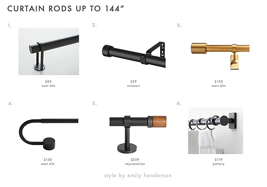
 Curtain Rods By Size
 photo by sara ligorria-tramp | from: ryann’s living and dining room MOTO reveal
1. Essential Black Curtain Rod: This is a really classic modern matte black option that is currently on sale for $80!
2. Curtain Rod: We love the clean line look of this one and reviewers say it is sturdy and easy to install.
3. Ball Finial Curtain Rod Set: A ball finial is classic and this comes in matte black and polished nickel too.
4. Boule Black Curtain Rod: This modern meets traditional curtain rod is really stunning.
5. Cole Curtain Rod: The ridged ball finial adds a lovely texture to this luxe glam rod (and also comes in black!).
6. 3/4″ Singles Curtain Rod Set with Round Finials: This is a great affordable option that comes in a range of finishes.

1. Standard Curtain Rod: Here is an affordable standard black rod that has great reviews.
2. Matte Black Ball Finial Curtain Rod: This traditional matte black with ball finials is super versatile.
3. 3/4″ French Rod: We love a French return style curtain rod and this one by Rejuvenation comes in three beautiful finishes.
4. Bridgette Curtain Rod: The circular plate detail on this one adds a cool, modern flair.
5. French Return Drapery Hardware Set: Caitlin cannot stop raving about this curtain rod that she bought for her living room windows. She says that it is really beautiful and super affordable for the quality.
6. Double Curtain Rod and Large Marble Round End Cap: A double rod is essential if you want to add a blackout curtain layer to your window treatment and the marble finial is so pretty.

1. Hidden Connection Room Darkening Curtain Rod: This cast iron French return style rod combines a rustic texture with a modern flair and comes in a variety of finishes.
2. Matte Black Blackout Curtain Rod: Jess had this one in her old living room and loved the way it looked.
3. French Curtain Rod – Project 62™: Here is an affordable modern curtain rod that is thin and sleek but can hold up to 25 pounds.
4. French Return Curtain Rod Matte Black: This is a really classic affordable option.
5. Dauntless Curtain Rod: This one is the lucky winner that replaced my aforementioned blanket over the window situation. I’m really glad this is the one I happened to snag at Target as it is really sturdy and looks high-end.
6. Bolt Matte Black Rod: If you are looking for an edgy, modern shape look no further.
1. Simple Curtain Rod: We love the wraparound bracket detail on this simple curtain rod.
2. Rustic Curtain Rod: Here is another affordable option that comes in a variety of lengths!
3. Oversized Adjustable Curtain Rod w/ Cylinder Finials: This is such a classic and elegant curtain rod that would look good in any room.
4. Swoop Blackout Curtain Rod – Dark Bronze: The curve on this one is really special.
5. Hillcrest Drapery Rod: The wood finial paired with the oil-rubbed bronze finish creates such a dynamic look.
6. Cg Matte Black Curtain Rod: To end our readymade options, we have this simple but sturdy curtain rod that comes in seven different finishes (and has a wraparound bracket that adds a special modern detail).
Some window sizes and shapes are too unique to be covered with readymade curtains, but luckily we know so many great companies that make incredible custom window treatments. Here are some of our favorites:

1. Wovn Home: In my living room, I have curtains and roman shades from Wovn Home and am still obsessed with them. The quality is top-notch and customizing on their site is so easy.
2. The Shade Store: The Shade Store does custom shades, blinds, and drapery and handles the installation.
3. Decorview: We’ve used Decorview for countless rooms and projects including the , , , Jess’ office/living room, and cannot say enough great things about their quality and service!
4. Etsy: Etsy has a ton of shops that provide custom window treatments and is a great place to go if you want to support small businesses.
5. Everhem: Everhem is a Los Angeles-based brand that offers custom drapery and roman shades. If you are nervous about measuring, they will connect you with someone to come take measurements for you.
6. Highland Forge: Highland Forge custom rods are hand finished and significantly stronger than readymade options. Their site is user-friendly and you can do everything online.
That is all for today, my friends. If you were looking for curtain rods I hope this post helped. See you tomorrow!
Opener Image Credit: Design by Dee Murphy | Styling by Velinda Hellen | Photo by Sara Ligorria-Tramp for The New Design Rules
The post Our Favorite Curtain Rods Organized By Size (+ Our Rules For Hanging Them) appeared first on Emily Henderson.
February 7, 2023
Show And Tell: The Case For The Really Pretty Electronic Piano (+ What We Think About It A Month In)
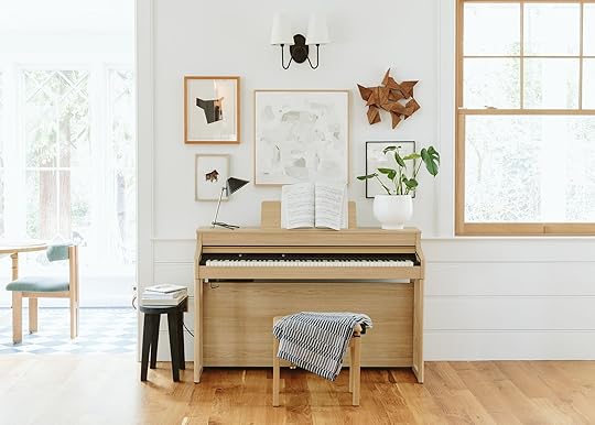
When we planned the layout of this house we made a specific space for my family’s heirloom piano – the one that multiple generations, including myself, learned on and I was excited to teach my kids (or have my mom teach our kids) on this same beautiful piece in our new home in Portland. It’s a 120-year-old player piano and one of the only heirlooms (besides portraits of ancestors) that I secretly hoped to inherit. It’s been in storage for a long time – at my brother’s house, in different wet garages of different siblings and it needed A LOT of work. But Brian and I really, really wanted it (it’s so pretty) and since no one else did (red flag) we nabbed it. The quote to fix it came to around $8k, but that was NOT including fixing the “player” part of it – just to make it operate as a normal piano. OOF. But it’s an heirloom! We said. It has so much meaning! We made sure that this spot could fit the piano in width and figured it was the perfect way to use this almost dead space as you walk in. Great. We spent another $400 to move it from my brother’s garage into one of our outbuildings (because they were moving) while we awaited the house to be done with construction. I told my parents the plan and they thought I was a bit nuts/naive – not exactly the emotional reaction I had predicted. They said, “It’s so broken, even if you fix it it’s going to have terrible sound – really echo-y and loud because the back of the piano is so cracked that it can’t ever be fixed”. Around that same time, I was at their house for family dinner, my kids banging on the piano in the background, me yelling at them to please stop (my nephew is incredible tbh) and I realized that the charming part of having your house filled with music is largely a fantasy, born out of my own nostalgia when the reality is a lot of less cute on the day to day basis. I was also reminded that I’m extremely extremely extremely sensitive to noises/music or anything that resembles audible chaos in our house (it’s a real thing amongst my friends and I’m often that person in a restaurant or yoga class who asks them to turn down the VERY loud music, which I secretly think everyone is grateful for). Like, I’ve been known to wear the silencing headphones that we bought Charlie for SXSW when he was 2 years old at parties when everyone gets to the shouty point in the night. So no, I don’t think I’m a candidate for a bad-sounding, extra loud echo-y piano in our very open and already echo-y home.
Around that time, but before my full realization, we also booked movers (not piano movers TBH) to move the piano from the garage into the living room. We had to build a ramp on the front in advance. They showed up, tried to move it, and said it was the heaviest piano they have ever moved and that they couldn’t do it. I was obviously very confused, but listen, one guy had a sprained ankle (which was sad on many levels) and I just had to accept that it wasn’t coming in. I told my mom and she said that it was indeed the heaviest piano ever and that she was seriously worried that it would damage our floors permanently if tried to bring it in or ever move it. It seems like all signs were pointing to us not having this heirloom that we were so excited about in our home. I think the loud bad sound was really the clencher for me.
So our options were A. buy a newer piano that had a more pleasant sound, but y’all I don’t love the look of most affordable new pianos and I wouldn’t have the sentimental attachment to it. It just felt like a “meh” decision. or B. buy an electronic piano for them to learn.
Over the holidays we were at our friend’s house who had this electronic piano and we fell in LOVE with it for many reasons that I’ll outline below – so when we got back I found the only one left in Portland, snagged it, and it was delivered 3 days later.

We bought a Roland electronic keyboard that is essentially housed in a wood piano-like frame. It’s about damn time. No weird stand. No light, janky keys. It feels like a real piano. The electronic keyboard industry has finally caught up with modern needs. Do you remember how most houses in the ’80s or ’90s had a piano? And now they don’t? It seemed more like a common childhood thing to take piano lessons back then, no? But real pianos are pretty cumbersome and a real thing to deal with (which is why they are free all over Craigslist and FB Marketplace). Listen, I hear all you piano purists (of which my family was as well) saying that there is nothing like the real thing and I totally agree with you. But sometimes the impracticality of it (sound + size + the constant tuning) makes it a harder purchase to make and we really really want to get our kids going on learning.
If you are like, “wait, you had such a beautiful mid-century piano in your old living room – just find another one like that?” I hear you. But the joke was on me because the sound on that piano was not good (famously bad actually, which is why they are so “rare,” and they stopped making them very quickly!!). So to get a great soft sounding piano you’d need to spend a lot of money or get something that looks generic which is fine, but kinda a bummer to me since it’s so prominent in our living room (full disclosure, I’m being a snob and I haven’t done more than a few hours of research).
Why Do You Like It So Much?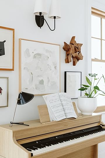
Let me count the ways why so far we LOVE it:
It sounds and feels like a real piano enough. Yes, the keys are weighted and it felt very very natural to play.You can control the volume – this is CLUTCH. I love it when our kids bang/play or practice (starting lessons next week). I also love this for me because I love to play but don’t want everyone in the house to hear my mistakes (which are painful to make when I used to be pretty darn good).You can plug in headphones – So if they DO want to use all the extra features (which admittedly can be annoying) they can do it with headphones so no one has to hear. You can even hook up two headphones so they can both hear.The kids love the extra “features” – This is basically where you play the keys and it sounds like drums, acapella singers, and even gun bullets (not a fan). These are annoying, but obviously very fun for the kids to play. Headphones are key. It’s not a “player” piano per se, but there are a lot of songs pre-loaded that you can hit play on. The keys don’t go up and down but it does sound really nice. Would a Spotify playlist sound as good? Maybe. But it’s a fun feature, regardless. You can record your own playing and playback, set tempo, and of course, change the type of piano sound (ballad versus concert piano, etc). I don’t really use those yet, but in the future will be fun to play with.You can see all the bells and whistles below (but they are super subtle and you can even bring the top over them so you can’t see them should you want to see the keys without the buttons).

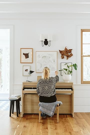
The biggest, yet not so shocking surprise here, is that I have enjoyed playing again SO MUCH. It definitely took a couple of hours to get my fingers less rusty and I’m certainly not saying I’m good, but it’s been really really lovely to play again. I’m of course embarrassed at how less good I am compared to when I was 18, but if you haven’t done something in 24 years you can’t expect to be good. So that’s why I love having the volume control or headphones so only I hear the painful easy mistakes I’m making as I re-learn how to play.

 Plus It’s Pretty And Simple… Design-Wise
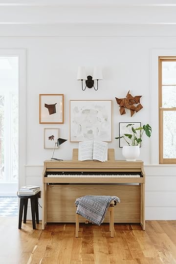
We’ve only had it for less than a month so I can’t talk about its longevity or anything like that. But what I can say is that it’s visually very simple and of nice quality, without being super heavy. I’m sure it’s a veneer, not solid white oak, but as you can see it is indeed handsome. I don’t LOVE the bench and will likely find something with more personality as I think that the bench cheapens the whole thing aesthetically. I think what really makes it is the wood back on it so you can’t see all the way through. Does it fool anyone at the beginning? Yes at first! But no, it’s not going to fool anyone who plays the piano. It is electronic, full stop.


We hired a hand model to show you how we can turn up and down the volume (lord those knuckles) so you can see the interface better. Also, the pedals (which you can see below) are great and feel just like a normal piano IMHO.

Price wise we bought ours for $2,599 which included delivery, set up, and box removal (no tax in Oregon). It’s not nothing but we felt like it was a great investment to get our kids going on lessons which is really the main goal. Am I sad to not have the heirloom? In theory yes, but honestly I’m so happy that we get so much more use out of this. I liken it to a wood fireplace versus a gas – one is better in so many ways, there is no denying that, but the latter is what you use and enjoy so much more often. It’s totally a personal preference, but our family thus far is so happy with it. And it’s so lightweight that you can easily put it in a bedroom or in a hallway – we can have total flexibility to put it upstairs and then if it doesn’t work, bring it back down whereas with a traditional piano, you can’t as easily.
I feel like there are a lot of examples of this conundrum – the real thing that is laborious and cumbersome but infinitely better in some ways, versus the “fake” version that is more convenient, less expensive, and doesn’t have the innate integrity of the original. But it’s my perspective that when the aesthetics, cost, and technology start to be pretty darn great, that’s when it’s ok to make the switch and prioritize use, function, and practicality over the real thing. We want our kids to learn piano and this is making that actually happen, with less stress, without spending close to $10k on refurbishing and having future flexibility. But don’t worry, we will be putting the heirloom in the older house on the property in the rec room when we are done with it (ha) – technically you can still play it and it’s so pretty so it will land somewhere, someday.
*Photos by Kaitlin Green
The post Show And Tell: The Case For The Really Pretty Electronic Piano (+ What We Think About It A Month In) appeared first on Emily Henderson.
February 6, 2023
How Megan Hopp Stretched Her Design Budget To TRANSFORM Her Three-Story Townhouse (You HAVE To See The Before & Afters)

I last left you with my tale of how I ended up buying this house in Alexandria VA, and what my plans were to turn this space around in a big way without a super big budget. Working on this new (old) house I had a lot of goals…
To fully finish the common spaces, kitchen, and bedrooms (bathrooms I would leave for another day).To turn these rooms around as quickly as possible! With a newborn baby and all the changes happening in life, now was not the time to dilly-dally.To use as much of the house “as is” without compromising my overall satisfaction with the design.To work with as many of my favorite vendors as possible on collaborations so as to represent the pieces and materials I love and use often in work. And to keep it real, help out with the overall budget.To round out furnishing and decorating the space with as many second-hand or outlet pieces as possible – if you’ve ever read or seen a drop about me, you know I am a second-hand, previously owned, thrifting gal about town. Not only was this element of working on my home ESSENTIAL to actually finishing the scope in budget, but it’s also just fundamentally who I am. I adore fancy furniture, but at this time in my life purchasing a fifteen thousand dollar sofa is not in the cards.With that-welcome to my home! I live in this three-bedroom, three-story brick townhouse with my husband and 18-month-old son. Join me as I take you through the house and design journey that unfolded as I built each room balancing style, budget, and practicality every step of the way!
The Entry/StairwellScope: Wallpaper, Retile Floor, New Lighting, Furniture & Decor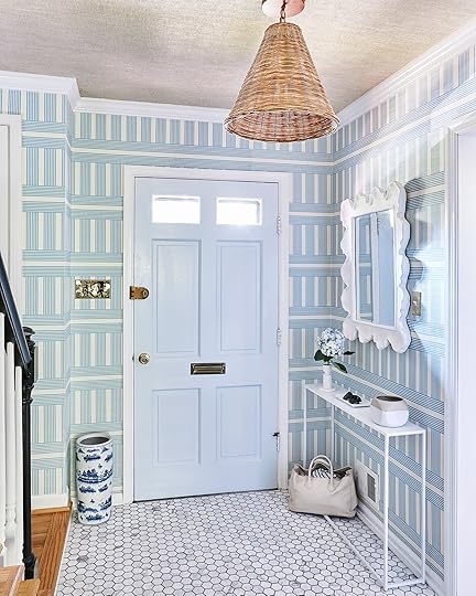
Wallpaper | Door Paint Color | Woven Pendant | Mirror | Marble Hex Tile


This space started off so dark, and nondescript with a black floor and door, and a teeny tiny light fixture. The goal here was clear, go big and go BRIGHT. Blue and white stripes are my go-to pattern/color combination and I knew I wanted one of the more dramatic prints used to be in the entry and stairwell as the first impression. I fell in LOVE with a print by Wallshoppe called Roman Holiday Grid (in grasscloth), and boy oh boy does it make a statement in the best way. The particular shade of blue strikes just the right tone, and the pattern proves super classic, with a tiny twist of vertical and horizontal lines, making it feel fresh and interesting. If you’ve ever encountered grasscloth, you know it completely elevates a room, changing the physical feel of the environment dramatically. After making my wallpaper selection, I knew I wanted to update my existing front door to a shiny blue, so I turned to Clare Paint (who makes paint shopping the absolute easiest), and selected the color Frozen. A big design mistake I see people make is matching colors too literally. I didn’t want an identical match in shade between the door and wallpaper, but rather to strike a complement of hues in the same universe to create a monochromatic harmony.
For the floor, I opted for a low price point classic Carrara 2” hex tile that I picked up myself at the local Floor and Decor for $13/sq ft. (now $15-inflation!). It’s not the tile of my dreams by any means, but the white marble added a much-needed light reflective surface, and the texture of the natural stone packs a punch design-wise higher than its actual cost. I used a dark gray grout to contrast the white in the tile and make it pop that much more, darker grout is also a more practical selection for a high-traffic area like an entry space. I am a big believer in big lighting, and so my personal rule is if you’re over 6’2”, you may need to duck. I don’t have high ceilings in this space, but opted for a rattan cone pendant that was just about as tall as I could manage to fit. What is an entry space without a superstar mirror right? I was lucky to partner with Shades of Light who have a great selection of mirrors, and for the entry I went with an ultra sculptural white textured option that holds its own as a real centerpiece. I rounded out the space with a slim simple console I’ve had for years prior from CB2.

 KitchenScope: Wallpaper, Moving Lighting/New Fixtures, Painting Cabinets, New Hardware, Custom Range Hood, Furniture & Decor
Taking a sharp left into the kitchen, this was a space where I really felt a challenge ahead of me. I myself am not super into modern kitchen design. My dream kitchen was probably built circa 1930, has original cabinets, tile countertops, a vintage stove, and quirky built-ins galore. I also like a kitchen that feels light, clean, and neutral, like the window is always open with a summer breeze blowing through…BUT I don’t want a boring white-on-white design. The kitchen was my greatest challenge budget-wise because I was going to be doing what I call “heavy decorating” (this is a term I would actually use to describe the nature of the work throughout the entire house), but I really wanted to make this space feel different. The kitchen had some modern updates (granite countertops, gray backsplash, and a stainless steel/glass hood) that felt really disjointed to me with the older features like the original cabinetry. I knew for better or worse we were keeping the counters and backsplash, so the task ahead was to adjust everything around them to make the entire space feel less…gray.

Cabinet Paint Color | Knobs | Tea Kettle | Sparkling Water Maker
The biggest splurge in here was a professional paint job on cabinets, which ran us about $5,000. Luxor Improvements (my go-to contractor in the DC area) did a wonderful job removing all the doors and hardware, sanding everything down (there were so many layers of paint on these cabinets they said each front took at least 20 min), and spraying the cabinets both off and on-site in Benjamin Moore’s French Canvas. I opted to keep the original brass hinges, but swapped in low price point knobs at less than $3 a piece. While there are certainly $30 knobs out there that I dream to have – blowing my budget on knobs was not the move in this time or place.

Onto the wallpaper, originally I would have told you I was committed to some sort of large-scale vintage floral in this space However, given my above sentiment on color pairings, with the counter and backsplash the right shades were crucial in this selection. When I saw Thibaut’s classic gingham print Saybrook Check, I immediately knew it was the perfect solution. The overlapping neutrals were the perfect color combination to tie in and warm up those gray counters, making them feel less stark, less modern, and more like a causal stone counter that’s just doing its thing. I also definitely had the ah-ha moment of “of course I should do a classic gingham…obviously”.

Another money-saving “hack” I came up with was to remove the glass arc from the existing hood, and build a custom decorative wood covering around it, so as to match and integrate with the cabinetry. This way I was able to keep the existing functionality of the hood as is, as opposed to starting from scratch, a huge win. Luxor was able to take some of my rough sketches and inspiration images and build something off the cuff on-site in a single day (I was so delighted, I kept saying your tagline should be “a hood in a day”).


I finalized the space by moving some lighting around and swapping in some classic schoolhouse-style fixtures, as well as replacing the window treatments with my all-star favorite bamboo roman shades that I have used for years. The furniture is all second-hand – the table is a vintage enamel top gem I scored on FB marketplace for $40 and the chairs from Goodwill for $10.
Living & Dining RoomScope: Wallpaper Walls & Ceiling, Eliminate Recessed Lighting, Add Flush Mount Lighting, Replace Chandelier, Furniture & Decor
Wall Wallpaper | Ceiling Wallpaper | Drapes | Sofa (Thrifted RH) | Coffee Table | Green Bowl | Side Tables | Brass Table Lamps (Similar) | Flush Mounts
Whether you know me or not, it takes nothing more than a quick glance at my work to gauge my passion and dedication to wallpaper. It’s the core of my design work and personal style, and it’s where I begin in crafting a space every single time. The living room is the center of the home, and therefore the center of a design, and as such this entire process began in selecting what wall treatments I would do in this room. I knew I wanted to paper both the walls and the ceilings, I knew I wanted blue and white on the walls, I had a hunch I wanted a block print of some sort…and so the search for the perfect print began. I ended up being lucky enough to partner with one of my tried and true favorite vendors, Thibuat, and they were generous enough to send me one million samples. While I like to review everything in the world, I am also the fastest decision-maker ever, so when I saw their Julian print it was “DING DING DING, selected and pressing on.” For the ceiling, I wanted to get something super textured up there to add an architectural quality and bring a real warmth to the room. I landed on a chunky woven grasscloth that ended up being one of the most special elements of the house.

Bench | Natural Rug | Top Rug (Vintage)


Planter | Chair (Thrifted Crate and Barrel) | Throw Blanket | Green Side Table (Thrifted and Painted ) | Decorative Box | Bar Cabinet

Chandelier | Dining Table (Vintage) | Captain Chairs (Old RH) | Side Dining Chairs | Mirror | Curio Cabinet (Vintage)
I always say that Alexandria reminds me of a mix of Charleston and Beacon Hill in Boston…which is a little like, “duh it’s geographically right in between”. Much like its place on the map, my goal with this design was to layer a mix of styles that struck that middle ground. I wanted the home to feel playful and color-forward without being a southern pastel Disneyland, as well as revolutionary chic, all while not ending up an uptight antique shop. As the furnishing theme continues, nearly every piece of furniture in the space was purchased second-hand, or from an outlet or thrift shop. The sofa is Restoration Hardware that I found on FB marketplace for one thousand bucks, the coffee table and bar cabinet I got at my local Crate & Barrel outlet at a super steep discount. The dining table is from Chairish and the Curio Cabinet I found at a Salvation Army for $250 (a nightmare to move but worth it). One thing I really splurged on in this design was lighting. There are light fixtures I have used in client spaces time and time again and kept in my heart for YEARS. This go around I finally got to implement some of these fixtures into my own space, the two brass Visual Comfort and Co Clark flush mounts being top of my list.

The last element to come together in this space were the window treatments (and when I say last I mean I hung them myself at 11 pm the night before we shot the room…and dropped a curtain rod on my eye sending me glasses to Mars). Real talk here…custom window treatments can cost you more than a car, they are just that expensive no matter how you slice it. I know this, I live this, and I just kept hemming and hawing over how to get substantial draperies into this room without spending ten thousand dollars, truly without spending one thousand dollars. Pepper Home to the rescue! These curtains were made to order so I could get the perfect length and style without having to alter some off the shelf panels myself. With their pinch pleat detailing, velvet border tape, and 100’ width per panel they transformed my living room in the most dramatic fashion!
Primary BedroomScope: Wallpaper, Built-in Removal, Replace Light Fixture, Furniture & Decor
Wallpaper | Bed | Quilt (Flax) | Fringe Pillows | Lumbar (No Longer Available) | Curtains

Desk | Chair | Chunky Knit Rug
The bedrooms required a lot less work than the common spaces and consisted mostly of wallcoverings, new lighting, furniture, and decor. In the primary bedroom, I ripped out an old built-in that spanned one side of the room. While built-ins can be such a luxury, this one wasn’t particularly practical or attractive. I could have spruced it up but it ultimately felt like a mistake to put any money into something that just wasn’t working from the start. Instead, I opted to eliminate it entirely creating a nook for the BIGGEST dresser I could fit. Casegoods are one category of furniture where cost and quality are directly correlated, but I obviously wasn’t going to shell out thousands for a new piece, so I took to the second-hand market. After a bit of a search, I came across a Restoration Hardware eleven-drawer piece on the second-hand site KAIYO, and was able to procure the dresser for a true fraction of the original retail price.

Mirror | Dresser (Thrifted) | Rug
Having come from NYC, you live a life where you never have enough drawers, and every time you open the ones you have, they are stuffed to the brim and the experience is miserable. This dresser is what suburban dreams are made of. I tend to lean towards lighter softer colors in a bedroom out of personal preference, but I didn’t want the room to feel sterile or even worse boring. I built the room around another Thibaut textured wallpaper in a sage green herringbone. The pattern and color are subtle enough to create a somewhat neutral base for the space but interesting enough to make a statement. If you are going to use textured paper anywhere in your home, prioritize the bedrooms. My favorite quality about a textured wallcovering is how it dampens the sound, creating an instant cozy factor.

Chair (Vintage) | Nightstand | Table Lamp
Another special find in this space was the silk striped armchair in the corner. I didn’t quite know what I was looking for with this piece but recognized the chair on FB marketplace as being from the home of another designer in the area whom I follow on Instagram. I immediately loved it and shot her a note to see if I could call dibs! The bed I wanted to keep bright, light, and neutral, and worked with Serena & Lily to dress it in all my favorite go-to linens and pillows. I’m not someone who subscribes to the “I’ll sleep when I’m dead” mentality. No time to waste, I’d prefer to do so now.
NurseryScope: Wallpaper Walls And Ceiling, Replace Light Fixture, Furniture & Decor
Wallpaper | Mirror | Dresser (Unavailable) | Rug (One of a Kind Kellogg) | Glider | Footstool (Vintage) | Roman Shades
The nursery was the first space I designed in this house, and to be honest, I really designed it well before we found the house, or even getting pregnant. After having worked on countless nurseries for clients, I slowly was building the nursery I would want in the back of my head over the years. Boy or girl, I knew I wanted neutral stripes and blue florals, and so that’s what I did. Serena and Lily worked with me on this space, and I was able to bring it to life with some of my favorite pieces from their line. Stripes are my number one pattern in the universe, and while I love color, I also like the flexibility a neutral pattern can offer while still adding fun visual interest. I also knew I wanted to run the stripes across the ceiling to create a circus tent atmosphere, which is always the physical place I really want to be.
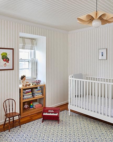


The wallpaper, crib, bedding, mirror, and baskets are all from Serena & Lily. The dresser I have had since my solo lady days back in my first Brooklyn apartment and was really thrilled to be able to repurpose it here. The rug was an excellent second-hand find (from say it with me, FB marketplace), a one of kind embroidered Kellogg rug.
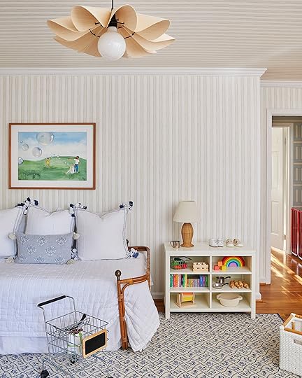
Daybed (Vintage) | Quilt | Square Pillow | Lumbar Pillow | White Bin | Shelf (unavailable)
The daybed frame I scored for $75 bucks with the seller claiming it was a vintage piece from a Parisian flea market – who knows but we’ll go with that story. My nature as a designer is to go all in on a colorway in a space, but in this room, the choice to lean more neutral was also very budget motivated. For starters, this child will age and the look of the space will need to grow and adapt with him, and financially speaking I will not be changing this wallpaper in 5 years.
There is also a potential we may do some room swapping/reconfiguring in the future and if the current nursery ever becomes the primary bedroom I wanted a base that would work in either scenario.

The one piece of furniture in my house that I TRULY splurged on is the glider. I bought it new and it arrived one week before I gave birth – I plan to sit in it every day until I die.
Guest RoomScope: Wallpaper, Carpet, Furniture & Decor
Wallpaper | Headboard | Bone Inlay Nightstand | Table Lamp | Lampshade (Vintage Laura Ashley) | Pedestal Side Table


Console | Mirror (Similar) | Shades | Rug (Vintage from Old New House Rugs) | Bench
I’ve obviously never had a guest room before and was really excited to create a cozy little space for family and friends to feel comfortable and welcome when they visit. In addition to my excitement about this space, it was also my last priority in terms of budget. As such, much of this room consists of repurposed pieces from previous homes and spaces. The only new piece of furniture in this room is the vintage cane seat side chair which I got at a Goodwill for $2.99, everything else I had previously. I love using furniture you’ve had one way forever in a new environment where it suddenly feels like it has a new lease on life, such a rush! The wallpaper was of course a new addition, also from Thibaut. I have a bit of an obsession with using red and blue in combination with one another, but I always feel a hesitancy in taking it too far with an end result that reads “patriotic lunatic”. This felt like a safe space to lean in on the red and blue while layering an eclectic combination of patterns and textures on top.
Den/OfficeScope: Wallpaper, Carpet, Paint Fireplace & Wall Paneling White, Replace Light Fixture, Replace Sliding Door With French Doors, Furniture & Decor
Wallpaper | Sofa | Loveseat | Side Chairs (Vintage) | Ottoman | Media Console | Pendant | Roman Shades | Drapes
Lastly, we come to our final destination on the tour, the hybrid den and office space, arguably the most transformed room in the house. Much of the house has very traditional finishes, crown moldings, etc. The lower level however was architecturally much simpler, and much more cookie-cutter as a starting point. My husband is a mid-century modern design lover and given that I didn’t really inject much of that anywhere else in the home, this felt like the moment to lean in. I wanted to do a fresh take on a classic mid-century wood-paneled basement, all while taking the original space from dark and heavy to light and airy.


Brown Velvet Pillow | Tiger Lumbar Pillow | Wall-to-Wall Carpet
The wallcovering in this space is the absolute star of the show, a geometric wood veneer covering from Thibaut that brought this room alive in the most electric way. This wallcovering was actually one of the first samples I ever ordered from Thibaut years ago, I kept it in a drawer just waiting for the right space to use it in-not knowing it would be my own! We ripped out the old carpet and covered the entire downstairs in a soft textured ivory wall-to-wall selection. It’s so nice to have at least one space in the house kids can roll around on and get cozy.
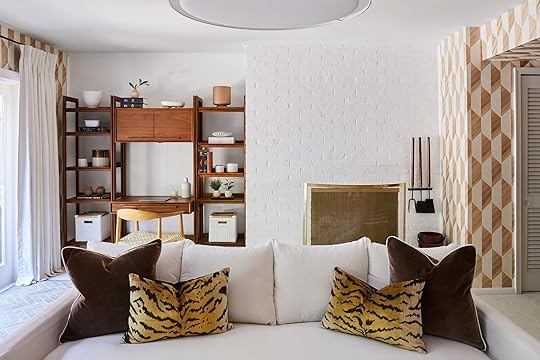
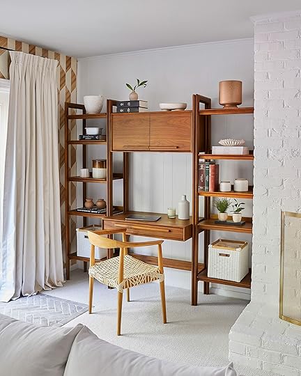
Desk | Bookcases | Chair | White Bins
Other updates included a fresh coat of white paint on the wall paneling and fireplace, updating the overhead lighting, replacing the old sliding door with a modern french door set, and new window treatments and furniture (the large ottoman from Shades of Light being my favorite piece to throw your toddler body on with zero risk). The room works out great as a workspace during the day that shifts into a place to relax on nights and weekends. While this is technically the least colorful room in the home, I’d hardly characterize it as neutral!
Until Next TimeIn hindsight, the timing of buying a house weeks after having a baby, and jumping into a full transformation soon after didn’t make for the most relaxing year – like anything worthwhile, the journey to get there is hard and taxing. I can say being on the other side of this project is really a sigh of relief to come home every day, and not think about what I need to do next in the space, but rather enjoy it. The moral of the story and what I hope to leave everyone with is to cut yourself a break when it comes to interior design. You aren’t crazy for wanting a picture-perfect space, everyone does, but nothing is as easy as it may seem or as one might say. I transform spaces for a living every day of my life, and even with the skill sets I have under my belt, the access to discounted product, and knowledge of how to stretch a budget as far as humanly possible…it’s a challenge. A challenge I enjoy more than anything and think about incessantly, but I never want to leave you with an unrealistic picture of what it takes. My best advice is to take your time (within reason of course – love a fast decision put into action!) and don’t let the pressure of the price tags defeat you altogether. Little by little the projects, progress, and great finds add up, and with each new improvement you’ll be on your way to that perfectly made space for you.
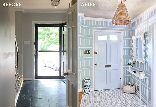


*Design by Megan Hopp
**Photos by Kelsey Ann Rose
The post How Megan Hopp Stretched Her Design Budget To TRANSFORM Her Three-Story Townhouse (You HAVE To See The Before & Afters) appeared first on Emily Henderson.
How Megan Hopp Stretched Her $25k Design Budget To TRANSFORM Her Three-Story Townhouse (You HAVE To See The Before & Afters)
I last left you with my tale of how I ended up buying this house in Alexandria VA, and what my plans were to turn this space around in a big way without a super big budget. Working on this new (old) house I had a lot of goals…
To fully finish the common spaces, kitchen, and bedrooms (bathrooms I would leave for another day).To turn these rooms around as quickly as possible! With a newborn baby and all the changes happening in life, now was not the time to dilly-dally.To use as much of the house “as is” without compromising my overall satisfaction with the design.To work with as many of my favorite vendors as possible on collaborations so as to represent the pieces and materials I love and use often in work. And to keep it real, help out with the overall budget.To round out furnishing and decorating the space with as many second-hand or outlet pieces as possible – if you’ve ever read or seen a drop about me, you know I am a second-hand, previously owned, thrifting gal about town. Not only was this element of working on my home ESSENTIAL to actually finishing the scope in budget, but it’s also just fundamentally who I am. I adore fancy furniture, but at this time in my life purchasing a fifteen thousand dollar sofa is not in the cards.With that-welcome to my home! I live in this three-bedroom, three-story brick townhouse with my husband and 18-month-old son. Join me as I take you through the house and design journey that unfolded as I built each room balancing style, budget, and practicality every step of the way!
The Entry/StairwellScope: Wallpaper, Retile Floor, New Lighting, Furniture & DecorWallpaper | Door Paint Color | Woven Pendant | Mirror | Marble Hex Tile
This space started off so dark, and nondescript with a black floor and door, and a teeny tiny light fixture. The goal here was clear, go big and go BRIGHT. Blue and white stripes are my go-to pattern/color combination and I knew I wanted one of the more dramatic prints used to be in the entry and stairwell as the first impression. I fell in LOVE with a print by Wallshoppe called Roman Holiday Grid (in grasscloth), and boy oh boy does it make a statement in the best way. The particular shade of blue strikes just the right tone, and the pattern proves super classic, with a tiny twist of vertical and horizontal lines, making it feel fresh and interesting. If you’ve ever encountered grasscloth, you know it completely elevates a room, changing the physical feel of the environment dramatically. After making my wallpaper selection, I knew I wanted to update my existing front door to a shiny blue, so I turned to Clare Paint (who makes paint shopping the absolute easiest), and selected the color Frozen. A big design mistake I see people make is matching colors too literally. I didn’t want an identical match in shade between the door and wallpaper, but rather to strike a complement of hues in the same universe to create a monochromatic harmony.
For the floor, I opted for a low price point classic Carrara 2” hex tile that I picked up myself at the local Floor and Decor for $13/sq ft. (now $15-inflation!). It’s not the tile of my dreams by any means, but the white marble added a much-needed light reflective surface, and the texture of the natural stone packs a punch design-wise higher than its actual cost. I used a dark gray grout to contrast the white in the tile and make it pop that much more, darker grout is also a more practical selection for a high-traffic area like an entry space. I am a big believer in big lighting, and so my personal rule is if you’re over 6’2”, you may need to duck. I don’t have high ceilings in this space, but opted for a rattan cone pendant that was just about as tall as I could manage to fit. What is an entry space without a superstar mirror right? I was lucky to partner with Shades of Light who have a great selection of mirrors, and for the entry I went with an ultra sculptural white textured option that holds its own as a real centerpiece. I rounded out the space with a slim simple console I’ve had for years prior from CB2.
KitchenScope: Wallpaper, Moving Lighting/New Fixtures, Painting Cabinets, New Hardware, Custom Range Hood, Furniture & DecorTaking a sharp left into the kitchen, this was a space where I really felt a challenge ahead of me. I myself am not super into modern kitchen design. My dream kitchen was probably built circa 1930, has original cabinets, tile countertops, a vintage stove, and quirky built-ins galore. I also like a kitchen that feels light, clean, and neutral, like the window is always open with a summer breeze blowing through…BUT I don’t want a boring white-on-white design. The kitchen was my greatest challenge budget-wise because I was going to be doing what I call “heavy decorating” (this is a term I would actually use to describe the nature of the work throughout the entire house), but I really wanted to make this space feel different. The kitchen had some modern updates (granite countertops, gray backsplash, and a stainless steel/glass hood) that felt really disjointed to me with the older features like the original cabinetry. I knew for better or worse we were keeping the counters and backsplash, so the task ahead was to adjust everything around them to make the entire space feel less…gray.
Cabinet Paint Color | Knobs | Tea Kettle | Sparkling Water Maker
The biggest splurge in here was a professional paint job on cabinets, which ran us about $5,000. Luxor Improvements (my go-to contractor in the DC area) did a wonderful job removing all the doors and hardware, sanding everything down (there were so many layers of paint on these cabinets they said each front took at least 20 min), and spraying the cabinets both off and on-site in Benjamin Moore’s French Canvas. I opted to keep the original brass hinges, but swapped in low price point knobs at less than $3 a piece. While there are certainly $30 knobs out there that I dream to have – blowing my budget on knobs was not the move in this time or place.
Onto the wallpaper, originally I would have told you I was committed to some sort of large-scale vintage floral in this space However, given my above sentiment on color pairings, with the counter and backsplash the right shades were crucial in this selection. When I saw Thibaut’s classic gingham print Saybrook Check, I immediately knew it was the perfect solution. The overlapping neutrals were the perfect color combination to tie in and warm up those gray counters, making them feel less stark, less modern, and more like a causal stone counter that’s just doing its thing. I also definitely had the ah-ha moment of “of course I should do a classic gingham…obviously”.
Another money-saving “hack” I came up with was to remove the glass arc from the existing hood, and build a custom decorative wood covering around it, so as to match and integrate with the cabinetry. This way I was able to keep the existing functionality of the hood as is, as opposed to starting from scratch, a huge win. Luxor was able to take some of my rough sketches and inspiration images and build something off the cuff on-site in a single day (I was so delighted, I kept saying your tagline should be “a hood in a day”).
I finalized the space by moving some lighting around and swapping in some classic schoolhouse-style fixtures, as well as replacing the window treatments with my all-star favorite bamboo roman shades that I have used for years. The furniture is all second-hand – the table is a vintage enamel top gem I scored on FB marketplace for $40 and the chairs from Goodwill for $10.
Living & Dining RoomScope: Wallpaper Walls & Ceiling, Eliminate Recessed Lighting, Add Flush Mount Lighting, Replace Chandelier, Furniture & DecorWall Wallpaper | Ceiling Wallpaper | Drapes | Sofa (Thrifted RH) | Coffee Table | Green Bowl | Side Tables | Brass Table Lamps (Similar) | Flush Mounts
Whether you know me or not, it takes nothing more than a quick glance at my work to gauge my passion and dedication to wallpaper. It’s the core of my design work and personal style, and it’s where I begin in crafting a space every single time. The living room is the center of the home, and therefore the center of a design, and as such this entire process began in selecting what wall treatments I would do in this room. I knew I wanted to paper both the walls and the ceilings, I knew I wanted blue and white on the walls, I had a hunch I wanted a block print of some sort…and so the search for the perfect print began. I ended up being lucky enough to partner with one of my tried and true favorite vendors, Thibuat, and they were generous enough to send me one million samples. While I like to review everything in the world, I am also the fastest decision-maker ever, so when I saw their Julian print it was “DING DING DING, selected and pressing on.” For the ceiling, I wanted to get something super textured up there to add an architectural quality and bring a real warmth to the room. I landed on a chunky woven grasscloth that ended up being one of the most special elements of the house.
Bench | Natural Rug | Top Rug (Vintage)
Planter | Chair (Thrifted Crate and Barrel) | Throw Blanket | Green Side Table (Thrifted and Painted ) | Decorative Box | Bar Cabinet
Chandelier | Dining Table (Vintage) | Captain Chairs (Old RH) | Side Dining Chairs | Mirror | Curio Cabinet (Vintage)
I always say that Alexandria reminds me of a mix of Charleston and Beacon Hill in Boston…which is a little like, “duh it’s geographically right in between”. Much like its place on the map, my goal with this design was to layer a mix of styles that struck that middle ground. I wanted the home to feel playful and color-forward without being a southern pastel Disneyland, as well as revolutionary chic, all while not ending up an uptight antique shop. As the furnishing theme continues, nearly every piece of furniture in the space was purchased second-hand, or from an outlet or thrift shop. The sofa is Restoration Hardware that I found on FB marketplace for one thousand bucks, the coffee table and bar cabinet I got at my local Crate & Barrel outlet at a super steep discount. The dining table is from Chairish and the Curio Cabinet I found at a Salvation Army for $250 (a nightmare to move but worth it). One thing I really splurged on in this design was lighting. There are light fixtures I have used in client spaces time and time again and kept in my heart for YEARS. This go around I finally got to implement some of these fixtures into my own space, the two brass Visual Comfort and Co Clark flush mounts being top of my list.
The last element to come together in this space were the window treatments (and when I say last I mean I hung them myself at 11 pm the night before we shot the room…and dropped a curtain rod on my eye sending me glasses to Mars). Real talk here…custom window treatments can cost you more than a car, they are just that expensive no matter how you slice it. I know this, I live this, and I just kept hemming and hawing over how to get substantial draperies into this room without spending ten thousand dollars, truly without spending one thousand dollars. Pepper Home to the rescue! These curtains were made to order so I could get the perfect length and style without having to alter some off the shelf panels myself. With their pinch pleat detailing, velvet border tape, and 100’ width per panel they transformed my living room in the most dramatic fashion!
Primary BedroomScope: Wallpaper, Built-in Removal, Replace Light Fixture, Furniture & DecorWallpaper | Bed | Quilt (Flax) | Fringe Pillows | Lumbar (No Longer Available) | Curtains
Desk | Chair | Chunky Knit Rug
The bedrooms required a lot less work than the common spaces and consisted mostly of wallcoverings, new lighting, furniture, and decor. In the primary bedroom, I ripped out an old built-in that spanned one side of the room. While built-ins can be such a luxury, this one wasn’t particularly practical or attractive. I could have spruced it up but it ultimately felt like a mistake to put any money into something that just wasn’t working from the start. Instead, I opted to eliminate it entirely creating a nook for the BIGGEST dresser I could fit. Casegoods are one category of furniture where cost and quality are directly correlated, but I obviously wasn’t going to shell out thousands for a new piece, so I took to the second-hand market. After a bit of a search, I came across a Restoration Hardware eleven-drawer piece on the second-hand site KAIYO, and was able to procure the dresser for a true fraction of the original retail price.
Mirror | Dresser (Thrifted) | Rug
Having come from NYC, you live a life where you never have enough drawers, and every time you open the ones you have, they are stuffed to the brim and the experience is miserable. This dresser is what suburban dreams are made of. I tend to lean towards lighter softer colors in a bedroom out of personal preference, but I didn’t want the room to feel sterile or even worse boring. I built the room around another Thibaut textured wallpaper in a sage green herringbone. The pattern and color are subtle enough to create a somewhat neutral base for the space but interesting enough to make a statement. If you are going to use textured paper anywhere in your home, prioritize the bedrooms. My favorite quality about a textured wallcovering is how it dampens the sound, creating an instant cozy factor.
Chair (Vintage) | Nightstand | Table Lamp
Another special find in this space was the silk striped armchair in the corner. I didn’t quite know what I was looking for with this piece but recognized the chair on FB marketplace as being from the home of another designer in the area whom I follow on Instagram. I immediately loved it and shot her a note to see if I could call dibs! The bed I wanted to keep bright, light, and neutral, and worked with Serena & Lily to dress it in all my favorite go-to linens and pillows. I’m not someone who subscribes to the “I’ll sleep when I’m dead” mentality. No time to waste, I’d prefer to do so now.
NurseryScope: Wallpaper Walls And Ceiling, Replace Light Fixture, Furniture & DecorWallpaper | Mirror | Dresser (Unavailable) | Rug (One of a Kind Kellogg) | Glider | Footstool (Vintage) | Roman Shades
The nursery was the first space I designed in this house, and to be honest, I really designed it well before we found the house, or even getting pregnant. After having worked on countless nurseries for clients, I slowly was building the nursery I would want in the back of my head over the years. Boy or girl, I knew I wanted neutral stripes and blue florals, and so that’s what I did. Serena and Lily worked with me on this space, and I was able to bring it to life with some of my favorite pieces from their line. Stripes are my number one pattern in the universe, and while I love color, I also like the flexibility a neutral pattern can offer while still adding fun visual interest. I also knew I wanted to run the stripes across the ceiling to create a circus tent atmosphere, which is always the physical place I really want to be.
The wallpaper, crib, bedding, mirror, and baskets are all from Serena & Lily. The dresser I have had since my solo lady days back in my first Brooklyn apartment and was really thrilled to be able to repurpose it here. The rug was an excellent second-hand find (from say it with me, FB marketplace), a one of kind embroidered Kellogg rug.
Daybed (Vintage) | Quilt | Square Pillow | Lumbar Pillow | White Bin | Shelf (unavailable)
The daybed frame I scored for $75 bucks with the seller claiming it was a vintage piece from a Parisian flea market – who knows but we’ll go with that story. My nature as a designer is to go all in on a colorway in a space, but in this room, the choice to lean more neutral was also very budget motivated. For starters, this child will age and the look of the space will need to grow and adapt with him, and financially speaking I will not be changing this wallpaper in 5 years.
There is also a potential we may do some room swapping/reconfiguring in the future and if the current nursery ever becomes the primary bedroom I wanted a base that would work in either scenario.
The one piece of furniture in my house that I TRULY splurged on is the glider. I bought it new and it arrived one week before I gave birth – I plan to sit in it every day until I die.
Guest RoomScope: Wallpaper, Carpet, Furniture & DecorWallpaper | Headboard | Bone Inlay Nightstand | Table Lamp | Lampshade (Vintage Laura Ashley) | Pedestal Side Table
Console | Mirror (Similar) | Shades | Rug (Vintage from Old New House Rugs) | Bench
I’ve obviously never had a guest room before and was really excited to create a cozy little space for family and friends to feel comfortable and welcome when they visit. In addition to my excitement about this space, it was also my last priority in terms of budget. As such, much of this room consists of repurposed pieces from previous homes and spaces. The only new piece of furniture in this room is the vintage cane seat side chair which I got at a Goodwill for $2.99, everything else I had previously. I love using furniture you’ve had one way forever in a new environment where it suddenly feels like it has a new lease on life, such a rush! The wallpaper was of course a new addition, also from Thibaut. I have a bit of an obsession with using red and blue in combination with one another, but I always feel a hesitancy in taking it too far with an end result that reads “patriotic lunatic”. This felt like a safe space to lean in on the red and blue while layering an eclectic combination of patterns and textures on top.
Den/OfficeScope: Wallpaper, Carpet, Paint Fireplace & Wall Paneling White, Replace Light Fixture, Replace Sliding Door With French Doors, Furniture & DecorWallpaper | Sofa | Loveseat | Side Chairs (Vintage) | Ottoman | Media Console | Pendant | Roman Shades | Drapes
Lastly, we come to our final destination on the tour, the hybrid den and office space, arguably the most transformed room in the house. Much of the house has very traditional finishes, crown moldings, etc. The lower level however was architecturally much simpler, and much more cookie-cutter as a starting point. My husband is a mid-century modern design lover and given that I didn’t really inject much of that anywhere else in the home, this felt like the moment to lean in. I wanted to do a fresh take on a classic mid-century wood-paneled basement, all while taking the original space from dark and heavy to light and airy.
Brown Velvet Pillow | Tiger Lumbar Pillow | Wall-to-Wall Carpet
The wallcovering in this space is the absolute star of the show, a geometric wood veneer covering from Thibaut that brought this room alive in the most electric way. This wallcovering was actually one of the first samples I ever ordered from Thibaut years ago, I kept it in a drawer just waiting for the right space to use it in-not knowing it would be my own! We ripped out the old carpet and covered the entire downstairs in a soft textured ivory wall-to-wall selection. It’s so nice to have at least one space in the house kids can roll around on and get cozy.
Desk | Bookcases | Chair | White Bins
Other updates included a fresh coat of white paint on the wall paneling and fireplace, updating the overhead lighting, replacing the old sliding door with a modern french door set, and new window treatments and furniture (the large ottoman from Shades of Light being my favorite piece to throw your toddler body on with zero risk). The room works out great as a workspace during the day that shifts into a place to relax on nights and weekends. While this is technically the least colorful room in the home, I’d hardly characterize it as neutral!
Until Next TimeIn hindsight, the timing of buying a house weeks after having a baby, and jumping into a full transformation soon after didn’t make for the most relaxing year – like anything worthwhile, the journey to get there is hard and taxing. I can say being on the other side of this project is really a sigh of relief to come home every day, and not think about what I need to do next in the space, but rather enjoy it. The moral of the story and what I hope to leave everyone with is to cut yourself a break when it comes to interior design. You aren’t crazy for wanting a picture-perfect space, everyone does, but nothing is as easy as it may seem or as one might say. I transform spaces for a living every day of my life, and even with the skill sets I have under my belt, the access to discounted product, and knowledge of how to stretch a budget as far as humanly possible…it’s a challenge. A challenge I enjoy more than anything and think about incessantly, but I never want to leave you with an unrealistic picture of what it takes. My best advice is to take your time (within reason of course – love a fast decision put into action!) and don’t let the pressure of the price tags defeat you altogether. Little by little the projects, progress, and great finds add up, and with each new improvement you’ll be on your way to that perfectly made space for you.
*Design by Megan Hopp
**Photos by Kelsey Ann Rose
The post How Megan Hopp Stretched Her $25k Design Budget To TRANSFORM Her Three-Story Townhouse (You HAVE To See The Before & Afters) appeared first on Emily Henderson.
February 5, 2023
The Link Up: The Stretchy Shoelaces Brian And His Friends Are Freaking Out Over, Caitlin’s WARM Sweatpants, And Our Favorite New Cooking Show

Happy Sunday everyone! The gang was back together up in Portland where we finally got to see in Farmhouse IRL! It was incredible…as expected. Also, more reveal shoots happened this past week so get ready for those:) Until then here are our links…
This week’s home tour is a wild adventure! If you follow Architectural Digest you probably guessed we are talking about Lily Allen and David Harbour’s Brooklyn brownstone. It’s full of unexpected choices, like carpet in the bathroom (WHAT?), but it’s impossible to not be taken with all the choices they and their designer Billy Cotton made. Also, we were all talking about how opposite this home is to David’s loft tour in 2019. Really fun to see the differences. So please go check it out and you HAVE TO watch the video.
From Emily: A shoe hack that solved Brian’s lacing woes:) We should be embarrassed that this produces so much joy in our house, but you know how I feel about laces (not into them) and yet I like boots and so does Brian. While lacing up his new redwings a few months ago he was annoyed with the amount of effort it took (this is from the guy who does 8 rounds of boxing and runs the dogs every day – he’s not lazy, but this is specifically annoying to him). So Brian found these stretchy laces and he’s never going back. He tells all his friends and they all freak out, too. They look like normal laces, but you can pull them open to slip on the shoe instead of lacing up, tying, knotting, untying, loosening, etc. I’ll show you it on stories because you have to see it to understand how good it looks while being so much easier.
From Caitlin: My mom got me these sherpa fleece-lined sweatpants for Christmas and OH MY GOSH, they are INCREDIBLE. I run super cold and these are heavy-duty toasty – like, even a little bulky if I’m being honest – but they’re so soft and comfortable and warm. I accidentally left them in Delaware when I flew back to LA and had to ask my mom to ship them (thanks Brenda!) because I didn’t want to wait til my next trip home to wear them again – they’re THAT GOOD. If you’re also falling prey to insaaaaaane gas bills in CA (or if you’re just cold because, like, it’s February), I cannot recommend them enough. You know how it feels when you first shave your legs after a while and then all fabrics feel really soft for a little while? That’s how these sweatpants feel ALL THE TIME. They’re on sale right now so GO GO GO and grab a pair if you also are a little popsicle person!
From Ryann: If you are into cooking competition shows, this is for you. Pressure Cooker is a new cooking show on Netflix where 11 chefs have to live under one roof AND compete against each other in various cooking challenges AND vote each other off. Alliances are made and broken, a little bit of manipulation is inevitable, and they make really good-looking food that makes me hungry. It’s like Survivor meets Top Chef. My husband and I love it and hope it is picked up for another season!
From Mallory: If you know me at all you know I am obsessed with Nespresso, so please know I’m not cheating on Nespresso but kinda. I needed a switch up in my coffee game (I go back and forth between Nespresso “espresso” and wanting a real, traditional kind of cup of coffee. I was gifted this cute coffee maker a while ago and I can successfully say this was just the shake-up I needed (I use a blend of Philz coffee grinds – half dancing water, half hazelnut coffee – and it’s DELICIOUS). It’s a tiny little guy so it’s perfect for someone that lives in a small space like an apartment or a dorm, OR it would just be great if there’s only one person using it (I do not advise using this to fill 12 people’s coffee mugs in the morning – you’ll get max 2 cups outta it) but it’s super retro and adorable. If you’re in the market or know someone who would like it (it would make a great gift) I highly recommend it. I got it in the green color and it makes me really happy:)
From Jess: Visiting friends is the best way to find out about their favorite new products! So when I was in NY last weekend, my best friend and her roommate (also my friend:)) told me about this new buffing soap bar from the brand Soft Services. They say it makes your skin feel incredible and butter soft. If you go on their site there are a ton of other benefits. So while I know you don’t know my friends, I take their recommendations very seriously and so should you. I can’t wait to try it!
Have a nice rest of your day and see you tomorrow. xx
Opening Image Credits: Design by Jess Bunge | Styled by Emily Bowser | Photo by Sara Ligorria-Tramp | From: The Feel-Good Modern Romantic Bedroom Makeover Jess Did For Her Dear Friend (All Thanks To The Company Store)
The post The Link Up: The Stretchy Shoelaces Brian And His Friends Are Freaking Out Over, Caitlin’s WARM Sweatpants, And Our Favorite New Cooking Show appeared first on Emily Henderson.
February 4, 2023
My Latest Vintage Haul Including More Pictures Of Dead Strangers And A Show-And-Tell Of Our New Dining Chairs (Not Vintage) That Bring Me Joy All Day Every Day…

Oh, she’s been shopping and now I’m getting closer and closer to shooting a couple of the rooms I have a real list of stuff that I “need”. These things do NOT include another vintage lamp, but as you can see it’s been found. My MIL came into town while Brian was OOT and I couldn’t just let her sit in the house while I was writing all week. So I reserved two days for us to shop for the stuff I “needed” (including some rugs and plants/pots, not just vintage shopping) however we did make it to a few of my favorite stores in town…so I’ve got a haul for you.
Our New Dining Chairs
Y’all, dining chairs and sofas – these are the two things I struggle with the most because I REALLY want them to be comfortable but they are such an investment and hold such importance in their respective rooms, so to have them be boring or basic is painful for me (which is why I still haven’t decided on a sofa for our living room and frankly am not even close). So when I saw these chairs debut in Athena Calderone’s collection for Crate and Barrel I sucked my breath in quickly and said to myself in a quiet, creepy voice, “These are them. These are it. We’ve found them”. The vintage Cherner chairs we had in here were too rickety for Brian or most people to enjoy sitting on. Finding eight vintage chairs that I loved was proving to be impossible (believe me, I was looking every day). I was looking for something that checked more boxes – comfortable, durable, solid yet modern + worked well with the tile, windows, and the table. I wanted something with a curve since there are so many squares in there but I didn’t want eight curvy armchairs because that could feel busy fun fact, a lot of people don’t like to feel confined in armchairs. I wanted the curve to be more subtle than say the wishbone chair. As you can see, these are PERFECT. The green velvet is subtle and yet happy (and the room is surrounded by trees so green is naturally a part of the room’s color palette). And they aren’t busy or complicated for your eye – they contrast so perfectly with the busyness of the floor. Now the only thing we are waiting on is a credenza for the back of this room that I’m shopping daily for (I need it to be under 20″ deep and between 72 – 84″ wide in ideally a deeper wood tone than the table and chairs, but I’m open).
More Vintage/Antique Portraits Of Strangers
A lot of people are confused by my love of these portraits which I fully understand. My kids say they are creepy which surprised me because I kinda felt like the creepy factor was more from long-term societal conditioning – like we shouldn’t like these things because they are associated with death, etc. When I try to even explain it to myself, I think it has a lot to do with my love of history and my deep curiosity about how people used to live. All these people had full lives and yet they didn’t have phones to capture any of it – except these rare portraits of themselves (some oil paintings, some early photography). Not that it matters, but like, who were they???? These pieces must have been really cherished by them and their ancestors, so to find them at a random antique mall makes me want to take them home and give them back the importance that they once held. I’m not trying to make myself sound cooler or smarter than I am, but I got my degree in history, specifically American History (and comp lit if you are tracking) and I like to stare at them and wonder what they were like and why they were deemed “important” enough to paint or photograph.
I do want to call out the excellent framing on all of those and the pretty shape of the mat on the lady frame (and yes, I’m specifically looking for more ladies for the wall – let’s just say the world of historical portraits isn’t exactly diverse, to no one’s surprise).

Take these two, for instance. They were fancy! “Important”!? American royalty maybe!?? And yet I found them on the floor leaning against other empty frames. Also, everyone looked 50 when they were 20. The clothes. The colors. They are more like flat sculptures than paintings to me. Just so intricate and expressive, even when they themselves are not.
Wait, So What Are You Going To Do With All Of These Portraits Of Dead Strangers?Well. Witchcraft. Voodoo. Stick googly eyes on their eyes during Halloween. Talk to them on the weeks when I don’t leave my house. Listen, since my children and most of our guests don’t necessarily support this “hobby” of mine, I am planning on putting them all together, gallery-wall style in a room and on a wall that isn’t seen very easily by the rest of the house. Brian actually loves them (“love” might be strong, “thinks they are funny” is more accurate). I have a plan and I’m now waiting on some portraits of my actual ancestors to hang and fill it out. My MIL and my mom have both seen my collection and said, “Oh, we have a lot of those in the garage” and I’m like, “WAIT. WHAT. WHY HAVE YOU BEEN HOLDING OUT ON ME??” So there is a chance that some of these won’t even make it because I do want to include real blood ancestors should I get my hands on them. Then is it creepy? NO, right? I don’t get it. I get zero creepy vibes from these strangers and find comfort in them. It also might be a Mormon thing – we are raised very into genealogy (I’ve never asked why but I think people like tracing their lineage back to the great flood to see which tribe they came from, which indeed is fascinating). I will conclude this monologue and say that I’m also very picky about what portraits I love and buy – the ones I collect are all by very talented artists or framed perfectly. The two above that Brian and I are holding are actually not my favorites (their frames are a big ornate/garish and yet kinda cheap, but they were so affordable that I couldn’t pass them up). But some of the other ones are so beautifully done…Have I convinced you yet???
More Moody Landscapes For Our Family Room Wall
We are repainting the media/family room in a couple of weeks (to Stillwater by Sherwin-Williams) and these greeny blue and gold paintings are looking SO BEAUTIFUL against the paint swatch. So I’m leaning in hard and collecting like a real hoarder. The forest painting isn’t a moody night moonrise painting (that’s the specific genre I’m collecting) but it was so pretty and so “Oregon,” by a signed artist from Salem. I need to remind myself that I don’t actually need to collect things that remind me of “Oregon” anymore as I actually live here now, but I’ve been vintage shopping long enough to know that when something grabs me, specifically a piece of art, I will find the right place for it.
 The Captain Found His Ship/Frame!
You probably remember this guy from the basement of our LA house, but he didn’t have a frame and you can’t smoke a proper pipe without a proper frame. So while I was shopping I brought him around and found this guy for $10. I feel like with the gold frame he might make it up on the seascape wall – he’s the captain of the sea!
A Random Abstract
Again, I am just collecting cool art when I find it. I loved the color palette here – the neutrals with the blue and gold frame. It was more than I should have paid (I think over $80).
My First Popscicle Lamp
I’ve been looking for a folk art popsicle lamp for years if you can believe that. They are normally around $1k each on 1stDibs, but you can find them randomly for far less. They are “folk art” and many call them “tramp art” which I need to learn more about, but essentially they are popsicle sticks expertly glued together to create these intricate patterns and sculptures. As you can imagine my kids were like, “I can make that” and I was like, “oh yeah? here you go” and gave them a bunch of popsicle sticks. They did NOT make me a $1k lamp. Now I didn’t find this on my own, I had texted Annie who runs WILMA, and gave her a few things to look out for – a popsicle lamp being one of them. And a few months later she texted from a thrift store saying she found this for $160 and if should she snag it for me. YES, SHE SHOULD. So yay. Baby’s first popsicle lamp.
Ball And Stick Magazine Holder/Plant Stand
You also may or may not have read past posts where I declared my love of Victorian ball and stick decor or furniture. Does it really work in this house? Questionable. But when I found this in a really pretty wood tone I snagged it. I think there is something so playful and graphic about this type of furniture – the round ball, the thin “stripe” of wood. I just need to find a place for it…
 A Pretty Antique Desk
This genius over here didn’t put doors on her “office,” so around 2:30 pm or 3:30 pm when the kids come in the house it’s hard to take any calls. I think I’m going to build some interior windows and a door into the sunroom (keep the light, but allow for some sound privacy) but for now I’m going to put this desk in our bedroom for afternoon Zoom calls. This desk is really simple and pretty, has such a lovely tone, and was only $100 which I thought was a really good price.
There you go. My latest vintage haul with a lot of over-explanation around each piece. My goal is to make every room as photogenic as this one (which might be impossible, honestly) and someday you’ll look out and see greenery instead of dirt through the windows (coming soon this spring!). Thanks for reading, friends. xx
*Photos by Kaitlin Gree n
The post My Latest Vintage Haul Including More Pictures Of Dead Strangers And A Show-And-Tell Of Our New Dining Chairs (Not Vintage) That Bring Me Joy All Day Every Day… appeared first on Emily Henderson.
February 3, 2023
Emily Tested 3 “Self-Heating” Mugs At 3 Different Price Points And Here Is Her Honest Review Of Each One
When I first heard about this $120 robot mug I was like, “what has the tech world invented now?” I pictured a bunch of dudes in Silicon Valley sitting around, trying to find a problem to solve with a new product to sell us. But then I realized how many times I go to the microwave to heat up my coffee when it goes cold. AH. That’s why. But I still couldn’t believe it was that expensive and I thought surely there was a more affordable version on the market. So before Christmas I bought all three (with the intent to review them in December, thus the holiday styling) and then regift them for Christmas gifts. None of which happened because, LIFE, but heck maybe it’s a better time now as people are hunkered down in the cold and wanting their life-blood/coffee to stay hotter longer. So I bought three at three different price points and after weeks of trying them out here is my review:
Wait, What Exactly Is An Electronic Mug?
Well. These bad boys sit on their little pad, which heats them up (through different methods) and the idea is that they stay hot for hours, tasting fresh and not disgusting. In theory I’m into this, but I’m also skeptical that this is something we NEED and doesn’t in fact just create more “stuff”. We drink a decent amount of coffee in the mornings – usually a cup while I walk the pups then I sip on another cup for a couple of house (thus the reheating). So technically I am a great candidate for this mug, but I’m also easily annoyed by technical difficulties so I avoid unnecessary tech at all times. So we need to explore the pros and cons and ensure that the pros outweigh the cons
Mug #1: Ember Mug² Temperature Control Smart Mug
Ember Mug² Temperature Control Smart Mug
This is the most famous and expensive of them all. The Ember was first to market (or first to social media) and runs $130. That’s a lot for a mug, so he better heat your coffee and change the oil in your tires or at least our AC filters twice a year. This is what it says:
“Enjoy hot drinks longer with an innovative mug that stays at your preferred temperature for up to 1.5 hours or all day on the charging coaster. Pair the smart mug to the Ember app on your smartphone to set the temperature, customize presets for your favorite drinks, receive notifications when your desired temperature is reached, personalize your mug and more. Advanced technology intelligently turns the mug on and off and keeps every sip the same temperature from top to bottom.”
This cracks me up. While it’s my preferred mug of the three because of portability, no bros, we don’t need to set different temperatures for different drinks via an app and I certainly don’t want more push notifications on my phone.
Pros: The biggest pro with this one is that it can be cordless (for an hour and a half) while the other two have to remain plugged in and on charging coasters. For me, this becomes the instant deal breaker and preference as I don’t sit at a desk against a wall and their cords aren’t long. I would be knocking over my mug every time I got up, or if the pups came over to say hi. Having this one cordless made it essentially the only one that I can use. Now if you have a desk against a wall or with an outlet directly underneath it you have options. I also like that the mug nestles into the charging coaster (not just sitting on it) as it feels more secure and you know if/when it’s plugged in right. It holds a decent amount of coffee (seems around 6 ounces) and the handle is comfortable.
When I remember to charge it and I’m sitting in one spot (I like to move around). It’s pretty darn wonderful to have hot fresh coffee for hours to sip slowly. I would prefer for the temperature to be controlled on the device itself (sometimes I’ll look at the app and it’s turned down for some reason and I like my coffee really hot). Per usual, the frustrations with tech are often not worth the “convenience” they provide. I’m really selling this thing aren’t I?


Cons: I don’t want an app for everything. I love a good old-fashioned on-and-off button. I know I’m not alone, but boy the tech industry wants us to have every device controlled by our phone (unsure if this is mostly to track behaviors). Sure, on the app you can control the temperature and know the amount of charge you have but again, I’d rather that be just on the pad.
OVERALL CON: This is for all of them – they need to be charged nightly and they don’t seem to hold their charge for hours. Now that’s fine, we can’t have everything in life but that means it’s another device you have to remember to charge at night or it’s useless. When I first started using it, it kept running out and then getting cold. But then you can’t microwave the mugs (or put them in the dishwasher) so you have to transfer to a microwaveable mug to heat up your tepid coffee that you spent $120 buying a mug for. I just couldn’t believe that it didn’t hold the charge for longer, that’s all. But I’m not an inventor so maybe this is really hard?
Mug #2: OHOM Ui Mug & Warmer Set
This one is electromagnetic (maybe they all are) so it’s not hot to the touch and keeps coffee hot for a pretty long time. I didn’t test it for more than 2 hours, but for those 2 hours, it was indeed hot.

Pros: This is dishwasher safe (not all of them are) and it also charges your iPhone (this is a lovely addition). It’s also a nice color and design. It’s also more affordable than the Ember, coming in at $88 (check their site for the second-run versions that are functional but have imperfections on the outside. You get 2 for 44$ random colors chosen).
Cons: Needs to remain plugged in to heat. The mug itself keeps the coffee hot for 10 or so minutes (in my experience) without being on the charging coaster, but typically it needs to sit on it to remain really hot. It also says “self-heating” but that feels misleading to me because you aren’t meant to put in cold coffee to make it hot (I don’t think) so it’s more about retaining heat and maybe making it slightly hotter. This one also has a strainer you can buy separately so you can do a pour over coffee or tea straight into the mug. From my experience to keep it super hot you have to put the ceramic lid on it, which is another task for me to do. If you don’t it does cool down a bit. Again, I like really hot coffee so it kinda defeats the purpose (Ember stayed hotter).
 Mug #3: Amazon BestSeller – Apexx Induction Mug
This Apexx Induction Mug one was an Amazon bestseller during the holidays, likely because it comes in at $32 – a huge drop in price from the other two. It looks nice for sure but I found that it was hard to get it to charge (which it needs to in order to stay hot) and was frustrated easily by it. When it did work, it would stay hot for 20 minutes or so but you’d have to put the ceramic lid on it.

Pros: Affordable and looks nice. The packaging was strangely high-end if you are into that sort of thing. Charges phone or earbuds on the coaster as well. No app needed.
Cons: Mine was glitchy, you have to keep it plugged in, use the ceramic lid, and even so it didn’t keep it scalding hot – just warmer than if you didn’t have the coaster. But if someone likes warm coffee for longer, I suppose it does that job (just not super hot).
And The Best Self-Warming Mug Goes To…
All in all, I’m sorry and not terribly surprised to admit that the expensive Ember Mug does this particular job the best. It stays hotter for longer without the need for the ceramic lid, can be cordless so less of a risk to knock over, and you can move around the house. I just recently read that you don’t have to download the app and that it will default at 135 degrees (which is very hot and hotter than the other two) and there is a dial on the bottom that I didn’t realize. It’s splurgy though. For my life, I only really sit one day a week when I write, so it’s not enough of a value add for my life (especially because there are more parts to keep track of). I’d rather just use a to-go thermos or microwave my mug. However, if you sit at a desk for many hours in the morning, one near a wall or have an outlet on your desk, I will say this is a solidly good purchase or gift. But it’s not for the casual morning drinker or someone who drinks coffee at the dining table. The convenience of all of these becomes inconvenient when you have to remember to plug it in and keep it charged, so IMHO you have to give it a designated desk and outlet and use it daily to make it worth it.
*Photos by Kaitlin Green
The post Emily Tested 3 “Self-Heating” Mugs At 3 Different Price Points And Here Is Her Honest Review Of Each One appeared first on Emily Henderson.
Emily Henderson's Blog

- Emily Henderson's profile
- 10 followers

