
Emily Henderson's Blog, page 89
May 26, 2023
60+ Of The Best Memorial Day Sales (+ Design-Editor Approved Picks In Furniture, Decor, Fashion, And More)
HI, FOLKS. Welcome to our biggest sale roundup of 2023! Let’s get one thing straight – the world has gotten pretty pricey lately, so I’ve been working behind the scenes to bring you an in-depth guide to the best, most relevant Memorial Day Weekend sales. If you’re looking to refresh your home, update your outdoor setup, or add a new dress that makes you feel great to your daily outfit rotation, YOU’VE COME TO THE RIGHT PLACE.
This is the weekend you’ll be seeing the biggest and best deals of the summer, and we’ve curated a bit of everything for you below – our selections run the gamut from appliances and sofas to skirts and sunscreen. Dive into our furniture & decor section below, or click right here to jump straight into our fashion & beauty picks. (And, as always, feel free to drop your own sale details in the comments if you’re a small business owner.) Happy saving!
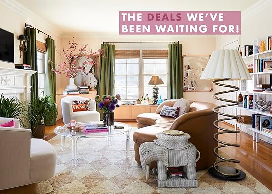
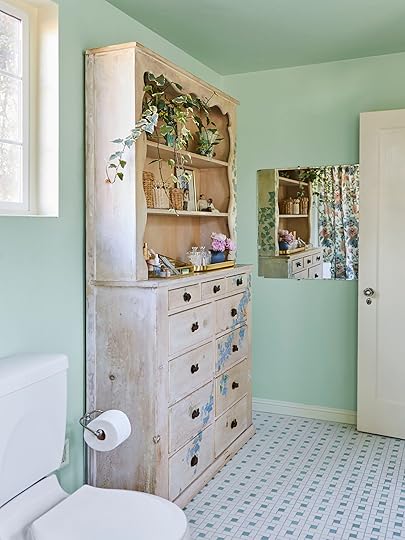
Furniture & Decor design by orlando soria | photo by sara ligorria-tramp | from: dreams do come true! the londo lodge is now a vacation rentalAllModern
Sale: Up to 60% off select items, plus an extra 20% off with code GET20.
Best Deals: Cheery Clean-Lined Sofa | Airy Leather and Wood Recliner | Scandi Beech Nightstands
Sale: 20% off site-wide with code SAILBOAT.
Best Deals: Diamond Jute Rug | French Blue Herringbone Indoor/Outdoor Rug | Leopard Wool Rug
Sale: Up to 40% off furniture, decor, gifts, and more.
Best Deals: Capri Blue Candle | Charming Scalloped Bathmat | Under-$90 Rattan Chair
Note: You can see 45 more of our favorite pieces from this sale right here.
Sale: 20% off site-wide; 25% off orders over $3,999; 30% off orders over $5,499; 35% off orders over $6,499.
Best Deals: Modern-Meets-Traditional Sofa | Contemporary Sleeper Sectional | Neutral Loveseat with Storage
Sale: Up to 30% off furniture, decor, and more.
Best Deals: Outdoor Sectional | Graphic Floor Mirror | Our Favorite Sheepskin
Note: If you’re on the hunt for some inspiration, check out these ready-to-ship room combinations designed exclusively with Article pieces!
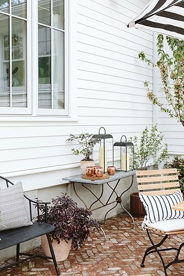
 design by emily henderson | photo by kaitlin green | from: our back patio reveal! (+ how everything’s held up to 6 months of portland weather)Ballard Designs
Sale: 20% off site-wide, plus free shipping.
Best Deals: Charming Outdoor Dining Table | Standing Planters | Brass Picture Rail System
Note: To see some Ballard furniture in action, check out Em’s newly-revealed patio.
Sale: 20% off site-wide with code SUMMER20, plus free shipping on all orders over $150.
Best Deals: Eco-Friendly Faux Florals | Charcoal Wood Chain | Leather-Wrapped Vase
Sale: An extra 20% off bedding bundles with code SUMMERDREAM.
Best Deals: Plush Bath Sheet Bundle | Signature Embellished Started Bundle | Linen Starter Bundle
Sale: 20% off site-wide.
Best Deals: Hardcore Bedding Bundles | Super Plush Robes | Emily’s Favorite Comforter
Sale: Up to 50% off furniture, outdoor, decor and more.
Best Deals: Half-Priced Lawson-Fenning Console Table | Punchy Wool Throw Blanket | French Industrial-Inspired Office Chair
 design and photo by tessa neustadt | from: 1 bedroom 4 ways with the citizenryThe Citizenry
Sale: Up to 30% off site-wide.
Best Deals: Round Leather Ottomans | Earthy XL Lumbar Pillow | Handcrafted Japanese Bench
Sale: 30% off site-wide.
Best Deals: Chic Rolling Laundry Cart | Pull-Out Drawer Solutions | Car Organization Essentials
Note: Read Sara’s comprehensive review of her Elfa shelving system here!
Sale: Up to 30% off select outdoor, decor, furniture, and kitchen, plus up to 70% off clearance.
Best Deals: Warm Vegan Leather Baskets | Athena Calderone Candle Holders | On-Trend Burl End Table
Sale: Up to 25% off in-stock items, plus free shipping.
Best Deals: Glass Straws | Bruno Rey Chair | Atollo Table Lamp
Sale: 50% off all orders over $25.
Best Deals: Taupe Taper Candles | Quiet Patterned Pillow | Terracotta and Rattan Bowl
 styling by emily edith bowser | photo by sara ligorria-tramp and veronica crawford | from: how to throw an elevated garden partyFood52
Sale: 20% off site-wide; 25% off orders over $200 with code SUMMER.
Best Deals: Collapsible Woven Food Tent | The Entire Five Two Collection | French Ceramic & Cork Fruit Bowl
Sale: Up to 70% off select items, plus an extra 20% off clearance.
Best Deals: Beach & Pool Essentials | Classic, High-End Doormats | Em’s Patio Umbrella
Sale: Up to 60% off site-wide.
Best Deals: Affordable Kitchen Accessories | Cheap AND Good Vessels & Vases | Peachy Cabana Stripe Shower Curtain
Sale: Up to 30% off select appliances; $300 off refrigerators over $2,498; $100 off select laundry sets.
Best Deals: All Eligible Appliances | Eligible Refrigerators | Eligible Laundry Sets
Sale: 22% off site-wide with code MEMORIAL22.
Best Deals: Playful Bench with Overstuffed Cushion | Effortlessly Chic Cane Bed | Industrial-Inspired Horizontal Light Fixture
 design by emily henderson | photo by tessa neustadt | from: staging my dream parisian hotel suiteJayson Home
Sale: 15% off site-wide with code SAVE15.
Best Deals: Brass Lucky Horseshoe | All the Vintage Finds | The Coolest Bar Stool
Sale: 25% off site-wide, plus up to 70% off markdowns with code HELLOSUMMER.
Best Deals: All Markdowns (They’re GOOD!) | Iconic Vice Canisters | Best-selling Statement Cabinet
Sale: Up to 60% off select items, plus an extra 20% off wide code TAKE20.
Best Deals: Glam Outdoor Umbrella | Timeless Iron Spindle Bed Frame | Elevated White Entryway Table
Sale: 20% off site-wide.
Best Deals: The Ginny Macdonald Collection | Em’s New Living Room Sofas | Playful Patterned Pillows
Note: I do always try to throw some spoilers in for our eagle-eyed readers. Stay tuned for a living room layout update post coming soon!
Sale: Up to 50% off select lighting, fans, furniture, decor, and more.
Best Deals: Aesthetically Appealing Ceiling Fans | Outdoor Lighting Essentials | Bath & Vanity Lighting
 design by arlyn hernandez | photo by sara ligorria-tramp | from: arlyn’s bedroom reveal is a lesson in the beauty of “unfinished” designMcGee & Co.
Sale: Up to 25% off site-wide.
Best Deals: Em’s Dining Nook Table Dupe | Gold-Leafed Iron & Leather Pendant Light | Organic Caned Oak Dining Chair
Sale: 25% off site-wide with code YAYSUNSHINE.
Best Deals: Woven Geometric Lumbar Pillow | Cabana Striped Dog Bed | Graphic Flatweave Rug
Sale: 15% off site-wide; 25% off Save the Dates with code MEMORIALDAY23.
Best Deals: Personalized Stationery | Wedding Essentials | Fine Art Prints
Note: Don’t forget that you can work with a free art advisor! I’m still thrilled with the gallery wall that the Minted team designed for me.
Sale: 30% off orders over $2,000; 35% off orders over $3,500; free white glove delivery with all orders over $2,500.
Best Deals: My Tried-and-True Swivel Chairs | Long, Luxe Daybed/Lounge | Textural Media Console
Sale: 15% off site-wide with code MEMORIAL15.
Best Deals: Modern Teak Outdoor Sectional | Durable Outdoor Dining Set | Protective Furniture Covers
Note: Remember Jess’ communal patio? Her Neighbor pieces are still holding up beautifully.
 design by jess bunge | photo by sara ligorria-tramp | from: jess’ communal patio revealOverstock
Sale: Up to 70% off select items.
Best Deals: Modern Organic Storage Nightstands | Boucle Swivel Accent Chair | Under-$300 Spindle Platform Bed
Sale: 20% off site-wide.
Best Deals: Vintage Linen Body Pillow Cover | Cloud Cotton Robe | Linen Duvet Cover
Sale: Up to 50% off furniture, outdoor, lighting, and more.
Best Deals: Elegant Vintage-Inspired Medicine Cabinet | Glazed Stoneware Bath Accessories | Outdoor Bistro Lights + Posts
Sale: Up to 70% off lighting, hardware, furniture and more, plus free shipping with code FREESHIP.
Best Deals: Sale Lighting Styles | Sale Furniture Styles | Sale Hardware Styles
Note: This one is REALLY good. Be sure to check out the fans in the lighting section, too!
Sale: Up to 75% off select items, plus an extra 40% off clearance with code MEMDAY.
Best Deals: Charming Blue Indoor/Outdoor Rug | Flatweave Rug with Tasseled Edges | Modern Trellis Textured Rug
 design by emily henderson | photo by kaitlin green | from: how i convinced my friend to paint her room really dark: a kid-dog-friendly basement makeoverSchoolhouse
Sale: 20% off orders over $200; 25% off orders over $500.
Best Deals: Em’s Favorite Coverlet | Sweetest Semi-Flush Mount Light | Our Go-To Plug-In Sconces
Sale: 20% off site-wide with code SPLASH.
Best Deals: Clean-lined Parsons Coffee Table | Scalloped Rattan Baskets | My Dream Floor Lamp
Sale: Up to 30% off outdoor, kitchen, bedding, and more.
Best Deals: Minimalist Round Metal Fire Column | Threshold Bedding | $100 Metal Windsor Bench
Note: If you click on that bench link, look to the video on the left side! You may recognize a certain someone on a certain iconic patio…
Sale: 25% off orders over $150 with code SUNSHINE25.
Best Deals: Planter Selection | Stunning Chimineas and Fire Pits | All Decor (But Especially Tabletop Goods!)
Sale: Up to $775 off mattresses, plus up to 40% off furniture, bedding, and more.
Best Deals: Mattresses | Dog Beds | Simple Platform Bed Frame
Note: Check out Em’s recent mattress review here! (I also have the Mint Hybrid and wrote about it here.)
 design by emily edith bowser | photo by sara ligorria-tramp | from: emily bowser’s beautiful, hardworking multipurpose room revealUrban Outfitters
Sale: An extra 40% off sale items.
Best Deals: Em’s Upstairs Storage Cabinet | Cutest Celestial Tumbler Glasses | 90% Off Ceramic Bread Basket
Sale: Up to 70% off select items, plus an extra 20% off with code SAVE20.
Best Deals: Timeless Wingback Bed | Hall Tree with Storage | Deeply-Discounted Campaign Desk
Sale: Up to 60% off select items.
Best Deals: Sculptural 3-Light Geo Sconce | Mid-Century Inspired Planters | Half-Priced Outdoor Lanterns
 photo by kaitlin green | from: em’s warm weather wardrobe reviewAbercrombie & Fitch
Sale: 20% off site-wide, plus an extra 15% off select styles.
Best Deals: Curve Love Bottoms | Cozy Summer Half-Zip | Pretty Toile Midi Dress (with Pockets!)
Sale: $20 off orders over $100; $35 off orders over $150 with code SUMMERSTYLE.
Best Deals: Cognac Belt Bag | Terracotta Twill Straight Leg Pant | Chic Everyday Sneakers
Sale: Up to 65% off select styles with code MDWSALE.
Best Deals: High-Necked One Piece Swimsuit | Baby Blue One Piece Swimsuit | V-Necked One Piece Swimsuit
Sale: Up to 40% off sale styles.
Best Deals: Em’s Summer Maxi (In Purple!) | Wide-Leg Flare Pants | Satin Cowl Neck Midi Slip Dress
Sale: 60% off final sale.
Best Deals: Regatta Stripe Button-Up | Apertif Striped Button-Up | Pleated Twill Safari Trouser
 photo by veronica crawford | from: the fun dresses i am opting for this summerCOS
Sale: 30% off select styles.
Best Deals: Contrast Panel Mini Dress | Parisian-Chic T-Shirt | Cropped Utility Jacket
Sale: Up to 30% off select styles.
Best Deals: Way High Jeans | Leather Crossover Sandal | Square Neck One Piece
Sale: 40% off site-wide, plus 60% off select dresses, tees, tanks, and shorts.
Best Deals: This Gap x Barbie ‘Ken’ T-Shirt | $15 Structured Straw Hat | Linen-Blend Bow-Back Dress
Sale: An extra 20% off sale styles with code EXTRA20.
Best Deals: Em’s Black & White Dress ($200 Off!) | Actually, All the Dresses | And All the Breezy Tops, Too
Sale: Up to 60% off site-wide.
Best Deals: Smocked Waist Midi Dress | Clueless-Style Houndstooth Mini Skirt | Breezy Paper Bag Shorts
 photo by kaitlin greenJ. Crew
Sale: 40% off site-wide, plus an extra 50% off sale styles with code WEEKEND.
Best Deals: Half-Priced Bow Back Maxi Dress | Relaxed Fit Short-Sleeve Linen Button-Up | EHD’s Best-Selling Swimsuit
Sale: 50-70% off site-wide, plus free shipping.
Best Deals: Cheery Striped Mini Dress | Linen-Blend Drawstring Shorts | Scalloped Active Dress
Sale: 30% off site-wide with code WARMUP.
Best Deals: Em’s Lightweight Striped Shirt | 100% Linen Mini Dress with Pockets | Our Favorite Matching Set
Sale: Up to 40% off select styles.
Best Deals: Easy-to-Style Blazer Low ’77 Shoes | Longline Sports Bra with Back Detail | Iconic Brief-Lined Tempo Shorts
Sale: Up to 50% off select styles with code SUMMER25.
Best Deals: Flatform Sandals | Woven Slide Sandals | Open-Toed Clog Sandal
 photo by kaitlin green | from: em’s warm weather wardrobe reviewNordstrom
Sale: Up to 60% off select womens, mens, kids, home, and beauty.
Best Deals: Ulla Johnson Styles | Millennials’ New Go-To Wedding Guest Shoe | Happy Straw Beach Tote
Sale: 35% off site-wide.
Best Deals: The Jean Shorts | Polka Dot Slip Skirt | Blousy Geometric Top
Sale: Discounted styles from $5 and up.
Best Deals: Ribbed High-Neck Tank | Blue & White High-Waisted Swimsuit | My All-Time Favorite T-Shirt
Sale: Extra 40% off sale styles.
Best Deals: Midform Universal Sandal | Original Universal Sandal | Midform Boot
 photo by kaitlin green | from: a quick trip to target: the little things that make me feel good and pulled togetherUlta
Sale: 15% off all makeup with code MAKEUP15.
Best Deals: Better Than Sex Mascara | Laura Mercier Setting Powder | Supergoop Unseen Sunscreen
Sale: 40% off sale styles.
Best Deals: Classic Vans Sk8-Hi Sneakers | Vegan Adidas Stan Smith Sneakers | Em’s Platform Boot Dupe
Sale: Up to 85% off select styles.
Best Deals: Rachel Comey Styles | Pleated Midi Skirt | Half-Off Linen-Blend Dress
Come back over the weekend for updates – I’ll be here, bringing the deals. Have a great Friday. xx
Opening Image Credits: Design by Caitlin Higgins | Styled by Emily Edith Bowser | Photo by Sara Ligorria-Tramp | From: The Reveal We’ve All Been Waiting For! Caitlin’s Mostly Thrifted, Postmodern Regency Deco Living Room
The post 60+ Of The Best Memorial Day Sales (+ Design-Editor Approved Picks In Furniture, Decor, Fashion, And More) appeared first on Emily Henderson.


May 25, 2023
Let Sara Show You How She Refreshed Her Parent’s Bedroom And Bath (With Almost NO BUDGET)

It’s been a while since I last wrote a blog post, but you know what they say about riding a bike…it might be a little wobbly.
Today, for your viewing eyeballs, I have the quaint little makeover of my mom and dad’s primary bedroom and bathroom. It’s really more of a refresh since we had an almost non-existent budget to work with and very strong attachments to many of the existing pieces. Let’s start with the befores, shall we?

Please, ignore the clean laundry all over the bed. I took these photos for my own reference, not realizing it would be the last time I saw the bedroom before my dad emptied it all out to refinish the floors on a whim. He did the refinishing himself, and it turned out beautifully.

The room is on the second floor of their Spanish Colonial home, facing northeast – which means it gets beautiful morning light, and then progressively darker through the day. It was painted three different colors (peach walls, green trim, white ceiling, and closet doors), and had a bit of a hodgepodge of styles going on.

It was a little cottage, a little Spanish, and a little Craftsman. So going into this refresh, I wanted the space to feel more cohesive. I also wanted the space to feel warm, relaxing, and very much like my parents. I didn’t want to make the same mistakes I made with their living room, so from the start, they were very involved with every decision. And I took a few design L’s in order to stay true to their wishes.
“You really want to keep the fan instead of adding a beautiful light fixture?”
You got it.
“Dad already installed the bedside sconces, and they’re extremely high and close together?”
I will cringe every time I see them, but as long as y’all are happy.
“You want to use the white Ikea shades that you already bought and installed without consulting me?”
…*deep heavy breathing*
All of that being said, I’ll still find the finished result pretty darn charming.

Warm, relaxing, and still filled with “Ana and Eric” personality. My parents were pretty hyped on the idea of painting the room green when we first started chatting about big impact-low budget ways to really make the room feel new. They’ve never been ones to shy away from color. The design WIN here was convincing my dad that the green paint color needed to go all the way up the ceiling, rather than keeping the ceiling white. The room just has so many angles and lines, I felt that separating the walls and ceiling would make the room feel more chaotic. The color is Sherwin William’s Cucuzza Verde in eggshell, and we accented it with Sherwin William’s Classical White on the closet doors and window trim. It’s a warm creamy white, that doesn’t feel stark against the yellow-green of the walls.


My parents were adamant about keeping all the art and furniture they previously had in the room but were open to reinterpreting where it went. I’ve seen these pieces on their walls since I was a kid, and each one is super special to them. This is my mom’s side of the bed, and where she used to have a bookshelf that wasn’t quite full enough, she now has her heirloom quilts (including the one currently on their bed!) and one of her favorite paintings of a “Madonna and Child”.


My dad’s side of the bed also used to be filled with a bookcase, only his was overflowing and had recently become a favorite scratching post of their adopted-during-quarantine cat siblings. It didn’t take much convincing to have him move all those books to the office, and instead fill his wall with family-created art. A super personal gallery wall consisting of embroidery by his sister, a painting by his niece, and other pieces by me and my brother.
I also want to call out that beautiful stained glass window behind the bed – my dad made it! Just like the big glass tree triptych in their living room (and their front door, which I need to get a good pic of just in case). I had originally thought that we would install a window treatment either over or around it, but my parents insisted that they like waking up to the natural light every morning. That and the fact that my dad installed the sconces we picked out together very high and close to the window. They are very well-installed sconces and are not moving again.
Table Lamp | Vintage Clear Glass Jewelry Box Organizer
I’m actually in love with these matching vintage tallboy and lowboy(?) dressers they own. My mom had always had this gray, plastic jewelry organizer sitting on the tallboy for as long as I could remember. I decided it was time for an update, and got her a gold and glass one instead. We decided to put this cute art piece over the dresser, instead of the large printed canvas portrait that used to be there, and it really brought together the whimsy cottage vibes that my mom likes. It was a gift from my aunt, who hand-colored the hair to match my brother’s and my hair color so that it looked like a watercolor of us.


The vintage mirror over the low dresser used to just lean against the wall, so we decided it was finally time it got hung. Which gave us room to display some more picture frames on the surface instead. And that vintage lamp had been living in a corner of the guest bedroom downstairs for years. They’ve always had it and always wanted to put it somewhere more prominent. Right next to the dresser felt like the perfect display spot, while also being practical.


If you looked carefully, you may have noticed that the knobs on my parent’s nightstands were little birds on branches. These are the kinds of whimsical things that my parents adore, so I decided to keep that theme going with their closet. I found these beautiful brass knobs from a seller on Etsy, and ordered a different forest animal for each closet door. We ended up going for a kind of woodsy theme in the bedroom, which tied in really beautifully with the vintage rug we brought in. It was something I had bought years ago with the hopes of using it in my bedroom, only to discover it was too large. I couldn’t bring myself to cut it down, and just hoarded it knowing one day it would find the perfect home. Now it has.
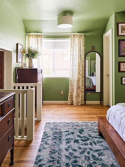
Curtains | Curtain Rod | Roman Shades | Floor Mirror | Flushmount
Continuing with that woodland theme, I found on-theme drapes covered in little taupe birds on branches. My parents had already installed stark white IKEA roman shades recently, and really loved them. I couldn’t convince them otherwise. But they were still open to keeping drapery on either side of the windows. So we installed a brass curtain rod over the window and added these mainly for aesthetic reasons. They already had a wall mirror in the original room layout, but it was unframed and unattractive. So I sourced this wood arched floor mirror to put there instead, which tied in with the darker wood tones throughout the rest of the room. And a simple linen and brass ceiling light brings that whole corner together.


It was my mom’s suggestion to hang that tiny painting over the mirror and I could not have been more excited/proud. I must truly be her daughter, and she must truly love small paintings in weird places as much as I do. And from here you can peek into the next room we’re going to visit – the primary bath. Shall we?
The primary bath was renovated originally by my dad several years back (they’ve lived in this home since 2000), and mostly without input from my mom while she was away over the summer. This isn’t to say it was BAD, just not quite what she had envisioned. And while we weren’t going to be getting to start from scratch, we were definitely going to take it in a direction that tied it in with the primary a bit more.

Here’s where we started – kind of a 50s meets Craftsman style, with bright teal walls that almost, but not quite, matched the glass tiles my dad installed. The vanity was fairly new, an amazing Reformation Home piece they found used on Craigslist. So the things we could change were the paint, lighting, and accessories.

Welcome to their new-ish bathroom. A lighter, brighter, and cleaner version of its former self. We carefully selected a paint color that truly complemented the floor tiles – Sherwin William’s Topiary Tint, which brought a really beautiful calm to the space. The trim is the same Sherwin William’s Classical White as the bedroom, so that the door and trim that touched between the two spaces seamlessly flowed into one another.

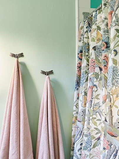
Dragonfly Wall Hooks | Shower Curtain
To keep that woodland theme going between the two rooms, I found these silver dragonfly wall hooks, which we installed as towel hooks next to the shower. And the floral and bird shower curtains tie in both with the bathroom color scheme and the birds sprinkled throughout both rooms.

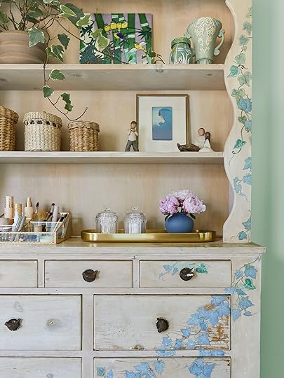
“MORE BIRDS” my mother screamed, in a fit of bird-fueled hysteria. She didn’t, that would have been terrifying. But there are more birds. This piece fits perfectly in their bathroom and is really where I took a lot of inspiration for both rooms from. It’s a vintage piece my late aunt whitewashed and decoupaged while she was living with my parents. When she passed away, my mom kept it and moved it in here. Please note the bird knobs. It’s a really sentimental piece, and also very kitsch in the best way. I organized my mom’s make-up into this glass and gold organizer, which matches the one on her tall boy (directly opposite this piece, in the bedroom).
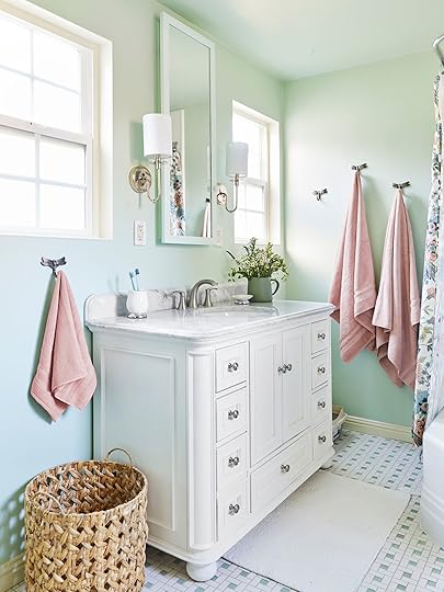
First person to spot the litter box wins a cat! Actually, if you spotted it that probably means you already have at least two of your own. Yes, the litter box lives in their bathroom. This is reality. But it’s nicely hidden in the corner! We swapped out the previously installed wall sconces with these more elegant ones, and added another dragonfly towel hook next to the sink. Small changes for big impact.

And there you have it folks – a quick bedroom and bathroom refresh that make all the difference. Some new wall paint, some new light fixtures, and a reorganizing of art are really the three biggest changes we made. But of course, it’s all about the details – the heirloom quilts, the family art, the vintage pieces sourced over years. My parents are really wonderful collectors, and I think these two rooms truly represent that. They just needed a little help bringing it all together in a cohesive way.


*Design and Photos by Sara Ligorria-Tramp
The post Let Sara Show You How She Refreshed Her Parent’s Bedroom And Bath (With Almost NO BUDGET) appeared first on Emily Henderson.
May 24, 2023
Our Back Patio Reveal! (+ How Everything’s Held Up To 6 Months Of Portland Weather)

The light at the end of the construction tunnel is getting bigger and brighter every day – we are hoping to be fully blinded by June. So it’s time to start showing you some of the finished spaces – starting with our kitchen patio. We’ve already spent many nights on this patio with family, kids playing soccer in the grass til 9 pm, grownups around the table, wine aplenty and I feel a flood of hope for the future, relief that we are happy here, and gratefulness that you are all still following along. Thank you 🙂 The landscaping and exterior construction was the second phase that we tackled, and it was a beast that almost devoured me whole. But we made it! Alive and with less mud! For today’s project, we partnered with Sunbrella on this patio, knowing that we wanted cushion fabric that provided comfort for our tushies for long hang sessions and durability from the weather/wine. Let me introduce you to our finished kitchen patio.
Where Is This Kitchen Patio?
The reason this patio was even a priority is that the living room (and deck on the right in the rendering) is west facing, which means that the afternoon sun is super hot over there and shadeless (the trees are too far away). Now that’s all fine and good – we’ll have umbrellas and can sit underneath the one big oak tree with friends (and it’s only hot/sunny a few months of the year). But on a daily basis when it’s just us four, we wanted somewhere closer to the shaded south-facing kitchen for breakfast, lunch, and dinner. It goes without saying that we are spoiled when it comes to places to hang out, but come 4 pm this area is full of shade and so lovely (and while I’m not a meteorologist a fun fact about being in the PNW is that 6 pm is the hottest time of the day, it does NOT cool down til 9 pm – truly baffling). So that’s why we invested in this patio early.
Three Years Ago…
When we first bought the property it looked like this (above) and it was still charming. Sure, it needed work but the potential was so clear. The family that lived here before also had it as a little kitchen patio. They had a covered walkway that came from a carport with eccentric rooflines. We removed part of it because the walkway didn’t line up with the new kitchen windows and the new stairs. It had become incredibly awkward and was kinda falling down, so we took off half of it. Here’s a quick video tour if you want to walk through the space with me (just wait for the ad to play please and thank you!!!)

There she is now! It makes me soooo happy. New siding. New windows. New EVERYTHING. We decided to take the hardscape all the way to the house mostly to make this a forever mud-free zone (I think we are pretty scarred from the last two years of mud) and chose pots instead of planting straight in the ground. The brick herringbone is so pretty and classic (and Native Northwest did a great job of installing), and while the original Yardzen plan called for window boxes, once we got the corner plants and the umbrella we felt that it was enough. We will be doing more of a full reveal of this south side of the house, but the plants aren’t grown in enough so today is all about the patio and Sunbrella, our fabric partner here.

Table and Chair Set | Seat Cushions
We kept everything here pretty classic, hoping that it looks integrated with the older style home. I bought the table and chair set from Ballard Design, including the cushions made with Sunbrella fabric, and at first, I was worried the table and chairs were going to be too small or just not cool enough, but once styled out I love the vibe. The black legs tie in with the metal of the stair railing, and wood always looks good outside. Since these are teak and slatted my hope is that we can leave them out for the occasional rain and then fold them and put them away for the winter. As you know, we are not good about covering our furniture (and this is so prominent that I wouldn’t want to walk up to and stare at furniture covers six months of the year anyway) thus us choosing something that folds/stores easily and isn’t totally upholstered. While I’ve only had these for six months I can say I am very happy with this table/chair set and I’ll continue to let you know (fun fact: our mountain house upstairs deck is still in perfect condition despite harsh weather).

I LOVE how the black and white striped umbrella made with Sunbrella fabric ties it all together and creates a sense of a room. The pattern is super classic and adds some pattern and visual interest in one big pow. Since the herringbone brick is a pattern and the slats on the wood feel like a stripe I didn’t want to keep adding busyness, so we went with the sold white seat cushions which really toned it down in a good way. These cushions have been outside now for weeks since I got them and look brand new – Sunbrella fabric truly is just so durable, long-lasting, and weather-resistant.

The entire set is easy to take down and store for winter (and we even bought more chairs to add to when we have more guests as they were pretty affordable).


While this area does get shady by 4 pm we wanted to be able to eat lunch out here and you can see what a difference the umbrella makes. Left is no umbrella = full dangerous sun for my baby white skin and right = shady and less hot.

Enamelware (similar) | Pitcher (similar)
I styled it out with some vintage enamel camping dishes and serveware in blue to contrast with the warm tones. Blush and blue forever:)

The cushions made with Sunbrella fabric fit nicely on the chairs and are rather comfortable, and with little ties, when it’s about to rain, you pop them off and they store so well. They come in a ton of different colors and of course, are weather-resistant. Also, my brother who is not a wee man found them perfectly comfortable – I was a little nervous that these chairs were too petite for my large man friends, but the reviews are in and they are super solid and feel big enough.


I wear overalls now because FARM. And those blossoms came from our orchard and are so so pretty.


Outdoor Sconce | Bench | Pillow | Side Table (vintage) | Lanterns | Candles | Cooper Mugs | Terra Cotta Planters | Dark Rust Planter
We kept it earthy with the pots, using the big ones that were left on the property, and adding in some pretty terra cotta and dark rust (both from Rejuvenation). I bought the lanterns from Terrain and huge candles from Pottery Barn (HOP TIP – do not leave them in the 95-degree sun – they both melted like an inflatable Gumbi). The copper exterior sconces are throughout our exterior, from Rejuvenation – Again, I love them so much and they add the perfect contrast.


This kitchen patio is a pretty darn lovely place to be, with the right balance of architectural hardness (brick, concrete, railings) and comfort-inducing softness (natural wood, fabric, plants, and umbrella). A huge thanks to the following: Sunbrella for partnering on this area, Yardzen for creating the initial design, Studio Campo for weighing in on all the things, and Native Northwest for executing it all (not a small job).
Resources:
Table and Chair Set: Ballard Designs
Seat Cushion: Sunbrella via Ballard Designs
Chair Striped Pillows: Sunbrella via Birch Lane
Bench Pillow: Sunbrella via Sien + Co
Umbrella: Sunbrella via Ballard
Lighting: Rejuvenation
Planters (New): Rejuvenation
Bench: Rejuvenation
Brick: Mutual Materials
House Paint Color: SW 7005 Pure White by Sherwin-Williams
Door Paint Color: SW 9655 Mountain Pass by Sherwin-Williams
Windows and Doors: White oak, Aspen Casement by Sierra Pacific Windows
This post was sponsored by Sunbrella but all words and opinions are mine🙂
*Design by Emily Henderson, Yardzen, and ARCIFORM
*Photos by Kaitlin Green
The post Our Back Patio Reveal! (+ How Everything’s Held Up To 6 Months Of Portland Weather) appeared first on Emily Henderson.
May 23, 2023
What I Learned About Stairs, Gutters, and Hardscape (oh my) That You Might Want To Know – The Kitchen Patio Is Almost Finished!

Tomorrow we have the reveal of the patio (come back!) so I wanted to take a second to revisit how far we’ve come and walk you through some things that I learned along the way about patio construction. One of the best (and worst) things about this job is the constant learning. I’m in very good hands here, with so many different teams helping both the design and execution. In fact, with this project in particular there might have been a “too many cooks” situation if everyone didn’t work so well together (I love a buffet)! Here’s how it went down (you might need to take notes): Yardzen reached out about partnering on the areas around the house, specifically this patio area and I was so excited to see what they came up with and we hit it off. Great! Right before that Cali, from Studio Campo had signed on to design the whole homestead and our visions were so aligned, so she of course needed to be kinda involved here as well to make sure it was cohesive. We still needed a landscape contractor so we hired Native Northwest to execute the plans. They are also a design-build company, and with Studio Campo being based both in Colorado and Oregon, there were times when we leaned on them for design changes, and when plans change then the design changes…so there was a lot of coordination. Lastly, of course, ARCIFORM was at the time doing the renovation of the house, including the exterior finishes, which shouldn’t necessarily affect the landscaping, but there are some things that crossed over – i.e. stairs, hardscape, the covered walkway, lighting, etc. It’s actually way less confusing than it sounds, but I suppose being more streamlined might have benefitted my brain at times haha. So, it’s kinda hard to talk about credit here as it was such a team effort and very nuanced. OH, and then I went ahead and changed some things at the end anyway because I’m ALSO a designer. HAHAHAHAH. I will absolutely admit that I might not have been the best client this year, BTW. It is what it is. So here we go…
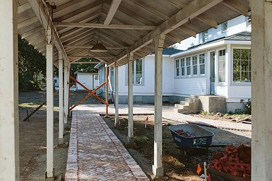
Covered Walkway Change
We loved this covered walkway when we bought the house but the kitchen from the inside was designed with so many windows that the covered walkway actually hit halfway through one of the windows. I don’t think that the walkway was calculated in the interior elevations and we weren’t living here. So, after the windows were installed we came to the house and we were like, uh guys. After many months of trying to figure out how to fix it (and it was rotting anyway), we ultimately decided that the kitchen would be better if we simply cut off half of it because even if the door had lined up with the walkway (it didn’t), we would be staring out the kitchen window onto a roofline. But not having a covered walkway in Oregon is pretty unadvisable. At this point, our roof was already done on our house so we couldn’t even add an overhang over the stair landing unless we ripped off part of the roof and reframed it, and since our kitchen windows are so tall there is no room to add even a bracket to do an overhang or awning. Believe me, we went through ALL of the options. Do I wish the kitchen door had a 3′ overhang so that the kids could take off their shoes before they come in? Sure. But honestly, it bothers us way less than we thought it would.

 photos by kaitlin green
Where the walkway ends is a bit abrupt so we are going to mask it with a mature cherry tree that is like “look at me look at me” and eventually add more rain chains (my new favorite architectural jewelry) to bling up that awkwardness. Jamie (ARCIFORM) cut it off and made it as solid and seamless as possible but there was a while when no one knew whose responsibility it was to design or fix it and it held up literally everyone’s plans. I’ve learned this happens way more than you think and that’s ok:)
Brick Layout Obsession, Then Last Minute Change
 photo by kaitlin green
Yardzen came up with a cool brick design layout, per my request, but ultimately when we got the brick on site I chickened out and decided to do a classic herringbone. We had some designs that were so pretty, but there was going to be more waste (and would take more labor) and I was like, “You will never regret a herringbone with a border, just do that”. But this is after I sourced like 55 different aged bricks of different sizes and played with like 90 different pattern configurations. Sometimes classic wins, but it’s “nice” to go through the obsessive exercise to make sure that you exhausted all the more interesting stuff, in favor of the stuff you will never regret (Brian will say that this is my true specialty – remember the sunroom floor?). We ended up using an aged 4×8 brick that you would normally stack vertically (think a wall or fireplace) but it has holes in the side and we wanted to lay it skinny side up (so 2″) for that look, which we LOVE, but it meant digging down further to allow for the 4″ of space and of course, it took more material. We knew this going into it and I’m very happy we chose what we chose, even though it cost more.
All in all, I believe that the bricks were $7k (including the long walkway) and the labor was around $10k (maybe more, it’s hard when it’s all wrapped up together in a huge job). Again, Native Northwest did an excellent job executing. Shout out to Dan’l, Scotty, and their crew for their extreme precision (which is super important when it comes to hardscape).
The Cement Stairs Decision photo by kaitlin green
Onto the more boring side of things – the cement stairs. Listen, I wanted more interesting stairs. I did. I wanted brick or just something, special. But ultimately we had four sets of stairs and they came in at $10k total ($2,500 each) for pouring cement, which everyone told me was by far the cheapest option. We were done spending money at that point. But this felt like a sad way to spend $10k – on something that I wasn’t even excited about design-wise and I still think that had we had more time I could have come up with a solution. But y’all, you have to have stairs to get into your house and we designed this house with five exits – one wood porch on the back, but the other four are cement. You can’t really do one brick while the others are cement (although I did fight for it). Ultimately, I said yes to the boring cement, paid the money, they came and did the mold and it was done in two days (which was great). While it’s still not my most favorite architectural feature, the ARCIFORM team was right in saying that once everything else looks done and pretty you don’t notice the stairs AT ALL and they just disappear. You’ll see tomorrow:) (but are there times when I want to clad it in the veneer version of the aged brick?? YES).
Our Siding Choice
 right photo by kaitlin green
Quite possibly the easiest decision ever was the siding, and that’s because ARCIFORM was so clear about the overall vision – that it should look like the original house from 1910. Thank god for them. They reined me in when I was shouting about scalloped belly bands and shark tooth details. When we bought the house it had 3″ aluminum siding painted white, but underneath was the original wood siding (in bad condition of course – she’s old) and essentially what we put back on top – a 5″ lap siding. GREAT, DONE WAHOO! I LOVE how it turned out. We painted it SW 7005 Pure White By Sherwin–Williams which might have been one of the better days of my life. Instantly transformed! Hope before our eyes.
Our Sconce Whoopsie/SwitchAround the entire house, we have these awesome very classic farmhouse Carson sconces (from Rejuvenation) on a gooseneck in the most beautiful copper that is going to patina like Martha Stewart on the cover of Sports Illustrated. Great. Check that box. But Brian and I’s obsession with large windows (fine, we might have overdone it) meant that on the outside we didn’t have enough room to open the door without hitting the shade. So as you’ll see tomorrow we switched out the sconce for a smaller one that totally works (but admittedly isn’t as cohesive as I’d like). We have a lot of black metal around the house so you literally don’t notice it because everything else is so pretty. I feel like I have such design mistake resilience at this point. like WHOOPS, PIVOT, TRY AGAIN, TELL THE WORLD, GET IT RIGHT. It’s a cycle I’ve become very used to.
Gutters, Storm Drainage, And WHAT ARE Dry Wells???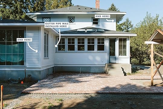 photo by kaitlin green
Another super fun way to spend $5k is gutters. We went back and forth for months about white versus copper, ultimately deciding that copper might actually be too much on this white house (looks better on darker houses IMHO). So we listened to ARCIFORM and just got white metal (not plastic). They are very important up here, I get that. But that’s not where it ends. Yes, they installed gutters, but the downspouts went directly into this kitchen patio (and the foundation). Native Northwest called it pretty quickly and suggested we put in storm drainage – something you don’t need in California, but you really do in Oregon. Water is insidious. We are not going to mess with flooding, mold, foundation problems, etc. So they put in storm drainage that led to a dry well that deposited in the middle of the lawn (admittedly I don’t totally know what that means, but there are NO water issues even on the days that don’t ever stop raining so a big thank you to Dan’l’s crew).
Rain Chains (Pretty And Practical?) photo by kaitlin green
On to good news that might make some of you enraged. I’m not a gutter purist (??) but I typically don’t like to put unnecessarily architectural things on houses (wait, isn’t that just what we do as creatives???). But the gutter was designed for the downspout to be in the corner of the kitchen patio, NOT the edge of the house where the rain chain was meant to go. You don’t need both a downspout and a rain chain – the rain chain is the downspout. So instead of re-doing the downspout or the gutter altogether, (duh) I had the rain chain installed to look like it functions, but it doesn’t. No one will know but all of you. I didn’t even tell ARCIFORM so shhh… We have three more left to hang (two on the covered walkways where they actually act as downspouts) and hang I will because they are so beautiful and special and I want them EVERYWHERE.
Stub Up For Irrigation (Why Is Borning Stuff SO Crucial)Another thing I didn’t really know about is how important it is to irrigate underneath the patio and then stub up for planters to be watered with a drip line. This wasn’t my idea and I’m so glad it happened. We haven’t hooked them up to the pots yet, but will very soon (that reminds me I need to go water the plants).
I think that is all the boring stuff that we did, that cost $$$ and or stress but ultimately I’m so grateful to have been able to get done. Come back for the big reveal and pretty photos! xx
The post What I Learned About Stairs, Gutters, and Hardscape (oh my) That You Might Want To Know – The Kitchen Patio Is Almost Finished! appeared first on Emily Henderson.
Some Of The Boring Ways To Spend A Lot Of Money While Doing Landscape Construction (+ What I Learned That You Might Want To Know)
Tomorrow we have the reveal of the patio (come back!) so I wanted to take a second to revisit how far we’ve come and walk you through some things that I learned along the way about patio construction. One of the best (and worst) things about this job is the constant learning. I’m in very good hands here, with so many different teams helping both the design and execution. In fact, with this project in particular there might have been a “too many cooks” situation if everyone didn’t work so well together (I love a buffet)! Here’s how it went down (you might need to take notes): Yardzen reached out about partnering on the areas around the house, specifically this patio area and I was so excited to see what they came up with and we hit it off. Great! Right before that Cali, from Studio Campo had signed on to design the whole homestead and our visions were so aligned, so she of course needed to be kinda involved here as well to make sure it was cohesive. We still needed a landscape contractor so we hired Native Northwest to execute the plans. They are also a design-build company, and with Studio Campo being based both in Colorado and Oregon, there were times when we leaned on them for design changes, and when plans change then the design changes…so there was a lot of coordination. Lastly, of course, ARCIFORM was at the time doing the renovation of the house, including the exterior finishes, which shouldn’t necessarily affect the landscaping, but there are some things that crossed over – i.e. stairs, hardscape, the covered walkway, lighting, etc. It’s actually way less confusing than it sounds, but I suppose being more streamlined might have benefitted my brain at times haha. So, it’s kinda hard to talk about credit here as it was such a team effort and very nuanced. OH, and then I went ahead and changed some things at the end anyway because I’m ALSO a designer. HAHAHAHAH. I will absolutely admit that I might not have been the best client this year, BTW. It is what it is. So here we go…
Covered Walkway ChangeWe loved this covered walkway when we bought the house but the kitchen from the inside was designed with so many windows that the covered walkway actually hit halfway through one of the windows. I don’t think that the walkway was calculated in the interior elevations and we weren’t living here. So, after the windows were installed we came to the house and we were like, uh guys. After many months of trying to figure out how to fix it (and it was rotting anyway), we ultimately decided that the kitchen would be better if we simply cut off half of it because even if the door had lined up with the walkway (it didn’t), we would be staring out the kitchen window onto a roofline. But not having a covered walkway in Oregon is pretty unadvisable. At this point, our roof was already done on our house so we couldn’t even add an overhang over the stair landing unless we ripped off part of the roof and reframed it, and since our kitchen windows are so tall there is no room to add even a bracket to do an overhang or awning. Believe me, we went through ALL of the options. Do I wish the kitchen door had a 3′ overhang so that the kids could take off their shoes before they come in? Sure. But honestly, it bothers us way less than we thought it would.
photos by kaitlin greenWhere the walkway ends is a bit abrupt so we are going to mask it with a mature cherry tree that is like “look at me look at me” and eventually add more rain chains (my new favorite architectural jewelry) to bling up that awkwardness. Jamie (ARCIFORM) cut it off and made it as solid and seamless as possible but there was a while when no one knew whose responsibility it was to design or fix it and it held up literally everyone’s plans. I’ve learned this happens way more than you think and that’s ok:)
Brick Layout Obsession, Then Last Minute Changephoto by kaitlin greenYardzen came up with a cool brick design layout, per my request, but ultimately when we got the brick on site I chickened out and decided to do a classic herringbone. We had some designs that were so pretty, but there was going to be more waste (and would take more labor) and I was like, “You will never regret a herringbone with a border, just do that”. But this is after I sourced like 55 different aged bricks of different sizes and played with like 90 different pattern configurations. Sometimes classic wins, but it’s “nice” to go through the obsessive exercise to make sure that you exhausted all the more interesting stuff, in favor of the stuff you will never regret (Brian will say that this is my true specialty – remember the sunroom floor?). We ended up using an aged 4×8 brick that you would normally stack vertically (think a wall or fireplace) but it has holes in the side and we wanted to lay it skinny side up (so 2″) for that look, which we LOVE, but it meant digging down further to allow for the 4″ of space and of course, it took more material. We knew this going into it and I’m very happy we chose what we chose, even though it cost more.
All in all, I believe that the bricks were $7k (including the long walkway) and the labor was around $10k (maybe more, it’s hard when it’s all wrapped up together in a huge job). Again, Native Northwest did an excellent job executing. Shout out to Dan’l, Scotty, and their crew for their extreme precision (which is super important when it comes to hardscape).
The Cement Stairs Decisionphoto by kaitlin greenOnto the more boring side of things – the cement stairs. Listen, I wanted more interesting stairs. I did. I wanted brick or just something, special. But ultimately we had four sets of stairs and they came in at $10k total ($2,500 each) for pouring cement, which everyone told me was by far the cheapest option. We were done spending money at that point. But this felt like a sad way to spend $10k – on something that I wasn’t even excited about design-wise and I still think that had we had more time I could have come up with a solution. But y’all, you have to have stairs to get into your house and we designed this house with five exits – one wood porch on the back, but the other four are cement. You can’t really do one brick while the others are cement (although I did fight for it). Ultimately, I said yes to the boring cement, paid the money, they came and did the mold and it was done in two days (which was great). While it’s still not my most favorite architectural feature, the ARCIFORM team was right in saying that once everything else looks done and pretty you don’t notice the stairs AT ALL and they just disappear. You’ll see tomorrow:) (but are there times when I want to clad it in the veneer version of the aged brick?? YES).
Our Siding Choiceright photo by kaitlin greenQuite possibly the easiest decision ever was the siding, and that’s because ARCIFORM was so clear about the overall vision – that it should look like the original house from 1910. Thank god for them. They reined me in when I was shouting about scalloped belly bands and shark tooth details. When we bought the house it had 3″ aluminum siding painted white, but underneath was the original wood siding (in bad condition of course – she’s old) and essentially what we put back on top – a 5″ lap siding. GREAT, DONE WAHOO! I LOVE how it turned out. We painted it SW 7005 Pure White By Sherwin–Williams which might have been one of the better days of my life. Instantly transformed! Hope before our eyes.
Our Sconce Whoopsie/SwitchAround the entire house, we have these awesome very classic farmhouse Carson sconces (from Rejuvenation) on a gooseneck in the most beautiful copper that is going to patina like Martha Stewart on the cover of Sports Illustrated. Great. Check that box. But Brian and I’s obsession with large windows (fine, we might have overdone it) meant that on the outside we didn’t have enough room to open the door without hitting the shade. So as you’ll see tomorrow we switched out the sconce for a smaller one that totally works (but admittedly isn’t as cohesive as I’d like). We have a lot of black metal around the house so you literally don’t notice it because everything else is so pretty. I feel like I have such design mistake resilience at this point. like WHOOPS, PIVOT, TRY AGAIN, TELL THE WORLD, GET IT RIGHT. It’s a cycle I’ve become very used to.
Gutters, Storm Drainage, And WHAT ARE Dry Wells???photo by kaitlin greenAnother super fun way to spend $5k is gutters. We went back and forth for months about white versus copper, ultimately deciding that copper might actually be too much on this white house (looks better on darker houses IMHO). So we listened to ARCIFORM and just got white metal (not plastic). They are very important up here, I get that. But that’s not where it ends. Yes, they installed gutters, but the downspouts went directly into this kitchen patio (and the foundation). Native Northwest called it pretty quickly and suggested we put in storm drainage – something you don’t need in California, but you really do in Oregon. Water is insidious. We are not going to mess with flooding, mold, foundation problems, etc. So they put in storm drainage that led to a dry well that deposited in the middle of the lawn (admittedly I don’t totally know what that means, but there are NO water issues even on the days that don’t ever stop raining so a big thank you to Dan’l’s crew).
Rain Chains (Pretty And Practical?)photo by kaitlin greenOn to good news that might make some of you enraged. I’m not a gutter purist (??) but I typically don’t like to put unnecessarily architectural things on houses (wait, isn’t that just what we do as creatives???). But the gutter was designed for the downspout to be in the corner of the kitchen patio, NOT the edge of the house where the rain chain was meant to go. You don’t need both a downspout and a rain chain – the rain chain is the downspout. So instead of re-doing the downspout or the gutter altogether, (duh) I had the rain chain installed to look like it functions, but it doesn’t. No one will know but all of you. I didn’t even tell ARCIFORM so shhh… We have three more left to hang (two on the covered walkways where they actually act as downspouts) and hang I will because they are so beautiful and special and I want them EVERYWHERE.
Stub Up For Irrigation (Why Is Borning Stuff SO Crucial)Another thing I didn’t really know about is how important it is to irrigate underneath the patio and then stub up for planters to be watered with a drip line. This wasn’t my idea and I’m so glad it happened. We haven’t hooked them up to the pots yet, but will very soon (that reminds me I need to go water the plants).
I think that is all the boring stuff that we did, that cost $$$ and or stress but ultimately I’m so grateful to have been able to get done. Come back for the big reveal and pretty photos! xx
The post Some Of The Boring Ways To Spend A Lot Of Money While Doing Landscape Construction (+ What I Learned That You Might Want To Know) appeared first on Emily Henderson.
May 22, 2023
Huge Deal Alert: Grab Up To 40% Off Anthropologie Today With This EHD Reader-Exclusive Code (!!!)

HI, HUGE NEWS. The powers that be (read: lil’ old me) have convinced Anthropologie to open up their Memorial Day Sale a WHOLE WEEK EARLY, just for EHD readers! It’s like the digital version of being first in line at a buzzy NYC sample sale…except instead of having to stand in line, you’re welcomed in a week ahead of time and given your full pick of the litter before anyone else gets eyes on the inventory. WEIRD ANALOGIES ASIDE, THIS IS VERY EXCITING. (PS. This blog post is not sponsored, I’m just very jazzed to share.)
Here’s the deal: you can nab up to 40% off everything displayed on this EHD-exclusive sale page with code EMILY40 before Anthropologie publicly shares these deals with the masses next week. Add an item from the page to your cart, apply the EMILY40 code, and watch the discounts stack up in real-time. Go take a peek now – the inventory on sale is AWESOME. Buuuuut if you don’t have the time or bandwidth to sort through 39 pages of incredible savings today, we’ve highlighted a few of our favorite deals below…

1. Meriah Gauze Throw Blanket | 2. Gilded Rim Red Wine Glass | 3. Pineapple Laundry Basket | 4. Zaha Burl Switch Plate | 5. Cecilia Curtain | 6. Capri Blue Volcano Capiz Glass Jar Candle | 7. Eyelet Agate Coaster | 8. Lascaux Decorative Blanket Ladder | 9. Riviera Bath Mat | 10. Glenna Teapot | 11. Birdcage Lidded Basket | 12. Tufted Caro Rug
…beginning with a few sweet pieces that won’t break the bank. If you’re looking to jazz up your space, you can’t go wrong with a lightweight blanket in a cheery print (feels very ‘Citrus Garden’ but on a budget, right?), a pair of cult-classic curtains, a chic bathmat, or a modern take on an Oushak rug (the 8’x10′ is $250 off!).
Looking for a gift? You can’t go wrong with those scalloped agate coasters (I bought some this morning in both white and green!), the ever-popular Capri candle (if you can afford to stock up, this is SUCH a deal!), some charming stemware, or a simple, elevated pitcher.
And, I mean, you know how I feel about wood and quirk…so I’ve been absolutely taken by those burled switchplates, the pineapple-shaped hamper (spoiler: coming soon to a bedroom MOTO near you), the graphic and modern blanket ladder, and that birdcage lidded basket that’ll make any room sing. THERE ARE SO MANY OTHER GOOD OPTIONS, TOO – this collection was just the tip of the iceberg!

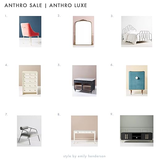
1. Quincy Bed | 2. Wallace Cane and Oak Sideboard | 3. Dalton Bookcase | 4. Avalene Bar Cabinet | 5. Quincy Console Table | 6. Wallace Cane and Oak Media Console
We’re getting into the larger, more permanent items and I gotta say: I was blown away by the furniture that’s included in this sale. We’ll give you a little taste in this post – starting out with these classic neutral pieces that’ll work in almost any style of home! – but WOW, there’s truly something for EVERYONE.
And the savings are ENORMOUS. The bed? $330 off. That sideboard? $800 off (and it comes in an oak tone, too, if that black finish feels too heavy for your space!). The bookcase? $540 off. The bar cabinet? $360 off. The console table? $270 off. The media console? A SWEET $500 OFF. I’m so excited that we get to offer you ALL of these options at these prices before they sell out next week!

1. Nemus Dining Table | 2. Leather Cove Bed | 3. Anya Travertine Coffee Table | 4. Cove Woven Leather Ottoman | 5. Lara Hutch | 6. Stanton Chair | 7. Kalle Sculptural Oak Console | 8. Caillen Accent Chair | 9. Sonali Oval Coffee Table | 10. Oak Farmhouse Counter Stool | 11. Kalle Sculptural Oak Bookshelf | 12. Checkered Jute Rug
One thing I really appreciate about Anthropologie is the consistent stylistic thread that runs through all of their pieces – these would all be so easy to mix and match, you know? You can build a living room around a bold statement coffee table, add in some comfortable chairs, throw in a wooden hutch, and then add a chunky console to bring the whole space together.
Or you could make a super serene retreat in a studio apartment – grab a textured leather bed, use this sculptural bookshelf as a room divider, add some classic sling chairs to keep the space light and bright, add a fun neutral rug to anchor your living space, and bring in some sweet woven ottomans to add a pop of color while echoing the texture of the bed.
1. Velvet Elowen Chair | 2. Gleaming Primrose Mirror | 3. Deco Bed | 4. Merriton Five-Drawer Dresser | 5. Fern Kitchen Island | 6. Juneau Velvet Bar Cabinet | 7. Cyrus Chair | 8. Marcelle Console Table | 9. Odetta Media Console
To no one’s surprise, I LOVE some of these classic Anthro pieces, and this is your chance to grab them at prices I’ve literally never seen before. Case in point: that iconic bar cabinet is currently on sale for $1,318.80 – that’s $880 OFF THE NORMAL PRICE.
It’d also be a great time to stock up on new dining chairs (a set of 2 of these are currently going for $586.80 – they’re usually $498 PER PIECE!) I’m sure you get it by this point, right? The savings are unprecedented and right now, they’re only available to you!
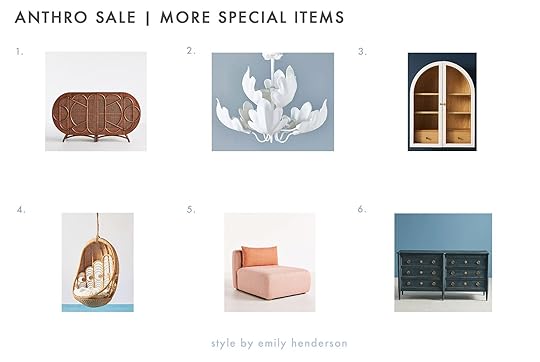
1. Ofira Buffet | 2. Delia Chandelier | 3. Fern Wall Cabinet | 4. Peacock Indoor/Outdoor Hanging Chair | 5. Kori Modular Armless Chair | 6. Washed Wood Six-Drawer Dresser
Closing out our recommendations with a few special pieces that are guaranteed to pull your room together. Whether you need an art-nouveau-inspired buffet, a whimsical lighting fixture, or a comfy hanging chair with a little extra design pizzazz…well, pal, it’s all on sale RIGHT NOW, and just for you.
As a reminder, here’s how it works:
Head to this exclusive landing page to see all the deals in one place, before they’re released to the public. Anything in this section is fair game, but it’s also not marked (as this is a special deal that’s only available for you!). Add items to your cart, then apply the ‘EMILY40‘ code on the right-hand side (just below your total) to see the discounts – there are thousands of items on sale, but everything seems to be falling in the 30-40% off category. Take your hard-earned savings and enjoy!I’m SO THRILLED (could you tell?) that we’re able to offer this for ya – what’d you think? Should we get some more special sales going just for our readers? Did you get anything good? LET’S CHAT ABOUT IT. See ya in the comments… xx
Opening Image Credits: Design by Dee Murphy | Styled by Velinda Hellen | Photo by Sara Ligorria-Tramp | From: Dee Murphy’s Home Tour Is Giving Us All Wallpaper Envy
The post Huge Deal Alert: Grab Up To 40% Off Anthropologie Today With This EHD Reader-Exclusive Code (!!!) appeared first on Emily Henderson.
I Asked ChatGPT – AI – Design Questions… Here’s What It Said… And What Does This Mean For Design Blogs/Websites???

We knew it was going to happen, but it’s all of a sudden HERE and NOW. Like most human beings, I have mixed feelings about Artificial Intelligence taking over the world (and my job). By “mixed” I think it’s mostly going to be pretty bad socially and culturally, but it also feels rather inevitable so we need to accept, pivot, and figure out ways to adapt and enjoy our lives while we are here (and pay our bills). Being a digital creator is now being highly challenged as a lot of the information that I try to give as design education, can now be asked to AI instead of Google (which would historically send us traffic). Creativity can be copied, just not as good, and figuring out what holes can NOT be filled by AI is the new challenge. It’s all ok, I PROMISE and we are trying new strategies to stay alive/relevant and stay definitely 100% human:) But first, out of deep curiosity, I asked ChatGPT a few questions based on our most popular posts – the ones that send us “Google” traffic (versus people that come every day as true followers – thank you). These posts are what we call “evergreen successes” and we update them yearly to make sure they are still relevant as they continue to get traffic every day. Historically these posts have brought a lot of revenue as apparently, people are googling them a lot. But as more and more people use AI and TikTok as search engines these posts could get less and less traffic. So here’s what I asked ChatGPT.
My Question For Chat GPT: How High Should You Hang Curtains?AI answer: The height at which you should hang curtains depends on several factors such as the height of the ceiling, the size of the window, and the overall aesthetic you are trying to achieve. Here are some general guidelines to follow:
Hang the curtain rod as close to the ceiling as possible: Hanging the curtains higher than the window frame creates the illusion of taller ceilings and makes the room feel more spacious. Ideally, the rod should be at least 4-6 inches above the window frame.Length of curtains: If you want your curtains to just touch the floor, measure from the bottom of the curtain rod to the floor and subtract 1/2 to 1 inch. If you want your curtains to pool on the floor for a more dramatic look, add an additional 2-4 inches to the length.Consider the style of curtains: The height at which you hang curtains also depends on the style of curtains you have chosen. For example, if you have full-length, heavy drapes, you may want to hang them higher than if you have shorter, lightweight curtains.Take into account any furniture or decorative elements: If you have furniture or decorative elements below the window, such as a sofa or a console table, you may want to hang the curtains just above them to create a cohesive look.In summary, it is generally recommended to hang curtains as close to the ceiling as possible, with a length that either just touches the floor or pools on it depending on the desired look, taking into account the style of the curtains and any furniture or decorative elements in the room.
GAH!!! That’s all pretty correct! Now, of course, what ChaptGPT can’t yet do is add photos, personal anecdotes based on experience with things to avoid, etc. There isn’t a voice that is entertaining, but y’all the information is accurate. Of course, the irony is that it’s searching the internet for this information that is gathered from this very site. It scrapes the world wide web which includes all our past posts. HA! Jokes on us!!!
Question For ChatGPT: How Do I Lay Out My Living Room Furniture?AI Answer: Laying out your living room furniture can be a challenging task, but here are some general steps and tips to help you create a functional and aesthetically pleasing space:
Determine the focal point: The focal point of the living room is usually the television, fireplace, or a large window with a view. Once you have identified the focal point, arrange your furniture around it.Create a conversation area: The living room is often used for socializing and entertaining guests, so it’s important to create a conversation area. Arrange your seating options (such as a sofa, loveseat, and chairs) in a way that encourages face-to-face conversation.Leave enough space for traffic flow: It’s important to leave enough space for people to move around the room comfortably without bumping into furniture. As a general rule, leave at least 2-3 feet of clearance around the seating area.Consider the size and scale of the furniture: Choose furniture that is appropriate for the size of your living room. If your room is small, choose furniture with a smaller scale to avoid overcrowding. If your room is large, choose larger pieces of furniture that can fill the space without looking out of place.Add accent furniture and accessories: Once you have the main furniture pieces in place, add accent furniture and accessories such as a coffee table, side tables, and lamps to create a cohesive look.Experiment with different layouts: Don’t be afraid to experiment with different furniture layouts until you find the one that works best for your space. You may need to move furniture around several times before finding the perfect layout.In summary, when laying out your living room furniture, consider the focal point, create a conversation area, leave enough space for traffic flow, choose appropriately sized furniture, add accent furniture and accessories, and experiment with different layouts until you find the perfect one for your space.
Again, their response is good and correct. Is there a lot missing? Of course. Pictures, nuance, a distinct voice, humor – none of that is there. After thinking about this for months and months and months, I’ve come around to the idea that this is just a new inevitable creative challenge for us to solve. And solve, we will. So what is our strategy moving forward to ensure that we don’t all get taken over by robots and lose all our traffic to AI? Well, it’s actually super simple. We’ll lean into our human-ness. I’m actually really excited. You’ve already seen it roll out a bit, but essentially we need to be more of a platform of opinions (yes, please), trust (via actual design expertise), humor (which is more and more challenging these days TBH), connection (relatability, vulnerability, and nuance), and very specific projects (like mine, Bowser’s, Orlando’s, my team’s MOTOs, etc). It’s not that any of these things aren’t already here, but it actually gives us more permission to do them more. More journal entries and thought pieces, less tutorials and shopping roundups. Will we still do some design educational posts? Yes, but we have a new goal of making sure that how we position these posts won’t be AI-able or even something you can find on TikTok (which is also taking down Google and Instagram rapidly). I’ll be writing way more posts and we have the data on what posts by what writers you feel the most connected to so we’ll be hiring and publishing those voices the most.
I’m also excited about a new video strategy (with a new local videographer) that will hopefully create some fun ways to learn/share and connect. I have all these super juicy posts in my head, maybe not fully formed but ready to be written – stuff about social media, marriage, feminism, parenting – pieces that I think I would have been scared to write the last couple years but more and more it’s what I want to read, and therefore it’s what I want to write.
Anyway, as always I want to know what you are reading and loving (and coming back for). We can see the evidence through the analytics and the backend – some posts get great traffic, but less engagement (time on site) and others do the opposite. Some both:) We love them all for different reasons, but the goal now is to engage who is already here or here frequently, and not try to necessarily get all those Google hits because as this new tech rolls out it might be a fool’s errand (or one where I’d have to hire a full-time SEO person to execute which I’m not really interested in doing). More and more blogs are dropping like flies (this is also due to many lawsuits from photo agencies about usage – myself included) and the online and social media “competition” is undeniably fierce – just too many people, on too many platforms to follow, and you have to be posting obsessively – practically 24 hours a day – to be favored in the algorithm. But it’s not a zero-sum game and it’s actually not a competition with each other. The only way to not burn out or fold altogether is to try every single day to have a healthy relationship with the shared foe (social media algorithms and now AI) and know that the only thing you can control is your reaction to it.
I paid for five new Substacks last month that I’ve enjoyed reading. Each one is highly opinionated, personal, and mind-broadening. It seems like there is a renewed hunger for the longer form writing as long as it’s, well, really really engaging, compelling, personal, and entertaining. So does that mean that blogs are dead or are the OG personal journal-style blogs actually back? It seems to me that the “design website,” something that we claimed to be might have to shift. And if you know me (which you do), you know that you don’t have to ask me twice to be more personal. I’m excited. We have a big summer of reveals planned (shooting is currently on pause to finish everything) as we “wrap up” this house and I get to move on to documenting two other big projects.
If you have any thoughts or suggestions, please, sound off in the comments. We’ve thought about text notifications for farmhouse content so people don’t miss it (and still might but the idea of someone asking for my number feels hilarious, while I guess it’s successful for others). Lots of ideas floating around my head and in our brainstorming sessions. Digital media has always felt like the wild west, but now it’s gone full futuristic/sci-fi, where robots could take over creative jobs if we don’t assert ourselves and take control. RIGHT??!!!
Opening Image Credits: Photo by Tessa Neustadt | Styled by Brady Tolbert for EHD | From: Custom Framing For Our Home Office With Framebridge
The post I Asked ChatGPT – AI – Design Questions… Here’s What It Said… And What Does This Mean For Design Blogs/Websites??? appeared first on Emily Henderson.
May 21, 2023
The Link Up: Em’s NEW Favorite Romance Beach Read, The Concealer Makeup Stick Jess Has Been Dying To Try, And A New Clothing Store We LOVE

Happy Sunday y’all! The warm weather miiiiight be here for good and we are PUMPED!! Some of us might even attempt a beach day this weekend:) Hope the weather is great where you are too but before it’s time to soak in those much-needed rays of sunshine let’s get to these links…
This week’s house tour has us all pretty jealous! Chloe Fineman (SNL Actor) might have the most wonderful apartment we’ve seen in New York. And it’s a rental! It’s clearly full of beautiful (expensive) pieces including lots of vintage but you can also feel like a real person lives there (not always the case with fancy house tours). It’s layered, full of pattern and color but in a muted and cozy way. Go check it out here!
From Emily: I just finished Emily Henry’s new book and I smiled for days while reading it. If you are into my rom-com recommendations (easy reads, happy endings, zero anxiety, look forward to reading every single night) then this book is for you. I loved her first book (Beach Read – Kindle and Local), enjoyed her second book (People We Meet on Vacation – Kindle and Local) and less so, but still liked her third book (Book Lovers – Kindle and Local). I was nervous that she was starting to pump them out too fast (which I fully understood and I want her to dominate financially so those book deals are so huge). But I’m so happy to say that I loved Happy Place (her most recent – Kindle and Local) as much if not MORE than Beach Read. It’s a coming-of-age romance, about a group of college friends and a super appealing/sweet love between two of them. It’s about what happens the 10 years after college and I found myself relating to it so much (Brian and I met in college as you know, all our friends dispersed and struggled to stay in each other’s lives, etc). Per usual her dialogue is excellent (funny without seeming like she tries too hard) and the pacing, the friendships – all of it. Listen, I also just finished The Candy House so I do dabble in real literature too, but y’all, I didn’t enjoy it (gave me anxiety) and it just felt like so much work to follow the story (more of a reflection on me than the book, I know). This book, Happy Place, I enjoyed reading it so much – every single second. I’m very excited to dive into Meet Me At The Lake (Kindle and Local) this weekend (Carley Fortune’s new book and if you haven’t read Every Summer After you should RIGHT NOW – Kindle and Local). It’s truly the beach read of this summer – you can’t put it down and it makes you feel VERY GOOD.
 photo by kaitlin green
Also From Emily: I just wanted to shout out my favorite denim dress one more time. It’s definitely not cheap but I’ve had it for over a year and I wear it A LOT. Whenever I throw it on I feel so comfortable (it’s loose) and cool (an added bonus:)). If you missed yesterday’s fashion post I have a few more options I also love.
From Arlyn: You know the things you have you love so much, you lose track of how many people you’ve recommended them to? That’s these Bombas Gripper Slippers. I don’t recall ever sharing them here, but if I have, consider this a reminder. My husband calls these my “elf shoes” and a friend asked me “what are those?!?” once when she saw them, but neither of them know anything, and these are great. They’re basically a roomy sock with grippers on the bottom and a little cushioning to make them more like a slipper. Plus, I just feel really good about buying from Bombas for so many reasons (including their lifetime guarantee on their products: if they don’t hold up or are getting too worn down, they’ll just send you new ones…for free…what?!?).
From Mallory: I was emailed marketed hard for this cute and classic crop top and man did that marketing hit its target. I immediately added it to cart and can’t wait for it to arrive!! This almost made it into my cart too but I had some restraint this time (but no promises for later though, it could end up in my closet eventually). I’ve bought a few different pieces from Oak + Fort recently and have always been impressed by the quality compared to the price. It feels like it’s really hitting that Zara price bracket but with slightly more elevated pieces and I am here for it. If you’re in the market for some summer clothes check them out:)
From Caitlin: I just tried these new ingrown hair patches – like a zit sticker, but for areas that grow hair! – and I HAVE BEEN BLOWN AWAY. I am about to write some very embarrassing personal information, so buckle up: my waxer recommended these patches to me because I have a few cystic ingrown hairs that keep coming back, wax after wax. I don’t necessarily love the aesthetics and I’ve caused scarring in the past by extracting them myself (again, not proud to write this on the internet), so I was in dire need of an at-home solution. While I initially balked at the price tag (that much for 12 patches?!), I can now confirm that these are 100% worth it – I’ve since used four of them on two particularly stubborn ingrowns and the results have been INCREDIBLE (though I would argue with their “6-hour” claim – it took mine two nights to totally surface and calm down). ANYWAY – if you’ve ever shaved or waxed and struggled with an uncomfortable ingrown hair afterward (and they work anywhere – face, armpits, chest, legs, pubic area, you name it!), I can’t recommend keeping a box of these on hand enough – they’re total lifesavers.
From Jess: I finally did it. I bought Merit’s “The Minimalist Perfecting Complexion Foundation and Concealer Stick” and so far I love it! I really don’t love wearing a ton of makeup but I also want an even skin tone…which I don’t naturally have lol. So this concealer stick is great because it’s a buildable medium coverage that you can apply with your fingers that looks really natural! Everyone’s skin tone is clearly different but I was matched with the Bisque shade if that helps at all. Enjoy!
Also From Jess: If you haven’t heard, let me be the first to introduce you to a WONDERFUL new podcast called Wiser Than Me, with host Julia Louis-Dreyfus (I KNOW!). Julia (in her early 60s) is exclusively interviewing women older (and wiser, or so she says) than her. Women like Jane Fonda, Fran Lebowitz, Isabelle Allende, and more! With each passing year, I find that I want and need stories of older women who have led and continue to lead beautifully full, inspiring lives. I’m so grateful for Julia, this podcast, and the women who are willing to tell their stories.
Hope everyone enjoys the rest of their Sunday and be sure to come back tomorrow afternoon for a very fun surprise deal you all might be interested in:) xx
Opening Image Credits: Design by Velinda Hellen for EHD | Photo by Sara Ligorria-Tramp | From: Sara’s Living Room & Dining Room Reveal
The post The Link Up: Em’s NEW Favorite Romance Beach Read, The Concealer Makeup Stick Jess Has Been Dying To Try, And A New Clothing Store We LOVE appeared first on Emily Henderson.
May 20, 2023
5 Flattering Dresses, 1 Cute Matching Set, And A Romper That’s Actually Comfortable: Emily’s Warm Weather Wardrobe Review

I was slow to the dress and sandal train this year (since I’ve left LA actually) because April RAIN tricks you into thinking summer will never come, but then all of a sudden it was 90 degrees and I was wearing constricting jeans and full toed shoes and these baby sausages were hot. But I can’t with the constricting anymore, I need loose, comfort, which I know is a behavioral result from the “covid comfort years” and some weight fluctuation. So right now, my summer outfit game needs to be lightweight, comfortable, loose (in the places I want it to be loose) yet flattering. I don’t think any of these are going to get me laid, but there is some cleavage involved so, maybe? Ha.


I hate to start with the most expensive, but I wore this dress three times last week because it’s just so good and I feel so great wearing it. I bought it last spring (or the spring before, it’s all a blur) but it’s always available as a staple (and yes a gold-plated staple, she is expensive). It’s a perfectly cut, perfectly distressed layerable piece that can span all four seasons and handles all my fluctuations. I wish it were shorter, but once I tie something around the waste it creeps up and everyone is happy. That shirt is super cute (wearing it right now as I type), and while I’d wait for a sale (it’s $88 full price) I think it’s excellent (I’m wearing it over biker shorts currently).

Back to this. I have a lot of denim dresses, and this one is not the most flattering of them all, but it is the one I want to wear and do wear the most. It’s my favorite. Full stop. Besides, all you have to do is pair it with some tanning foam and Arizona Birkenstocks and you look like a stealth wealth lady of leisure. Please don’t look closely at those pedicure-less toes (although I love how the Birkenstocks mask my bunion – that should be a whole post – open-toe shoes even bunioned people can wear without shame! My dad could make a cameo).

Here she is ready to attend literally any daytime event that includes champagne, ladies, Jesus, or tea (it’s also the perfect wedding guest dress). So lightweight (poplin cotton), and busy enough with the alternating stripes to give all the guests eye enjoyment with no judgment and full modesty. I felt GREAT in this dress – she’s pretty and pulled together.


I bought this as a swimsuit coverup and yet I wore it on a really hot day to clean the house and again to run errands. It’s so lightweight (gauzy), flowy, and drapes perfectly with so much volume (but really short). We found it hilarious that I was trying to strip-tease a sexy shoulder as if I had some sort of “come hither” swimsuit underneath when it’s literally a gingham high-necked full but coverage one piece (hey felllllllaaasss!!!). The suit is GREAT though, (the new Andie Malibu in Gingham). The sandals are Reef and have a cork bottom that is super comfortable. If I’m being honest they are more comfortable than the Birkenstocks that take a while to form (what with the bunion and all). These babies really highlight my spray tan/orange toes.


I’m unsure if this dress is “sexy summer date night” or “Renaissance Faire”. Is it flattering? Yes. A little cheezy? I think so. I’m going to let Brian decide if this dress is a yes or no (not because he owns me, no need to be offended by the patriarchy this time, but I really like when Brian thinks I’m hot and this low coverage would be to specifically attract my own husband, not other guys. So if he’s not into this dress, then I’d rather not have, let’s say a waiter, trying to locate my areola while refilling my water).


Matching Set (Top + Shorts) | Sandals
All my lady friends freaked over this outfit when I debuted it. I think it looks like cute pajamas but I guess that’s in and the level of enthusiasm was high with my team who is all far younger and cooler than I am. So yes, this is an extremely comfortable, cute, and casual outfit that I will be wearing a LOT this summer. I would buy the top on its own TBH and wear it with Levi’s shorts which is more my jam, but obviously, these cotton boxer-looking things are far more comfortable and I guess more on trend so win/win. She’s comfortable and cool!!


Left: Dress + Purse (similar) + Slides | Right: Dress + Sandals
None of us are sure that a purple bubble dress should be a thing, yet all of us were into it! And as the person embodying this dress, I was very pleased with how free I felt. It’s short and voluminous, thus making your legs look long and tiny if you are into that. I actually thought I bought the white one, but this one arrived and I think maybe the statement is better. We all decided that if I lived in New York and had a job at a magazine (a la Devil Wears Prada – I would be Emily Blunt, not Meryl or Anne). I would wear this in the summer because it’s so cool and comfortable, but this has a lot of style and is kinda editorial (this girl isn’t basic). But since I live on a farm and I throw on lace dickies for Zoom calls methinks this isn’t for me. Those mules though, always and forever.

Now THAT’S ME. I hate to bookend this post with another splurge from the same company (and no, I have no affiliation and #ipaidforthis), but it’s the best short jumper I’ve tried yet (and I have a few more coming from other brands, stay tuned). This is flattering on any day and I always feel pulled together. I have a decent-sized beef with fashion designers for thinking that we want these jumpsuits to be fitted and all body con. We do not wear these to show off sexy curves. No, these are cool and utilitarian. We want jumpers to have a structured shoulder, be fitted in the armpits (to show our frame), but roomy around our waist. And then again more fitted in the inside of the crotch but then flair out in the leg. I know that sounds specific (and I’m giving away my future million-dollar fashion line), but all my favorite ones are expensive and have that all in common – the perfect flattering cut. I should probably start a fashion line but like many a lady before me, I’m sure I’d find that in order to get those cuts they have to cost what that one does. But I bought the linen version of this last year and I wore it 3-4 times a week all spring/summer and fall and already have worn it a ton this year. So I splurged on the denim one.
Thanks for coming and staying 🙂
*Photos by Kaitlin Green
The post 5 Flattering Dresses, 1 Cute Matching Set, And A Romper That’s Actually Comfortable: Emily’s Warm Weather Wardrobe Review appeared first on Emily Henderson.
May 19, 2023
5 Design Tips To Keep In Mind When Designing For A Kid (Or Adult) With ADD/ADHD…From A Designer/Licensed Marriage And Family Therapist

As any parent who has ever faced an ADHD or ADD diagnosis for their kids knows, the journey to get answers is fraught with worry followed by feelings of confusion about what to do next, even with that diagnosis in hand.
As a licensed Marriage and Family therapist of 20 years, I know all too well that as parents and children with ADHD begin weeding through diet, medicinal, and behavioral possibilities, post-diagnosis, so begins the deluge of well-intended but often overwhelming opinions that can be heaped upon us you by your peers or other parents. Those suggestions, meant to be helpful, can cloud the clarity you think you’re gaining as you learn more.
In my book, Home Therapy, I talk a lot about the ways our homes can support our healing paths, including for ADD and ADHD. As you can very well guess, our environment can be supportive or destabilizing to our journey. The truth I’ve learned is this: how we go out into the world begins with the tools we establish at home.

In my design projects, I absolutely love to put these tools into practice, as was the case with a family who hired me to make their home more supportive for a son struggling with ADHD. Specifically, this family brought me in to transform their 1988 home into a relevant and functional living space that would support every family member from the inside out. Our goal – as is the goal for every design project for me — was to put the mental health needs of the family in first position. Through this very intentional project, I was able to increase their calm and happiness throughout the home.
Here are the places I began that transformation:
COLOR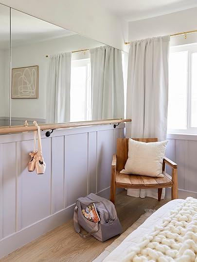
Color is by far the easiest and most impactful place to begin with ADD and the home environment. When we see color, our retina sends a message to our brain. That transmission triggers the release of certain hormones in our brains such as dopamine and serotonin. In each project that I’ve worked on with an ADD child, we begin with color.
Here’s a fun fact: rooms for ADHD do not need to be all white. There is a notion that ADD or ADHD means you are over-stimulated. That’s false. Many ADHD individuals — kids and adults, alike — are actually being understimulated in a way that results in their symptoms. Using colors, especially in these situations, can be an appropriate way to increase healthy brain regulation.
Blues, greens, and whites are the go-to when creating a sense of calm, but if we want to encourage productivity or increase energy, pops of reds, oranges, and yellows are where we turn.
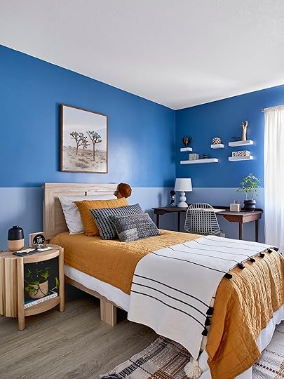
This room was designed for the son of my client who was struggling with his ADD. We wanted to land on a color that could meet him on two planes. He wanted a space to decompress at the end of the day but also encourage an increased amount of focus for reading or homework when the time called for it. Together, he and I landed on a blue that was both calming when he needed it and invigorating when his goal was to be productive.
ORGANIZATIONOrganization is a great way to empower our kids to be in charge of the behavioral symptoms that often come along with this diagnosis — those symptoms being forgetfulness, lack of focus, and an inability to stay on task…among others. In the case of a loved one suffering with ADHD/ADD it’s difficult to watch them struggle with symptoms while simultaneously finding yourself frustrated at having to deal with the very same symptoms they are experiencing. In fact, I think I’ve heard every parent of an ADHD/ADD kid say at one point or another, “I get sick of asking them a thousand times to do something and them not doing it. It’s like they don’t even hear me,” — which by the way is a problem for every parent, but is definitely magnified for a parent of an ADHD kid.
Diagnosed or not, organization is good for all our brains. Things like order, consistency, and schedules, not only help us be more productive, they make us feel safer. All of which is important, especially for children with either of these diagnoses. But, here’s something important to know, people have different styles of organization that speak most to their brain. Some of us are visual, others are listers, while some are more abstract. What feels like chaos to you and I, makes sense to them.
When I’m designing organizational systems into a client’s home, I bring them into the process, especially if they have ADD or ADHD. Do the same with your kids. Start first with the intention of the room and organize to that goal. The reason being, what works for the cook in the kitchen might not work for your 13yr old who needs something very different for their space.
Also, expand your mindset around organization. Yes, it’s bins and baskets, but it’s also behavior. If we can solve or establish a behavior before the disorganization begins then we are remedying the symptom before it happens. What that looks like is this:

In this client’s home, we turned a 1988 wet bar into a mudroom wall, complete with a drop zone cubby system. Each family member had their own cubby and we had lower baskets for shoes, bags, and purses. Hooks — which I love to ensure we are using all the vertical space — went on the opposing wall, keeping jackets, scarves, and hats off the floor.
The bar top was also zoned to include a spot for keys and an intention tray, my solution to help give visual to your personal goals and dreams.

This entire space, built first to give their child with ADD a system to keep them on track, quickly became a solve for the whole family.
TIME INThere are three main ways that ADHD presents. Those three are: Inattentive, which is the difficulty to pay attention, Hyperactivity-Impulse, which leads to extreme struggles with sitting still or impulse regulation, or Combination, which is a blend of the two. What complicates all of this, is that there are other challenges that can look like ADHD or ADD but aren’t, like depression, anxiety, or sleep disorders. While all of that adds to the confusion of what your child may be facing, one thing is clear. For children wrestling with a range of these symptoms, there is a real struggle for them to feel in charge of or in tune with their mind/body connection.
As science shows us, the mind/body connection is increasingly-important, affecting focus, productivity, healing, and so much more. As a tool to solve this, I like to create TIME IN spaces, these are spots in our homes where your child can reset and be present.
The payoff for TIME IN with kids is HUGE.
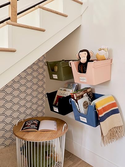
In this TIME IN space, I created a nook under the stairs by DIY’ing a faux wall with foam board. I lined both sides with temp wallpaper but on the other side – facing into the dining room – I used the space to put in a wine rack.
This space is almost always small in scale to cocoon the child. It’s meant as a quiet space where they can sit and read or simply daydream, all to calm the mind and body.
On the wall we installed bins and filled them with intentional activities that research has shown, quiet the mind. These activities can be tailored to the child but often include a sensory focus such as aromatherapy and music to help the child connect their mind to their body, always adding in quiet games to increase focus and blankets or plushies to soothe.
COMMUNALWith ADD and ADHD, it can be easy to give more focus to behaviors that are less than ideal in our kids than it can be to speak about what is working. In other words, we risk no’s and criticisms becoming louder than kudos and compliments. I like to reverse engineer our thinking on parenting from correcting behavior to building it.
I have three daughters hitting three different developmental stages — a 16-year-old, a younger teen at 14, and a 3rd grader. Our schedules are bananas! Yes, we have all sorts of scheduling apps that we can resort to, but somehow paper, clutter, and junk find their way onto every surface from the stair steps to the kitchen countertops. Like my clients, we too, were desperately in need of our own dropzone. To define ours, I traced out the most common path from where we enter the home through the garage into the kitchen and I saw how our stuff pile-up began the moment our kids hit the door. So, I followed the advice I give to my own clients. I created a FAMILY COMMAND CENTER. Like them, I chose the wall that we never paid much attention to and maximized it.
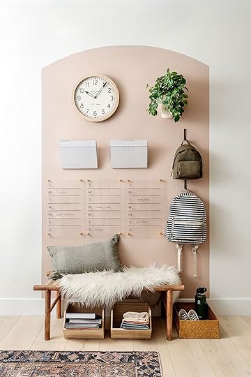 photo by ali harper
To start, we added hooks to utilize all the vertical space. Next – and I love this tip – I used paint to define and frame our wall workspace. It is SO effective because the color is the cue to pay attention, something that if you’re like me, you are always shouting at your kids to do. TBH, I lump my husband Travis into that, too. He has ADD and I’m on him as much as the kids to help keep the schedules and the space organized. This wall is my first line of defense.
By choosing an unused wall, you are building a home organizational system seemingly out of nothing and tailoring it to your needs!
 photo by ali harper
Another great thing is to add a habit board to your wall. This is where we can build positive processes and patterns that become the habits that keep us on track. No habit is too small. Plus it allows us to celebrate our wins as a family.
I devised my own habit tracker in my primary bathroom to help me get into the groove of exercising and meditating, during the pandemic when I literally lost all of my personal space, I created a small corner in my bathroom to lift weights, do yoga, and meditate. My habit tracker reminds me to keep up with my habits so that I don’t lose track of my previous routine.
Between the colors or sticker systems, this entire wall becomes a visual cue for our goals. And for children with ADD or ADHD, it can help build focus and establish routines that lead to positive behaviors. Don’t shy away from customizing this space with family goals or memories, whatever it takes to make this a destination.
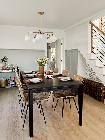
Lastly, and maybe most importantly, set a weekly family meeting. This is where you all come together in the same communal space each week. I like the dining room. Phones go away and we check in with one another. As parents, arm yourself with a list of family goals, needs, and updates as well as plenty of questions to get those kids talking.
For my client teenager struggling with ADD and his family, we found that their dining room was the perfect neutral space to share feelings and frustrations as well as problem-solve. Finding a non-judgemental area in the home, where they could meet regularly, was the key to opening up positive communication for their family. When I was a full-time therapist, this was the main tool I helped families implement.

There is so much rich data that tells us that parents and kids talking like this leads to goodness in their mental health and ours. That might sound obvious, but with devices, activities, and a zillion other things vying for our attention – not to mention an already over or under-stimulated brain — and it’s too easy for hi and bye to be the extent of our daily exchange.
The number one thing to remember about our spaces and our struggles, be it ADD, ADHD, or something else, is that our homes are more than just a backdrop for our lives. They are a reflection of the habits and balance we are creating in ourselves. When we evoke the design of our surroundings to support us, our homes can actually lift us up and enrich our mental health.
*Designs by Anita Yokota
**Styling by Emily Bowser
***Photos by Sara Ligorria-Tramp (unless otherwise noted)
The post 5 Design Tips To Keep In Mind When Designing For A Kid (Or Adult) With ADD/ADHD…From A Designer/Licensed Marriage And Family Therapist appeared first on Emily Henderson.
Emily Henderson's Blog

- Emily Henderson's profile
- 10 followers

