
Emily Henderson's Blog, page 247
September 17, 2019
These Unique Beds & Headboards Will Make You Want to Rethink Your Bedroom Style
 design by studio shamshiri | image via architectural digest | photo by stephen kent johnson
Despite the complete lack of any final designs, I have been thinking, dreaming and getting hard, random pangs of headboard ideas for my bed nook . Yes, someday (hopefully in the not too far future), you will see where I rest my head and the headboard I WILL design. Our office was closed the last week in August, and over our break, I whispered the first whims of a custom headboard to my father and you could visibly see the fear in his eyes. But because he is truly the greatest and most likely forgot what a pain in the butt I was during my other MOTO projects (check out my DIY-filled living room and kitchen here), he restrained himself from instantly running away and instead talked me through one of the top design contenders. My goal? Something wooden, “cool,” simple but interesting and easy “enough” (for my dad) to make. No problem and will most likely not result in the end of our otherwise great father-daughter relationship…right?
 right: image via domino | design by phoebe nicol | left: image via remodelista | design by studio shamshiri
The headboards above and below have all been HUGE inspirations for me. The predictability of my love for squiggles is stupid at this point. BUT the curves, interesting details and the attention they demand are (once again) proof that getting a little “risky” with your bed (like we proved with sofas and accents tables) gives your bedroom personality and uniqueness. That is really what I want.
 image and design via chzon | photo by karel balas
In my long and vast headboard research, I was seeing a ton of really awesome headboards and beds. Wonderful products that don’t cause you to risk your family’s happiness and instead you can just BUY. Like click, purchase and install…all in a completely reasonable timeline. An obvious foreign concept to me. So I thought to put my madness to good use by rounding up 62 of my favorite “not your average” headboards and beds if like me, you are searching for something outside of the rectangle.
 styled by nc interiors and greenhouse interiors | image via nc interiors | photo by armelle habib
I want to kick it off with my headboard crew. Whether you prefer just a headboard or have no other choice (like me), there are a lot of great, cool options that are actually very reasonably priced. To break up the price points, let’s start with the most affordable with the under $400 category (FYI a lot are under $250).

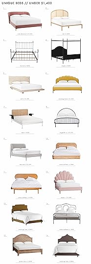
1. Paloma Metal Retro Headboard | 2. Curved Headboard | 3. Arched Headboard | 4. Palmera Fan Headboard | 5. Natural Woven Wingback Headboard | 6. Headboard in Beige & Navy Blue | 7. Upholstered Channel Stitched Headboard | 8. Mid-Century Wood and Synthetic Rattan Wrap-Around Headboard | 9. Peacock Rattan Queen Headboard | 10. Linen French Yellow Tufted Headboard | 11. Noctis Headboard | 12. Lynette Headboard | 13. Duke Metal Headboard | 14. Imelda Grey Headboard
If I had to pick my favorites, I would go with #1, #2, #8, #14. The first one is a pretty killer and a crazy affordable dupe of an Anthropologie bed you may have seen. The second is a beautiful, modern and simple shape that looks awesome in that velvet pink. #8 looks like a great affordable canned headboard option but can also be purchased as a full bed if that works better for you. Lastly, I really like #14 because of its simple shape. However, if I were to buy it, I would paint it a deep jewel tone color to modernize it a bit. Don’t forget that you can always DIY if something isn’t exactly what you want.
Onto the more expensive bunch…

1. Bed Head | 2. Antique Pine Queen Size Headboard | 3. Slipcover Headboard | 4. Buchanan Headboard | 5. Sera Headboard | 6. 1970s Vintage Polished Chrome King Size Headboard | 7. Stella Bedhead | 8. Paxton Headboard | 9. Boho Chic Rattan Full Headboard | 10. Velvet-Upholstered Headboard | 11. Camden Untufted Headboard | 12. Lempi Headboard | 13. Mid-Century Modern Italian Faux Bamboo Gilt Metal Queen Headboard | 14. Zane Headboard
I love LOVE #1 and #2 for the same reasons: Raw wood, simple and special. I think #6 is just sick. It’s vintage from Chairish so it’s incredibly unique which makes sense why it’s on the pricier side. Lastly, I really love #8 because the shape is interesting and that Kelly Wearstler fabric is one of my favorites.
Now that we have headboards pretty much down, let’s move onto beds…
 design by amber interiors | photo by tessa neustadt
 It’s probably no surprise but beds are usually more expensive than headboards and “unique” beds also come with a higher price tag than your average bed. However, I searched the internet to find the best “less conventional” looking beds that range a decent number of budgets. I also want to say there is NOTHING wrong with a simple rectangle headboard bed. It’s all about what speaks to you and what you love. There are millions of ways to show your personality. But maybe some of you will find your dream bed now…
1. Ava Pink Bed | 2. Bobila Cane Bed | 3. Black Wrought Iron Queen Size Sleigh Bed | 4. Southwick Farmhouse Queen Size Metal Canopy Bed | 5. Landscape Live Edge Bed | 6. Isabella Platform Bed | 7. DELAKTIG | 8. Irving Iron Bed | 9. Lana Upholstered Bed | 10. Ria Rattan Bed | 11. Camila Bed | 12. The Emily & Meritt Shell Upholstered Bed | 13. Paxton Bed | 14. Aria Metal Bed | 15. Camille Bed | 16. Thalia Bed
Man, this is fun to look at these beds but my favorites (I think, it’s so hard): #1, #3, #4, and #11. #1 looks like the most luxurious hug in the world. #3 is such a cool, modern traditional vintage bed that I would absolutely own if I could. #4 kills me! I think everyone should buy this bed now before Target realizes it’s way underpriced. #11’s style is very much what I am currently into and would highly consider it if I could. I think I’m really making my bed nook design sound cryptic at this point. You’ll see what my challengers are in due time. 


September 16, 2019
Our LA Playroom Update With Solutions That Work For Us + Another DIY Fail

There is no room that I apologize for more than this one. And while I know we are all done apologizing, I physically can’t help it because I’m TRULY regretful that I can’t seem to figure this one out. When new people walk in I immediately distract them to the left, into the living room with a ‘nothing to see over there!’ vibe. It’s gotten better, thank god so today you are going to see where we are at now, and how I’m stuck and another epic DIY fail.
When I started this playroom, the kids were 2 and 4. They are now 3 1/2 and 5 1/2 and if I don’t start speeding this up I will have two tweens no longer interested in playing ‘horsies’ or ‘inventor’. But I was distracted by the mountain house and at such a loss of what to do here that I just couldn’t.
Here’s where we started:
BEFORE:

When we bought the house, it looked like the above photo. Sure, easy enough. It would be the playroom, er, TV room, er both…
But I’d make it cozy…paint it really dark, not realizing that it would chop up the house so much and make it feel so much smaller.
That was makeshift, obviously, with leftover furniture, not actually designed, but you get the idea.

So we painted it light and got a sofa that was better scale for the space, but it was still a TV room with some toy storage in the back. (The sofa now lives in the apartment of our last Feel Good Flash Makeover.
But then we realized that the kids really needed a playroom, a space just for them. We nixed the sofa and TV and brought in a bunch of toy storage.

We made the same mistake that a lot of new parents make—too many toys, not enough that they actually play with or engage with for a long time. Bins of balls, action heroes and garbage that they pull out all day every day but they don’t really engage with. They liked the play kitchen, but the rest was mostly for other kids to be enamored with, not them. As much as I begged them to play dollhouse with me, they weren’t old enough. Even that adorable workbench that we got for them for Christmas sat totally untouched unless we did it with them. What they love are two things: arts and crafts and building things (think Legos).

THE CHALLENGES:
It’s a long skinny room that needs to function as the playroom (for now) but you see it IMMEDIATELY when you walk in. I actually wanted to put in some glass doors and somehow figure out how to decrease its importance and give it its own space (because someday it would be a great home office) but Brian wasn’t on board as he thought it would break up the space too much and make it feel smaller (it would).
It has an architectural break in the wall, almost creating two different spaces, but it’s awkward.
You can see it from many rooms on the first floor so it can’t scream TOYS and instead, should look pulled together. You know, as if an actual designer lives here, but I still want it to be playful and fun, you know, as if it’s an actual playroom.
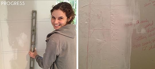
Additionally, the lighting felt too big. It doesn’t look like it in the photos, but I just wanted to simplify it a bit.
After trying a million different layouts, I drew inspiration from, well, our preschool and had the idea that maybe where the wall juts out should be its own “room,” with cubby dividers creating walls and a sense of privacy for them. Not because they need privacy, but because creating zones seems like what little kids like, and areas where they can imagine and play felt right for their age. I was right and this was a huge hit with them.
The good news:
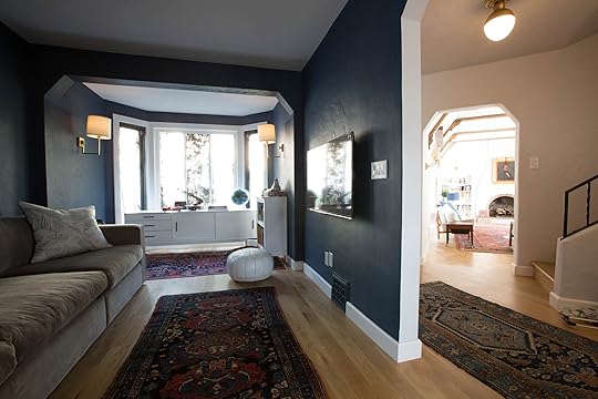
MURAL: I love that mural so much. I ordered it from Rebel Walls and you can size it exactly to your wall so it fits perfectly. And yes, we put it over the plaster wall because we didn’t want to skim coat over the original pretty plaster as we knew that someday we would likely remove it and then we’d have one flat wall. We customized the color to be a nice muted navy blue and white. It’s graphic yet exciting, as it’s not too busy and it’s playful in an old-world way (matching our 100-year-old English Tudor).
LIGHTING: I switched out the lighting so that the sconces matched the living room (we stole two from the living room over the bookshelves and instead put in horizontal art lights—I’ll show you soon). They project less into the room but still provide nice lighting (the house has no can lighting and we didn’t put any in except for in the kitchen and bathrooms during the remodel). We switched out the ceiling fixture to be glass (from Rejuvenation) so it took up less visual space. It is raw brass so it will age really nicely. I love them both.
RUG: The round rug really helps that space feel brighter and more playful. Obviously a round white rug in a playroom seems a bit nuts, so I bought an inexpensive one in hopes that if it only lasts for a couple of years, I’m at least not wasting too much money. The other options we considered are a darker round rug (which might have been a better choice long-term) or using Flor tiles. But out of desperation on a Saturday morning, I pressed “purchase” and you know what? It’s been TWO months and it still looks this white. It’s cheap, 100% polyester or rayon and for some reason, maybe that it’s such a high pile, it hasn’t stained at all. I came up with a genius rule that there are not paints in the craft room, which they don’t miss (remember we can play/paint year-round outside in LA) so it’s actually GREAT.

ART TABLE: I bought the table a year ago and put on the taller legs that came with it so it’s a great height for them (and us) to sit at. I used Target stools that come with a different table that was too small, but we had leftover from another project. I wish they sold them on their own. Elliot sits here for HOURS a day. She spends more time drawing than I ever knew a child could. It’s amazing.

BOOKCASES: I used that architectural break to divide the room with bookcases. They each take a side. On Charlie’s, he has his Legos (the kid is SUPER into Legos, guys) and he displays them on the top shelf. Birdie has a ton of beads, treasure boxes, princess crowns and horses. I already had these Pillowfort bookcases/cubbies from Target that were functional and great but the back of them had a wood/white detail that was too busy to be seen from the back.
So here were our options:
Make it look more “built-in” and cover it with with the same white as the molding and even add trim pieces like a baseboard and a trim piece against the wall to make it look “built-in.” That is a lot of work though for two pieces of furniture that are definitely NOT built-in.
Make the back of the shelves functional (as in create some sort of feature for them).
The Pottery Barn shelving (from the “befores”) is now upstairs in their room (not all of it—some is in storage).
After thinking about it for a while, we realized that we would be spending way too much time/money trying to make a piece of furniture look built-in. If it were something we could do ourselves (Brian and I), that would be different but paying someone (our handy PA, Shade) to do it could take hours and add up to hundreds.
So instead, we had this idea that we would put a pegboard on the back that could be a few different interactive things, such as:
Rubberband art:
 images: left via instructables | right via kara paslay designs
Marble run or tubes that you snake around the pegs:
 images: left via frugal fun 4 boys | right via frugal fun 4 boys
You can use cardboard tubes like they did on the left, or really bendable tubes, or PVC pipes like they did on the right.
We do need more art storage for more maker supplies so we also thought that one of them could be styled out more like this:
 image via cup of jo
This is where it all started going/rolling downhill.
Because we are perfectionists, we felt that we couldn’t use something readymade. WE don’t just buy pegboard, no, and certainly not a system from IKEA that would, well, create the most perfect and functional art wall. NO, we have far too much time and money to waste to do a simple solution!
Instead, Shade would buy some plywood, cut it perfectly to size and drill each hole INDIVIDUALLY, then attach it to the back of the shelves (after bolting them together). Sounds easy, but this did, of course, take time and time is money. I think he spent a day and a half on it, which is about $350 in labor (not including materials). We ordered some marble run stuff and attached the pegs to them so they could move it around and create their own creation.
The problem is by customizing our own holes, it fits no art system because they aren’t spaced apart in a standard way.
I’ll remind you what it looks like:
We found these raw wood marble run pieces and glued pegs into them, with the hope that they can be rearranged on the peg wall and be an interactive game that our kids will spend hours quietly playing with.
The kids came home that first day, got excited then realized that they are VERY hard to take in and out and went back to Legos and art. Even when I sat down to do it, I got frustrated. It could be that they are too young, but it’s frankly just more annoying and the payoff (a marble rolling) isn’t worth their frustration.

Admittedly, it does look fun, but for whatever reason, they don’t like it. It’s kinda hard and again the payoff isn’t worth it.
Around the same time, we bought an art system for the play attic at the mountain house that was awesome (update on that space with photos coming soon). I then realized that we had gone through all this trouble to create a custom system that already exists readymade and affordable, only better and more functional! It would be like spending months designing a chair that already exists.
Cool. Sure, it’s white and plastic and ours is raw wood and pretty, but I actually think that white would work better in here anyway. Why didn’t we just do this in the first place? Honestly, because I haven’t been to IKEA in years and didn’t know it existed. I was hasty. Too busy to research. Preferring instead to spend time and money customizing something that doesn’t work.
Additionally, after ours was done, I thought we couldn’t find pegs that really fit easily because the ones that we bought for the marble runs were too big and tight. Then last week, I decided to, you know, measure the holes. From there, I Googled pegs that size, ordered them and boom. The morning of the shoot, I set up the rubber band activity and it looked cute. I couldn’t find rubberbands so I used Birdie’s hairtyes to show you the function.

PLOT TWIST:
When the kids came home from school on Thursday (when we shot this), they started playing with the rubberband wall and proceeded to play for a while (I’d say around 25 minutes which is a long engagement time for a 3 and 5-year-old). Birdie wanted rubber bands on her side so we took out the marble run and they put the pegs in where they wanted them, moved them around and made patterns, letters and shapes with the hair ties. We then found our actual rubber bands, started playing with those and guess what? It’s a really fun guitar wall and they played with that for a while.
So now I’m thinking that maybe it wasn’t an epic DIY fail but only time will tell. Part of me wants to fill the holes and paint it white and then attach the art organization system I mentioned we already have at the mountain house.
I did, however, buy them a cart full of garbage to play with in the meantime.

We call it the “makers cart” or the “inventor cart.” It’s full of recyclables (plastic containers, cans, paper towel rolls, newspaper), different tapes (I need to buy stock in 3M or Scotch because the amount of tape we buy for them to make things is INSANE), magnets, screws/bolts/brackets, strings, pipe cleaners, etc. Hell, we put all takeout materials in there—chopsticks, plastic forks, etc…
Like I said, LITERAL GARBAGE, but it makes us feel way less bad if they at least get some creativity out of that waste. Charlie LOVES it. Birdie is much more into art and coloring, but Charlie loves inventing things and our neighbor (my best friend’s son) tortures her with bringing home his “inventions” daily (riddling her house with our garbage).
So there’s one success.
I also LOVE this art wall. Like nothing makes me happier than when they finish something and ask me if they can put it on the wall (not sure why they ask).

So the next challenge is making a big bulletin board that is actually pretty. Here are my ideas:
Put it in an interesting shape, like a house. Have it lean or start on the floor so that they can reach and add their own finished pieces.
Use masonite (a soft composite) and cover in a fabric (likely a pretty linen or maybe a subtle pattern).
Mount a thick roll of cork to plywood then paint it a color or white.
Frame or trim it out with thin wood.
Like so:
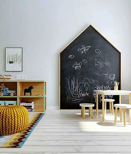 image via live loud girl
I’ve tried to think about different shapes that make sense, to try to reinvent this but I haven’t come up with something that would be easy to execute that makes sense for art. I love the graphicness of the house, and remember that we have a big moment, the mural on the opposite side of the room.

Okay. This room also needs to kinda function as the kids mud-room. So we brought in that bench that has great storage, but also provides a great drop place for the kids’ bags and shoes, as if they put them there, EVER. HA. They are getting better, but the first week of school they dropped them within inches of the door, on the floor.
The drawers right now hold more art supplies and paper, but will be great for either shoes or homework stuff later. We had it at the foot of our bed for a while (which we loved) but we needed it down here more.
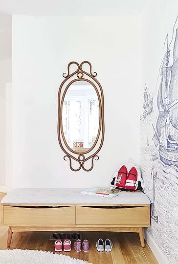
I was going to get a bigger mirror, possibly pill-shaped because its 2019 and evidently we DON’T do rectangles in 2019, but then I found this vintage Thonet mirror at a thrift store near the mountain house and couldn’t not buy it (I think it was like $45) and so one day I put it up on an already existing nail and realized that I actually might love it here.
Side note: I never bought or installed nice grate covers. I meant to. I have had it on my list for 2 years now. It’s a long list but above it are things like “raise children” and “stay alive” which are taking more time than I had predicted, so the bottom of the list sits there unchecked. Instead, we have the $3 ones that I feel like you could buy at 7-11. I really need to replace them and will, I promise. (I have a personal assistant now so maybe it will happen before 2025!).
Now I need to decide if I want to add hooks for bags and make it look like a proper Pinterest-worthy mudroom or just call it and let them put their bags on the bench because that is more likely to actually happen.
So I’d love any and all opinions on what to do in here. I know I want to create a more awesome art wall. I know that Birdie would like easier access to art supplies, but we could just do another cart full of supplies and tools and keep the rubberband art. Also right now she is super into colored pencils because that is what is in front of her, why do I need to add more? Less is more with kids, right?
Resources:
Toy Cubbies | Table | Stools (similar) | Rug | Bench | Wall Mural | Ceiling Flushmount | Sconces | Supply Cart | Marble Run Set | Play Kitchen
***Update photos by Veronica Crawford
The post Our LA Playroom Update With Solutions That Work For Us + Another DIY Fail appeared first on Emily Henderson.
September 15, 2019
The Link Up: $30 Boots Emily is VERY Into, Mallory’s “Spectacular” Budget Leggings & the Grain-Free Chips We Can’t Stop Eating
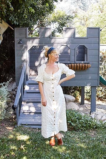
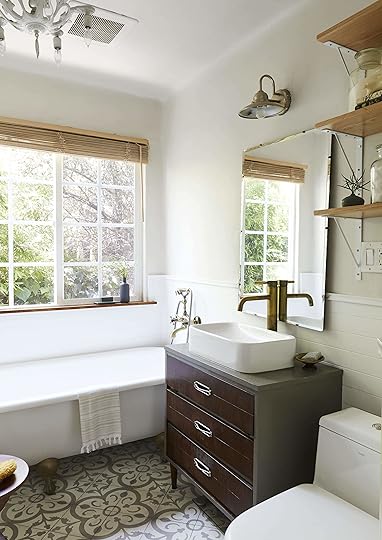
 image via Architectural Digest | design by Pamela Shamshiri
Happy Sunday funday, folks. This week you were invited to the coolest party in town (a.k.a. ), we went thrifting with Emily, and furthered her fashion story with “Uptown Prairie.” Meanwhile, our production and editorial calendars are already into December, meaning we have officially started shooting holiday content ::gulp::. But no need to fret because you won’t be seeing wreaths or stocking stuffer recommendations just yet. We are still very much into summer as our links most certainly suggest, so let’s get to it:
We’re in the process of working up a “fall accessories trend” piece for later on in the month (stay tuned), and Emily stumbled upon these under-$30 boots she’s very much into and wanted to share ASAP because the sizes are almost all sold out. These are similar, though a little chunkier—more “combat” than “prairie.”
There was a collective “WHOA” in the office when we all hovered over one person’s desktop to look at this home tour—the “country” home of Anna Hathway and her jewelry designer husband Adam Shulman.
The big 1-0 wedding anniversary trip is coming up for Bowser, where she will be bicycling through the Swiss and French Alps. Knowing she has to be active and très chic, she went on the hunt for the perfect fanny pack. She settled on this “belt” bag (way chic-er sounding than fanny pack) in black by Madewell (available at Nordstrom).
If you haven’t already indulged in the best show on Netflix then may Jess present Blown Away. It’s a competition show about glass blowing and while it sounds like a “pass,” it is NOT. Jess is praying Deborah gets her own show. Watch and you’ll agree. Maybe we’ll start a campaign.
Ryann loved this short article on how 25 very famous and successful women get their best ideas. “Anytime I can absorb wisdom from J.K Rowling, Toni Morrison, and Kristen Wiig to name a few, I’m in.” Plus, she always finds it inspiring to read/hear about creative people’s creative process.
The entire office loves to steal these amazing Siete tortilla chips from Chandler. They’re grain-free, come in multiple flavors and pair very well with salsa and guacamole. The brand also has grain-free tortillas, cashew queso and more if you’re into that, and we promise they taste so, SO good!
Arlyn is all about the “feel good” Instagram accounts because the world needs more visible goodness, so one of her favorites to follow is Tanks Good News. It’s just what it sounds like: news, but good.
New to the gym life, Mallory has been purchasing workout clothes like a madwoman. Quality is the name, cheap is the game, and she recently found these leggings from Nordstrom rack (for only $28) and they are spectacular for the price. She pairs them with this shirt (which she bought in two colors) and it’s only $19.
Veronica has wanted Nike slides forever, and finally took the plunge and bought these a few weeks ago. “They are so comfortable and perfect for the beach, around the house, running quick errands, communal showers, or just everyday use. And, they’re on sale right now.”
Carolina is a matcha devotee. One of her favorite places to visit is Matcha Bar in LA, and she just discovered their Matcha Green Tea Powder Tin! Not only is it so easy to make but saves her SOOO MUCH $$. She also recommends getting this handheld whisk.
Sara recently bought these shorts and they are here new favorite. They’re just long enough that they stop her thighs from chaffing, but not so long that they look like Bermuda shorts. They also have some stretch to them. And the light gray color feels very modern.
There you have it, a very short and sweet link up. Will you be joining us tomorrow? Great. It’s a date. xx
The post The Link Up: $30 Boots Emily is VERY Into, Mallory’s “Spectacular” Budget Leggings & the Grain-Free Chips We Can’t Stop Eating appeared first on Emily Henderson.
September 14, 2019
Turns Out My “Uptown Prairie” Style Is All Over The Internet (And Affordable, Too)

The “Uptown Prairie” look, my officially diagnosed 2019 style and possible “forever style” does not exist just in my closet; nay, it’s all over the internet (oh zeitgeist I’m your victim AGAIN). I’ve historically said that I’m a mix of Footloose-meets-Mad-Men-meets-Wes-Anderson-meets-Marie-Antoinette (in both home and fashion) and I think that the only thing I would take out now is Wes Anderson. I wish I had elements of that amazing weirdness, but not sure I do in my fashion anymore. ANYWAY, in case you are wondering what “Uptown Prairie” is, it’s a mix of country (ripped Levi’s, boots, plaids with ruffles, anything that feels you could ride a horse/bull in), Victorian (puffed sleeves, bohemian patterns, billowy silhouettes) with a slight hit of rogue Ren-Faire/Pirate/Outlander. The trick is to make sure that it’s not a costume, so I mix it with vans, sneakers, modern jackets and, of course, some basic T-shirts. It’s typically casual, but when needed can be elevated. Most of my uniform involves some sort of ripped pants/shorts, and a top from Ulla Johnson, The Great, or Doen which are three American-made brands that make high quality, long-lasting clothes that I wear for years and years. They are expensive, yes, so we wanted to do a roundup of a more affordable Uptown Prairie for all those who are interested in dabbling into the trend without making such an investment. (Of course, I understand “affordable” is relative, and some of below pieces are still not exactly “budget” but certainly not $300 for a top.)
So my team ordered me a few pieces, some of which I think worked; others were more Uptown Pirate than Uptown Prairie but I know someone who would love that—one Charlie Henderson. I have such a Nurse Betty brain though, guys, and as I am marathoning Outlander and legitimately obsessed with this 18th-century style, it has wormed its way into my wardrobe (and language and LITERALLY EVERYTHING I DO). So, now I’m like “Do I like this shirt or do I just want to be an extra on the boat as we sail to Jamaica to find Young Ian?” Aye. It can be confusing to me, too. But as for the three looks we did, I really liked a lot of the pieces and can vouch for their “Uptown Prairie” vibe.

Shop the Look: Shirt | Shorts | Hat | Shoes
First up, I like this shirt, I do, but it is oversized so just size WAY down. I’m wearing an XS if that helps you at all. I was coveting a few other shirts from Free People (here and here), but we couldn’t get them in time. (I’ll keep you updated if they are a “hell yes” when they come.) THAT HAT THOUGH. We all agreed that the hat is GREAT. It’s extremely lightweight and almost made out of that same material as Chilewich placemats (in a good way). It’s really breathable and I would even say really packable so you don’t have to be like me and wear 2-3 hats in the airport and on the plane because you don’t want to ruin them in your suitcase nor do you want to succumb to hat boxes.
Next is more of my “Uptown Chambermaid” look, hmm…or maybe just “Chambermaid.”
Shop the Look: Dress | Scarf (similar) | Shoes (similar here)
Wait. This is more appropriate:

I just need a wee bairn on me chebs! (Translation: a little baby on my breasts.)
I have to say I felt kinda sexy in this, but it could be because I’m channeling my inner Claire and awaiting Jamie to get back from the stables, while I tend to me garden. The dress falls really nicely but I fear that my bosoms might be too large for me to be comfortable wearing in public… in this century anyway.
For the last look, we ventured back to the year 2019 and went with a more basic and simple slightly on-look chambray dress, with cute little princess sleeves and a really flattering silhouette (am I not allowed to use the word “flattering”? I forget the rules to modern feminist PC at times…we didn’t have such restraints in 1754 Scotland—nye).

Shop the Look: Dress | Shoes | Scarf
I kept saying that it’s so good for church—so comfortable, easy to wear and wrangle kids in, but modest. And yes, I’m back to going to a church. Excited to hear the “journey” and see what denomination if any I’m currently liking?? Stay tuned… But yes, it’s a perfect “farmers market to church to Sunday supper” kind of dress and I know I have a lot of my LDS ladies reading so that one is for you.
September 13, 2019
My Latest Vintage Haul + HOT TIPS on What to Buy (& Skip) at the Antique Mall/Flea Market


This is a good old fashion vintage “what I bought and why,” “what I realized I didn’t really need so I skipped” with a special edition addendum of “what I ended up not needing and returning and kinda feeling like an A-hole” post. I went to the Pasadena Antique Mall and annex, a frequent of mine when I need a fix. We were doing a sponsored story for our social channels about vintage shopping, but I figured this could easily be a blog post with some tips and general questions to ask yourself when shopping. It helps to have someone there so your solo external processing doesn’t alarm the locals. I’ve been known to grab any warm body that had a couple of hours to spare to come with me simply so it doesn’t look like I’m talking to myself. A Weekend at Bernies sort of strategy could work, as well. I try to implement any Weekend at Bernies strategy when possible. REMEMBER WHEN HOLLYWOOD MADE MOVIES ABOUT FALLING IN LOVE WITH STORE MANNEQUINS AND PEOPLE YACHTING WITH DEAD RICH MEN?
Which brings me to my obvious segway into what I scored and what I overpaid for (and why).
First up: a primitive dough bowl that, TWIST, has legs so it could kinda be a table.

I had been eyeing this dough bowl for MONTHS. The reason I didn’t pull the trigger before was:
I don’t need it. Still don’t.
It’s expensive at $375; if it were $125, I would hoard it for the right project or my future farmhouse.
I don’t really know what to do with it. Sure, I know that back in the day they literally made dough in it and I am marathoning Outlander every night, set in te highlands of 18th-century Scotland, so I think we all know that I’m about to start using my own urine to set the dyes in my indigo tapestries, and therefore making the kids’ birthday cakes in said dough bowl isn’t far behind. But for now…
I thought it could be a GREAT key/purse drop, which I still concur however I don’t have room for it in my entry. We also thought we could put glass on it as a side table, but that sounds kinda weird and it would be high. Maybe a blanket holder? A magazine holder? A bassinet?
Then Brian chimed in with the winning answer: a very large, guacamole making/serving bowl. Obviously.
JK.
Ultimately, I bought it on “memo” which means I have 24 hours to try it out and bring it back or they charge my card. They will not do this for everyone, mostly people they know or designers, but it is a nice feature to know that you can move it around your house, try to make it work but if it doesn’t, you are okay.
HOT TIP: Pull the piece out into the cleared hallway, like I did above. This piece was BURIED and it’s hard to see in that messy context, so pull it out and sometimes I even use my hands to block things visually so I can focus on it. I will then often refer to photos of my house on my phone because even though I KNOW what my house looks like, sometimes you need to stare at it to really see/feel if something will work or maybe you’ve forgotten that corner that could use a bit of primitive warmth.
Find out at the end if I own it or if the world’s chicest guacamole bowl is still available to be yours!
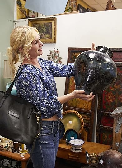
ANOTHER HOT TIP: There has to be at least one VERY compelling reason to buy vintage. Either A. It’s a steal (like this vase at $25), B. you NEED IT and C. It’s so amazing and you know you’ll love it forever. If it’s moderately priced, you don’t really need it and it’s cool but not soul-exploding wonderful, then skip it.
This vase was inexpensive at $25 and really big and dark and pretty. I don’t need it but that is a GREAT hoard either for a shoot, future project or when I feel like restyling a vignette in my house.
Now for something I REALLY wanted but I had to channel “logic” and “common sense” to make a decision:
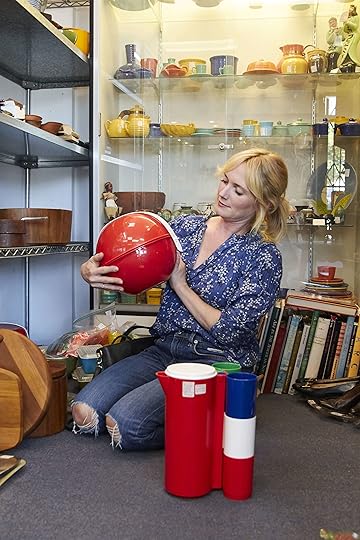
Vintage plastic portable picnic “baskets.” They come in these adorable little spheres with a handle, then inside are cups, dinner plates and smaller plates.
IT’S SO CUTE. The problem is that I’ve fallen victim multiple times to the “sound of music family-picnic fantasy” that rarely happens. When we do go on picnics, we need FAR more than just come cups and plates. We end up bringing a full cooler, with either ready-made sandwiches or plastic containers of garbage pasta salad from Albertsons. We picnic in the backyard all the time, but we don’t need to dirty any vintage plastic for it.
HOT TIP: Without looking, ask yourself what price you would pay, what you feel it would be worth it to you to pay, for YOUR life. The rule is that if it’s over that, you HAVE to put it back. In this instance, I said $30, and the rule is that if it’s over that, you HAVE to put it back.
For these, I said $30, and they turned out to be either $35 or $40 (don’t remember exactly). SO CLOSE. But $30 was already a stretch for something I’d likely only use once, lose all the pieces to then end up giving away. So NO GO.
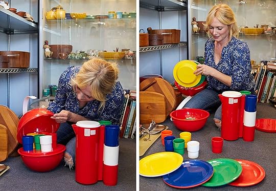
It’s the perfect playful photoshoot picnic set though. I pictured a big white pom pom vintage bedspread as the blanket (as you would with kids), sandwiches wrapped in parchment or maybe little cute white bread tea sandwiches. There would be a cut open bright red watermelon on a platter, vintage plaid napkins, and wooden utensils.
I had it all pictured. Shoot, I need to go back. This is why stylists are hoarders—we can envision the future shot and get a flutter in our belly about how a particular piece will not only be beautiful, but actually make our lives easier. Trying to find this when asked can be hard, hoarding it until you need it, even years down the road, is easier. This is not a tip, it’s just an ugly part of my psyche/reality.
But you know what you should NEVER pass up?

…a vintage French string dispenser. YOU NEED THIS.
I’d like to reiterate: this is why stylists are hoarders. There have been (and will be) so many shoots where I’m styling out a craft space or a desk and you want interesting desk props, and this wooden round container with that string coming out of the top so gracefully, with the perfect loop landing on the desk, is what will impress the art director, photographer and really MAKE THE SHOT.
It was $40. That’s absurd. Did I buy it? MAYBE. (cut to my kids finding it and unwinding all of the vintage French string followed by me screaming about not touching mommy’s vintage French string container—it was a great moment for the family).
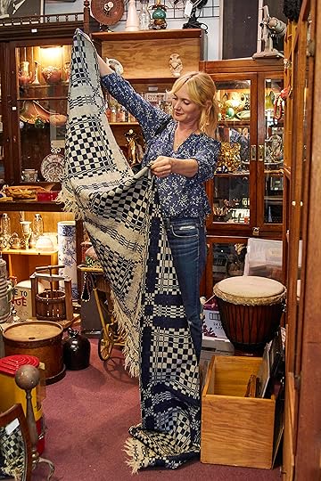
Then I found this scrap of primitive indigo fabric for $35. What do you do with a scrap of fabric? Here you go:
Pillows, duh
A table runner (if cleaned)
Layered at the foot of a bed over another blanket
Thrown over a simple headboard to dress it up
Thrown over a sofa
Cut up and stretched over wood for art or simply hung in a very vertical space like a stairway
I could do even one of those highly popular YouTube videos on how to wear a scarf with this. Did you know that people get famous and make millions from videos on how to wrap a scarf around one’s neck? The universe is clearly sending signs that I need to start wrapping my cold neck in primitive yardage and spreading my message to the tween population.
SEE? I NEED THIS.
Lastly, more art to hoard.

I bought this from Bonita Interiors within the Pasadena Antique Mall, a vendor I’ve shopped from for years but I didn’t know Angie was a painter. These pieces are my colors. They just LOOK like me, we all know this. And I knew that they would look GREAT in my master bedroom. The problem is that they were expensive, weighing in at $450 a piece. Now, I got a discount (I think 20% off) because I have a relationship and she knew I would post about it but I still think they are worth $450 because of the following reasons:
Materials cost money, and even buying materials takes time.
Talent takes time to cultivate, sometimes over DECADES of learning, experimenting, teaching yourself not to mention any classes or art school that was attended.
Creating a very good color palette is not easy, thus more time experimenting and likely a lot of first drafts.
Actually painting the piece takes time. I don’t know how much but this looks like over 10 hours.
Having it framed is expensive and takes more time/effort.
The stress of putting your work out there, paying for the booth that you sell it in and then merchandising in a way that looks good takes more time (and money).
You get it. If you can paint this yourself for less than $450, sure, go for it! If not, I think that an original painting for $450 is a great deal by a contemporary artist.
Now, onto some less good deals (i.e. what you should skip):

I find vintage 1960s architectural pots all the time and they are so expensive and look 100% like what you can find at the flower market, new. They HAVE to look special in order for you to splurge on them. Those back there were over $100 and were just gray pots. Sure they are old and yes, more important than what’s at the local nursery, but don’t buy something vintage if it’s not special and if a modern day version is actually better and more affordable. Seems obvious, but when you are shopping, it’s so easy to get wrapped up in and tell yourself this vintage pot fantasy, but be careful.

A vintage wood rocking horse, weighing in at $2,700. SKIP!

A “chair”(?) made out of punching bags that had a clear “please do not sit” on it sign, which always cracks me up. You want me to spend $3,400 on a “chair” (or whatever it was, it was in the thousands) and not sit on it? My other favorite sign at an antique mall is “NSF’ – NOT FOR SALE.” It both amuses me and pisses me off at the same time. Being the irreverent rebel that I am, I have challenged this MULTIPLE TIMES, with an “everything has a price” attitude. Sometimes it will be a super boring innocuous bookshelf that MIGHT be worth like $60, but they are all “nope, not for sale,” so I like to challenge back with a “well what If I offered you $1,500?” They say, “well of course I’d sell it then,” where I retort, “then put your top price on it!! Everything has a price!!”
It’s kinda an asshole conversation I realize, but it’s just so annoying when someone has a piece in their booth or even worst at the flea market that is NFS.
So here is the final haul…what I landed on:
Let’s play the “did I keep or return” game:
Dough bowl: For now, it’s back at the mall, but I’m picturing an epic Cinco De Mayo shoot where we need a 65-avocado guac situation (…or more realistically, what if I do actually move to a farm at some point? It’s so sculptural and beautiful and LEGIT…ugh…next to a bathtub with a plant in it, flowing over the sides?).
The vase, white pottery tray ($30, Bennington) string holder, fabric and black spiral sculpture ($60) are all a “hell yes.”
The black Thonet stool was a risk but I love all things Thonet. I don’t think it was too expensive, but don’t remember—I think like $125. But I got it home and tried it in a few places and it wasn’t a hell yes. If it had been all light wood, I could have hoarded it but between the mixed finishes and the scale and the curves, it just felt overly decorative for me without the perfect place to put it. I have SO many sculptural chairs (it’s a thing) so I didn’t need another.
The paintings are a hit and look great in the master bedroom. I think I actually might have only needed one, but I love them together, too.
There you go guys. I hope you learned the importance of using the word “French” when trying to sell overpriced string dispensers and why we should not balk at expensive original paintings.
Please stay tuned for my YouTube channel where I dramatically wrap myself in fabric/scarves, or better yet demonstrate the avant-garde “foot/bed scarf” which is an actual thing that I’d like to both expose and then take down.
***photography by Veronica Crawford
The post My Latest Vintage Haul + HOT TIPS on What to Buy (& Skip) at the Antique Mall/Flea Market appeared first on Emily Henderson.
September 12, 2019
All the New Fall Target Products We Used at the Mountain House Are Now Available

When we revealed the in August, we were granted early access to use a lot of pieces from Target’s fall collection that weren’t yet available online or in stores (perks of my partnership with them) so we couldn’t link it up for you when we rolled out those posts. I could sense your up-in-arms-ness through the computer, understandably, being teased by the affordability and style of those pieces without the ability to get your hands/bodies on them. Now that the fall collection has launched and is online, we got you and we are linking and calling out what is new (or evergreen that we used here) from Target. It’s peppered throughout the house, in every room, and it’s very, very good. Oh, and we have another big fall launch post coming up later this month with SUCH good stuff, so stay tuned for that. Target’s over here killin’ it, per usual.
LIVING ROOM

Shop the Look: Pouf | Green Throw | Candle | Cream and Wood Accent Chair
Because I used so much vintage, I shopped for mostly accessories, textiles, lighting, candles, pillows and smaller pieces of furniture. It’s the mix of high-end, vintage and more affordable pieces that makes the “low” feel high and makes the high, well…not bankrupt you.
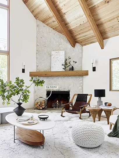
Shop the Look: Log Holder | Candle | Pouf
That log holder is the single best out there for how affordable it is. And that candle on the coffee table is so good. In other shots, we styled it with a black cone-shaped candle that we all loved, as well.

Shop the Look: Green Throw | Striped Pillow | Pouf | Entry Bench | Mirror
That green quilt is big enough to go on a bed, but we loved the color in here. I likely spent a combined 45 minutes throwing that quilt on the sofa to get the perfect “land” for every single angle. It moves based on the composition of the shot (like if the branches are right in front of it, then we moved it to the right or left). I wish I had footage of all the throws, over and over and over, unhappy in whatever way until you get THAT LAND. And then some passerby or child sits on it and you sadly have to murder them.
But the quilt is good, and that pillow is the perfect “interesting stripe.” In the entry (that we still need to shoot!), you can see a round mirror and a bench that are also from the fall collection.
LOFT
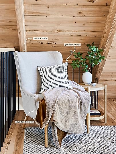
Shop the Look: Chair | Throw Pillow | Faux Fur Blanket
Our kids have adopted the faux fur blankets as their current blankie du jour/summer for the singular reason that they are the softest thing you’ll ever, ever, ever feel in your life. Like, if they were an animal in the 18th-century, royal women would pay thousands to wear this coat. Yes, they catch the light beautifully. Yes, they are in really warm colors (Charlie has this one and birdie has the pink ones) but my kids care less about colors or style-ability and more about how INCREDIBLY soft they are. They drag them down from their bedrooms every morning with them to watch cartoons and up back at night.
The wingback is great and while nobody sits there, it’s a really simple, classic piece to put in front of the busier railing. It was released last fall, and it’s still a winner, stylistically.
DINING ROOM

Shop the Look: Pillows Left to Right: Dash Pillow | Striped Pillow | Pom Pillow (similar)
While you know that we are likely going to redo the back cushions that came in too big (read this post for more info), for this shot (and for now) we styled the banquette with a ton of pillows from the new line, that will simply make it into other projects soon. There were some tabletop pieces that I loved also from Target that didn’t work in the shot but we linked up below.
FAMILY ROOM

Shop the Look: Table Lamp
You know I love a black shade on black lamp base. It’s so graphic and modern and edges up any room. This one is crazy affordable (and comes in wood, as well). We also like that it’s petite enough that it doesn’t overpower a vignette, but not so small that it feels like a child’s room.

Shop the Look: Oversize Square White Pillow (coming soon) | Black and White Contrast Pillow | Candle
More pillows, more candles—all really good. Target launched their new candle collection that rivals ANYTHING you’d find at a hipster store for $30. I love a pretty candle, mostly to make me feel like a grown person who can handle “nice things” but my kids will dig their fingers into the wax, thus I mostly just hope to receive them as gifts. Side note: Did I ever tell you about the candle I received as a Christmas gift from a famous European company that will remain nameless? It was the size of a gallon of milk and retailed for, get this, $600. I didn’t know what to do with that information and couldn’t believe that someone out there would indeed purchase this. WHAT IS THE WORLD??
Anyway, no need to spend even $40 on a candle unless it’s something you are really into (which I get). The new ones at Target look just as good for $15.
Also, those plush pillows are SO SOFT. They are out of the same material as the beloved blankets I mentioned earlier.
DOWNSTAIRS GUEST ROOM

Shop the Look: Grey Quilt (coming soon) | Green Quilt | Linen Comforter | Green Pillow
Bedding is one place where I like to mix one to two pieces of more special/high end with mostly affordable layers. The comforter is Target’s linen one that’s been out for a while, but the stitched gray quilt and green velvet quilt (same as on living room sectional, although a little more muted here—the living room shot is more accurate) the green pillow, as well as the basic fillers, are where you can save, easily.

Shop the Look: Sherpa Chair
That sherpa chair is soooo good. We used it in both bedrooms for the shoot. It worked perfectly with our warm Scandi vibe, although it could have worked well in our Atlanta makeover, as well.
UPSTAIRS GUEST ROOM

Shop the Look: Velvet Quilt | White Lumbar Pillow (coming soon) | Pink Lumbar Pillow | Duvet Cover | Sherpa Chair
We were all legitimately impressed/obsessed with that velvet quilt. The color is BEAUTIFUL and very on-trend and modern, while being so warm. I wish it came in 10 more colors; it would sell out and fast.
The sherpa chair is here again, although now that we switched this bed to a king, it doesn’t fit so we’ll need to re-home it (which I don’t think will be a problem).
Like the throw that was in the loft, that pink lumbar pillow (and the white lumbar) is ridiculously, indulgently soft. It’s one of those things you want to smoosh your face into, but instead, just run your hand over to avoid judgment. And while I don’t think it’s new, the duvet cover is such a nice subtle texture to get that layered upscale bed look. It’s actually a very light blush, even though it looks almost white in that photo.
MASTER BEDROOM

Shop the Look: Green Quilt | Lumbar Pillow (coming soon) | White Duvet Cover
Probably my favorite pillow in the house from Target is this faux leather lumbar (which, at the time of publishing, is sadly not yet available but we’ve been told all new fall product will be live no later than September 22 so we’ll come back and update this). It’s GREAT on a king-size bed and it’s all you need. We layered it with other pieces, but for everyday life, you don’t need more. The green blanket underneath the world’s more luxurious non-Target blanket (the $750 one which I just can’t get over in every way) has a great texture and is really simple and light (and big, so it’s easy to layer/style).
Shop the Look: Side Table | Throw Blanket
We paired my beautiful Fernweh Woodworking chair with that side table that we all love and have now used in like four projects. It’s not new, but I just wanted to call it out for being so pretty in here with that chair. It looks like a million bucks. Sadly, it’s no longer available online, but a reader mentioned in the reveal post for this room that they saw the table in-store, so be sure to check your local store.
***photography by Sara Ligorria-Tramp
Check out all of the Mountain House reveals here: The Kitchen | The Kitchen Organization | The Kitchen Appliances | The Powder Bath | The Living Room | The Downstairs Guest Suite | The Loft | The Kids’ Room | The Upstairs Guest Bath | The Dining Room | The Family Room | The Master Bedroom | The Master Bathroom
The post All the New Fall Target Products We Used at the Mountain House Are Now Available appeared first on Emily Henderson.
September 11, 2019
From “Prison Cell” to Classic & Collected: Velinda’s Budget DIY Bedroom and Bathroom Makeover

It’s day three of this wild party and it’s been a ride! We’re practically “Burners” by now (which I initially referred to as Burnie Bros, so now you know how many times I’ve actually been to Burning Man). If you’re now just strolling in, you can check out Days 1 (living room and dining room) and 2 (kitchen)…but you’re so late, this party’s for sure down to Bud Light and there’s no way it’s still cold.
A quick glib-kill: this series was a scary one to write because this “budget” space matters so much to me and it’s been really amazing having you guys share your own, similar ventures as well as your ideas and kind words. THANK you. “Good enough” is feeling good enough. In fact, when I put my mind on starting my own Makeover Takeover projects (a huge perk that comes with my job, thanks to an incredibly generous boss), I’m split. On one hand, I’m filled with new ideas (and I’m honestly not sure how much longer the springs in our couch are going to hold up). On the other hand, I think, “but my mom painted that door. It shall never be anything-ever-again but blue.” As piece-meal as this 980-square-feet may be, I’m not sure there’s more to want…though it’s fun to think about.
But I’m getting ahead of myself…THANK YOU, Burnie Bros, for reading and commenting this week. We’ve really entered a new phase in our relationship. And on that note, please join me in the…
Bedroom
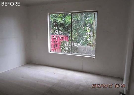
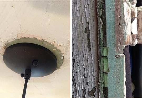
First Impression: “Cracked walls and cat pee? We’ll take it!”
Wall-to-wall carpeting was stained by urine and the yellowed walls were cracked in a way I worried meant foundation issues (inspection cleared suspicions). The closet is quite small. So is the room (10’x12′). Upon lifting a corner of the carpet, we discovered (circa 1970s) vinyl linoleum and started praying for more hardwood below. Our prayers were answered…we just had to walk through hell first. The ENTIRE two weeks we had prior to moving in (weeks we thought would be enough time to scrape all popcorn, paint all walls and see all floors refinished) were spent melting and scraping through TWO layers of glued linoleum—Inch. By. Inch.

Flash Forward:
We sleep (very snuggly) here now. Someone gave me the bed when I was 24 finally broke recently and we found a quick replacement on Craigslist for $75. It’s a full like our last one, but is somehow shorter, so a bit cramped for two women 5’8″ and 5’9″ (Katie would deem it amiss if I didn’t mention she’s an inch taller).

That watercolor is a gift from my artist friend, Ramlah Yavar, as a thank you for posing for her series when I was 23. It’s one of her concept/mini pieces. I love it so much.
The dresser, rug, bedside tables, tension pole lamp and burlwood mirror (not photographed) were Craigslist finds from many years ago and I’m still into them. The bedding, wardrobe rack, cosmos tapestry and ’60s curtains were updates when Katie moved in a few years ago (and the pretty black and white abstract on the dresser is by MaryAnn Puls…a holiday gift from Emily). Prior to that, the room was painted a grassy-green to the same line. Due to curved ceilings (which we love), we’re forced to either paint every surface or color block/create our own paint end-line. Being frugal, we used the new window we discovered in the dining upon moving in (but didn’t need due to new french doors) to replace the janky one and added a sill in attempt to make it slightly more interesting.

Looking Back:
I wish we had at least priced out having someone else handle the floor restoration in this room, doing it ourselves delayed EVERYTHING else and lead to a quick burn out. I’m sure it would’ve shot the budget up $10K… but how would I know? Too gung-ho…we didn’t even call. DIYers, do the research, have the numbers and then decide what to take on yourself.
When the bed broke, we stuck to the same size (full) because we didn’t want to buy a new mattress. Cheapskates!! It’s time for a queen. It’ll mean having to get creative with bedside tables as the closet door opens toward the bed, very much limiting the width of that 10-foot wall. But there are worse things than a narrow side table.
Reusing the dining room’s window in this room saved a few hundred dollars, but it secured the style-decision for several other windows. I wish I had just gone with mullion-free windows across the board. But I’m annoyed by it only .02% of the year, so there’s no chance that’s changing anytime soon.
Bedroom Two
Just kidding. That room’s hiding because there’s nothing in there but an elliptical runner. We’re currently trying to dream up a multi-functional office-guest bed-gym space. Elliptical runners are giant eye bullies! HELP?! (Side note: we’re very happy with our $1,250 Nordictrak that folds down and is easy to lift up and out of the way. We just need to figure out the best way to hide it.)
Bathroom
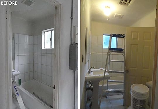
First Impression: “Prison cell with just a dash of rat maze.”
The footprint of this all-beige-tiled, lightless room was 5’x5′ and yet for some reason, had two entrances…meaning two doors that both opened INWARD. If both were open fully, the toilet would be trapped in the corner. There was zero storage. OH, and someone had shoved a towel down the toilet, which we discovered when we flushed for the first time and soiled water poured down the hallway and into the kitchen (thanks, double entrance!). So, this only bathroom was tight, drab AND unusable. Yay! I’ll take two!

Flash Forward:
First thing: We fixed the layout, closing off the door from the kitchen/utility room and rehanging the remaining door so that it opened outward (not conventional, but you no longer have to dodge doors within the tiny space). We placed the sink between the toilet and tub, collecting all free floor space into one “walkway.” Keeping in mind the house was built in the ’20s, I wanted to make sure the overall design vibe was still classic. A clawfoot tub (the staple of a “classic” bath) and vintage chest-turned-vanity provide visual space beneath surfaces…anything to help fool the eye a bit (though a tad more annoying to keep clean). Our contractor actually gave us that tub after it was left over from another project. He gave us the antique chandelier, too. We just had to refinish both.
A much larger window brightens this sad room…and look, a functioning toilet! We added horizontal beadboard, DIY shelves (made from leftover material from our living room unit), a vanity light (which I’m pretty “meh” about) and a vintage mirror found on Etsy. The custom vanity ended up enduring a candle-explosion and had to be painted/stained due to deformation. It was once a very pretty solid wood. A vessel sink maximizes drawer space…but may be a past trend? Once again, you’ll spot cheap faucets from China. The splurge in this room was the hand-poured, cement tile.
I give kudos to Young Velinda for figuring out it was possible to add a built-in cabinet/shelf between wall studs. It’s needed storage and is easy to reach from the tub, so the soaking area remains free of cluttering bath products.

Here’s what cabinet “drawings” looked like in these pre-designer days:
Looking Back:
Guys, clawfoot tubs are NOT fun for showering. My original shower solution failed! I had an affordable “carousel curtain ring” enclosure (that luckily, Signature Hardware doesn’t sell anymore) because I wanted to have a single curtain instead of multiple trying to avoid water leaking. Multiple curtains are usually necessary for clawfoot shower enclosure designs due to the way they are mounted. You wouldn’t know it since every gorgeous clawfoot you see on Pinterest is photographed either without a curtain or w/ a “sliver of curtain” that would actually result in minor flooding. The track/sliding design of the enclosure I chose was a great solution, in theory…but it rusted! AND the corners were angled vs. rounded, so it was not easy to slide the curtain. Good concept. Bad design. Too cheap. There was once a simple mount on the wall for the handheld piece of my shower to attach, but the gap in the shower curtain and that “showerhead” solution created water leaking onto the wall, which meant a full wipe down after each shower (and begging my roommates to please do the same). As an extra treat, the shower curtain closed in on us from all sides while we rinsed. So for now, as we prep the next solution. WE ONLY BATHE! Not okay.
If I repurposed a piece of furniture as a vanity again, I’d probably choose something other than a wood top/surface. And while I love mid-century lines, the style isn’t really this house.
I’m not sure I would’ve chosen a different stone/material or color, but I didn’t realize my “splurge” tile would yellow (er, “patina”) overtime/with every reseal (done every couple of years. High maintenance.)
Once again, cheap faucets from China failed me. The tub faucet shows a lot of corrosion and the sink faucet, horrible water spots. I get that at that time, I couldn’t spend $500-2K per faucet…but at what price point do these things start working/looking good without looking completely basic? Any better experiences out there?
That’s all 980 square feet! So, now what? As mentioned, a perk of working here at Emily Henderson Design is creative fulfillment that comes from doing Makeover Takeover projects (as examples, here are , , ). But I couldn’t progress to the next chapter of this house without documenting this one, because this is the home the women in my family built! And THAT, I’m proud of…and incredibly content with as is. Any changes from here would just be cherries and ice cream. But what flavor?
Here’s what I’m craving. I don’t need to replace every old street-find with something new. I still like so many of the pieces I was drawn to years ago. But if I did a Makeover Takeover, I’d lean, overall, a bit more into what this house is at its core; an Art Deco-era Mediterranean bungalow.
There’s also a sudden appetite for color… evidence collected from hidden surfaces (in particular the dearly-departed, original plaster fireplace) has revealed there was an outright bloodbath of varying greens in the original design. It’s what inspired the current exterior color (which we so gracefully settled on…real pros!) But I wonder if we’ve “fixated on this verdigris” enough in the current design? I’m having doubts.

What if we kept a lot of what’s here, but leaned a bit more this way…these are the vibes I’m loving, that hint a bit more toward Art Deco and Spanish… with a dose (or more) of green:
 image via wescover | design by salt + bones
 image and design via arent & pyke
 image via house beautiful | design by studio ashby
 image via est living | design by smart design studio
I’m not saying we end up looking exactly like any of these, but maybe pull in some elements/feels…AND A SHOWER!!? Okay, just a few more:
 image via ana degenaar | design by framework studio
 image via residence | design by artilleriet studio
 image via yatzer | design by takenouchi webb
 image and design via bang interiors helsinki
That’s it. We made it, team. Would love to hear what you think still works and what you think should stay moving forward. Drop your good ideas (considerately) in the comments! And now as promised, for better or worse, here are the final numbers…alllllll combined as we look back, we’re standing at just under $55K (holding breath the walls don’t fall down):

Thanks again for joining me for a recap of this journey… really could’ve used your extra hands a few years ago. But, all forgiven. 
September 10, 2019
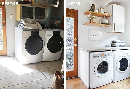
Velinda’s Under-$20,000 DIY Kitchen (& Laundry Room) Gut Reno

Welcome back! If you’re just showing up, you’re late. The party at my place started yesterday. Go catch up, then come on in…everyone’s in the kitchen, which is FINALLY (hopefully?) a place you wanna be.
Some of you just disobeyed the “go catch up” part of what I just said. Shame on you…the Cliff’s notes:
Entire house renovated and furnished for under $55K
No money, gross house
Making decade-old Craigslist finds work over and over again
Not yet a designer; no training or experience
Tons of sweating out equity and DIY-ing by our “team”: My mom, her wife, my 11- and 13-year-old sisters, some very good friends, my wife, myself and one brave contractor
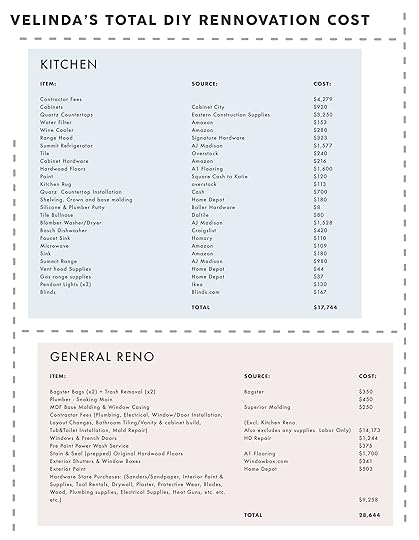
Now for our budget kitchen. While in school, I heard from other students a professor had taught, “you can’t renovate (truly renovate…not update) a kitchen for less than $20K.” Challenge accepted. We barely made it under that mark. Once again, I’ll be sharing all the numbers later. But here’s what we had to work with:

First impression: Barney & Friends.
This tragic little (4’x10′) galley kitchen was claustrophobic, unfunctional and apparently painted purple by a 5-year-old. Beyond it: a laundry room (8’x8′) that opened into the tiniest 5’x5′ bathroom. (More to come on that soon). I’m assuming this utility space is where past tenants shoved both their laundry and refrigerator because there was zero space for a fridge in the actual kitchen. Everything in the room was sticky since there was no hood or ventilation, so clean up was fun *vomit emoji.

Redoing this tiny beast meant saving a second round of funds, so for years, the kitchen was a lingering project. But some changes had to be made early. When we bought the house in 2012, while we were still doing permitted work upfront (windows, plumbing and electrical), it was time to commit to some long-term decisions. We couldn’t afford to push out exterior walls to really add space to this room, but I wanted to change the layout/open it up as much as possible. There wasn’t yet a design, so, we knocked out some walls (with help from our contractor) and hoped for the best. Then, we lived in it for five years. It looked something like this:

The only thing good about the kitchen during this hold period (besides the memories we made…awww) were a couple of these initial changes. We replaced the door that leads outside with a glass-panel option which visually expands the space a ton. Then, inspired by the arched entry of the dining room (bet you stragglers wish you were caught up now), we opened up the claustrophobia-inducing doorways that divided the kitchen from the adjoining spaces. On top of turning oddly-divided tiny rooms into one now “larger” space, this added an extra dose of the home’s original character. Wiring for a line of (IKEA) pendants also helped visually connect the once-divided spaces.

Other than these permitted upgrades, we basically knocked down half the cabinets to make room for a refrigerator, painted the remaining cabinets, and utilized a lot of IKEA storage solutions. Oh right… and painted the walls really gloomy colors! That always helps.

We spent five years stepping over chunks of missing floor where walls used to be and dodging jagged-edges where cabinets/tiling came to abrupt ends. But in 2016, it was FINALLY time to officially undertake this project…
Flash Forward:

The renovation in 2016, including all supplies, appliances and labor cost $18K and for this round, the team included Rick (same contractor), Katie and myself…with a friend popping in here and there (my mom was in chemo at the time, so our free-labor was called away. Excuses, excuses.).
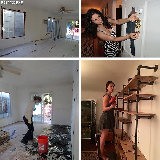
Our DIY contributions: Anything we could do to limit Rick’s time. Demolition!!!! So fun. I took a jackhammer to the old floor tiles (and now I want to be a demolisher when I grow up). The clean up/disposal was not so fun. There was a lot of lugging along the way, but we handled it ourselves thanks to Bagster.
It’s mind-blowing what haul away can cost! I was really impressed with Bagster. We bought a $30 bag at Home Depot, filled it while it sat in our driveway, then called to have it picked up for less than a couple hundred bucks! We had to do this twice (during the entire reno), but it cost a fraction of what dumpster rentals and other alternatives would’ve. Don’t throw you money in the garbage, folks!

Adding to our DIY endeavors, Katie and I assembled ready-made cabinet boxes (not IKEA). Our contractor, Rick, secured them into place/balanced them once they were built and then we stepped back in to install every door, knob and pull (sacrificing a few additional years off our lives. Never again!).

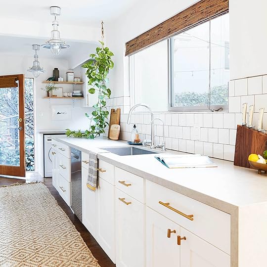
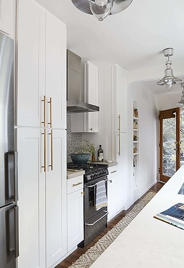
Now, floor-to-ceiling cabinetry maximizes storage space and creates a clean, simple line where giant appliances used to jut out awkwardly. The added height (plus light reflecting off of white) makes the space feel bigger. My two cents on white cabinets: yes, white kitchens can be boring, BUT white cabinets don’t have to mean a white kitchen…it’s what I love about white (and other neutral cabinet options)—the flexibility. At the time of this renovation, I was obsessed with the idea of green cabinets, but I worried green cabinets could end up being a very pretty, but more quickly-passing trend. Since cabinets are one of the biggest ticket items in a kitchen reno, I’m unlikely to afford being able to swap them out anytime soon. Even painting (if done really well) is expensive…so, I stuck to something classic/timeless and neutral, knowing I can update the wall color and even backsplash tiles easily with each passing whim. Though maybe not show-stopping, It’s a lot harder to go wrong with white.
The cabinets weren’t IKEA, but were still incredibly affordable (we got the through Cabinet City). I’m pretty sure they’re from China and I have mixed reviews as far as the quality. Now three years later, they still look great! But what made them extra affordable is we did pickups from the warehouse ourselves, so we saved on shipping costs. I can’t tell you how many times we had to make a lengthy drive back and forth swapping out door faces that turned out to be juuuuust warped enough not to close. There’s one door that still has a tiny gap when closed because after two exchanges, we finally gave up. If we had been dealing with shipping back and forth, I can’t imagine how far behind our project would’ve run. Still, I love that these are real wood and the paint finish/shaker detail feel high-quality (and is easy to clean). I’d rate the quality higher than IKEA.
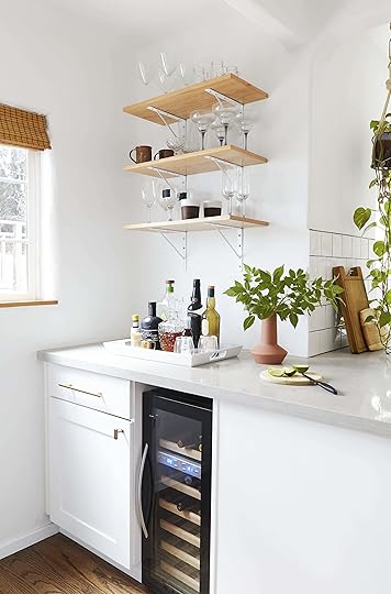
We added lower cabinets/countertop space, wrapping them around the corner into the former laundry room…which now serves as a bar (pro tip: in any design, whiskey bar = must have). The space still also functions as a utility room, with 24-inch counter-height electric washer/dryer. It’s surprisingly hard to find non-massive washing units in the US and it required installing a 220V for an additional $600. (Are they making this size in an affordable, gas option yet??) I did a TON of research for these because opinions of electric washer/dryers were low…but we love this pair and are so happy they don’t consume more of the very limited space.

Our appliances were sourced from all over (Craigslist included OF COURSE…new Bosch dishwasher score!). All machines are as compact as possible to avoid projecting into the 3-foot wide walking path (and to maximize storage). Instead of going deep or wide with the fridge, we utilized height to gain additional cubic feet (13 in total?). Enough space? For sure. If Katie and I had a child (in theory…not in the works), we’d keep this fridge. If we had two (god help this imaginary us), probably not. (Quick shout out to Ashleigh Ninos of Nino Studios before moving on; she created that small white artwork on the bottom shelf.)

The white tile (on the other side of the kitchen) was chosen because it’s classic and the original tile was square, so it’s a nod. The backsplash tile here was chosen as a nod to the home’s Mediterranean soul and by 2016, I was into the graphic simplicity of black and white. We kept the original nook and extended the wood flooring to make it feel bigger by unifying the rooms.

Looking Back:
I wouldn’t change a thing about what we DIYed. It was all doable, but if you’re headed toward the same boat, expect a breakdown or two. It’s overwhelming, especially when you’re eating from a fridge in your living room while dodging giant boxes of dust-covered “inventory.”
Despite the mentioned frustration, I’d source from Cabinet City again over IKEA. But that’s only because I live close enough to assess in person/make exchanges in a timely manner. Now, if I could afford to have custom doors made for an IKEA base (which I definitely couldn’t at the time), I’d splurge for that.
Engineered countertops are my friends. On our budget, natural stone (though gorgeous) wasn’t an option. But, engineered quartz (along with the porcelain in my basement kitchen) can be simple, clean and pretty PLUS so user-friendly! I don’t personally mind this “faux” option. But take a careful look if you’re choosing a faux stone with veining… laser-printed veining can look super cheap super fast. Proceed with caution.
I regret cheap plumbing fixtures! The sink faucet is a China buy (eBay) and it will NOT stop spinning/wiggling due to cheap hardware/threading that won’t fasten tightly enough to stay put. Spoiler: This “save” didn’t serve me well in the bathroom either (stay tuned for that tomorrow).
Affordable cabinet hardware can be good. These knobs are heavy, print-resistant and cost a fraction of what I was finding in my research. I worried they’d feel cheap. They don’t.
Before we get to the budget, let’s look at just a few satisfying side-by-side before and afters:

Ahh, that feels good. Now! The numbers! Here’s how it all broke down. Full disclosure, a small portion of the general reno cost went toward the original kitchen changes in 2012, so add a couple thousand for that…but still, we are standing right at $20K. (Come back tomorrow to join me in the bedroom and bathroom…warning there’s only one bath in this bungalow, so get your tickets now. We’ll be wrapping this party up tomorrow!)
The post Velinda’s Under-$20,000 DIY Kitchen (& Laundry Room) Gut Reno appeared first on Emily Henderson.
September 9, 2019
Velinda Renovated & Furnished Her “Fixer Upper” For Under $55k…Here’s How


Velinda here. This year, I’ve welcomed ya’ll to my wedding and you’ve managed to sneak into my basement. But today, I’m actually inviting you into my home. And to be frank, I could barf.
I hinted at the fact that I renovated my formerly sh**hole house (purchased in 2012 when LA was “affordable”) on a budget. Renovated and furnished for under $55K, to be exact. Still, it took everything we had—which didn’t include a whole-lotta-dollas—so we’re talking “sweat equity” (and the blood/tears that naturally come along). We found a contractor willing to teach us, help us and loan us tools. My mom, stepmom, 11- and 13-year-old step sisters (pro tip, child labor is cheap), later, my wife and a couple of very good friends put on their construction hats (nope, couldn’t afford those) and made the house a home, er… liveable-ish, at first. It’s taken YEARS to become truly comfortable and stylistically, it’s still mostly filled with decent Craigslist purchases I made in my mid-20s.
After hinting at my humble, but very loved, home in my basement post, comments popped up requesting to see it and Emily asked if I’d let you in. “Sure! No problem.” But as we geared up to shoot, nerves began and I had to do a quick soul search after almost chickening out. My house and the budgets involved have been MODEST (I’m going to show you all the numbers…but spoiler alert, we’re talking under $55K for reno, furnishing and everything!). I’ve always been incredibly proud of the Craigslist/DIY solutions I’ve been making work since my early 20s…up until being asked to bring them to a, y’know, slightly popular blog. Blog-worthy? I wasn’t yet a designer during these renovations. Adding this budget bungalow to our lineup of aspirational/inspirational editorial seemed like such a leap.
But my brief soul-search brought me to this: As a newer designer building a portfolio, I’m scared. This isn’t what I’d necessarily do, given real resources. I might not even grab the same “finds” as the designer I am today, a whole decade later. There isn’t a sponsored item, heck even an item that cost more than $650 (second-hand sofa) anywhere in this house, so there’s not a chance this project compares to a “real” portfolio…or even a Makeover Takeover reveal. It’s not that.
Still, I’m really proud of what’s gone into making it work. And aren’t most of us in the same “make it work” boat? Look, I’ve spent the last several months visually producing and styling Emily’s second book and it has meant tours of jaw-dropping homes. I’ve witnessed a large percentage of these homeowners apologetically point out things they have yet to “fix” or upgrade. And these are book-worthy homes! So, when is a house good enough? Why does sharing our homes uncover such deep vulnerability and why are we all apologizing? I’m both a confident individual AND on a mission to stop needlessly apologizing (ladies!)… so, screw chickening out. Today, I’m very PROUD to let you into…

THIS “beauty” that awaited us upon purchase in 2012. She’d sat on the market for several months, bank-owned and UNLOCKED. Nobody wanted her…just 980 square feet of hot mess.

Here she is from the outside now (above), but let’s begin this Cinderella story in the first room of the house (though stay tuned this week for my kitchen reno and bed/bath)…
The Living Room

First impression: Iffy ballet studio!
There was a floor-to-ceiling, wall-to-wall mirror and an unmistakable smell of mildew. The old windows leaked, allowing water to mold away the walls below. And there was a needless, badly veneered faux fireplace hogging very limited space. The room was (and currently is) quite dark, as a neighbor’s cinder block wall blocks most of the light just outside. We loved the cove ceilings…didn’t love the fact they were, along with every other ceiling in the house, covered in “popcorn.” What. Was. That. Trend? And, to our pleasure, a quick peek under the cheap plank flooring revealed original hardwood!

Flash Forward:
The windows (throughout the house) and the sliding door were replaced by a licensed contractor who agreed to charge less if he didn’t pay any additional laborers…formally bestowing us his unpaid assistants. The contractor replaced all plumbing/electrical throughout the house and repaired molded walls. We left these jobs to the pro, but were hands-on everywhere else, cutting down costs IMMENSELY (though likely cutting down years of our lives, as well. Stressful!)
My family, friends and I (henceforth called “the team”) scraped the overhead popcorn, spackled the uneven walls, and hung a mid-century pendant found on Craigslist. We sanded the worn original flooring (throughout the house), but called in a pro to do the staining/sealing because we wanted to make sure it was done well and were too burnt out by that point to make sure of it ourselves.
The ballet mirror (unsafely) came down thanks to a hammer…as did the faux fireplace, which sadly revealed a gorgeous, original plaster surround that couldn’t be salvaged. (Damn you, ’80s faux brick!)
Why the wall to wall curtain? You’ll find us hiding the wall-mounted AC unit that came with the house, which we unfortunately still need, behind said curtain, which really isn’t the prettiest textile (don’t love grommets these days), but they had enough panels at TJ Max to stretch the wall, so good enough. It would be room-transforming to no longer have to hide this ugly AC box. If we paint and powder coat this box so that it disappears, the poor placement of the unit still makes it impossible to center art above the sofa. It’s a conundrum. Central A/C is not in the budget, so this box is our homely, slightly annoying best friend for now. But speaking of art, my friend Shawn painted the old door in the corner.
Here’s a peek behind the curtain:


(Have you spotted Atticus yet?)
The sofa (which now has springs falling out), coffee table, begging-to-be-refinished campaign chest (above), rocking chair and side tables were Craigslist finds. The wingback chair is the first (and so far only) reupholstering I’ve ever done after finding it in an antique shop in 2010.

The shelving…DIY. Katie and I wanted a visually lightweight storage solution that also helped “hide” the TV box a bit and we found this tutorial. It seemed an affordable alternative to those sexy, vintage wall units we may never afford. After struggling to figure out material needs and shelf spacing via rough sketches on loose-leaf (thank god for CAD these days), we settled on a design and planned to dedicate a whole weekend executing it. FUNNY. Two weeks and one complete breakdown (each) later, we were very happy and only spent $450…and only that much because we opted for higher quality wood that we could seal instead of paint. Pine could’ve cut that cost in half.

My mom and her wife gave us the (working!) mid-century record player. The mirror above is vintage from Etsy.
Looking Back:
That GIANT pendant puts off surprisingly little light and wasn’t the best scale or functionality choice. But maybe I just need to figure out how to clean it?
Though I’d love custom windows, the budget allotted standard/big box one. Fine, but why the faux mullions, Young Velinda? “I know what this gorgeous garden view needs; a vinyl grid!”
DIY sanding of floors is as easy as it looks on TV (and pretty fun) and renting a sander from Home Depot is cheap ($50ish). I wish I’d chosen a lighter stain or had just sealed the raw redwood, but there’s 0% chance I’m removing all the furniture again (or coughing up the funds) to make that change possible in the future. It’s totally fine, I just find myself still drooling over the ‘raw’ wood of the Mountain House (Link).
MDF molding instead of hardwood made me nervous, but so far, I don’t mind that I couldn’t splurge for real deal because they’re holding up just fine. (Buy backup in case a section needs to be replaced in the future…it can’t really be sanded/healed as easily as wood).
The Dining Room
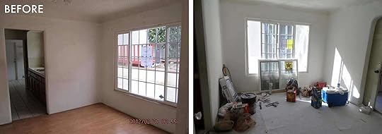
First Impression: “This basic box is the best room of the house.”
Small, but bright with a new window already in place! There was a hallway-leading door with original character and a pretty, arched doorway off the living room. Again, we found original flooring beneath the faux. I figured it’d feel tight/not have great flow once a table came in, but what’re ya gonna do…besides get rid of POPCORN CEILINGS? Whyyyyy?

(Nice bandana, Young V…?)

Flash Forward:
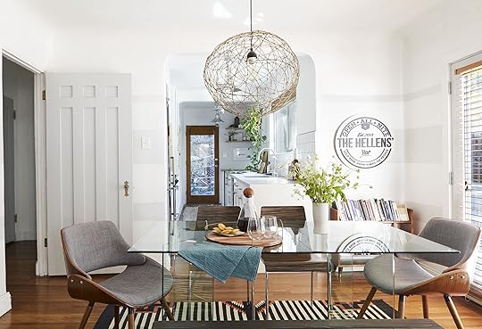
You’re looking at a dining table, second-hand IKEA shelf and DIY pendant (Orb-lando!) I brought with me from my last apartment. The chrome/wood chairs were purchased in the desert several years ago when I was, for some reason, determined to have Palm Springs furniture in my house. I could afford these. I found the bookcase by the curb on my street and decided to refinish it (never did that).
On the walls…the bar sign from our wedding and some subtle gray lines that were painted upon moving in (2012, same time the rug was purchased). Katie and I almost painted over them when we redid the kitchen in 2016, but weren’t committed enough to losing them to go through the trouble. Are these totally dated now? *Hands Splayed Shrugging Emoji*
Throughout the house, we painted every wall…and door. That involved dismounting them and removing each hinge/knob, soaking the hinges in acetone and then chipping away layers of paint, sanding down decades of paint layers on the doors themselves, and finally, spray painting the hinges and hand painting the doors. My mom earned a medal of honor for this particular project.
One of the best decisions Young Me made during reno was swapping the window in the dining room for French doors. It makes the room feel so much bigger as it becomes part of the garden when opened up. We LOVE the breeze during meals and there’s now a lovely, indoor/outdoor flow for entertaining.

Looking Back:
Once again, I’d opt for a different lighting functionality. The single bulb doesn’t give off great light for dining at night. It was even worse when we used an Edison bulb (the current bulb’s much “cooler” brother).
Thinking we couldn’t afford to add a door to the budget at all, we put in the most basic french door available. Worth the added cost. Wish I’d spent more. This model is pre-primed and must forever be painted. Okay, fine. But the plastic-based latching system feels on the cheaper side and can be a little finicky to operate.
The table and seating have been collected over time and feel about as accidental as their combination actually was. Incorporating several styles is fine, but this just doesn’t quite jive in a way that makes my heart happy. Are we rustic? Are we mid-century? Are we ’80s? Whatever we are, we are NOT comfortable. The glass table takes up little visual space, which is nice for the small room, but the top just balances on the bases, meaning if you lean on it, you risk… not sure… shards of glass in your leg? Living on the edge over here while we eat our oatmeal. (But guess you’ll find us hiding under here when “the big one” hits…?) Katie and I love playing games together and usually shift the chairs around so we both get an upholstered seat. The others are just no fun to sit on for any length of time. It would be SO amazing to have nothing but comfortable seating. Downsizing our dining surface for an even easier flow is definitely “on the table.”

Before we dive into the ins-and-outs of the budget, let’s look at the before and afters for each space (and the front exterior), because it’s fun:


As for the kitchen you see through the dining room, the house has one! But this post is already a beast and I have TOO MUCH to say about gutting a kitchen and pulling it back together for under $20K. So come back tomorrow and I’ll break it down. For now, the numbers so far (including room-specific numbers as well as the “general reno” notes that applies to the whole house):

Before you go… can we give a huge round of applause to our new(ish)ly-hired photographer, Veronica, for these stunning “after” photos! This is her first feature on the blog as an interior photographer (she normally shoots Em’s fashion posts), so if you see her, buy her a drink! Okay… see you all tomorrow at my place! BYOB.
***photography by Veronica Crawford
The post Velinda Renovated & Furnished Her “Fixer Upper” For Under $55k…Here’s How appeared first on Emily Henderson.
September 8, 2019
The Link Up: Emily-Approved Pants, Souptember-Inspired Recipes & Arlyn’s Plastic-Free Solution For Produce
 image via Architectural Digest | design by Ben Pentreath
Welcome back to The Link Up. This week was team EHD’s first week back from vacation, so needless to say we had LOTS to chat about and share with each other. First up, today’s home tour is brought to you by Architectural Digest and is home of the lovely Liv Tyler. If you love a dreamy, retro-styled home, we recommend giving your eyeballs a treat. Now, let’s get to those links:
Emily loves these pants from Target. They have a strangely modern and good fit that reminds her of her favorite designer Ulla Johnson, but literally at a fraction of the cost. She is still figuring out what to wear them with (crop top? fitted tank?) but every time she puts them on she’s like “DAMN these are cute.”
If you haven’t already been listening to Jenna Kutcher’s Goal Digger Podcast, let today be the day you change that. It is a really great podcast all about how we can redefine success and chase our dreams. We are all huge fans. Run don’t walk.
Oh and speaking of new things to listen to, one of my good friend’s (emily here) band just dropped a new album. It’s a throwback rock and roll album by Dbone Reckley (we call him Derik) and its RAD – I especially love Happy Hour and Peach Tree Jacket. If you have the budget to buy it instead of streaming do that
Emily Henderson's Blog

- Emily Henderson's profile
- 10 followers

