
Emily Henderson's Blog, page 243
October 25, 2019
Secrets From a Stylist: Introducing My First How-To Styling Series (On Skillshare)

Today is very exciting as I’m finally releasing my styling class on Skillshare. When they first approached me to do this, I reacted like I have historically to teaching styling workshops—intimidated by the prospect of trying to boil down how to find your style and execute it in your home, in digestible steps. But I’ve wanted to do it forever, and heck, I wrote a whole book about it. Besides, I love Skillshare as a creative platform for learning and sharing and once I got over the initial fear, I got so excited. So with the help of my team (led by Velinda), and the very lovely and thorough Skillshare Originals production team, we came up with and shot 11 lessons for my first styling class. I typically hate watching myself on screen, strangely (watching Design Star was painful) but as I reviewed these, even I was like, I LOVE THIS. Let’s break it all down:
True to what we stand for here on the EHD team, the class is called Style Your Space: Creative Tips & Techniques for Interior Design (and if you want to jump right to it, head here to sign up for a special offer of 2 free months of Skillshare Premium, and then you’ll be taken straight to the class!) (P.S. Once you’re a member, you can watch it all, every lesson, right away, right now!)
The goal of this class is for people, anyone (not just designers) to learn the basics of styling their home to look like them. It breaks down styling versus interior design, how to find your style, what styles are really out there and then how to execute it in your space. It’s approachable, fast and the way they shot and produced it was so casual and fun. I was scared it was going to be this scripted lecture or that I would have to have a billion props, but it’s really more me just having a conversation with you, which made it so fun and easy for me to shoot.
We shot up at the mountain house a few months ago, right after it was done (did you know that you can rent it out for shoots? Yep, it’s basically the best set house with amazing light; more details here). My team worked really closely with senior content producer Rebecca Cloyd to hone in on what people really want and frankly can learn from a styling class. We broke it down into eight lessons:

Lesson 1: Introduction. If you’ve been reading this blog, you might technically know some of this information but don’t think I’ve ever actually told you in person how I got to where I am. This is basically my life story condensed into 2 minutes. Please enjoy. (Bonus! Anyone can view this intro without having to log in or create an account, so check it out here.)
Lesson 2: What is Styling? The line between styling and interior design is often blurred, but there are some major differences, folks…as I’ve learned (sometimes) the hard way. It’s kind of like the difference between cooking and baking. One is suggestive…play around with spices until it feels/tastes right; the other is a total fail if you forget the baking powder or get the proportions wrong. I’m going to get down to the nitty-gritty of what I actually do every day and how it differs from the term “interior design.”
Lesson 3: Quiz: Find Your Style. This is huge you guys. It’s an all-new updated version of my style quiz (remember that? I mean, it’s kind of what put me on the map…style diagnostics)! This was everyone in the office’s favorite part of the entire class (and most of them already know their styles…). Have fun with this. And for those of you who took it in Styled (the book) and got “Zen” throwing you into a style identity crisis, that’s because the first printing of the book had it wrong. This one from Skillshare is actually accurate and is a totally different format. Here’s your chance to set your design life back on track, former “Zen” people.

Lesson 4: Identify Your Style. There are 12 DIFFERENT STYLES you could potentially be. So to help with your quiz results, I literally explain what each style is (with visuals) so you can learn each one and assess which one (or ones) best fits your personality based on your answers.
Lesson 5: Develop Your Style Confidence. You might have more than one style, heck, you might have three to four styles. I get it, I like to say I’m “Footloose meets Marie Antoinette” so I can empathize. This lesson is basically to help you refine your style a little and gives you tips and tricks to home in on the perfect style for your personality.
Lesson 6: Stock to a Color Palette. HERE I TEACH YOU THE NUMBER ONE TIP OF LIFE. I can’t tell you what it is though. You need to check out the course. Obviously.

Lesson 7: Mix Your Favorite Styles. Now, you may have found one style you’re really leaning toward or you might feel torn between two or three. Here, I teach you how to find elements you like from your top styles and combine them all together in a tasteful way so they don’t look like a thrift shop (no offense to thrift shops—they’re great).
Lesson 8: Use Trends Wisely. Trends can help, or trends can hurt. BUT learning what to do with them is a great first step. This sounds like a commercial for some new prescription drug or something, but really I just teach you about tastefully using trends so you don’t hate how you decorated your home in a year.
Lesson 9: Source Items You’ll Love. Okay, guys. Now you have all of this great information but what are you supposed to do with it? How do you find interesting items that don’t make your home seem generic? What should you splurge on? I know the questions will continue to flow. But they’ll be answered in this lesson.
Lesson 10: Shop for Vintage Finds. Everyone here probably already knows I’m a fiend for vintage finds. But I know better than anyone how tough it can be to actually choose pieces at flea markets, antique malls or on Craigslist that are really beautiful and are ACTUALLY worth the price. So, to help, I walk you through, step by step, how I go about choosing vintage and antique pieces on sites like Craigslist so you can start confidently shopping the second you finish this course. The buyer’s remorse ends here.

Lesson 11: Style a Space With Emily. I take you with me as I restyle the mountain house living room. I show you my messy but effective process and share all of my thoughts that go through my head while I style a room.
I really really want you guys to watch it. It’s a format I haven’t done before with new information and presented in a conversational way. It’s neither a lecture nor a ton of me throwing pillows around, it’s like we are hanging out and you learn along the way what it’s like to do what I do…and maybe figure out how to do it for yourself (whether for your home or for clients).
Plus, the best part? The reason I chose to bring this class to life with Skillshare is because they have THOUSANDS of creative classes that you can explore alongside mine. Interior design, photography, illustration, design, journaling…this platform is the perfect way to get that creativity spinning and find the perfect pathway for you. Once you’ve joined me in styling your home, there are so many more classes to help you photograph it, sketch it, and share it on Instagram. If you want to take that step forward in creating your own brand (or even if you just want to learn new things for fun), seriously, there’s so much to explore and dig into over on Skillshare.
So…you’re into it. Great! Click here to join my class and sign up for 2 FREE months of Skillshare. The link will take you to a checkout page to redeem the special offer, and then straight to my class so you can start styling like a pro right away (once you start playing around at home or for a client, I’d love it if you could share your images at #ShowEmYourStyled…because we all want to see the fruits of your creative labor).
See you there!
The post Secrets From a Stylist: Introducing My First How-To Styling Series (On Skillshare) appeared first on Emily Henderson.


October 24, 2019
Design Myth Busters: The “Real Cost” of Custom Drapery
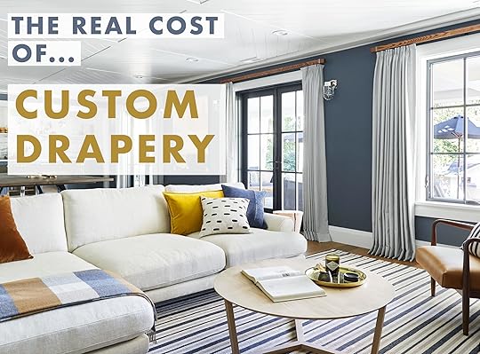 photo by sara ligorria-tramp | from: the ultimate family-friendly media room + wet bar
I don’t know about you but I am legitimately mystified by what custom things in the design world really cost. Even me, a person who has actual access to most of the answers gets overwhelmed at just the idea of “the cost” when it comes to things like custom drapery, reupholstered furniture, CUSTOM furniture, etc. I am usually in a “there’s no way I could afford that” camp despite everything I want being nearly a bajillion dollars. I toyed A LOT with this issue during the design process of my (MOTO). I was having such a hard time finding what I wanted that I was ready to become my own personal product designer. Dramatic? Sure, because I ended up finding items I loved but I did need to design and have some pieces made by my very gracious and (free-labor) father.
I have started to tease my bedroom MOTO for a while and I am sorry to report that it’s nowhere near done. One reason there has been a holdup is that I need custom drapes to hide my very/too tall “closet.” My dad is a button sewing wizard but curtains are sadly a no go. If only I had paid more attention when my mom was sewing all of my middle school’s Dickens’ Carolers costumes maybe I could attempt it?
Now, I am also in a unique position that there may be a chance a company would be willing to work with me to gift drapes but there is never a guarantee on that front. Also, transparency is one of EHD’s most valued commodities so I wanted to know what this sort of service really cost outside of a very incredible potential job perk because if I’m curious, I bet a lot of you are, as well. That being said, welcome to our new “The Real Cost of…” series where we do the heavy lifting of asking the questions and getting the quotes so you’re armed with more information on the front end before embarking on your own “custom” project (or maybe even it’s more of an “oh, wow, I thought that would be more” scenario which is as nice as finding a crisp 20 in the pocket of a jacket you haven’t worn for a year).
 Photo by Tessa Neustadt | From: The Griffith Park Master Bedroom Reveal
In my first “investigative report,” I spoke with three of our current go-to custom drapery companies Decorview, Tonic Living and (most recently) Barn & Willow. Each has a slightly different approach to their custom drapery services and were gracious enough to answer all of my burning drapery questions.
 Photo by Tessa Neustadt | From: Elliot’s Nursery Reveal + Get The Look
But actually, before we get to the cold hard facts and professional tips, let’s talk about these three companies so you can get a better idea of where they are coming from and what they offer. Also just to be clear, this post is in no way sponsored. These are truly three companies we love and use and like I just said, were kind enough to answer my questions. Okay, here we go. 
October 23, 2019
Sara’s House: A Long Narrow Floorplan Design Agony + Designing Begins
Alright, folks. It’s Sara, I’m back, and this time I’ve brought someone else with me. But first for a very quick recap – I’ve told you how we bought our house here, and I’ve shown you what we’ve done with it so far here. I’m pretty proud of how far our little ragtag renovation team (comprised of my father, brother, boyfriend, and self) has taken this 1921 bungalow. I feel really confident about designing a handful of the spaces myself, and I’m even pushing myself and designing a bathroom, mostly by myself. I’m growing a lot in terms of my design know-how and confidence after 5 years at EHD. AND YET…
There are some things I was feeling really at a loss about; fireplace hearth material? Building a built-in bookcase in our TV room? (My uneducated, non-specific drawings aren’t getting us nearly as far as my embarrassing bathroom vanity drawings did.) And there’s the biggest design brain melter: our open floor plan living room/dining room. One of the first things we did when we started renovation was knock down a partition wall between the living room and dining room. It made the space feel SO much bigger, SO much brighter. AND SO MUCH MORE DAUNTING TO DESIGN.
I was waxing poetically about my home design woes one day at the office and Emily interjected with “you literally work at a company with professional interior designers, this shouldn’t be an issue. In fact, let’s just assign someone to you, document it, and share it on the blog!” Don’t let anyone tell you complaining doesn’t get you anywhere.
Enter Velinda from the design team, who we’ve been working with on the living room and dining room with since September. She’s been assigned as our design caseworker (aka design couples’ therapist), and I thank her every. Single. Day. for putting up with me, because it turns out I have a lot of opinions. Her first order of business was getting a sense of the functions these rooms will serve so she could tackle this long, narrow open space monster that Mac and I created. But, I’ll let her tell you how she did it…
Velinda here now, ready to run you through my section of this relay-race post. “New client” Sara is technically my boss, so no pressure. We’re only one month into this project, but so far Mac and Sara are still together, the house is still standing and I still have a job. So all in all, we’re off to a great start. But where exactly did we start and where are we now?
(Side note: for those of you following this series for tips on the designers’ end, I’ve got a few treats here for you. For you super experienced designers, leave a few tricks in the comment section along the way for me. Tricks and treats for all! Happy October.)
Let’s rewind to September and take it slow. Figuring out the function then layout of a space (spatial planning) is really the first step in the process. That means meetings and measuring, measuring, measuring.

In this first meeting, I sat down to learn more about Sara and Mac (utilizing a brief questionnaire… see Step #2 in this post if you’re curious). Here’s where the designer must play therapist… or pretend to be the special guest in a threesome and remember IT’S NOT ABOUT YOU! The couple is the core. This moment is about their thoughts and desires (design desires, people). So listen before you bombard them with your surely-brilliant ideas.
Just for fun, and because I know them as more than just ‘clients’, I adapted our standard, simple questionnaire introduced in a recent process post by adding additional, inciting questions just to stir up trouble. Like, “What’s been your partner’s worst design idea so far”? Y’know, just taking the professional approach. I learned that when Mac hates an idea, he squints and says ‘mmmmmmmm’ for a long time as if trying to imagine it… or hoping the idea fades from topic. Sara, when given an answer or opinion she doesn’t like about one of her design ideas, just re-asks the same question a few days later as if she never got an answer in the first place.
Less juicy, I realize, but I also learned they don’t actually eat at their dining table, but want one big enough to seat eight for game-nights. And they don’t need a television anywhere in this space because they have a dedicated TV room in the works off their master suite. (Still, Sara deemed “TV above the fireplace” as Mac’s “worst design idea”). They want to create as open a flow as possible from room to room to unite the rooms while entertaining (the biggest assignment for these two rooms), but still want them visually defined as separate spaces.
Seeing and Measuring the Space
In our first meet and greet, I also took in the space – first visually, and then inch by inch. Since we very recently covered our general design process here, I’ll try not to bore you with repeats. Instead, I’m gonna list out every measurement I took while exploring Sara and Mac’s space. Also boring? How about we just take a quick look at my go-to, time-saving tools for this step of the process and why I love them:
Digital Measure: Game changer for quick measuring and easily measuring things out of reach (ceiling heights).
iPad Pro/Pen (or I suppose any pad with a stylus): I’ll often do a quick, plan-view sketch for overall dimensions and layout, but then photos of every wall and draw dimensions directly on the pictures. Saves time, sure, but I do this so that I’m constantly looking at what’s actually in the space vs my own elevation drawing, increasing the odds I won’t miss the fact there’s an outlet or vent yet to be accounted for, etc.
Tape Measure: You’ll still need it.
Later, I’ll refer to these images and measurements to create a 3D model.

Visually inspecting, I immediately loved the true-to era touches of their 1921 house… the built-in shelves, the fireplace and the newly-added window casing that matched original windows elsewhere in the house. I love that they went with a classic wood floor, too. I personally veer toward staying true to a home’s original character for the more permanent design decisions, which allows for more room to play with trends/modern elements in the furnishing and easy-to-update details. Mac said he wants a “sharp”-feeling space and is wary of anything too traditional (all of which confuddled Sara). To me, that means modern pops are in store, but this classic “blank slate” is a great canvas! But let’s not get too carried away with “pops” until we even know what fits in this space! Quick reminder, here’s what we’re working with:


Layout is one of Mac and Sara’s shared challenges, and I see why. Long, narrow spaces are always hard, plus the opening to the dining room isn’t centered to the living room, further reducing allotted space for furniture in the living room’s size due to needing to keep a clear path for walking from room to room. They’ve tossed their hands up when it comes to where to place their sofa and how to include any other furniture in such a narrow room, without closing it off to an open flow.

My first instinct was that their sofa isn’t necessarily in the wrong spot, but it’s definitely the wrong size for the narrow space they have due to their front door (see above). But they are obsessed with their sofa (by Article), so that’s great insight to have. I also noted the rug (from Neon Dove), though perfect in style for the home wasn’t anchoring the space well due to it’s size (but should work well in a different room). And while I love their vintage coffee table, it might also serve better in another space. I started thinking that using a round coffee table in here could immediately permit better flow. They also have a LOT of mantel space to cover so immediately started brainstorming something that could be a moment for that area. I love using mirrors in small spaces (visually expanding) and that mantel looks like the perfect plot of real estate for such a thing. And as far as the living room and dining room flowing, there would need to be some sort of piece or pieces in the middle that worked for both areas or was low enough to create a visual bridge… or both.
Research & Modeling
Now, it’s my turn to play (within their boundaries). From my measurements, I created a quick, simple model, within which I played with furniture scale and layout (The program I use is called SketchUp! My life-saving tool of choice). Designers, let’s not forget “space planning” didn’t start here, behind your computer screen. “Walk around” imaginary furniture and feel the room while you’re in it measuring, as space isn’t a 2D process of discovery! Going into this, I knew Sara didn’t love an “asymmetrical” look to a room (i.e. a single chair opposite a sofa) so symmetry was kept in mind. Here are the possible layouts I proposed:

And here’s a sketch I made of an idea they had proposed in our initial meeting:
When I took the ideas back to Mac and Sara, I was able to show them that placing the sofa in front of the fireplace would mean visually closing off the room and invading the path to the dining room. It would mean walking into the side of a sofa when entering the front door. Seeing the diagram, they immediately understood. Magically, and I don’t think I did tooooo much nudging, we all ended up sharing the same favorite two options: Layout C and Layout D. Layouts A and B divided the spaces too much due to a visual “wall” created by the floating sofa. In a bigger house, this could be fine. But we need all the visual space we can get.
They were pretty torn 50/50 between the favorite layouts. I leaned visually toward option C, but functionally toward Design D. Design C was the best solution for truly opening up the space and a chaise/daybed could be utilized from either room. It’s a less-predictable setup and would break up a series of chairs in the visual line from living into dining room. But functionally, a bench-like daybed is never going to be as comfortable as something with back support. Chairs could rotate between rooms if needed and just the right chairs would mean even a “predictable” setup is still “sharp” (don’t worry, we’ll go deeper into their design desires in another post next week). Regardless of ultimate layout, to break up said “series of chairs,” I pitched a bench at the dining table to reduce our chair-footprint. Mac and Sara both went for it. They’re still torn on layout, though. I know either layout could work, so we’ve moved forward sourcing for both options and we’ll see if there’s a piece or pieces that speak to them and solidify this decision.
Knowing the scales of what I’m shopping for and armed with lots of Pinned imagery and description from their questionnaires, I’ve leapt into the fun part. SOURCING! But, more on that next week. We’ll dive into the directions I’m steering toward and some of the initial (and abundant) feedback received from our backseat drivers; the eloquently-spoken Mac and the “bit-more-curt” Sara. Who will be left most satisfied? (Sara here one last time with an answer to that question: Me *thumbs up emoji*)
Stay tuned!
The post Sara’s House: A Long Narrow Floorplan Design Agony + Designing Begins appeared first on Emily Henderson.
October 22, 2019
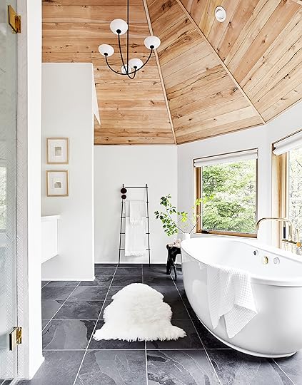
We Are Renting Out the Mountain House…But To Who?

We have officially decided to rent out the mountain house when we aren’t staying there. Brian booked another play so our weekends will be in LA for a while and it actually makes me sad to know that it’s JUST sitting there. And sure, of course, it could help offset the cost of the world’s most over-budget project. Last week, we had a furniture and decor company rent it out as a location to shoot their pieces and well, it was super easy and just a general win-win (plus, really fun to see how they put their pieces in our space).
So, for anyone wondering the who, what and when, here are answers to what I think might be FAQs:
Q: Who can rent it out?
A: Production companies to shoot film, TV, product advertising or editorial. This could be a one-day or 10-day shoot. We are super open to what makes sense. It can be used as a location for whatever scene needed like maybe someone needs to shoot a fancy ski weekend getaway for a film and need to show their characters in a Scandi home like this.
We are also open to vetted groups for vacation as it can sleep three families fairly comfortable. If that’s interesting to you, here are the details: there are two bedrooms with king beds and attached bathrooms, one bedroom with a king AND a queen bed (so great for a family with small kids that want to sleep near parents), and the kids’ room that also has a king bed. We also have two roll-out twin mattresses. So there are beds for 10 and then you could easily bring a pack’n’play or sleeping bags as the carpet in the kids’ room has memory foam under it. There are a ton of toys and games, an art room in the attic, a (small) climbing wall and it’s just generally very kid-friendly. Plus, the backyard has access to hiking trails and acres of private woods.
Additionally, small companies for retreats or off-sites. The EHD team has done this but of course, this means people sharing king beds which we’re comfortable doing. Maybe a couples therapy retreat?
Q: How much is it?
A: It will vary based on lots of factors. Generally, production companies know the rates (they are in the thousands per day), but it does vary on size of crew, how many rooms they are shooting in and generally how disruptive it is to our lives and the house.
Brian has made it clear, though, that he doesn’t want college parties there because we all know what happens (because we’ve been there). So it will be vetted and with 3,500 square feet and all those luxuries you get (the pebble ice machine alone!), yes it will be a high-end rental.

Q: Are you scared of people trashing it and stealing stuff?
A: Yes… and no.
I’m generally very trusting so I’m the wrong person to ask. But Brian was, and then I had to remind him of this: 1. most people are actually good, 2. Production companies have to have insurance for real damages, 3. Our children will be with us and everything else are just “things,” 4. We designed it to be relatively family-friendly. Sure, the white carpet in our bedroom is getting dirty with traffic to the deck that I didn’t predict, and there is cream wall-to-wall in the guest room that makes me nervous, but otherwise I designed it to withstand a ton of wear and tear. Besides… 5. The little wear-and-tear that often isn’t covered by insurance could be worth the money that we’d get out of the rental of this house.

Q: Why would someone want to rent it out? Why this house?
A: First off, because it’s magical. It’s so quiet, has the best energy, amazing flow and the prettiest light. Secondly, speaking as a producer, it’s very easy to shoot here. Almost nowhere in the house does the sun blaze through and make it impossible to shoot. Even in the master where there are skylights, we can shut them and the windows still light the room beautifully. It’s not chopped up, it has such good flow and really easy access to garage and front door (hey art department, only four steps to walk up in the front and none in the back). The architecture is obviously really pretty, but simple enough to let whatever they bring into it shine.
Q: Can we remove all your furniture, bring in ours and then just put yours back?
A: Yep, that’s the point. As a stylist, I did this for years. We (art department or the styling team) put down layout board on the floor, take pictures of every room, then wrap and carefully remove each piece to store in a big truck or a room that’s not needed for the shoot. Will they accidentally bang the walls with a sofa leg? Probably, which is why it’s expensive. Then we would shoot whatever company’s furniture and accessories and after we wrap, we would have the very fun job of putting everything back. Maybe that’s secretly why I didn’t put a lot of stuff here—less to move and potentially damage (and hey producers, because there’s less “stuff,” loading in and out is fast, which saves on time).
Guys also, hanging out here is fun.

Q: Are you going to put it on one of those rental websites? Airbnb, VRBO, One Fine Stay, Peerspace?
A: Yes, likely. We are currently researching and figuring it out. Back in the day when I did production, there were location agents and really big sites that let you “shop” for locations meant for TV/film online. But I don’t know where those are or who I should talk to so if anyone knows, let me know.


Or maybe you are just a group of ladies who need to get away and have a girls’ weekend, and this house very much feels like a retreat. With three fireplaces, four king beds, a fire pit on the deck, a couple hammocks and a running stream, it’s so peaceful. There is also a surprisingly good spa in town and some decent antiquing. But honestly, it’s the house that you kinda don’t want to ever leave.


The kids’ room now has a king bed that they share with colorful animals on the headboard instead (we are shooting it next week and yes, I typically fall asleep in the middle while reading books).

I’m kind of excited. It’s like a new business venture that I didn’t necessarily think I’d pursue, but after renting it out once, it just seems so crazy to let it just sit there if we can’t be enjoying it. People have always asked if we are ever going to sell this house and our answer is always “no, never (well, unless we leave LA)”, but maybe this is a good way to use it as part of the business, and since I’ve been on the other side so much working in production, I actually really trust and respect how they treat location houses.
If you are interested, email caitlin@emilyhendersondesign.com for any inquiries.
Have you guys ever done this? I know there are horrific stories about weekend renters stealing or doing extensive damage, which keeps a lot of people from doing that but has anyone rented their house out as a location for film/tv or photo shoots?
Do tell … (and also help me with the rates, we are guessing over here).
***photography by Sara Ligorria-Tramp
Psst…if you think you missed one of the mountain house reveals, head to see them all.
The post We Are Renting Out the Mountain House…But To Who? appeared first on Emily Henderson.
A Midcentury “Magical Fairy” Bedroom Project Intro + A Completely Reversible Paint Trend We’re Trying
 design by powell architecture + building studio | image via domino
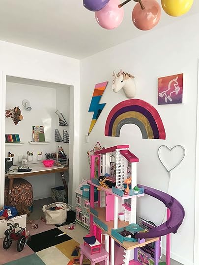
Hey all, Julie from the design team here to quickly intro you to one of our latest projects, but mostly to talk about a new take on a longstanding trend we plan to implement in that space. In case you missed it on Emily’s Insta-stories the other week, we have a very high profile client we are working with…her name is Violet, she’s 6 and this girl knows what she wants. The theme is fairies, there will be wallpaper and some color blocking in a new way we haven’t done before here at EHD. I have a deep love for the and all its moody yet neutral moments but this project is the 180 of it and I am pumped.
A little bit about our client’s parents, they are close friends of Emily’s and who I want to be when I finally decide to grow up (I still think of myself as a mature 12-year-old…and I dress the part). They own a store called The Reckless Unicorn which pretty much sums up their design style. Their mid-century home has an unspoken rule: Each room has a minimum of three patterns/colors and it just works. Yes, we did shoot their house for Emily’s new book so you will see sneak peeks of it soon. It is basically my dream home. Will you be my parents? Great, moving on!
Now, let me introduce you to Violet’s space so you can see what we were working with (and to help you envision some of the ideas I’m going to walk you through):

There is a lot happening in here: the toys-fairies-color-princess theme covers every inch of the space. The plan is to simplify and unify these elements through larger scale items like the aforementioned wallpaper that will allow all of our eyes to be drawn to a “bolder moment” and then layer in the quieter elements like extra storage pieces and a custom wrap-around headboard which we will dive into another time. During our initial design meeting, Emily asked our 6-year-old client what she wanted the theme of her room to be, princesses or fairies. She chose fairies which I was very pleased with since that leaves more room for design interpretation.
Once that was decided, I spent more than a few hours sourcing and putting together a presentation for our next meeting, which took Violet a total of five minutes to quickly go through and circle her favorites and ‘X’ out the rest. We all need to start taking notes on how to be as decisive as this little one. To give you a some context on where the design direction is headed, here are the two wallpaper options we narrowed it down to which will cover all four walls.
 on the left: bahamas by bien fait | on the right: may meadow by rebel walls
These are from two of our wallpaper vendor favorites, Bien Fait and Rebel Walls. Both of them would add so much personality to the space and to be honest the office is pretty split so we might have to throw it to you guys and do an Ask the Audience post soon (with a little more design context so you can make an educated decision).
Let’s talk about that art nook and the design element I think it is begging for (which is why we’re all here today for this post).
This nook is already such a special moment but with a room covered in playful prints, this space would feel like a white box afterthought. In comes the color blocking!
 design by racheal jackson | image via domino
During the “let’s pin a bunch of inspiration images” phase of the design process, this entryway by muralist Racheal Jackson popped up on the “more like this” section on Pinterest. Thanks (creepy) Pinterest! I quickly stalked Jackson’s Instagram @banyanbridges and for all of you tired of white walls, this one is for you. Her use of color and how she applies it is like an optical illusion for the eye, and I’m into it.
 design by Holly Becker | image via independent
This trend is coloring outside of the lines (Jess you’re not the only one who loves a good pun) highlighting the architecture of the space in a fresh modern way. I see you blue doorway.
 design by daria zinovatnaya | image via boca do lobo
It also doesn’t have to be age-specific, meaning, this isn’t just for kids. If you’re a person looking for bold and three-dimensional design done in a simplistic way that is easy to change later on (hello paint), bookmark this now.
 design by studiopepe | image via the socialite family
The photo above shows the trend done in a very simplistic way with the use of just two colors. The design ends purposefully above the doorway to lead your eye into the adjoining space.
 design by julia rouzaud | image via elle decoration
This layered look and the combination of colors is what I ultimately want to bring to that nook. I think letting colors “spill out” onto the walls and the ceiling above the reading alcove would add some dimension, but also make it become “part” of the rest of the room’s design.
What do you all think about this layered color block look? Do you love it for the space? Are you worried about mixing it with such bold wallpapers? Or are you excited for a new color palette? If you have a link to one you love, leave it below, along with any comments (just be kind because this is my first time around here).
October 21, 2019
Accent Chairs Under $800 (Organized By How You Actually Use Them)
 image by zeke ruelas | from: ginny’s living room reveal
One of the few incredibly sad things about having an apartment under 400 sqft (like mine) is that you are extremely limited on the number of accent chairs your “living room” can hold (and by limited I mean one very petite gal at most). Accent chairs are kind of an obsession around here. Often someone (that someone is usually me) will be perusing the web and then call over whoever will humor me in drooling over a truly beautiful chair. A great accent chair to us is nearly heartstopping and more so can bring real personality to a room. However, as much as a stunning sculptural accent chair is what we all dream of, the price tag can also be heartstopping…but not in the good way. Last year, our wonderful contributor Lauren Taylor wrote a post about the best accent chairs under $500. You all loved it so Arlyn thought we should do it again but maybe stretch the budget a little to $800 and should categorize by how we actually shop for them aka how we need them to function in our home. Don’t worry, there are still A TON of chairs under $500 but we thought we would mix it up a little, dream a little bigger and get even more functional. It’s our accent chair glow up.
But before we jump into the 78 chairs I have carefully selected, let’s go over the accent chair purchasing rules that Lauren laid out for us last year, as a reminder.
 image by sara ligorria-tramp | from: jess’ long-awaited small space living room reveal
1. Pick a chair with similar arm height to the surrounding chairs and/or sofa in the room. Seat heights are allowed to vary a bit, and back heights will definitely vary, but keeping the arm height in line will do magic for the eye.
2. The size of the room will determine the size of the chair. Consider the room you are shopping for and ask yourself how would you describe its size: Sort of small? Pretty big? Comfortable, but not too roomy? Whatever your description, you want similar words to come to mind when you’re selecting the chair(s) for it. Granted, this isn’t a scientific approach, but it works (plus, all science ever got me was a C+). Another thing to keep in mind: are you using just one chair or a pair? If you’re going the pair route, you’ll want to be sure two of the chairs won’t totally consume your floor plan. When in doubt, look online for the dimensions and tape it out with painter’s tape (which is super easy to remove) before you buy.
3. If all else fails, just try before you buy! Either shop small and locally where you can literally take the product home and test it before you buy it (most local shops will be a-ok with you taking home a chair for 24-48 hours at no charge…though they’ll likely ask for some kind of deposit). Or, just shop online at places with stellar return policies. This way, you may test it out with the assurance that you can return it if you totally hate it. There are also a ton of bigger box retailers that have come out with augmented reality functionality. This means you can see a piece of furniture in your home via your mobile phone. The tough part about this is understanding an item’s dimensions in comparison to what you’re superimposing it against in your “virtual” home.
Thanks, Lauren! Okay, now that we have those down, let’s shop. Please note that a lot of these picks can are interchangeable within the categories. It really just depends on your individual room and style. Have fun because design should be fun.
The “Reading Corner” Chair
 image by sara ligorria-tramp | from: the portland living room reveal
We define “the corner chair” as a larger statement chair that you could likely sit and read a book in…in a corner. Typically, an upholstered option is great because they tend to be cozier but ultimately it’s a chair that can hold its own visually and hold you comfortably. Here are 27 of our favorites.

1. Modern “Wassily” Style Chair | 2. Morpho Swivel Velvet Arm Chair | 3. Lita Chair | 4. Velvet Burnt Orange Accent Chair | 5. Quinn Striped Chair | 6. Isabella Rattan Barrel Arm Chair | 7. Modern Vassily Tube Chair | 8. 4040 Locust Leather Butterfly Chair Cover | 9. Boston Swivel Slip Cover Chair | 10. Iron Rattan Accent Chair | 11. Cheswold Wingback Chair | 12. Mod Blue Berry Armchair | 13. Chandra Swivel Chair | 14. Cognac Mid Century Huxley Chair | 15. Harlow Swivel Chair | 16. Galathea Leather Accent Chair | 17. Davis Upholstered Armchair | 18. Sven | 19. Myna Tufted Arm Chair with Brass Legs | 20. Cirrus Convertible Floor Chair | 21. Natural Rattan Fallon Cocoon Chair With Cushion | 22. Berwick Barrel Swivel Chair | 23. Nord | 24. Feather Filled Swivel Brynn Armchair | 25. Grey Foldover Arm Accent Chair | 26. Massey Faux Fur Metal Base Slipper Chair Nubby Ivory | 27. Black Leather Channel Barcelona Chair
The Side Chair With Wood Accents
 image by sara ligorria-tramp | from: arlyn’s living room makeover takeover reveal
Okay, the “wood accent” part is pretty specific but we needed to break up the side chair category so it wasn’t insanely big and overwhelming. BUT if you are looking for specifically a chair with natural wood elements to bring in warmth and texture then you are in the right place! By “side chair,” we mean a chair that maybe isn’t really big enough to stand on its own. It is however perfect for an adjacent seating area and would look great in a pair of two like Arlyn did in her living room or Emily has done with many variations in her LA living room. Again, size-wise it all depends on the size of your living room. These are more guidelines, not hard and fast rules and classifications. Let’s get into them shall we?

1. Oskar Lounge Chair | 2. Lucy Chair | 3. Round Natural Chair | 4. Larabee Arm Chair | 5. Thurlow Wood Base Slipper Chair Cream | 6. Lento | 7. Mid Century CH25 Lounge Chair | 8. Ingrid Chair | 9. Jeanneret Lounge Chair | 10. Thetis | 11. Armless Chair in Maze Gesso White | 12. Modern Lounge Chair | 13. Charcoal Gray And Ivory Dash Print Noemi Tub Chair | 14. Couture Dilan Leather Safari Chair | 15. Jeanneret Kangaroo Lounge Chair | 16. Latta Armless Club Chair | 17. Marte Lounge Chair | 18. Esters Wood Arm Chair
The Side Chair Without Wood Accents
 image by tessa neustadt | from: the design milk family room reveal
Great, we already have the definition of a “side chair” down so for those of you looking for a more modern and “less wood” look, then here are 18 of my favorite picks.

1. Plume Lounge Chair | 2. Addie Chair | 3. Jessa Chair | 4. 1950s Vintage Objekto Paulistano Armchair | 5. Arlette Velvet Retro Mid Century Accent Chair | 6. Ulriksberg | 7. Wesley Lounge Chair | 8. Cupa Leather Chair | 9. Chloe Accent Chair | 10. Jean Lounge Chair | 11. Welton Arm Chair | 12. Yates Chair | 13. Woven Camel Suede Chair | 14. Effie Tripod Chair | 15. Hew Lounge Chair | 16. Tierman Swivel Chair | 17. Axle Lounge Chair | 18. Crescent Swivel Chair
The Small and Special Chair
 image by sara ligorria-tramp | from: the portland living room reveal
This might be my favorite category because this is where things can get real sculptural and funky without (totally?) breaking the bank. Take the chair that the design team used in the Portland living room above. That wall needed a little something that was extremely cool and sculptural. Is it a chair that you would want to sit in for a long period of time? No, probably not. But it does add a ton of character to the space. I have a similar type of chair (because it’s the only type that will fit) I got for only $100 at the Rose Bowl and while I sit in it hardly ever, it brings that necessary “cool” factor I wanted. All I am saying is that it’s worth the purchase…in the name of a “design moment.” Plus, in this under $800 price range for this category, you can actually find VERY awesome vintage options. I found a bunch on Chairish (plus the EXACT chair from the photo) if you need an online place to start your search.

1. Crafted Cubist Wood Accent Chair | 2. Kendel Accent Chair | 3. Nadia Cane Chair | 4. Tejido Dining Chair | 5. Vaermer | 6. Modern David Kawecki Puzzle Chair Vintage | 7. Ibis Dining Chair | 8. Mid-Century Minimalist Industrial Side Chair | 9. Pierce Wicker Chair | 10. New York Contemporary Glam Metal Accent Chair | 11. Enid Chair | 12. Julie Chair | 13. Modern Wood Chair | 14. Zig Zag Accent Chair in Black | 15. Vintage School Chair
I hope this was helpful. I hope you find the accent chair you’ve been dreaming of and I hope you have a great week.
October 20, 2019
The Link Up: Brian Henderson’s Favorite T-Shirt, Sara’s New Meditation & A New Podcast “The Office” Fans Will LOVE
 image via Lonny | home of Neada Deters
Hello friends and welcome back! We don’t know about you, but we think Sunday funday is made even more fun with The Link Up, and today is a VERY special one because it is the first after being formally introduced to you all via this post. Now that we are all best digital friends, these links are even more special, right? Right. Let’s get to it:
First up, today’s featured home tour (via Lonny) is the breath of fresh air we all needed, and we definitely suggest clicking over to see the rest if you love a neutral home as much as we do.
We finally convinced Brian Henderson to be apart of the link up! This is his favorite V-neck T-shirt and he wears them almost every day (from Emily: “this makes Christmas shopping for him VERY easy”).
Veronica has been searching for a pair of white pants for what feels like her entire life and she finally found them. They are so comfy and super stretchy.
Arlyn, who you might remember from this post is a cooking enthusiast, is pretty jazzed about this apron she just ordered. Full disclosure: this is not a review as she’s waiting on the package, but she wanted to share anyway because it’s an apron with BUILT-IN OVEN MITS! From Arlyn: “Why has no one thought of this before? Well, maybe someone has, but I like the way this one looks.”
From Mallory: “I don’t know anything about skincare and am trying to find a skin routine. Since I’m melanin-deficient, everyone has been telling me I need to wear sunscreen every day and that my SPF 15 ain’t gonna cut it. I am using this now and I LOVE.”
These are Jess’ favorite reusable straws. Yes, they are unapologetically fancy but she loves how beautiful they look displayed in her kitchen and in her morning iced coffee. They are thick so the quality is awesome and aren’t as delicate as you may think.
Watching ceramicists throw is Sara’s new meditation (and also how she learns new skillz). This account is her favorite.
We got to talking about plumbing issues in the office and Bowser remembered she had recently read this handy article over at Don’t Ask Do. If you are having drainage issues but don’t want to pay a plumber head over there to get the low down and everyone (especially those of us with a lot of long hair) should have a cobra in the house at all times to try before pouring toxic chemicals into your drain.
One of Ryann’s favorite Instagram follows is @dellostudio. She loves the wavy, strange geometric sculptures juxtaposed with the somehow calming nature of their photos that make scrolling through their feed such a treat.
Caitlin loves “The Office” (shocker!) and needs EVERYONE to listen to the brand new Office Ladies podcast. It’s hosted by Jenna Fischer (Pam) and Angela Kinsey (Angela, obvi) who are REAL LIFE best friends! The podcast is dissecting EVERY EPISODE in order and giving behind the scenes details from each. Caitlin’s watched “The Office” all the way through at least 10 times (anyone else have it on every night before bed?) and Jenna dropped some crazy fast facts that Caitlin’s never even noticed before. HIGHLY RECOMMEND!
From Arlyn: “I’ve long had a crush on Commune Design. Their designs are the kind that make you stop and think ‘why does no one else do this/think of this.’ Architectural Digest recently published a look into the founders Los Feliz condo and I’m basically obsessed. If you love spaces that look well-lived and layered yet still somehow tailored and purposeful—and colorful—head over to see it.”
Velinda bought this jumpsuit over the weekend and we love it…and now it’s on sale! It is so “fall” and so comfortable!
Multiple people in the office have been talking about a Korean thriller that came out last weekend called Parasite, which won the Palme D’or this year at the Cannes Film Festival. It’s a great Halloween thriller, but also just an amazing film about class. It’s like Downton Abby but set in modern Korea. Has anyone else seen it? Should we all go see it together?? Please weigh in.
That is all we have for you today. Thanks for stopping by, and we hope to see you around these parts tomorrow. xx
The post The Link Up: Brian Henderson’s Favorite T-Shirt, Sara’s New Meditation & A New Podcast “The Office” Fans Will LOVE appeared first on Emily Henderson.
October 19, 2019
I Tried 3 “Party” Makeup Looks: Can I Pull Off These Trends?
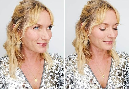

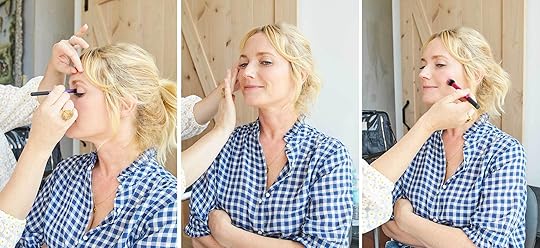
For someone who loves a good party, I barely change my makeup AT ALL for nighttime, not owning even one eye shadow beyond a cream glimmer, that I don’t know how to apply. I don’t love the look of heavy makeup and frankly think most people look better more natural (i.e. the no-makeup makeup look). But makeup is such a fun way to shift your look, amp it up, try something weird and risky. It’s like the throw pillow of your face—it’s low commitment but can shake things up. So, one day I was lamenting my inability to pull off one of these looks with Noel, one of my lovely makeup artists when she adamantly disagreed and when I said ‘prove it’ she offered to teach me, and you, how to do three different party looks based on the trends she is seeing and products that she loves. She’s been doing this for 20 years and has not only her go-to products for years but also stays on top of what is new out in the market.
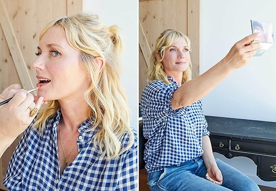
Quick side-note: The morning of this shoot (that we had booked for weeks in advance and had even borrowed a salon location for) I had a massive emotional breakdown and couldn’t stop crying. Like I cried at drop off, cried through my run (hoping a run would help—it didn’t) and cried all the way to the shoot. Everyone is fine, just parenting a sweet boy that has perfectionism can be very, very, very, very hard and sad and there are times when I just feel so helpless trying to coach him to let go and be okay with mistakes while he is sobbing and screaming about the most innocuous mistake. His meltdown lasted over a half-hour (I think about wanting to spell and write kaleidoscope perfectly without us helping him at all…he’s 5 by the way). I couldn’t stop crying, and yet I couldn’t really let myself wail and get it out because I knew I had to be on camera, shooting makeup no less. So my eyes are puffy and yes, I look tired and almost sad. Thanks to Noel for painting pretty things on my face and helping turn my day around. It was actually SO FUN, I learned so much and, yes, got some product recommendations that I couldn’t wait to buy.
Here is what I looked like when I showed up. And no, we don’t Photoshop any faces or bodies on this blog.

Now, those aren’t my real lashes, I get lash extensions, a luxury I may never be able to quit. Otherwise, you guys have seen me without any makeup a lot on stories so nothing too shocking up there.
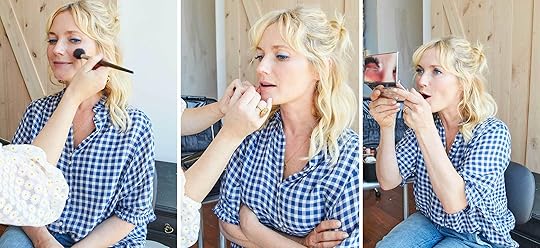
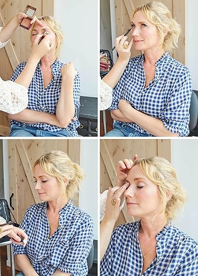
First, we are going to start with what Noel does to my face on a normal day, and then we will add those party looks on top, step by step. Here we go.
The Base:

1. Before you start, moisturize your face (we used La Mer Moisturizing Cream for my face and By Terry Baume de Rose on my lips). Next, apply primer to entire face. We used Laura Mercier Foundation Primer SPF 30.
2. Apply highlighter to cheekbones and bridge of the nose (Noel does this before foundation for a subtle, inner glow). We used Becca Glow Silk Highlighter. Hot tip: Noel uses liquid highlighter because it melts into the skin better for a more natural look.
3. Using a foundation brush, apply your foundation where needed on face and neck. I had never used this foundation (Face Atelier Foundation in #3) before and I loved it. From Noel: “When ever I apply foundation, I always opt for the sheerest formula I can get away with, because I love fresh looking and feeling skin! I love foundations that have a buildable formula, that way on days where someone might need a little more coverage, I can add a little more than usual.”
4. Using a finger and small brush, dab concealer (Nars concealer in Madeline) under eyes and over any blemishes or red areas. Noel also applies on my eyelids to get rid of any redness and to prep for eyeshadow.
5. Using fingers, dab a cream blush onto cheekbones then blend with a foundation brush. Noel uses La Mer Lip and Cheek Glow, which is limited edition and sold out most places, but this is a similar product that works well (and is more affordable).

5. Fill in brows with Anastasia Brow Wiz and brush with eyebrow brush.
6. Use a setting powder or spray to lock the makeup for long-lasting wear. We used Laura Mercier Translucent Setting Powder, a product Noel SWEARS by.
Here’s the final “base” look:


1. La Mer Crème de la Mer | 2. By Terry Baume de Rose | 3. Laura Mercier Foundation Primer SPF 30 | 4. Becca Glow Silk Highlighter | 5. Nars concealer in Madeline | 6. La Mer Lip and Cheek Glow | 7. Face Atelier Foundation in #3 | 8. Laura Mercier Translucent Setting Powder | 9. Anastasia Brow Wiz in Blonde
The product I bought from here was the Becca Glow Silk Highlighter as under my foundation it truly looks day-time glowy, like I wasn’t wearing any makeup and just looked fresh.
Party Look #1: “La Vie En Rose”

I tell every new makeup artist, in the least diva way possible, that I don’t like deep or dark eyeshadow on me and will most likely sneak to the bathroom and wipe it off after they leave. I think it makes me look sick and old, probably because I’m fair and yes, my lids show my age. But something reflective I could handle and when she proposed a rose gold look, I was obviously down to try. Here is how Noel does it:
1. Start with cream-based shimmer eyeshadow to give the look more depth. We used one by Beauty Pie (currently unavailable) but this is a similar product. Hot tip: Noel starts every eye look with a cream base which will keep the eyeshadow on longer because it gives the powder something to stick to. She also uses the pencils because they are easier to apply.
2. Using a brush, blend the shimmer all over the eyelids.
3. Next, use gel powder (Stila Magnificent Metals Foil Finish) eyeshadow and apply with finger. This was SO PRETTY and kinda felt like a rose gold glitter cream.

4. Add a little powder shadow (MAC Eyeshadow in Blackberry) under the eye and in the outer corner of the eye to make the eyes pop.
5. Apply a dash of liquid shadow (Stila Glitter & Glow Liquid Eye Shadow) on back of hand, and using finger, tap on the center of the lid.
6. Blend lipstick (Bite Matte Crème Lip Crayon) and gloss (Blowzy Ultra Glossy Lip) on back of the hand and with a brush apply onto the lips generously.

1. Sephora Colorful Shadow & Liner | 2. Stila Magnificent Metals Foil Finish | 3. MAC Eyeshadow in Blackberry | 4. Stila Glitter & Glow Liquid Eye Shadow | 5. Blowzy Ultra Glossy Lip | 6. Bite Matte Crème Lip Crayon
What I bought: the Stila metal foil finish. I will absolutely wear this my next special occasion. Although the lip color was really pretty, too.
Party Look #2: “The Cobalt Blues”

I was so excited for this look. Just the one bold line of blue is SO enticing to me.
1. Again, prep eyelids with a little concealer to get rid of any redness.
2. Apply the liner (NYX Vivid Brights) starting from the inner corner of the eye, and continue straight across. We chose a crazy bright blue to get that real pop. From Noel: “Don’t be afraid to experiment with color! Keep it sophisticated by using it sparingly and pair it with toned down lips and cheeks. Emerald green, purple and burnt orange are all fun but wearable options.”
Hot tip: To get the perfect line, use Makeover Remover Q-Tips and wipe any errors/wavy edges. I bought these after the shoot and love them.
3. Apply mascara on lashes (I am wearing lash extensions, so Noel only needed to apply on the bottom).
4. Apply blush (Laura Mercier Crème Cheek Color) on cheekbones.
5. Fill in the lips with lip liner (Sephora Lip Liner) and finish with gloss (Blowzy Ultra Glossy Lip).

Despite my eyes being bloodshot, I loved this look and am indeed going to try it. I think it’s crucial that the rest of the face (at least for me) looks fresh and not too makeup heavy or yeah, it can look kinda ’80s mom.

1. Nars concealer in Madeline | 2. NYX Vivid Brights | 3. Makeover Remover Q-Tips | 4. Laura Mercier Crème Cheek Color | 5. Sephora Lip Liner | 6. Blowzy Ultra Glossy Lip
Party Look #3: “Red-y Set Gloss”
This might be my favorite look of the three we tried this day: that glossy lid looked and felt so fresh, but still fun.
1. Apply champagne-colored cream eyeshadow (Bobbi Brown Long-Wear Cream Shadow Stick) all over eyelid and blend with a medium-sized eyeshadow brush.
2. Dab a little of the cream eyeshadow on cheeks as highlighter.
3. Apply cream blush (Laura Mercier Creme Cheek Color) with a brush.
4. Apply sheer eyeshadow (Benefit Hoola Matte Bronzing Powder) on the crease (for some depth, Noel says) and blend.
5. Use same sheer shadow and apply under eye with a thin eyeshadow brush.
6. Use a shimmer eyeshadow and tap on lid using fingers (we used Sculpting Stick by Chanel which has a little bit of shimmer but mostly glossy texture). This is the stuff. This is what I want to buy forever. From Noel: “This product is also stunning on cheekbones, down the bridge of the nose and on the Cupid’s bow. Or you can mix a little with a copper or gold eyeshadow and make a gorgeous lid tint.”

For the lips, here’s what we did:
1. Use lip liner (Nars Precision liner in Mariachi) to line the edges of lip.
2. Apply lipstick (Fenty Beauty in Uncensored) generously and let dry.

LOOK AT THAT LID! It was just shine, no color which I think is my jam. I think that I’d rather have a more orange-y red on me (but what do I know).
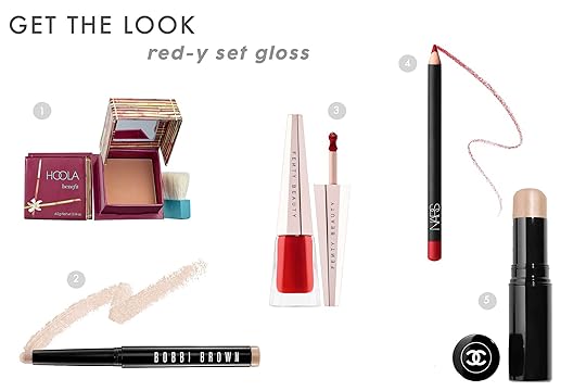
1. Benefit Hoola Matte Bronzing Powder | 2. Bobbi Brown Long Wear Cream Shadow Stick | 3. Fenty Beauty in Uncensored | 4. Nars Precision liner in Mariachi | 5. Sculpting Stick by Chanel
I’m definitely buying that glossy eye shadow pencil and the sculpting stick.
Thank you Noel for brightening my day and face. Sometimes you just need someone to take a small brush and gently stroke your face until you wake up party ready to change your mood.
October 18, 2019
Meet Team EHD: Introducing All the Women Who Make This Happen + A BLOG SHIFT UPDATE

It’s about time. All those people in the link up and all those makeover takeovers, well, its time to actually meet these lovely, talented, creative and very funny ladies. It just took us a bit to build out the team page to officially announce it. But it’s here, finally. And no, I’m not going ANYWHERE, they’d have to kill me – and there are enough of them that they could do it. And Mallory looks a lot like younger me so they could probably ‘weekend at Bernies’ it for a while. But until then I just want you to get to know the editors and designers here officially – and give them more presence on this site that they work so hard for.
Last year while we were all on a team retreat I realized that these women were all interesting, unique and hilarious. Instead of trying to find anonymous contributors we should read what they have to say. Besides, I’m just one demographic and not all of you can identify with my situation. I’m a 40-year-old white mom, with two small kids and after building my career for 18 years, yes, I have a decent budget now. These women, the EHD team, range from 22 to 35, have different backgrounds/ethnicities/gender preferences, VERY different styles and budgets, and homes with different functional needs (lots of small space solutions or rental hacks).
So we’ll be rolling out some more MOTOs (MakeOver TakeOver), yes, (Emily Bowser’s living and dining room are coming up next month, Julie’s bedroom, Sara’s house, which Velinda is helping her to design to document the entire process from both sides), but also more personal posts from everyone on the team. Things that work great for them (both in their homes and their bodies), conversation starters, inspiration jumping-off points for EVERYONE (not just me and Arlyn/Jess). I can’t do it all -and haven’t for years so lets make it official.
Please let us know what specific topics you’d love to hear from these wonderful, smart women, but in the meantime…we have some ideas.
So here you go. I’d like to officially introduce you to the EHD team here, but also, head to our brand new TEAM page to learn even more, see all the posts they’ve written, and become fast digital friends.
 photo by julie rose
Sara Ligorria-Tramp, Director of Production & Photography
1. How’d you land at EHD? I was 24 and had been working as a personal assistant for an actor while also working freelance as a set PA with the hopes of becoming a line producer. I loved being on set—being wildly busy all day, exhausted by the end, and feeling accomplished and productive. But, I realized that I needed a creative component to my career and line producing is pretty much the opposite of that. At that point (in 2014), I was reading a lot of DIY blogs and a friend told me that an interior designer she followed was hiring for a blog assistant/office manager. I didn’t know who Emily was and knew nothing about interior design, but I was hungry for a job in a creative field. I think she hired me because I knew my way around photoshop and was willing to do LITERALLY. ANYTHING. I’m still here 5 years later, basically, line producing while also doing something creative.
2. What do you do around here? I’m the head of production which means I oversee all the production for the site (project scheduling, client facing communication, working with the production and design team, etc.), as well as being our lead in-house photographer. I also help Em with some of the more administrative and HR oriented tasks that come with running the company. But I’ll be honest, I work with some really awesome producers, designers, stylists and a photo assistant. Everyone else is amazing at their jobs, so I basically do nothing all day except send everyone annoying Slacks about remembering to log their project hours correctly (which they already do, but it gives me a sense of purpose).
3. What advice would you give to someone looking to do what you do? Did you know that you spend 1/3 of your life working? I LOVE working. I didn’t get into photography seriously until I was working at EHD, but once I decided photography was going to be my career, I really pushed myself. I got a hand-me-down camera, watched hours of tutorials, and annoyingly hovered around any freelance photographer anytime I was on set. I would DM photographers I followed on Instagram asking them questions about how they shot a specific photo or what equipment they were using. I started shooting every weekend, coming into work early and staying late to edit the photos I took. Eventually, Em started letting me shoot small things for blog posts. As my skills developed, I was able to shoot larger and larger projects. I still buy interior magazines to study the photos, what’s the composition, what’s the lighting? My biggest piece of advice is to pursue something with passion and dedication. And the fact that you can learn just about anything you need to via the internet.
FAST FACTS
Instagram: @hellosaratrampinteriors
Sign/Enneagram/Hogwarts House: Virgo, Strong 1 (The Perfectionist), Hardcore Gryffindor
Design Aesthetic in 5 Words: It’s called a credenza, right?
Favorite EHD Room of All Time: Curbly Family Living Room
Favorite Place to Shop for Home Decor: Emily’s Garage – There’s nothing better than being in close proximity to Emily Henderson when she’s purging
Favorite Place to Shop for Your Body: My Mom’s Closet – That lady is working with a better budget
 photo by Veronica Crawford
Arlyn Hernandez, Chief Content Director
1. How’d you land at EHD? After studying journalism back in the olden days of media, I went directly to work in print magazines which was SO much fun. I worked almost every editorial job (assistant/associate editor, managing editor, copy editor, features editor, executive editor), but transitioned to digital about four years ago when I landed at Apartment Therapy as Design Editor (also SO much fun). I dabbled in freelancing with EHD for about a year and when I saw her post about hiring a new Editorial Director, I JUMPED at the opportunity, trekking across the country from Florida to take on the role.
2. What do you do around here? All the posts you see flash before your eyes were touched by me, whether Emily wrote it, Jess wrote it, whoever wrote it…I was there. I should start leaving “Arlyn wuz here” secretly at the end of every post because #accurate. I oversee the editorial and social teams day-to-day, set and manage the editorial calendar and goals, work on site refreshes and user experience (except for ads…don’t yell at me about those, pretty plz) and write/research my little heart out. You’ll typically find me leaning over Jess or Ryann’s desk asking them what they think about some very random or obscure design/color idea that almost always turns into a blog post around here…or saying something like “sofas are good for SEO” (they are).
3. What advice would you give to someone looking to do what you do? The greatest thing I ever did to land in the type of writing I wanted to be doing (my first job in editorial was at a professional water skiing magazine, people) was to hustle at night writing for outlets that synced up with my passions and pursuits. At first, I wrote for free, just for the byline. At one point, I wrote for beauty products (honestly, not a bad deal…do you know how much serums cost?!?), and then finally started getting paying gigs. I started my own blog to write whatever I wanted (this was in a time before Instagram and Pinterest) and used all of that to show people a portfolio that fit what I wanted to pursue instead of just where I had been employed. You gotta create your own path sometimes, so why not just start now?
FAST FACTS
Instagram: @arlynhernandez
Sign/Enneagram/Hogwarts House: Aquarius / 2 (The Helper) / Hard Gryffindor
Design Aesthetic in 5 Words: Eclectic British grandma who decluttered.
Favorite EHD Room of All Time: 120-Year-Old Barn (THAT BLUE ON BLUE IS LIFE)
Favorite Place to Shop for Home Decor: furniture: ReStore (Habitat for Humanity’s thrift store); decor: Etsy or Target (and no, I didn’t get paid to say that…wait I guess I kind of did?).
Favorite Place to Shop for Your Body: Nordstrom when I feel like going to a mall, ASOS when I don’t.
 photo by veronica crawford
Caitlin Higgins, Partnerships & Marketing Manager
1. How’d you landed at EHD? I hopped on the EHD train in late 2015 with Sara’s first MOTO series. I had just moved out of an apartment with like, a million roommates and into my first LA 1BR and her posts were SO INSPIRING. I’ve been following ever since and actually found my job posting via Em’s Instagram! I was wrapping up a yearlong “Eat, Pray, Love” break (read: mostly eating) after spending long time working in a ton of different music industry business development jobs and was super excited to parlay that experience to the design world. Fun fact: I had my final interview here on a Tuesday afternoon and was planning to move to NYC on Thursday—yeah, like, 36 hours later—so getting hired felt like a REAL LIFE MOVIE MOMENT.
2. What do you do around here? I work with all our brand partners (and then all our internal teams) to bring y’all sponsored content that you will actually like reading/looking at/watching. Beyond that, I’ve been jumping into some business development projects (normal speak: what does the future of EHD look like, and who can we work with to get it there?) and I’ve been known to plan an event (or two? Stay tuned for more from us in 2020!).
3. What advice would you give to someone looking to do what you do? I am VERY LUCKY because I have basically worked in partnership/relationship management roles for my WHOLE ADULT LIFE. (In my whole child life, I worked in a skate rental handling people’s smelly shoes, so that’s decidedly less glamorous.) The two things that have helped me: 1. Being pretty shameless and social. I’m happy to slide into ALL THE DMs. Ya gotta be willing to make connections, even if you feel super dumb sending a million cold emails or hopping on cold calls. 2. Literally no one knows what they’re doing. A lot of the time people are like, “oh, I don’t know the procedure for reaching out or how to close a deal,” but I’ve worked at everywhere from startups to the biggest tech company in the world and I’m here to tell ya — there’s no playbook! There’s no secret MBA sauce you learn for partnerships; you already have all the tools, it’s just a matter of practice! (Bonus tip: pay for LinkedIn premium. I live in InMail!)
FAST FACTS
Instagram: @chigglypuff
Sign/Enneagram/Hogwarts House: Libra (Cap moon, Cancer rising) / 9 (The Peacemaker / Slytherin
Design Aesthetic in 5 Words: Post-Modern. Bright. Comfortable. Graphic.
Favorite EHD Room of All Time: Give me all the colors!
Favorite Place to Shop for Home Decor: Craigslist, Chairish, Pepe’s Thrifty Shop in LA (the one on Centinela), Long Beach Flea, Instagram, Facebook Marketplace
Favorite Place to Shop for Your Body: Madewell. Exclusively. If we ever run into each other, I WILL be wearing a Central shirt french-tucked into Skinny Skinny High-Rise jeans.
 photo by veronica crawford
Jess Bunge, Senior Market Editor
1. How’d you land at EHD? Mine is a story of a late 20s career change, extreme luck and a lot of hard work. I had just returned from let’s say a not extremely successful move to Australia and was jobless. My (now favorite) cousin was moving out of LA after working at EHD for a few months and asked if I wanted her to recommend me to replace her. I had been a fan of Emily’s for at least three years at that point and desperately was trying to get my foot in the design door somewhere. After a few months of back and forth, I was hired as a graphic designer/office administrator. Three years later, I am the Senior Market Editor and couldn’t love it more.
2. What do you do around here? My main role is researching and writing for the blog. I research constantly (like all hours of the day) and look for the new and exciting things that are happening in the design world that I think our readers would find interesting. That could be anything from trends to products. But since we are a small team, I also help with marketing, press and the occasion dirty dish.
3. What advice would you give to someone looking to do what you do? My path was obviously not the norm and I never lose sight of that but I would say just do what you can to get your foot in the door. Contact anyone you know who may have a connection to an editorial site. AND if you are like I was, try not to feel too stressed that you are older than you would like in terms of starting at an entry-level position. If you work hard, have good ideas, and pitch in where help is needed then you will have huge potential to move up. Also, start writing to find your voice.
FAST FACTS
Instagram: @jessbunge
Sign/Enneagram/Hogwarts House: Libra / 9 (The Peacemaker) / Hufflepuff
Design Aesthetic in 5 Words: Modern. Natural. Euro-Wannabe. Abstract Crazed.
Favorite EHD Room of All Time: The , because it was the room that first made me a fan of Emily.
Favorite Place to Shop for Home Decor: As a hardcore indecisive Libra, this question is ACTUAL torture. I would say Etsy and Chairish. Lots of options but there are SO many others.
Favorite Place to Shop for Your Body: Madewell and Zara (though if money weren’t an option, I’d go with Lisa Says Gah)
 photo by veronica crawford
Julie Rose, Lead Designer
1. How’d you land at EHD? After graduating college with a BFA in Interior Architecture, I did the sensible thing and took about a year off to pull a Cheryl Strayed and attempted to thru-hike the PCT. 700 miles later, a foot injury landed me living in LA with my mom at the age of 28 (not ideal). Two weeks later, Emily posted on Instagram that she was hiring a design assistant…I promptly updated my portfolio and resume. The following Wednesday, Brady emailed me for an interview. Meeting Emily that day felt so surreal. I would tell people, “No, I would never move back to Los Angeles…unless, of course, I could work for Emily Henderson” and THEN IT WAS HAPPENING, I got hired that night!
2. What do you do around here? In the past two years, I’ve worn many hats and I’m not really a “hat person”. I started off on editorial then jumped into being a design assistant on the Mountain House. A month later I was the design assistant and project manager of both the Mountain House and the Portland project (I love the PNW & everyone knows it!). This past year I have worked as a stylist on some Target shoots, the Atlanta Project, House Beautiful shoot for the Mountain House and then lead designer on the Velux Bedroom project & some other projects in the works! Sara has even taught me how to edit photos, so in short a little of everything!
3. What advice would you give to someone looking to do what you do? Absorb as much information as possible. There are many aspects to interior design/architecture and the amount of information out there can sometimes be overwhelming but don’t feel the pressure to know it all when you first start out. The best learning moments that I’ve had is on the job, school prepares you to think like a designer and the job will turn you into one.
FAST FACTS
Instagram: @julie.a.rose
Sign/Enneagram/Hogwarts House: Libra / 9 / Hufflepuff…basically this means that I just want peace and love in life.
Design Aesthetic in 5 Words: Old man goes on hike.
Favorite EHD Room of All Time: Oh come on, this is so hard to choose! Okay, anything from the ’cause it’s my fake baby.
Favorite Place to Shop for Home Decor: Long Beach Flea Market or Etsy Vintage…is it cheap? Great, I’ll take it!
Favorite Place to Shop for Your Body: REI; if it was socially acceptable to wear my hiking clothes to work every day, I would.
 photo by sara ligorria-tramp
Velinda Hellen, Lead Designer
1. How’d you land at EHD? I was still in design school and applied at random to the Jobs@ email, not expecting much. Two months later, Brady called! Four days later, I was hired on-the-spot via a Skype interview.
2. What do you do around here? All things design, styling and often, producing. Oh… and writing. It’s pretty much impossible to get bored here. I came on as a designer on the mountain house and Portland projects and later took on a lot of the Flash Makeover designs/production. Somewhere along the way, I started writing on the blog and now I’m writing on Emily’s next book, which is what a lot of my year has been dedicated to; producing styling and helping to write/research that beast!
3. What advice would you give to someone looking to do what you do? Read this post!
FAST FACTS
Instagram: @velindahellendesign
Sign/Enneagram/Hogwarts House: Pisces / 1 (The Reformer) / Self-identified Ravenclaw
Design Aesthetic in 5 Words: Scandi. Vintage. Earthy. Collected. Quirk.
Favorite EHD Room of All Time: Mountain house master…or kitchen
Favorite Place to Shop for Home Decor: Craigslist
Favorite Place to Shop for Your Body: Crossroads Exchange…wait, other stores exist?
 photo by veronica crawford
Emily Bowser, Lead Stylist
1. How’d you land at EHD? I followed Emily for a number of years before working here. If I had been thinking clearly, it wouldn’t have taken me long to realize that my real passion was interior styling. It took years of people going out of their way to tell me I had a natural knack for it and blogs like Emily’s showing me that it was a real job. She posted in the fall of 2016 that she was looking for a styling assistant, though I had seen and dismissed it. Five different people screenshot it and sent it to me and I took it as a sign—maybe I could/should do this? I knew someone who knew her and asked for a referral, Emily gave me a chance (I dug my nails in deep) and here we are.
2. What do you do around here? In the early days, I was a freelance styling assistant for Emily, Ginny, Mel, and Brady, and before long, I had more and more responsibility and now I’m producing and styling shoots from “soup to nuts.” My roles have varied, but at first, it was a lot of schlepping, organizing, steaming, picking out/arranging flowers, pre-styling (when you style but then a professional comes behind you and makes it look WAY better by moving 3 things 1 inch each while you watch in amazement), returning, storing and making itemized lists of things we used so that editorial can insert into the post. Now, it’s all the things above except I have to move all the items 1 inch and hope it looks way better. In addition, I’m now involved in ideating out the creative along with Emily, the client and sometimes someone else (Julie or Velinda), making decks (which are basically the “plans” of the shoot), sourcing and shopping, styling to camera, wrapping out, and submitting notes to editorial to help them form the post.
3. What advice would you give to someone looking to do what you do? Styling is 95% hard, physical labor. 4% is dreaming up the beautiful ideas. 1% is styling to camera while pretty music plays. Most importantly, 100% of it is collaborative. You have to show people that you are willing to do the hard physical work and do it with a good attitude. Other than that, be willing to work for free or cheap in the beginning but still value yourself. The value, or how you’re getting “paid” is the experience and the networking. Find someone who knows someone, make cold calls to production houses or do a “test shoot” with a photographer who wants to build their portfolio. Invest in a stylist kit and be ready to go! Sometimes people will rent kits for a couple hundred dollars for a shoot, if that “kit fee” comes with a willing and able body, I don’t know many stylists who would say no to that. I sure wouldn’t.
FAST FACTS
Instagram: @emilyedithbowser
Sign/Enneagram/Hogwarts House: Capricorn / 9 (The Peacemaker) / Slytherin
Design Aesthetic in 5 Words: Livable. Organized. Grounded. Quirky. Vintage.
Favorite EHD Room of All Time: This is impossible, though Brady’s living room made me want his job, the Parisian hotel with Sothebys is the thing dreams are made of. OH ALSO Jess’ living room reveal. All the heart eye emojis.
Favorite Place to Shop for Home Decor: Long Beach Flea Market
Favorite Place to Shop for Your Body: Also Long Beach Flea Market, haha. Recently really into Alter in Silver Lake, as well.
 photo by veronica crawford
Ryann Miller, Lifestyle Editor
1. How’d you land at EHD? Despite being told by nearly everyone that it would be a pointless degree unless I became a teacher, I studied English Literature in college. Naturally, some were proven right (at first) as my first real job was working as a personal assistant for a fashion writer, stylist and photographer. Eventually, I quit that horrible job, saw EHD was looking for a temporary data entry person and despite knowing nothing about design, applied. Somehow I got the job (that promised only 2-3 weeks) and never left.
October 17, 2019
#ShowEmYourFall: How You Guys Are Actually Styling Your Home For Ultimate Fall Happiness
 photo by sara ligorria-tramp | from: target’s new threshold collection is hitting “elevated prairie” style hard
As much as we (and by we, I mean non-professional stylists like Emily) would all love to change up our home furnishings and general decor as soon as we are in need of a refresh, that isn’t always the most time/money efficient way to change up the feel of your home. If only right?! But as I said in our fall front entryway post a couple of weeks ago, I look at decorating for the season/holidays not only as an act of self-care but a great/more affordable way to make your house feel happy and new. I’m pretty sure most of you felt the same if the comments were any indicator.
Since (like us) you love a good seasonal feel in your home, we asked you to use #ShowEmYourFall on Instagram to show off how you decorated for maybe the best time of the year (that last statement was controversial I know). We LOVE getting to see your incredible creativity and feel very strongly that it deserves a platform…like say, a blog post. Much like the #ShowEmYourStyle: Holiday Edition and the #ShowEmYourDIY series we rounded up some of our favorite reader/follower submissions to help you get into the holiday spirit and hopefully inspire a little seasonal decorating of your own. It’s only mid-October so there is plenty of warm-toned, leafy, pumpkin time to be had. Shall we get cozy with our first category??
Entrance and Foyer

The front porch and the entryway were basically MADE for holiday decor. Why? Well, because anyone who enters and then (hopefully) leaves will have to pass through this part of your home. Even if you only throw a few pumpkins into your most likely already beautifully styled entry, it will undoubtedly make you feel happier. It’s science, people. But these next six followers did a little more than that…

clockwise from top left: @alexis.mbrink | @alyssawine | @nestingwithgrace | @1954_house | @restored_haven | @michelle_janeen
Man, doesn’t this just make you want to run to the nearest hot cider dispensary? Look at these pumpkins in carefully curated color palettes/sizes, and the perfect sprinklings of Halloween decor. However what is probably my FAVORITE decor item amongst these photos…the pampas grass. The pampas grass explosion of 2018 had me a bit fatigued if I’m honest but the way @alexis.mbrink and @alyssawine gently incorporated it into their entryways makes me feel like there are few better foliage options for fall. Do you agree?
Fireplace

Now that temperatures are finally dropping (in some parts of the country/world) we get to snuggle up by the fire…hopefully with that cider from my imaginary hot cider dispensary or you know, your kitchen. As someone who dreams daily about having a fireplace, looking at these makes me incredibly happy and not jealous at all.
clockwise from top left: @rebecca_june | @alexis.mbrink | @1954_house | @istyleustyle
I love how different yet festive each of these four fireplaces are. It shows that you can get super playful in a chic way like @rebecca_june and @1954_house did (also that disco ball is AMAZING and unexpected), go full-on fall colorful eclectic like @alexis.mbrink (the pampas grass master) or minimal and cozy like @istyleustyle did. All are extremely seasonal and show that any style can include some fall decor.
Kitchen and Dining
Formal table settings were obviously made for seasonal decor but we love popping in a little bit in the kitchen and on the (everyday) dining table. Heck, we spend most of our communal time in the kitchen and dining table so it really only makes sense to spread the fall joy in those spaces, no?
clockwise from top left: @astridreifer | @prettydomesticated | @briannenekole | @tarynwhiteaker_design | @dexterandplaid | @restored_haven
Of course, if you are the type of person who is a holiday maximalist then, by all means, go for it. It’s meant to be fun. But also a little can go a long way. I love how @astridreifer created a muted, neutral color palette with pops of warm colors and then put a large bowl of white pumpkins as the centerpiece. It’s simple, chic and adds just the right amount of season into an already insanely beautiful kitchen (that black tile is everything to me). But if you want to be a little more festive, going the traditional orange pumpkin route like @prettydomesticated did in her all-white kitchen is equally as awesome. Some cute ghosts are pretty great, too.
Emily Henderson's Blog

- Emily Henderson's profile
- 10 followers

