
Emily Henderson's Blog, page 241
November 12, 2019
Would I Recommend Starting a Blog in 2020? Advice From this OG Blogger
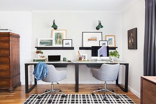 Photo by Tessa Neustadt | From: Custom Framing for our Home Office With Framebridge
At a recent Q&A, I was asked by an interior designer if I thought she should start a blog. My gut reaction was “no,” not simply because I know how unsustainable running a client business and a daily blog is in terms of time investment needed on both ends (BOTH are full-time jobs, FYI). But then I had to back off my pessimism, drawn from years of experience, and I decided to retract. Instead of jumping to answer, the real response comes in form of a question: WHY would you start a blog? We should ask ourselves “why” before embarking on any new venture, obviously, but when leaning into any creative business adventure/roller coaster, you really have to identify the root and purpose. Then based on THAT, I have different answers. Here are some of the most common reasons I hear, and what I would say to them in response:
Reason #1 to start a blog: As a creative outlet, to journal my projects/DIYs in a longer written form than I can on social media. A hobby. Maybe some people will read it, maybe it will lead to business opportunities, but I really just want to express my creativity and have a journal of my creative life.
My advice: This is a GREAT reason to start a blog, just don’t put pressure on it to be a financial success. This is why I started and why I continue. I love storytelling in the longer form. I love beautiful pictures. I love documenting processes and teaching what I’ve learned or warn off because of my failings. Ultimately, I love writing. I love having a voice and yes, I love that it’s widely read because having your work read is fulfilling. But honestly, I would and will write it forever even if the audience shifts completely elsewhere. I grew up journaling every day, so the need to write is fully engrained. If the blog hadn’t blown up, I’m not sure I would have kept up writing every day having two kids, but who knows, maybe I still would have.
Reason #2 to start a blog: I want to document my projects to grow my current business.
My advice: Maybe you have a store and you want to tell a larger story than your website does. You want to connect with your customers in a closer way. I used to say “yes” to this before social media became what it is today. But now with Instagram and Pinterest, I say just do all that there unless you are truly doing it for fun, not to create more content. Creating posts and running a blog is, needless to say, a full-time job. Trying to get eyeballs on a blog, or any website, these days is, well, chasing something you likely might not ever catch. Tell your story on Instagram and Insta-story. That is where there is more community right now and the ability to connect is higher.
However, I did want to add a good point that was brought up in the office. If “owning” your audience is important to you (or your business), then know that if you only build up a following on, say, Instagram, that that audience isn’t technically “yours.” If from one day to the next they decide to pull the plug, or something shifts, or there’s a glitch that wipes out your followers…that’s it. There’s no way to connect with those people again. Meanwhile, if you have a blog or an email list, those are YOURS. I know all of this isn’t as simple as I’m making it, but regardless, it IS something to consider.

Reason #3 to start a design blog: I want to be a professional blogger/influencer and have that be my career because it will make me a lot of money.
My advice: Being driven by money in a creative field has rarely led to long term successes. This daily blogging business is HARD, it is saturated with people big and small trying to grab eyeballs, sponsors and advertisers. Chasing the dollar is not how we function. Oh sure, we’ve done some projects just for money when we’ve needed to, it is a business after all, but it’s not what drives us. It’s not our WHY. Boy, I wish I thought about the bottom line far more than I have (more on that later), but I’m driven by fun, creative expression in multiple forms and new challenges. There is very little authenticity in creating for the sole purpose of money and frankly, there is even less fulfillment in it. Now, becoming an influencer on social might be easier, less heavy lifting, more ROI but again if your why is money, then I think you should probably leave the design/style world and head into the finance world or head to SF and get into a startup (and then come and consult with me, please).
Reason #4 to start a blog: I have a unique voice, a missing perceptive and feel there is a hole in the market for my talent/voice. I think there is an audience who needs to hear from me and connect with my story. I am nothing if not passionate.
My advice: YES. The world always has room for the truly unique and new, fresh creative voices and talent, in every single medium. You are never too old to start or shift into any creative career if you are passionate about it.
Example:
I recently met with a podcast producer and the first thing he asked me was, “why do you want to start a podcast in 2020?” My answer: Because I want to tell a story in a different way and be free to talk less edited, more conversational. I want to connect with my audience on a whole other platform and I feel like I have a unique perspective on life that people seem to want to hear. Also, I love talking almost more than writing, so I think it would be FUN. I didn’t have the right idea until this month and now I’m SO EXCITED.”
Once I told him my idea, he said this: “The podcast world is saturated, for sure, but that podcast, the Emily Henderson podcast, does not exist. There is indeed a hole for it because you are the only Emily Henderson.”
It was encouraging and made me want to write this post, to give a bit more hope.
So that’s what I’d say: if you are looking around and you say “I have a unique set of skills, I have a voice that people want to listen or read, I can create a blog that doesn’t already exist and I’m willing to work VERY HARD EVERY SINGLE DAY” then YES, YOU SHOULD DO THIS. Telling your unique story is what will get you traffic and while it may not lead to your blog being a huge financial support quickly, it can lead to so many other opportunities to expand your own personal brand and your life experiences. Know this: the key is authenticity, honesty, being human and willing to be vulnerable. Before you start, ask yourself if you can handle that. 


November 10, 2019
The Link Up: Emily’s Comfy Rug Secret, Eyeshadow Veronica Can’t Get Enough Of & A Compact Printer (That Isn’t An Eye Sore)
 image via Dwell | design by Rachel Eccles
Hi friends and welcome back to your weekly peek into what’s in our shopping carts and on our minds. In case you need some filling in, this week we announced some big news (drumroll please..) we are now doing two posts a day Monday-Friday! This has been on our to-do list for quite some time and we are so pumped that the time has finally come to make it happen. So yes, you will be hearing from us more (once in the AM and again for what we are calling your “afternoon snack” at around 11 am PT, 2 pm ET) and we hope that excites you as much as it does us. Now, let’s get to those EHD links:
First things first, today’s home tour (via Dwell) is a minimalist, modern dreamboat with some REALLY fun and cool handmade materials sprinkled all over. It is a real treat.
From Emily: “Anyone who comes over to our house asks me why my rugs are so cushy and comfy (it’s truly remarkable), and it is because of this pad. This is the only one I buy for rooms where a lot of floor lounging and wrestling happens.”
Veronica bought this eyeshadow/eyeliner crayon in brown copper over the weekend and immediately fell in love. It is super easy to use, cheap, and a less than five-minute application. She wants them in every color now!
Caitlin just discovered Farm Rio and is experiencing SEVERE HEART PALPITATIONS!!! This one’s for all the maximalists out there — here’s her favorite cardigan, pair of pants, and winter coat. (From Caitlin: “Can someone please remind me what seasons are like? I just want to wear a jacket!!!! I normally save up my money for furniture purchases, but this has me wanting to start a separate ‘toucan printed outfit’ fund.”)
In a bind, Velinda had to replace her old printer and made a run for something basic and affordable. She chose this one because of its compact size. Now, there’s less of an eye-sore in her small, bedroom office.
From Mallory: “Last week, I talked about wine, and this week I’m talking cheese. I’m really not that boujee, I just feel that this is something everyone should know about. So for my cheese-plate lovers, here’s my all-time FAVORITE Instagram (other than Emily’s of course) called cheese by numbers. This gal literally teaches you how to build the most gorgeous cheese plates step by step, through Instagram carousels. Please enjoy!”
As Jess was casually getting ready this past Friday morning, she threw on Seth Meyer’s new comedy special, Lobby Baby, and she found herself laughing out loud. So if you need a funny, easy pick me up then do yourself a favor and click play.
Sara is back with another delicious recipe that the whole office can vouch for. She recently made these pumpkin muffins and brought them in. Needless to say we couldn’t get enough. They are super easy to make, really soft and moist (though next time she will probably add some chocolate chips for more flavor).
Ryann bought her boyfriend this knife for Christmas four years ago, and it is still his favorite gift she has ever got him, and he talks about how amazing it is all.the.time. From Ryann: “I do not understand what it is with men and their knives, but my boyfriend insists this one is the best, and he says he uses it every day. I must admit that at least once a week, I need to open something on the go or what have you, so his trusty knife comes in handy for me too.”
From Arlyn: “With the recent fires, I’ve pulled out my air purifier (which I SHOULD run year-round) and remembered how great it was so decided to share. It was top-rated from Apartment Therapy so I picked it up because for the price (about $85) it worked and looked great. It’s not too loud and not gross looking. Win win!”
That is all for today. See you around these parts tomorrow (for TWO brand new posts). xx
The post The Link Up: Emily’s Comfy Rug Secret, Eyeshadow Veronica Can’t Get Enough Of & A Compact Printer (That Isn’t An Eye Sore) appeared first on Emily Henderson.
November 9, 2019
8 Pajama Sets That I WILL Be Wearing All Winter: A Review

It wasn’t until I was 31 that I discovered the joy and positive psychological effects of the matching pajama set. It’s like making your bed, but for your body. Once they are on your body, you feel more pulled together, more cohesive, more grown-up in a good way. I’m typically VERY bummed when I can’t find a set in my drawers, and recently I realized I only own two sets and one was at the mountain house. This would not do so I shopped and read reviews and today I have for you eight sets that I love for a variety of reasons.
But first, what makes a good pajama set? I have narrowed it down to three things:
Comfort: They better not be super tight at the waist and cut in. That infuriates me. A pajama maker’s first priority should be comfort and when it’s not, it makes me so mad.
Cuteness: I want to be able to wear these on weekends and on holidays around family and not feel like I’m wearing a sack. I personally like when they are cute and drape in a way that isn’t unflattering.
Affordability: I have been sent luxury pajamas before and I’m not opposed to them and frankly LOVE them as gifts, but it’s not where I want to splurge on in life. They don’t have to be expensive (as you can see below) but for a gift, it’s nice to give/receive one that I wouldn’t buy myself.
Split-Neck Modal Henley, $32 + Modal Joggers, $45

I haven’t shopped at the Gap in a while but Arlyn said these got great reviews so I tried them and they are a hell YES.
Comfort: They are so thin and drape so so so so well. No cutting in, no clinging to places it shouldn’t. Just EXTREME comfort and breathability. I’m literally wearing them right now as I opted for them to sleep in last night. I had a late dinner with a friend and came home and rummaged around JUST for these if that tells you anything. Brian woke up and was like “what are you doing?” and I replied “sorry! pajama hunting!” These are super lightweight so great if you run hot at night but still want pants and long sleeves.
Cuteness: I feel super cute in these. I have room around the waist and it doesn’t cling to my bra strap. They are just GOOD.
Affordability: $77 for the set and worth every penny. I just got them so I don’t know how they wear over time, so if anyone else has more long-term experience with these, please leave in the comments.
Next up, my team’s favorite (and now mine, too):
Soft Notch Collar Pajama Set, $22

PJs are not where I splurge in life so I’ve been wearing Target’s matching sets for years. I actually usually buy two of the same so in case I misplace a top or bottom, I’m covered.
Comfort: 10/10. Feels like you are wearing nothing, in a good way.
Cuteness: YEP. I feel cute, and because the shorts are pretty short, Brian really likes these, too. The shorts are boxy which is good, they don’t cling and are really loose. They drape really nicely, are roomy but not too boxy and come in so many colors.
Affordability: At $22 for the set, you honestly can’t regret it in any way. The two sets I bought two years ago from Target are just now starting to pill, but I still opt for them in the summer. This model is better.
(That wreath with the faux candle is from Target, too and making me so happy).
Henley PJ Top, $34 + Long John Pant, $34

Two years ago, I bought this version in green and white for the family and it’s my FAVORITE. It’s from Hanna Andersson who specializes in pajamas so you’d expect them to do it right and they do.
Comfort: Another 10/10. They are comfy and lightweight but still warm. It think it’s hard to find a thicker fabric that is also very comfortable and breathable but these are it. Even though they’re more fitted, they don’t cling to places they shouldn’t.
Cuteness: The henley and long John styles are more playful and whimsical than a boxier model. It does NOT feel tight in at the waist and THIS IS KEY. Pajamas that cut in at the waist and give you an uncomfortable muffin top while you sleep are doing the opposite job it should. I’ve discovered that you want a light elastic waist, with a drawstring to go tighter if you desire.
Affordability: $68 for the set. These are more expensive than many below, true. I just love them and have found that myself (and Brian and the kids) opt to wear them ALL THE TIME. They just make us happy. The first pair that I had years ago was gifted from the company or else I might not have splurged initially, not realizing why they are worth it, but over the years they are the pair that I splurge on for myself. I still wear the green set, and two years later, they absolutely hold up.
PJ Set in Tennanbaum, $69

I bought this other version from Hanna Andersson that I also love, although the red/white stripe might make a better family set.
Comfort: I took it for a test sleep and that Supima cotton is so soft, breathable and the drape is good. I’m only calling out the type of cotton so we all remember what makes a good breathable yet soft cotton: “Supima.”
Cuteness: The arms are slim, while the shape is more flowy so it doesn’t feel like you are wearing a big paper bag. No clinging. No cutting in.
Affordability: $69 for the set. Again, splurge-y but super high quality. No pilling or rips in two years of wearing.
Silk Leisure Pant, $80 + Silk Long-Sleeve Leisure Shirt, $85

I wanted to try some silk sets (or silk feeling sets) and so I reached out to ban.do to test theirs. This is a set I would absolutely bring on a girls’ weekend because it’s so cute and fun. It’s also a great gift as it is on the splurgier side.
Comfort: The top is super comfy but I had to size up on the bottom. I originally ordered a small but it cut in and the elastic is too tight (yes I hope the company reads this and adjusts its sizing). The medium bottom was much better, (the top is still a small) so I’d say size up at least for the bottoms.
Cuteness: These are great for a girls weekend and with converse and a long coat or sweatshirt I know that it might even look cool going to the grocery store or grabbing coffee on Saturday morning.
Affordability: The most splurgey of the bunch at $165. They’re a great gift, especially for a college-aged girl who wants to look cute/cool but can’t spend the dough.
Silk Leisure Shirt, $75 + Silk Leisure Shorts, $65
This is another set from ban.do in the silky material that I know people love.
Comfort: I wanted to try the silk feel being a supreme cotton lover lady and now I know I prefer cotton (for sleeping that is) because the silk or satin doesn’t have the same give. They sort of pull when you move around which isn’t very comfortable.
Cuteness: SO CUTE. While I won’t go for these most nights, opting for something stretchier instead, I will be keeping these for those weekends away either with Brian or my girlfriends. I felt really cute and ready to put on a face mask.
Affordability: $140. I would absolutely buy these for my nieces that are just starting college.
Short Sleeve Pajama Set, $29
This set had strangely great reviews on Amazon and I am here to say the reviews were right.
Comfort: They are great and almost identical to Target’s in the comfortability region.
Cuteness: The little dots are very cute and for a summer set, I’d opt for these for sure. Soft fabric, doesn’t cut in at the waist, breathable and drapey.
Affordability: At $29 they are cheap, and who can resist that one click to buy and one-day shipping?
Striped Perfectly Cozy Flannel Pajama Set, $30

While living in LA, I rarely need a flannel number, but I wanted to try a pair for you guys.
Comfort: It’s comfortable, breathable and all-around good.
Cuteness: This one is soooooo cute because of the stripe on stripe. The set looks “designer-y” but they’re affordable. Due to the flannel nature, the fit is boxier and they don’t drape as well, but they don’t cling or cut in either. They’re just thicker. I’m bringing this set up to the mountain house, for sure.
Affordability: At $30, the set is absolutely worth the warmth and comfort (I love that little hem).
In a perfect world I would have tried on every pair in the entire world, but who’s got that time? I did reject like 9 pairs at The Americana, mostly due to cutting in at the waist (I MEAN, YOUR ONE JOB IS COMFORT, PLEASE GET THAT RIGHT, PAJAMA MAKERS) so know that there are some definite “no’s” out there.
Here are some more that we’d love to try:

1. Star-t Over Satin Pajama Set | 2. Satin Pyjama Shirt | Satin Pyjama Short | 3. Woven Pj Pant Set | 4. Pastel Zebra Crop Pants | 5. Stretch Flannel Long-Sleeve Pajamas | 6. Henley & JoggerPJ Set | 7. Ultra Soft Buffalo PJ Set | 8. Satin Pajamas | 9. Girlfriend Pajamas | 10. Polka Dot Long Sleeve Pajamas | 11. Matching Women’s Tree-Print Pajamas Set | 12. Save Me A Spot Polka Dot Pajamas | 13. Super Span Dots PJ Set | 14. Slouchy Pajama Set | 15. Notch Collar PJ Set | 16. Kiss Me Goodnight Flannel PJ Set | 17. Stars Above Thermal Pajama Set | 18. Butter Knit PJ Set | 19. Luxe Short Pajama Set | 20. Whisperluxe Waffle PJ Set | 21. Thermal Pajamas
I would LOVE your recommendations or if you’ve tried any of the above, let me know your thoughts. We are about to purchase our family set for the holidays and I’m likely going to go with a super cute elf or Santa one from Target for the day-of and the red/white one from Hanna Andersson for the rest of the time. I swear even Brian gets into this. Pajama sets for everyone!
**photography by Veronica Crawford
The post 8 Pajama Sets That I WILL Be Wearing All Winter: A Review appeared first on Emily Henderson.
November 8, 2019
Friday Finds: What’s In Our Cart (It’s All on Sale, FYI)
 Photo by Sara Ligorria-Tramp | From: 14 Rules for How We Style the Perfect Bedroom + 3 Reveals
Hungry for your Friday Afternoon Snack? We thought so. Not sure what we’re talking about? Well then welcome to our new, regularly scheduled second post of the day (head here to read this morning’s post). These are meant to be a quick, fun article that can serve as a helpful afternoon pick-me-up. Now, let’s dive into today’s delicious treat…
A wise man once said, “it’s not the shopping cart itself, but what you choose to put inside of it.” I don’t know who this man is or why he said this, but with this whole “I don’t want to leave my house or put on pants to go shopping” kind of world we live in these days, we thought it might be fun to show you guys what’s in our ~online~ shopping carts (plus some other great weekly online steals). For today, our first “Friday Sales” second-day post (get excited!), we are keeping things more general and recommending products that we are all loving. But after that, we will be hitting you with fun sale recommendations from different team members so not only will you get a variety of styles but A TON of deals. Plus, at the end of each post, you will get a fun new treat. Did Friday just get better?? Yes. Yes, it did. Okay to the deals we go…
This Week’s Steals:
If you don’t already know, World Market is slashing 40% off all of their furniture PLUS free shipping after you spend $75. We are big fans and here are a few of our favorites: We all love this beautiful queen wood spindle bed for only $329 (originally $550). I also personally fell extra hard for this bar cart. It’s now only $102 (originally $170) and is perfect for a small space (like the one I am living in). Last but not least, one of our favorite sofas is now on sale for $540 (originally $900). Wowza.
We love a throw pillow, and even more so…a round throw pillow. This round canvas cutie is now 56% off! So at $15 (originally $34) you can have an EHD-approved pillow in your home. If you want to see it in a project here you go.
Design Agony: A Tricky Living Room Layout, Useless Alcoves & Color Balance Problems

We are back for another round of Design Agony. Needless to say, we have been getting a ton of pleading requests because designing can be hard (check Em’s Instastory highlight for more). And in an effort to help ease the stress and idea that “there is no answer,” we are here to help…with at least one answer. Today, we have three never-before-seen agonies: two that are product/styling based and one that is yet another layout conundrum. Furniture layouts can truly be the hardest, so we will likely always have one agony that addresses it because we GET how stressful it is. With that said, let’s get the weekend off to a happy start by chasing these agonies away.
Agony: How to Balance A Bold Color In An Open Plan Space
Our first agony comes from Ray who decided to go for it when he bought these awesome forest green velvet dining chairs (pictured below). How could he not, right? The only issue is that the rest of his living/dining room is totally neutral and adding in these bold beauties made the rest of the space feel visually off-balance.
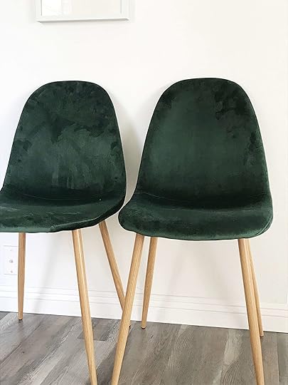
Here are the photos that Ray sent me of his space. Lovely but could definitely use some green sprinkled around the other side of the room to make the two spaces talk a bit more to each other. The other issue is that his space is already so nicely decorated that spending a ton of money on anything new is not what he wants to do. Very understandable.

So I searched the internet for all things forest green, conferred with the design team and came up with these four items that he could easily pop into his living room. We think that taking away two of the larger pillows on the sofa (the dark patterned one and the solid gray one) and replacing it with the green jacquard pillow and velvet lumbar pillow is the way to go. This way we have our green accents, are tying in the velvet and the size/shapes of the pillows are more varied. The tassel pillow could replace the tan and faux fur pillow on the accent chair closest to the fireplace with it. Then for the final touch, Ray can switch out that tan box on the ottoman for the green marble box. It will create greater contrast and adds in a different texture.

1. Jacquard-weave Cushion Cover | 2. Cushion Cover with Tassels | 3. Oversized Forest Green Velvet Lumbar Pillow | 4. Marble Vanity Box
Ray could also play with a lighter gray-green tone if he didn’t want to go all-in forest green. Playing around is key once the products are in the space. But when dealing with a bold color like this, the idea is just to pepper it into a neutral space (aka not go overboard) and make sure that the rooms feel balanced to the eye.
Agony: Rectangle Living Room Layout
Here we have another rectangle shaped living room brought to us by Ashley. She and her partner just moved into their “grown-up house” and need help with this room. “How would one lay this room out?” she asked. Well here is our recommendation…

The chairs are probably going to need to be relocated into a different room because the design team recommends pulling the sofa forward and all the way to the left wall (looking towards the back wall) so it sits in front of the doorway and centers with the fireplace (Ashely said that black cabinet is temporary so don’t worry about crowding). Then depending on the remaining space, one of the chairs might be able to fit in the corner, with a side table, where the sofa currently is for a separate reading nook. But a large plant in the corner would look equally as great. Also, if/when you are in the market for a new sofa, consider one that is a little slimmer in its profile and has more space between the floor and the bottom of the sofa. It will help make the room feel lighter.
HOT TIP: Don’t feel like your sofa always NEEDS to be pressed up against a wall. In fact, if you find that you actually have an opportunity to “float” your sofa in the center of a room, it could really help to fix most of your layout problems if you’re dealing with a long narrow space. It opens up other areas that you can assign another purpose to (reading corner, closed storage, small work space) without things feeling cluttered or ever wall being full.
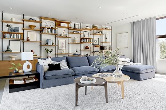 Photo by Sara Ligorria-Tramp | From: In Defense of the Comfy Sectional—A Friend’s Almost-Finished Family Room
Bonus Round: Ashley also asked about what to do with the large empty walls in the space. We touched on this topic in the last post but on the wall next to the fireplace, a nice large diptych or triptych would look great and then potentially on the back wall some kind of slender shelving or a large art ledge. You just want to make sure the two walls don’t compete for attention and don’t be afraid of some negative space.
Agony: The Useless Alcove
So. Many. Homes. Have. Random. Alcoves. Why? Not sure, but when Jenalyn asked for help styling her alcove, I knew this could be relatable to (hopefully) many people.

The main goal here is to create quiet visual interest. You don’t want too much going on up there that it makes you feel overwhelmed. A neutral color palette here is key unless the style of your home requires otherwise. Okay, now that that’s covered, let’s get into our two suggestions for Jenalyn.
 Photo and Ceramics By Luke Eastop
The first suggestion is to use all neutral/tonal pottery that look similar to each other such as in the photos above by ceramicist Luke Eastop. You just want to make sure that the pieces differ in size and shape so that it looks interesting and intentional (not like you were just storing them up there until you found a better purpose). Also, make sure to factor in the scale of the alcove. Anything too tiny or too large will look off.
 Photo By Sara Ligorria-Tramp | from: Jess’ Moto: You Have To See How She Hacked Her Kitchen With Diys
The second suggestion is similar to the first but has a more eclectic feel like how I arranged my open shelving in my kitchen. Pick a very simple color palette (for Jenalyn we would stay more neutral) and then play with all sorts of vessels. Bowls, baskets, vases, pitchers, etc. Just make sure they aren’t too crowded and have room to breathe. Remember to vary scale, height, shape and material. Below, I have rounded up a bunch of beautiful vessels in various budgets to help to inspire Jenalyn to tackle her agony.

1. Eva Tall Jug | 2. Beechwood Bowl | 3. Rimini Ivory Basket Planter | 4. Celia White Vase | 5. Audrey Small Low Round Glass Vase | 6. Slim Glass Vase | 7. Judy Jackson Tiny Stoneware Bottles | 8. Livsverk | 9. Audrey Tall Oval Glass Vase | 10. Matte Porcelain Vase | 11. Chunky Seagrass Woven Serving Bowl | 12. Shape Studies Vase | 13. Lyle Round Vase | 14. Cylinder Vase Bowl (set of 3) | 15. Narrow Seagrass Vase
Agonies be gone! And again hopefully, some of you have found some answers or inspiration for your burning design questions. This was not the first and won’t be the last so stay tuned for our next round of agony squashing.
If you have any design agonies of your own, feel free to DM Em on Instagram (be sure to write DESIGN AGONY in the prompt so it stands out) and check out the Design Agony highlight on her profile to see what we’ve covered already. For an issue you’re having that might be a deeper dive, be sure to email us at designagony@emilyhendersondesign.com.
Love you, mean it.
Want more Design Agony? We have them…well, the answers to them! Click through for more useful solutions:
3 Awkward Window Problems Solved + Shoppable Solutions
Sara’s House: A Long Narrow Floorplan Design Agony + Designing Begins
3 Design Agonies, 1 Post: Tricky Lighting, Big Empty Walls and Foyer Styling
The post Design Agony: A Tricky Living Room Layout, Useless Alcoves & Color Balance Problems appeared first on Emily Henderson.
November 7, 2019
Styling Hack: How I Stopped Spending Hundreds on Flowers For Shoots (& Instead Spend $0)
 Photo by Sara Ligorria-Tramp | From: Portland Project: The Entry & Staircase Reveal
We are back with another Afternoon Snack! Not sure what we’re talking about and waiting for someone to pass the popcorn? Well then sorry to say there is no actual food…but welcome to our new, regularly scheduled Second Day post (head here to read this morning’s post). These are meant to be a quick, fun article that can serve as a helpful afternoon pick-me-up. Now, let’s dive in…
Oh, what value being desperate can bring to your life. Historically, I have spent probably $300-$500 a month on flowers from the flower market for photoshoots. Sure, I’m likely over-spending because once I’m there I’m highly inspired by one of my favorite things in the world—FLOWERS—and need to hoard all of them. It was an expensive habit and one that was hard to break. But with both the mountain house and Portland projects, we didn’t have access to the flower market; plus we were shooting for weeks and weeks for both, so even when we did buy them, they had to be replaced often. While there is a flower market in Portland, it was far from where we were staying (and the house) and we didn’t have a license to get in. Could we have used a florist? Yes, but florists are quite expensive (understandably, they have to mark up to profit) and we didn’t have the budget for what we would have needed. So we took to the streets, well…the woods, and with the abundance of greenery in Portland we foraged and clipped.
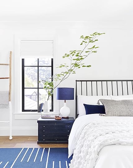 Photo by Sara Ligorria-Tramp | From: 14 Rules for How We Style the Perfect Bedroom + 3 Reveals
Obviously, it was on our property or literally in the middle of the woods and we took from trees that needed the trim, perhaps doing them a favor, really. *No plants were permanently damaged in the making of these photos. I don’t need to say this but I will: don’t steal your neighbors’ branches, don’t trim in a way that disfigures the one bush in the front yard, and I’m not here saying that we should stop buying flowers and chop down our trees instead.
So let’s go through the whys and hows:
Why the branch? Not only is it free, but it’s very high impact and sculptural.
How do you choose what to clip?
Go for one branch that has an asymmetrical shape, not a perfect line of leaves, but instead does something interesting sculptural.
Clip much longer than you would initially think. This is something I’ve had to teach to assistants. Make sure you are getting enough stem because you can always go shorter.
If you can’t find that one amazing branch, get two but ensure that one is shorter and that they don’t look symmetrical. You are going for a sculptural effect, not a semi-circle of leaves coming out of a vase.
One weird big branch off to the side works as long as it’s facing the right way (like the branch below).
 Photo by Sara Ligorria-Tramp | From: Portland Project: The Entry & Staircase Reveal
In Portland, there was a plethora of maple which is gorgeous since it’s sculptural and graphic but not too visually “heavy.”
 Photo By Sara Ligorria-Tramp | From: A Budget and Renter-Friendly Makeover
For the Atlanta project, also in the suburbs, we snagged that large weed which did in fact die that night and had to be replaced the next day, but worth the extra foraging time for such a large impact for free.
 Photo by Sara Ligorria-Tramp | From: The First Mountain House Bathroom Reveal: Our “Quiet Drama” Powder Bath
The mountain house has a forest behind it full of manzanita and maples so we carefully clipped some (and hot tip: manzanita lasts for months and looks GREAT dried).
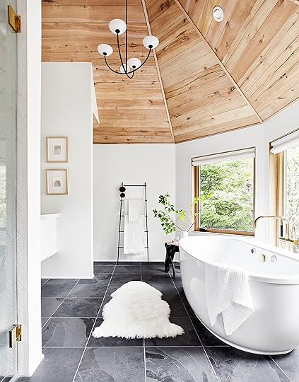 Photo by Sara Ligorria-Tramp | From: The Mountain House Master Bath Reveal
Maple branches last for at least a week, two weeks if you take care of them and keep them watered.
 Photo by Sara Ligorria-Tramp | From: The Portland Dining Room Reveal
 Photo by Sara Ligorria-Tramp | From: Mountain House Reveal: Our Light Filled Neutral & Textural Living Room
It doesn’t just work for the big “moments” guys. Nope. Smaller weeds or just a clipping from bushes/trees work for smaller vessels, too:
 Photo by Sara Ligorria-Tramp | From: Mountain House Reveal: The Upstairs Guest Bath That Used To Be A Closet
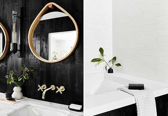 Photo by Sara Ligorria-Tramp | From: Mountain House Reveal: Our Soft Yet Secretly Sultry Downstairs Guest Bed + Bath
Now, a lot of these are more for shoots, we don’t keep branches in the shower for real life but you get the idea. If you have a guest coming over and want last-minute flowers but don’t want to buy carnations from Albertsons? Get your clippers and head to your backyard.
If you love branches but want the ones that actually dry the best (and therefore last for months), then let me know in the comments because there are a lot that we buy (I wish we could just forage and pick) that have literally looked almost as good months later when dried. We walked into the mountain house recently thinking we were going to need to refresh some, but nope, they looked great after 2 months. Let me know and I can write a quick post about my favorites because I LOVE A STYLING HACK. Especially ones that save me time and money.
The post Styling Hack: How I Stopped Spending Hundreds on Flowers For Shoots (& Instead Spend $0) appeared first on Emily Henderson.
Turns Out, Velvet Is a Family-&-Pet Friendly Design Secret Weapon (+ 60 Shoppable Picks)
 photo by sara ligorria-tramp | from: arlyn’s light and bright living room reveal
Hey look, it’s my living room! Any story angle I can cook up to push this space onto your eyeballs, I will gladly take because I gave up so many weekends to put this thing together (only sort of kidding here). In a recent brainstorm, we were talking about very exciting topics such as “function,” and I dropped some knowledge on my EHD ladies about velvet and why it’s actually a VERY durable fabric. It might look fancy and shiny, but guys, this stuff can take a beating and more people need to know about it. 9/10 of my EHD audience was pretty shocked and anytime something like that happens, we do what any good blogger does: turn it into a post so everyone can benefit.
I’ve had my velvet sofa (the Maxwell sectional from Interior Define) for just over a year at this point, and it still looks brand new. Granted, I live in a household of just two adults with no children and no pets so…what could possibly go wrong? But hear me out before you dismiss me for not having put this thing through the wringer…I know several people with kids AND pets and a velvet sofa and they’re out here singing its praises. They all agree that the lack of “loops” in the weave prevents snagging from paws and nails and that, because velvet has a dense top layer, spills don’t instantly sink down into it like, say…linen. Instead, it kind of hovers on top of it (for a few seconds), giving you time to run and grab something before it permanently moves into your sofa (without rudely paying any rent). OH and because of the natural varying visual pile, stains are pretty easily to hide…just a swipe of the hand in the opposite direction and all of a sudden, you can’t really tell if it’s just velvet being velvet or last night’s fettuccine alfredo. Yes, there is the matter of dust and fur, but a regular vacuum or lint roller goes a long way (I’ve also heard from pet owners that an old-school squeegee works wonders, especially on a fabric like velvet, so…just sayin’ in case that’s helpful to someone).
 photos by zeke ruelas | from: brady’s living room reveal
As I started writing this article, I realized I didn’t have all the answers to those original questions the team bombarded me with, so I reached out to our friends at Article for their actual expert take who put me in touch with Zoe Garred, Director of Product Development. (And no, this isn’t sponsored in any way…I reached out to a few furniture companies we work with regularly and they happened to get back to me on time!) Here are some highlights I found interesting:
Consider the type of velvet before deciding if it’s good for your kids and pets. “In this case, whether it’s cotton or synthetic velvet. While both are equally beautiful, we tend to recommend synthetic velvet for customers with kids or pets since it’s much easier to care for. We’ve found that stains don’t soak in as deep and the color doesn’t fade as much in direct sunlight, compared to cotton velvet.”
Velvet is sensitive to color fade due to direct sunlight, but particularly cotton velvet (another win for synthetic in this case). “To avoid it, I suggest protecting your furniture by selecting a space that isn’t in direct sunlight. If that’s not possible, drape a throw blanket over the sun-exposed areas to protect it from the sun.”
If you are able to find the rub count of a sofa’s velvet, look for something higher rather than lower (for instance, Article’s velvet has a rub count of 40,000, which Zoe says is ideal for a family home with high traffic areas).
“Remember to soak up spills immediately with a clean, absorbent cloth or paper towel, but be careful not to dab or rub as this will push the liquid deeper into the fibers. Leave the cloth on the spill until all the liquid has been absorbed and let it air dry.”
Companies can sometimes interchange “velvet” and “microfiber” but there are differences, mostly in the materials used to make the fabric and how it’s actually manufactured. “Microfiber is a synthetic fabric typically made of micro strands of polyester that are woven and split into smaller stands to have the appearance and feel of velvet. Natural velvets, like cotton velvet, is a bit heavier and thicker and has a matte look. It’s created on a special loom that weaves two thicknesses of the material at the same time, which are then cut apart to create the pile effect giving velvet its soft feel.”
Fascinating stuff…no? Just me? I mostly think it’s interesting because so many people assume velvet, because of its sheen and “glam” leanings, is super high maintenance or not suitable for a “real” home but guys, THIS IS NOT CORRECT. Are there people reading this who might be scrolling immediately to the comments to tell me how wrong I am…maybe, but the point is this: velvet is no more high maintenance than a standard cloth; if anything, it’s less so for all the reasons mentioned above.
 photo by sara ligorria-tramp | from: experimenting in my living room, trying to find “the” rug
Besides, aesthetically, it just packs such a visual punch and goes a long way to making a room feel really special. I’m sure this next little fact won’t be shocking to you, but the colored velvet sofa has long been an EHD favorite and that’s for the texture and character it adds to a space. Even when more on the neutral side, it’s hard to overlook the style power of velvet. It’s a great tool to use in say, a smaller room that needs more design bang for its buck or to really shake things up in a main living space. Don’t save this for the “sitting” room that no one ever sits in. Velvet can take the heat, let’s stop leaving it just warming the bench, hm?
Now, in terms of shopping, luckily, thanks to the rampant spread of these babies on social media, the price point has been brought down and you can find really great velvet options at budget-minded retailers and mainstream stores in ALL kinds of colors. Below, I rounded up all my favorites under $1,300 (some as low as $300!) and then under $2,000. And while no, I haven’t tested out all of these, I will note the ones I HAVE tested out IRL during my own sofa search, but also during a big “sofa squad” test series I did back when I was at Apartment Therapy (check that out here).

1. US Pride Furniture 70″ Sofa | 2. Farlov 86″ Sofa | 3. Chamberlin Velvet 85.5″ Sofa | 4. Ceni 83″ Sofa | 5. Sven 88″ Sofa | 6. Rivet Emerly Mid-Century Modern 83.5″ Sofa | 7. Fairfax Denim Velvet 89.4″ Sofa | 8. Shelia Velvet 80″ Sofa | 9. Albany Park Mid-Century Modern 87″ Sofa | 10. Todd 78.7″ Sofa | 11. Calais Channel Tufted 71″ Sofa | 12. Rivet Aiden Tufted Mid-Century Modern 86.6″ Sofa | 13. Cirrus 82″ Sofa | 14. Rivet Frederick Mid-Century Modern Tufted 77.5″ Sofa | 15. Marta 70″ Sofa | 16. Milly Velvet 87″ Sofa | 17. Eddy 84″ Sofa | 18. Milly Velvet 87″ Sofa | 19. Mirage 75″ Sofa | 20. Chamberlin Velvet 60″ Love Seat | 21. Matrix 78″ Sofa | 22. Drew Barrymore Flower Home Velvet 86″ Sofa | 23. Olsen 90.5″ Sofa | 24. Cloud 90″ Fabric
#2: I didn’t test the velvet version of this because the Farlov had JUST been released and was only available in a linen-like fabric, but it was just deep enough to feel cozy but not so deep that you need 5 pillows behind you for lumbar support.
#4: This sofa sits pretty low, so if you’re looking for something low-profile for good sightlines in an open room, it’s a good consideration. A bit firm, but I know some people like that for support.
#5: Sara has this sofa (in leather) and loved it so much she sourced it for her parents’ living room makeover and is considering reordering it for her TV room in velvet.
#19: The arms slope down pretty low on this baby which might feel weird if you’re used to leaning up against an arm (but a good height for resting your head on during a short nap). Also, it’s just so dang pretty (especially in that golden yellow velvet).

1. Forte Channeled Charcoal Velvet 80″ Sofa | 2. Brooklyn Down-Filled 81″ Sofa | 3. Lounge II 93″ Sofa | 4. Romano 93″ Sofa | 5. Jason Wu Two-Seat 77″ Sofa | 6. Calhoun 76″ Sofa | 7. Vail Curved Arm 87″ Sofa | 8. Andes 76.5″ Sofa | 9. Carlo Mid-Century 77.5″ Sofa | 10. Maxwell 82″ Sofa | 11. Kaye 95.75″ Sofa | 12. Sutton 78.5″ Sofa | 13. Harmony Down-Filled 82″ Sofa | 14. Anderson 88″ Sofa | 15. Todd Extended 108″ Sofa | 16. Goodwin 90″ Sofa | 17. Shelter 84″ Sofa | 18. Briar 90″ Sofa | 19. Bannister 87″ Sofa | 20. Loren 79″ Sofa | 21. Denver 80″ Sofa | 22. Channel Tufted Two-Cushion 76″ Sofa | 23. Delia 83.3″ Sofa | 24. Dylan 89.75″ Sofa | 25. Ainsley 77″ Sofa | 26. Graham Velvet 90″ Sofa | 27. Jasper 60″ Sofa | 28. Modern 87″ Sofa | 29. Monroe Drive 80″ Sofa | 30. Lewis 83″ Sofa | 31. Alto 83.5″ Sofa | 32. Puff Puff 87″ Velvet Sofa | 33. Willhoughby Two-Cushion 79″ Sofa | 34. Cassidy Bolster Back Orchid Velvet 98″ Sofa | 35. Savile Storm Velvet 92.5″ Sofa | 36. Olivia 85″ Sofa
#2: Besides the unique leg on this one, it’s a good “sitting” sofa in that it’s a bit upright, a little on the firmer side (though not firm) and not super deep. A good “conversation” sofa, but not so much a “binge-watching Superstore” sofa.
#3: I owned this sofa for four years and I still mourn the loss of it in terms of comfort. It’s my favorite sofa of all time for sheer coziness. This is a serious curl-up-and-watch-movies-for-centuries sofa. I’ve also had several house guests sleep incredibly comfortably on this because it’s SO deep, it’s basically like a twin mattress, but it definitely forces you to lay back and, well, lounge.
#8: This is much deeper than I gave it credit for when I first saw it in-store. The back on it is a bit upright but overall it was a nice level of smooshy firmness.
#10: I own this bad boy (see it in the lead image of this post, or in full action here in my living room makeover) and I love it. It needs fluffing about once or twice a week to keep it from looking a bit sloppy, but I don’t mind…it’s a good work out. The blue I got doesn’t seem to be available anymore, but the new blue seems a little moodier and darker, which is actually what I initially envisioned. It’s a great refresh on the classic English roll arm sofa with lots of fun leg options.
#17: I wish West Elm had reviews on their website, so I’m always a bit dubious of anyone who DOESN’T, but I did sit on this in-store and found it to be relatively deep (which I LOVE, but I know that’s not for everyone) with a nice combo of soft yet firm. The one cushion looks sleek and modern.
#18: VERY comfortable. I would have bought this sofa if I hadn’t bought the Lounge II (I tested it about a year after I bought the Lounge and was like…WAIT I love this sofa). It’s kind of the perfect depth if you’re looking for something to curl up in but without sacrificing support.
#25: This is definitely a “living room” sofa in that it’s very livable and not the flashiest in terms of style. It’s a pretty basic shape and profile, but the velvet really jazzes it up which is a nice “best of both worlds” thing.
#27: The Jasper is a nice tailored sofa for the modern/minimal enthusiast. It’s nice that you can create the shape you need since it’s a bit modular. It’s a very relaxed sofa in terms of how it sits but still firm and supportive.
#35: I tested out the leather version of this sofa a few years back. It’s only 35 inches deep but it sits deeper than you’d think since it’s a tight back without additional or pillows. A bit firm and tight, but not necessarily in a bad way.
Alright, so…did I win you over? Are you #teamvelvet, yet? Tell me everything, and if there are any sofas up there that you own or have tested, I’d love to hear your own feedback (good or bad), too! We can’t test EVERYTHING, but with your own experiences and input, we can get closer to knowing more about which sofas are worth our time, and which are an easy “pass.”
The post Turns Out, Velvet Is a Family-&-Pet Friendly Design Secret Weapon (+ 60 Shoppable Picks) appeared first on Emily Henderson.
November 6, 2019
How to Bring “Winter” In (Without Going Full Holiday…Yet) With Target


I hate starting a post with bad news, but we only have three weeks between Thanksgiving and Christmas this year. Last year, we had just over 4. I don’t know who decided that Thanksgiving should be so late, but they should be canceled (also, I know it’s just how the last Thursday of the month landed, but still). So, the question becomes, how do we stretch out the feeling of the holidays, create moments earlier and honestly get the most out of all the effort of decorating for as long as possible? We got you. Today, we are showing you how to “winterize” your home—how to make it feel like a snowy wonderland with a nod to the holidays (yes there are stockings, but no tree…YET) in early November that could easily be added to for the holiday you celebrate but also stripped back a bit to last you through February. This, my friends, is not a “Christmas” post; instead, it’s a “winter decorating” post that is giving me all the cozy feels.
We shot this up at the mountain house, in a few different rooms, using 100% Target product that is in this beautiful winter vibe. Our general aesthetic thesis was “Scandi hygge ski village” so we kept everything simple and minimal to work with the style of the house up there. The main palette was set with whites, grays, woods and greenery rounded out with lots of soft ambient (faux) candles (those lanterns up there are battery-operated, FYI) and twinkle lights…starting at the front door.
Create a Simple, Subtle Welcoming

That entry shot actually kills me. It looks so pretty. Faux greenery is your long-term friend and you don’t just have to use it on the mantel. We fastened it together with wood and twine to make a little winter moment instead of a big wreath for the door, and also wrapped it around the top half of the round mirror, which is incredibly welcoming with very little effort. (Oh, and sorry, but those skis are vintage…I know, it hurts.) BONUS: No messy pine needles to sweep up constantly, because nothing robs you of your joy quiet like getting needles stuck to the bottom of your feet every day or finding rogue ones deep into March and thinking they’re sprouting from your floors.

Just around the corner near the stair landing, is this little “moment” we set up. Yes, since we were going for Scandinavian, we went all hygge on you with a lot of texture, warmth and coziness, which we get easily through more textiles. Layer it on and go for chunkier textiles (like the sherpa-like fabric on that great chair that’s new to Target this fall) if you want it to last longer.

The runner over the table tones down the black of the console so the etched glass trees and votive holders feel less high-contrast. Oh, and if you want to start early, real greenery won’t last you so here (and throughout the house) we used faux garland and greenery—this flocked wreath is great—everywhere (and yes, you can reuse year after year).
FYI, trees are year-round natural elements, guys, so I think it’s perfectly acceptable to bring them in early. Those glass hurricanes in the shape of trees add a lot of light reflection/glimmer. Again, we kept it quiet by keeping them in a very light color palette. The baskets store extra textiles nearby.
Bring in (Toned Down) Iconic Holiday Elements

This star focal point is pretty awesome, guys. It’s big but still subtle and just made us all so happy. At night, the ambiance was incredible in this room because of all the soft ambient glow coming from the star’s twinkle lights, the fireplace and all the candles smattered across the mantel. Lighting is extremely important during these darker days, and with small, grabby kids, I am pro faux candles. These glowed like the real deal, both pillars and tapers.
I wanted to note that while yes, this house is already pretty neutral, going with softer colors instead of traditional holiday hues like red and green (or even blue and silver) neutral colors really extends the life of the “winter” look. Plus, I don’t know if you’re like me, but just a few days after Christmas, I get what I call “clutter body” and want to rip everything down. I can’t imagine getting tired of cozy, pet-able pillows and glowy candles, tbh, so I know this is something that I could carry until at least spring.

It wouldn’t be a shoot with Target product without my favorite Esters chair. This is an “evergreen” product in that it is sold year-round because it’s not seasonal, but a squishy sherpa pillow and a nubby throw makes it instantly even more welcoming. Set it up near a fireplace or reading corner with a wood table (this one here is from Threshold’s 2018 fall collection and is technically a “coffee table” but it’s a great size and height as more of a drinks-and-popcorn table).


You could easily hold off on the stockings until after Thanksgiving because the faux greenery garland and candles would definitely stand on their own here. And when you’re ready…stockings up! We loved these because of their sweater knit that felt nostalgic but also really fresh and modern (and it’s always a “yes” for me when it comes to faux fur this time of year).
Add a Few Festive Touches to Get Party Ready

There’s something about a ceramic tiny house village that instantly makes it feel like wintertime, but I know a lot of them can feel very…present, like you stumbled into a Cracker Barrel and bought the whole lot, which is why these white porcelain ones are so, so great. You get that “holiday village” feel without the visual noise. These could easily work on a console table somewhere, but here we brought them into the dining room to create more of a party vibe. And FYI, these are SUPER affordable—under $10—from Wondershop.

If you want something more casual than a big sit-down dinner, take your table and transform it into a winter scene with a few textiles (like the subtly sparkly tablecloth here). We used a faux fur runner here which is so fun because it kind of gives off snow vibes but is really just something I bet everyone will end up petting. A few more bottle brush trees (also a great budget buy) and some great faux branches (these are only sold in stores, FYI) and ta-da…you have yourself the perfect dessert or buffet table.

Quick party hack: don’t feel like you have to run out and get a cake stand that you’ll probably use twice a year if you don’t want to. Using a larger dinner plate in the same setting (or different setting, whichever!) you already have keeps things cohesive and just simpler for you. Mix in some brass flatware (grounded by linen napkins) and anything feels special.
Fit In Unexpected Moments
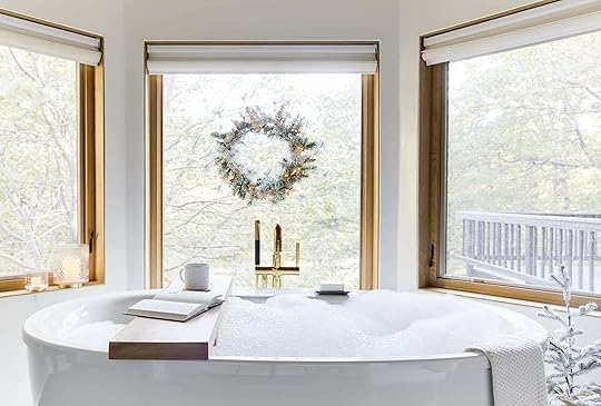
How to decorate your bathroom for winter/the holidays is probably something that has (likely) never crossed your mind. If it has, maybe you should work here. But if you have a “window moment” like the one in my master bathroom, a simple (battery-operated) lit wreath goes a long way to remind you about seasonal stress while you try to unwind from seasonal stress (kidding). It’s just a smile-inducing addition to an unexpected room.

A bubble bath and a wreath moment = my winter happy place.


Those etched glass hurricanes are so pretty and high-end looking and frankly, could be used from now until…always. They have that “magic” of the winter season but would also just be so special on a random day in March.

The same goes for a corner in a bedroom (this is in the adjacent master bedroom). I love those little lit trees; they’re such a great scale to fit into basically any and every vignette around your home. Throw in a knit blanket (I LOVE the oversize tassels on this one), something to squish your toes into (may I recommend a faux fur pelt?) and the perfectly updated buffalo check wing chair and you’ve got yourself a dreamy, comfy “winter” reading nook.
Don’t Forget Your Littles

We love to let the kids decorate their rooms, but if you don’t want to hand over the reins, it’s really just about sprinkling a few little touches throughout to add a little wonder.

The soft Christmas calendar is so sweet and easy for the kids to take off the wall without fear of breaking anything. Then it’s just bringing in a little lit faux green tree, another (smaller) star and fuzzy, furry, plush textiles.

Oh, and a kid-sized wreath, of course. The lights are battery-powered so you don’t have to worry about any cables or wires if outlets are scarce. This would be so sweet over twin beds, on the door, over windows or in a nook like this one above.
Well, I don’t know about you, but I’m full-on ready now to bring in winter (even though it’s 75 in LA). The snow will be falling up in the mountains in no time and all that will be left is bringing in the tree.
To shop each of these looks, Target put together these super useful collection pages by vignette (or scroll down to the Get the Look to shop that way, too).
Holiday Dining Room
Modern Holiday Gray & Black Entryway
Traditional Festive Holiday Mantle & Cosy Living Room Decor
Holiday Front Porch
Holiday Inspired Relaxing Bathroom Decor
Traditional Holiday Reading Nook
Modern Holiday Themed Black & White Accent Furniture Collection
Countdown to Christmas Kids’ Reading Nook
Holidays Kids’ Reading Nook Decor
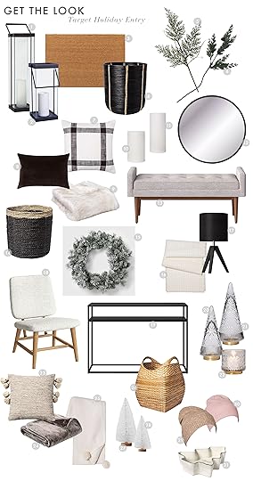
1. Large Metal Glass Lantern | 2. Small Metal Glass Lantern | 3. Doormat | 4. Black Rattan Basket | 5. Cedar with White Berries Dried Arrangement | 6. Artificial Cedar Stem with Pine Cones and Glitter Green | 7. Woven Plaid Pillow Square White/Brown | 8. Velvet Pillow with Linen Reverse | 9. Tipped Faux Fur Throw Blanket Cream | 10. Short LED Distressed Shimmer Flameless Pillar Candle | 11. Large LED Distressed Shimmer Flameless Pillar Candle | 12. Round Mirror | 13. Upholstered Bench | 14. Raffia Basket | 15. Wreath | 16. Metallic Fringe Table Runner | 17. Tripod Table Lamp | 18. Sherpa Chair | 19. Metal Console | 20. Tall Fair Isle Embossed Glass Christmas Tree | 21. Short Fair Isle Embossed Glass Christmas Tree | 22. Small Fair Isle Glass Hurricane Pillar Candle Holder | 23. Tassel Pillow | 24. Faux Rabbit Fur Throw | 25. Solid Plush With Faux Fur Poms Throw Blanket | 26. Large Basket with Curved Handles | 27. 2pc Bottle Brush Trees Decorative Figurine | 28. 4pc White Bottle Brush Trees Decorative Figurines | 29. Light Camel Knit Beanie | 30. Pink Knit Beanie | 31. Christmas Tree Candy Dish

1. Large Lit Standing Metal Christmas Star Decorative Star | 2. 2pk LED Distressed Shimmer Flameless Taper Candle Set | 3. Cable Knit Christmas Stocking | 4. Artificial Cedar Garland | 5. Tall LED Distressed Shimmer Flameless Pillar Candle | 6. Short LED Distressed Shimmer Flameless Pillar Candle | 7. Small Ceramic Taper Candle Stick | 8. Medium Ceramic Taper Candle Stick | 9. Accent Chair | 10. Cylinder Vase | 11. Cedar with White Berries Dried Arrangement | 12. Log Holder | 13. Black and White Throw | 14. Faux Sheepskin Throw Pillow | 15. Wood Accent Table | 16. Snowflake Coaster Set | 17. Chunky Knit Pouf | 18. Corded and Tufted Throw Pillow | 19. Channeled Faux Fur Throw Pillow | 20. Snowflake Serving Bowl | 21. Empty Bottles Full of Stories by Robert M. Drake & R. H. Sin | 22. Coiled Rope Square Base Tapered Basket

1. Corded and Tufted Throw Pillow | 2. Mongolian Faux Fur Throw Pillow | 3. Faux Fur Pillow | 4. Chunky Knit Pillow | 5. Striped Lumbar Pillow | 6. Large Ceramic House | 7. Small Fair Isle Glass Hurricane Pillar Candle Holder | 8. Medium Ceramic House | 9. Small Flocked Bottle Brush Tree | 10. Large Flocked Bottle Brush Tree | 11. Glass Jug Vase | 12. Decanter | 13. Dinner Plate | 14. Salad Plate | 15. Wine Glass | 16. Cloth Napkin | 17. Gold Flatware | 18. Serving Platter | 19. Gold Turner Spatula | Tablecloth (available soon)

1. Wreath | 2. Cable Knit Chenille with Sherpa Reverse Throw Blanket | 3. Short Faux Fur Square Throw Pillow | 4. Euro Channeled Faux Fur Throw Pillow | 5. Tipped Faux Fur Oversize Lumbar Throw Pillow | 6. Hanging Fabric Christmas Countdown | 7. Faux Fur Christmas Stocking | 8. Dew Drop Hanging Star | 9. Large LIT Flocked Hard Needle Tree Decorative Christmas | 10. Judith Faux Fur Ottoman | 11. Wooden Tractor Set | 12. Corded and Tufted Lumbar Throw Pillow | 13. Mongolian Faux Fur Rug

1. Hook Rack Black | 2. Wreath | 3. Tall LED Distressed Shimmer Flameless Pillar Candle | 4. Short LED Distressed Shimmer Flameless Pillar Candle | 5. Small Fair Isle Glass Hurricane Pillar Candle Holder | 6.Large Fair Isle Glass Hurricane Pillar Candle Holder | 7. Soap Dish | 8. Bath Towel | 9. Hand Towel | 10. Candle | 11. Apothecary Glass Storage Bottle | 12. Bath Mat | 13. Black Accent Table | 14. Burlap Wrapped Plastic Flocked Tree | 15. Wood Accent Table | 16. Accent Chair | 17. Small Glitter Tree | 18. Large Glitter Tree | 19. Cream Throw Blanket | 20. Mongolian Faux Fur Rug | 21. Cedar with White Berries Dried Arrangement | 22. Mug | 23. Glass Bud Vase | 24. Light Filters In by Caroline Kaufman
***photography by Sara Ligorria-Tramp, creative direction by me and styling by Velinda Hellen
The post How to Bring “Winter” In (Without Going Full Holiday…Yet) With Target appeared first on Emily Henderson.
November 5, 2019
What’s the Next “Arch”?

 design by jessica helgerson | styled by emily henderson for styled the book | photo by david tsay
We’re back with another blog snack, as reader MM said in yesterday’s second-day post. We’ll henceforth call this our “afternoon snack” because who doesn’t get a little munchy for a lil’ sumptin’ at around this time, hm? Dig in!
If there is one architectural element that has taken over the design world, it’s the arch—rounded doors, hallways, headboards, niches, you name it, it probably has an arch on it. It’s the new “put a bird on it.” To call it a trend would negate its classic and timeless nature; it’s just a rounded edge rectangle or square, that’s all. I am in no way sick of it, it’s not going anywhere hopefully soon, as our move toward round anything is long overdue. A typical house is full of straight hard lines—if you are lucky, floors, walls and ceilings that meet at 90 degrees, so a soft round shape certainly breaks it up in perfect quiet contrast. Plus, let’s be honest, walking through an arched doorway is more fun. It just is. Bathing in an arched bathtub nook feels magical. We are all about the arch.
So in the office, we were thinking…what are the new interpretations of the arch going to be? Anything? Are our two choices squared-off corners or rounded ones? Well, we started seeing this pop up…
The keyhole.
design by pablo chappelli | photo by ricard romain | via elle decoration nlFirst off, “technically” the shape in the stunning bathroom above (designed by Pablo Chappelli) is a rounded horseshoe arch but the two terms are used pretty interchangeably. But to show you the difference, the killer marble backsplash (pictured below) from designer Beata Heuman leans more toward the traditional keyhole shape but, like most anything cool, is a very modern take.
 design by beata heuman | photo by simon brown | via domino
Now I’m not saying that this will be as ubiquitous as the arch, it won’t nor should it. It’s more specific and while it is a traditional Moroccan architectural feature, I feel it could easily go in a contemporary home. I don’t think it should necessarily take the place of an arched doorway in a colonial home (not that arches are a thing in colonial homes anyway).
I love it for niches or entries into modern spaces. I could absolutely see it taking off in the boutique hotel world. The Menorca Experimental (below) has clearly shown it’s modern power. Also, Chzon (the design firm) makes design magic with everything they touch. If you don’t know them, change that immediately.
 design by chzon | photo by karel balas | via remodelista
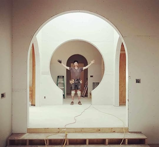
When I was scrolling through #keyholearch on Instagram for research, I saw that architect Assembly a.b. installed one in a modern home in North Carolina and man did it turn out so cool. The “after” photos on their site didn’t have a straight-on shot of it so first is a photo of the construction process then below the finished result featuring all the natural light I want in my life at all times.
 design by assembly architecture + build
I think we all can agree this house is incredible.
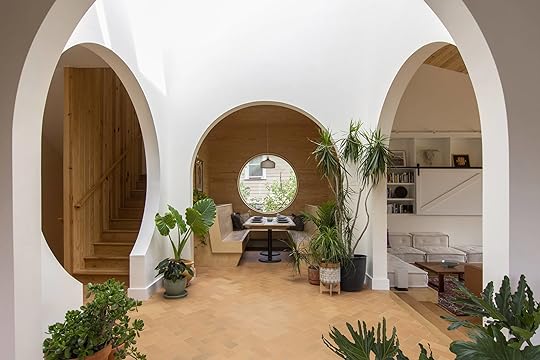 design by assembly architecture + build
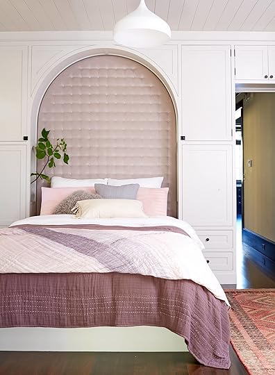
In conclusion, I love the keyhole arch and think we will be seeing it more. Just wait and see. I mean it’s easy for your eye to understand it, and just soooo playful and whimsical. I’m not alone in my love over here at EHD. Jess is considering using it for her bed nook, which I think is the perfect place because it’s super cozy and you don’t need the wider access/entry. DO IT JESS and then show us how.
Thoughts? Are you into it? Let’s discuss.
In case you are still “hungry” and missed Sara’s morning post head on over. You won’t be left wanting:)
The post What’s the Next “Arch”? appeared first on Emily Henderson.
Sara’s House: On Making “Adult” Decisions + A Look at the Final Design Plan

People tell you that buying a home is hard. They also tell you that renovating a home is both emotionally and financially draining. They even tell you that you won’t believe it until you’re doing it yourself. But I think humans are programmed to ignore that kind of information until they’re actually going through it themselves, otherwise we’d never do anything, right? BUT WOW RENOVATING A HOUSE REALLY IS EMOTIONALLY AND FINANCIALLY DRAINING. I’m just yelling for the people in the back. The whole process also brings up a lot of weird emotions and thoughts. I’m really lucky to be doing this alongside a great human (I’m talking about Macauley, not my work wife Velinda, though she’s pretty great, too). This post might get a little mushy, so try and stay with me and you’ll be rewarded with a sneak peek of our FINAL design boards for the living room and dining room at the end. I’m literally squirming with excitement for you all to see it. But first…

This guy right here, he’s pretty amazing. 2020 will mark 8 years for us. It’s hard to imagine liking someone THIS much for THIS long, but then I think about him and I’m like “yeah, yeah I get it.” Listen, I don’t need grief about how 8 years is nothing from those of you who have been together like 35 years (I’m looking at you mom and dad). For us, eight years feels like an accomplishment. But it also feels like in a lot of ways we’re just getting our life together started. Of those 8 years, we’ve only been living together for 3 of them. I mean, I know people who have gotten married or had kids in less than three years. And we’re starting to get into the real nitty-gritty of co-lifeing, like figuring out how to share bills and signing legal documents together. Our first apartment together was a dream…
 photo by tessa neustadt for ehd | from: sara’s living room reveal
But buying and renovating a house together is one of the most adult things I can think of. And once you start tearing down walls and ripping out floors, you’d be surprised at what other real-life adult things can pop to the front of your brain. For me, this thing was life insurance.
We really value honesty here at EHD, and we like being upfront with you all whenever we are sharing sponsored content. So yes, this is a sponsored post about life insurance. Sponsored posts are a big part of how we support the content we create (like this series about my house!), and we love working with companies that not only align with our values but who also believe in the work we do! But the second, more important part of this equation is the fact that life insurance is a subject I was actually already researching. When Caitlin said Haven Life (an online life insurance agency that we’ve worked with in the past) had reached out about the possibility of collaborating again, I was like “ME! PICK ME! I can write about this.”
When I brought it up with my parents to get their advice, they were a little surprised I was already thinking about something like life insurance (they both have life insurance policies). Mac and I don’t have kids, we’re not married yet, and our debts (not including our house) are pretty minimal at best with some student debt and car loans. But that house, man…it suddenly meant our individual low-debt lives have become a single, intertwined LARGE debt. We really do look at this house as an investment in our future together. Possibly as our forever home, but more likely as a stepping stone to something bigger and better. We were also careful not to get into a mortgage that we couldn’t reasonably pay. But that’s hoping for the best-case scenarios (neither of us getting hurt, losing our jobs, or something else unpredictable), because our mortgage is something that relies on both of our incomes to afford. And all of this got me thinking seriously about what would happen if something were to happen to either of us.
My interest in life insurance is a two-part equation. First, we had a slight but very real brush with that “worst case” scenario with our apartment fire in December 2017.

When I was woken up at 4 am to the sounds of people yelling and the smell of smoke, I have to admit that my first instinct wasn’t “we’ll pull through this stronger than before, and it will eventually lead to us owning our first home.” My first thought was “OUR CHRISTMAS TREE IS ON FIRE” followed closely by “what if we don’t get out?” Both were very scary thoughts, but the second one is the one that still haunts me. I can’t even drink mezcal anymore because the smokey flavor triggers this pit of anxiety in my stomach. If there’s one thing that fire taught me, it was that it’s very easy to think “the worst” will never happen to you… until it does. I’m not trying to be dramatic, and that fire did not end in a worst-case scenario. Both Mac and I are fine, our cats are fine, and we’ve landed very much on our feet. However, having the living room of your beautiful apartment charred like a hot dog left on the grill too long definitely wasn’t an ideal way to kick off 2018. We made the best of it though:

The second part of the equation is seeing life insurance in action. Sadly, I’ve experienced first hand the sudden and unexpected death of a loved one. I won’t go into too much detail because it’s an extremely personal story and one that is not solely mine to share. What I will say is this—an unexpected death is unimaginable grief wrapped up with scrambling to figure things out, plus huge piles of paperwork, legal documents, and bills. And none of those things wait for your grief to subdue (it can take years to find any semblance of a “new normal”). BUT I’ve also seen how beneficial having even a small life insurance policy can be for grieving loved ones. In fact, in the specific situation I’m referring to, the proceeds from the life insurance policy are still proving wildly important to the family’s financial stability, and I don’t know what they would have done without it.
If the worst were to happen to me, the last thing I would want for Mac to be thinking about is how he’s going to pay the mortgage on our house or being forced to quickly sell the house and move amidst the emotional turmoil. (In this scenario, I’m going to assume for my own self-esteem that he would be in emotional turmoil after losing me). I would want Mac to be able to choose, in his own time, what he’d like to do with the house. And because we own a house together, but we’re not married, I want to set up systems that protect him. Life insurance is one of those because I can choose to list him as a primary beneficiary. But it extends beyond Mac. I would want my parents and grandmother to be paid back their share of the down payment if Mac decided to keep the home, which is why they would also be set as primary beneficiaries with a specific amount allocated to them. That way, they can help my brother buy his first home in the future. It turns out that there are many other good reasons for life insurance, beyond being a parent with children.
And as I’ve been doing my research, Haven Life’s site has been one of my favorites. It’s wildly user-friendly and super easy to navigate. It also doesn’t hurt that they are backed and wholly owned by MassMutual, a nearly 170-year-old insurer with a long history of financial strength. It’s really simple to get an initial estimate for coverage. You can adjust the different areas like your health rating and the amount of coverage you’re looking for until you find a Haven Term policy that you think could work for you:
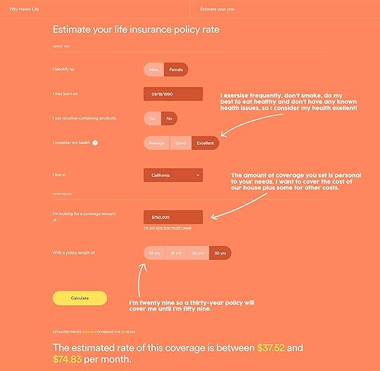
With the quote tool, I was able to see that Mac and I could each purchase a policy that would cover the cost of our home (plus some) for about $35 a month for me and $45 a month for him. $80 a month total isn’t bad for our peace of mind. I know that $80 a month may not fit everyone’s budget, but for us, I would really want to make a few budgetary changes to make it work. Next, I went further and filled out the life insurance application (which took about 15 minutes total). Once completed, I got my final rate, and it was exactly the same as my initial quote. The benefit of starting a life insurance plan now (not too young, not too old) is that my health is still in really good shape, and I’m able to get an affordable rate that I can lock in for the next 30 years.
I was instantly approved for coverage and didn’t need to take a medical exam (this is not always the case, though, as most applicants do. Regardless, the process is quick; it’s several weeks with other, less digital options.)

Here are some nuts and bolts about what a term life insurance policy gets you:
Term life insurance provides a simple, affordable way to help financially protect your loved ones. This type of life insurance coverage lasts for a fixed period of time—typically 10, 15, 20 or 30 years. You have coverage in place during the years your loved ones need it most, until the mortgage is paid off (like us) or the kids are adults.
Like other kinds of life insurance, term life guarantees a financial payout to your beneficiaries during the designated time frame in exchange for your regular monthly premium payments. That payout is often tax-free and paid in a lump sum.
Most term life policies offer guaranteed level premiums. All this means is that your monthly rate is locked in and will not change (which is GREAT). If your monthly premium for a 30-year term policy is $35 when you sign up, then it will be $35 next month, next year and so on… right up to the end of the term even as you age. That also means that if your needs change as the years go on, say you have children or you buy a bigger home with a larger mortgage, you’ll need to revisit your life insurance needs and potentially purchase an additional policy.
Once your term length is up, coverage ends. You don’t get the money back that you paid in premiums because like car insurance, for example, you’re paying for coverage in case something does go wrong. You do have an option to renew your coverage once the term is up, but premium pricing is much more expensive. So it’s more cost-effective to revisit your life insurance needs periodically and buy an additional policy if it’s needed.
Not everyone needs life insurance. It’s a personal choice that usually happens once there’s someone who relies on your financial contribution in some capacity. It’s one of those things you pay into hoping you never have to use it, but life is unpredictable and having seen first hand how important a safety net can be, it’s something I’m seriously considering for myself. Mac and I are on a very strict budget right now, and probably for a while. But for us, life insurance feels like something worth working into our budget. I buy too many $5 turmeric lattes anyways.
We’re really turning this house into our HOME, which makes me even more anxious to protect the future of it. And the design process so far has been making it all worth it. Finally being able to pick out pieces is giving us a light at the end of the tunnel. And I know you’re all excited and anxious to see what final decisions have been made. So, without further ado, here is our FINAL design/furniture board for both our living room and our dining room!

Arched Mirror from Rejuvenation | Fireplace Hearth Tile from Bedrosians | Ceiling Light from Rejuvenation | Custom Roman Shade from Decorview | Velvet Sofa from CLAD Home | Rug (Vintage) | Coffee Table from Blu Dot | Leather Chairs from Blu Dot | Standing Lamp from Article | Nantucket Front Door from Simpson | Monoprints from A.E.U. | Vintage Bar Cart from Sunbeam Vintage | Hanging Pendant from Target | Portrait Print by Stephanie Kurth | Bar Cabinet from All Modern | Dining Table from Lulu and Georgia | Vintage Dining Chairs from Amsterdam Modern | Bench from Rejuvenation | Vintage Rug from Esmaili Rugs
We have yet to add that final layer (art, accessories, textiles—including bringing some green into the dining room), but there you go! Our brand new living room and dining room in 2D. The pieces aren’t even in my house yet and I’m already in love with all of them. This process is getting me so wildly excited to really move into our home and start enjoying it. But there are a few more steps before we get there (like adding quarter-inch to all of our baseboards, which is a very fun task I’ve relegated to my brother). Stay tuned… and thank you Velinda (our designer and friend) and EHD for inventing this series.
And an extra big thank you to Haven Life for supporting this series. If you’ve ever even been curious about what the benefits of life insurance are or how much it might cost you I highly recommend heading over to their site and starting with the quick quote tool. It took me two minutes but started a very important and needed conversation between Mac and me about the steps we can take to protect each other.
Disclaimer:
***Thanks to Haven Life who sponsored this post and allows us to continue to bring original content to you every day. Thank you for supporting the brands that support us.
Haven Term is a Term Life Insurance Policy (DTC and ICC17DTC in certain states, including NC) issued by Massachusetts Mutual Life Insurance Company (MassMutual), Springfield, MA 01111-0001 and offered exclusively through Haven Life Insurance Agency, LLC. Policy and rider form numbers and features may vary by state and may not be available in all states. In NY, Haven Term is DTC-NY. In CA, Haven Term is DTC-CA. Our Agency license number in California is OK71922 and in Arkansas, 100139527.
The post Sara’s House: On Making “Adult” Decisions + A Look at the Final Design Plan appeared first on Emily Henderson.
Emily Henderson's Blog

- Emily Henderson's profile
- 10 followers

